eme 157’s domehome emerges from foliage-covered brick house in spain
CategoriesArchitecture

eme 157’s domehome emerges from foliage-covered brick house in spain

EME 157 Studio’s DOMEHOME expands existing house in Aravaca


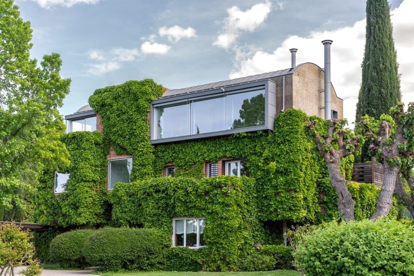
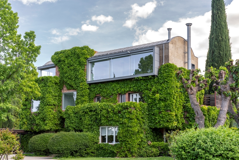
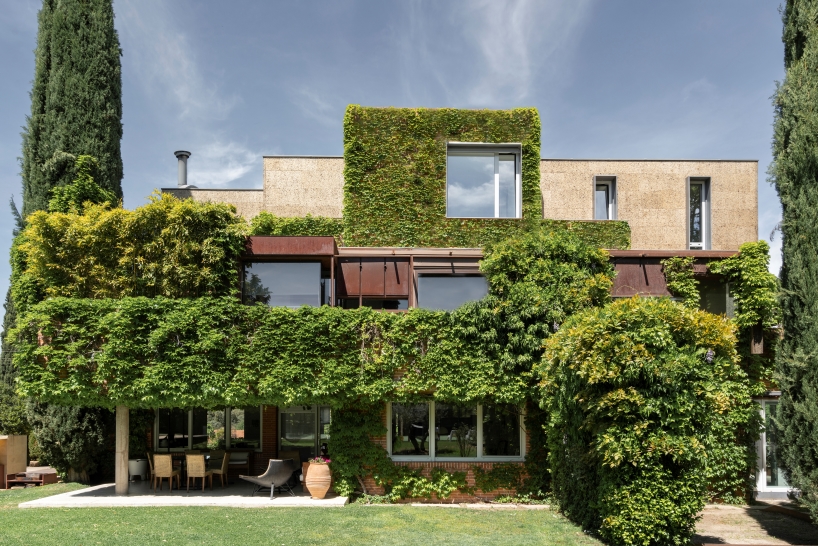
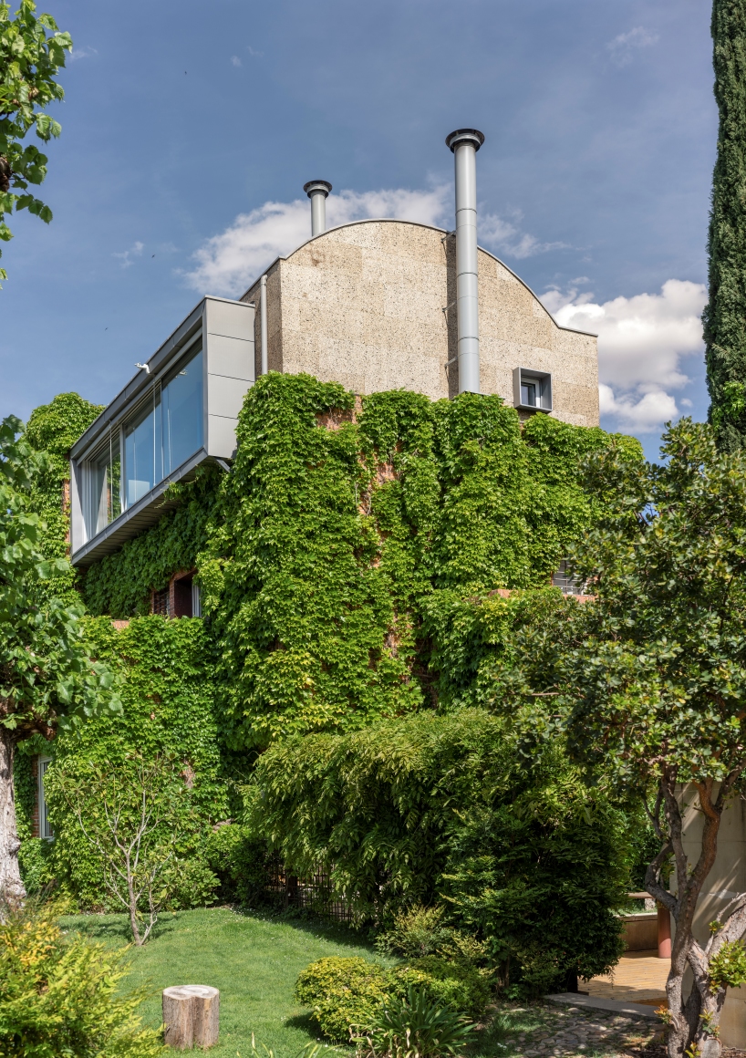
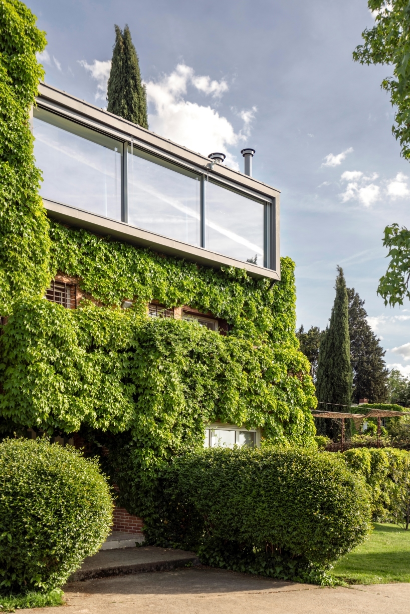
DOMEHOME project by EME 157 involves the expansion of a single-family home in Aravaca, Madrid, adding a new floor to accommodate an independent apartment for the family’s son. The renovation primarily focuses on transforming the previously unused terrace on the top floor into a habitable space. The design process begins with the consideration of the external appearance, emphasizing how to crown the existing brick house covered in vegetation. To maintain a balanced height without excessive increase, the design adopts a domed shape, allowing for increased internal height, spatial dignity, and reduced perception of height from the exterior.


The choice of cork for the new floor contributes to its distinctiveness, both in terms of materiality and insulation properties, contrasting with the solidity of the brick in the rest of the house. Zinc is employed for the vault, aligning with the overall design strategy. 
eme 157's domehome emerges from foliage-covered brick house in spain
all images by © Luis Asin


large circular skylight illuminates the house’s interior


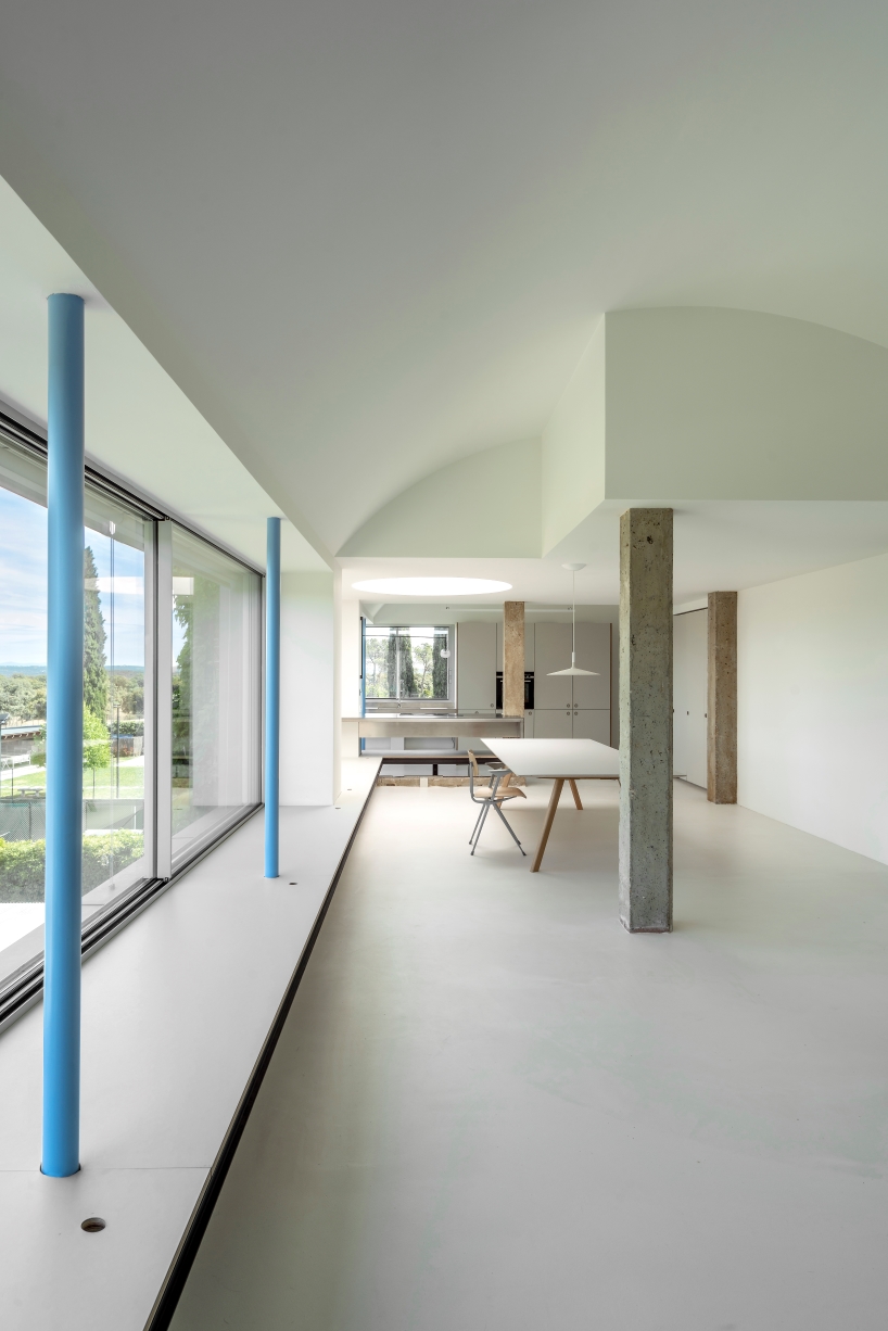
The interior layout, driven by the desire to prioritize panoramic views, comprises 50 sqm on the ground floor housing the entrance, a bedroom, and a bathroom. The upper floor, spanning 130 sqm, is divided into private and public areas. The private zone features a bedroom and bathroom, while the public space integrates an open kitchen, dining room, and living room with expansive north-facing windows. A large circular skylight, originally illuminating the stairwell, floods the room with natural light.


Material simplicity characterizes the interior, with mortar floors, polished stainless steel for countertops and showers, and plywood and linoleum board for furniture. The design team at EME 157 experiments with the contrast between cold and warm materials. Exposed original concrete beams and pillars create a contrast with the new slender circular metal pillars painted in sky blue, seamlessly blending with the breathtaking views outside.
eme 157's domehome emerges from foliage-covered brick house in spain
EME 157 transforms a home in Aravaca, Madrid, adding a new floor for an independent apartment
eme 157's domehome emerges from foliage-covered brick house in spain
the architects crown the brick house with a distinctive domed shape covered in vegetation
eme 157's domehome emerges from foliage-covered brick house in spain
the renovation converts the previously unused top-floor terrace into a functional living space
eme 157's domehome emerges from foliage-covered brick house in spain
the domed design maintains a balanced height, offering increased internal space

Reference

el departamento infuses mountainous hues into texturized optical boutique in madrid
CategoriesArchitecture

el departamento infuses mountainous hues into texturized optical boutique in madrid

El Departamento unveils new PJ Lobster boutique in Madrid


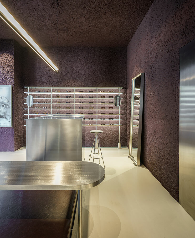
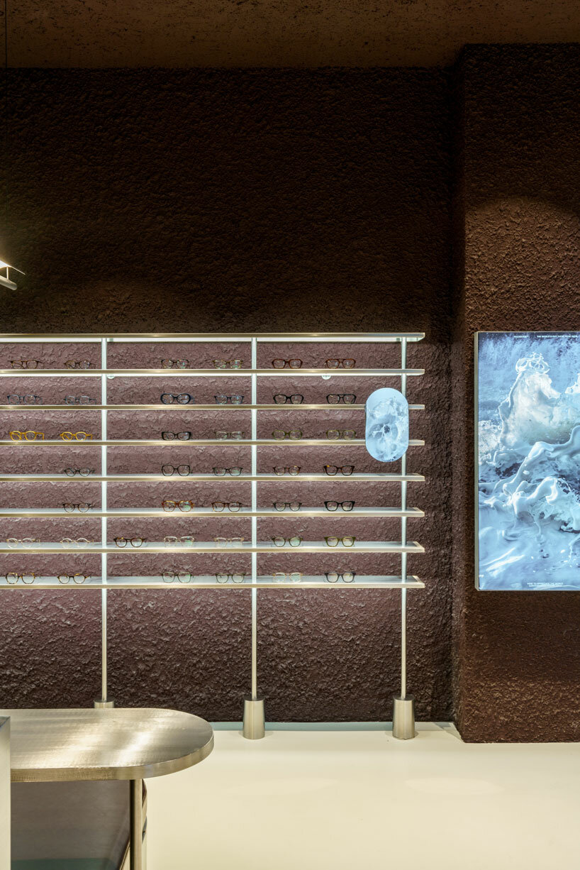
Valencia-based architecture practice El Departamento has crafted a contemporary optical boutique for the PJ Lobster brand in Madrid, Spain. Drawing from the character of the project location, which combines both sophistication and vibrancy, the retail interior incorporates texturized minimalism, rough materiality, organic forms, and stainless steel elements throughout its design. The color palette is inspired by the hues of the Madrid mountains, infusing a natural essence into the design which is otherwise described as ‘high-tech’.

el departamento infuses mountainous hues into texturized optical boutique in madrid
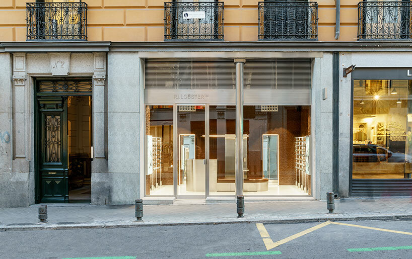
the exterior of the new PJ Lobster boutique in Madrid | all images courtesy of Miguel Fernández-Galiano


PJ Lobster’s Madrid store Unveils a Design Continuum


The new PJ Lobster boutique in Madrid continues the design exploration initiated in the previous project located in Barcelona (see designboom’s previous coverage here), focusing on color, organic forms, and different textures as common design elements.


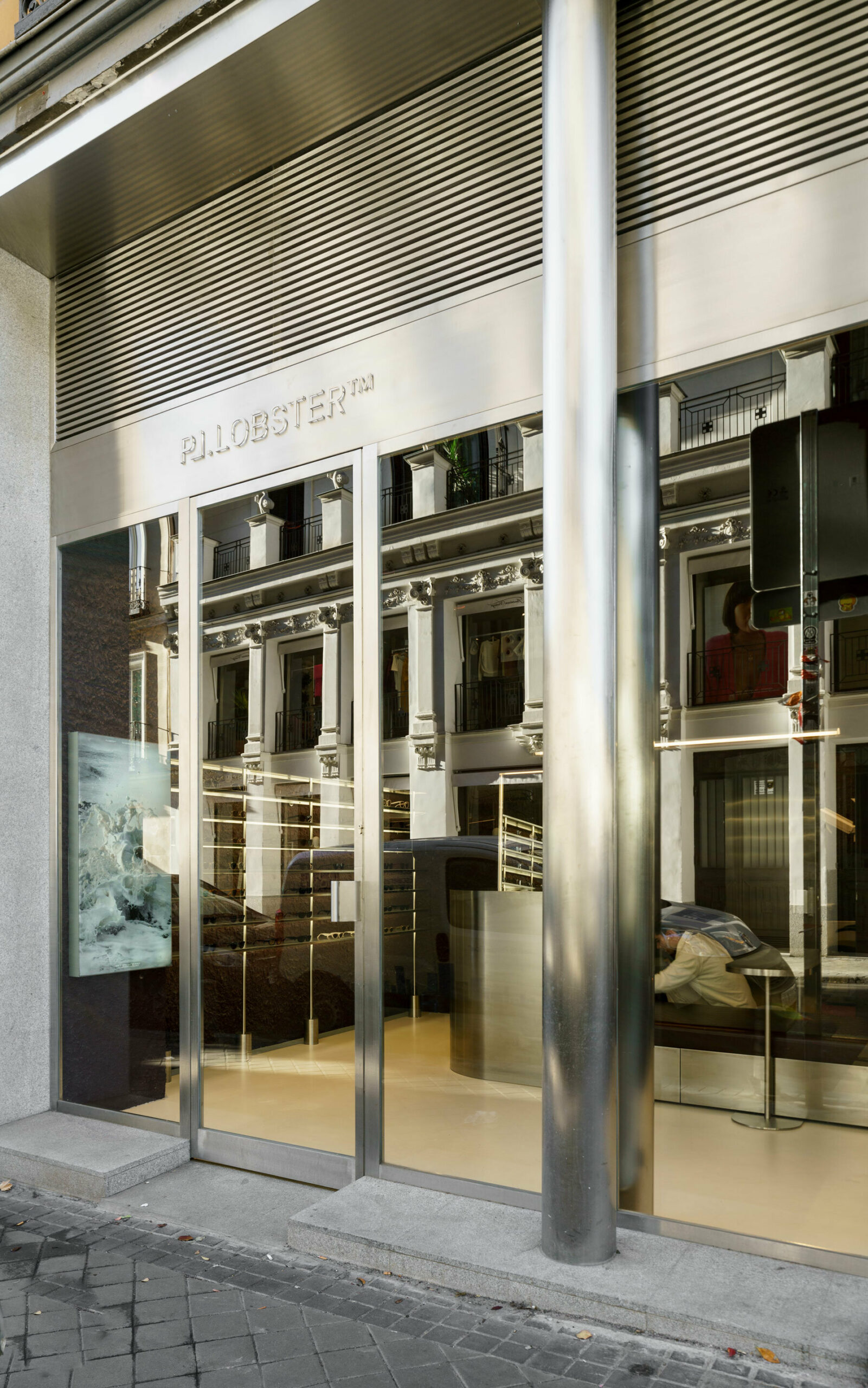
Spanning 42 m2, with an additional operational basement, the structure redefines traditional storefront concepts with an expansive, unobtrusive street-facing facade. The interior boasts ornamental structures, including wooden beams and cast-iron columns, maintaining an impressive free height of over 4 meters. El Departamento (find more here) preserved the original cast-iron pillars on the facade, encasing them in a sleek stainless-steel skin that transforms their appearance into two seamless cylinders. A striking glass facade, precisely centered between the two pillars, establishes a clear boundary, inviting patrons to experience the seamless transition between the external environment and the meticulously crafted interior space.


el departamento infuses mountainous hues into texturized optical boutique in madrid
the entrance of the store features reflective stainless steel elements


El Departamento’s Fusion of Textured Minimalism & Raw Precision


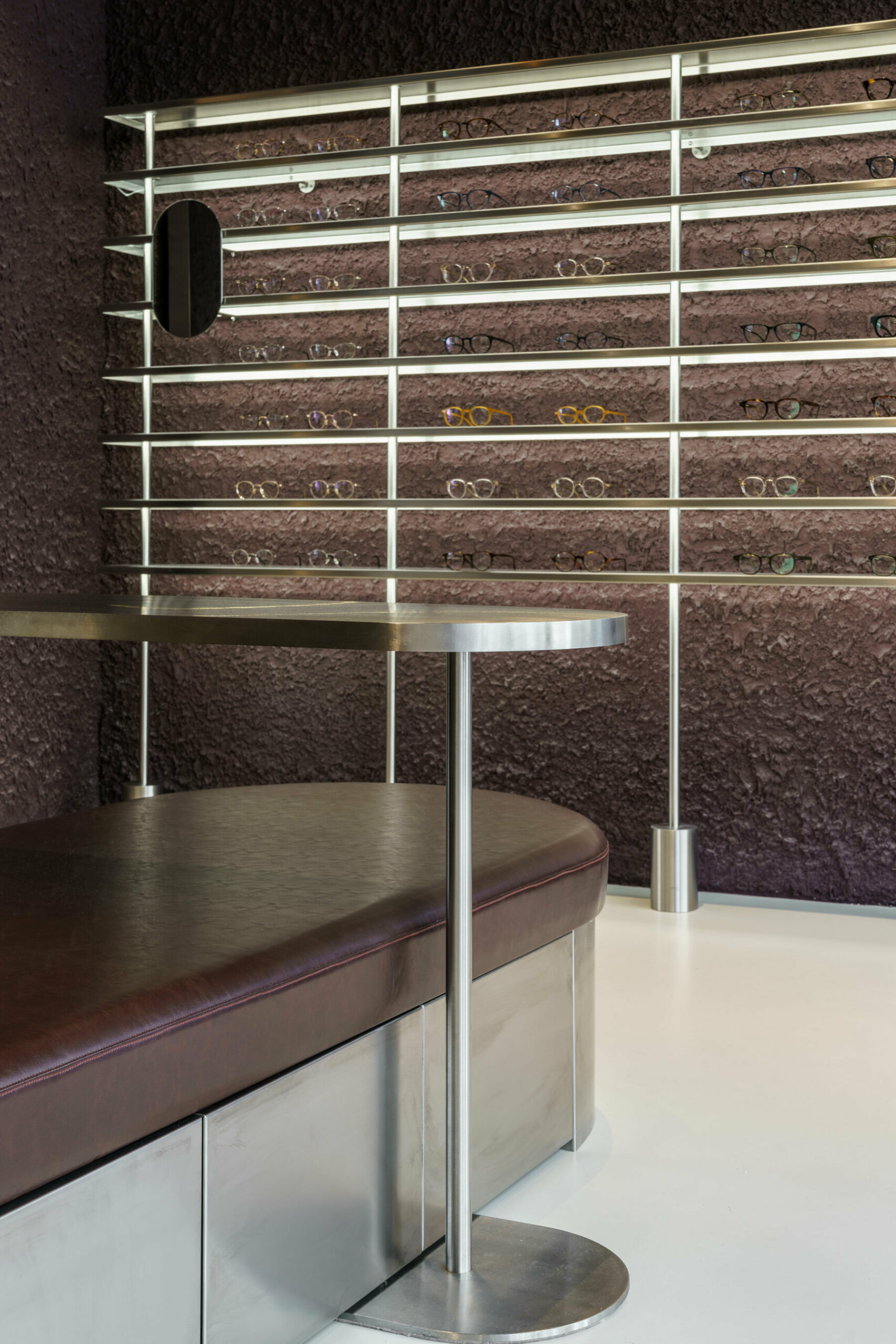
In their latest spatial exploration for this new optical boutique, El Departamento blends textured minimalism and raw precision. Meticulous attention to detail is evident as the color-blocked sales area dynamically contrasts with a neutral floor, yet harmonizes with stainless-steel furniture, accentuating the high-tech ambiance of the space.


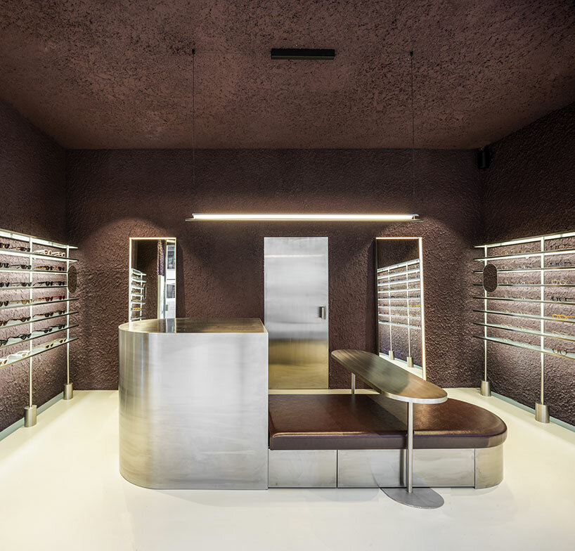
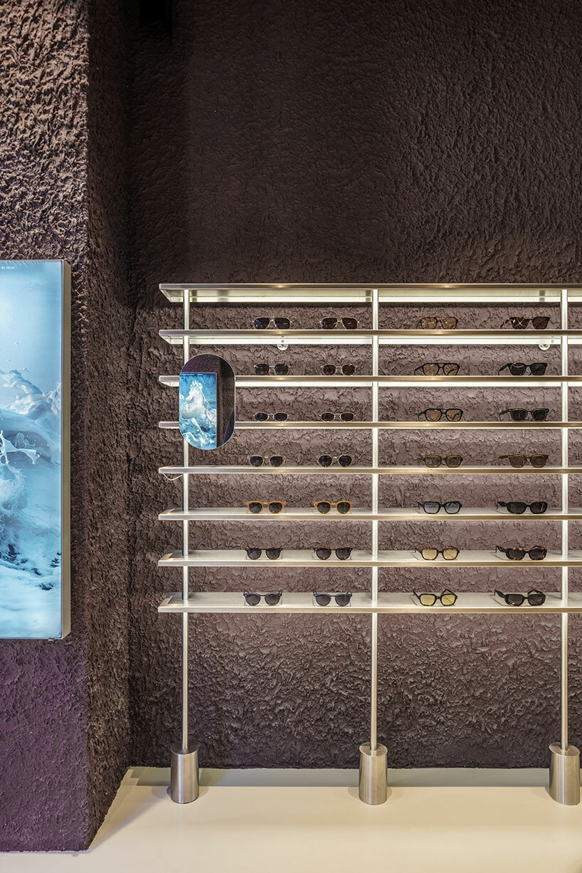
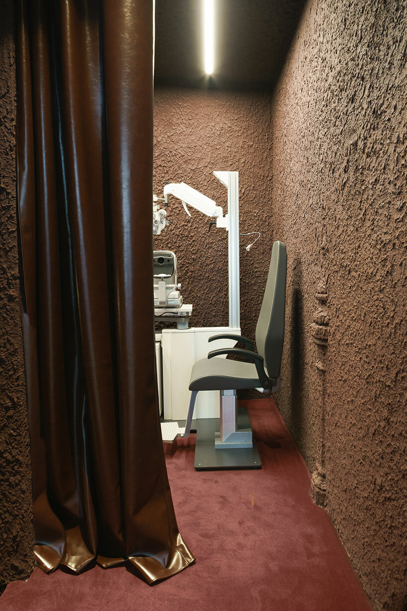
The design of the shop is characterized by rough materiality, as a prominent irregular plaster finish emerges. The color palette, dominated by dark garnet and aubergine hues, pays homage to the traditional color of Madrid’s exposed brick. This color, derived from the various clays of the central plateau, harks back to the architectural materials of Madrid’s late 19th-century aesthetics. ‘This tribute to reddish tones, transformed into garnet, evokes the hues that tint the fields of Madrid’s mountain range in autumnal twilights,’ the design team shares. 

el departamento infuses mountainous hues into texturized optical boutique in madrid
the retail interior incorporates rough materiality, organic forms, and stainless steel elements

el departamento infuses mountainous hues into texturized optical boutique in madrid
the color palette of the project is inspired by the hues of the Madrid mountains

el departamento infuses mountainous hues into texturized optical boutique in madrid
an irregular plaster finish emerges within the interior

el departamento infuses mountainous hues into texturized optical boutique in madrid
the interior boasts ornamental structures, including wooden beams and cast-iron columns

el departamento infuses mountainous hues into texturized optical boutique in madrid
the store is dominated by dark garnet and aubergine hues

el departamento infuses mountainous hues into texturized optical boutique in madrid
the boutique s characterized by a high-tech ambiance


project info: 

name: PJ Lobster Restyling
architects: El Departamento | @eldepartamento.estudio
design team: Alberto Eltini & Marina Martín

location: 2 Fernando VI Street, Madrid, Spain 
area: 42 sqm
photography: Miguel Fernández-Galiano

myrto katsikopoulou I designboom

dec 25, 2023


Reference