A suite with a yellow colour scheme in the Art Legacy Hotel in Lisbon
CategoriesInterior Design

Moooi furnishings “tell a different story on every floor” of Art Legacy Hotel

A suite with a yellow colour scheme in the Art Legacy Hotel in Lisbon

Father and son architect duo Luís and Tiago Rebelo de Andrade explain how they furnished Lisbon’s Art Legacy Hotel entirely with Moooi products in this video produced by Dezeen for the Dutch furniture brand.

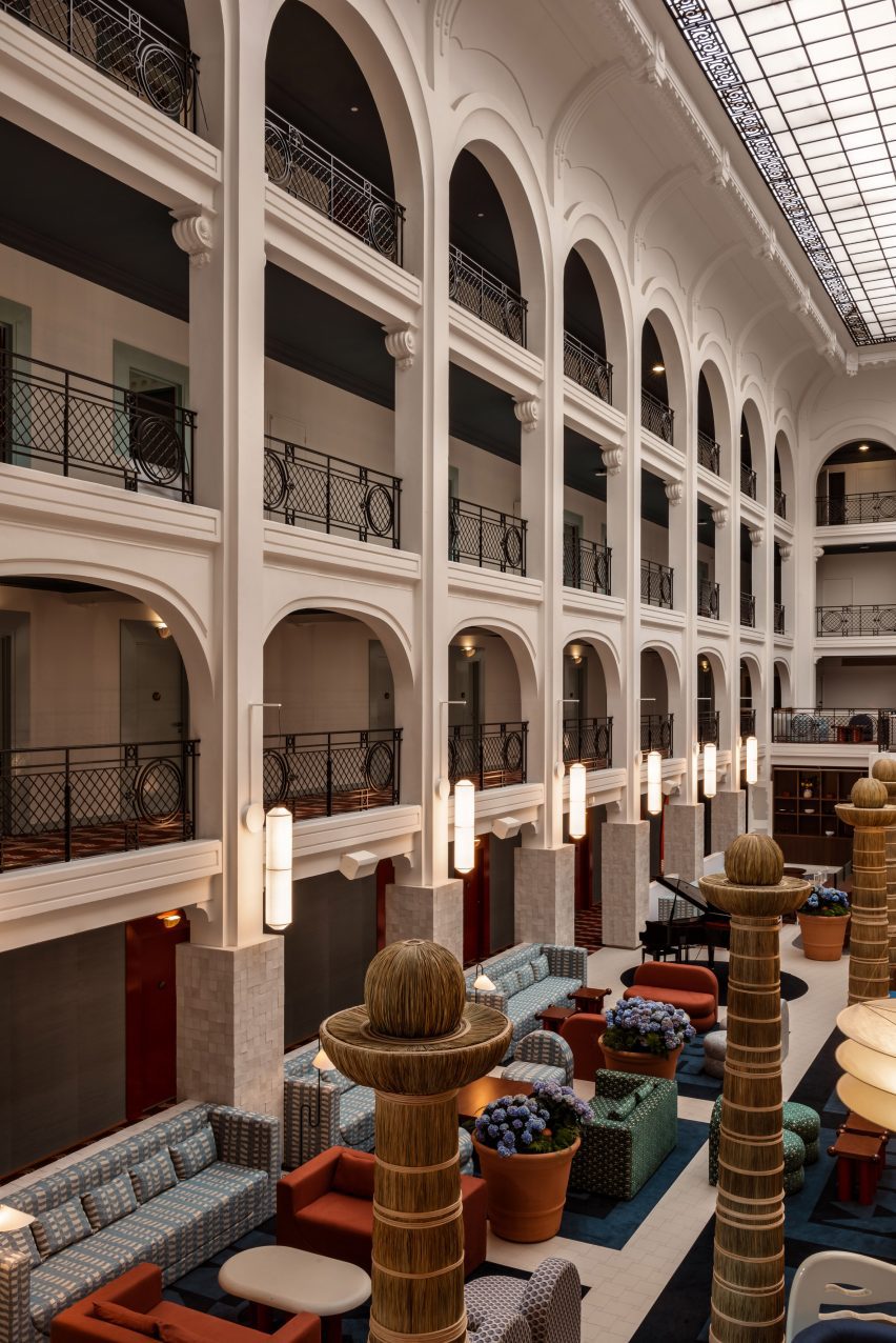
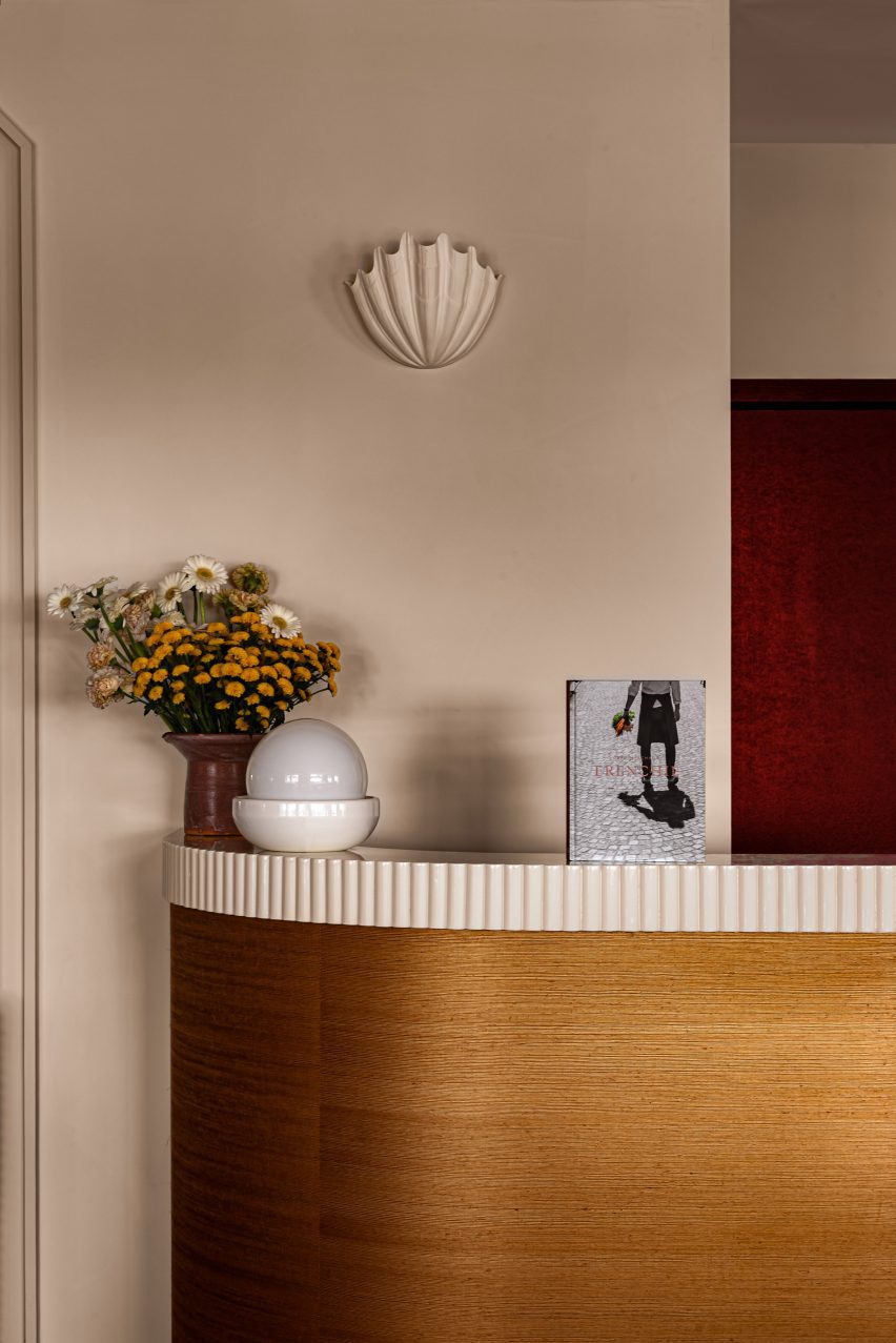
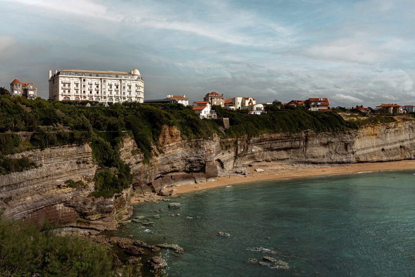
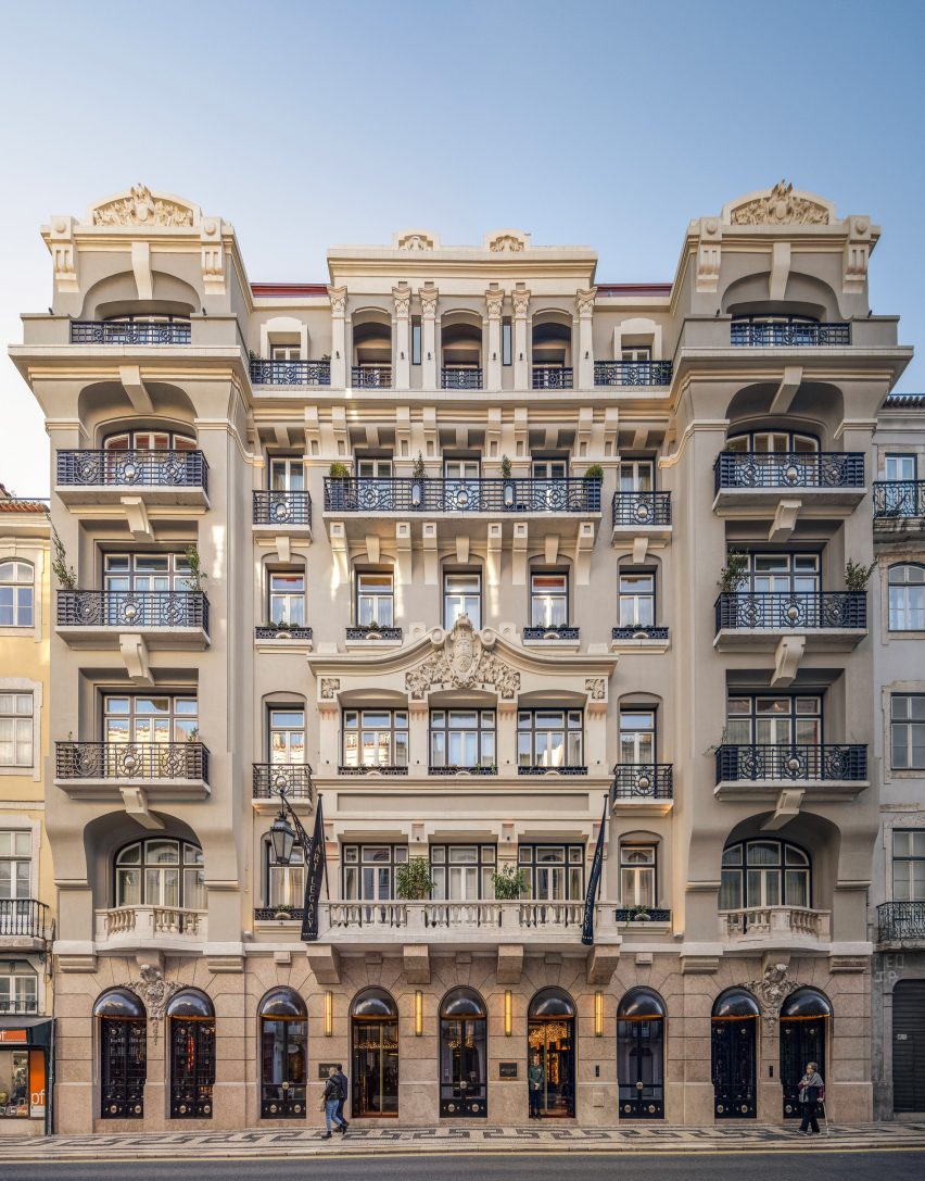
Lisbon practice Rebelo De Andrade designed the interiors of the five star Art Legacy Hotel, located in the Baixa-Chiado district in the city’s centre.

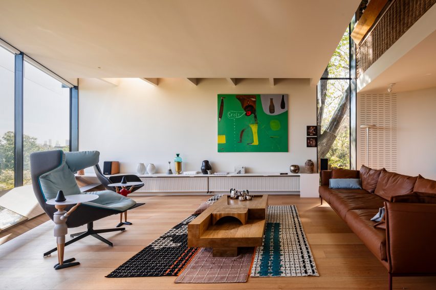
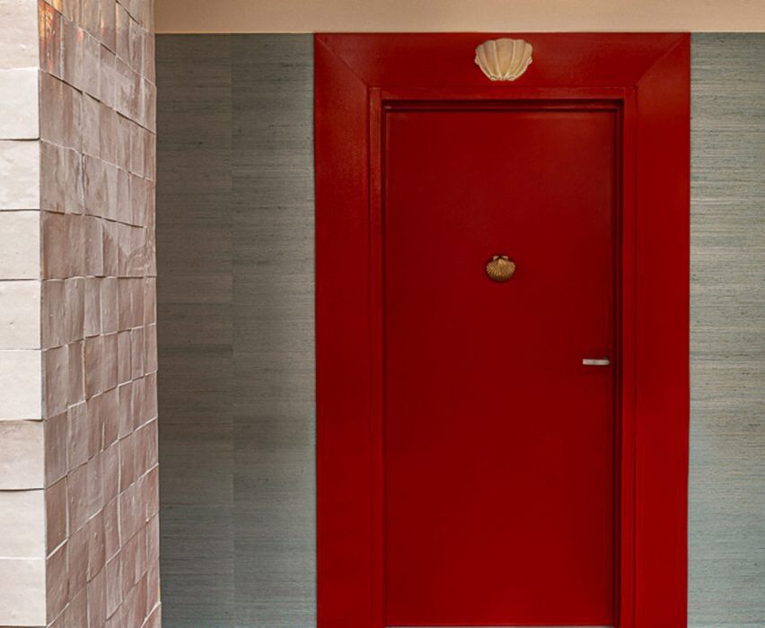
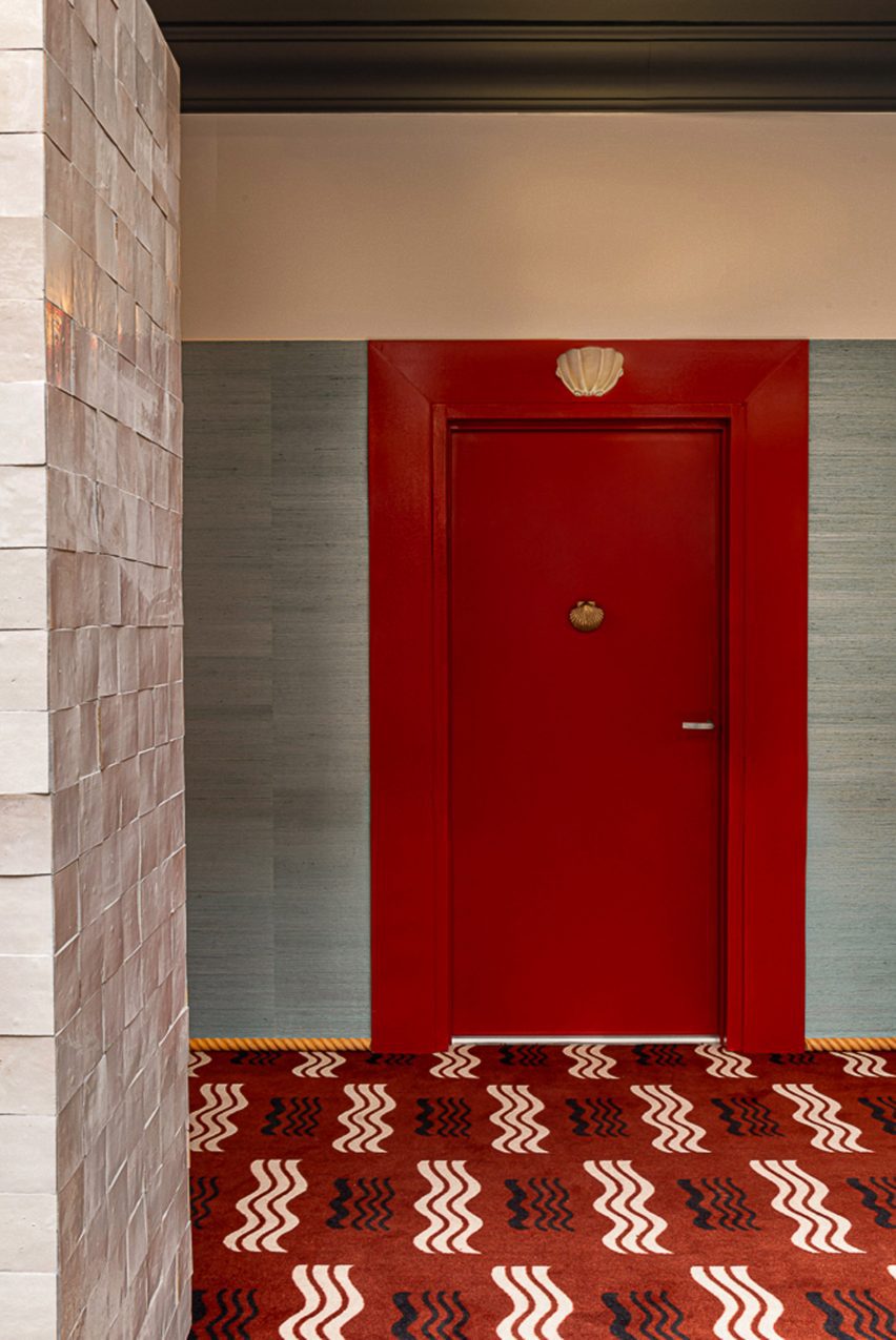
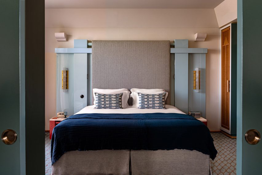
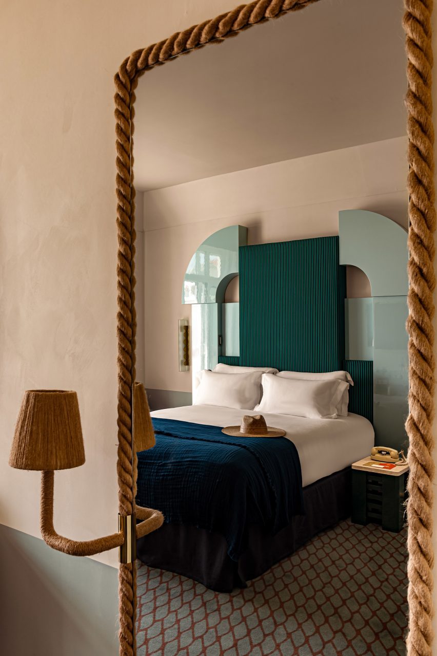
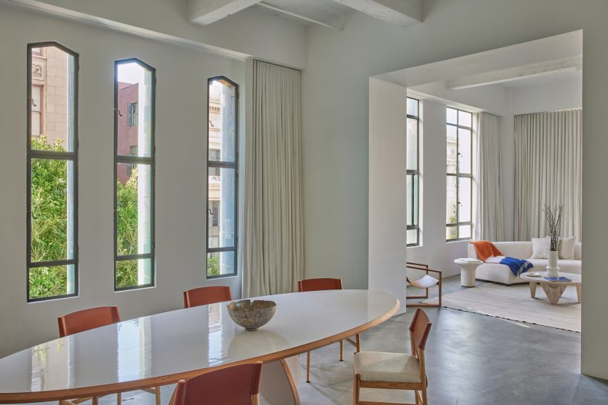
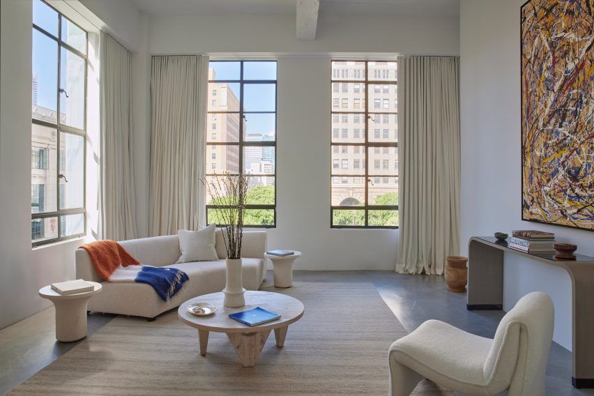
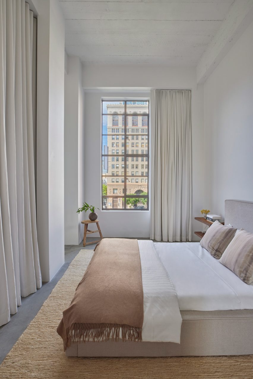
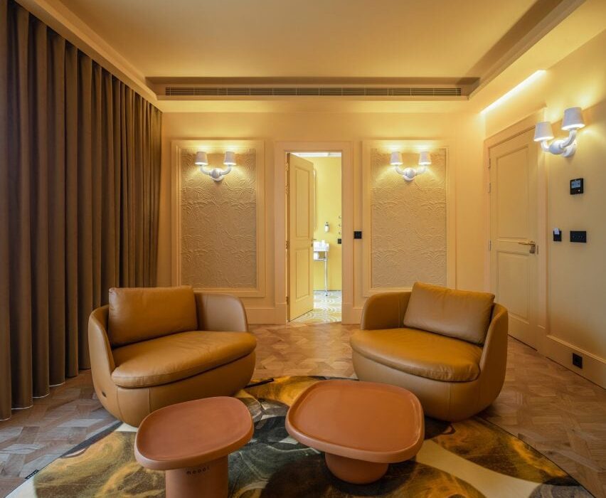
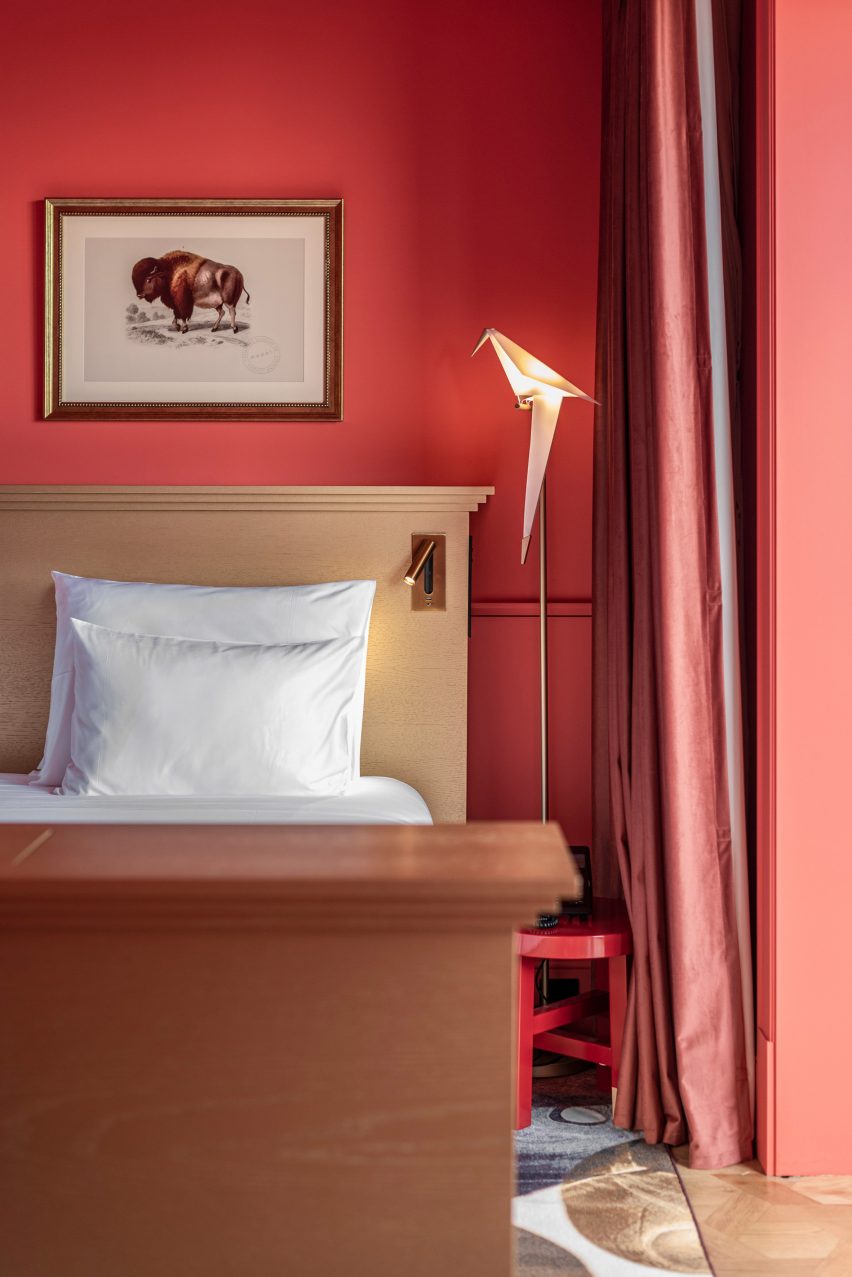
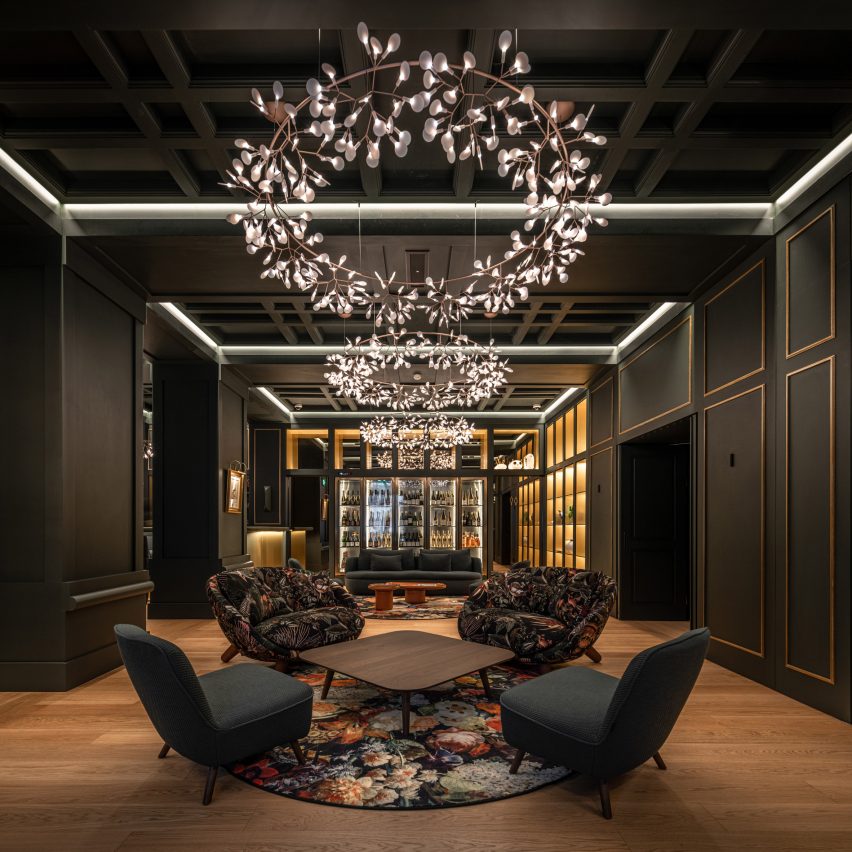
The hotel is notable for its exclusive use of Moooi products and rooms with bold primary colour schemes.

A suite with a yellow colour scheme in the Art Legacy Hotel in LisbonA suite with a yellow colour scheme in the Art Legacy Hotel in Lisbon
Art Legacy Hotel is a five star hotel in Lisbon

“Hospitality is always about image and stories,” said Luís Rebelo De Andrade, founder of the studio, in the exclusive Dezeen video interview. “We wanted the guests, when they come to this hotel, to have a completely unexpected experience.”

“So, we proposed to our client that we make a hotel with only Moooi products, to give it a very strong identity.”

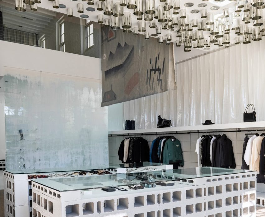
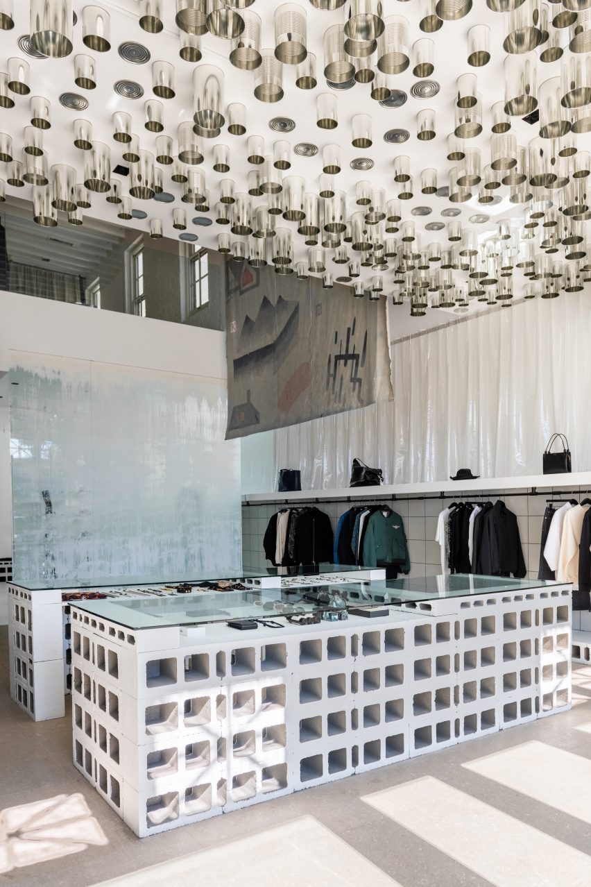
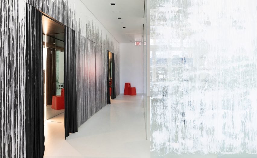
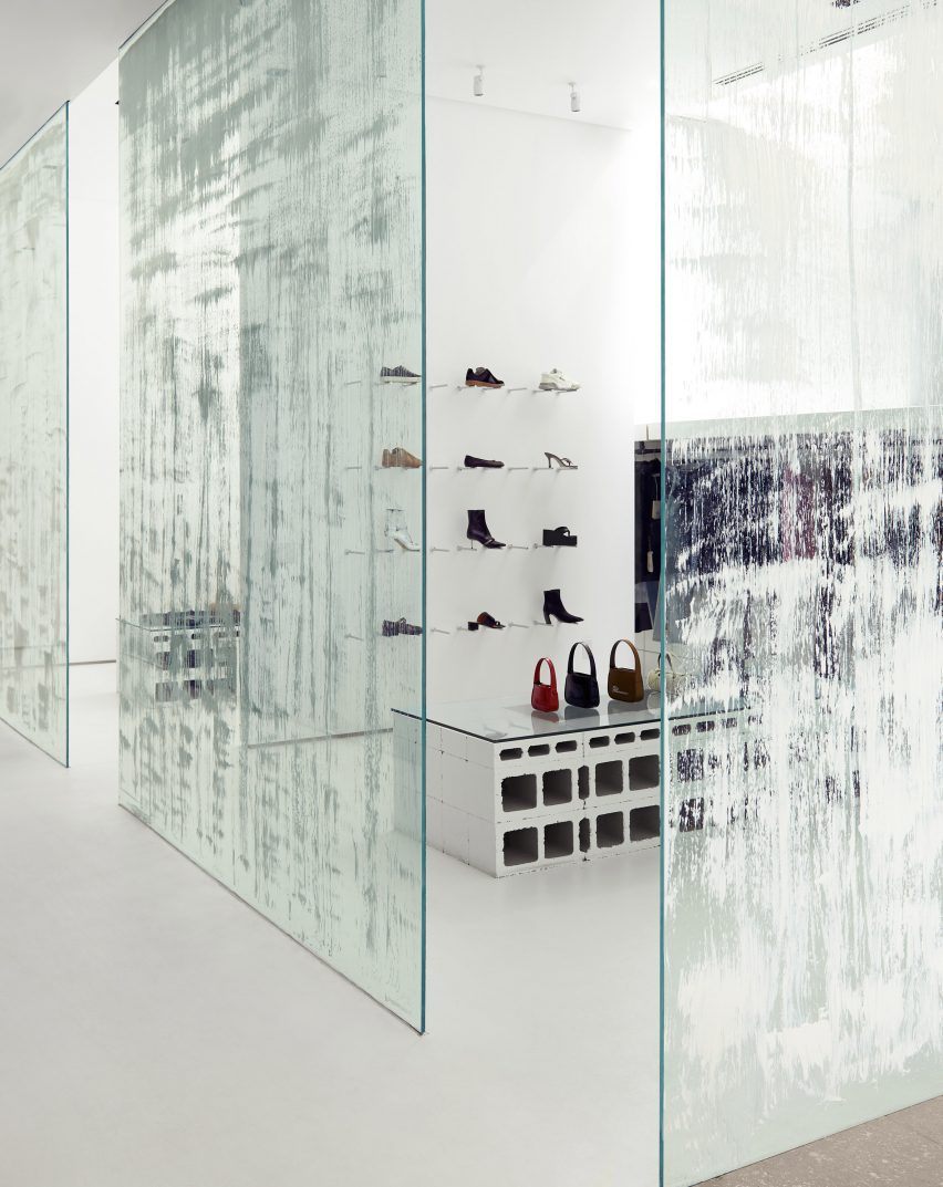
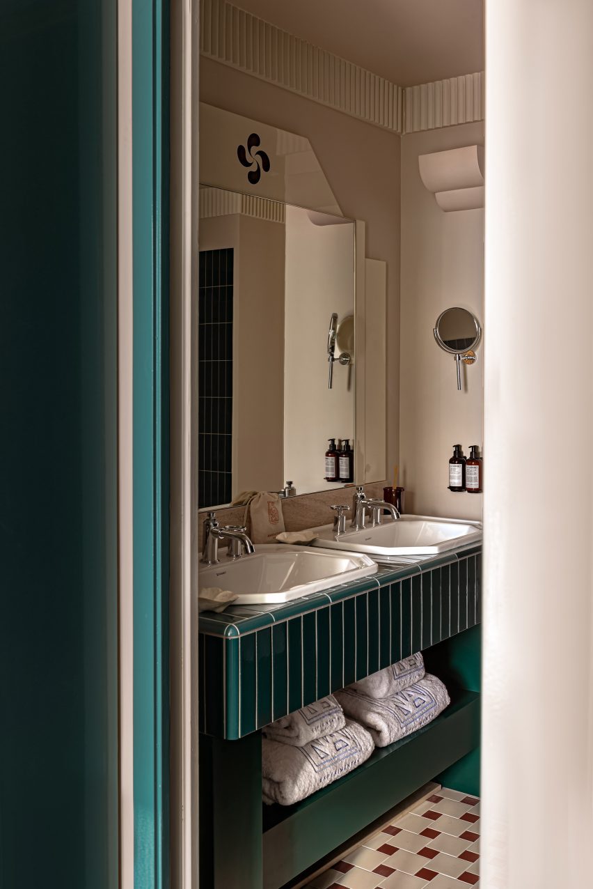
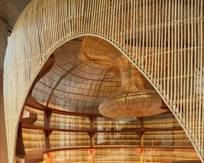
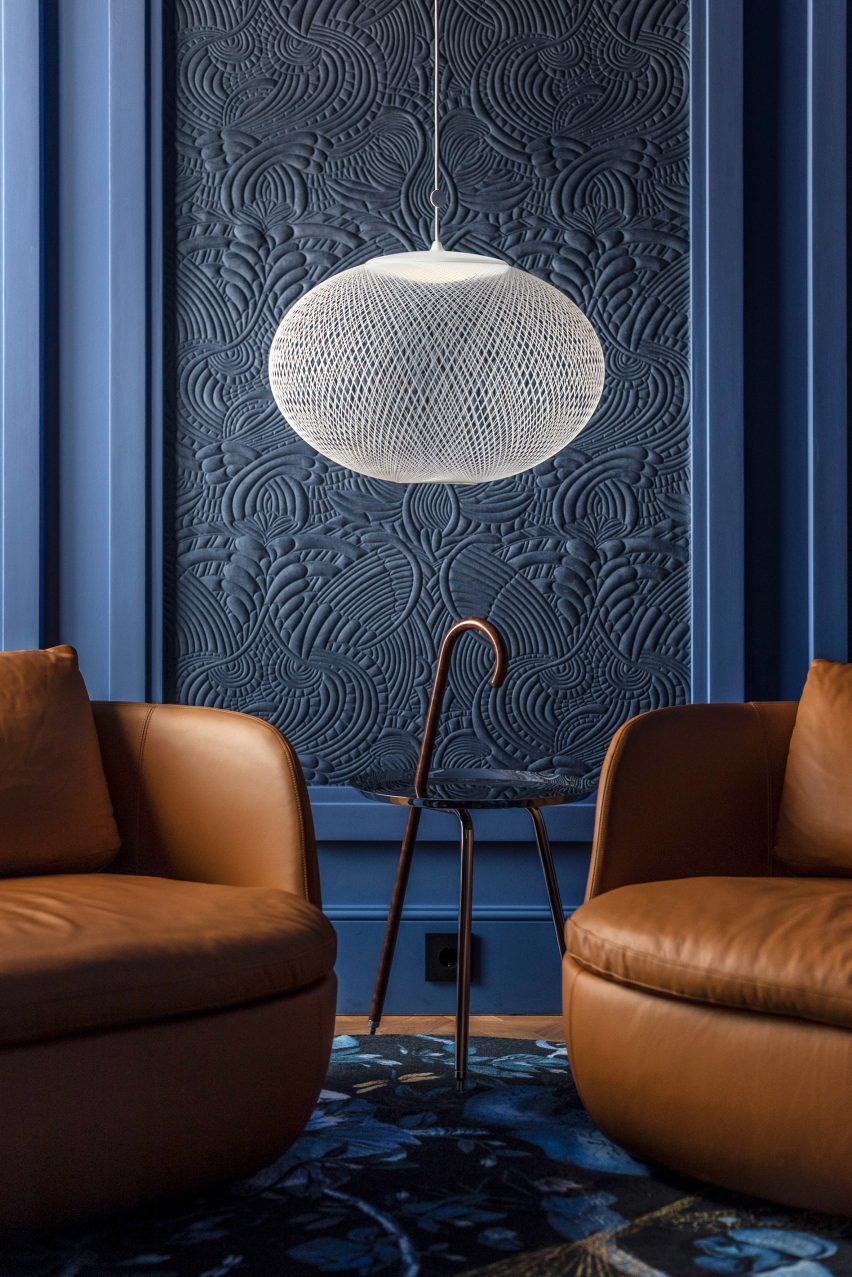
Moooi’s products were used throughout the hotel, including carpets, furniture, lighting, wall coverings and art pieces.

“Moooi is everywhere in the building,” said Tiago Rebelo De Andrade, who is partner and principal architect at the studio and Luís Rebelo De Andrade’s son. “When you enter the hotel, all the colours, all the textures, all the furniture from Moooi helps us to tell a different story in every floor.

A room with a red colour scheme and Moooi lighting in the Art Legacy HotelA room with a red colour scheme and Moooi lighting in the Art Legacy Hotel
Rebelo De Andrade furnished the Art Legacy Hotel entirely with Moooi products

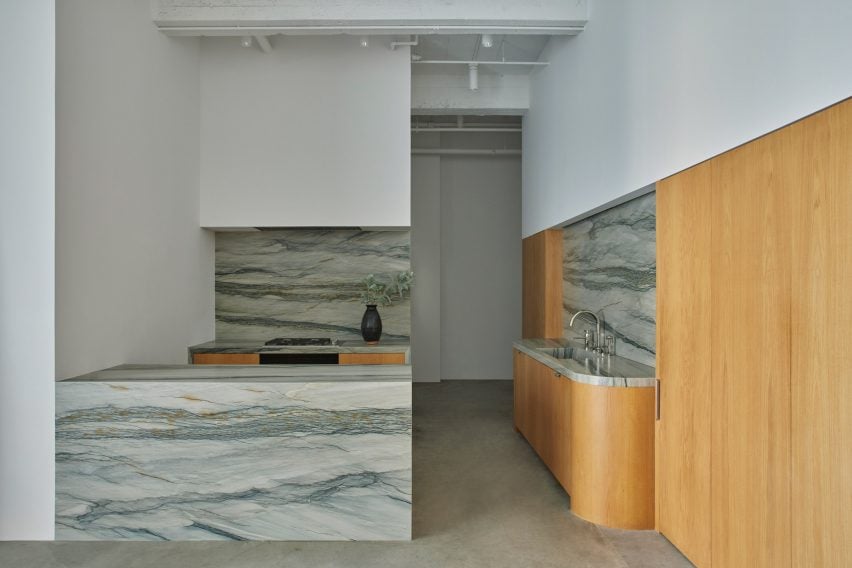
The project is a renovation of a historical office building. Alongside overhauling the hotel’s interior, Rebelo De Andrade also redesigned its facade.

According to Tiago Rebelo De Andrade, Moooi’s blend of modernity and classical references suited the studio’s approach to designing the hotel’s interiors.

“Moooi is classic but in a way that can also be modern,” he said. “It’s a modern-classic building.”

The facade of Art Legacy HotelThe facade of Art Legacy Hotel
Art Legacy Hotel is a renovation of a historic building in Lisbon’s centre

Luís Rebelo De Andrade decided to partner with Moooi on the hotel’s interiors after visiting the brand’s Museum of Extinct Animals exhibition at Milan design week in 2018.

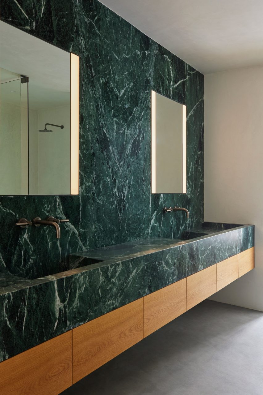
Each room in the Art Legacy Hotel has either a blue, red, yellow or green colour scheme, with matching wall coverings, furniture and tiling in the bathrooms.

“When I first met Moooi’s products, I felt that it uses a lot of primary colours,” he said. “So I used primary colours in a very strong way in the hotel. They are colours that provoke you.”

Lobby of Art Legacy Hotel in LisbonLobby of Art Legacy Hotel in Lisbon
Moooi’s lighting, furniture, wall coverings and carpets are used throughout Art Legacy Hotel

In the video interview, the duo also discussed their working relationship.

“My son, he provokes me,” said Luís Rebelo De Andrade. “We had to educate ourselves on how to work together.”

“I offer my experience, he offers his youth in projects,” he continued. “So I think it’s a good mix.”

A room with a blue colour scheme and Moooi furnishings in Lisbon's Art Legacy HotelA room with a blue colour scheme and Moooi furnishings in Lisbon's Art Legacy Hotel
Rebelo De Andrade used primary colour schemes in Art Legacy Hotel’s rooms

“It’s difficult because it’s a father and son relationship,” added Tiago Rebelo De Andrade. “We are always arguing, but at the end of the day, we drink a bottle of wine so that we can make peace with each other.”

Other recent projects from Moooi include the IDEO-designed Pallana suspension lamp, made up of adjustable ring lights, and the rope-like Knitty Chair designed by Nika Zupanc.

The photography is by João Guimarães.

Partnership content

This video was produced by Dezeen for Moooi as part of a partnership. Find out more about Dezeen’s partnership content here.

Reference

Neri&Hu Ota Fine Arts gallery
CategoriesInterior Design

Neri&Hu highlights simplicity and functionality at Shanghai art gallery

Neri&Hu Ota Fine Arts gallery

Chinese studio Neri&Hu has designed a contemporary art gallery for Ota Fine Arts in Shanghai with a focus on the “sublime beauty of the banal”.

The gallery sits on the ground floor of a mixed-use tower at Rockbund, a development amidst the historical Bund in Shanghai along the Huangpu River, where a series of restored colonial art deco buildings are located.

Neri&Hu Ota Fine Arts galleryNeri&Hu Ota Fine Arts gallery
The entrance of the gallery features an oversized sliding door

“The primary design challenge was to utilise the areas along the facade for both storage and display, blurring the distinction between functional and experiential space,” explained Neri&Hu.

“This deepened threshold condition found on both facades defines the visitor’s arrival sequence and journey within.”

Neri&Hu Ota Fine Arts galleryNeri&Hu Ota Fine Arts gallery
The facade of the gallery is framed in aged steel to contrast the contemporary gallery

The facade of the gallery was framed in aged steel, with portions of solid metal and large glass panels arranged to form a window display for the artworks.

Handmade ivory tiles line the inner side of the window in a subtle woven pattern, serving as a neutral backdrop for the art pieces.

Neri&Hu Ota Fine Arts galleryNeri&Hu Ota Fine Arts gallery
A warehouse-sized door can be fully open on the west facade for easy transport of large art pieces

An oversized sliding door marks the entry to the gallery on the eastern facade. When opened, the entrance of the gallery is revealed, with the outer sliding door framing the window display next to it.

When closed, the door slides back to its original position and allows the full-height glazed window to be exposed.

The western facade features a warehouse-sized door that can be fully opened using a custom-designed handle. This allows large artworks to be delivered directly from a designated parking area into the gallery.

Neri&Hu also added fluted glass to the exterior, which glows in the evening to illuminate the adjacent Rockbund courtyard and add elegance to the functional facade.

Inside the gallery, the 350 square-metre space is divided into two zones – a 150-square-metre main public viewing gallery and a private zone that houses VIP rooms and office space.

The pared-back, white VIP rooms feature contemporary furniture pieces with custom-made white tiles and a stained oak floor and were designed to create a relaxing environment, in which the attention can be focused on the art itself.

Neri&Hu Ota Fine Arts galleryNeri&Hu Ota Fine Arts gallery
The interior of the gallery has a neutral and simplistic tone

“The project’s understated material palette and overall conceptual underpinning lies in the juxtaposition of old and new, raw and refined, ordinary and spectacular,” said Neri&Hu.

“We hope one can appreciate the sublime beauty of the banal, as much as the brilliance of contemporary art,” it added.

Neri&Hu Ota Fine Arts galleryNeri&Hu Ota Fine Arts gallery
Clean white rooms are intended to highlight the art piece

Neri&Hu was founded by architects Lyndon Neri and Rosanna Hu in 2004 in Shanghai.

Other recent projects completed by the studio include the Sanya Wellness Retreat hotel on the Chinese island of Hainan and a fashion boutique with fabrics and marble screens.

The photography is by Zhu Runzi.


Project credits:

Partners-in-charge: Lyndon Neri, Rossana Hu
Associate-in-charge: Jacqueline Min
Senior interior designer-in-charge: Phil Wang
Design team: Rovi Qu
FF&E procurement: Design Republic
Contractors: ETQ Project (Shanghai) Limited

Reference

Plant-filled office space by Workers of Art (WOA)
CategoriesInterior Design

Workers of Art designs studio space using materials “relegated to landfill”

Plant-filled office space by Workers of Art (WOA)

Indian architecture studio Workers of Art has converted a former storage space into its own plant-filled office, using recycled and repurposed waste materials in almost every aspect of its design.

Called WOA Second Home, the office is located in Kochi, Kerala, and occupies a 1,450-square-foot (135-square-metre) concrete structure that was previously used for storing tiles.

Aiming to “underscore the necessity of the curtailment of waste output in architecture,” Workers of Art (WOA) made use of materials that had been “relegated to landfill” including concrete board, PVC pipes and acrylic sheets, to create a workspace that would reflect the studio’s ethos.

Plant-filled office space by Workers of Art (WOA)
WOA has converted a former storage space into an office in Kerala

“The design celebrates the value of materials that might have otherwise been discarded, creatively forming patterns and combining different elements to breathe new life into the space,” said the studio.

“For instance, odd-shaped waste tiles are harmoniously mixed and matched, finding their new home in the powder room. A strikingly repurposed tile piece also elevates the entry steps, underscoring the studio’s attention to detail and innovative flair,” it added.

Organised across one floor, the entrance to the office leads into a large space lined with a zig-zag of ferrocement desks along the eastern wall, next to a meeting table and sample board at the centre of the room and a more private workspace to the west.

Office interior of 'WOA Second Home'
The design uses recycled and repurposed waste materials

A new partition with a large arched opening and blackout curtain leads through to a breakout area and facilities space containing a locker area, kitchen and bathroom.

“The design of the workstations, which meander through the shared workspace, was strategically planned to encourage teamwork while also allowing for individual space,” WOA co-founder Priya Rose told Dezeen.

“The philosophy was to create a workspace that feels like a ‘second home’ – evident in the thoughtful design elements that prioritise comfort, aesthetic pleasure, and a sense of belonging,” she added.

Custom black light fittings on the ceiling were created by repurposing lengths of PVC pipe, while bespoke planters were made using ferrocement lined with blue plastic barrels.

The existing tile floor in the building was retained, with areas that had become cracked removed and infilled with microcement to create contrasting dark grey geometric areas.

Throughout the studio, discarded antiques and over 100 species of local plants were introduced to bring a “homely” quality to the space.

Office interior of Workers of Art studio office
A large arched opening forms a new partition within the office

WOA Second Home has been shortlisted in the workplace interior (small) category of Dezeen Awards 2023.

In Madrid, designer Lucas Muñoz used upcycled junk and construction waste to create nearly every interior element of the Mo de Movimiento restaurant.

The photography is by Ishita Sitwala. 

Reference

Amagansett house by Athena Calderone
CategoriesInterior Design

Eight living rooms enhanced by decorative and striking art pieces

Amagansett house by Athena Calderone

For our latest lookbook, we have gathered eight examples of serene living rooms where well-curated artworks add a touch of creativity.

Paintings, sculptures and other art pieces can add a more personal feel to interiors, as seen in these eight art-filled living rooms.

While some have gone all in on the art, others chose just one or two signature pieces to create a creative atmosphere.

Either way, smartly placed artworks can enhance an interior and give homes a more personal feel.

This is the latest in our lookbooks series, which provides visual inspiration from Dezeen’s archive. For more inspiration see previous lookbooks featuring living rooms with cowhide rugs, monochrome interiors and basement apartments.


Amagansett house by Athena Calderone
Photo by Nicole Franzen

Amagansett house, US, by Athena Calderone

Plaster walls, marble details and linen fabric were used to decorate this renovated mid-century home in Long Island, New York.

Owner and designer Athena Calderone also added plenty of sculptures and paintings to the interior, including in the living room where white artworks with playful textures and shapes add interest to the pale walls.

Find out more about the Amangansett house ›


Living room with mosaic and gallery walls
Photo by Fran Parente

Gale Apartment, Brazil, by Memola Estudio

Brazilian studio Memola Estudio aimed to balance natural and industrial materials in this apartment in São Paulo, which has a double-height living room.

The owners took advantage of the height to create a gallery wall on one side of the living room. Artworks also decorate an adjacent mosaic wall, giving the whole room a gallery-like feel.

Find out more about Gale Apartment ›


Vasto gallery by Mesura apartment interior
Photo by Salva López

Casa Vasto, Spain, by Mesura

Designed to be both an apartment and an art gallery, this home in a former factory in Barcelona features an exquisitely curated living and exhibition space.

A large abstract blue-and-beige painting sits on top of a low bookshelf, which also displays a sculpture and multiple smaller paintings.

Find out more about Casa Vasto ›


Living room in Kew Residence by John Wardle Architects in Melbourne, Australia
Photo by Trevor Mein and Sharyn Cairns

Kew Residence, Australia, by John Wardle Architects

A large contemporary painting in a bright green hue decorates the living room of this house in Melbourne, the home of architect John Wardle.

Other artful details include playful side tables held up by mannequins, a sculptural wooden coffee table and numerous small vases and sculptures.

Find out more about Kew Residence ›


Living room in Riverside Tower flat
Photo by Olmo Peeters

Riverside Tower, Belgium, by Studio Okami Architecten

Located inside the brutalist Riverside Tower in Antwerp, this pared-back apartment has made a feature out of its original concrete structure.

In the living room, the material is juxtaposed with a dark blue wall and a large painting in green and blue hues. Cosy leather sofas and green plants add a homely feel.

Find out more about Riverside Tower ›


Photograph showing large sofa in living area looking into dining area
Photo by Andrey Bezuglov and Maryan Beresh

Log cabin, Ukraine, by Balbek Bureau

This house in Ukraine, a modern interpretation of a log cabin, features a number of striking and strategically placed artworks in the open-plan living room and dining room.

Above the dining table hangs a large painting in a neo-expressionist style, integrating turquoise, white and pink to create an eye-catching focal point among the room’s more neutral colours.

Find out more about the log cabin ›


Malibu Surf Shack by Kelly Wearstler
Photo by by Ingalls Photography and Mark Durling Photography

Malibu Surf Shack, USA, by Kelly Wearstler 

Designer Kelly Wearstler created Malibu Surf Shack, a renovated 1950s beachfront cottage, as a bohemian retreat for herself and her family.

Its wood-clad living room has been enhanced by artworks in tonal colours that match the warm panelling, as well as tactile timber sculptures and geometric stone tables.

Find out more about Malibu Surf Shack ›


Canal Saint-Martin apartment by Rodolphe Parente
Photo by Giulio Ghirardi

Paris apartment, France, by Rodolphe Parente

This apartment in a Haussmann-era building in Paris was given a makeover by interior designer Rodolphe Parente.

Parente played with contrasting materials and colour palettes in the apartment, which was designed around the owner’s “radical” art collection. In the living room, a framed photo print hangs on an otherwise empty wall overlooking two sculptural coffee tables.

Find out more about the Paris apartment ›

This is the latest in our lookbooks series, which provides visual inspiration from Dezeen’s archive. For more inspiration see previous lookbooks featuring living rooms with cowhide rugs, monochrome interiors and basement apartments.

Reference

Wabi-Sabi: Why Architects Should Discover the Art of Imperfection
CategoriesArchitecture

Wabi-Sabi: Why Architects Should Discover the Art of Imperfection

Wabi-Sabi: Why Architects Should Discover the Art of Imperfection

The latest edition of “Architizer: The World’s Best Architecture” — a stunning, hardbound book celebrating the most inspiring contemporary architecture from around the globe — is now available. Order your copy today.  

There is a crack in everything / That’s how the light gets in
Leonard Cohen

The most memorable buildings are not always the most stunning ones. A bit of awkwardness — clunkiness even — can help a building stick in the mind, much like a crooked nose or a lazy eye can give a human face “character.” There is a Japanese term for this idea: wabi-sabi. The Random House Unabridged Dictionary defines wabi-sabi as an aesthetic attitude “which delights in the tarnish on an ancient silver bowl and the old uneven cobblestones.” Wabi-sabi is not the valorization of ugliness but of beautiful objects that seem to approach perfection, only then to veer away from it at the last moment. Perhaps in this way, they signal that they belong to the world of things and not ideas. 

Wabi-sabi is precisely what AI-generated designs will always lack. It is also what is missing from Brasilia, the immaculate, centrally planned capital city of Brazil that people famously hate living in because it seems too sterile. In fact, I would argue that it was precisely a lack of wabi-sabi that doomed the International Style, opening the way for postmodernists to restore decorative motifs, whimsy and weirdness of various kinds to their designs. 

You can’t bottle wabi-sabi though. Just because one intends to lend their building a charming sense of imperfection doesn’t mean one will succeed. In fact, it is perhaps not advisable to intend to create such an effect. Think back to the archetypal examples of wabi-sabi: a tarnished bowl, uneven cobblestones. These details simply emerged organically, and they remain as an index of the object’s contact with the world. 

The Kaleidoscope by Inrestudio, Quang Binh Province, Vietnam. Note the dramatically scaled and off-kilter roof.

Nevertheless, some new buildings do achieve a sense of wabi-sabi, a charming awkwardness. And I think they achieve this effect by working with the environment, seeking neither a pure functionalism nor a dramatic ornamental scheme. One building that inhabits this zone is The Kaleidoscope, a mixed-use workplace and residential studio in central Vietnam designed by the firm Inrestudio under the direction of lead architect Kosuke Nishijima.

The Kaleidoscope, which was Jury Winner in the 11th Annual A+Awards’ Office – Low-Rise category, makes a strong impression when one encounters it in the forests of Vietnam, wedged between a forested hill and the sea. Relatively small (two stories, 3,150 square feet) but sturdy, it at first appears to be a kind of squat brutalist fortress, perhaps some sort of municipal building or outpost for forest rangers. But then one notices the roof – heavy, sculptural,and off-centered, with dramatic eaves that shade the trunk of the building like a mushroom cap. Walking around the building, one then notices the perforated ventilation blocks and, finally, the outside of a white spiral staircase. The design elements all work together nicely but not cleanly. There is a sense of bricolage, of different ideas pieced together according to a design that is idiosyncratic but not random. 

The Kaleidoscope by Inrestudio, Quang Binh Province, Vietnam

When one looks into the rationale behind this beautiful roof, one learns that it indeed has a function tied to the harsh tropical climate of central Vietnam. “Resembling a “nón lá”, a traditional farmer’s hat of Vietnam, a large conical roof casts shadows on the entire building,” explains Inrestudio. “The ventilated cavity between the double layered roof functions as a natural heat insulator against the sunlight, while the deep eaves enable the central space’s windows to remain open even during the rains. The main function of the building is placed at the center of a floating slab, which keeps the space protected from the ground moisture.”

So this is the purpose of the squat Brutalist fortress – to allow individuals to experience fresh air even during typhoons. The perforated walls enhance this relationship to the outdoors. As the sun moves across the sky, the shadows cast inside the building change, much like the patterns of a kaleidoscope change when the end is rotated. 

The Kaleidoscope by Inrestudio, Quang Binh Province, Vietnam

“Perforated ventilation blocks are common building elements in tropical regions, not only to moderate environmental factors but also casting impressive light patterns,” explains Inrestudio. “Custom precast ventilation blocks compose the outer surfaces of the triangular volumes to provide privacy to the inner rooms. These fiber-reinforced concrete blocks have larger dimensions than usual, and match the grand scale of the surrounding backdrop.”

The Kaleidoscope by Inrestudio, Quang Binh Province, Vietnam | Interior view of perforated ventilation block.

The intended use of this building is interesting as well. It is both a living and working space. Located near a factory in a relatively remote area of Vietnam, the building houses offices on the lower level and residences above. Inrestudio explains that they placed a large emphasis on natural light in their design in order to highlight the transition from day to night, when the function of the building will shift from working to living. 

Notre Dame du Haut, nicknamed Ronchamp Chapel, is one of Le Corbusier’s most loved buildings. Photo by Ricardo Gomez Angel on Unsplash

Wabi-sabi is a Japanese term, but the idea has been embraced by Westerners as well – even those one wouldn’t expect. Le Corbusier, for instance, is remembered as the archon of high modernism, drawing up wicked plans to flatten Paris to make room for concrete high rises. And yet, the building he is best remembered for looks a lot like The Kaleidoscope. In fact, it would be hard for me to believe that Inrestudio did not have the Ronchamp Chapel in mind when they designed The Kaleidoscope. 

Completed in 1954, near the end of his career, Ronchamp Chapel is a masterpiece that seems to bear little resemblance to the harsh symmetries of Corbusier’s earlier buildings. It replaced a stone chapel that had been destroyed in the second world war, and one gets the impression that Corbu understood that his design should preserve some of the gentleness, or wabi-sabi, of the original, even though his design was entirely original. Like the Kaleidoscope, its greatest features are its sculptural roof, which seems to float above the structure, and the way it draws in natural light in the interior. In the case of Ronchamp Chapel, this is done through a charming array of stained glass windows – arranged in an irregular pattern of course. 

Interior view of Ronchamp Chapel. Note the slight gap at the roof line, which lets in a crack of sunlight. Photo by Richard Hedrick on Unsplash

Like The Kaleidoscope, Ronchamp Chapel is possessed of a humble beauty that is easy to relate to. It might be an odd building, but it is not unserious of self-consciously quirky. Above all, it is very much itself. I hope to see more buildings designed in this mode in the coming years.

The latest edition of “Architizer: The World’s Best Architecture” — a stunning, hardbound book celebrating the most inspiring contemporary architecture from around the globe — is now available. Order your copy today.  

Reference

Store with concrete breezeblock displays and metal cans on the ceiling
CategoriesInterior Design

“Fashion meets art and design” at Pittsburgh boutique by NWDS

Store with concrete breezeblock displays and metal cans on the ceiling

Global team NWDS took a spontaneous approach to designing the Tons fashion boutique in Pittsburgh, which contains a mix of modest materials and iconic furniture pieces.

The Tons store in the city’s East Liberty neighbourhood occupies a long, narrow building with its shorter side facing the street.

Store with concrete breezeblock displays and metal cans on the ceiling
The Tons store features a variety of “mundane” materials, including concrete breezeblocks and metal cans

Formerly an atelier, the two-storey structure was reimagined by NWDS to create a light-filled destination “where high-end fashion meets art and design”.

“Inside is a spacious and light-filled interior that now hosts a multifunctional venue designed to meet the needs of a modern-day sartorialist equally interested in fashion, art, and culture,” said the group.

Seating area beside clothing display
In the lobby, new apparel collections are displayed below a tapestry-like artwork

Designing the interiors of the 400-square-metre space involved dividing up the floor plan into several distinct areas that all flow together, but serve different purposes.

Throughout the various retail and office areas, a selection of unexpected materials were combined and layered.

Walls splashed with white paint
Some of the walls are splashed or streaked with white paint

Immediately through the glass front door is a lobby where new collections are presented.

Here, product displays were built from concrete breeze blocks, while the upper walls above the clothing rails were dressed in transparent plastic curtains.

Glass panels partition different retail areas
Glass panels are used to partition different retail areas

The ceiling above was covered with metal tubes of different lengths and diameters, and gives way to a double-height space where tall tapestry-like artworks by Sasha Brodsky hang over opposite walls, and white paint was seemingly dragged across another.

“There was a lot of spontaneity and many design decisions taken on site: some surfaces were uncovered and left in an unfinished state, and some were splashed with white paint,” NWDS said.

Frank Gehry Wiggle Chair next to clothing displayed on rails
A selection of iconic furniture designs can be found around the store, including Frank Gehry’s Wiggle Chair

Further along, fitting rooms are lined up behind black and white streaked partitions to one side, facing a room defined by glass panels that hosts monobrand products.

Towards the back, a lounge area that also displays shoes is reached by descending a short flight of stairs, which run parallel to a raised, built-in seating area.

Built-in seating area in front of shoe display room
A built-in seating area at the back of the store overlook the sunken shoe room

The lower floor level in this space results in a higher ceiling, which NWDS took advantage of by extending a mural the full height behind a wall-mounted shoe display.

A staircase at the very back leads to the upper storey, where retail displays and office areas for store employees sit side by side, and a photography studio is in full view.

“Inside Tons, the client space and the workspace are blended,” said NWDS.

“Buyers and managers have their work desks right next to the sale rails on the first floor, and store visitors are welcome to take a peek at the fashion photo shoot happening right there at Tons.”

Upper-floor rooms partitioned by artworks and glass balustrades
The unfinished aesthetic continues across the upper storey, where retail and offices spaces are blended

Throughout the store are a selection of iconic furniture pieces that continue the theme of unexpected materials and functionality.

They include metal-mesh Hi Tech armchairs by Piero Lissoni, a Mate chair by (A+B) Dominoni, Quaquaro that doubles as shelving, and Frank Gehry‘s compressed cardboard Wiggle Chair for Vitra.

“An interior comprising modest materials is a backdrop for high-end Italian furniture pieces, a collection carefully curated by the NWDS team,” said the designers.

Photography studio viewed from across a double-height void
An open photography studio allows shoppers to watch shoots as they happen

NWDS was established in 2013 as a team of architects, designers, curators and researchers from cities including New York, Tbilisi, Moscow, Paris, Berlin, Yerevan, Lisbon and Dubai. The group’s projects span residential, retail, hospitality, culture, exhibition design and more.

Other recently completed boutiques that feature unusual materials include the Boyy flagship in Milan, which reveals layers of the store’s history, and a Parisian jewellery store featuring rippled sheets of acrylic.

The photography is by Ekaterina Izmestieva and Alexandra Ribar.


Project credits:

Design concept: NWDS
Supervision and project management: Brnz Bureau
Lighting design: Natalia Markevich
Art: Sasha Brodsky

Reference

Corridor at Regina Experimental hotel
CategoriesInterior Design

Dorothée Meilichzon blends nautical and art deco inside Biarritz hotel

Corridor at Regina Experimental hotel

French interior designer Dorothée Meilichzon has renovated a Belle Epoque-era hotel in Biarritz, France, blending maritime and art deco motifs to add contemporary flair to the historic building.

The Regina Experimental sits on a clifftop overlooking the Bay of Biscay in the French seaside city, which was once a royal getaway and is now a popular surfing destination.

Corridor at Regina Experimental hotel
Nautical designs decorate the corridors

Constructed in 1907 by architect and landscape designer Henry Martinet, the grand building features a 15-metre-high atrium, large bay windows, a glass roof, and hints of art deco throughout.

The majority of its spaces were well preserved, so Meilichzon‘s input involved modernising the furnishings and decor – adding colour and pattern to enliven the spaces while playing on the hotel’s coastal location.

Atrium of Regina Experimental hotel
Totemic sculptures were used in the hotel’s atrium

In the light-filled atrium, dark red and green sofas were arranged to create intimate seating areas within the expansive room.

Totemic wicker sculptures form a line down the centre of the room, and cylindrical paper lanterns by designers Ingo Maurer and Anthony Dickens hang from the columns on either side.

Bedroom with art deco influenced headboard
Guest rooms feature geometric, art deco-influenced headboards and striped upholstery

Guests in this space are served cocktails from a bar top shaped like an ocean liner, designed as an homage to modernist architect Eileen Gray, while listening to live piano music.

While the bar top nods to Gray’s designs, the sofas in the room play on the shapes of the Itsasoan footbridge in nearby Guétary.

Reflection of a bed in a rope-wrapped mirror
Mirrors wrapped in rope continue the maritime theme in the rooms

Carpet patterns vary between the different areas of the hotel – in the corridors, they carry a nautical motif, while the markings are reminiscent of fish scales in the guest rooms.

The hotel’s restaurant, Frenchie, offers Basque-inspired cuisine within a bright room that features more nautical references, such as rope-hung shelves and shell-shaped sconces.

Dining room of Regina Experimental
Shell-shaped sconces decorate the dining room

Highly patterned tiled floors and furniture contrast the restaurant’s neutral plaster walls and ceiling, which are punctuated by arched niches and curved plywood panels.

The dining area spills onto an outdoor terrace, populated by red cafe tables and chairs lined up against pale blue banquettes, around the corner from a swimming pool.

The hotel’s 72 guest rooms are accessible from corridors that wrap around the atrium, and face either the ocean or the Golf de Biarritz Le Phare golf course.

Shades of blue and green dominate the art deco-influenced bedrooms, which feature glossy geometric headboards and marine-striped upholstery.

Bathroom with teal-coloured tiles
A cool palette of greens and blues is used in the bathrooms

Small lamps extend from rope frames that wrap around the mirrors, and red accents on smaller furniture pieces pop against the cooler hues.

“Bedrooms are awash with Japanese straw and rope combined with marine stripes and plaster frescoes with aquatic motifs,” said the hotel. “Evocative of an ocean liner, each bedroom incorporates curved forms and long horizontal lines.”

Hotel perched on a cliff overlooking the sea
Built in 1907, the hotel overlooks the Bay of Biscay from a clifftop

Meilichzon, founder of Paris-based design agency Chzon, is a frequent collaborator of the Experimental Group, and has designed the interiors for several of its properties.

Earlier this year, she gave a bohemian refresh to Ibiza’s first hotel, now called the Montesol Experimental, and previously completed the Hotel Il Palazzo Experimental in Venice.

The photography is by Mr Tripper.

Reference

Dining room and living room
CategoriesInterior Design

Sheft Farrace designs loft in LA’s art deco Eastern Columbia building

Dining room and living room

Architecture studio Sheft Farrace has renovated a loft apartment in Los Angeles’ iconic Eastern Columbia building, subtly incorporating colours from the art deco exterior into the minimalist interiors.

The studio renovated the loft while drawing details from the exterior of the 13-storey building in Downtown Los Angeles, known for its highly detailed turquoise facade and clock tower, which was designed by Claud Beelman and completed in 1930.

Dining room and living room
Sheft Farrace chose to divide up the loft, yet retain visual connections through framed openings

It was converted into lofts in 2006, and local studio Sheft Farrace was recently tasked with renovating one of the condos for a young creative from Kazakhstan.

“Uninspired by the unit’s original 2006 layout and interiors, the owner wanted it to feel like a brand new space — so Sheft Farrace approached it as a blank canvas,” said the studio, led by Alex Sheft and John Farrace.

Living room
The pared-down decor contrasts the building’s colourful exterior

The apartment has tall ceilings, and their height is accentuated by the building’s long narrow windows and floor-to-ceiling drapery.

Rather than keep the open floor plan, the studio chose to divide up the space to help define areas for different functions.

Bedroom with tall ceiling and drapery
The ceiling height is accentuated by tall windows and floor-to-ceiling drapery

However, the visual connections between the kitchen and dining room, and the living room and bedroom, are retained by large framed openings used in place of doors.

“Every space has its own character, based on what time of day it is and how the natural light comes in through the full-height windows,” said Sheft Farrace.

For the most part, the home is decorated in a much more pared-down style than the building’s opulent exterior, primarily with soft neutral hues and sparse furnishings.

Certain material choices in the kitchen and bathroom tie much more closely to the colourful facades, including white oak, Verde Aver marble, and Florida Brush quartzite to echo the orange, green and blue exterior tiles.

Kitchen with white oak and Florida Brush quartzite
Materials like white oak and Florida Brush quartzite in the kitchen nod to the art deco exterior

The curved corners of the kitchen counters and elongated cabinet hardware also evoke 1930s design.

“Upon first glance, it’s stylistically in stark contrast with the historical building that it’s within, but throughout the space are subtle nods to the art deco exterior and ultimately, it feels like it belongs,” Sheft Farrace said. “We felt honored to have contributed a small chapter to the long and storied history of a Los Angeles landmark.”

Bathroom lined with Verde Aver marble
In the bathroom, Verde Aver marble was also chosen to reference the historic tiled facades

Downtown Los Angeles has dramatically transformed from a no-go zone to a popular and thriving neighbourhood over the past 20 years.

This shift is partially thanks to the opening of cultural institutions like Frank Gehry’s Walt Disney Concert Hall and Diller Scofidio + Renfro’s The Broad museum, as well as a spate of high-end hotels.

The photography is by Yoshihiro Makino.

Reference

recessed angular frames form art house cinema's facade in france
CategoriesArchitecture

recessed angular frames form art house cinema’s facade in france

recessed angular frames form art house cinema's facade in france

L’Atalante art house cinema by Farid Azib in Bayonne


Paris-based architectural firm Farid Azib reconstructs L’Atalante art house cinema in the center of Bayonne, France, forming a contemporary white angular facade. Originally built in 1990, the edifice is located on the waterfront of Amiral-Antoine-Sala on the right bank of the Adour, just below the Saint-Esprit bridge leading to the city center. The refurbishment program demanded the conjunction of two cinemas adjoining one building and expanding the dedicated theater plan. Aiming for a design that retains the historical character of the site yet explores the possibilities of architectural modernity, the project shapes contrasting forms and materials displaying its dynamic frame in striking white color, standing out between the rest of the buildings on the embankment.

recessed angular frames form art house cinema's facade in france
L’Atalante art house cinema | all images by Luc Boegly


angular frames are a conceptual nod to the Seventh Art


Drawing from a conceptual take on windows and frames in connection to the Seventh Art, the design team at Farid Azib Architects focuses on the main feature of the facade’s openings to form the building’s external identity, sharing ‘the cinema facade is essential in enhancing our visibility with its openings on to the river and its uniqueness which makes it very cinematic-like’


The frames are exposed to the southwest allowing the light on each side to pass through both the interior and the exterior, regarding natural and artificial light respectively. ‘The facade stands all at once discreet and surprising, integrated and singular, asymmetrical, deconstructed and harmonious, angular and wise, soft and open’. The glass apertures project landscapes, movements, silhouettes, and lights like an ever-changing film scene underlined by the orientations of the different viewpoints. Thus the facade is made up of prismatic projecting volumes, created with light prefabricated elements forming an interaction between the interior and exterior space.

recessed angular frames form art house cinema's facade in france
the project sets up a contemporary white angular facade


The cinema hall undergoes specialized interior planning


The interior arrangement of the building consists of a new hall, a bar-restaurant, and cinema zones, combining the reception and dining area through a system of a wooden mesh on three levels channeling the flows and allowing the installation of access control points to the cinema halls. Two apartment units are housed within the plot of L’Atalante, setting sound protection as one of the major planning factors.


The transversal bar-restaurant forms the strategic link between the existing transformed spaces and the extension, shaping a long wooden counter made of oak wood sourced from the original building’s flooring construction. Thus, the cinema and music bar-restaurant rooms are designed as airtight boxes to avoid any sound leaks. Acoustic lining and independent double wall, double frame, uncoupled from the structure, as well as floors with independently treated slabs complement the protected framework. The restoration remodels the screening rooms providing expanded seating areas and larger projection screens. The structure opens toward the city and the riverbank shaping wide frames along with loggias and terraces.

L'Atalante art house cinema
recessed prismatic frames form the building’s external identity

Reference

Meandering rattan structure in a dining room by Enter Projects Asia
CategoriesInterior Design

Rattan installation meanders through Thai art gallery by Enter Projects Asia

Meandering rattan structure in a dining room by Enter Projects Asia

Architecture studio Enter Projects Asia has completed a private gallery for a collector in Chiang Mai, Thailand, featuring an undulating rattan structure designed by an algorithm that weaves its way in and out of the building.

The 2,000-square-metre gallery complex comprises gardens, water features and a series of pavilions for displaying the owner’s collection of silverware, fine china and porcelain, including what is reportedly the largest collection of Wedgwood porcelain in Southeast Asia.

Meandering rattan structure in a dining room by Enter Projects Asia
A rattan installation weaves throughout the gallery

Enter Projects Asia, which is based on the Thai island of Phuket, developed a holistic proposal for the project that spanned everything from spatial planning to lighting and furniture, with the fluid rattan structures providing a consistent element throughout the scheme.

The aim was to create a less “clinical, antiseptic” interpretation of a traditional gallery, based on the studio’s research into parametric design and dynamic forms, Enter Projects Asia director Patrick Keane explained.

Inside of a rattan pod with built-in shelving
The overhead rattan structure drops down to form several pods

“We sought to create an immersive experience, giving the space a warmth and depth uncharacteristic of conventional art galleries,” he said.

The gallery features two wings arranged on either side of a central entrance. Each wing contains an exhibition space, with a private dining area also accommodated in the larger of the two volumes.

Meandering rattan structure around a courtyard tree
The gallery complex also includes gardens

The rattan installation begins at the entrance and traces an overhead route through the building, seamlessly transitioning between inside and outside.

At several points, the suspended structure drops down to create bulbous open-sided pods, incorporating shelves for displaying artworks and objects.

Meandering rattan structure by Enter Projects Asia
The rattan structure weaves in and out of the building

The installation’s complex form was generated using generative design software and is intended to simulate the movement of clouds and steam.

Its shape seems to change constantly when viewed from different perspectives, adding visual dynamism to the interior.

Lighting integrated within the overhead structure creates a warm glow both during the day and night, while concealed lights illuminate the display areas.

The three rattan pods – measuring five, four and three-and-a-half metres in height respectively – were fabricated in a factory during the coronavirus lockdowns before being transported to the site and assembled.

Meandering rattan structure by Enter Projects Asia
Lighting was incorporated into the rattan shapes to create a warm glow

Enter Projects Asia regularly works with rattan palm, which is a naturally abundant resource in the region. Previously, the studio produced a similarly sculptural wickerwork installation for an office and factory building in Waregem, Belgium.

During the pandemic, the practice also launched an initiative called Project Rattan that focuses on creating bespoke rattan furniture and lighting using local craft skills.

Meandering rattan structure incorporated into outdoor landscaping by Enter Projects Asia
The rattan structure creates a cohesive scheme throughout the gallery

According to Keane, the fast-growing palm species are well suited to use in interior design, offering a sustainable alternative to conventional building materials.

“It is not hard to be sustainable in construction if we adapt to our environment,” he said. “Why would we use synthetic, toxic plastics when we have all the noble materials we need at our fingertips?”

Inside of a rattan pod with built-in shelving
The bulbous shapes were created with parametric design software

Keane founded Enter Projects in 2005 after completing his studies in Australia and the USA. Since relocating to Asia, the firm’s projects aim to combine a focus on innovation with a strong sustainable agenda.

Previously, a rattan studio the practice designed for yoga brand Vikasa was named leisure and wellness interior project of the year at the 2020 Dezeen Awards.

The photography is by William Barrington-Binns.


Reference