frank gehry designs new center for young artists at LA’s colburn school
CategoriesArchitecture

frank gehry designs new center for young artists at LA’s colburn school

frank gehry-designed school: breaking ground ceremony


The Colburn School in Los Angeles, one of the world’s leading schools for music and dance, held a groundbreaking ceremony for its 100,000-square-foot expansion designed by Frank Gehry. The new Colburn Center will dramatically increase the school’s elite training and performance facilities and provide much-needed performance space, including a 1,000-seat, state-of-the-art concert hall, for young artists across LA. The groundbreaking ceremony took place adjacent to the construction site at 130 Olive Street, located within Downtown Los Angeles’s Bunker Hill area diagonally across the street from Colburn’s existing campus on Grand Avenue. The expansion will stand as an important addition to the cultural corridor which includes Gehry Partners’ Walt Disney Concert Hall, the Music Center, the Museum of Contemporary Art, and the Diller Scofidio + Renfro-designed broad. Anticipated completion is expected for the first quarter of 2027.

colburn school breaks ground on frank gehry-designed campus expansion in LA
left to right: Sel Kardan, Carol Colburn Grigor, Andrew Millstein, Jerry Kohl, Terri Kohl, Maeesha Merchant, Toby Mayman, Merle Mullin, and Terry Greene at Colburn Center groundbreaking ceremony, April 5, 2024 | image © Loreen Sarkis


a hall for all


Designed by Frank Gehry (see more), the Colburn Center at the Colburn School (see more) will be a ‘hall for all,’ giving artists and students a place to shine. the center will stand at the crossroads of culture, education, and landmark architecture — marking frank gehry’s third project within three blocks to become the world’s greatest concentration of his architecture. The colburn school welcomes over 2,000 students from across los angeles and around the world, with ages ranging from seven months to adult. the new center will make the colburn campus an even livelier hub of artistic activity and enable the school to expand its mission of presenting programs for the public, which include performance and educational collaborations with acclaimed local and touring artists and ensembles. it will also provide much needed performance space in a mid-sized hall for the region’s established and emerging performing arts organizations.
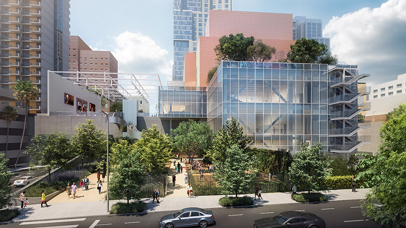
frank gehry colburn school
view from hill street west towards dance school entrance | image © Gehry Partners


the 1,000 seat theater, ‘terri and jerry kohl hall’


Frank Gehry’s Colburn Center will welcome students and audiences alike, with a dynamic composition of transparent and opaque interlocking blocks that step down into the natural contour of the site. A 1,000-seat concert hall uses an in-the-round design to create intimacy between the performers and the audience and removes the stage lip, putting front-row seats at eye-level with the performers. Orchestra, opera, dance, and musical theater will all be at home in the hall, which is equipped with an orchestra pit and a stage large enough to accommodate the grandest works and the largest orchestrations.

colburn school breaks ground on frank gehry-designed campus expansion in LA
branded shovels used for groundbreaking ceremony | image © Loreen Sarkis


the theater and dance studios


Four professional-sized dance studios and a 100-seat flexible studio theater are enveloped in glass and provide a literal window into the beauty and rigor of dance training and performance. Qith a separate entrance and distinct architectural character, the light-filled dance facilities will have their own identity while harmonizing with the larger project. The Colburn Center will be equipped to take a modern approach to multi-media technology and production. The facilities include commercial-quality recording and streaming capabilities, and performance spaces will be outfitted with state-of-the-art lighting. Public spaces include an outdoor plaza, giving visitors a front-row seat to the performing arts, and gardens which provide much-needed green space and pedestrian access to nearby public transit hubs.
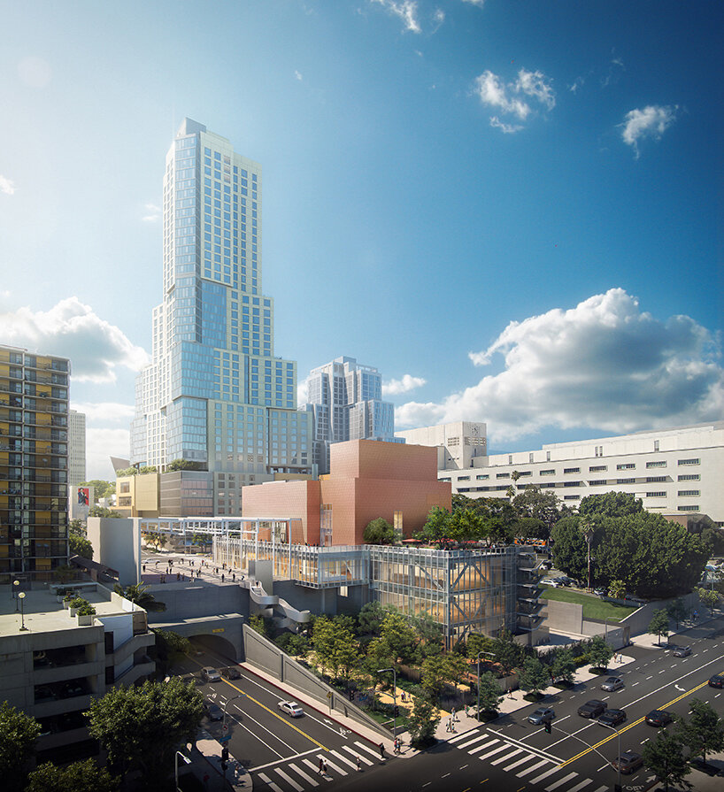
frank gehry colburn school
view from Hill Street and 2nd Street intersection


colburn president sel kardan comments:With great joy and excitement, we share the design of Frank Gehry’s multi-dimensional project, which will welcome our students, performing artists, and audiences from across los angeles.The Colburn Center is a physical manifestation of the school’s founding principle of ‘access to excellence,’ allowing Colburn to continue and expand our educational and performance activities in a design which breaks down barriers between audience and performer and reveals the educational process. We look forward to collaborating with our artistic partners in Terri and Jerry Kohl hall, which complements the other stellar performance spaces in Downtown Los Angeles.’
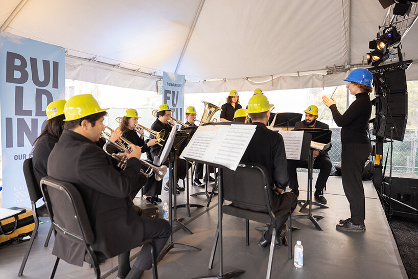
colburn school breaks ground on frank gehry-designed campus expansion in LA
performance by the Colburn Conservatory’s Pep Band | image © Loreen Sarkis
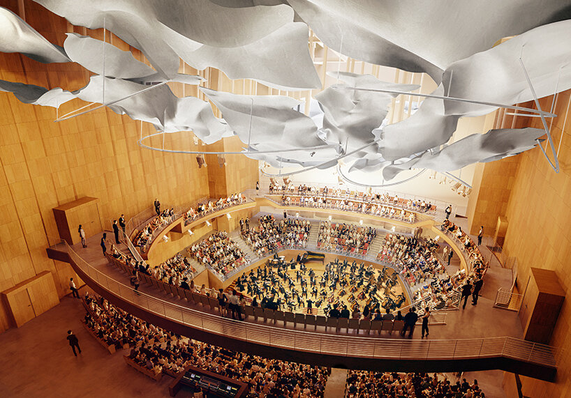
frank gehry colburn schoolinside the 1,000-seat Terri and Jerry Kohl Hall | image © Gehry Partners


Reference

Rotating panels define spaces in artist’s studio by Ab Rogers Design
CategoriesInterior Design

Rotating panels define spaces in artist’s studio by Ab Rogers Design

Ab Rogers Design has completed an artist’s studio and residence in Kanazawa, Japan, featuring a series of fluorescent partition walls that can be rotated to transform how the space is used.

Called Fishmarket, the multipurpose creative and living space was designed for Japanese artist Hiraki Sawa, who lives in London but regularly visits his home city of Kanazawa.

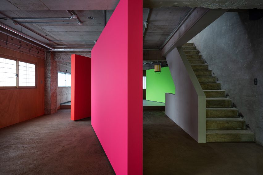
Pink, orange and green rotating partition walls in a concrete apartment by AB Rogers
Ab Rogers Design introduced rotating walls that define spaces

Sawa met Ab Rogers in 2019 when the pair were both working on projects for the Wonderfruit music festival in Thailand.

At the time, they were both living in east London and over the course of several conversations decided to work together on what Rogers calls the “co-being space” in Kanazawa.

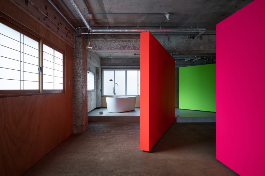
Fluorescent rotating partition walls revealing a freestanding bathtub in a concrete apartment by Ab Rogers Design
The interior was stripped back to its shell

Named after the duo’s shared love of fish, the former commercial space was converted into a place for Sawa to stay while in Kanazawa, as well as a place to host workshops around design, culture and food.

Rogers’ studio stripped the interior back to its industrial shell before adding foil-backed insulation to some of the walls and introducing interventions including the rotating plywood walls.

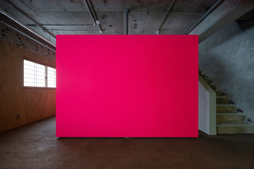
Pink fluorescent partition wall in an industrial apartment with concrete staircase to the side
The fluorescent partition walls are made from plywood

“We didn’t want to make it cosy or glossy, we wanted to work with the bones of what was there,” Rogers told Dezeen.

“We tried to let the light in as much as possible while keeping it raw and creating these interventions, these objects in space.”

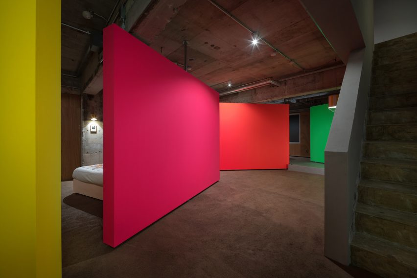
Yellow, pink, orange and green rotating partition walls zoning a bedroom in a concrete apartment by Ab Rogers Design
The walls were painted in different colours to add character

The insertion of the four movable partitions on the building’s second floor allows this open space to be transformed into three smaller multipurpose zones.

Pivoting doors conceal the bathroom and enable the bedroom to become a workshop for making art, a place for viewing it or a social space for gatherings.

Each panel is painted in a different fluorescent highlighter hue to bring a sense of vibrancy and character to the otherwise pared-back space.

“I love fluorescent colours because they’re really alive and dynamic,” Rogers explained. “When daylight hits them they become electrified and they transform into something else.”

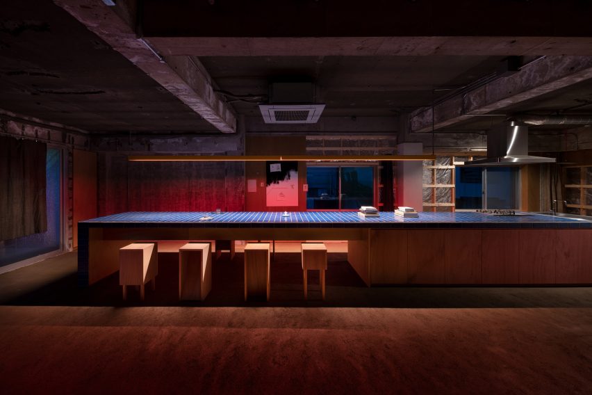
Long kitchen island bench topped with blue tiles in a dimly lit industrial apartment
The kitchen is located on the upper floor

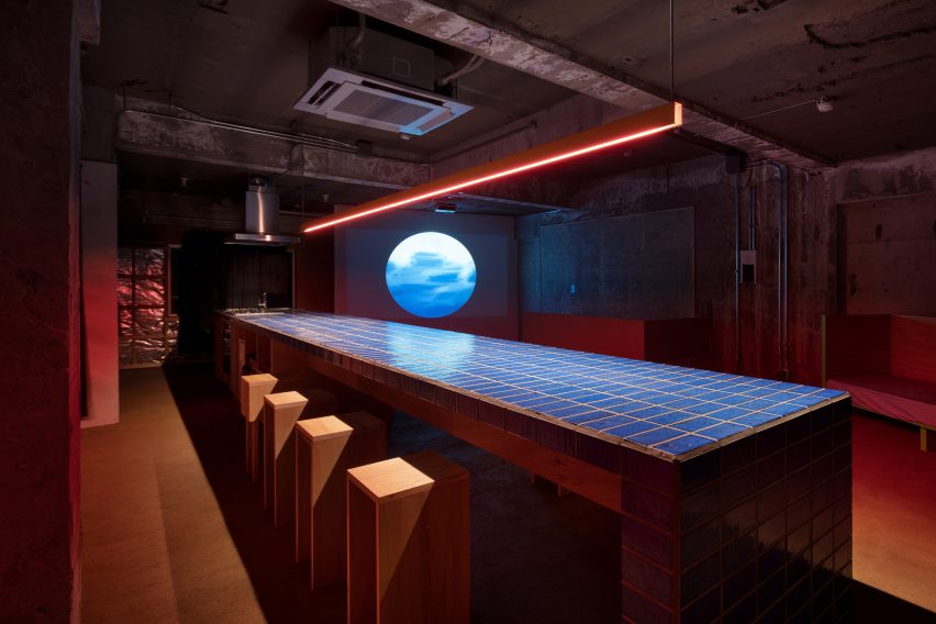
A concrete staircase ascends to another open space where a monolithic nine-metre-long workbench functions as a kitchen, a worktop and a table for cooking, eating and sharing.

“The kitchen can be used as a kitchen but it’s also adaptable depending on what actions are being performed in the space,” Rogers explained.

“If you put a plate on it, it becomes a restaurant,” he added. “If you put a computer on it then it’s an office and if you put a sewing machine on it then it becomes a workshop for designing or making textiles.”

Long kitchen table topped with blue tiles with red strip lighting overhead in an unfinished industrial apartment
A long tiled bench provides space for food preparation and dining

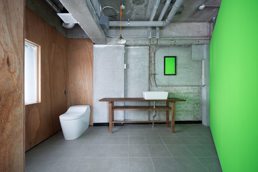
All of the materials used in the project were sourced locally and chosen for their affordability. Building regulations also dictated some of the design decisions, such as the need to line certain walls with plywood panels.

Rogers never visited Kanazawa, so Sawa was responsible for solving problems on-site and finding materials to turn his ideas into reality.

Toilet and sink on a wooden bench in an industrial bathroom with fluorescent green wall by Ab Rogers Design
Some walls were lined with plywood panels

The project evolved over time with lots of back and forth between the client and designer. According to Rogers, this organic process produced an outcome that embodies both of their visions.

“I love these small projects where you have a strong affiliation with the client,” said the designer. “This symbiotic way of designing through a conversation is really fluent and means you’re always building ambition.”

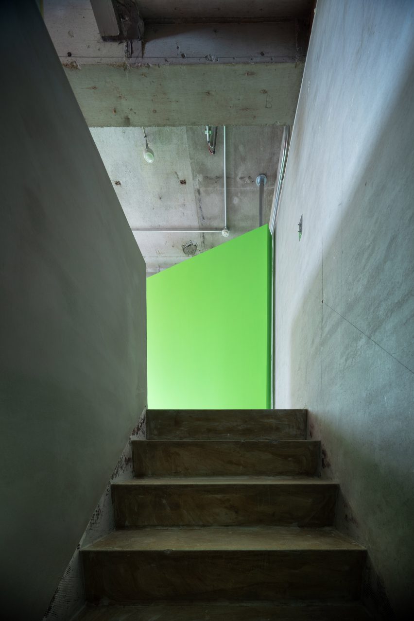
Fluorescent green rotating wall at the top of a concrete staircase
The studio was previously a commercial space

Rogers works across fields such as health, culture, retail, hospitality and housing.

Previous projects by the multidisciplinary design studio include a cancer treatment hospital clad in glazed red terracotta and a space-efficient apartment with a floor area of just 19 square metres.

The photography is by Takumi Ota.

Reference