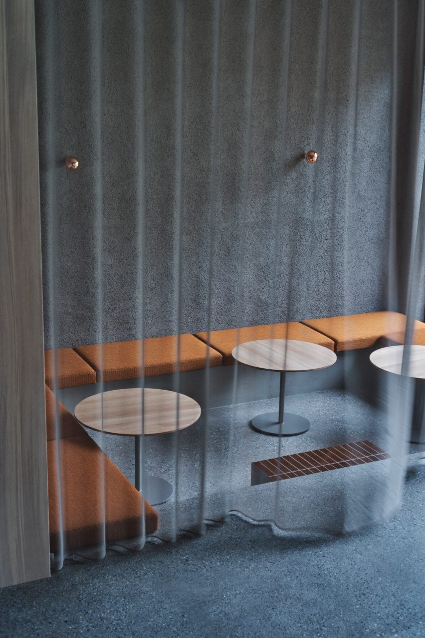
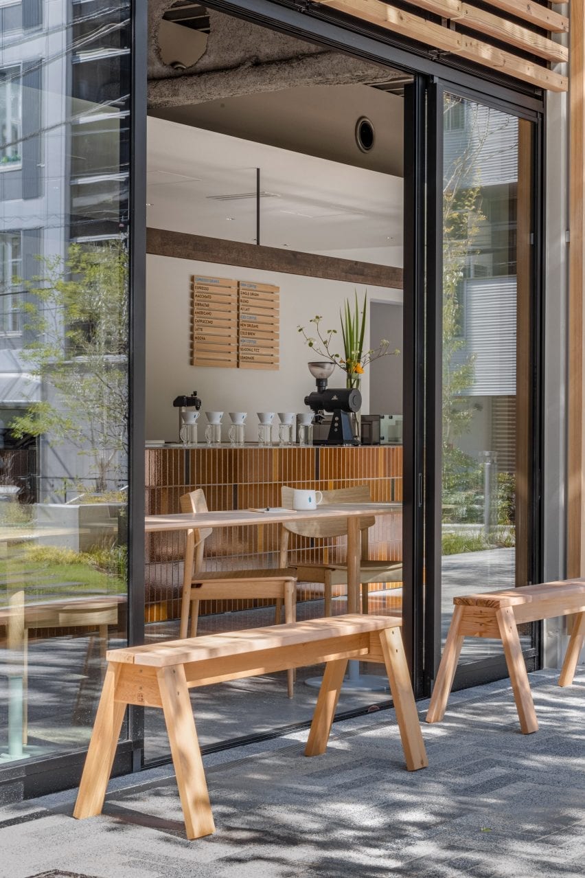
Keiji Ashizawa adds “residential calm” to Aloop clinic in Ginza
CategoriesInterior Design

Keiji Ashizawa adds “residential calm” to Aloop clinic in Ginza

Japanese architect Keiji Ashizawa has created the interior for a skincare clinic in Tokyo, using textiles and custom-made furniture to make it feel more residential than medical.

The Aloop Clinic & Lab, which provides “skin cure and care”, is located in the city’s upscale Ginza area and run by Japanese beauty company POLA. Ashizawa wanted to give it an interior that would feel peaceful, while also representing the brand.
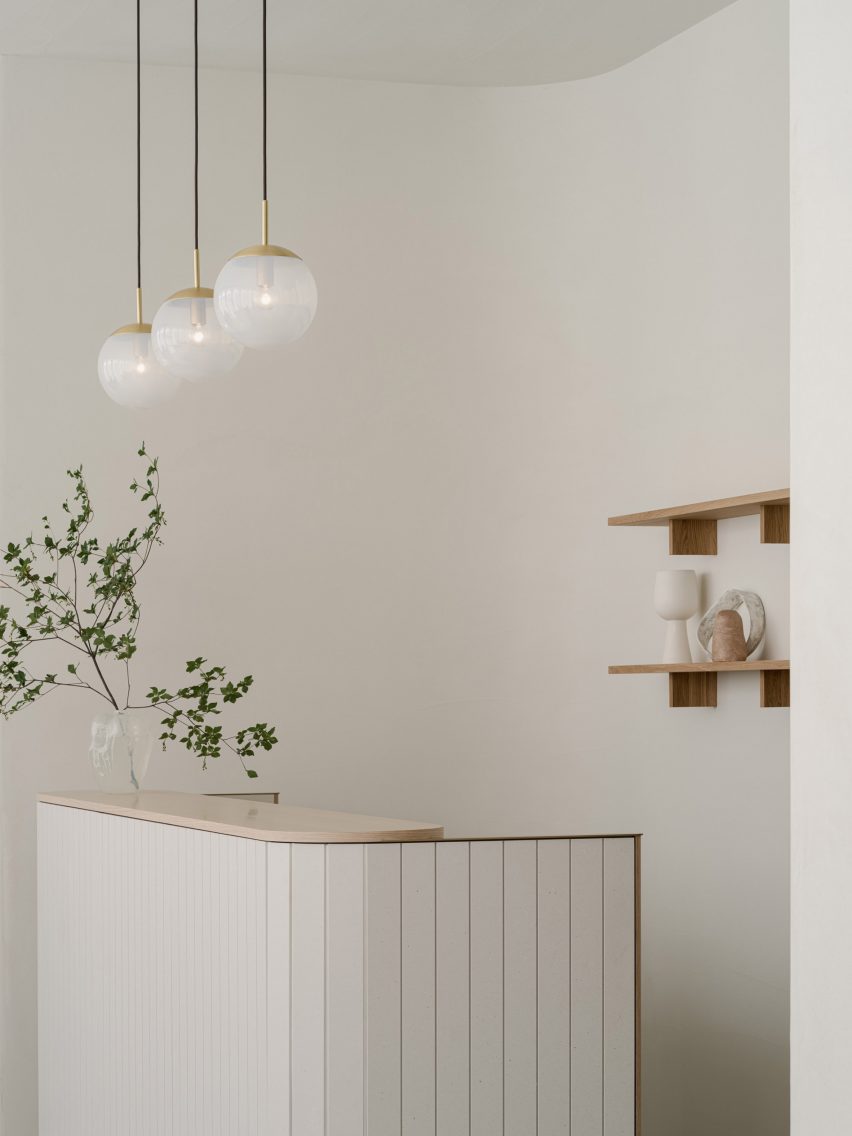
White Aloop clinic receptionWhite Aloop clinic reception
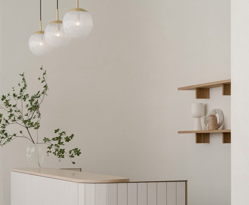
The Aloop clinic has a calm minimalist interior

“As a clinic that uses medical technology to deal with beauty, we thought that the space should have sincerity, calmness, and beauty in order to create a comfortable time for customers to feel at ease,” Ashizawa told Dezeen.

“In addition, considering that this is a completely new business for the POLA beauty brand, we felt that it was necessary to create a space that would enhance the brand.”
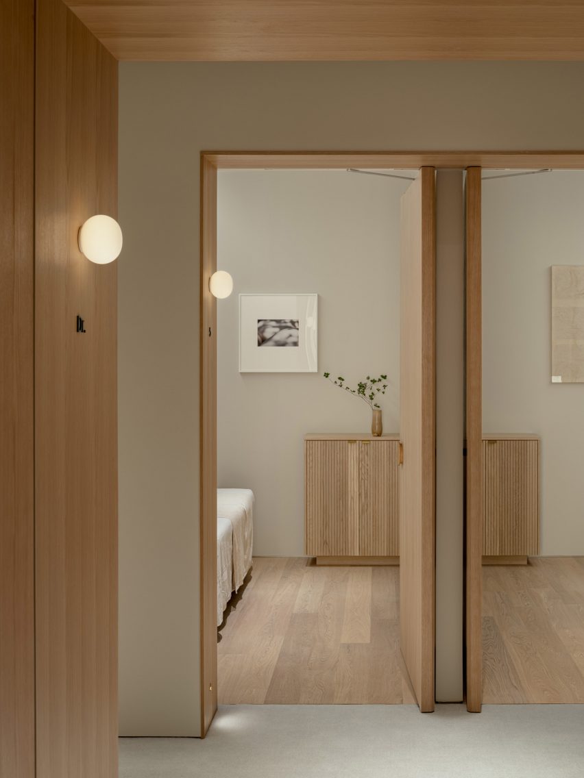
Wooden panelling inside Aloop clinicWooden panelling inside Aloop clinic
Wood was used throughout the space

To do so, Ashizawa looked at the design of the 210-square-metre clinic like he would if he were designing a residential space, giving it a calm, minimalist interior.

“Although it is a clinic, I considered the space to be similar to a hotel or a living space,” he said. “Therefore, I used materials that I use in designing living spaces and hotels.”

“The walls are plaster and the floor is a wool rug from Hotta Carpet,” he added. “The sofa and furniture at the characteristic entrance are made of Kvadrat wool textile to create a pleasant texture.”
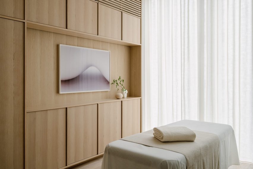
Treatment room in Japanese skincare clinicTreatment room in Japanese skincare clinic
Treatment rooms were designed to have a residential feel

The architect used a clean, simple colour palette throughout the space, with white-painted walls contrasting against wooden panelling and wooden doors.

“Wood was used for doors, furniture and details because we wanted to create a residential calm rather than a clinic,” Ashizawa said. “We felt that a bright and healthy atmosphere was necessary.”

“The extensive use of wood was to create a residential atmosphere, and we wanted the space to be as far away from a typical clinic as possible,” he added.
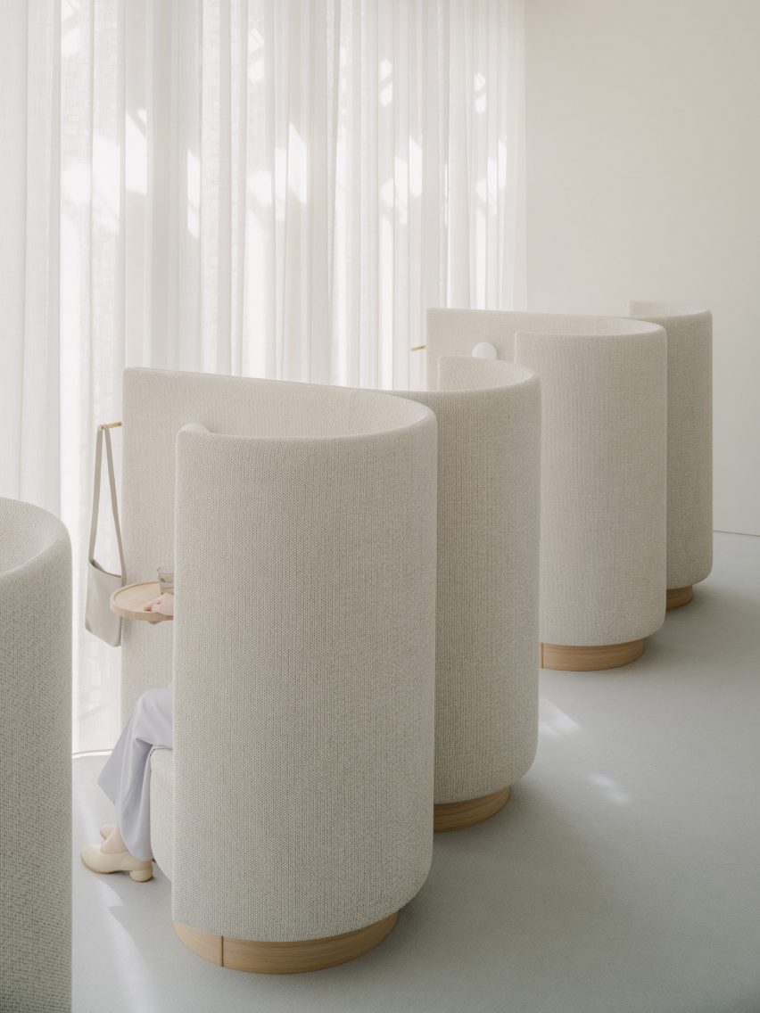
Sofas by KarimokuSofas by Karimoku
Keiji Ashizawa created custom-made sofas with furniture brand Karimoku

His studio worked together with wooden furniture brand Karimoku to design the custom-made sofas for the space, which welcome customers as they enter the clinic.

“Of particular importance to this project were the custom sofas,” Ashizawa said.

“We asked Karimoku, with whom we communicate on a daily basis for furniture development and wood projects, to work with us on the development of the furniture.”

He compared his collaboration with the brand to that of mid-century modern Finnish architect Alvar Aalto and furniture brand Artek.

“For me, Karimoku has become an indispensable partner in thinking about space, just as Aalto is for Artek,” he explained.
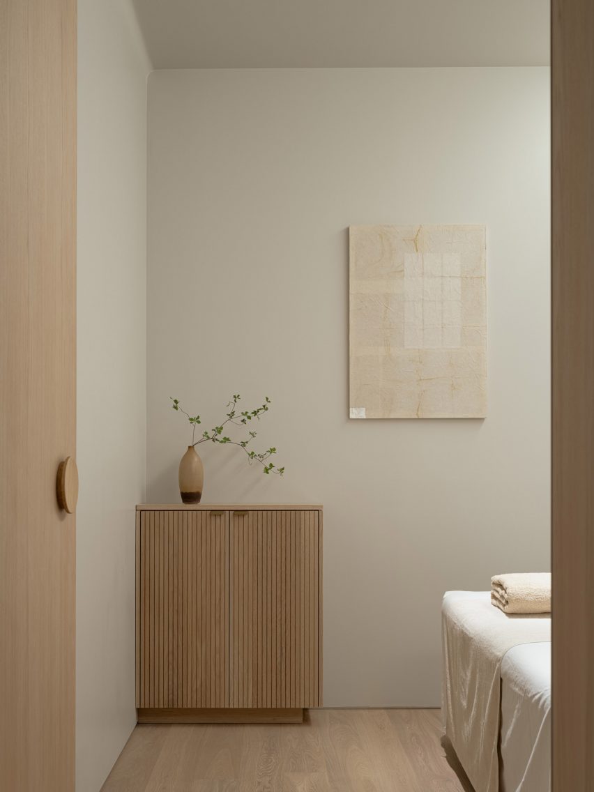
Calm treatment room in TokyoCalm treatment room in Tokyo
Neutral colours contrast against pale wood

By creating the sofas with rounded edges, Ashizawa aimed for them to “gently envelop” customers after their treatments.

“The mere fact that something looks hard or painful makes the body tense, so we thought it would be desirable to eliminate such things,” he said.

“However, in order to maintain a comfortable sense of tension in the room, delicate details of metal and wood were used to achieve a balance.”
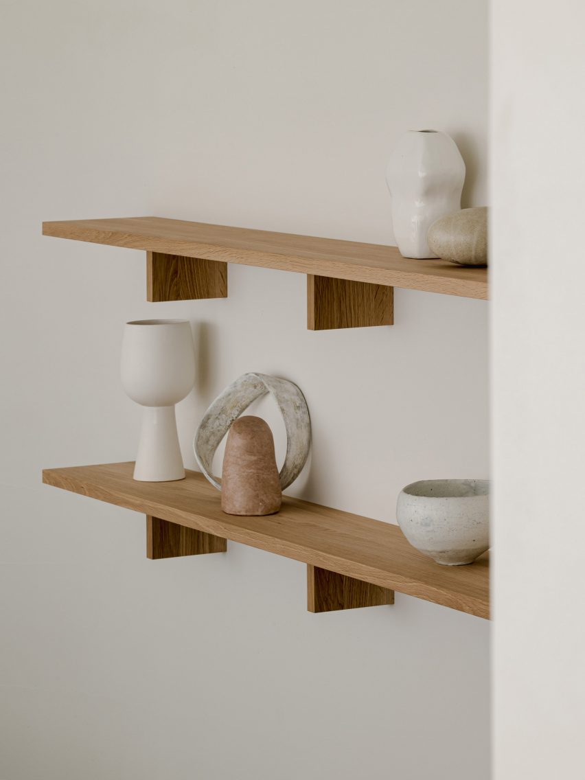
Sculptures in Aloop clinicSculptures in Aloop clinic
Small sculptures decorate the space

Small sculptures were dotted throughout the Aloop clinic, including in the treatment rooms.

Ashizawa has previously designed an interior with a similar colour palette for the Hiroo Residence in Tokyo, and also used plenty of wood for his and Norm Architects minimalist Trunk Hotel design.

The photography is by Tomooki Kengaku.

Reference

Keiji Ashizawa Design and Norm Architects create Trunk Hotel in Tokyo
CategoriesInterior Design

Keiji Ashizawa Design and Norm Architects create Trunk Hotel in Tokyo

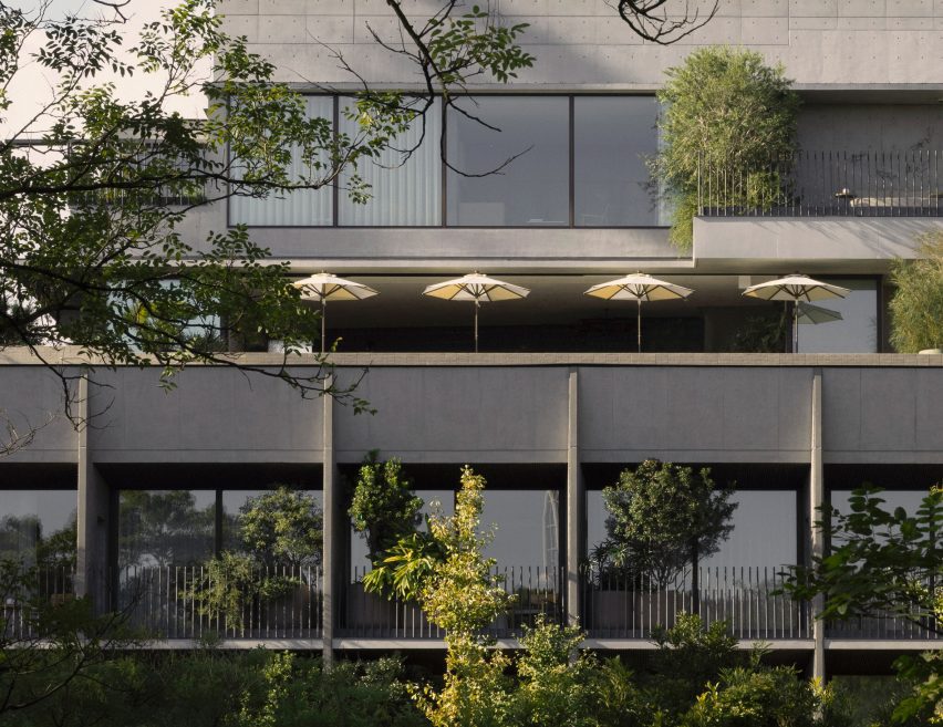
An exposed raw concrete facade fronts the Trunk Hotel Yoyogi Park, which Japanese studio Keiji Ashizawa Design and Danish firm Norm Architects conceived as a minimalist retreat in the heart of the city.

Marking the third location in a trio of Trunk hotels in Tokyo, the design of the boutique hotel was rooted in the concept of “urban recharge”, according to Trunk chief creative officer Masayuki Kinoshita.

The raw concrete facade of Trunk Hotel Yoyogi Park
Trunk Hotel Yoyogi Park features a raw concrete facade

The hotel group said the idea was to balance the opposing elements of tradition and modernity as well as nature and the city and the melding of both Japanese and European craft.

Keiji Ashizawa Design created a textured concrete aggregate facade for the seven-storey building, which is punctuated with steel-lined balconies and overlooks Yoyogi Park’s lush treetops.

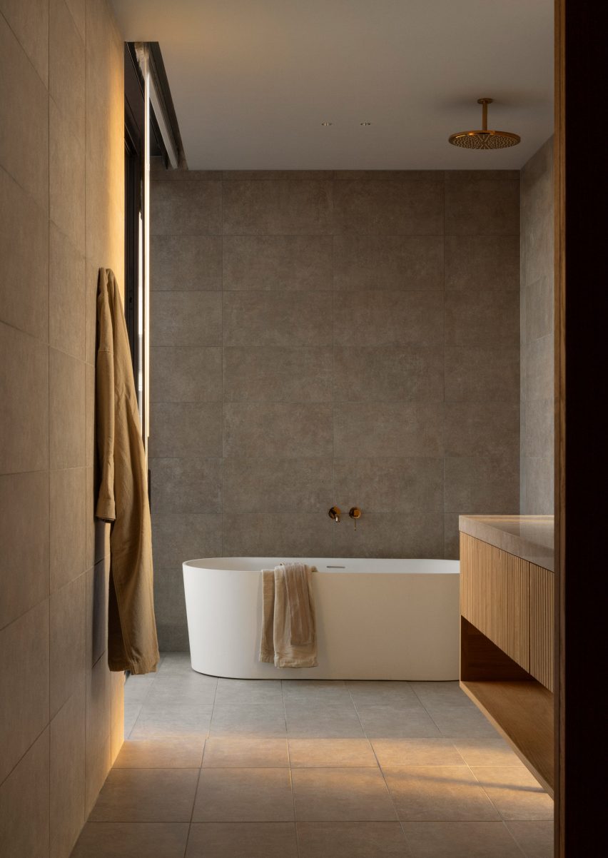
Neutral bathroom within Tokyo's Trunk Hotel
Guest rooms feature a muted colour and material palette

The studio worked with Norm Architects to design the minimalist interior, accessed via a copper-clad entrance.

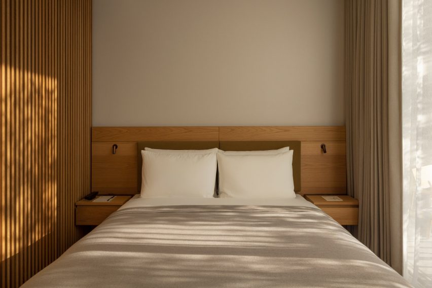
A total of 20 guest rooms and five suites were dressed in a muted colour and material palette featuring hardwood flooring and plush Hotta Carpet-designed rugs informed by traditional Japanese architecture.

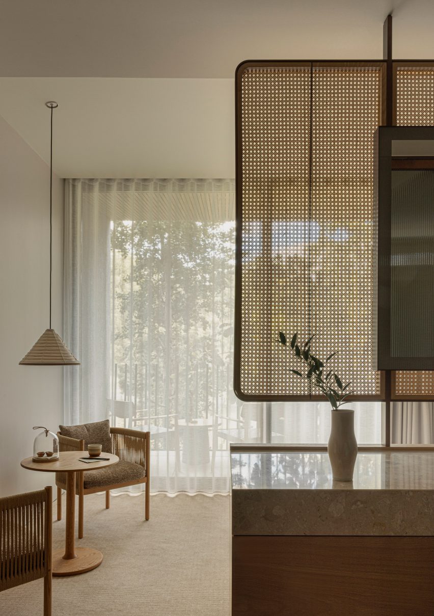
Paper-cord chairs and washi pendant lights at Trunk Hotel in Tokyo
Paper-cord chairs and tapered washi pendant lights contribute to the minimalist design

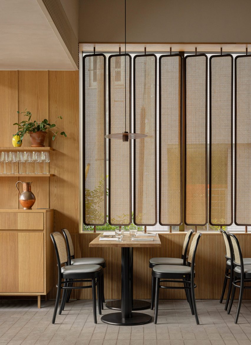
Delicate rattan partition walls delineate spaces within the rooms, which open out onto the building’s balconies that were fitted with slanted ceilings in order to encourage sunlight into each room “as if mimicking the gentle transitions of a day”.

“It’s been an interesting journey for us to find the right balance between a space that is relaxed and vibrant at the same time,” said Norm Architects co-founder Jonas Bjerre-Poulsen.

Minimalist neutral double bed within the Trunk Hotel in Tokyo
The interiors were designed to be both “relaxed and vibrant”

The rooms are also characterised by paper-cord chairs and tapered washi pendant lights as well as abstract artworks, amorphous vases and grainy floor-to-ceiling bathroom tiles.

On the ground floor, oak seating designed by Norm Architects for Karimoku features in the hotel restaurant, which includes a striking copper-clad pizza oven and the same rattan accents that can be found in the guest rooms.

Rattan room dividers in the restaurant of Trunk Hotel
Rattan accents can also be found in the hotel restaurant

“It is a very unique and gratifying experience in the sense that the architecture, interior and furniture, as well as the attention to detail, have created a space with such a strong sense of unity,” said Keiji Ashizawa Design.

An open-air pool club is located on the sixth floor of the hotel.

Sand-blasted concrete flooring was paired with thin bluey-green tiles that make up the infinity swimming pool, which overlooks the park below.

A “glowing” firepit can also be set alight after dark, intended to create a soothing contrast with the bright Tokyo skyline.

Rooftop infinity pool overlooking Yoyogi Park
The Trunk Hotel features a rooftop infinity pool

The city’s first Trunk Hotel opened in Shibuya in 2017, while the second location is an offbeat one-room hotel in the metropolis’s Kagurazaka neighbourhood featuring its own miniature nightclub.

The photography is by Jonas Bjerre-Poulsen.

Reference

Keiji Ashizawa designs “home-like” The Conran Shop in Hillside Terrace
CategoriesInterior Design

Keiji Ashizawa designs “home-like” The Conran Shop in Hillside Terrace

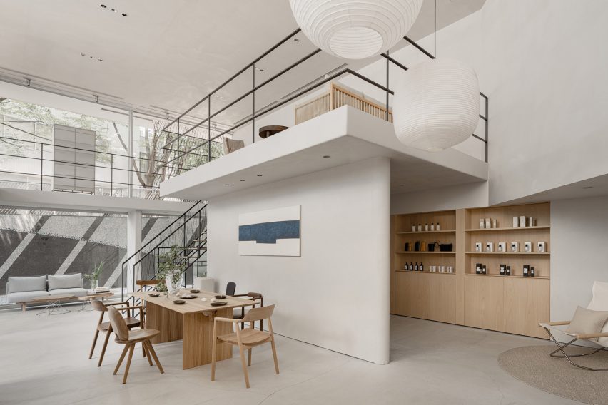
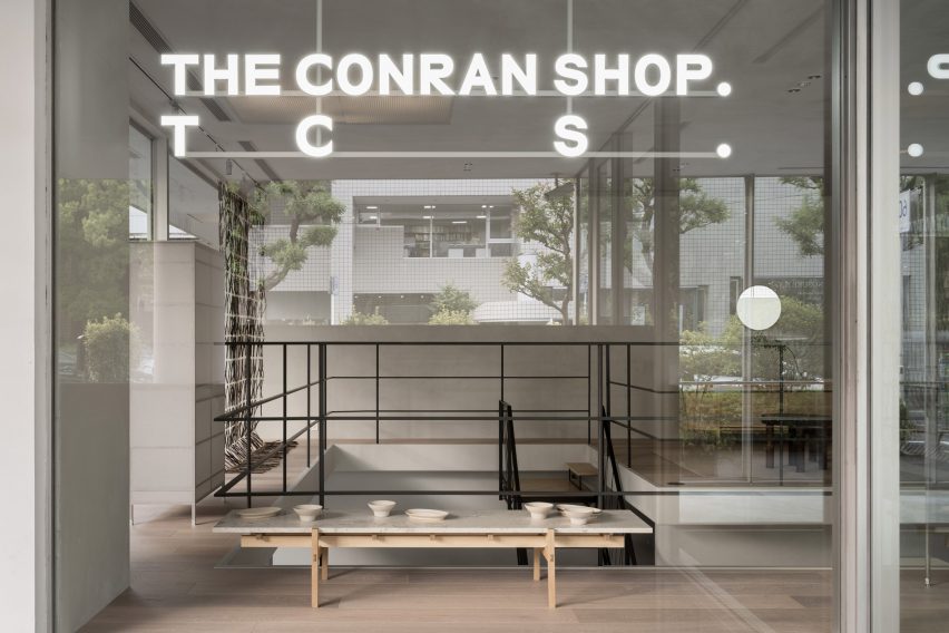
Designer Keiji Ashizawa has devised the interiors of The Conran Shop Daikanyama in Tokyo, which is located inside a building by architect Fumihiko Maki and spotlights products from Japan and Asia.

The latest outpost from British retailer The Conran Shop is located in the modernist Hillside Terrace in Daikanyama, a quiet area close to the Tokyo city centre.

The complex was designed by Pritzker Prize-winner Maki and constructed between 1967 and 1992.

Tokyo Conran Shop in Daikanyama
The Conran Shop Daikanyama was designed to resemble someone’s home

Ashizawa aimed to take the existing architecture of the two-storey building into consideration when designing the interior of The Conran Shop.

“Since the existing space had great potential, we knew that the work had to be put into elevating what was already there – thinking about the proportions of the space, the dry area and so on,” he told Dezeen.

“Although it is inside a well-known architecture, there were elements where we thought we could bring change to the inside.”

Interior of The Conran Shop Daikanyama
It features pieces by Japanese and Asian designers

These changes included turning one glass section into a solid wall.

“Glass walls were used extensively as part of the architectural concept so that the store space could be viewed through the layers of glass,” Ashizawa said.

“While building the store, we decided that there wouldn’t be a problem in making a section of the glass wall become a solid wall, considering its serenity as a space and its relationship with the street.”

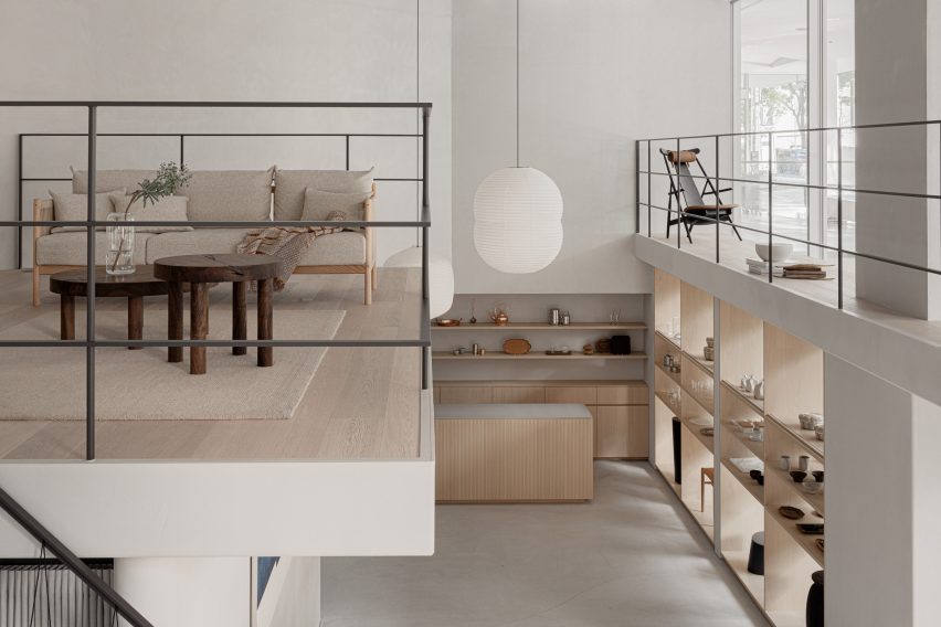
Mezzanine in Conran store
A mezzanine showcases a sofa and other living room furniture

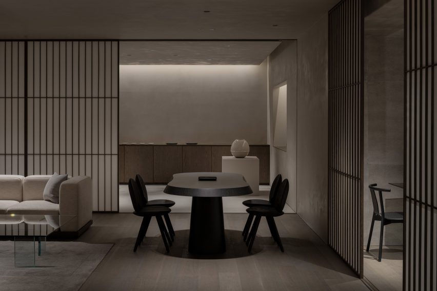
The designer created the 200-square-metre store to look like someone’s home, in a nod to the peaceful nature of the surrounding area. It features a large atrium on the ground floor, connecting it to an adjoining courtyard.

“Daikanyama is a very calm neighbourhood in Tokyo, where we wished to design a store where people could feel relaxed and away from the stimulation of the city,” Ashizawa said.

“We intended to create a space for people to stay for a long period of time and feel the space.”

Exterior of Tokyo interior store
The store is located in the iconic Hillside Terrace complex

The interior design was also based on The Conran Shop’s three keywords – plain, simple and useful – CEO of The Conran Shop Japan Shinichiro Nakahara told Dezeen.

The store’s product selection also places a special focus on Japanese and Asian design.

“Specifically for The Conran Shop Daikanyama, the selections were focused on objects from Asia, including Japan,” Nakahara said.

“The process of [founder] Terence [Conran] travelling around the world, finding and buying items in each place by himself, has not changed,” he added. “Many of the objects selected by the Conran team in Japan have a sense of craftsmanship.”

“We created the space by imagining a situation in which such objects would be displayed alongside each other. For example, the details of the objects are reflected in the interior design.”

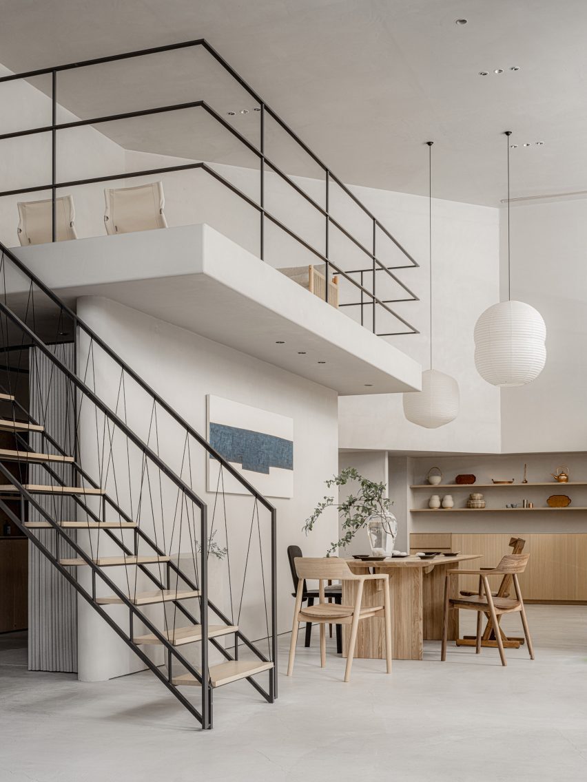
Staircase in Japanese interior store
It features a staircase with a handrail made from black paper cords

The interior uses materials that are common in Japan including concrete, steel, wood, plaster, Japanese stone and paper.

“The use of Japanese paper in interior design is an element that is distinctively Japanese,” Ashizawa explained.

“Shoji screens are an important element in creating a Japanese-style room but I realize that they can also be well used in both functional and aesthetic ways in a modern space.”

Basement floor in Conran Shop Daikanyama
Concrete walls and shoji screens were used for the interior

The studio also used Japanese paper that had been dyed in a grey hue as wallpaper to give the space a “soft and contemporary feel.”

“Since we weren’t building an actual house but rather a home-like Conran store, the materials were thoughtfully instrumented to achieve a balance,” Ashizawa said.

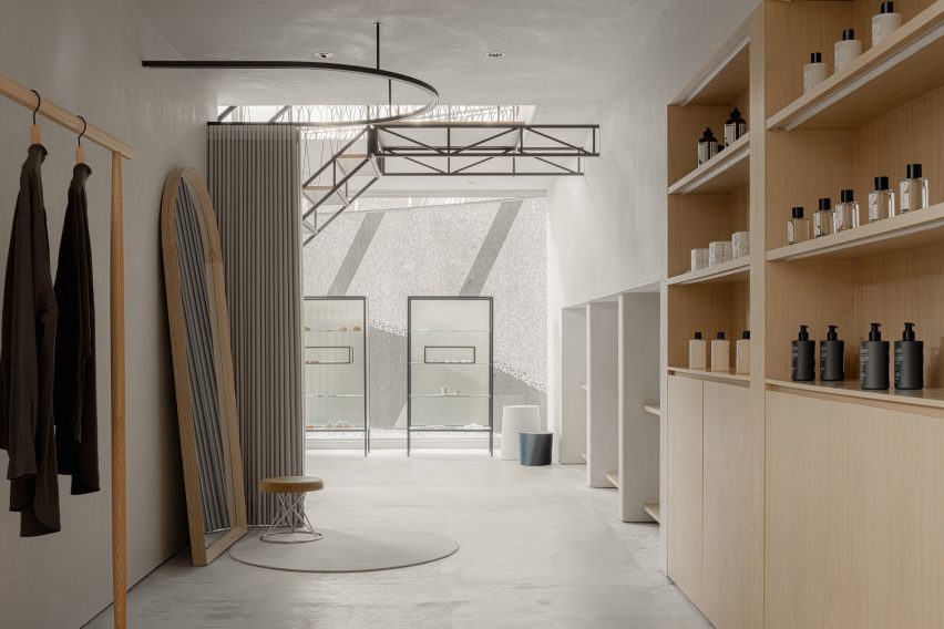
The ground floor of the store holds furniture, homeware and apparel, and also has a mezzanine floor that is accessible by a staircase featuring a handrail made from black paper cords.

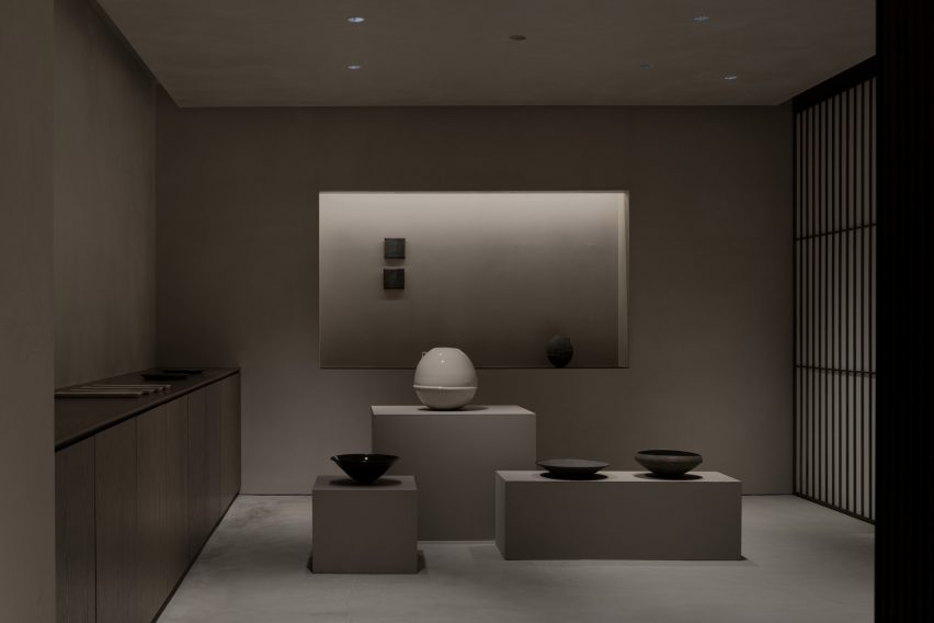
Gallery-like interior by Keiji Ashizawa
A gallery-like space is located on the basement floor

Ashizawa designed the basement floor, which functions both as an additional shopping area and a gallery space, to have a calmer atmosphere.

“Filled with natural light, the ground floor uses colours that bring grandeur and a sense of calmness,” he said.

“The basement floor is toned to create a more private feeling. We respected the natural colours of the materials as much as possible, while also considering the harmony with the objects on display and in the gallery.”

Clothes in Conran Shop Tokyo
The store has a neutral colour palette and wooden details

The Conran Shop Daikanyama also has an adjoining bar where visitors can enjoy teas such as sencha and macha.

Ashizawa has previously worked on a number of other projects in Tokyo, including the Bellustar Tokyo “hotel in the sky” and the Hiroo Residence.

Reference

Keiji Ashizawa draws on “whiteness of tofu” for Saga Hirakawaya eatery
CategoriesInterior Design

Keiji Ashizawa draws on “whiteness of tofu” for Saga Hirakawaya eatery

Japanese designer Keiji Ashizawa paid homage to the food on offer when designing the Saga Hirakawaya tofu restaurant, which hopes to revitalise a depopulated community in Japan.

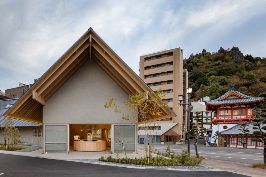
Located in the hot spring resort Takeo Onsen in Japan’s Saga prefecture, the curved restaurant was designed to blend in with the surrounding environment, including a historical tower gate.

Outside the Saga Hirakawaya tofu restaurant
The Saga Hirakawaya restaurant is located next to a historical tower gate

“Tofu, a food culture rooted in the region of Saga prefecture, is the main ingredient of this restaurant,” Ashizawa told Dezeen. “Since tofu is a simple food, we chose materials with a sense of simplicity such as wood, concrete and walls finished in plaster to bring out the texture in the materials.”

“With a background of wishing to use local materials, wood was used for the entrance, windows and undersurface of eaves to match the wood from Ariake, a furniture brand based in Saga.”

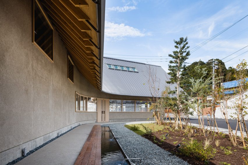
Foot bath outside tofu restaurant
Volcanic ash was used for the plaster

The studio also used shirasu – a type of volcanic ash from Mount Sakurajima in Kyushu – as a plastering material for the building’s exterior walls.

Saga Hirakawaya has a curved design forming a semi-open interior courtyard, which holds a foot bath with hot spring water that aims to encourage the restaurant’s customers to eat and stay outside the establishment for longer.

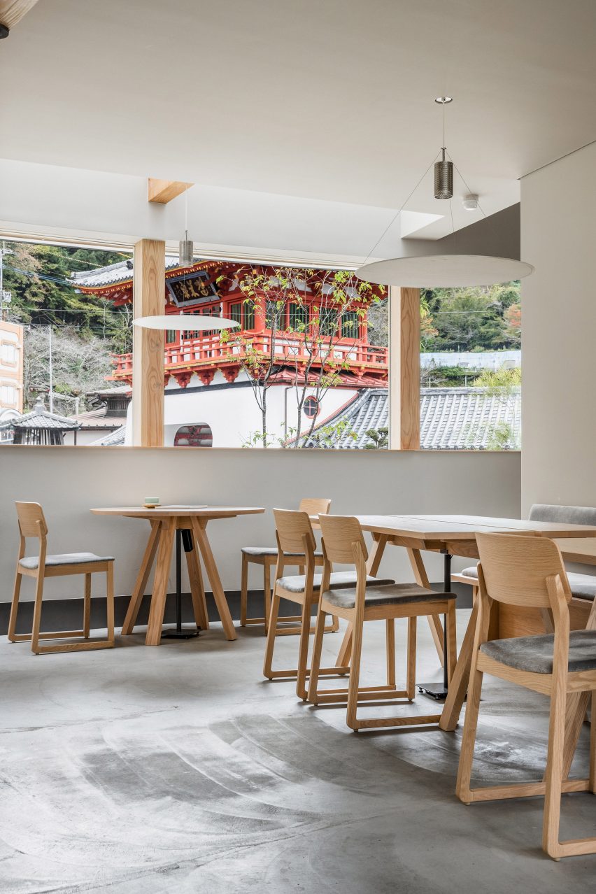
Wooden furniture inside Saga tofu restaurant
Wooden furniture matches the pared-down interior

Inside the 435-square-metre restaurant, the interior matches the exterior with pale grey walls that nod to the food on the menu.

“As the ceiling and walls are curved, pale colours are used to extend the light beautifully in the restaurant, complemented by the use of grey colours on the walls and floors,” Ashizawa said. “It also signifies the whiteness of the tofu.”

The restaurant’s ground floor houses a shop selling tofu-based products and sweets, while the first floor is home to a restaurant serving onsen yudofu – a type of tofu made using hot spring water.

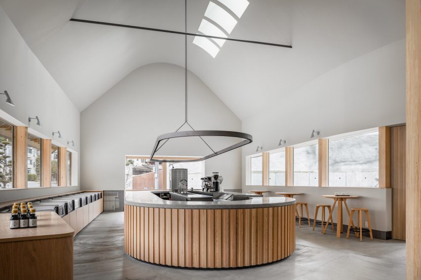
An open atrium connects the shop and restaurant, which both feature large windows.

Central counter at Saga Hirakawaya restaurant
The ground floor houses a shop

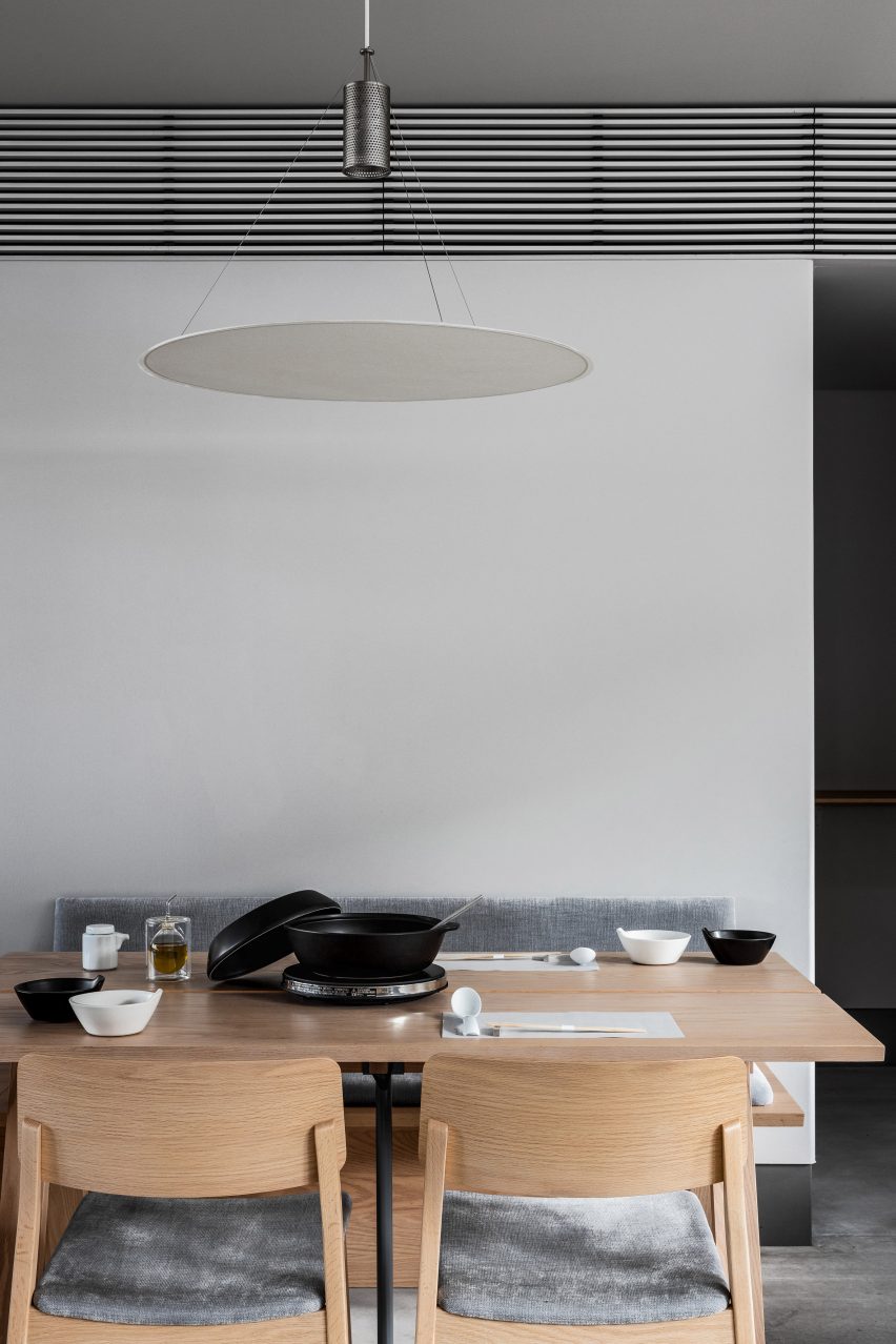
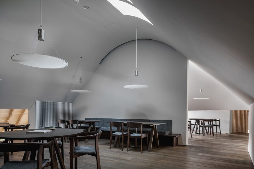
Circular lamps made by local paper manufacturer Nao Washi hang over the tables while the wooden furniture was made by furniture brand Ariake, which manufactures in Saga prefecture.

The decision to open the Saga Hirakawaya restaurant in Takeo Onsen was made by its owner, who was born and raised in the area and wanted to help revitalise the community, which has suffered from a population decline.

Washi paper lamp about table in restaurant
Paper lamps hang over tables

“Depopulation is inevitable in rural areas of Japan,” Ashizawa said. “But in order to revitalise a region, it is important to attract people to the area through tourism.”

“The client decided to create a restaurant serving onsen yudofu, believing that the region’s unique culinary culture could be an incentive to visit the area for sightseeing.”

Dining space in Saga tofu restaurant
A restaurant space is located on the first floor

“We deeply sympathise with the client’s hope to make the most of the wonderful location in front of the historical tower gate of Takeo Onsen, an important cultural asset, and to combine it with the region’s unique food culture to attract tourists from both inside and outside of Japan, contributing to the revitalisation of the area,” he added.

Other recent projects by Ashizawa include a Blue Bottle Coffee shop in Kobe and a mid-century-modern-informed residence in Tokyo.

The photography is by Ben Richards.


Project credits:

Architect: Keiji Ashizawa Design
Project architect: Keiji Ashizawa, Kentaro Yamaguchi, Tsubasa Furuichi
Construction: Yamakami Inc
Furniture: Hirata Chair/Legnatec
Lighting: Saito Shomei/Nao Washi

Reference

Keiji Ashizawa creates Blue Bottle Coffee shop in Kobe department store
CategoriesInterior Design

Keiji Ashizawa creates Blue Bottle Coffee shop in Kobe department store

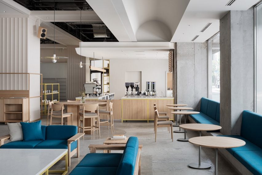
Japanese studio Keiji Ashizawa Design has created the interior of the Blue Bottle Coffee shop in Kobe’s Hankyu department store, taking advantage of its display windows to connect the cafe with the street outside.

The 173-square-metre cafe, which shares the department store’s ground floor with a number of apparel brands, has five large display windows.

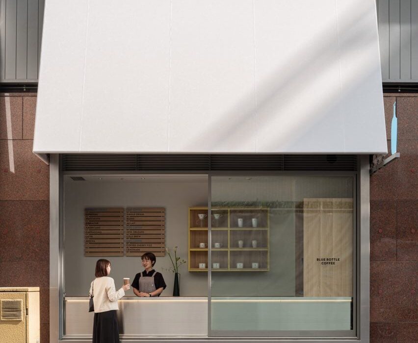
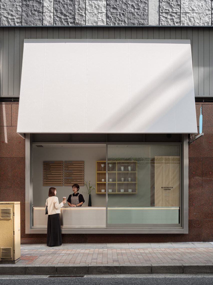
To open the coffee shop up towards the street, designer Keiji Ashizawa turned one of the windows into a take-out counter.

Window counter of Blue Bottle Coffee shop in Kobe
One display window was turned into a take-out counter

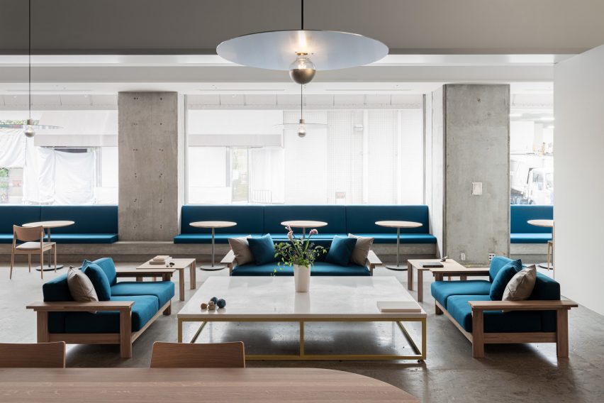
The remaining window niches were filled with blue built-in seating, creating a splash of colour among the wooden furniture.

Inside the cafe, square-shaped and rectangular furniture nods to the graphic look of the facade and is contrasted by round tables and large circular ceiling lights.

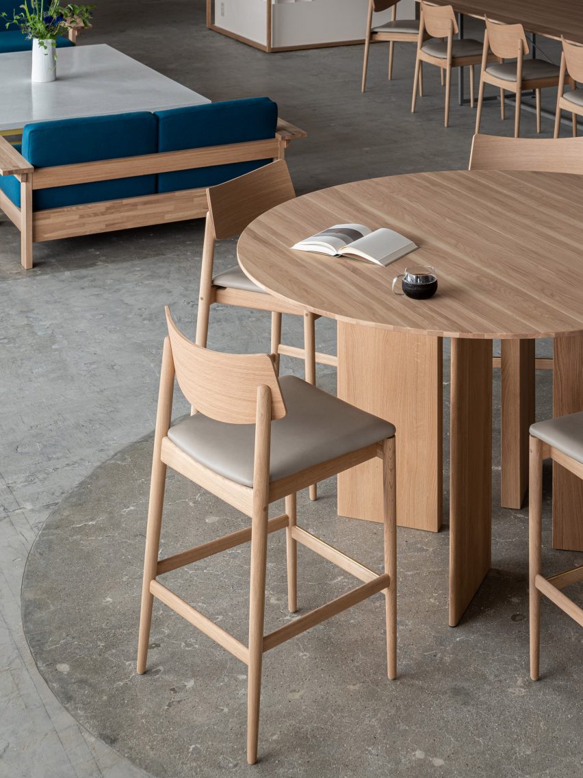
“The furniture is mainly made of domestic wood in collaboration with the Japanese furniture manufacturer Karimoku, who specializes in working with oak wood,” Ashizawa told Dezeen.

Interior of Hankyu Blue Bottle Coffee shop
Wooden furniture and terrazzo tabletops were used for the interior

The studio also mixed in terrazzo amongst the wooden furniture to give the cafe a welcoming feel.

“By placing a large terrazzo tabletop with fine textures created by mixing grounded glass into the material, it adds to the soft and welcoming atmosphere that identifies Blue Bottle Coffee and their hospitality,” Ashizawa said.

“It is also used for the low coffee table surrounded by the sofas, creating a sense of harmony and elegance throughout the space of the cafe,” he added.

While the studio was unable to change the material of the existing rough concrete floor, the department store allowed it to create a discrete demarcation by polishing the floor underneath the central tables.

Terrazzo table inside Blue Bottle Coffee shop
Circular pendant lights were made from raw aluminium

Large disc-shaped pendant lights add a sense of drama to the coffee shop’s pared-back design.

“With the idea of creating a high ceiling within the space, the pendant lights were made from raw aluminum to complement the industrial structures,” Ashizawa said.

“Six pendant lights are placed in the central space at equal distances in three zones, creating a sense of rhythm and spatial balance.”

Polished concrete floor in Blue Bottle Coffee shop
The concrete floor was polished in part of the cafe

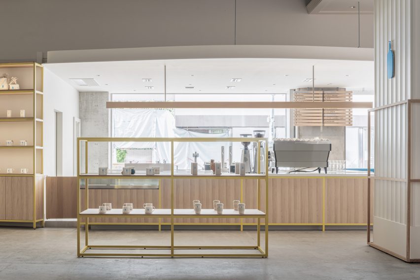
The wooden furniture inside the Blue Bottle Coffe Hankyu cafe has mainly been kept in its natural colour, but Ashizawa added bright colour to some of the wood.

“In the space with concrete structures, the yellow color was added to balance the combination of wood and concrete, and the blue color was placed as a contrast,” he said.

“We also designed the space to fit in with the apparel brands that share the ground floor.”

Colourful shelving in Kobe cafe
Shelves were painted a bright yellow

Ashizawa has previously created a number of cafes for the Blue Bottle Coffee company, including a Shanghai store decorated with traditional Chinese roof tiles and a Tokyo outpost with a volcanic-ash counter.

The photography is by Tomooki Kengaku.

Project credits:

Architect: Keiji Ashizawa Design
Project architect: Keiji Ashizawa, Tomohiko Fujishita, Masaru Kiotya
Construction: Tank
Design supervision: Miyachi Office/Kunihiko Miyachi
Lighting design: Aurora/Yoshiki Ichikawa
Furniture: Karimoku Case Study/Ichinomaki Laboratory by Karimoku
Metal works: Super Robot

Reference

Keiji Ashizawa Design designs Blue Bottle Coffee outpost in Tokyo
CategoriesInterior Design

Keiji Ashizawa Design designs Blue Bottle Coffee outpost in Tokyo

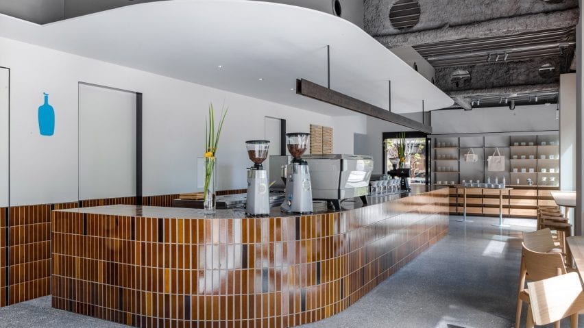
Brick-like tiles with a volcanic ash glaze created by Formafantasma and textured concrete walls feature in this coffee shop in Shibuya, Tokyo, by Japanese studio Keiji Ashizawa Design.

Located a short walk from Tokyo’s busy downtown area, this Blue Bottle Coffee outpost was conceived as an urban retreat sandwiched between two parks.

It serves coffee during the day and appetisers and natural wine in the evenings.

Curving counter with brown tiles in Blue Bottle Coffee Shibuya
Brown tiles with a volcanic ash glaze feature throughout the interior of Blue Bottle Coffee Shibuya

Keiji Ashizawa Design, which also designed the coffee brand’s Yokohama outpost, wanted to create a warm and welcoming interior that brought the park surroundings into the glass-walled and concrete-floored space.

“It was a challenge to come up with a playful interior plan in this square two-storey building,” Ashizawa told Dezeen.

“The other challenge was to make links between the first and second floors, and the exterior and interior.”

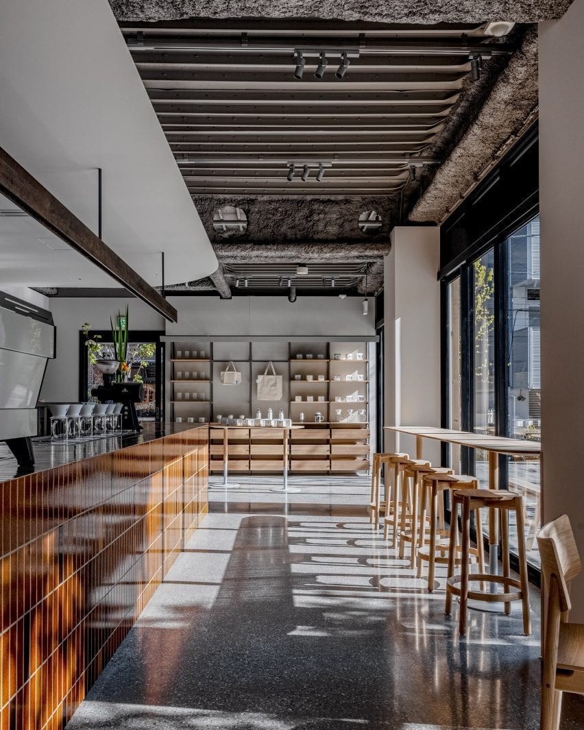
Brown-tiled bar and wooden counter seating in coffee shop by Keiji Ashizawa Design
Counter seating runs along the wall of windows

To bring the outside in, the studio installed a large, curved tile counter that wraps around the cafe’s kitchen area and welcomes customers as they enter.

The brown tiles – developed as a collaboration between London material manufacturer Dzek, and the Amsterdam-based design studio Formafantasma – are finished with a special volcanic ash glaze.

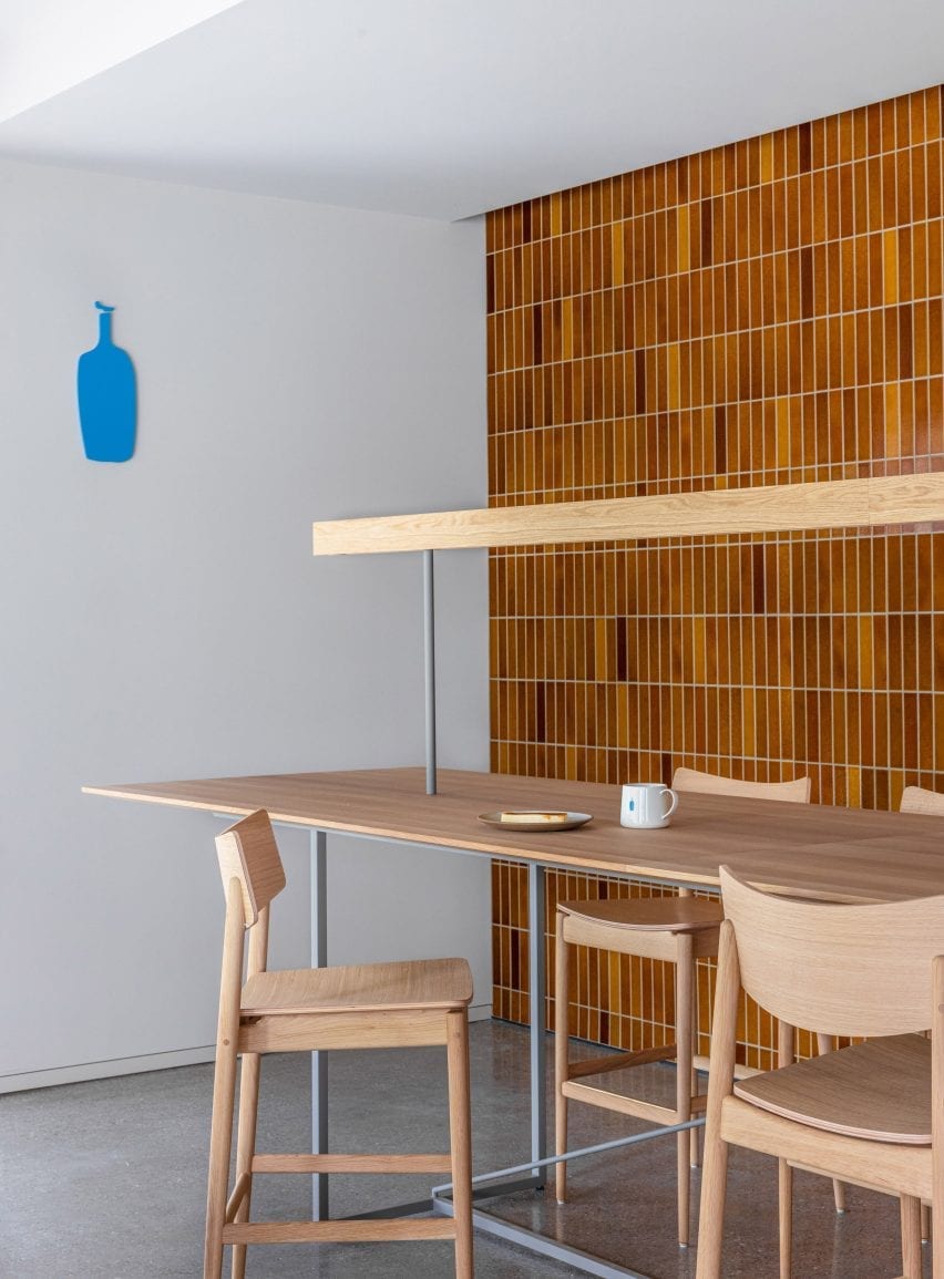
Brow-tiled walls and wooden counter seating in Blue Bottle Coffee Shibuya
A single artisan laid all 7,000 tiles in the interior

A single skilled artisan laid more than 7,000 of the tiles in the cafe. As well as the counter, they cover a low coffee table and a wall in the upstairs lounge area. Ashizawa said the tiles were specifically chosen to connect the interior and exterior spaces.

“We wanted a park-like item as a key material which stands out in the interior but also makes a strong connection between first and second floor, and the exterior and interior at the same time,” explained Ashizawa.

Sunken seating area with orange pillows in coffee shop by Keiji Ashizawa Design
A sunken seating area is fringed in bench seating

“I thought that this tile, which has a brick-like colour, is an item reminiscent of parks in Japan,” he continued.

“Also, there is the fact that the soil from volcanic ash is a familiar material in this Kanto region, and I remember that the soil floor of the original Kitaya Park was also Kanto loam.”

In addition to the warm-coloured tiles, pink and orange textiles by Kvadrat, and wooden furniture by Karimoku, Ishinomaki Lab and Ariake add warmth to the largely glass and concrete interior.

On Blue Bottle Coffee’s ground floor, tables are set at differing heights. The high counter with stools allows customers to watch the barista preparing their coffee, while the lower table provides a good view of the park.

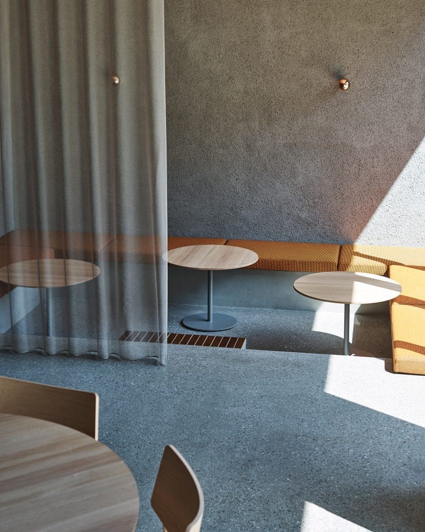
Sheer grey curtain over sunken seating area in Blue Bottle Coffee Shibuya
The seating area is obscured by a translucent grey curtain

More seating types are installed upstairs, including a lowered floor area with banquette seating upholstered in an autumnal orange textile. This space can be sectioned off from the main area by a grey, sheer curtain.

An oval dining table sits in the centre of the space providing a casual and communal dining option. A high counter table with a library-like light allows for quiet groups and singles to sit at the rear of the space.

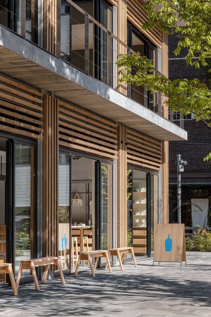
Wooden benches outside coffee shop by Keiji Ashizawa Design
Wooden benches offer seating outside of the cafe

At the far end, a low, tiled coffee table is surrounded by comfortable lounge chairs and sofas upholstered in muted pink fabric.

A textured, brushed mortar finish has been applied to the cafe’s ceiling on the ground floor, and across a wall upstairs to help improve the acoustics in the space.

Timber-clad facade of Blue Bottle Coffee Shibuya
The furniture is in keeping with the buildings timber-clad facade

“When we plan cafes or restaurants, it is essential to think about acoustics,” said Ashizawa. “It is important that you can speak easily and that you can hear the music comfortably.”

“When we first saw the condition of the interior – the floor was made of concrete with glass walls. We definitely thought that we should leave the ceiling some kind of texture to promote sound absorption. At the same time, I thought that creating a feeling of touch in the space would have the effect of relaxing customers in the stressful city of Shibuya, like the greenery of a park.”

“We hope that visitors will enjoy the warm atmosphere as if they had been invited to visit the welcoming house of a close friend,” he concluded.

Photography is by Ben Richard and Masaaki Inoue.

Reference