a brick tower rises from a concrete base inside matteo arnone’s caso attico
CategoriesArchitecture

a brick tower rises from a concrete base inside matteo arnone’s caso attico

casa attico by atelier matteo arnone


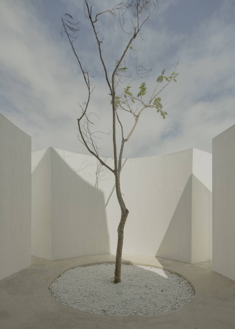
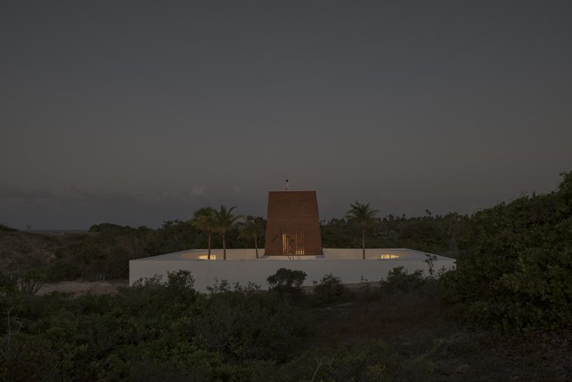
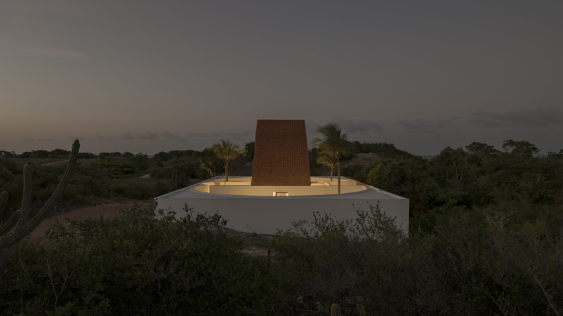
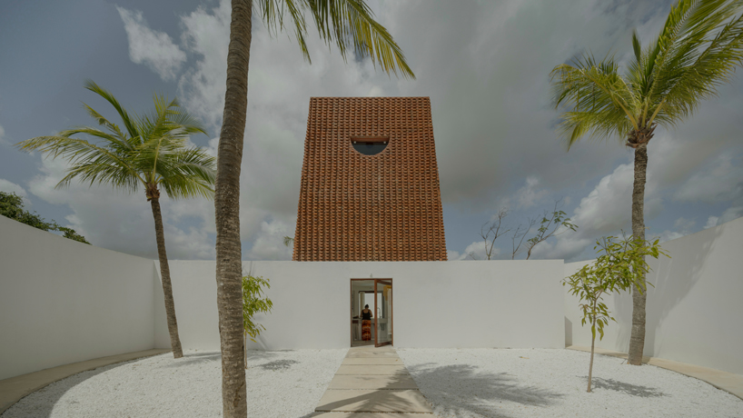
In the north-east of Brazil, on the shore of São Miguel do Gostoso, Casa Attico emerges as one of the recent and characteristic projects of architecture and urban design studio Atelier Matteo Arnone. Made of brickwork and concrete, the residence takes on a unique, circular morphology and position, both influenced by the regional winds. Its concrete foundation reveals an exposed, almost labyrinthine layout with a brick core shaped like a tower that rises just enough from the dunes to capture scenic views of the Brazilian sea, becoming a reference point for the landscape. 
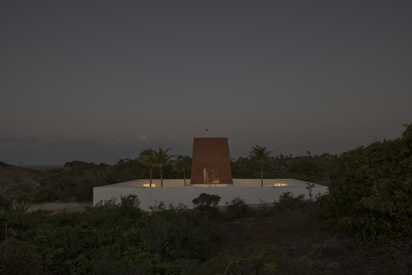
casa attico atelier matteo arnone 2
all images © Federico Cairoli


a sweeping morphology inspired by the movement of wind


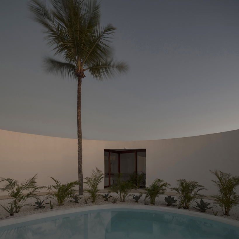
Observing both sections and plans of Casa Attico, one understands Matteo Arnone’s willingness (see more here) to capture the natural ventilation coming from the east and drive it across every corner of the living spaces. On the ground floor, the house is shaped like a wind machine. From the east, the wind penetrates the patios and circulates geometrically according to the shape of the walls, breaking strength and aerating the four symmetric bedrooms. At the tower level, the wind rises in between the two layers of brickwork composing its wall structures. The central kitchen, positioned to overlook four patios, serves as the focal point of the ground floor. Its symmetrical placement creates the core of the house, connecting with the living spaces.
casa attico atelier matteo arnone 3
Casa Attico by Atelier Matteo Arnone rises amid dunes in Brazil


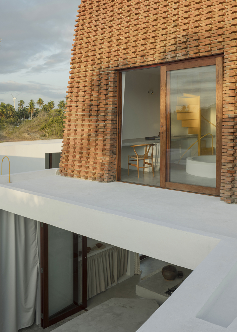
Matteo Arnone and his team mainain visual continuity between the kitchen and first floor of Casa Attico through a circular opening that leads to the living room and office area. ‘As one ascends, a sense of privacy intensifies, offering a feeling of seclusion amidst the expansive natural surroundings. This sensation culminates on the top floor, where a compact space provides a panoramic view of the landscape, allowing for quiet contemplation,’ concludes the architect. 
casa attico atelier matteo arnone 4
a circular morphology inspired by eastern winds
casa attico atelier matteo arnone 7
a brick tower rises from the core

casa attico atelier matteo arnone 5
cicular openings and layouts take over the design of Casa Attico
casa attico atelier matteo arnone 10

Reference

Nameless Architecture creates “artificial valley” at base of Gyeryongsan Mountain
CategoriesInterior Design

Nameless Architecture creates “artificial valley” at base of Gyeryongsan Mountain

Architecture studio Nameless Architecture has completed the Café Teri bakery in Daejeon, South Korea, in a pair of buildings that flow into a central courtyard.

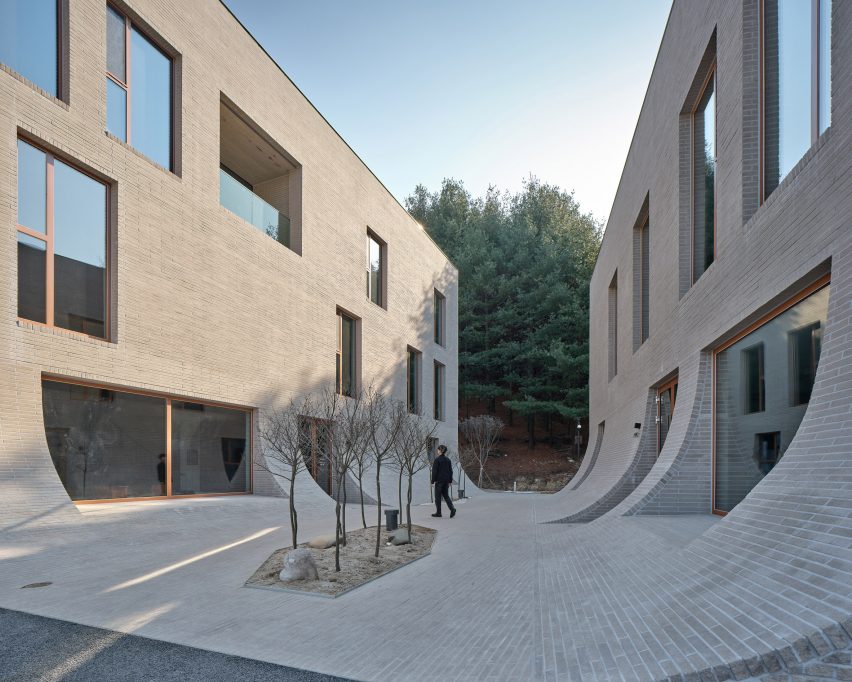
Located at the foot of the Gyeryongsan Mountain in Daejeon, Nameless Architecture designed the two buildings to frame the entrance to a hiking trail that continues up the mountain.

Concrete brick courtyard at Cafe Teri by Nameless Architecture with two facing buildings
The cafe’s courtyard leads onto a hiking trail

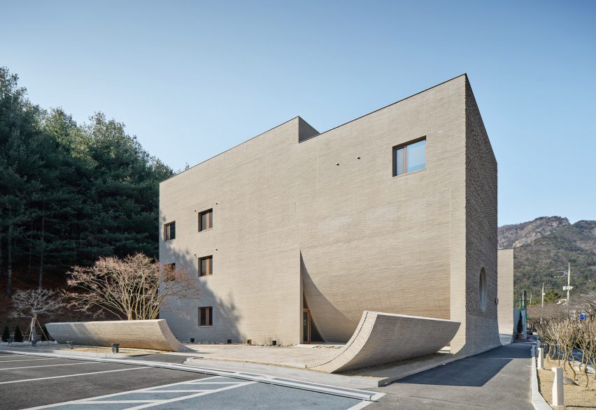
The two rectangular buildings were angled, creating an outdoor space that narrows towards the mountain path. The three-storey building contains a cafe and the two-storey building opposite is a bakery.

“The artificial valley, where the distinction between the wall and the floor is blurred, creates a flow towards the forest and becomes the yard to the cafe and a path for walkers,” Nameless Architecture co-principal Unchung Na told Dezeen.

“We intended the building to become a path and courtyard that guides the flow of nature and visitors rather than blocking the promenade.”

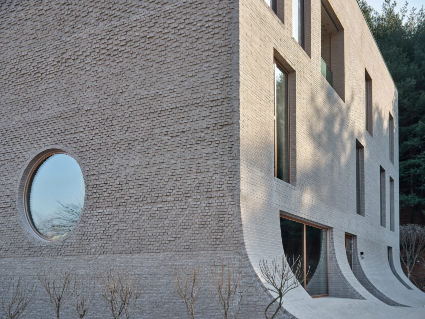
Corner of Cafe Teri by Nameless Architecture with sloping walls
Concrete brick walls slope down into the floor of the courtyard at Café Teri

The 900-square-metre project was finished in concrete bricks, creating a rough texture on the exterior walls.

“The concrete bricks used to construct the architectural topography emphasise the continuity of the flowing space,” said Na.

“On the other hand, the facade wall made of rough broken bricks creates a difference of boundaries through the change of light, shadow, and time.”

Cafe interior with polished concrete walls and sloping wall with concrete brick steps
Nameless Architecture used concrete brick for the interior of the cafe as well as the exterior

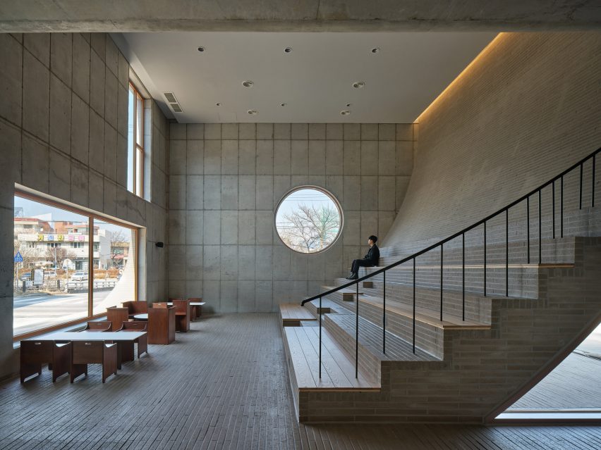
The flowing exterior walls of the project are replicated inside the ground floor of a cafe, where the back wall of a double-height space curves down into stepped seating.

The floor, curved wall and stepped seating inside the cafe were finished in concrete bricks, and the remaining walls were finished in polished concrete.

“The fluid wall is continuous not only in the yard but also in the interior space, connecting the inside and outside scenery through a stepped space,” Na explained.

A backyard area features uplifted terrain that mimics the curved concrete brick walls of the cafe and bakery, which Nameless Architecture designed to provide a spatially interesting place for people to enjoy food outside.

Backyard of Cafe Teri by Nameless Architecture with uplifting elements from the ground
Nameless Architecture used curved walls to create a distinct “architectural topography”

The architecture practice designed the curved elements that appear to emerge from the ground with the aim of blurring the lines between what is wall and floor.

“The basic elements of architecture can be reinterpreted to induce various experiences and actions of people,” said Na.

“In particular, the two elements, wall and floor, are defined as fundamentally different architectural elements, but we tried to reconsider this strict relationship.”

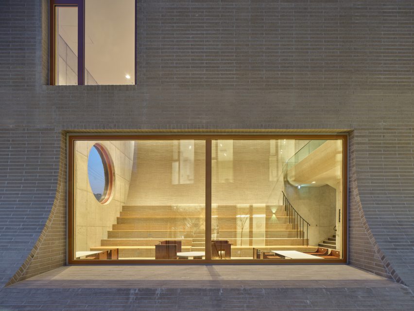
Large glazed window showing the interior of Cafe Teri with sloping back wall of the cafe
The project aims to reinterpret how walls and floors are used as architectural elements

“The mutual relationship in which the wall becomes the floor, and the inside becomes the outside can be interpreted in various ways through the experience of the place,” Na continued.

Other projects recently completed in South Korea include a department store in Seoul with an indoor waterfall and skyscrapers with red-painted steel columns designed by Rogers Stirk Harbour + Partners.

The photography is by Kyung Roh.


Project credits:

Architect: Nameless Architecture
Principals-in-charge: Unchung Na and Sorae Yoo
Project team: Taekgyu Kang, Changsoo Lee and Jungho Lee

Reference