Cake Architecture draws on Bauhaus principles for Hoxton bar
CategoriesInterior Design

Cake Architecture draws on Bauhaus principles for Hoxton bar

Cake Architecture has renovated A Bar with Shapes for a Name, an east London cocktail bar featuring “utilitarian” interiors.

A Bar with Shapes for a Name owes its title to the yellow triangle, red square and blue circle that are emblazoned on its facade in a nod to the primary colours and understated geometry commonly associated with the Bauhaus.
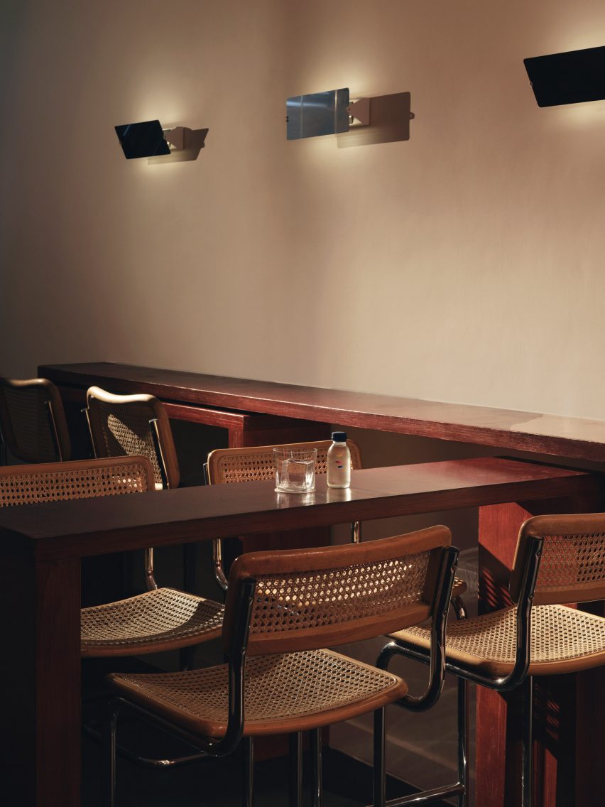
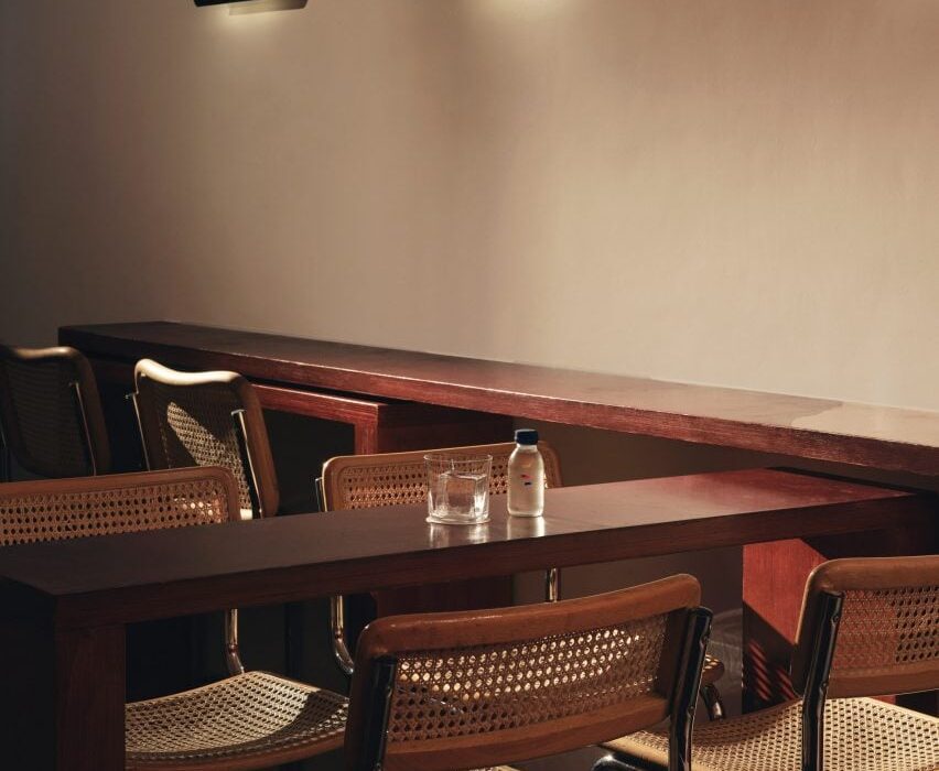
Tall tubular chairs at A Bar with Shapes for a Name by Cake ArchitectureTall tubular chairs at A Bar with Shapes for a Name by Cake Architecture
Tall tubular chairs feature on the ground floor

When creating the bar’s minimalist interiors, Dalston-based Cake Architecture took cues from the influential German art and design school that was established in 1919 and advocated for an emphasis on functionality, among other similar principles.

Located at 232 Kingsland Road in Hoxton, the cocktail bar was renovated by the studio to serve as a multipurpose venue.
Reddish plywood barReddish plywood bar
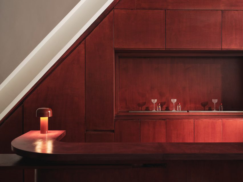
Cake Architecture created a smooth ground-floor bar from reddish plywood

Cake Architecture doubled the bar’s capacity by adding a basement, which acts as a “kitchen-bar” room, and refurbished the ground floor’s existing seating area as well as a classroom-style space that offers a location for rotating events or workshops.

“These spaces have specific functional requirements and we selected colours and materials to suit,” studio director Hugh Scott Moncrieff told Dezeen.
Rectilinear light installation within bar by Cake ArchitectureRectilinear light installation within bar by Cake Architecture
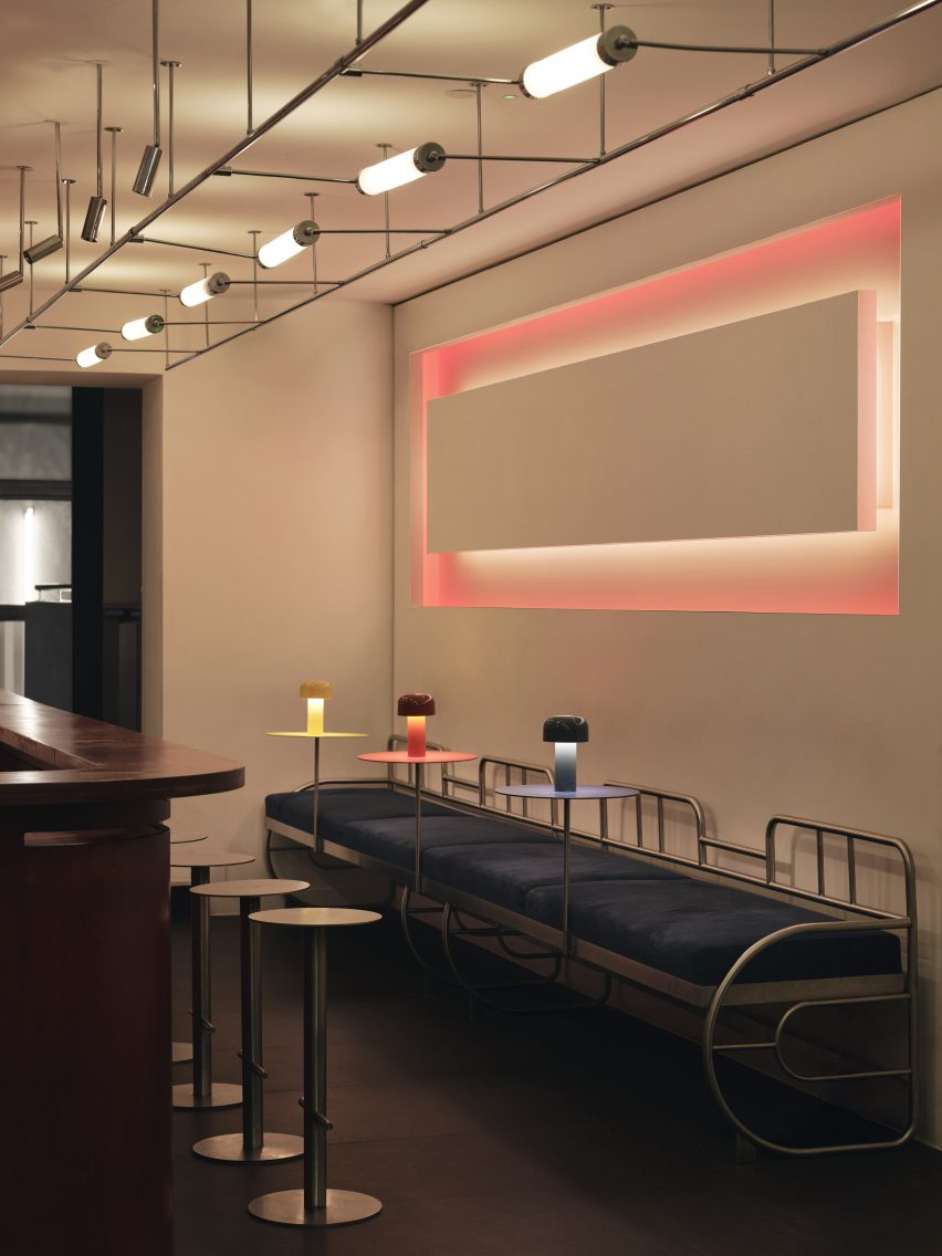
It was positioned opposite a rectilinear light installation

Upon entering the bar, visitors are greeted by the main seating area or “showroom”, which was designed to be warm and inviting.

Tall tubular chairs finished with neutral rattan were positioned around chunky geometric tables made from birch ply stained to a rich, reddish-brown hue.
Glass-topped central table in the basementGlass-topped central table in the basement
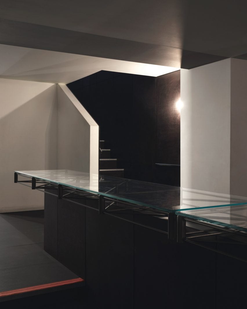
The renovation included the addition of a new basement

The team also used the same timber to create the space’s curving bar, which is illuminated by a squat, cordless table lamp by lighting brand Flos.

Opposite the bar, a glowing rectilinear light installation by photographer Steve Braiden was fitted to the wall underneath bench-style seating reminiscent of early Bauhaus furniture designs.
Close-up of the steel, glass-topped tableClose-up of the steel, glass-topped table
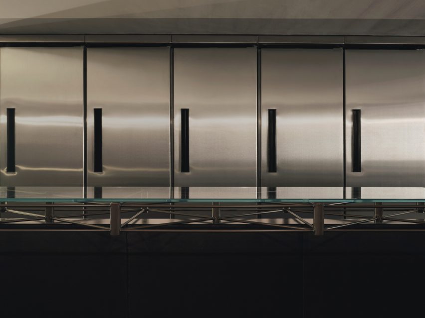
A steel, glass-topped table sets an industrial tone

“We looked in particular at projects by the Bauhaus founder Walter Gropius,” reflected Scott Moncrieff.

“Gropius is a master of this elegant zoning through the application of colour and form,” he added.
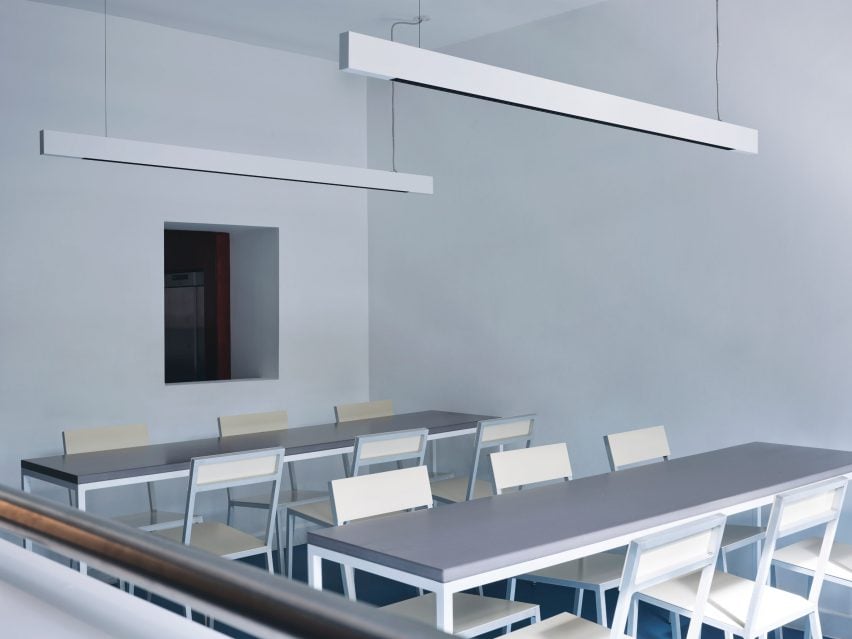
Steel-framed tables in the classroomSteel-framed tables in the classroom
The “classroom” includes steel-framed tables

Downstairs, the low-lit basement was created to house additional seating as well as “all of the crazy machinery they use to prepare the drinks,” the designer said.

The basement is characterised by a bespoke central table by Cake Architecture and furniture designer Eddie Olin.
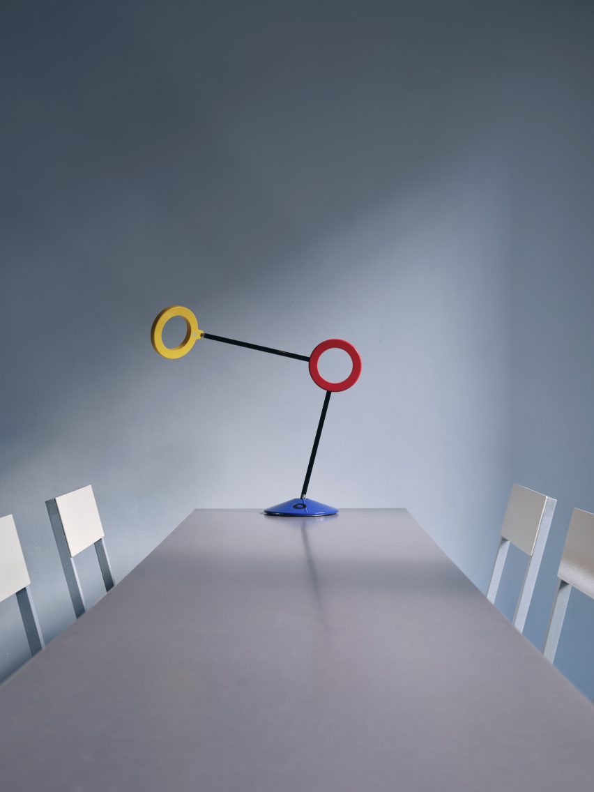
Sculptural, colourful lampSculptural, colourful lamp
Red, yellow and blue accents define a sculptural lamp

Consisting of a steel frame that “floats” over a central leg, the table was topped with a glass surface and its base was clad in phenolic-coated plywood to match the floor and walls.

“This new basement is predominantly a production space – so the palette reflects this with hardwearing, utilitarian and industrial materials,” said Scott Moncrieff.

A thick, felt curtain in ultramarine adds a pop of colour to the otherwise pared-back space.

With its pale blue walls and Valchromat-topped, steel-framed tables, the ground-floor “classroom” pays homage to the Bauhaus as an educational institution.
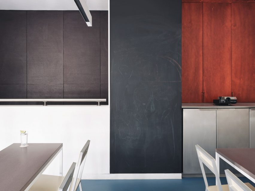
Tall blackboard in the classroomTall blackboard in the classroom
A tall blackboard provides space to learn in the classroom

Brighter blue vinyl covers the floors while a sculptural lamp featuring red, yellow and blue circles echoes the bar’s logo.

A tall blackboard and overhead strip lighting add to the classroom feel of the space, which is used for various group events.
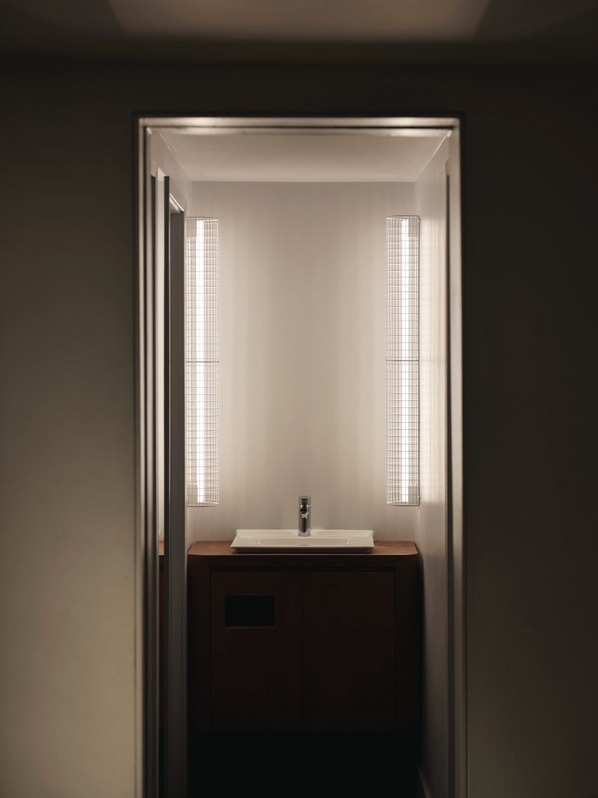
Illuminated bathroom sinkIlluminated bathroom sink
Thin vertical lights frame the bathroom sink

Cake Architecture worked closely with the bar’s founders Remy Savage and Paul Lougrat when creating the interiors, which were primarily informed by the duo’s way of working.

“The team has a conceptually driven ethos drawn from the theory and practice of Bauhaus embedded in everything they are doing. We found that incredibly exciting,” explained Scott Moncrieff.
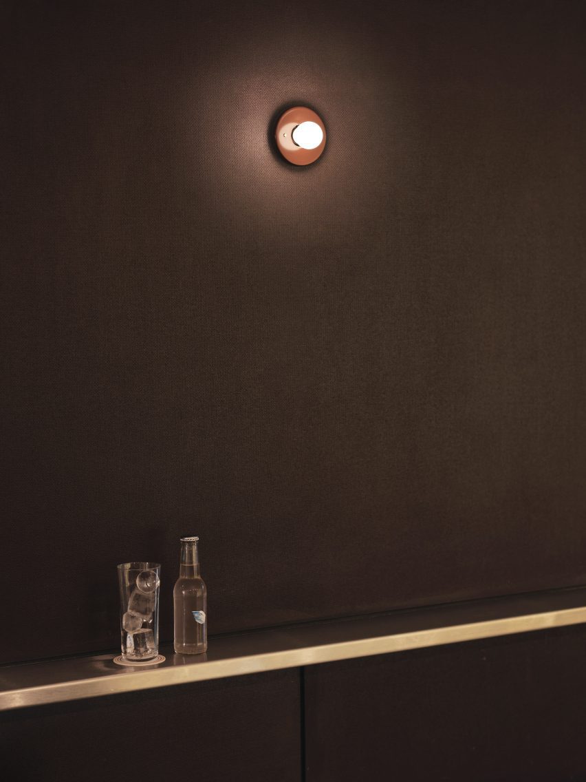
Sconce lighting on the wallSconce lighting on the wall
A Bar with Shapes for a Name is located on London’s Kingsland Road

“The Bauhaus phrase ‘party, work, play’ was pertinent to some early ideas and this carried through all our design discussions,” noted the designer.

“The space enables these three things. Separately as individual functions and simultaneously as a representation of the overall atmosphere of a bar!”

Cake Architecture previously worked with interior designer Max Radford to create a curtain-wrapped speakeasy in London’s Soho. The studio also designed a workspace for London agency Ask Us For Ideas in the same part of the city.

The photography is by Felix Speller


Reference

Ten Bauhaus interiors that draw on the principles of design school
CategoriesInterior Design

Ten Bauhaus interiors that draw on the principles of design school

A hotel that pays tribute to early German modernism and an apartment within a ski resort designed by architect Marcel Breuer are among the projects collected in our latest lookbook, which explores interiors informed by the Bauhaus.

The most influential art and design school in history, the Bauhaus’ was established in Germany in 1919 and although it closed just over a decade later continues to influence interior designers today.

Work produced by students and teachers during the school’s 14-year history, centred on founder Walter Gropius’ ethos that art and craft should marry to create a new architecture.

The below projects feature distinctly Bauhaus elements including chrome tubular chairs, geometric shapes, primary colours and abstract textiles.

This is the latest in our lookbooks series, which provides visual inspiration from Dezeen’s archive. For more inspiration see previous lookbooks featuring living rooms that use warm neutrals to create a cosy ambience, bedrooms with wardrobes that are disguised as walls and contemporary living rooms in Georgian and Victorian homes.


Interiors of Flaine holiday apartment, revamped by Volta
Photo is by Arthur Fechoz

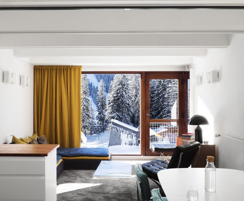
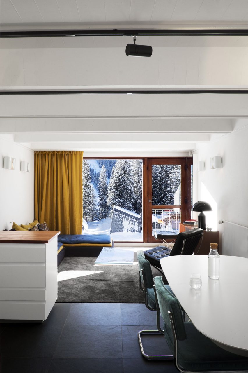
Cassiopeia Apartment, France, by Volta

Tasked with reviving the “Bauhaus spirit” of this apartment set within a Breuer-designed ski resort, architecture studio Volta added soft furnishings in mustard yellows and royal blues, referencing the colour palette of movement.

Armchairs with steel frames that resemble Breuer’s Wassily Chair have also been used to decorate the living room.

“The Bauhaus movement was predominant in the design of the project,” said the studio. “It has influenced its history, its choice of materials and its furniture. The challenge was to revive its influences in a contemporary context.”

Find out more about Cassiopeia apartment ›


De Maria by The MP Shift
Photo is by Nicole Franzen

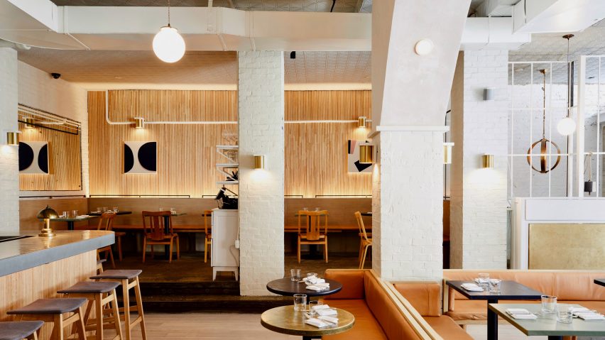
De Maria, US, by The MP Shift

Design studio The MP Shift wanted De Maria, a contemporary American restaurant in Manhattan’s Nolita neighbourhood to look like an artist’s studio, complete with white brickwork and pink-tinted plaster.

The studio paid tribute to Bauhaus and 1970s Soho style by adding sofas upholstered in tan-coloured leather, orb-shaped pendant lamps and simple pieces of art with triangular shapes.

Find out more about De Maria ›


Nadzieja restaurant designed by Agnieszka Owsiany Studio
Photo courtesy of Agnieszka Owsiany Studio

Nadzieja, Poland, by Agnieszka Owsiany Studio

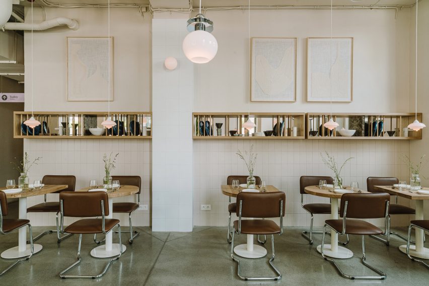
Design influences from the Bauhaus collide with Israeli flavours at Nadzieja, a restaurant in Poznań, Poland designed by local studio Agnieszka Owsiany Studio.

Filled with brown-leather chairs with tubular steel frames, high granite ivory counters and spherical pendant lights, the eatery has a bright and warm interior that draws parallels with the large number of Bauhaus buildings found in Tel Aviv.

Find out more about Nadzieja ›


Schwan Locke hotel Munich by Fettle
Photo is by Edmund Dabney

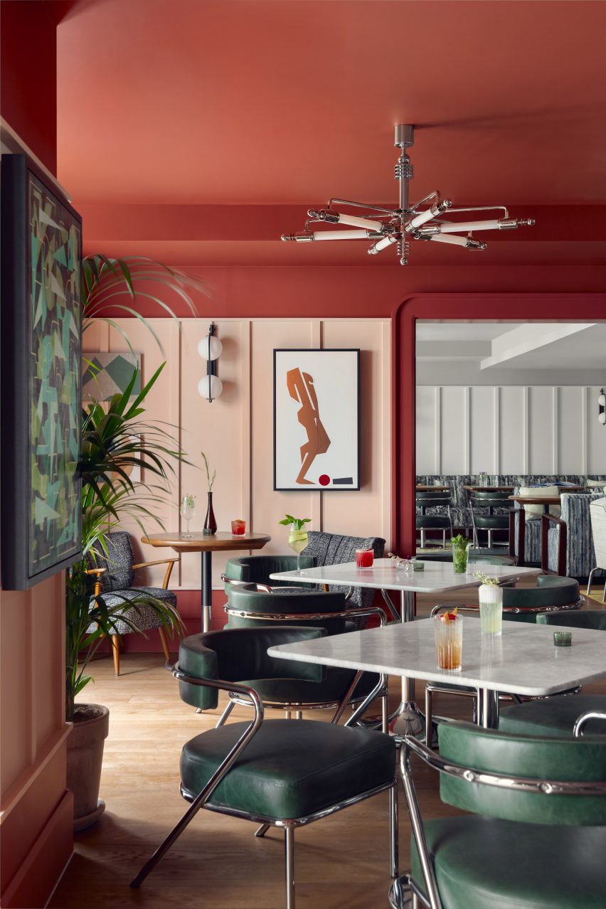
Schwan Locke Hotel, Germany, by Fettle

Influenced by the work of proto-Bauhaus association Deutsche Werkbund, design studio Fettle wanted the interiors of aparthotel Locke to be at once nostalgic and distinctly contemporary.

Its 151 apartment rooms feature a combination of light timber, raw plaster, chrome, steel and mohair materials set against a colourful yet muted pink and green backdrop.

Find out more about Schwan Locke hotel ›


A living room with a geometric rug
Photo courtesy of Kasthall

Quilt by Ellinor Eliasson

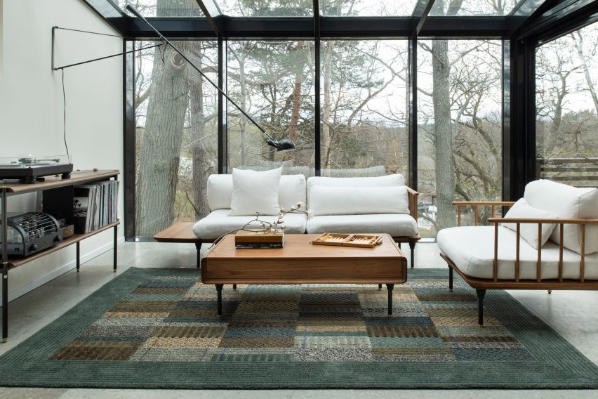
In this living room, Swedish designer Ellinor Eliasson’s tufted rug acts as a centrepiece and gives the space a warm and richly textured look.

The graphic, modernist rug recalls the work of renowned Bauhaus weaving workshop teacher Anni Albers, who is best known for her textiles and recognisable lines, colours and forms.

Find out more about Quilt ›


Members' Club areas divided by metal shelving
Photo is by Andrew Joseph Woomer

Soho House Nashville, US, by Soho House

At the Soho House in Nashville, guests can enjoy a taste of the city’s musical heritage while uncovering the building’s industrial past as a knitting mill.

Designed to feel warm and rich, much like the rock and roll, jazz and blues music that Nashville is known for, the accommodation features bespoke lamps, brassy industrial finishes and plenty of tubular decor to create an industrial interior that still feels modern.

Find out more about Soho House Nashville ›


53 West 53 by Andre Fu 36B
Photo is by Stephen Kent Johnson

53 West Apartment, US, by André Fu and AFSO

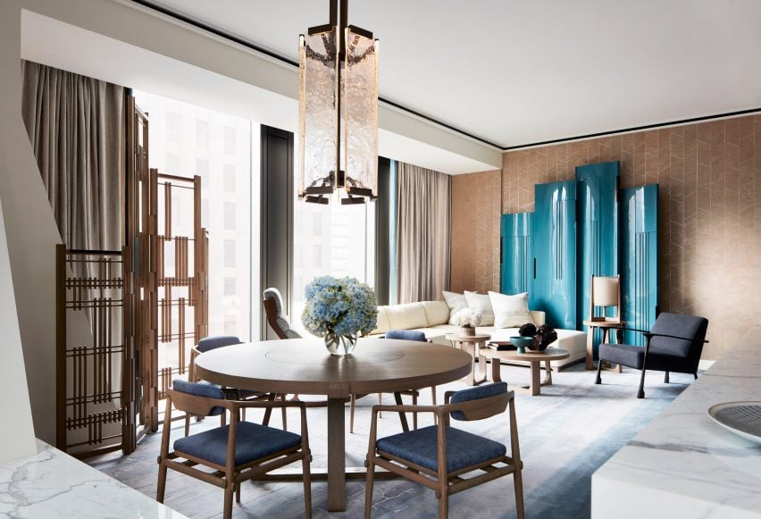
Architect André Fu and his Hong Kong studio AFSO referenced the geometric designs of the Bauhaus school for 53 West Apartment, a model unit set within architect Jean Nouvel’s New York tower block.

The two-bedroom apartment is peppered with sculptural pieces of furniture such as a room divider comprised of dark wood and rods, which compliments the existing walnut doors and oak floors and cabinets.

Find out more about 53 West Apartment ›


RP House by Estudio BG
Photo is by Fran Parente

RP House, Brazil, by Estúdio BG

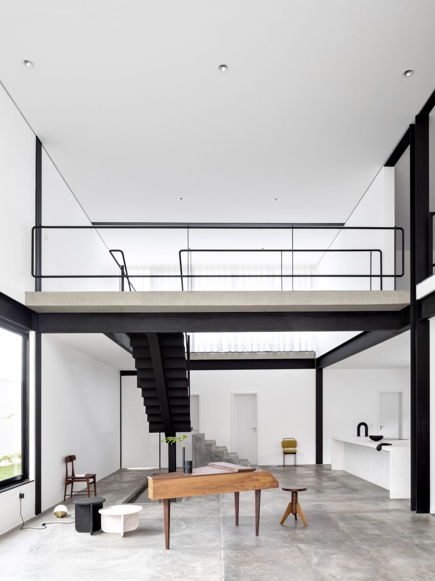
Inside this stripped-back two-storey residence called RP House, black steelwork, bare walls and simple white volumes stacked on top of each other come together to create a sparse yet light-filled Brazilian home.

São Paulo studio Estúdio BG said that the design referenced the principles of repeatability and standardisation advocated by designers of the Bauhaus.

“This 1920s movement was characterised by the replication of design in an industrial format,” the studio said. “The simple geometric volume, the elimination of decorative elements and the use of the roof as terraces reinforce the principles adopted in the project.”

Find out more about RP House ›


Dome House by Pavlina Williams
Photo is by Krista Jahnke

Palm Springs Dome House, US, by Pavlina Williams

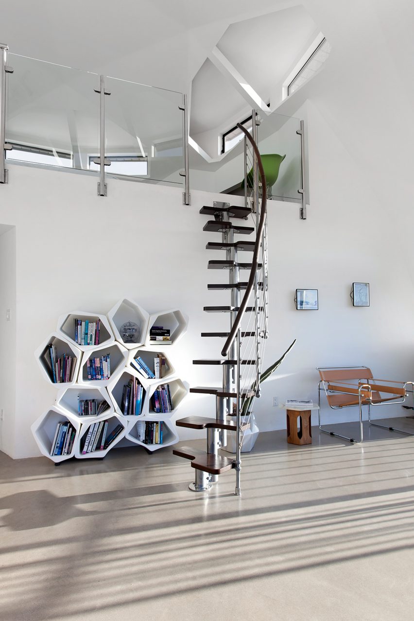
Los Angeles-based architect Pavlina Williams added multiple windows and knocked down several walls in her renovation of this Californian house, transforming it from a gloomy residence into a desert sun trap.

In the open-plan living area, a caramel leather Wassily Chair by the Hungarian architect and designer Breuer sits alongside a spiral stainless-steel staircase that leads up to a loft.

Find out more about Palm Springs Dome House ›


KaDaWe department store in Berlin
Photo is by Derek Hudson

KaDeWe, Germany, by India Mahdavi

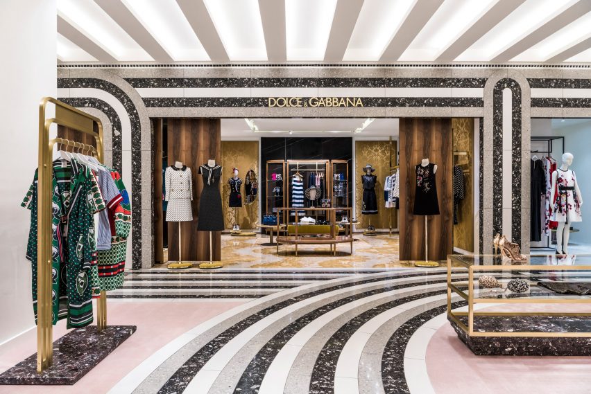
French architect India Mahdavi borrowed from the Bauhaus’ preoccupation with strong graphic lines and shapes in her renovation of department store KaDeWe by adding sweeping black, white and grey stripes of Santa Margherita to the floor of the womenswear section.

Elsewhere in the 2,000-square-metre shopping space, pink carpeting is set off against triple-tiered, brass clothes rails and olive green and dusty pink velvet curtains.

Find out more about KaDeWe ›

This is the latest in our lookbooks series, which provides visual inspiration from Dezeen’s archive. For more inspiration see previous lookbooks featuring bathrooms where the sink takes centre stage, homes with arched openings that add architectural interest and bookshops designed to enhance the browsing experience.

Reference