Beauty in the Grain: How a Colorado Mountain Home Was Brought to Life With Redwood Cladding
CategoriesArchitecture

Beauty in the Grain: How a Colorado Mountain Home Was Brought to Life With Redwood Cladding

A home’s materials tell a story of how we live. Nestled in the picturesque mountains of Colorado stands a remarkable testament to sustainable material sourcing. Brought to fruition by Colorado Springs-based architect-engineer Scott Harvey, this mountain home was made to connect with the natural surroundings as an expansive and open retreat. In turn, the project’s redwood cladding reflects a family’s values as they built a home of their own.

A Family Home in the Mountains

Located in the mountains north of Colorado Springs in the town of Monument, this home was made for an active family with five children. The family was hoping for a home that embraced natural light and views out onto the landscape. Working together with builder Palmer Ridge Construction, the team brought the new, 10,538 square-foot home to life with seven bedrooms and expansive glazing. Outside, the home features an unadorned stucco finish and a continuous, seamless band of wood cladding. This warm, redwood band runs non-stop from the exterior through the interior.

The Colorado Mountain Home features an extensive use of redwood from Humboldt Sawmill. Humboldt Sawmill manufactures a full line of redwood and Douglas-fir wood products. Logs are sourced from nearly 450,000 acres of company-owned timberlands, where harvest levels are consistently below the forests’ annual growth rate and harvested trees are replanted. Logs are then processed into lumber.

For this home, the builder had Humboldt Sawmill transport the raw lumber to a dealer in Colorado where it was milled locally to the desired shiplap pattern. Local availability kept the cost within budget. In addition, it was easier to install than tropical hardwoods and no stain was required; only two coats of clear sealer. Redwood, known for its durability, beauty and sustainability, adds warmth to the design and creates a seamless transition from the interior to the exterior of the home.


Sustainable Sourcing
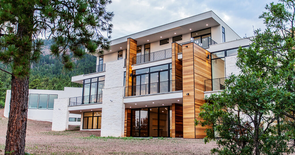
Photo by Kelly Edmondson

What sets this mountain home apart is not just its design but also its commitment to sustainability. The redwood from Humboldt Sawmill was sourced from company-owned Forest Stewardship Council® (FSC® C013133) certified timberlands in Northern California, where it is grown and harvested to the highest environmental standards in the world. FSC certification ensures that products come from forests that provide environmental, social and economic benefits. The FSC Principles and Criteria provide a foundation for all forest management standards globally, including the FSC® US National Standard (v1.0) that guides forest management certification in the U.S.

This commitment to sustainability not only reduces the home’s carbon footprint but also supports the conservation of forests for future generations.


Key Properties of Redwood
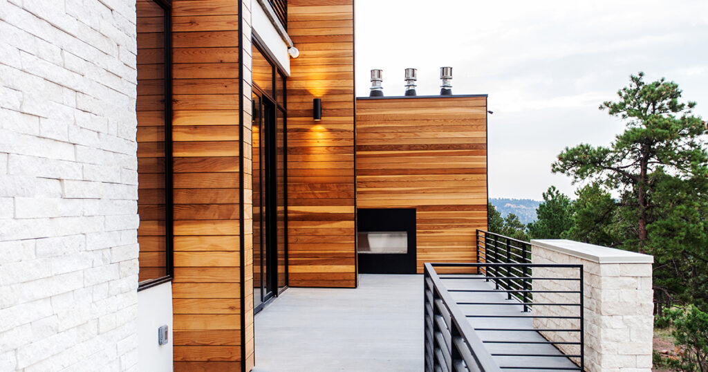
Photo by Kelly Edmondson

Redwood is renowned for its natural beauty and resilience, making it an ideal choice for this mountain home. Redwood is also native to the U.S., not imported. There are several key properties of redwood that make it a preferred building material:

Durability: Redwood heartwood from the center of the tree is naturally resistant to decay and insects, making it an excellent choice for outdoor applications such as siding, decking and fencing. As the team for the Colorado Mountain Home explain, “natural durability through tannins in the redwood heartwood render the wood resistant to termites and decay, an important factor in the home’s mountain environment.”

Aesthetic Appeal: Redwood’s rich color and grain patterns add a touch of elegance and warmth to homes and commercial projects alike. Its natural beauty only enhances over time, developing a patina that adds to the charm of a building.

Sustainability: Redwood is a renewable resource, with the ability to regrow from the stump after harvesting. When sourced from responsibly managed forests, redwood is a sustainable building material that helps reduce the environmental impact of construction.

Workability: Redwood is easy to work with, making it a favorite among architects and builders. It can be easily cut, shaped and installed, allowing for intricate designs and detailing that enhance the overall aesthetics of the home.


Built to Last: A Home for Future Generations
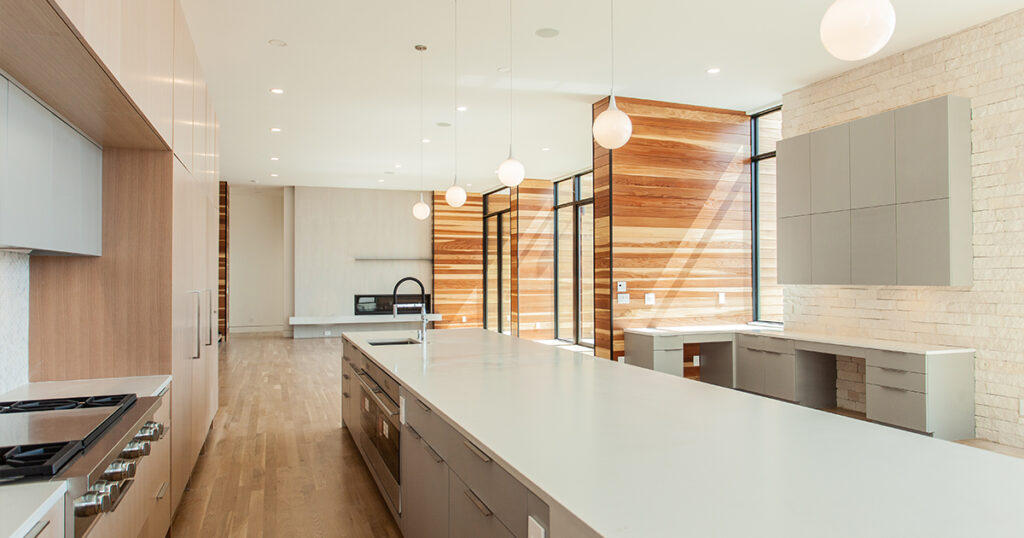
Photo by Kelly Edmondson

At the heart of this Colorado home is the contrast between materials: the natural white Brauer veneer stone and stark white stucco stand out against the warmth of the redwood. Expansive windows open up to views of ponderosa pines and scrub oaks, while inside, the home features white oak flooring and custom cabinets. From these rooms, multiple patios and decks flow together to bring the family outside and create connections to their surroundings.
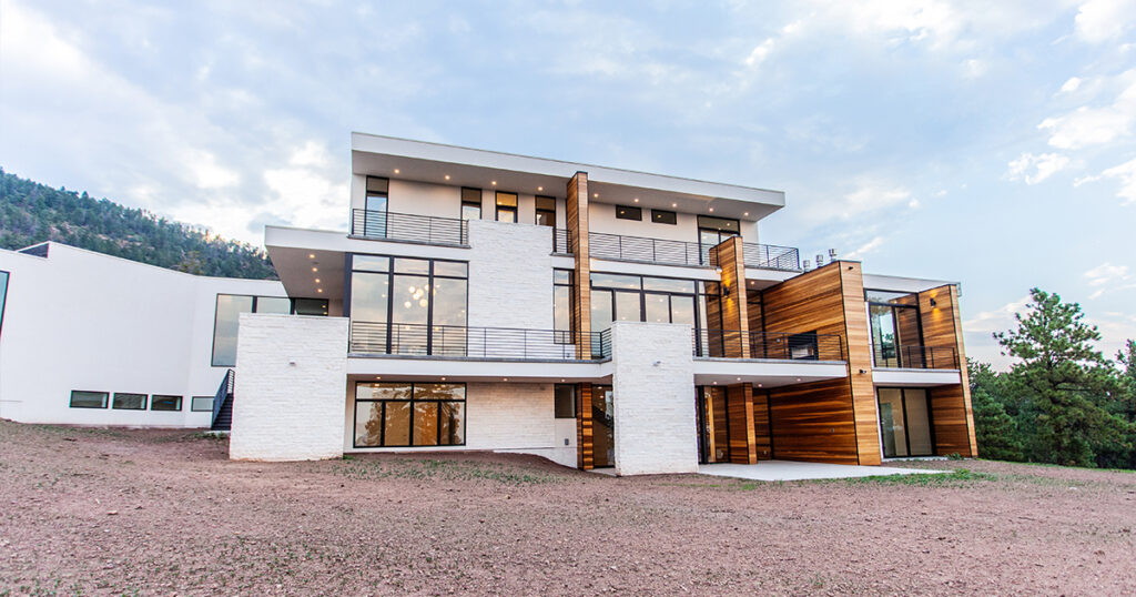
Photo by Kelly Edmondson

The Colorado mountain home stands as a testament to the harmonious relationship between nature and design. Through the use of Humboldt Sawmill’s redwood sourced from responsibly managed forests, this home not only showcases the beauty and durability of this remarkable material but also highlights the importance of working with the right manufacturers and builders. Today, the home tells a story of family, warmth and connectedness through its details and construction.

To learn more about how you can harness the unique qualities of redwood for your next project, reach out to the experts at Humboldt Sawmill.

Reference

Commoncraft draws on “beauty in imperfection” for New York cafe
CategoriesInterior Design

Commoncraft draws on “beauty in imperfection” for New York cafe

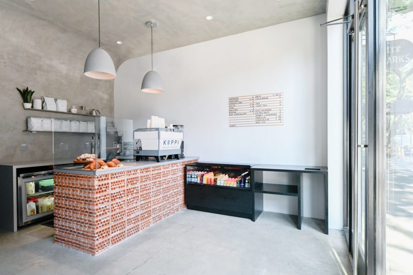
Distressed concrete, rowlock bricks and worn plasterwork create an intentionally unfinished appearance at this cafe in New York City’s East Village neighbourhood, designed by Brooklyn studio Commoncraft.

For its expansion into Manhattan, New Jersey-based Kuppi Coffee Company secured a 350-square-foot space on bustling St Marks Place – its second location.

Cafe with concrete walls, ceiling and floorCafe with concrete walls, ceiling and floor
Textured concrete plaster envelops the interior of Kuppi Cafe in the East Village

The compact interior has just enough space for a customer area and the cafe counter, plus a prep area and a WC for staff at the back.

Commoncraft approached the front-of-house space with an ethos akin to wabi-sabi, the Japanese art of “flawed beauty”.

Cafe counter faced with rowlock-course bricksCafe counter faced with rowlock-course bricks
Commoncraft chose materials for the space that appear purposefully rough and unfinished

“Employing a range of rough and raw materials, Commoncraft’s design of Kuppi Cafe seeks out the beauty in imperfection,” said the studio, which was founded by Zach Cohen and Tony-Saba Shiber.

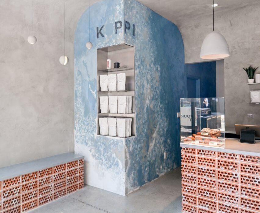
Textured concrete plaster curves up from two perpendicular walls and over the ceiling, enveloping the room together with the concrete floor.

Concrete interior with small brick bench against a wallConcrete interior with small brick bench against a wall
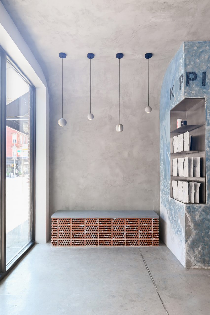
The compact space features a small bench for customers awaiting their orders

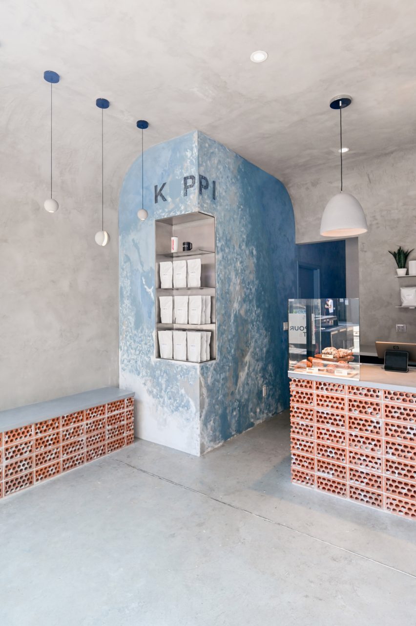
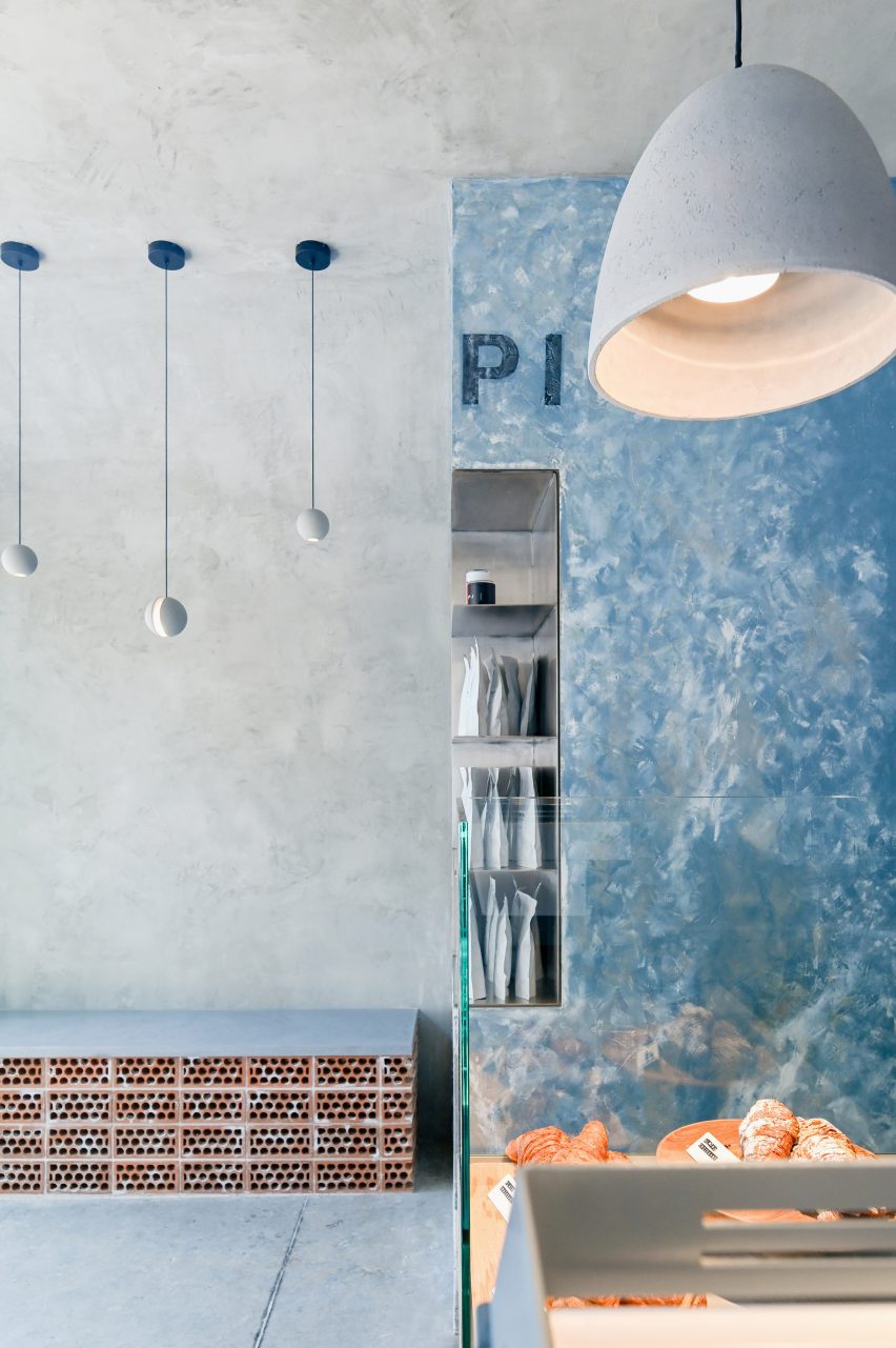
Where these walls meet, a vertical element is wrapped in bluish plaster that’s peeling away to reveal a whitewash beneath.

The Kuppi logo is applied faintly at the top, and stainless-steel shelves for displaying merchandise are cut into part of the pillar’s corner.

Brick cafe counter facing a glass facadeBrick cafe counter facing a glass facade
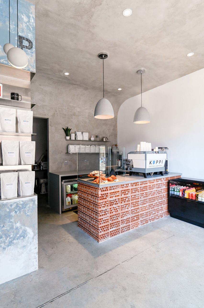
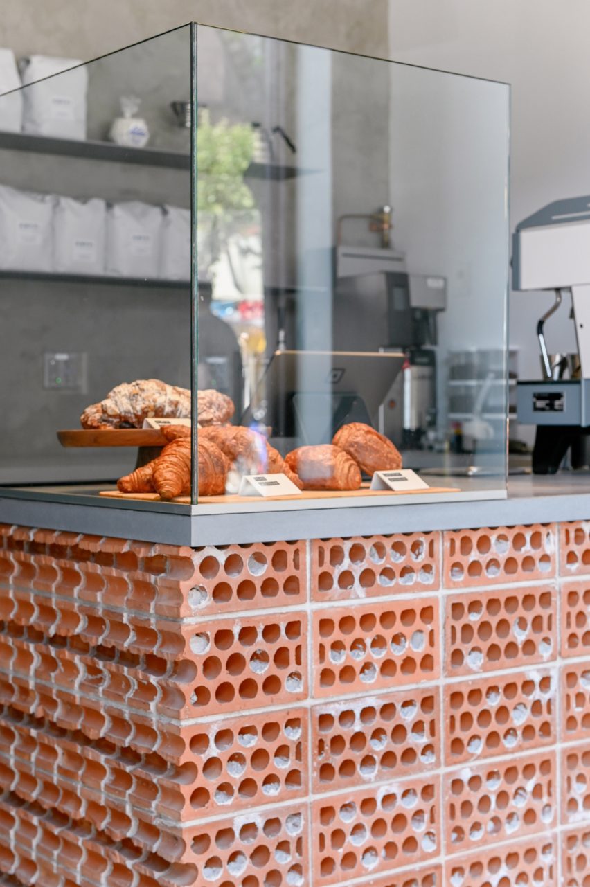
The cafe counter is faced in bricks stacked on their sides to expose their “guts”

Zones for customer interaction – including the service counter and a small bench – are defined by terracotta bricks, which are stacked on their sides in rowlock courses “to expose their core and mortar ‘guts’.”

“Each terracotta volume is terminated by a course of cut bricks, further revealing the rough, imperfect cores,” Commoncraft said.

In such a compact space, the designers have ensured that their concept carries through each of the cafe’s elements.

“The material honesty of the space is further reinforced by a number of small details,” said Commoncraft.

A corner element is wrapped in bluish plasterA corner element is wrapped in bluish plaster
A corner element is wrapped in bluish plaster that’s distressed to reveal a whitewash underneath

These include floating stainless steel shelves behind the counter, a freestanding glass splash guard for baked goods and spherical concrete pendant lights suspended at different heights above the bench.

The cafe is highly visible from the high-traffic street through its fully glazed facade.

A counter terminated by a course of cut bricks, with a glass enclosure for pastries on topA counter terminated by a course of cut bricks, with a glass enclosure for pastries on top
The counter is terminated by a course of cut bricks

New York City is home to thousands of cafes and coffee shops, including many independent establishments with unique interiors intended to entice customers inside.

Among them is another Commoncraft project: a Williamsburg eatery named Gertie designed as a playful tribute to the owner’s grandmother.

The photography is by Andrew Fu.


Project credits:

Client: Kuppi Coffee Company (Kevin and Vivian Kim)
Architecture and interior design: Commoncraft
Plumbing engineer: Alan R Schwartz
General contractor: LTI Construction Corp

Reference

Bark to beauty: forest byproducts for cosmetics, food, and chemicals 
CategoriesSustainable News

Bark to beauty: forest byproducts for cosmetics, food, and chemicals 

Spotted: One part of the UN FAO’s (Food and Agricultural Organization) forestry programme is the “conservation and sustainable use of forests to enhance forest-based livelihoods.” In this spirit, Finnish materials technology company Montinutra has created a chemical-free extraction process for valorising forestry waste.

Using Pressurised Hot Water Extraction (PHWE), the company transforms forest industry side streams into valuable new ingredients for the cosmetics, food and beverage, and chemical industries. Sawdust and bark are two of the most common waste products in the forestry, and with Montinutra’s inexpensive, efficient extraction process, businesses can turn a byproduct with little value into a new income stream. 

The bioactive compounds that come from wood waste are highly valuable ingredients. When they are used in place of petrochemical-based materials, manufacturers reduce production emissions while improving the health of their products. In cosmetics, for instance, wood sugars provide emulsifying, SPF-boosting, and antioxidant qualities, and the ingredients can be used in industrial applications as binders, coatings, and fillers.  

The extraction process works with many different types of feedstock, and the machinery and hardware are modular, transportable, and use closed-loop water circulation and energy recovery. That makes it easy for lumberyards and other forestry businesses to integrate a new system into existing infrastructure while improving the overall sustainability of their operations. The minimal amount of material left over after extraction can then be used for biofuel. 

Montinutra’s pilot plant in Turku, Finland, proved the viability of the technology, and the company is now in the planning stages for its expansion to industrial-scale manufacturing capabilities by 2026. Following recent funding, the company hopes to quicken its international expansion and is also looking to soon rebrand as ‘Boreal Bioproducts’.

In Springwise’s database, other innovations centred on upcycling sawdust include using the material for 3D printing and building new beehives that help the insects survive winters.

Written By: Keely Khoury

Reference

Yinka Ilori imbues Courvoisier bar with natural beauty of Cognac region
CategoriesInterior Design

Yinka Ilori imbues Courvoisier bar with natural beauty of Cognac region

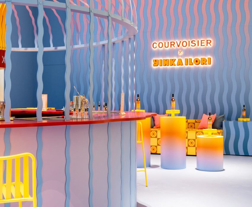
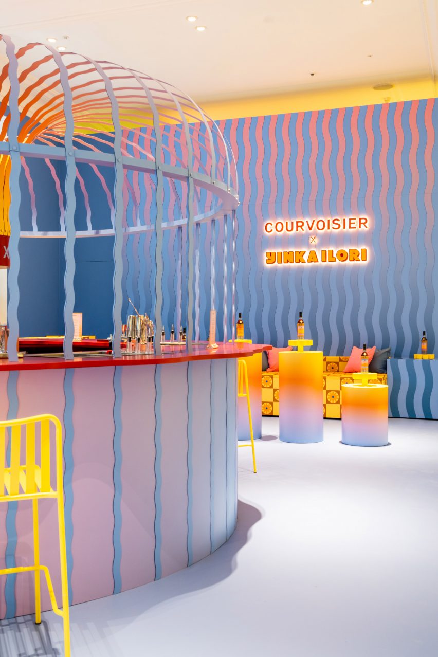
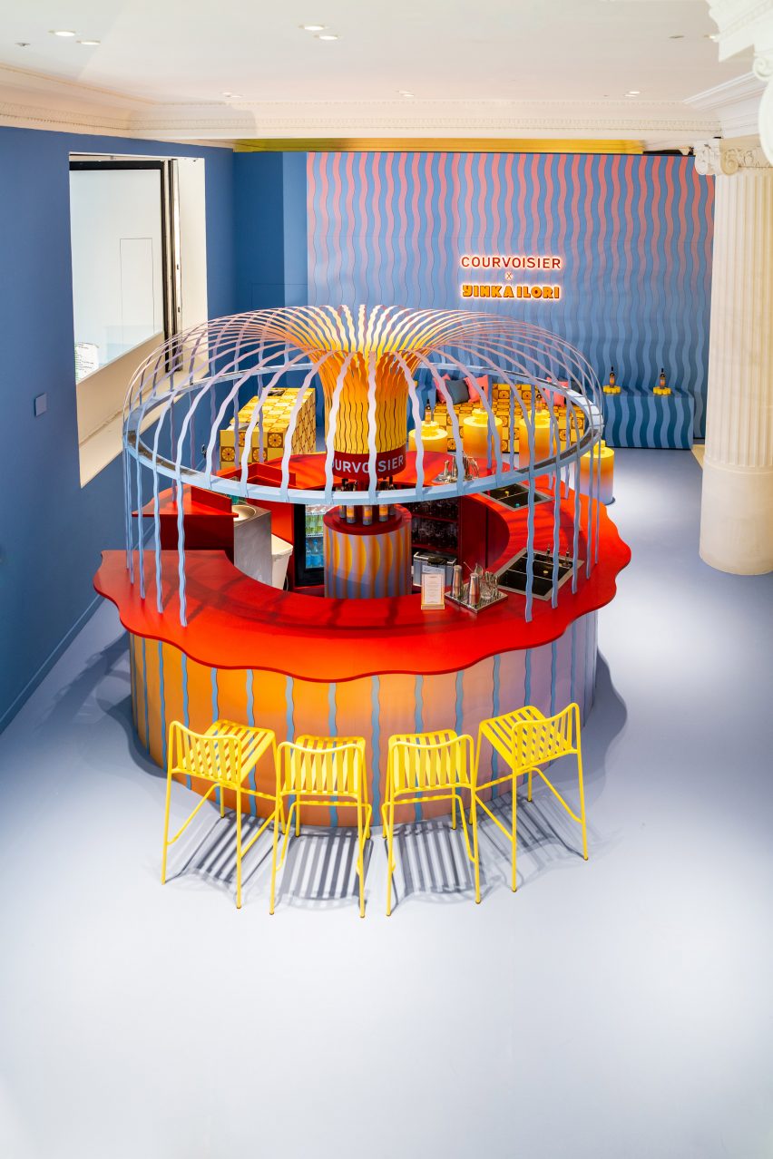
A wavy canopy emerges like a fountain from this pop-up cognac bar inside Selfridges in London, designed by local designer Yinka Ilori to mimic the glistening waters of the Charente river in France’s Cognac region.

The bar belongs to cognac brand Courvoisier and was designed to capture its hometown of Jarnac and the surrounding region, where cognac brandy is made using white grapes from one of six designated “crus” or areas.

Bar and seating area in Courvoisier pop-up bar at Selfridges designed by Yinka Ilori
Courvoisier has opened a pop-up bar at Selfridges

Ilori wanted to bring this bucolic setting to London’s Selfridges department store, using it to inform the colours and patterns featured throughout the space.

“I aimed to capture the essence of Jarnac – the warmth of the sun, the rippling of water, the beautiful wildflowers and the natural beauty in the surroundings,” he told Dezeen.

“The design pays homage to the magic and nature of Jarnac, creating a space that embodies its spirit.”

Seating area in Selfridges cognac bar pop-up
The interior was designed by Yinka Ilori

The town’s location on the Charente river is the most prominent influence, seen across the pale-blue floors, the sinuous rippling pattern on the walls and, most importantly, in the bar itself.

Here, a circular counter was topped with a wavy blue canopy that seems to pour out of a central pillar, with the same pattern continuing down onto the base.

Courvoisier VSOP bottle designed by Yinka Ilori
Ilori also designed a limited-edition VSOP bottle for the brand

“I wanted people to feel like they were surrounded by water, with it flowing both above and below them, creating a sense of immersion and tranquillity,” Ilori said.

“The design of the canopy aims to reference the effortless flow of water, making visitors feel as though they are in the midst of a serene river.”

The bar’s scalloped countertop picks up on the sinuous shape of the waves but provides a colourful contrast thanks to its lacquered red finish.

Another reoccurring feature throughout the space is a cartoonish flower shape that nods to Jarnac’s wildflower fields and is found across drinks stands and upholstered benches in the seating area.

To create a visual connection between the blue waves and the buttercup-coloured flowers, Ilori incorporated a sunset gradient that fades from yellow to soft lilac and envelops several cylindrical display stands as well as the base of the bar.

“I was struck by the gradients in the sky in Jarnac and wanted to capture this unique visual,” Ilori said.

Seating area of pop-up bar at Selfridges designed by Yinka Ilori
A wavy pattern features across the walls

These three repeated motifs, spanning earth, sky and water, also feature in the limited-edition bottle design that Ilori created for Courvoisier’s Very Superior Old Pale (VSOP) cognac.

The bottles are available in four different ombre colours and displayed throughout the bar, which will stay open for three weeks until 11 September.

Overhead shot of circular bar inside Courvoisier pop-up bar at Selfridges designed by Yinka Ilori
The same pattern is picked up in the canopy of the bar

The project forms part of Ilori’s ongoing collaboration with Courvoisier as the brand’s “ambassador of joy”.

Last year, the designer created an immersive dining for Courvoisier in New York, designed to transport diners into a surrealist interpretation of Jarnac.

Ilori’s colourful work is often considered as part of the New London Fabulous movement and includes a colourful skate park in Lille and The Colour Palace pavilion at the London Festival of Architecture.

Reference

Indigenous-owned beauty brand makes toxic lip gloss to highlight clean water crisis
CategoriesSustainable News

Indigenous-owned beauty brand makes toxic lip gloss to highlight clean water crisis

Spotted: For June’s Indigenous History Month, Cheekbone Beauty launched a social-driven ‘#GlossedOver’ campaign with the help of agency Sid Lee. Cheekbone Beauty is a Canadian, Indigenous-owned beauty brand that makes vegan and sustainable cosmetics. The campaign recognised the struggles First Nations and Indigenous communities have faced for access to clean drinking water – a hot-button issue in the last three Canadian federal elections.

As part of the campaign, Cheekbone Beauty is releasing a line of lip gloss made using water from Indigenous communities in Canada. The twist? The lipgloss cannot actually be sold because the water is so contaminated.

With names like ‘Lucious Lead’ and ‘E.Coli Kiss’, the Cheekbone Beauty lip glosses are sure to get people talking—and thinking—about why anyone should have to put contaminated water to their lips.

Cheekbone’s mission is to make ‘a difference in the lives of Indigenous youth through donations addressing the educational funding gap, and to create a space in the beauty industry where Indigenous youth feel represented and seen’. To date, the brand has donated over CAD$150,000 (around €110,000) to a variety of non-profit organisations across North America.

Innovations spotted by Springwise that tackle contaminated water include a mobile filtration system that provides affordable clean water, a green technology to treat industrial wastewater, and kombucha used to remove e-coli from water.

Written By: Katrina Lane

Website: cheekbonebeauty.com

Contact: cheekbonebeauty.com/pages/contact-us

Reference