PSLab’s monochromatic Berlin showroom is a “sacred place for light”
CategoriesInterior Design

PSLab’s monochromatic Berlin showroom is a “sacred place for light”

A pared-back palette of raw materials creates a calm backdrop for PSLab’s lighting products inside the brand’s Berlin workshop and showroom space, designed in collaboration with Belgian firm B-bis architecten.

The newly opened studio occupies the ground floor and basement of a 1907 residential building in the city’s Charlottenburg district.

Entrance of PSLab's Berlin studioEntrance of PSLab's Berlin studio
PSLab has opened a new workshop and showroom in Berlin

PSLab, which designs and manufactures light fixtures for architectural projects, set out to create a showroom where customers can experience lighting effects in a home-like environment.

“PSLab is not a digital platform where clients pick and buy products,” the company’s founder Dimitri Saddi told Dezeen. “Therefore the physical space as a ‘home’ is most important for one-on-one communication.”

“In Berlin, as with all our studios, we wanted to design a canvas to show the quality of our light and to show the process of our bespoke design approach by integrating a material library of endless opportunities and possibilities.”
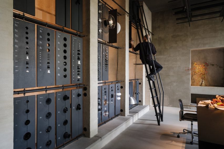
Library of materials inside lighting showroom by B-bis architectenLibrary of materials inside lighting showroom by B-bis architecten
The space includes a materials library with a movable ladder

Working together with B-bis architecten, the design team looked to create a contemporary space that contrasts with Charlottenburg’s classical architecture whilst retaining references to common elements like colonnades, arches and symmetrical forms.

The entrance takes the form of a large zinc-and-glass sliding door that is set into the facade of the building on Niebuhrstrasse. Moving the door aside reveals a full-height opening that welcomes visitors into the studio.
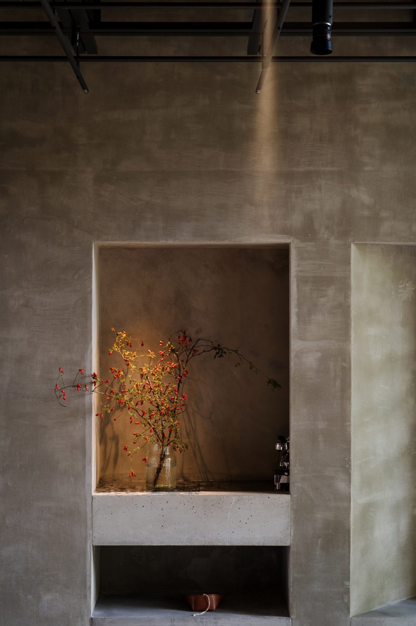
Vase illuminated inside PSLab's Berlin studioVase illuminated inside PSLab's Berlin studio
The interior was designed to present the brand’s lighting to its best advantage

Inside, a double-height space with a six-metre-high ceiling allows lighting products to be hung in various heights and configurations.

Arched openings on either side of the staircase void lead through to a garden room that looks onto a leafy courtyard. Daylight streams into the space through large windows to create a tranquil atmosphere.

The workshop space includes a materials library where visitors can touch and explore the physical qualities of the brand’s lighting products. A movable ladder provides access to items on the library’s upper rows.

The cosy basement level is a place for informal conversations with clients. A projector in this parlour space also allows the team to display the company’s extensive digital library.
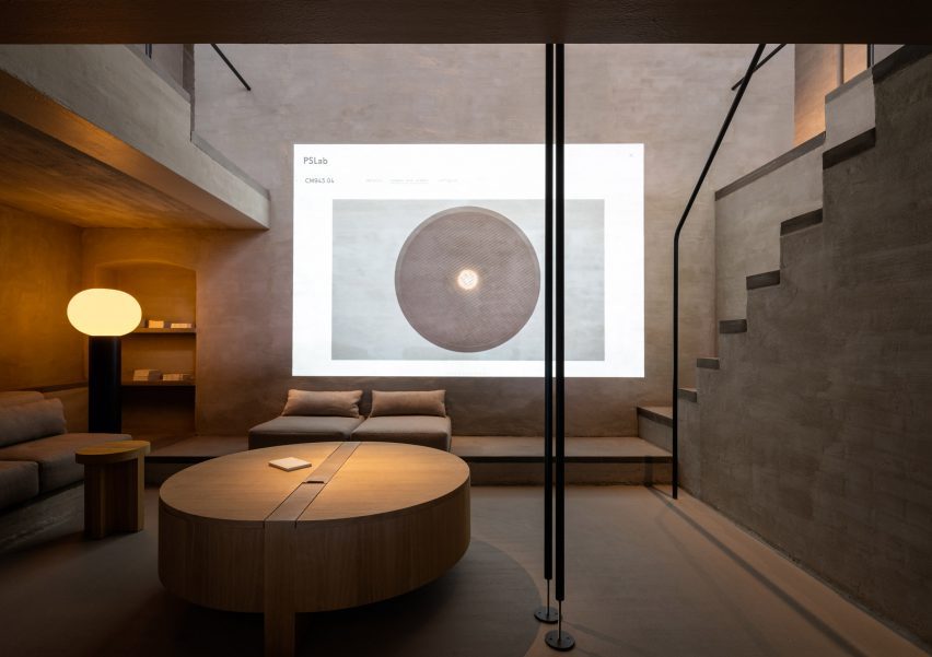
Lounge inside lighting showroom by B-bis architectenLounge inside lighting showroom by B-bis architecten
The basement serves as a cosy lounge

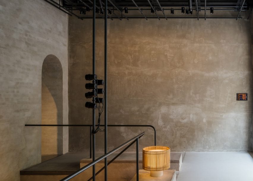
Throughout the studio, PSLab chose materials and finishes including lime wash, concrete, zinc and textiles that focus attention on how the space is lit rather than its architectural features to create a kind of “sacred place for light”.

“It is all about monochromatics and textures, which are specific to the location,” said Mario Weck, a partner at PSLab GmbH. “The atmosphere lets people focus on our approach.”
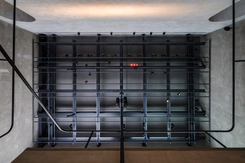
Llighting rig inside PSLab's Berlin studioLlighting rig inside PSLab's Berlin studio
Gantries provide support for various light sources

On the ceiling of both the front room and garden room is a grey-steel gantry that helps unify the spaces whilst supporting various light sources as well as technical elements, much like on a theatre stage.

Furniture is mostly built in, with simple cushions providing casual seating while cylindrical wooden side tables and coffee tables offer somewhere to place a cup or catalogue.
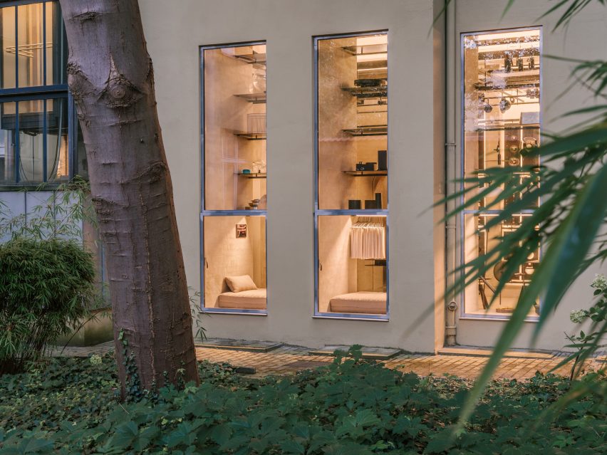
Exterior of PSLab's Berlin studioExterior of PSLab's Berlin studio
The showroom is set in Berlin’s Charlottenburg

PSLab has studios in Antwerp, Bologna, London, Stuttgart and Beirut, where the firm originated. For its UK headquarters, the company commissioned JamesPlumb to convert a Victorian tannery into a space that evokes the “quiet brutalism” of the former industrial building.

Previously, the lighting brand has collaborated with Parisian studio Tolila+Gilliland on the design of an Aesop store in London featuring felt-covered walls and slim black pendant lights.

The photography is by Nate Cook.

Reference

Forma is a nomadic design gallery popping up around Berlin
CategoriesInterior Design

Forma is a nomadic design gallery popping up around Berlin

Contemporary German furniture designs are displayed alongside vintage pieces at this travelling gallery that multidisciplinary designer Vanessa Heepen has launched in Berlin.

Rather than having a permanent home, Forma will take over different locations across the German capital.

Travelling design gallery in Berlin by Vanessa Heepen
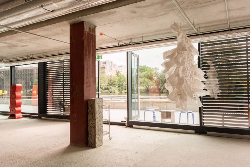
Forma’s first exhibition was held in a building next to the Spree river

The gallery’s inaugural exhibition, titled The Room I Walk the Line, was recently on show on the ground floor of a mixed-use building in Friedrichshain, nestled in between fragments of the Berlin Wall on the banks of the river Spree.

“To be honest, the area is not where I would typically choose to open a gallery,” Heepen told Dezeen. “But when I first saw a picture of it on a real estate website, I was deeply touched by its huge windows, red columns and by the water, of course.”

Two stools in a concrete room
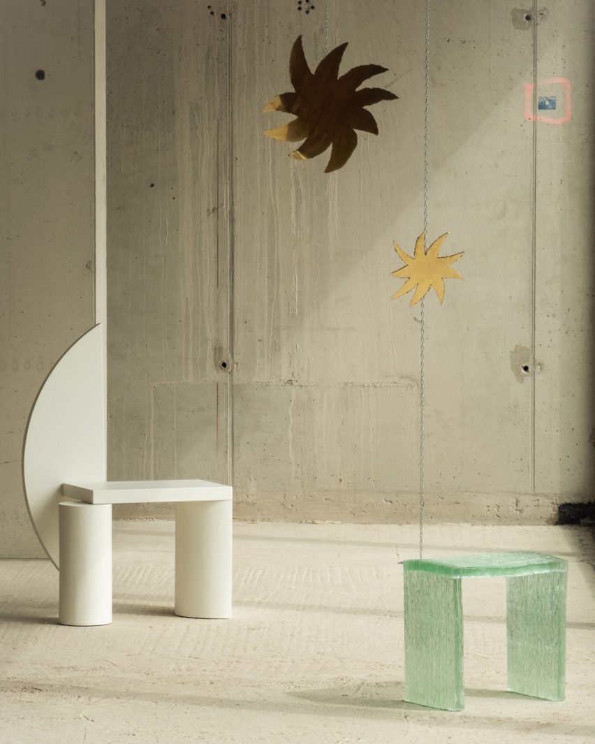
It featured German designers including Nazara Lázaro (left) and Studio Kuhlmann (top right)

A trained interior designer, Heepen largely left the space in its found state but worked with her team to create a simple mahogany bar counter and storage unit for the gallery.

She also asked “soft architecture” studio Curetain to create a white latex screen for the corner of the gallery.

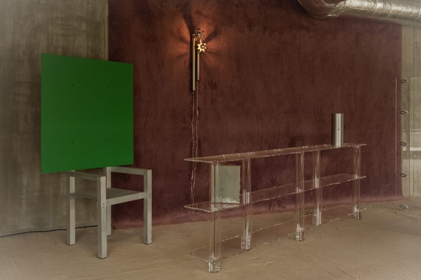
As part of the exhibition, this served as the backdrop for a tall white spectator shelf by Stuttgart-based Freia Achenbach, along with a graphic white stool by local designer Nazara Lázaro.

Travelling design gallery in Berlin by Vanessa Heepen
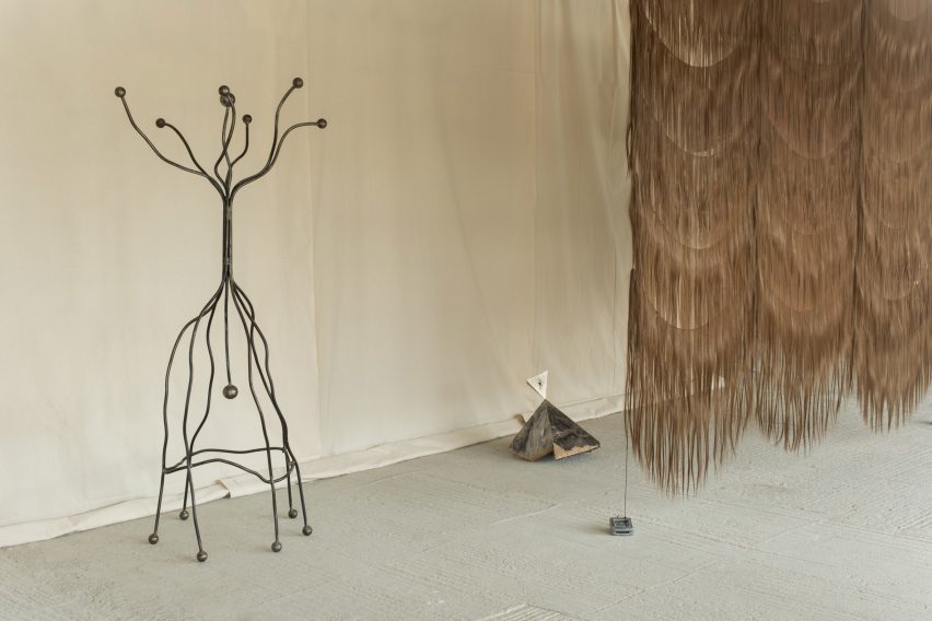
This wiggly coat stand was mong the vintage pieces featured

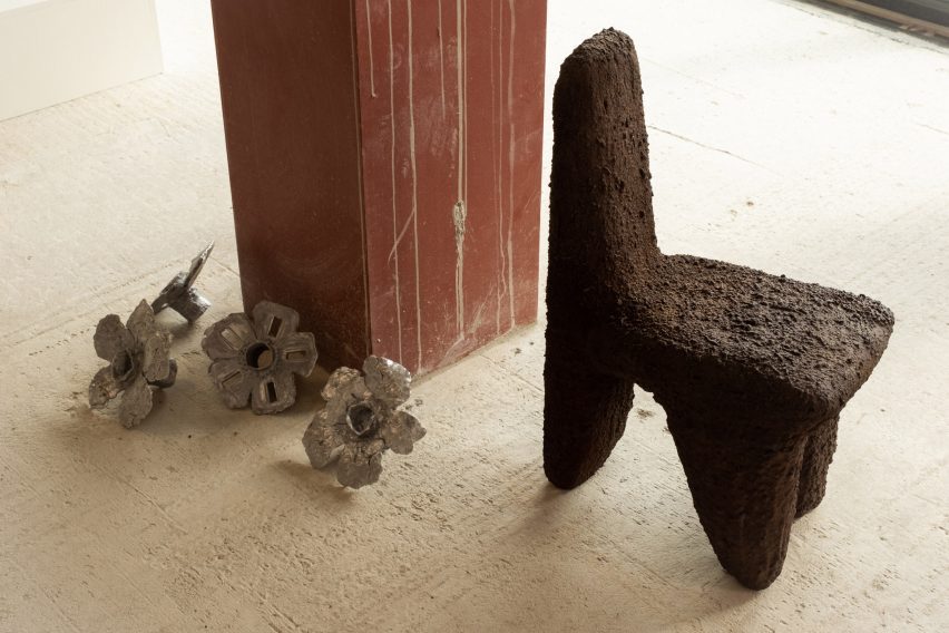
Other pieces in the exhibition included a pigmented concrete chair by Carsten in der Elst and hanging metallic stars by Studio Kuhlmann, both from Cologne, as well as a translucent shelf by Berlin’s Lotto Studio.

Forma also sourced a number of vintage pieces from Moho – a 20th-century furniture showroom in Prenzlauer Berg – among them an embossed metal cabinet and a wriggly coat stand.

One of Heepen’s main motivations for founding the gallery was to carve out a space for showcasing design-led furnishings in Berlin, which she says is something of a rarity in the German capital.

“It is a discursive topic, and people have always been unsure about the success of it,” she explained. “After Forma’s first edition, I am glad to say it was hugely successful”.

Chair and transluscent shelf in Forma gallery
Contemporary design pieces included a translucent shelf by Lotto Studio

The designer is currently on the hunt for Forma’s next location and will let the new setting inform her selection of furnishings.

“I’m always open to something new that occurs within the process,” she said. “I hold on to my vision, but I am also open to taking a detour.”

Travelling design gallery in Berlin by Vanessa Heepen
Also featured was a pigmented concrete chair by Carsten in der Els

Elsewhere in Berlin, Swiss architecture firm Herzog & de Meuron is currently constructing a major new museum for modern art.

The building’s design came under fire at the end of last year, when it was discovered its complex air conditioning system would result in the venue using four times as much energy as a nearby museum from the 1800s.

The photography is by Matthias Leidinger

The Room I Walk the Line was on show at Mühlenstrasse 63 in Berlin from 15 June to 15 July 2023. For more exhibitions, events and talk in architecture and design, visit Dezeen Events Guide.


Reference