vincent callebaut’s biophilic hospital campus in belgium unfolds around flower-shaped atrium
CategoriesArchitecture

vincent callebaut’s biophilic hospital campus in belgium unfolds around flower-shaped atrium

Vincent Callebaut’s Hospital Campus in belgium


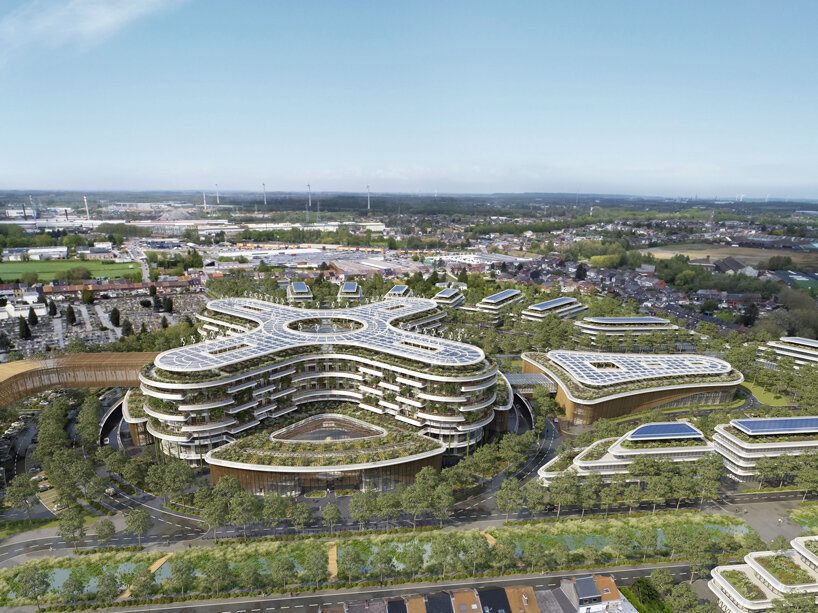
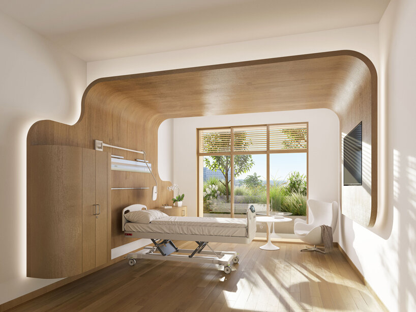
Vincent Callebaut has designed HOSPIWOOD, a biophilic hospital campus in Belgium with the aim of enhancing sustainability as well as patients’ experience and recovery. The project brings together local hospital networks on a 14-hectare campus designed to prioritize sustainability and offer high-quality healthcare. HOSPIWOOD serves as a link between the Buset and Longtain sites, situated along the Boulevard Urbain de l’Est, positioned to accommodate various functions within the cityscape, contributing to its overall vitality. At its core, HOSPIWOOD is committed to environmental responsibility and community well-being. The project’s masterplan promotes efficient resource management, incorporating features such as solar car parks, rainwater harvesting systems, and green spaces to mitigate environmental impact and enhance the local ecosystem.
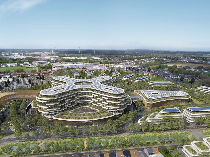
vincent callebaut's biophilic hospital campus in belgium unfolds around flower-shaped atrium
all images by Vincent Callebaut 


a Modern and patient-friendly Hospital Infrastructure


The architects implemented a range of structures, such as The Building K, The Ponte Vecchio, The Vertical Forest, and The Medical Logipole, signaling a departure from traditional hospital design towards a more integrated and environmentally conscious approach. Building K connects to the core of the Tivoli Hospital’s Tripod, and its construction is now underway. The Ponte Vecchio acts as an inhabited bridge, linking various medical staff facilities like restaurants, meeting rooms, and administration offices, along with an amphitheater. Spanning Avenue Max Buset, it forms a direct link between the K building and the new Longtain hospital, featuring dynamic, spiral architecture symbolizing hospital partnership. The Vertical Forest embodies the new Longtain Hospital, featuring 600 rooms across 66,500 sqm within a mid-rise building. Its soft curves create a biophilic atmosphere promoting well-being and serenity. The circular base houses technical platforms around large patios, atriums, and gardens.
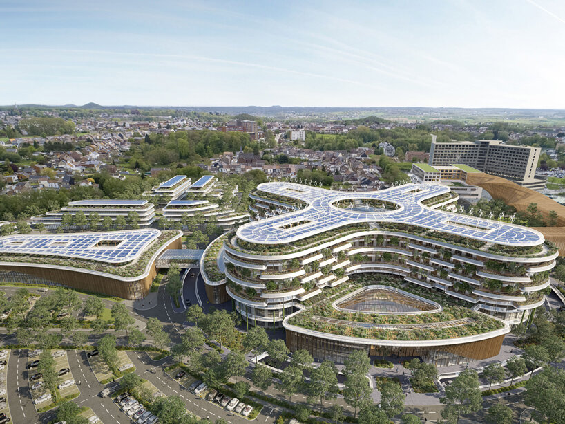
vincent callebaut's biophilic hospital campus in belgium unfolds around flower-shaped atrium
a biophilic hospital campus promoting sustainability and patient-centered care


On the ground floor, a flower-shaped atrium integrates the admissions hall and shops, while various medical services are distributed across the circular plane’s four petals. The first floor hosts intensive care, interventional platforms, and other specialized units, following a similar layout. The logistics basement, accessed via a peripheral circular moat, facilitates seamless flow management while minimizing visual and auditory disturbances. The Medical Logipole serves the logistical needs of the La Louvière site and other network locations. Situated on the northern roundabout side of Boulevard Urbain de l’Est, it offers direct road access and connects to the Longtain Hospital via a glass footbridge. The Campus consolidates complementary functions such as intergenerational housing, nursing homes, and recreational facilities within a masterplan promoting urban diversity and integration.
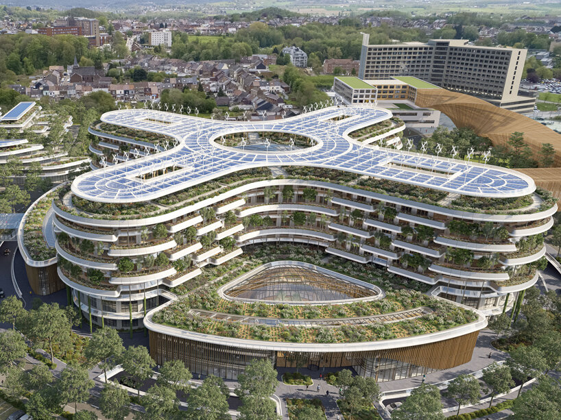
vincent callebaut's HOSPIWOOD is a biophilic hospital campus in belgium
promoting a nature-infused design


Green Infrastructure & Sustainable Solutions


HOSPIWOOD aims to develop a real eco-neighborhood where residents can enjoy living, working, and seeking medical care. The project focuses on efficient and balanced management of resources and flows, maximizing the site’s assets while preserving its environment. The project integrates elements of ecological and solidarity transition, such as urban greening, renewable energy use, and sustainable transportation. The masterplan adopts a radial and concentric layout, directing flows toward a central atrium, which serves as a public urban hub. The architecture blends harmoniously with the landscape, incorporating features like wind turbines and repurposed mining residues. Preserving the landscape involves combatting soil artificialization by transforming the Longtain site into a lush urban forest. This includes planting endemic trees, fostering native biodiversity, and implementing rainwater harvesting systems. A prominent feature is the tree-lined valley along the New Boulevard Urbain de l’Est, which serves as a rainwater filtration pond and provides a serene environment for residents. This holistic approach honors the industrial, cultural, and natural heritage of the region, enriching the identity of the community.
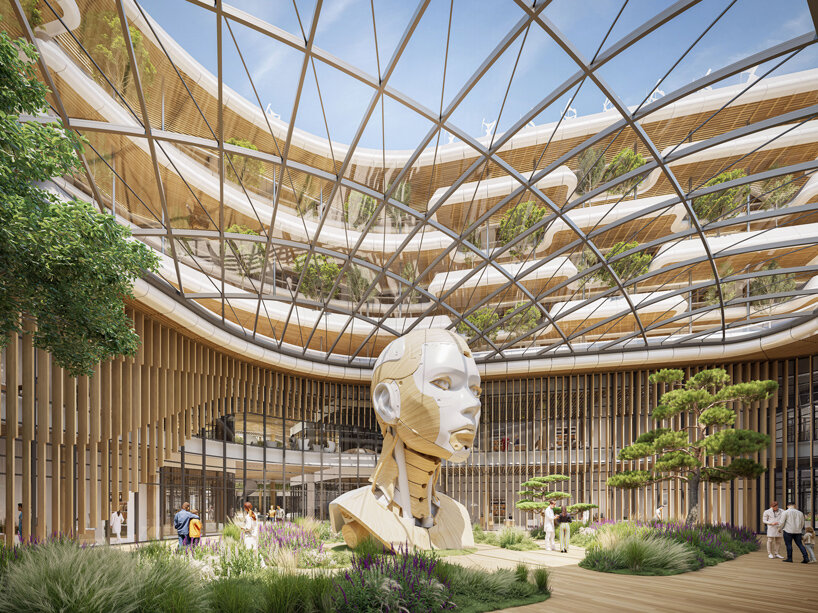
vincent callebaut's HOSPIWOOD is a biophilic hospital campus in belgium
an eco-neighborhood where residents can enjoy living, working, and seeking medical care


The solar car parks, equipped with photovoltaic canopies, are designated for staff, patients, visitors, and logistics. They are strategically located near the hospital in concentric bands, bordered by large hedgerows, with 50% of parking spaces covered with grass to promote soil drainage. Trees within the site are planted along these concentric hedges. Vertical landscaping is also prominent. Rooftop gardens, including a medicinal garden, adorn the eco-district, providing a shared space for caregivers and patients. These gardens are sheltered by solar canopies, generating electricity and hot water for patient rooms. Geothermal probes ensure year-round comfort, with additional solar canopies covering the logipole, totaling 7,350 m² of solar roofs for Longtain Hospital. Over 2.5 kilometers of planters line the care unit windows, offering hospitalized patients a soothing green environment. Rain chains connect these planters, guiding rainwater from the rooftop garden. The vertical forest hosts over 20,000 plants, capturing up to 120 tons of CO2 annually and aiding in bioclimatization, reducing temperatures by 3 to 5 degrees for patient comfort. This comprehensive approach reflects a commitment to citizen well-being and environmental stewardship.
vincent callebaut's biophilic hospital campus in belgium unfolds around flower-shaped atrium

Reference

Biophilic design informs moss-covered installation at luxury bag store
CategoriesInterior Design

Biophilic design informs moss-covered installation at luxury bag store

Creative studio Spacemen looked to biophilic design principles to construct a tree-like installation covered in moss, which forms the centrepiece of a flagship outlet for luxury leather brand Braun Büffel in Malaysia.

Described by Shanghai-based Spacemen as a store that straddles an art gallery and a laboratory, the studio wanted to create an interior that would attract a younger audience and serve as “an abstract oasis” in Putrajaya’s IOI Mall.

Interior of bag store in Malaysia with marble cabinetry
Spacemen designed the store interior for bag brand Braun Büffel

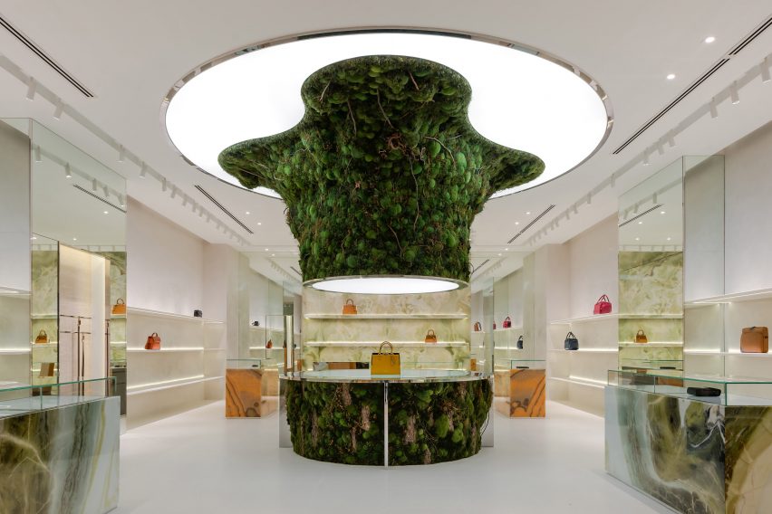
Central to this design is an oversized, organic-shaped sculpture clad in preserved flat moss, ball moss and lichen that is suspended from an illuminated disc in the middle of the shop.

A rounded table clad in the same plants was positioned directly below to complete the installation. It also doubles as a plinth for Braun Büffel leather bags, which are displayed sparsely across the store like museum artefacts.

Organic-shaped moss-covered installation that recalls a sprouting tree
It is characterised by a central moss-covered sculpture

The sculpture takes cues from biophilic design – a concept that encourages a closer connection between humans and nature when creating interior spaces.

“The form was designed to seem as though it is sprouting from the ground towards the ceiling – towards the sun – hence why we integrated the membrane lighting ceiling above it, just like how it would grow out of a beaker in a mad scientist’s lab towards natural light,” explained Spacemen founder Edward Tan.

“We envisioned an otherworldly concept akin to something out of a Hollywood sci-fi movie,” he told Dezeen.

Green onyx feature wall with handbags displayed on its shelving
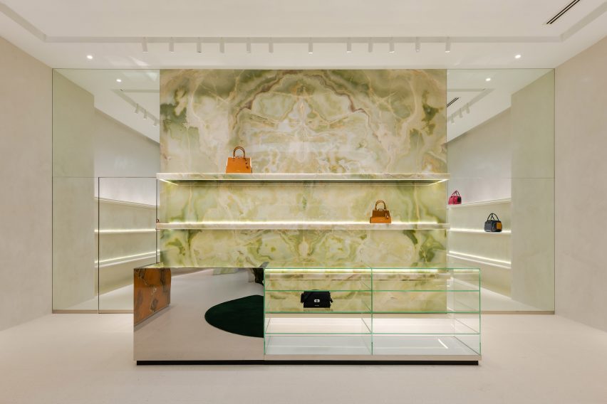
A green onyx feature wall was placed at the back of the store

Tan said that Spacemen adopted a “maximal minimalism” approach when creating the store interiors, in an attempt to challenge the neutral shapes and colours often associated with luxury.

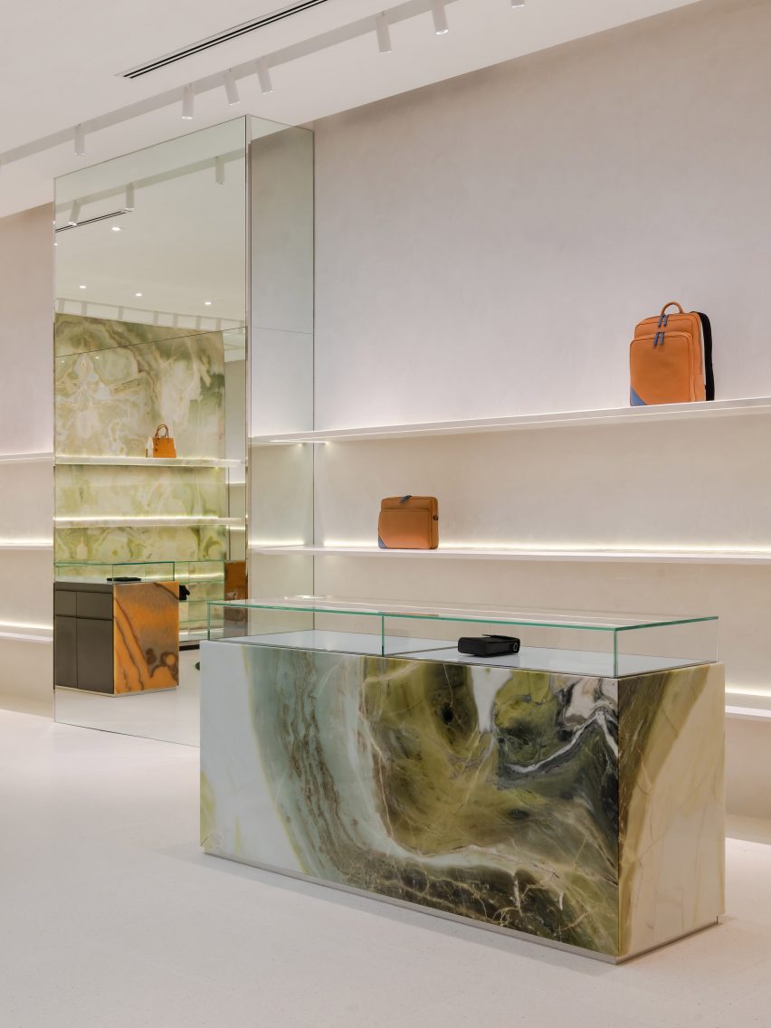
Throughout the shop, lime plaster walls and bright white terrazzo floors are interrupted by various ornate display units and shelves magnified by floor-to-ceiling mirrors.

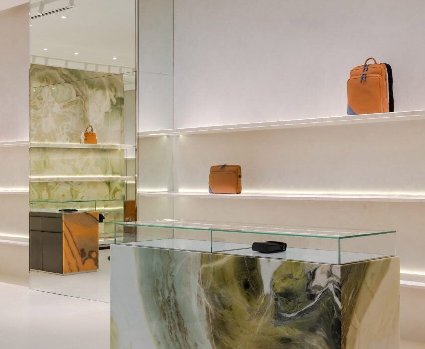
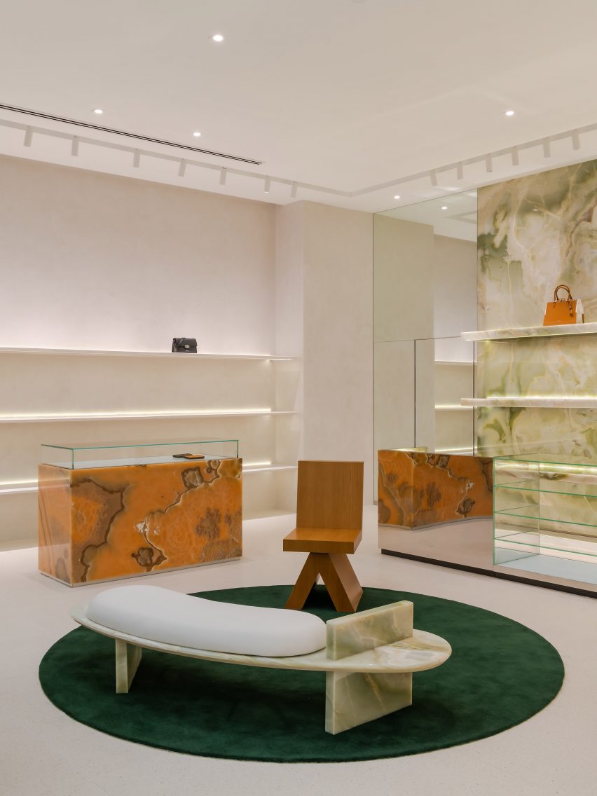
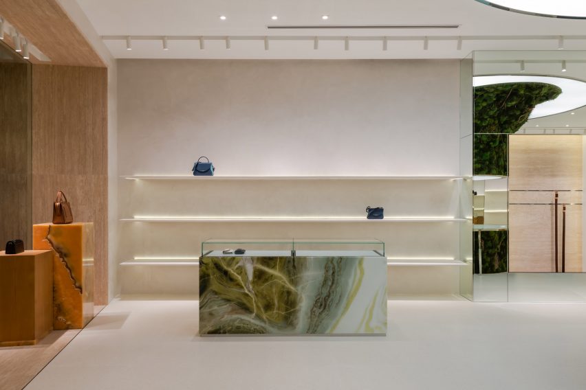
This cabinetry is made from decadent slabs of swirly orange onyx and jade marble, some of which are topped with glass vitrines that reveal small leather goods.

Spacemen placed a green onyx feature wall at the back of the store, which sits behind furniture including a bespoke curved bench created from the same material as well as a custom oak armchair.

Waiting area in store by Spacemen with bespoke furniture
Bespoke seating creates a waiting area for customers

Explaining the decision to incorporate biophilic design into the Braun Büffel outlet, Tan said, “I think with the pandemic, people have taken to appreciating nature a lot more than before.”

“This is especially true for people living in big cities where they live in apartments and are confined to office cubicles all the time, and do not have access to nature and greenery as much as they should.”

“Therefore it has become a new form of luxury to be able to afford lush greenery and gardens indoors,” he concluded.

Green and orange marble and onyx cabinetry within store interior by Spacemen
Green and orange hues add colourful accents to the space

Other retailers featuring similar designs include a store in Seattle for beauty brand Glossier with a mossy mushroom-covered mound and a Celine boutique in Paris that is characterised by large expanses of brass and marble.

The photography is by David Yeow Photography.


Project credits:

Interior design: Spacemen
Moss artist: Ohsum Mossum

Reference

Bringing the Outside In: Using Biophilic Design Principles to Transform Commercial Interiors
CategoriesArchitecture

Bringing the Outside In: Using Biophilic Design Principles to Transform Commercial Interiors

Modernism was all about clean lines, raw surfaces, and celebrating the uncompromising rationality of the machine. The vision of LeCorbusier was revolutionary in its time, and caught on in ways he would likely not have expected. Today, most of the public spaces we move through, from offices and schools to hospitals and transport hubs, owe something to the modern movement and its penchant for no-frills design.

Not everyone is happy with this state of affairs. Today, there is a renewed interest in the textures, patterns, and curves, the very features of classical architecture that modernists once avoided. Design-thinkers have learned that natural forms, from the vein patterns in leaves to the curves of the human body, are based on fractals rather than grids. As human beings, we find fractals pleasing to the eye and emotionally restorative. Right angles, in contrast, are harsh and even exhausting. This is why so many people describe modern spaces as feeling grim, sterile, or anxiety provoking.

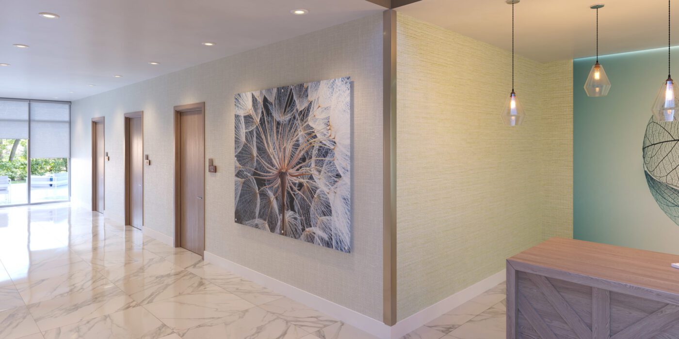
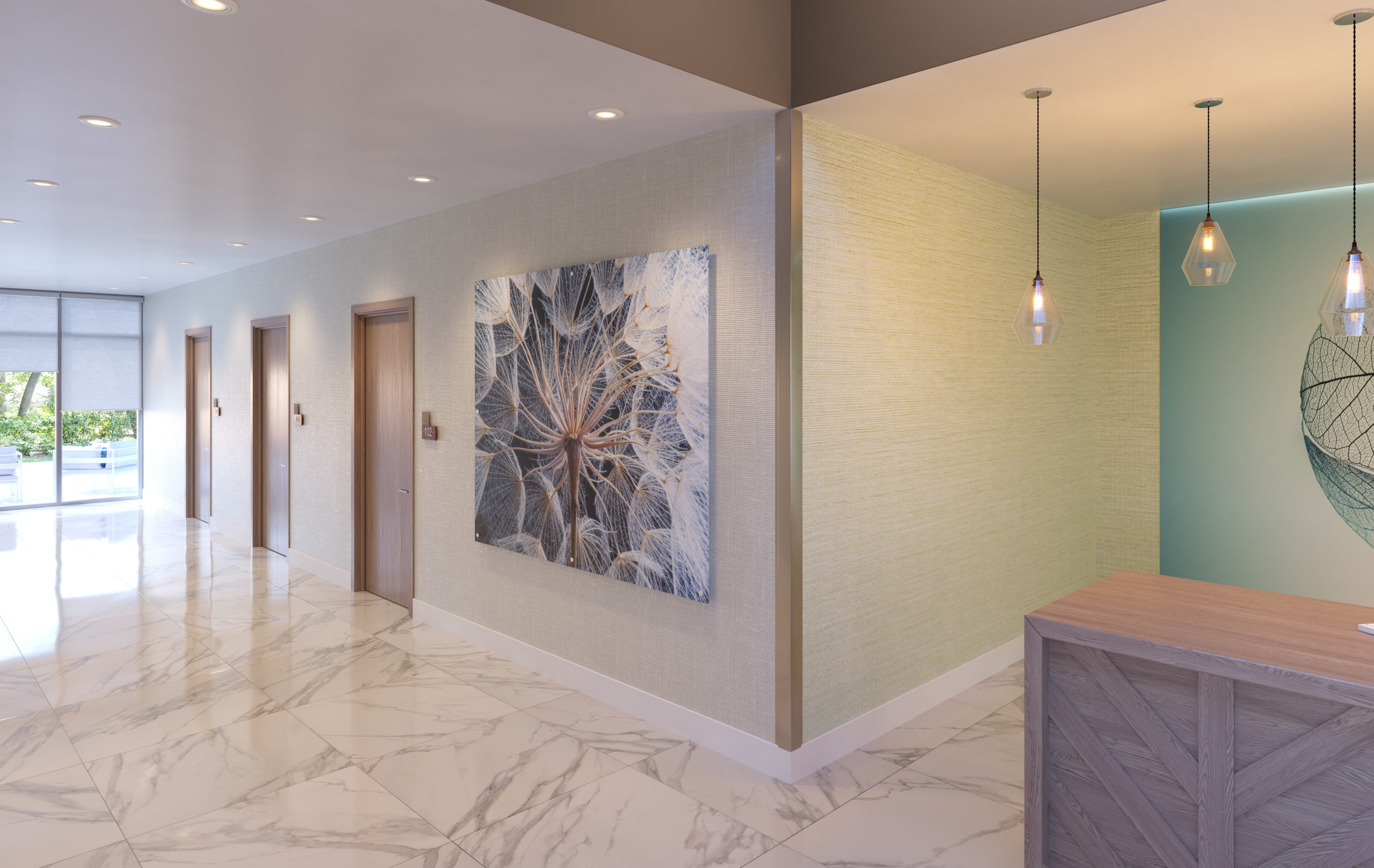
Wall art by Inpro

For architects that are looking to warm a space with natural forms, bringing in some of that fractal energy people literally crave, the experts at Inpro are providing new, high-tech solutions. They create high-end, digital artwork optimized for spaces such as offices, schools, hospitals and more, bringing vitality to spaces that would otherwise be merely functional 

Through their critical design research into art and biophilia, and from the inspiration that guides it, Inpro is looking to make art “work” for the occupants in any commercial building. How art, working through digital imagery or printed on an architectural product, can bring a brand, an idea or even a feeling to life.

Nick Cotter, Creative Director at Inpro, says: “The right image can have a calming effect, especially in healthcare environments where patients might be experiencing anxiety, fear or pain. Images of nature offer serenity in an otherwise sterile space, while bright and colorful artwork can stimulate interest and put smiles on faces.” Studies have shown that looking at images of nature is healing, much like spending time in nature. Art, then, is a crucial component of any healthcare space. 

As the company explains in their Imaging Products brochure, “North Americans spend nearly 90% of their time indoors. . . Whether it be promoting healing in healthcare, productivity in office environments, stimulating creativity in education, triggering brand recognition in hospitality or reinforcing positive transactions in retail and restaurant, the use of imagery, pattern and color can have an influence. . . these influences are seen even in our sleep, diet and mood.”

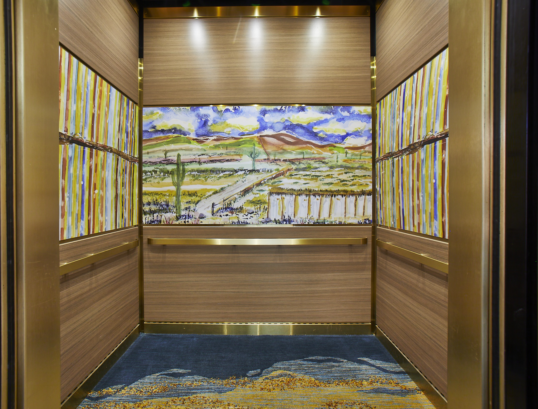
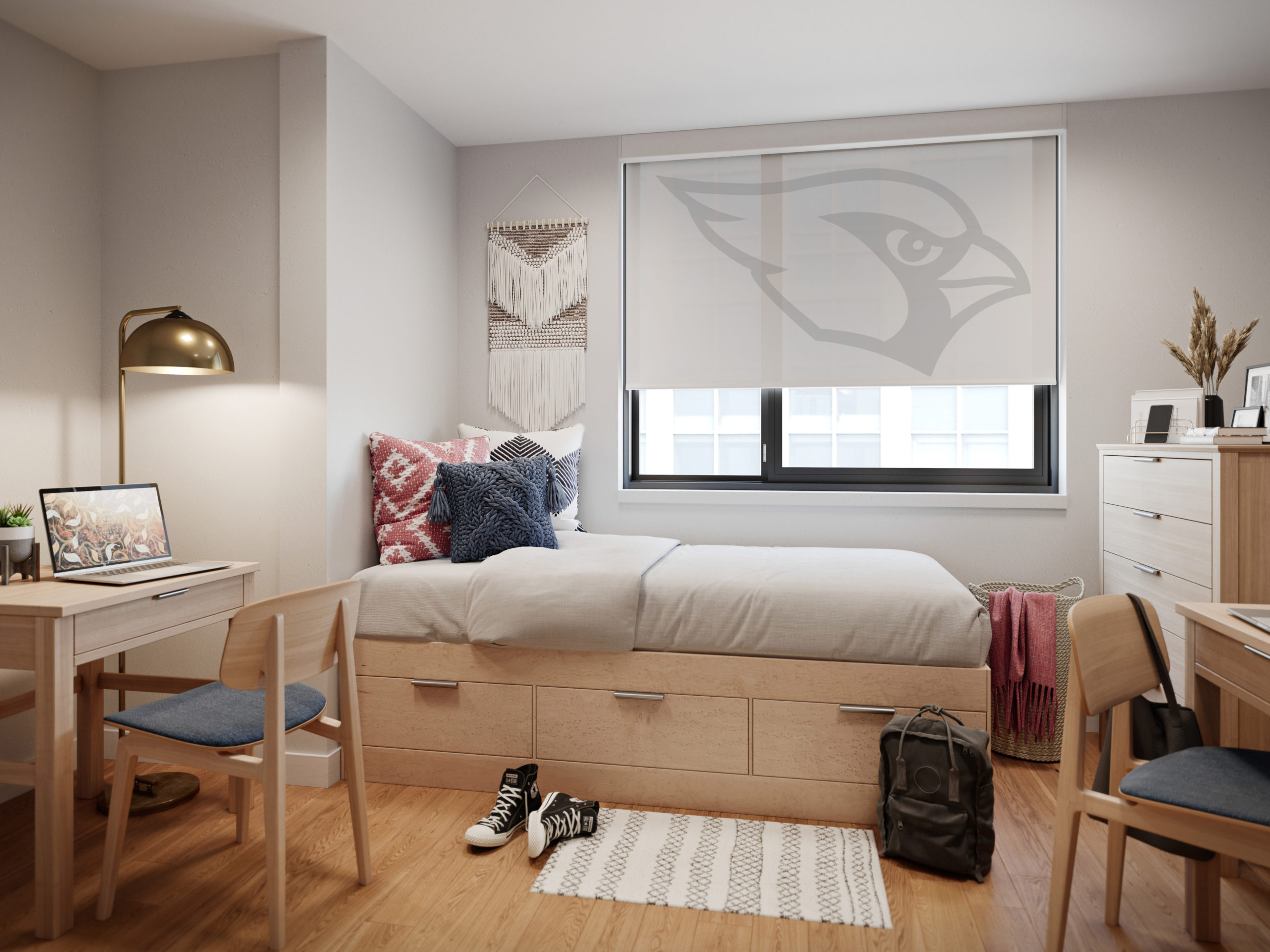
Inpro offers six product types for people looking to bring art and photo prints into their office, including Aspex® Printed Wall Protection, a printed, protective wallcovering that can be applied directly to the wall at virtually any size, and printed wall art, which hangs on the wall just like a painting. The brand also produces printed signage, which allows art to be integrated in creative ways throughout the space, durable wall panels that can be used in high traffic spaces like elevator interiors, and printed window shades, which can turn any office into a room with a view. Made from fiberglass, polyester, vinyl, and acrylic, these high-tech Solar Shades help to block glare and unwanted heat while still allowing a degree of natural light.

Elevator interior with prestige gold trim and Aspex panels showcasing local artwork.

Each of these products is durable and super high resolution. Furthermore, they are fully customizable. Inpro works with clients to select imagery suited to their brand. If no stock images fit the bill, the brand can help facilitate collaborations between clients and local artists to curate unique artwork for their space. In 2023, Inpro is also launching curated art galleries that can be printed on products based on moods, including categories like “comfort”, “focus”, “restore”, “inspire” and “energize”.

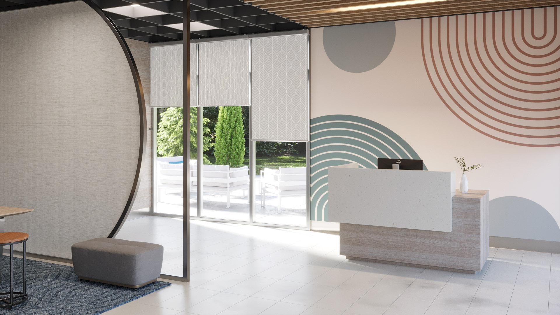
 The key is to think about your design needs, choose a theme, and stick to it. Like a real natural landscape, the whole is greater than the sum of its parts, and artworks function better when they are placed in harmonious relation to one another. Through the careful selection of Inpro products, shades can be integrated with wall coverings, art, and signage, creating a fully integrated space.

Personalized dorm room window shades by Inpro

“Adding imagery throughout your spaces brings continuity throughout your building and how people experience it,” Dan Roller, Product Manager at Inpro, explains. “For example, use an overall nature theme and create variations on each floor to help people remember different locations and change up the scenery.” This type of cohesiveness will strengthen your brand, whatever industry you are in, and elevate the experience of clients or other visitors to your professional space.

If biophilia isn’t your thing, Inpro can also create graphics that have a more streamlined, minimalist look. The key thing to remember is that with new digital imaging and printing techniques, the possibilities are endless when it comes to wall coverings. One is not limited to solid colors or patterned wallpaper. Any image you can think of can find a place on your walls, your signs or your window treatments.

Coordinated window shades and wall art by Inpro

Art is no longer something that hangs on the wall – an ornament for spectators to gaze at – but something that is ultimately functional, helping spaces work better for everyone. This sounds like something even LeCorbusier would approve of.

To learn more about Inpro’s extensive range of architectural products, check out their website and their brand profile on Architizer, or download their visual inspiration guide here.

Reference