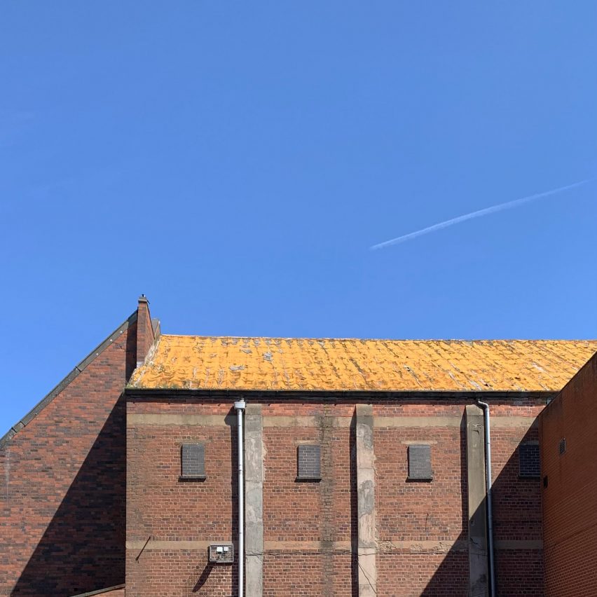
For architects specifying materials for their projects, it’s hard to look past the building envelope as the most important element to consider. Not only is it one of the most visually significant aspects of a building, but it can also make or break a project’s sustainability credentials, given the potential environmental impact of sourcing, transporting, constructing and maintaining materials used for exterior surfaces.
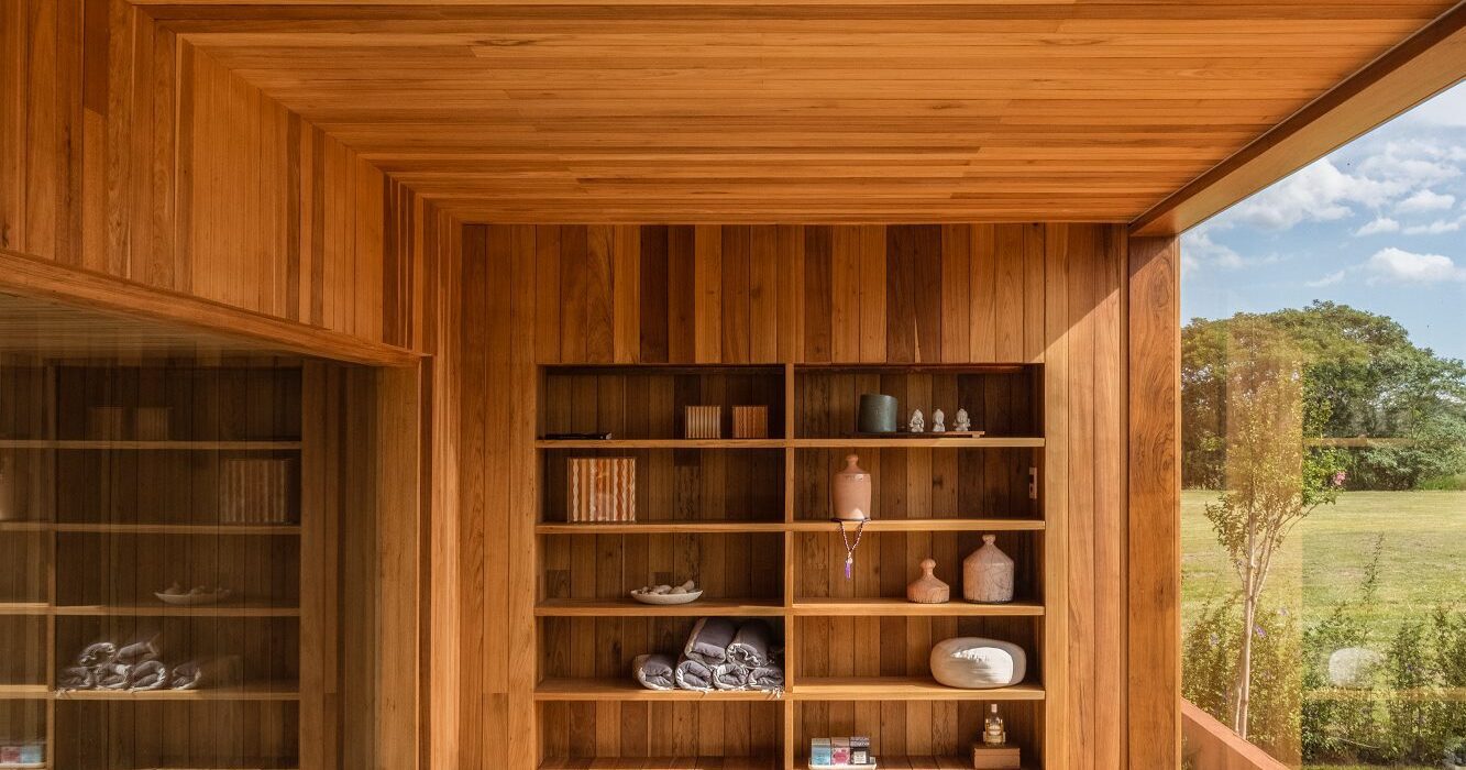
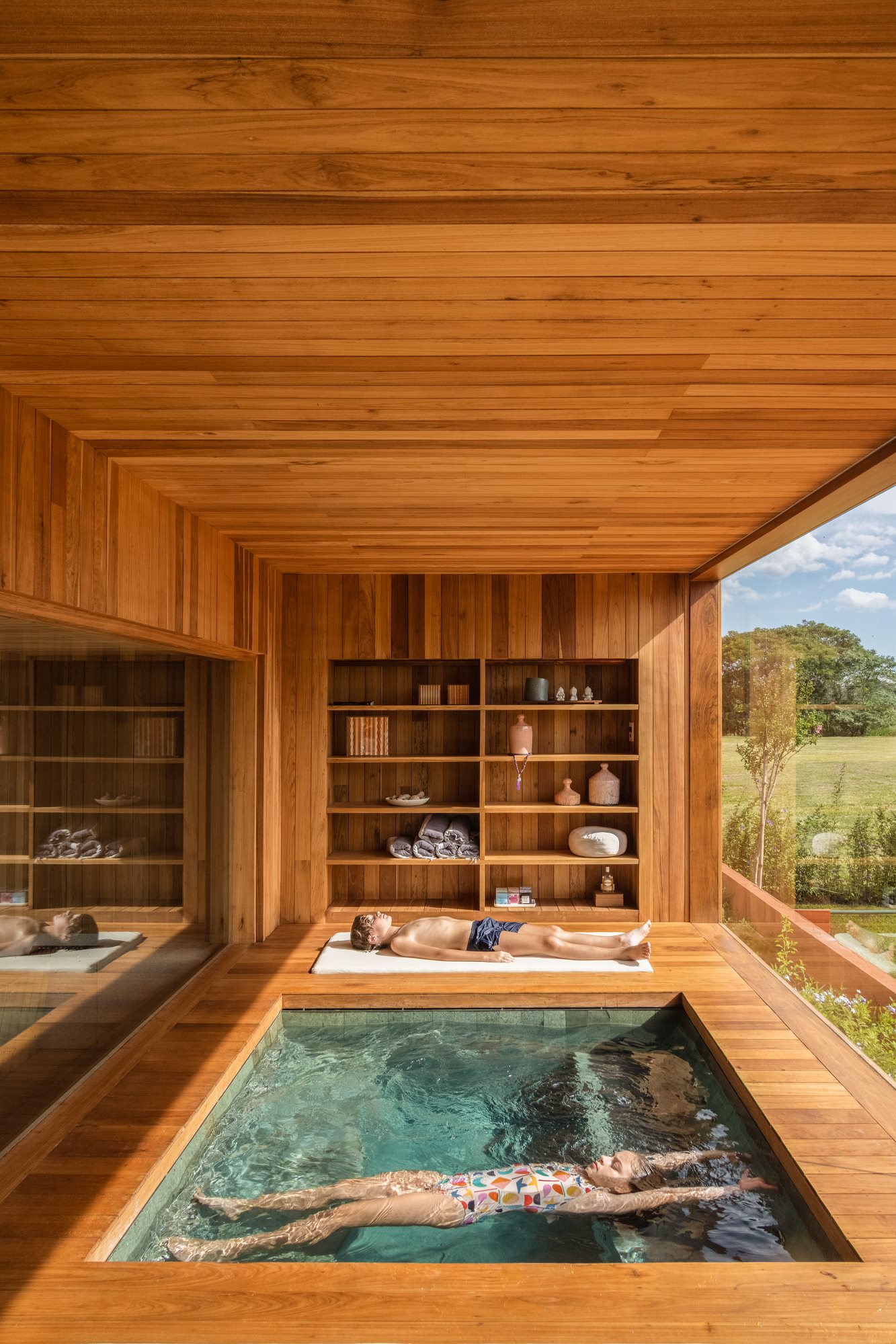
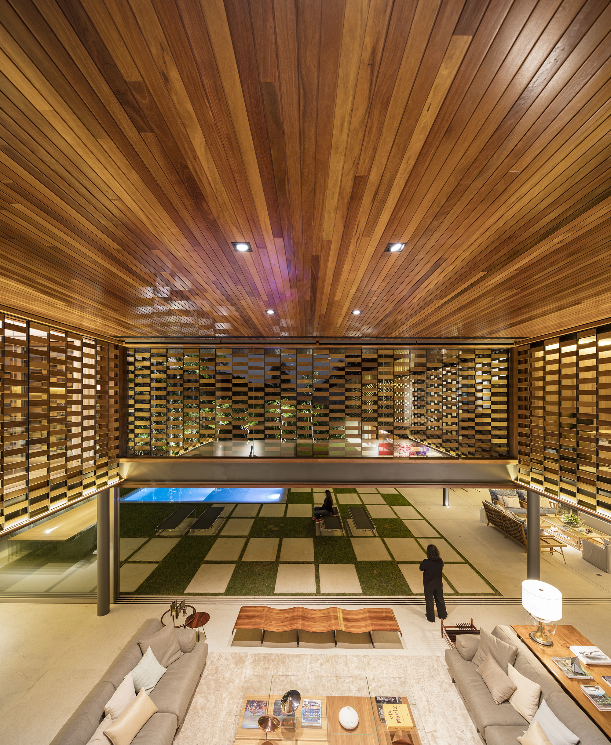
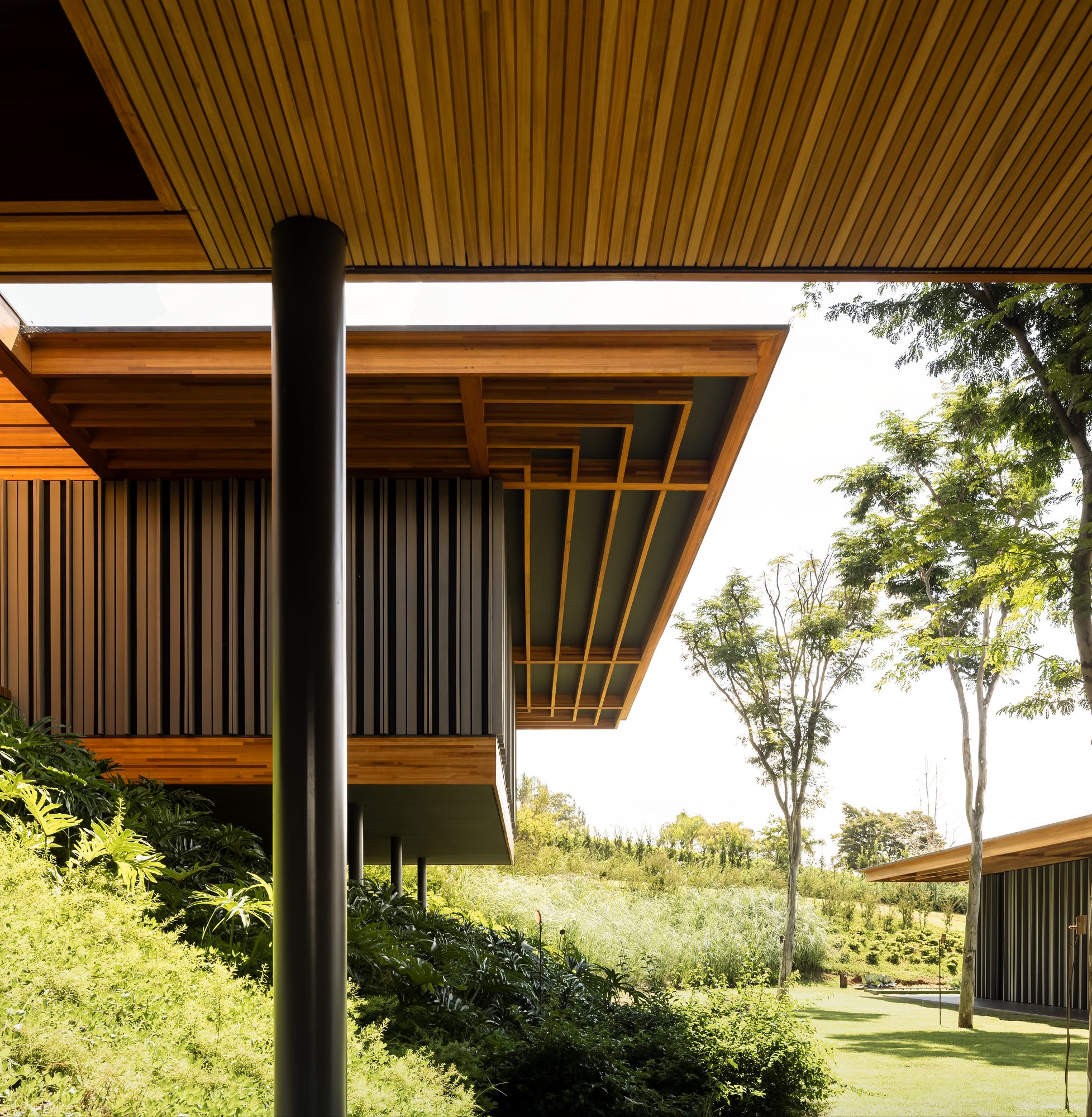
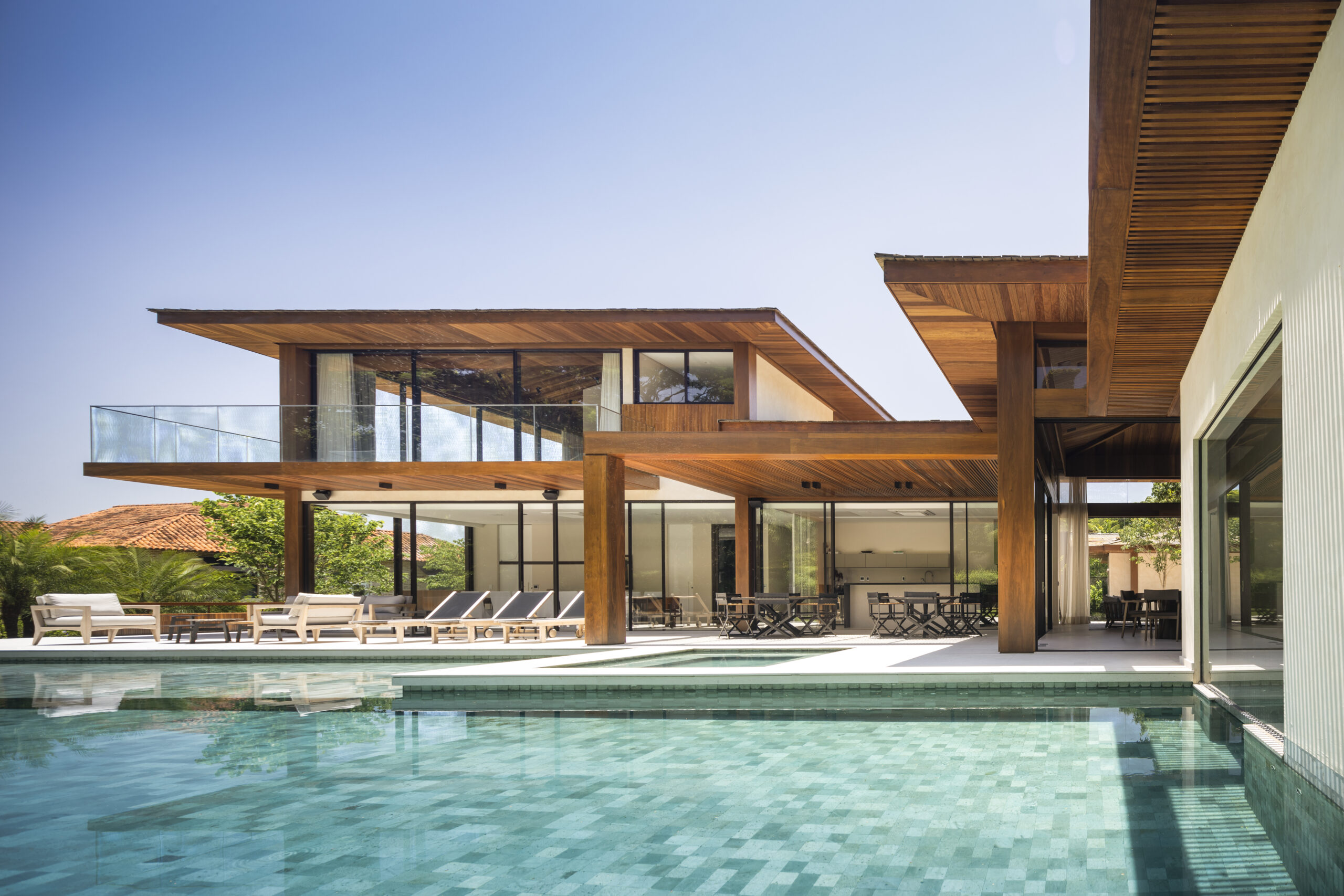
Enter Black Label by Tropical Forest Products, one of the world’s most sustainable building products for decking, cladding and more. This forward-thinking manufacturer has refined its process to minimize the environmental impact of its products without compromising on the durability and incredible aesthetic qualities of its collection. The results are stunning: the warm, rich tones and resilient nature of tropical hardwood makes it a fit for a wide range of contemporary architecture projects, including hospitality, commercial, residential and landscape design typologies. Black Label Sustainable Lumber topped the popular choice vote in the Landscape Design category for the 2022 A+Product Awards.
 Architizer spoke with Tropical Forest Products about their products, their processes, and how they see their work evolving in the future.
Congratulations on winning a 2022 A+Award! What does winning this accolade mean to you and your brand?
We are thrilled to have Black Label sustainable lumber named a winner in the world-renowned Architizer A+Awards. This prestigious recognition proves that the architectural community appreciates our efforts to bring high quality and organic tropical hardwoods to market.
The fact that we were awarded by People’s Choice makes it even more special. We would be equally thrilled if this was a jury award, but the fact that this came from architects, designers, contractors and homeowners who have been using Black Label wood confirms the great acceptance that the industry has given to our sustainable, architectural grade products.
What inspired the design of your product?
We are inspired by nature. We believe that natural hardwoods are not only the most sustainable and renewable building product in the world, but they’re also the most exquisite. So we keep our interference as minimal as possible. That means that Black Label hardwoods have no chemicals, additives or toxins – nothing is added. Our products are already what the engineered industry has tried to mimic for years, with no success.
From natural one-of-a-kind designs to unmatched structural strength, our hardwoods are born nearly impeccable. Our role is selecting the optimal boards – Premium Architectural Grade on all sides and edges, with no knots – and kiln-drying them in state-of-the-art Italian chambers.
 Using advanced sustainable forest management techniques certified by the Forest Stewardship Council or Unfloresta, we go deep inside the forest and hand pick a limited number of trees with potential to become a piece of art in the hands of architects. Our mission is to give professionals the ability to create stunning, meaningful work that not only delights people, but that also reconnects them to nature.
Add to that the design of specific product profiles, along with the product testing and engineering into a system-based approach consisting of CAD details and CSI based specification language, and you have the essence of the Black Label brand.
Tell us about the manufacturing process — What are the key stages involved, and how do these help ensure a high quality end product?
Manufacturing sustainable wood products goes way beyond what meets the eye. Kiln-drying every board in Italian-made chambers until they meet precise humidity levels is a challenge, as is the world-class millwork we do with our state-of-the-art German-built planers. But it’s when we go into the forest to source our wood that we really set ourselves apart.
To craft every piece of Black Label hardwood, we use the most stringent forest management protocols, guaranteeing forests forever for all future generations. We remove less productive trees (that no longer store carbon) and make room for new trees to flourish.
Think of it as a garden, but on a bigger scale. We prune aging trees the same way you prune old branches in your backyard, allowing new life to grow. And not just any aging tree. From an area as big as a football field, only four to six trees are carefully selected, leaving the remainder intact. And for every one we harvest, up to 25 new trees benefit from the opening in the canopy of leaves and have a chance to flourish.
We go out of our way to keep our products not only sustainable and organic, but to make sure they bring a positive impact on both nature and people. Our multiple certifications with world-class organizations like FSC and Unfloresta only prove how seriously we take sustainability at Black Label.
What detail of your product was the biggest challenge to design, and why? How did you resolve it?
Solving design challenges are at the core of Black Label. Wood, by its very nature, is an incredibly flexible building product, and we take that to the next level by bringing unlimited profile options with state-of-the-art molders and CNC platforms. There’s nothing a commercial or residential project would need, no matter how big or small, that we could not provide.
We also have a dedicated department to serve designers and architects in their specification development process with all of the tools and data they require available on our website. Additionally, we always love to hear from designers directly so we can match their needs, from product sampling to our mill shop.
 What makes your product unique and of great value to specifying architects?
Tropical hardwoods are the best in the world for a wide range of residential and commercial applications, and Black Label heightens this aspect. Black Label wood products such as Ipe, Garapa, Tigerwood, Jatoba, Cumaru and Bulletwood — the world’s most appealing species — are sustainably sourced and perfect for all climates. Besides, all of them have unmatched durability and require low maintenance, without the use of chemical treatments. They represent the perfect mix of beauty and unrivaled performance.
Black Label hardwoods have almost twice the strength of Generic FAS grade lumber, and because of the establishment of definitive grading rules, Black Label offers lifestyle products with Premium Appearance on all four sides and edges of each board. Our hardwoods are 100% organic — with absolutely no additives — harvested from sustainably managed forests, and some species have an impressive lifespan of up to 75 years. Hardwood last longer than other materials, and therefore does not have to be replaced nearly as often, making it even more sustainable. Plus, every piece of wood has enhanced stability, made possible by an optimal temperature control system that increases the structural performance by hardening the cell walls. It’s what the industry has been trying to match for years by using chemicals and toxic additives, with no success.
Combine this with FSC, Unifloresta, and even our own Legal Lumber certification program, and designers have a validated and comprehensive approach to biophilic design within the wood product category.
What has the reception to your product been like from architects/clients/consumers?
It has been amazing to watch the incredible reception for such a young brand that has been on the market for less than two years. Dealers all over North America are working with Black Label products every day, and we were awarded by People’s Choice at the Architizer A+Awards. On top of that, we received additional prestigious recognition, which made us the most awarded hardwood brand in our industry in 2022.
Technically, the architects and designers are astounded by the breadth of resources that are available to them to assist in specifying naturally durable hardwood products from our resource library and our availability to work through design challenges with them.
Both designers and consumers are reassured by our comprehensive environmental compliance certification programs, including FSC certification. But the real challenge remains in the continuing education about the Life Cycle Benefits of renewable wood products over non-renewable building products. We are extremely grateful to have received the Architizer A+Award and for any attention it brings to this most important environmental initiative.
 How do you see the product evolving in the future?
We have just recently introduced prefabricated deck tiles into our Black Label roof deck system. And for the first time ever in our industry, they are kiln-dried, providing a resistance only similar to that of steel.
But only offering wood sometimes isn’t enough for a brand that aims to support architects and builders with everything they need to deliver world-class projects. So, we’re excited to announce the evolution of the Black Label brand into a wide range of accessories from deck and clad clips to tool kits to stains and beyond.
This evolution is how we guarantee our builders will always find the same quality standards we stand for, from the wood all the way down to the smallest screw.
To find out more about Black Label Sustainable Lumber, visit their website, and reach out to one of their experts to learn how to implement the product in your next project.
All images courtesy of Tropical Forest Products


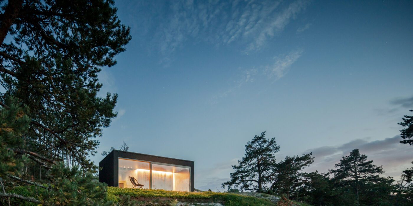
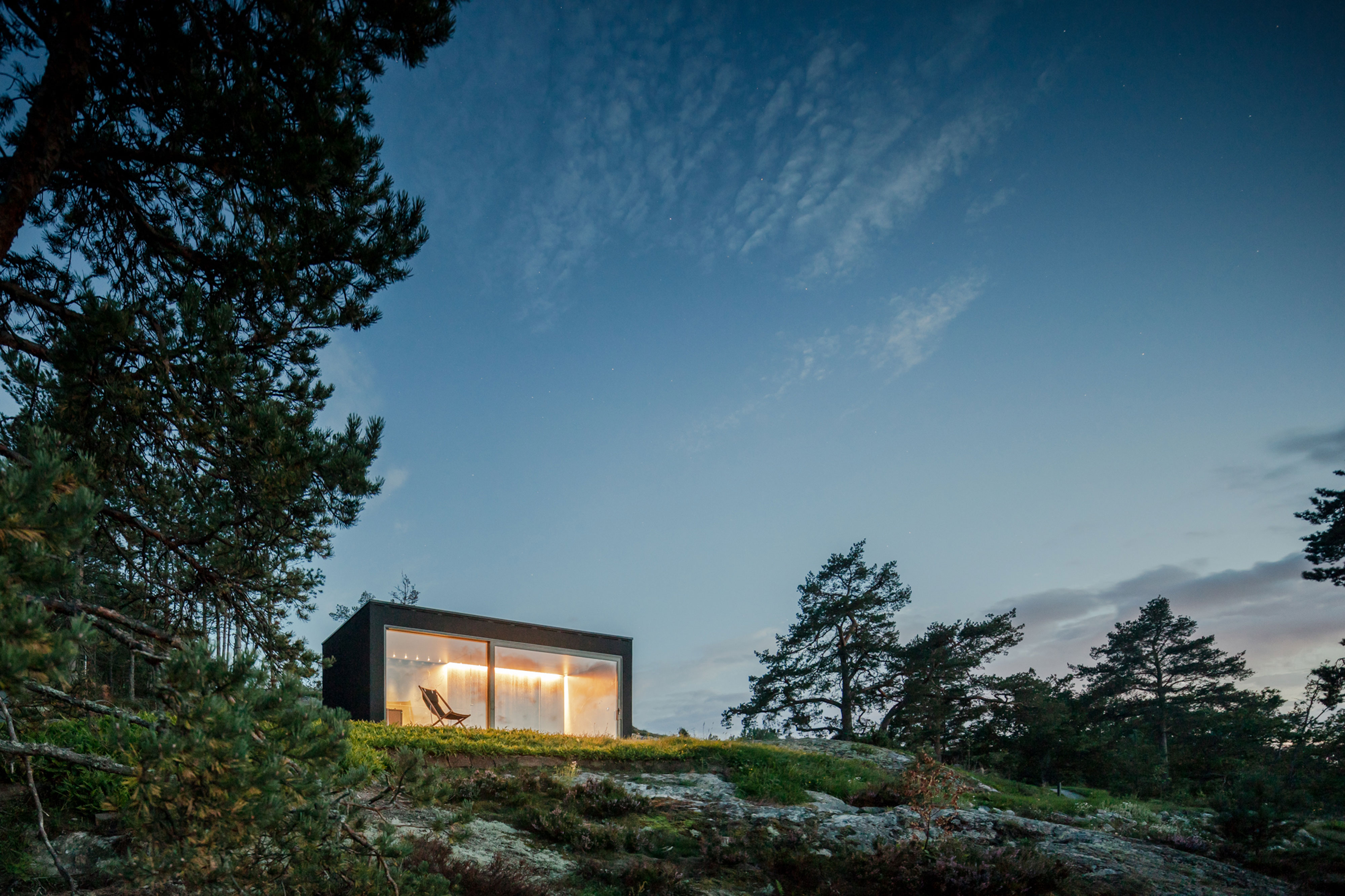
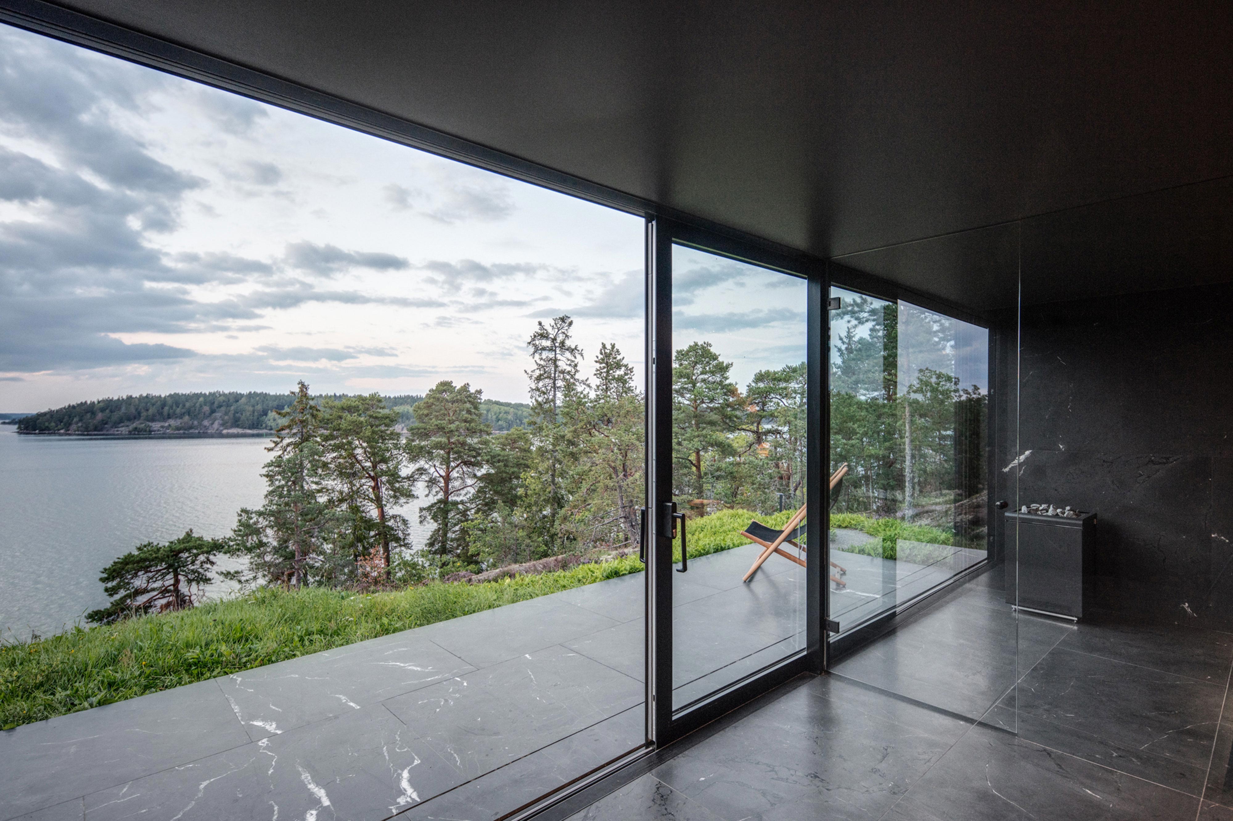 Made of black granite (Negresco) and dark wood (Oak), this sauna was designed to be a camera obscura, a box drawn to shape views of the landscape. Located in the middle of Stockholm’s archipelago, a narrow pathway brings the visitors to the sauna: a black box embedded in the rocks. The matte finish can be seen both inside and as part of the structure’s façade. As the team outlines, inside is a monolithic stone bench that faces the water through a large sliding window. On the back, a thick wall contains all the services: a small kitchen hidden behind the sliding doors and a bathroom illuminated by a skylight. At night, the small sauna resembles a lighthouse, a warm and cozy space illuminated from the inside.
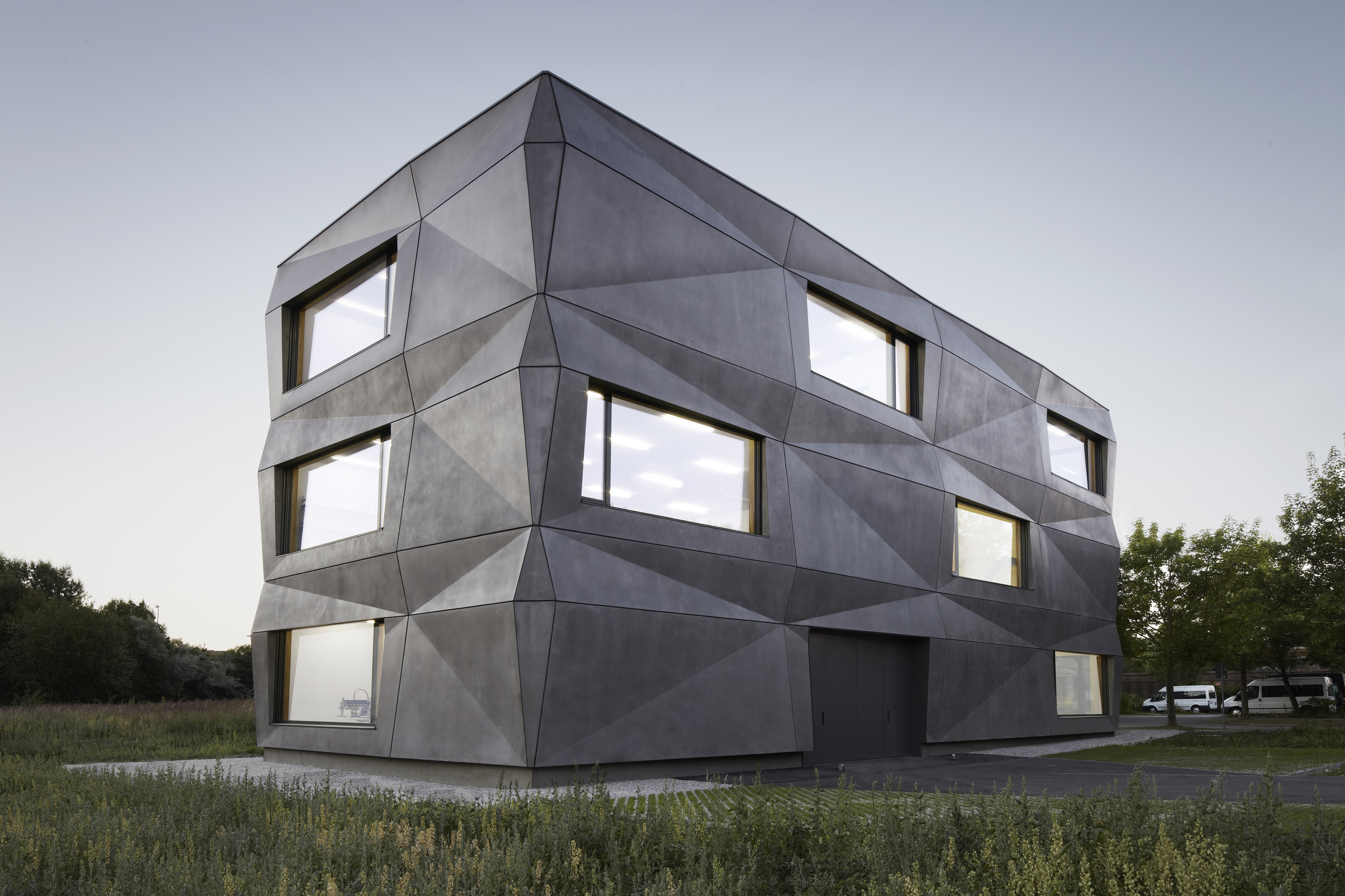
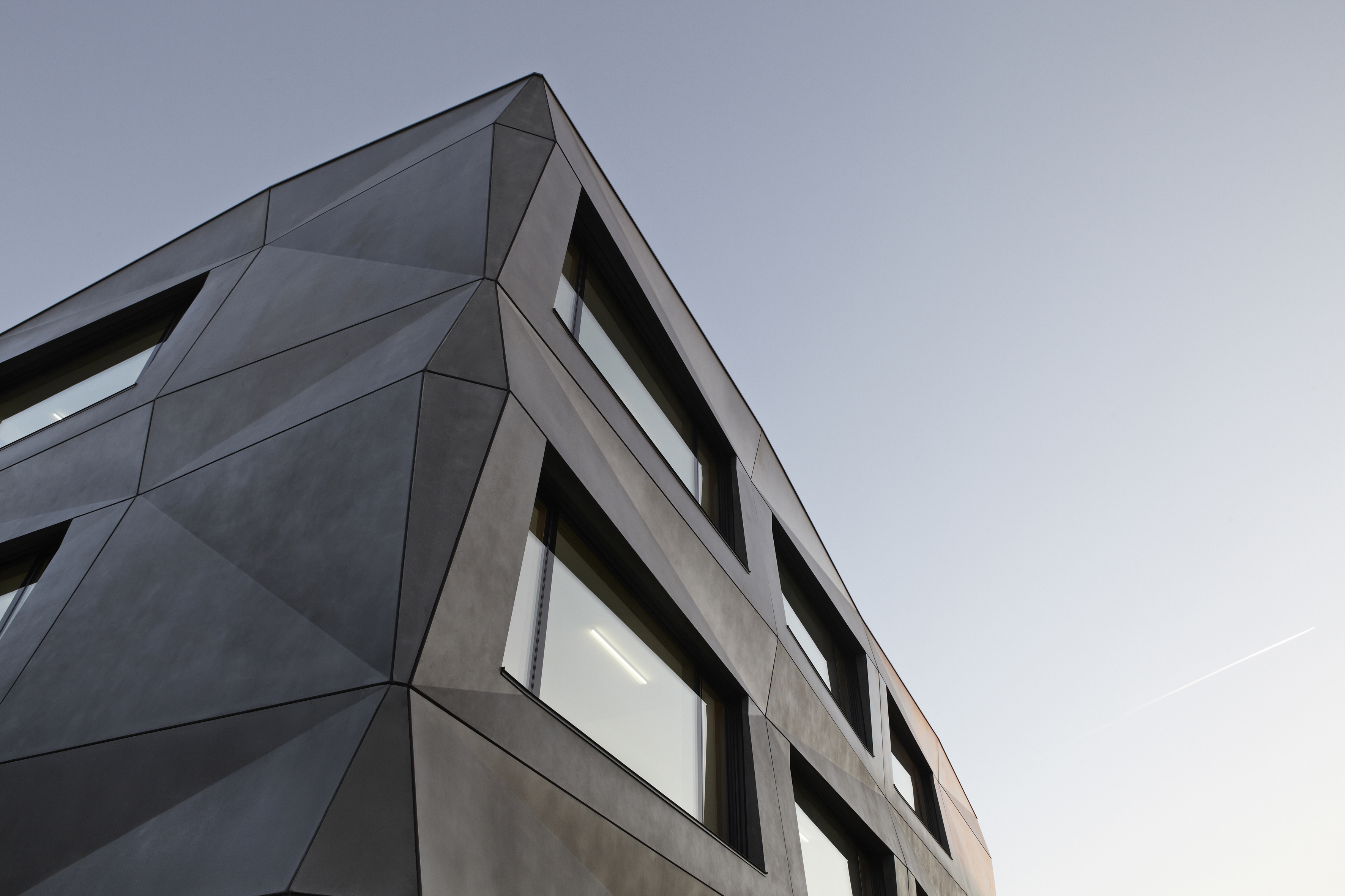 Tillicharchitektur designed this building to host production and office spaces for a textile finishing and vending firm. Its iconic feature is the folded façade, which reimagines the simple cube. The matte bright surface of the anthracite pigmented concrete responds to its environment. Depending on the season, time of day, weather, and lighting, the façade continuously changes its character. In contrast to the expressive façade, the interior design leaves more space for the production process and the products in the showroom. The team explains that the limitation on few, but high class materials, is the main factor driving the interior.
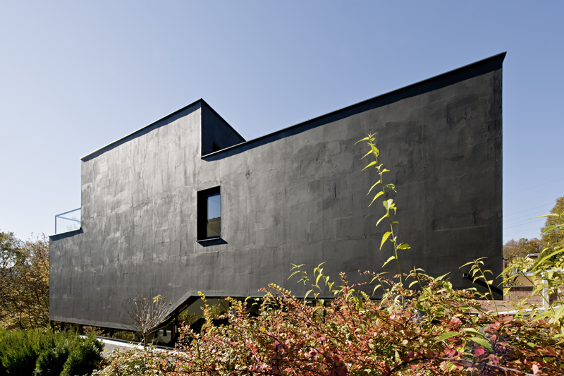
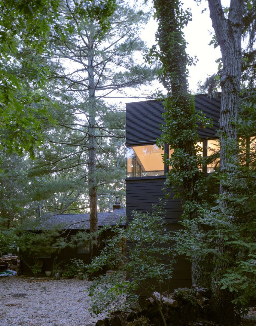
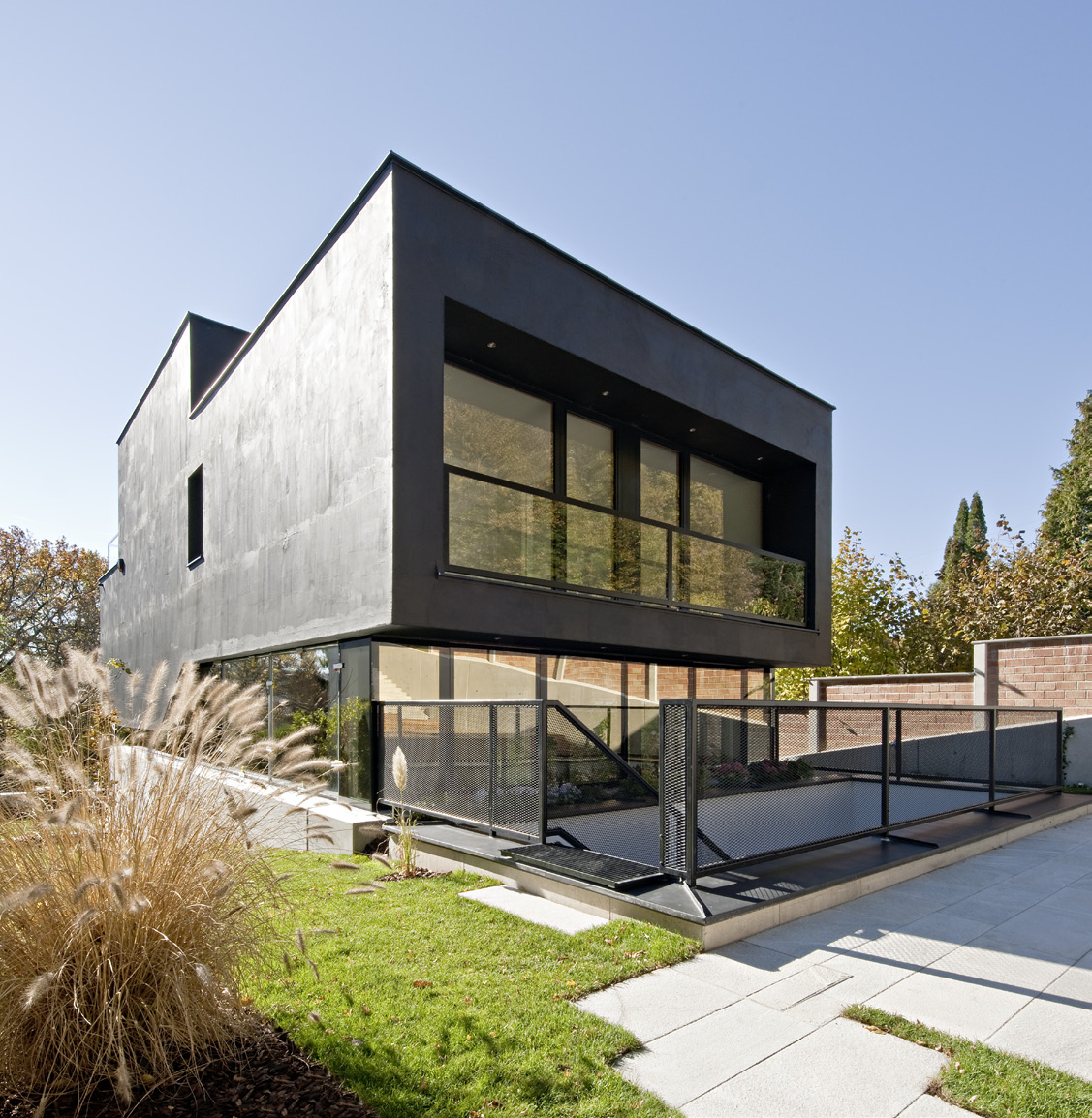 On the fringe of the Vienna Woods sits this compact single-family house LOU. Resting on a steeply sloping site, the designers wanted the first impression to be reinforced by the matte black skin of the building. Inside, the project offers a spacious and varied living environment on staggered half-story levels. As the team notes, at each level, the house opens differently to the outside world. The main residential levels are nestled against the slope, separated from the garden only by an all around-strip of windows which allows looking and stepping out in every direction.
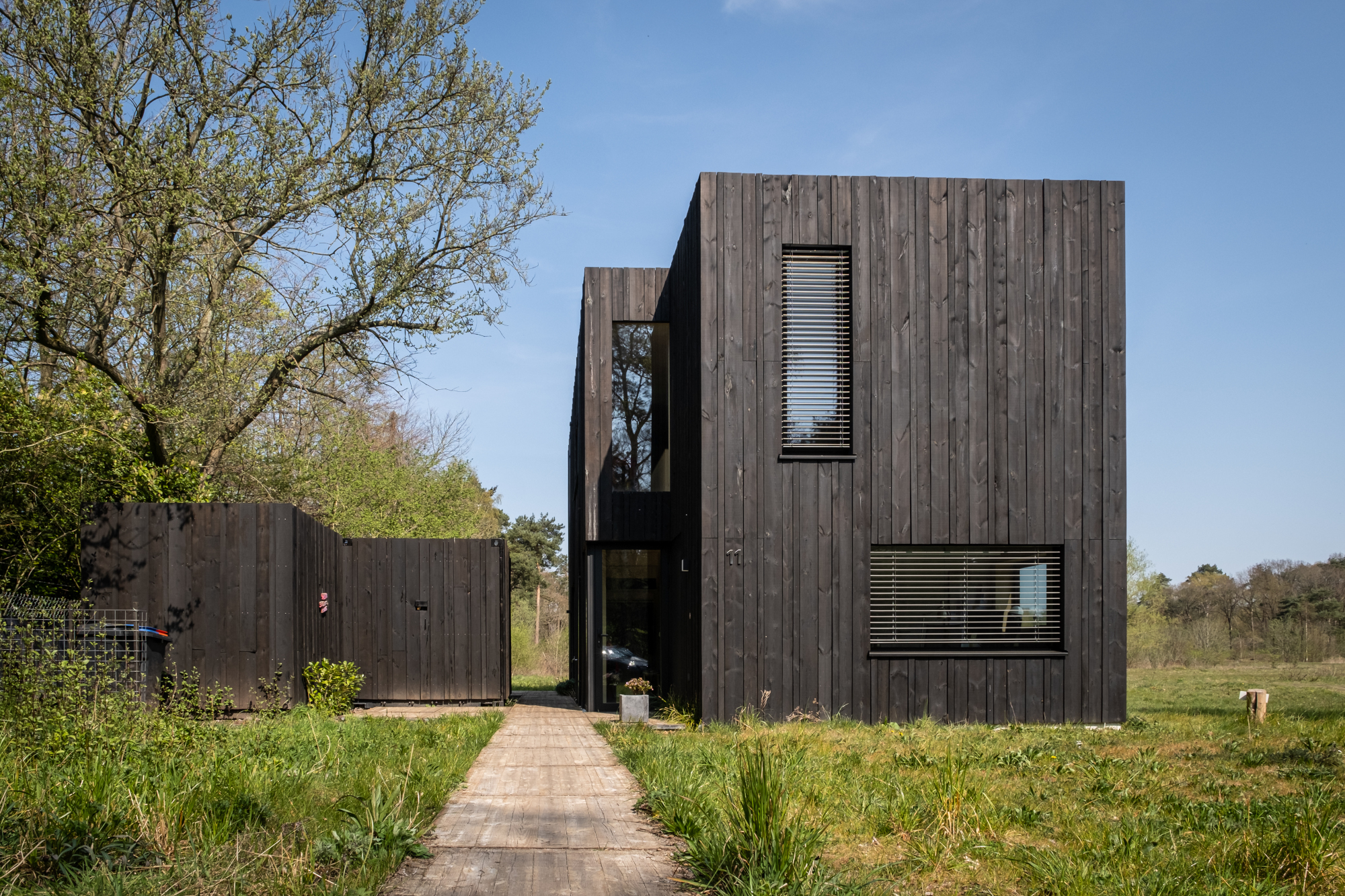
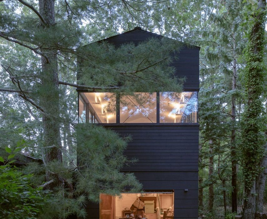
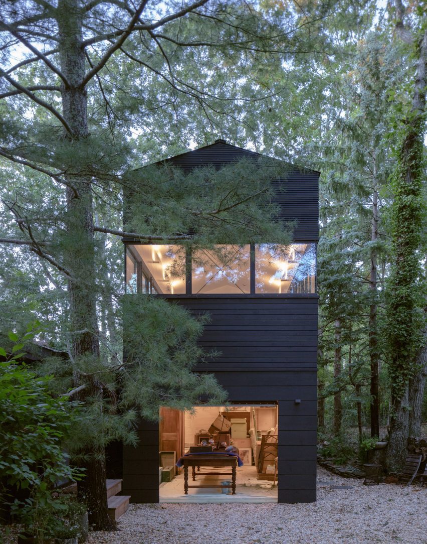
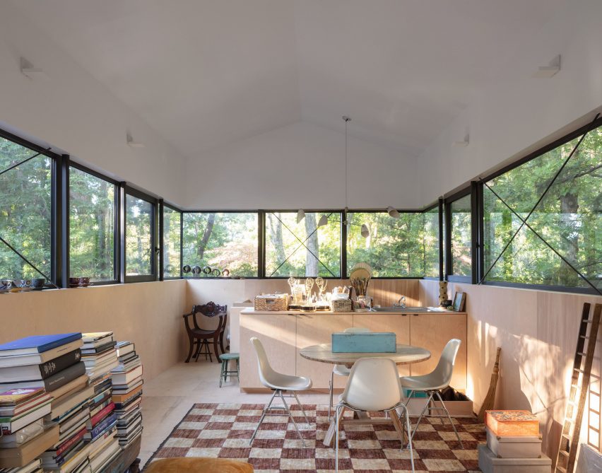
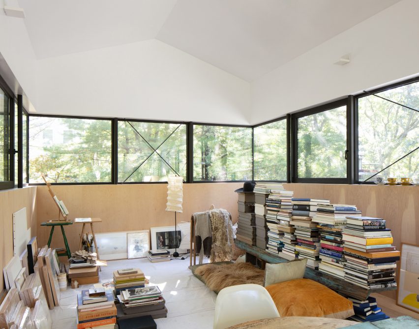
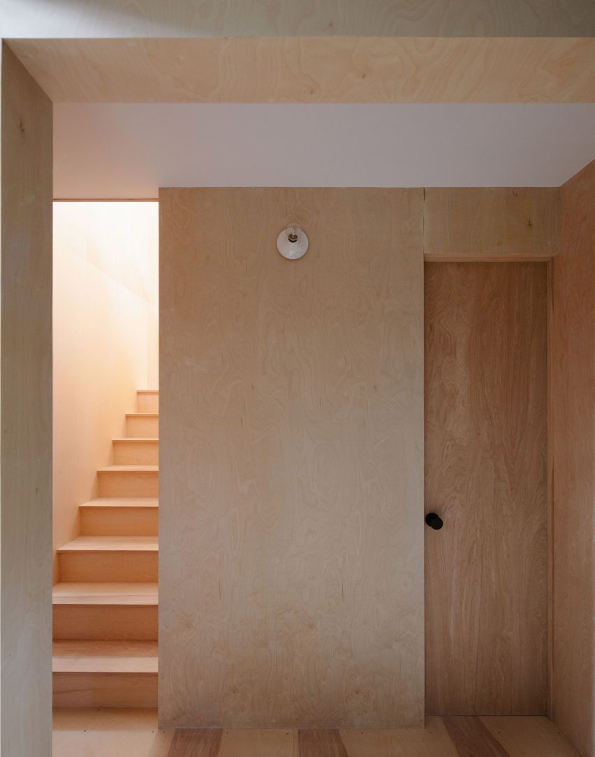
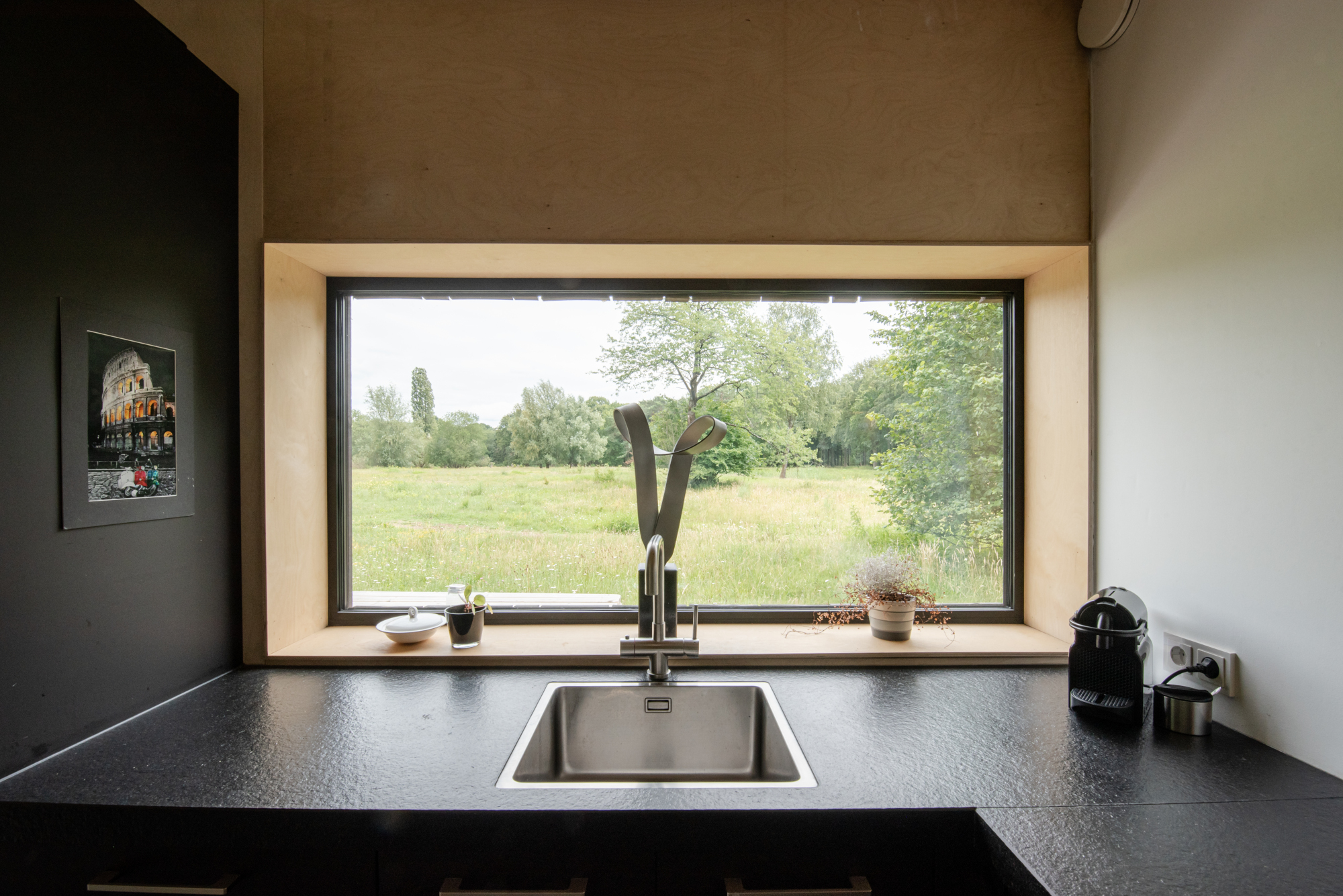 This compact wooden house was designed by architect Joris Verhoeven for himself. Located within the Drijflanen nature reserve in Tilburg, the matte building is designed to be a part of nature. With its rough black façade, it was made to fit within the context of surrounding tree trunks. The cottage house is prefabricated and constructed out of wooden cassettes filled with flax insulation. In turn, the interior of the cassettes is made of birch plywood. Other parts of the interior, such as the interior door, kitchen and stair railing, are finished in matte black, just like the exterior window frames. In this way the inside and outside of the house were made to relate to one another.
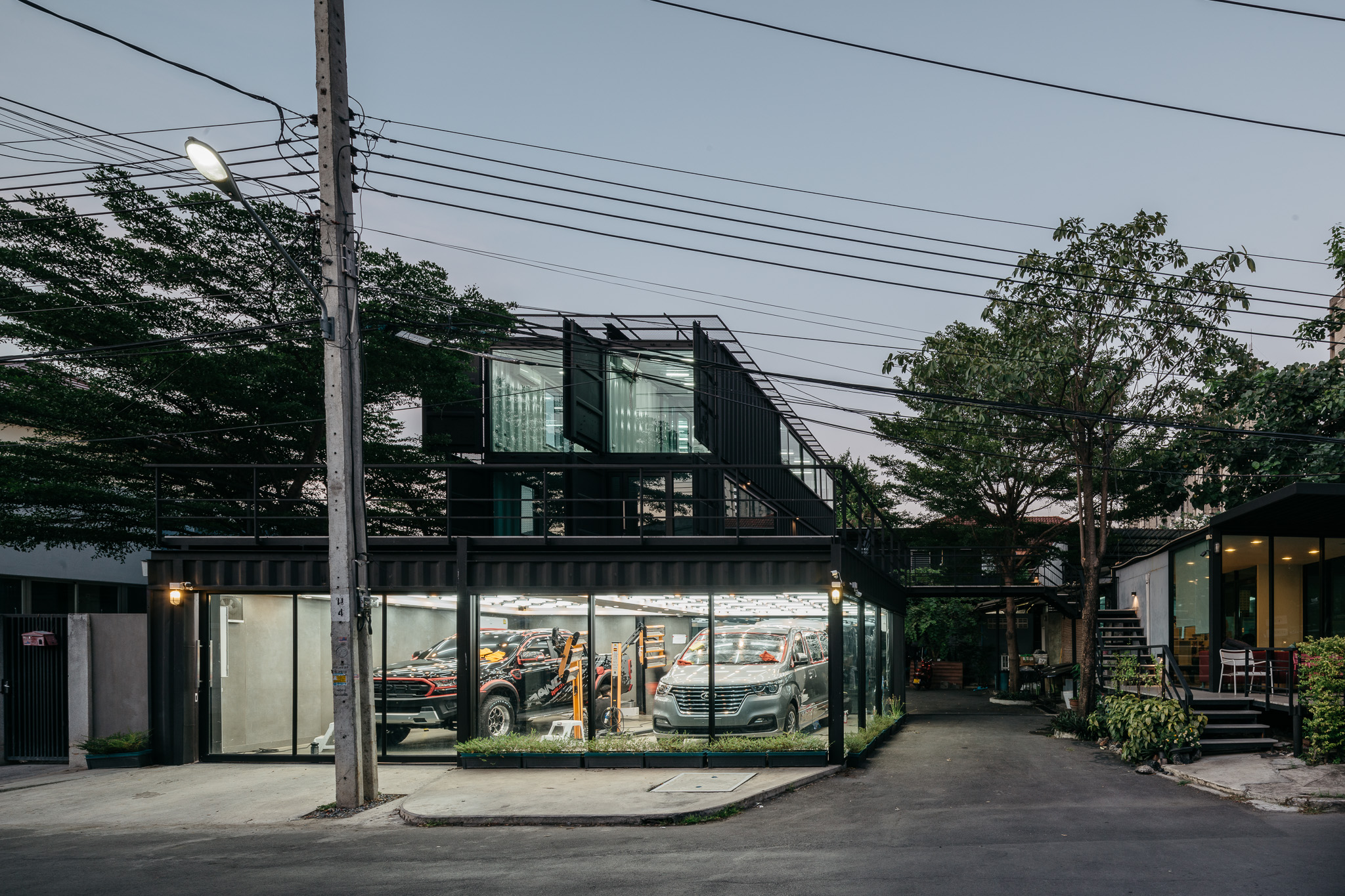
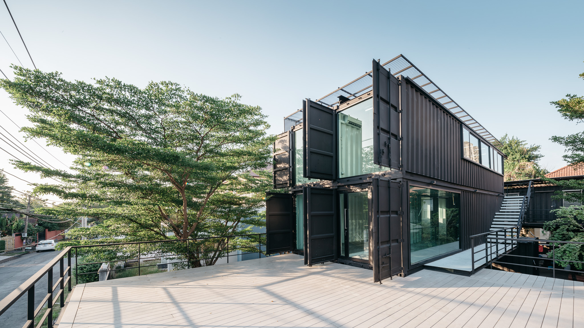 Located in Muang Thong Thani, this project is the expansion of a car care center. The building is located on a 3230-square feet (300-meter) plot of land, with a long and narrow plot that required an in-depth organization of the building. Since the space of the car care center was too limited, a new space was necessary for project extension. The building consists of four small containers and four large containers. The design team made the building exterior to be painted in matte black but the interior is white. The external envelope includes the west façade and the roof, which have metal sunshades to reflect sunlight and protect the building from the heat.
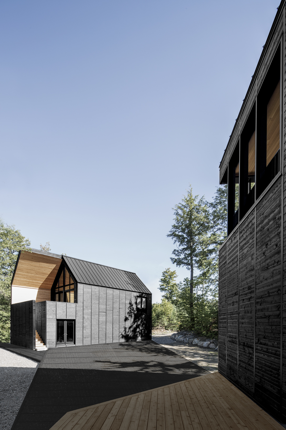
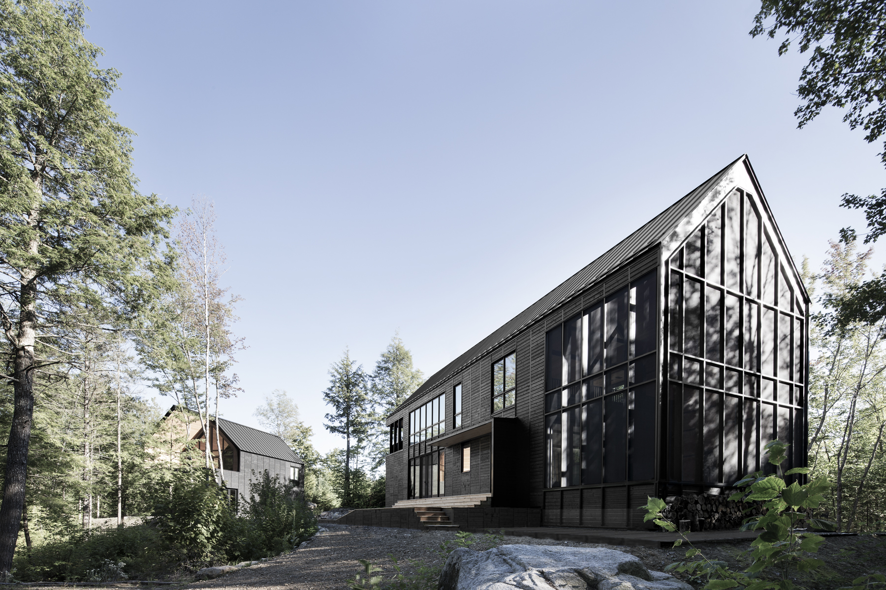 The ‘Les Marais’ project started with the design team’s fascination for the built landscape of the empty space that characterizes North American rural areas. For this design, depending on the observer’s location in the neighboring forest, the scales of the buildings are relative. The team explains that the wetland nature of this lakeside property was preserved and then the collective landscape of the built complex was designed. A large ‘plate’ of black wood links the three structures to establish a common base, while large cutouts were made in each ‘shape’, also of black painted wood, to reveal the interior materiality of the red cedar buildings.
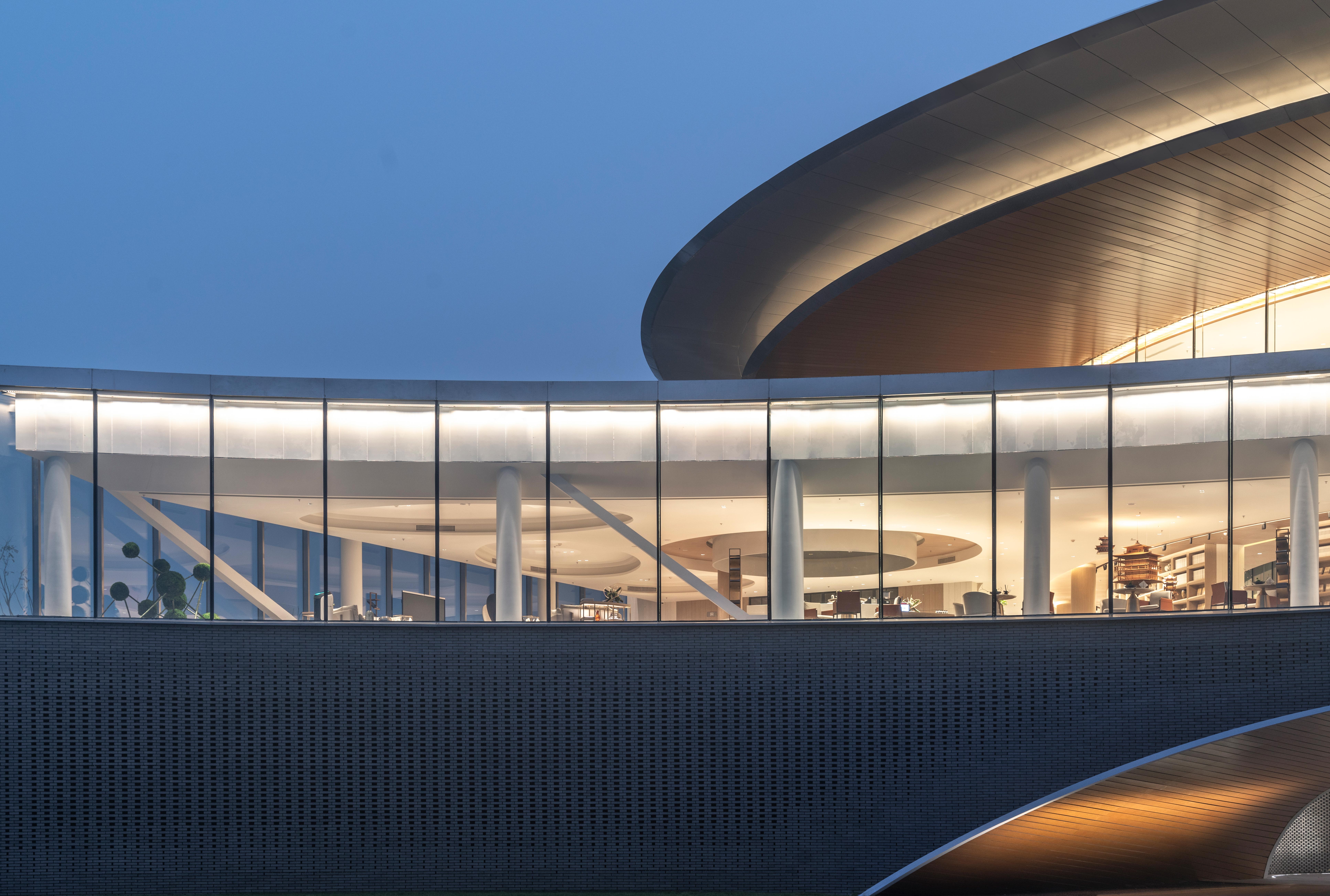
 Sited at the future land-air transport hub of Henan, this hotel was made as a “paradise city with national customs” in Zhengzhou. Ideas of Chinese ancient garden construction were introduced into the “south garden” that make the most important building the starting point of the entire array. Moreover, the matte building façade is presented in the shape of arc to match the main garden in the front. The team choose a range of matte-finish materials like frosted earthenware tile, matte composite aluminum-plastic sheet and brushed stainless steel. It is the first floor of the building that is composed of external matte façade built from 100,000 earthenware tiles.