Yellow lighting illuminates Le Père store in New York by BoND
CategoriesInterior Design

Yellow lighting illuminates Le Père store in New York by BoND

New York architecture studio BoND has used tubular lighting to create a bright yellow glow inside this men’s apparel store on Manhattan’s Lower East Side.

The first flagship for cult fashion label Le Père occupies a 1,000-square-foot (93-square-metre) corner unit on Orchard Street.

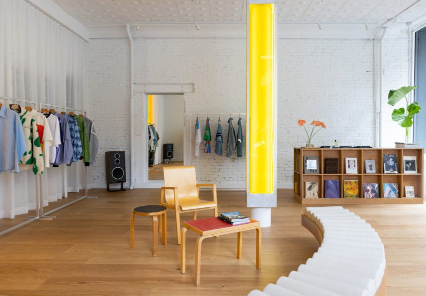
Store interior with white walls, wooden floors and a central yellow columnStore interior with white walls, wooden floors and a central yellow column
The flagship store for Le Père is largely painted white to allow the bright clothing to stand out

Utilising the store’s large exposure to the street, BoND opted to create an interior that would be just as impactful from the exterior as it is once inside.

“BoND designed the store to feel like a canvas, highlighting the design elements of the clothes while ensuring the space is a place that creators feel encouraged to spend time in,” the team said.
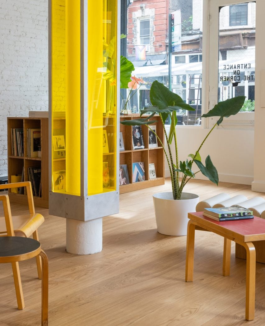
A central column encased in a translucent yellow boxA central column encased in a translucent yellow box
A central column is encased in a translucent yellow box

The firm’s approach was to leave the majority of the space white, allowing the boldly patterned clothing to stand out, then highlighting the fitting rooms using bright yellow lighting and surfaces.

A structural column in the centre of the store encased in a translucent box is also fitted with lights to give off a sunny glow.
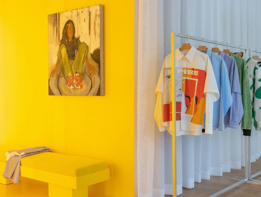
Yellow fitting room with a rail of clothing to the rightYellow fitting room with a rail of clothing to the right
Yellow lighting installed in the fitting rooms emits an inviting glow

This yellow aura is immediately apparent from the street and is meant to entice passersby to step inside.

Neon lighting has seen a resurgence in retail and other commercial interiors of the past year, appearing everywhere from a Brooklyn cafe to a Calgary chicken shop.
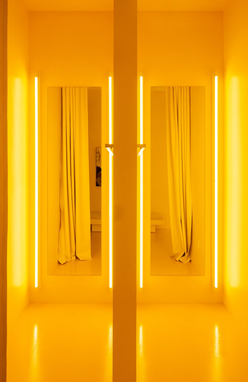
Pair of yellow fitting rooms with tube lights either side of the mirrorsPair of yellow fitting rooms with tube lights either side of the mirrors
The tube lights were installed on either side of mirrors in the fitting rooms, which are also yellow

At Le Père, other elements like the tops of vintage Artek furniture are coloured red and black, to borrow from the street signs across the neighbourhood.

Floor-to-ceiling curtains along the back wall create a soft and neutral backdrop for the apparel, which is displayed on industrial metal racks.
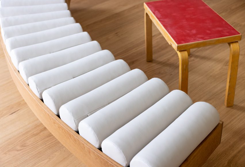
Close-up on a curved bench with a row of cylindrical seat pillowsClose-up on a curved bench with a row of cylindrical seat pillows
Custom furniture pieces were designed by BoND and fabricated by Lesser Miracle

Wide-plank wood floors are laid across the main shop floor, which doubles as a space for gatherings, conversations, exhibitions and events.

Custom furniture pieces including a curved bench were designed by BoND and fabricated by Brooklyn design and art studio Lesser Miracle.

“The design scheme blurs the lines between a store, a home and an art studio – a space that is both aspirational and livable, combining contemporary and historic elements as a playful strategy,” said the studio.

On the exterior, a generous portion of the facade is given over to a giant billboard that Le Père will use to present its seasonal visual campaigns and artwork by the brand’s collaborators.
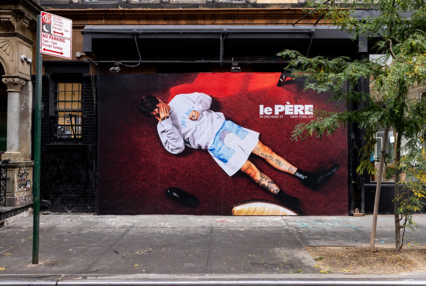
Billboard across a storefrontBillboard across a storefront
A large portion of the facade is given over to a billboard to display the brand’s campaigns

The debut placement for Fall/Winter 2023 was titled And Sometimes Boys and influenced by the work of Korean visual artist Nam June Paik.

BoND was founded by Noam Dvir and Daniel Rauchwerger, who previously designed the global headquarters and showroom for the Brazilian brand PatBo in New York.
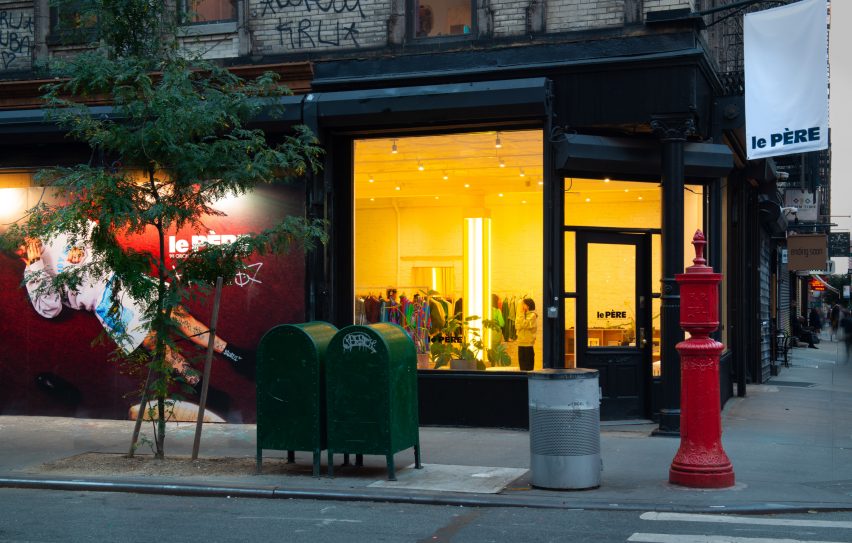
Le Père store exterior on Orchard StreetLe Père store exterior on Orchard Street
The glow from the yellow lighting is designed to entice in shoppers on the Lower East Side. Photo by BoND

The duo earlier overhauled an apartment in Chelsea for themselves, turning the dark, divided space into a light-filled home.

The photography is by Stefan Kohli, unless stated otherwise.


Reference

Burberry’s draws on minimalism at New Bond Street store
CategoriesInterior Design

Burberry’s draws on minimalism at New Bond Street store

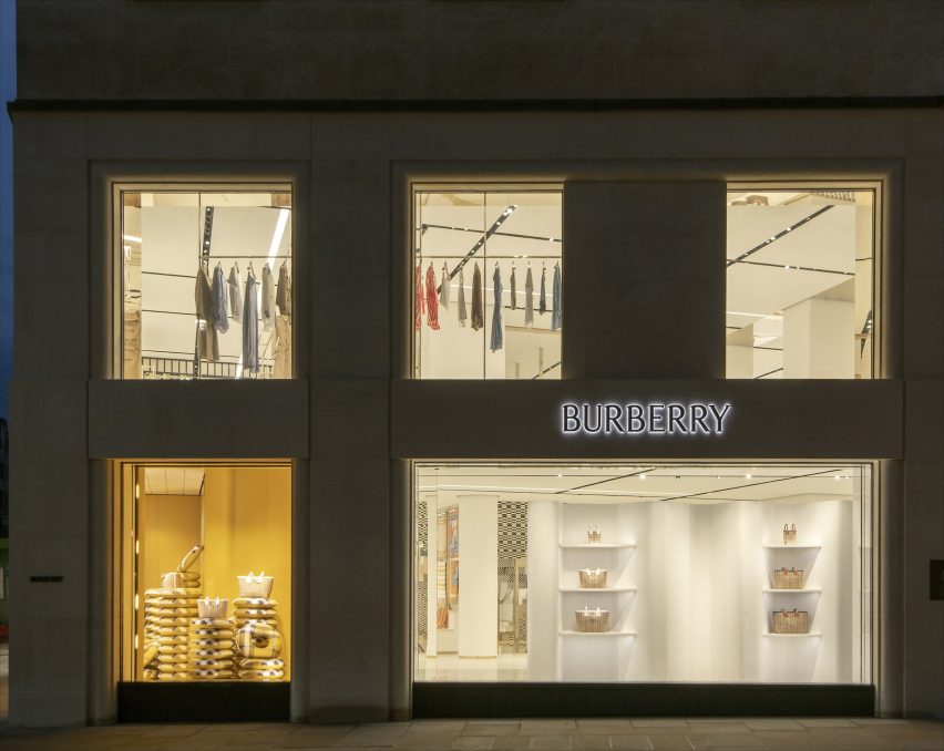
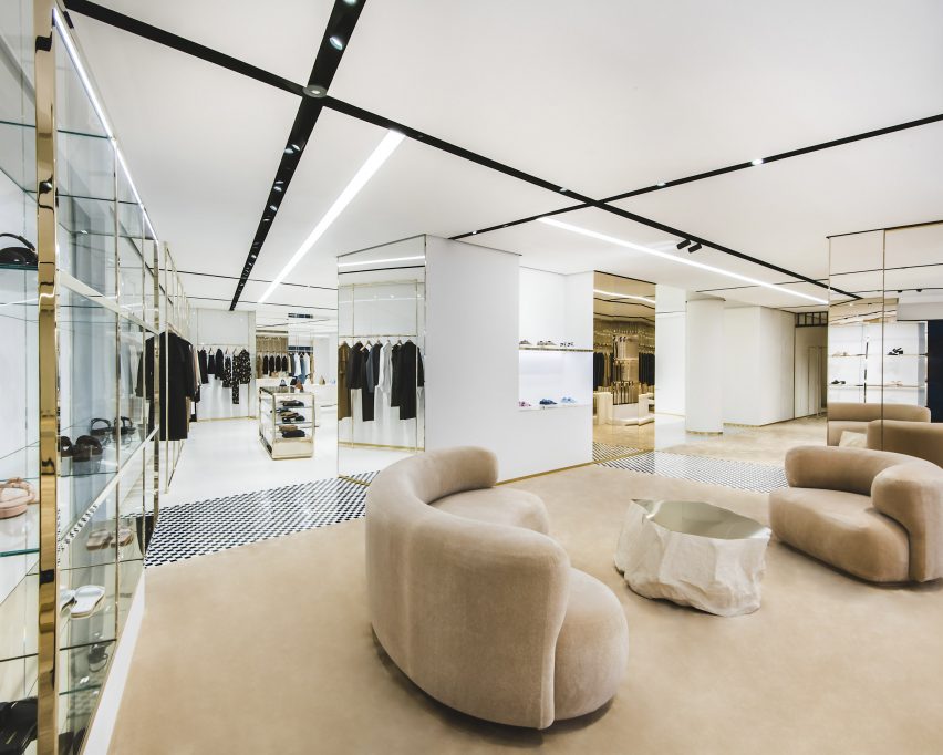
British luxury brand Burberry has renovated its New Bond Street store, which has been decorated with a minimalist scheme that is populated with striking contemporary furniture.

Set on a prominent spot on the corner of New Bond Street and Conduit Street in central London, the 22,000-square-metre store is split across three levels.

Exterior photo of Burberry's New Bond Street store
Burberry’s flagship store is located on New Bond Street

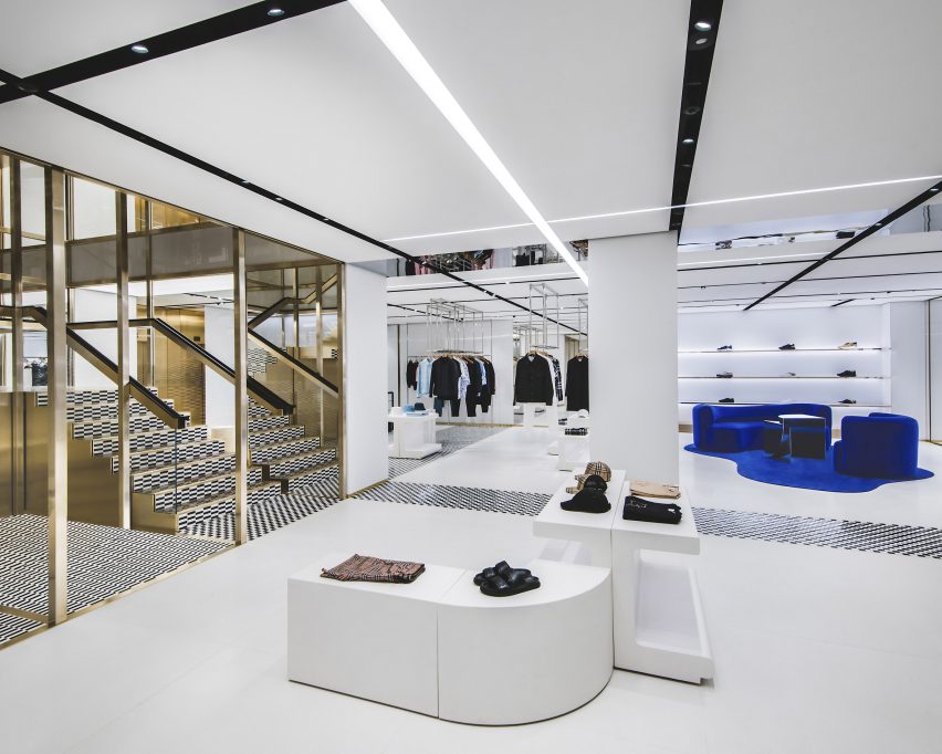
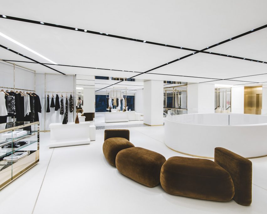
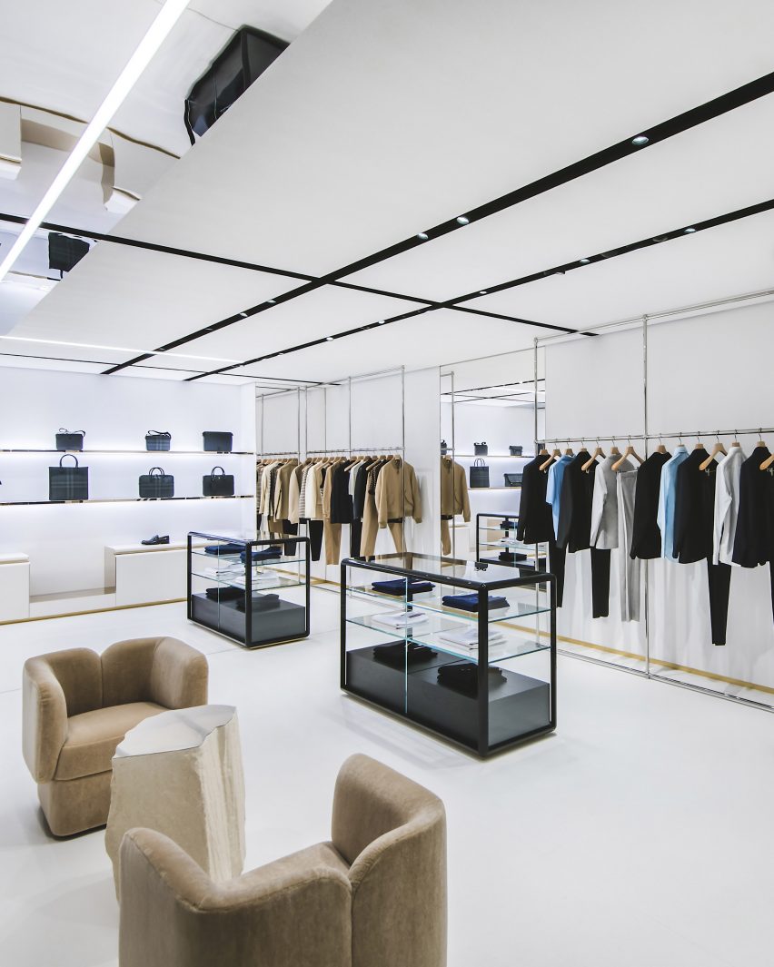
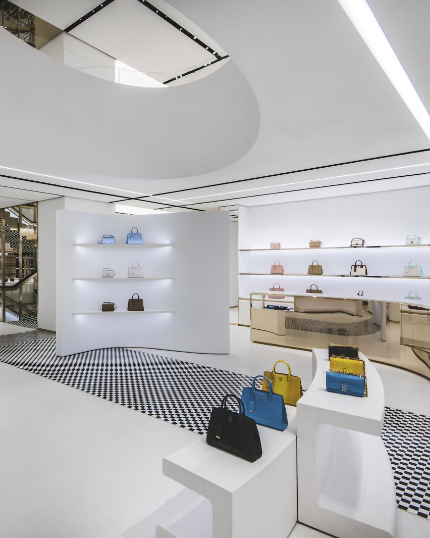
The flagship store has a minimal open-plan interior that is characterised by stark white floor, walls and ceilings which are offset by pops of gold, blue and tones of brown.

The fixtures of the store such as its pillars, staircase, wall displays and mirrors bring a rigid and strict geometry to the space that is complemented by a panelled ceiling which was designed to mimic the brand’s iconic check.

Interior photo of Burberry's New Bond Street Store
It has a minimalist interior

“The minimalist interior is punctuated with an eclectic mix of contemporary furniture, creating a stripped-back setting designed to spotlight key Burberry pieces,” said Burberry.

“Overhead lighting has been crafted to replicate the iconic Burberry Check – a pattern introduced in the 1920s, referencing the brand’s rich heritage.”

Interior photo of Burberry's New Bond Street Store
Burberry’s check was incorporated across the ceiling

Ceiling panels were organised in a gridded formation with spotlights set between each. Lighting strips were added to the panels at various intervals throughout the store and reference the multiple lines of the signature check.

Throughout the store, slivers of checkered tiles punctuate the stark white floors. A classic black-and-white checkered tile covers multiple areas of the interior, zoning numerous different spaces including ready-to-wear and accessory sections.

Other combinations of tiling include a dark brown and black rectangular tiles that are similarly organised in a checkerboard formation.

In contrast to the rigid lines of the store’s more permanent fixtures, furniture brings a softer and more playful look.

Curving sofas and armchairs were upholstered in bold shades of beige, brown and vibrant blue and placed on top of matching area rugs and carpets.

Photo of a seating area at the store
Areas of the store were decorated with pops of colour

Display tables in blocky shapes are carried throughout each of the store’s floors and sit alongside glass, metal and mirrored vitrines.

Clothing rails draw on an industrial look, with the floor-to-ceiling structures reminiscent of scaffolding systems, however, set apart by their polished and reflective finish.

Photo of a shopping area
Polished metals were paired with glass

“We are excited to open the doors of our newly refurbished flagship store on New Bond Street in one of London and the world’s premier luxury shopping destinations,” said Burberry’s chief executive officer Jonathan Akeroyd.

“The store showcases our beautifully crafted products in a luxury setting that connects our customers with our brand and unique heritage.”

Photo of the store interior
Blocky display units were placed throughout

In 2022, British designer Daniel Lee was announced as Burberry’s creative director following a shock exit from Bottega Veneta. Soon after his appointment, Lee revealed the “first creative expression” under his direction in the form of an archive-inspired charging knight logo and serif logo font.

Earlier this year, British artist Tom Atton Moore was commissioned to create a series of hand-tufted textile installations for Burberry’s Paris showroom and Rue Saint Honoré store.

The photography is courtesy of Burberry.

Reference

BoND creates New York “embassy” for fashion brand PatBo
CategoriesInterior Design

BoND creates New York “embassy” for fashion brand PatBo

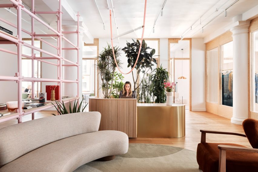
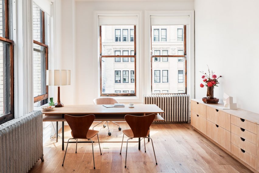
Architecture studio BoND has designed the New York headquarters for Brazilian fashion brand PatBo, which features pink scaffolding and rugs based on drawings by Roberto Burle Marx.

The office and showroom for PatBo occupies a 7,000-square-foot (650-square-metre) loft, which spans the entire seventh floor of a historic building on Fifth Avenue.

Reception area at the PatBo New York showroom
The PatBo showroom is located in a light-filled loft in New York’s Flatiron District

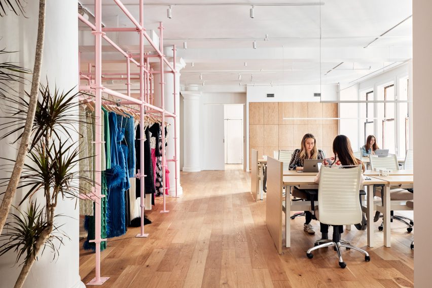
As the brand’s global headquarters, this space serves multiple purposes: showcasing the brand’s apparel; providing office space for staff; hosting buyers and events.

“Our biggest challenge was to divide the space according to the showroom’s new program while keeping its loft-like openness,” said BoND co-founder Noam Dvir.

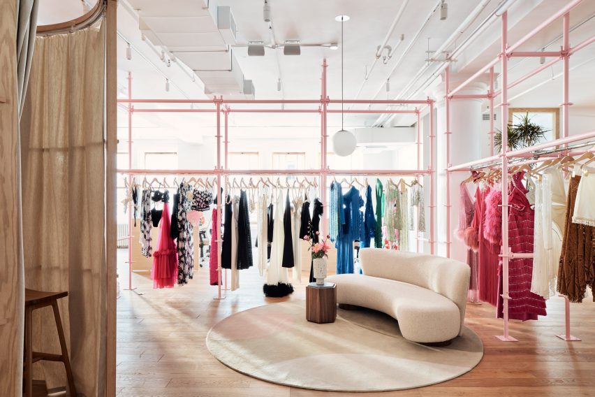
Pink scaffolding used as clothes trails
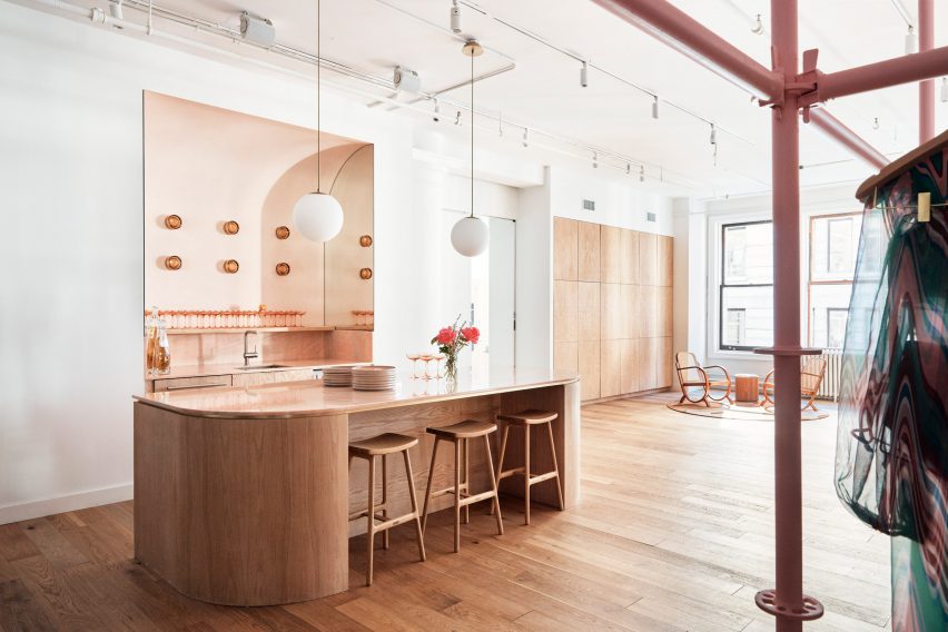
To divide the open space, BoND used pink-painted scaffolding that doubles as clothing rails

To create partitions that double as displays, the designers chose scaffolding elements on which clothing can be hung and shelving can be installed.

“They are so readily available, so New York in their character, and very easy to adapt to different conditions,” said Daniel Rauchwerger, BoND’s other co-founder. “Moreover, they’re inexpensive and have a younger, fresher feel that works so well with the spirit of a PatBo studio.”

The showroom also serves as an office space
The showroom also serves as an office space for the PatBo team

Scaffolding has been used in a variety of retail environments for its versatility and ease of installation, including a bright yellow Calvin Klein store transformed by Raf Simons and Sterling Ruby, and a boutique for Wardrobe NYC designed by Jordana Maisie.

Painted pale pink in the PatBo showroom, the industrial scaffolding takes on a more feminine appearance, which sets the tone for the rest of the showroom.

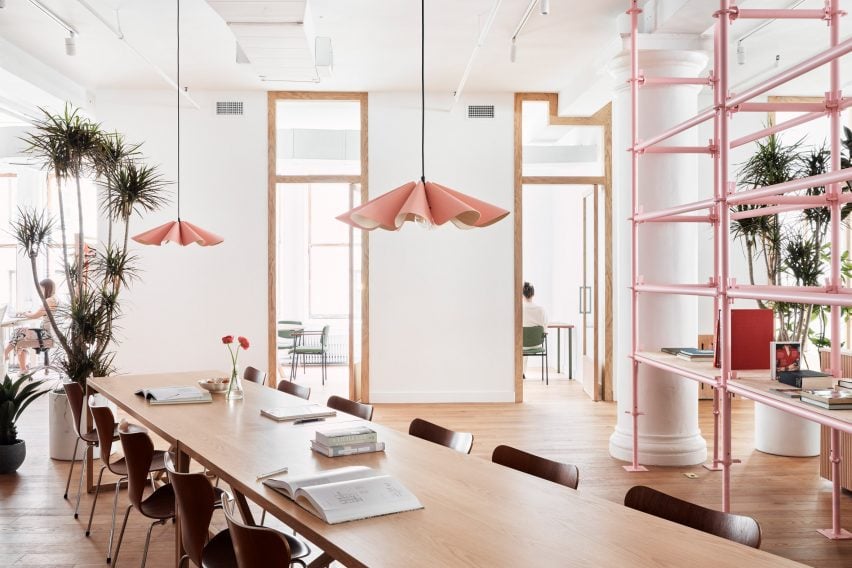
Pleated pendant lights hang above a long table
Feminine touches like pleated pendant lights align with the brand’s aesthetic

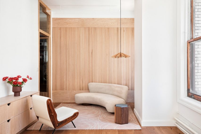
Curved couches, pleated pendant lamps and tambour panelling all add to the soft aesthetic and further align with PatBo’s brand expression.

Circular fitting rooms surrounded by curtains allow clients to try on the colourful clothing in the main showrooom.

Tambour panelling is installed in private offices
Private offices feature tambour panelling and a mix of furniture

A second showroom area for hosting buyer appointments and casting calls includes minimal clothing racks with brass rails and oak frames.

This space is closed off from the reception, but still visible through large glass panels that allow light from the exterior windows to pass through.

The loft space overlooks Fifth Avenue
The historic building overlooks Fifth Avenue

Private offices along the far side of the loft also feature glass doors for the same purpose, and add to the feeling of openness and transparency throughout the showroom.

“It’s not meant to be too precious or delicate, but rather a place where a group of creative professionals can feel encouraged to move things around and make it their own,” said Dvir.

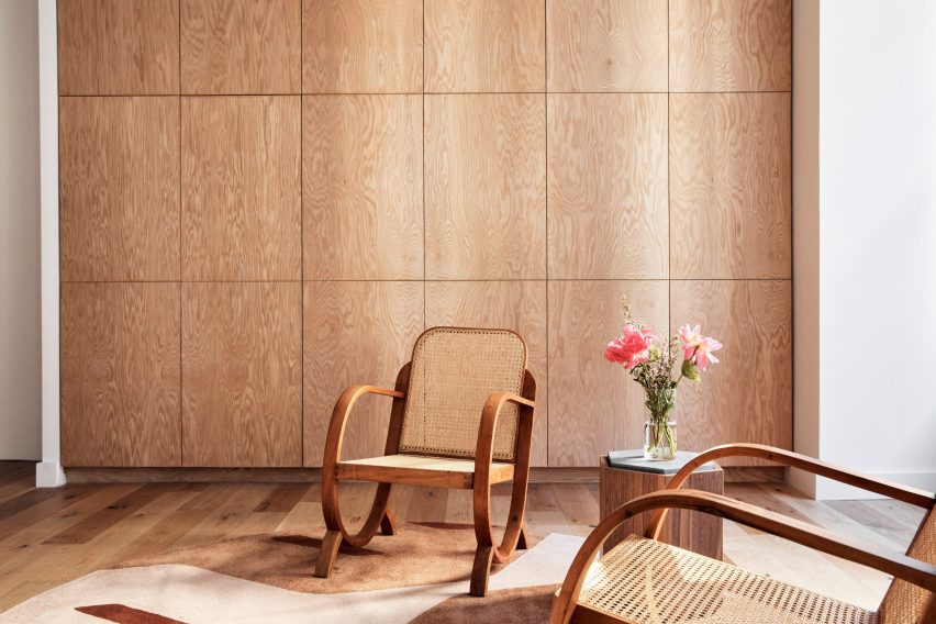
Atop the wooden floors are rugs based on the drawings of Brazilian modernist and landscape architect Roberto Burle Marx, designed in collaboration with São Paulo-based Punto e Filo.

Colourful furniture and potted plants also contribute to the Brazilian vibe in the space, and complement PatBo’s vibrant garments.

Wooden chairs on top of a rug inspired by Roberto Burle Marx
Rugs throughout the space are based on the drawings of Brazilian modernist Roberto Burle Marx

At the back of the showroom is a bar area, featuring a pink stone counter with rounded corners, and a sink placed within a curved niche that has mirrored sides.

“This is a space that combines elements of office, retail, and hospitality,” said Rauchwerger. “With that, it is able to serve as a real embassy for PatBo as a brand.”

A bar area with pink stone counters
A bar area with pink stone counters is used for hosting events

Rauchwerger and Dvir, both former journalists, founded BoND in 2019 after working as architects at OMA, WeWork and more.

Their studio’s previous projects have included the renovation of a dark Chelsea apartment into a light-filled home.

The photography is by Blaine Davis.


Project credits:

Project team: Daniel Rauchwerger, Noam Dvir, Liza Tedeschi

Reference