Restored Book Tower in Detroit features hospitality venues by Method Co
CategoriesInterior Design

Restored Book Tower in Detroit features hospitality venues by Method Co

Several restaurants and a hotel have opened within Detroit’s historic Book Tower as part of a years-long restoration project of the building undertaken by its developer and architecture studio ODA.

The 1920s skyscraper has undergone extensive restoration work over the past seven years by local developer Bedrock, which has transformed the former office building into a mixed-use space.

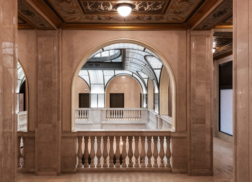
Giant glass dome over a neoclassical lobbyGiant glass dome over a neoclassical lobby
Among Book Tower’s restored features are a grand glass dome, which sits over the lobby’s Bar Rotunda

A collaboration with Method Co has led to the first phase of restaurant and bar concepts, which were introduced through the course of 2023.

“We have been ever-mindful of what the restoration of Book Tower means to this city,” said Randall Cook, CEO and cofounder of Method Co, “and we’ve worked hard to create hospitality concepts that will excite and reconnect Detroiters to Book Tower once again, and at the same time honour the heritage of this magnificent property.”

View through an arch in a stone wall of an atriumView through an arch in a stone wall of an atrium
Developers Bedrock worked with architects ODA on the restoration of the 1920s neoclassical building

Located on Washington Boulevard in Downtown Detroit, the 38-storey neoclassical building was designed by Louis Kamper – a prolific and celebrated architect in the city during its Gilded Age.

New York architecture firm ODA was hired to update and expand the programming and existing structures, resulting in half a million square feet (46,450 square metres) of mixed-use space.

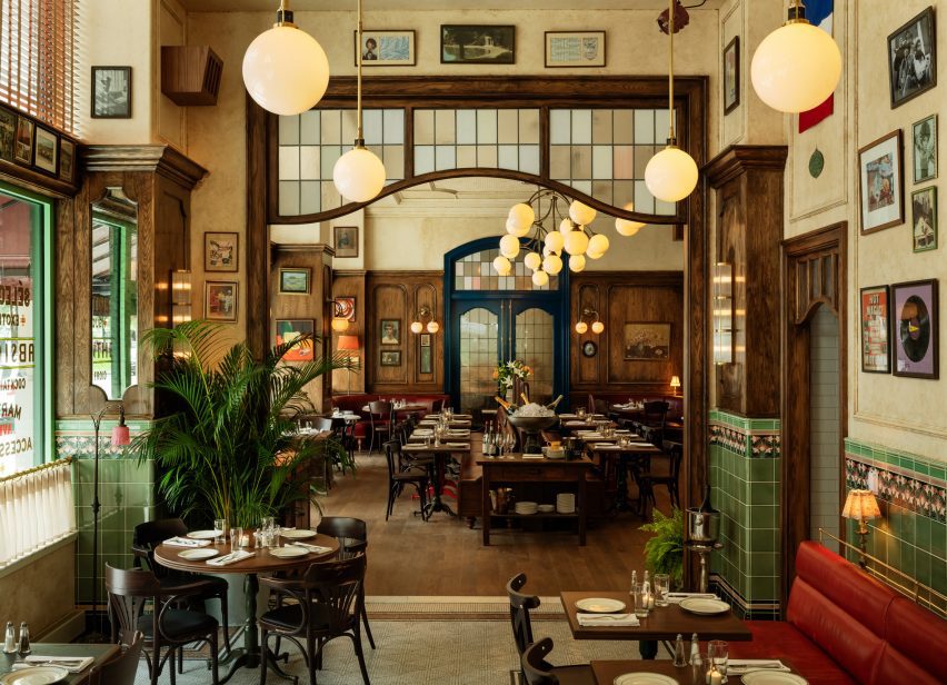
Le Suprême brasserie interior with green tiles and wood accentsLe Suprême brasserie interior with green tiles and wood accents
Method Co was brought on to conceptualise and operate multiple culinary offerings within the building, including Le Suprême brasserie at street level

The work included restoring the exterior windows and stonework and bringing an ornate domed glass ceiling back to life.

Method Co was then brought on to conceptualise three restaurants and bars, as well as a hotel, and operate each of these venues within the building.

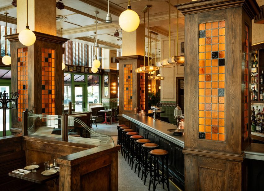
Le Suprême restaurant with zinc bar top, hand-made tiles and mosaic marble flooringLe Suprême restaurant with zinc bar top, hand-made tiles and mosaic marble flooring
Designed with Stokes Architecture + Design, Le Suprême includes a zinc bar top, hand-made tiles and mosaic marble flooring

Dining options include Le Suprême, a classic French brasserie that offers an all-day menu and both indoor and outdoor seating at street level for up to 210 guests.

Designed in collaboration with Stokes Architecture + Design, the 6,200-square-foot space features a traditional zinc bar top, hand-made art nouveau tiles, mosaic marble flooring and oxblood leather booths.

Furniture and decor were chosen to reflect Detroit’s cultural heritage, and photos on the walls of the Le Mans car race tie to the city’s automobile legacy.

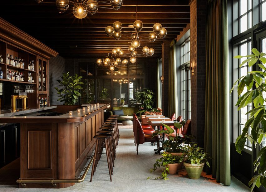
Kamper's rooftop cocktail bar with exposed brickwork and dark wood accentsKamper's rooftop cocktail bar with exposed brickwork and dark wood accents
On the 14th floor is Kamper’s, a rooftop cocktail bar designed with ODA

On the 14th floor is Kamper’s, a rooftop cocktail bar designed with ODA comprising an indoor lounge that opens onto an expansive outdoor terrace via large French doors.

The cosy interior has exposed brick walls and dark wood accents, complemented by marble mosaic flooring, antiqued mirrors and velvet drapery.

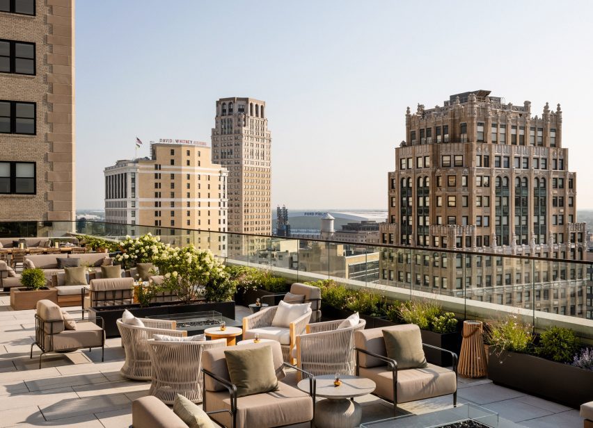
Expansive outdoor terrace with views across DetroitExpansive outdoor terrace with views across Detroit
Kamper’s opens onto an expansive terrace with views across Detroit

Bar Rotunda sits below the glass dome and acts as an all-day lobby cafe and bar, with 70 seats surrounded by ornate architectural details that recall the grand eateries of early 20th-century Paris.

“The space is canopied by a beautifully restored 100-year-old Keppler Glass dome that features more than 7,000 individual jewels and 6,000 glass panels making it an architectural centerpiece,” said Method Co, which also worked with ODA on this space.

Also planned to open soon within Book Tower are sake pub Sakazuki, and izakaya and omakase-style dining spot Hiroki-San.

The hotel component of the building, Roost Detroit, offers short and long-stay accommodation in contemporary apartment-style spaces, alongside The Residences that are purchasable as permanent homes.

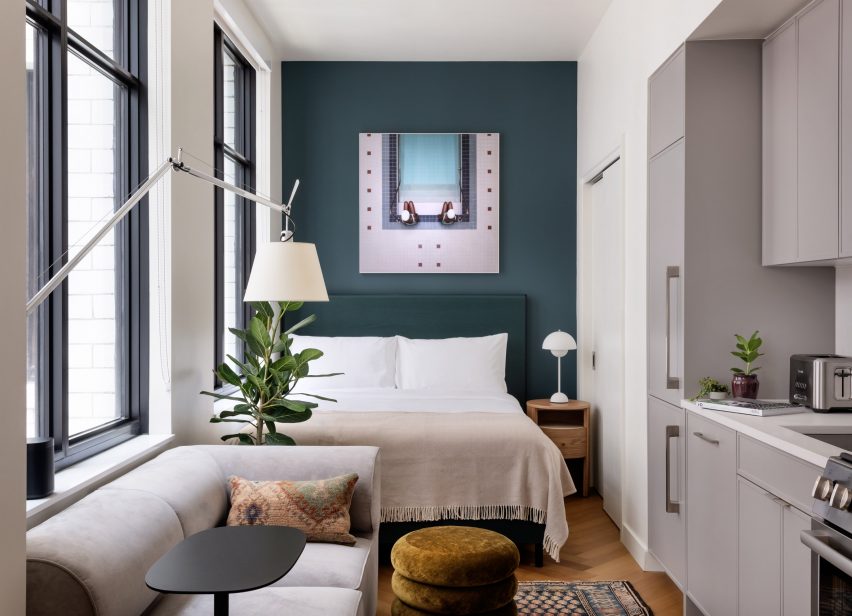
Studio hotel-apartment with a bed, kitchen and sofaStudio hotel-apartment with a bed, kitchen and sofa
The building’s accommodation component, Roost Detroit, is Method Co’s latest iteration of its apartment hotel brand

Roost Detroit is the latest iteration of Method Co’s apartment hotel brand, joining multiple outposts in Philadelphia – including the Morris Adjmi-designed East Market – along with Tampa, Cleveland and more across the US.

The company also operates The Quoin boutique hotel in Wilmington, Delaware, which offers 24 guest rooms within a converted bank building, and the Whyle extended-stay property in Washington DC that was longlisted in the hotel and short-stay interior category of Dezeen Awards 2021.

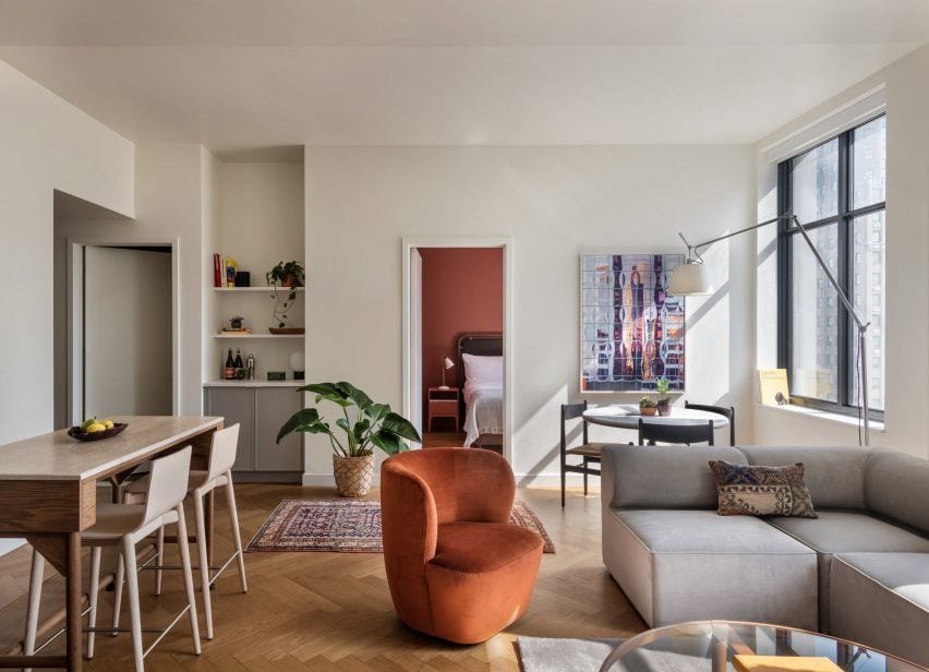
Contemporary residential interior with lounge and dining areasContemporary residential interior with lounge and dining areas
Roost Detroit offers short and extended stays within contemporary spaces of various sizes and configurations

Downtown Detroit’s revitalisation has taken shape over the past few years, and a handful of new hotels have opened to accommodate visitors who are returning to witness its cultural and creative rebirth.

They include The Siren Hotel, designed by ASH NYC to recall the city’s glamorous past, and the Shinola Hotel, which Gachot Studios designed for the local watch company of the same name.

The photography is by Matthew Williams unless stated otherwise.

Reference

Five days left to book early-bird tickets to Dezeen Awards 2023 party
CategoriesInterior Design

Five days left to book early-bird tickets to Dezeen Awards 2023 party

There are just five days left to save on tickets for the Dezeen Awards 2023 party. Book now to secure your place at our reduced early-bird rate and see this year’s winners announced.

Early-bird tickets will be on sale until 23:59 London time on 31 October 2023. Save 20 per cent and book your ticket for the special early-bird price of £145 (excluding VAT) if you order before 23:59 on 31 October 2023.

You can also save a further 10 per cent if you book a package of 10 tickets or more.

Buy your early-bird tickets now!

Taking place at Shoreditch Electric Light Station in London on 28 November, we will celebrate the winners of Dezeen Awards 2023 with food, drink, live entertainment and music throughout the night.

The winners of all 39 Dezeen Awards project categories will be revealed, as well the overall architecture, interiors, design and sustainability projects of the year.

We will also be announcing the six Designers of the Year and revealing the winner of the inaugural Bentley Lighthouse Award.

Stay at One Hundred Shoreditch

If you are travelling to London for Dezeen Awards 2023 you can save further on your stay with our hotel partner, One Hundred Shoreditch. Located just under a 10 minute walk away from the venue in the heart of Shoreditch, it is the ideal spot for your stay in London.

Use the code Dezeen23 as a “rate access/corporate code” when booking to save an extra 20 per cent off the best available price.

Book your Dezeen Awards 2023 party ticket now via Eventbrite: dezeenawards2023.eventbrite.co.uk

Email [email protected] if you have any questions. Sign up to our Dezeen Awards newsletter to get updates on the winners party and future editions of Dezeen Awards.

Reference

One Drawing Challenge Winner Explores Enduring Truths at the Heart of a Classic Book Beloved by Architects Worldwide
CategoriesArchitecture

One Drawing Challenge Winner Explores Enduring Truths at the Heart of a Classic Book Beloved by Architects Worldwide

The winners of Architizer’s Fourth Annual One Drawing Challenge have been revealed! Interested in next year’s program? Subscribe to our newsletter for updates. 

Italo Calvino’s Invisible Cities is officially more than 50 years old; yet, its enduring appeal is attested to by the special place reserved on most architect’s bookshelves for the Italian fables. For young architecture students and experienced practitioners alike, the book remains a source of inspiration and a constant reminder of the infinite possible experiences inherent to any place. This year’s One Drawing Challenge Non-Student Winner, Thomas Schaller, is one of those architects.

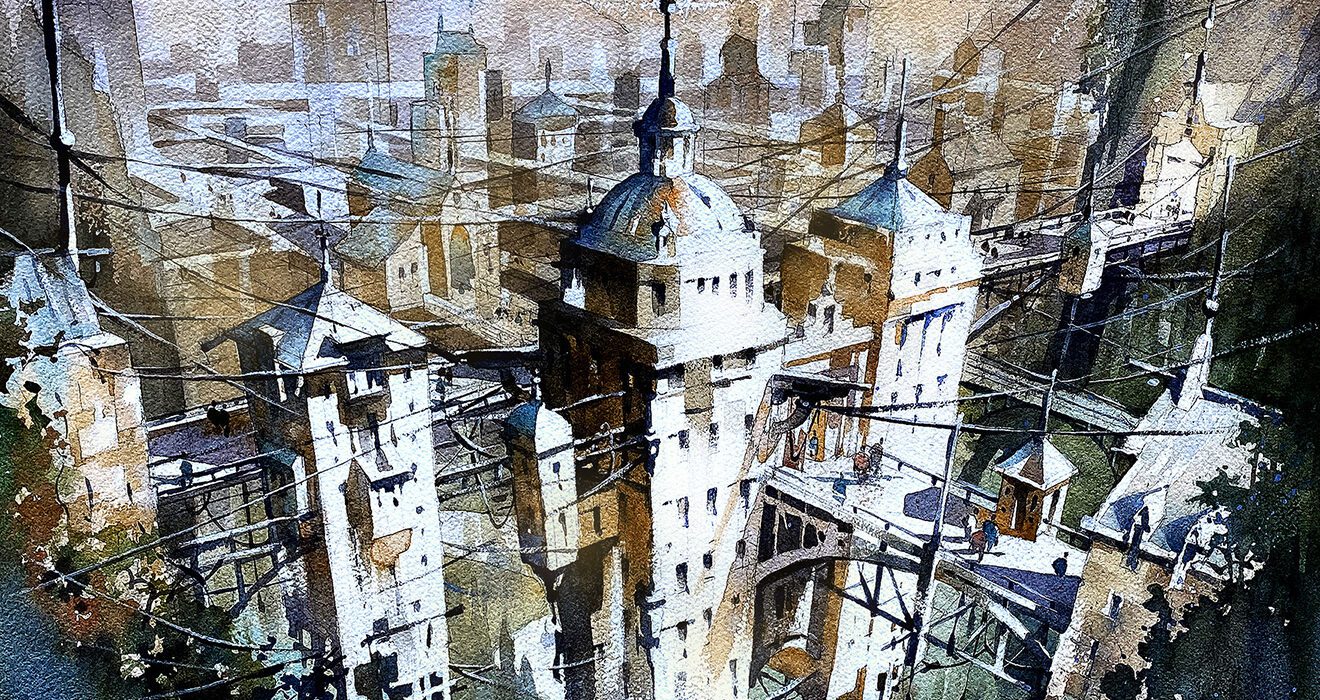
While at first glance, the city in his painting appears to be reflecting on a body of water, longer gazing reveals that the buildings grow both up and down. As the fine artist explains, “This drawing tells the story of Octavia, a city suspended above the Earth by a spider’s web of cables and wires. Interpretations are limitless, but in my interpretation, the inhabitants of Octavia depict the central truth about humanity – connections are profound – but tenuous, just as is our grasp on life itself.” The razor’s edge distinction between precarity and strength is at the core of the urban experience.

Expertly oscillating between the precision of fine lines, seen in details like the bridge and cables, and the more atmospheric and reflective qualities of diffused pigments, the image is mind-bending: not only in terms of subject matter but also in terms of technique. Schaller’s use of his medium, therefore, amplifies the thematic subject matter at the heart of the image.

To learn more about his conceptual and creative processes, Architizer’s Architecture Editor, Hannah Feniak, was delighted to chat with Thomas, who delved into topics such as the relationship between architecture and fine art, and the inspiration for his winning entry. Keep scrolling to see process sketches by the award-winning architectural artist!
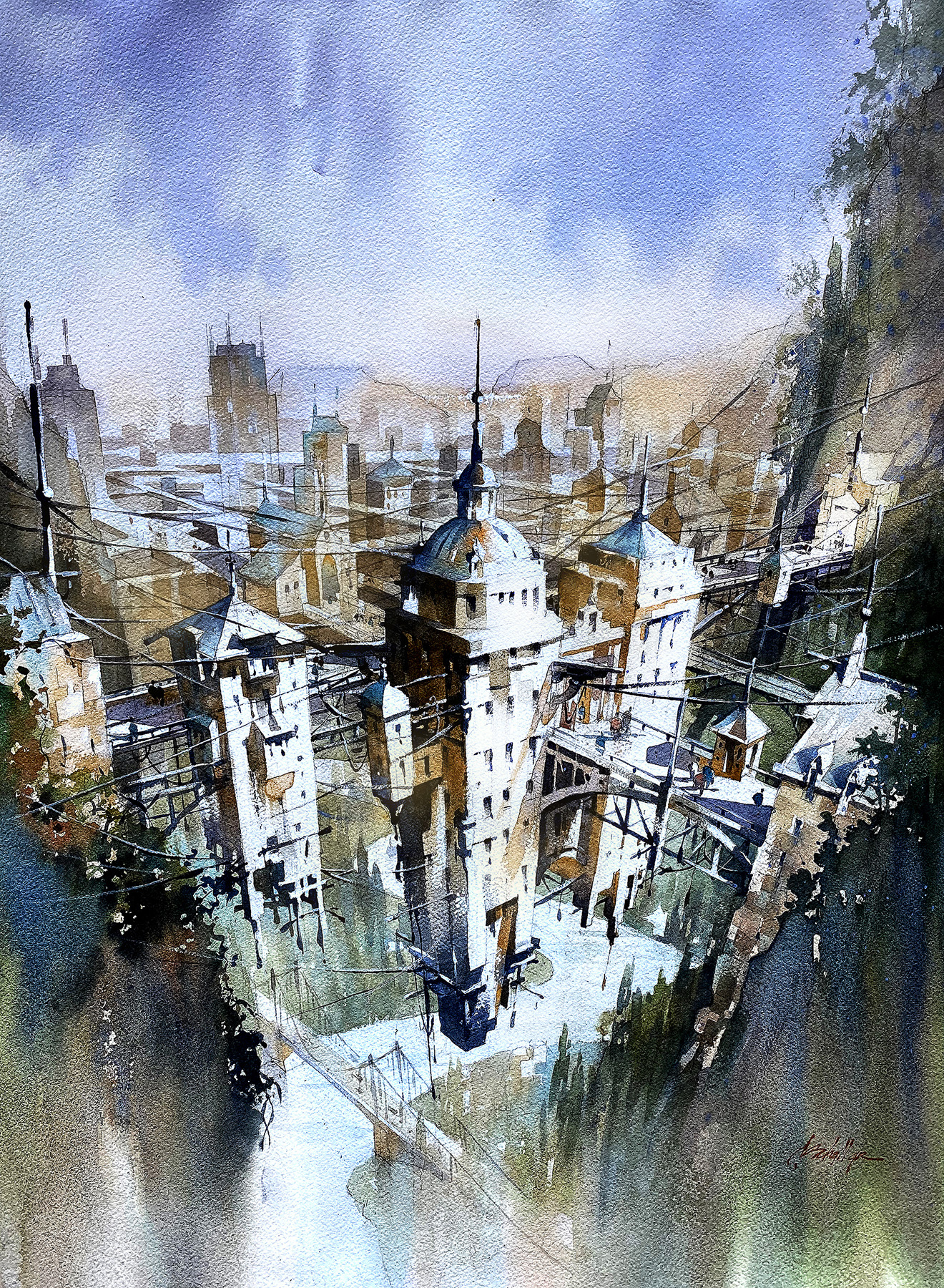
Hannah Feniak: Congratulations on your success with the One Drawing Challenge! What sparked your interest in entering the competition, and what does this accolade mean to you?

Thomas Schaller: First, I want to say a very big “Thank You” to everyone at Architizer who designed and hosted this competition and exhibition. It is a great honor for me to even be included. I appreciate all your hard work. And I am in awe of the incredible work entered. Congratulations to all.

From the time I could see, drawing has been fundamental to who I am. As a child, I drew to try to make sense of the worlds I saw both around me and within my imagination. To this day, I am never without a sketchbook and a pocket full of sketch pencils in order to keep a kind of “visual diary” of the ideas in my head as well as to record my impressions of the world we all inhabit. And so, I am thrilled that this competition even exists.

It is my belief that drawing is the most effective and direct connection between the visual image and the human need to record, express, and create. While I rely on traditional pencil and paper, I have no opposition whatsoever to any means, method, or technological tool anyone uses to draw. But for the human mind to open the windows upon the landscapes of perception, creativity, and imagination, drawing is the most effective, enjoyable and expressive way to do so.

HF: What were the primary challenges of conceiving your work, from forming the idea to the creation process?

TS: Like many, I worship the iconic work, Invisible Cities by Italo Calvino. It was written in the early 1970s but its themes of exploration, the clash of the real and the imagined, the built and the unbuilt, the plausible and the impossible, dreams, memories and the human condition are simply timeless. The book’s protagonist — an adventurous interpretation of Marco Polo — travels a dreamscape of a world visiting cities built of memory and dreams and offers endless insights into the nature of cities and the very fabric of human life here on Earth.

One of the cities visited is Octavia, described in the book as suspended high above the Earth between two rocky mountain peaks by a tenuous spider’s web of cables and wires. Countless metaphors and analogies can be drawn. One of course is the dependence of any city on a healthy infrastructure of roads, bridges and lines of communication, etc. But another more broad theme is the “infrastructure” of humanity itself. Our very real need to congregate, to form groups for safety, sanity and survival was, for me, the takeaway and the theme of my drawing.

Especially after coming through two years of pandemic, the themes of human interaction and the need for interconnectivity were at the forefront of my mind as I designed this work. We can take our society’s survival for granted, but if we fail to care for and nurture one another, as well as the very planet upon which all societies depend, we can learn just how frail and fragile our infrastructure may truly be.
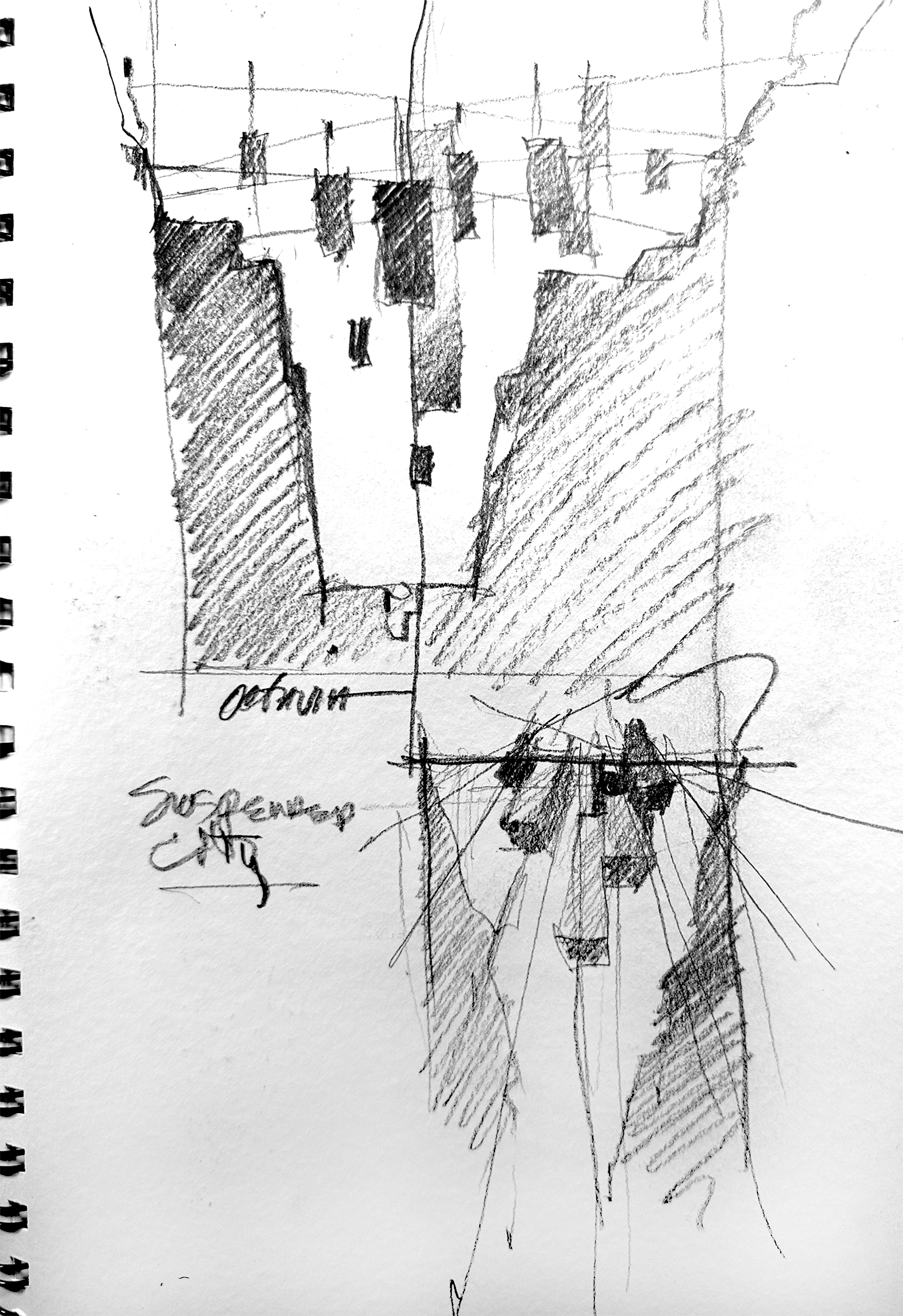
Preliminary sketch for the winner entry courtesy of the artist

HF: You trained as an architect but now have a successful international career as an architectural watercolor artist and author. How do you think the medium itself contributes to the scenes that you depict — in particular, in your winning entry?

TS: In my earlier days, I felt that I had to choose between my wish to become a visual artist and my desire to become an architect. In time, I became both, but my career interests operated on separate tracks, divided by an arbitrary and faulty belief that each had separate aims. It has taken many years for me to understand that these interests,  as well as many others, could be successfully merged into a single creative energy. The key to this for me was in realizing that all things — all ideas, all people, all places, all atmosphere and negative space itself has a kind of architecture. There is a shape and a volume to everything seen and unseen, real or simply imagined. And so anything can be studied, modeled and drawn. If I concentrate on drawing what I “see” rather than what I “look at” — drawing genuine emotional experiences rather than simple visual observations, the landscapes for creativity become boundless.

HF: Your winning entry was inspired by Italo Calvino’s classic, Invisible Cities. Are your other architectural paintings and drawings as conceptual as “Octavia – Suspended City”?

TS: Repeat readings of Invisible Cities helped me to form the cornerstone of what would become my “artistic voice”. I am more aware of contrasts than anything else as I move through the world. By that I mean of course the clash of dark and light, but also ideas about what is real or simply imagined, the man-made and the natural environments, warm and cool tonalities, vertical, horizontal, and diagonal energies, and thoughts about time — what is past, present, or yet to be.

As polarities meet and find some kind of resolution — or not — this is what my work is always about, trying to find a resolution on paper of two or more things in opposition. And so yes, such conceptual work is exactly what I have been long most interested in exploring.

HF: What first drew you to watercolor as a medium for depicting the built environment?

TS: As a choice of medium, watercolor is a perfect fit for me. It has the ability to be either very precise or completely abstract, controlled or wild. The use of watercolor is a study in edges: hard and explicit, or soft and ephemeral. Watercolors can at once be subtle and suggestive or bold and explicit.

I think of watercolor too as a “subtractive” process in that we begin with a piece of white paper, 100% in light. And we proceed to subtract away some of this light as we go. The transparent nature of watercolor enhances our potential to study light. And in the end, the parts of our work that are not painted can be as powerful and full of meaning as those which are painted.

And the connection to drawing itself cannot be ignored. I actually consider what I do with watercolor as drawing, but I draw with shapes of value and tone rather than with lines.
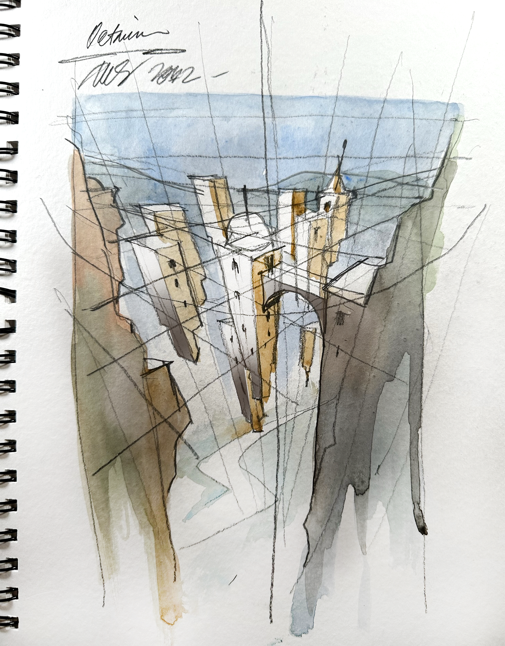
Planning the concept and colors for the winner entry, image courtesy of the artist

HF: My next question is somewhat related to the preceding one: How did the process and workflow of creating your drawing compare to traditional architectural drafting?

TS: As stated, watercolor is a form of drawing to me. But rather than depicting ideas of space and form with a line, we do so by using shapes of tone and value, shadow and light, and color. But line-based sketching and more precise architectural drawing are always an element in what I do as well. These are time-honored and beautiful means of expression which I hope never to abandon. In my work, I try to merge the precise with the suggested, the implied with the stated, and so while I wander quite far from my more precise architectural roots, they are always there as a kind of north star shading any wild flights of fancy with at least a note of plausibility.

HF: What one tip would you give the other participants looking to win next year’s One Drawing Challenge?

TS: Oh my … “ advice”. I always say that the best advice I have is to take very little advice. This is a glib non-answer I realize but there’s something in it. What I mean is that as we all try to improve and advance in our careers and our own sense of achievement, it becomes all-too easy to compare our work or measure ourselves against our colleagues or others whose work we admire. This is natural, but should be avoided as much as possible.

I am nowhere near the artist I hope to be some day, but I only started to make noticeable improvements when I trained my ego to be a bit more self-reliant and less “noisy”. It’s too easy to live on social media and if we succumb to the flattery or the uninformed critiques we hear online, we are doomed. I think we should take any feedback onboard, process it quickly and move past it.

Genuinely, I celebrate the accomplishments of my colleagues. But I understand that another’s win does not equal my loss. And anything I might achieve does not diminish any other’s work. While you can never draw or paint like anyone else, neither can anyone else draw or paint like you.

And so rather than by seeing the world always by looking outward, spend as much time exploring the worlds you see by looking inward. And listen. There is your voice telling you what you need to do and where you need to go. We already have within us all we need to do most anything we wish to do. So if we trust that voice and learn to hear it more clearly, it will lead us in the direction we should be traveling.


Interested in seeing more work by Thomas Schaller Fine Art? Peruse his portfolio and connect with the artist through your preferred channel:

> www.thomaswschaller.com
> www.facebook.com/thomaswschaller
> www.twitter.com/twschaller
> www.instagram.com/thomaswschaller

The winners of Architizer’s Fourth Annual One Drawing Challenge have been revealed! Interested in next year’s program? Subscribe to our newsletter for updates. 


Reference

7 Pocket-Sized Book Borrowing Buildings
CategoriesArchitecture

7 Pocket-Sized Book Borrowing Buildings

Have your say in the world’s best architecture: the 10th Annual A+Awards Public Vote is now open! Cast your ballots in the largest awards program for architects and designers before May 27th, 2022!

Libraries can be massive and solemn with classical portals and floor-to-ceiling bookshelves. Or, they can be tiny and playful with bright colors and lightweight structures. While their functions are not limited by size, these tiny libraries can easily be approachable community spaces that house a range of facilities and activities. Explore with this collection 7 inspiring mini-libraries that utilize their tiny site.

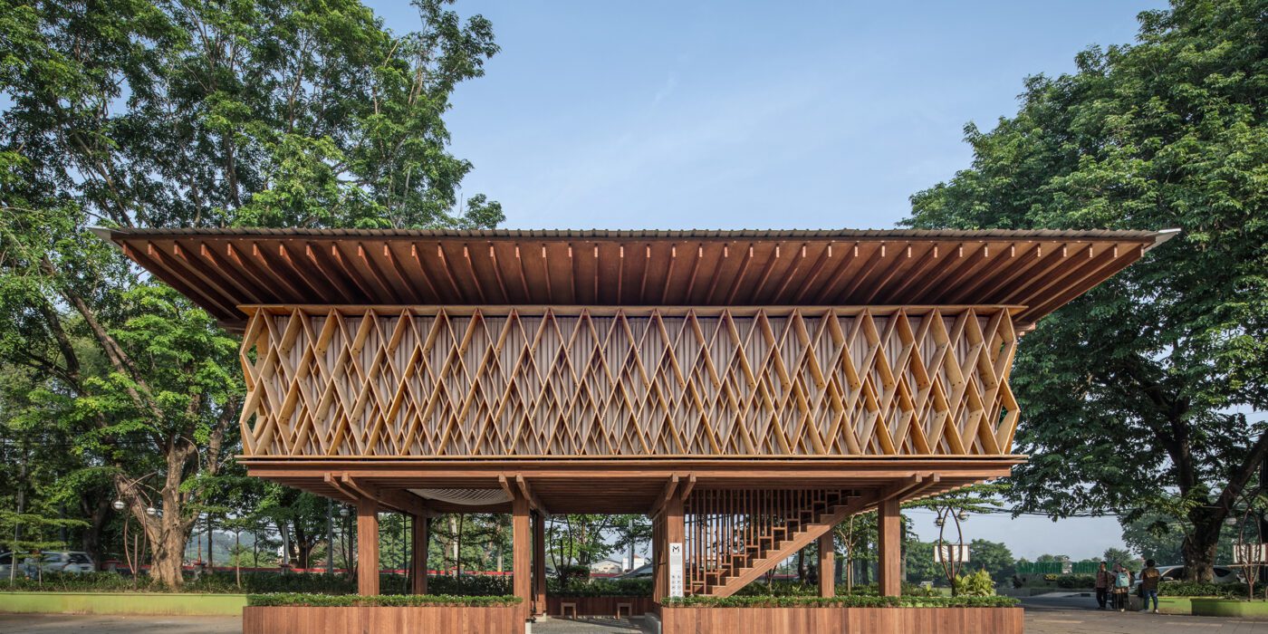
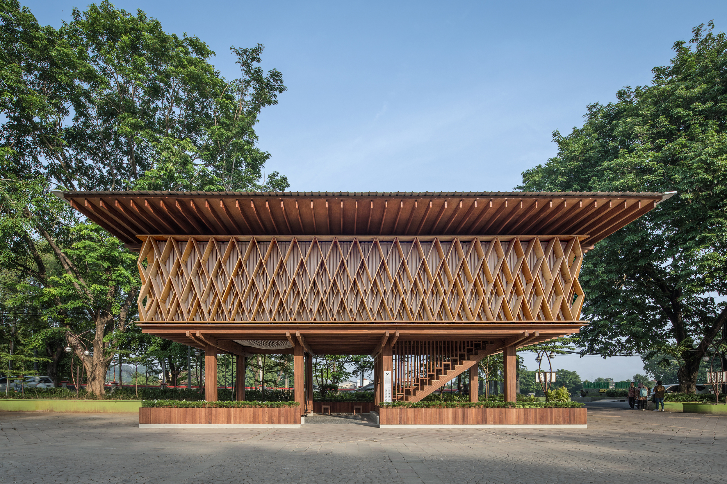
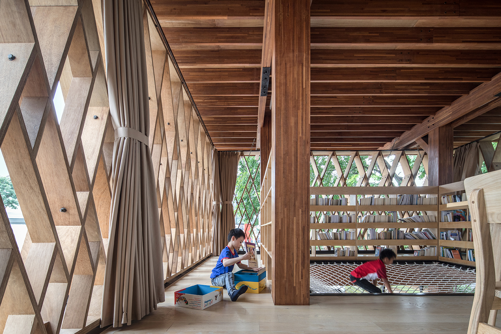
Microlibrary Warak Kayu_exteriorMicrolibrary Warak Kayu_interiorMicrolibrary Warak Kayu by SHAU, Semarang, Indonesia
Popular Choice, 2020 A+Awards, Libraries

This finely made timber structure is a mini-library that simultaneously functions as a children’s playground and a community space. The ground floor is highly transparent: the building is a pavilion-like space with a few structural columns, seats, stairs, and a wide swing that attracts children. Pedestrians can easily access the sheltered space and utilize it as a roadside rest point.

The library on the second floor has chairs around a table as well as a net where children can read in a playful manner. The net is also a communication portal between the two levels. A timber brise-soleil wraps around the library space, enclosing the four sides. Along with the overhang roof, the screen keeps the library space from burning sun while leaving the space naturally ventilated.

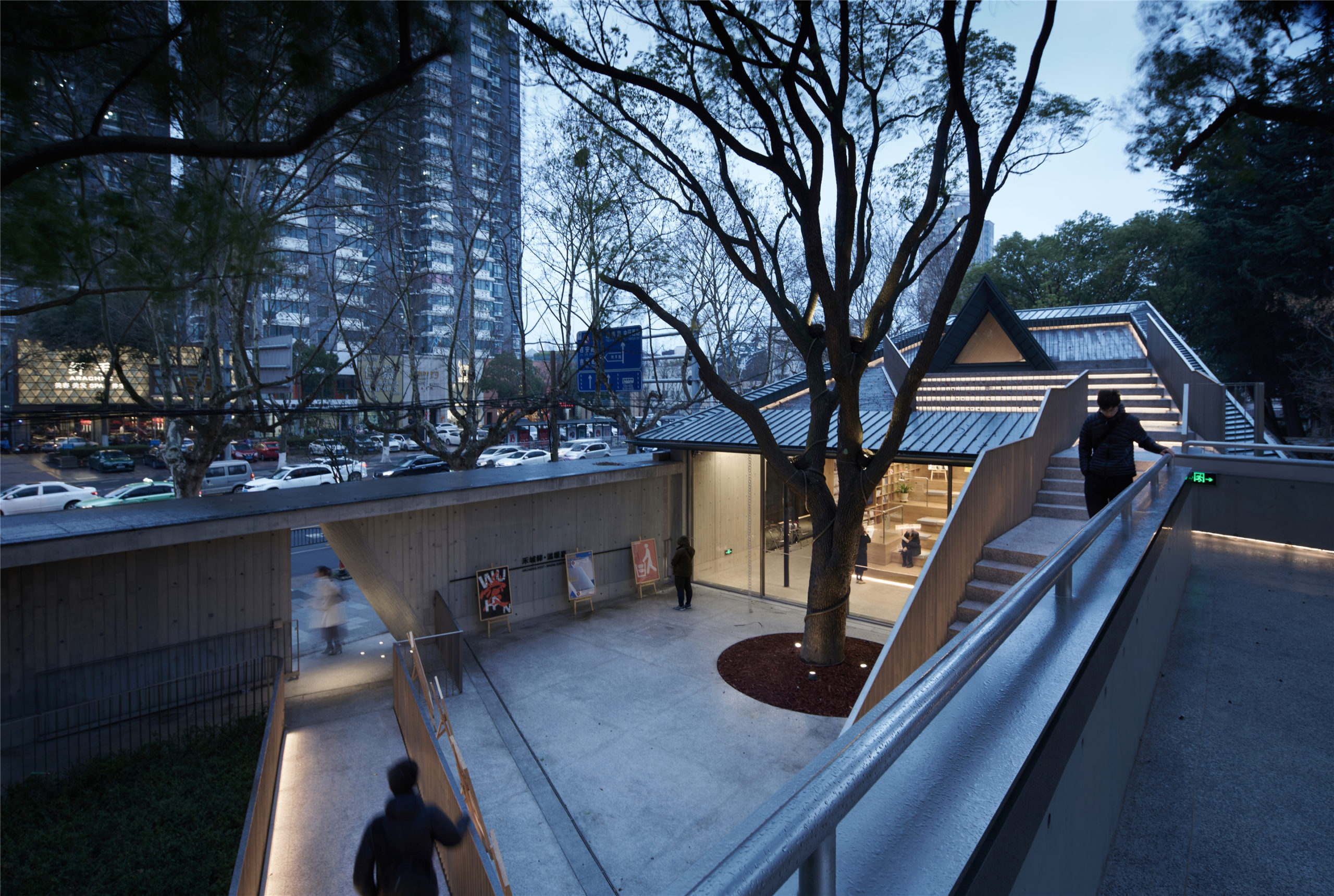
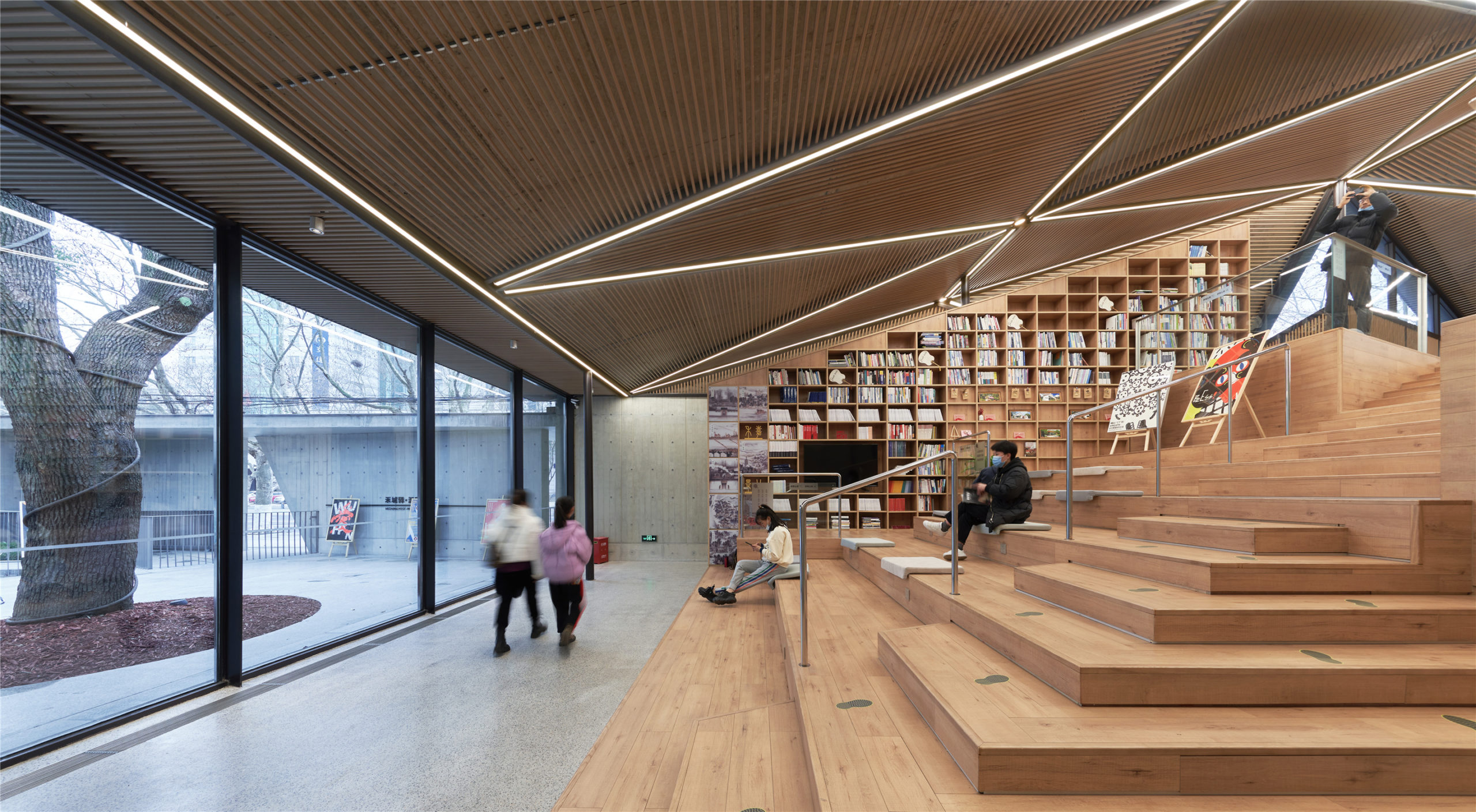
City lounge_exteriorCity lounge_interiorCity Lounge of Zhongshan Road by The Design Institute Of Landscape & Architecture China Academy Of Art CO.,LTD, Jiaxing, China
Popular Choice, 2021 A+Awards, Libraries

The City Lounge is an unusual public facility that combines public restrooms with a community reading room. Located at a street corner, the traffic noise is buffered by concrete walls which create two courtyards on the site. People enter through a rolled concrete entrance into a courtyard. The first courtyard introduces three circulations, one to the reading room, one to a water courtyard and another onto the roof.

Alternatively, another entrance behind a fenced corridor leads directly to the reading room, which features a huge staircase as the seating area and walls of bookshelves. The restrooms are hidden behind and under the staircase, away from the two courtyards.

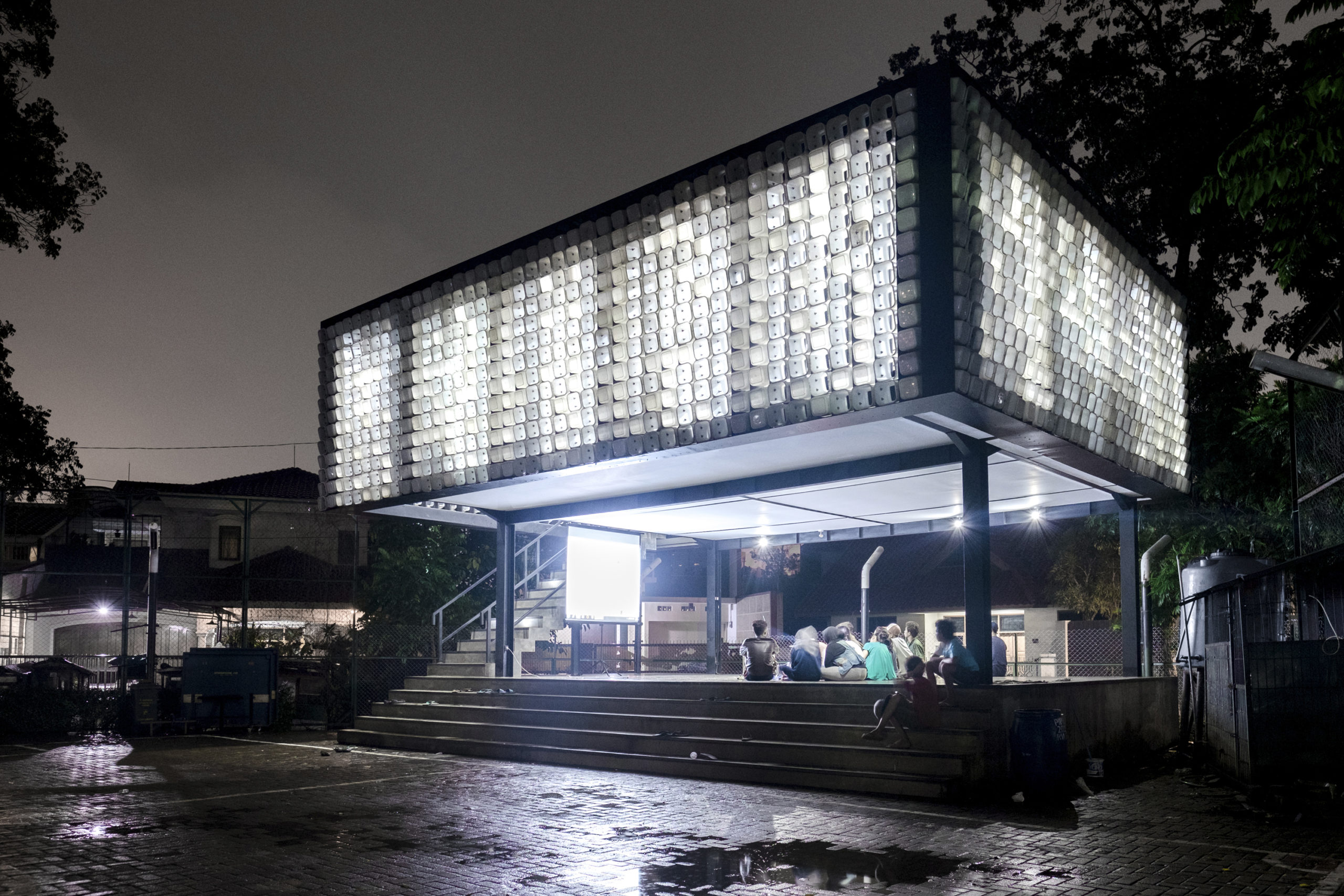
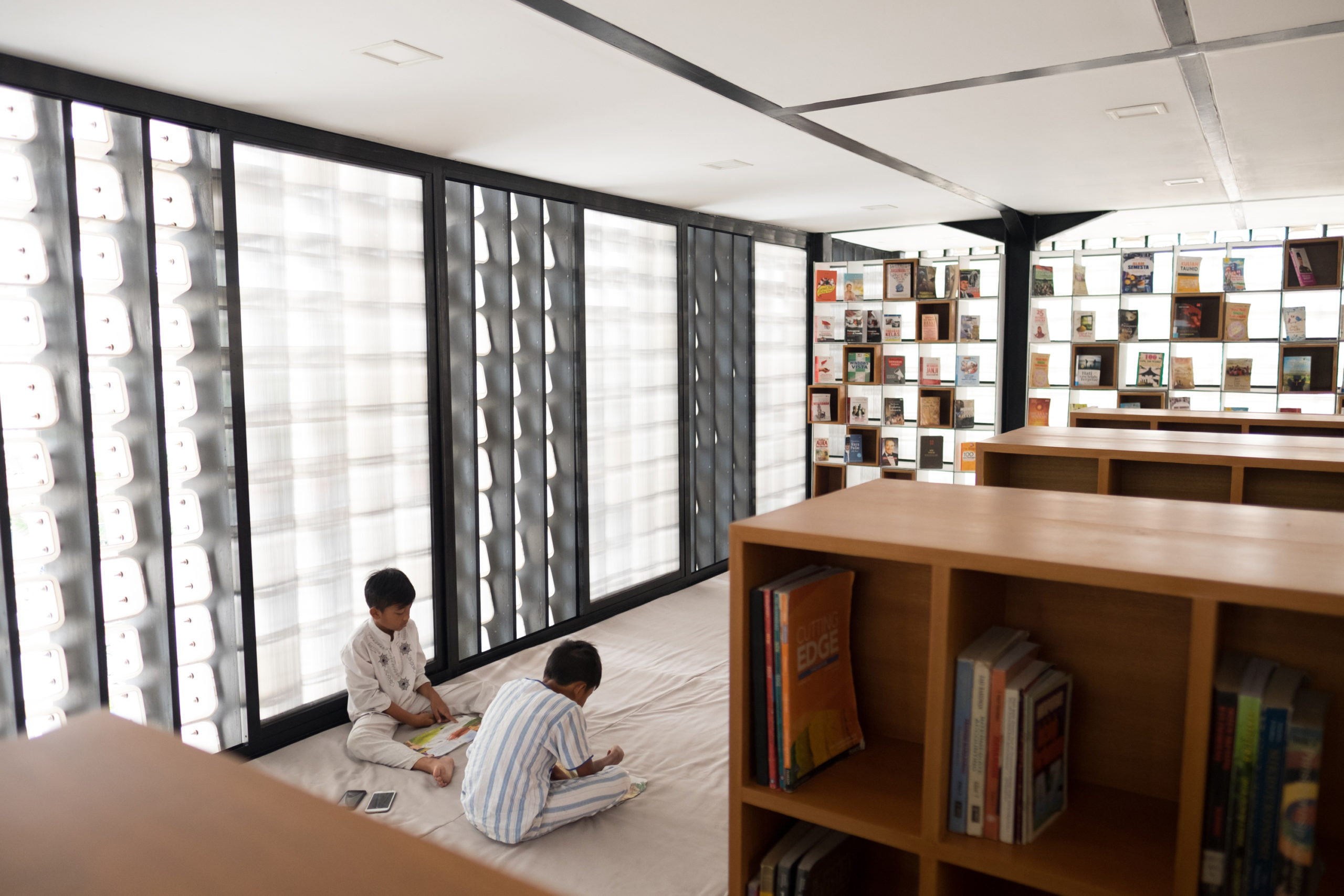
Microlibrary Bima_exteriorMicrolibrary Bima_interiorMicrolibrary Bima by SHAU, Bandung, Indonesia
Jury Winner & Popular Choice, 2017 A+Awards, Architecture +Community

Also by SHAU, Bima is the first realized in the firm’s microlibrary series. The ultimate aim of the building is to foster learning by providing a dedicated place for reading and community-scale cultural activities. Similar to Warak Kayu, Bima has an open first floor and a more enclosed second floor. The first floor is a preexisting platform that is already a gathering place for local people. Instead of occupying the platform, the design team shelters it with a simple steel structure.

The translucent brise-soleil that wraps the second floor is made of ice cream buckets. Some of them have their bottom cut to facilitate cross-ventilation. If seeing the opened buckets as 0’s and the closed ones as 1’s in binary code — a message saying “books are the windows to the world” can be read from the façade.

Reader's House_exteriorReader's House_interiorReaders’ House by Atelier Diameter, Beijing, China
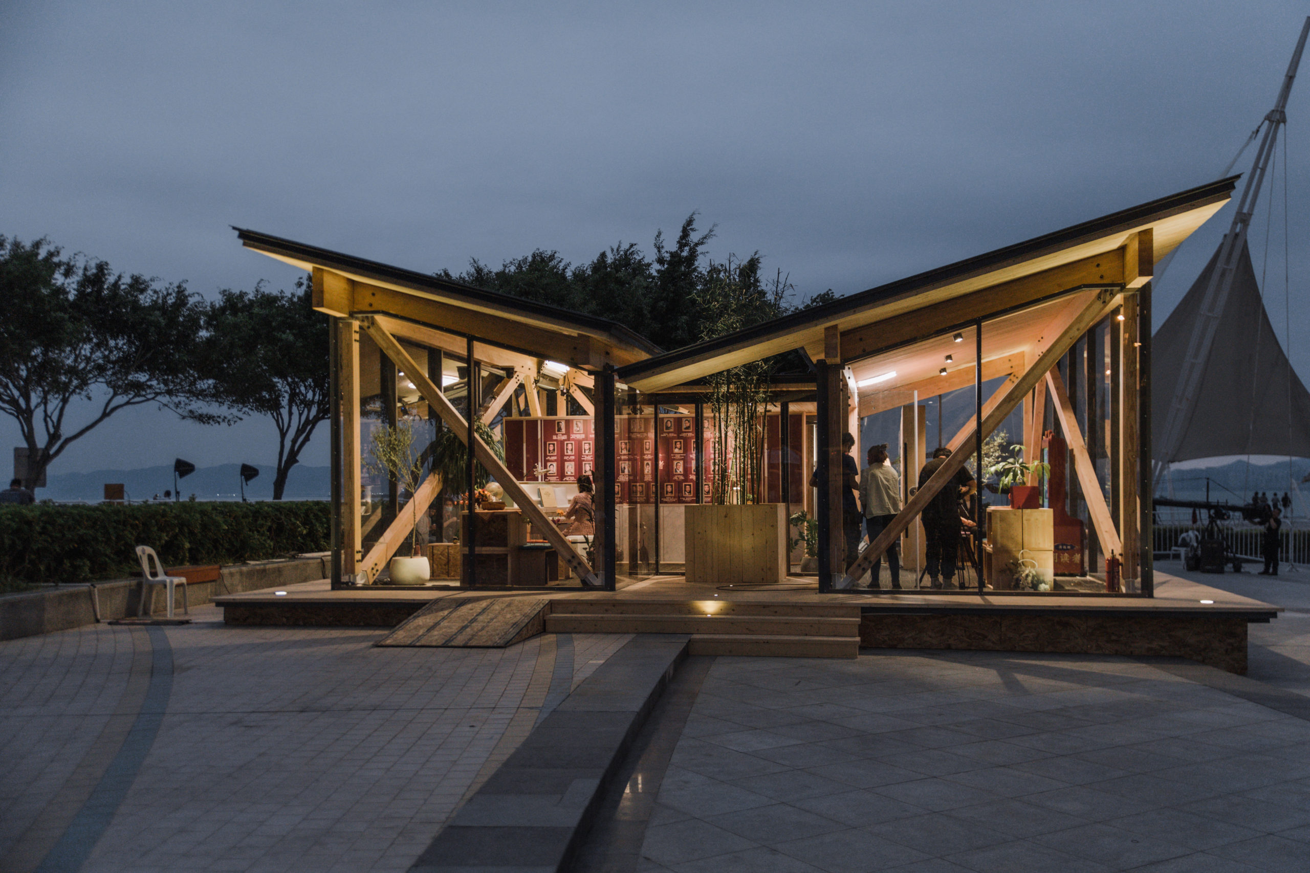
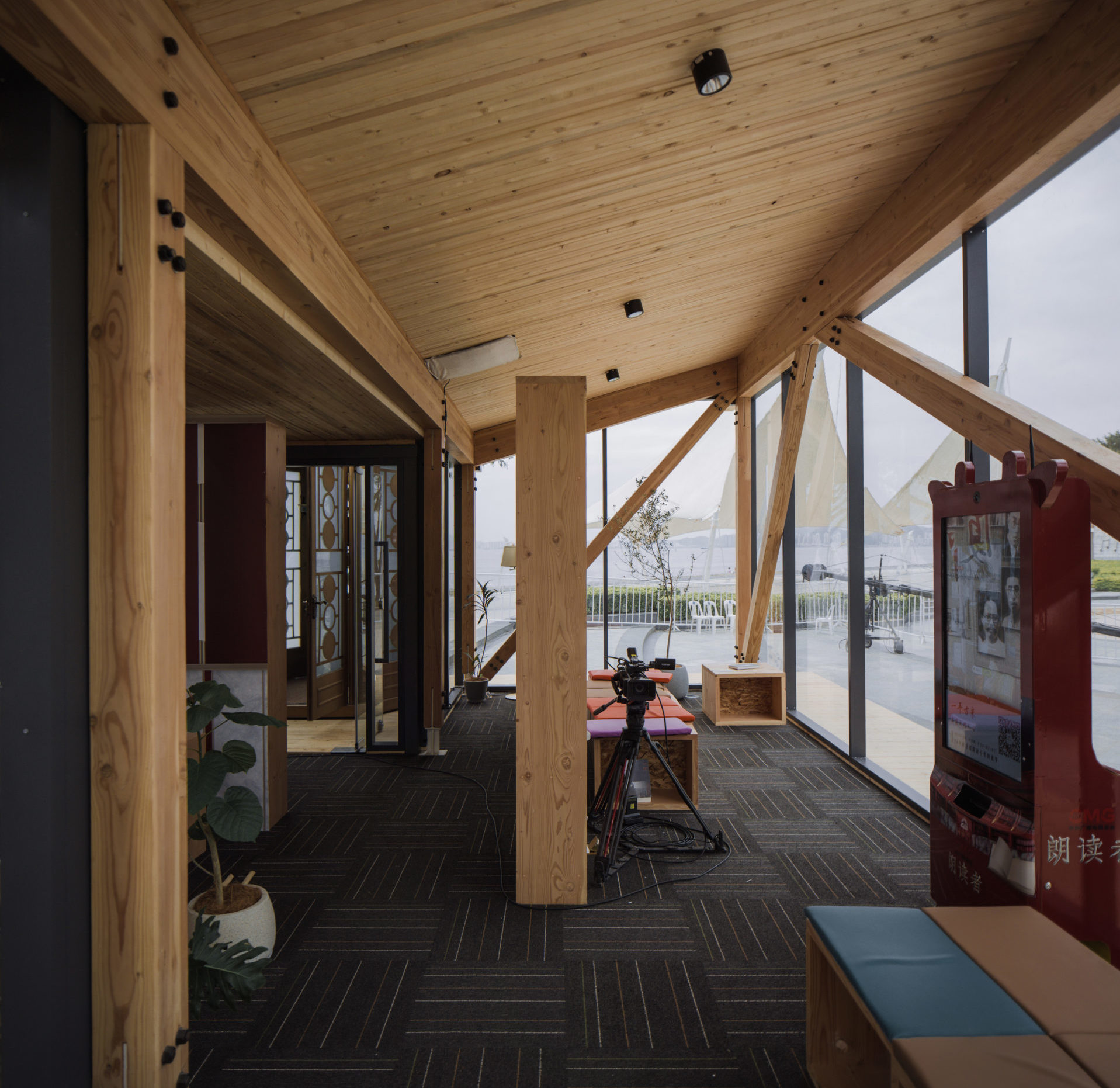
The Readers’ House is a temporary reading room that stages a 72-hour live-streaming program. Within the 72 hours, people come to the building, pick up a book of their favorite, read it out loud and share their story behind the choice of book. After the program, the building stays for another two weeks before being taken down.

The whole process of design, construction and dismantling happens within 2 months. In order to achieve this fast-paced schedule, the simple structure was primarily designed of timber and steel. The two tiling roofs resemble an opened book. Visitors enter below the lowest point of the roof. The reading areas on the two sides are visually connected to the outside with tall floor-to-ceiling glazing. The transparency of the structure makes the place public and invites passers-by in.

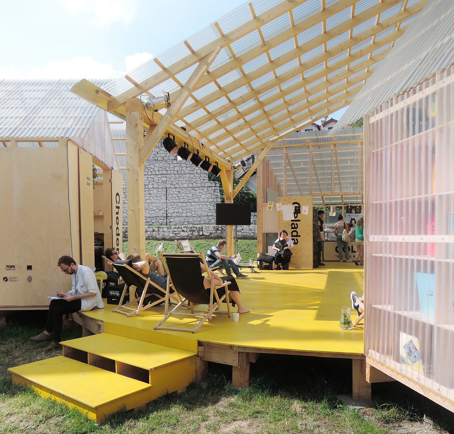
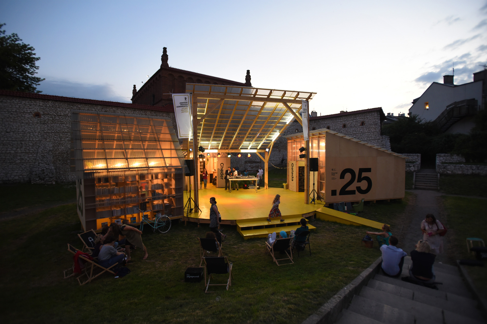
FKZ Quarter_dayFKZ Quarter_nightThe Quarter for Jewish Culture Festival by BudCud, Kraków, Poland
The Quarter for Jewish Culture Festival (FKŻ Quarter) activates a forgotten urban green area with a group of lightweight structures. It occupies the middle section of the site with three cabins, a sheltered platform and a table tennis corner. The three cabins respectively house a café, a library and a boutique which can also be used as a workshop. Both locals and visitors can grab a chair and enjoy a book with some drinks.

The platform can turn into a stage and as the audience spread across the lawn, the Quarter softly expands to the whole site. Plywood panels and beams together with corrugated plastic plates bring the space lightness and a sense of openness, especially when sunshine floods the cabins or when the feathered lights get through the roofs from inside the cabins.

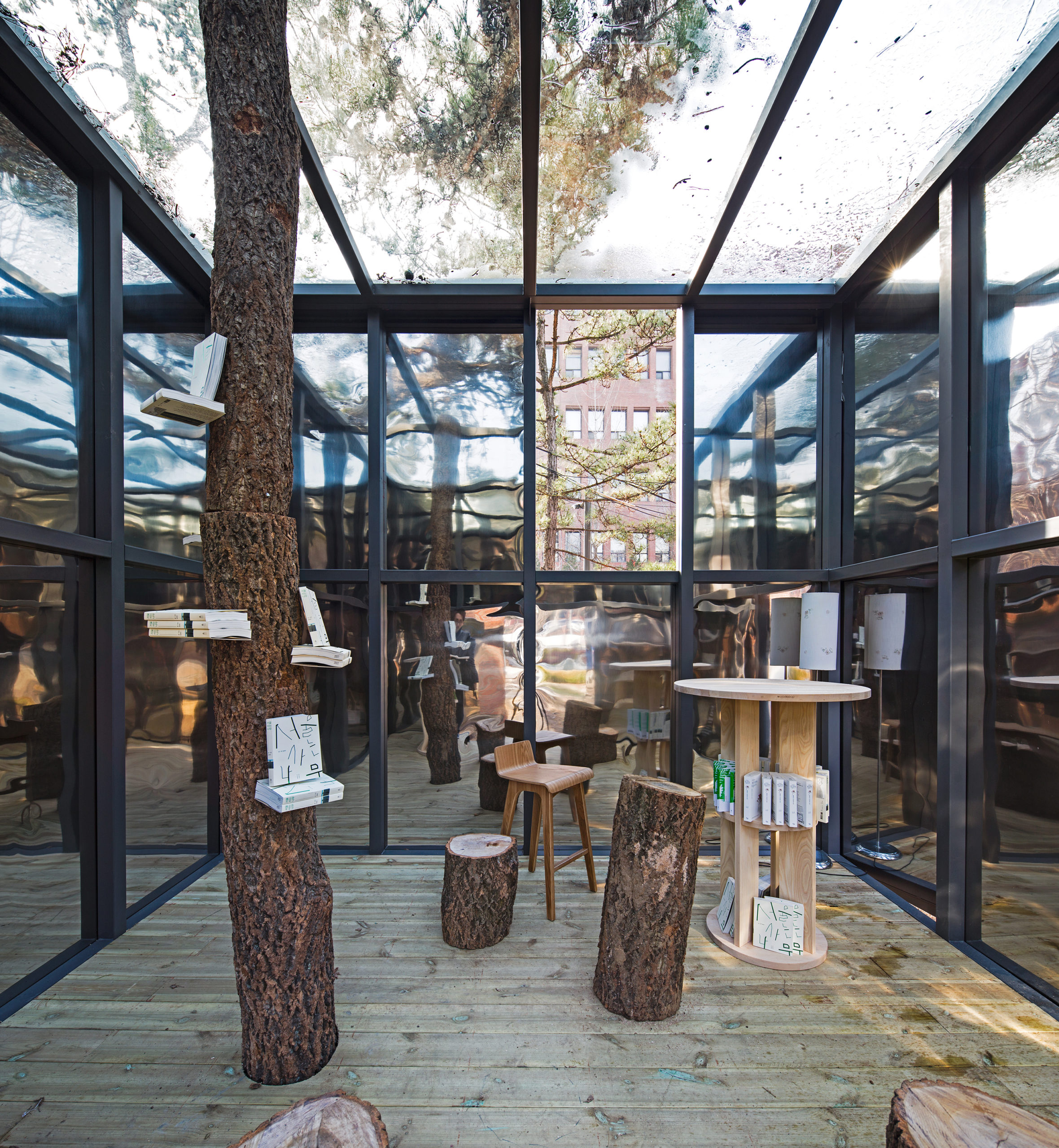
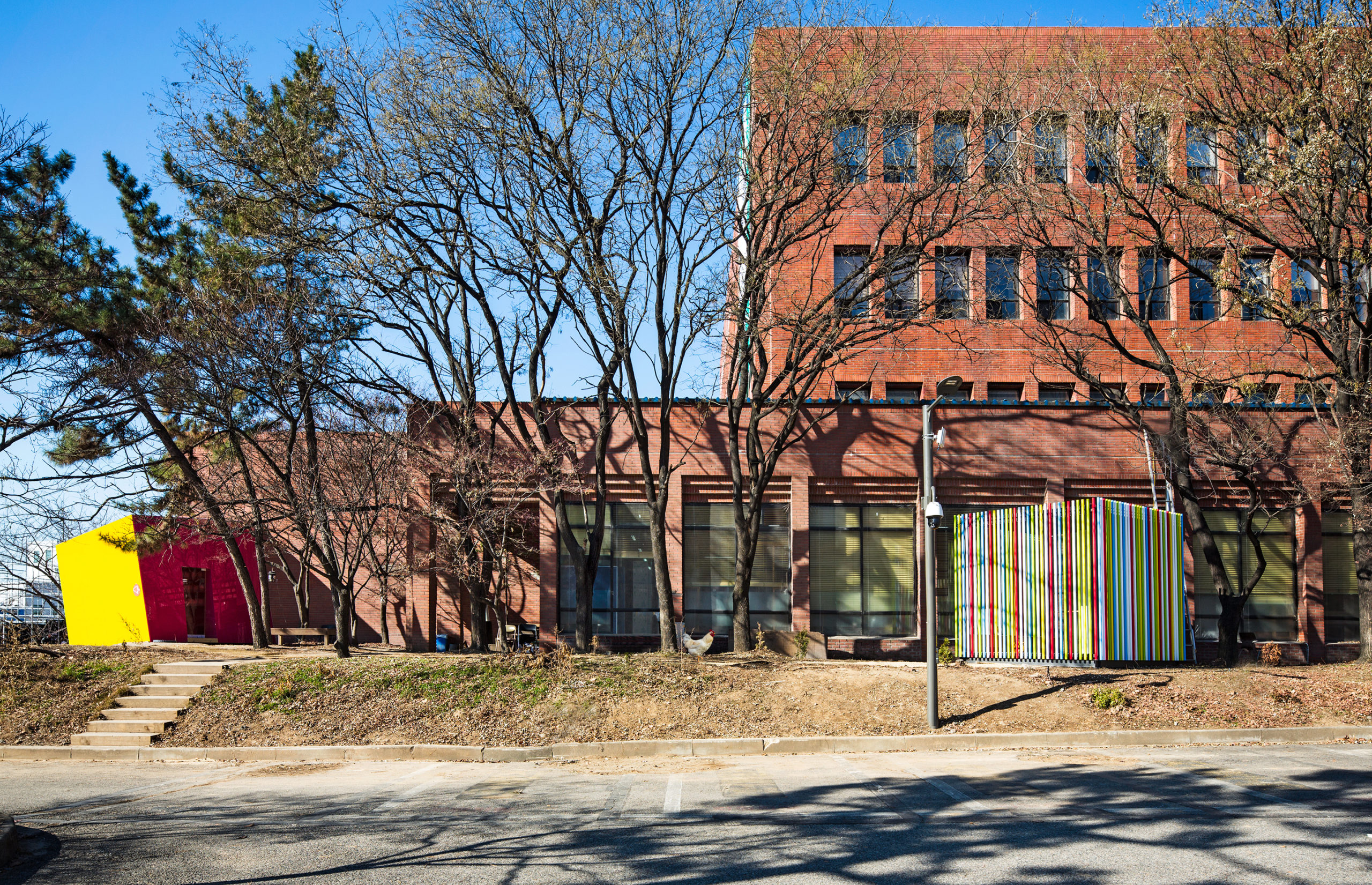
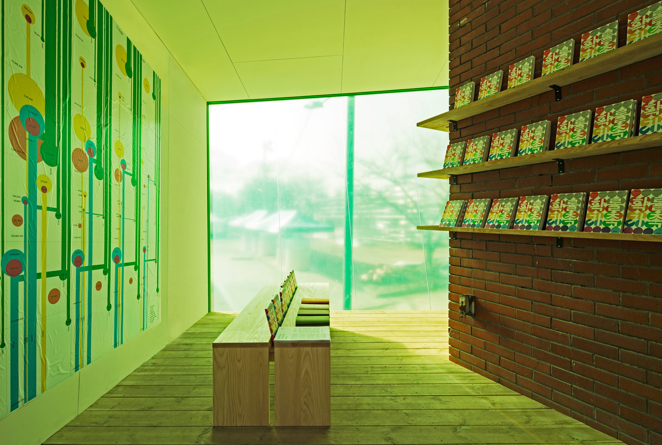
Mobile library_exteriorMobile library_interior_1Mobile library_interior_2Mobile Library by ArchiWorkshop, Seoul, South Korea
Mobile Library consists of four small pavilions, each having an appearance and interior space different from the other ones. Out of the four pavilions, the Block Attached Pavilion is attached to the red brick building on the site. While employing a similar rectangular shape as the brick building, the pavilion block is tilted following a drop of the land. One side of the block is transparent green, the interior space is rendered green as a result, creating an unrealistic atmosphere while keeping the outside world visually connected.

The Mirage Pavilion hides with reflective skin. The simple structure of steel beams and polished stainless-steel panels is also reflective on the inside. A pine tree enclosed in the mirror cube is endlessly duplicated, from which the design team wishes to create an illusion of sitting in a forest.

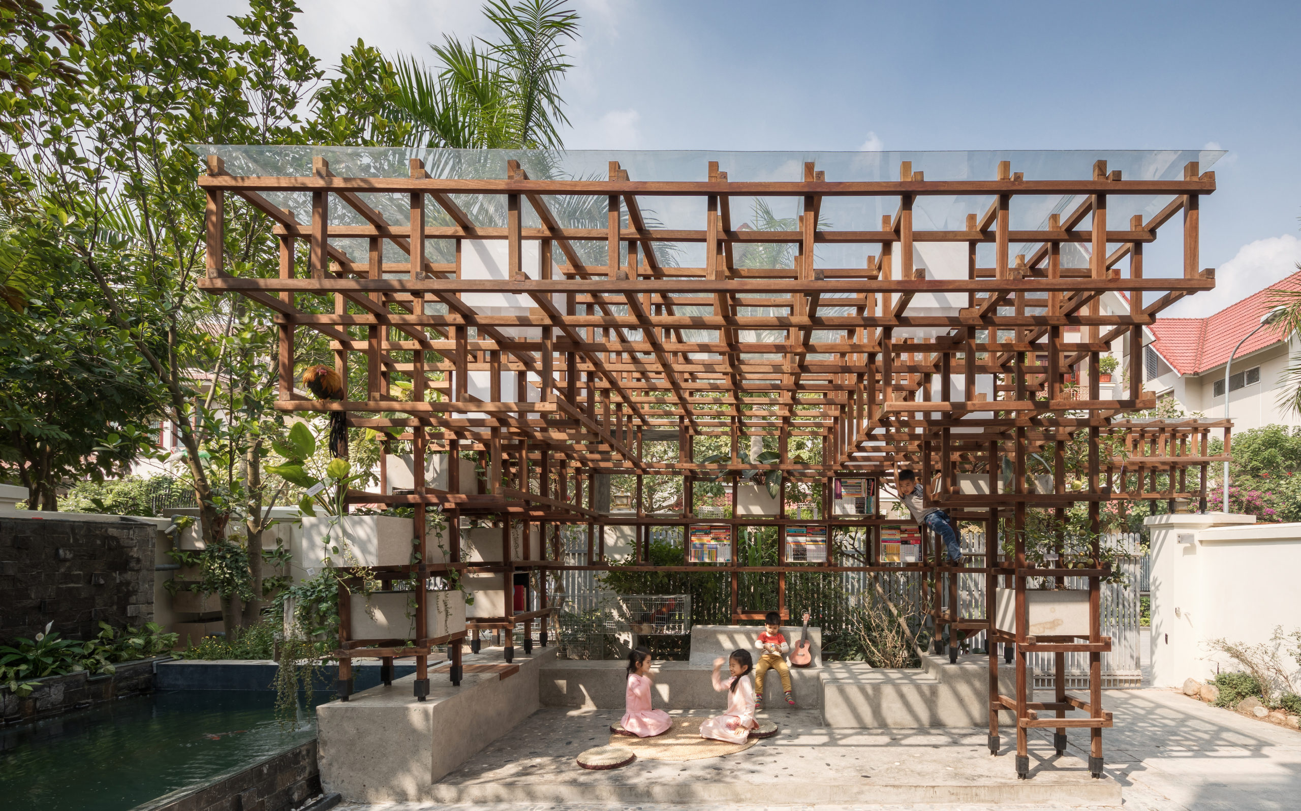
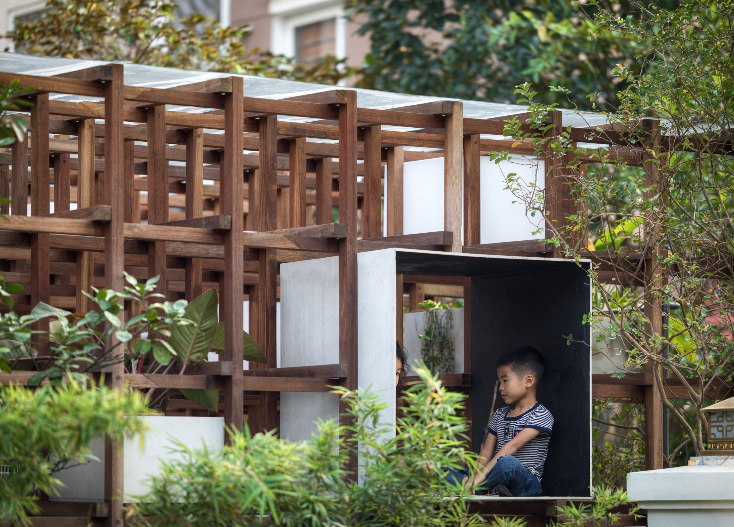
VAC_sideVAC_closeupVAC-LIBRARY by Farming Architects, Hanoi, Vietnam

The VAC Library is an experimental prototype that functions as an educational urban farm while being an urban playground for children to play and learn. VAC stands for Garden, Pond and Cage in Vietnamese.

The plants cultivated hydroponically form the garden. A pond for raising aquatic animals provides nutrient-rich water to the plants after suitable treatments. The timber grids hold sitting platforms, planting pots and lights, and also hold the possibility to be extended. The modularity of the structure makes it a prototype that is adaptable to different sites.

Have your say in the world’s best architecture: the 10th Annual A+Awards Public Vote is now open! Cast your ballots in the largest awards program for architects and designers before May 27th, 2022!

Reference