Bottlecup is a two-in-one reusable water bottle and coffee cup
CategoriesSustainable News

Bottlecup is a two-in-one reusable water bottle and coffee cup

London studio Seymourpowell has combined an insulated water bottle and a cup with a lid into a single product, Bottlecup, so users only need to remember one item when leaving the house.

The owners of Bottlecup, Kate and Mark Arnell, asked multidisciplinary agency Seymourpowell to help them create a single item that could replace both disposable water bottles and coffee cups.

They found that approximately 2.5 billion disposable coffee cups are used and then thrown away each year in the UK, with only one in 400 of those being recycled.
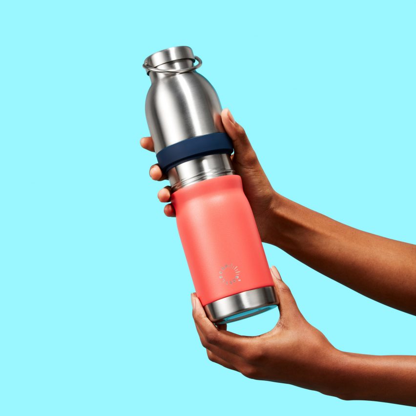
Bottlecup in apricot colour
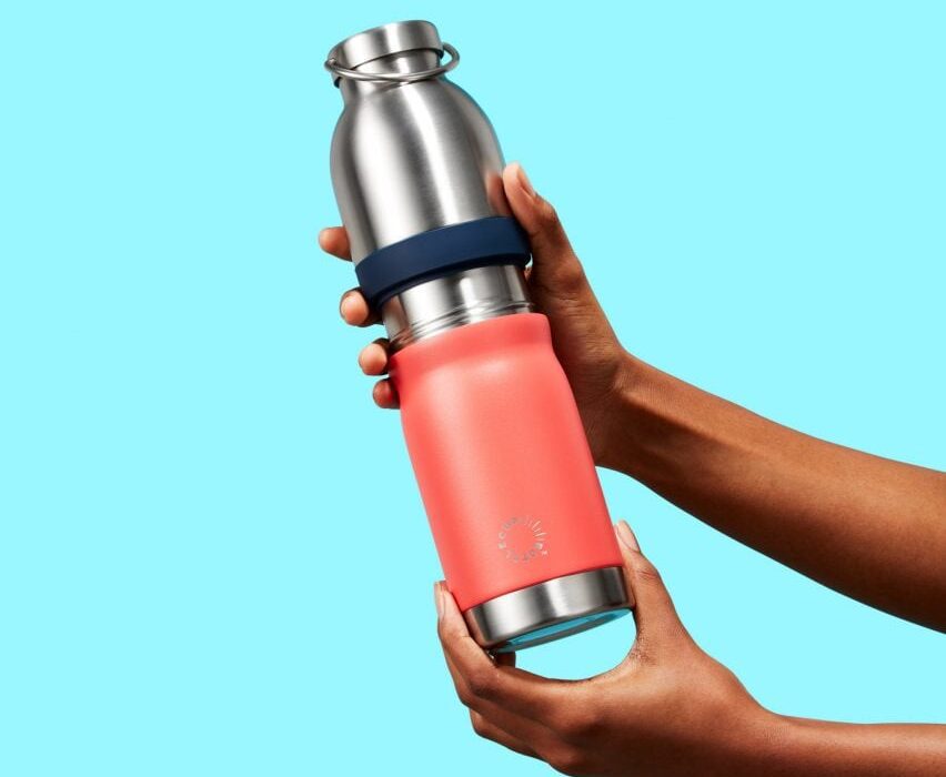
The product combines a vacuum-insulated bottle with a lidded cup

Recognising that reusable-cup owners often forget to carry their vessel with them, they looked for a way to unite a vacuum-insulated bottle with a lidded cup that can be used for takeaway drinks.

The project team identified that existing reusable bottles or flasks on the market either didn’t provide a cup lid, or didn’t allow the bottle and cup to be used independently of one another.

“Bottlecup innovated to combine a reusable water bottle and reusable cup and cup lid into one seamless item, where both items functioned in their fullest independently of each other without compromise,” the designers explained.
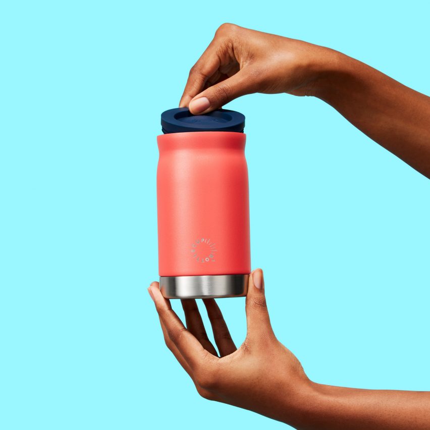
Visual of combined cup and bottle
The cup can be used on its own

The stainless-steel water bottle slots inside the cup and twists to lock it in place when carrying both items. The two elements each feature a gently curved silhouette that improves their ergonomic properties.

The cup can be released with a simple twist and used on its own or with the silicone lid, which is stored in its base so users don’t need to carry it separately when drinking beverages such as smoothies, beer or soups.

The silicone waist provides a tactile surface for holding the product, which makes twisting the cup on and off easier. The coloured band also prevents liquid from leaking into the user’s bag when the two elements are united.

A variety of colour options for the silicone band and cup lid allows Bottlecup to be personalised by selecting a favourite hue when purchasing the product. The cup is also available in a range of colours or in plain stainless steel.
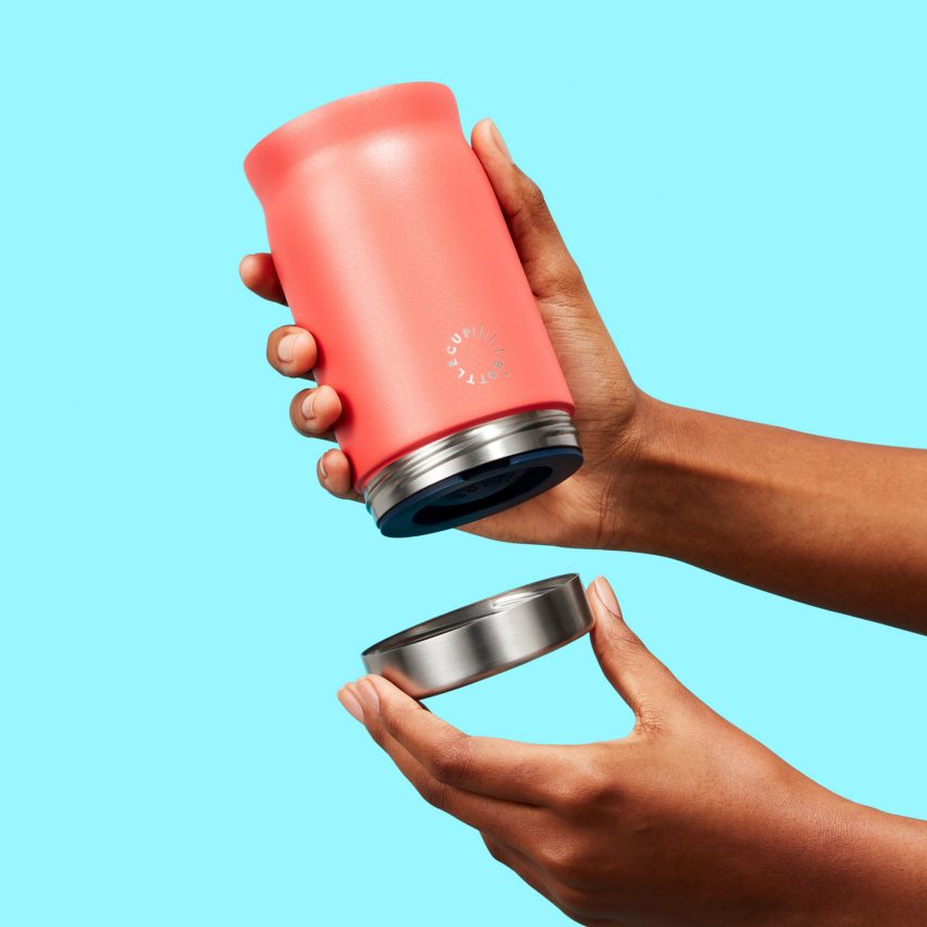
Removable Bottlecup lid
A silicone lid is stored in the base

Sustainability and circular design were key concerns throughout the project, leading to the creation of a product that is plastic-free and uses no mixed materials so all of the component parts can be easily recycled.

“Designing without plastic meant features like push-close lids and mouldable rigid shapes were all restricted from the design,” the project team explained.

“The majority stainless-steel finish has a satisfyingly engineered and qualitative feel,” it added.
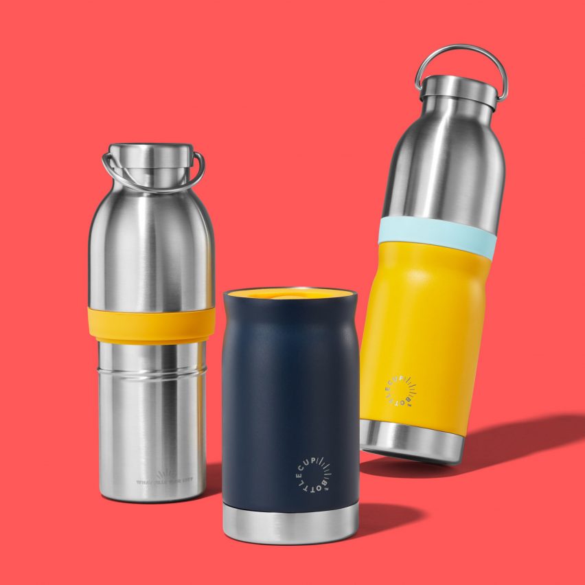
Bottles and cup designs by Seymourpowell
The design is available in a range of colours

The 18/8 stainless steel used for the bottle and cup can be collected by curbside recycling services, while the band and cup lid are made from food-grade silicone that can be returned to Bottlecup to be recycled responsibly.

Bottlecup features on the shortlist for the product design (consumer design and wearables) category at Dezeen Awards 2023, alongside projects including the latest version of Samsung’s Galaxy Z Flip smartphone and a bicycle that can easily switch between analogue and electric riding modes.

Other designs that respond to the issue of waste generated by disposable drinking cups include biodegradable cups made using home-grown vegetables and a circular-economy service called Cupclub that supplies and then recycles its own reusable coffee cups.

Reference

GoneShells is an edible juice bottle peeled like fruit
CategoriesSustainable News

GoneShells is an edible juice bottle peeled like fruit

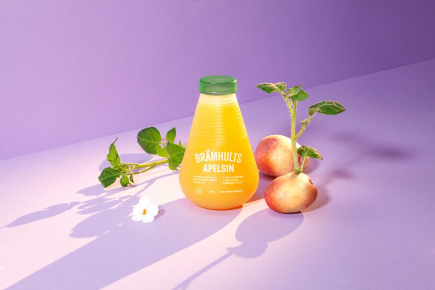
Design studio Tomorrow Machine has created a biodegradable juice bottle made from a potato starch-based material that can be peeled away like fruit skin and then eaten, composted or dissolved.

Called GoneShells, the bottle is currently a prototype that is still being developed by the studio in collaboration with global company Eckes Granini for its juice brand Brämhults.

GoneShells juice bottle by Tomorrow Machine
Top: a short video shows how the material dissolves once peeled and added to water. Above: GoneShells is a juice bottle made from a potato starch-based material

“We wanted a name that symbolised a natural way to protect food, similar to fruit peel or eggshells,” Tomorrow Machine founder Anna Glansén told Dezeen. “‘Gone’ connects to the unique invention behind the material with its multiple ways to make the packaging disappear after usage.”

Curved in shape, the bottle is made from a potato starch-based material and coated in a bio-based, water-resistant barrier on both its insides and outsides to preserve the juice it holds.

Biodegradable bottle that can be peeled and spiralised like fruit
The bottle can be peeled like fruit skin

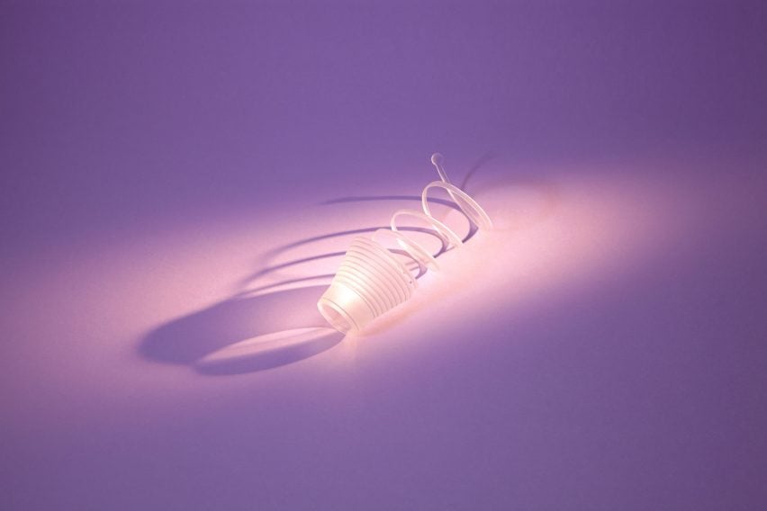
Once the juice is finished, the bottle can be peeled into a spiral formation a similar way to fruit, which breaks its barrier and immediately begins the material’s decomposition process.

After this, the “peel” can be eaten or dissolved in water. Although Tomorrow Machine can’t currently disclose more details about the material, the studio said that it is biodegradable and compostable and does not contain any synthetic components.

“As long as you don’t activate the degradation process by peeling the bottle or tearing it apart in another way it works similarly to a traditional plastic bottle,” explained Glansén.

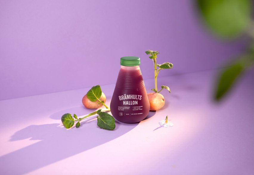
Clear bottle with green cap arranged next to sprouting potatoes
It is currently a prototype with a potato starch-based bottle cap

According to its creators, GoneShells can be manufactured using existing equipment designed to process fossil fuel-based thermoplastics.

The material design also aims to tackle landfill and address the lack of recycling and industrial composting facilities in some parts of the world.

“We started this project by asking ourselves, is it reasonable that the lifespan of a package spans over years or even decades when the content inside goes bad after a few days or weeks?” said branding agency F&B Happy, which collaborated on the project.

“By developing packaging with a lifespan that better matched the content inside, GoneShells aims to offer a new form of sustainable packaging, which skips recycling systems in a traditional sense,” it added.

The prototype bottle includes a green top that is also made from the potato starch-based material.

Although the packaging is currently emblazoned with manually foiled lettering, F&B Happy said that it is working on a printing solution “that follows the concept of the bottle”.

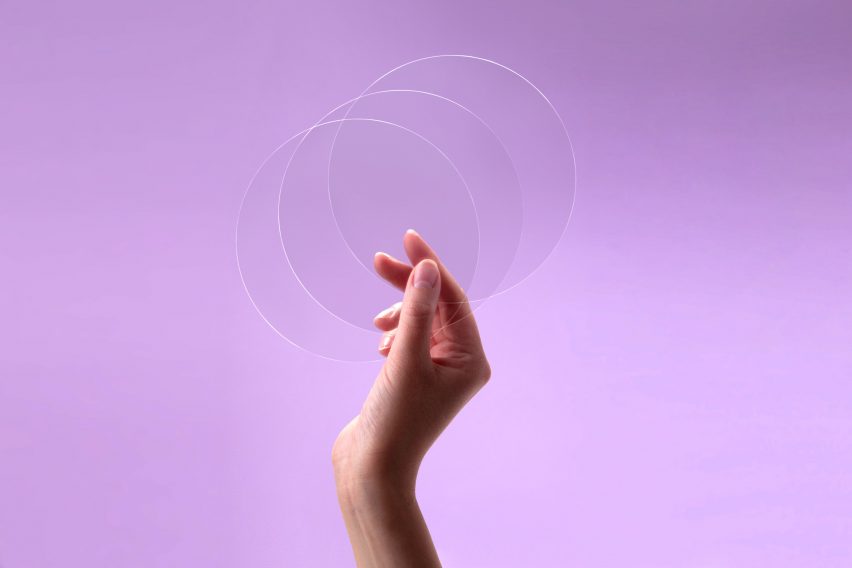
Circular sheets of biodegradable material developed by Tomorrow Machine
Tomorrow Machine says the prototype is biodegradable

GoneShells was informed by a previous project by Tomorrow Machine called This Too Shall Pass – edible packaging with a lifespan that matched the food it contained.

“We made a series of prototypes but the packaging was never meant to be put into production due to high material costs and complicated production methods,” said Glansén.

The designer explained that the existing manufacturing techniques and more affordable raw materials used to create GoneShells make it a viable product to market.

Increasingly, designers across the globe are looking for more sustainable ways to package products. Australian biomaterials company Great Wrap created a compostable bioplastic alternative to clingfilm made from waste potatoes while Packioli is peapod- and artichoke waste-based soap packaging.

The images and video are courtesy of Tomorrow Machine.


Project credits:

Branding: F&B Happy
Research partner: RISE Research Institute of Sweden
Funding: BioInnovation, a joint venture between Vinnova, Formas and Swedish Energy Agency

Reference

Keiji Ashizawa creates Blue Bottle Coffee shop in Kobe department store
CategoriesInterior Design

Keiji Ashizawa creates Blue Bottle Coffee shop in Kobe department store

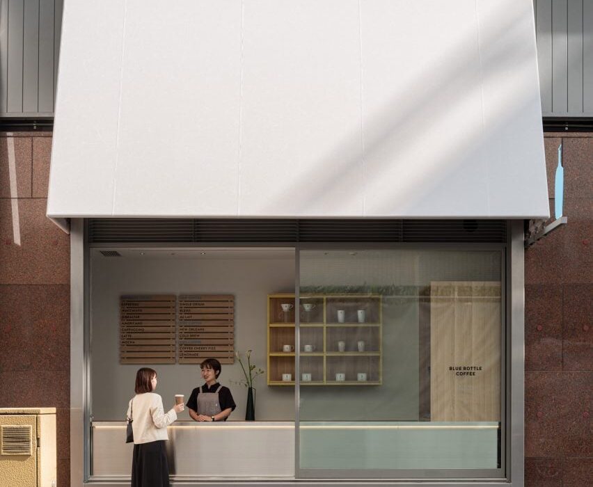
Japanese studio Keiji Ashizawa Design has created the interior of the Blue Bottle Coffee shop in Kobe’s Hankyu department store, taking advantage of its display windows to connect the cafe with the street outside.

The 173-square-metre cafe, which shares the department store’s ground floor with a number of apparel brands, has five large display windows.

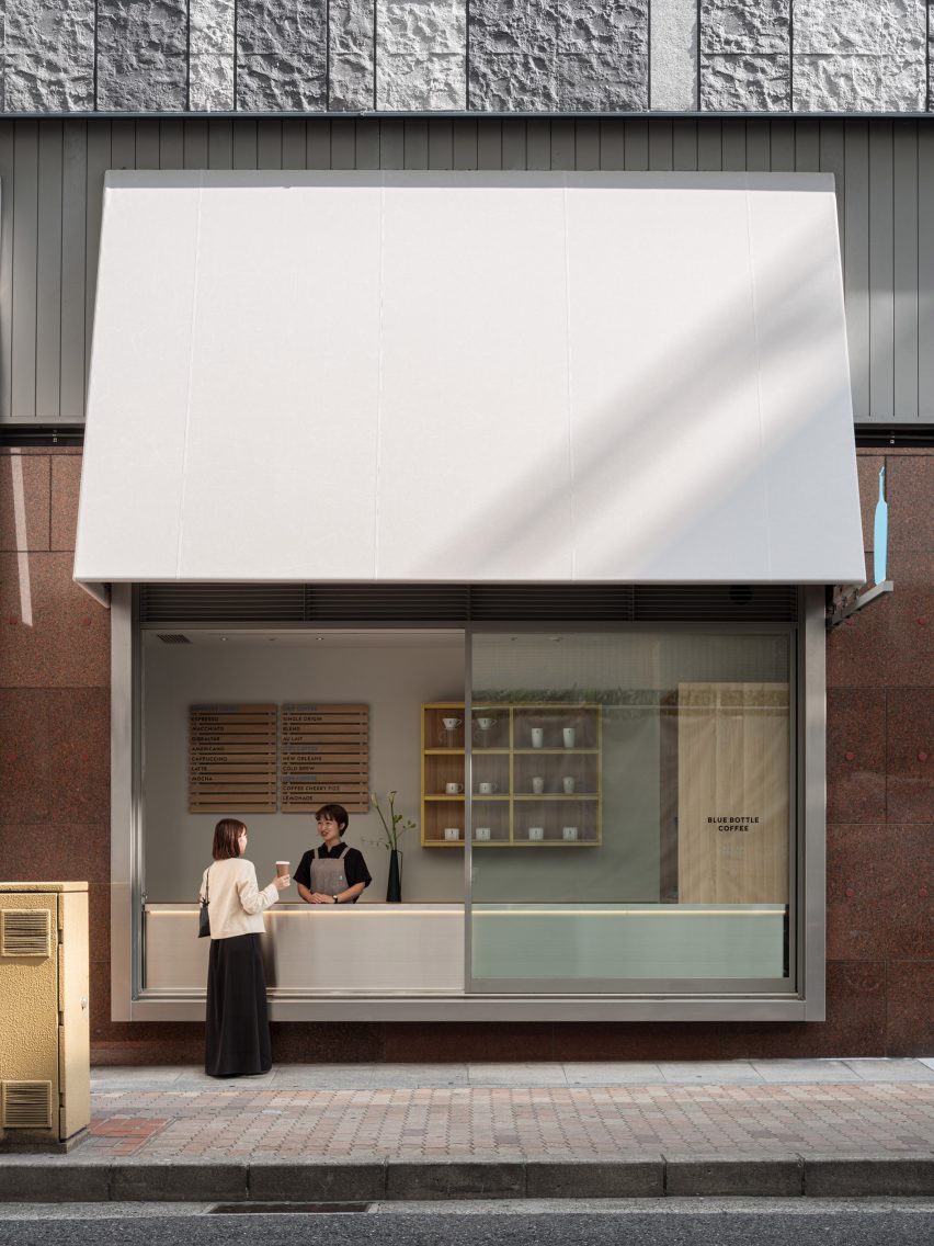
To open the coffee shop up towards the street, designer Keiji Ashizawa turned one of the windows into a take-out counter.

Window counter of Blue Bottle Coffee shop in Kobe
One display window was turned into a take-out counter

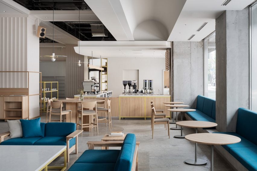
The remaining window niches were filled with blue built-in seating, creating a splash of colour among the wooden furniture.

Inside the cafe, square-shaped and rectangular furniture nods to the graphic look of the facade and is contrasted by round tables and large circular ceiling lights.

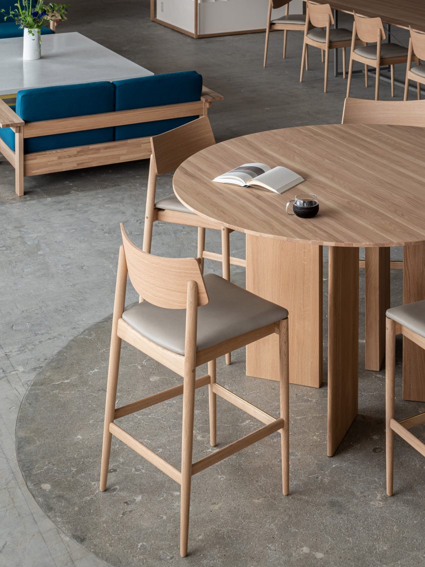
“The furniture is mainly made of domestic wood in collaboration with the Japanese furniture manufacturer Karimoku, who specializes in working with oak wood,” Ashizawa told Dezeen.

Interior of Hankyu Blue Bottle Coffee shop
Wooden furniture and terrazzo tabletops were used for the interior

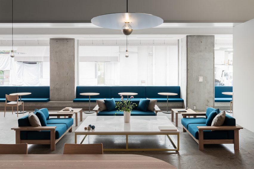
The studio also mixed in terrazzo amongst the wooden furniture to give the cafe a welcoming feel.

“By placing a large terrazzo tabletop with fine textures created by mixing grounded glass into the material, it adds to the soft and welcoming atmosphere that identifies Blue Bottle Coffee and their hospitality,” Ashizawa said.

“It is also used for the low coffee table surrounded by the sofas, creating a sense of harmony and elegance throughout the space of the cafe,” he added.

While the studio was unable to change the material of the existing rough concrete floor, the department store allowed it to create a discrete demarcation by polishing the floor underneath the central tables.

Terrazzo table inside Blue Bottle Coffee shop
Circular pendant lights were made from raw aluminium

Large disc-shaped pendant lights add a sense of drama to the coffee shop’s pared-back design.

“With the idea of creating a high ceiling within the space, the pendant lights were made from raw aluminum to complement the industrial structures,” Ashizawa said.

“Six pendant lights are placed in the central space at equal distances in three zones, creating a sense of rhythm and spatial balance.”

Polished concrete floor in Blue Bottle Coffee shop
The concrete floor was polished in part of the cafe

The wooden furniture inside the Blue Bottle Coffe Hankyu cafe has mainly been kept in its natural colour, but Ashizawa added bright colour to some of the wood.

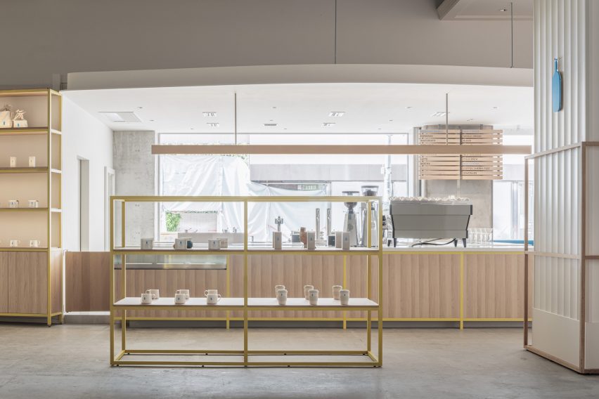
“In the space with concrete structures, the yellow color was added to balance the combination of wood and concrete, and the blue color was placed as a contrast,” he said.

“We also designed the space to fit in with the apparel brands that share the ground floor.”

Colourful shelving in Kobe cafe
Shelves were painted a bright yellow

Ashizawa has previously created a number of cafes for the Blue Bottle Coffee company, including a Shanghai store decorated with traditional Chinese roof tiles and a Tokyo outpost with a volcanic-ash counter.

The photography is by Tomooki Kengaku.


Project credits:

Architect: Keiji Ashizawa Design
Project architect: Keiji Ashizawa, Tomohiko Fujishita, Masaru Kiotya
Construction: Tank
Design supervision: Miyachi Office/Kunihiko Miyachi
Lighting design: Aurora/Yoshiki Ichikawa
Furniture: Karimoku Case Study/Ichinomaki Laboratory by Karimoku
Metal works: Super Robot

Reference

Keiji Ashizawa Design designs Blue Bottle Coffee outpost in Tokyo
CategoriesInterior Design

Keiji Ashizawa Design designs Blue Bottle Coffee outpost in Tokyo

Brick-like tiles with a volcanic ash glaze created by Formafantasma and textured concrete walls feature in this coffee shop in Shibuya, Tokyo, by Japanese studio Keiji Ashizawa Design.


Located a short walk from Tokyo’s busy downtown area, this Blue Bottle Coffee outpost was conceived as an urban retreat sandwiched between two parks.

It serves coffee during the day and appetisers and natural wine in the evenings.

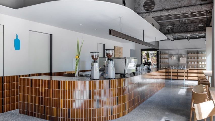
Curving counter with brown tiles in Blue Bottle Coffee Shibuya
Brown tiles with a volcanic ash glaze feature throughout the interior of Blue Bottle Coffee Shibuya

Keiji Ashizawa Design, which also designed the coffee brand’s Yokohama outpost, wanted to create a warm and welcoming interior that brought the park surroundings into the glass-walled and concrete-floored space.

“It was a challenge to come up with a playful interior plan in this square two-storey building,” Ashizawa told Dezeen.

“The other challenge was to make links between the first and second floors, and the exterior and interior.”

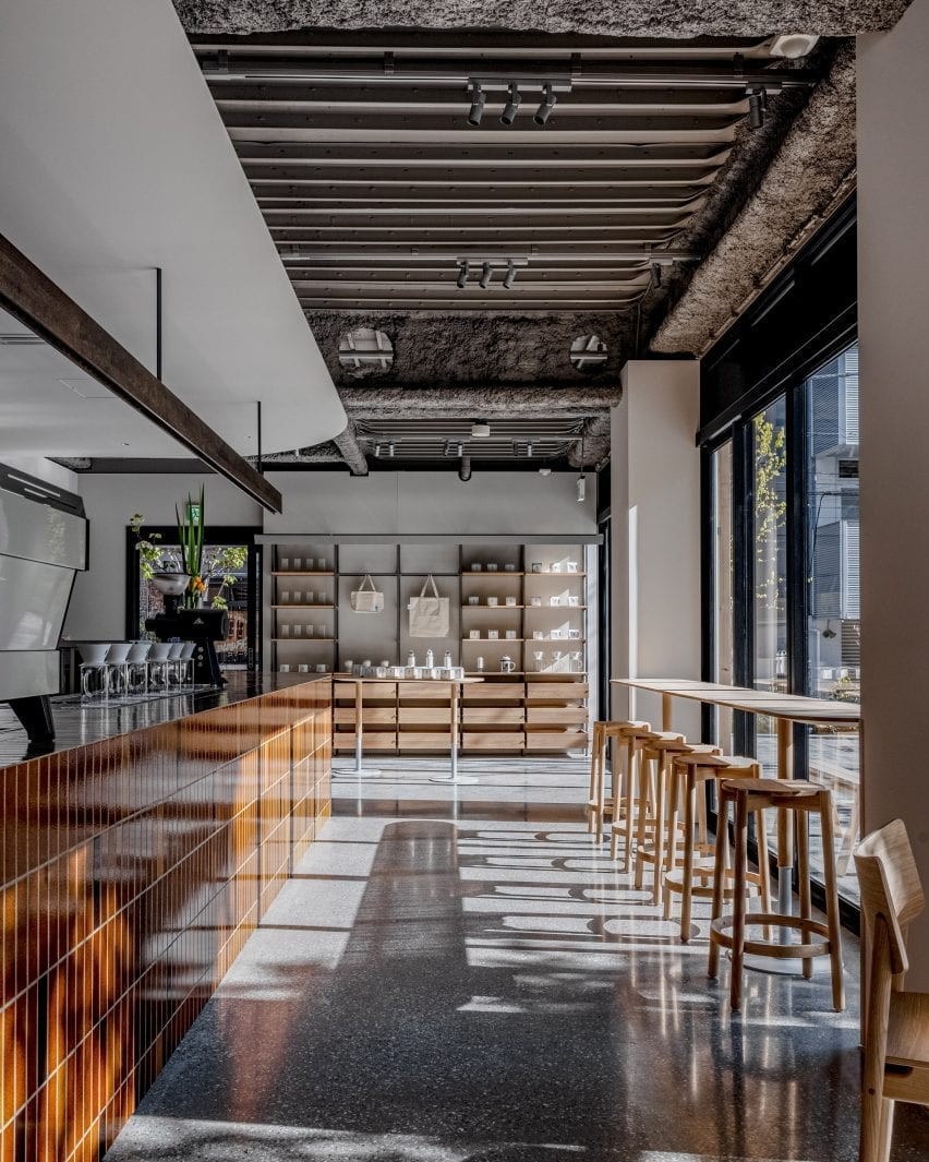
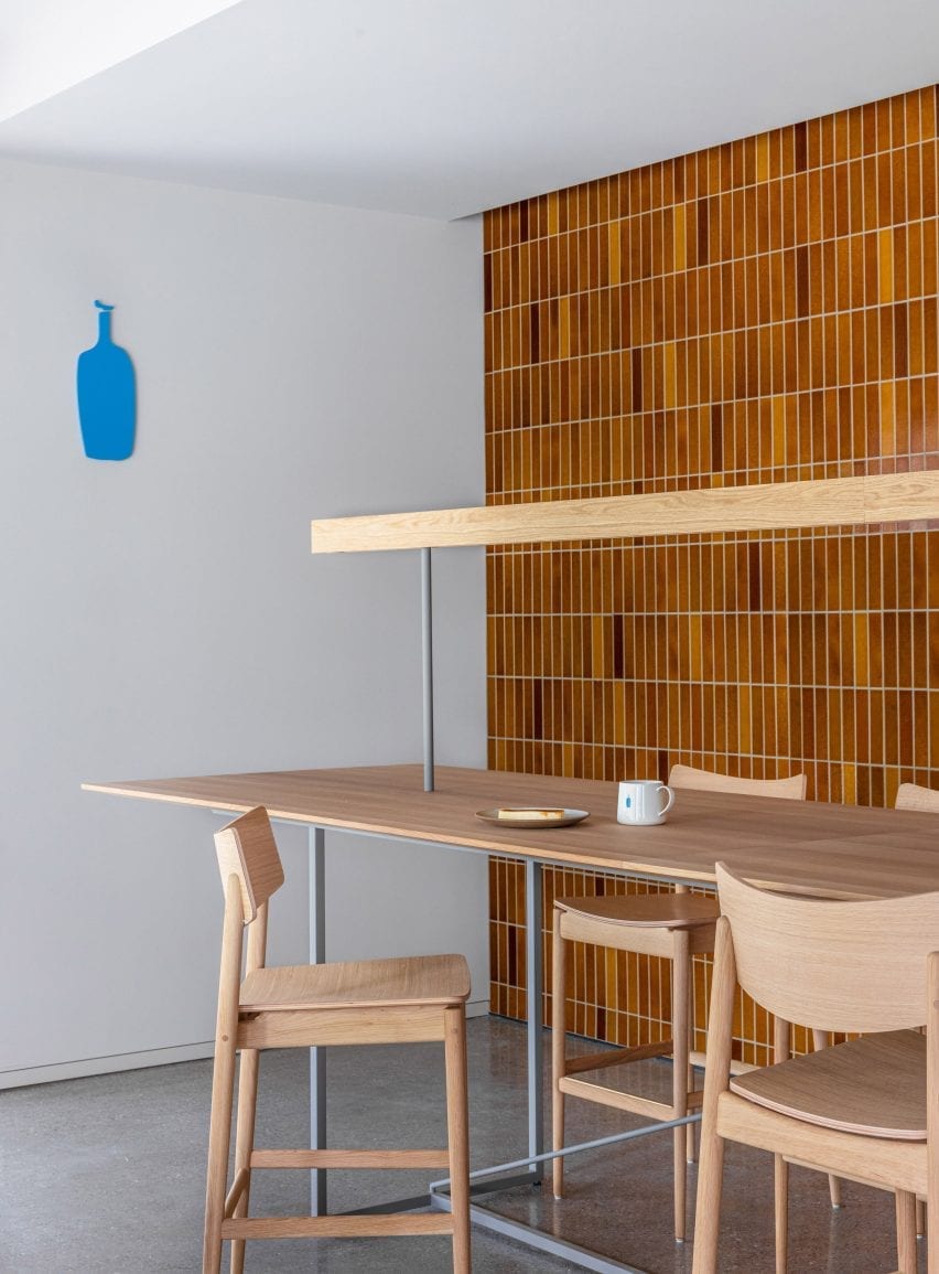
Brown-tiled bar and wooden counter seating in coffee shop by Keiji Ashizawa Design
Counter seating runs along the wall of windows

To bring the outside in, the studio installed a large, curved tile counter that wraps around the cafe’s kitchen area and welcomes customers as they enter.

The brown tiles – developed as a collaboration between London material manufacturer Dzek, and the Amsterdam-based design studio Formafantasma – are finished with a special volcanic ash glaze.

Brow-tiled walls and wooden counter seating in Blue Bottle Coffee Shibuya
A single artisan laid all 7,000 tiles in the interior

A single skilled artisan laid more than 7,000 of the tiles in the cafe. As well as the counter, they cover a low coffee table and a wall in the upstairs lounge area. Ashizawa said the tiles were specifically chosen to connect the interior and exterior spaces.

“We wanted a park-like item as a key material which stands out in the interior but also makes a strong connection between first and second floor, and the exterior and interior at the same time,” explained Ashizawa.

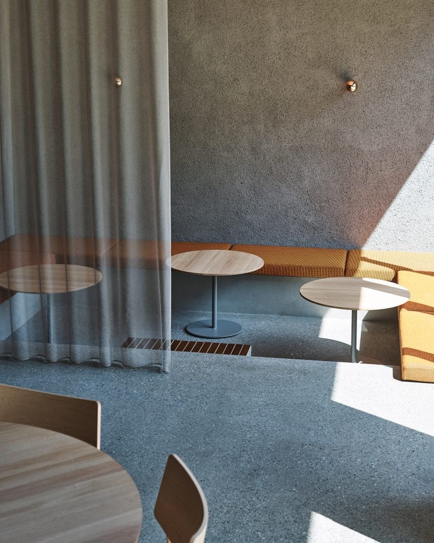
Sunken seating area with orange pillows in coffee shop by Keiji Ashizawa Design
A sunken seating area is fringed in bench seating

“I thought that this tile, which has a brick-like colour, is an item reminiscent of parks in Japan,” he continued.

“Also, there is the fact that the soil from volcanic ash is a familiar material in this Kanto region, and I remember that the soil floor of the original Kitaya Park was also Kanto loam.”

In addition to the warm-coloured tiles, pink and orange textiles by Kvadrat, and wooden furniture by Karimoku, Ishinomaki Lab and Ariake add warmth to the largely glass and concrete interior.

On Blue Bottle Coffee’s ground floor, tables are set at differing heights. The high counter with stools allows customers to watch the barista preparing their coffee, while the lower table provides a good view of the park.

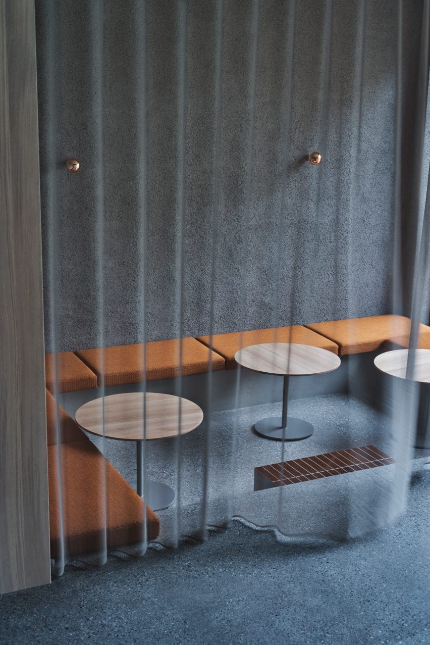
Sheer grey curtain over sunken seating area in Blue Bottle Coffee Shibuya
The seating area is obscured by a translucent grey curtain

More seating types are installed upstairs, including a lowered floor area with banquette seating upholstered in an autumnal orange textile. This space can be sectioned off from the main area by a grey, sheer curtain.

An oval dining table sits in the centre of the space providing a casual and communal dining option. A high counter table with a library-like light allows for quiet groups and singles to sit at the rear of the space.

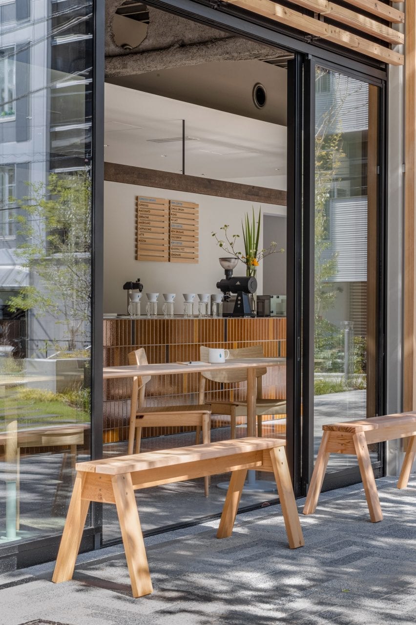
Wooden benches outside coffee shop by Keiji Ashizawa Design
Wooden benches offer seating outside of the cafe

At the far end, a low, tiled coffee table is surrounded by comfortable lounge chairs and sofas upholstered in muted pink fabric.

A textured, brushed mortar finish has been applied to the cafe’s ceiling on the ground floor, and across a wall upstairs to help improve the acoustics in the space.

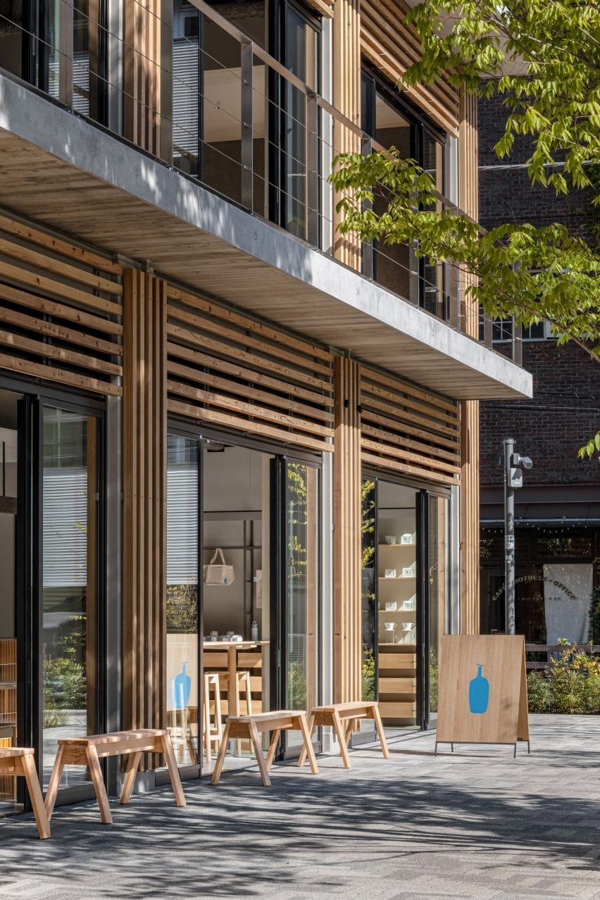
Timber-clad facade of Blue Bottle Coffee Shibuya
The furniture is in keeping with the buildings timber-clad facade

“When we plan cafes or restaurants, it is essential to think about acoustics,” said Ashizawa. “It is important that you can speak easily and that you can hear the music comfortably.”

“When we first saw the condition of the interior – the floor was made of concrete with glass walls. We definitely thought that we should leave the ceiling some kind of texture to promote sound absorption. At the same time, I thought that creating a feeling of touch in the space would have the effect of relaxing customers in the stressful city of Shibuya, like the greenery of a park.”

“We hope that visitors will enjoy the warm atmosphere as if they had been invited to visit the welcoming house of a close friend,” he concluded.

Photography is by Ben Richard and Masaaki Inoue.

Reference