Store interior with green stucco columns and radial grey floor tiles
CategoriesInterior Design

22RE invokes “stillness” inside green Miami golfing boutique

Store interior with green stucco columns and radial grey floor tiles

Los Angeles studio 22RE has used pale-green stucco informed by Miami’s colours and golf courses for the interiors of a golf clothing boutique in the city.

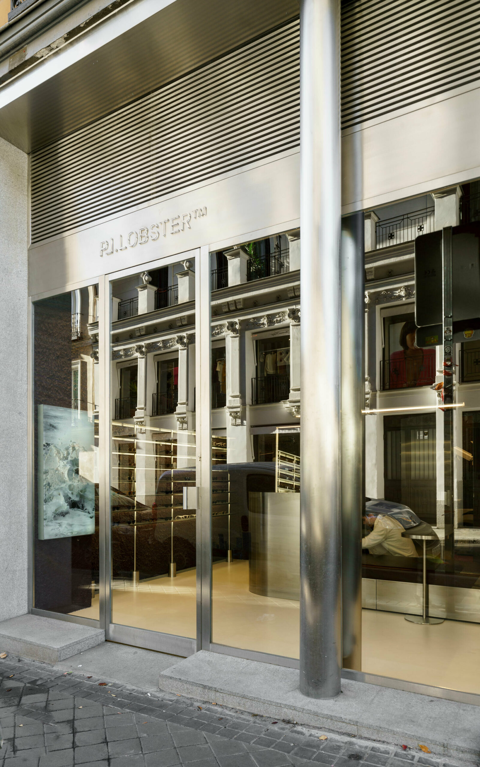
A few blocks from the ocean, the Malbon store in Coconut Grove serves a large customer base for the brand in South Florida – a popular golfing destination thanks to year-round warm weather.

Store interior with green stucco columns and radial grey floor tilesStore interior with green stucco columns and radial grey floor tiles
The Malbon Miami store revolves around a central area, from which handmade tiles emanate in a radial pattern across the floor

The verdant neighbourhood and Miami’s distinct architecture provided 22RE with a starting point to build upon, aiming to create a tranquil space amongst such vibrancy.

“We intended to create an oasis within the city, one that invoked stillness – a feeling that Malbon customers are accustomed to while they’re out on the green,” 22RE founding principal Dean Levin told Dezeen.

Golf clothing boutique with green stucco wallsGolf clothing boutique with green stucco walls
Pale green stucco covers the walls, columns and ceiling beams

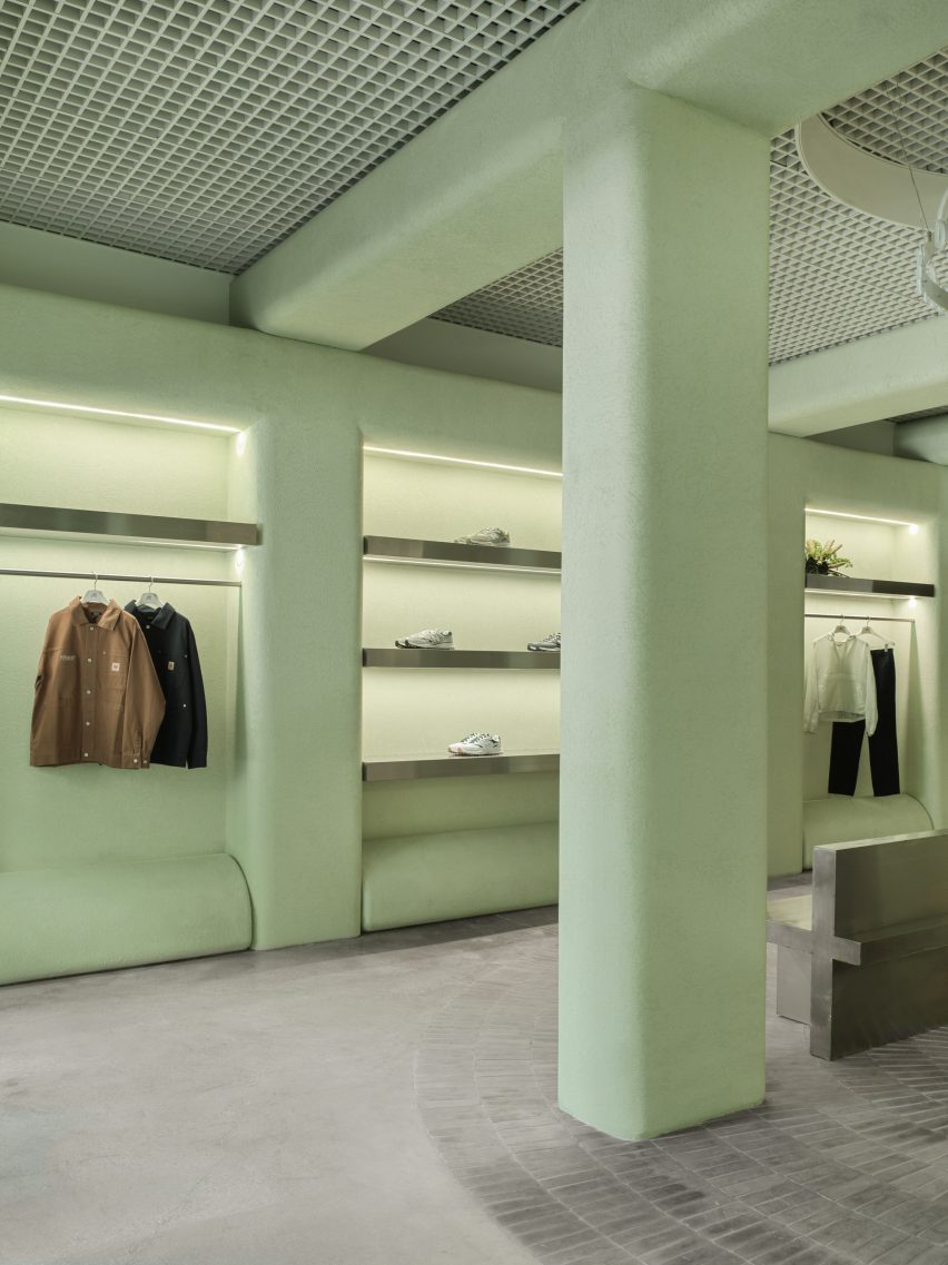
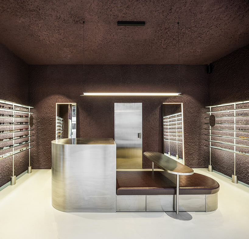
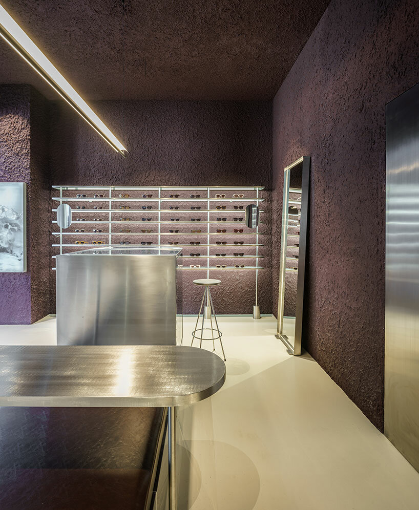
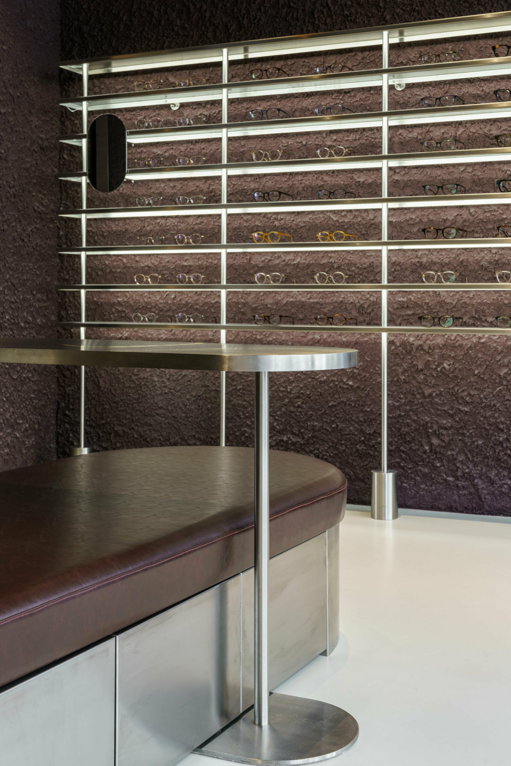
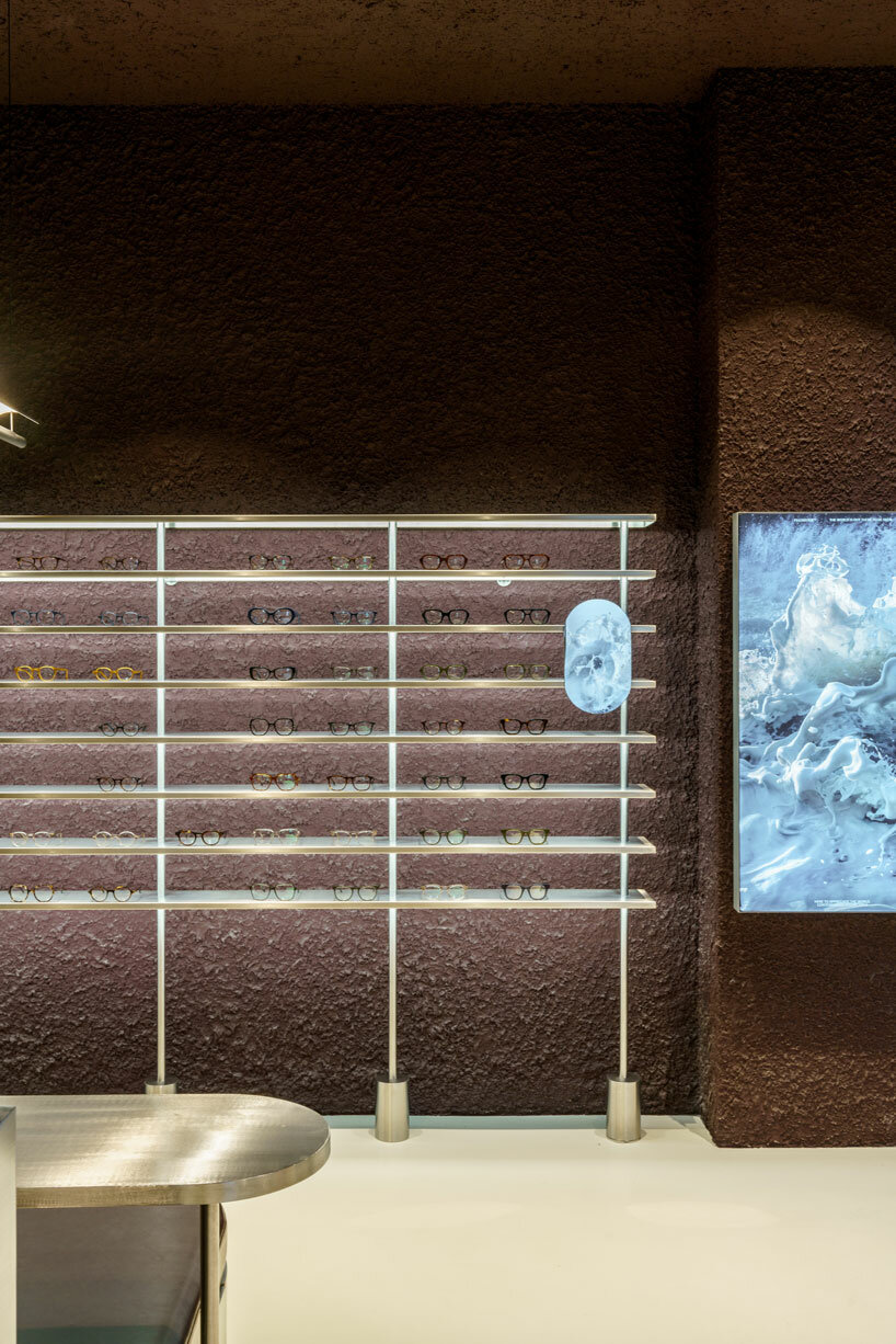
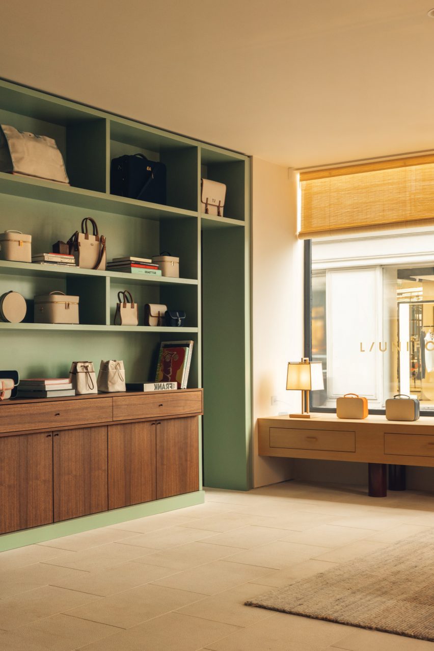
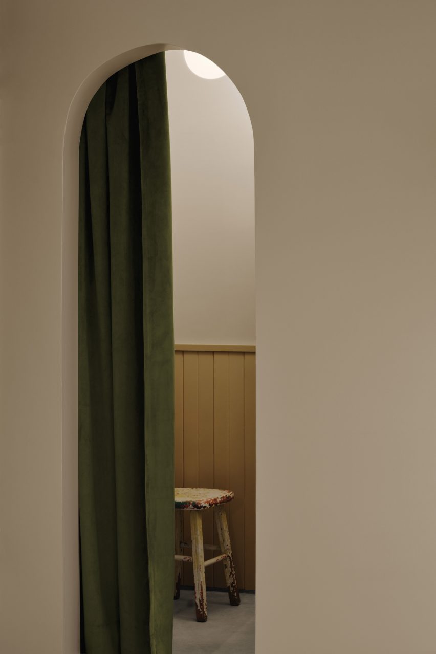
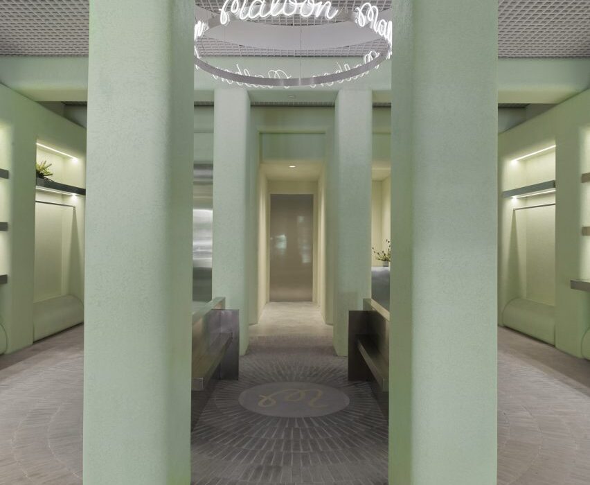
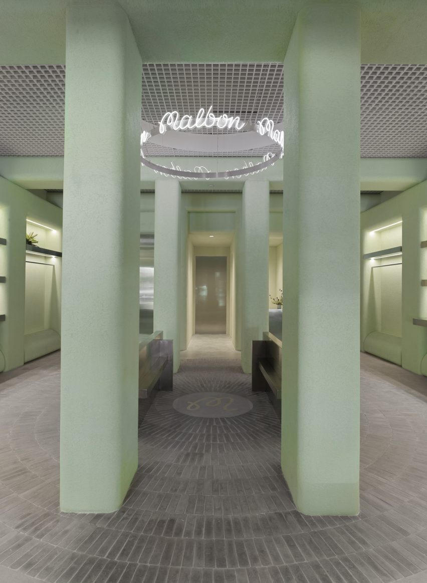
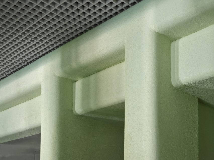
The store’s most striking feature is the pale green stucco that covers the majority of vertical surfaces and ceiling beams that form square archways overhead.

“The shade of green used throughout the space was inspired by the studio’s first visit to the location, and inspired by the vibrant hues associated with Miami as a city,” said Levin.

Accessories displayed on stainless steel shelves, surrounded by green stuccoAccessories displayed on stainless steel shelves, surrounded by green stucco
Merchandise is kept to the perimeter of the store, displayed on stainless steel rails and shelves

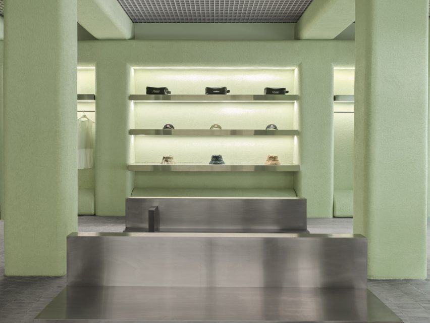
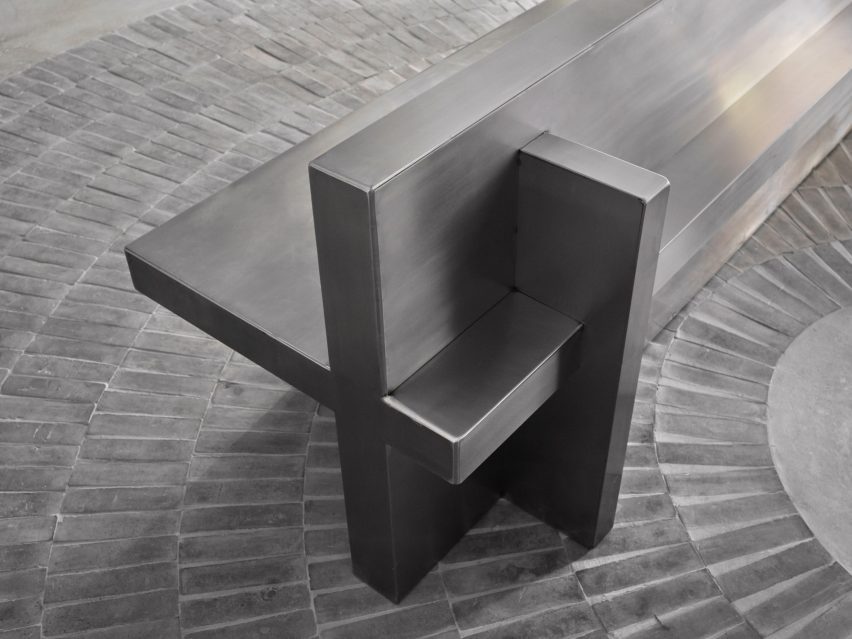
The placid hue is contrasted with stainless steel elements including the sales counter and a doorway to the stock room.

From the centre of the space, mid-grey handmade Mexican tiles are laid across the floor in a radial pattern, emanating from a circular plaque that displays the brand’s monogram.

Filleted stucco surfaces contrast an aluminium open-cell grid ceilingFilleted stucco surfaces contrast an aluminium open-cell grid ceiling
Filleted stucco surfaces contrast the aluminium open-cell grid ceiling

A ring-shaped installation above, suspended from an aluminium open-cell grid ceiling, also bears the Malbon logo scribed repeatedly in white neon.

Four columns and a pair of stainless steel benches define this central area, which is intentionally devoid of merchandise to create a moment for pause and conversation between customers.

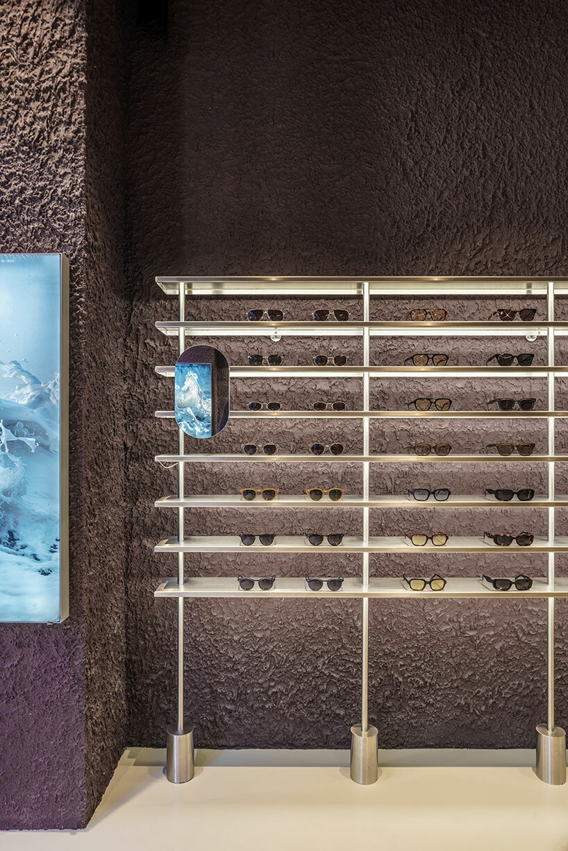
Clothing and accessories are kept to the perimeter, displayed in illuminated niches on stainless steel rails or shelves.

“In retail stores, there is a predominantly unchanging relationship between salesperson and customer,” Levin said. “We wanted to consider and account for the things we could – foot traffic, merchandising and general flow.”

Detail of a stainless steel bench made from perpendicular planesDetail of a stainless steel bench made from perpendicular planes
A pair of stainless steel benches offer a place for pause and conversation in the middle of the boutique

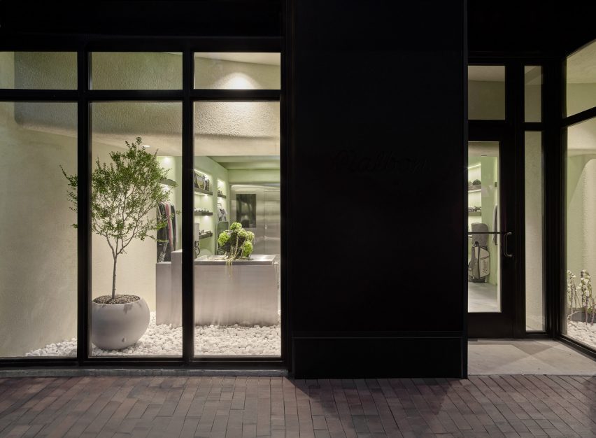
Behind the street-facing windows, white stones cover the floors and plants so that the store “feels like a natural extension of the vegetation and foliage” in the surrounding area, said Levin.

“Through juxtaposing a variety of different materials both organic and industrial, the Malbon Miami storefront is an accurate reflection of the values we celebrate and preserve as an architecture and design firm,” he added.

Storefront with greenery behind large windowsStorefront with greenery behind large windows
The storefront contains greenery to create a natural extension of the verdant surroundings of Coconut Grove

Miami has grown significantly as a retail destination over the past decade, with a large concentration of new luxury stores in the city’s Design District.

Brands including Louis Vuitton, Off-White and Christian Louboutin all have distinctly designed outposts in the neighbourhood.

The photography is by Erik Stackpole.


Reference

Hotel San Fernando with lettering and entrance corridor
CategoriesInterior Design

Bunkhouse and Reurbano convert Mexico City building into boutique hotel

Hotel San Fernando with lettering and entrance corridor

American hotel brand Bunkhouse and interior design studio Reurbano have used motifs derived from the history of a Mexico City structure when converting it into a boutique hotel.

Hotel San Fernando is located in the Condesa neighbourhood of Mexico City, a largely residential zone that in recent years has seen an influx of national and international travellers.

Hotel San Fernando with lettering and entrance corridorHotel San Fernando with lettering and entrance corridor
Bunkhouse and Reurbano have converted a 1940s apartment building into a boutique hotel in Mexico City

Bunkhouse worked with local interior design studio Reurbano to take a 1940s apartment building and convert it into a 19-room hotel, with finishes informed by the neighbourhood.

The face of the structure was restored and painted a light green, with darker green used on the awnings that provide coverage for seating attached to the hotel’s lobby and restaurant, which open to the street through glass-paned French doors.

Chandelier on bar top Chandelier on bar top
It features renovated spaces that maintain details of the original structure

An art deco-style logo spells out the name of the hotel above the door. Saint Fernando is known as the patron saint of engineers, and the team wanted to highlight this by maintaining the name of the original building in the branding of the new structure.

“We wanted to honour this building,” said Bunkhouse senior vice president of design Tenaya Hills.

“We love the story and the history and like to imagine what it has been for people over the decades.”

Woman on spiral staircase at Hotel San FernandoWoman on spiral staircase at Hotel San Fernando
A spiral staircase leads from the lobby to the rooftop

This primary entrance features a metal door with glass panes informed by the original stained glass of the building.

The entry corridor leads past a lobby lounge, with lighting by Oaxaca studio Oaxifornia and furnishings by local gallery Originario; and design studios Daniel Y Catalina, and La Metropolitana, which also created custom furniture for all of the guest suites.

At the far end of the lobby lounge is the restaurant’s bar, which features a large semi-circular cabinet with mirrored back to hold the spirits. A chandelier by local sculptor Rebeca Cors hangs above the clay-clad bar.

French doors with black and white tile flooringFrench doors with black and white tile flooring
French doors feature at the entrance and on some of the rooms

The entrance corridor has green encaustic concrete tiles from the original building. Other original details include the wainscotting and casement windows.

A reception area is located at the end of the corridor and behind it is a circular staircase with metal-and-wood railing that leads all the way up through the building, with landings on each of its five floors, terminating at a terrace on top of the building.

The guest rooms range from single-room setups to multi-room suites, the largest of which are accessed through French doors with opaque windows.

Here the studio departed from the greens used on the exterior and the lobby and utilised soft orange, pink and white paints.

Room at Hotel San FernandoRoom at Hotel San Fernando
Light colours and hand-crafted goods fill the rooms

Floors in the rooms are either tile or wood and furniture made from light-coloured wood is covered by locally derived textiles. Three rooms on the rooftop level feature furniture designed by Bunkhouse and fabricated by local design outfit B Collective Studio.

Pendant lamps and sconces by local ceramicist Anfora are found in the kitchens and bathrooms.

Sculptural breezeblocks on hotel terraceSculptural breezeblocks on hotel terrace
The rooftop features sculptural breeze blocks

The rooftop features a tiled dining and lounge area surrounded by sculptural breeze blocks, designed to mimic the original building’s patterned stained glass.

Mexican design studios Mexa and Comité de Proyectos contributed furniture pieces for the rooftop.

Other hotels in Mexico include a tile-clad structure in San Miguel de Allende by Productora and Esrawe Studio and a hotel in Mexico City with wooden lattices by PPAA.

The photography is by Chad Wadsworth. 


Reference

el departamento infuses mountainous hues into texturized optical boutique in madrid
CategoriesArchitecture

el departamento infuses mountainous hues into texturized optical boutique in madrid

el departamento infuses mountainous hues into texturized optical boutique in madrid

El Departamento unveils new PJ Lobster boutique in Madrid


Valencia-based architecture practice El Departamento has crafted a contemporary optical boutique for the PJ Lobster brand in Madrid, Spain. Drawing from the character of the project location, which combines both sophistication and vibrancy, the retail interior incorporates texturized minimalism, rough materiality, organic forms, and stainless steel elements throughout its design. The color palette is inspired by the hues of the Madrid mountains, infusing a natural essence into the design which is otherwise described as ‘high-tech’.

el departamento infuses mountainous hues into texturized optical boutique in madrid
the exterior of the new PJ Lobster boutique in Madrid | all images courtesy of Miguel Fernández-Galiano


PJ Lobster’s Madrid store Unveils a Design Continuum


The new PJ Lobster boutique in Madrid continues the design exploration initiated in the previous project located in Barcelona (see designboom’s previous coverage here), focusing on color, organic forms, and different textures as common design elements.


Spanning 42 m2, with an additional operational basement, the structure redefines traditional storefront concepts with an expansive, unobtrusive street-facing facade. The interior boasts ornamental structures, including wooden beams and cast-iron columns, maintaining an impressive free height of over 4 meters. El Departamento (find more here) preserved the original cast-iron pillars on the facade, encasing them in a sleek stainless-steel skin that transforms their appearance into two seamless cylinders. A striking glass facade, precisely centered between the two pillars, establishes a clear boundary, inviting patrons to experience the seamless transition between the external environment and the meticulously crafted interior space.


el departamento infuses mountainous hues into texturized optical boutique in madrid
the entrance of the store features reflective stainless steel elements


El Departamento’s Fusion of Textured Minimalism & Raw Precision


In their latest spatial exploration for this new optical boutique, El Departamento blends textured minimalism and raw precision. Meticulous attention to detail is evident as the color-blocked sales area dynamically contrasts with a neutral floor, yet harmonizes with stainless-steel furniture, accentuating the high-tech ambiance of the space.


The design of the shop is characterized by rough materiality, as a prominent irregular plaster finish emerges. The color palette, dominated by dark garnet and aubergine hues, pays homage to the traditional color of Madrid’s exposed brick. This color, derived from the various clays of the central plateau, harks back to the architectural materials of Madrid’s late 19th-century aesthetics. ‘This tribute to reddish tones, transformed into garnet, evokes the hues that tint the fields of Madrid’s mountain range in autumnal twilights,’ the design team shares. 

el departamento infuses mountainous hues into texturized optical boutique in madrid
the retail interior incorporates rough materiality, organic forms, and stainless steel elements

el departamento infuses mountainous hues into texturized optical boutique in madrid
the color palette of the project is inspired by the hues of the Madrid mountains

el departamento infuses mountainous hues into texturized optical boutique in madrid
an irregular plaster finish emerges within the interior

el departamento infuses mountainous hues into texturized optical boutique in madrid
the interior boasts ornamental structures, including wooden beams and cast-iron columns

el departamento infuses mountainous hues into texturized optical boutique in madrid
the store is dominated by dark garnet and aubergine hues

el departamento infuses mountainous hues into texturized optical boutique in madrid
the boutique s characterized by a high-tech ambiance


project info: 

name: PJ Lobster Restyling
architects: El Departamento | @eldepartamento.estudio
design team: Alberto Eltini & Marina Martín

location: 2 Fernando VI Street, Madrid, Spain 
area: 42 sqm
photography: Miguel Fernández-Galiano

myrto katsikopoulou I designboom

dec 25, 2023


Reference

Neri&Hu Ms MIN shop Shanghai
CategoriesInterior Design

Neri&Hu creates a tactile fashion boutique in Shanghai with fabrics screens

Neri&Hu Ms MIN shop Shanghai

Chinese studio Neri&Hu has completed a store interior for Ms MIN in Shanghai, China, to showcase the fashion brand’s diverse use of materials.

Located at the Taikoo Li shopping complex in central Shanghai, the 195-square-metre store was designed to evoke a sense of traditional home-based atelier that places materials and craftsmanship at its centre.

Neri&Hu Ms MIN shop Shanghai
Neri&Hu designed the store in Taikoo Li

“Before the Industrial Revolution, textiles were made by hand in villages across China by individual families; carding, spinning and weaving all took place in farmhouses, indeed a loom could be found in every well-conditioned homestead,” Neri&Hu explained.

“We harken back to the notion of a traditional fabric atelier, showcasing craftsmanship, rich materiality, and a domestic sensibility.”

Neri&Hu Ms MIN shop Shanghai
White fabric sheets were hung to divide the space

The space was divided into several zones by a series of floor-to-ceiling open grid wooden structures.

White fabric sheet was hung in between a wooden grid to serve as lightweight semi-transparent partitions situated on left and right side of the shop. These were designed to allow plenty of natural daylight into the store.

“Natural daylight and the chaos of the shopping mall are filtered by the sheer fabric screens, giving the space an overall sense of calmness,” Neri&Hu said.

Neri&Hu Ms MIN shop Shanghai
The flexible panels can be re-arranged and interchanged with different materials

The same wooden structures with overhanging eaves to the right side of the shop form a series of more private rooms.

These are used as a reception at the front of the store along with a VIP lounge, VIP fitting room and studio area at the rear of the shop.

Neri&Hu Ms MIN shop Shanghai
An internal courtyard was formed that can accommodate exhibitions

The central display area was arranged by a series of panels, either made with micro-cement or marble and framed in brass, which form an internal courtyard that can be used as an exhibition space.

These panels can be re-arranged and interchanged to suit the changing fashion trends in motifs every season.

The entire shop was paved with curved roof tiles stacked and inlaid, a traditional pavement commonly found in the region.

Neri&Hu also created custom mannequin figures for Ms MIN. According to the studio, the linen-made mannequins have a skin-like subtle texture.

Neri&Hu Ms MIN shop Shanghai
The lightweight semitransparent partitions allow natural daylight into the shop

Neri&Hu was founded by Lyndon Neri and Rossana Hu in 2004 in Shanghai. Other recent interior projects completed by the studio include cafe brand Blue Bottle’s latest shop and a flexible office space, both in Shanghai.

The photography is by Zhu Runzi.


Project credits:

Partners-in-charge: Lyndon Neri, Rossana Hu
Associate-in-charge: Sanif Xu
Design team: Muyang Tang, Zhikang Wang, Amber Shi, Yoki Yu, Nicolas Fardet
Lighting: Viabizzuno (Shanghai)
Contractor: Shanghai Yali Design Decoration Co.

Reference

Store with concrete breezeblock displays and metal cans on the ceiling
CategoriesInterior Design

“Fashion meets art and design” at Pittsburgh boutique by NWDS

Store with concrete breezeblock displays and metal cans on the ceiling

Global team NWDS took a spontaneous approach to designing the Tons fashion boutique in Pittsburgh, which contains a mix of modest materials and iconic furniture pieces.

The Tons store in the city’s East Liberty neighbourhood occupies a long, narrow building with its shorter side facing the street.

Store with concrete breezeblock displays and metal cans on the ceiling
The Tons store features a variety of “mundane” materials, including concrete breezeblocks and metal cans

Formerly an atelier, the two-storey structure was reimagined by NWDS to create a light-filled destination “where high-end fashion meets art and design”.

“Inside is a spacious and light-filled interior that now hosts a multifunctional venue designed to meet the needs of a modern-day sartorialist equally interested in fashion, art, and culture,” said the group.

Seating area beside clothing display
In the lobby, new apparel collections are displayed below a tapestry-like artwork

Designing the interiors of the 400-square-metre space involved dividing up the floor plan into several distinct areas that all flow together, but serve different purposes.

Throughout the various retail and office areas, a selection of unexpected materials were combined and layered.

Walls splashed with white paint
Some of the walls are splashed or streaked with white paint

Immediately through the glass front door is a lobby where new collections are presented.

Here, product displays were built from concrete breeze blocks, while the upper walls above the clothing rails were dressed in transparent plastic curtains.

Glass panels partition different retail areas
Glass panels are used to partition different retail areas

The ceiling above was covered with metal tubes of different lengths and diameters, and gives way to a double-height space where tall tapestry-like artworks by Sasha Brodsky hang over opposite walls, and white paint was seemingly dragged across another.

“There was a lot of spontaneity and many design decisions taken on site: some surfaces were uncovered and left in an unfinished state, and some were splashed with white paint,” NWDS said.

Frank Gehry Wiggle Chair next to clothing displayed on rails
A selection of iconic furniture designs can be found around the store, including Frank Gehry’s Wiggle Chair

Further along, fitting rooms are lined up behind black and white streaked partitions to one side, facing a room defined by glass panels that hosts monobrand products.

Towards the back, a lounge area that also displays shoes is reached by descending a short flight of stairs, which run parallel to a raised, built-in seating area.

Built-in seating area in front of shoe display room
A built-in seating area at the back of the store overlook the sunken shoe room

The lower floor level in this space results in a higher ceiling, which NWDS took advantage of by extending a mural the full height behind a wall-mounted shoe display.

A staircase at the very back leads to the upper storey, where retail displays and office areas for store employees sit side by side, and a photography studio is in full view.

“Inside Tons, the client space and the workspace are blended,” said NWDS.

“Buyers and managers have their work desks right next to the sale rails on the first floor, and store visitors are welcome to take a peek at the fashion photo shoot happening right there at Tons.”

Upper-floor rooms partitioned by artworks and glass balustrades
The unfinished aesthetic continues across the upper storey, where retail and offices spaces are blended

Throughout the store are a selection of iconic furniture pieces that continue the theme of unexpected materials and functionality.

They include metal-mesh Hi Tech armchairs by Piero Lissoni, a Mate chair by (A+B) Dominoni, Quaquaro that doubles as shelving, and Frank Gehry‘s compressed cardboard Wiggle Chair for Vitra.

“An interior comprising modest materials is a backdrop for high-end Italian furniture pieces, a collection carefully curated by the NWDS team,” said the designers.

Photography studio viewed from across a double-height void
An open photography studio allows shoppers to watch shoots as they happen

NWDS was established in 2013 as a team of architects, designers, curators and researchers from cities including New York, Tbilisi, Moscow, Paris, Berlin, Yerevan, Lisbon and Dubai. The group’s projects span residential, retail, hospitality, culture, exhibition design and more.

Other recently completed boutiques that feature unusual materials include the Boyy flagship in Milan, which reveals layers of the store’s history, and a Parisian jewellery store featuring rippled sheets of acrylic.

The photography is by Ekaterina Izmestieva and Alexandra Ribar.


Project credits:

Design concept: NWDS
Supervision and project management: Brnz Bureau
Lighting design: Natalia Markevich
Art: Sasha Brodsky

Reference

Wooden display cabinets in boutique in Paris by Halleroed
CategoriesInterior Design

Halleroed mixes French and Japandi influences inside L/Uniform boutique

Wooden display cabinets in boutique in Paris by Halleroed

In the arty Paris district of Saint-Germain-des-Prés, Stockholm design studio Halleroed has designed a new boutique for French bag and luggage brand L/Uniform.

Taking cues from the brand’s simple, rational approach to design, Halleroed design lead Ruxandra Halleröd created a series of backdrops that allow the products to “pop out in a beautiful way”.

Wooden display cabinets in boutique in Paris by Halleroed
Halleroed has designed a boutique for L/Uniform in Paris

The boutique is comprised of two rooms that drawing on L/Uniform‘s French heritage alongside a mixture of Japanese and Scandinavian design traditions – also known as Japandi.

The first room was designed to nod to the vernacular of the traditional French marketplace, with stepped display furniture and rustic materials, such as walls papered in woven raffia.

Bags hand on walls in L/Uniform boutique
In the first room, bags are hung from integrated wooden hooks

“It reminds us of L/Uniform’s use of French canvas on its more functional bags, but on a bigger scale,” Halleröd told Dezeen.

“We used a Shaker-inspired approach where bags are hung from hooks. There’s an association with everyday market life because some of these bags are specifically made for bringing to the market.”

To create a striking visual contrast with the natural textures of this space, Halleroed added a monolithic display table in deep burgundy with a high-gloss finish.

Mint green display cabinets in boutique in Paris by Halleroed
Glossy red details feature throughout the store in finishes and furnishings

The second room is more “elegant and eclectic”, according to Halleröd. Here, L/Uniform’s leather handbags are displayed against a palette of soft pink and green, featuring an olive-coloured velvet sofa and pistachio display cabinet alongside tactile elements like the handwoven jute-and-wool carpet.

The same glossy red finish from the first room is also reprised – in this case applied to two exposed pipes, around which Halleroed has constructed a low timber cabinet.

Mint green display cabinet in L/Uniform boutique
Pistachio display cabinets provide additional storage

“We worked with colour, texture and material as one entity, creating contrast and also unity,” said Halleröd.

Around the counter, Halleroed added cedar cladding “for a Japanese look and feel”.

This is mirrored across the shop with details such as a rice-paper pendant light by Isamu Noguchi and chairs by George Nakashima, as well as cedar table lamps with rice-paper shades created by a Japanese cabinetmaker.

Gallic influences are reflected in the lighting by Pierre Chareau and Charlotte Perriand and the bush-hammered limestone floor, which according to Halleröd has a “calm, vintage touch that for us is very French”.

Hallway of boutique in Paris by Halleroed
Travertine floors and stone counters bring a sense of refinement to the space

Halleroed also brought Swedish elements into the mix, reflecting the studio’s own approach.

“With our minimalist Scandinavian mindset, we prefer to work with fewer elements and materials but in a conscious and precise way,” said Halleröd.

“Working with wood and craft is something that I think is common for both Japan and Sweden, while we think of the warm tones here as being both French and Japanese.”

Wooden storage cabinets in L/Uniform boutique
Timber joinery nods to Japanese and Scandinavian craft traditions

“Many of the items in the store were handmade specifically for the space, which was important for us since we believe that this reflects the L/Uniform mentality and approach,” she added.

Since it was founded in 1998, Halleroed has completed a number of high-end boutiques around the world.

Among them are an Acne Studios store in Chengdu and various outposts for Swedish streetwear brand Axel Arigato in Berlin, Paris, Copenhagen and London.

The photography is by Ludovic Balay

Reference

Storefront of Billie Le Kid Boutique by Vives St-Laurent
CategoriesInterior Design

Vives St-Laurent creates Billie Le Kid boutique in Mont-Tremblant ski resort

Storefront of Billie Le Kid Boutique by Vives St-Laurent

Harnessing soft colours and gentle curves, interior design studio Vives St-Laurent has completed a shop for children’s boutique Billie Le Kid in Mont-Tremblant – a Canadian ski resort known for its colourful architecture.

Following on from Billie Le Kid‘s first store in Montreal, the brand brought in Vives St-Laurent to create a new outpost that captured the spirit of the brand while reflecting its location.

Storefront of Billie Le Kid Boutique by Vives St-Laurent
Vives St-Laurent designed the interiors for Billie Le Kid’s Mont-Tremblant boutique

Its storefront was designed to resemble a theatre, showcasing the brand’s wholesome edit of children’s clothes, toys and books.

Custom-made awnings recall the idea of a general store, while the front was repainted in a vibrant blue-on-blue palette to reflect Mont-Tremblant’s colourful charter.

Counter and changing room in boutique by Vives St-Laurent
Painted tongue-and-groove panelling adds a touch of nostalgia

Referencing the facade, arched openings throughout the boutique bring a whimsical touch to the transitions between different sections.

Rounded corners were used to soften the edges of the display cabinets, adding character and creating a playful and welcoming atmosphere.

Storage wall in Billie Le Kid Boutique
Integrated display cabinets provide plenty of storage

Bianco Carrara marble was used on top of the checkout counter to convey a sense of timeless luxury, while moss-coloured velvet changing room curtains reference the theatre concept and bring softness and tactility to the space.

The polished concrete floor was a practical choice, as the low-maintenance material allows skiers to visit the store in their ski boots.

Storage cupboard and counter in store interior by Vives St-Laurent
Bianco Carrara marble covers the store’s counter

Painted tongue-and-groove panelling was added to give the boutique a touch of nostalgia.

“We combined classic and contemporary materials to create a harmonious yet unique ambience,” Vives St-Laurent’s interior designer Léa Courtadon told Dezeen.

Courtadon said she chose the store’s calming colour palette of stone beige and sage green to create “a whimsical mood that recalls the playful world of childhood while maintaining sophistication and ensuring the products stand out”.

Sturdy vintage Canadian furniture was chosen to draw on the idea of the general store and family home. Long wooden refectory tables were repurposed as displays for toys and clothing, adding visual interest while paying homage to the brand’s Canadian heritage.

A row of vintage frilled-glass pendant lights creates a feature above the counter.

“The lamps’ rippled globes resemble ballerina tutus, adding a delicate touch to the overall design,” Courtadon said.

Integrated storage in Billie Le Kid Boutique
Rounded corners give the storage units a playful edge

In contrast, the main lighting system with its matt white finish was chosen to blend seamlessly with the store’s high ceiling. The railing system allows for precise positioning to highlight different items within the display cabinets.

Vives St-Laurent used baskets for storage to contribute to the nostalgic, homespun aesthetic as well as offering a practical way to store and display plush toys.

Changing room of Billie Le Kid Boutique
Changing rooms are hidden behind velvet curtains

“They create an impression of abundance and allow children to interact with the toys, promoting a sense of independence and autonomy,” said Courtadon. “It all contributes to a playful and engaging atmosphere that’s ideal for a kids’ store.”

Since its founding in 2018, Vives St-Laurent has completed a range of projects across Canada. Among them is a tactile home in Montreal with a grey-heavy colour scheme.

The photography is by Alex Lesage.

Reference

Planted beds surrounded by raised ceramic floor
CategoriesInterior Design

MRDK creates a “journey through nature” at Attitude boutique in Montreal

Planted beds surrounded by raised ceramic floor

Blocks of granite among planted beds are used to display plastic-free beauty products at this Montreal store, designed by local architecture firm MRDK.

MRDK, also known as Ménard Dworkind, designed the interiors of the Attitude boutique to reflect the sustainable focus of the cosmetics for sale.

Planted beds surrounded by raised ceramic floor
Planted beds are surrounded by a raised ceramic floor at the Attitude store

“From the moment you step inside, the design of the space reflects their commitment to sustainability and a connection to nature,” said the studio.

Located on Saint Denis Street in the Plateau Mont-Royal neighbourhood, the 1,000-square-foot (93-square-metre) shop is laid out to evoke a “journey through nature” according to MRDK.

Sinks carved out of a granite block
A large granite block at the centre has two sinks carved into its top

Planted beds in the store window and around the space overspill with greenery, and a raised ceramic floor creates the impression of traversing a boardwalk between them.

“This subtle elevation change immediately transports you into a new space, a forest floor full of life and colour,” MRDK said.

Oak shelves display products
The brand’s plastic-free beauty products are display on oak shelves that emerge from the greenery

Chunks of granite are used as pedestals for displaying products in the window, while a much larger block in the centre has a pair of sinks carved into its flat top.

“The boulder-like shape and texture of the island suggest a natural element, as if it has been carved by the forces of nature over time,” said MRDK.

“This centerpiece perfectly complements the natural theme of the space, giving customers the sense of being in a nature surrounded by rock formations.”

The majority of Attitude’s products are presented on white oak shelves that emerge from the plant beds on both sides of the store.

Granite plinth surrounded by plants
The raised floor is designed to create a boardwalk between the planted beds

Suspended on white poles and backed by fritted glass, these shelves match the rectangular cashier’s desk at the back, into which the brand’s name is hewn.

There’s also a refill station that customers can use to replenish the aluminium bottles, further promoting sustainability.

Attitude storefront on Saint Denis Street
Smaller blocks of granite are used as plinths to showcase the products in the storefront

MRDK was founded by partners Guillaume Ménard and David Dworkind in 2010, and has completed a wide variety of projects in and around Montreal.

These include a 1970s-themes pizza restaurant, a colossal Chinese brasserie and a wine bar that takes cues from bottle labels, as well as a renovated 1980s home and a cedar-clad hideaway.

The photography is by David Dworkind.


Project credits:

Architecture: MRDK
Team: David Dworkind, Benjamin Lavoie Laroche
Contractor: Groupe STLC


Reference

Clothes on displays 3D-printed from recycled plastic by Nagami
CategoriesInterior Design

Nagami 3D-prints plastic to mimic melting glaciers in Spanish boutique

Clothes on displays 3D-printed from recycled plastic by Nagami

Spanish design studio Nagami has completed a shop interior for sustainable clothing brand Ecoalf near Madrid that is almost entirely 3D printed from recycled plastic.

Walls, shelves and display tables inside the store in the Las Rozas Village designer outlet are made from 3.3 tonnes of repurposed plastic waste, sourced mainly from hospitals and used to create transluscent surfaces that resemble melting glaciers.

Clothes on displays 3D-printed from recycled plastic by Nagami
Nagami has 3D-printed the interior of Ecoalf’s boutique near Madrid

Additive manufacturing specialist Nagami created the plastic panels using a robotic arm equipped with a custom-built extruder that can print complex 3D forms, with the aim of uniting design and technology to raise awareness about the climate crisis.

“We wanted to highlight the melting of the polar glaciers due to climate change,” Nagami co-founder Manuel Jiménez García told Dezeen. “So the walls are meant to represent a glacier that is cracking.”

“The 3D-sculpted texture is a reference to the way the wind and snow erode the ice over time,” he added. “The idea was to recreate the sensation you might have when walking inside a glacier.”

Clothes on displays 3D-printed from recycled plastic in Ecoalf shop near Madrid
The interior was designed to resemeble a melting glacier

The Ecoalf store is the first fully 3D-printed interior completed by Nagami. And García believes it may be the first in the world to be fully 3D-printed using recycled plastic.

The project was completed with a very short lead time of just three months from design to installation.

Clothes on displays 3D-printed from recycled plastic by Nagami
Almost all of the surfaces are made from recycled plastic

According to García, the undulating forms that cover almost all of the store’s internal surfaces pushed the robotic printing technology to its limit.

“The machines needed to literally dance to create all of these different angles,” the designer explained. “Traditional 3D printing uses layers. But we can change the angle of the robot to make the kinds of curved and wavy forms you see in this project.”

The walls are divided into panels and joined using connectors that form part of the printed structure. This meant that the tolerances needed to be very precise so that the components can slot together neatly.

On the floor, natural stone tiles feature veins reminiscent of cracking ice to enhance the feeling of walking on a glacier.

All of the components used for the interior can be disassembled and reused or recycled for future projects. The plastic itself is almost infinitely recyclable, losing just one per cent of its structural performance with each new use, Nagami claims.

Interior of Ecoalf store in Las Rozas Village by Nagami
The shop is located in the Las Rozas Village designer outlet

Both companies share an interest in sustainable manufacturing, with Ecoalf creating clothing, footwear and accessories using recycled materials including plastic bottles, discarded fishing nets, used tyres and post-industrial wool and cotton.

Similarly, Nagami works with recycled plastic to create furniture, sculptures, interiors and architectural elements as part of a closed-loop production process.

The studio’s previous projects include several window displays for Dior, as well as a mobile toilet cubicle called The Throne and a collection of 3D-printed chairs by designers including Ross Lovegrove and Zaha Hadid Architects.

Robotic 3D-printing arm printing clear plastic
Nagami used special robotic arms to 3D-print the panels. Photo by Nagami

During the coronavirus pandemic, Nagami also made use of its quick-fire production process to 3D print face shields for medical staff.

“We see 3D printing as one of the most sustainable forms of production,” García explained. “You don’t have to produce stock, it doesn’t create any fumes and it’s very versatile so you can create things on demand.”

“In the future as we expand we want to have production sites around the world making things locally and reducing our carbon footprint even further.”

All photography is by Alfonso-Quiroga unless otherwise stated.


Reference

Reflecting pool and floating staircase in multi-brand store in Shanghai designed by Dongqi Design
CategoriesInterior Design

Reflecting pool centres XC273 fashion boutique in former Shanghai factory

Reflecting pool and floating staircase in multi-brand store in Shanghai designed by Dongqi Design

Chinese studio Dongqi Design has turned a disused factory in Shanghai into a multi-brand fashion and lifestyle store, adding glossy marble and metal surfaces to offset its exposed concrete shell.

Set across three floors, the XC273 retail space houses designer showrooms and pop-ups alongside a small cafe, as well as providing spaces for temporary exhibitions and events.

Reflecting pool and floating staircase in multi-brand store in Shanghai designed by Dongqi Design
Dongqi Design has turned a former factory into a fashion boutique

Formerly a state-owned towel factory, the building had already been changed several times before the latest round of renovations.

Dongqi Design strived to preserve and emphasise these different layers of history, which are contrasted against shiny new finishes to create a kind of “nostalgic futurism”.

“All the differences of the space were kept as part of the building’s history so that people walking in could feel that the boundaries between the past and the present are blurred, as if they had walked into a timeless space,” the studio explained.

Cafe with glossy floors in XC273 store
The XC273 store houses a cafe alongside designer showrooms and pop-ups

The building is organised around three voids, which now form the basis of the store’s circulation routes.

The largest of these voids consists of a double-height space at the core of the building, where Dongqi Design added a small reflecting pool surrounded by a collonade.

Fashion retail space with glossy floors in multi-brand store in Shanghai designed by Dongqi Design
Glossy surfaces are contrasted against the building’s raw concrete shell

The collonade’s raw concrete columns are left exposed where they face the pond, while their other three sides are wrapped with either marble, wood or metal.

This approach is replicated across the store’s display fixtures to create a sense of spatial continuity. It can also be seen on the first floor, where new paving was added to enhance the existing geometric flooring.

A sound tunnel that provides visitors with an experimental music experience was placed near the cafe on the ground floor.

The second floor is accessed via a metal staircase, which is suspended above the reflecting pool and winds its way up through a small hole in the ceiling.

Reflecting pool in XC273 store
A reflecting pool was installed at the core of the building

“The key element connecting all the spaces is the stairs,” the studio explained.

“The stairs are designed in their purest metallic form, further enhanced by the details of the balustrade where the fence becomes a simple element sliding into the structural beam at the bottom while having a profile on the top to allow visitors to grab the handrail comfortably.”

First floor of multi-brand store in Shanghai designed by Dongqi Design with geometric flooring
Concrete paving was added to complement the geometric flooring on the first floor

On the second floor, Dongqi Design selected a bright white finish to emphasise the old wooden structure of the building’s pitched roof. A series of square windows let light into the space and offer views out across the city and toward the sky.

To balance out the otherwise all-white interior, the VIP room is finished in a darker palette. During spring and summer, these darker shades also contrast with the colour of the trees outside.

White-painted second floor of multi-brand store in Shanghai designed by Dongqi Design
Dongqi Design gave the second floor a bright white finish

XC273 has been shortlisted in the large retail interior category of this year’s Dezeen Awards.

Other projects in the running include a second-hand bookshop in Shanghai that uses supermarket-style crates to display its wares and a reusable sales showroom with fabric walls.

The photography is by Raitt Liu.

Reference