Archiloop converts Italian monastery into hotel Vocabolo Moscatelli
CategoriesInterior Design

Archiloop converts Italian monastery into hotel Vocabolo Moscatelli

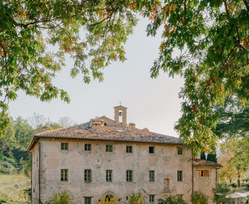
A 12th-century monastery in Italy’s Umbria region has become a boutique hotel in the hands of Florence studio Archiloop, which aimed to retain the site’s “rustic simplicity” during its renovation.

Vocabolo Moscatelli sits in the countryside near the hamlet of Calzolaro, close to the Tuscan border, on a remote estate surrounded by woodland.
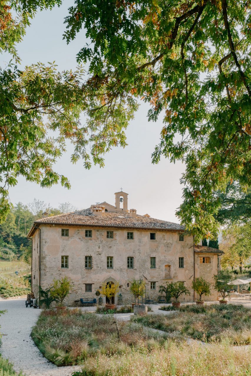
Exterior of converted monastery building with a bell tower, surrounded by landscapingExterior of converted monastery building with a bell tower, surrounded by landscaping
Vocabolo Moscatelli occupies a converted monastery in Umbria

The property was discovered by chef concierge Frederik Kubierschky and his partner Catharina Lütjens, who set about restoring the various 800-year-old stone buildings with the help of architect Jacopo Venerosi Pesciolini of Archiloop.

Aiming to retain the historic charm and as much of the original features as possible, the team kept the original wooden floors, exposed terracotta brickwork and ceiling beams, alongside brass, iron and stone details.
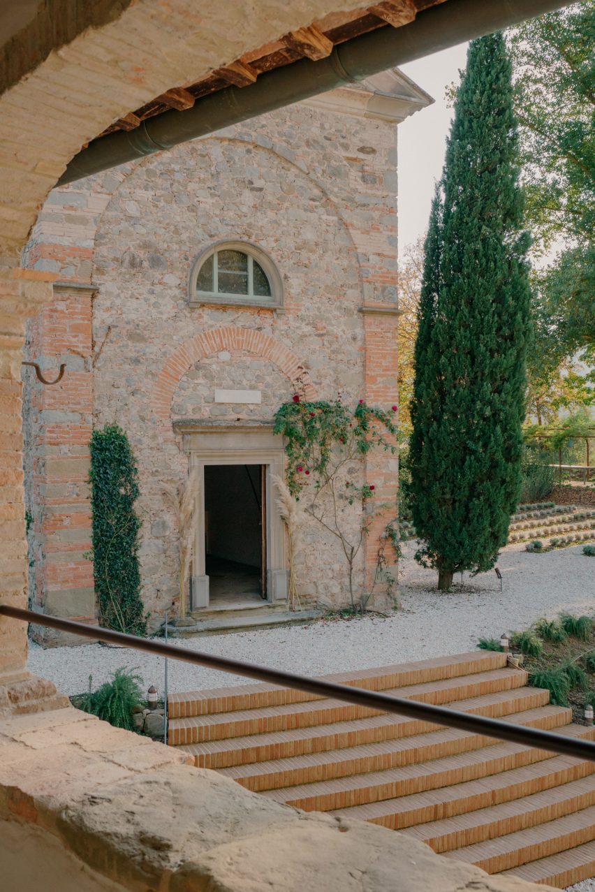
Stairs leading up to Vocabolo Moscatelli hotel in converted monasteryStairs leading up to Vocabolo Moscatelli hotel in converted monastery
The original brick and stone buildings were restored by Archiloop

They worked with local craftspeople on the restoration of these elements and incorporated new pieces by artists and designers from across the region, too.

“Vocabolo Moscatelli brings together the stone mason, blacksmith and woodworker with the artisan makers: ceramicists, tile makers and painters, creating a boutique style canvas that plays homage to the past while bringing in the design references of the now,” said the hotel team.
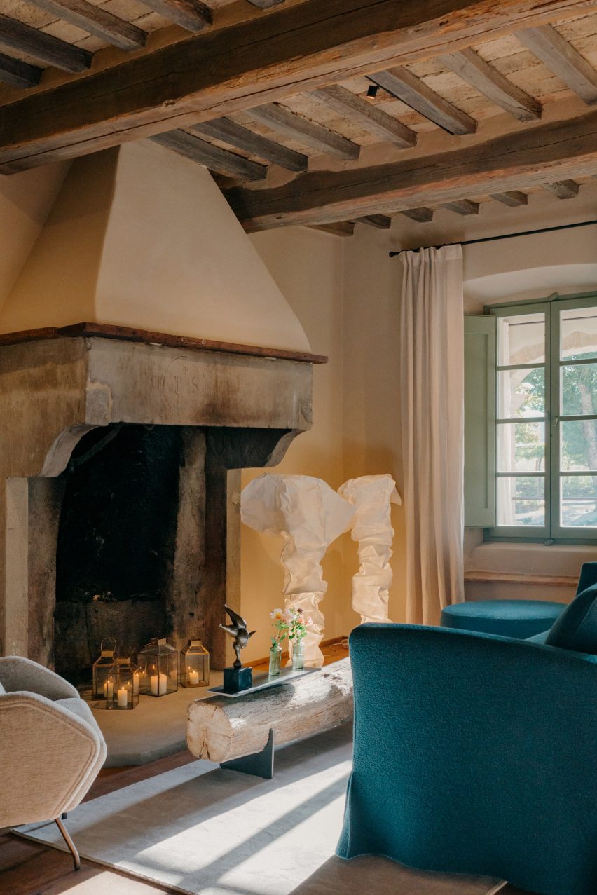
Seating area with fireplace inside Hotel Vocabolo Moscatelli in Umbria by ArchiloopSeating area with fireplace inside Hotel Vocabolo Moscatelli in Umbria by Archiloop
Timber ceiling beams are left exposed throughout the hotel

New additions to the site include a travertine swimming pool, coloured to match the surrounding woodland and Mediterranean landscaping by Fabiano Crociani.

“Threaded smoothly together, the effect is a template of rustic simplicity with heart,” the team said.
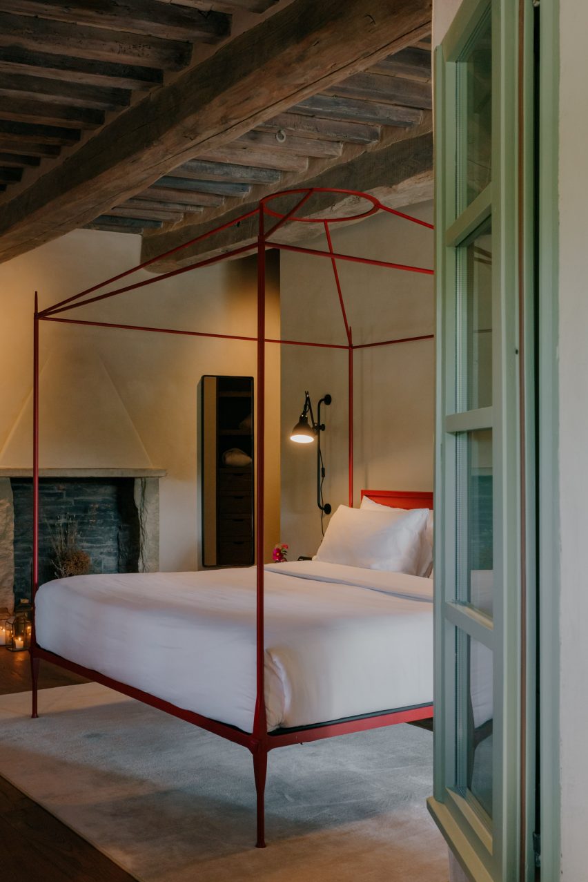
Bedroom with a red-framed, four-posted bedBedroom with a red-framed, four-posted bed
Each of the property’s 12 guest suites is unique and includes a custom bed frame

Vocabolo Moscatelli offers 12 spacious guest suites: eight in the main building and four more dotted around the landscaped grounds, all with a “monastic chic” style.

Each includes a unique colour palette and collection of design pieces, like a sculptural black two-person bathtub on one of the terraces and the various handmade beds.

The Bridal Suite includes a round canopy bed and a private garden, while the Spa Suite has its own sauna and jacuzzi.
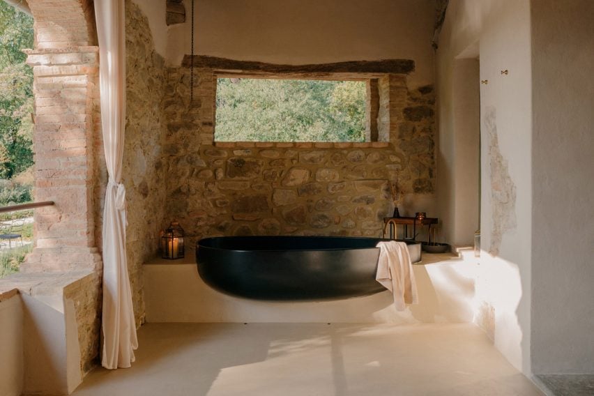
Bathtub on a terraceBathtub on a terrace
Some of the suites have sculptural al fresco bathtubs

Furniture and products were sourced from Italian brands, such as outdoor furniture by Paola Lenti and lighting from Davide Groppi and Flos.

Handmade glazed tiles by local Umbrian company Cotto Etrusco adorn the bathrooms, contrasting the rough stonework of the building’s thick walls.

Vocabolo Moscatelli is part of hotel group The Aficionados, which brings together 90 design-led properties across Europe.
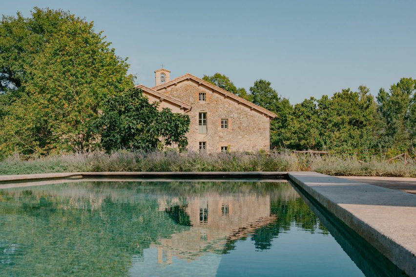
Swimming pool of Vocabolo Moscatelli by ArchiloopSwimming pool of Vocabolo Moscatelli by Archiloop
New additions to the estate include a travertine swimming pool

Many historic buildings across Umbria have been converted into guest accommodations, from remote holiday homes like the Torre di Moravola watchtower to sprawling rural estates like Castello di Reschio.

Several monasteries in Italy have also found new life as hotels, including the Monastero Arx Vivendi near Lake Garda.

The photography is by Fabio Semeraro.

Reference

Bunkhouse and Reurbano convert Mexico City building into boutique hotel
CategoriesInterior Design

Bunkhouse and Reurbano convert Mexico City building into boutique hotel

American hotel brand Bunkhouse and interior design studio Reurbano have used motifs derived from the history of a Mexico City structure when converting it into a boutique hotel.

Hotel San Fernando is located in the Condesa neighbourhood of Mexico City, a largely residential zone that in recent years has seen an influx of national and international travellers.

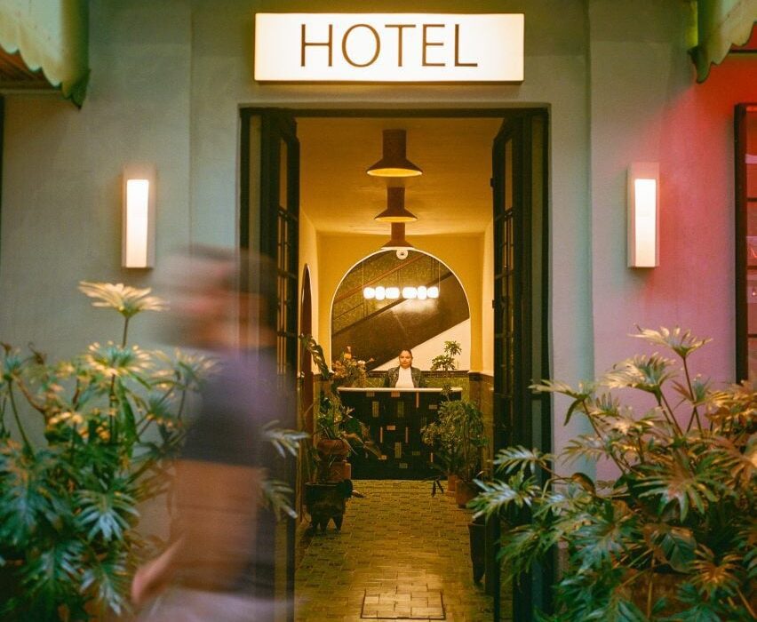
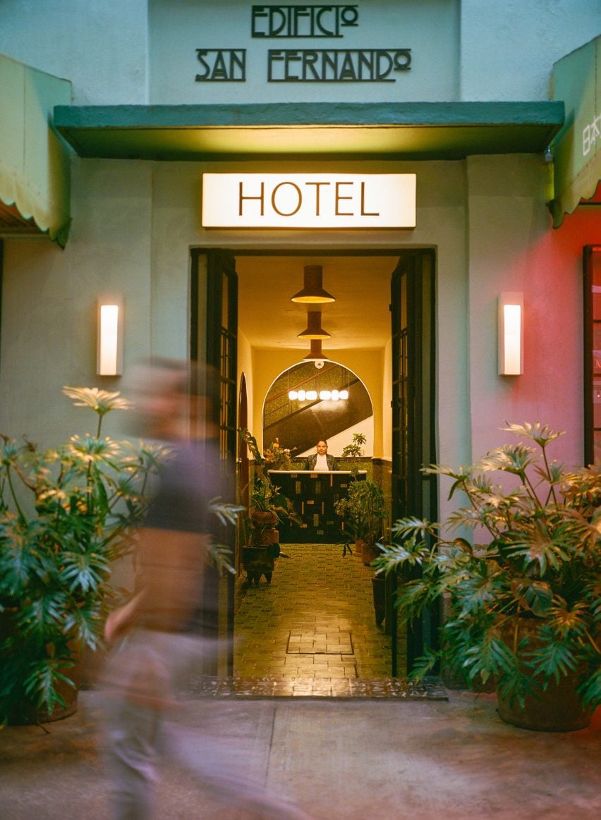
Hotel San Fernando with lettering and entrance corridorHotel San Fernando with lettering and entrance corridor
Bunkhouse and Reurbano have converted a 1940s apartment building into a boutique hotel in Mexico City

Bunkhouse worked with local interior design studio Reurbano to take a 1940s apartment building and convert it into a 19-room hotel, with finishes informed by the neighbourhood.

The face of the structure was restored and painted a light green, with darker green used on the awnings that provide coverage for seating attached to the hotel’s lobby and restaurant, which open to the street through glass-paned French doors.

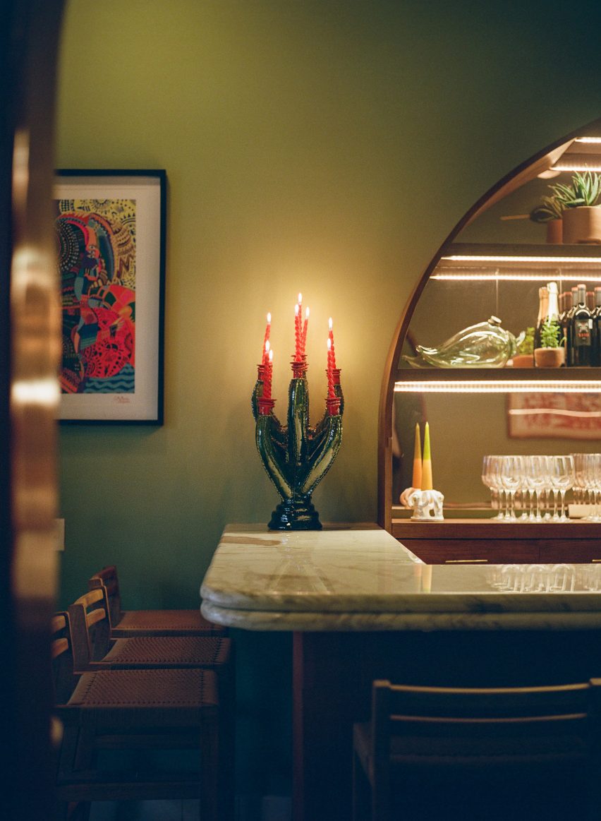
Chandelier on bar top Chandelier on bar top
It features renovated spaces that maintain details of the original structure

An art deco-style logo spells out the name of the hotel above the door. Saint Fernando is known as the patron saint of engineers, and the team wanted to highlight this by maintaining the name of the original building in the branding of the new structure.

“We wanted to honour this building,” said Bunkhouse senior vice president of design Tenaya Hills.

“We love the story and the history and like to imagine what it has been for people over the decades.”

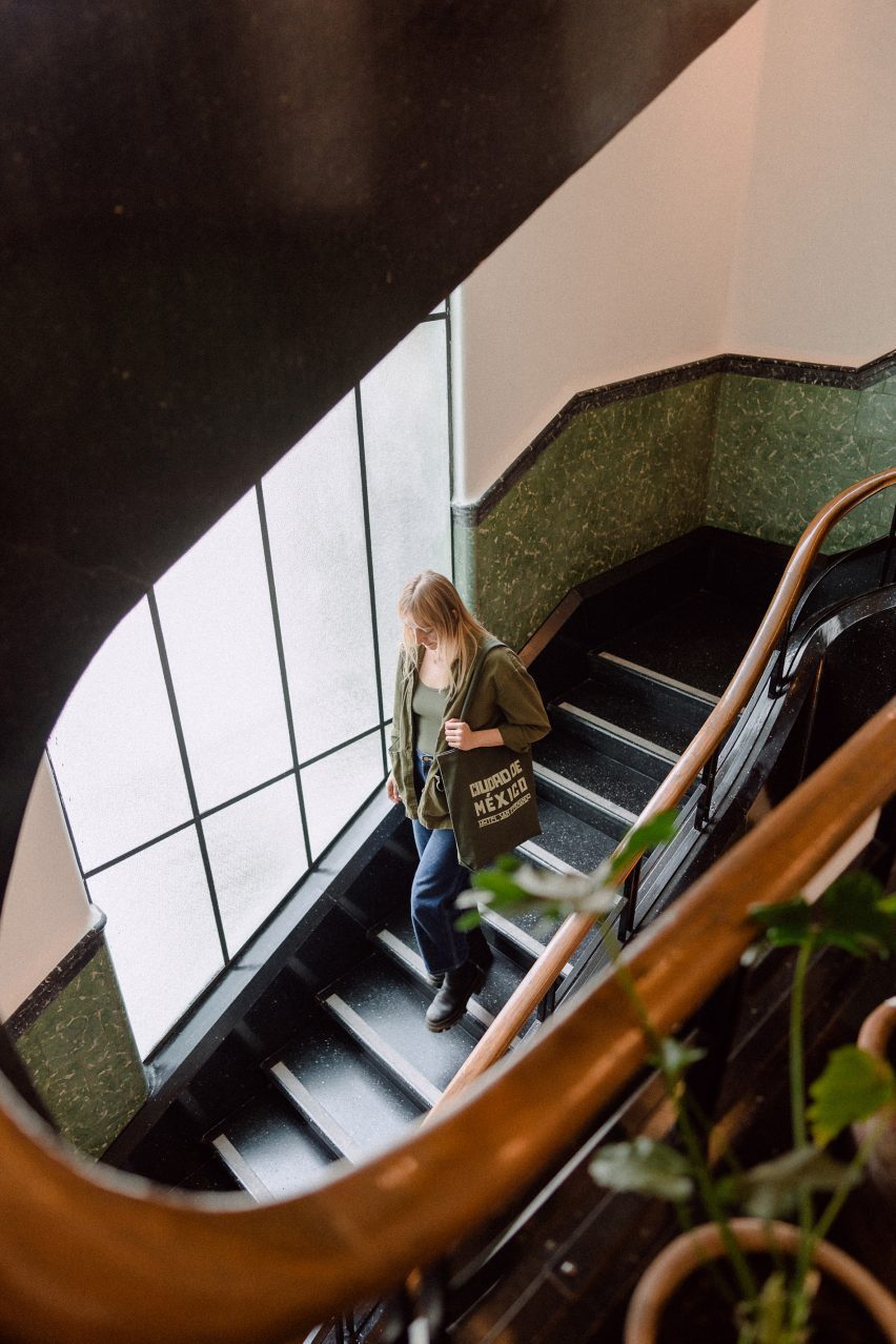
Woman on spiral staircase at Hotel San FernandoWoman on spiral staircase at Hotel San Fernando
A spiral staircase leads from the lobby to the rooftop

This primary entrance features a metal door with glass panes informed by the original stained glass of the building.

The entry corridor leads past a lobby lounge, with lighting by Oaxaca studio Oaxifornia and furnishings by local gallery Originario; and design studios Daniel Y Catalina, and La Metropolitana, which also created custom furniture for all of the guest suites.

At the far end of the lobby lounge is the restaurant’s bar, which features a large semi-circular cabinet with mirrored back to hold the spirits. A chandelier by local sculptor Rebeca Cors hangs above the clay-clad bar.

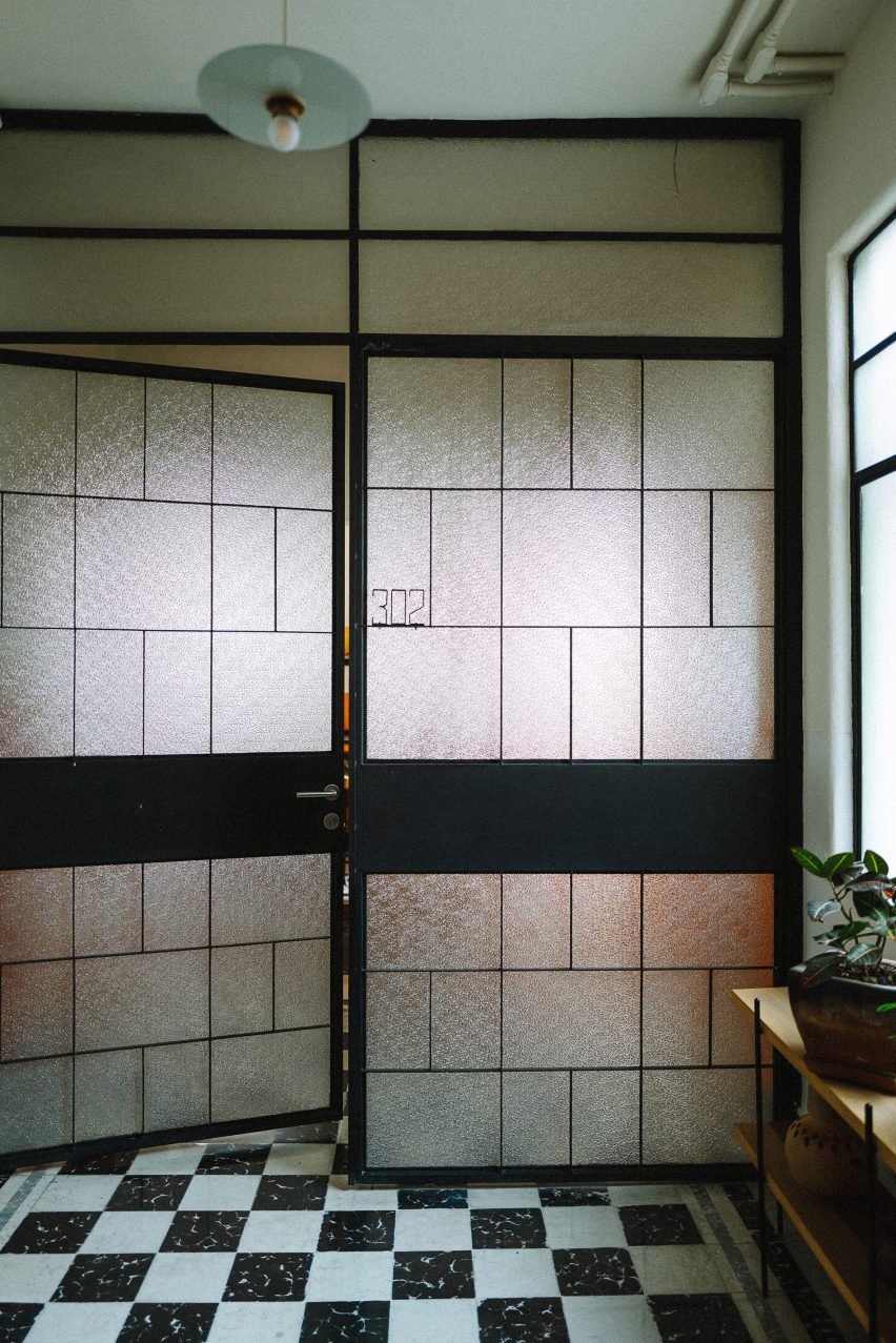
French doors with black and white tile flooringFrench doors with black and white tile flooring
French doors feature at the entrance and on some of the rooms

The entrance corridor has green encaustic concrete tiles from the original building. Other original details include the wainscotting and casement windows.

A reception area is located at the end of the corridor and behind it is a circular staircase with metal-and-wood railing that leads all the way up through the building, with landings on each of its five floors, terminating at a terrace on top of the building.

The guest rooms range from single-room setups to multi-room suites, the largest of which are accessed through French doors with opaque windows.

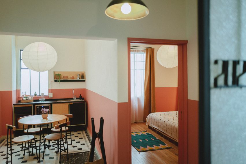
Here the studio departed from the greens used on the exterior and the lobby and utilised soft orange, pink and white paints.

Room at Hotel San FernandoRoom at Hotel San Fernando
Light colours and hand-crafted goods fill the rooms

Floors in the rooms are either tile or wood and furniture made from light-coloured wood is covered by locally derived textiles. Three rooms on the rooftop level feature furniture designed by Bunkhouse and fabricated by local design outfit B Collective Studio.

Pendant lamps and sconces by local ceramicist Anfora are found in the kitchens and bathrooms.

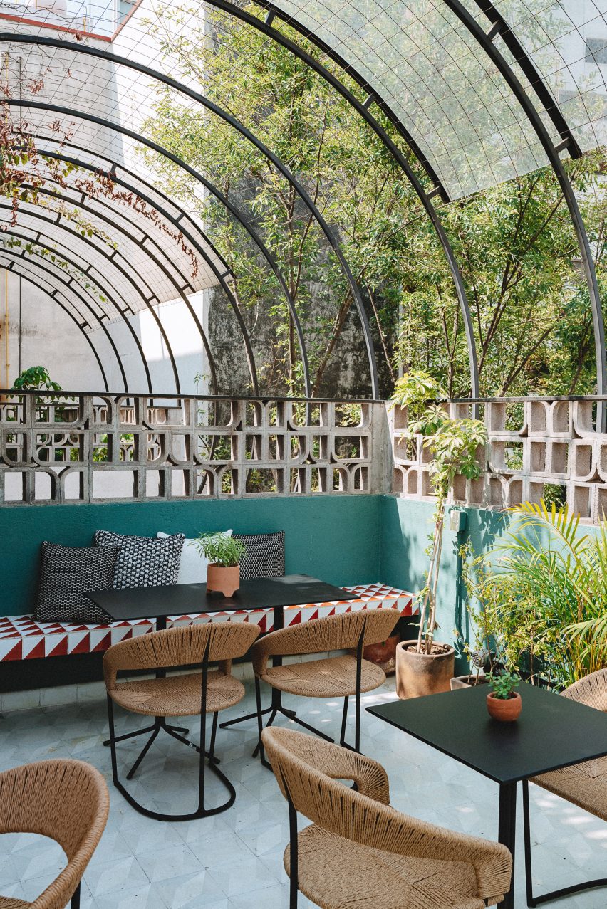
Sculptural breezeblocks on hotel terraceSculptural breezeblocks on hotel terrace
The rooftop features sculptural breeze blocks

The rooftop features a tiled dining and lounge area surrounded by sculptural breeze blocks, designed to mimic the original building’s patterned stained glass.

Mexican design studios Mexa and Comité de Proyectos contributed furniture pieces for the rooftop.

Other hotels in Mexico include a tile-clad structure in San Miguel de Allende by Productora and Esrawe Studio and a hotel in Mexico City with wooden lattices by PPAA.

The photography is by Chad Wadsworth. 


Reference

Martin Brudnizki designs Gilded Age-interiors for Fifth Avenue hotel
CategoriesInterior Design

Martin Brudnizki designs Gilded Age-interiors for Fifth Avenue hotel

Martin Brudnizki Design Studio has designed the interiors for a 1907 Renaissance-style palazzo building in New York, which has been turned into a luxury boutique hotel by architecture studio Perkins Eastman.

The Fifth Avenue Hotel sits on the site of what was once one of the last mansions of The Gilded Age.

Throughout the late 19th century, the home of Charlotte Goodridge at 250 Fifth Avenue hosted receptions and musical evenings as part of New York’s social season.

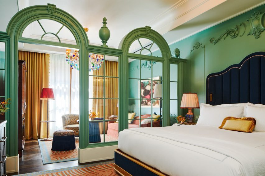
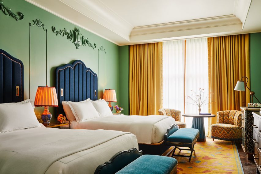
Green classical screen separates bedroom spacesGreen classical screen separates bedroom spaces
Classical fixtures contrast a contemporary colour palette in the hotel’s rooms

Perkins Eastman added a 24-storey glass tower, designed with PBDW Architects, to the five-storey brick and limestone building.

This was originally designed by McKim, Mead & White as the Second National Bank in 1907, replacing Goodridge’s 19th century home.

Drawing on the history of the neighbourhood and heritage of the building, Martin Brudnizki Design Studio (MBDS) aimed to create an aesthetic for the new hotel that would embrace “Bohemian romanticism and the glamour of the gilded age,” while maintaining contemporary styling.

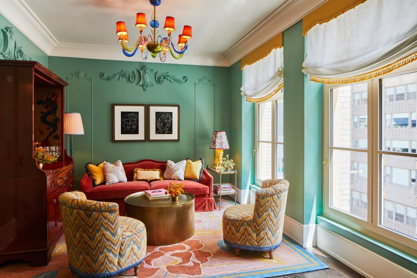
Green walls and ornate fittings and fixturesGreen walls and ornate fittings and fixtures
Martin Brudnizki has employed colour and texture to reflect global travels

“One of the biggest challenges was that we were working with both an existing and a new building at the same time, which each presented their own challenges architecturally,” studio founder Martin Brudnizki told Dezeen.

“We worked with the architects to marry the historic narrative with the contemporary tower addition, which reflects New York today, and the concept of the modern traveller,” he said.

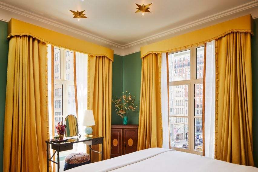
Yellow curtains in The FifthYellow curtains in The Fifth
A corner bedroom features yellow curtains

Rooms feature a rich colour palette of garden greens, buttercup yellow and peony pink with gold accents.

Bold patterns and textures jostle each other in a “harmonious and fun way, juxtaposing modernity with the classic finishings,” the designer said.

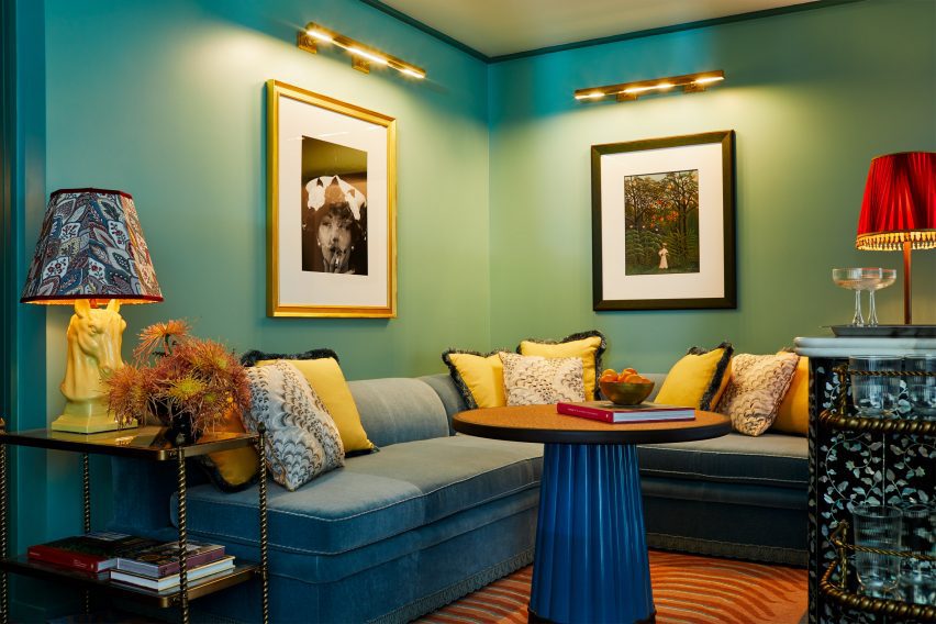
green walls and bespoke coffee tables at The Fifth Avenue hotelgreen walls and bespoke coffee tables at The Fifth Avenue hotel
The hotel’s walls host an extensive art collection

“The intersection of interiors with architecture is so important. The mansion is a much more classical response to the history and details of the building, whilst the tower enthuses a more modern touch,” Brudnizki explained.

“Both are unified by the choices of colours and certain furniture, fixtures and equipment that carry between the two sites.”

Bedrooms feature a global blend of references, including Pagoda-style table lamps, custom wardrobes informed by traditional Chinese cabinets, antique inlaid side tables, Murano glass chandeliers and star-like ceiling lights.

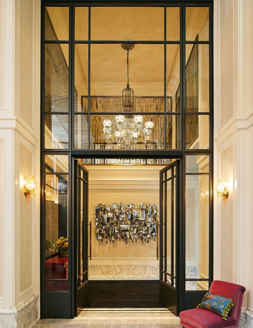
The double-height entrance lobby features walls panelled with faceted antique mirrors, marble floors and grand arched windows – which echo throughout the hotel bedrooms as room dividers between sleeping and sitting areas.

Rich colours evoke the gilded ageRich colours evoke the gilded age
Rooms have been designed to have a residential feel

“We loved the idea that all these great characters had once walked along the boulevard of Fifth Avenue and the fabulous parties hosted within the mansions of Fifth Avenue; the people and the conversations that took place,” said Brudnizki.

“We wanted to create a space that felt as though its interiors had been brought together over time, pulling items from our muse’s travels and adventures from across the globe.”

Double height lobby at The Fifth Avenue Hotel manhattanDouble height lobby at The Fifth Avenue Hotel manhattan
Antique glass panelling and modern mirrored artworks fill the double-height lobby

“It is a truly eclectic and layered project that is intended to feel as though it has been around since the days of The Gilded Age,” the designer concluded.

Other boutique hotels recently published on Dezeen include Christian Louboutin’s hotel Vermelho in Portugal and Trunk Hotel Yoyogi Park in Tokyo, by Keiji Ashizawa Design and Norm Architects.

Photography is by William Abranowicz.

Reference