Isern Serra completes “serene” office for eyewear brand Gigi Studios
CategoriesInterior Design

Isern Serra completes “serene” office for eyewear brand Gigi Studios

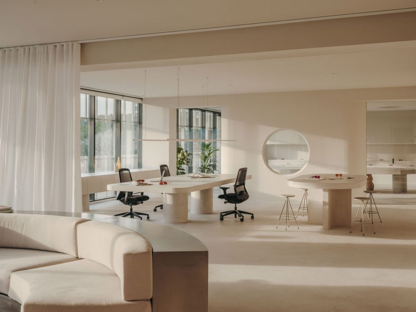
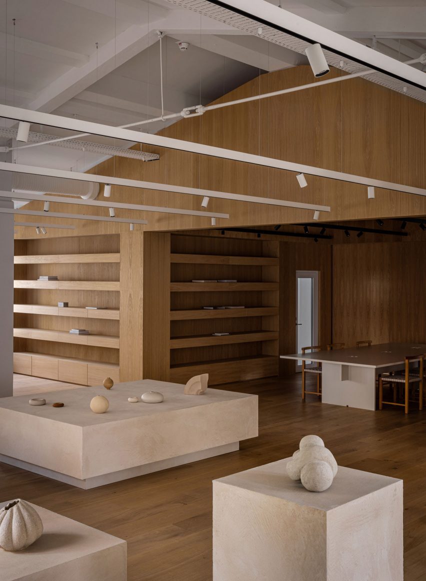
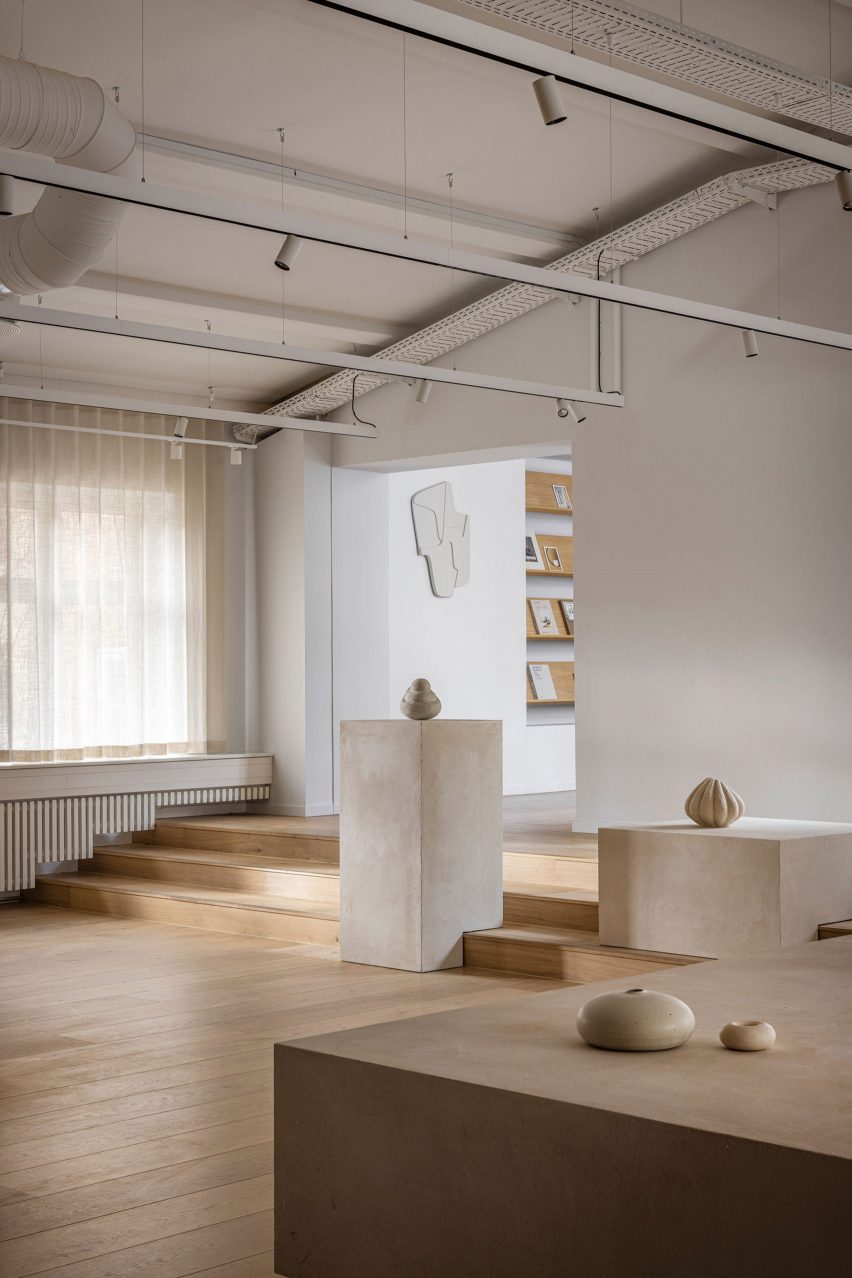
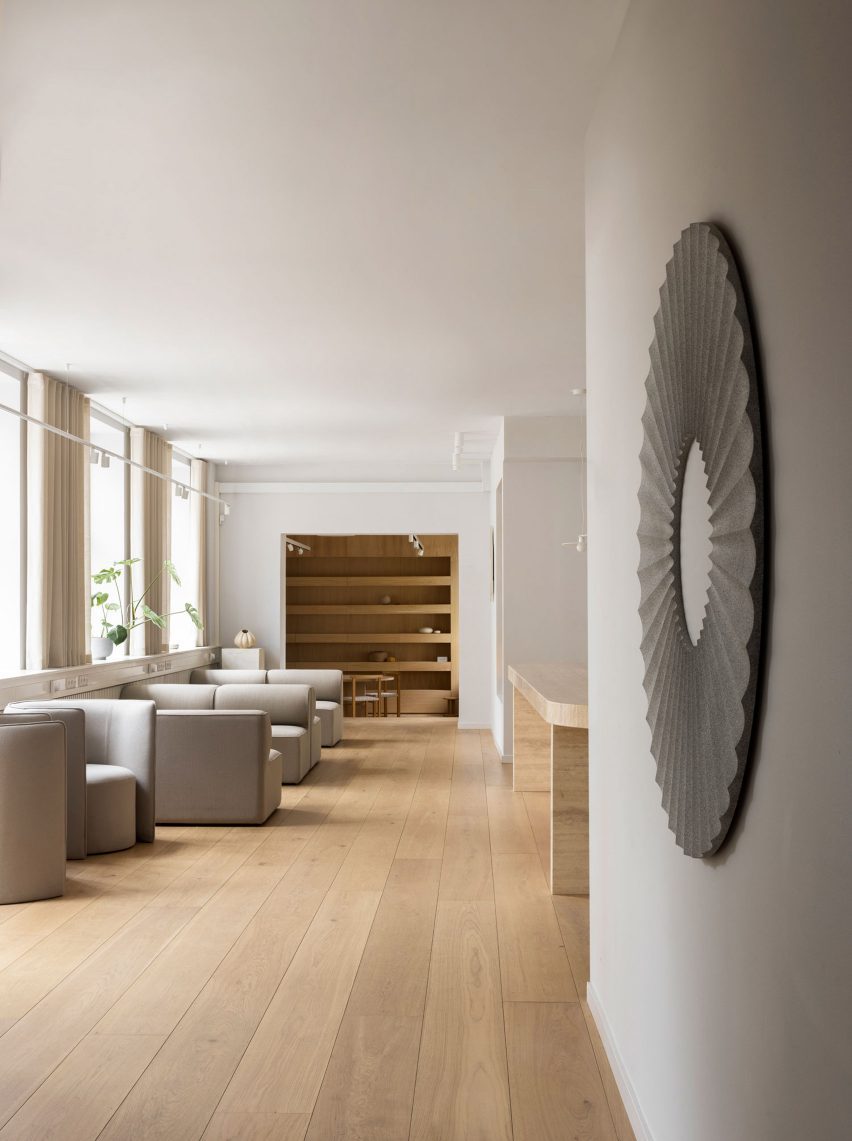
Sculptural custom-made furniture adds artistic flourishes to this otherwise minimal showroom and head office, designed by Spanish interiors studio Isern Serra for eyewear brand Gigi Studios.

Isern Serra was tasked with creating a holistic scheme for the 900-square-metre headquarters, occupying one floor of a building in the town of Sant Cugat del Vallès just north of Barcelona.

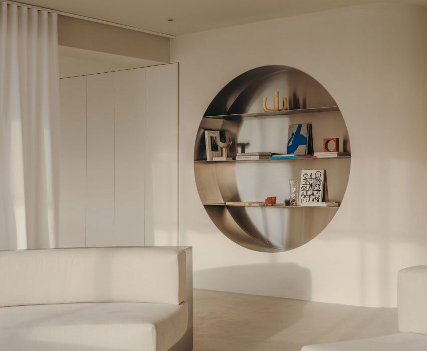
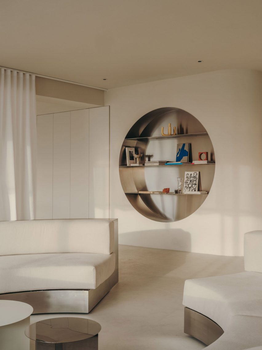
Wall niche with stainless steel shelving in Gigi Studios office Wall niche with stainless steel shelving in Gigi Studios office
Isern Serra has filled the Gigi Studios headquarters with custom furniture

The brief called for a design that creates a sense of spaciousness and comfort while reflecting founder Patricia Remo’s vision of Gigi Studios as a brand.

“It is also serene, warm and elegant and conceptually close to the idea of a studio and away from the concept of a traditional office, without losing the practicality and functionality,” Isern Serra explained.

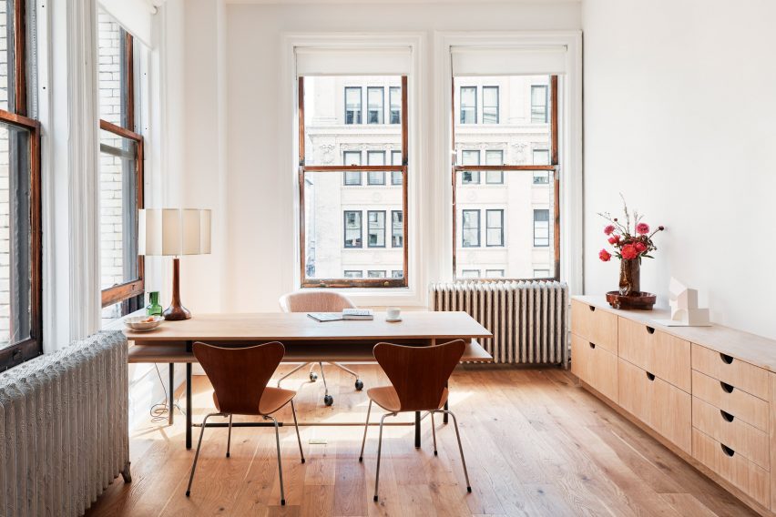
Workspaces in office in Spain by Isern SerraWorkspaces in office in Spain by Isern Serra
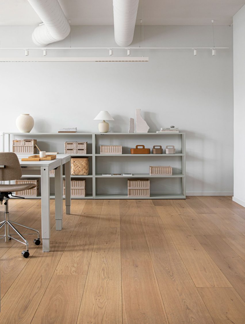
Rows of desks were replaced with more intimate work areas

The building’s rectangular floor plan features a central service core housing the lifts and toilets, with the workspaces, meeting rooms, kitchen and showroom occupying the surrounding O-shaped open space.

Serra and his team positioned the kitchen and showroom at one end of the plan and placed the meeting rooms and client areas at the other, leaving the longer sides open to optimise circulation.

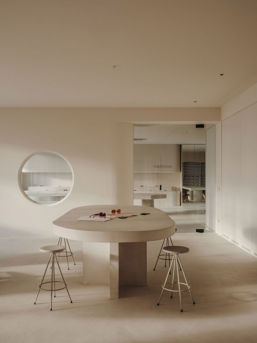
Table with stools in Gigi Studios office Table with stools in Gigi Studios office
Concrete bases for the work tables were cast in situ

Various bespoke furniture pieces, conceived by Isern Serra as “small works of art”, bring a distinct personality to the different formal and informal spaces.

These interventions were designed to embody Gigi Studios’ design ethos while standing out against the warm and minimal backdrop.

“The project aims to experiment with the limits of the workspace and seek a new concept that goes hand in hand with the idea of domus and museum,” Isern Serra explained.

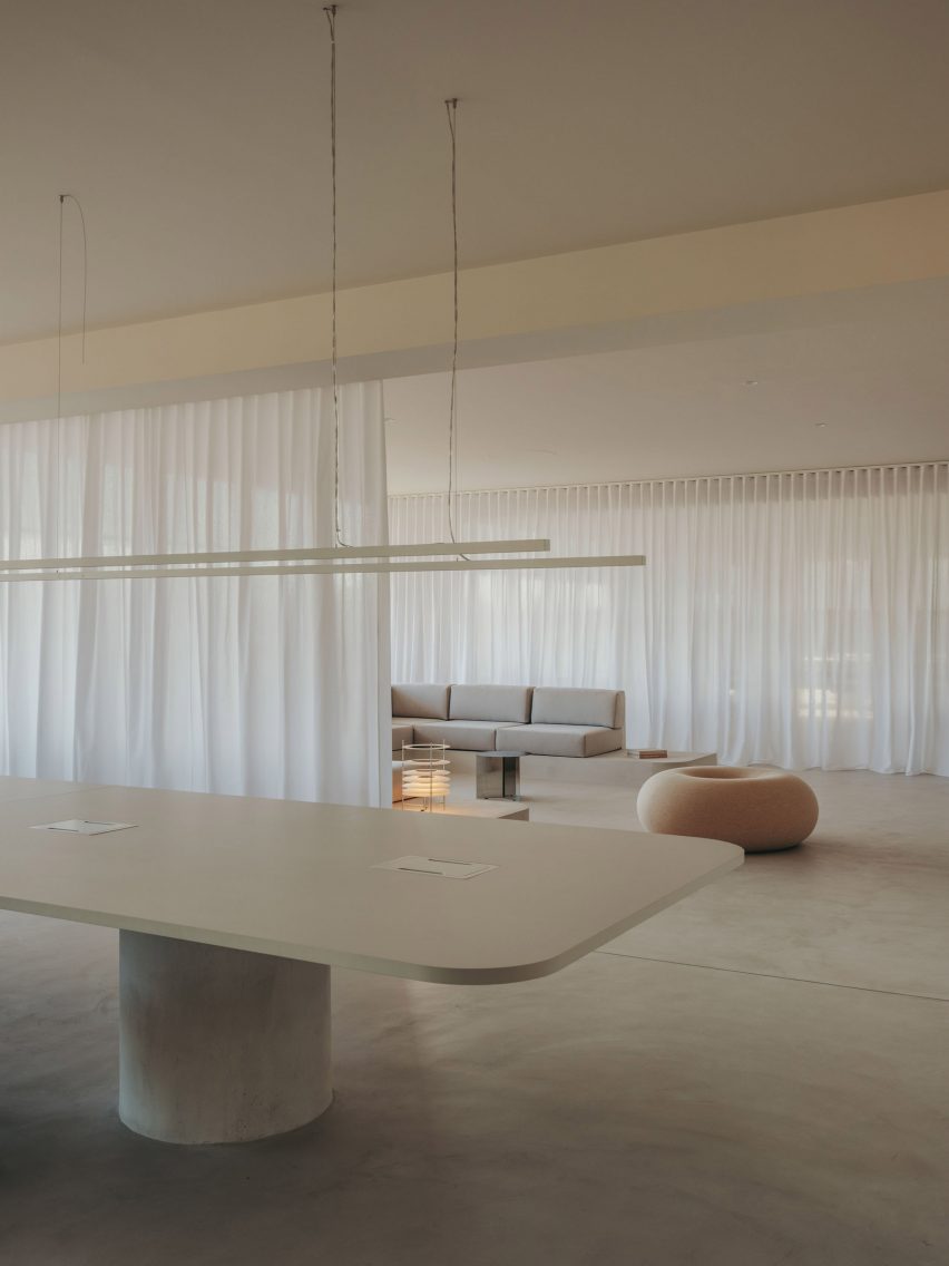
Table and lounge area inside office in Spain by Isern SerraTable and lounge area inside office in Spain by Isern Serra
Curtains can be used to cordon off the lounge area

A large circular sofa framed in stainless steel provides a bold statement in one of the reception areas.

The sculptural piece fulfils a dual function as a seating area and a space for working, with tables and book storage integrated into the backrest around the perimeter.

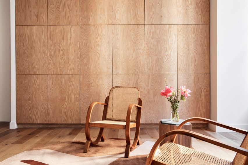
Similarly, the building’s central core is wrapped in a layer of built-in storage units including circular stainless-steel niches that incorporate shelves for displaying books and materials.

Rather than a typical office layout with rows of workstations, the large open spaces are separated into more intimate zones with a more domestic scale.

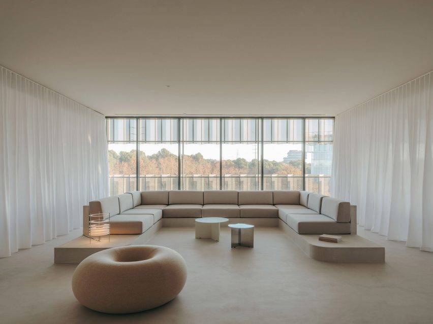
Lounge area inside Gigi Studios office Lounge area inside Gigi Studios office
A Boa Pouf by Sabine Marcelis provides informal seating

Next to the lobby is a design area featuring tables made from concrete that was cast in situ. Task seating surrounds the work table and a taller table is accompanied by stools, while lenses for the different glasses are stored in a custom-made unit.

The second workspace features a large C-shaped sofa with a concrete base that was also cast in situ. Custom-made tables and one of Sabine Marcelis’s Boa Poufs complete this lounge-style space, which can be visually separated from the rest of the office using curtains on either side.

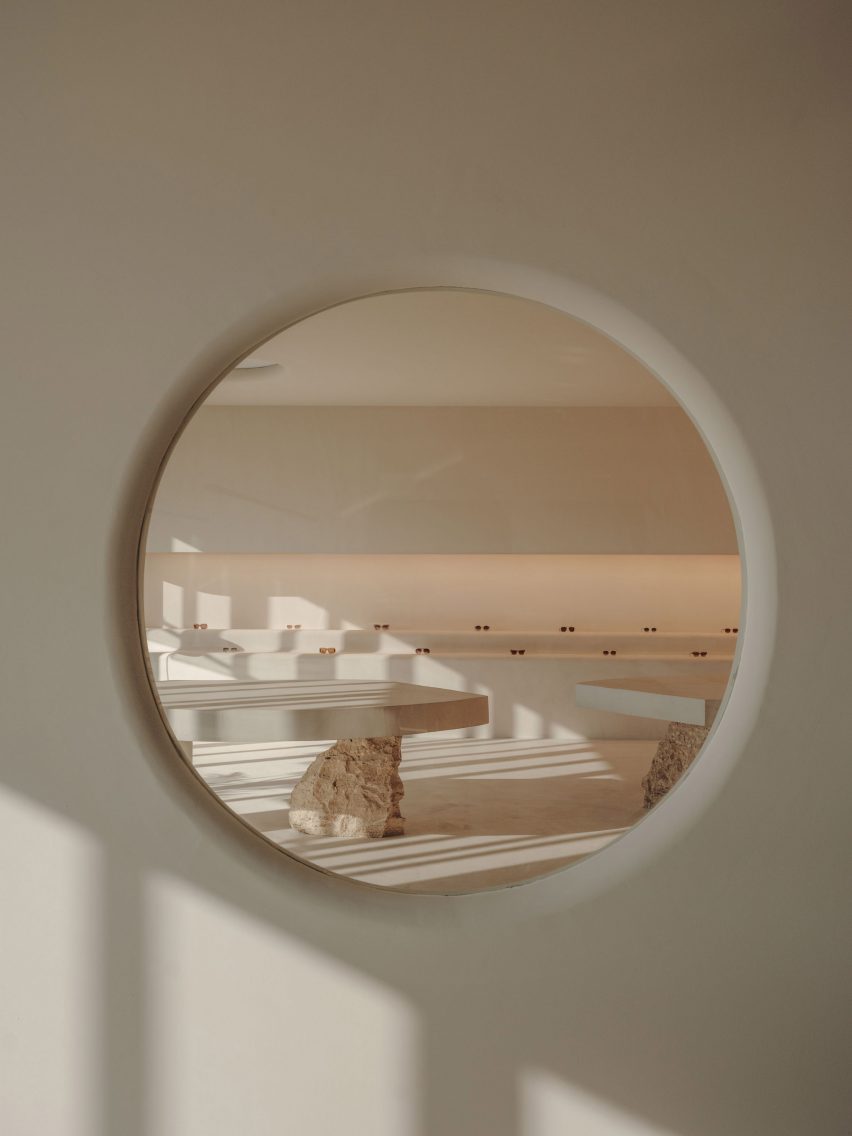
Look at eyewear showroom through circular windowLook at eyewear showroom through circular window
The showroom is visible from the office through a circular window

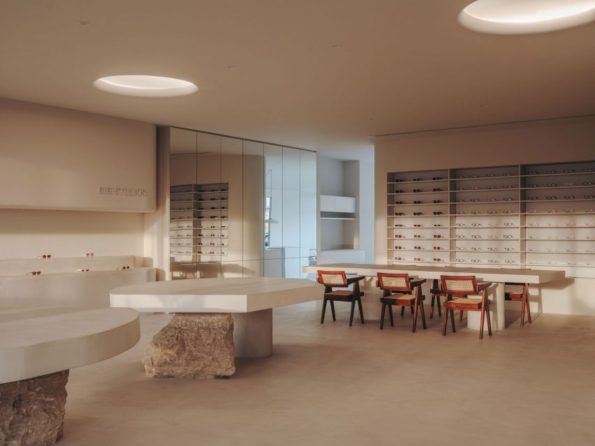
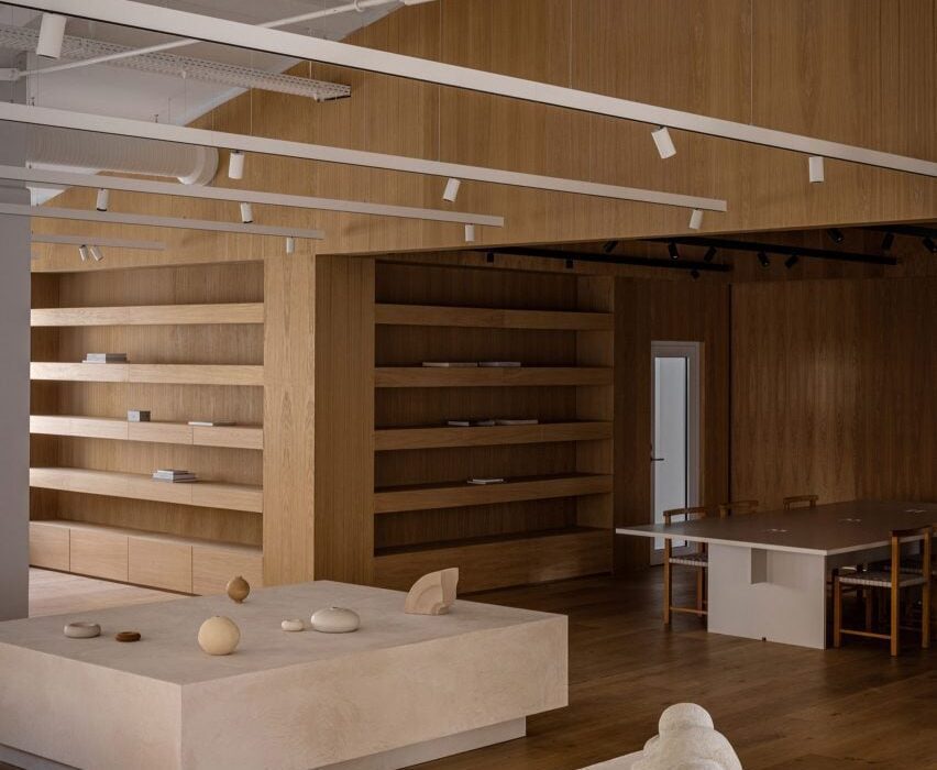
A circular window with rounded edges provides a glimpse of the showroom, which is dominated by two sculptural tables with concrete tops supported by rough chunks of travertine stone.

A built-in tiered display is used to highlight different Gigi Studios’ eyewear. The rest of the collection is housed in a backlit cabinet, while a mirror-fronted unit conceals a large screen used for presentations.

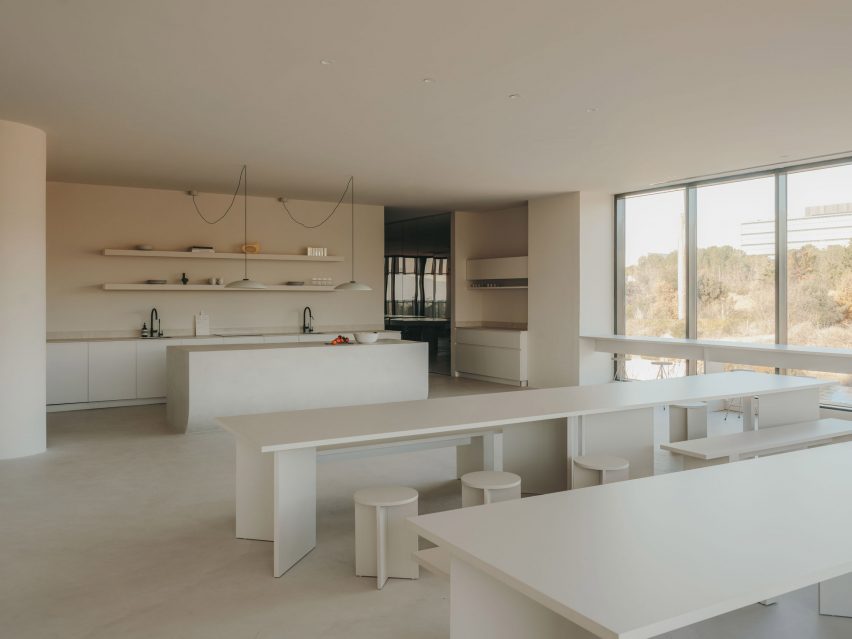
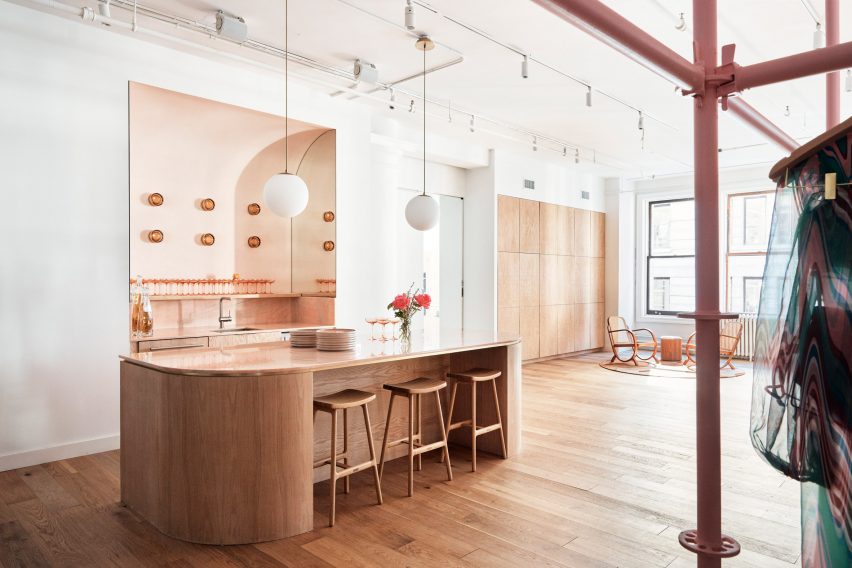
The kitchen is located next to the showroom so that the two spaces can easily be used together for events. Here, a homely, Mediterranean feel is created via a five-metre-long sharing table, custom-made alongside the accompanying stools.

Showroom inside Gigi Studios headquartersShowroom inside Gigi Studios headquarters
Display tables in the showroom are held up by rough chunks of travertine

The sizeable kitchen island is finished in micro-cement and features a curved base that enhances its sculptural presence.

A curved corridor incorporating a sofa niche on one wall provides access to offices and a meeting room positioned to have the best views of the surrounding countryside.

Internal columns are used to support one end of concrete tables built in each of the workspaces, furnished with classic designs including Marcel Breuer’s Wassily and Cesca chairs.

Office inside eyewear brand headquarters in Spain by Isern SerraOffice inside eyewear brand headquarters in Spain by Isern Serra
Large sharing tables allow for communal eating in the kitchen

Interior designer Isern Serra founded his self-titled studio in Barcelona in 2008 and works across architecture, interiors and industrial design.

Previous projects including a rose-coloured shop for Barcelona’s Moco Museum that was based on a computer-generated image and a minimalist office for digital artist Andrés Reisinger, which was named small workplace interior of the year at the 2023 Dezeen Awards.

The photography is by Salva López with art direction by Aasheen Mittal.

Reference

A circular toy brand – Springwise
CategoriesSustainable News

A circular toy brand – Springwise

Spotted: As most parents know all too well, a lot of money gets spent on toys that are played with for only a short time and then discarded or forgotten. Aside from being unnecessarily expensive, this is also environmentally unsustainable – especially as most toys are made from virgin plastics. However, at the same time, toys and play are essential to children’s development. To tackle these issues, Colombian startup Toynovo has created a circular model for toys.

Toynovo has developed a unique subscription service that allows parents and educational institutions to rent or buy ‘gently used’ toys through the platform for a monthly fee. Users can also exchange toys for new ones and sign up to receive a monthly bundle to exchange multiple toys on a regular basis.

In addition, Toynovo donates any toys that are no longer suitable for the subscription service to low-income families – extending their life further. Along with the toys, the company also provides educational materials for schools, community parks and play kits, and breastfeeding cabins for workplaces. The company has even developed its own line of (non-plastic) toys, called Joynovo.

Toynovo became a certified B Corp in 2022 and claims that it has eliminated more than 40 tonnes of carbon dioxide by extending the life of toys. The company is also expanding in other directions – exploring ways to reinforce toys so they last longer, repurposing toys made from wood into construction materials, and expanding the service to the US.

Toys are just the latest product to be offered on a subscription basis to widen access and save resources. We have also recently spotted affordable subscription models for kids’ bicycles and reusable nappies.

Written By: Lisa Magloff

Reference

Normal Phenomena of Life brand launches to sell biodesigned products
CategoriesSustainable News

Normal Phenomena of Life brand launches to sell biodesigned products

After years of exploring the merging of biotechnology with design, Natsai Audrey Chieza and Christina Agapakis have started what they describe as the “first biodesign lifestyle brand”, which launched at London Design Festival.

Titled Normal Phenomena of Life (NPOL), the brand will take the form of an online platform selling objects fabricated with the help of bacteria, algae, fungi, yeast, animal cells and other biological agents.

Biodesigned objects do not just use plant or animal matter as a material but are made by harnessing the natural processes of living organisms.

Campaign photo of a female model wearing the Exploring jacket in a forest. The jacket has been dyed by bacteria to have a patchy pink and purple pattern on white silk
New brand Normal Phenomena of Life will focus on selling products made through biodesign

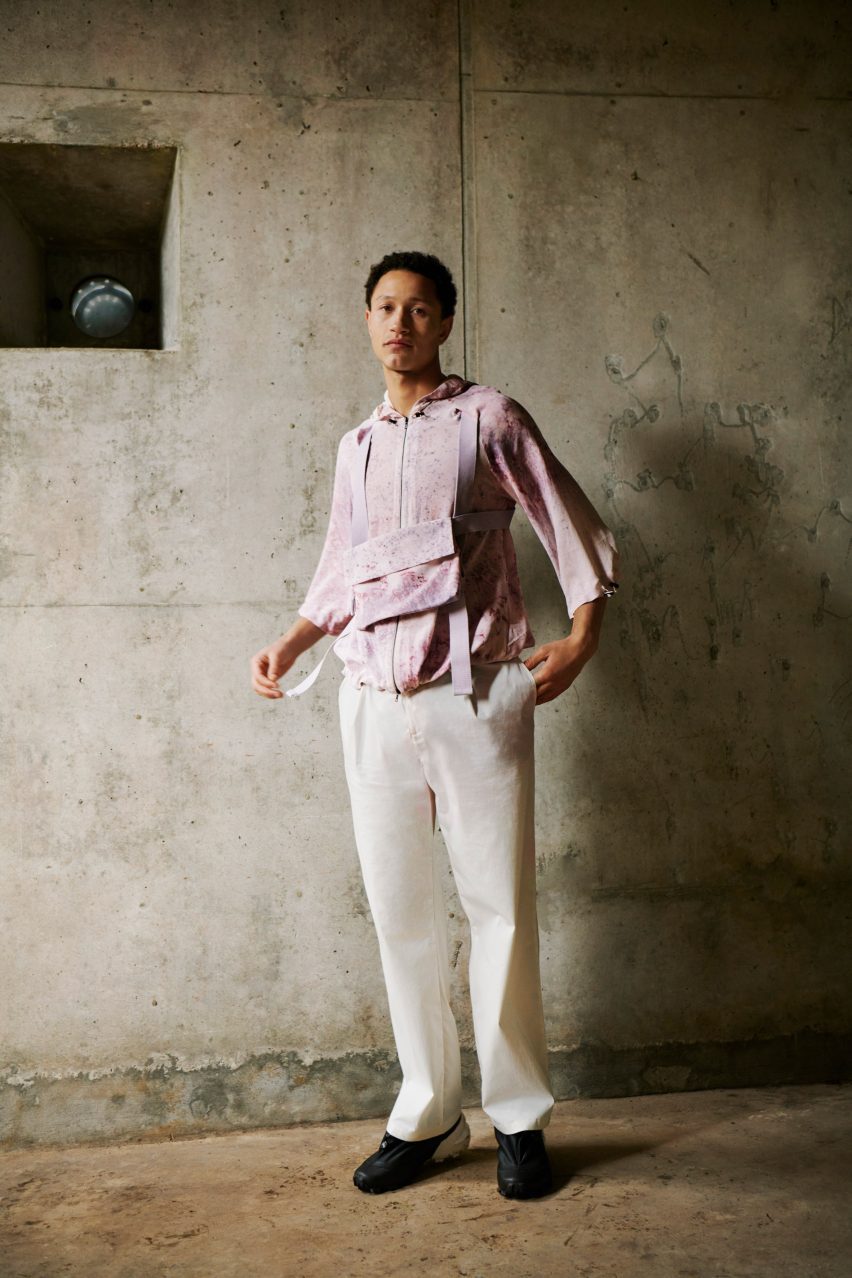
A silk jacket dyed with bacteria-produced pigment and a letterpress print created with ink grown by algae will be among the first products available on the platform, which will also focus on telling the stories behind the designs and developing consumers’ “material literacy”, according to Chieza.

“My vision for it is that not only does it story-tell and make visible the work of so many others under one umbrella, it also catalyses innovation and creates a less traditional framework for pushing products through a pipeline,” Chieza told Dezeen.

Chieza is the founder of multidisciplinary agency Faber Futures, while Agapakis is the creative director of biotechnology company Gingko Bioworks.

Like many others in their field they hope that biodesigned inks, yarns and building materials, which are non-toxic and resource-efficient, could come to replace high-polluting and petroleum-based materials.

Photo of a male-presenting model wearing the pink-hued NPOL Exploring jacket and musette within an industrial environment
Among the brand’s first products is the Exploring Jacket and Musette

The duo decided to start NPOL following years of collaboration in this field that have seen them set up a residency programme and start the Ferment TV YouTube channel during the pandemic.

With NPOL, they aim to give themselves the ability to develop more prototypes, more quickly, while also setting up the infrastructure so that other biotechnology companies can channel their innovations into products.

The platform’s own brand, NPOL Originals, which Chieza describes as “basically our R&D pipeline”, will designate goods made together with partner companies “who don’t have the bandwidth or don’t have a clear pipeline for how they might bring a consumer-facing product to market”.

Campaign photo of a person wearing the bacteria-dyed NPOL Exploring jacket lit up while walking through a forest at night
The unisex jacket is dyed by a bacteria that naturally produces pigment

Among the first NPOL Original products will be the Exploring Jacket and Musette, created together with biotech company Mbeu, designer Louise Bennetts and garment manufacturer Fabrika.

The unisex garment and accessory are made from silk that has been batch-dyed with the wild-type bacteria, streptomyces coelicolor, a microbe that naturally produces pigment.

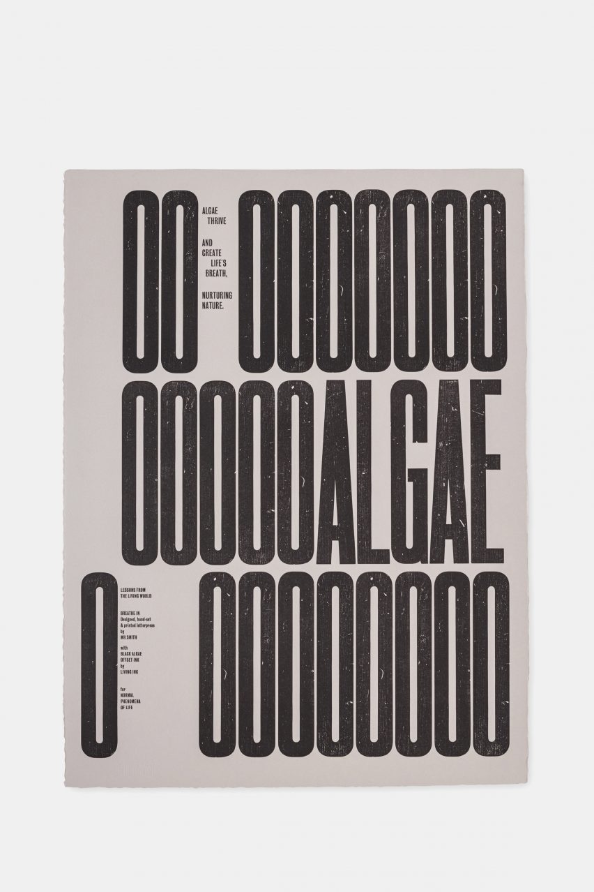
There will also be the print series Lessons from the Living World: Breathe In, made by algal ink manufacturers Living Ink and designer and printmaker Kelvyn Smith.

Image of print one in the series Lessons from the Living World: Breathe In Editions, with letterpress letters reading OO OOOOOOOOOOALGAE O OOOOOOO
Another NPOL product is a triptych of prints titled Lessons from the Living World: Breathe In Editions

The non-toxic, carbon-negative black ink is grown from algae, and the triptych’s designs represent the role the plant plays in converting carbon dioxide into oxygen.

Alongside the NPOL Originals, the platform will stock products by other companies. Not all of these will be biotech-enabled, including books and cosmetics, but Chieza and Agapakis hope they will contribute to communicating the brand story in a world where true biodesign is still rare.

The platform will include mycelium goods, which are “still not mainstream enough”, according to Chieza, despite their growing presence in design.

“We need ubiquity,” said Chieza. “We need it to be everywhere. And it takes a lot of hard work and many years of dedication for that to be the case.”

Image of print two in the series Lessons from the Living World: Breathe In Editions with big letterpress letters reading OOOABSORB O OCARBON OO OOO DIOXIDE
The prints are created with algae ink

The NPOL founders’ mission is to contribute to this ubiquity by creating informed conversations around biotech innovations that consumers may eye with suspicion.

“One of the reasons why we thought it was important to create a place like NPOL is because the boundaries between synthetic and natural are so grey now, with the emergence of these technologies,” said Chieza.

“How do we create consumer insights into products that might be engineered with biology? How do we talk about the benefits of that? How do we problematise that in a way that is constructive and opens up critique from all of the right places?” she continued.

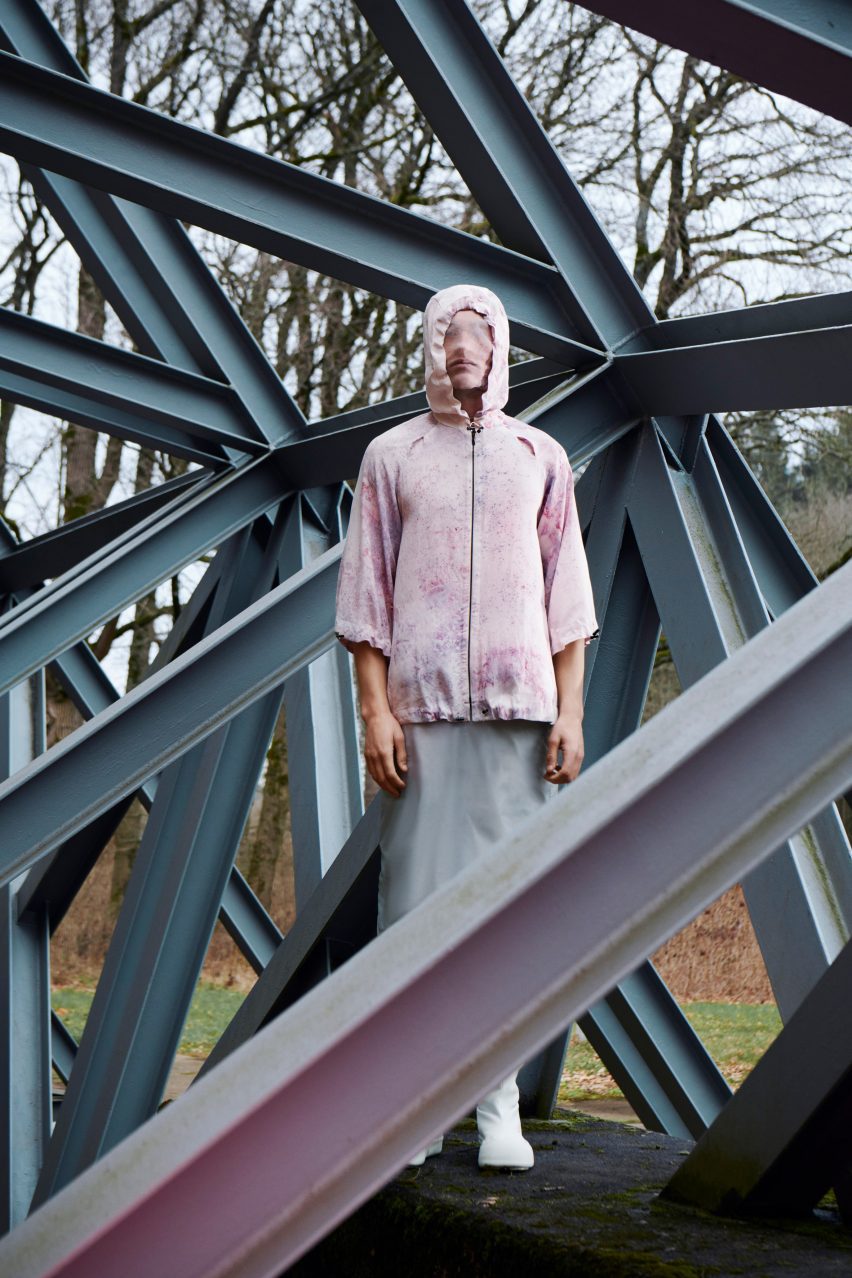
Fashion campaign photo for the Normal Phenomena of Life brand featuring a veiled figure standing on a bridge
NPOL’s founders hope the brand starts a conversation

“It’s very important that we have material literacy around the kinds of technologies that are mediating the living world and that are going to permeate our lives,” Chieza added.

Chieza started in biodesign while undertaking her masters in Material Futures at London design school Central Saint Martins, from where she graduated in 2011. She went on to found her biotech-leaning multidisciplinary agency Faber Futures in 2018 and has become a leader in the field.

In 2021, she laid out a manifesto of five principles to advance the field of biodesign for Dezeen.

NPOL will launch during the London Design Festival with the exhibition This Is Living, on at the Design District, Building D4 in Greenwich from 16 to 24 September. For more information about events, exhibitions and talks, visit Dezeen Events Guide.

Reference

Aggressively Passive: Why Fierce Brand Competition Is a Huge Win for Green Architecture
CategoriesArchitecture

Aggressively Passive: Why Fierce Brand Competition Is a Huge Win for Green Architecture

Michael Ingui is a partner at Baxt Ingui Architects and the founder of Passive House Accelerator. The Accelerator is a catalyst for zero-carbon building and a collaborative media platform for practitioners, developers, and manufacturers working to create better buildings through Passive House design and construction.

We are in an incredibly exciting time as architects, designers and builders. Every day a new high-performance product enters the market, existing products are modified to perform better, and new solutions are identified. This is true whether the project is new construction or a retrofit, single-family or commercial. As the marketplace has expanded, more developers and owners have realized that they can build buildings that are healthier and more energy efficient with lower embodied carbon than in the past. Thanks to the growing competition and innovation within the market, these products also cost far less than they once did, and the kinds of sourcing difficulties that high-performance buildings experienced even five years ago are becoming a thing of the past, which has further contributed to the robust growth in the sector.

One of the most telling signs about the health of the emerging green building industry is the accelerated growth of Passive House construction across North America. Since 2014, the number of projects annually certified by Phius, one of two organizations through which one can obtain Passive House certification, has more than tripled. Meanwhile, the square footage of Phius-certified projects doubled from 2021 to 2022 — from 600,000 to 1.2 million square feet. This is in addition to the 37.5 million square feet of usable area certified by the Passive House Institute as of January 2023.

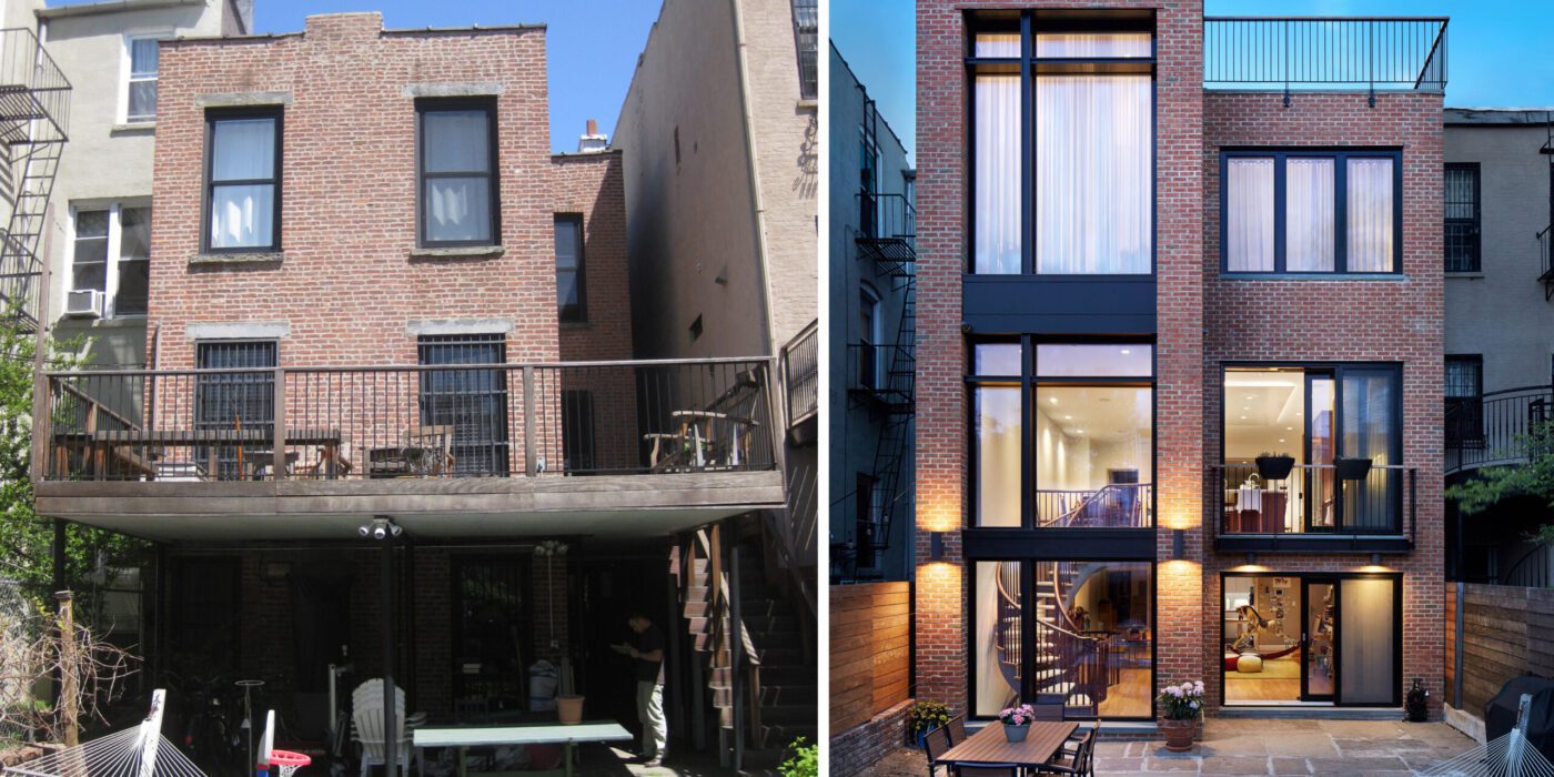
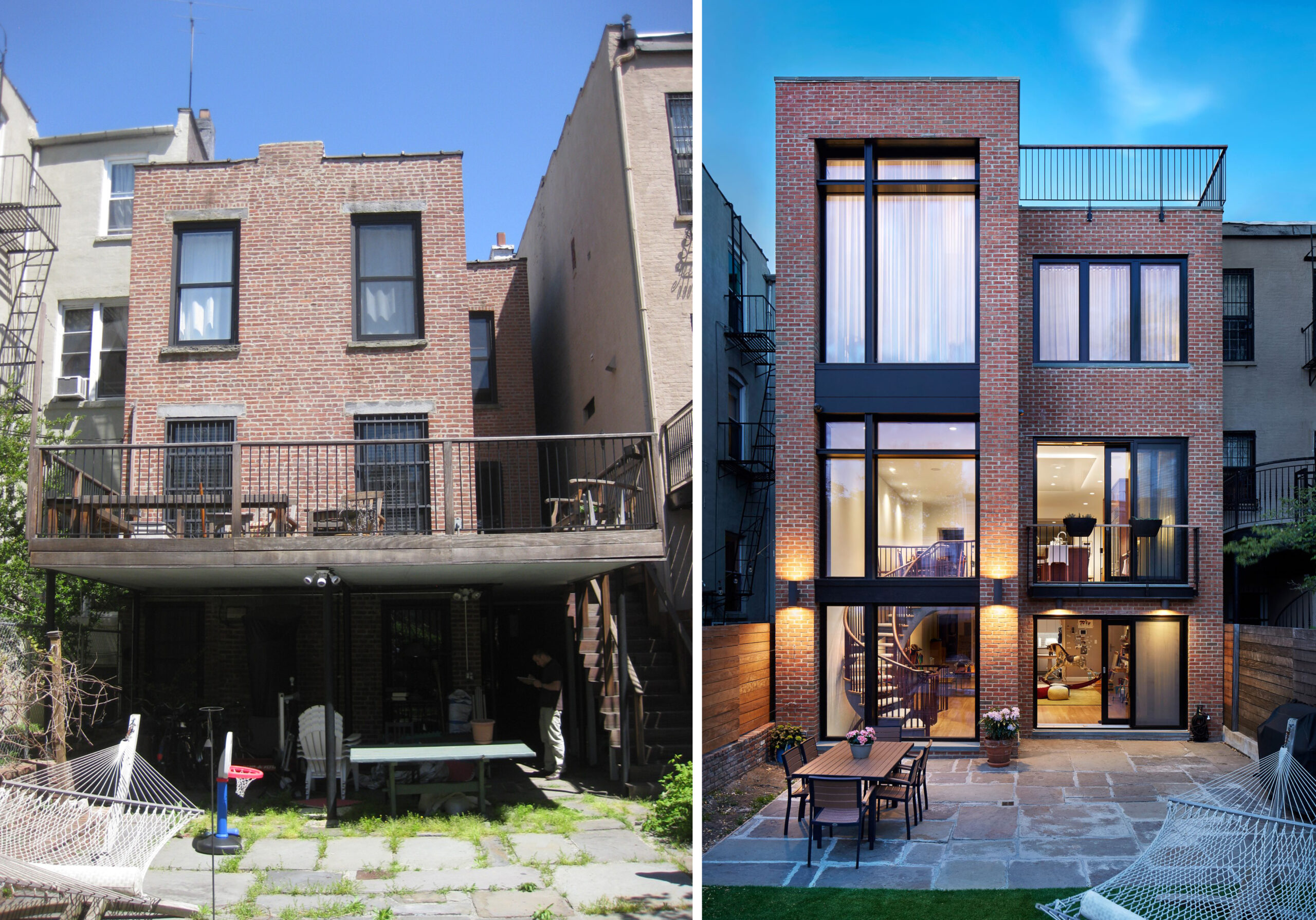
Left: Before, Right: After, Photography: John Muggenborg 

This would have been unthinkable less than a decade ago when Baxt Ingui Architects designed our first Passive House in Manhattan. Many of the challenges we faced were a lack of available materials and difficulty sourcing products. Passive House-quality windows on a brownstone receiving a full façade restoration was a first, and it required a public hearing. The window company, Zola Windows and Doors, collaborated with the Landmarks Preservation Commission and us to create a window they could approve. This helped pave the way for many successful Passive House projects to come. We are spoiled with the current options for readily available stock and custom skylights that meet Passive House standards, along with multiple interior and exterior shading options. For our first several Passive House townhouses, we were saved by a New Jersey-based custom skylight company, Fiore Skylights, who was able to help us work through many of the details we were doing for the first time on this project.

These kinds of growing pains stifled the growth of the high-performance building industry in North America. Design teams and manufacturers were hesitant to fully embrace what was often seen as an immature market. The lack of early adopters only compounded problems with access to materials and limited product options. Within the last few years, this hesitancy has eroded as sourcing networks have expanded and knowledge about the benefits of Passive House and high-performance construction has become more widespread. Consequently, the flood gates are now opening, and we are seeing loads of new high-performance products enter the market.

One of the most critical components to any high-performance construction project is the air barrier. When we began doing Passive House construction more than a decade ago, it was extremely difficult to source fluid-applied membrane air barriers in the U.S. Oftentimes, the only product that was readily available was manufactured by Sto Corp. Sto continues to be one of the air sealing products of choice for many, but now they have been joined by several others, including Intelligent Membranes, Partel, Rothoblaas, Prosoco and Pro Clima.

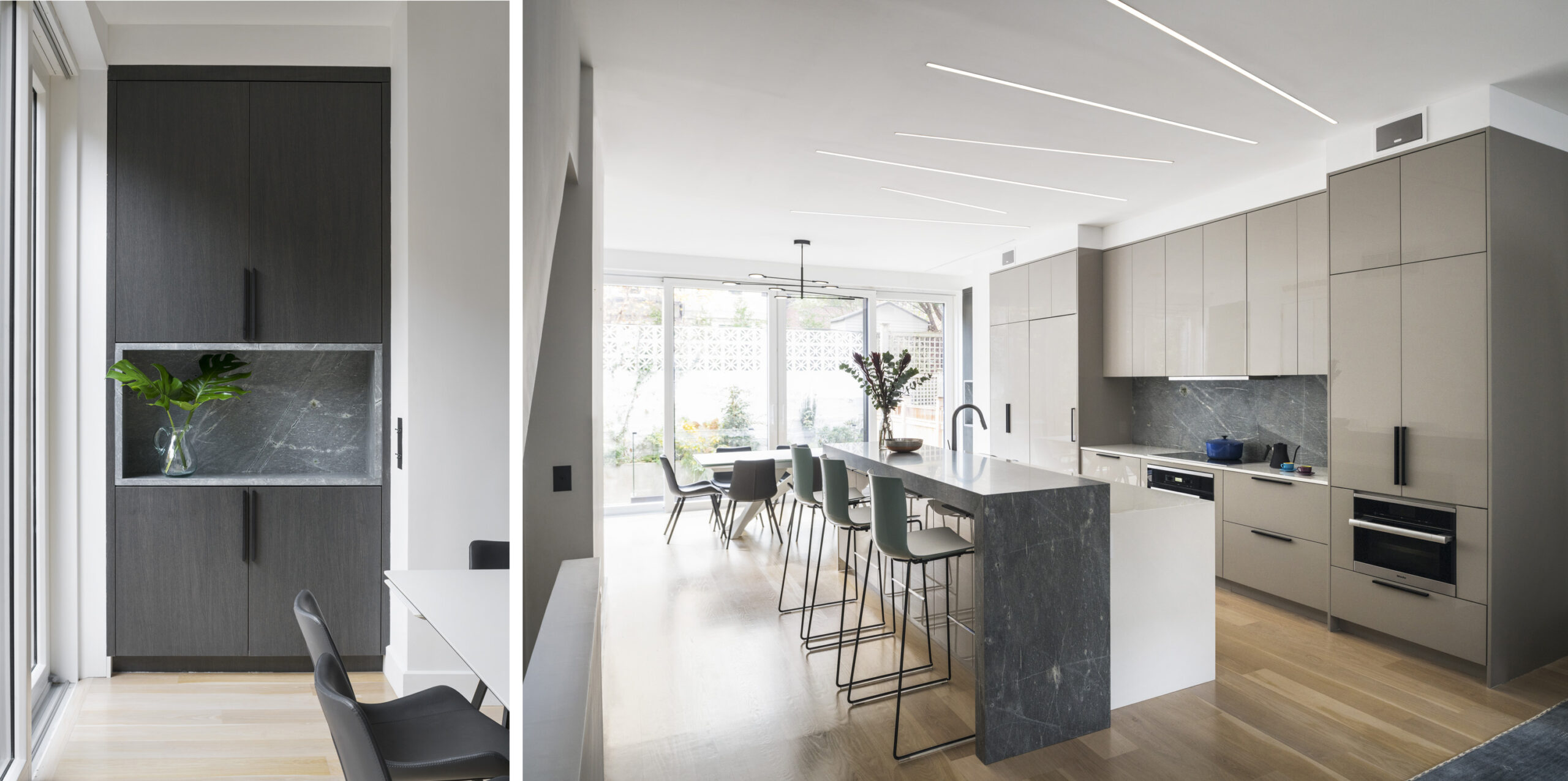
Finish Photography: Peter Peirce

Creating more airtight envelopes is certainly integral to improving building performance and pursuing Passive House certification, but it plays a more important role in buildings than you might think at first glance. Airtightness is a crucial part of the building’s wall system because it keeps the conditioned air inside separate from the unconditioned air outside. This translates into the lower heating and cooling costs associated with Passive House design.

Air sealing is also important from the perspective of occupant health. Rather than haphazardly finding pinholes and other seams or cracks through which to travel, all air that enters the building is directed through mechanical ventilation systems — another feature of Passive House construction. When outfitted with a filtration system, these ventilation systems can provide a constant supply of fresh air for occupants that is free of pollutants and allergens. For people with allergies in high pollen areas, this can be life-changing. For those who live in areas where wildfires are common, a more robust system outfitted with charcoal filters can keep their homes virtually smoke-free.

All-in-one mechanical systems (known as energy recovery ventilators [ERVs] or heat recovery ventilators [HRVs]) are currently available that provide not only mechanical ventilation, but also heating and cooling. What is truly impressive about these systems is their size. Products that have been developed by manufacturers like Minotair and Ephoca can fit in a closet. While this may seem undersized at first glance, when a building has been properly insulated and air sealed, the amount of energy it needs for heating and cooling drops precipitously. Therefore, the need for enormous mechanical systems disappears. Sometimes you don’t even need the heat at all. This winter, I only had to turn on the heat in my own Passive House certified home in Brooklyn for a few nights.

Finish Photography: Peter Peirce

Relatedly, the growth of heat pumps has been truly remarkable. Though they’ve been built by enormous manufacturers like Mistubishi, Daikan, and Fujitsu for years, they are becoming increasingly commonplace in new construction and retrofits. Rather than using natural gas or oil, heat pumps use electricity to efficiently heat and cool spaces, which helps reduce operational carbon emissions, particularly when paired with onsite and renewable energy generation. The same is true for electric and tankless water heaters, which will probably soon become industry standard.

The market for high-performance windows has also become exceptional, particularly in New York. In 2014, high-performance windows had to be ordered from Europe and there were only a few companies in the business of doing so. Moreover, most builders had never installed high-performance windows systems. Consequently, design options were limited, prices were outrageous, and months-long delays were inevitable.

Today, there are nearly two dozen high-performance window companies that include Zola Windows, Ikon Windows, Innotech Windows + Doors, EuroLine Windows, and Wythe Windows. Competition between these manufacturers is leading to innovations that are not only making high-performance more affordable, but also more varied. For designers, this means more options with respect to materials (wood, aluminum, or uPVC), dimensions, and configurations — including double hung. Builders are also far more accustomed to installing these systems and the process has gone from complicated (and sometimes contentious) to routine.

Another major change is that Landmarks Commissions have become more accustomed to high-performance retrofits. As I noted above, including a Passive House window on a townhouse just a few years ago almost always resulted in a months-long public hearing process. New York City’s Landmarks Preservation Commission was clear about what window companies had to achieve in order to be approved at staff level, and thankfully, window companies were able to successfully meet those requirements. This has been a significant game-changer, because window selection often drives the decision to pursue Passive House.

Finally, as the components that are necessary to make buildings more efficient become increasingly commonplace, a new generation of manufacturers is beginning to move beyond the problem of operational carbon and looking to how materials choices affect embodied carbon and human health. With respect to the former, this means using natural or recycled materials and manufacturing them without the use of fossil fuels. With respect to the latter, this means manufacturing products that do not release volatile organic compounds (VOCs) and harmful other chemicals during the beginning phase of their lifecycle (a process known as off-gassing).

Given the exponential growth in the high-performance marketplace that we’ve seen in just the last ten years, I believe the next decade is going to be defined by product innovation, improvements in sourcing, and new materials that ultimately make buildings healthier and more sustainable.

Judging for the 11th A+Awards is now underway! While awaiting the Winners, learn more about Architizer’s Vision Awards. The Early Entry Deadline on May 5th is fast approaching. Start your entry today >
Reference

BoND creates New York “embassy” for fashion brand PatBo
CategoriesInterior Design

BoND creates New York “embassy” for fashion brand PatBo

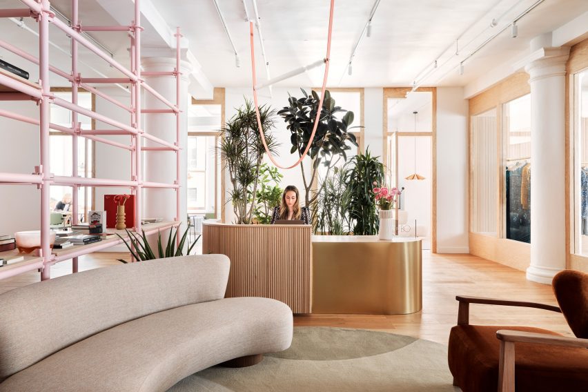
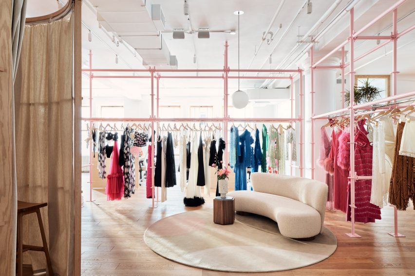
Architecture studio BoND has designed the New York headquarters for Brazilian fashion brand PatBo, which features pink scaffolding and rugs based on drawings by Roberto Burle Marx.

The office and showroom for PatBo occupies a 7,000-square-foot (650-square-metre) loft, which spans the entire seventh floor of a historic building on Fifth Avenue.

Reception area at the PatBo New York showroom
The PatBo showroom is located in a light-filled loft in New York’s Flatiron District

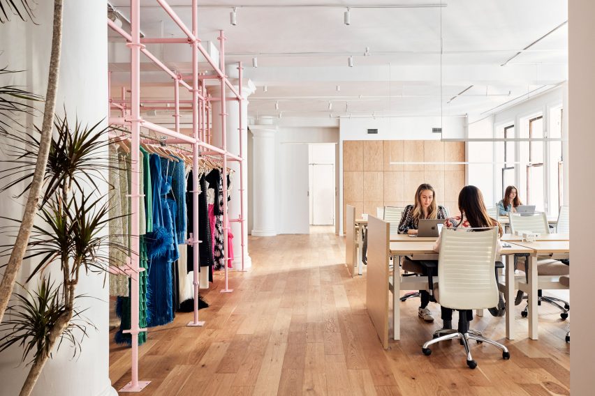
As the brand’s global headquarters, this space serves multiple purposes: showcasing the brand’s apparel; providing office space for staff; hosting buyers and events.

“Our biggest challenge was to divide the space according to the showroom’s new program while keeping its loft-like openness,” said BoND co-founder Noam Dvir.

Pink scaffolding used as clothes trails
To divide the open space, BoND used pink-painted scaffolding that doubles as clothing rails

To create partitions that double as displays, the designers chose scaffolding elements on which clothing can be hung and shelving can be installed.

“They are so readily available, so New York in their character, and very easy to adapt to different conditions,” said Daniel Rauchwerger, BoND’s other co-founder. “Moreover, they’re inexpensive and have a younger, fresher feel that works so well with the spirit of a PatBo studio.”

The showroom also serves as an office space
The showroom also serves as an office space for the PatBo team

Scaffolding has been used in a variety of retail environments for its versatility and ease of installation, including a bright yellow Calvin Klein store transformed by Raf Simons and Sterling Ruby, and a boutique for Wardrobe NYC designed by Jordana Maisie.

Painted pale pink in the PatBo showroom, the industrial scaffolding takes on a more feminine appearance, which sets the tone for the rest of the showroom.

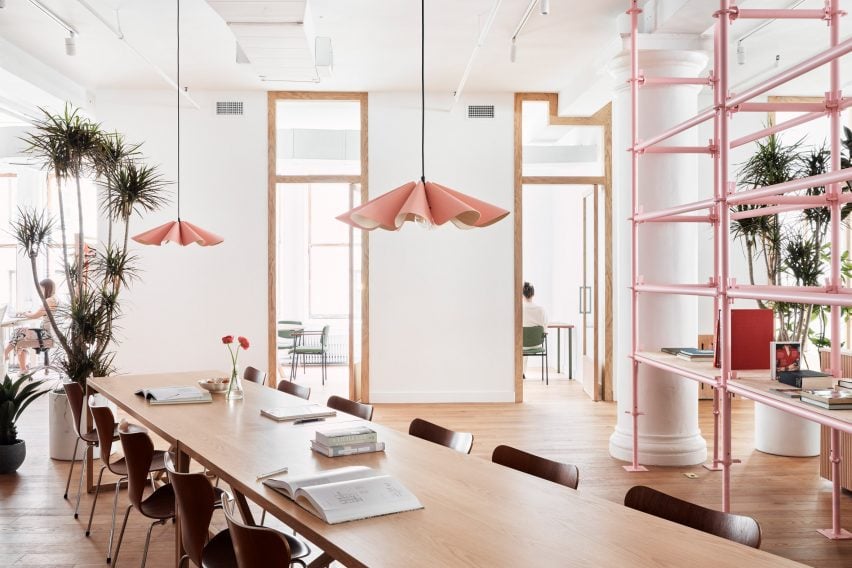
Pleated pendant lights hang above a long table
Feminine touches like pleated pendant lights align with the brand’s aesthetic

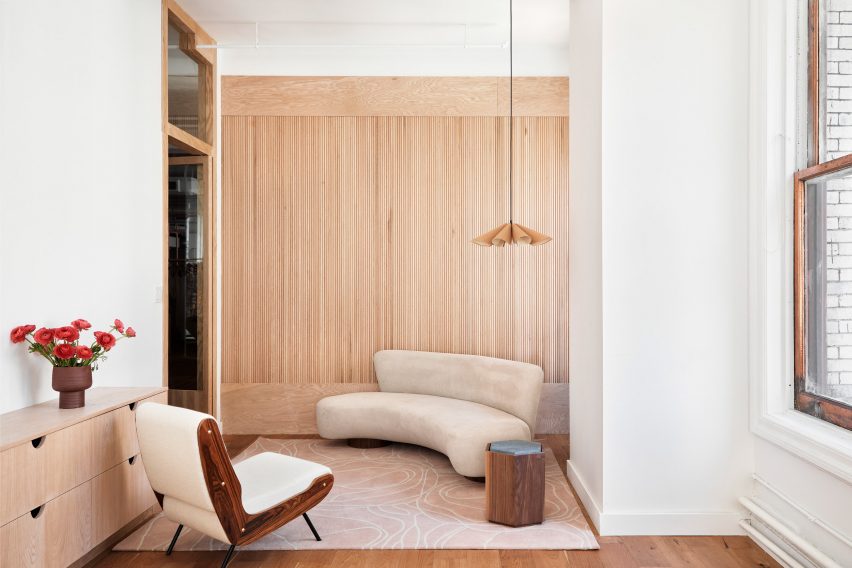
Curved couches, pleated pendant lamps and tambour panelling all add to the soft aesthetic and further align with PatBo’s brand expression.

Circular fitting rooms surrounded by curtains allow clients to try on the colourful clothing in the main showrooom.

Tambour panelling is installed in private offices
Private offices feature tambour panelling and a mix of furniture

A second showroom area for hosting buyer appointments and casting calls includes minimal clothing racks with brass rails and oak frames.

This space is closed off from the reception, but still visible through large glass panels that allow light from the exterior windows to pass through.

The loft space overlooks Fifth Avenue
The historic building overlooks Fifth Avenue

Private offices along the far side of the loft also feature glass doors for the same purpose, and add to the feeling of openness and transparency throughout the showroom.

“It’s not meant to be too precious or delicate, but rather a place where a group of creative professionals can feel encouraged to move things around and make it their own,” said Dvir.

Atop the wooden floors are rugs based on the drawings of Brazilian modernist and landscape architect Roberto Burle Marx, designed in collaboration with São Paulo-based Punto e Filo.

Colourful furniture and potted plants also contribute to the Brazilian vibe in the space, and complement PatBo’s vibrant garments.

Wooden chairs on top of a rug inspired by Roberto Burle Marx
Rugs throughout the space are based on the drawings of Brazilian modernist Roberto Burle Marx

At the back of the showroom is a bar area, featuring a pink stone counter with rounded corners, and a sink placed within a curved niche that has mirrored sides.

“This is a space that combines elements of office, retail, and hospitality,” said Rauchwerger. “With that, it is able to serve as a real embassy for PatBo as a brand.”

A bar area with pink stone counters
A bar area with pink stone counters is used for hosting events

Rauchwerger and Dvir, both former journalists, founded BoND in 2019 after working as architects at OMA, WeWork and more.

Their studio’s previous projects have included the renovation of a dark Chelsea apartment into a light-filled home.

The photography is by Blaine Davis.


Project credits:

Project team: Daniel Rauchwerger, Noam Dvir, Liza Tedeschi

Reference

Norm Architects devises understated HQ for kids’ lifestyle brand Liewood
CategoriesInterior Design

Norm Architects devises understated HQ for kids’ lifestyle brand Liewood

A refined palette of oak, plaster and steel defines the interior of the Liewood headquarters in Copenhagen, Denmark, designed by local practice Norm Architects.

The pared-back 2,200-square-metre office was conceived to give prominence to Liewood‘s colourful, Scandi-style children’s clothes, toys and homeware.

Norm Architects creates minimalist HQ for children's brand Liewood
Norm Architects has completed Liewood’s Copenhagen headquarters

“With the ambition to create a comfortable space with a somewhat understated character, we worked to let the space obtain its significance through the thoughtful use of tactile elements such as textured plaster walls and contrasting elements like oakwood and steel,” explained Sofie Bak, an architect at the practice.

Staff enter the five-floor office via an airy light-filled lobby that is anchored by a rounded counter, roughly washed with sandy-beige plaster.

Norm Architects creates minimalist HQ for children's brand Liewood
Plaster podiums provide display space on the first floor

Cone-shaped pendant lights are strung along the ceiling while oversized stone tiles are laid across the floor, helping to “emphasise the grandeur” of the space.

A pre-existing staircase curves up to the first floor, which accommodates a showroom. This part of the building formerly served as a production hall, with a vast scale that could easily feel empty and unwelcoming, according to Norm Architects.

Norm Architects creates minimalist HQ for children's brand Liewood
At mealtimes, staff can gather in The Parlour

To counter this, the practice constructed what it describes as a “warm wooden core” – a house-shaped oakwood volume with built-in shelves for showcasing Liewood’s products.

Large, plaster-coated display plinths are dotted across the rest of the room. At the back is a short flight of wide, wooden stairs where staff can sit and chat throughout the day.

More products can also be presented here on bespoke podiums that, thanks to cut-outs at their base, are able to slot onto the steps.

The building’s first floor also contains The Parlour – a kitchen and dining area where Liewood employees can enjoy meals together. It features a large travertine table, a series of plump grey sofas and graphic art pieces by the Danish designer Sara Martinsen.

Norm Architects creates minimalist HQ for children's brand Liewood
Traditional work areas can be found across the rest of the HQ

Work areas throughout the rest of the HQ are furnished with practical desks and storage units that match the off-white walls, while meeting rooms are fronted with panes of glass to foster a sense of openness.

As the building’s original staircase didn’t extend all the way to the fifth floor, Norm Architects installed a spiralling set of white-steel steps.

These grant access to a space the practice refers to as The Apartment: a secondary showroom designed to have a more intimate, homely feel.

Norm Architects creates minimalist HQ for children's brand Liewood
The top floor accommodates The Apartment, a more intimate showroom

Elsewhere, Norm Architects recently took its minimalist aesthetic off-shore when designing the interiors of the Y9 sailing yacht, decked out with supple suede furnishings and wood-panelled surfaces.

The photography is by Jonas Bjerre Poulsen of Norm Architects.

Reference

A climate-positive chocolate brand – Springwise
CategoriesSustainable News

A climate-positive chocolate brand – Springwise

Spotted: The mainstream chocolate industry is affecting rainforests, damaging the environment, and contributing to global warming – and the problem begins when sourcing the cocoa bean. In normal chocolate production, cocoa farmers clear tropical forests to plant new cocoa trees rather than reusing the same land. This has resulted in massive deforestation in West Africa, particularly in The Ivory Coast.  

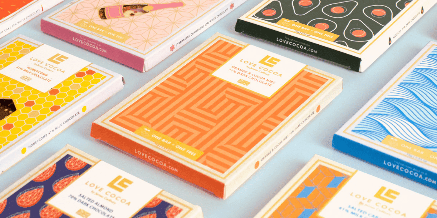
But British chocolate company Love Cocoa has created a brand that makes chocolate consumption and manufacturing more sustainable. As the great-great-great-grandson of John Cadbury, creator of Cadbury chocolate, James Cadbury aims to follow in his footsteps by building his company on ethical grounds. For every product sold, the company is planting one tree in their Plant A Tree Project to create a fairer, more sustainable chocolate industry.  

Love Cocoa is working in partnership with Eden Reforestation Projects, a non-profit NGO that works with local communities in developing countries to restore natural landscapes destroyed by deforestation, thereby creating jobs, protecting ecosystems, and helping to combat climate change. The company has already planted one million trees in West Africa. Planting more trees isn’t only ecologically beneficial, it also benefits local communities and cocoa farmers who can transition to more stable and sustainable practices. 

Increasingly, the chocolate industry is looking to minimise its carbon footprint. Springwise has also spotted a 3D-printed dress made from waste cocoa bean husks, and a blockchain programme that supports local cocoa farmers.

Written By: Anam Alam

Reference

Retail Space of Zhima Health at the Universal Beijing Resort // Le Brand Strategy
CategoriesSustainable News

Retail Space of Zhima Health at the Universal Beijing Resort // Le Brand Strategy

Text description provided by the architects.

After a night-owl drink, you feel instantly refreshed, start walking in the air all the way up to the ceiling along the twists and turns of the spiral stairs and in front of your eyes is unfolding a world that sees no end…
While you chill out, you see four Chinese characters that read “Zhima Health” in front of a counter.

© Le Brand Strategy

© Le Brand Strategy

That’s when you let out a sigh of relief, realizing what happened was nothing but hallucination.

As a leader in the transformation and upgrade of time-honored brands, Zhima Health, a brand owned by the renowned TCM firm Tongrentang, draws the wisdom of the interior designer Wang Yong from Beijing Wuxiang Space Architecture Design Studio to put two stores-zero store in Daxing District and No.1 store in Shuangjing area-in place, highlighting a lifestyle trend that values both punk and health preservation among the young generation.

© Le Brand Strategy

© Le Brand Strategy

Along with the grand opening of the Universal Beijing Resort, a new retail store “Beijing Youli” under the support of Beijing State-owned Assets Supervision and Administration Commission also made its debut as the first suggested stop for the park visitors after they get off from the subway station. As a shop-in-shop, a disruptive new retail experience area for Zhima Health was designed by Wang Yong for an independent space of 30 square meters in the store.

© Le Brand Strategy

© Le Brand Strategy

1.Design Challenges of Re-upgradeTwo Tasks for the DesignerIn response to the call of “carrying on the essence while pursuing innovations” of time-honored brands proposed by Beijing State-owned Assets Supervision and Administration Commission, Beijing Youli emerged as a multi-brand store that gathers a portfolio of traditional brands that represent the humanitarian spirit of a city.

© Le Brand Strategy

© Le Brand Strategy

Its opening at Universal Beijing Resort has pooled nearly 30 local or national time-honored brands as well as other recognized ones, which, spurred by China Chic and together with other fashion brands, have formed a synergy as the new limelight at the new landmark.
With the experience of two existing stores, Zhima Health has taken consumption experience to the next level-on top of functionality and social networking, the space is expected to also offer an ever more critical emotional value for consumers, which is what Wang Yong must address as the first challenge.
The second challenge comes from the space itself-a 6.5m×4m box area of less than 30 square meters.

© Le Brand Strategy

© Le Brand Strategy

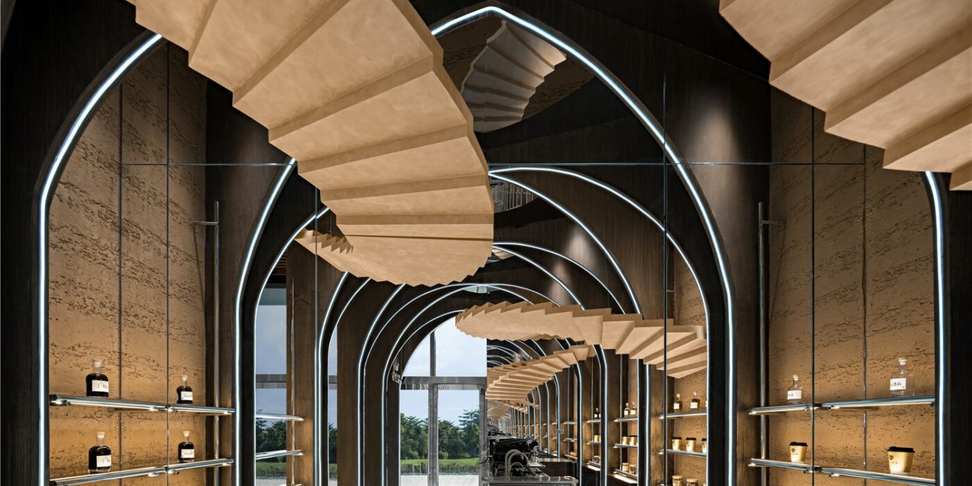
Given its relatively compact size compared to the other two stores, Wang Yong has to figure out how to minimize the “small” feeling of the confined space through the addition of a “fourth” dimension based on a 3D design concept.2.Design ConceptThe Uniqueness of the SpaceWhat Wang Yong had in mind was to target a certain customer group for Zhima Health with a brand new architectural style, which should conform with the culture of Universal Beijing Resort, cater to the diversified consumption preferences of the young generation, comply with the brand genes of Zhima Health and fit in the limited space.As a result, Wang Yong and his team decided to incorporate inspirations from Inception, multi-dimension, fashion and traditional brand genes into the design to deliver a space which is on the one hand fashionable and sci-fi and on the other light and friendly.As Zhima Health features the display and selling of light drinks in the quasi-concept store, Wang Yong, considering its finite space with a raised ceiling, worked out a light and 3D product arrangement plan and circulation design, resulting in a new retail space with a devotion to a sense of infiniteness and preservation of functionality.3.pace PresentationA 30㎡Metaverse Taking advantage of the high ceiling, Wang Yong deployed numerous towering wood arches, which were designed to intersect on the ceiling and then extend all the way down to the bottom of the rammed earth walls where product shelves were mounted.Four pairs of life-size wood spiral stairs echo each other overhead, threading through arches from a height and dominating the shop-in-shop.

© Le Brand Strategy

© Le Brand Strategy

The entire space, thanks to the arches and stair structures, resembles an unfolded accordion which is waking up the folded time and space.
On both horizontal and vertical dimensions, the use of mirrors enhances visual spaciousness. A whole glass on the ceiling and one side of the wall, together with the stretching structures that present a distortion in time and space, seems to have eliminated the boundary of the space and distorted time in a dazzling way.

© Le Brand Strategy

© Le Brand Strategy

With light projecting from underneath the ground and structured light belts on the arches, a metaverse of new retail space is throwing its arms wide open to all customers.4.New ValueBrand Genes That Combine Tradition and InnovationAs all century-old brands denote a particular trend or fashion in a certain era, the rise of China Chic is more of the rebirth of culture and value than cultural revival.

© Le Brand Strategy

© Le Brand Strategy

In particular, the irreplicable culture and spirit in the brand genes have enabled the reinvigoration of time-honored brands. From Goji Berry Coffee to Night Owl Drink, Zhima Health has achieved continued success, celebrating the everchanging time and the aspiring young generation and asserting its say as a new brand under a time-honored one in the modern era.

© Le Brand Strategy

© Le Brand Strategy

For any young person who is looking for a trendy and healthy night owl drink, Zhima Health is poised to provide a most authentic solution.
Building on Tongrentang’s brand recognition over the past few centuries, Zhima Health, through the concept zero store covering an area of nearly 20,000 square meters and the new retail social space of merely 30 square meters, is extending its antenna with innovation and courage ingrained in the brand to reach the future market.

© Le Brand Strategy

© Le Brand Strategy

To meet the demands of the new market and new consumption groups, it is brewing a new interpretation for the genes of its parent brand through space, for which Wang Yong has led the interior design–In hopes that the retail space at Universal Beijing Resort can strike a chord with the young customers, heralding a brighter future for Zhima Health albeit a small beginning through the combination of tradition and innovation.Project DetailsProject Location: Beijing, ChinaCustomer: Beijing Tongrentang Health Pharmaceutical CompanyTime of Design: September, 2021Interior Design: Beijing Wuxiang Space Architecture Design StudioWeb:www.wuux.netBuilding Type: CommercialLead Designer: Wang YongDesign Team: Wang Yong, Yu Yue, Jia Zhiyong, Zhu Chenxu, Tan Wei, Zhang Guiying, Beijing Wuxiang Space Architecture Design StudioPhotography: Zheng YanProject Planning: Le Brand Strategy AgencyCopywriting Agency: NARJEELING.

© Le Brand Strategy

© Le Brand Strategy

Retail Space of Zhima Health at the Universal Beijing Resort Gallery

Reference

Durable children’s clothing brand expands into adult sizes
CategoriesSustainable News

Durable children’s clothing brand expands into adult sizes

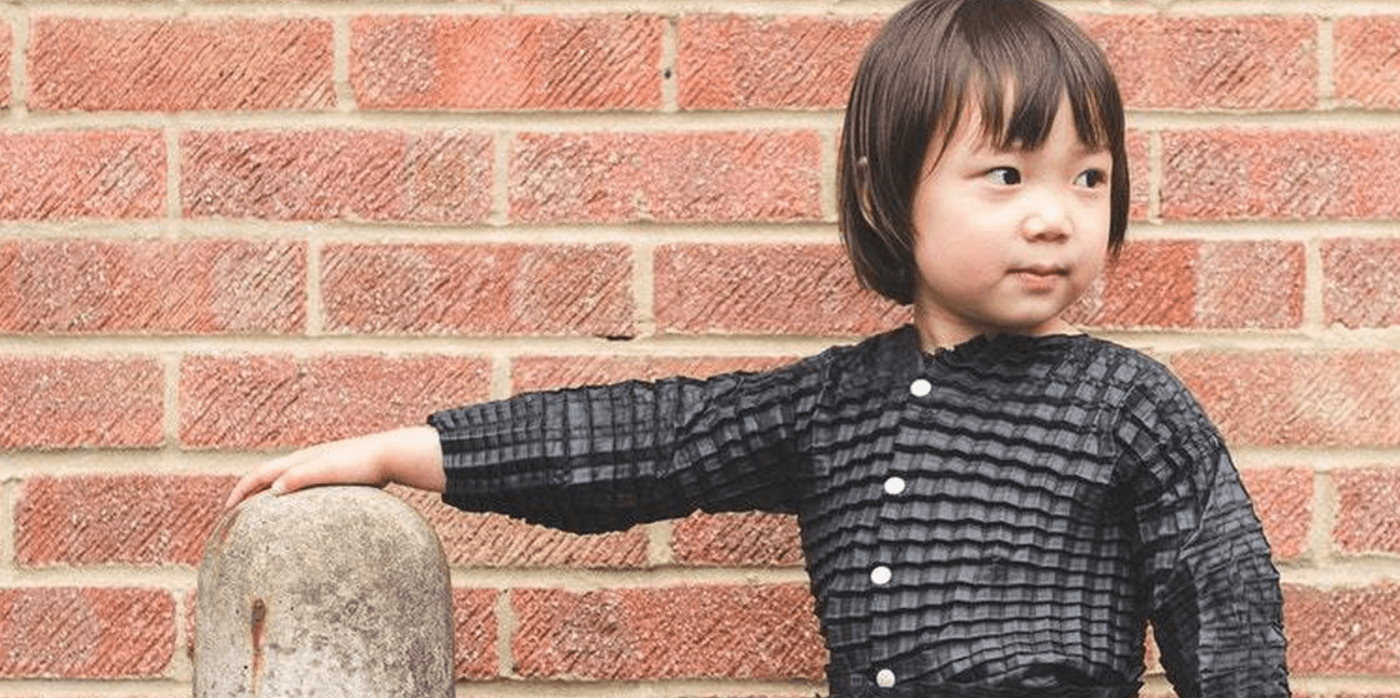
Spotted: Material technology company Petit Pli has won the 2022 European Startup of the Year award in Amazon’s annual Innovation awards. The brand’s pleated designs are all made from recycled plastic, and its children’s garments can ‘grow’ up to seven sizes as the child grows. Initially started to reduce textile waste in the children’s wear segment of the fashion industry, the company has recently expanded into adult sizes.

The children’s line is called LittleHuman, and each piece includes water and stain-resistant coating that is incredibly durable. The technology behind the pleated design ensures that the strength of the fabric remains consistent even as the garment stretches out. Should a piece rip, Petit Pli offers free repairs.

Alongside the reduction in waste and overproduction, reducing the numbers of items of clothing that consumers buy each year contributes dramatically to reductions in carbon dioxide emissions. Every nine months that a garment is used, rather than buying a replacement, reduces water usage and carbon emissions by 20 to 30 per cent.

The Amazon award includes €100,000 and online sales support on the platform. Springwise covered the launch of the brand in 2017 and its win of the UK James Dyson Award for technological invention. Since then, innovations in materials and fashion, in general, have proliferated, bringing to fruition products such as dissolvable thread that makes it easy to recycle clothes, and zero-waste luxury wool made from recycled garments.  

Written By: Keely Khoury

Reference

Create-your-own soap brand uses all organic ingredients and minimal packaging
CategoriesSustainable News

Create-your-own soap brand uses all organic ingredients and minimal packaging

Spotted: Created to reduce waste in the cosmetics industry, CustomiseMe soap uses all organic ingredients in its made-to-order production. The company reduces waste by producing orders individually by hand and by using recycled and recyclable materials in its shipping packaging. Soaps are made using the cold press technique which involves a four-week curing process.

Organic materials are sourced from responsible producers, and the brand provides a list of ingredients that customers can choose from on its website. The company claims that each ingredient has a benefit for the mind and body – from butters to essential oils.

CustomiseMe can include logos on each soap and uses organic dyes to provide a range of finished colours. For individuals and teams interested in learning more about the process of soap making, the company runs workshops for hands-on creation. Prices for a customer order begin around €34 for four bars of soap.

Springwise has spotted several innovations making bathroom products greener. These include refillable containers for bathroom products, a refillable toothpaste dispenser, and a soap company that salvages plastic dispenser bottles from other brands.

Written by: Keely Khoury

Email: info@customiseme.dk

Website: customiseme.dk

Reference