BVN and UTS rethink air conditioning with 3D-printed “breathing” system
CategoriesSustainable News

BVN and UTS rethink air conditioning with 3D-printed “breathing” system

Australian architecture practice BVN and the University of Technology Sydney have created a low-carbon, 3D-printed system that “breathes” like frog skin.

Named Systems Reef 2, the invention was made of recycled plastic 3D printed into a computationally optimised design that BVN said has 90 per cent less embodied carbon than a standard air-conditioning system.

The system also uses less operational energy because the air flows more easily around the organically shaped, branching tubing, with no corners to get stuck in.

Photo of translucent plastic tubes branching underneath a concrete slab ceiling
Systems Reef 2 is a reimagined system of air conditioning with an optimised design

The invention was designed to tackle the many deficiencies the architecture studio identified with air conditioning, a technology that BVN co-CEO Ninotschka Titchkosky describes as not having changed much since its invention in the early 1900s and having been “largely designed for manufacturing processes as opposed to human comfort”.

Air conditioning systems are typically made from steel sheets, which the BVN and UTS team’s analysis showed results in high embodied carbon and the use of much more material than is necessary. The systems also waste energy because they are structurally inefficient and difficult to change after installation.

“At the moment, the systems that we have, they’re really inflexible, they’re not particularly great for human comfort, they’re really expensive to change and they really limit the way we want to occupy buildings now in the 21st century, which is much more adaptive and agile,” Titchkosky told Dezeen.
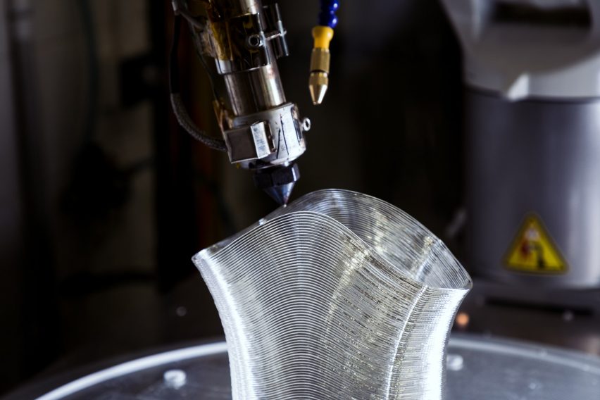
Photo of a 3D printer nozzle extruding clear plastic in a layers to form a tube
The system is made of recycled plastic that is 3D printed into tubes

A key difference with Systems Reef 2 is that it’s “designed for air”, removing one of the key sources of inefficiency in existing systems: right angles.

These systems’ orthogonal designs, while suiting sheet metal construction, lead to air becoming stuck in corners and needing more energy to force it out.

“The most shocking thing we realised is that existing air conditioning systems basically aren’t aerodynamic and don’t even go through a computational fluid dynamic modelling process most of the time,” said Titchkosky.
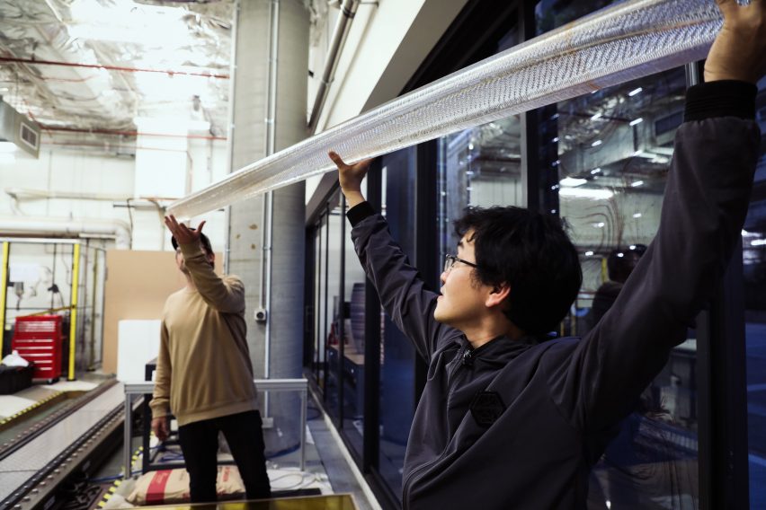
Photo of two people holding up a length of clear plastic tubing as if to install it on a ceiling
The tubing is meant as a replacement for steel air conditioning ducting

Systems Reef 2 instead has an irregular, branching form with no sharp corners, and with a tapering shape so that extra energy isn’t needed to push cool air out of the furthest reaches of the tubing.

With the friction removed from the system, it is also smaller and slimmer, using overall less material.

To increase the comfort level for people sitting under the contraption, the team drew inspiration from frogs, which breath through their skin. Instead of using ducts, they covered Systems Reef 2 in tiny pores that effectively mist cool air into the space below.
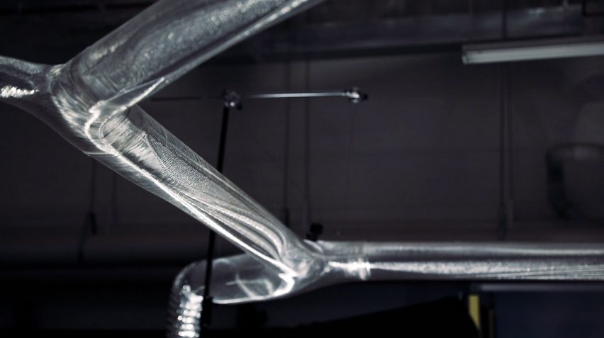
Close-up photo of translucent plastic tubing forming the Systems Reef 2 air conditioning system
The tubing is said to have a beautiful, crystalline appearance

For a low-carbon material solution that is suitable for 3D printing, they chose recycled plastic, on the basis that not only is plastic waste plentiful but it can be easily recycled again and again, making Systems Reef 2 a circular design.

BVN used waste plastic that was obtained from hospitals, crushed into pellets and fed into the 3D-printing robot.

The material gives Systems Reef 2 a translucent, crystalline appearance that BVN says is “very beautiful”. There is also the possibility to print it in colours or illuminate it to personalise an office environment.
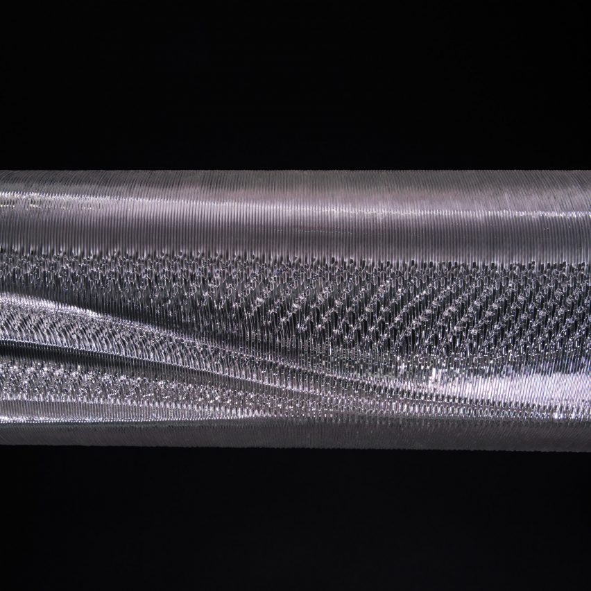
Close-up photo of the Systems Reef 2 tubing showing the texture of fine coils of plastic filament
The 3D-printing process gives BVN and UTS the ability to precisely control the shape of the ducting

The team’s final goal for Systems Reef 2 was that it be adaptable, which they achieved with a click-and-connect system with standardised fixings and seals to facilitate easy changes.

Because it is so simple and light, BVN estimates that it cuts down on onsite labour by more than 50 per cent — a significant draw given worldwide labour shortages — while being friendlier to the health of the installers.

The team uses generative design to tailor Systems Reef 2 to specific spaces, with an algorithm generating hundreds of iterations based on a given floor plan and the final design being chosen and tweaked through manual review.

BVN installed a prototype Systems Reef 2 at its own studio in Sydney, replacing the existing tertiary ducting and diffusers. It is now exploring more demonstration projects while getting the design ready to launch as a commercial product.
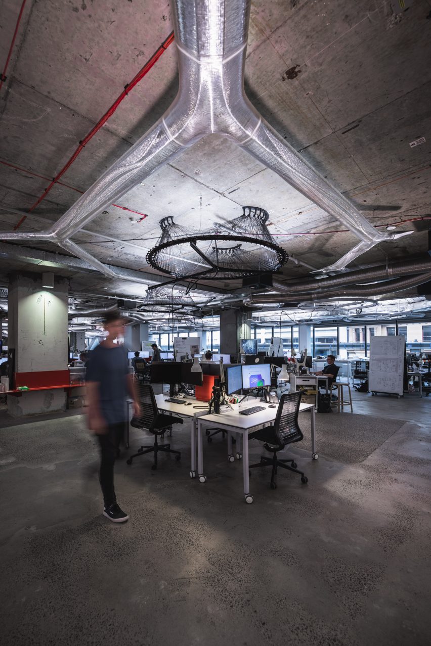
Photo of BVN's Sydney studio with Systems Reef 2 air conditioning system installed
BVN has installed a prototype of Systems Reef 2 at its studio in Sydney

It particularly sees the product as having great potential for retrofitting ageing buildings and says it could theoretically be installed in any office with an open-plan layout.

BVN and UTS were awarded Best Green Building Material/Product at the Australian Sustainability Awards 2022 for the design.

It is the second Systems Reef project BVN has undertaken, with each dedicated to some aspect of building services.
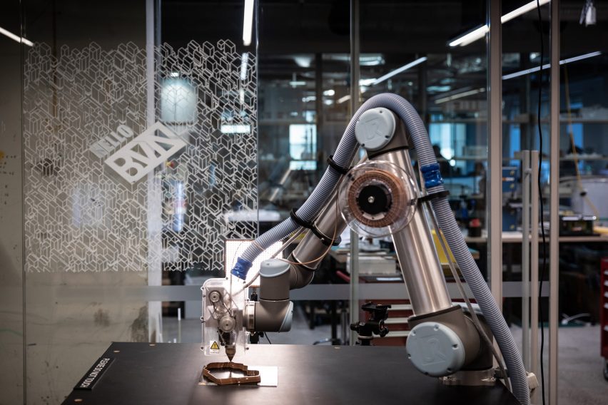
Photo of 3D-printing robot extruding material in coils
The team is now aiming to bring their invention to the market

“The reason it’s called Systems Reef is because we were starting to think about all the layers that exist in the ceiling as sort of like a reef — this kind of multi-layered environment where everything plays a part,” said Titchkosky.

“We wanted to move away from the idea of a services infrastructure to a services system that was more holistically interwoven and a lot smarter.”

BVN is an Australian architecture practice with offices in Sydney, Brisbane, London and New York. Its current projects include the Sydney headquarters for technology company Atlassian, which will be one of the world’s tallest hybrid timber towers at 40 storeys in height.

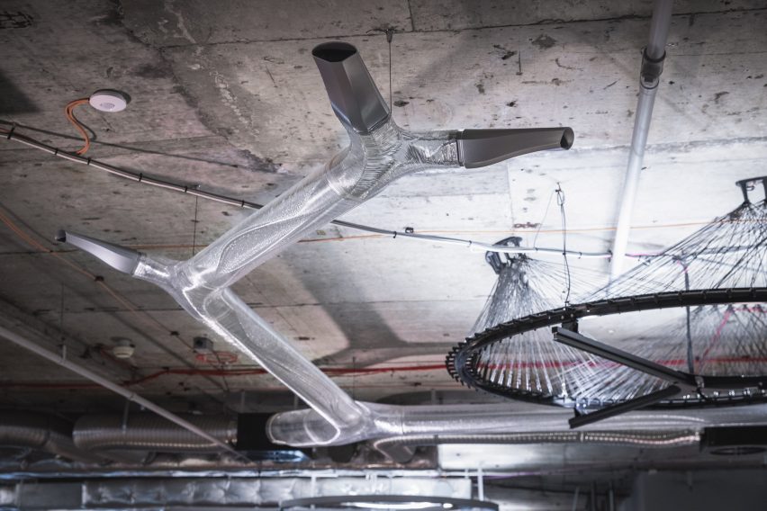
Reference

Breathing New Life into The Procuratie Vecchie in Venice
CategoriesArchitecture

Breathing New Life into The Procuratie Vecchie in Venice

Browse the Architizer Jobs Board and apply for architecture and design positions at some of the world’s best firms. Click here to sign up for our Jobs Newsletter. 

Few cities in the world have been for so many centuries a melting pot of different languages, religions and lifestyles as Venice: here, the salty air of the lagoon not only gave rise to the city’s trade relationships, but also continues to create an intoxicating atmosphere that lays fertile ground for cultural exchange and dialogue.

Procuratie Vecchie is an iconic building that occupies the north side of St. Mark’s Square: completed in the first half of the 16th century, the complex — once the seat of the Procurators of St. Mark’s, high officials with offices inferior only to those of the Doge and responsible for assisting the poor — since the 19th century has housed Generali, one of the largest global insurance and asset management providers.

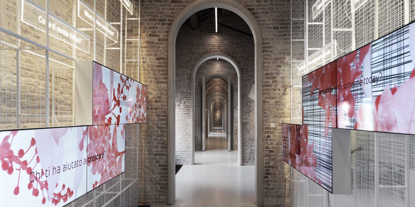
Introduction tunnel. Photo by Andrea Martiradonna

“The Human Safety Net”. Photo by Andrea Martiradonna

After the completion of the restoration, commissioned by Generali and designed by David Chipperfield Architects Milan, a large portion of the complex has finally opened to the public. The restoration, which involved the renovation of the first and second floors, the reorganization of the accessibility of the building through the insertion of new stairs, and a renewed central entrance on the third floor, has not only brought back to its original splendor one of the most fascinating places in Venice but it is also re-established the building’s link to the original social dimensions of the larger Renaissance complex.

In addition to being a place of work, the building’s third floor houses the 32 291 square foot (3000 sq m) home of the Generali Group Foundation, “The Human Safety Net,” which works to improve the living conditions of people in vulnerable situations around the world. To convey the spirit of the Foundation, the third floor hosts the interactive exhibition “A World of Potential” curated by Orna Cohen and Andreas Heinecke, founders of Dialogue Social Enterprise and designed for the interior, exhibition, graphics & multimedia design by the Milan-based studio Migliore+Servetto under the artistic direction of Davide Rampello.

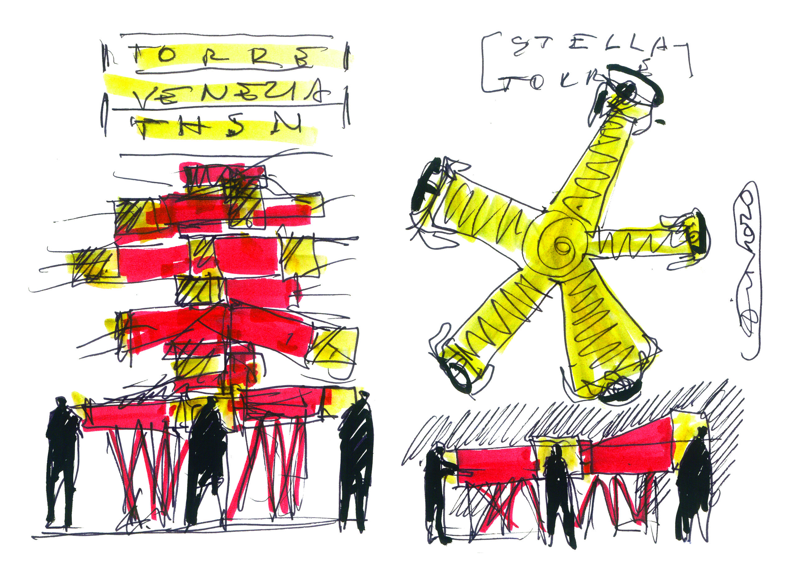
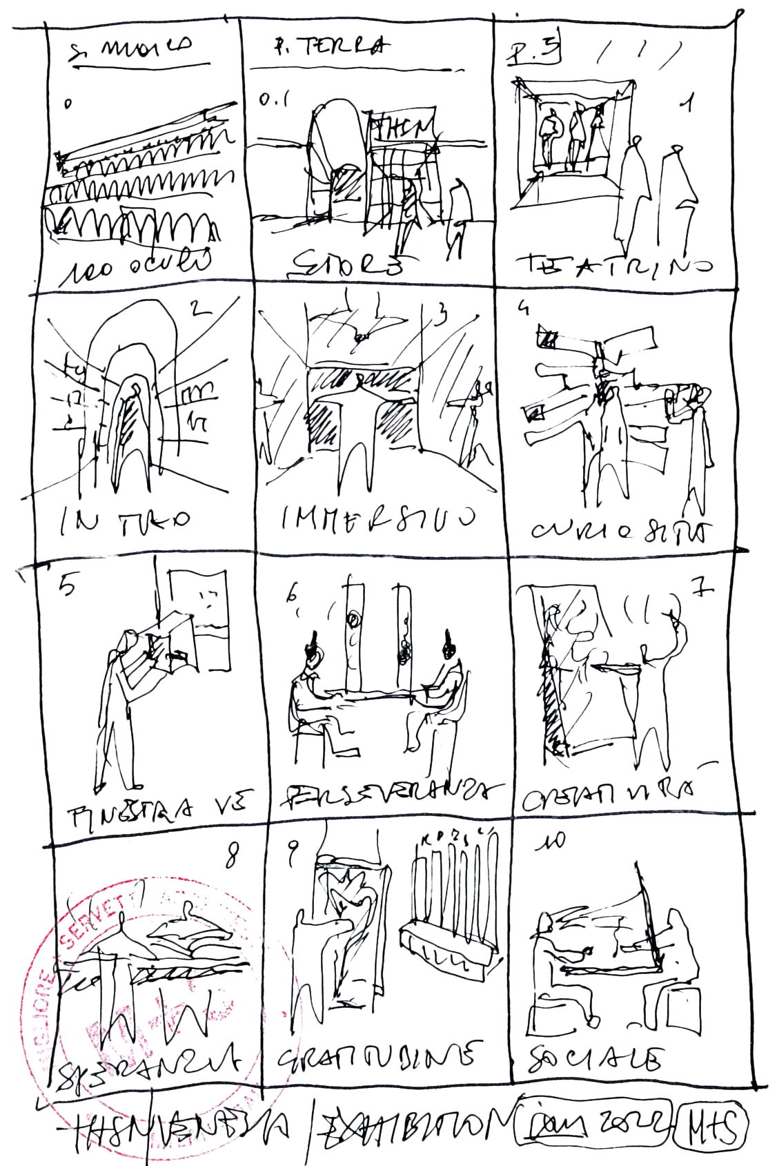
Sketch by Ico Migliore

Exhibition itinerary. Sketch by Ico Migliore

In addition to the exhibition, the Migliore+Servetto studio developed the design of the reception and commercial areas on the ground floor and the spaces for interaction on the third floor: a café, a coworking area, event rooms and an auditorium.

Achille Castiglioni used to say that “we don’t design objects or spaces but behaviors”: and this statement can only be more apt in relation to this exhibition. In fact, the exhibition offers visitors a cognitive experience to recognize the potential in themselves and in others, according to the “learning by doing” method by John Dewey and on the basis of the ” values in action” outlined by the positive psychology of Martin Seligman and Christopher Peterson, and selected by the curators (creativity, kindness, perseverance, gratitude, curiosity, hope, social intelligence, teamwork): the result is a project halfway between a science and technology museum and an anthropological experience.

The café. Photo by Andrea Martiradonna

The coworking. Photo by Andrea Martiradonna

The entire itinerary is characterized by three recurring symbols: the table, the nest and the mirror. The table is an emblem of meeting and dialogue, and is present throughout the interactive installations and in the convivial spaces. Meanwhile, the nest symbolizes welcome and bonds, and recalled in the structures of the bookshops. Finally, the mirror, which in Venice boasts a centuries-old tradition, recurs in the furnishings of the café and in various installations as an allegory of reflection and of the comparison with oneself.

The café with optical chamber. Photo by Andrea Martiradonna

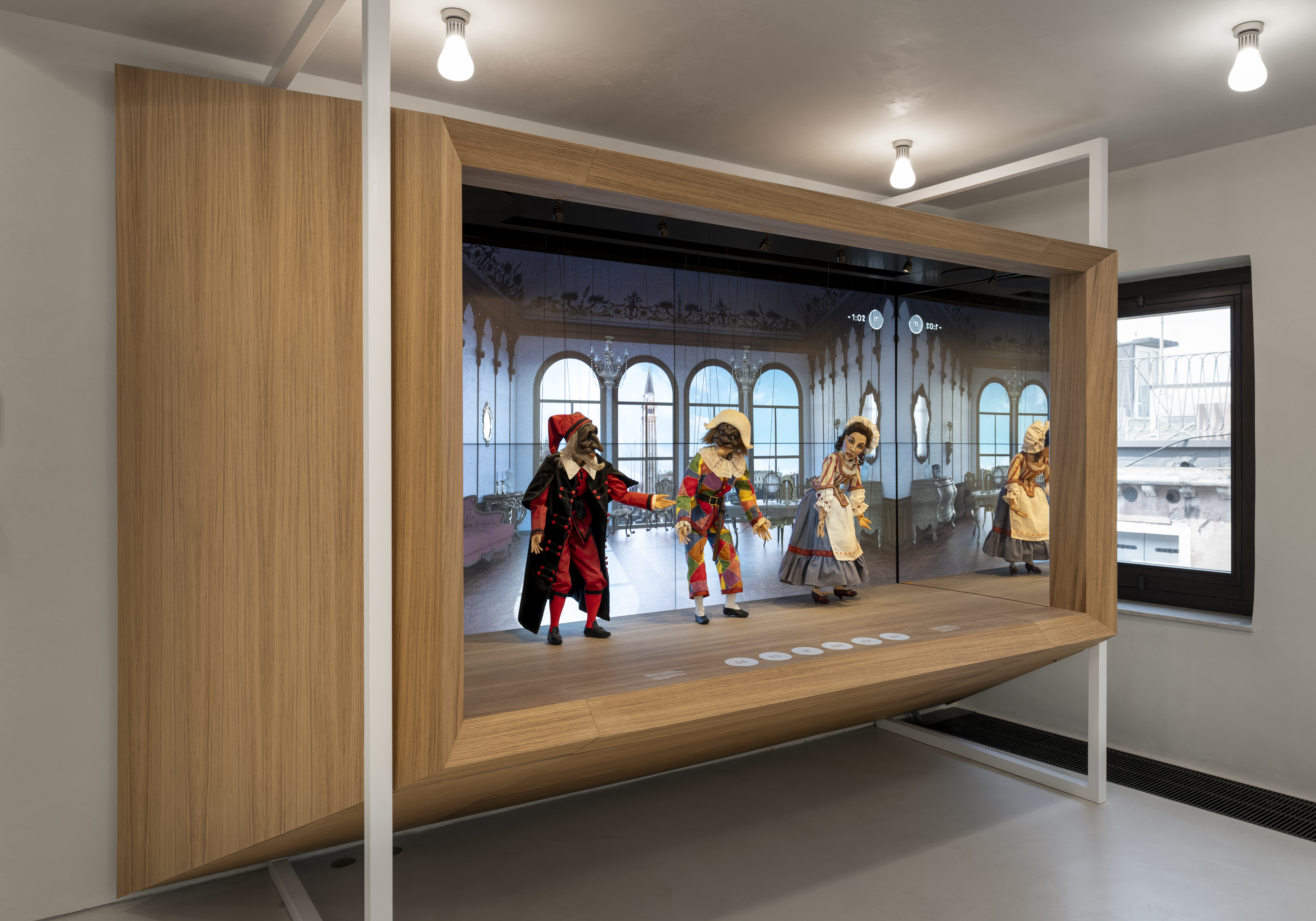
The Venetian theatre. Photo by Andrea Martiradonna

The entire narrative space, suspended between craftsmanship and refined technologies, tells of a strong bond with the city. Venice’s pulsating life is filtered uninterrupted through the “oculi” — the openings on the façade of the third floor. Some of these openings create a system of visual enlargement that recalls the optical machines of Canaletto.

At the beginning of the exhibition, the wooden puppets of Harlequin, Pantalone and Columbine — masks of Venetian theater — animated by sophisticated technology interact with visitors by answering questions about the history of the city in several languages. The installation “Window on Venice” allows visitors to take a leap back in time, exploring in 3D what some places in the city looked like in the 16th century.

Team work. Photo by Andrea Martiradonna

Team work. Photo by Andrea Martiradonna

The partitions of the spaces and the furnishings, all designed by Migliore+Servetto, enter into conversation with the existing structures. This dialogue enhances the presence of local materials such as glass, copper, wood, mirrors. The characteristic Venetian “bricole” constitute the supporting structure of the installation of the exhibition route dedicated to team working; the benches of the café, in natural wood, recall those of the historical Venetian cafés; the patterns of the carpets rework traditional motifs, such as the ornate arches of the Doge’s Palace or the “millefiori murine”; the chandeliers made by local master glassmakers create an evocative dialogue between natural and artificial light.

The studio also contributed to the selection of the contents of the Art Studio, the space dedicated to temporary exhibitions that hosts “CHUTZPAH. A tent that is not a tent, animals that are not animals”, curated by Gabi Scardi, is a project created by the collective “Atelier dell’Errore BIG” that gives voice through art to a community of young people marked by neurodiversity.

Image by Migliore + Servetto architects

Social intelligence. Photo by Andrea Martiradonna

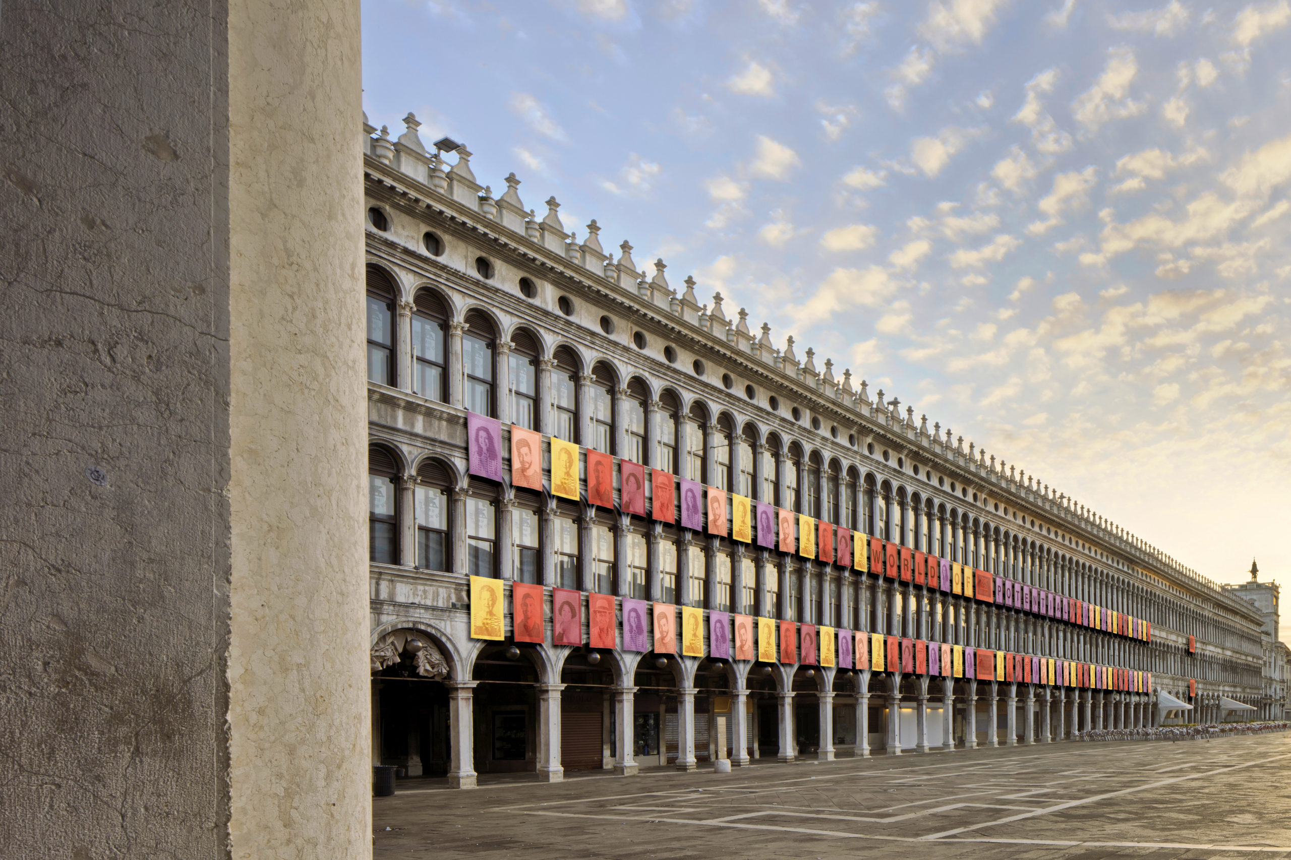
The temporary installation, also by the studio, of 100 external tapestries on the façade of the Procuratie Vecchie facing St. Mark’s Square and 22 tapestries on the internal façade of Corte Maruzzi tells about the actions and the identity of the Foundation.

An intervention under the banner of a holistic approach that, through the culture of inclusion, social innovation and sustainability, and through an effective design language, opens new possibilities for self-awareness and awareness of others, in the perspective of transforming more and more the concept of “me” into that of “us”.

Browse the Architizer Jobs Board and apply for architecture and design positions at some of the world’s best firms. Click here to sign up for our Jobs Newsletter. 

Reference