a vibrant social space, haixin bridge curves across pearl river to reconnect guangzhou
CategoriesArchitecture

a vibrant social space, haixin bridge curves across pearl river to reconnect guangzhou

SCUT proposes a revived plan for Guangzhou’s haixin bridge 


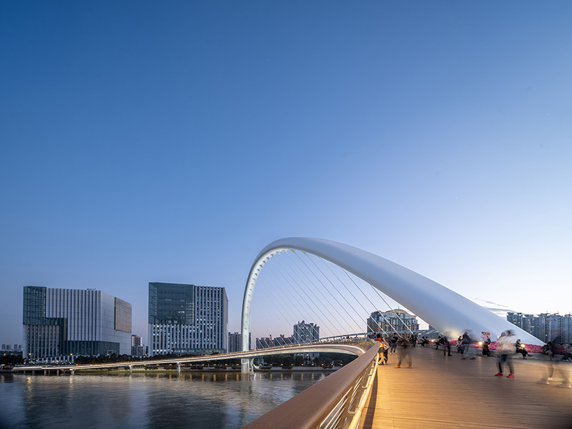
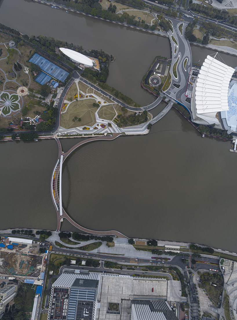
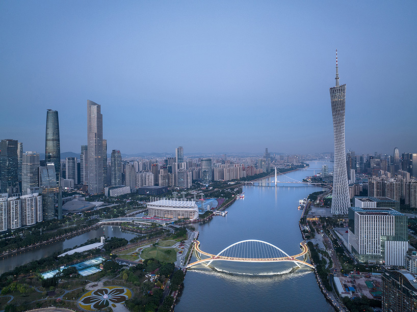
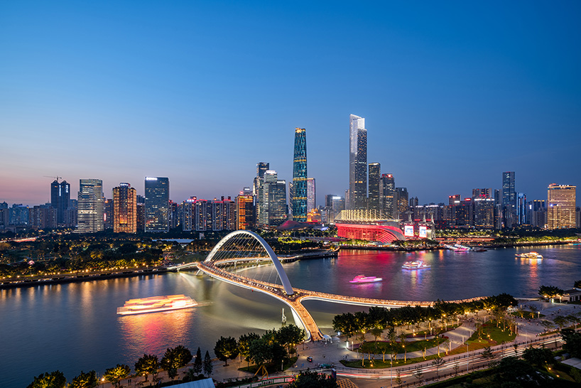
In the heart of Guangzhou’s CBD, the Haixin Bridge marks the first pedestrian landscape bridge across the Pearl River. Proposed by the Architectural Design & Research Institute of South China University of Technology (SCUT), it will stretch from Ersha Island Art Park in the north to Guangzhou Tower in the south to strategically connect key points in the cityscape. As an extension of the city’s public realm, the bridge serves as a vibrant and engaging social space, imbued with a sense of place and cultural identity that is essential to the region’s architectural heritage. Its curved shape will integrate with existing pedestrian systems, addressing the need for connectivity between the metropolis split between the two sides of the river while paying attention to the spatial order of the central axis. With an open posture, the bridge will offer panoramic views of the Pearl River’s core area.
guangzhou haixin bridge 3
all images courtesy of SCUT


a bustling urban space mirroring cultural motifs


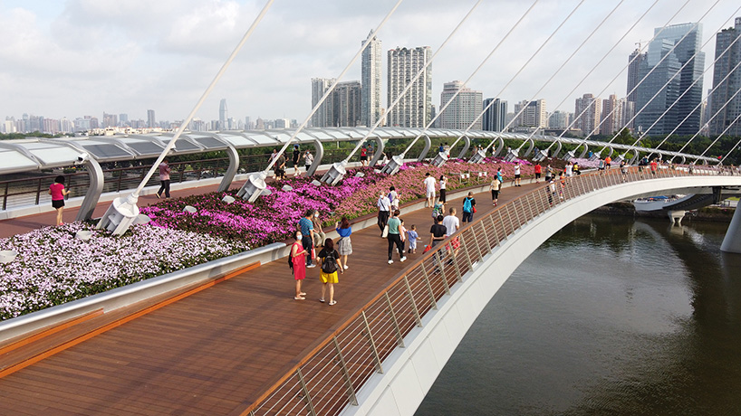
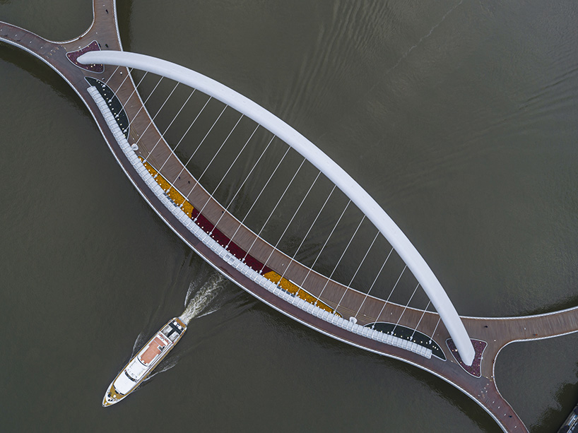
Deeply rooted in regional cultural identity, SCUT’s design draws inspiration from the water sleeve and ancient Qin, cultural motifs distinctive to the Lingnan region. The landscape design of the bridge deck mirrors the local water flower market, resulting in a cohesive and integrated design that is both functional and aesthetically pleasing. The introduction of flower boats creates a physical separation between the eastern and western sides of the bridge deck, enhancing functionality and providing additional space for pedestrians while creating a distinctly dynamic urban space.


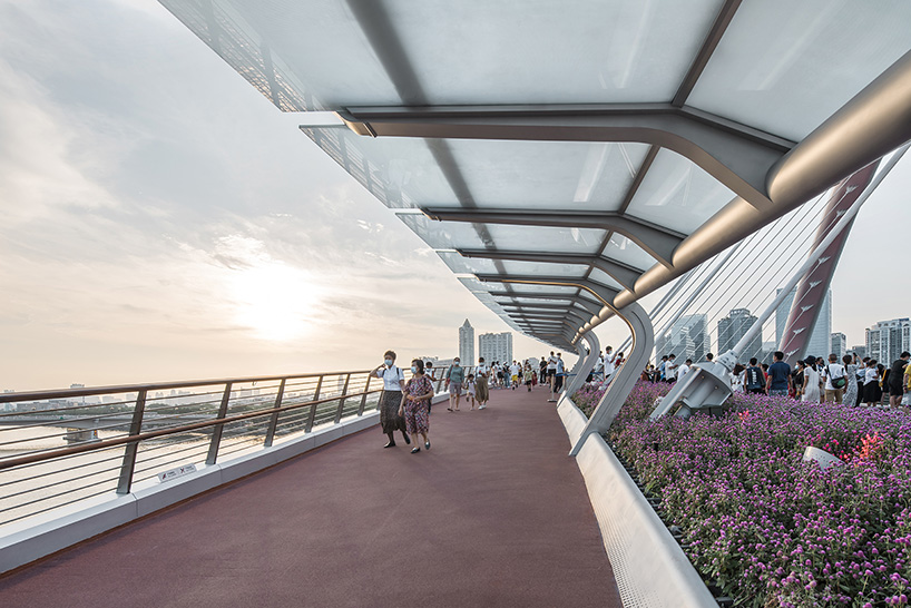
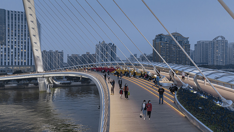
The segmented bridge deck features a varied height profile, incorporating flower ponds, observation decks, and two types of pedestrian walkways for upper and lower levels. This use of space caters to the diverse needs of pedestrians for passage and sightseeing, enhancing the city’s vitality with distinct spatial textures. Its sloping connection to pedestrian walkways on both sides ensures an uninterrupted urban public experience, with additional user-friendly features like warm wooden handrails, glare-free lighting, rounded corners to prevent collisions, and mist cooling systems for comfort and accessible use.
guangzhou haixin bridge 2

guangzhou haixin bridge 5

guangzhou haixin bridge 6

guangzhou haixin bridge 7

guangzhou haixin bridge 9

guangzhou haixin bridge 4

guangzhou haixin bridge 10

guangzhou haixin bridge 1


project info:


name: Guangzhou Haixin Bridge
architecture: Architectural Design & Research Institute of SCUT Co., Ltd.

location: Guangzhou, China


designboom has received this project from our DIY submissions feature, where we welcome our readers to submit their own work for publication. see more project submissions from our readers here.


edited by: ravail khan | designboom

Reference

Ryan Leidner adds bridge to geometric San Francisco house
CategoriesArchitecture

Ryan Leidner adds bridge to geometric San Francisco house

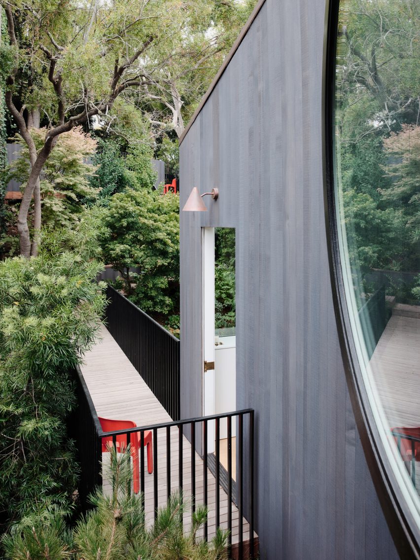
Local studio Ryan Leidner Architecture renovated a 1940s home in the Bernal Heights neighbourhood of San Francisco, resolving entry access with a bridge over the front garden.

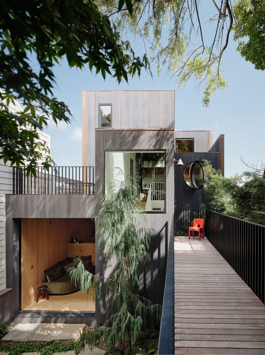
Ryan Leidner Architecture completed the 2,500-square-foot (230-square metre) Hosono House in 2021, cladding the house in charcoal-stained cedar siding with a copper, standing seam roof.

Bridge over garden at Hosono House in San Francisco
Hosno House features a statement bridge

The original structure was built at the rear of a steeply sloped 2750-square-foot (255-square-metre) lot, “giving the home a unique sense of privacy and a feeling of being a true retreat,” the studio said.

However, the setback challenged the home’s circulation, causing people to cross the yard, descend a long staircase, and climb back up three flights to access the primary living space.

Ryan Leidner Architecture house in San Francisco
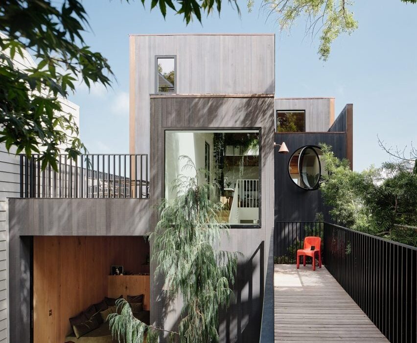
The bridge is arranged over the front garden

During an initial walkthrough with the clients, founding principal Ryan Leidner threw out a “crazy idea” – to redirect access from the street to a new front door with a bridge.

The bridge would span the lush front garden and connect to the house between the top and middle stories.

“The front entrance sequence was totally reimagined,” Leidner told Dezeen.

Blackened facade featuring a circular pivot window
A circular pivot window marks the front facade

The studio rebuilt the front facade – now marked by a circular pivot window that replaced a leaking solarium – gutted the interior and rearranged spaces.

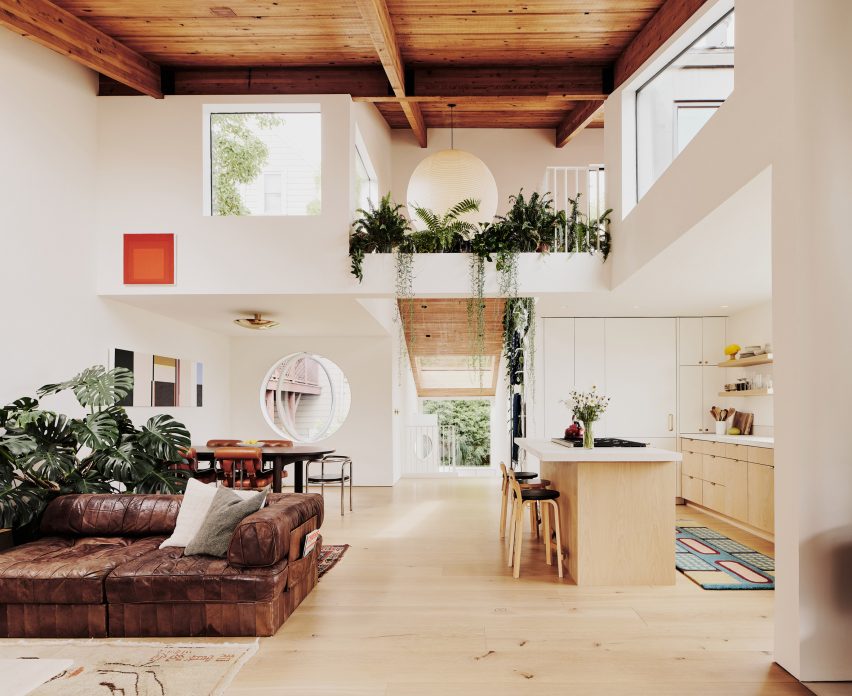
“Wanting to preserve the historic character of the house, the existing wood beams and ceiling were refinished and left exposed while all of the original windows, floors and finishes were replaced, creating a greater sense of material continuity throughout the house,” Leidner said.

Wood-toned interior within Hosono House with skylights
Natural wood tones and white surfaces characterise the interior

The subtle palette of natural wood tones and white surfaces allows the interior spaces to serve as a canvas for the owners’ affinity for design.

“The interior spaces are filled with a mix of vintage Italian furnishings and custom pieces, while the overall sensibility of the space was inspired by trips to Norway and Japan, and the ethos of Californian hippie modernism,” Leidner noted.

Nobuto Suga dining table within Hosono House by Ryan Leidner
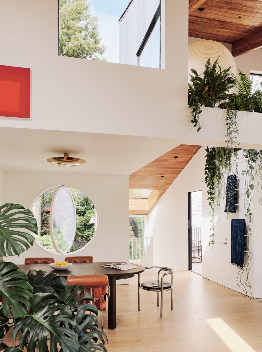
A custom Nobuto Suga dining table is framed by statement chairs

The top-floor kitchen, living and dining areas enjoy sweeping views of the San Francisco skyline through a variety of window shapes.

Plant-filled niches that reference 1960s and 70s Italian projects surround a space that holds accent furniture including a custom Nobuto Suga dining table, vintage Guido Faleschini chairs and a Gae Aulenti armchair.

Bedroom by Ryan Leidner
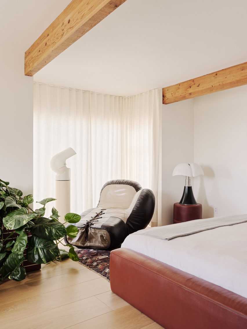
Two bedrooms are on the second floor

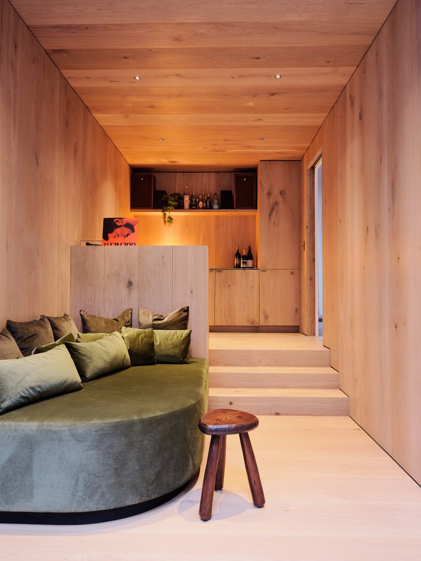
The second floor contains two bedrooms, a Venetian-plastered primary bathroom and a lounge space inspired by a Tokyo whiskey bar with warm wide-plank white oak and a custom velvet daybed.

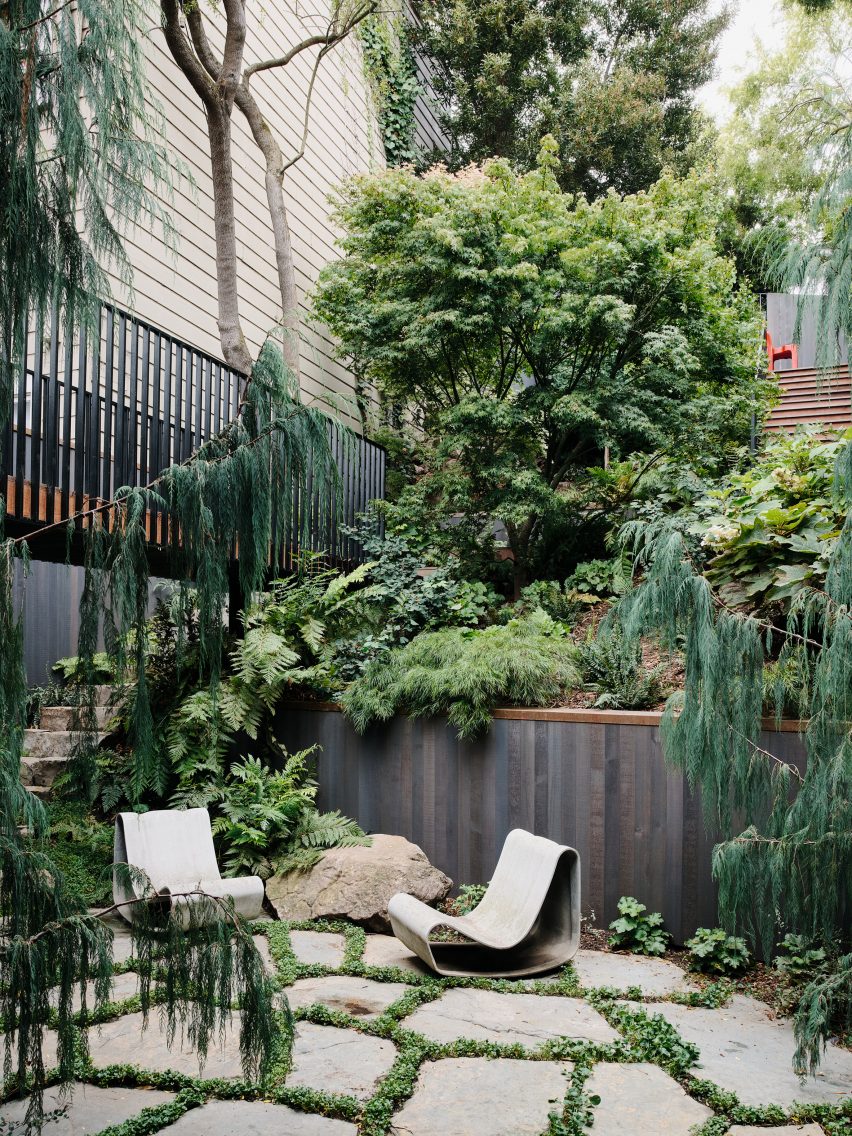
A large opening in the lounge leads to the lower courtyard, which was reimagined by landscape architect Stephen Design Studio.

The lowest level boasts one of the home’s most unique spaces: the guest bedroom.

“A textured hemp-plaster was used on the walls and ceiling, and a custom tiled bed frame and furnishings give a nod to the history of Italian modernism,” the studio said.

Ryan Leidner interiors
Ryan Leidner added luxurious touches throughout the home

Throughout the home, custom fabricated brass details – like countertops, sinks and CNC Dieter Rams-inspired exhaust covers – add a luxurious touch that will patina over time.

Ryan Leidner Architecture had previously collaborated with Stephen Design Studio to remodel a midcentury Eichler home, complete with twin gables and a lush central courtyard.

The photography is by Joe Fletcher.


Project credits:

Architects: Ryan Leidner Architecture
Landscape Design: Stephens Design Studio
General Contractor: DKG Construction
Landscape Contractor: Ground Cover Landscaping

Reference