Food-waste dyes bring colour to mycelium leather by Sages and Osmose
CategoriesSustainable News

Food-waste dyes bring colour to mycelium leather by Sages and Osmose

Two British materials companies, Sages and Osmose, have collaborated to dye sheets of mycelium with natural food waste, mimicking the appearance of tanned leather and suggesting a colourful future for the biomaterial.

Osmose is a company making a leather alternative from mycelium – the fibrous underground root network of mushrooms – while Sages makes natural dyes from food waste such as avocado pits, blueberries, red cabbages and onion skins, which are normally applied to textiles.

The two believe they’ve achieved a world first with their collaboration, combining two emerging areas of sustainable material development to colour mycelium without resorting to petroleum-based synthetic dyes, thereby keeping the product non-toxic and able to biodegrade safely in soil.
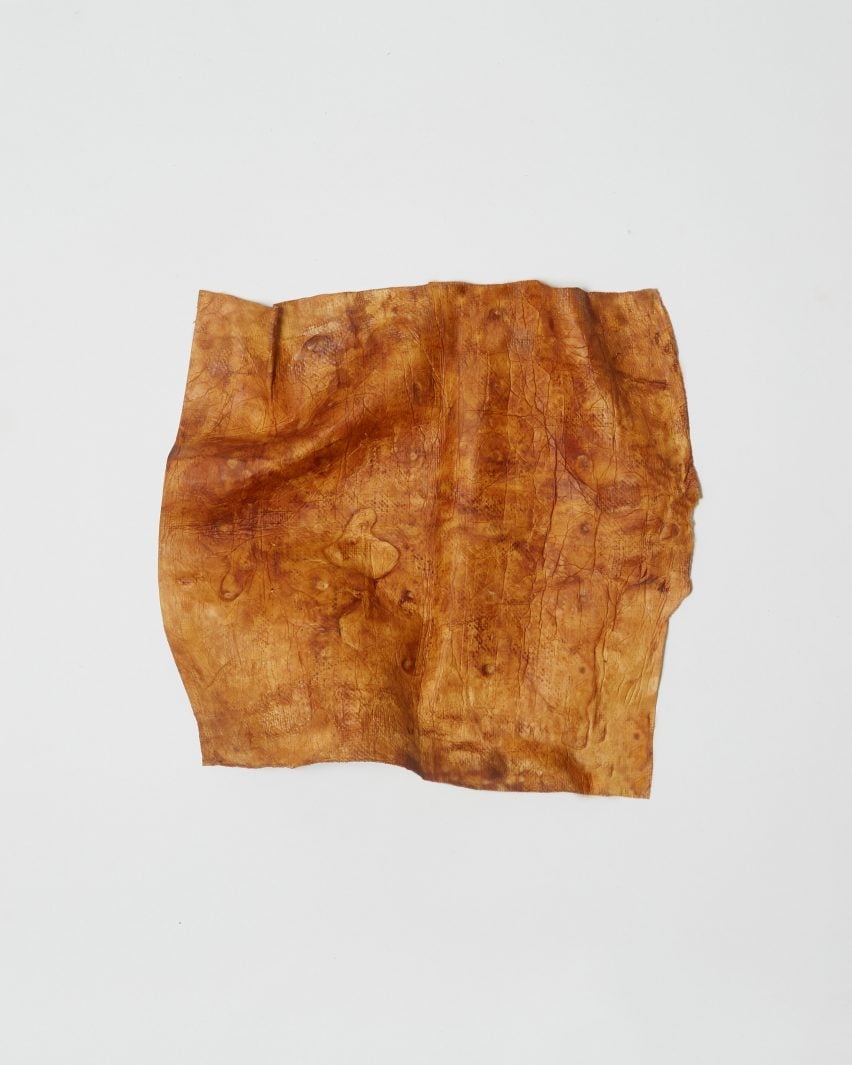
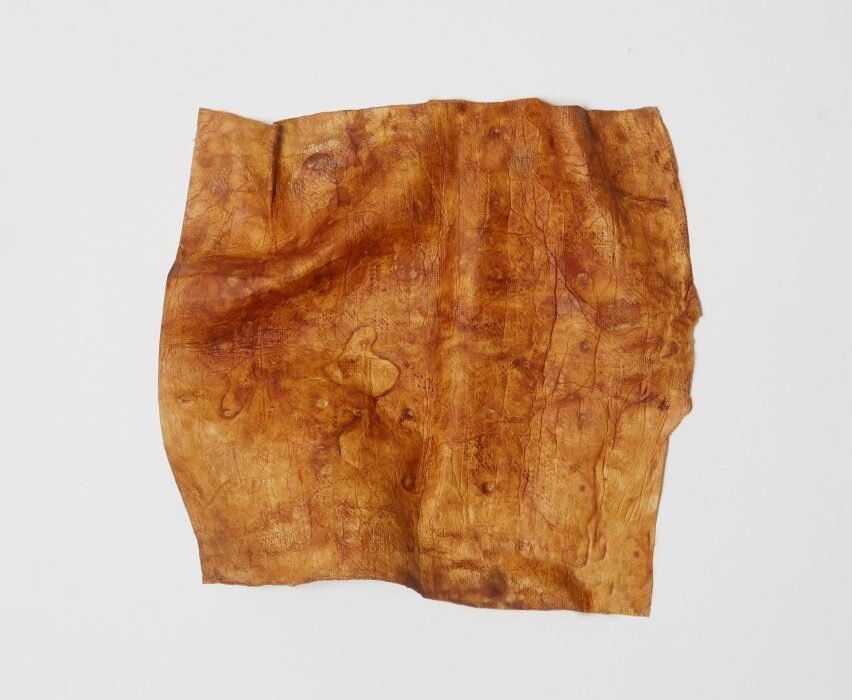
A small square piece of leather-like material, in a mottled hue of caramel brown A small square piece of leather-like material, in a mottled hue of caramel brown
Sages and Osmose have developed a natural dying process for mycelium leather

“There are lots of different types of vegan leather alternatives to traditional leather but the majority of them use either synthetic colourations or they use plasticisers, so they’re non-biodegradable,” said Sages CEO Emily Taylor.

“We wanted to explore an option where we could have a fully biodegradable leather that has also been coloured in a biodegradable and sustainable manner,” she continued.

Companies that prioritise biodegradability have offered mycelium in its natural shades of white and brown or black, which Osmose CEO Aurelie Fontan says is much easier to achieve naturally.

“I think the challenge for mycelium leather was that the offering just wasn’t there in terms of aesthetic,” she said. “When you’re presenting for brands and you’re like ‘we can only do brown’, it’s a little bit boring for them.”
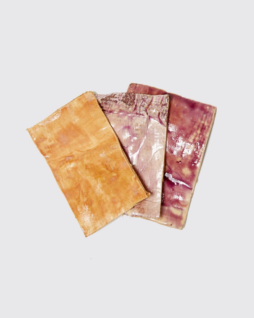
Photo of swatches of mycelium dyed in different shades of tan, pale violet and mulberryPhoto of swatches of mycelium dyed in different shades of tan, pale violet and mulberry
The companies experimented with different food wastes in the dyeing process

“The colour sector is somewhere where you can develop your USP, essentially, which is why working with Sages is so interesting,” Fontan added.

Osmose and Sages have created tan-coloured mycelium sheets using avocado waste, which Sages sources from an importer and guacamole factory in Milton Keynes, where tens of tonnes of leftover pits and skins are produced each week.

It was a new area for both companies, as the food waste dye takes differently to mycelium leather than it does to the usually cellulose-based textiles that Sages has worked with.

The duo collaborated with materials science researchers at the UK’s Cranfield University on the project, for which the researchers focused on how to transfer and fix the dye to the material using “green chemistry” – an area of chemistry that aims to cut out hazardous substances.

In this case, the researchers sought to replace the formic acid and fluorinated acids that are often used in tanning to dissolve the polymers of the leather so it can be infused with dye. Instead, the team developed a method, which they say is significantly less toxic.

After working with Cranfield University, Sages and Osmose expanded the experiment and trialled other waste streams such as blueberries and onion skins to see what colours they could get, producing mycelium swatches in shades of violet and bordeaux.

Taylor and Fontan say they are trying to develop a process for mycelium that is akin to leather tanning, where both colour and durability properties are added in one or two steps. Their equivalent, they say, would be to dye and waterproof the material at the same time.
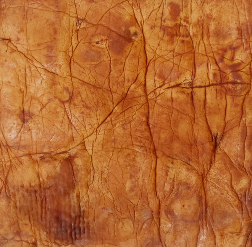
Close-up of vegan mycelium sheet showing its similarity to the texture of tanned leatherClose-up of vegan mycelium sheet showing its similarity to the texture of tanned leather
The tan colour was created by using waste avocado pits and skins

Osmose’s focus now is on developing a waterproof coating for their mycelium that, like the dye, is bio-based, non-toxic and able to biodegrade safely in soil. This is notoriously a challenge for plant-based leather alternatives, which almost always rely on a protective synthetic coating.

“It’s really hard to design a solution that fits all materials, which is basically what everyone is struggling with,” said Fontan. “Someone might have pineapple leather and they have their own coating but it doesn’t mean it’s going to work on mushroom and so on.”

Unlike some companies, however, Osmose says it does not want to bring a product with a non-biodegradable coating to market.

“If you’re doing a composite, it will not biodegrade at the end of life, which is compromising all the good work that you’ve been doing before that step,” Fontan said.

Mycelium is one of the most popular emerging leather alternatives. It has already appeared in luxury goods such as a bag by Hermes, clothing by Stella McCartney and trainers by Adidas.

Reference

How can AI bring academic research to the fore?
CategoriesSustainable News

How can AI bring academic research to the fore?

Spotted: In 2024, more than two billion people could vote in elections being held throughout 50 countries. This is the largest sequence of elections since generative AI tools became widely available in 2023. Many experts believe that governments are not fully prepared for the new situation, with technology developments having rapidly outpaced regulation, and policies such as the EU’s Artificial Intelligence Act not becoming active until 2025 at the earliest. But, as much as AI-driven misinformation is a particular concern for the coming year, the technology can also be used to help us access and interpret essential information. 
Artificial intelligence (AI) can help prioritise publications based on an individual’s preferences, which is how social media platform feeds work. For those worried about increasingly narrow perspectives forcing people into echo chambers, a new discussion platform is launching to help bring the latest research to the forefront of public discourse.  

Created by a Danish startup, Proemial is an AI-powered platform for open discussion that personalises reading recommendations to users and suggests connections across many different fields of study. The company brings together a variety of AI models to digest research and then make it not only applicable to scholars, but also interesting, relevant, and easy to understand for the general populace without specialist knowledge.

The platform encourages collaboration across teams and fields of study with a public Q&A forum. And by bringing scientific research into the larger public domain, Proemial’s team hopes to facilitate deeper, more innovative discussion and, ideally, further research fuelled by the connections made via the site. The platform customises feeds based on users’ queries and interests, and readers can ask detailed, conversational questions of the AI to garner more detailed insights into various research results.  

Proemial recently raised €2 million, and the company’s funders and advisors include leaders from the Pioneer Centre for AI in Copenhagen, Amazon, Apple, Google, and Meta. 

Other recent use cases for AI highlighted in Springwise’s library include helping teachers build interactive curriculums and helping healthcare professionals stay on top of the latest in clinical developments.

Written By: Keely Khoury

Reference

Eight sculptural wooden staircases that bring warmth to the home
CategoriesInterior Design

Eight sculptural wooden staircases that bring warmth to the home

Our latest lookbook features eight sculptural staircases made of wood that make a statement and bring warmth to apartments from Hong Kong to Boston.

Often the organizing principle in the planning of any space, a staircase can either blend in or stand out.

The eight gathered in this lookbook lean into the latter – showcasing both the structural abilities of wood like larch, birch and plywood and demonstrating how circulation need not be boring.

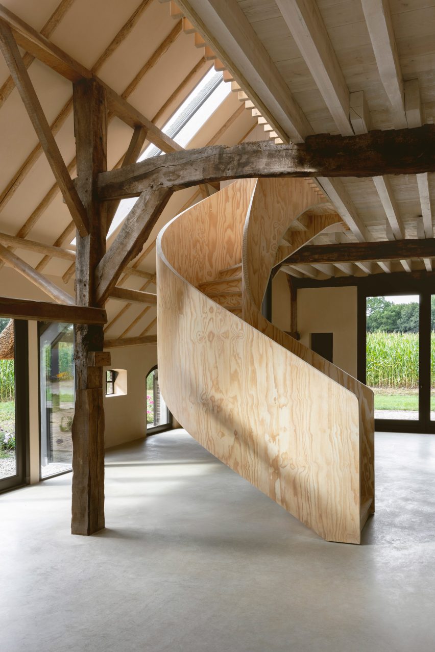
From a completely pre-fabricated staircase in a Boston apartment to a plywood spiral staircase twisting from the loft of a renovated barn in the Netherlands, these sculptural stairs create a visually striking centrepiece, as well as a fun way to traverse a house.

This is the latest in our lookbooks series, which provides visual inspiration from Dezeen’s archive. For more inspiration see previous lookbooks featuring rustic Italian interiors, autumnal bedrooms and show-stealing dining room tables.


Photo by James Leng

Hairpin House, USA, Studio J Jih and Figure

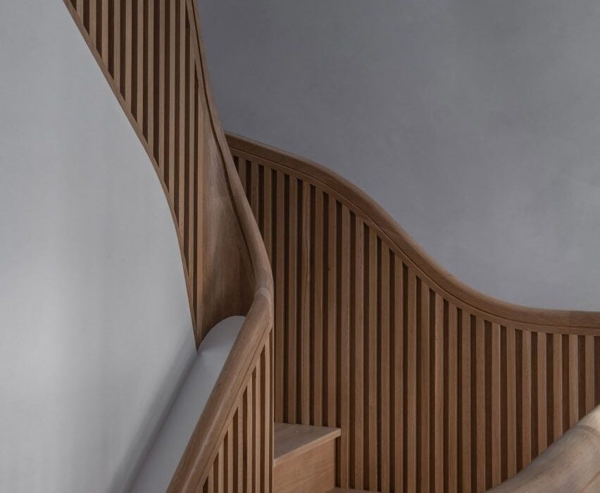
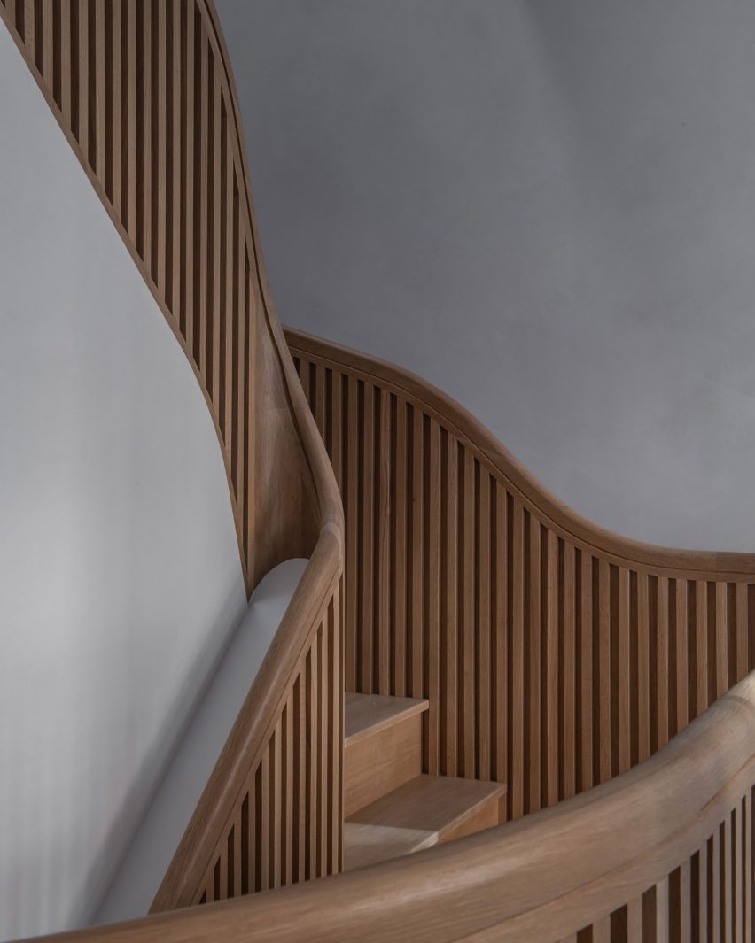
Located in Boston’s South End neighbourhood, this historic townhouse renovation sees a four-storey interior plan wrapped around a white oak staircase that spirals around a 40-foot-high (12-metre-high) atrium.

“Aptly named Hairpin House, the project takes the tight, unpredictable, and ultimately poetic switchback turns of a mountain road as inspiration for the overall renovation – and in particular a new unravelling central stair,” said the design team.

Find out more about Hairpin House ›


Linehouse Cape Drive residence
Photo by Jonathan Leijonhufvud

Cape Drive Residence, Hong Kong, Linehouse

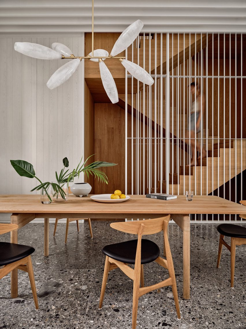
Just a short walk from the beaches of Hong Kong’s south side, this three-storey house channels “coastal essence” through natural materials and light, Chinese studio Linehouse told Dezeen.

An “easy flow” was also imbued into the design, created in part by a timber stairwell that’s tucked to the side and – save for a white metallic screen – is open to the living spaces.

Find out more about Cape Drive Residence ›


A wooden staircase with a planting bed at the base
Photo by Frank Frances

Mass Timber House, USA, Schiller Projects

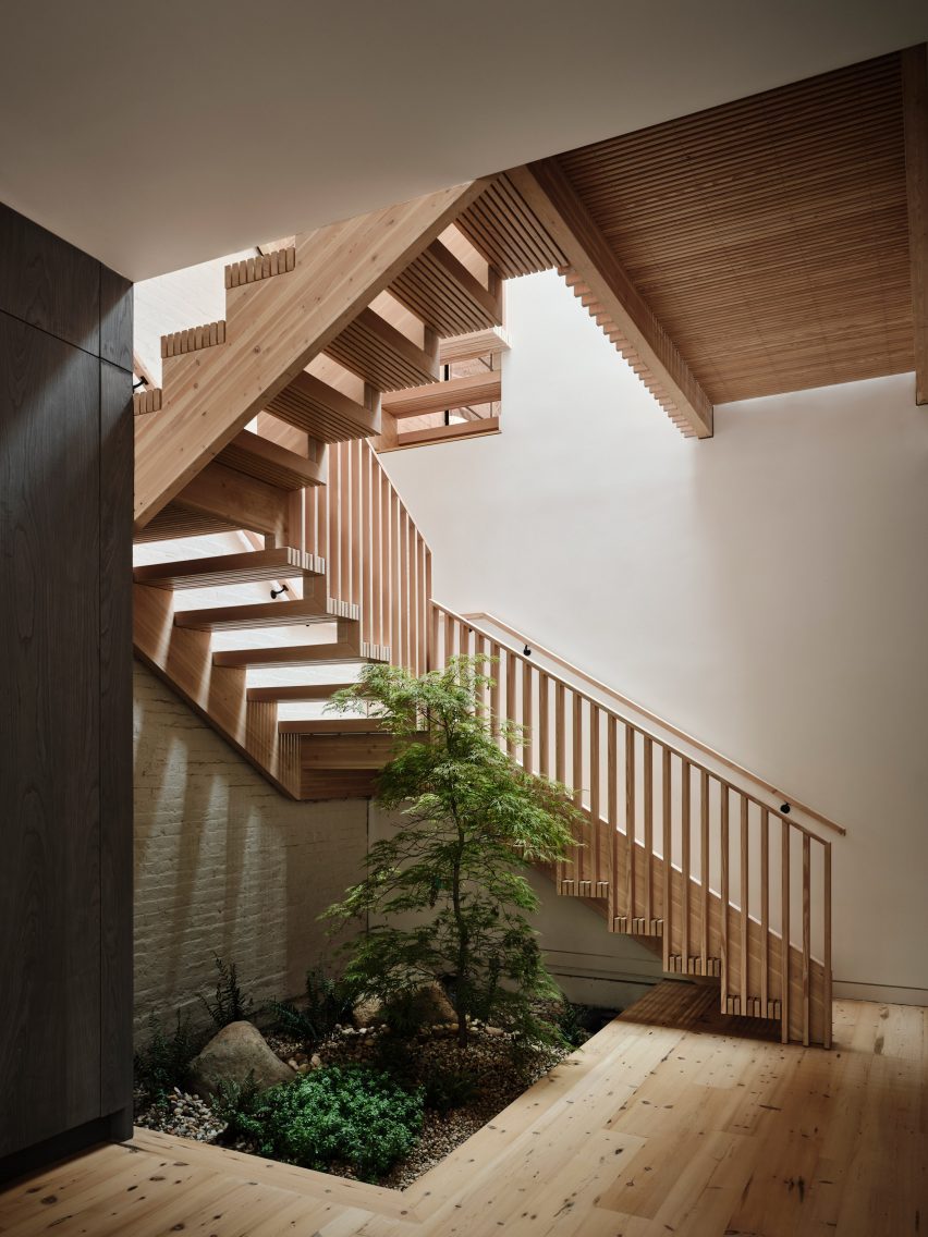
According to design studio Schiller Projects, this renovated carriage home in Brooklyn is the borough’s first single-family residence that uses mass timber construction.

Besides repurposed wooden elements like timber panels and floorboards used for the project, the house features a pre-fabricated glue-laminated timber (glulam) staircase that can be completely disassembled.

Find out more about Mass Timber House ›


Plywood spiral staircase in Barn at the Ahof by Julia van Beuningen
Photo by Alex Baxter

Barn at the Ahof, the Netherlands, Julia van Beuningen

Architectural designer Julia Van Beuningen converted this Gelderland barn into a holiday home complete with a spiral staircase made out of plywood at the heart of the floor plan, which contrasts the more rustic materials of the surrounding building.

“This is very different and very unusual in a barn like this,” said Van Beuningen. “It’s something you either love or hate, but it’s definitely a statement.”

Find out more about Barn at the Ahof ›


Photo by Eric Petschek

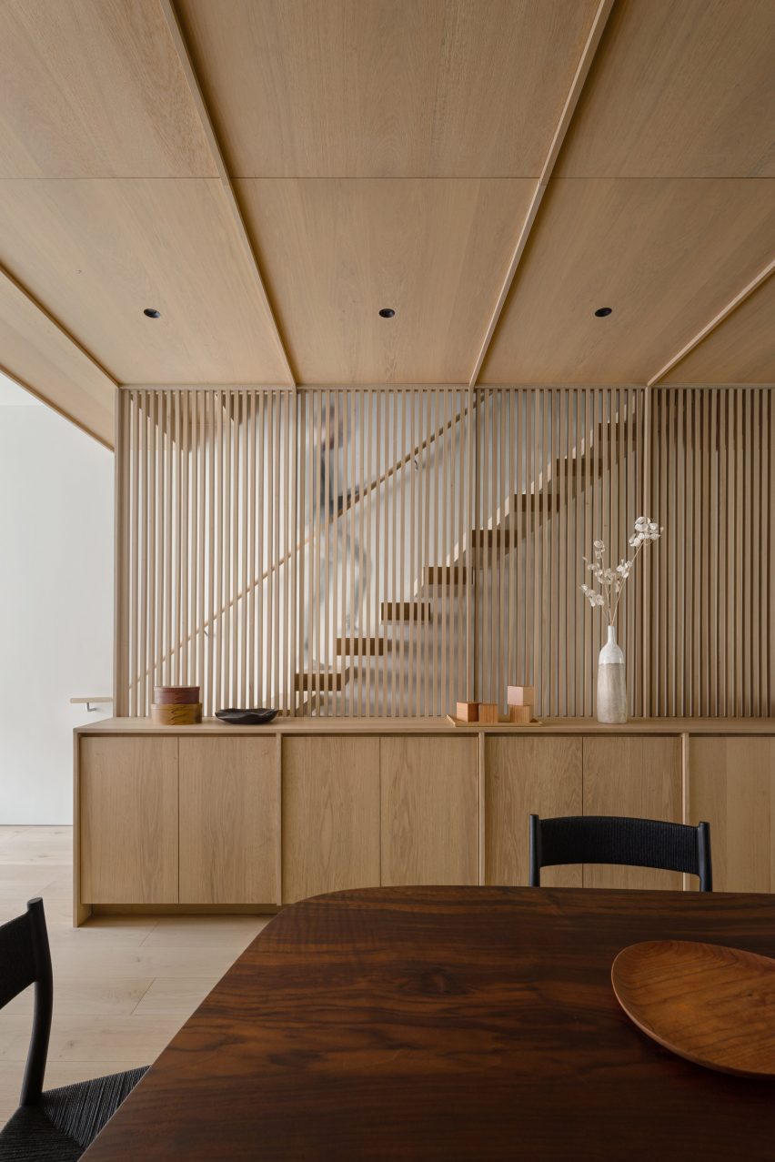
Carroll Gardens Townhouse, USA, Starling Architecture and Emily Lindberg Design

New York studios Starling Architecture and Emily Lindberg Design merged a two-family dwelling into one for the owner’s growing family.

White oak running throughout the two units unifies the project, which includes the addition of a new wooden staircase covered by a slated screen made of the same material.

Find out more about Carroll Gardens Townhouse ›


Larch Loft extension in London by Whittaker Parsons
Photo by Jim Stephenson

Stoke Newington loft, UK, Whittaker Parsons

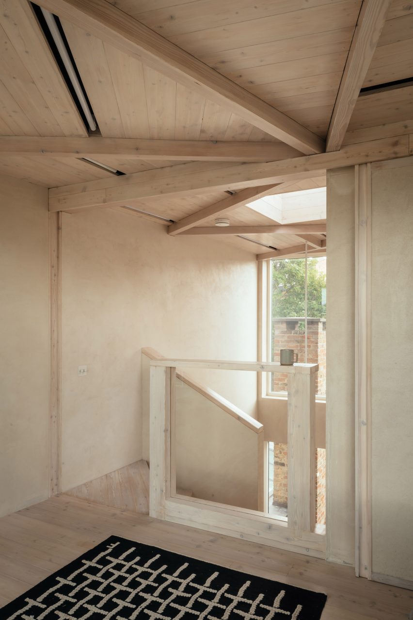
Architecture firm Whittaker Parsons was tasked with adding a loft to a house in Stoke Newington, London, as well as updating spaces throughout the lower floors.

With efficiency and quality in mind, the studio used prefabricated structural insulated panels (SIP) to construct the new loft. The space is accessed by a spiral staircase made of larch that’s topped with a skylight.

Find out more about Stoke Newington loft ›


Staircase and kitchen in Dragon Flat by Tsuruta Architects
Photo is by Tim Croker

Dragon Flat, UK, Tsuruta Architects

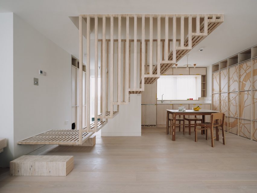
A floating timber staircase features in this flat in London, which is outfitted with walls CNC-etched with images of peonies, dragons, bats and the Thames.

The central staircase allows light to filter into the kitchen and living room below, while solid timber bricks act as landings on either side.

Find out more about Dragon Flat ›


Elsternwick Penthouse in Melbourne by Office Alex Nicholls
Photo by Rory Gardiner

Elsternwick penthouse, Australia, Office Alex Nicholls

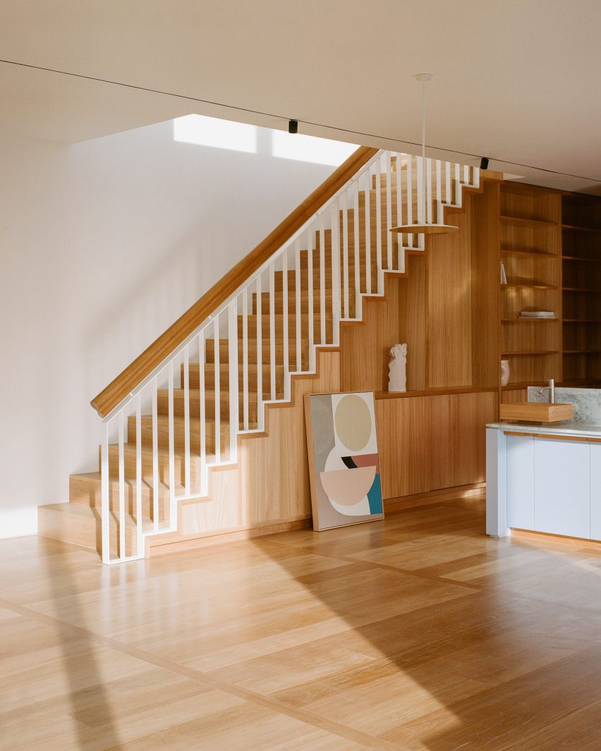
The timber staircases in this Melbourne house were integrated into its “library spine” an organizing corridor that contains the family’s collection of books, art and artefacts.

“From a practical standpoint, it allowed everything to be easily accessible and displayed but it also helps to draw people through the apartment and celebrate the two staircases to the roof garden at either end,” said Office Alex Nicholls founder Alex Nicholls.

Find out more about Elsternwick penthouse ›

This is the latest in our lookbooks series, which provides visual inspiration from Dezeen’s archive. For more inspiration see previous lookbooks featuring rustic Italian interiors, autumnal bedrooms and show-stealing dining room tables.

Reference

Ten buildings with glazed walls that bring the outside in
CategoriesInterior Design

Ten buildings with glazed walls that bring the outside in

For this lookbook sponsored by Vitrocsa we’ve selected 10 buildings with glazed walls created using the Swiss window brand’s products, from a Foster + Partners-designed villa to a restaurant in a former police station.

Floor-to-ceiling windows maximise views and flood rooms with natural light, while enabling a seamless transition between interior and exterior spaces.

Founded in 1992, Vitrocsa specialises in minimalist windows with ultra-narrow aluminium-alloy frames, rails and thresholds designed at its facility in Saint-Aubin-Sauges, Switzerland.

Here are 10 projects where the brand’s sliding, pivoting, guillotine and turntable corner products have been used to form glass walls.

This is the latest in our lookbooks series, which provides visual inspiration from Dezeen’s archive. For more inspiration see previous lookbooks featuring homes with pocket doors, interiors informed by biophilic design and garden swimming pools.


Headland House by Atelier Andy Carson
Photo by Michael Nicholson

Headland House, Australia, by Atelier Andy Carson

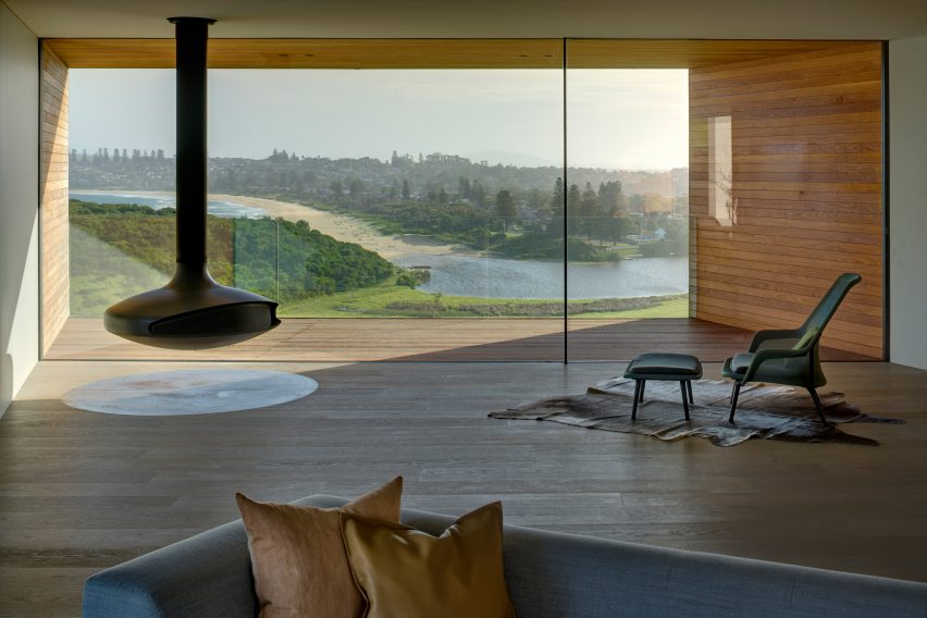
One end of Headland House in New South Wales features a rectangular glazed wall overlooking the surrounding coastline and farmland.

Sydney-based studio Atelier Andy Carson used Vitrocsa sliding doors to open up the living space onto a funnel-like, timber-clad balcony with a glass balustrade, leaving the vista uninterrupted.

Find out more about Headland House ›


Spring Road by EYRC
Photo by Matthew Millman

Spring Road, USA, by EYRC Architects

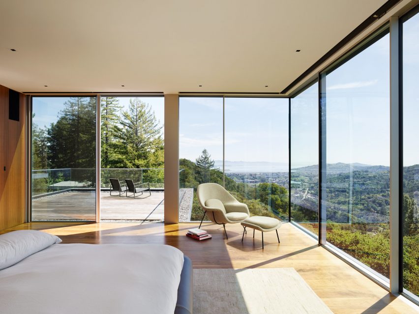
Stacked glass boxes define Spring Road, a house near San Francisco designed as a tranquil hilltop retreat by EYRC Architects.

In the large master suite, the dramatic views of Mount Tamalpais and the San Francisco Bay are exploited via a corner of Vitrocsa glazed walls that can be opened up onto an adjacent terrace.

Find out more about Spring Road ›


House in Jackson by McLean Quinlan
Photo by David Agnello

Jackson Hole, USA, by McLean Quinlan

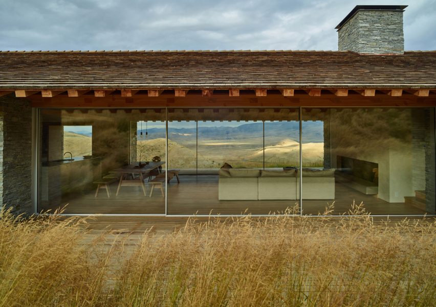
British architecture firm McLean Quinlan was appointed to deliver a house in Wyoming modelled on a nearby settlers’ cabin dating from 1888.

Rustic materials are balanced with contemporary elements such as floor-to-ceiling windows spanning the open-plan kitchen, dining and living room, and an all-wood alcove overlooking the mountainous landscape through a large glass wall.

Find out more about Jackson Hole ›


Dolunay Villa by Foster + Partners in Turkey
Photo by Nigel Young

Dolunay Villa, Turkey, by Foster + Partners

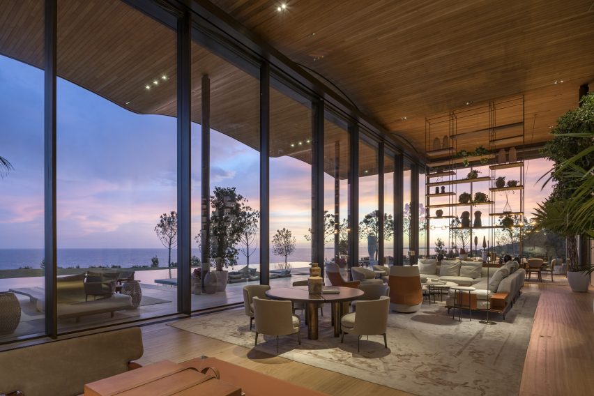
A rare private residence designed by British studio Foster + Partners, Dolunay Villa has huge areas of glazing on its coast-facing southern side.

The glass wall slides open onto a terrace sheltered by a rippling timber roof that cantilevers outwards and was designed to look like an extension of the rocky, beachside setting.

Find out more about Dolunay Villa ›


Private spa in Israel by Pitsou Kedem Architects
Photo by Amit Geron

Private Spa, Israel, by Pitsou Kedem Architects

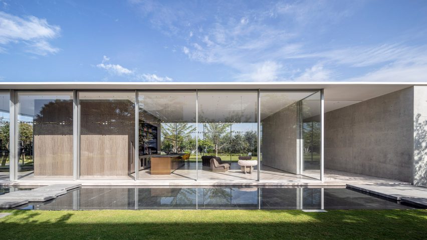
This glass-house pavilion in Herzliya was designed by Tel Aviv studio Pitsou Kedem Architects to have the feel of a hotel spa.

The main wing is enveloped with glazed walls on three sides set on a bespoke system of aluminium rails produced by Vitrocsa that allow them to slide wide open.

Find out more about Private Spa ›


F House by Pitsou Kedem
Photo by Amit Geron

House F, Israel, by Pitsou Kedem Architects

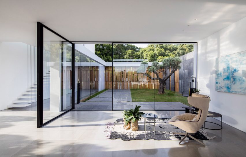
F House, also in Israel and by Pitsou Kedem Architects, features a glass curtain wall with a large pivoting door from Vitrocsa that swings inward from a private courtyard.

Glazing is used liberally throughout the project to produce multiple seamless transitions, including an all-glass corner section looking onto another courtyard and clerestory windows that frame views of a separate lounge space on the upper level.

Find out more about House F ›


Former Rocks Police Station by Welsh + Major
Photo by Katherine Lu

Former Rocks Police Station, Australia, by Welsh + Major

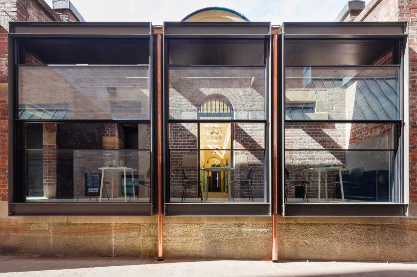
A trio of full-height, sash-style Vitrocsa guillotine windows face the street at this restaurant in Sydney that occupies a converted 19th-century brick building.

They were fitted to the building by Australian studio Welsh + Major as part of a renovation of the former police station.

Find out more about Former Rocks Police Station ›


Vitrocsa windows in Cleveland Rooftop by SJB
Photo by Felix Forest

Cleveland Rooftop, Australia, by SJB

Vitrocsa sliding windows divide the living spaces from a private garden at this rooftop apartment in the Sydney suburbs designed by architecture studio SJB.

The architects aimed to create a space that seemingly flows from inside to outside and used large glazed Vitrocsa Swimms sliding windows to divide the interior and exterior.

Find out more about Cleveland Rooftop ›


A House by the Sea by Pitsou Kedem
Photo by Amit Geron

A House by the Sea, Israel, by Pitsou Kedem Architects

The third home designed by Pitsou Kedem Architects on this list is a beachfront house where the studio aimed to maximise the connection with the Mediterranean Sea.

Giant windows flood the home with views and natural light, including in the double-height living area and in the cantilevered upper storey’s master bedroom where thin protruding lintels help to provide shade.

Find out more about A House by the Sea ›


Portland Japanse Garden by Kuma
Photo courtesy of Kengo Kuma Associates

The Portland Japanese Garden Cultural Village, USA, by Kengo Kuma

Kengo Kuma created pavilions for a new complex at a Japanese-style urban garden in Portland, Oregon.

To maximise the connection between the interiors and their serene surroundings, the Japanese architect used Vitrocsa sliding windows throughout the scheme.

Find out more about The Portland Japanese Garden Cultural Village ›

This is the latest in our lookbooks series, which provides visual inspiration from Dezeen’s archive. For more inspiration see previous lookbooks featuring homes with pocket doors, interiors informed by biophilic design and garden swimming pools.

This lookbook was produced by Dezeen for Vitrocsa as part of a partnership. Find out more about Dezeen partnership content here.

Reference

Chinese designers can “bring something different to the world”
CategoriesInterior Design

Chinese designers can “bring something different to the world”

Architects and designers in China are poised to have a greater global influence as the country emerges from the coronavirus pandemic, according to Dezeen Awards China judges at a talk at Design Shanghai.

Hosted by Dezeen’s co-CEO Benedict Hobson, the panel discussion marked the launch of Dezeen’s new regional edition of Dezeen Awards to celebrate architecture and design in China, which is open for entries now.

It featured Dezeen Awards China judges Alex Mok and Frank Chou, alongside Neri&Hu managing director Jerry del Fierro, who stood in for Dezeen Awards China judge Rossana Hu, who had to pull out due to illness.

Frank Chou portrait
Frank Chou is a product designer and Dezeen Awards China judge

According to Chou, who is one of the most established product designers in China, the country has a huge amount of untapped design potential.

“In Europe, there are so many design firms,” he said.

“In China, we have a population of 1.4 billion, but how many designers are there? There’s really a huge potential for Chinese designers to bring something different to the world.”

Sofa by Frank Chou
Frank Chou designs furniture under his own brand

Chou believes that emerging Chinese designers are cultivating a unique, contemporary design language that draws from China’s rich history without being overly deferential to it.

“We need to shape the real modern Chinese culture,” he said.

“When we talk about culture, many people equate this to history, to something in the past. But we should also be thinking about the culture of the future. What will be China’s future culture?”

Jerry del Fierro portrait
Jerry del Fierro is managing director of Neri&Hu

One firm that has successfully created a contemporary Chinese design identity is Neri&Hu, one of China’s best-known architecture and design studios.

According to managing director Del Fierro, the practice’s co-founders Hu and Lyndon Neri have been highly influenced by cultural theorist Svetlana Boym and her concept of “reflective nostalgia”.

“Reflective nostalgia is not a nostalgia that recreates the old, it respects the old but projects something new, something inspiring,” he said.

“It’s not about feeling sad about something that’s lost, but rather to taking elements from the past and making them fresh and new.”

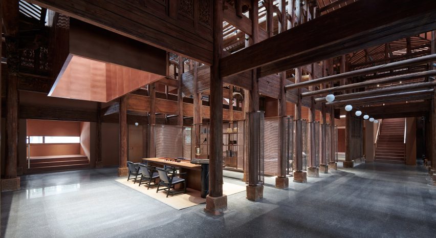
The Relic Shelter teahouse in Fuzhou, China
Recent Neri&Hu projects include The Relic Shelter teahouse in Fuzhou, China

He believes that the conditions are right in China for architects and designers to push boundaries.

“If you work in America, and I worked in America for many years, some of the developers are very conservative,” he said.

“A lot of the Chinese developers are actually ready to try something more innovative. I think there’s something to be said about the culture here that allows for innovation.”

Alex Mok portrait
Alex Mok is co-founder of Linehouse and a Dezeen Awards China judge

Mok, who is co-founder of Shanghai- and Hong Kong-based architecture and interior design studio Linehouse, agreed.

“Transitioning from working in the UK to China was a revelation,” she said.

“At first, I was a bit shocked. But very quickly I just embraced how fluid and fast it is here. We now have the opportunity to be working globally, but our heart is still in China.”

Taking place as part of the Forum programme of talks at Design Shanghai 2023, the first edition of the annual trade show that has taken place since China relaxed international travel restrictions imposed during the coronavirus pandemic, the panel discussion explored how China’s architecture and design scene has been impacted by the pandemic.

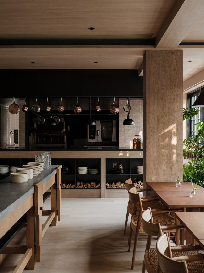
Gaga's Coast restaurant in Shanghai designed by Linehouse
Recent Linehouse projects in China include the Coast restaurant in Shanghai

According to Mok, Covid-19 forced many architecture and design firms in China who previously relied on foreign workers to nurture and cultivate local talent instead.

“Everything had to be more local, which I think was a positive thing,” she said.

“It became a bit more about Chinese creativity. When we were hiring, we kept getting all these CVs from foreign architects, but it was impossible [to hire them]. This meant we ended up fostering more local Chinese talent.”

Del Fierro said that Neri&Hu experienced something similar, with many of the firm’s foreign workers returning to Europe or the US and working remotely. According to Fierro, this had the unexpected but welcome consequence of increasing the practice’s international projects.

Covid-19 pandemic created “new opportunities” for architects and designers

“Our practice is very different from three years ago,” he said.

“When the pandemic happened, there were a number of our staff who wanted to return to Europe. We now have about 50 per cent of our projects diversified. Fifty per cent of them are still in China, but 50 per cent are now outside of China.”

According to Del Fierro, the global acceptance of remote working will provide more opportunities for firms based in China to work on projects abroad.

“The concept of remote working is now very commonplace and we are not limited by physical travel anymore,” he said.

“So suddenly, we have all these new opportunities. We are based in Shanghai, can we work in Cape Town? Absolutely! And we don’t have to go there every month. So I think the pandemic caused an interesting situation to create new opportunities.”

Dezeen Awards China 2023 in partnership with Bentley

Dezeen Awards China open for entries until 24 August

Chou, Mok and Neri&Hu co-founder Hu are among the first judges to be announced for Dezeen Awards China, which launched in Shanghai on 8 June in partnership with Bentley. Further judges will be announced in the coming weeks.

Dezeen Awards China is open for entries now until 24 August 2023, but studios can save money on their entry if they enter before 13 July 2023.

There are 17 project categories to enter across architecture, interiors and design. The winners of these project categories will go head to head for the chance to be crowned one of three project of the year winners across architecture, interiors and design.

Reference

ADUs Bring Organic Growth to Suburbia, And We Desperately Need More Of It.
CategoriesArchitecture

ADUs Bring Organic Growth to Suburbia, And We Desperately Need More Of It.

Browse the Architizer Jobs Board and apply for architecture and design positions at some of the world’s best firms. Click here to sign up for our Jobs Newsletter.

Accessory Dwelling Units (ADUs) mandated by the State of California override local planning regulations to permit a second unit on almost any single-family zoned property. The law also allows any single-family zoned lot to be subdivided into two parcels. Additionally, it allows ADUs to be built with just a four-foot setback or no setback at the new interior property line of a subdivided parcel, in contrast with most towns, which have setbacks of more than 7 feet, up to 30 feet. It also mandates very relaxed parking requirements or no parking if the project is near public transit.

Is California paving the way for ADUs across the US?

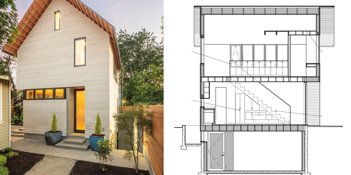
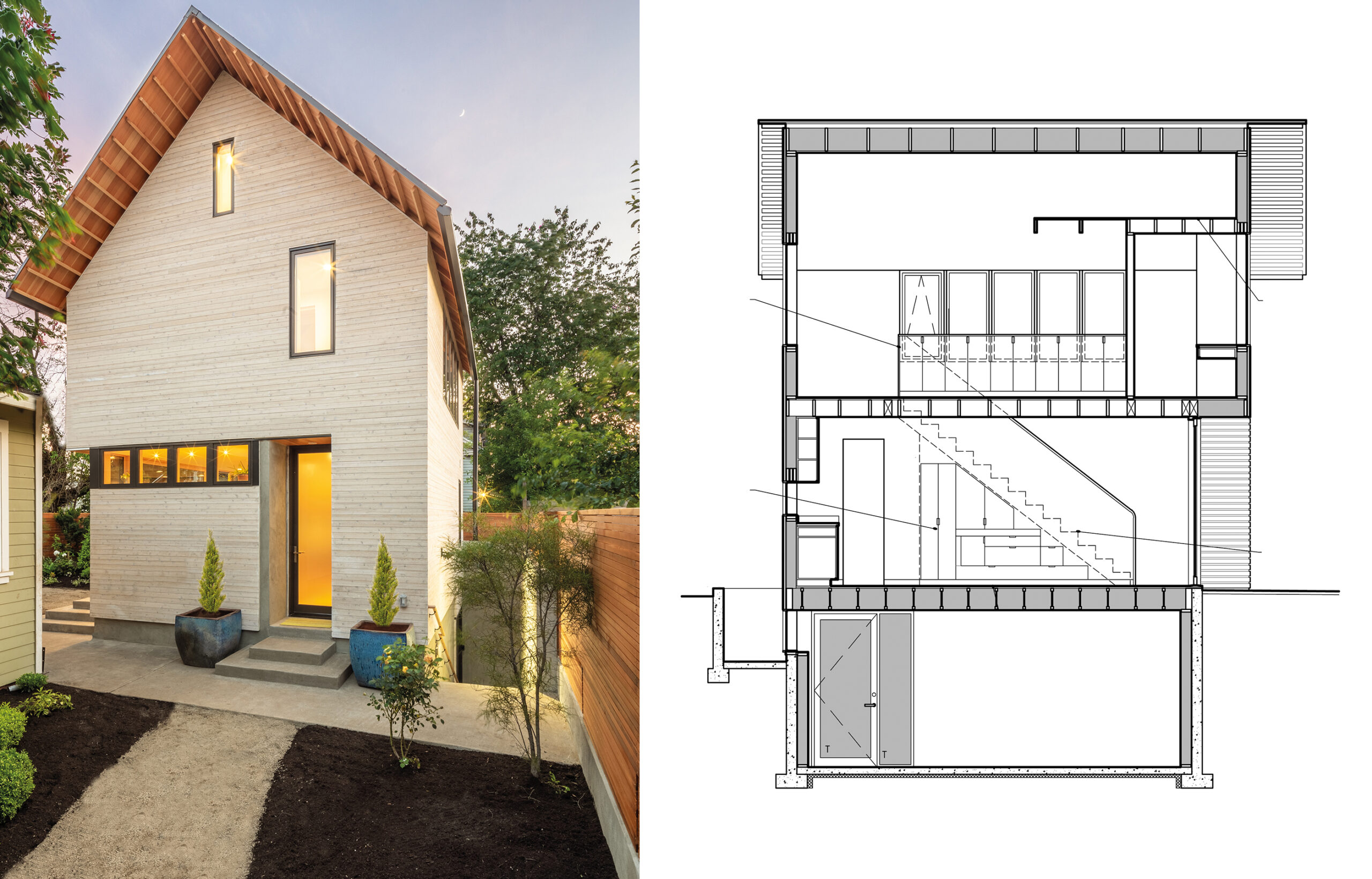
ADU Portland. Exterior view and section.

ADU Portland. Left: Exterior view; right: building section. Courtesy of Webster Wilson Architect. Image by Caitlin Murray.

ADUs: A Solution for Affordable Housing Shortage

California has long grappled with an acute housing shortage, especially affordable housing. Local governments, under the thrall of NIMBY residents trying to preserve the rural/suburban “character” of their communities, have not been very cooperative with state goals for new housing.

Local planning departments bristle at their authority being usurped by the state, but for growing numbers of people, these ADU rules offer welcome flexibility and opportunities for growth in a place that is building better, more stable communities, providing housing, and stemming sprawl.

ADUs for Families of all Sorts of Forms

The endless swaths of single-family houses spreading across the hills and valleys of suburbia are the physical manifestation of a culture that fetishized the nuclear family — and conspicuous consumption. But, a simple nuclear family unit has never been anywhere near the universal living arrangement and is becoming ever less universal. Homeowners are using the ADU rules to build houses for a kaleidoscopic variety of living arrangements and “families” of all shapes, types, and sizes.

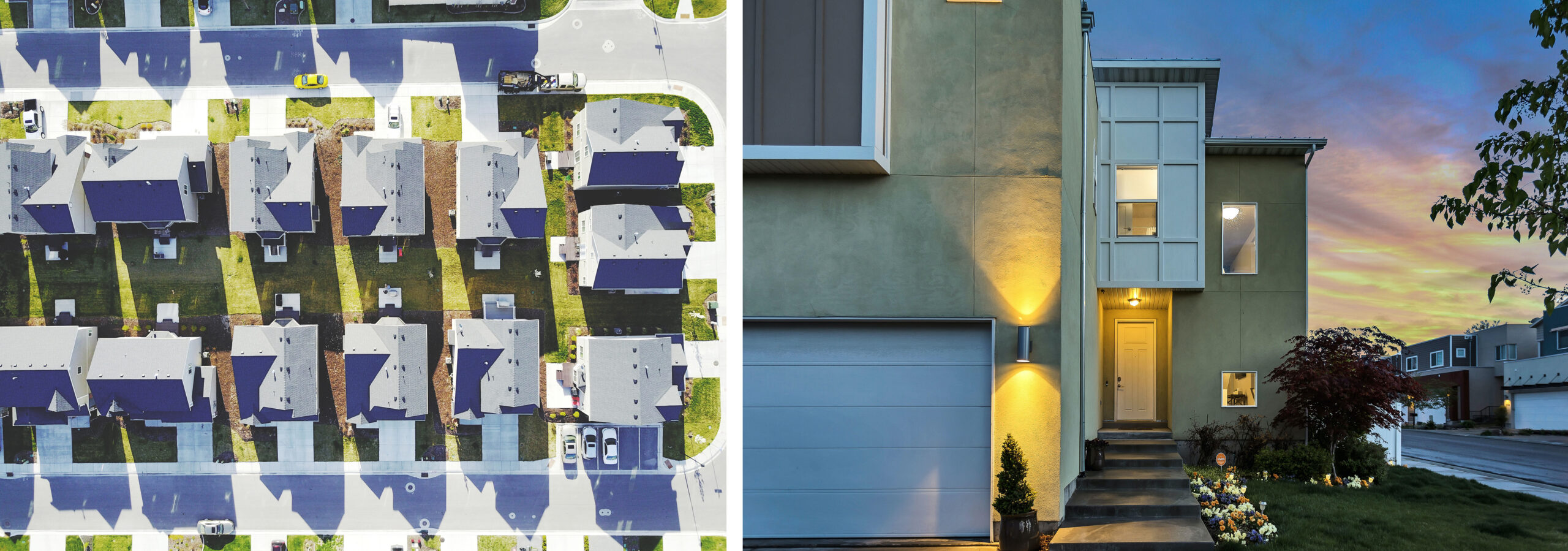
Drone view of suburban Utah town and Modern addition to existing house in the Salt Lake City area

Left: Drone view of similar houses, driveways, and yards in the Utah suburbs. Original public domain image from Wikimedia Commons via rawpixel; right: Modern addition to an existing suburban house in the Salt Lake City area. Image by Brian Babb via Unsplash.

From Granny Flat to Rental Property

Having a place for “granny” is hardly the only use for these units. Homeowners may be looking for something affordable for grown children and their partners that doesn’t force them to move hours away. They’re also looking for flexibility and future-proofing. What is grandma’s house today can become an income rental property that allows a homeowner on a fixed income to afford to stay in place.

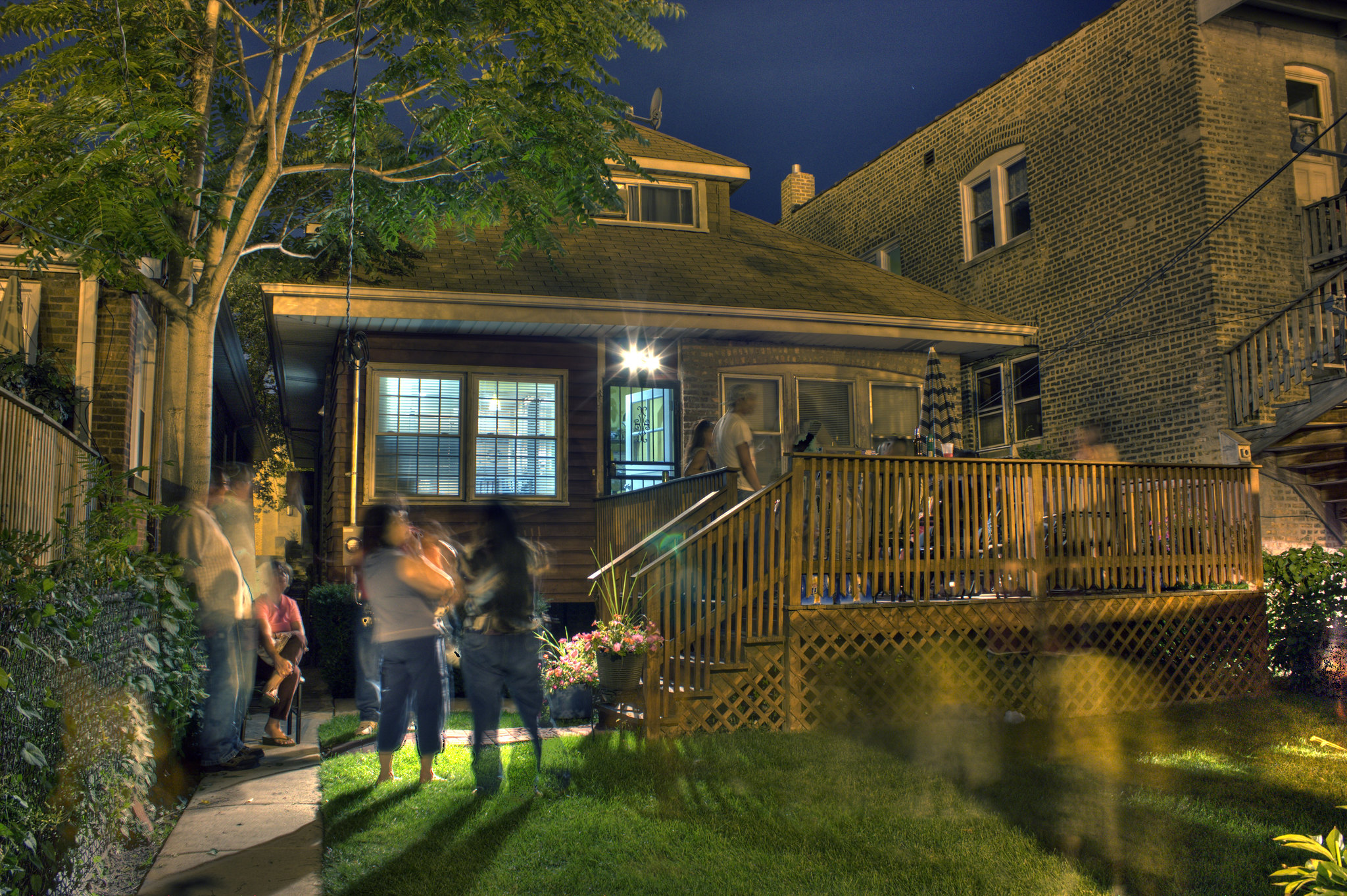
Family party BBQ. Chicago.

Family party BBQ. Chicago. Image by Tela Chhe via Flickr.

Building Stronger Communities

The law allows a single-family zoned parcel to be subdivided into two parcels, and each of these parcels to have two units, so up to four units can be made from a single-family house. This lets people do what traditionally has often been standard operating procedure: houses are extended to accommodate growing and branching families. It can help keep extended families together, which in turn, builds stronger communities.

Breaking the Monotony of Suburban Architecture

These new units are also changing the look and feel of suburbia for the better as well. Blank two-car garage doors are being replaced by lively facades of windows and openings. The tighter setbacks help give the remodeled houses a different rhythm and feel on the street, breaking the monotonous sameness of cookie-cutter ranchers.

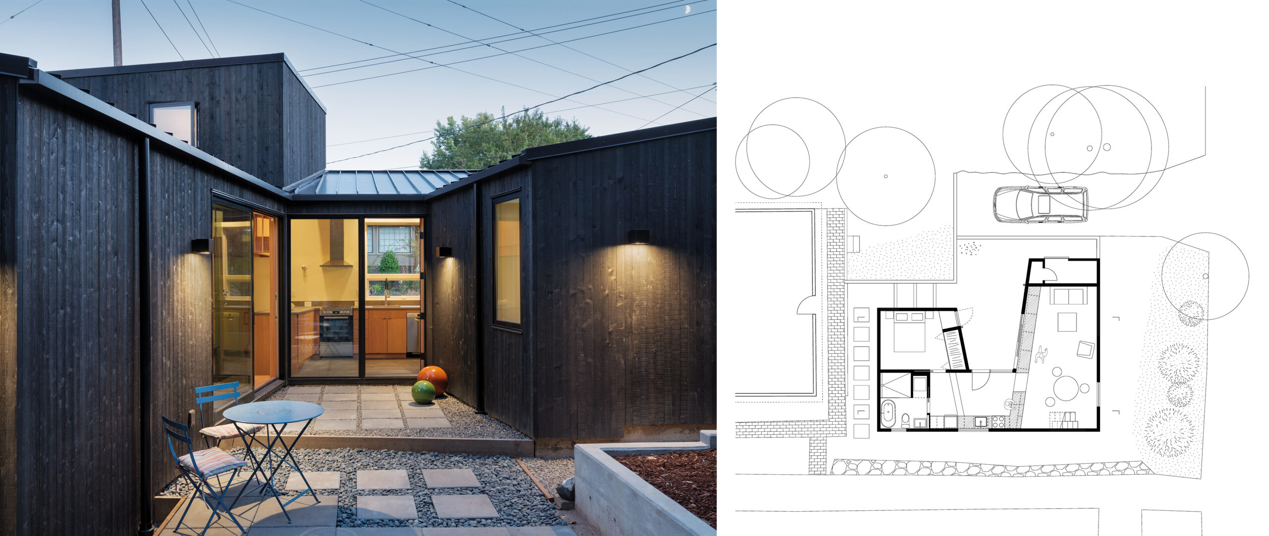
Courtyard DADU, Seattle, WA.

Courtyard DADU, Seattle, Washington. Left: View from the courtyard; right: floor plan. Courtesy of Robert Hutchison Architecture. Photo by Eirik Johnson.

YIMBY!

Until the advent of professional planners, towns and cities almost always grew and became more densely developed in small steps in exactly this way. This laisser-faire method of “planning” has produced most of the best, most treasured urban landscapes across the world. Our banal suburban sprawl may yet be redeemed through organic in-fill growth done by and for residents who are increasingly proclaiming YIMBY! (Yes, In My Back Yard).

This article was written in collaboration with Californian architect Ian Ayers.

Browse the Architizer Jobs Board and apply for architecture and design positions at some of the world’s best firms. Click here to sign up for our Jobs Newsletter.

Reference

Wood and stone surfaces bring “rich texture” to Primrose Hill House interior
CategoriesInterior Design

Wood and stone surfaces bring “rich texture” to Primrose Hill House interior

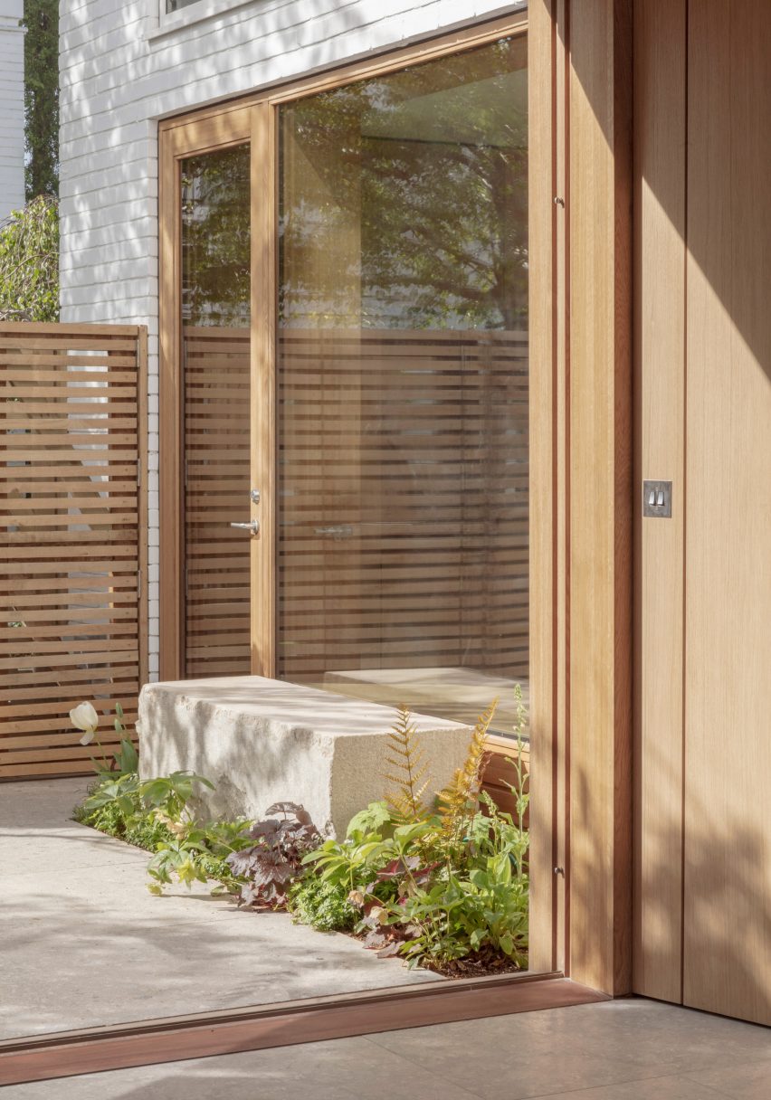
Architecture for London has updated a 1960s house in London, creating an open-plan interior filled with natural materials and an improved connection to the rear courtyard garden.

The house is one of two detached properties set in a modernist estate in Primrose Hill that primarily consists of painted brick courtyard houses and small terraces.

Photo of Primrose Hill House
Primrose Hill House was designed by Architecture for London

The new owner asked Architecture for London to transform the interior into a modern layout that is better suited to their lifestyle.

“The house had a very broken plan consisting of lots of small rooms,” the studio’s director Ben Ridley told Dezeen. “The client wanted to create a family house that was more open plan with better views of the garden.”

Exterior photo of Primrose Hill House
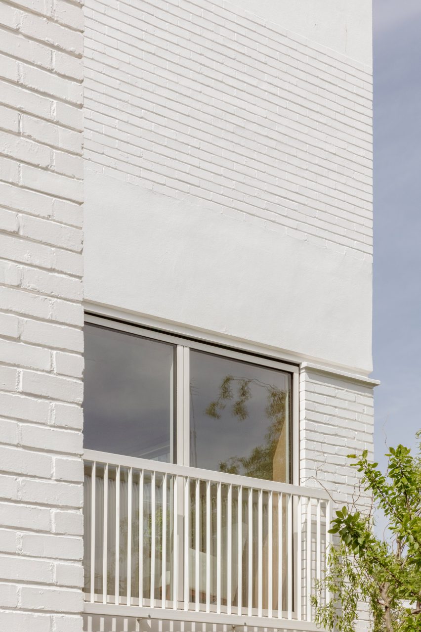
The studio added a rooftop extension clad in white bricks

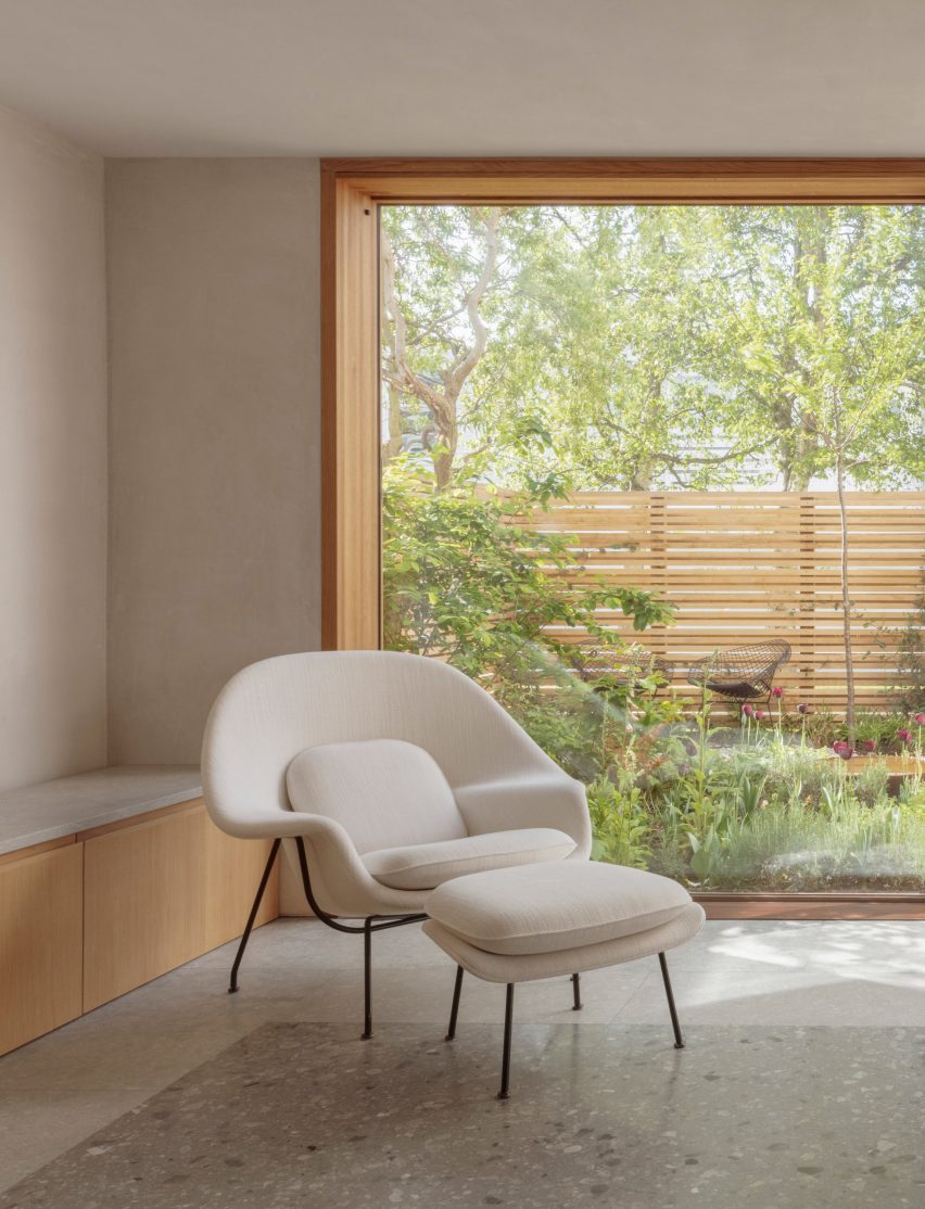
The remodelled interior improves the connection with the garden by incorporating a large picture window in the kitchen, along with sliding wood-framed doors in the living area.

The ground floor also contains a smaller reception area next to the entrance hall, with folding doors allowing this space to be separated from the kitchen and dining area.

Image of Primrose Hill House
Sliding wood-framed doors open the living room up to the garden

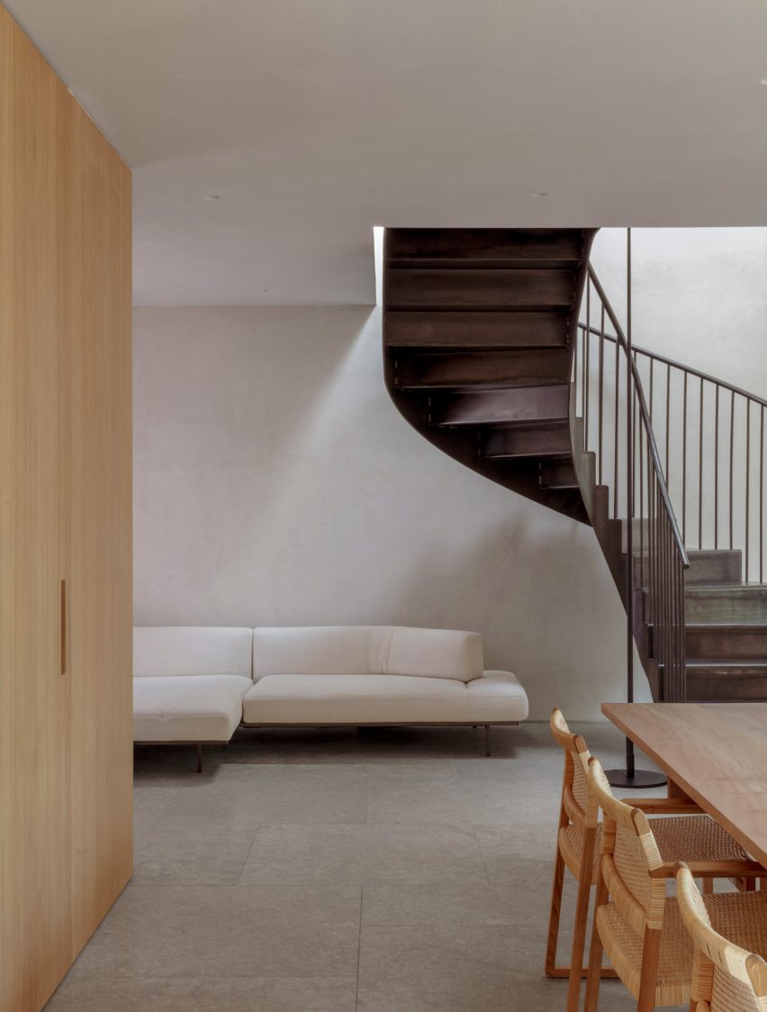
A bespoke blackened-steel staircase provides access to four bedrooms on the first floor, including a main suite with a juliet balcony overlooking the garden.

Following a detailed cost and sustainability review, a decision was made to demolish all of the property’s interior walls and rebuild them in order to achieve the required spaces.

Interior image of Primrose Hill House
The interior was finished in a rich material palette

This solution also offered the best energy-efficiency potential, according to Ridley, with a layer of wall insulation added alongside a heat recovery ventilation system (MVHR).

The home’s first-floor plate was replaced using steel beams and timber joists to enable the demolition of the ground-floor walls and the opening up of the interior.

Interior photo of Primrose Hill House
Flooring was used to define different zonessp

The project also involved the addition of a timber-framed rooftop extension, clad with white-painted brick to tie in with the rest of the house and set back so it’s largely hidden from view.

The extension contains a flexible mezzanine space for yoga and meditation that is accessed from the main bedroom suite.

Throughout the home, Architecture for London applied a pared-back palette of natural materials that is intended to create a sense of calmness and connection with the garden.

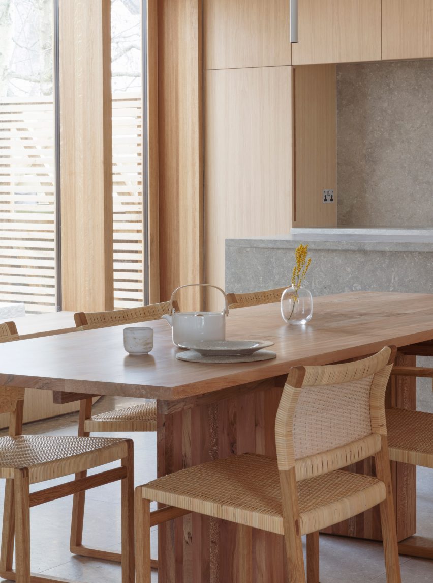
Internal walls treated with breathable lime plaster provide a neutral backdrop for furniture designed by architect Christian Brailey, which includes a dining table made from locally sourced London plane trees.

Photo of a dining area
Doors and windows are framed with wood

“We intentionally didn’t use a lot of colour so there’s a strong feeling of consistency,” Ridley said. “The choice of stone and timber brings a rich texture to the palette.”

A reference image of a Portuguese manor house, featuring a tiled trompe l’oeil frieze around a doorway, informed the use of materials to define space within the interior.

Photo of a bar at the home
The shared living areas have an open-plan layout

In the living room, stone floor tiles in different shades create a border around the room, as if an area rug has been placed on the floor to demarcate where furniture could be placed.

Ben Ridley founded Architecture for London in 2009 following his studies at London’s Barlett School of Architecture. The studio aims to create places that improve how people live and work, with a focus on reducing their operational emissions.

Photo of a staircase at the London home
Wood lines the interior walls of the home

Ridley’s own London house recently featured in our round-up of five UK house renovations designed to improve energy efficiency.

“Ultimately we are going to have to accept some changes in the appearance of our traditional homes,” he said, speaking to Dezeen as part of a feature on architects who have retrofitted their own homes.

The photography is by Christian Brailey.

Reference

Digital technology and a floating museum bring contemporary art and culture to the people
CategoriesSustainable News

Digital technology and a floating museum bring contemporary art and culture to the people

Spotted: The impact of digital technologies on the world of art has been nothing short of transformative. From online platforms that make it easier for amateur artists to connect with their audience, to virtual tours that allow us to experience historical works up close, technology has completely redefined how we interact with, understand, and appreciate art in all its forms.

Perhaps no organisation embodies this shift better than Art Explora, a cutting-edge initiative that is shaking up the art world by making contemporary art accessible to everyone. The French foundation was created in November 2019 by entrepreneur Frédéric Jousset. Its mission is to reduce the cultural divide by bringing works of art to new, large, and diverse audiences.

Art Explora has developed a groundbreaking digital art history platform in collaboration with Sorbonne Université. This cutting-edge platform is designed to be accessible to users around the globe and offers intuitive interfaces that make it easy for anyone to explore art from all periods and styles. Through its unique journeys of discovery—which range from ancient Egyptian art to contemporary works—users of Art Explora are able to explore a wide variety of artistic styles and techniques in an engaging and interactive way. And by testing their knowledge through a series of quizzes and challenges, users can earn a valuable certificate that shows their level of expertise.

Another recent initiative from Art Explora is a new mobile museum, which has been christened the ‘MuMo’ and is a joint effort between Art Explora, the Centre Pompidou, and the MuMo Foundation. The truck will tour France in 2022 and Europe in 2023, bringing two themed annual exhibitions to each location. The exhibitions will be curated from the collections of the Centre Pompidou, as well as from other major European institutions. The MuMo will also host educational programs and workshops for children and adults alike. This unique opportunity to experience art from around the world will be an invaluable addition to the cultural landscape.

Art Explora also plans to bring art to the waves by converting one of the world’s largest catamarans into a mobile digital art museum. The floating museum is due to set sail from Marseille for various locations in the Mediterranean basin in September 2023.

Other Art Explora initiatives include the installation of ‘short story dispensers’ at the Armand Trousseau Children’s Hospital, and a residency programme enabling artists and researchers to carry out research and creation work in the heart of one of the most iconic and vibrant districts of Paris.

Other recent art and culture innovations spotted by Springwise include an online storytelling platform for female and under-represented filmmakers, an AR art exhibition embedded in the London landscape, and remote art tours via robots.

Written By: Katrina Lane

Website: artexplora.org

Contact: artexplora.org/en/contact

Reference

Ten calming green kitchens that bring natural tones into the home
CategoriesInterior Design

Ten calming green kitchens that bring natural tones into the home

For our latest lookbook, we’ve rounded up ten fresh and airy kitchens that use shades of green to give a hint of the natural world.


From soft sage to bright emerald, green is this year’s kitchen colour trend, often paired with natural local materials.

Perhaps inspired by our craving for nature during the pandemic, calming sea greens, grassy hues and mossy tones are popular choices for kitchen cabinetry, walls or tiles.

This is the latest roundup in our Dezeen Lookbook series providing visual inspiration for the home. Previous articles in the series showcased living rooms with statement shelving, peaceful bedrooms and designer bathrooms.


Kitchen with murky green cabinets

Belgium Apartment, Belgium, by Carmine Van Der Linden and Thomas Geldof

Local architects Carmine Van Der Linden and Thomas Geldof designed this duplex for a coastal location surrounded by sand dunes on the Belgian coast.

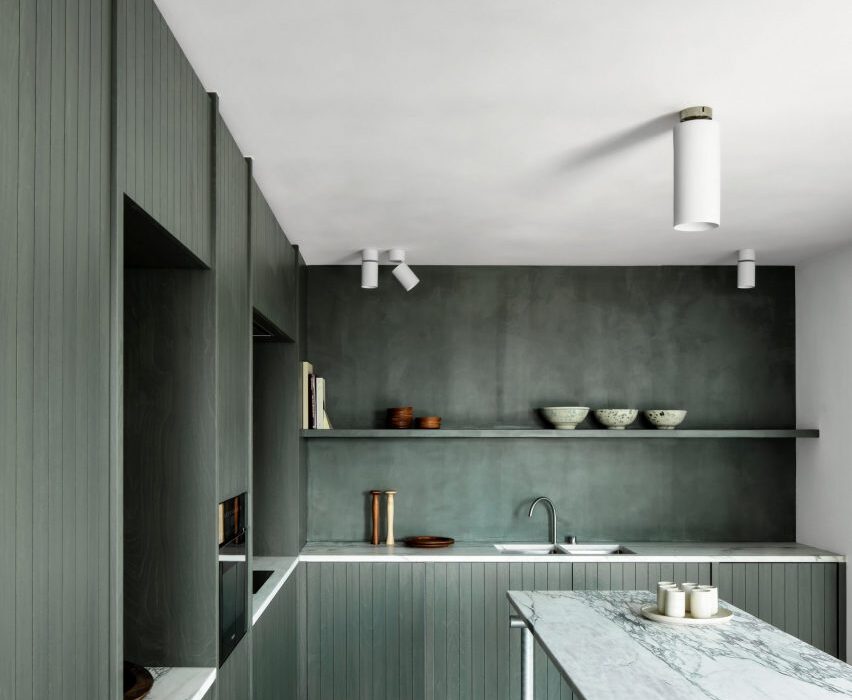
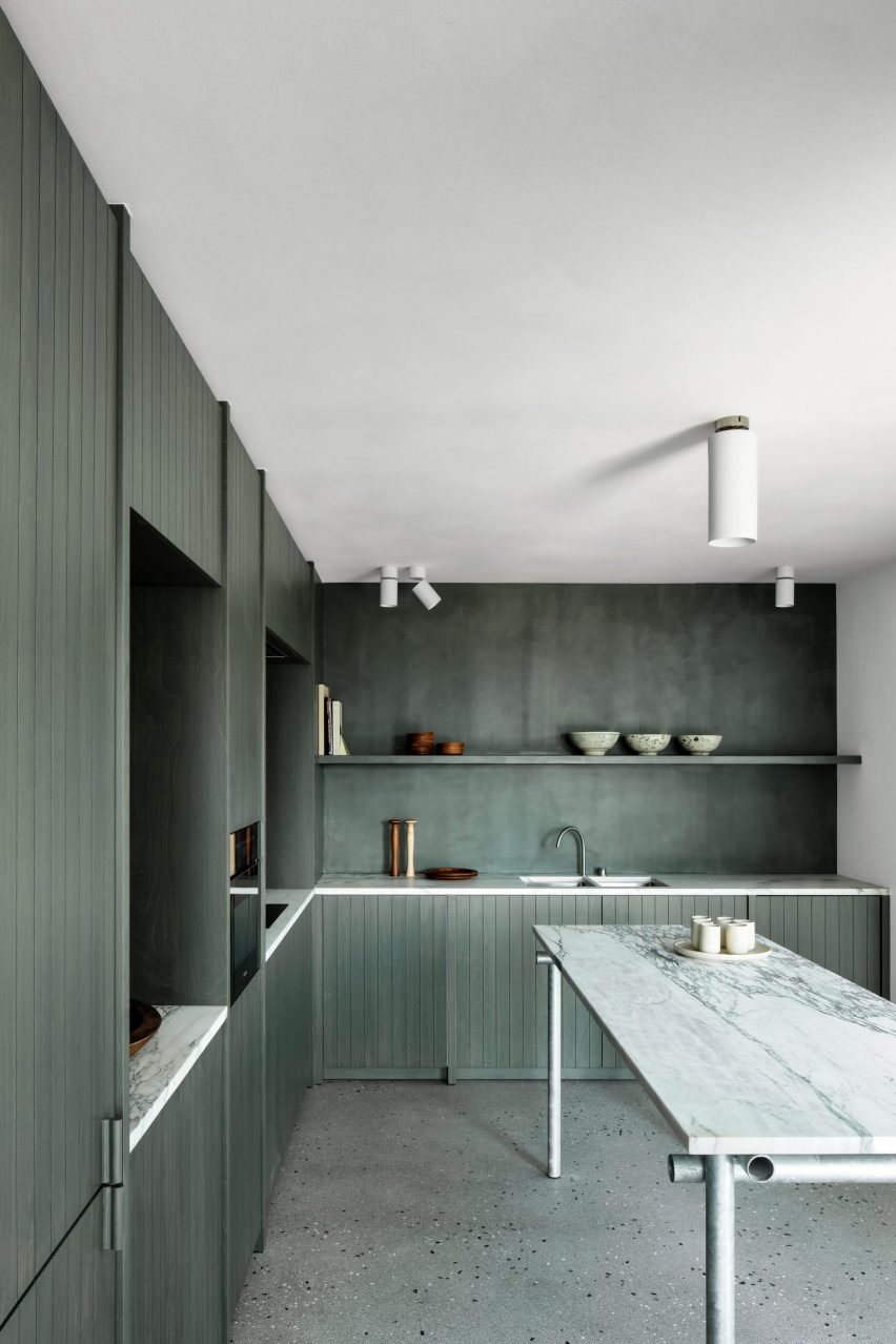
To contrast the marble-topped counters, the architects choose to colour the splashback, shelving and panelled birch-wood cabinets in a shade of green that recalls seaweed and beach grasses.

“The colour choice of the wood subtly brings in the seaweed colour from the adjacent sea and the marram grasses in the surrounding dunes,” the architects explained.

Find out more about Belgium Apartment ›


Kitchen with countertops of terrazzo flecked with orange stone

The Mantelpiece Loft, Stockholm, Sweden, by Note Design Studio

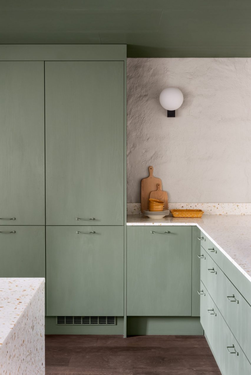
Note Design Studio painted furniture in green and pink throughout The Mantelpiece Loft to stand out against its white walls.

Sage green was used for one of the staircases and a bedroom, as well as the kitchen cabinets that were paired with contrasting countertops of terrazzo flecked with orange stone.

Find out more about The Mantelpiece Loft ›


Green kitchen in Lyon apartment

Apartment XVII, Lyon, France, by Studio Razavi

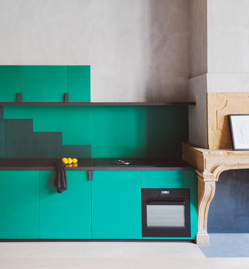
Studio Razavi combined pale-grey plaster, a light wooden floor and sea-green cabinets in this renovation of an apartment in a Renaissance-era building in the historic Vieux Lyon neighbourhood of Lyon in France.

The green kitchen cabinetry has a matching splashback with a stepped silhouette.

Find out more about Apartment XVII ›


Kitchen with sea-green cabinetry

Casa Mille apartment, Turin, Italy, by Fabio Fantolino

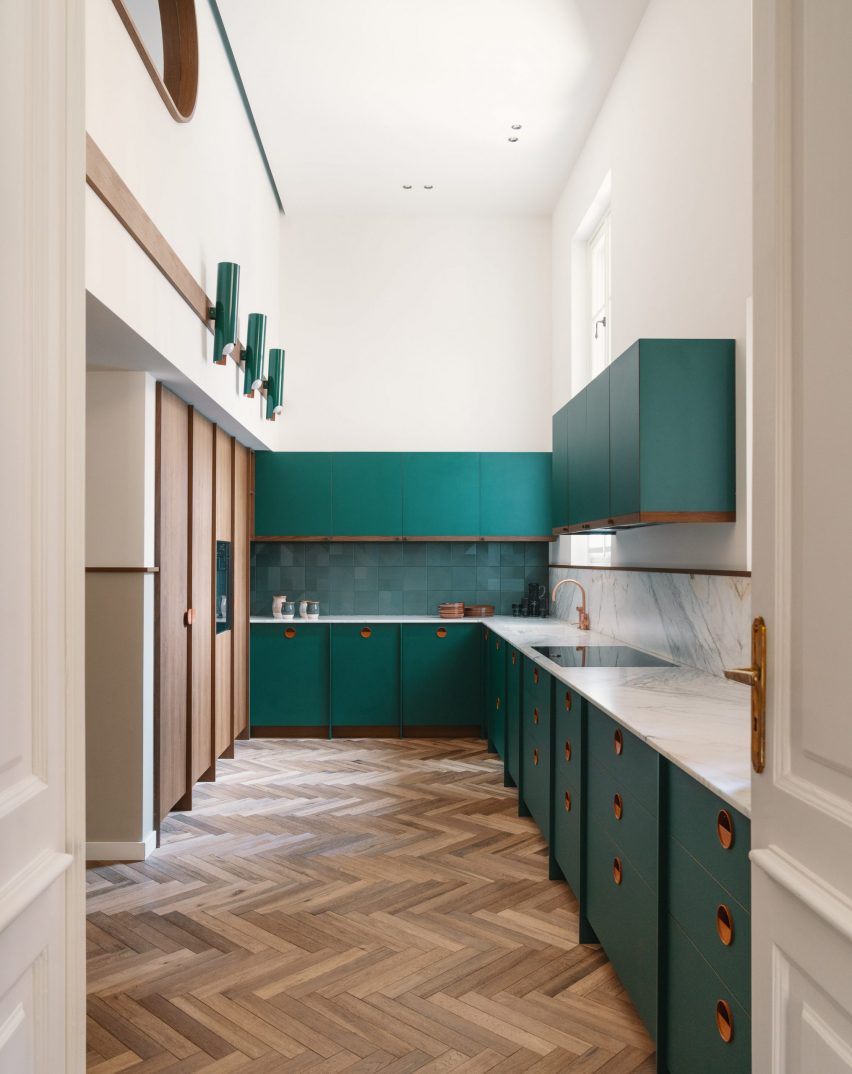
Italian architect Fabio Fantolino used pops of green and petrol blue throughout the interior of this apartment in Turin that he designed for himself.

In the herringbone-floored kitchen, sea-green cabinetry is paired with copper handles.

Find out more about Casa Mille ›


Stained-green kitchen cabinets

House extension, Sheffield, UK, by From Works

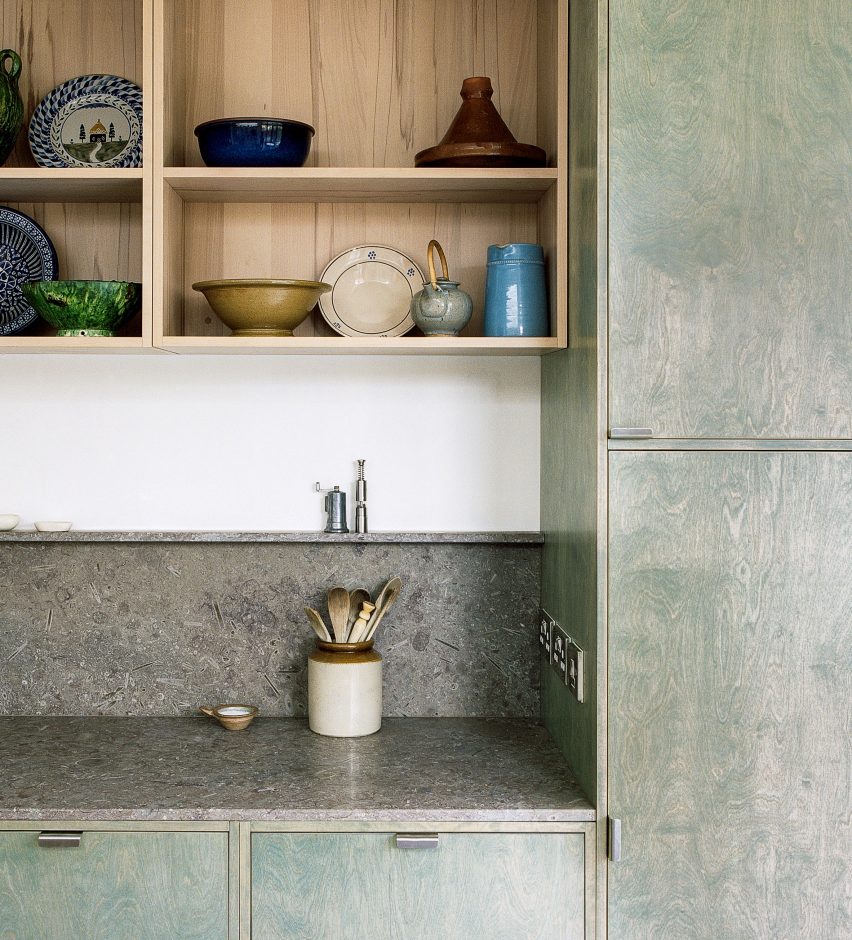
The bespoke kitchen of this house in Sheffield was designed to incorporate the materials and colours of moss-covered rocks found in the nearby Peak District.

It combines green-stained plywood with grey fossil limestone worktops and splashback sourced from a Derbyshire quarry.

Find out more about Sheffield house extension ›


Green kitchen

Waterfront Nikis Apartment, Thessaloniki, Greece, by Stamatios Giannikis

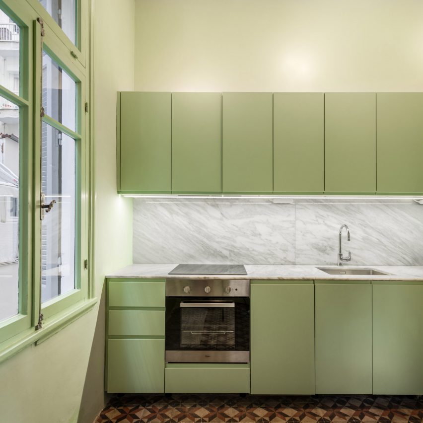
Architect Stamatios Giannikis used colour-blocked walls painted in flamingo pink, azure blue and pastel green to define the different rooms in this seaside apartment in Greece.

The green chosen for the kitchen cabinets and walls was designed to be in sharp contrast with the apartment’s original geometric red and black cement-tile flooring.

Find out more about Waterfront Nikis Apartment ›


Apartment with a mint-green floor

Apartment on a Mint Floor, Porto, Portugal, Fala Atelier

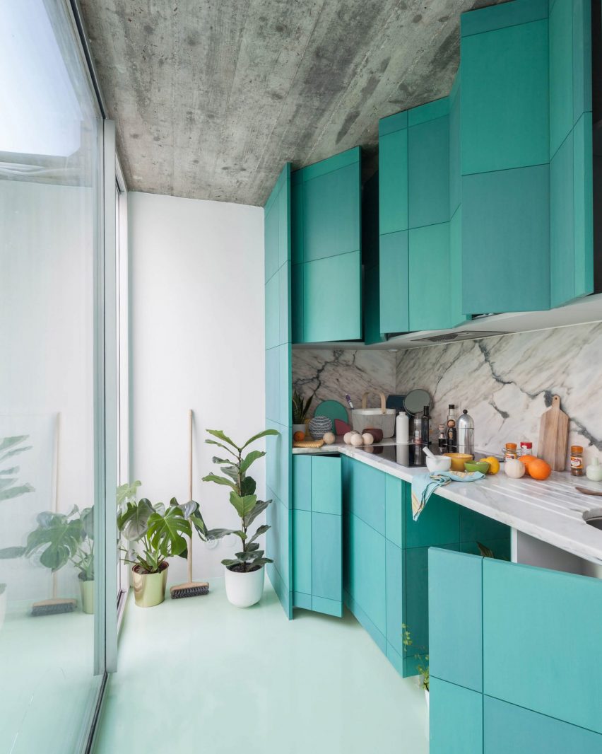
As the name suggests, Fala Atelier created a mint-green floor from epoxy resin throughout this two-bedroom apartment in Porto, Portugal.

To complement the floor, the apartment’s kitchen unit doors were coloured two subtly different shades of turquoise.

Find out more about Apartment on a Mint Floor ›


Green kitchen in Paris apartment

Parisian apartment, Paris, France, by Atelier Sagitta

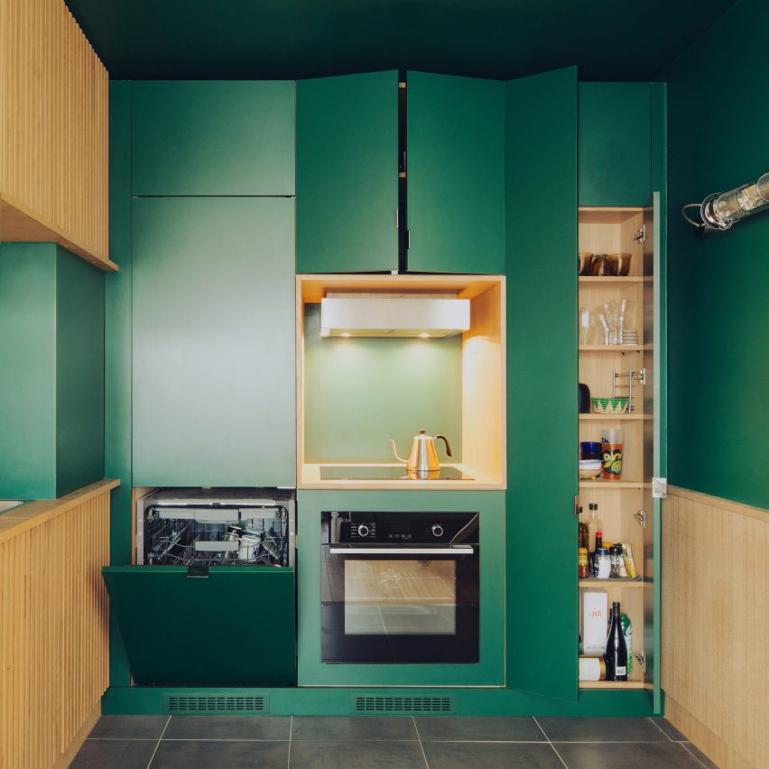
French practice Atelier Sagitta added an almost entirely green kitchen to this previously characterless apartment in Paris.

The emerald-green walls and cabinets, combined with grooved oak cupboards made by a local cabinet maker, make the kitchen the focal point of the apartment.

Find out more about Paris Apartment ›


Plum-purple kitchen walls

Esperinos guesthouse, Athens, Greece, by Stamos Michael

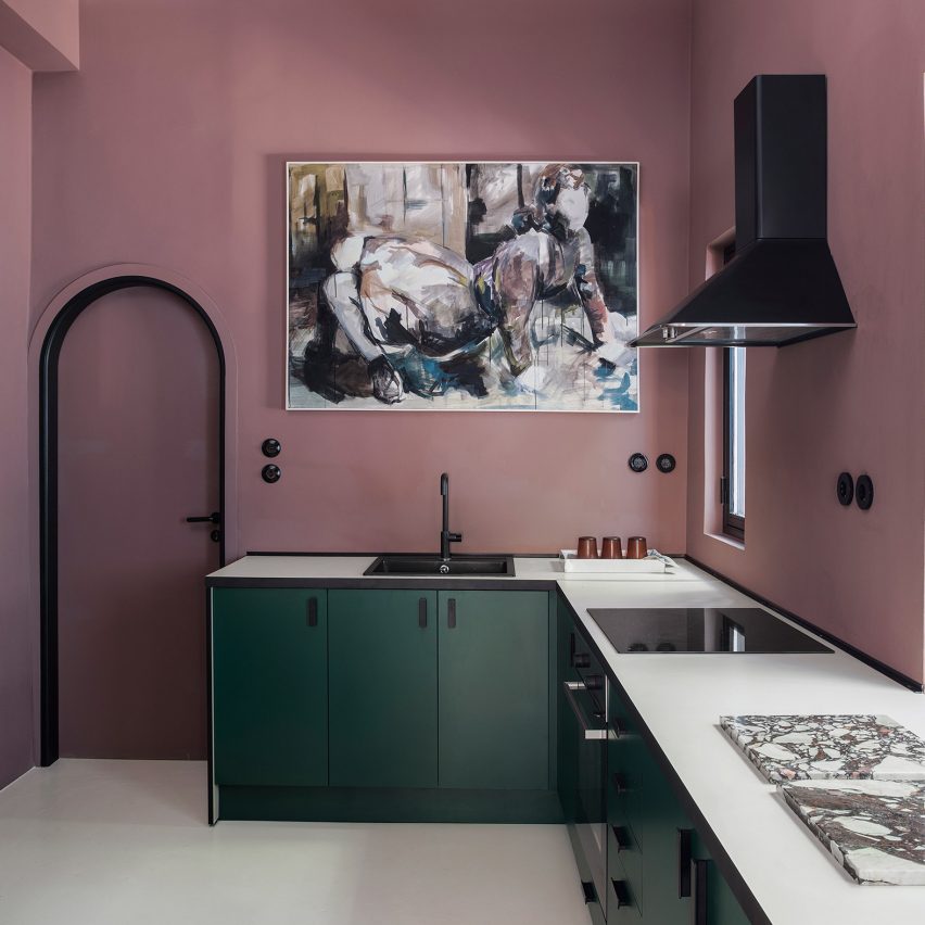
The kitchen of this guesthouse in Athens was painted a plum-purple hue to contrast with the rest of the largely moss-green interiors.

Green was also introduced in the kitchen where dark emerald cabinetry was matched with black, industrial-style shelves that display crockery.

Find out more about Esperinos guesthouse ›


Dark green kitchen cabinets

Apartment #149, Lviv, Ukraine, by Roman Shpelyk

Interior designer Roman Shpelyk designed this apartment in the Ukrainian city of Lviv to have largely simple white interiors.

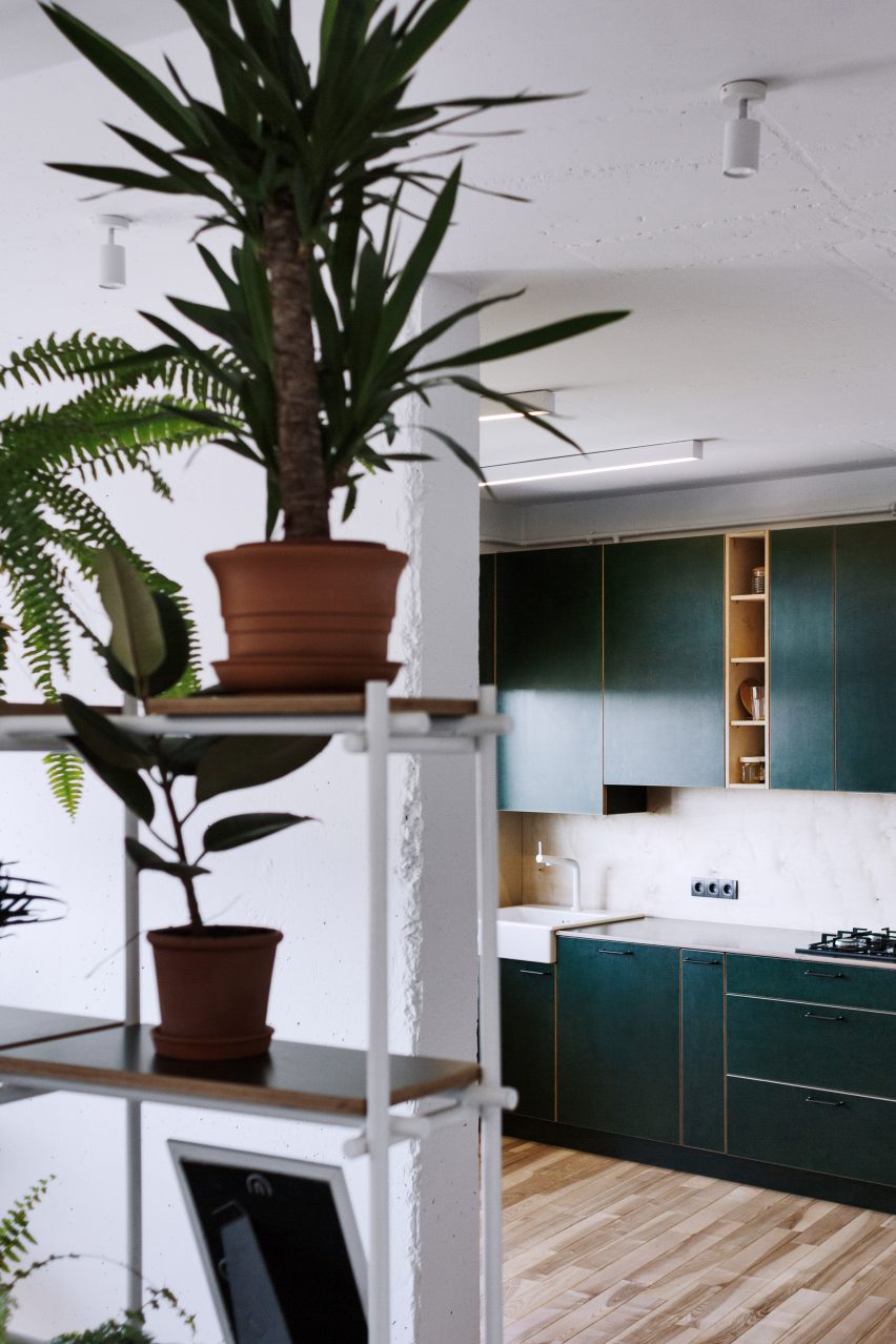
Colour was added with a plant-filled shelving unit and the forest-green laminated-plywood cabinetry in the kitchen.

Find out more about Apartment #149 ›


This is the latest in our series of lookbooks providing curated visual inspiration from Dezeen’s image archive. For more inspiration see previous lookbooks showcasing peaceful bedrooms, calm living rooms and colourful kitchens.

Reference

Domestic interiors with statement plants that bring nature indoors
CategoriesInterior Design

Domestic interiors with statement plants that bring nature indoors

If your home doesn’t have a garden or a balcony, a well-chosen houseplant can bring the natural world inside. The second of a trio of spring lookbooks this Easter weekend showcases 10 domestic interiors with carefully chosen plants.


The projects feature plants ranging from full-sized trees to smaller houseplants such as aloe, peace lilies and ferns.

This is the latest roundup in our Dezeen Lookbooks series providing visual inspiration for the home. Previous articles in the series feature stylish home offices, children’s bedrooms, inspiring outdoor living spaces, and living rooms with beautiful statement shelving.


A living room with a narrow-leafed fig

The Gymnasium by Robbert de Goede

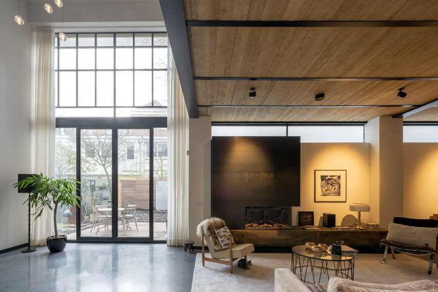
This ground-floor apartment in Amsterdam was once a gymnasium. Converted by architect Robbert de Goede, the airy dwelling features a couple of statement potted plants.

A narrow-leafed fig (Ficus maclellandii Alii) is located next to the glass doors that lead to the terrace while a large fiddle-leaf fig (Ficus lyrata) is placed beside the staircase.

Find out more about The Gymnasium ›


Orange apartment interior with a large peace lily

Trevi House by Studio Venturoni

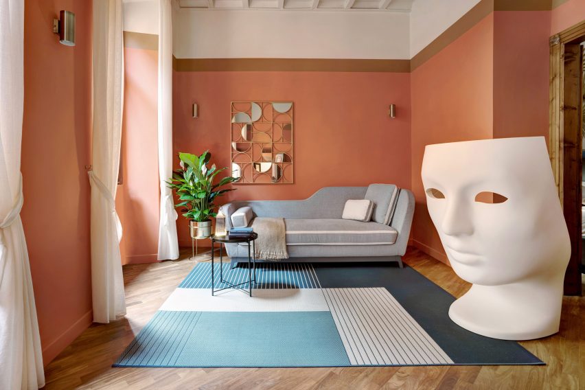
A peace lily (Spathiphyllum) in a raised silver planter complements a Nemo chair by Fabio Novembre in this one-bedroom apartment in Rome designed by Studio Venturoni. The room also features a corn plant (Dracaena Fragrans).

Find out more about Trevi House ›


A white-walled bathroom with a snake plant

Yurikago House by Mas-aqui

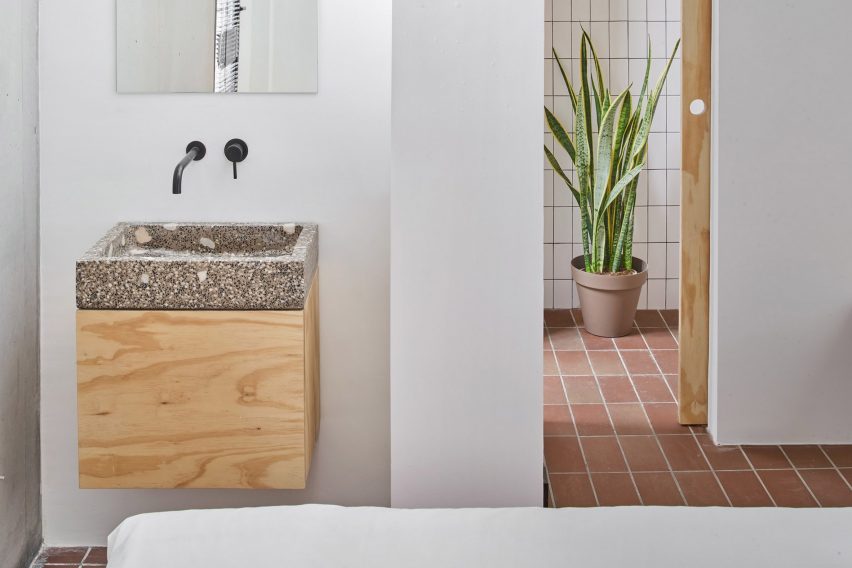
Architecture studio Mas-aqui transformed this Barcelona apartment into a multi-level home featuring a variety of materials including ceramic, plywood, terrazzo and steel.

A single plant, a snake plant or mother-in-law’s tongue (Dracaena trifasciata), guards the entrance to the bathroom.

Find out more about Yurikago House ›


A bedroom overlooking a plant-filled courtyard

A Forest House by Aquiles Jarrín

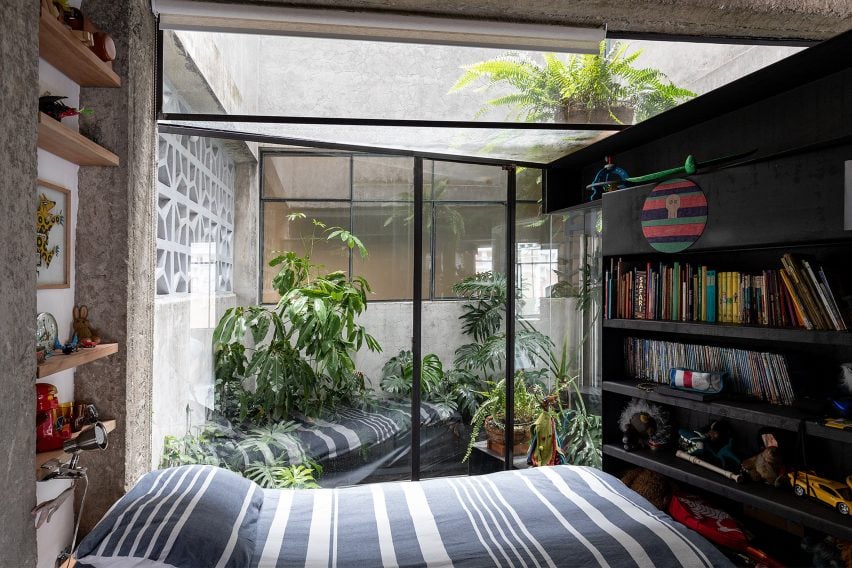
This spectacular apartment in Quito by architect Aquiles Jarrín features several large, architectural plants. Swiss cheese plants (Monstera Deliciosa) are clustered around the indoor pool while an internal courtyard is filled with umbrella trees (Schefflera), ferns and more Swiss cheese plants.

The apartment also features hanging baskets planted with a chain of hearts (Ceropegia woodii).

Find out more about A Forest House ›


A white-walled apartment with a large Kentia palm

Apartment in Lavapies by Leticia Saá

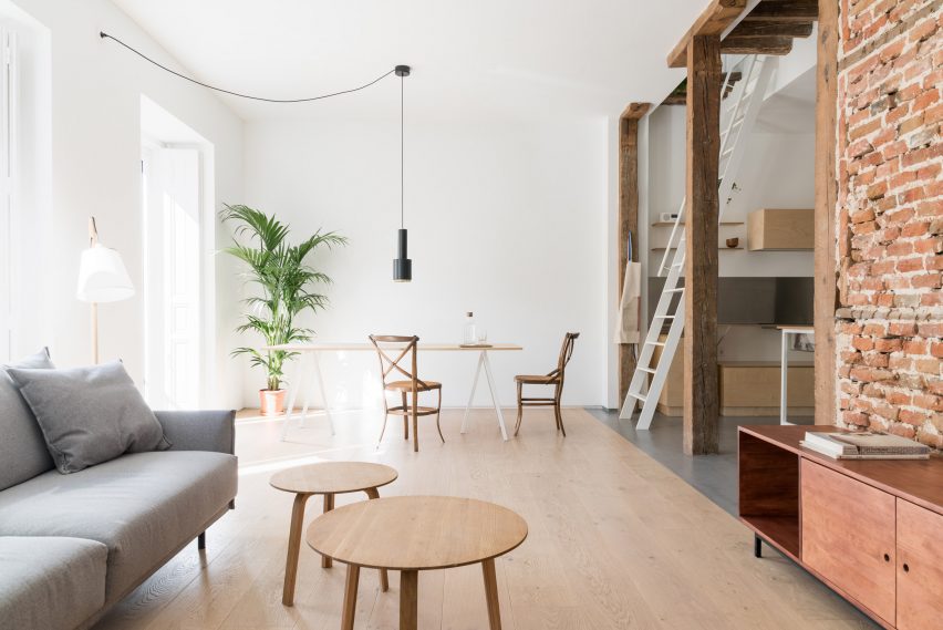
Architect Leticia Saá’s conversion of a Madrid apartment features a plant in every room. A large Kentia palm (Howea forsteriana) occupies a bright corner in the dining area while a giant white bird of paradise plant (Strelitizia nicola) is a key feature in the living area.

Smaller plants are dotted around the rest of the apartment (although it looks as if the photographer has used the same specimen in several of the photos).

Find out more about Apartment in Lavapies ›


A white kitchen with plants and wooden cabinetry

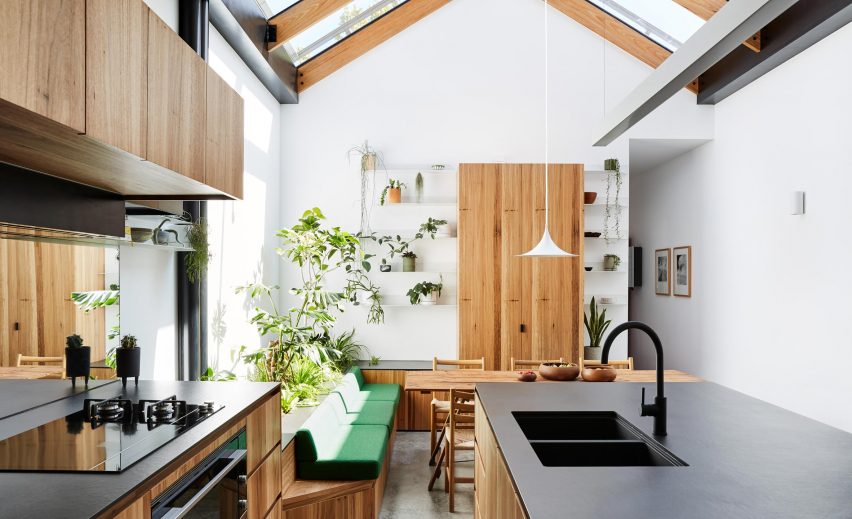
Newry House by Austin Maynard Architects

Austin Maynard Architects transformed a narrow Melbourne house by adding a raised indoor bed beneath a glass roof over the dining area.

Planted with a range of species including a philodendron and ferns, the border creates a leafy, living backdrop to the built-in banquette.

Find out more about Newry House ›


A minimalist apartment with a giant cactus

Apartment A by Atelier Dialect

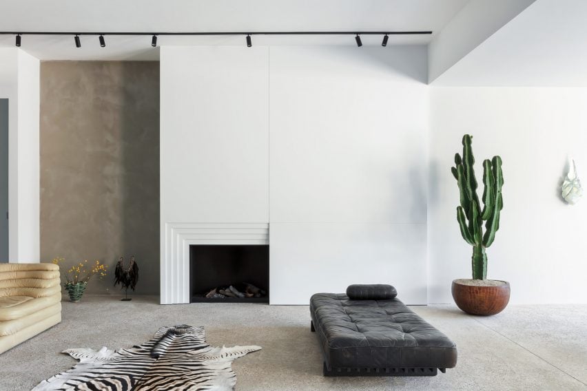
Atelier Dialect chose a spectacular cereus peruvianus as the finishing touch to its elegantly minimal conversion of an Antwerp apartment.

The giant cactus is the only plant in the home, which is otherwise finished with materials including cement, exposed-aggregate concrete and mirrored steel.

Find out more about Apartment A ›


A white-walled living room with indoor plants

Casa SD by Escribano Rosique Arquitectos

There are more plants than furnishings in this spartan house near Valladolid in Spain by Escribano Rosique Arquitectos.

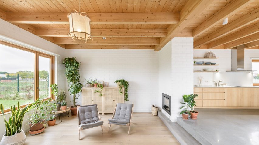
Arranged around an open courtyard and featuring open-sided living spaces, the white-brick interior is dotted with including various species of ficus including a rubber plant (Ficus elastica) as well as a snake plant (Dracaena trifasciata).

Find out more about Casa SD ›


A concrete living room with a large screw pine tree

Brutalist Tropical Home by Dan Mitchell and Patisandhika

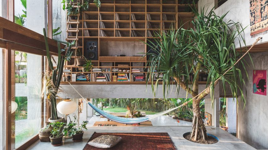
A large screw pine (Pandanus utilis) grows out of the living room floor in this brutalist home in Bali.

Created by designer Dan Mitchell and architectural studio Patisandhika, the concrete dwelling sits amid lush tropical vegetation and features a terrace planted with palms.

Find out more about Brutalist Tropical Home ›


A minimalist house interior

A White House, A Growing Home by RIGI Design

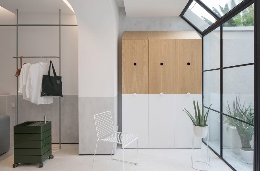
An aloe plant in a raised planter has been paired with a white Hee dining chair by Hay in the bedroom of this converted Shanghai home by RIGI Design.

The succulent is one of many plants artfully placed around the home, which also features a courtyard scattered with more plants in containers.

Find out more about A White House ›

Reference