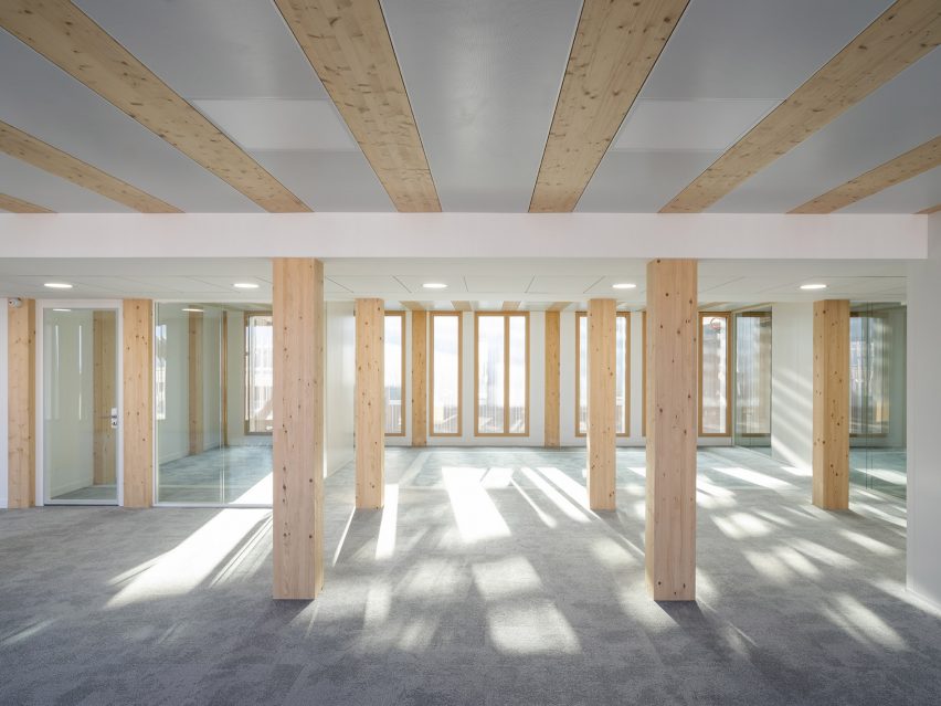
Waugh Thistleton Architects designs mass-timber Black & White Building
CategoriesSustainable News

Waugh Thistleton Architects designs mass-timber Black & White Building

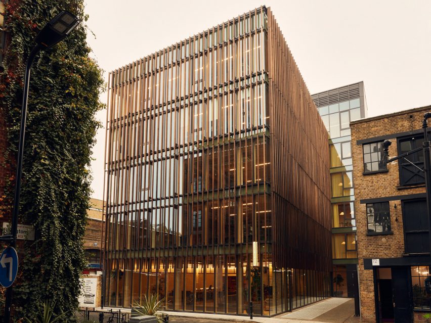
London studio Waugh Thistleton Architects has unveiled the Black & White Building, a mass-timber office building designed for The Office Group in Shoreditch with a slatted tulipwood facade.

The 17.8-metre-high office building, which the studio says is the “tallest mass-timber office building in central London”, was built from a combination of beech, pine and spruce timber.

Black and White building made from mass timber
The building is located in Shoreditch, east London

Constructed from structural timber, Waugh Thistleton Architects clad the exterior of the six-storey building in tulipwood timber louvres from the street level to the roof.

“The design means that you also get the beauty of the timber internally,” Waugh Thistleton co-founder Andrew Waugh told Dezeen.

“It’s a simple form driven by the context of timber engineering, as well as the context of the surrounding Victorian buildings – these were also constructed using current methods and built to a brief,” Waugh added.

“There is no narrative here, it is pure modernism.”
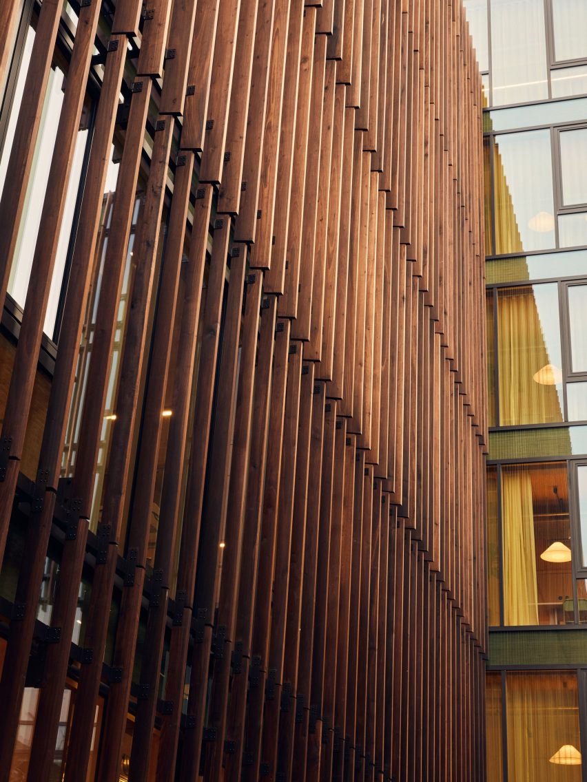
Tulipwood timber cladding on the Black and White building
Tulipwood louvres protect it from the sun

Waugh Thistleton Architects constructed the 4,480-square-metre Black & White Building from prefabricated components that were precision-engineered to be slotted together.

This means the building, which Waugh describes as “visibly sustainable”,  is dismantlable and can be disassembled rather than demolished at the end of its life with its materials reused.
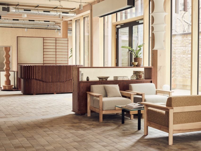
Wood-clad interior of London office building
Wood was also used to decorate the interior, with sculptures created from wood beams

Its foundation and lower ground floor were made from concrete, with the rest of the structure constructed from cross-laminated timber (CLT).

Curtain walling was made from glued laminated timber (glulam), while columns and beams were constructed from laminated veneer lumber (LVL), which the studio said helps save on space.

“We have CLT panels for the core and CLT panels for the floors,” Waugh Thistleton Architects associate director David Lomax said. “And then the columns and beams are made from quite a highly engineered product called LVL.”

“We’re talking about typically, at the lowest level where the loads are greatest, about 100 millimetres on each side of the column saving in its dimensions,” he added.

“That’s made out of beech, which is a hardwood so it performs much, much better. [It’s] smaller columns.”
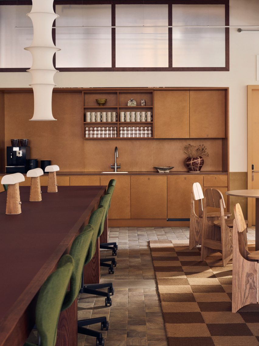
Inyterior of Black and White office building
London studio Daytrip designed the interior

According to the studio, by using engineered-wood materials rather than a traditional concrete and steel structure, the building saves “thousands of tonnes in CO2” as it generates much less greenhouse gas.

The building also has at least 37 per cent less embodied carbon than comparable concrete structures, according to The Office Group (TOG).

It was named the Black & White Building as it replaces an earlier building on the site, a Victorian brick warehouse with a timber interior that had been painted black and white.

The existing building was deteriorating and not suitable for a retrofit, Waugh Thistleton Architects said.

“It couldn’t be extended – it was very small and had no foundations,” Waugh said. “Extending it would have been just a cosmetic exercise. This isn’t romance, it’s architecture.”
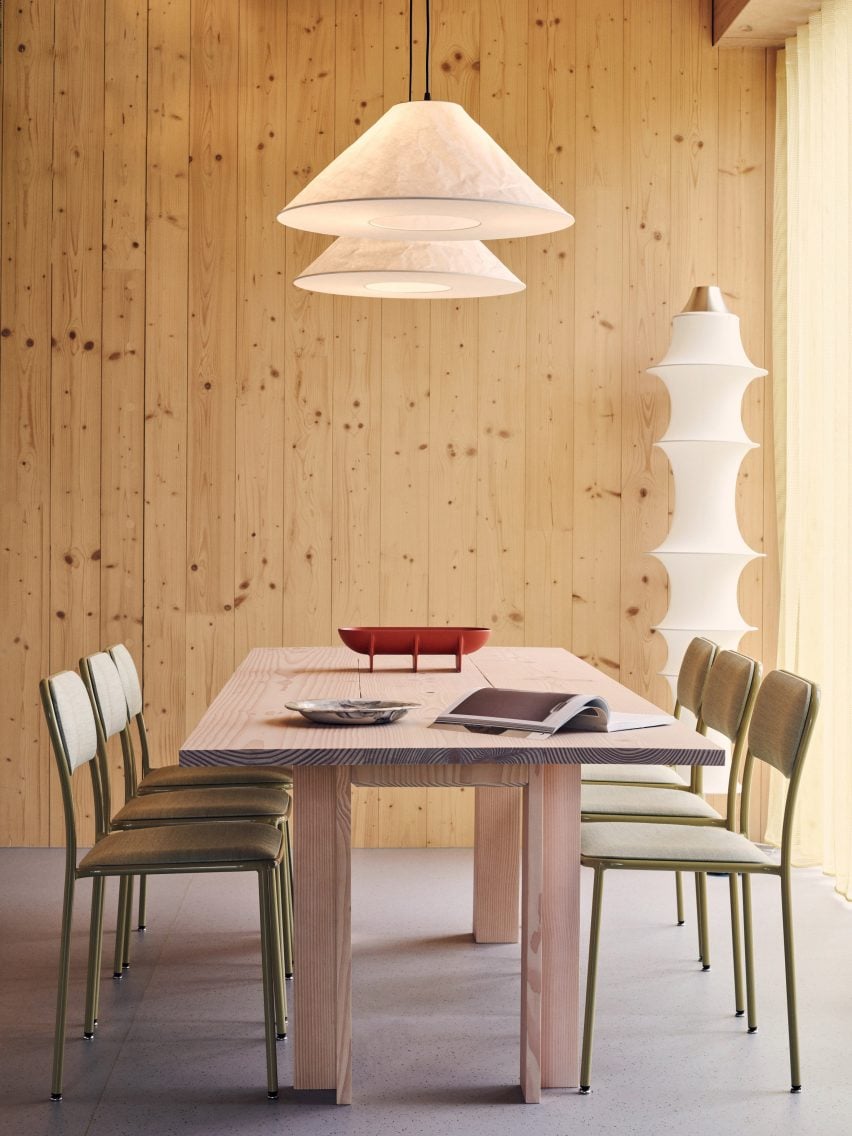
Workspace inside the Black & White building by Daytrip
Warm hues contrast the timber walls inside

After meeting Waugh at a panel talk about sustainability, TOG co-founder Charlie Green asked him to instead create a new building that would be suitable for the site.

“We took our planning consented scheme, and we used the envelope and the massing of that to ask Andrew to create something within that form that’s timber,” Green said.

“He did more than that, he redesigned it so we had a more efficient core position to create a better flow of space, and came up with this timber scheme.”

The office is partly powered by 80 photovoltaic panels on its roof, with all other energy coming from green suppliers, Green said.
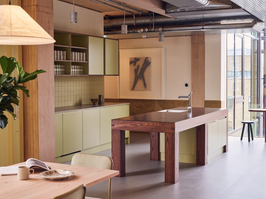
Daytrip-designed interior of Shoreditch office building
“Wasabi green” was used for the interior

Design studio Daytrip created the interior of the building, which contains 28 offices in different sizes as well as six meeting rooms, break-out areas and focus booths and a dedicated yoga and barre studio on the ground floor.

The building’s timber features are also visible inside, where the timber walls match the wooden furniture.

“We reacted to the original concept and the sustainable drive and wanted to continue that in the interiors,” said Daytrip co-founder Iwan Halstead.

“We wanted to respect and celebrate the timber part of the architecture.”
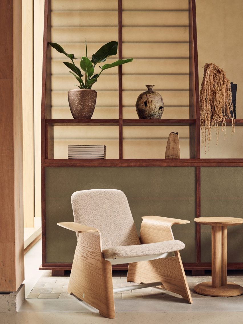
Wooden furniture in interior by Daytrip
Most of the furniture comes from UK suppliers

Timber beams from the Victorian warehouse that previously occupied the site were kept and turned into wooden sculptures that decorate the ground-floor lobby.

Daytrip aimed to also keep the furniture as local and sustainable as possible.

“A lot of the specifications and furniture are UK suppliers and that was something that we wanted to make an effort to achieve, and we’ve done it with 80 per cent of the furniture,” Halstead said.

The overall interior design was informed by Tokyo’s original Hotel Okura, a mid-century modern hotel that was demolished in 2015 but has since been rebuilt.

A colour palette of muted green and earthy hues, which Daytrip gave names like “wasabi green,” is combined with tactile materials, including some made from recycled components.
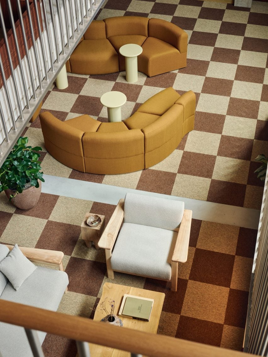
Chequered floor inside The Office Group building in Shoreditch
The interior design was informed by Hotel Okura in Tokyo

At the top of the building sits a rooftop terrace, while a central lightwell was designed to help maximise the building’s natural light.

The building is “about sustainability more than anything,” Waugh said. “It’s a bright future for architecture, not the hair shirt and oat milk that sustainability is always described as.”

TOG operates more than 50 workspaces in the UK and Europe. These include an office in Borough Yards with an interior by Danish designer David Thulstrup, and a Euston workspace with an interior informed by nearby buildings such as the British Library.

The photography is by Jake Curtis.

Reference

Smart sockets reduce building energy consumption
CategoriesSustainable News

Smart sockets reduce building energy consumption

Spotted: Small power refers to unfixed electrical equipment, products, and appliances, commonly plugged into the electricity network. In an office environment, there may be thousands of these devices left turned on 24/7, and they can account for up to 40 per cent of energy usage. Yet, it is not practical to go around turning these devices on and off all the time.

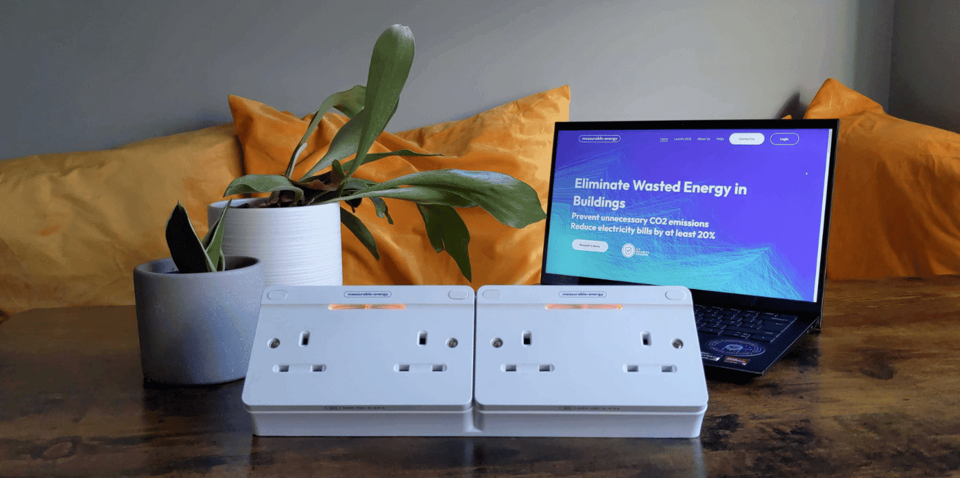
To lower the energy usage of small power, startup measurable.energy has developed a smart socket designed specifically for commercial use that incorporates machine learning to automatically measure and eliminate small power waste. The sockets work like a normal socket but contain software that can automatically identify devices plugged into the sockets, monitor their energy use, report granular real-time data, and automatically turn devices on or off to avoid wasted energy.

The sockets can measure the exact usage of small power energy per socket, showing when and where energy is in use or wasted. Organisations can then use this data to decide the best way to cut back on energy usage.

On its website, measurable.energy emphasises that its hardware and software is designed to help individuals and businesses adjust their behaviour to use more renewable energy. The company writes that their solution, “pays back within two years and allows businesses to reduce electricity bills by at least 20 per cent.”

Nowadays, it seems like just about every appliance and device has smart capabilities. When used correctly, many of these can help people save energy and money. Some recent smart devices Springwise has spotted include a smart cooking pot that helps users save energy, and a self-powered smart pillow that monitors sleep.
Written By: Lisa Magloff

Reference

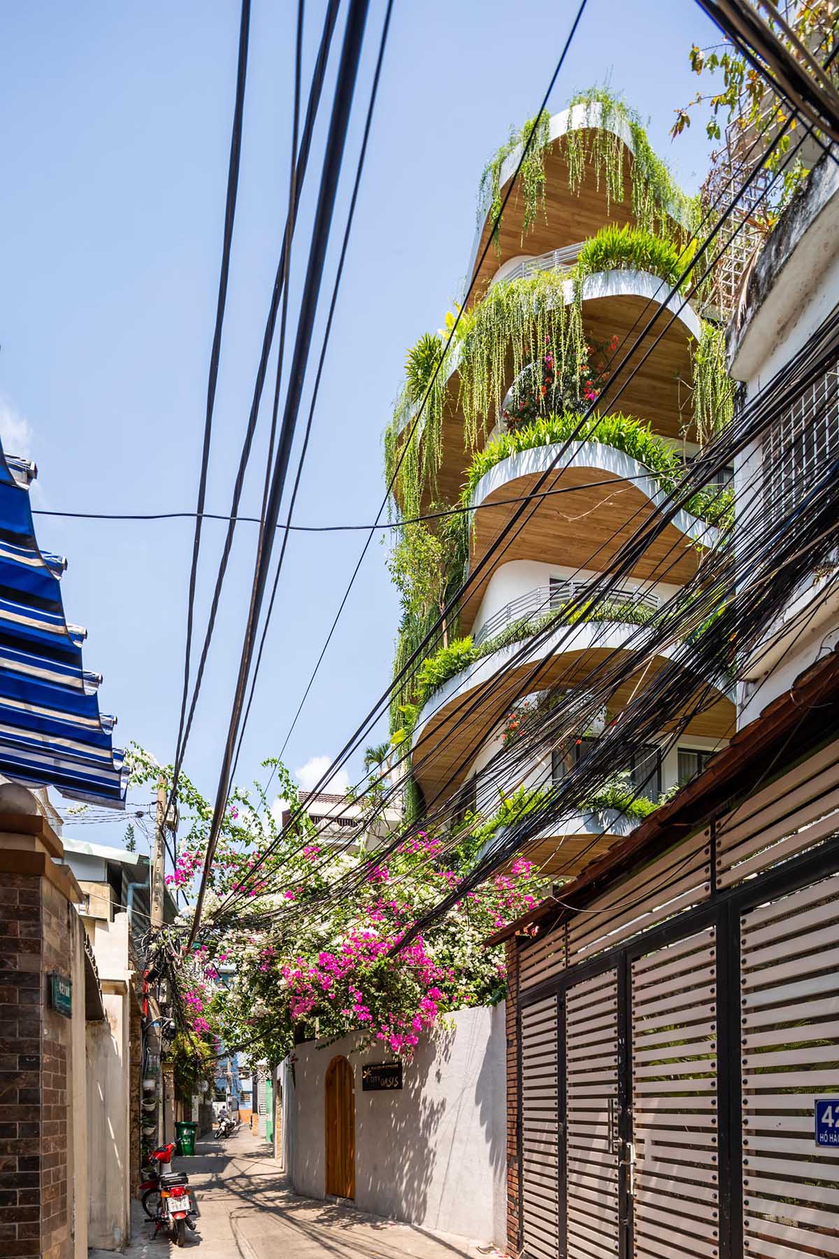
Wavy Balconies With Overhanging Plants Are A Design Feature On This Apartment Building
CategoriesArchitecture

Wavy Balconies With Overhanging Plants Are A Design Feature On This Apartment Building

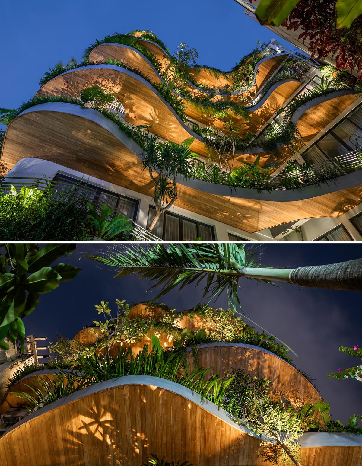
A modern building with curved balconies and overhanging plants.

Architecture firm K.A Studio has designed the remodel of an apartment building in Ho Chi Minh City, Vietnam, that included the addition of green space.

A modern building with curved balconies and overhanging plants.

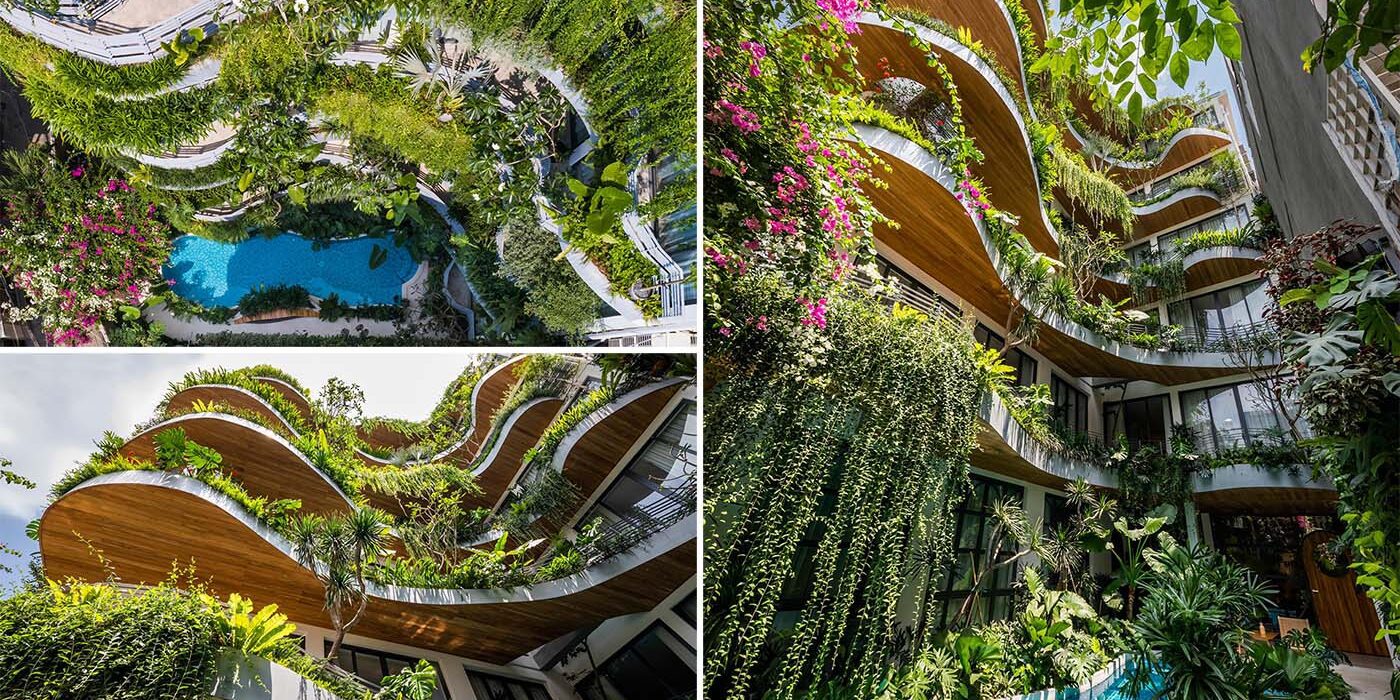
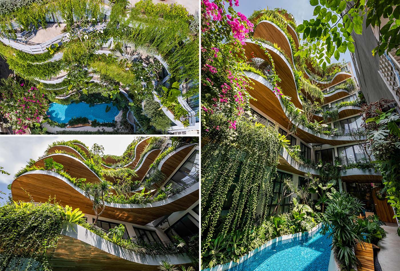
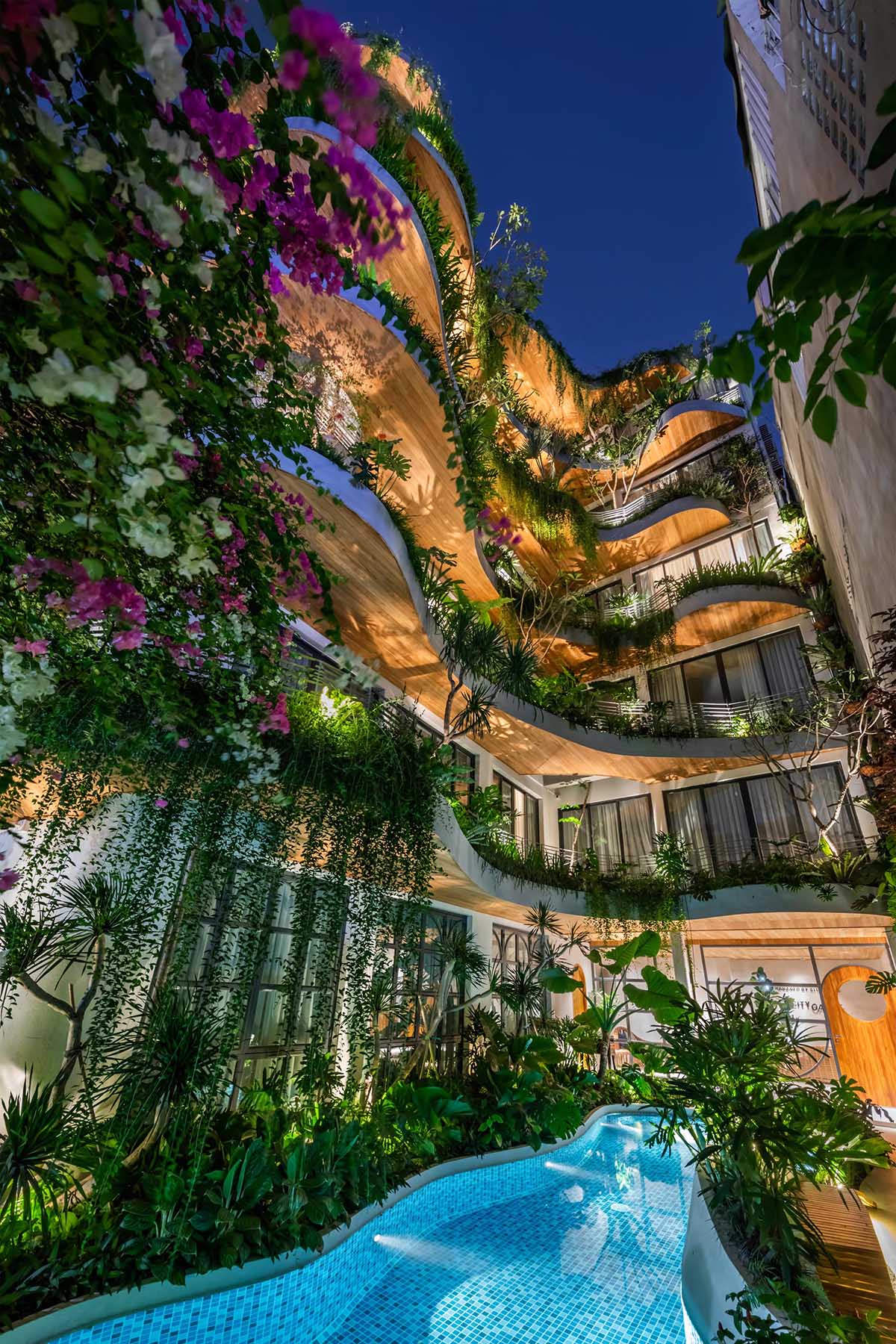
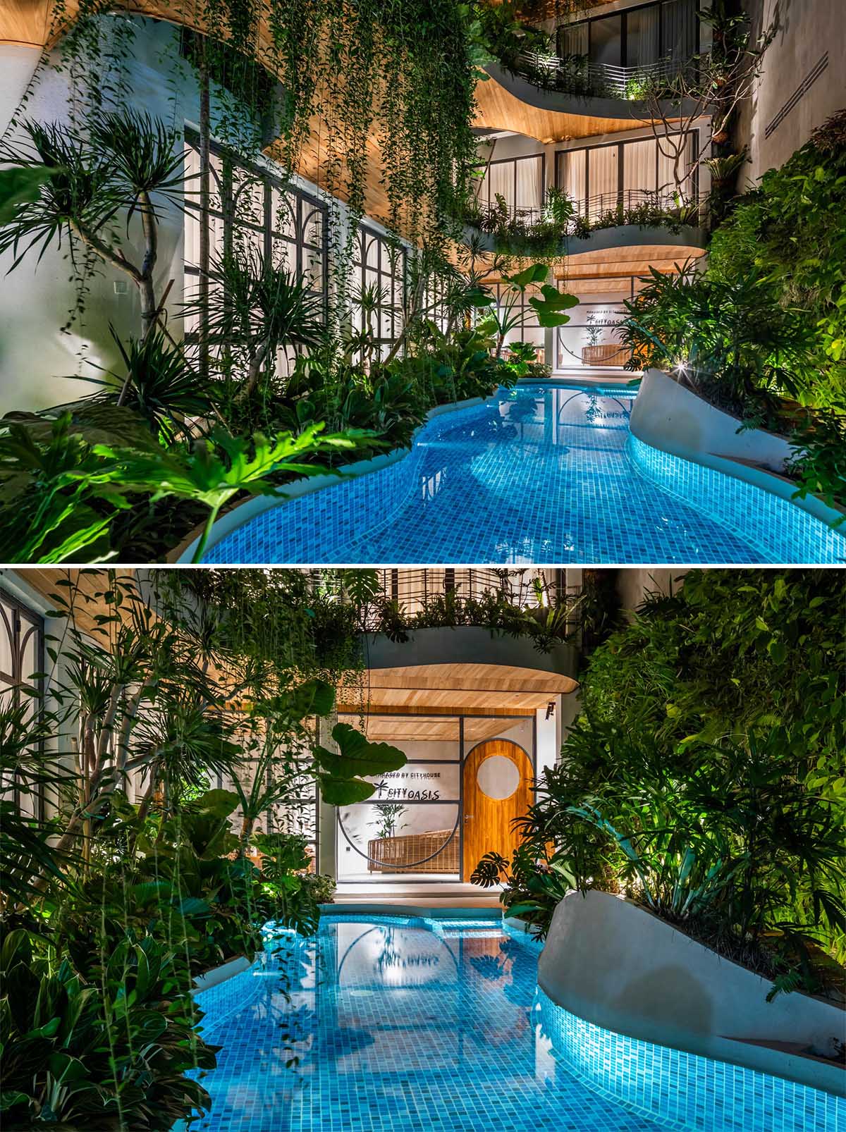
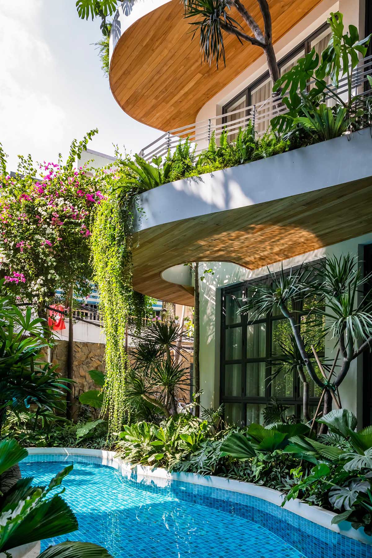
In an area filled with concrete and hard lines, this updated apartment building, which is now used for staycations, has been designed as an oasis in the city, with the curved balconies creating a soft edge on the facade.

A modern building with curved balconies and overhanging plants.

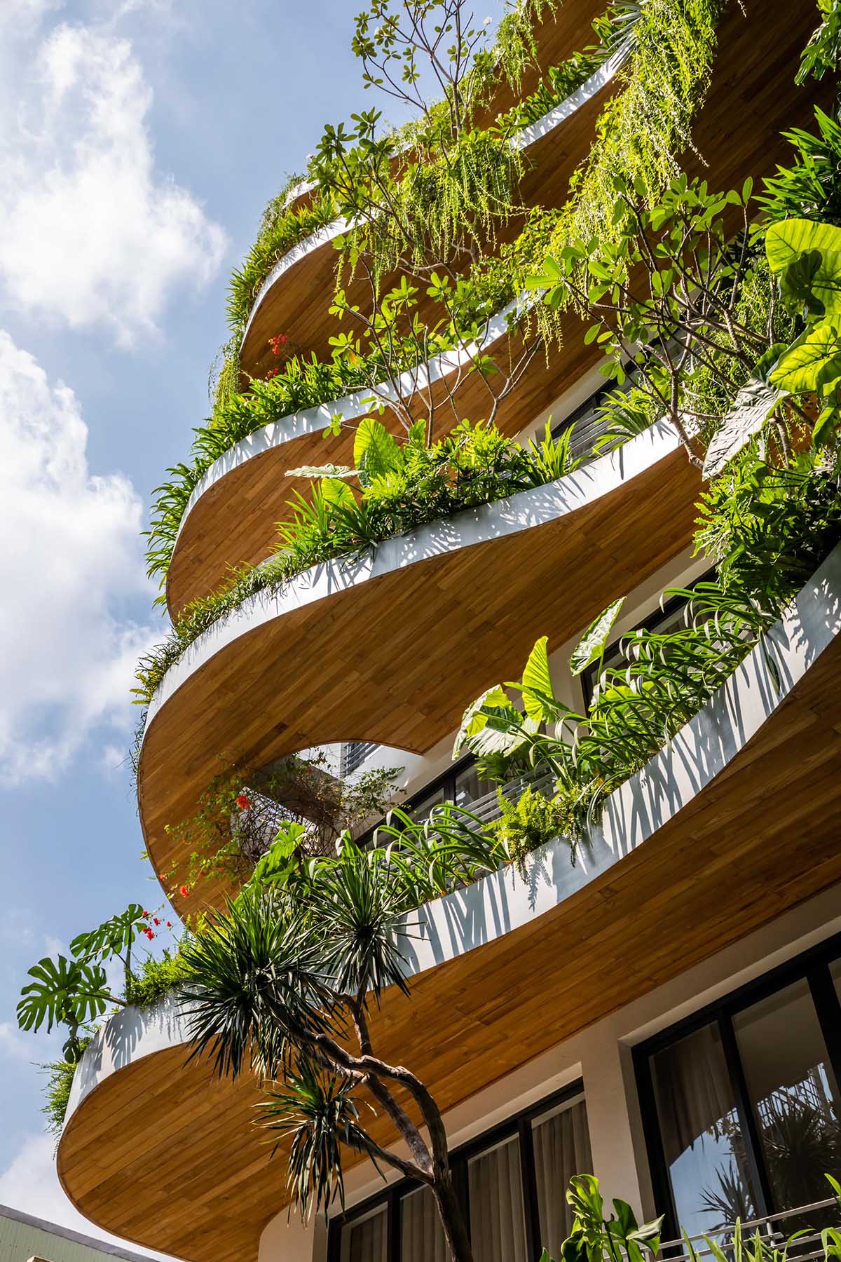
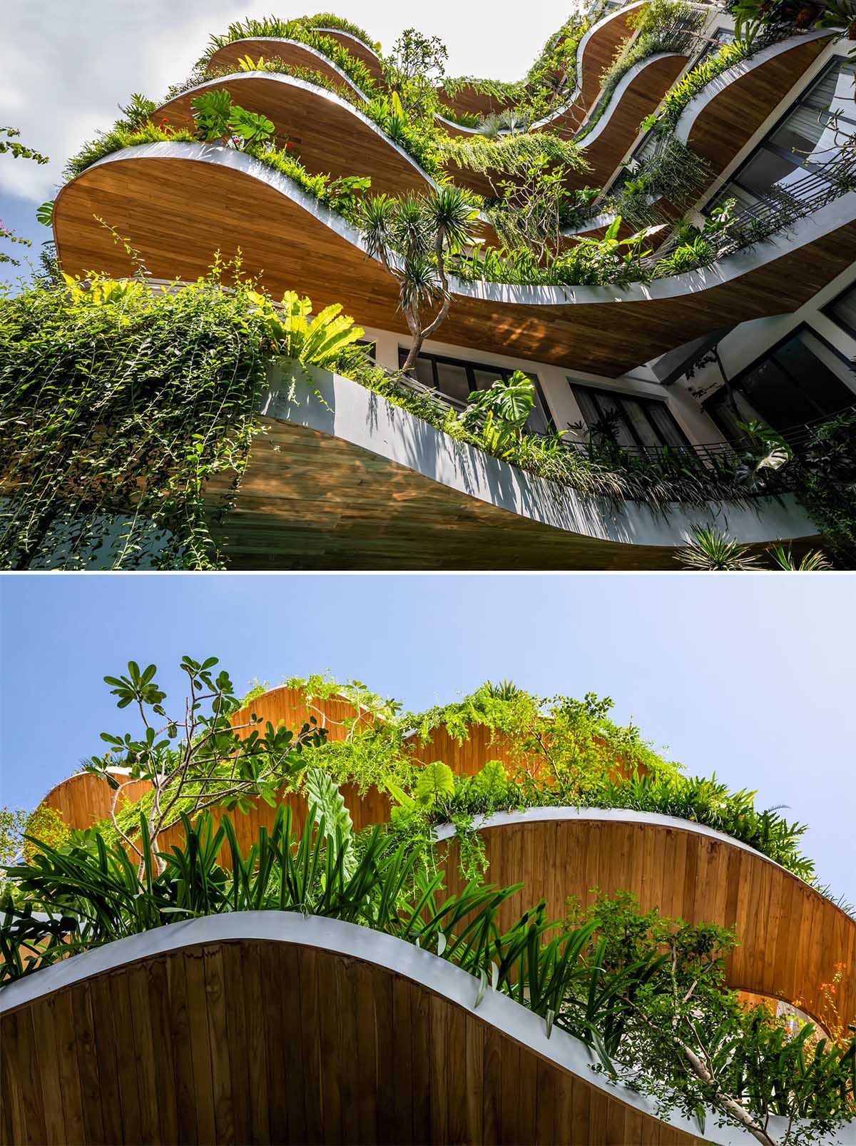
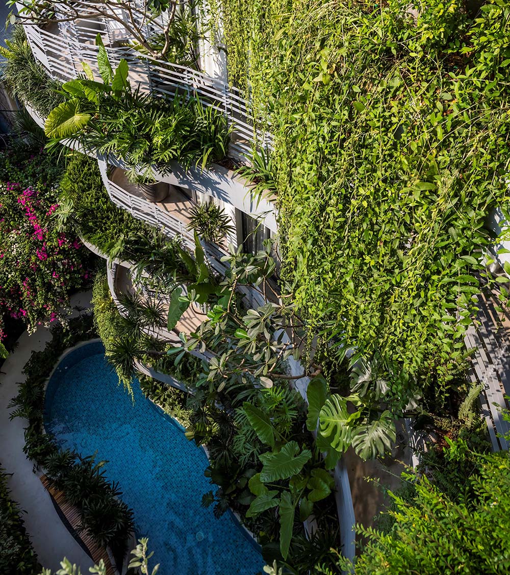
Overhanging plants cascade down the side of the building, while taller plants add different layers and grow up between the voids created by the balconies.

A modern building with curved balconies and overhanging plants.

The underside of the balconies is lined with wood, adding to the natural look of the building.

The underside of these balconies is lined with wood, adding to the natural look of the building.

At night, uplighting creates shadows on the balconies above.

At night, uplighting creates shadows on the balconies above.
A modern building with curved balconies and overhanging plants.

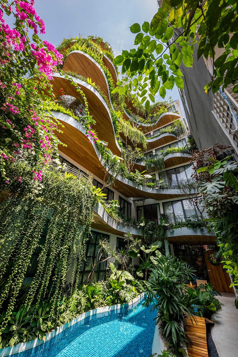
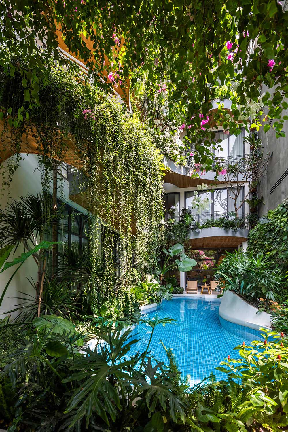
The balconies overlook a pool that’s located on the ground floor and has curves that mimic the exterior of the building.

A curved swimming pool complements the curved balconies above.
A modern building with curved balconies and overhanging plants.

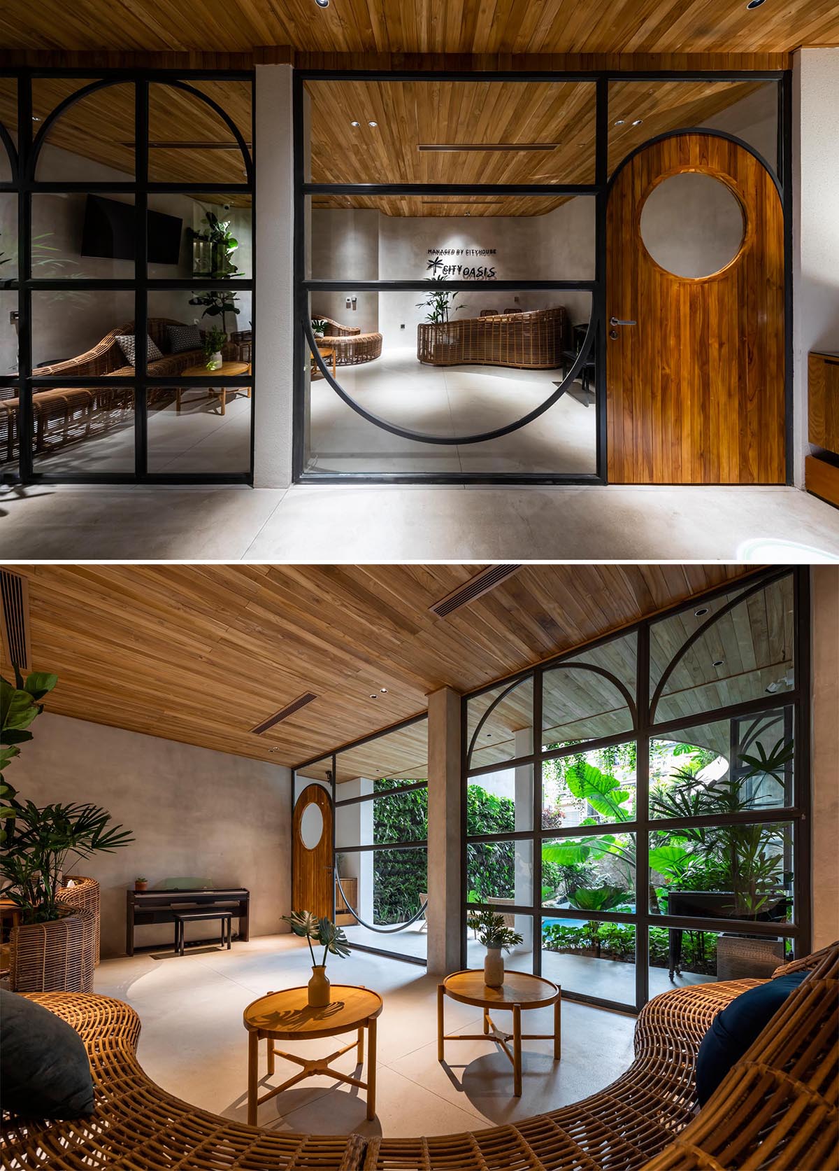
Throughout the building materials like woods, local split stones, concrete, terrazzo, and rattan are featured.

The interior of this building features materials like woods, local split stones, concrete, terrazzo, and rattan.

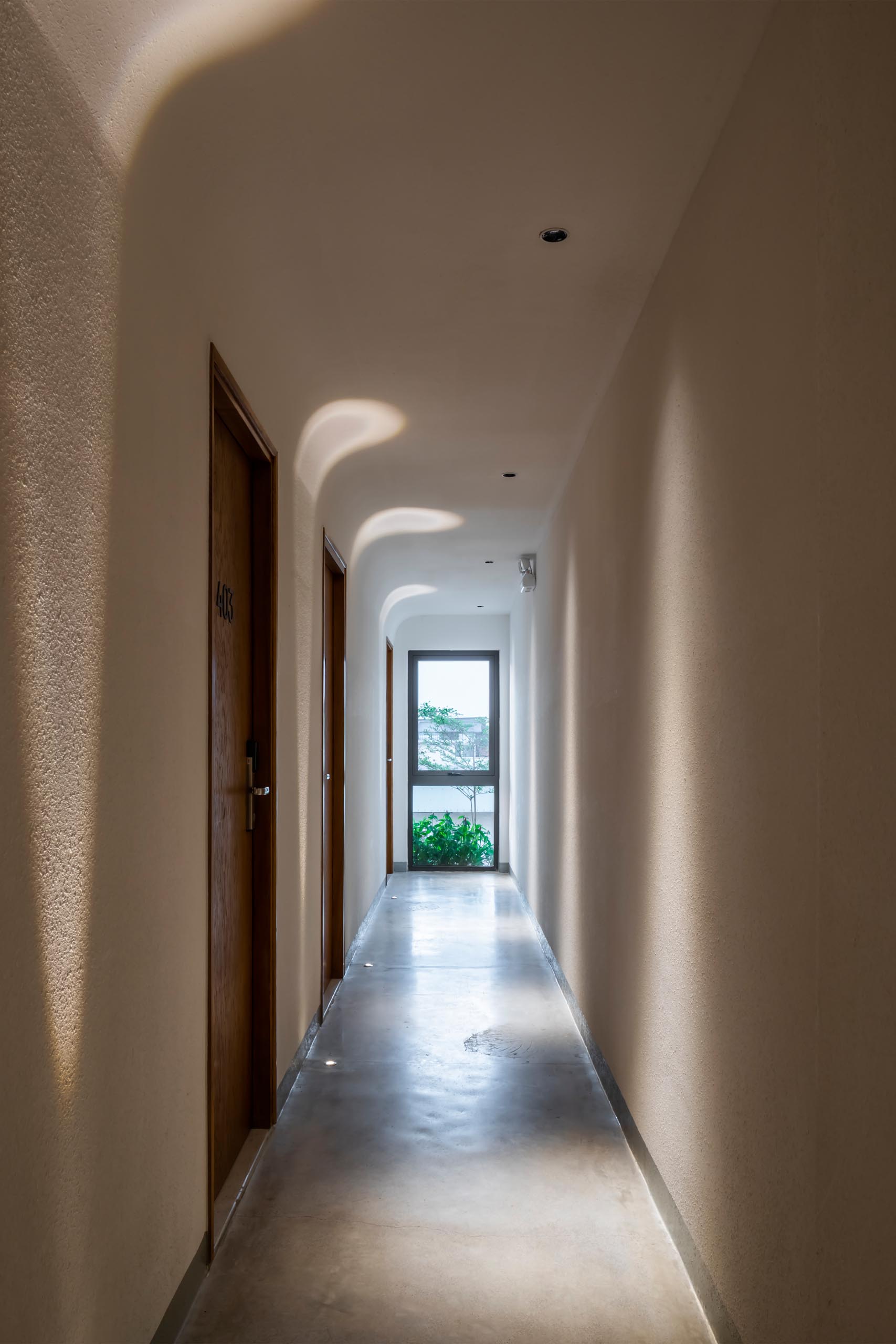
Bright hallways with lighting embedded in the concrete floors, and in the ceiling, guide guests to their private apartments.

Bright hallways with lighting embedded in the concrete floors, and in the ceiling, guides guests to their private apartments.

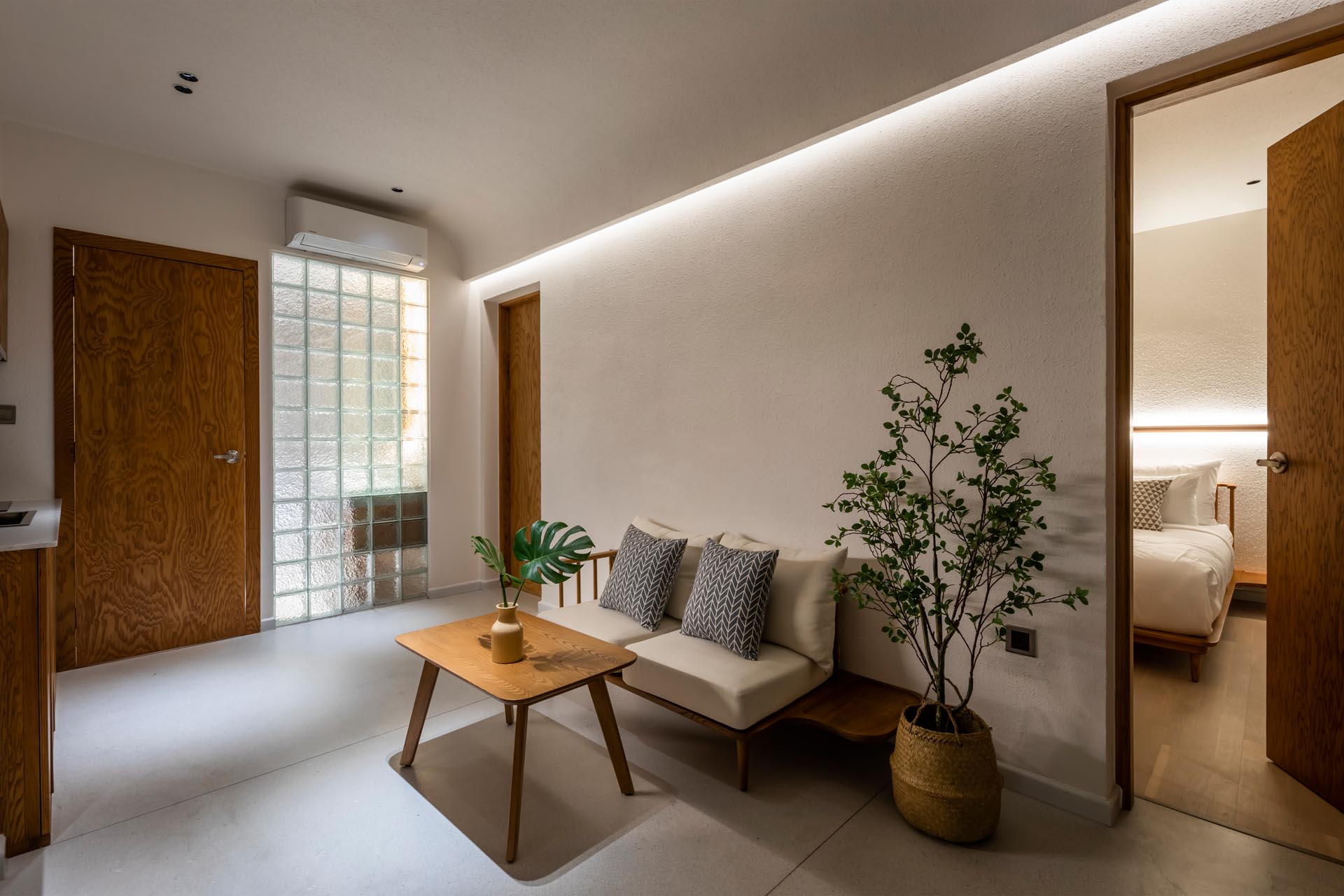
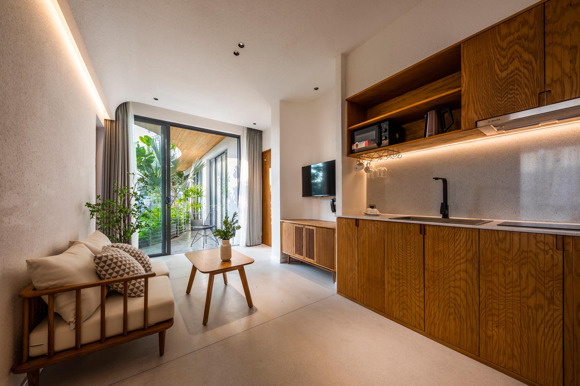
The apartments are minimal in their design, with simple wood furniture in the living room, and a kitchenette.

A minimalist apartment interior with LED lighting and a small living room.
A minimalist apartment interior with LED lighting, a small living room, and kitchenette.

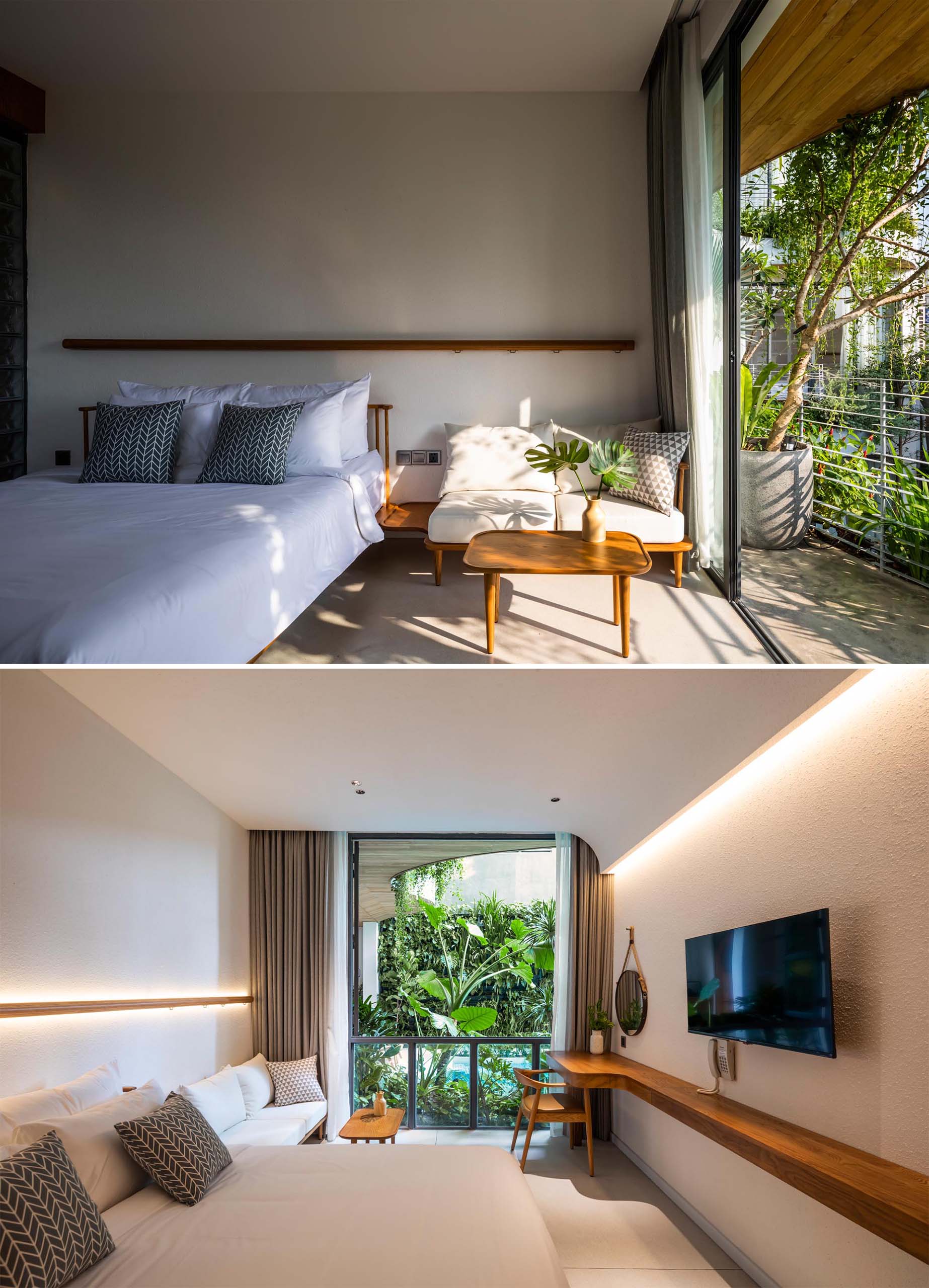
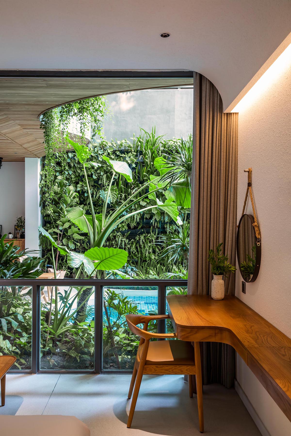
In the bedroom, a horizontal wood accent above the bed hides LED Lighting, which also complements the lighting on the opposite wall. There’s also a floating wood desk that lines the wall, and a sliding door opens to a balcony.

In this bedroom, a horizontal wood accent above the bed hides LED Lighting, which also complements the lighting on the opposite wall.
A floating wood desk.
Photograph: Hiroyuki Oki | Architects: K.A Studio | Lead Architects: Doan Quoc Khanh | Design team: Dang Anh Khoa, Hoang Anh Dung, Tran Quoc Nhat, Le Duc Duy | Construction: La Maison Du K

Source link

Instead Of Stairs, A Spiraling Ramp Was Designed For This Office Building
CategoriesInterior Design

Instead Of Stairs, A Spiraling Ramp Was Designed For This Office Building

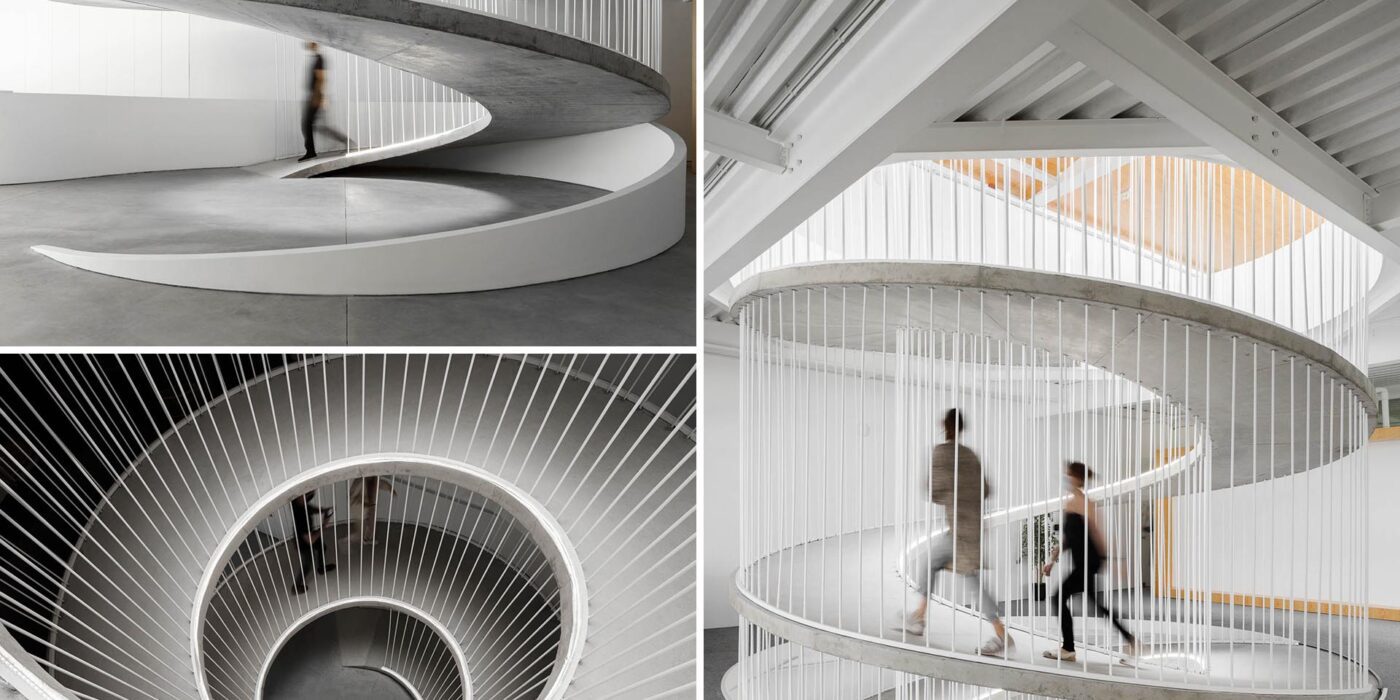
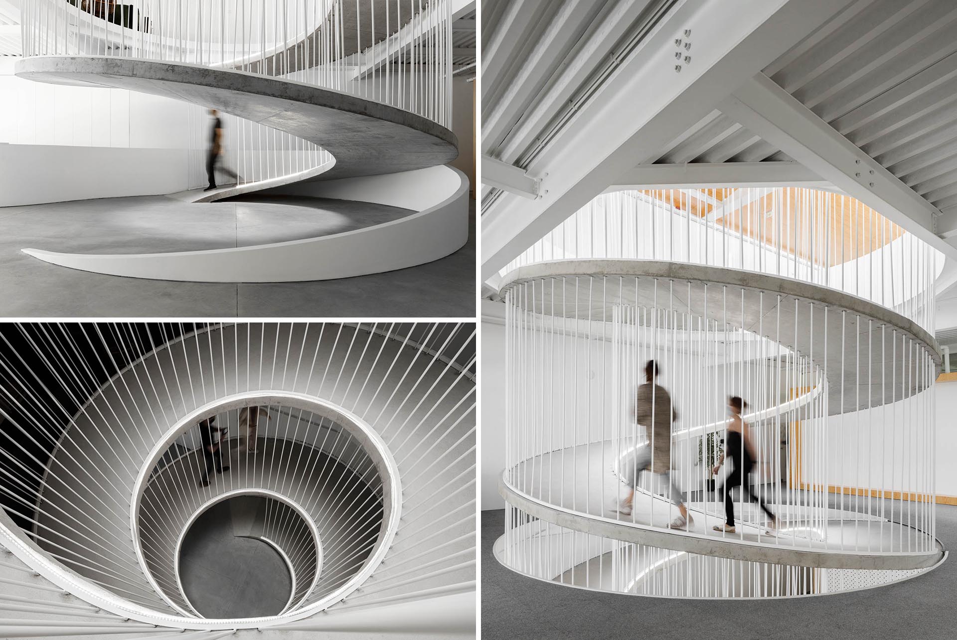
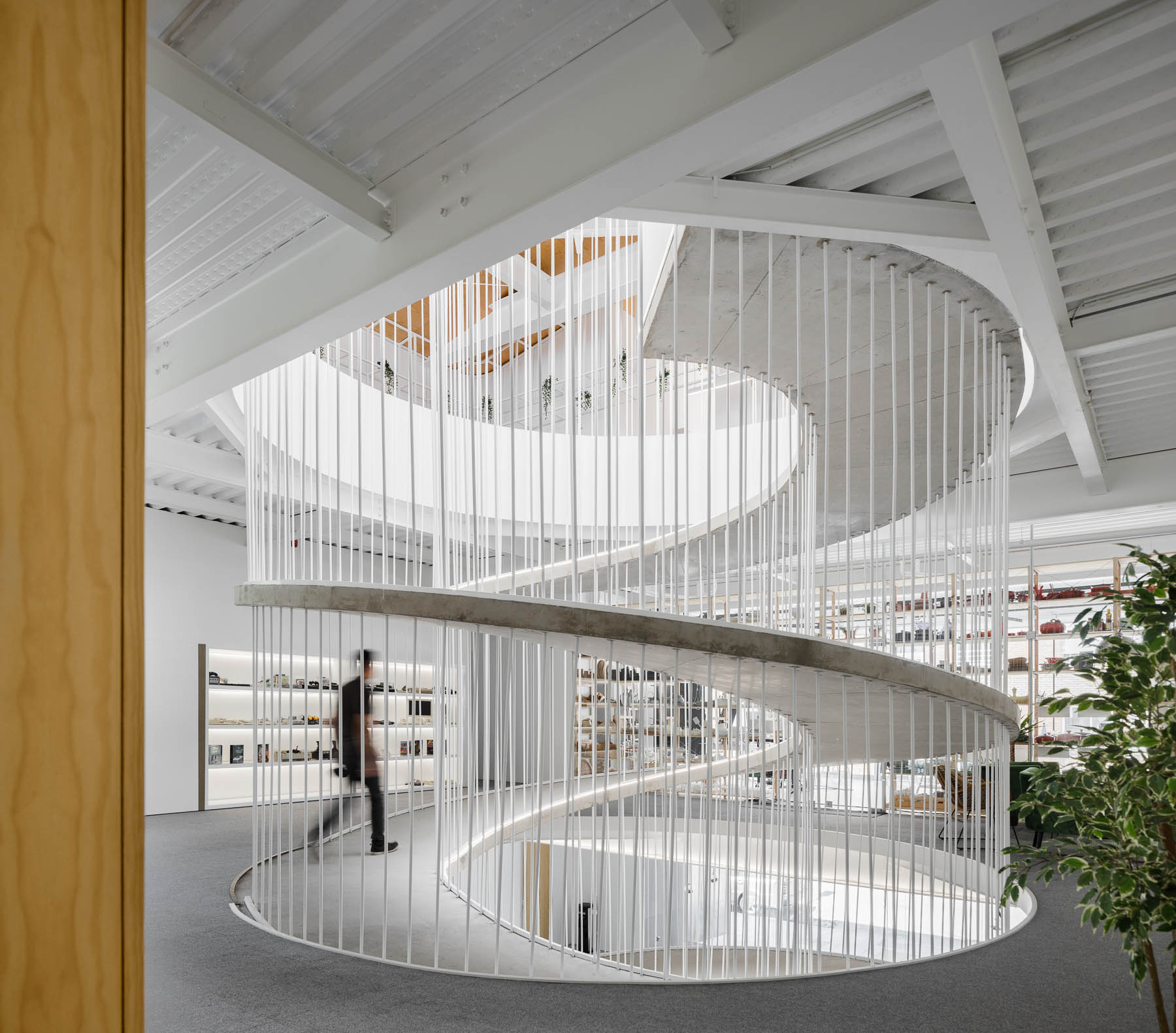
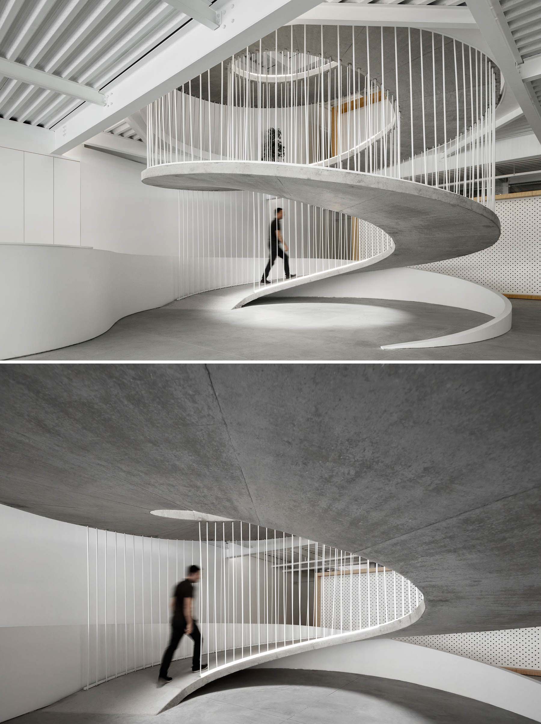
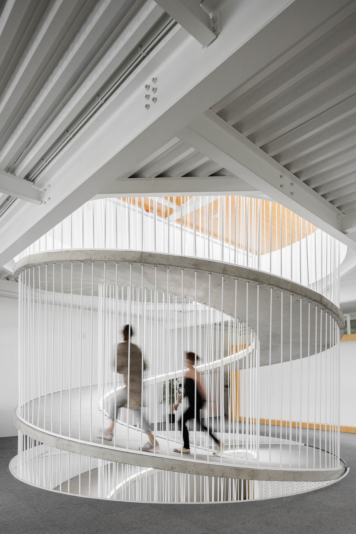
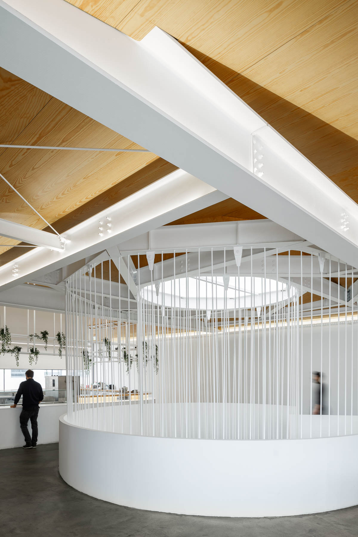
A spiraling ramp replaces the need for stairs in this modern office and adds a sculptural element.

PAULO MERLINI architects has designed the offices of E-GOI & CLAVEL´S KITCHEN in Portugal, and one of the main design features central to the interior is a spiraling ramp.

A spiraling ramp replaces the need for stairs in this modern office and adds a sculptural element.

The former warehouse, which has now been transformed into offices that span multiple floors, includes a ramp that replaces the need for a staircase.

A spiraling ramp replaces the need for stairs in this modern office and adds a sculptural element.

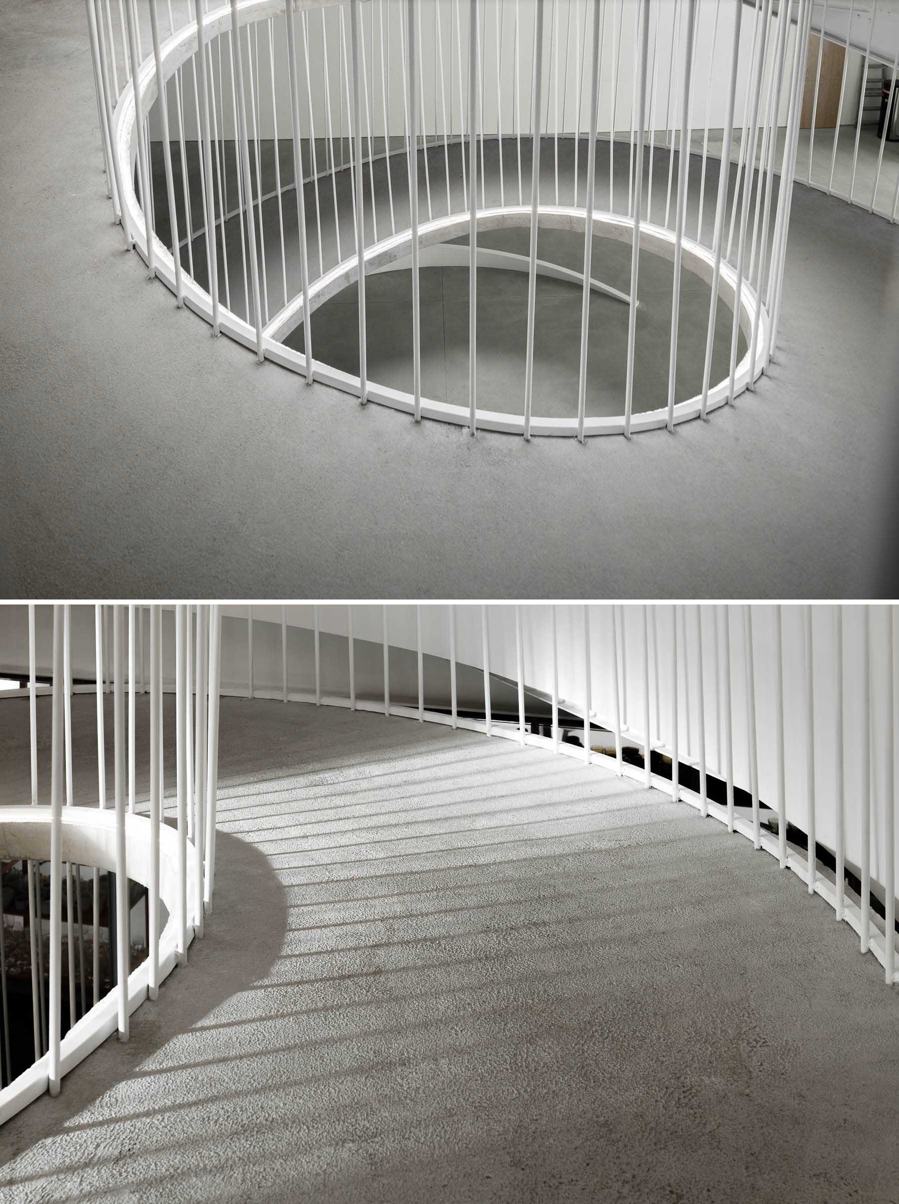
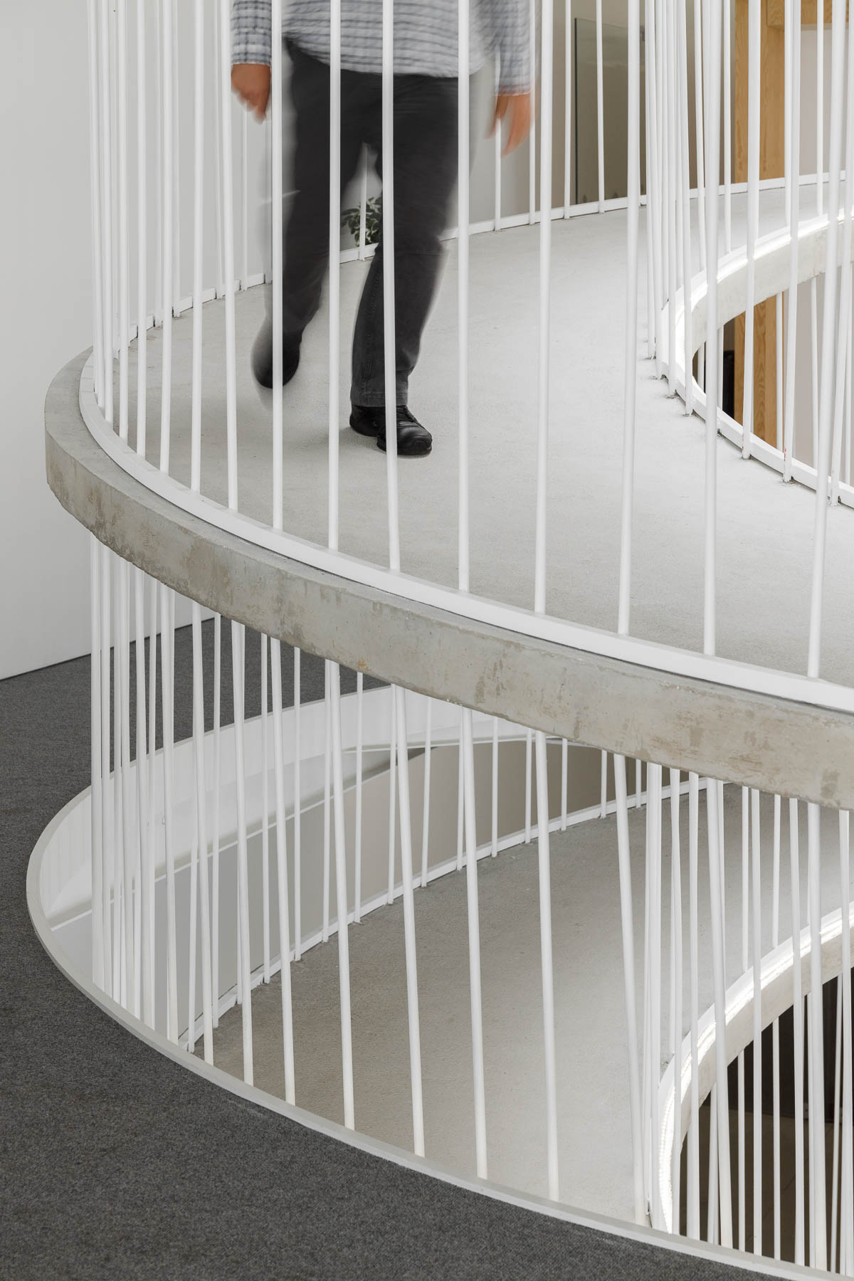
The elegantly curves of the concrete form is accentuated by the use of white bars and edges.

A spiraling ramp replaces the need for stairs in this modern office and adds a sculptural element.

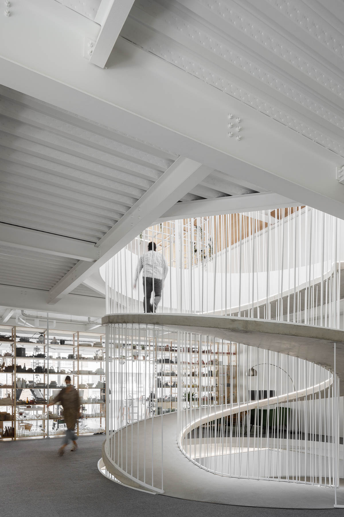
The circling ramp connects the floors of the office and adds a sculptural element that doesn’t block the light from traveling throughout the interior.

A spiraling ramp replaces the need for stairs in this modern office and adds a sculptural element.
A white frame and supports connect the top of a spiraling ramp with the ceiling.

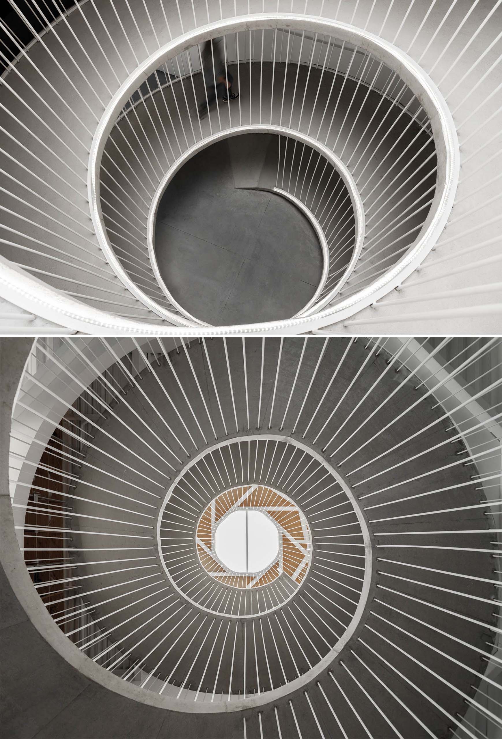
Here’s a glimpse of the ramp looking down from the top floor, and up from the ground.

A spiraling ramp replaces the need for stairs in this modern office.

Let’s take a look at the rest of the office…

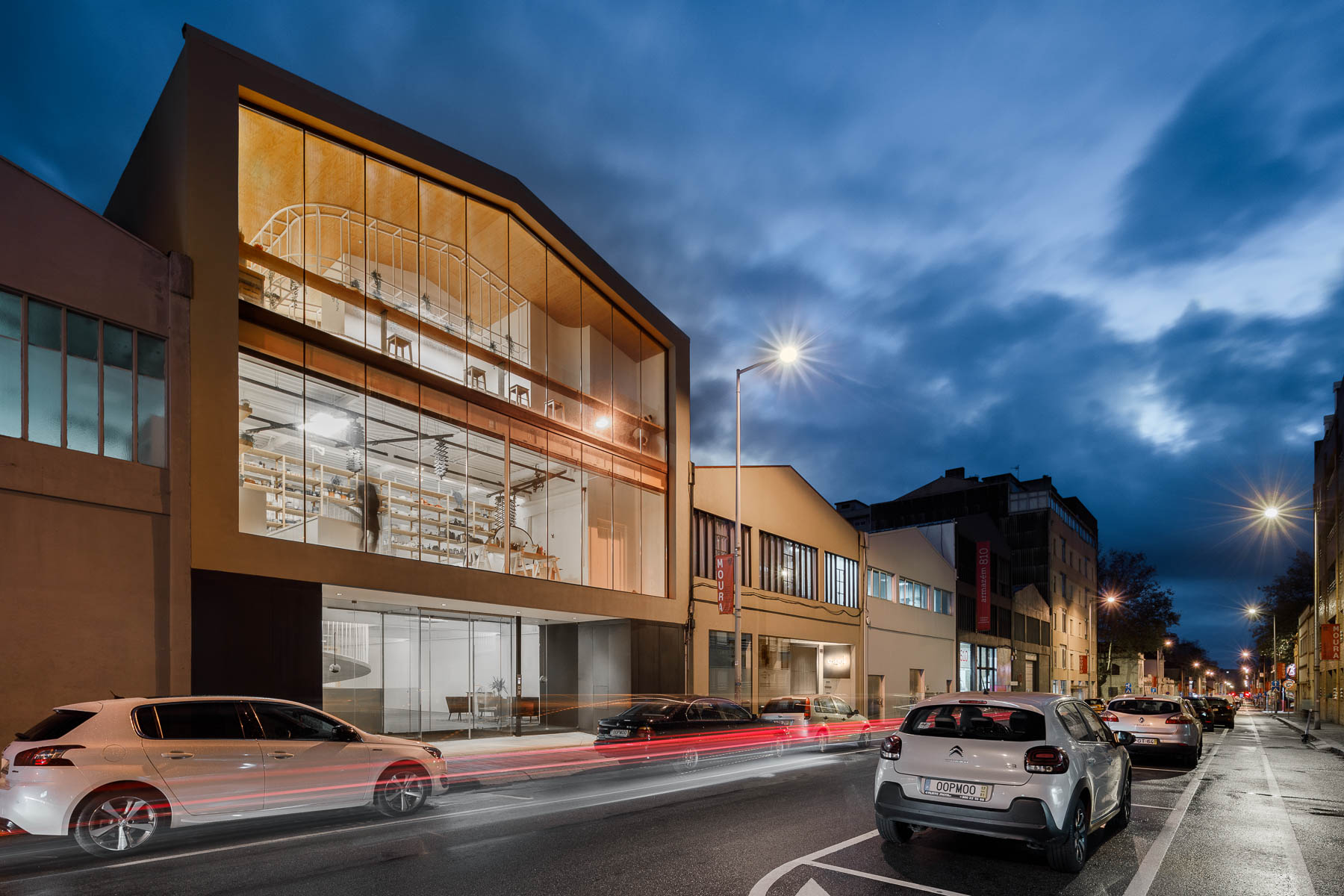
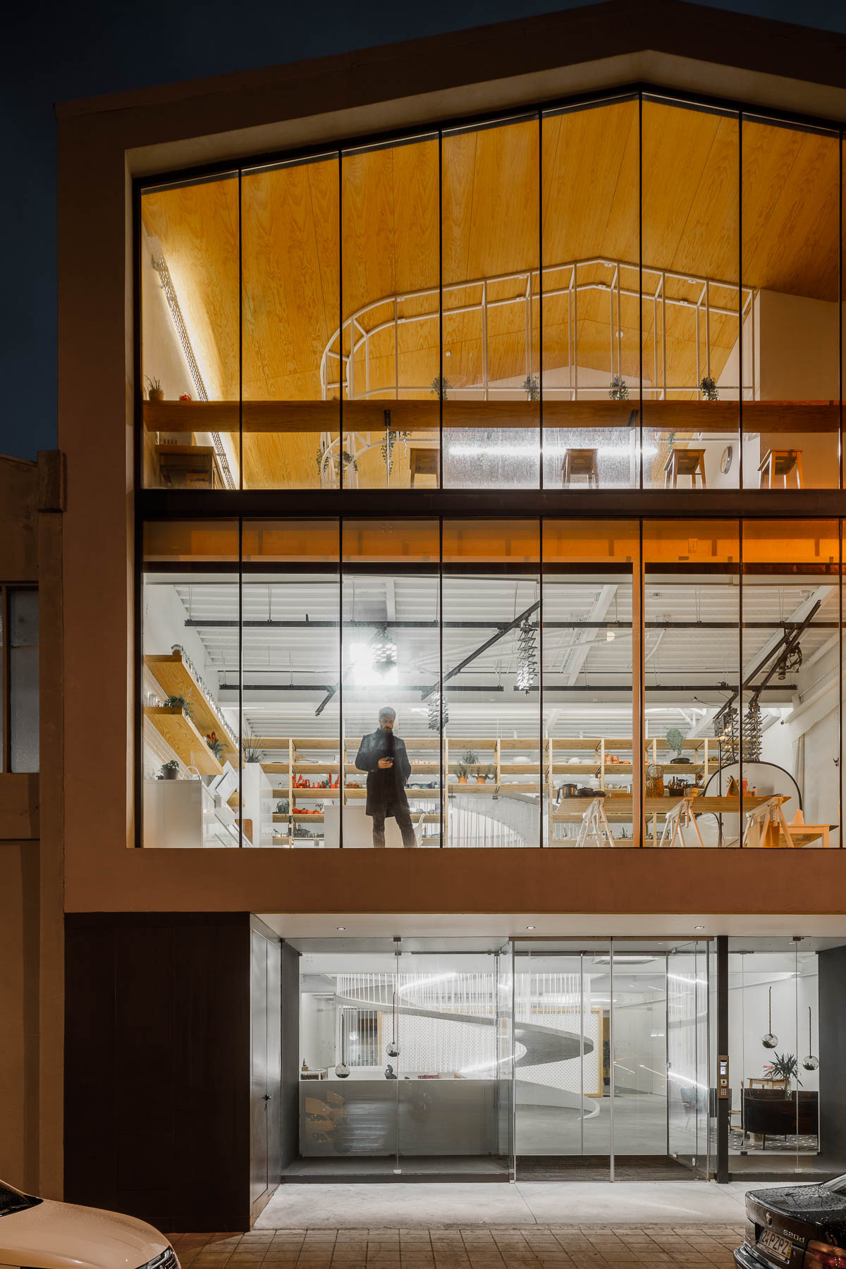
The exterior of the office has walls of glass providing a glimpse of the interior for the pedestrians on the street.

The exterior of this modern office has walls of glass providing a glimpse of the interior for the pedestrians on the street.

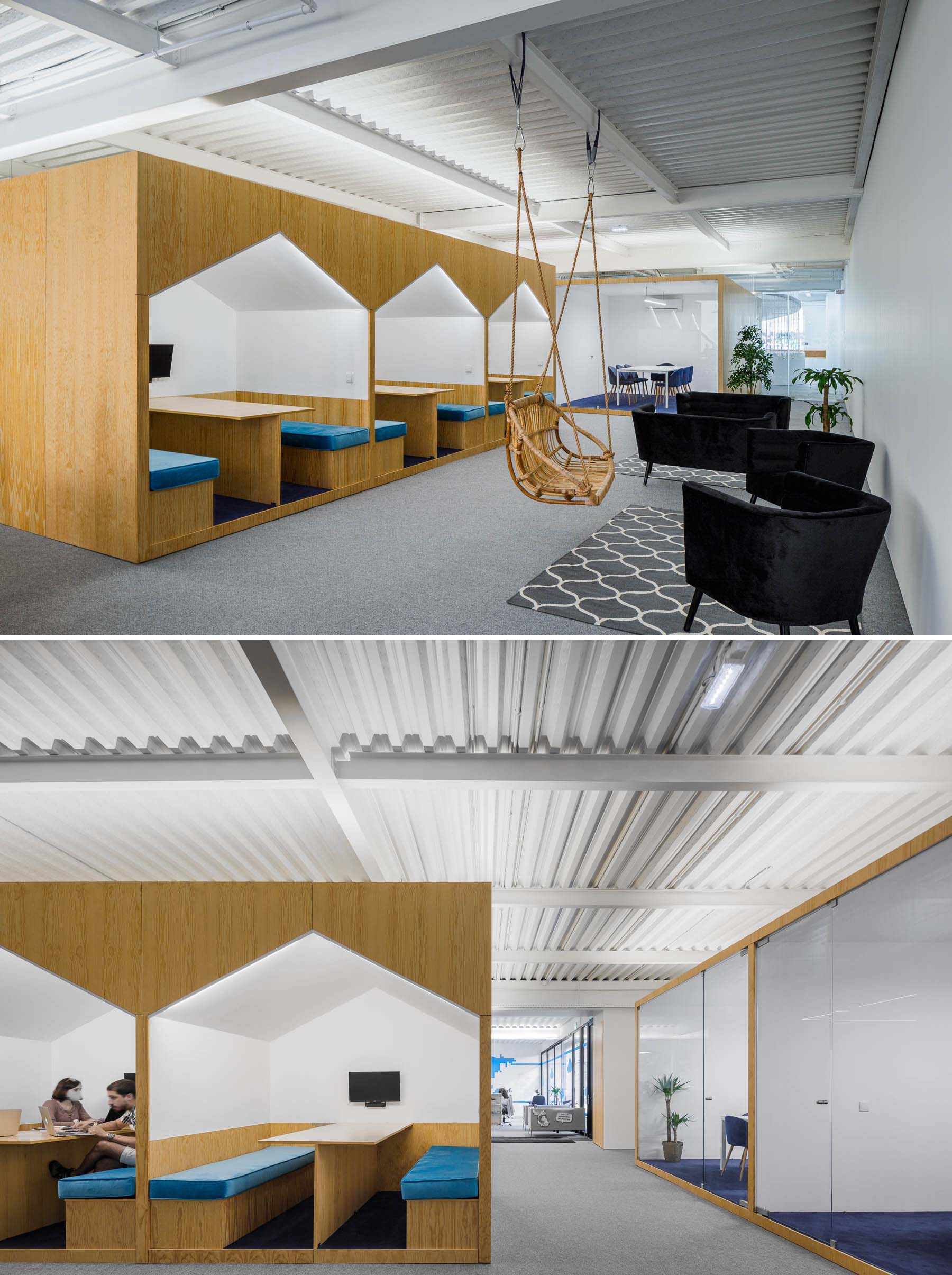
There’s a variety of different seating areas in the office interior, including spaces for casual meetings in house-shaped alcoves.

There's a variety of different seating areas in this modern office interior, including spaces for casual meetings in house-shaped alcoves.

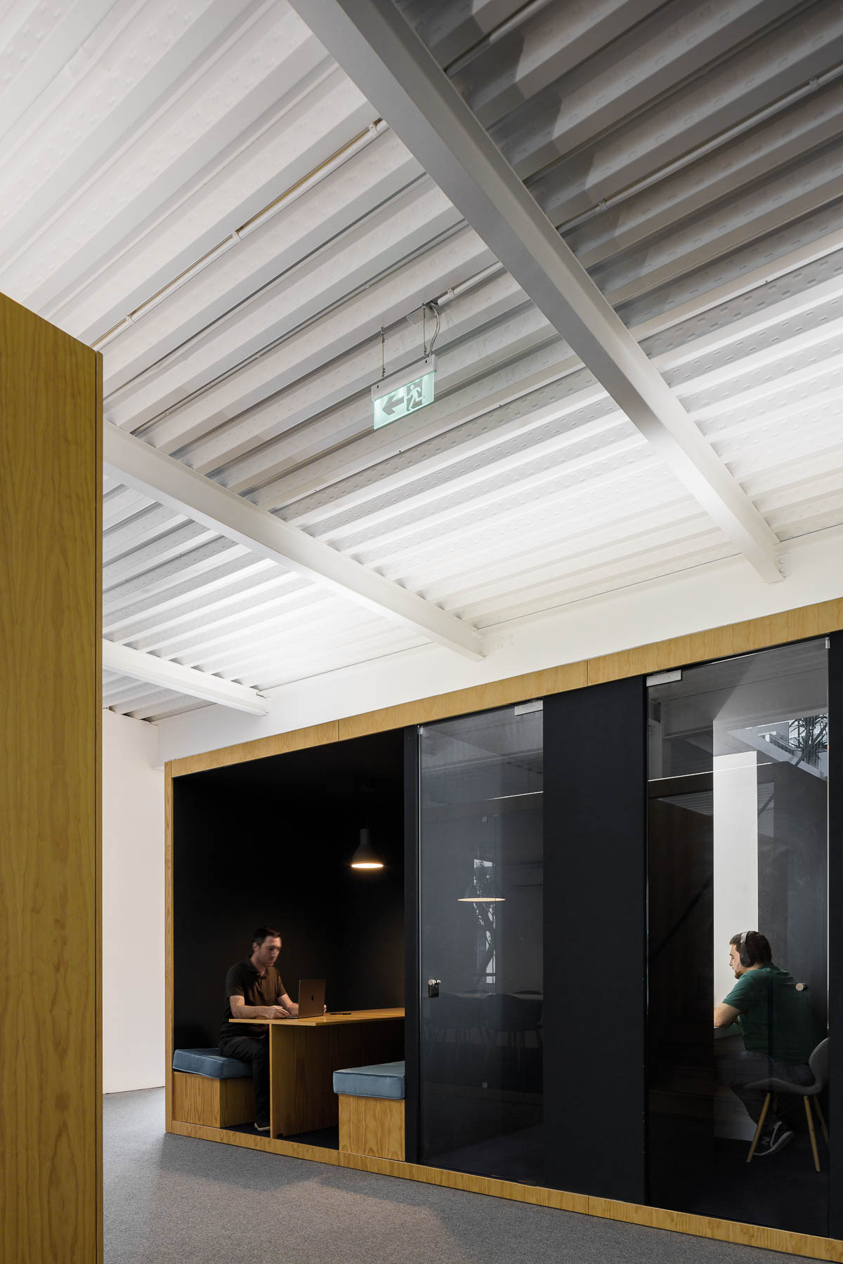
More private work rooms with glass walls that keep the sound in or out.

A modern office interior with a variety of work areas.

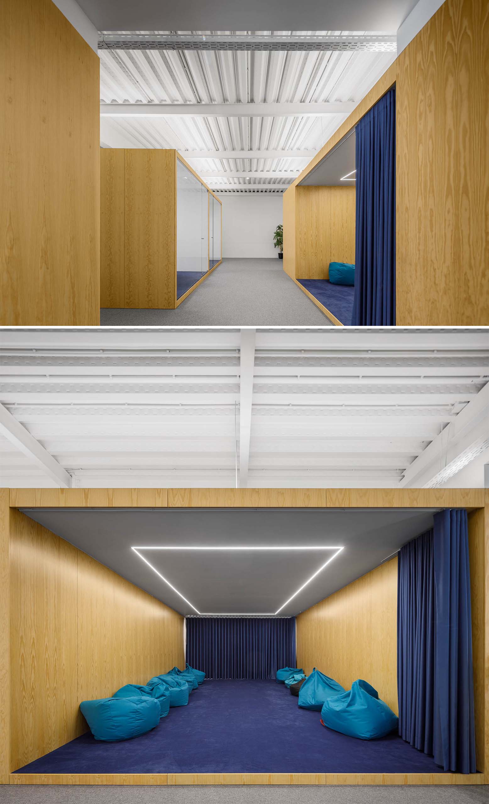
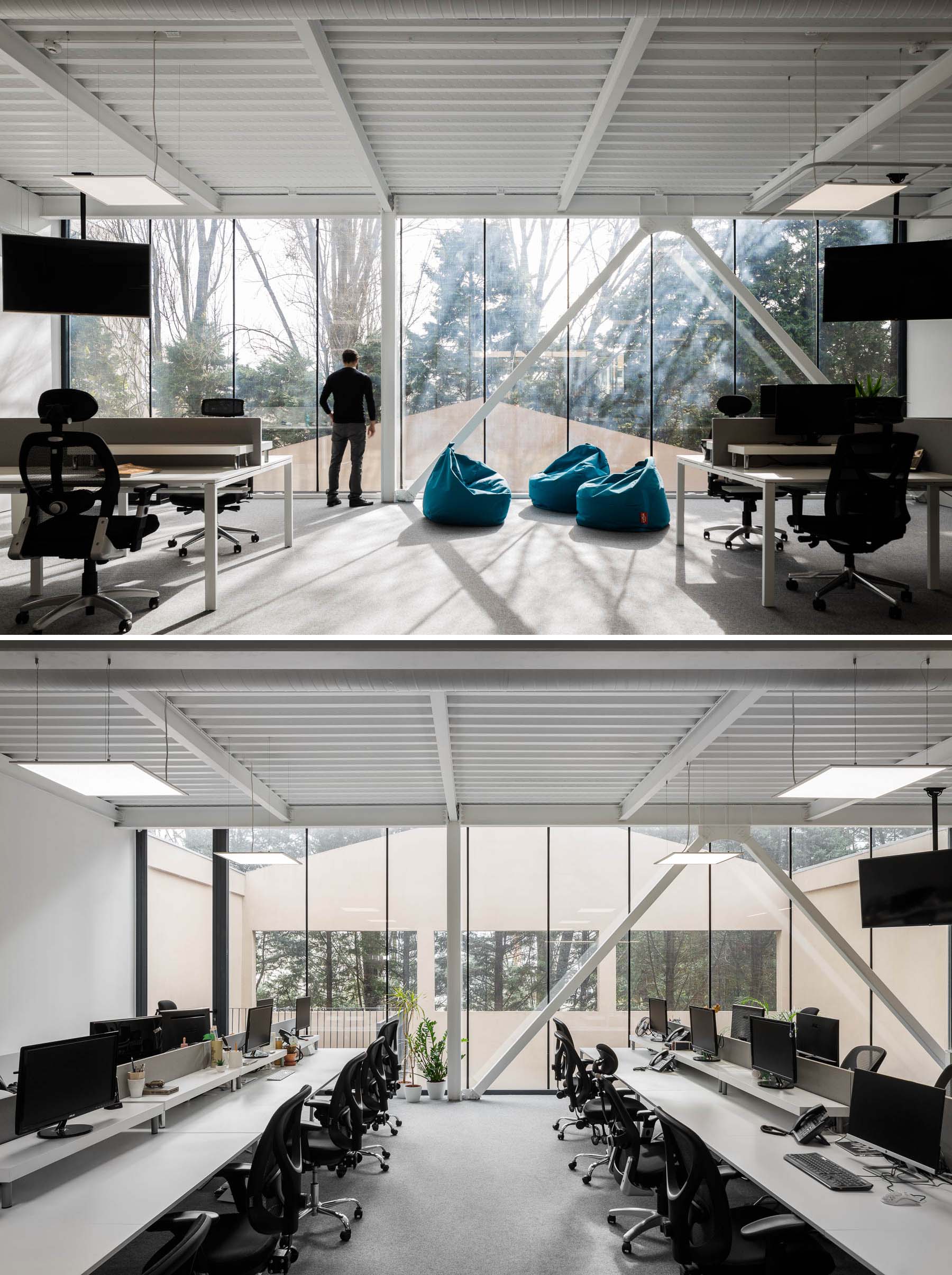
A larger meeting room with a blue curtain that’s filled with beanbags and has LED lighting in the ceiling.

A large meeting room with a blue curtain that's filled with beanbags and has LED lighting in the ceiling.

Other more traditional work spaces exist too, with desks that include multiple work stations.

A modern office with floor-to-ceiling windows.

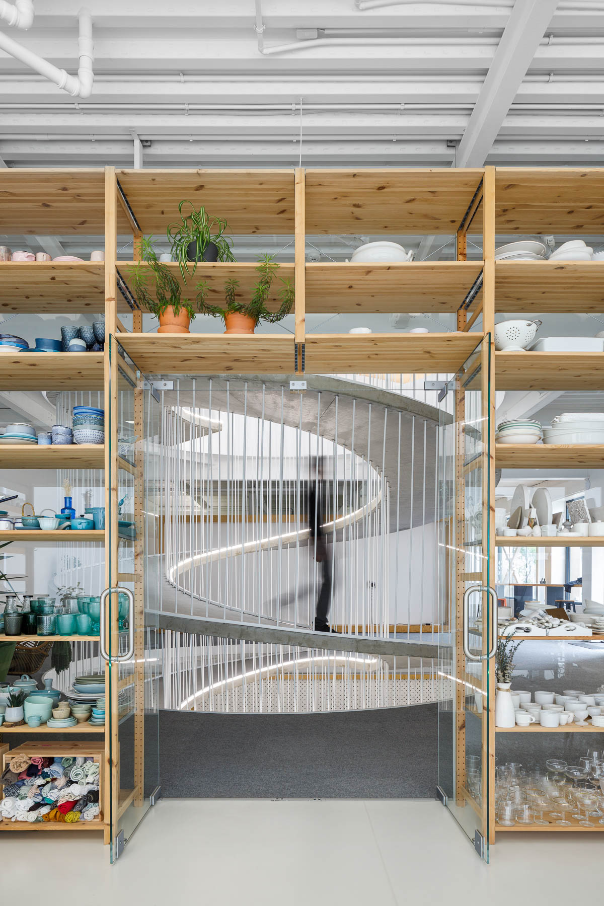
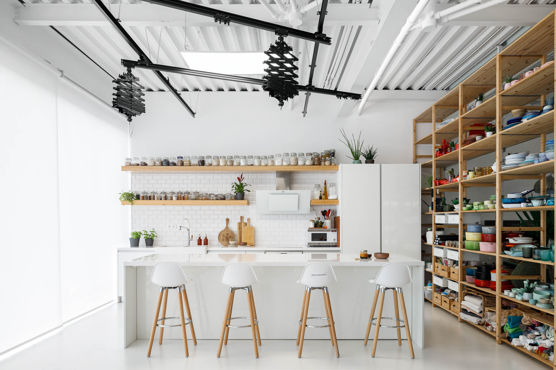
There’s also a photo studio with a minimalist white kitchen with floating wood shelves. Adjacent to the kitchen are tall wood shelves filled with photography props and kitchen equipment.

A modern office has a photo studio with a minimalist white kitchen with floating wood shelves. Adjacent to the kitchen are tall wood shelves filled with photography props and kitchen equipment.
Wood shelves frame a spiraling ramp in the center of this modern office.

When it’s time to take a break from working, there’s a communal area with long wood tables, a kitchenette, seating by the windows, and an outdoor space.

A modern office with a communal break room.
A modern office with seating by the windows that take advantage of the natural light.
A modern office with plants that hang from a metal detail.
Photography by Ivo Tavares Studio | Architecture Office: PAULO MERLINI architects | Main Architects: Paulo Merlini/ André Santos Silva

Jaqui Seerman updates interiors of LA bank building to create Hotel Per La
CategoriesInterior Design

Jaqui Seerman updates interiors of LA bank building to create Hotel Per La

A new hotel occupies 1920s bank headquarters in Downtown LA, where Jaqui Seerman refreshed public spaces to include a botanical-themed lounge and a mirror-lined arched gallery.

Hotel Per La is housed in the neoclassical Giannini Building, built in 1922 as the headquarters for the Bank of Italy, and takes the place of the NoMad Los Angeles which closed its doors in March 2021.

Double-height lounge
Hotel Per La replaces the Nomad Los Angeles in the 1920s bank headquarters

Its 10,000 square feet (930 square metres) of public and event spaces have been refreshed by local interior designer Jaqui Seerman, who used the 12-storey property’s Italian connection to inform her updates.

“A nod to the building’s storied beginning as a bank for the people, the ‘Per La’ name translates to ‘for the’ in Italian,” said the hotel.

“[The bank’s] founder, Amadeo Pietro Giannini, believed in the dignity and abilities of those commonly overlooked, signifying the hotel’s inclusive spirit and name, essentially meaning ‘for Los Angeles, and people like you’.”

A mirror-lined arched gallery
A mirror-lined arched gallery opens into the main lobby

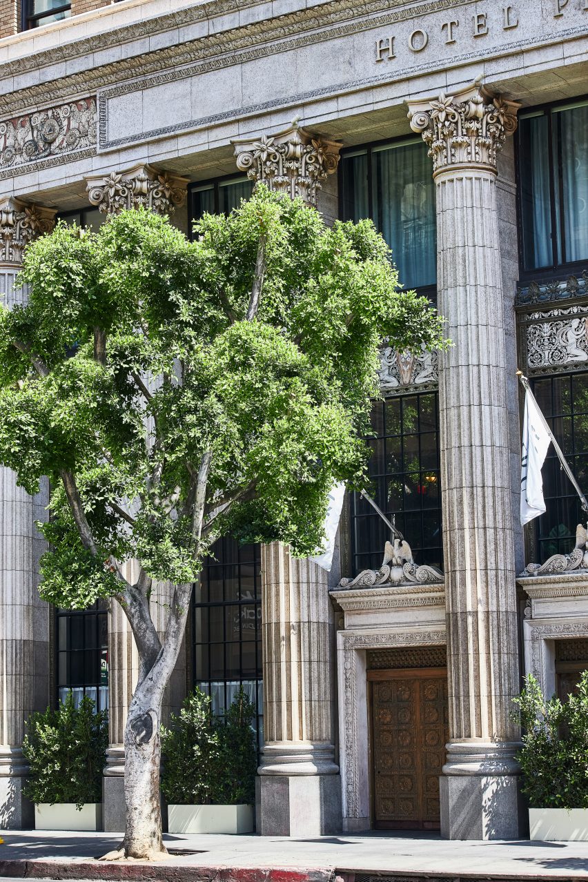
Demarcated by a pale blue awning, the hotel’s entrance has been relocated from 7th Street to Olive Street, leaving the doric columns across the grand facade fully visible.

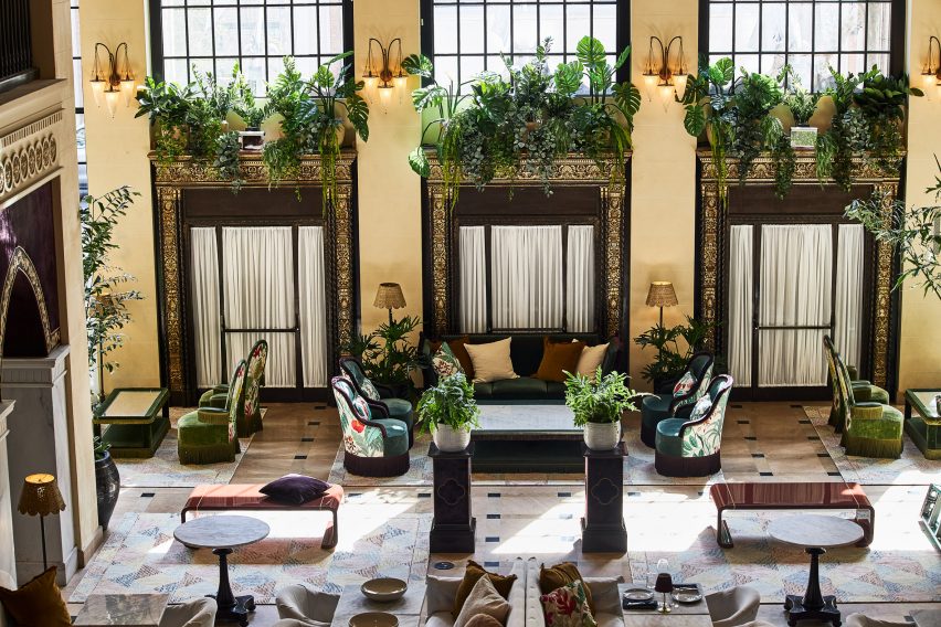
Through the doors, guests find themselves in a double-height lounge filled with plants and comfy chairs covered in botanical patterns.

Reception
The custom front desk is by Voila Creative Studio and the hand-painted tapestry behind is by Jessalyn Brooks

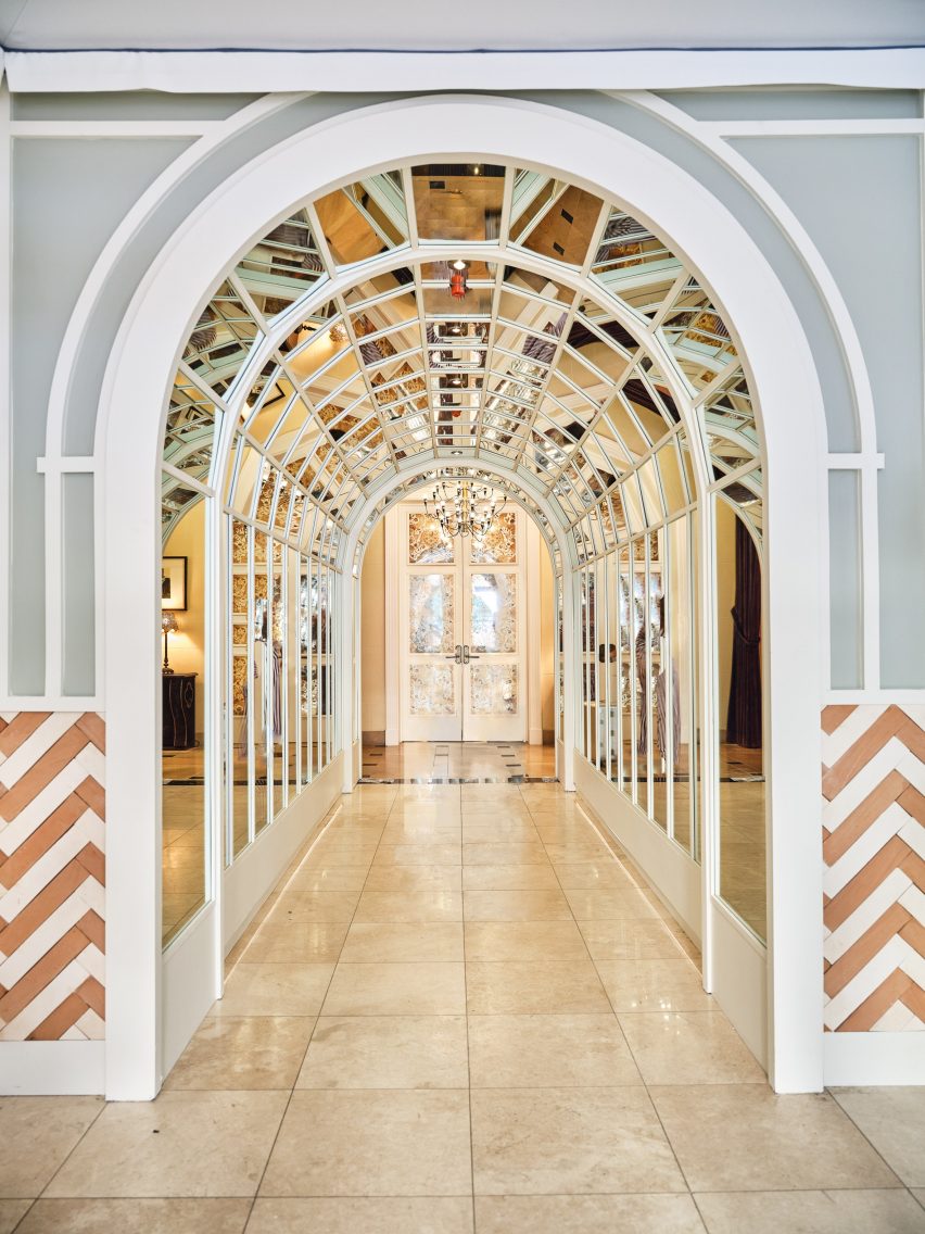
An arched gallery lined with mirrors leads to the lobby, situated in what was once the main banking hall.

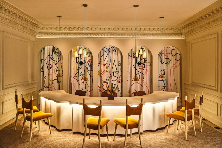
In the reception area, a custom-made curved plaster front desk influenced by linen fabric was designed by Voila Creative Studio, while a hand-painted tapestry that hangs in the niches behind was produced by LA muralist Jessalyn Brooks.

Purple games room
A purple games room features commissioned art and furniture from local artisans

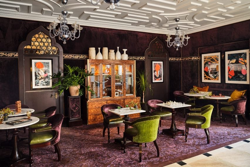
A rich purple lounge features a new game cabinet, as well as commissioned art and furniture sourced from local artisans.

Event spaces range from a second-floor courtyard for private outdoor dinners, to larger spaces for up to 850 people.

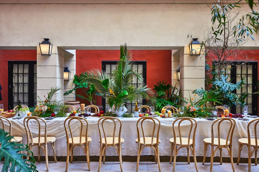
Dining table in outdoor courtyard
A second-floor courtyard hosts private outdoor dinners

Dining options within the hotel include Per L’Ora, which serves Italian cuisine and features a light colour palette across curvaceous design elements influenced by the early 2000s.

“The bar of the restaurant acts as a dramatic centerpiece, with a custom-made marble top in shades of green, grey, and white, and globe-shaped light fixtures, while custom white plasterwork on the front of the bar offers a new sense of texture,” said the hotel operators.

Adjacent to the restaurant is a casual cafe modelled on a Venetian coffee shop, serving beverages, pastries and snacks.

On the rooftop, Bar Clara offers cocktails for poolside lounging and hosts live performances with the LA skyline as a backdrop.

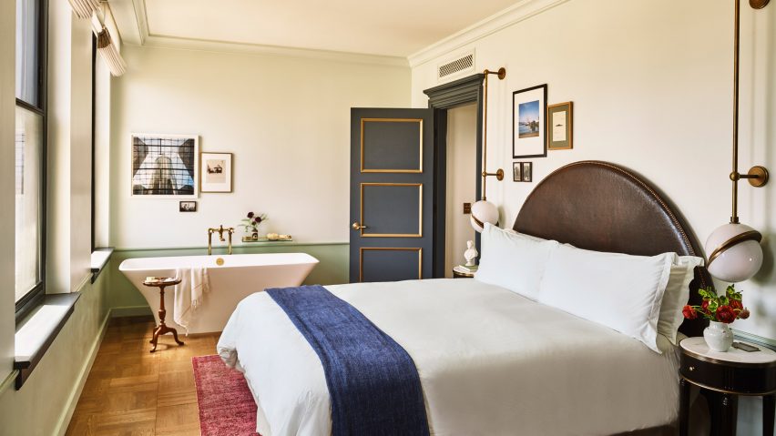
Guest room
Guest rooms are decorated to echo the ornate blue and gold ceiling in lobby

The 241 guest rooms and suites have retained much of the aesthetic created by French architect Jacques Garcia for the NoMad, referencing the restored gold and blue ceiling in the lobby.

Downtown LA, the city’s most walkable neighbourhood, has experienced a cultural renaissance over the past decade.

The hotel occupies the neoclassical Giannini Building
The hotel occupies the neoclassical Giannini Building in Downtown LA

The area is now home to several design-forward hotels including Kelly Wearstler’s Proper – which was just named hotel and short-stay interior of the year at the 2022 Dezeen Awards – a Soho House, and an Ace Hotel.

Per La is the latest hotel in the US to open in a converted bank building, following the likes of The Durham in North Carolina and The Quoin in Wilmington, Delaware.

The photography is by The Ingalls.


Reference

Building an inclusive network of sustainable, connected farms
CategoriesSustainable News

Building an inclusive network of sustainable, connected farms

Spotted: For farmers in Africa and the Middle East, reliance on an increasingly volatile climate is making it more and more difficult to achieve a stable, predictable income. And, according to The Carnegie Endowment for International Peace, aridity in parts of the Middle East/North Africa (MENA) region will increase in the next century, shrinking arable lands and disrupting agricultural patterns. This worrying trend inspired the foundation of Jodoor, a Rabat-based startup that designs, builds, and installs hi-tech connected greenhouses for farmers.

The company’s greenhouses are internet-of-things-enabled and can be used by farmers to produce 10 high-quality salad staples and herbs – from iceberg lettuce to basil. By producing leafy greens in a controlled environment, farmers are protected from the vagueries of climate and are able to produce crops year-round. The technology ensures consistent productivity and quality as well as a fixed price for farmers throughout the year. Moreover, the vegetables and herbs grown in the hi-tech greenhouses require no pesticides or herbicides.

The startup plans to use a franchise model to drive the implementation of its technology. Each greenhouse will be tailored to the exact local needs of each farmer, and by building a network of farmers, Jodoor is hoping to match local production to local demand.

Currently in the early stages of its development, Jodoor has nonetheless piqued the interest of several institutions including the Mohammad VI Polytechnic University (UM6P). At the end of 2021, the startup launched its first greenhouse on a 200-square-metre plot in Skhirat, a seaside town between Rabat and Casablanca. Its second greenhouse, which is intended to showcase the commercial potential of the technology, will be installed at UM6P.

Longer-term, the startup plans to hone its model in Morocco before expanding across the Middle East and North Africa. Many of Morocco’s neighbours share similar challenges when it comes to water scarcity and food sovereignty, making them prime candidates for Jodoor’s technology.

Other innovations spotted by Springwise that improve the prospects of small farmers include a startup that provides software and hands-on assistance for farmers in Nigeria and solar-powered irrigation pumps for farmers in East Africa.

Written By: Matthew Hempstead

Reference

Farmland informs design of school building by Eskew Dumez Ripple
CategoriesSustainable News

Farmland informs design of school building by Eskew Dumez Ripple

American studio Eskew Dumez Ripple has used features of vernacular architecture in creative ways to form a sustainable, multipurpose school building.

The Home Building is part of the Thaden School, a private school in Bentonville, Arkansas, that serves students in grades six to 12.

Rainwater in pond
Rainwater is collected and stored in a pond, or “water lab”, at the Thaden School. Photo is by Tim Hursley

With a focus on learning by doing, students engage in activities such as filmmaking, constructing bicycles, and growing and preparing food.

The school is backed by the Walton Family Foundation, which is led by the founders of the retail giant Walmart.

The school’s 26-acre (10-hectare) campus was master-planned by Eskew Dumez Ripple – a studio based in New Orleans, Louisiana – in collaboration with local firm Marlon Blackwell Architects, landscape architects Andropogon and engineering firm CMTA.

School building in Arkansas
The team took cues from the area’s pastoral heritage for the architecture. Photo is by Dero Sanford

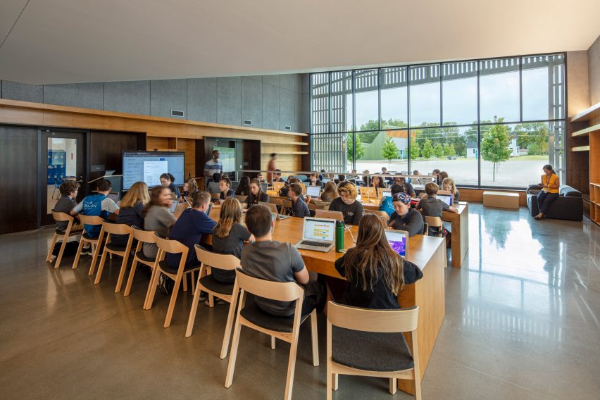
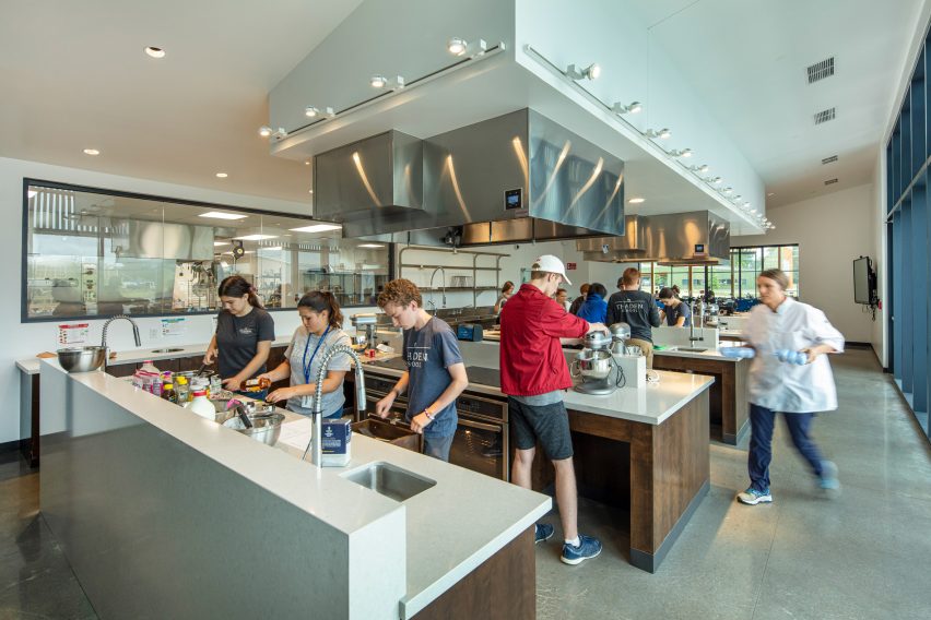
Eskew Dumez Ripple was tasked with designing the Home Building – a 34,000-square-foot (3,159-square-metre) facility that holds a dining hall, teaching kitchen, bookstore, library and lounge/study spaces.

“The Home Building serves as both the social and spiritual center for students,” the architects said.

Eskew Dumez Ripple study room
Eskew Dumez Ripple added a study room to the project. Photo is by Dero Sanford

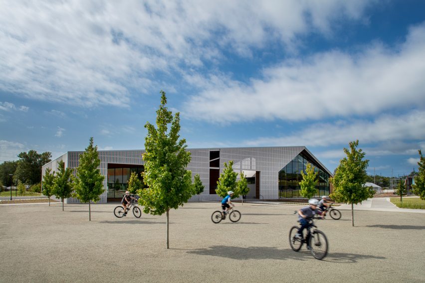
While designing the facility, the team took cues from the area’s pastoral heritage, including its vernacular architecture.

“The design reconciles seemingly contradictory notion: lofty ambitions for the building’s design with the humble nature of local, vernacular architecture,” the firm said.

Gabled slatted canopy
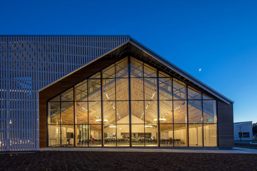
A gabled, slatted canopy made of poplar wood features in the dining room. Photo is by Tim Hursley

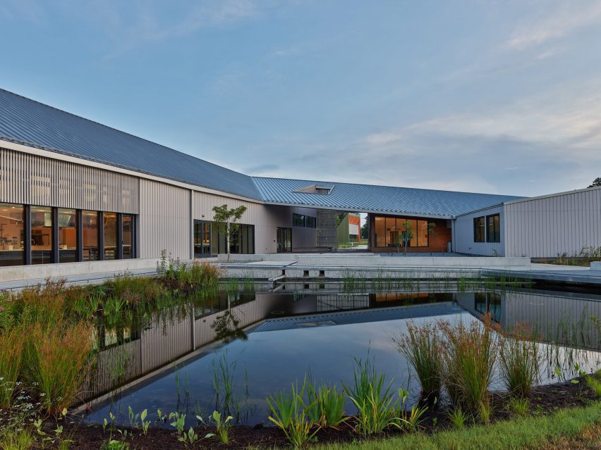
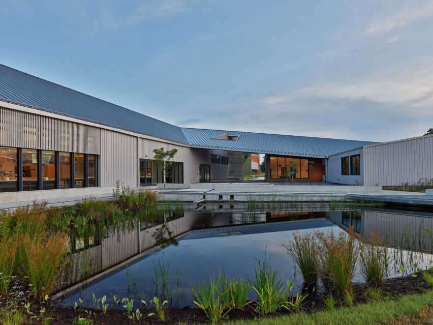
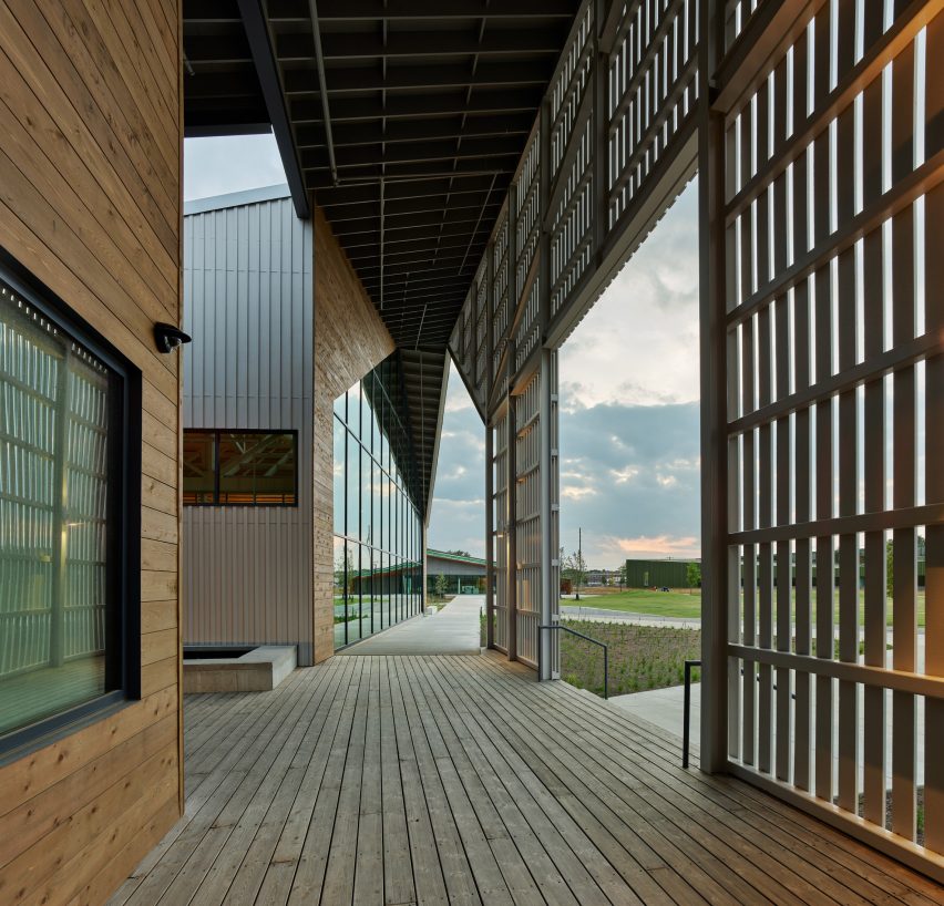
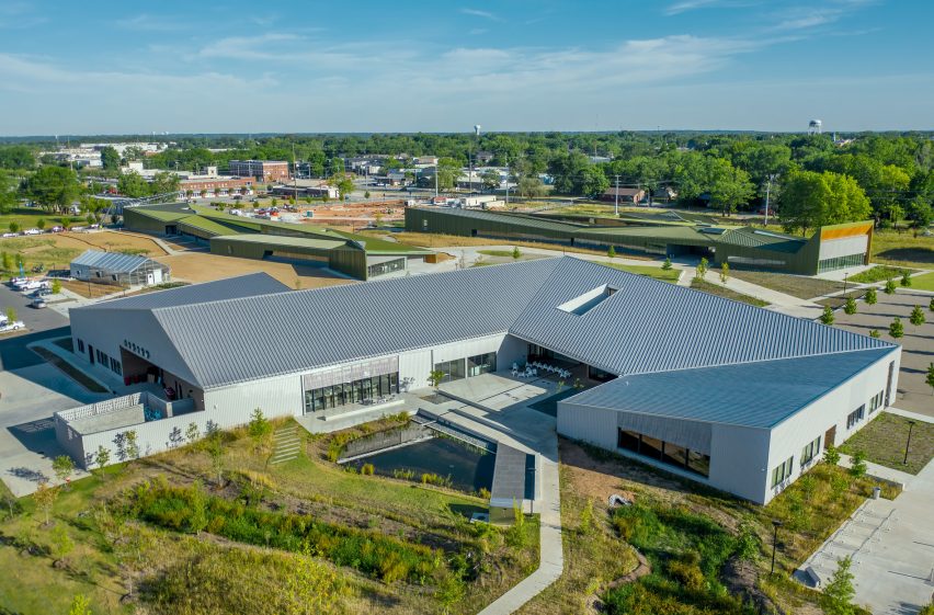
Zigzag in plan, the wood-framed building stretches across the site, bending at several points to create porches and courtyards.

Facades are clad in shiplap cedar siding and board-and-batten siding made of white, fibre-cement Hardie panels. 

Cedar siding
Facades are clad in shiplap cedar siding. Photo is by Tim Hursley

The building’s different parts are topped with either single-slope or gabled roofs, all of which are covered with standing seam metal.

Within the building, the team used basic finishes such as concrete flooring and white-painted sheetrock, and incorporated special accents like custom millwork in the study hall and a live-edge wooden table in the teaching kitchen.

Eskew Dumez Ripple interior space
Eskew Dumez Ripple used basic finishes within the facility. Photo is by Dero Sanford

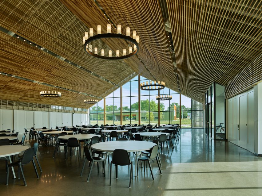
At the heart of the facility is the dining room, which rises to 38 feet (12 metres) at its highest point and features a glazed wall. Hung from large, exposed trusses is a gabled, slatted canopy made of poplar wood.

“The design employs common materials and methods in uncommon ways,” the team said.

The building has a number of sustainable features, including low-flow plumbing fixtures, a geothermal well and an energy recovery wheel.

Rainwater is collected and stored in a pond, or “water lab”, that serves as a teaching tool for students. The landscape is filled with native species like prairie grass and pecan trees.

The building has a number of sustainable features. Photo is by Tim Hursley

“Sustainability is placed at the forefront of the students’ education, and the landscape functions as a botanical textbook rife with plants that represent a microcosm of the region’s native species,” the team said.

With plans to install a photovoltaic array in the future, the building is designed to achieve an Energy Use Intensity score of 23. A score of 25 or less for a school building indicates that the building is “zero energy ready”, according to the architects.

Thaden School building
Thaden School building is located in Arkansas. Photo is by Dero Sanford

The Home Building at Thaden School was a recipient of the 2022 AIA Architecture Awards.

Other projects there include the Crystal Bridges Museum of Art, designed by Sadie Architects, and a co-working, dining and recreational venue by Brand Bureau and Modus Studio that is located within a former industrial building.

The photography is by Tim Hursley and Dero Sanford.


Project credits:

Architect: Eskew Dumez Ripple
Landscape architect: Andropogon Associates
Civil engineering: Ecological Design Group
MEP engineering: CMTA Consulting Engineers
Structural engineering: Engineering Consultants
Project management: Aegis Property Group | WEI
General contractor: Milestone
Irrigation: Aqueous
Signage and wayfinding: Tom Zetek

Reference

Building the largest network of profitable smallholder farmers
CategoriesSustainable News

Building the largest network of profitable smallholder farmers

Spotted: Smallholder farmers in many developing countries suffer from a lack of scale – they cannot compete with large conglomerates, even if they offer a high-quality product. This is due to their lack access to financing, food processors, and the fast-moving consumer goods (FMCG) market. In Nigeria, agricultural company ThriveAgric is using technology to help small farmers compete. 

ThriveAgric uses its proprietary Agricultural Operating System (AOS) to assist farmers with financing, development and training, technology and post-harvest services, access to premium markets, and social and financial inclusion. Each season, the company onboards farmers and communities, inputting data about individual fields, soil texture, slope, proximity to water, and creditworthiness into the AOS. This data is used to calculate and disburse loans to each farmer, in the form of improved seeds, fertilisers, and crop protection products, rather than cash.

But that’s not all. ThriveAgric also gives tailored advice and tracks each farms’ progress using multiple data points, assisting, where needed, to maximise harvest. Farmers repay their loans in form of produce, based on agreed amounts. The rest of their harvest is profit. ThriveAgric stores all the produce in its own warehouses and sells it at volume at peak prices to markets where they have established relationships.

ThriveAgric recently raised $56.4 million (€58.2 million) in debt funding from local commercial banks and institutional investors. Discussing the investment, Chief Executive Officer Uka Eje said, “The new investment takes us one step closer to fulfilling our mission of building the largest network of profitable African farmers using technology to ensure food security.” 

The climate crisis has encouraged innovators to explore new ways of increasing crop yields without using intensive methods that can harm the environment. Springwise has recently seen many promising developments in this area, including a sustainable fertiliser that can be manufactured on-site and the use of extremophile bacteria to increase crop yields. 

Written By: Lisa Magloff

Reference

Louise Hederström designs furniture from building waste materials
CategoriesSustainable News

Louise Hederström designs furniture from building waste materials

Swedish designer Louise Hederström has worked with furniture brand Swedese to use leftover wood and plywood from a Cobe-designed building to create furniture for its public spaces.

Hederström‘s project Rephrased Matter, which was on show as part of the annual design festival Southern Sweden Design Days, saw the designer work together with Swedese to create a collection of furniture for the atrium, restaurant and meeting rooms in developer Skanska‘s Hyllie Terrass building.

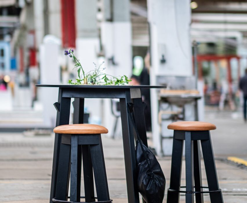
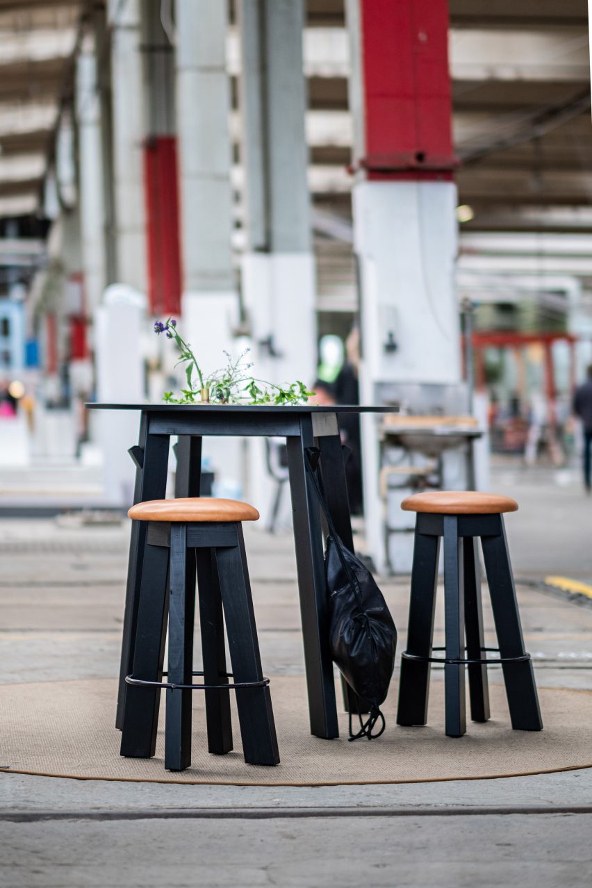
Two stools and a table made from waste materials
Above: Louise Hederström’s designs were on show at Southern Sweden Design Days. Top image: a prototype of her stool for Skanska. Photo is courtesy of Hederström

The furniture will be made from materials such as plywood and wooden beams that were used during the construction of the building, which was designed by Danish studio Cobe, and would otherwise have been burned.

Hederström, who approached Skanska together with Linus Davidsson, sales representative at Swedese, said they will instead use the waste material from the building site for both “big and small projects.”

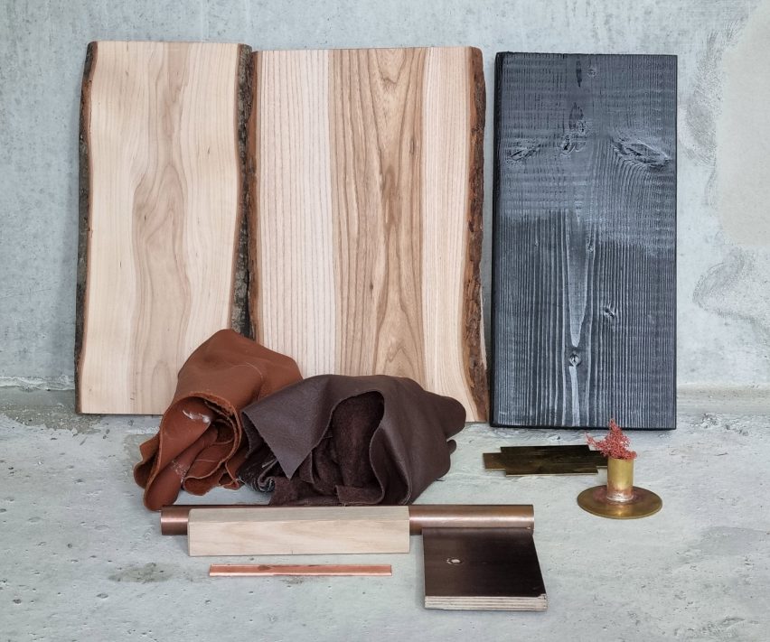
Materials used for furniture designs by Louise Hederström
Waste materials and leftover materials were used to construct the furniture. Photo is courtesy of Louise Hederström

The first item is set of stools and a table that will be used in the building’s atrium. They were made from wooden latches and plywood used on the site to cover elevator shafts and as temporary staircase banisters.

“We don’t really know yet, but that’s also the part of the process – we see something, we save it and we and the latches was really something that was easy to see that this is possible to work with,” Hederström told Dezeen.

Stool on show at Southern Sweden Design Days
Hederström worked together with furniture company Swedese

The time-consuming process of designing furniture from scrap materials requires a lot more preparation than working with virgin wood does.

“You have to have time to collect the material, you have to store it and dry it,” Hederström explained. “It’s a longer process, and we’re learning by doing.”

For the stools Hederström combined waste wood with leftover materials from Swedese, as the padding and fabric material needed was not available from the building site itself.

Instead, the stools have a filling made from leftover sheepskin from Swedese’s production, covered by leather seats that are made from leather with minor imperfections that meant the company was unable to use them for other furniture.

A steel ring used in Swedese’s furniture production and made from 80 per cent recycled metal holds the stool’s wooden legs together.

Table made from leftover wood
A table made from wood matches the stools

The current collection also includes a table made from the same wood and plywood pieces, and Hederström also plans to use the wooden latches to create a long sofa that will sit in the central atrium.

For her, having to use already-cut wood and other materials in existing conditions was a welcome challenge, rather than a disadvantage.

“I like the challenge that you have a material to have to work with,” she said.

“So with the stool, I wanted to change the dimensions of course, but I wanted you to still feel the connection to the material and understand its construction, how it holds together.”

Hederström will also use wood from elm trees that have had to be felled because of Dutch Elm disease, while leftover materials from Swedish furniture and design companies will be used to create accessories for the interior of the building.

Materials used for accessories in Hyllie Terrass
Other leftover materials will be used to create accessories

Hederström hopes that the initiative, which Skanska said it hopes to also expand to other buildings, will become more commonly used when constructing new buildings.

“I hoped that it would open their eyes, but also, I think that when they count and see ‘we have 1,000 metres of wood that we just throw away’ they can also say ‘let’s save it for next building’,” Hederström said.

“They can rethink their way of planning. And I think it was an eye-opener, that they realise that this is something that we could use. Especially when the world is a bit upside down, we have to take better care of material resources.”

Hyllie Terrass, the building that the furniture will be used in, was designed by Cobe for Skanska and is part of a pilot program for NollC02 buildings, which Skanska says will have net-zero emissions over their entire life cycle. It will be ready for occupation in spring 2023.

Hederström has previously made a concrete bench and traffic barrier using waste, while Swedese recently worked with graduate Mika Lindblad on a furniture collection designed without upholstery.

The photography is by Daniel Engvall unless otherwise stated.

Southern Sweden Design Days took place from 19 to 22 May 2022 in Malmö, Sweden. See Dezeen Events Guide for an up-to-date list of architecture and design events taking place around the world.

Reference

GRAAM Architecture wraps Burgundy office building in timber exoskeleton and “glass veil”
CategoriesArchitecture

GRAAM Architecture wraps Burgundy office building in timber exoskeleton and “glass veil”

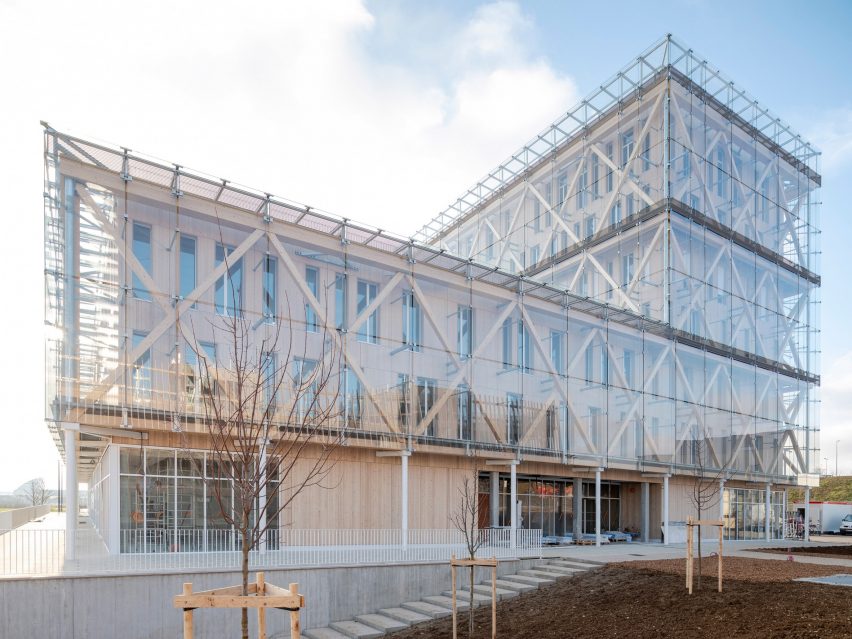
A glazed skin hangs from a timber exoskeleton at this office building in France by French studio GRAAM Architecture, which has been shortlisted in the business building category of Dezeen Awards 2022.

Completed for banking group Caisse d’Epargne in Dijon, Burgundy, the seven-storey building was designed to provide airy, flexible and naturally-lit workspaces that meet the Passivhaus requirements of using no more than 15 kWh/m2 per year.

Raised above its sloping site on a concrete podium containing garage space, GRAAM Architecture‘s design was informed by a desire to use materials and companies local to the area.

Exterior image of the Caisse d'Epargne Bourgogne Franche Comté Headquarters
The Burgundy office building was designed by GRAAM Architecture

“Located on the heights of Dijon in Burgundy, a few metres from the tramway stop, the building is built of seven levels, allowing it to be seen from a distance from the city’s expressway,” said the practice.

“Its wooden structure echoes the local resources of the Burgundy region, whose reputation for hardwood and softwood forests is well known,” it continued.

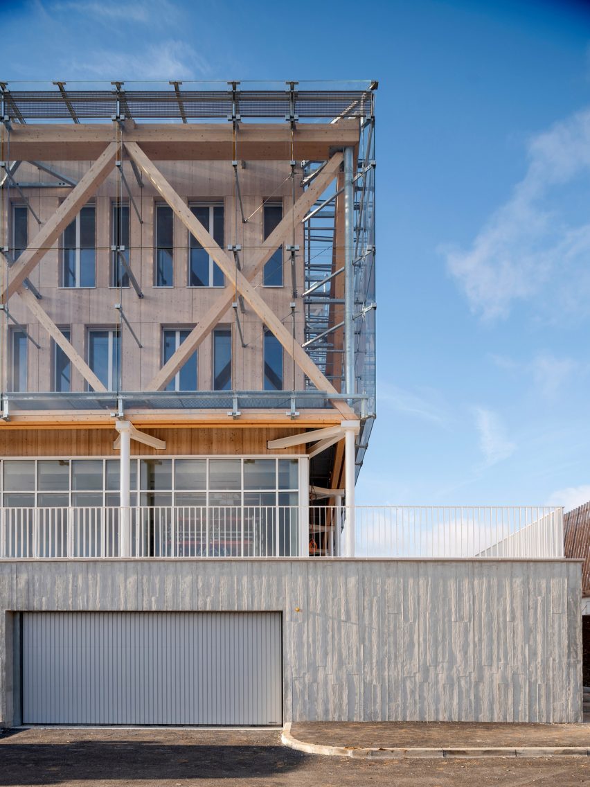
The timber structure of the building prioritises the use of traditional beam and joist techniques, only using concrete and cross-laminated timber (CLT) where necessary, such as for the floors and stair and lift cores.

Exterior detail image of the street facing entrances at Caisse d'Epargne Bourgogne Franche Comté Headquarters
The building incorporates a timber exoskeleton

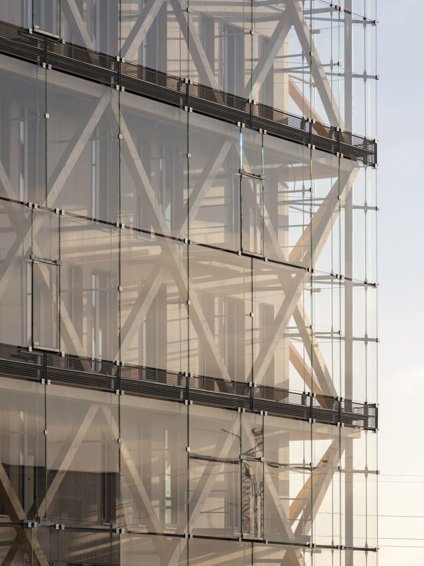
Helping to free up the interiors, the structure is supported by an exoskeleton of timber bracing, the upper beams of which are used to hang the external “glass veil” envelope, supported by secondary steel elements.

The choice of materials means the structure could be entirely dry-process built, with the concrete elements prefabricated before being brought to the site.

“The project responds to a desire for exemplarity, modularity and intelligence,” said the practice.

“[It is] designed with a wooden structural skeleton, prefabricated concrete floors, and a wooden exo-structure covered with a glass double skin,” it continued.

“The building allows the bank to play a part in environmental issues, displaying its exemplary and unique nature without ostentation.”

Exterior image of Caisse d'Epargne Bourgogne Franche Comté Headquarters glass facade
The exterior is clad in a double glass skin

At the base of the structure, thin white steel columns support the building’s outer structure, creating a small sheltered area around the building’s perimeter that extends onto a terrace created by the concrete base and lined by a metal balustrade.

Inside, thin, almost full-height windows on each floor flood the office spaces with natural light, and the spacing of wooden columns allows for the easy addition of partition walls.

Interior image of a timber column-lined space at the office in France
The interior was developed to be divided and organised to best suit its users

“The space can be subdivided to create working areas for specific departments, or rented out to another firm if needed,” said the practice.

Among the other buildings shortlisted in the business building category of Dezeen awards 2022 is the Sanand Factory in India by Studio Saar, which aims to elevate otherwise typical factory structures with thoughtful details.

Photography is by Nicolas Waltefaugle.

Reference