Dense Cities, Open Homes: 8 Multifamily Housing Projects Built for Modern Life
Architects: Want to have your project featured? Showcase your work through Architizer and sign up for our inspirational newsletters.
Housing is central to architecture and cities. Across generations and socio-economic backgrounds, a mix of housing options makes cities more lively, sustainable and human. Amidst global housing scarcity, the need to build more multifamily and affordable housing is widespread. Equitable housing begins with policy and planning, but it’s also tied to design. Architects worldwide are considering this idea and how to create more beautiful, integrated housing that reflects how we live today.
Multifamily housing is key to creating more equitable cities. In this type of housing, multiple separate units are contained within one or several buildings within one complex. A key benefit of multifamily in the current market is that it’s usually more affordable than single-family housing. With real estate today, it’s increasingly difficult for people to buy a home, especially for first-time buyers. In multifamily housing, less land is needed, and it helps to meet the growing demand for households of all ages and income levels. As architects consider the impact of housing, the following projects represent multifamily housing design across the world. Made for residents to either rent or own, they represent a cultural shift and underline the importance of housing in architecture today.
Timber House
MESH Architectures, Brooklyn, NY, United States
Jury Winner, 11th Annual A+Awards, Multi-Unit Residential Building
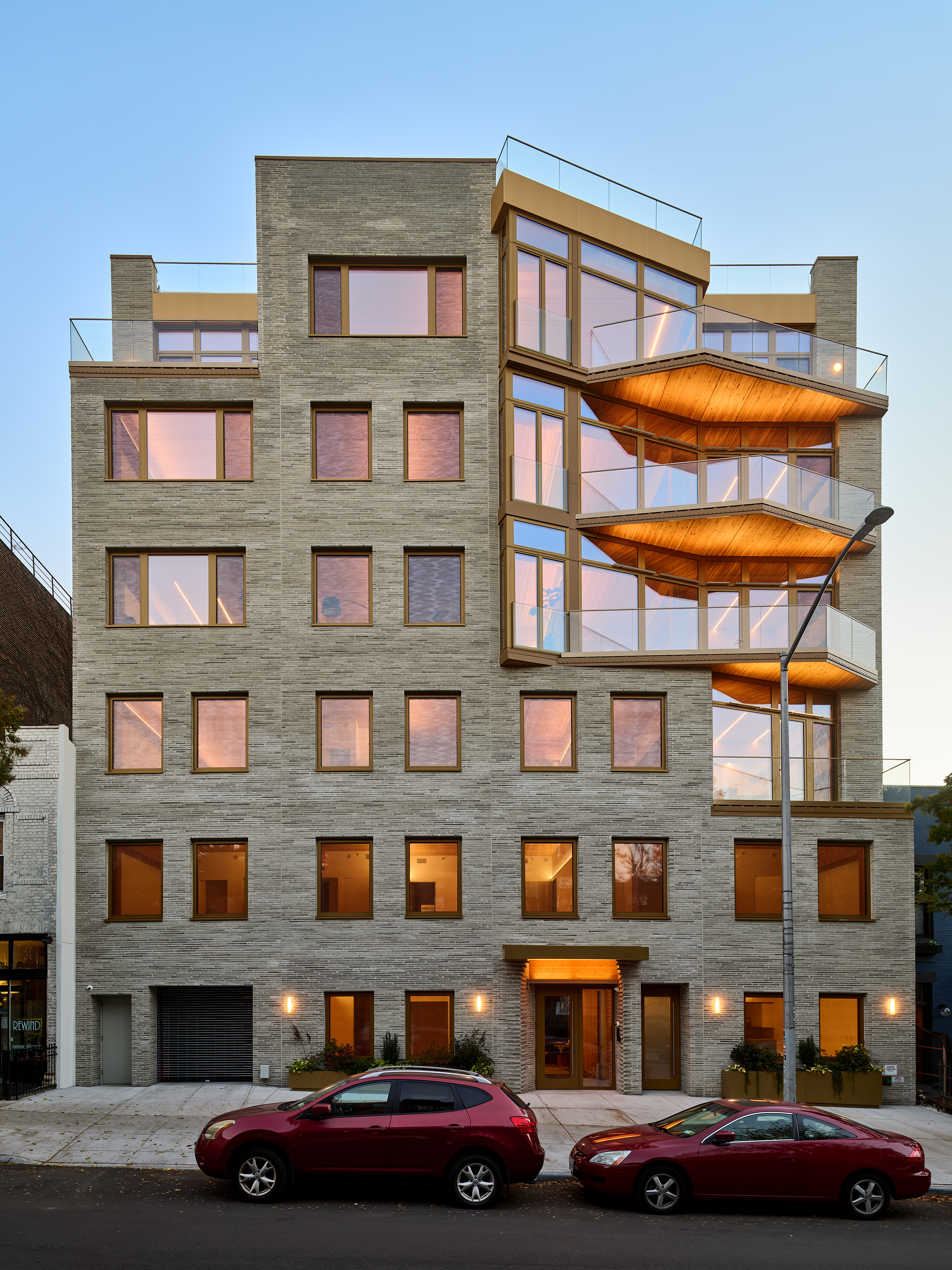
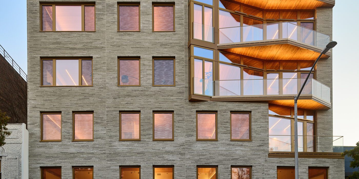
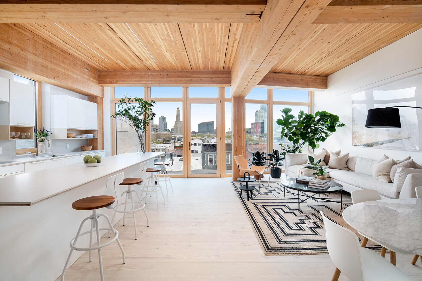 New York is a city known for housing scarcity, and a place that’s defined by reinvention. For Timber House, MESH Architectures was inspired by natural finishes and “botanical architecture.” The idea was not only to foster well-being, but create a new model for timber construction in the city. The project is the first mass-timber condominium in New York, and the structure was built with glue-laminated timber columns, beams, and floor plates. The six-story, multifamily project is comprised of fourteen homes.
Beyond the novel material approaches to construction in Timber House, it was also a test in learning from passive-house design. Those principles informed its high-performance envelope, with “intensive insulation, smart air sealing, and triple-glazed wood windows.” Less interior finishes were required thanks to leaving the wood structure exposed, while the team also prioritized low-carbon material choices. For Timber House, MESH wanted to demonstrate that sustainable multifamily buildings can balance well-being and comfort, as well as beauty.
Valley
MVRDV, Amsterdam, Netherlands
Jury Winner, 11th Annual A+Awards, Architecture +Façades
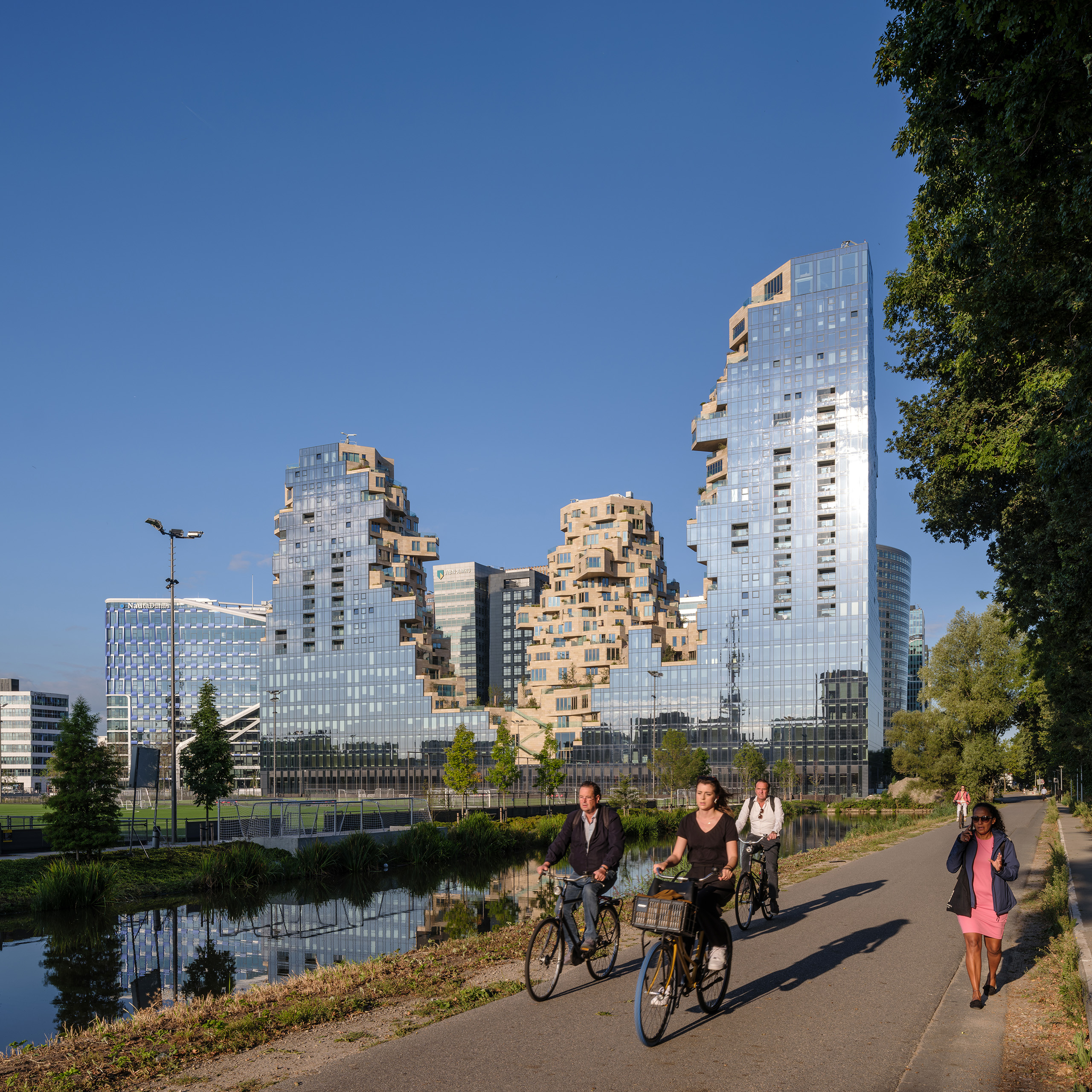
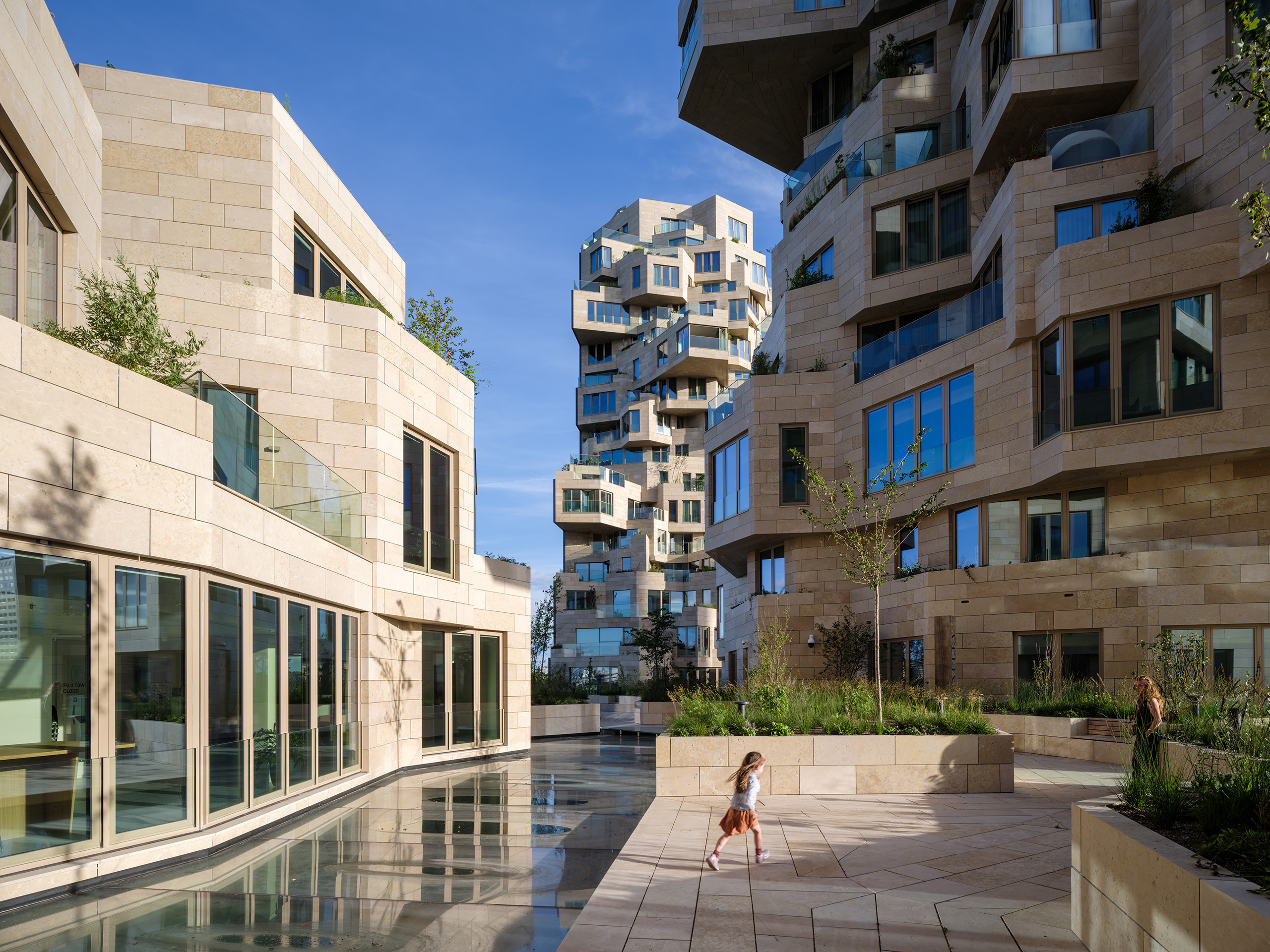 MVRDV has earned a reputation for reinvention and creating new building forms. That same approach extends to housing, where the team designed Valley with a more “green and human” touch. Built for developer Edge, the project is located in Amsterdam Zuidas. Rising to three distinct towers, the façades shift across the complex. The outer edges are mirrored glass, while the inner façades are clad with stone and swaths of greenery.
Valley was built for a mix of residents, as well as workers and visitors. Not only for multifamily housing, the project also includes offices while much of the building is open to the public. For the materials, over 40,000 stone tiles of varying sizes were used throughout the building’s façades. “Each of the 198 apartments has a unique floorplan, made possible by the interior designs by Heyligers Architects.” Outside, the team worked with landscape architect Piet Oudolf on the placement and selection of trees, shrubs and approximately 13,500 smaller plants that are in within the natural stone planters.
One Hundred
Studio Gang, St. Louis, MO, United States
Jury Winner, 9th Annual A+Awards, Multi Unit Housing High Rise (16+ Floors)
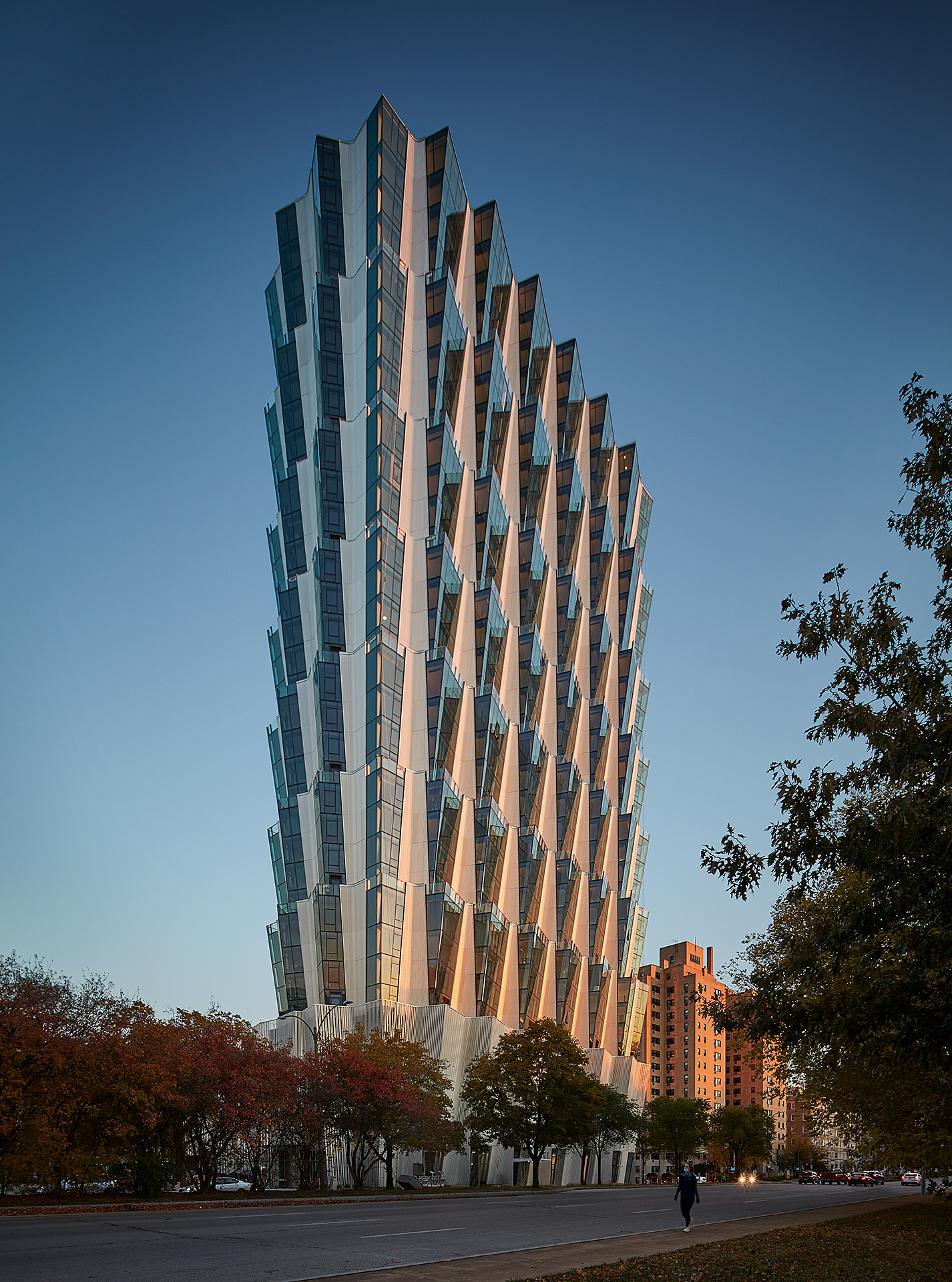
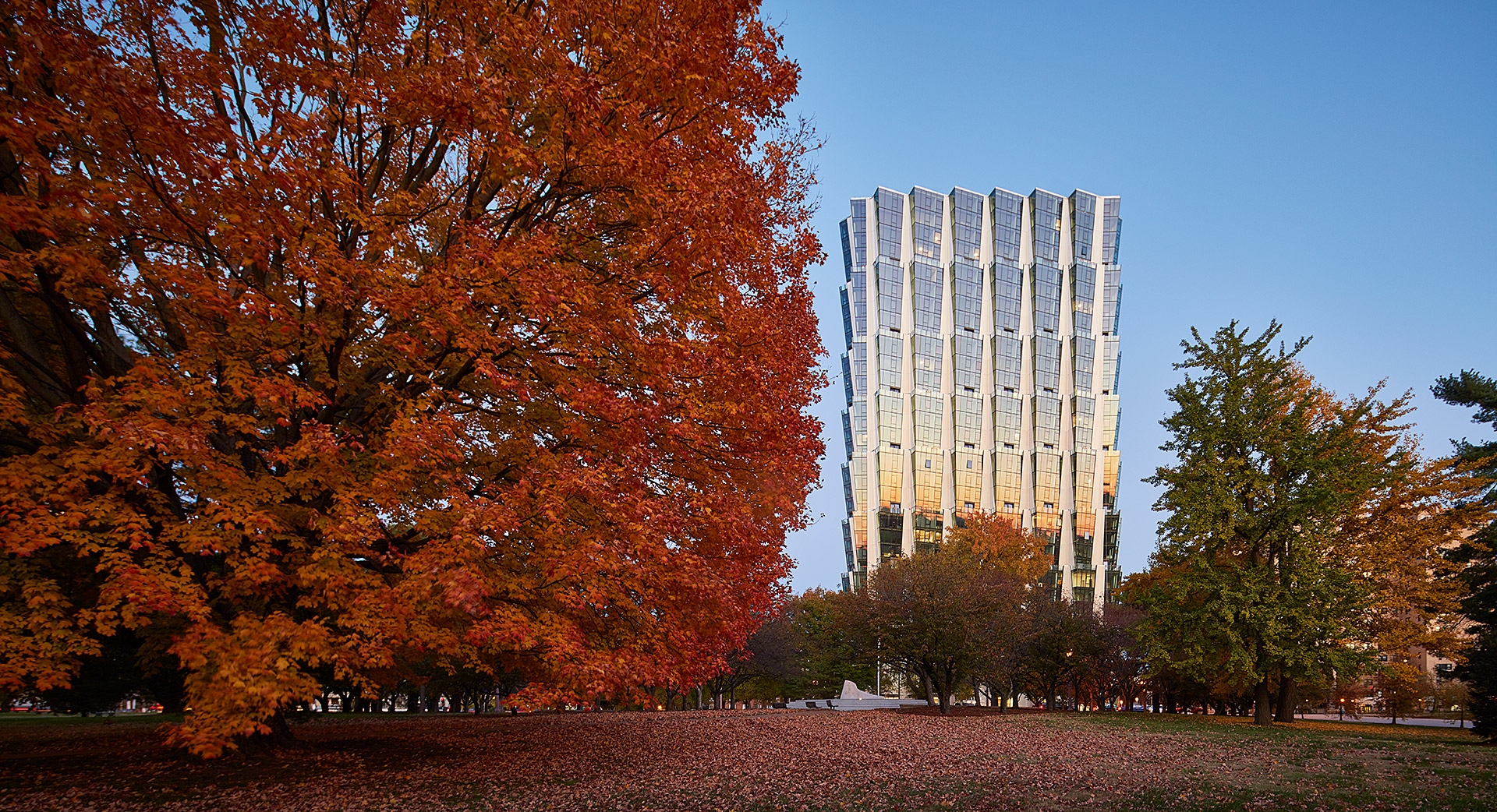 Few locations are more prominent for multifamily housing in St. Louis than Forest Park. Designed by Studio Gang, One Hundred is a residential tower overlooking the park and the studio’s first project in the city. The tower includes a mix of housing, retail and amenities on four-story stacked tiers. The apartments were designed for views of Forest Park and east to the Gateway Arch.
From a formal approach, Studio Gang designed the tower with an angled façade that creates a series of large outdoor spaces atop each tier. This move also produces outdoor space for residents atop the green roof podium. The team notes that, “each apartment features its own corner living room with double exposures that, in addition to offering panoramic views, enhance the amount and quality of daylight within the units.” The tower includes public and retail spaces at ground level adjacent to the park, while establishing a new landmark for St. Louis.
Cirqua Apartments
BKK Architects, Melbourne, Australia
Jury & Popular Choice Winner, 2018 A+Awards, Multi Unit Housing Low Rise (1-4 Floors)
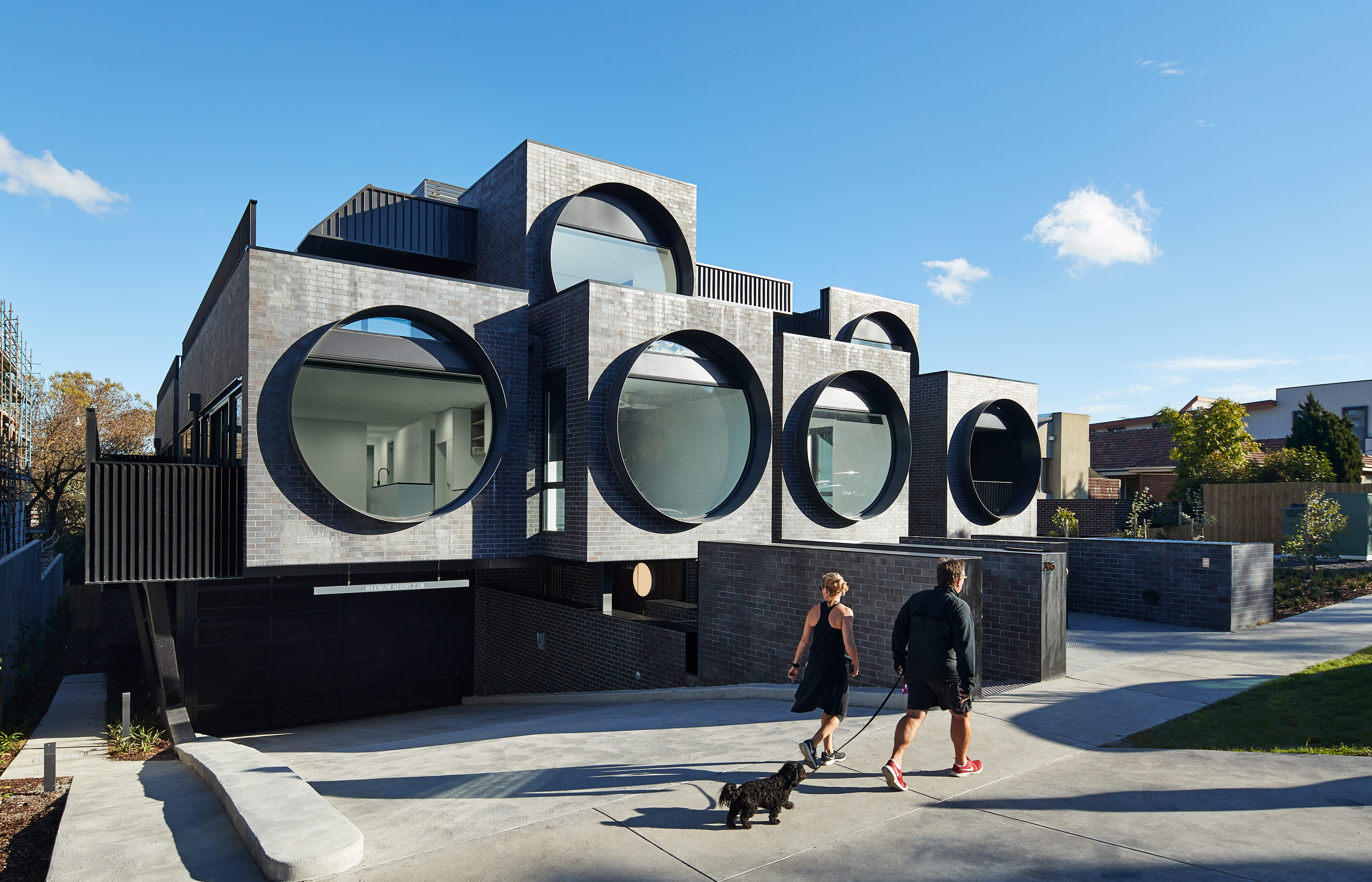
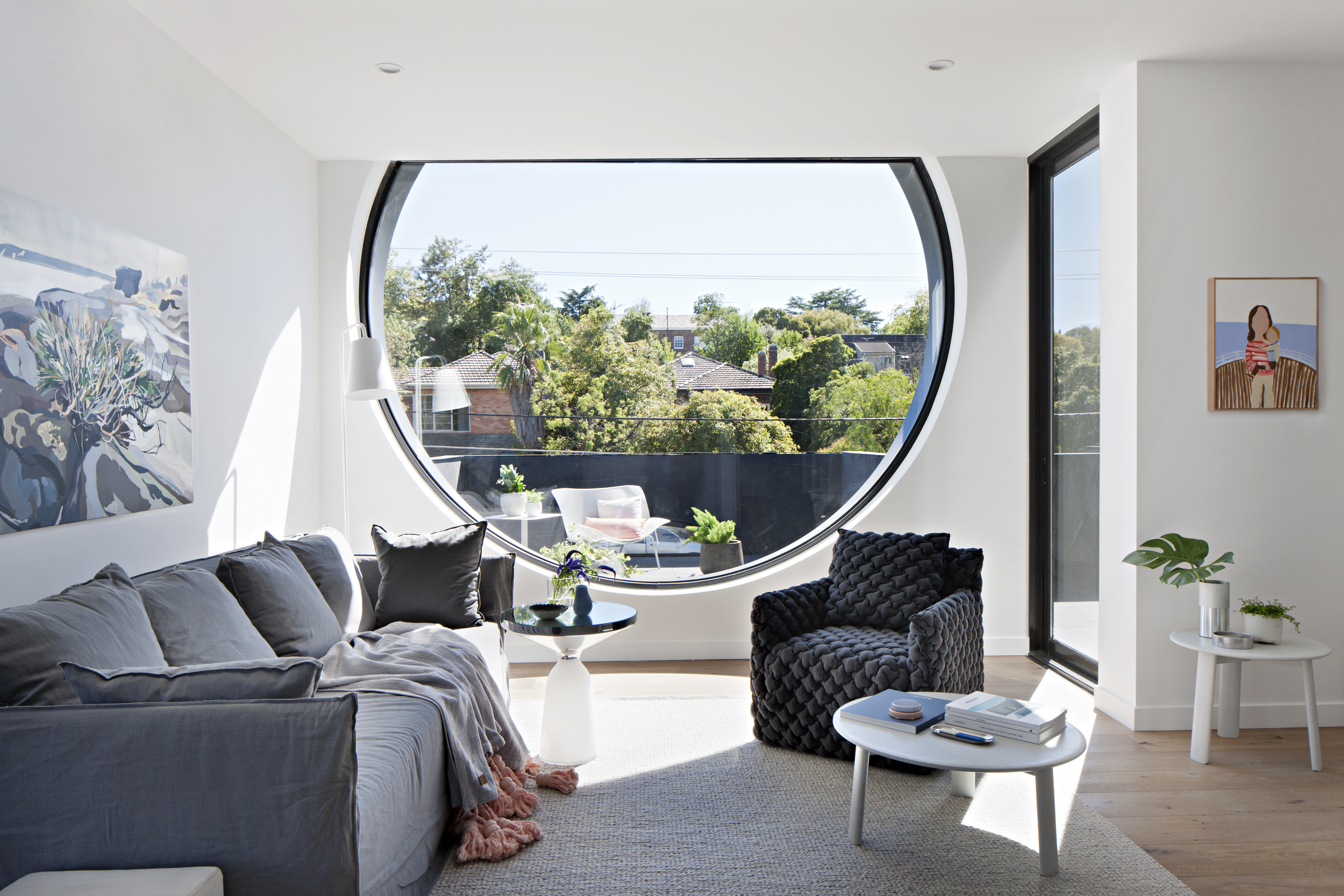 The Cirqua project by BKK gained widespread recognition for creating beautiful, inventive multifamily architecture. The project includes 38 unique unit types out of the 42 total apartments made with spacious balconies and an integrated approach to landscaping. Combining two properties into a single block, the project was formed with careful attention paid to scale and the surrounding context. Cirqua not only showcases a smart, nuanced approach to multifamily housing, but also how to design for accessibility and passive performance.
As the team noted, prospective owners are increasingly buying into the apartment market (over detached housing) as owner-occupiers. A sense of place was a key driver of the design, establishing a neighborly feel. All living areas and bedrooms have direct access to ventilation, natural light and views, while maximizing glazing created connections to the surrounding garden. From the neighborhood scale, a study in massing led to reducing the overall building volume to make the development fit seamlessly into its site.
Caterpillar
Prince Concepts, Detroit, MI, United States
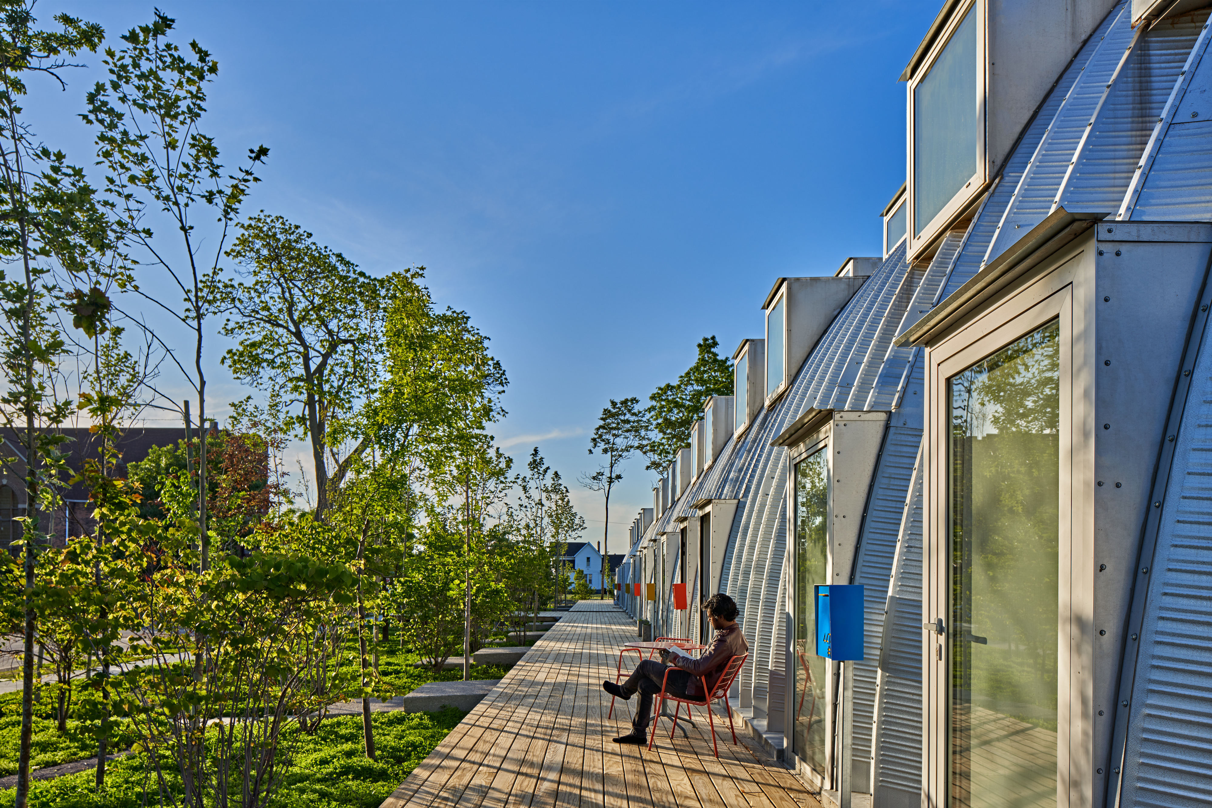
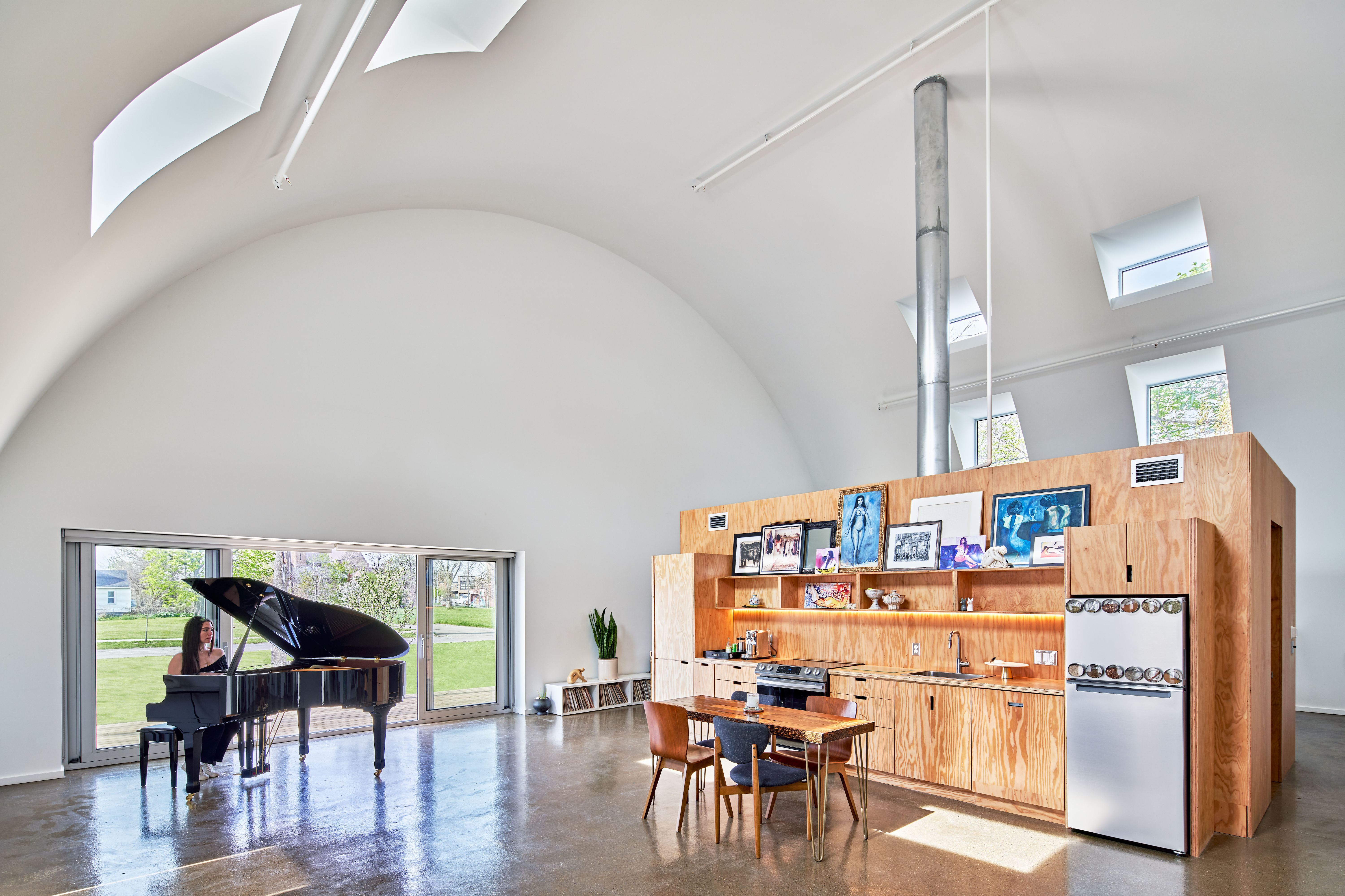 Caterpillar approaches density through a novel construction and design in Core City, Detroit. It utilizes a Quonset Hut structure that holds eight units, all entirely prefabricated. The result is an 8,000 square foot (745 square meter) residential project that prioritizes indoor and outdoor space. Prince Concepts created the project with tall ceilings that rise to 23 feet (7 meters); the units were designed to capture morning light in the bedrooms and evening sunsets in the living room.
Multifamily housing and density are charged subjects, but they also hold the potential to reimagine everyday life in cities. For Caterpillar, the team wanted to rethink the standard ratios of a multifamily project. To do so, instead of “150 apartments surrounded by eight trees with just one window per room, Caterpillar provides eight apartments surrounded by 150 trees and 12-18 windows per room.” The multifamily project built on the success of True North, completed in 2017. That Prince Concepts development was made with eight Quonset huts and ten leasable units.
Casa Jardin Escandon
CPDA ARQUITECTOS, Mexico City, Mexico
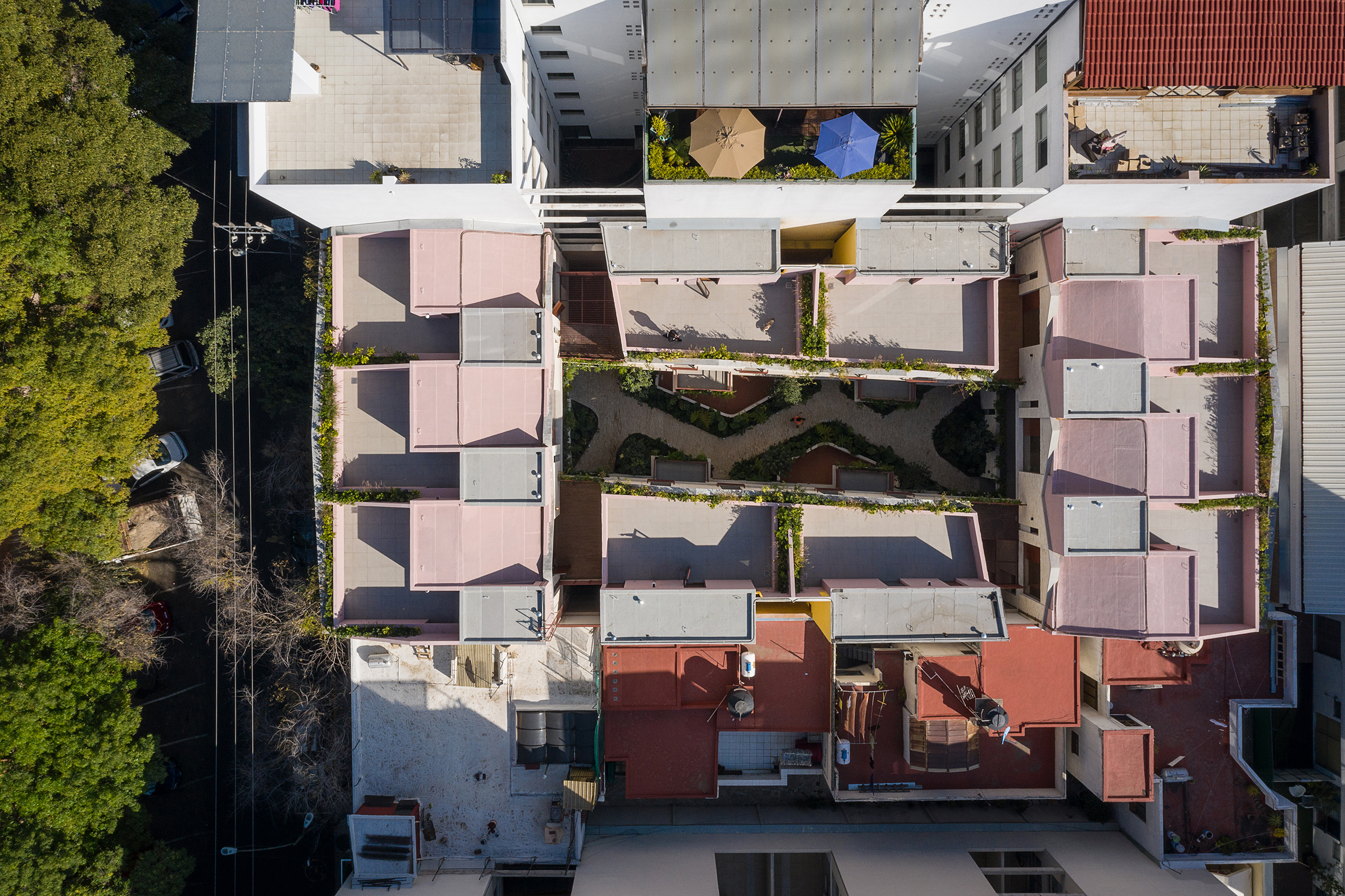
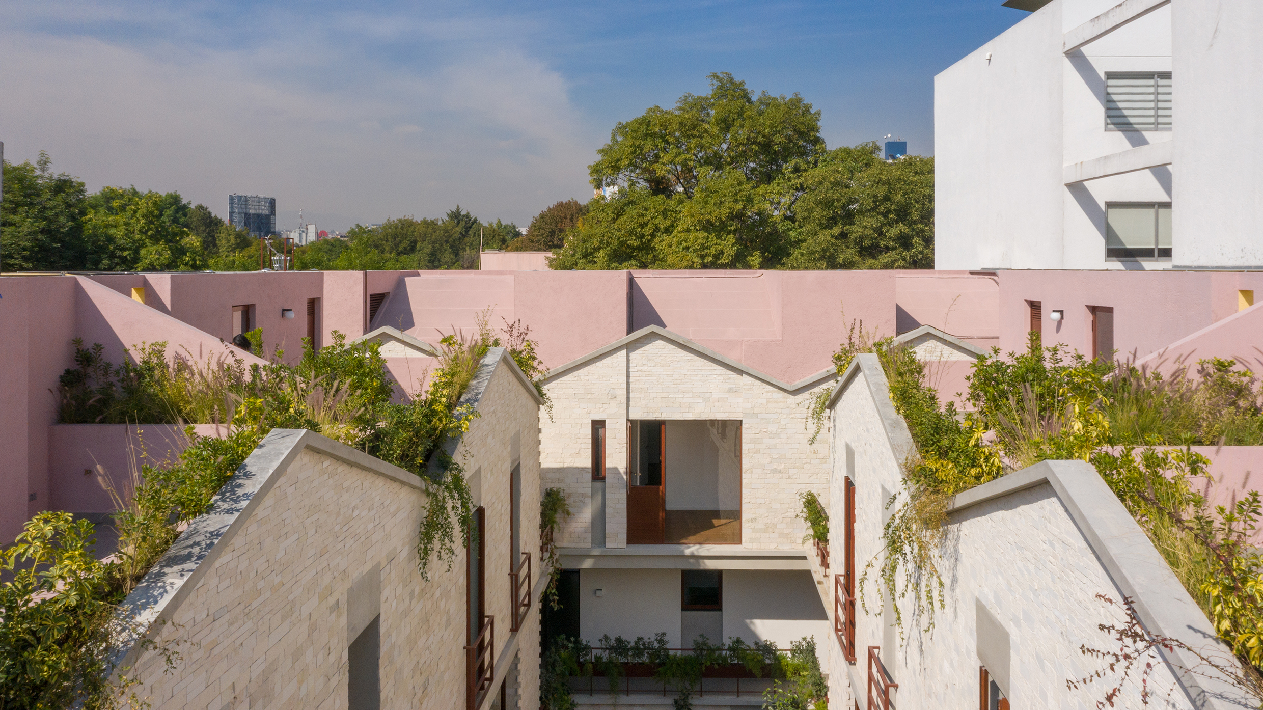 CPDA Architects designed this garden house project as a multifamily development in Mexico City. Located in the Escandón neighborhood, the project includes fourteen residential units. At its heart, a central courtyard is the connective element that defines the housing project, opening up access to natural light and cross ventilation. Ten townhouse units are set up the four ground-floor units below, all of which share a similar material relationship.
As the Escandón neighborhood has seen rapid growth, new populations moved in across age and income levels. The project provides a mix of unit types, as well as changing faces along its façade. The exterior showcases the concrete slabs that stand out and the gabled façade, while the interior has simple, seamless and integrated forms that define the inside complex. The idea was to create a “secret garden” that residents can enjoy within the city.
The SIX Veterans Housing
Brooks + Scarpa Architects, Los Angeles, CA, United States
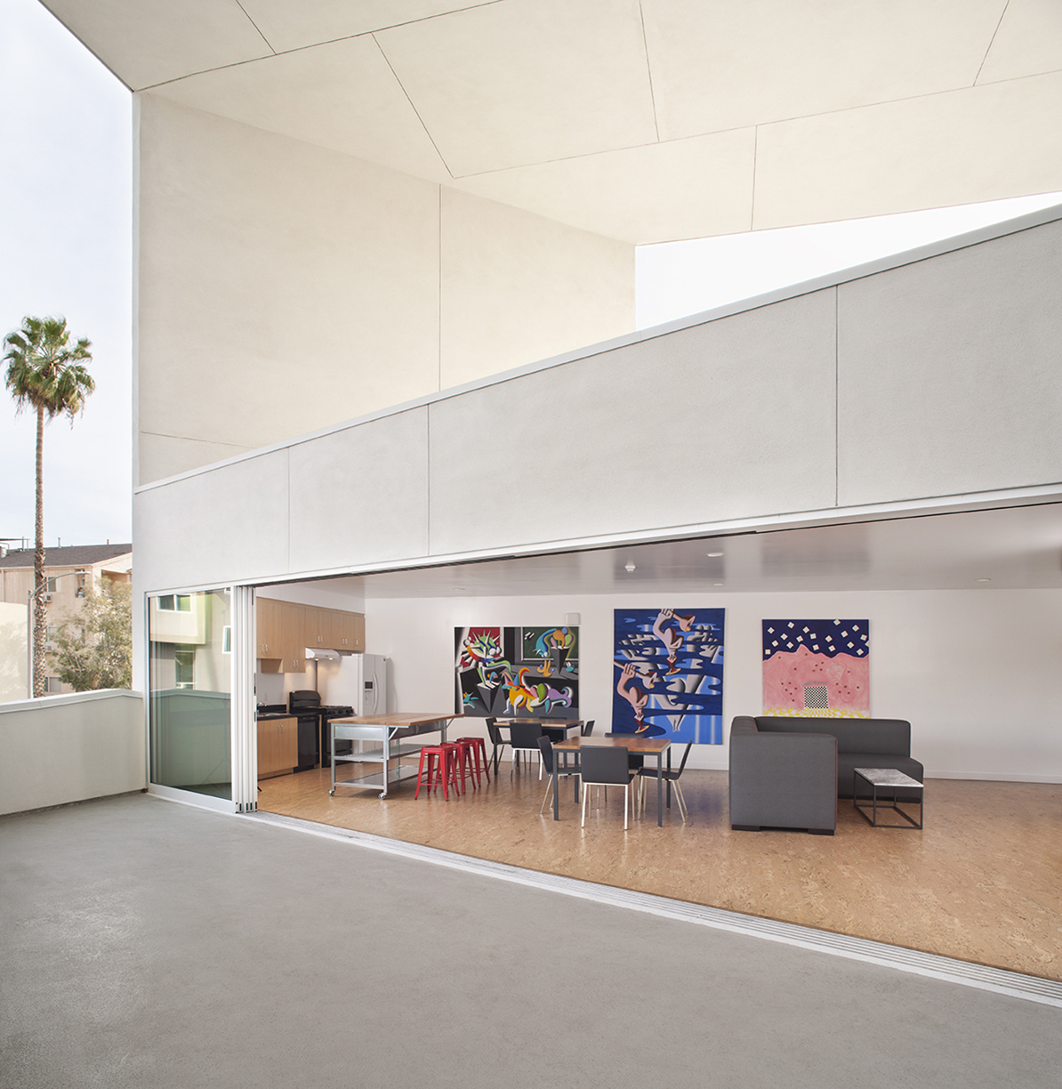
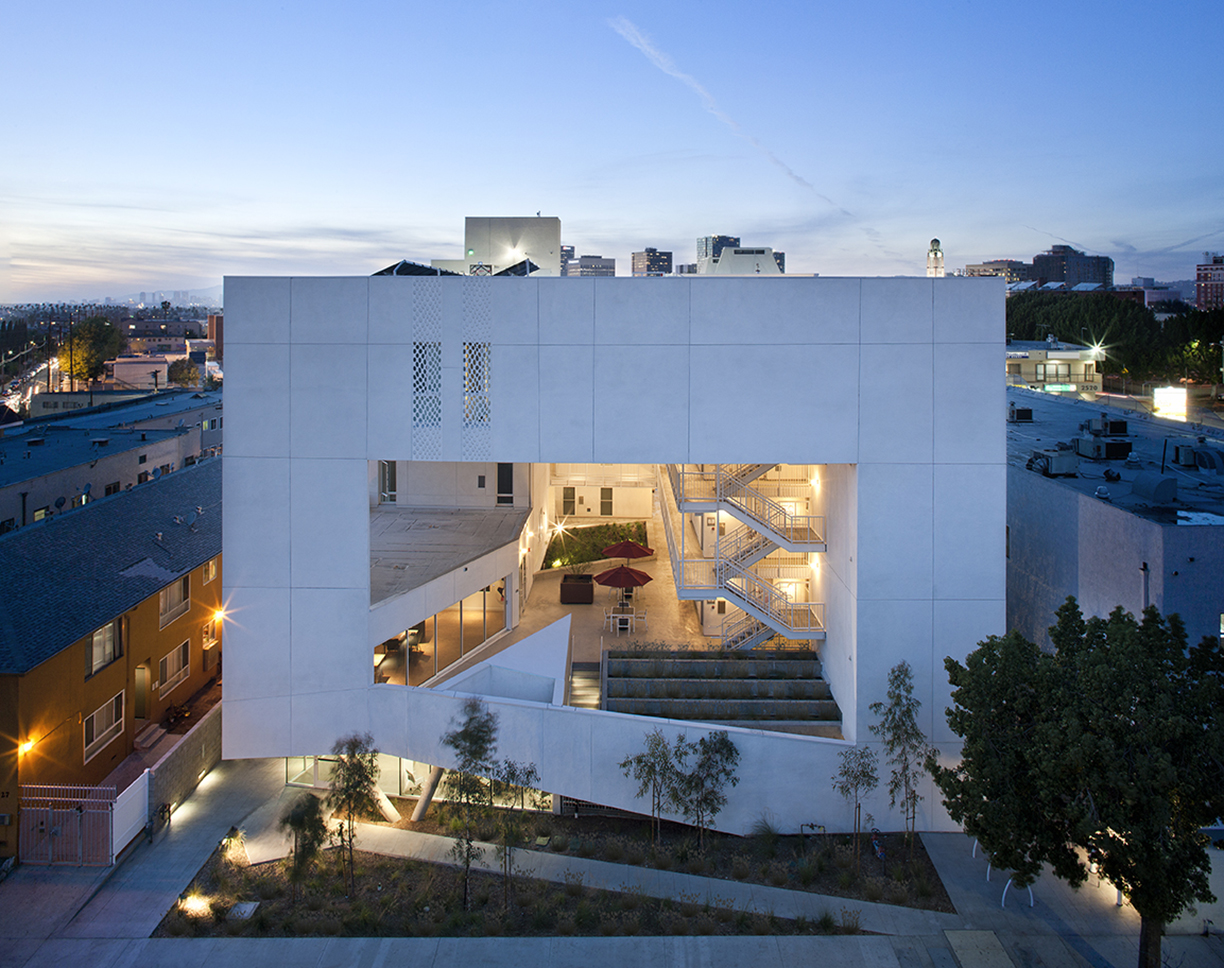 Few cities in the world are grappling with homelessness and a severe lack of housing affordability like Los Angeles. Brooks+Scarpa has built a practice addressing issues in the city and across the nation. For this multifamily residential, The SIX was designed as a 52-unit affordable housing project that “provides a home, support services and rehabilitation for previously homeless and/or disabled veterans.”
Located in the MacArthur Park area of Los Angeles, The SIX was made to break the mold of multifamily housing by creating public and private “zones” in which private space was deemphasized to create large public areas. At ground level, the program includes support spaces for veterans, as well as bike storage, parking and offices. The second level is the core of the project, with a large, public courtyard. The idea was to create a community-oriented, interactive space that opens to its surroundings.
Jinshan 9
Steffian Bradley Architects, Shenzhen, China
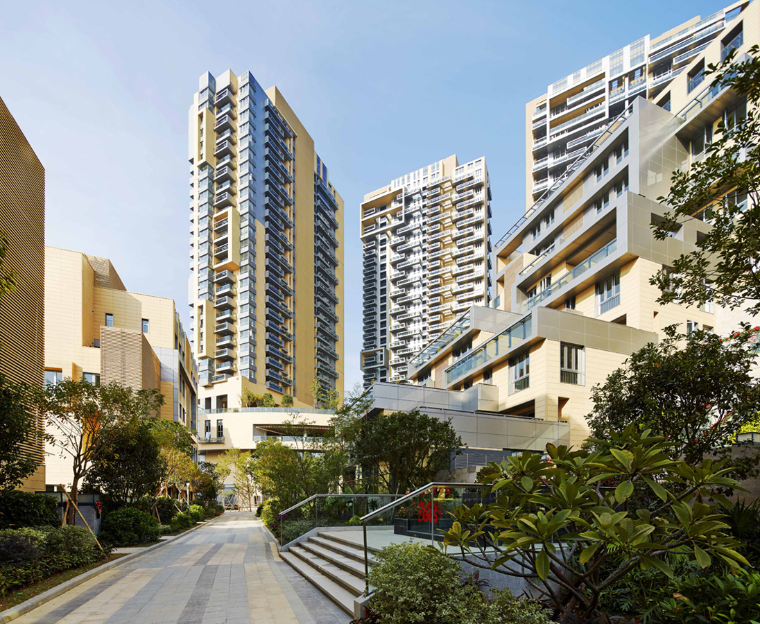
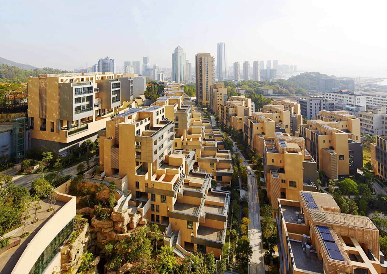 Over the last two decades, development in China has been defined by a dizzying pace and new architecture produce in-mass. For Jinshan 9, this force behind new buildings was directed into a multifamily living community. Located in China’s Shekou mixed-use district, the project looks out west to wild, forested mountains and east to Shenzhen Bay Bridge. With a range of both low-rise and high-rise structures, the development was made for diverse lifestyles and populations.
With 210 townhouse units, the project also has four residential towers rising 32 floors in height. Between integrated pedestrian paths and trails, the development comprises a network of gardens and interconnected terraces. From its material palette, Jinshan 9 includes natural-colored terracotta panels with aluminum trim on the exterior. This combines with marine-inspired imagery and forms, like balcony details echoing sailboat decks.
Architects: Want to have your project featured? Showcase your work through Architizer and sign up for our inspirational newsletters.

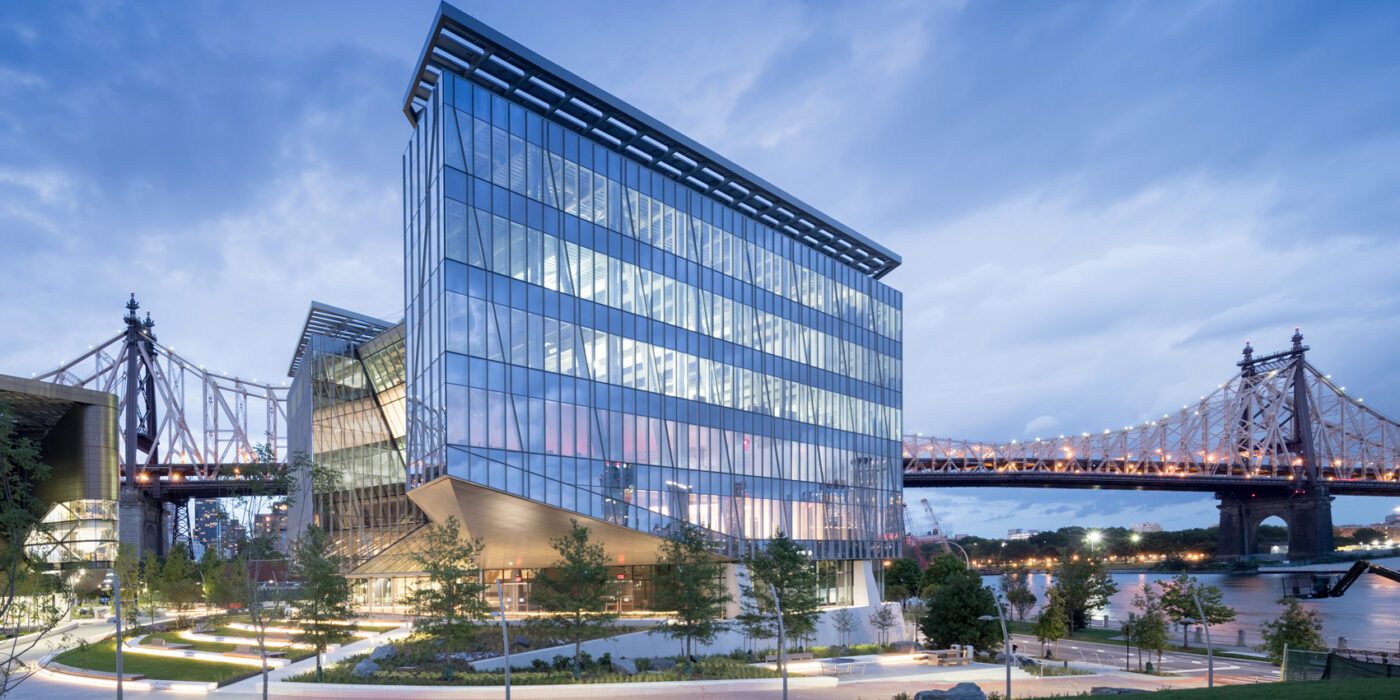
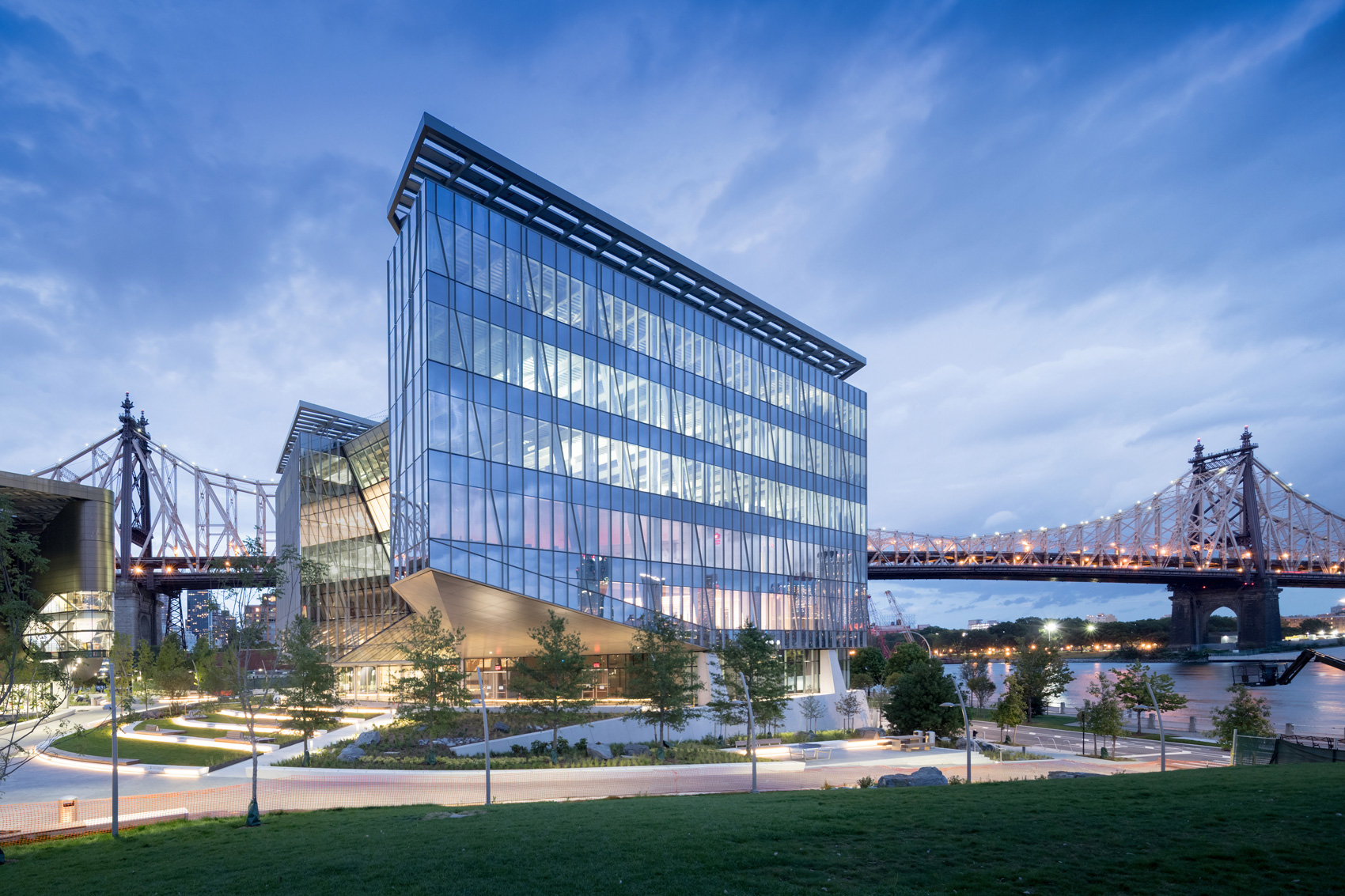
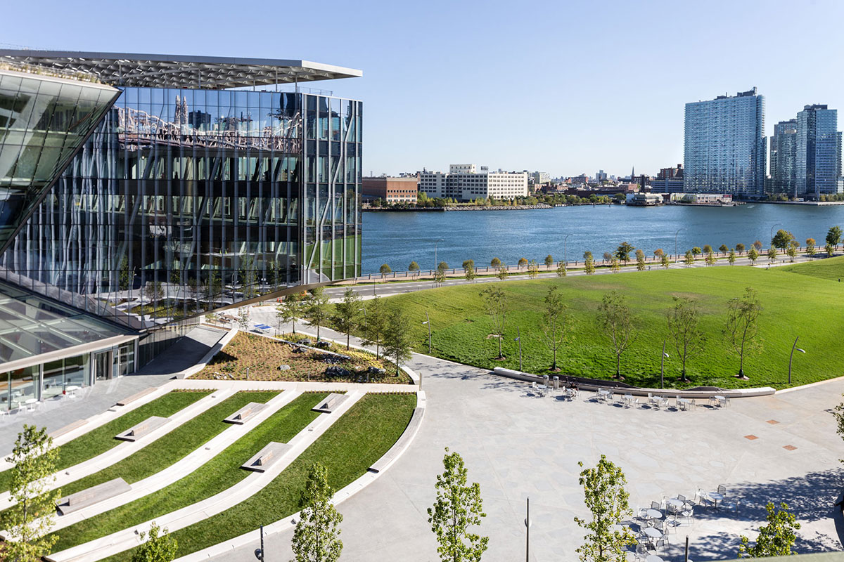
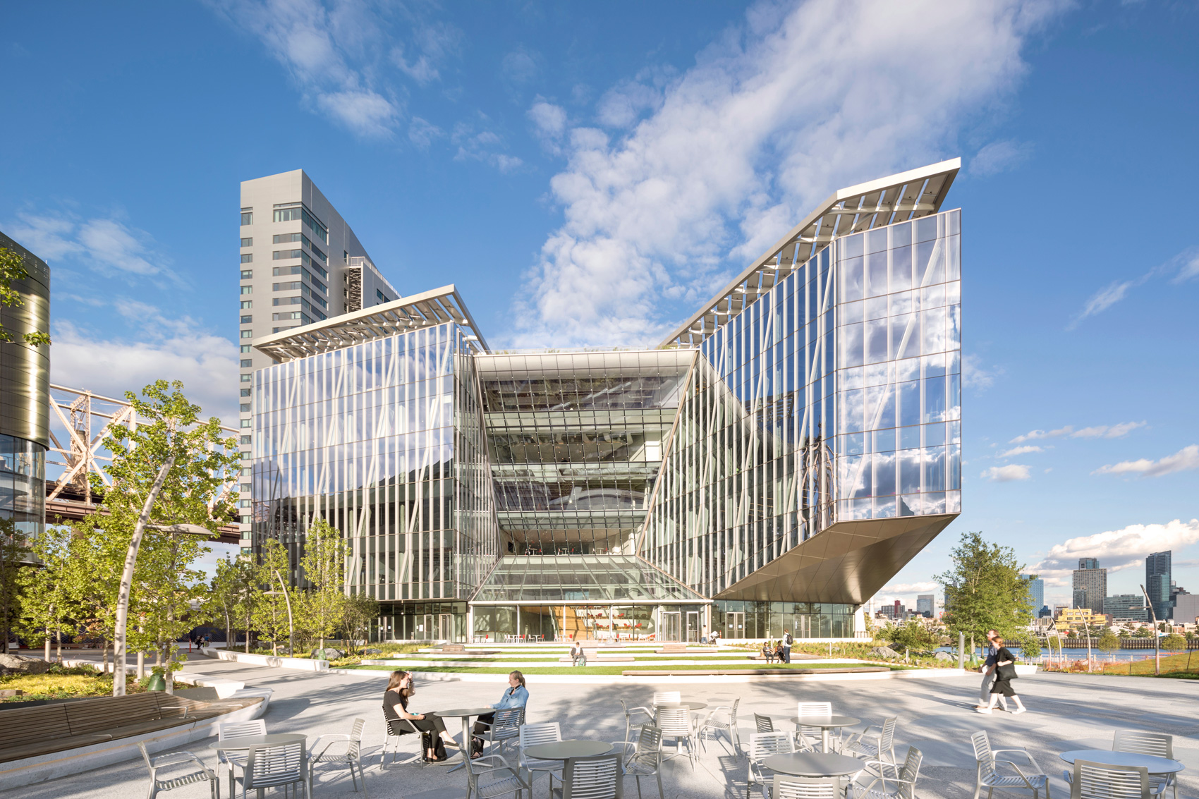 Outside the Tata Innovation Center and the surrounding grounds on Roosevelt Island, ABC provided a series of granite stone pavers. The project itself was developed by Forest City New York to supports Cornell Tech’s efforts to fuse entrepreneurial and academic ambitions on its new Roosevelt Island campus in New York City. One-third of the 235,000-square-foot building hosts Cornell Tech studios, labs, classrooms, and event spaces, while the upper levels are dedicated to a mix of technology-focused companies and start-ups.
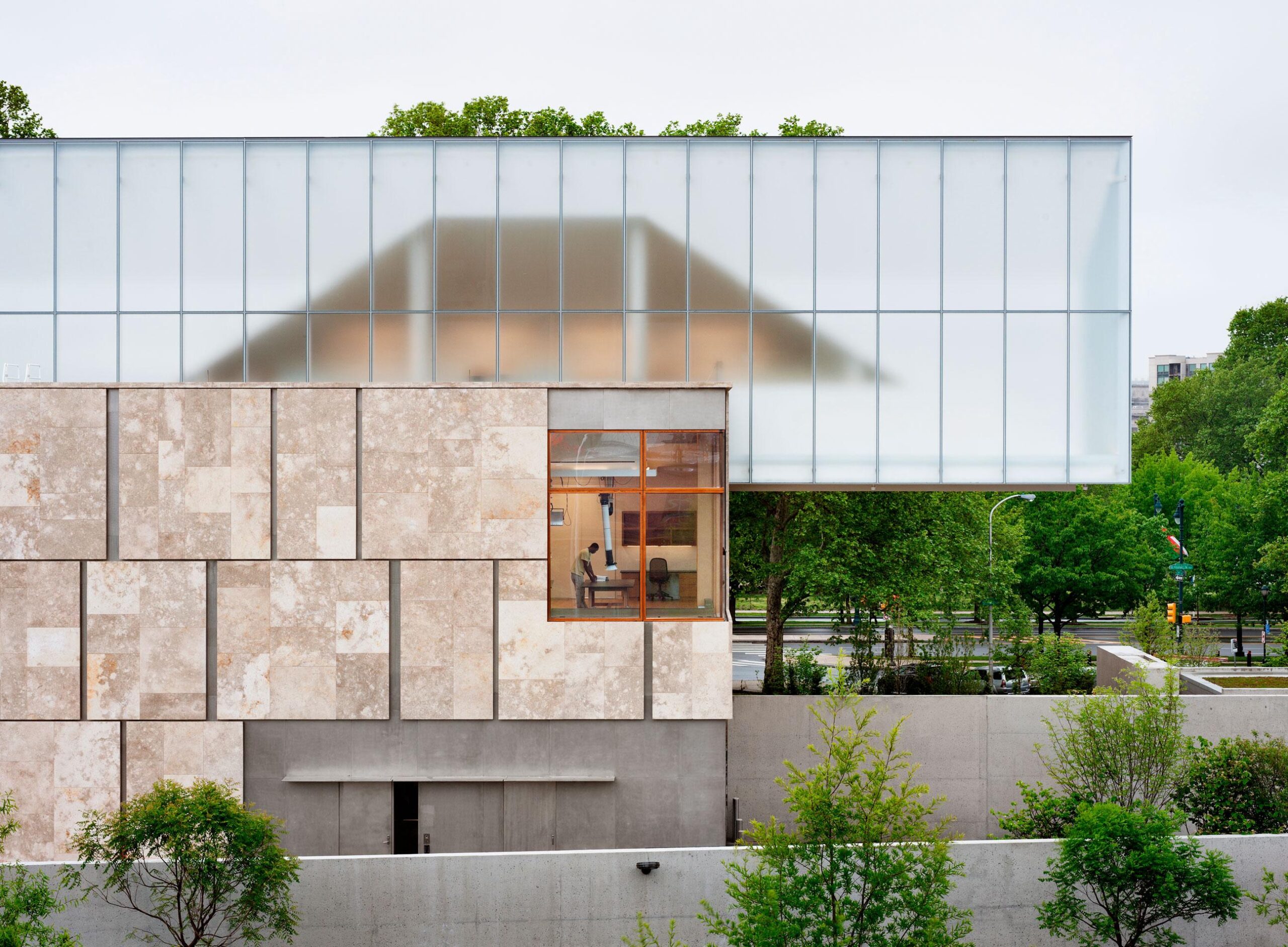
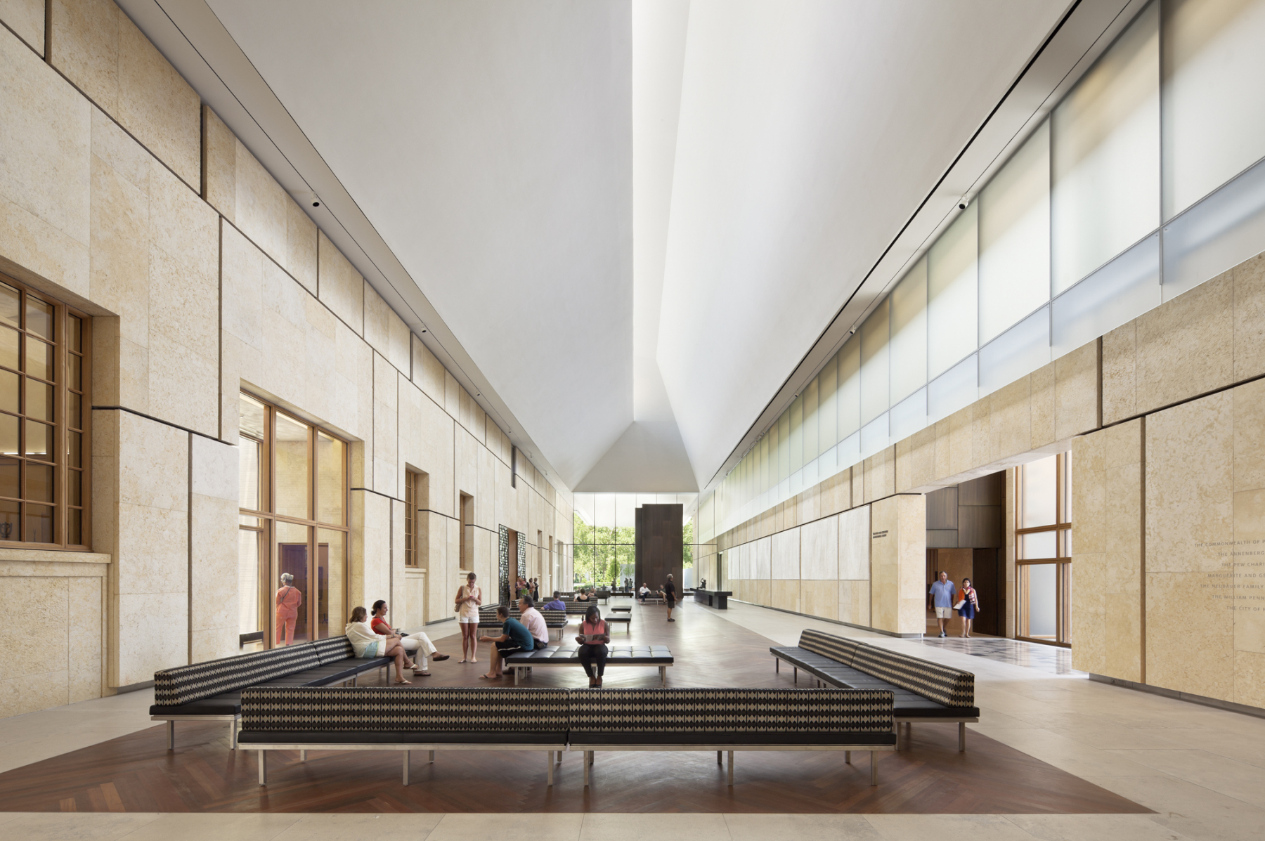
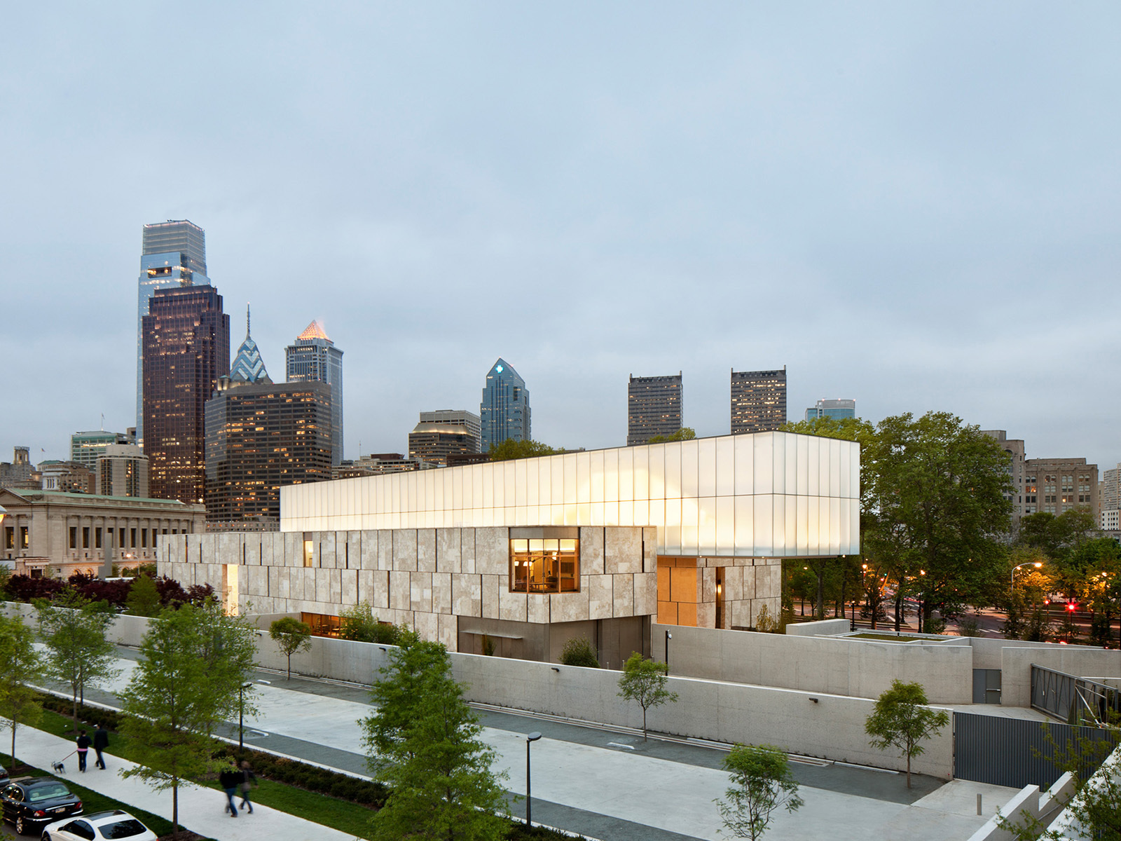 The Barnes Foundation collection was relocated to a 93,000 square foot, LEED Platinum building on the Benjamin Franklin Parkway in downtown Philadelphia. Conceived as “a gallery in a garden and a garden in a gallery,” the new building honors the past Merion facility and provides visitors with a personal experience. Clad in fossilized limestone and crowned by a luminous light box, the two-story building, with an additional level below grade, is set in a public garden.
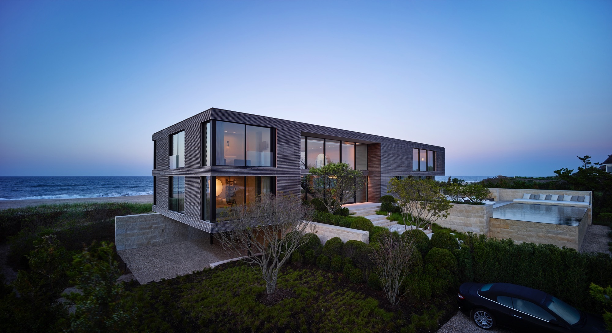
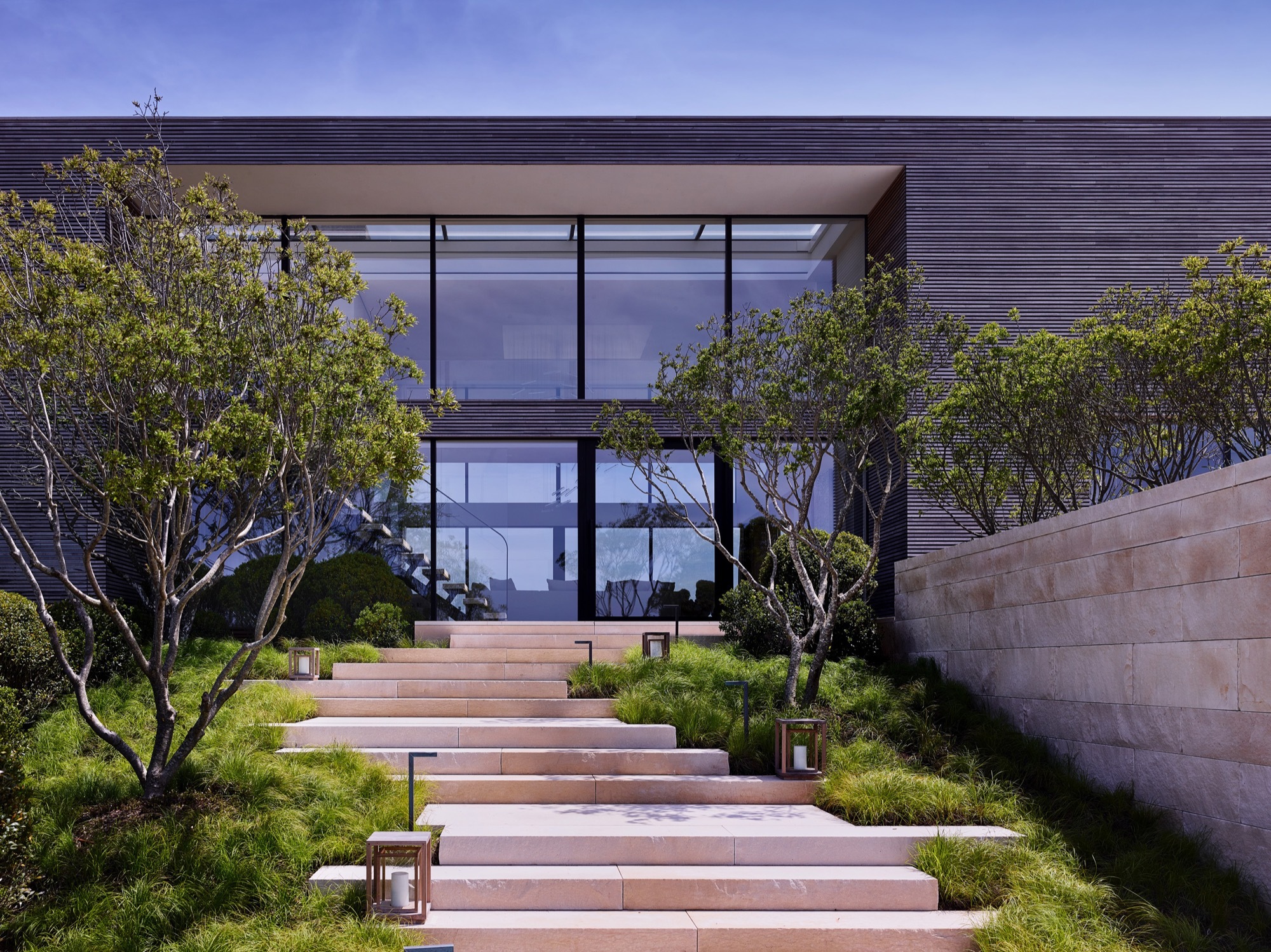
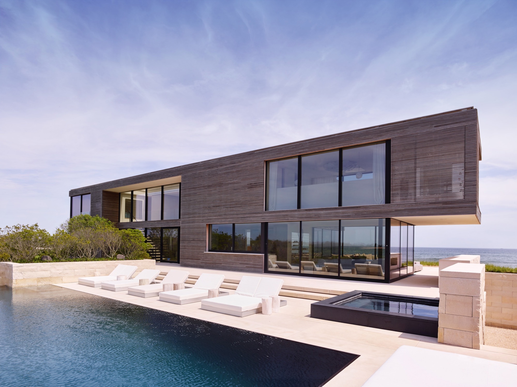 Field House was built between ocean and pond. With the landscape seemingly running through it, the house was designed around flooding and wind. It was constructed on piles with a steel frame and high density limestone. The house is approached through a terraced set of stairs, and the interior palette matches the exterior, with the limestone extending throughout the main level and reappearing as solid blocks in bathrooms.
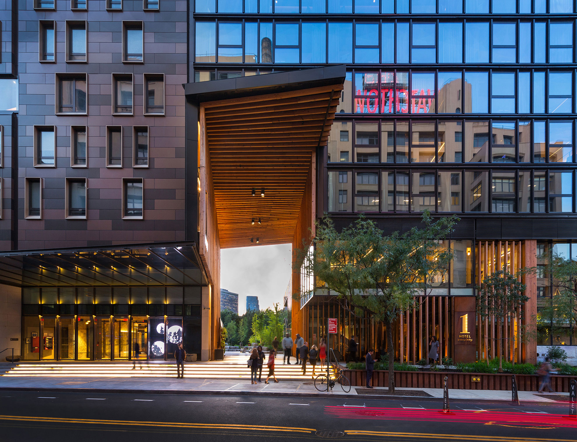
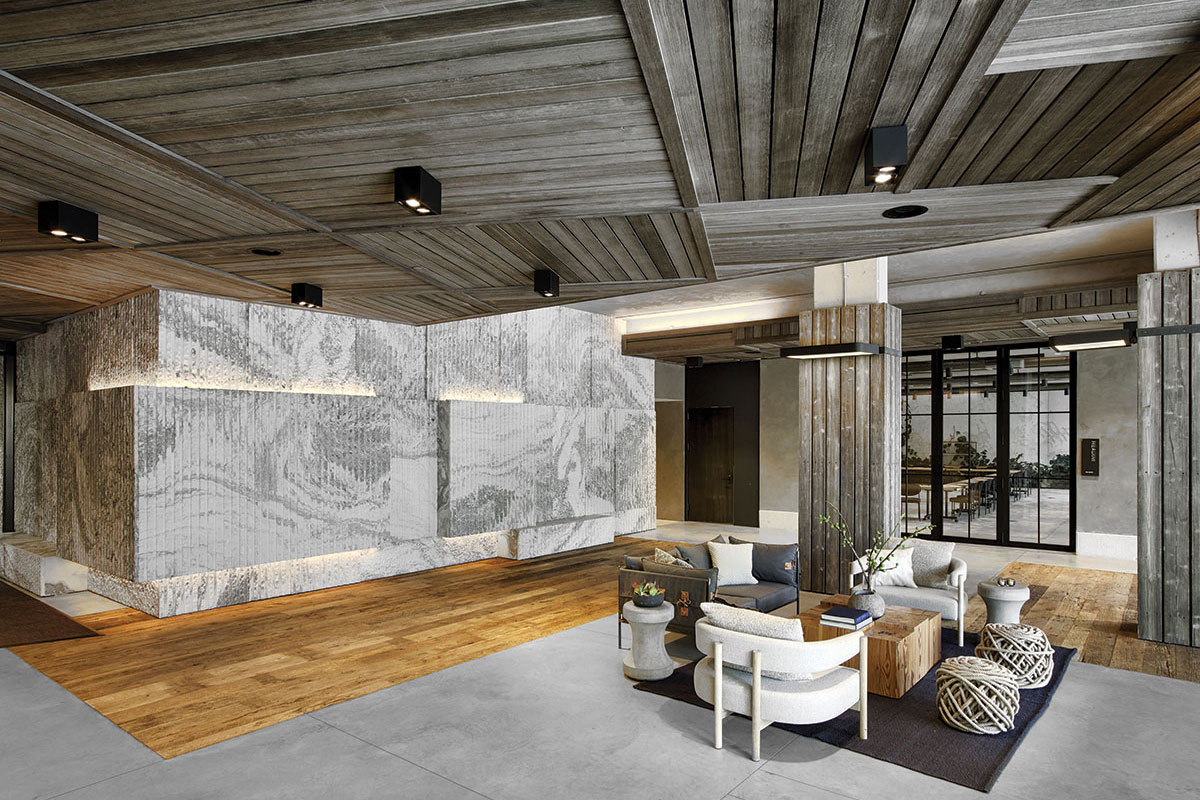
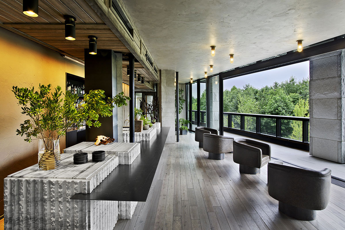 1 Hotel overlooks the East River in Brooklyn’s DUMBO neighborhood and features more than 10,000 square feet ABC’s Montclair Danby Vein Cut, Mountain White Danby, and Crystal Grey Danby. The Pierhouse and 1 Hotel Brooklyn Bridge building echoes the park’s simplified use of stone and steel. It steps down to meet the green lawns with planted roofs. Using stone from a Vermont quarry helped the project achieve the designation of LEED Gold certification.
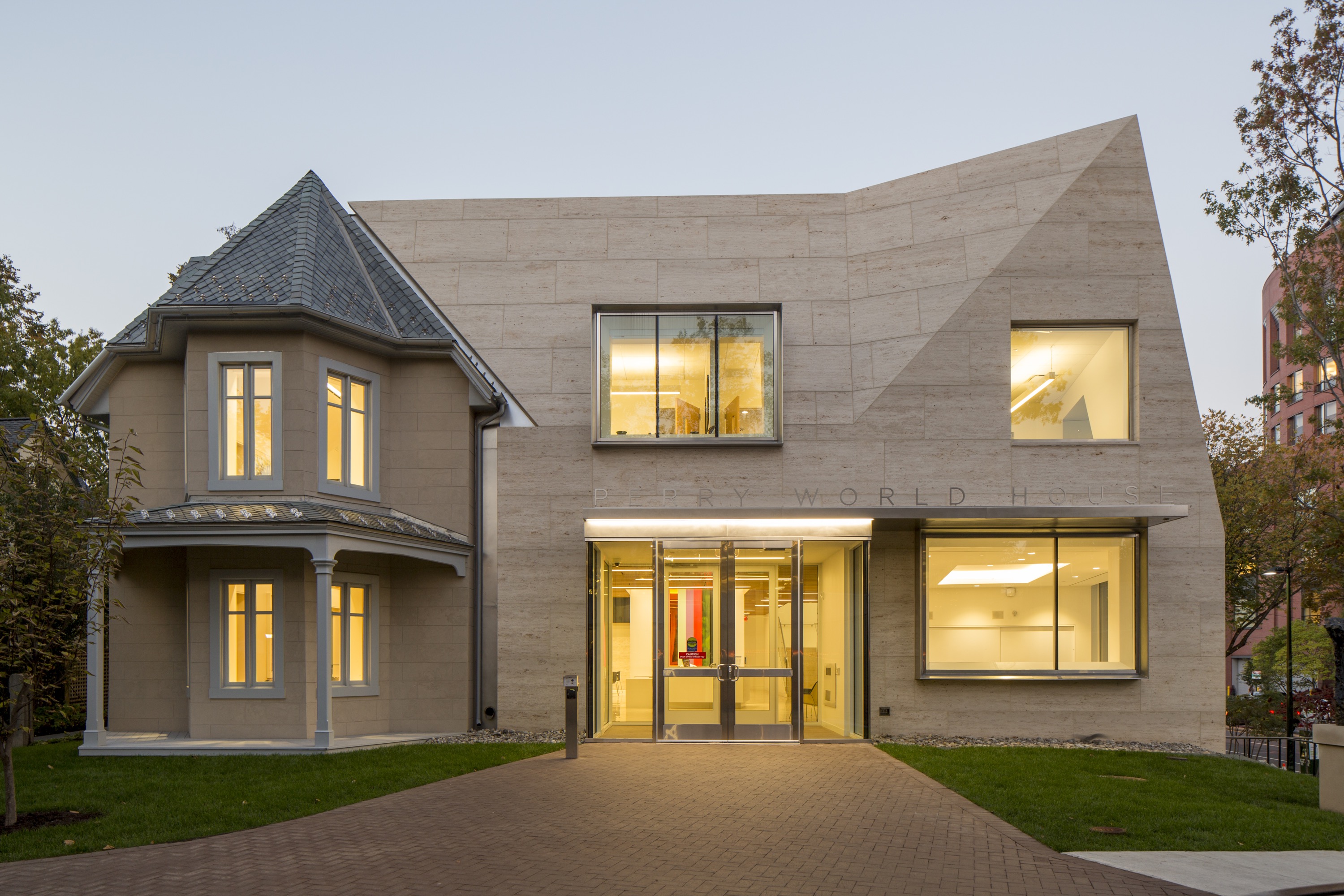
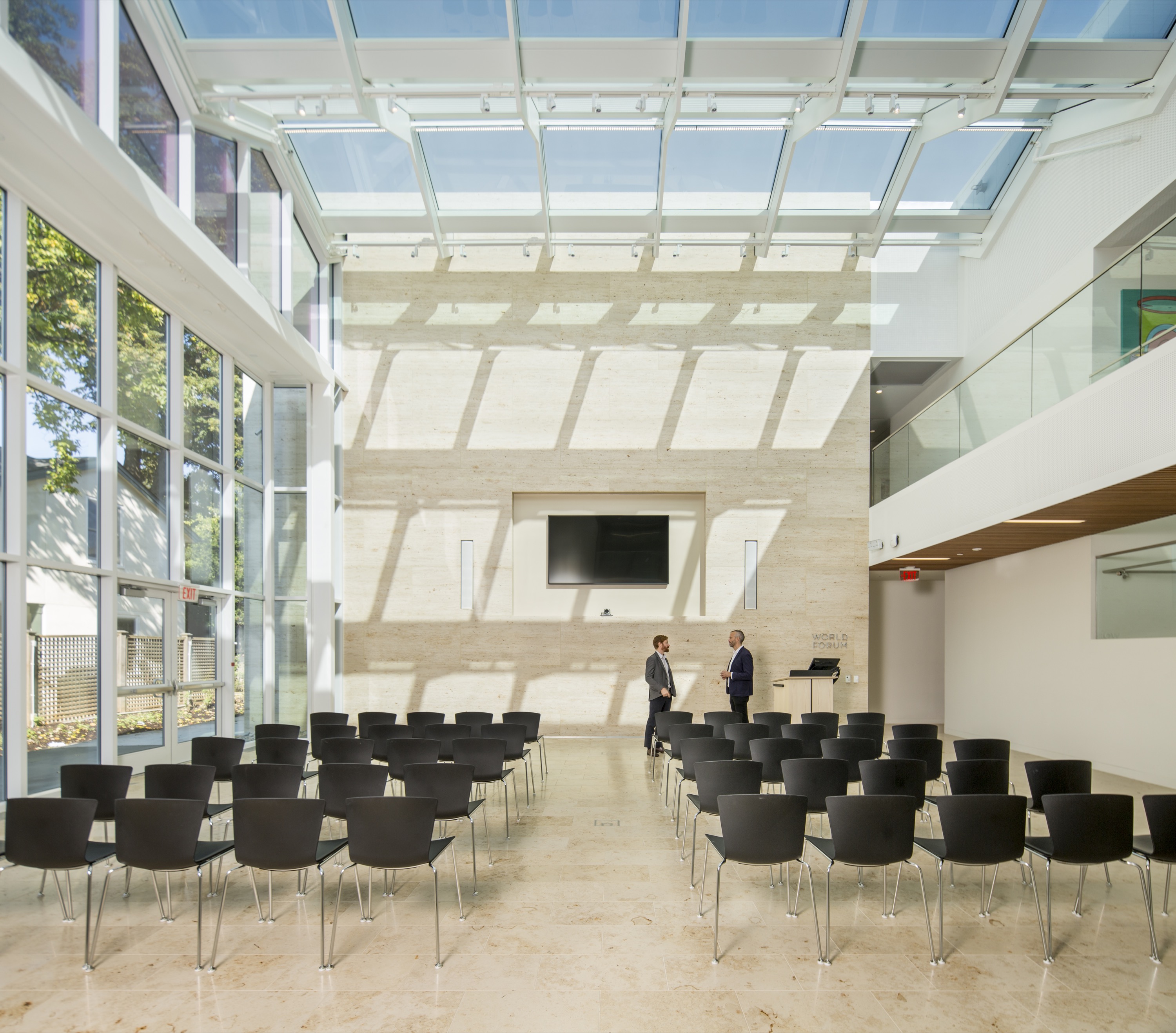
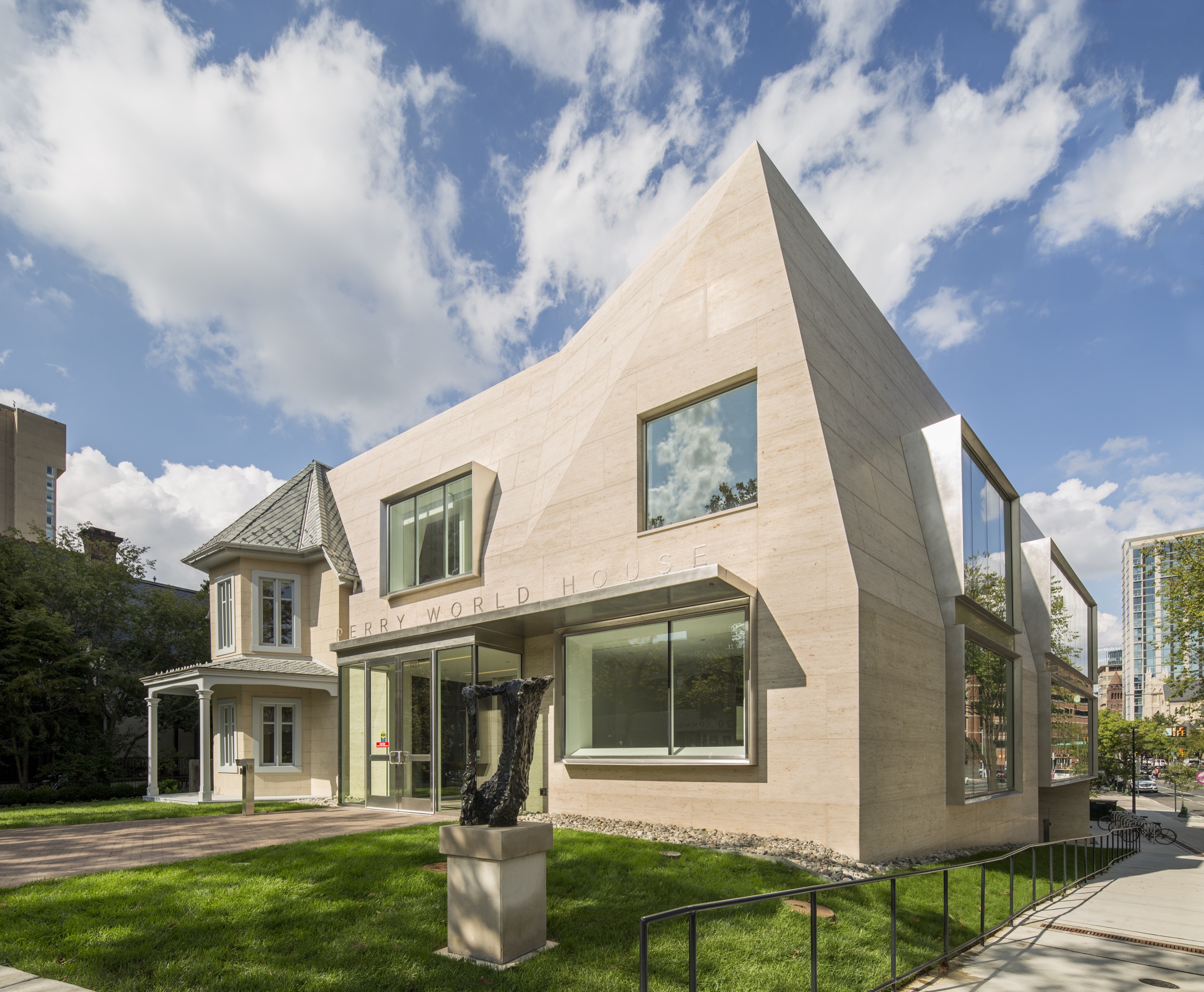 For the Perry World House, the University of Pennsylvania needed a space for its new institute that would aggregate all its international activities. This became a renovated cottage that was originally built in 1851. Designed by 1100 Architect, the team preserved the house while transforming the site into a 21st century flagship for this newly formed institute. ABC Worldwide Stone was responsible for sourcing, selecting, quality checks, logistics and fabrication approvals on all the project’s 1,850 cubic feet of Renaissance Beige limestone.
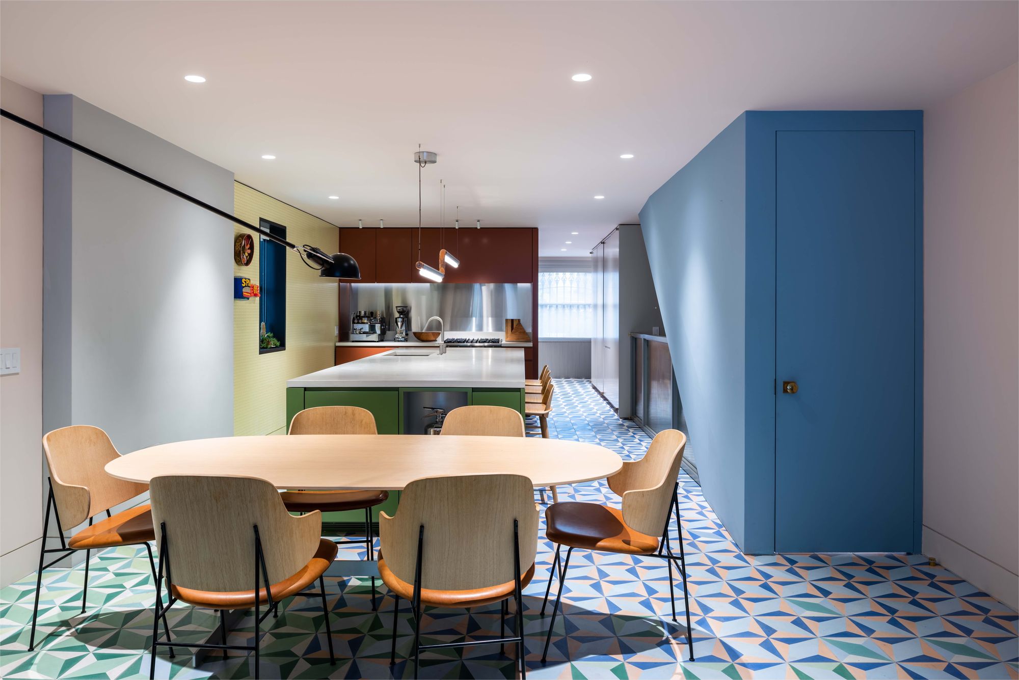
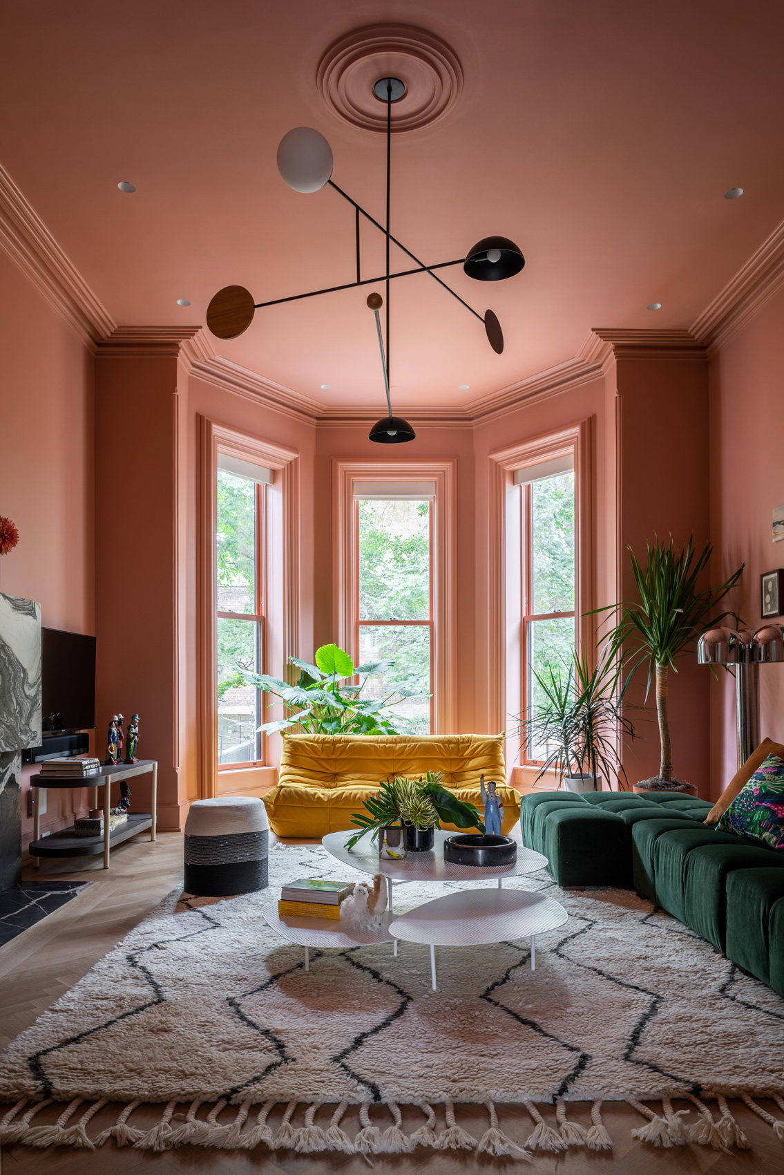
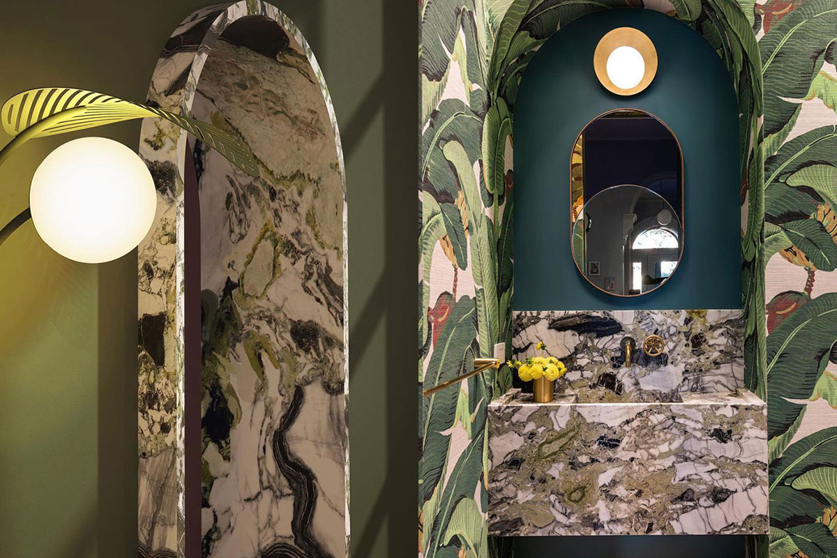 MKCA’s gut renovation and exterior restoration of a landmark Brooklyn brownstone balances history with a playful intervention. Located in the historic Clinton Hill neighborhood, the original structure was abandoned to decay for twenty years. The design of the house balances stabilizing the building and recapturing its original details with efforts to create a new home in an adventurous, innovative manner, producing an appealing aesthetic between the historic elements and the new additions.
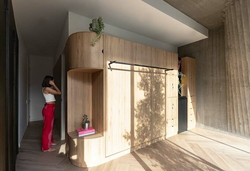

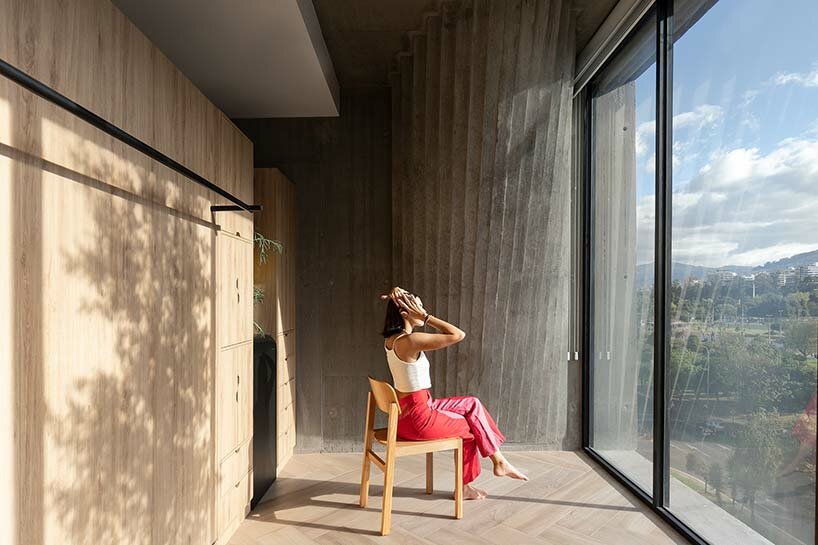
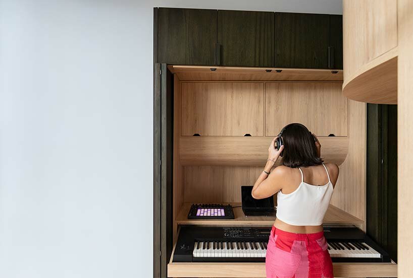 a keyboard is hidden away in the ‘music studio’ station
