designboom has received this project from our DIY submissions feature, where we welcome our readers to submit their own work for publication. see more project submissions from our readers here.
B.L.U.E. Architecture Studio designs compact café in Beijing
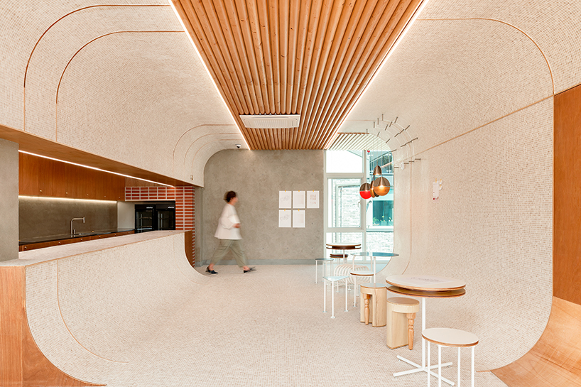
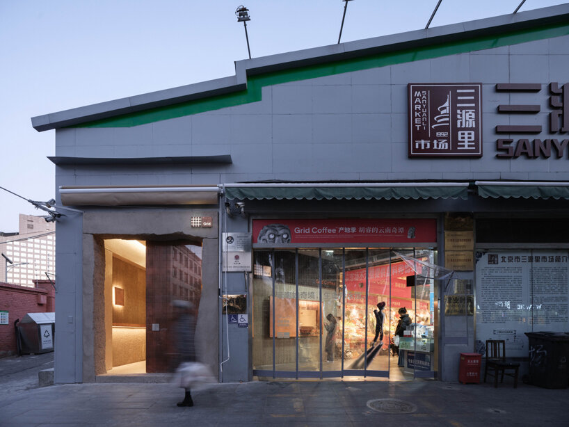
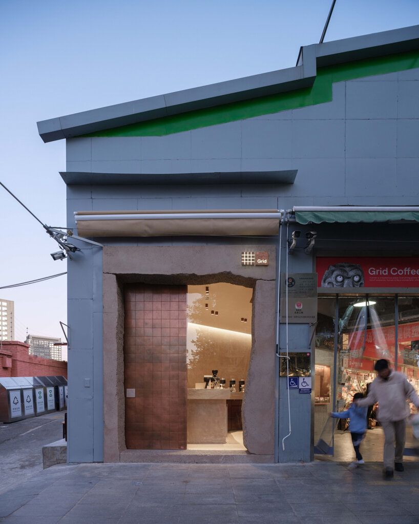
Located within the lively SanYuanLi Food Market in Beijing, this café designed by B.L.U.E. Architecture Studio offers a modern twist amidst the traditional marketplace. Occupying a small 25 sqm space, it stands out at the northern entrance, blending modernity with the market’s historic charm. Inspired by the market’s vibrancy, the café’s design aims to harmonize past and present, revitalizing the community and connecting with the urban environment. ‘Our focus is on establishing both the ‘uniqueness’ and ‘everyday sensibility’ of the community space, seamlessly integrating the distinctive spatial ambiance into daily life,’ describes the team.
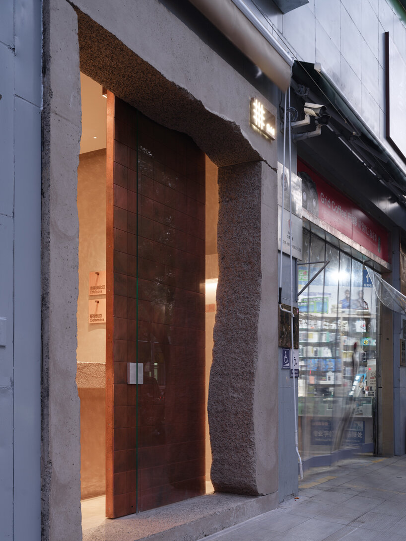
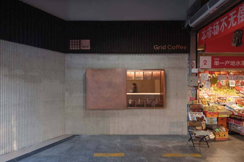
B.L.U.E. Architecture Studio‘s design captures attention with its juxtaposition of concrete framing and a copper door. Despite its small footprint, this project aims to spark conversations about street life, community renewal, and urban connectivity, exploring innovative ways to enhance public spaces. The facade design maintains coherence with the market’s aesthetic, featuring a clever window mechanism. ‘When open, it showcases interaction and integrates communication between urban life and community scenes. When closed, the hand-hammered copper plate forms a contrast with the bustling market, resembling a piece of art,’shares the team.
The unique shape of the concrete framing mirrors the market’s vibe, while the copper door adds visual interest without overwhelming the space. ‘With this design, our objective is to initiate a discourse on street, community revitalization, and urban connections, aiming to explore innovative approaches to communal public life’. Inside, the design fosters the ritual of enjoying coffee on the go, with the sculptural bar efficiently dividing the space. The windows blur the lines between the café and the market, encouraging interaction. Material choices, from oxidized copper to hand-cast ribbed facades and elm wood surfaces, further integrate the café with its surroundings.
the handcrafted copper door, in contrast with the rough and weighty concrete
windows on the inner façade foster interaction among various stalls and blur the boundaries between the café and the market
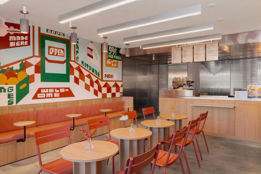
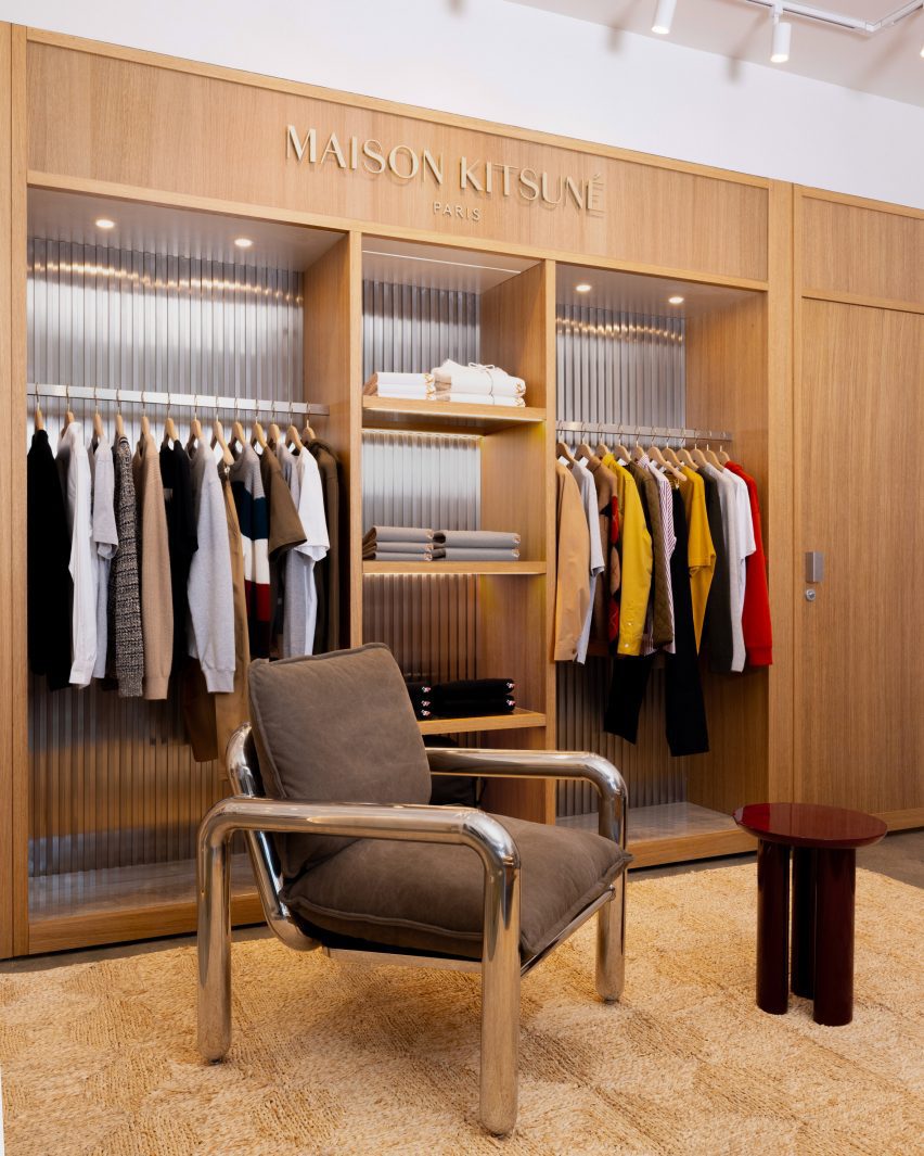
Paris-based lifestyle brand Kitsuné has opened a cafe next to its boutique in Silver Lake, Los Angeles, both with minimalist interiors featuring white oak and stainless steel.
The interiors of the new Cafe Kitsuné and the renovated Maison Kitsuné store were designed by co-founder Masaya Kuroki to reflect the brand’s French-Japanese culture as well as the West Coast setting.
The Cafe Kitsuné interior includes a mural by Jeffrey Sinich that imagines the space as an old-school market
Facing Sunset Boulevard on the east side of the city, this is the brand’s fourth cafe in North America – following locations in Manhattan, Brooklyn and Vancouver – and its first in LA.
“A sprawling city of diverse findings, from cutting-edge restaurants to pockets of art and architecture second to none, LA has lent design inspiration and a backdrop to several campaigns for the fashion house,” said the Kitsuné team.
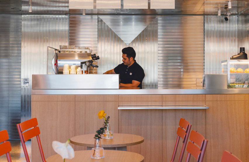
White oak tables and surfaces are set against stainless steel counters and panelling for a minimalist look
“Now, it’s the perfect setting for Café Kitsuné, a physical extension of the brand’s Franco-Japanese DNA, and reinvention of the classic Parisian cafe and wine bar experience with a Japanese twist,” they added.
The building’s red-tile exterior and poured concrete flooring were preserved, and hand-painted signage by Californian artist Jeffrey Sincich was added over the large street-facing windows.
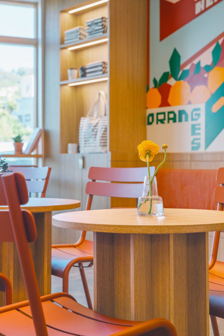
Burnt orange dining chairs and upholstered benches highlight the colours of the mural
Inside the 700-square-foot (65-square-metre) cafe, white oak tables and brushed stainless-steel counters feature alongside burnt orange dining chairs and upholstered benches.
Another Sincich mural covers the full length of a wall, offering “a whimsical take on Café Kitsuné’s standard appearance” and presenting the space as an “old-school market”.
A speaker system by Japanese audio company Rotel was installed in the cafe “to provide a top-notch sound experience for customers”, according to Kitsuné.
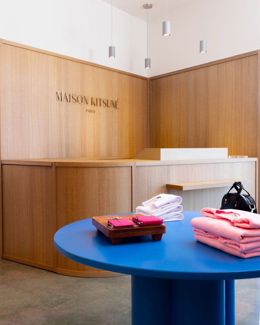
Next door in the boutique, a similar material palette is used for elements including a built-in storage and display unit across the back wall.
The existing Maison Kitsuné boutique next door has also received a refresh
White oak forms the framing, shelves and doors that lead to the stock and fitting rooms, while ribbed stainless-steel sheets provide a backdrop for the items on show.
More oak was used for the minimalist service counter and panelling behind, and a bright blue table sits in the centre to add a pop of colour.
White oak and stainless steel are repeated in this space to create a visual connection with the cafe
Kitsuné was founded by 2002 by Kuroki and Gildas Loaëc and encompasses the fashion brand, Maison Kitsuné; a music label, Kitsuné Musique; and its line of cafes, bars and restaurants.
Back in 2017, French designer Mathieu Lehanneur designed the Kitsuné store interior in New York’s Soho, adding snaking metal rails for displaying garments.
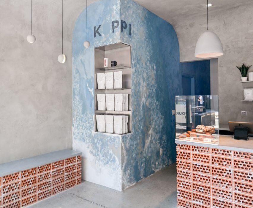
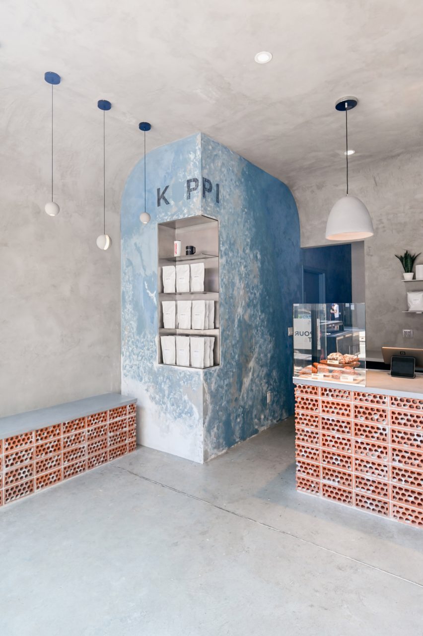
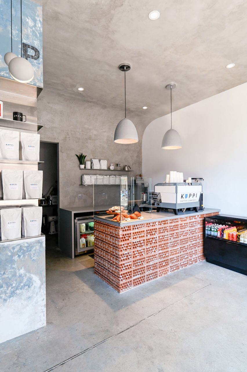
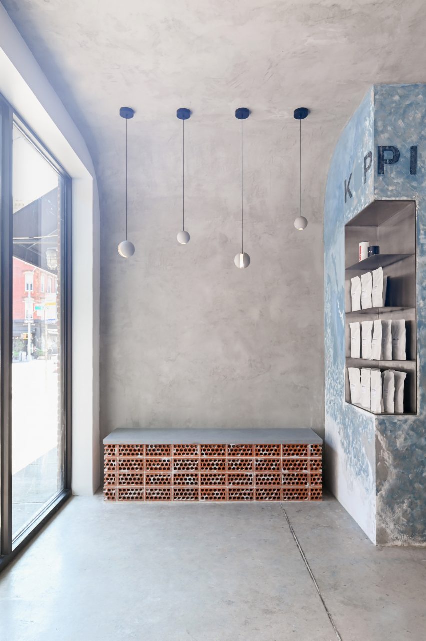
Distressed concrete, rowlock bricks and worn plasterwork create an intentionally unfinished appearance at this cafe in New York City’s East Village neighbourhood, designed by Brooklyn studio Commoncraft.
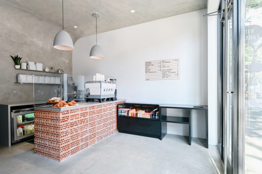
For its expansion into Manhattan, New Jersey-based Kuppi Coffee Company secured a 350-square-foot space on bustling St Marks Place – its second location.
Textured concrete plaster envelops the interior of Kuppi Cafe in the East Village
The compact interior has just enough space for a customer area and the cafe counter, plus a prep area and a WC for staff at the back.
Commoncraft approached the front-of-house space with an ethos akin to wabi-sabi, the Japanese art of “flawed beauty”.
Commoncraft chose materials for the space that appear purposefully rough and unfinished
“Employing a range of rough and raw materials, Commoncraft’s design of Kuppi Cafe seeks out the beauty in imperfection,” said the studio, which was founded by Zach Cohen and Tony-Saba Shiber.
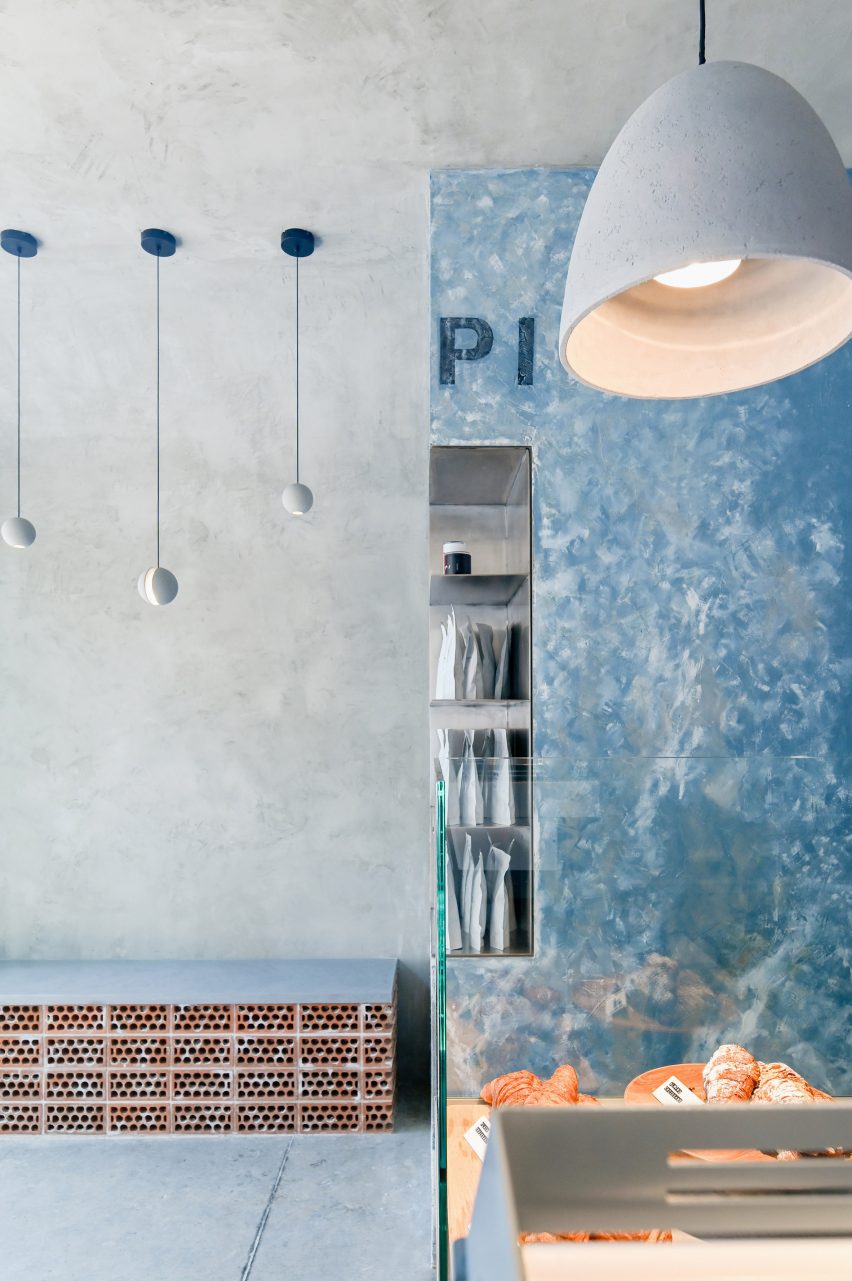
Textured concrete plaster curves up from two perpendicular walls and over the ceiling, enveloping the room together with the concrete floor.
The compact space features a small bench for customers awaiting their orders
Where these walls meet, a vertical element is wrapped in bluish plaster that’s peeling away to reveal a whitewash beneath.
The Kuppi logo is applied faintly at the top, and stainless-steel shelves for displaying merchandise are cut into part of the pillar’s corner.
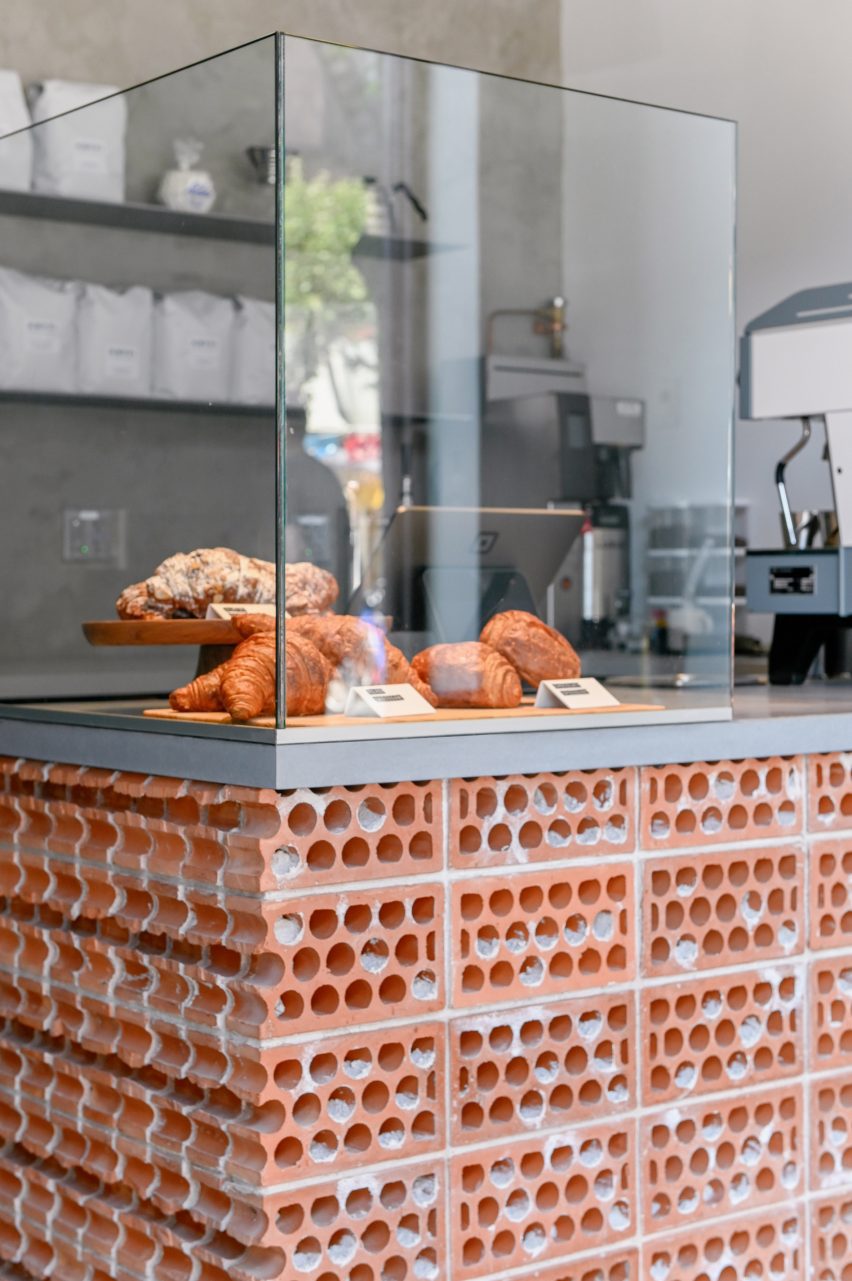
The cafe counter is faced in bricks stacked on their sides to expose their “guts”
Zones for customer interaction – including the service counter and a small bench – are defined by terracotta bricks, which are stacked on their sides in rowlock courses “to expose their core and mortar ‘guts’.”
“Each terracotta volume is terminated by a course of cut bricks, further revealing the rough, imperfect cores,” Commoncraft said.
In such a compact space, the designers have ensured that their concept carries through each of the cafe’s elements.
“The material honesty of the space is further reinforced by a number of small details,” said Commoncraft.
A corner element is wrapped in bluish plaster that’s distressed to reveal a whitewash underneath
These include floating stainless steel shelves behind the counter, a freestanding glass splash guard for baked goods and spherical concrete pendant lights suspended at different heights above the bench.
The cafe is highly visible from the high-traffic street through its fully glazed facade.
The counter is terminated by a course of cut bricks
New York City is home to thousands of cafes and coffee shops, including many independent establishments with unique interiors intended to entice customers inside.
Among them is another Commoncraft project: a Williamsburg eatery named Gertie designed as a playful tribute to the owner’s grandmother.
Client: Kuppi Coffee Company (Kevin and Vivian Kim) Architecture and interior design: Commoncraft Plumbing engineer: Alan R Schwartz General contractor: LTI Construction Corp
kengo kuma revives traditional craft and materials
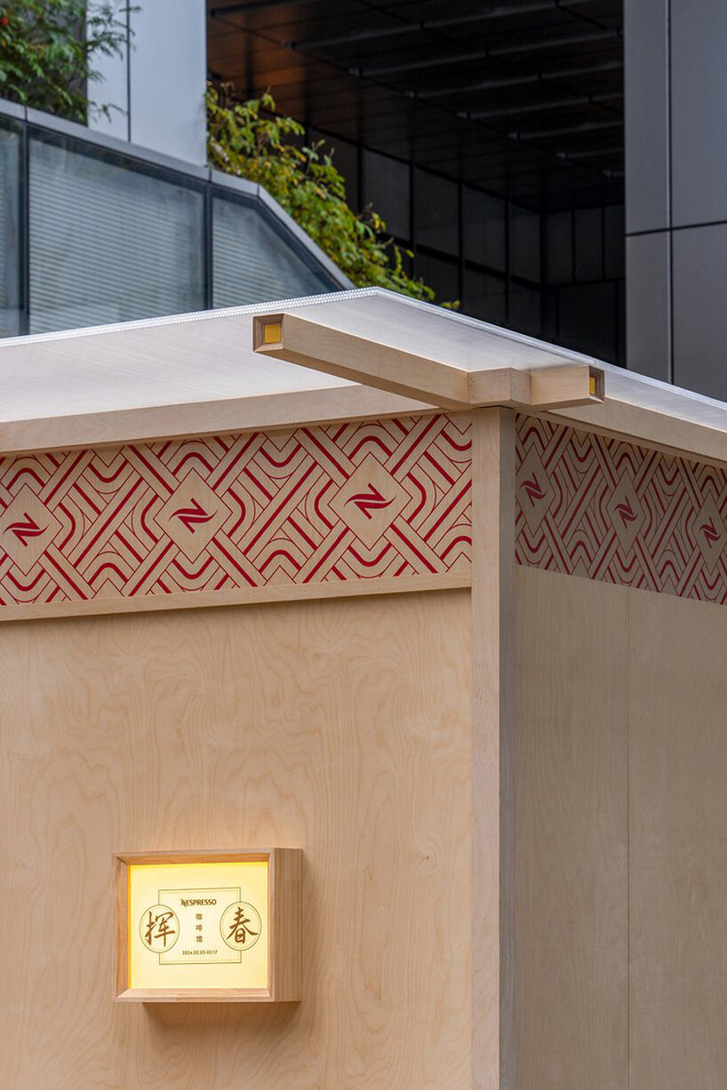
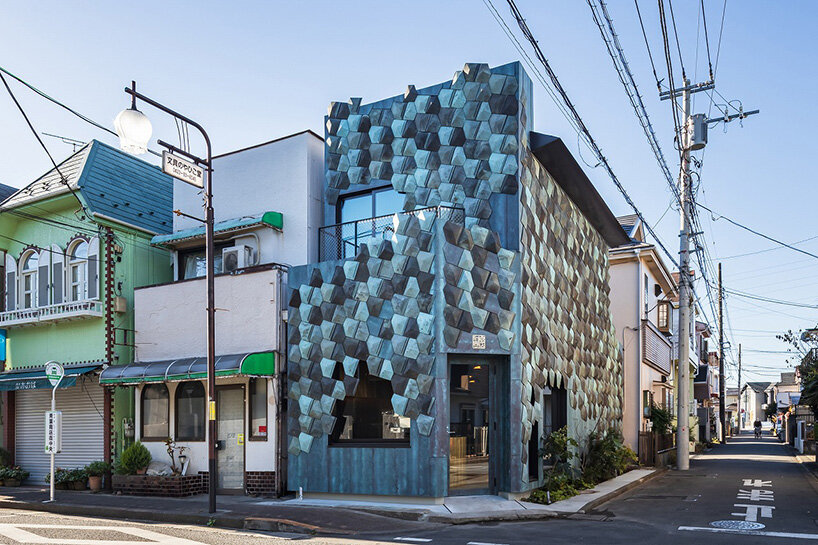
This so-called Wakuni Shoten café is set to open in In the heart of Higashimurayama City, Tokyo with architecture by Japanese icon Kengo Kuma. Recognized at once by its textural, patterned facade, the architecture expresses a contemporary reading of tradition. Its materials have been repurposed from a Shinto shrine, and have been reassembled with influence from the art of origami. Thus, the project is more than a café, but a celebration of community, sustainability, and the enduring spirit of Japanese craftsmanship. With its architecture now complete, the Wakuni Shoten café will open in January 2024.
images courtesy Kengo Kuma & Associates
learning from the heritage of tokyo
The Wakuni Shoten café is the result of a collaboration between Kengo Kuma & Associates, Okaniwa Construction Co., and Tomokazu Uchino, head of Uchino Sheet Metal. The space was born from a deep love for Uchino’s childhood home, the Aoba shopping district. Witnessing the district’s gradual decline, the team sought to breathe new life into the area while celebrating its rich heritage. The collaboration with Kengo Kuma and his design team proved to be the perfect marriage of vision and expertise, as the Japanese architect is known for his work with salvaged materials.
the folded facade in green and blue
The defining feature of Kengo Kuma’s Wakuni Shoten café is undoubtedly its exterior, a patterned composition of seven hundred patinated bronze plates each sourced from the roof of Hayatani Shrine in Hiroshima Prefecture. Rather than discarding these disused plates, Tomokazu Uchino and his team of skilled craftsmen painstakingly reshaped and repurposed them, imbuing them with a new lease on life. The result is a mesmerizing facade that shimmers with a spectrum of greens and blues.
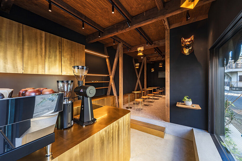
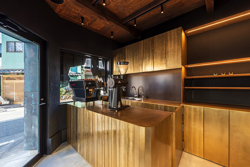
The café’s interior walls are finished in a stark black plaster, serving as a backdrop for brass accents, including lampshades, sinks, baseboards, and kitchen elements. Even the outdoor chairs, designed by Kengo Kuma and crafted from salvaged seats of the former National Stadium, echo this theme of reuse. Sustainability is woven into the very fabric of the project. The decision to reuse the cafe’s original 52-year-old framework honors the past while minimizing environmental impact. By reinforcing the foundation and strategically integrating new wood, the team has revived the derelict structure, demonstrating a respect for both the environment and the district’s history.
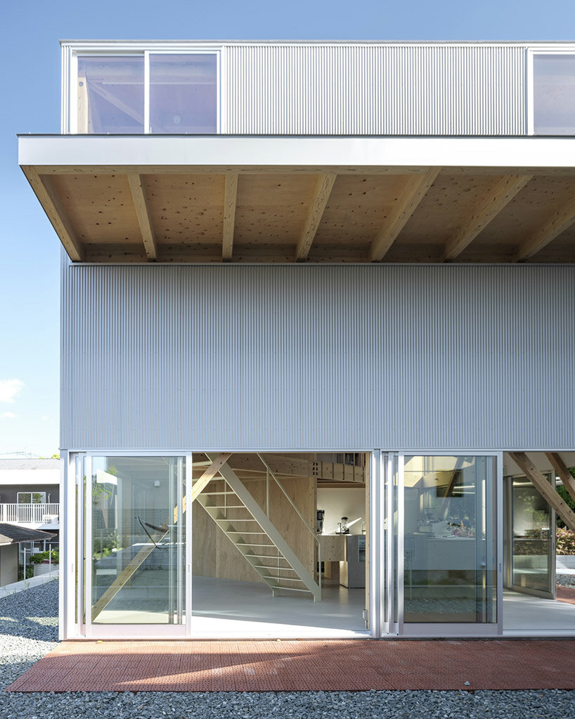
Nestled in a tranquil corner of a lakeside residential area in Kumamoto, Japan, the recently completed ‘EZU House and Café‘ stands as a testament to innovative architectural design, crafted by Yabashi Architects and Associates (YAA). this structure opens broadly out toward its surroundings to provide a unique experience for its occupants. The site’s terrain, with its stepped landscape along the lakeside, offers breathtaking views of nearby gardens, private house roofs, and distant mountains. By skillfully incorporating these elements into the design, the architects have created a multi-layered structure that fosters a sense of harmony between its retail and residential programs.
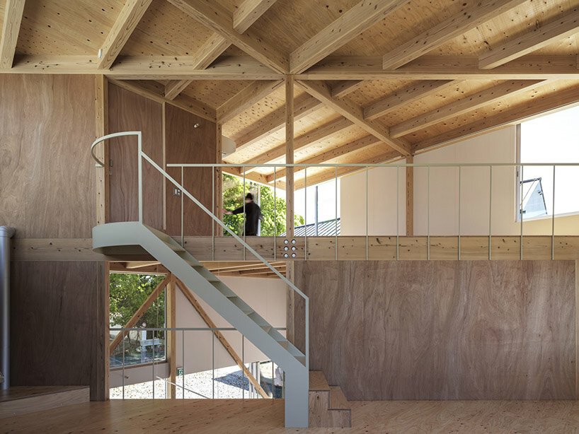
At the core of the design philosophy is a square plan that encompasses the site. The upper floors of the building are ingeniously divided diagonally, establishing a dynamic interplay of spaces. By shifting the floors to increase the parameter with the ground and connecting them through a spiral vertical movement, the architects have achieved a three-layered structure that presents an array of viewpoints at every turn. This deliberate arrangement allows for a varied experience on each floor, with minimal necessary functions, furniture, and plants. The result is a space that transcends conventional definitions, offering an open canvas for inhabitants to freely create their own personalized environments.
Seamless Integration of Functions
The ground floor of the EZU House and Café serves as a retail area, seamlessly transitioning into the residential space on the upper floor. The distinction between these two sections is purposefully fragmented, employing diagonal load-bearing walls that create a continuous three-dimensional living space. This approach fosters a sense of connectedness and flow throughout the entire structure. Furthermore, the architects have emphasized the integration with the natural surroundings by incorporating a double structure. This design envelops the earthquake-resistant framework with elements dedicated to wind resistance and heat insulation, while the outer skin of the building serves as a gateway to the outdoor environment.
Unobstructed Views by yabashi architects
The absence of partitions between spaces is a deliberate choice that enhances the occupants’ experience of the surrounding environment. Depending on one’s body position and movement, glimpses of the sky, verdant greenery, or sudden visual breaks may appear through the windows on adjacent floors. This design creates a spatial experience that emphasizes the inherent richness of the location and the generosity of life itself. In essence, the EZU House and Café may appear as a mere assembly of floors, outer panels, and openings. However, it transcends its utilitarian nature, transforming into a powerful tool that allows individuals to perceive the external environment as an integral part of the internal space.
a double structure wraps earthquake-resistant elements with wind resistance and heat insulation the multi-use space is flexible with a spiral vertical movement and minimal necessary functions
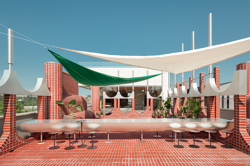
Seoul studio Sukchulmok has designed a red brick cafe in South Korea inspired by European public squares.
The building, named Parocindo Bakery Cafe, features lively curved shapes and rounded walls. For its interior, the studio used small tiles made from travertine limestone.
Commenters dissected the project. One loved the project and thought it was “beautifully executed”, whereas another described it as “odd” and “strange”.
Venice Architecture Biennale “does not show any architecture” says Patrik Schumacher
Other stories in this week’s newsletter that fired up the comments section included an opinion piece by Patrik Schumacher on the “lack of architecture” at the Venice Architecture Biennale, four inflatable structures by Steve Messam at Clerkenwell Design Week and BIG being named as the masterplanner of Neom’s octagonal port city.
Dezeen Debate
Dezeen Debate is sent every Thursday and features a selection of the best reader comments and most talked-about stories. Read the latest edition of Dezeen Debate or subscribe here.
You can also subscribe to our other newsletters; Dezeen Agenda is sent every Tuesday containing a selection of the most important news highlights from the week, Dezeen Daily is our daily bulletin that contains every story published in the preceding 24 hours and Dezeen In Depth is sent on the last Friday of every month and delves deeper into the major stories shaping architecture and design.
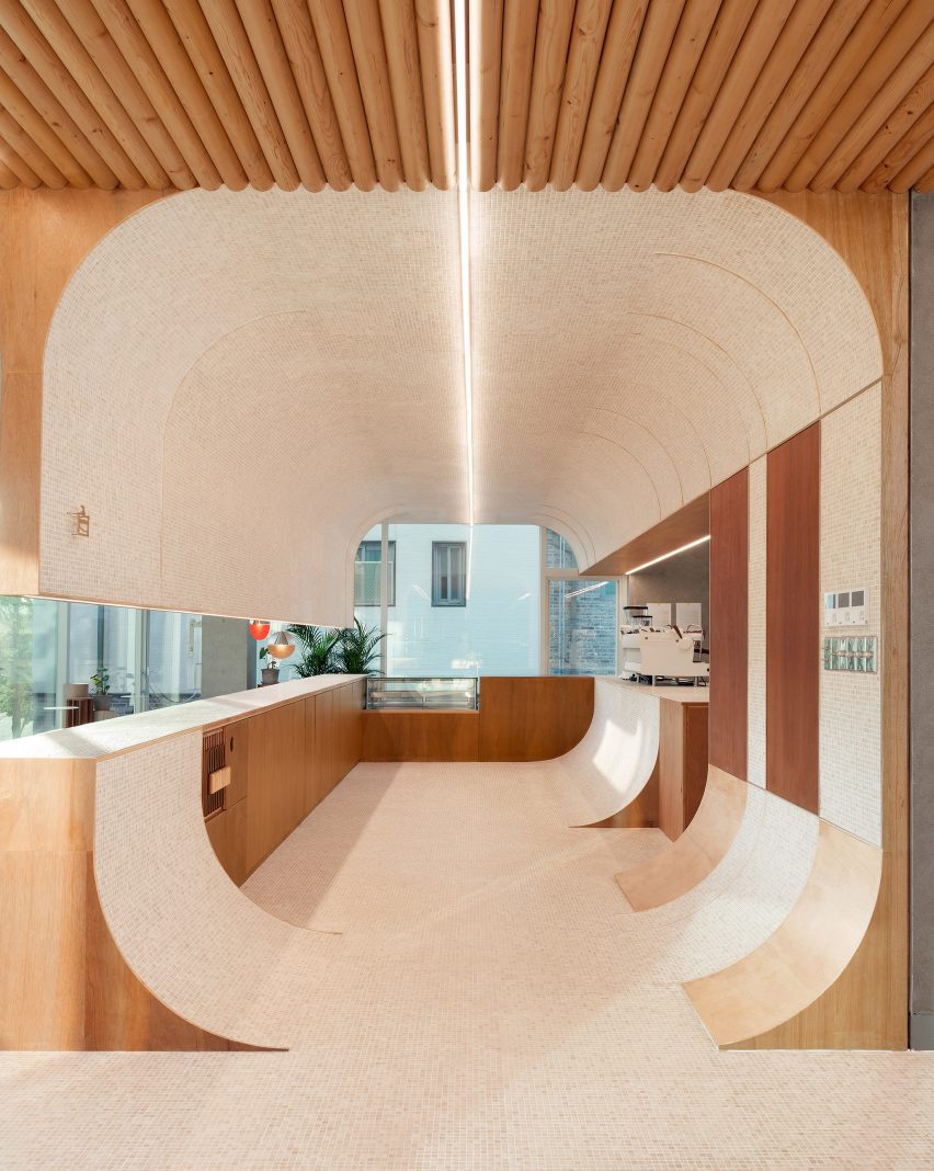
Curved forms and arched openings feature in this cafe, which Seoul studio Sukchulmok has added to an existing building in South Korea’s Gyeonggi-do province.
Named Parconido Bakery Cafe, the cafe is made from red bricks and features playful curved shapes and rounded walls designed to create an illusion-like effect.
Parconido Bakery Cafe was designed by Sukchulmok
“The space, created through one rule, was designed to give a sense of expansion and the experience of an optical illusion image,” lead architect Park Hyunhee told Dezeen.
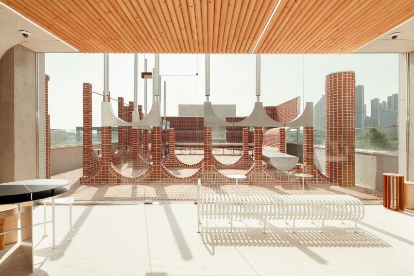
Arranged across three floors including a rooftop level, the cafe was designed by architecture studio Sukchulmok to resemble European public squares in reference to the client’s time spent in Italy.
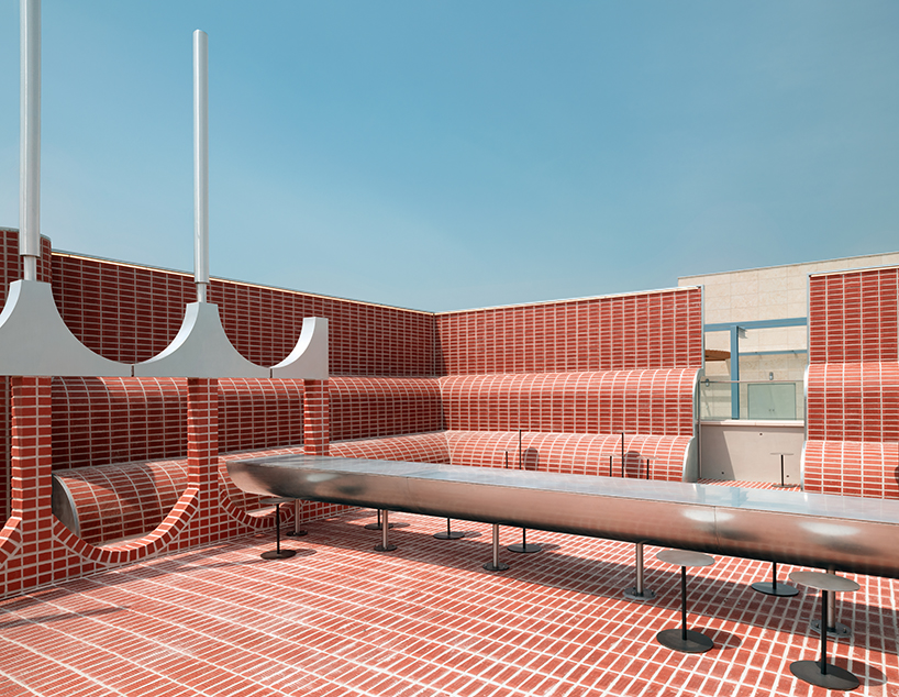
The studio topped the roof with curving brick volumes
“The client who spent his youth living in Italy is a clothing businessman, opening the cafe as a business expansion to provide people with a space for peaceful rest,” said Park.
“These two aspects naturally reminded me of the image of the European square, where people are huddled together talking on a sunny day between red brick buildings and stone pillars.”
The design drew references from nostalgic memories of Italy
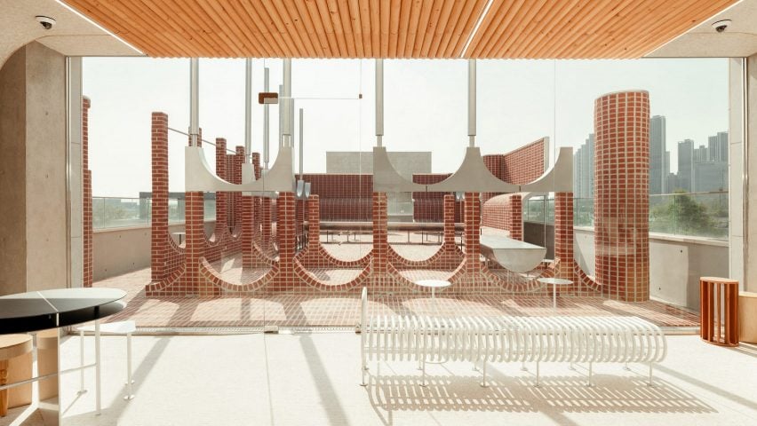
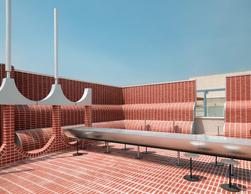
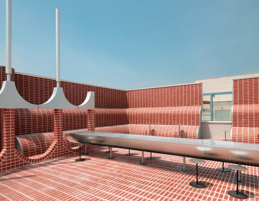
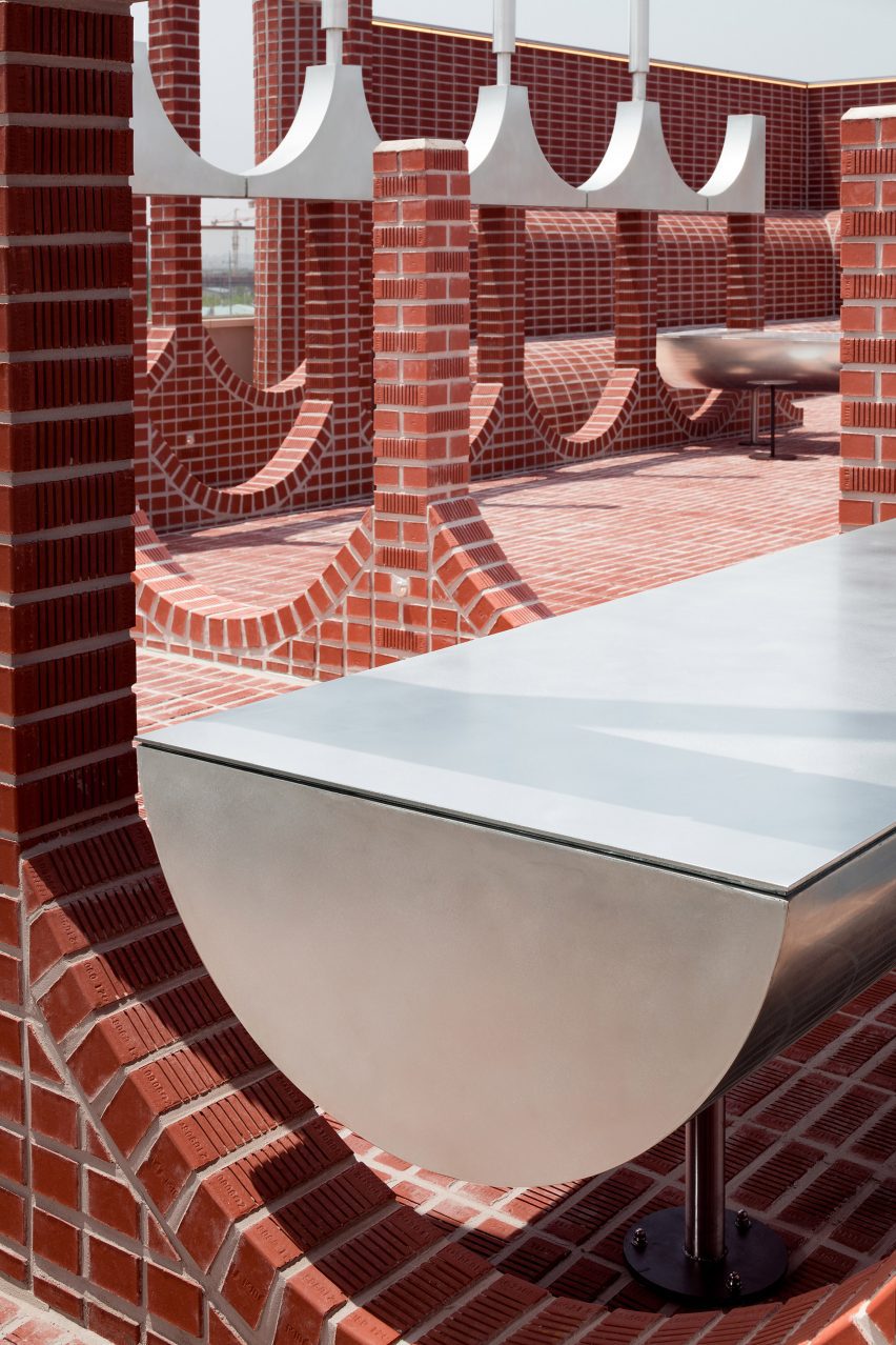
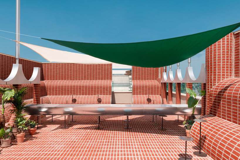
On the rooftop level and terrace, the outdoor dining spaces are punctuated by clay brick columns with arched connections and walls with U-shaped openings.
Built around steel frames that extend into curved forms above the brick walls, the curved elements are coated in bricks cut to two-thirds of their original thickness to lighten their weight.
The walls and floors have curved edges
A long stainless steel table with a curved underside, along with circular stools and planting, is shaded by a removable canopy made from green, orange and white fabrics.
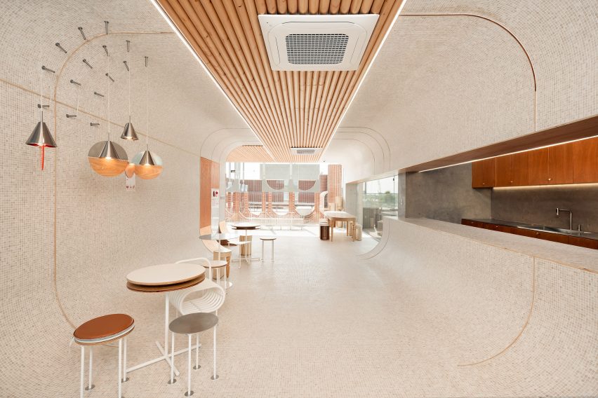
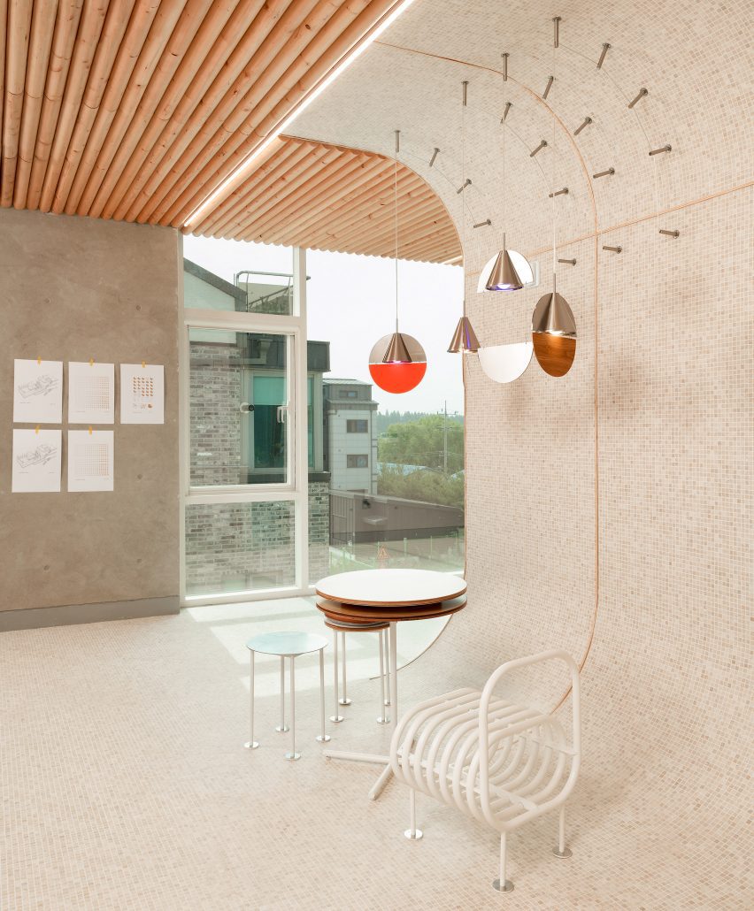
Curved walls lined with white tiles join with the tiled floor and ceiling to create rooms with rounded forms on the interior levels of the cafe.
The rooms are covered in small tiles of travertine limestone, selected for its use in the fountains of European squares.
Kitchens are built into recesses in the curved walls, while wooden elements, including wall panels and pipes that line a portion of the ceiling, add a feeling of warmth to the interior.
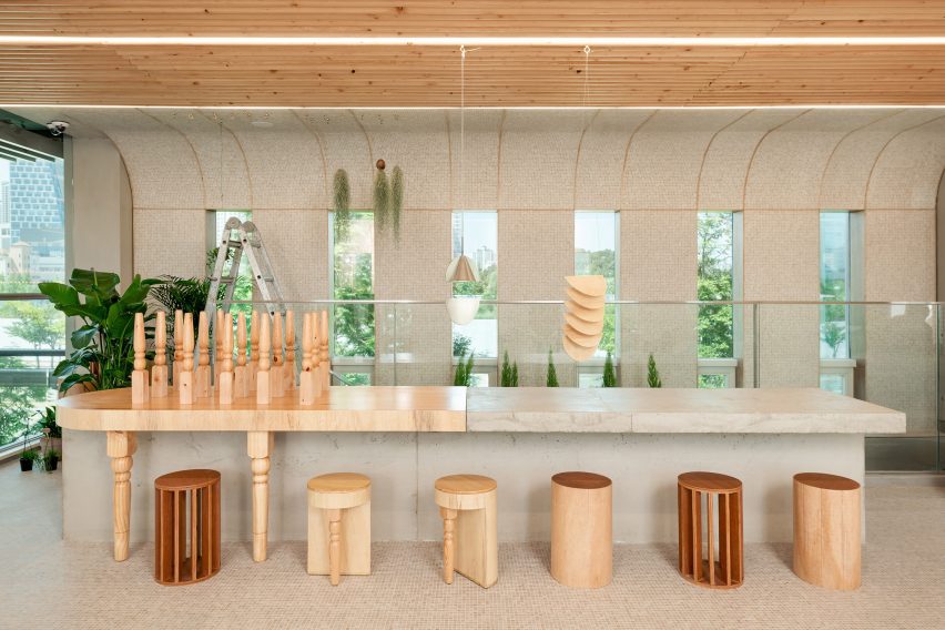
Throughout the spaces, uniquely designed seating areas and bespoke circular furnishings provide spaces for dining.
The interior was covered in different textural materials
Comprising twelve different designs, the cafe’s set of furniture was designed to exhibit a variety of shapes, textures, and materials, including leftover finishing materials, wood, overlapping pipes, and concrete castings.
“Although they have slightly different shapes and textures, the pieces of furniture are all in harmony with the space and show good synergy with space as an object,” said Park.
The cafe’s curved edges all have a radius of 600 millimetres
To maintain a sense of uniformity, the studio based the design of each element, including the walls, columns and furniture, around a circle with a constant radius of 600 millimetres.
“A radius of 600 millimetres was used as an act of connecting spaces that were not monotonous,” said Park. “It was simply based on the idea that the distance from the height of the door and window to the ceiling finish is 600 millimetres.”
Furniture was specially designed for the interior
Other South Korean cafes recently featured on Dezeen include a bakery with a curved courtyard designed to act as an “artificial valley” and a Seoul cafe with a vertical farm.
red bricks shape out a modern bakery cafe by sukchulmok
Design practice sukchulmok constructs ‘parconido’ bakery cafe in northern Gyeonggi-do, South Korea, utilizing subtle contemporary materials and shaping simple rounded forms. The cafe presents a consistent space in which forms, furniture, and lighting are designed to create a unified atmosphere. The project draws from ‘European’ architectural elements applying red brick in combination with stainless steel.
The structure develops in layers ‘stuck one by one’ with columns that surge everywhere and rounded walls wrapping the open layout. Although the walls and columns compose different shapes, they all present a radius of 600 mm. Following this design rule that acts as a reference point throughout the construction, the project generates a sense of unity while still avoiding monotony. The contemporary café is built out of stacked clay bricks with no holes, that are cut off by two-thirds of the thickness and form a coating skin on an iron frame to relieve the load.
smooth edges and round shapes generate a sense of expansion
The furniture, manufactured in perfect circles, is appropriately blended into the space in various forms, such as concrete castings, combined wooden textures, and overlapping circular pipes. The fittings highlight the round spaces while travertine limestone, usually suitable for the fountains in squares of Europe, is designed to cover the floor, walls, and ceiling of the rooms. The angles in the indoor space are smoothed out in round shapes blurring the boundaries of each zone and generating an illusion of expansion and weightlessness.
The mixture of the three main materials, red brick, travertine, and wood, adorns the interior space in warm tones. All fittings and fixtures are custom-made and produced to fit the unique rounded design of the café.
stacked clay bricks are cut off by two-thirds of the thickness forming a coating skin on the iron frame
an elongated form of stainless steel shapes up an outdoor table
on the third floor, a terrace can be seen following the extended passageway
a sense of expansion and uniformity is adjusted both vertically and horizontally through curved forms
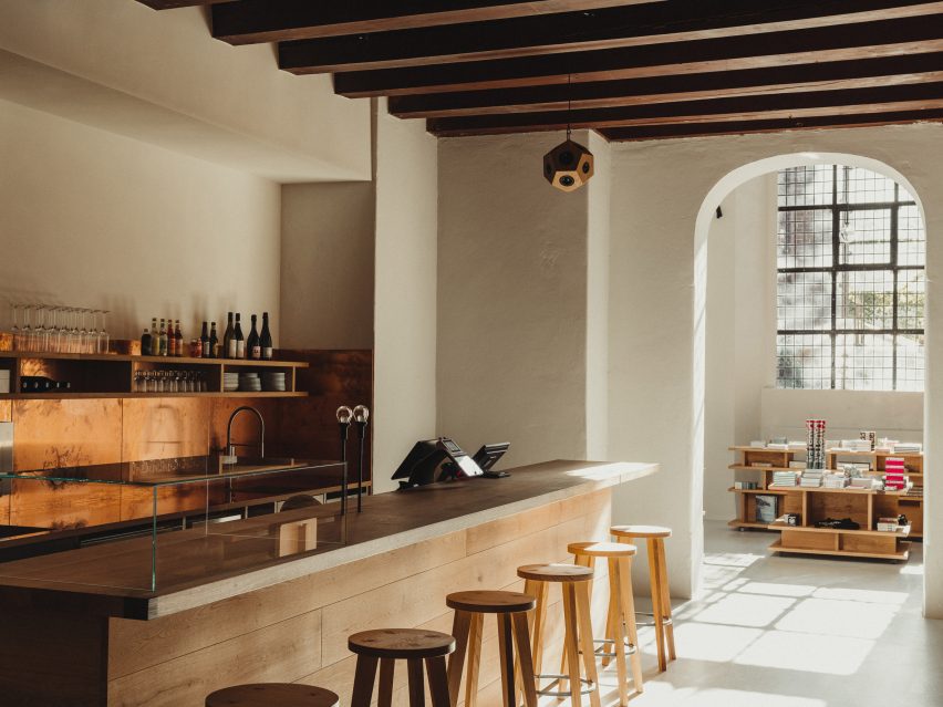
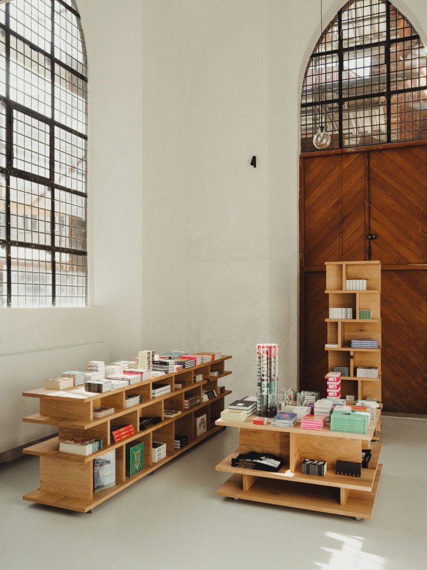
Architecture firm MEE Studio has designed the interiors and bespoke wooden furniture for a cafe and boutique in the Nikolaj Kunsthal art gallery within an old church.
The municipality-run gallery, which is set in a deconsecrated church in central Copenhagen, asked MEE Studio to design a “lively and functional” space.
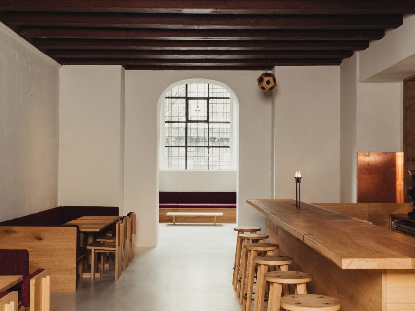
Before designing the interior spaces, which feature warm and tactile materials such as copper and wood, the rooms in Nikolaj Kunsthal first had to be restored.
The gallery is located in a former church
“The spaces had been used for various purposes since the 1980s including art installations and other changing uses,” MEE Studio founder Morten Emil Engel told Dezeen.
“This has left the spaces with remnants of ad-hoc electrical wiring, bricked-up arches, blocked-off windows and arbitrary lighting. Additionally, there was no water supply or plumbing in the spaces that now have the cafe.”
The studio reestablished the grand door and window openings in the space and replaced the old acrylic paint with breathable lime-based paint, while also adding acoustic plaster to improve the acoustics of the spaces.
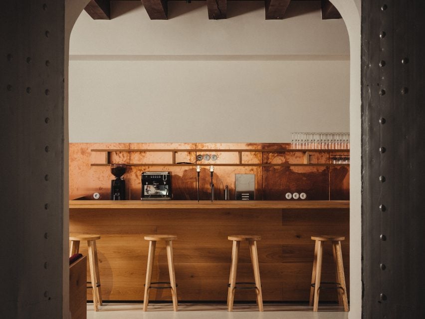
Untreated copper was used as a backsplash for the bar
At the centre of the cafe, Engel created a long bar that also functions as a ticket counter and is made from solid oak wood.
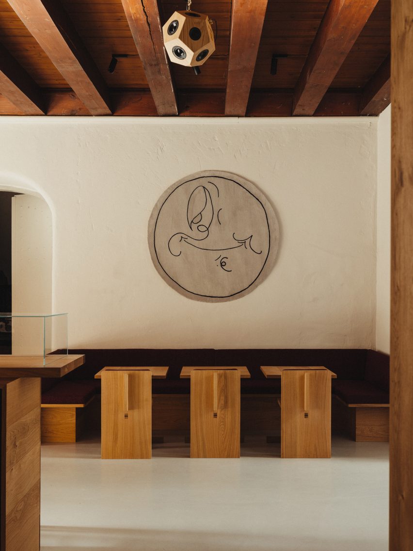
Wood was also used for all the other furniture, including benches, tables and sculptural shelves, which Engel designed specifically for the project using European oak from sustainable forestry.
“I wanted the benches to reference church benches – a bit chunky and heavy,” he said. “The church architecture is very robust with the church tower having two-metre thick walls. So the furniture had to have some substance to them.”
The furniture complements the “robust” church architecture
Engel also aimed to give the pieces a contemporary feel by fusing their “heavy look” with more contemporary elements.
“All the furniture has visible joinery and tectonics in fumed oak, which allows the user to see how they are made and assembled,” he said.
“I added some decorative inlays in the bar counter and boutique shelves. Inlays were traditionally used as a way of repairing wood and I wanted to symbolise that repair can be beautiful and sustainable,” he added.
“In this way, it is sending the message that the furniture should have a long life and be repaired if it ages.”
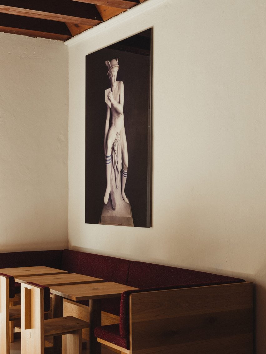
Artworks decorate the walls, here Pull by Martha Hviid
Behind the central bar, a copper backsplash adds an eyecatching material detail together with the matching sink and worktops, which were designed in reference to the roof of the old church.
“As many traditional buildings in Copenhagen, the roof of St Nikolaj Church is made with traditional copper roofing, which has aged to a rich green patina over time,” Engel said.
“I wanted to reference the existing material palate of the church but use it in a new way. So the kitchen features worktops, sinks and backsplash in raw untreated copper, which will evolve beautifully with time.”
Lime-based paint was used for the walls
The white walls of the cafe and store were contrasted with not just the copper and wood but also a burgundy red fabric designed by fashion designer Raf Simons for Kvadrat, which was used for the cushions and backs of the sofas and chairs.
The colour was a nod to some of the space’s original colour but could also help disguise red wine spills in the cafe.
“Oakwood was already used throughout the church so it seemed natural to use oak as a material,” Engel explained.
“There was also the burgundy red paint which had been used originally for some woodwork, for instance, the stairs in the tower and the ceiling in what is now the cafe,” he added.
“So it seems natural to work with an interpretation of the burgundy red for the color of the cushions. I matched the burgundy red to a fantastic Kvadrat textile designed by Raf Simons and it worked in providing vibrancy, but also as a practical colour in a cafe where red wine is served.”
Red fabric was used for the seating, with the artwork Mercury (socks) hanging above
As well as the bespoke furniture pieces, the space was also decorated with carefully chosen artworks that have ties to the city of Copenhagen.
“Mercury (socks) is a photograph by the famous Danish/Norwegian artist duo Elmgreen & Dragset from a series of classical sculptures by the world-famous Danish sculptor Bertel Thorvaldsen,” Engel explained.
“The Thorvaldsen Museum is located only a few minutes away from Nikolaj Kunsthal, so the work relates both to art from the 19th century and contemporary art from the 21st century which is what you find in Nikolaj Kunsthal.”
Other recent interior projects in Copenhagen include Space10’s headquarters, which has a kiosk-like design library, and the cafe and shop design for Designmuseum Denmark by OEO Studio.


 images courtesy Kengo Kuma & Associates
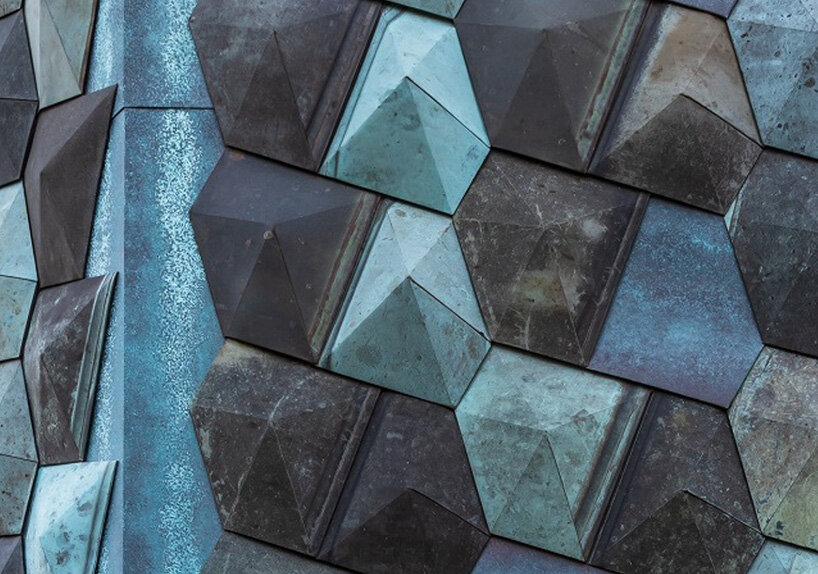
 images ©
 the multi-use space is flexible with a spiral vertical movement and minimal necessary functions