tiled roofs crown stepped modules of office and cafe space in china
CategoriesArchitecture

tiled roofs crown stepped modules of office and cafe space in china

Xie Ke devises a mixed-use sales office in Chongqing, China


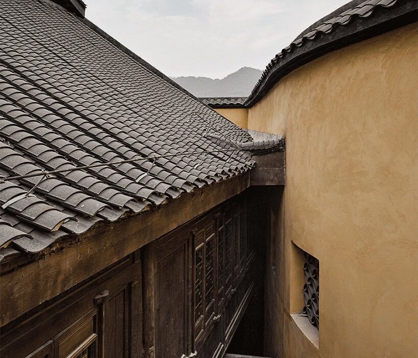
A series of stepped modules, standing under intricate historic tiled roofs, integrate Xie Ke’s new Sales Office into the ‘ladder style’ traditional mountain blocks in Chongqing, China. The building consists of Canopée Café and Sihai Club and adjoins Huguang Club and overlooks East Watergate. The design concept deviates from pure commerciality and focuses on creating social mixed-use spaces which can restore a sense of community and the area all the while raising awareness for the brand’s sales center. Derived from the history of the Huguang region’s urban state, the project is driven by a goal for urban renewal and preservational design, retaining the original structure while breathing new life into the interior under a minimal contemporary renovation plan.
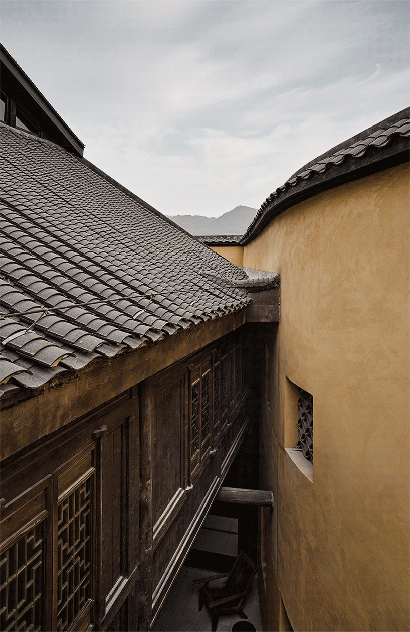
traditional tiled roofs crown the stepped modules of office and cafe space in china
all images by Jonathan Leijonhufvud 雷坛坛


urban renewal project draws from the history of Huguang city


The project centers around fostering relationships between the urban fabric and communities. Over time during the process of urbanization, the upper half of Chongqing city has become an arena for modern architecture, leaving behind memories of the past. Meanwhile, the lower half city is filled with unmaintained antique structures. Seeking to reflect the simplistic culture of Chongqing and to cultivate the collective character of its community, the architect looks to his own memories of the city to devise the design concept – namely its ‘outdoors’ culture where people carry out their daily routines on the streets and in the pockets of the mountainous town, always interacting with neighbors.


As such, the design begins to form a connection between people and previous times, thus incubating and activating the endogenous forces of the city. ‘The steps covered with moss, Huguang Club standing still over time, the to-and-fro ropeway across the river, the close connection between houses and streets… All the characteristic memories of Chongqing were properly placed in people’s vision and became the background color of [the project]… and also the design basis of Xie Ke.’
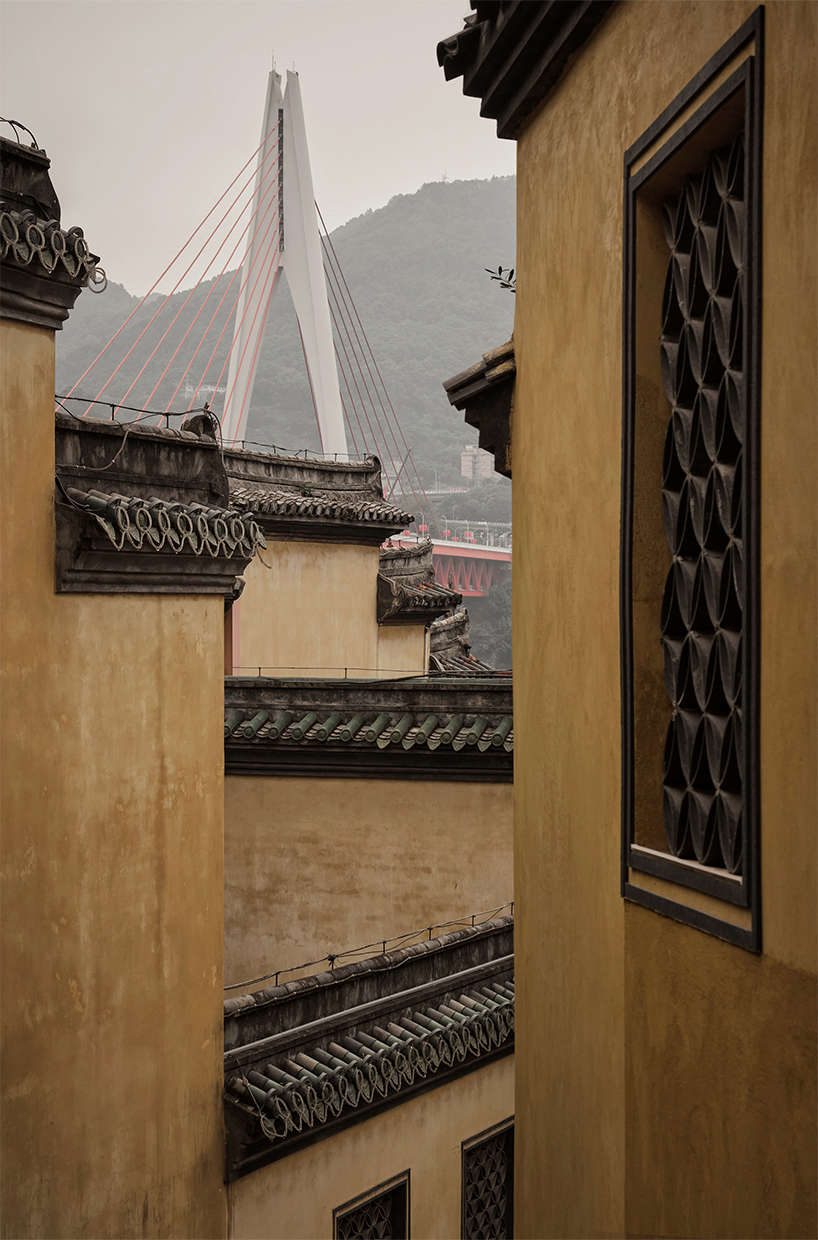
traditional tiled roofs crown the stepped modules of office and cafe space in china
the unmaintained antique structures of Chongqing stand under intricate historic tiled roofs


infusing contemporary interiors into the traditional structure


Nodding to the region’s traditional architecture, wooden structures are used to reinforce the wooden columns and to decorate the roof with old tiles, blending a harmonious fusion between old and new. The moderate renovative plan restores the old construction embracing the surrounding greenery and incorporating it into the design as a free-formed canopy of branches and leaves. Taking its name from the immersive natural element wrapping the structure, the Canopée Café, accessible from the second floor, overlooks picturesque views of the Yangtze River, engulfed by the shade of trees, and the peeling walls and the undulant eaves of Huguang Club maintaining a sense of stillness. The building ‘grows’ vertically tracing over the contours of the mountainous landscape of Chongqing.


The interior arranges low-standing walls and partitions to avoid permanent alterations to the original construction. The layout forms an open plan dividing several functions into blocks, such as the bar and facilities zones, reviving the old building’s scheme and circulation flow. The steel gallery bridge and large folding windows stand as the main modifying feature of the renovation. The interior fosters a sense of serenity with a pure, rhythmic white atmosphere and minimalist aesthetic, while the alterations between light and shadow accentuate the historic wooden frame.

traditional tiled roofs crown the stepped modules of office and cafe space in china
the stepped volumes trace over the mountainous landscape of Chongqing


Reference

Tokyo warehouse revamped into Koffee Mameya Kakeru cafe
CategoriesInterior Design

Tokyo warehouse revamped into Koffee Mameya Kakeru cafe

Tokyo-based Fourteen Stones Design has designed the Koffee Mameya Kakeru cafe for barista Eiichi Kunitomo in a former water transportation hub in Kiyosumi Shirakawa.

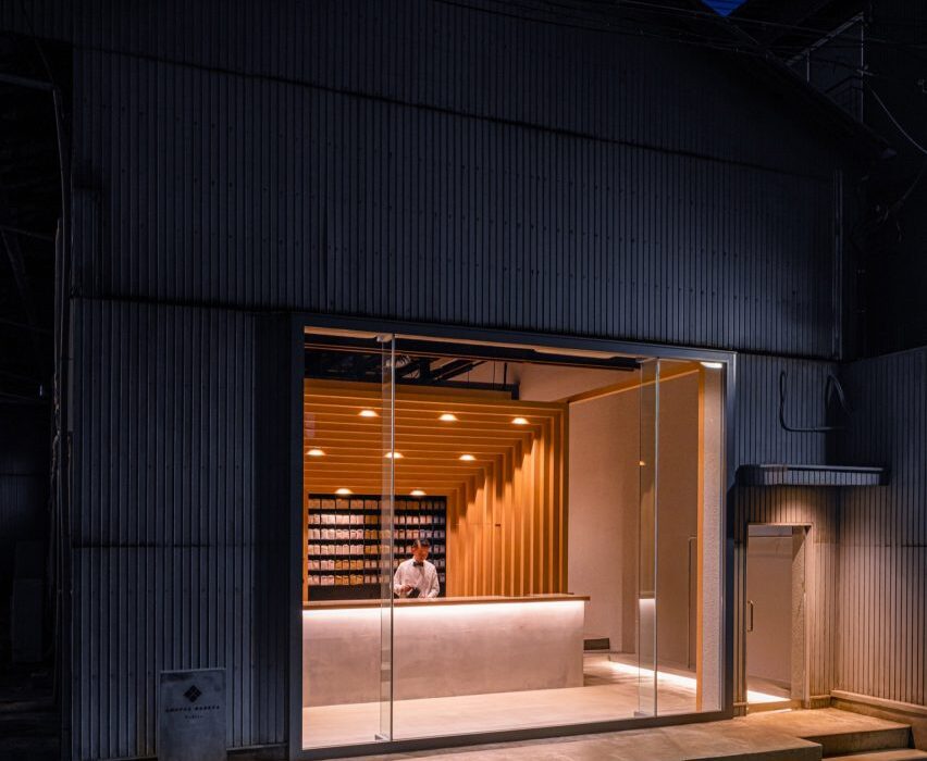
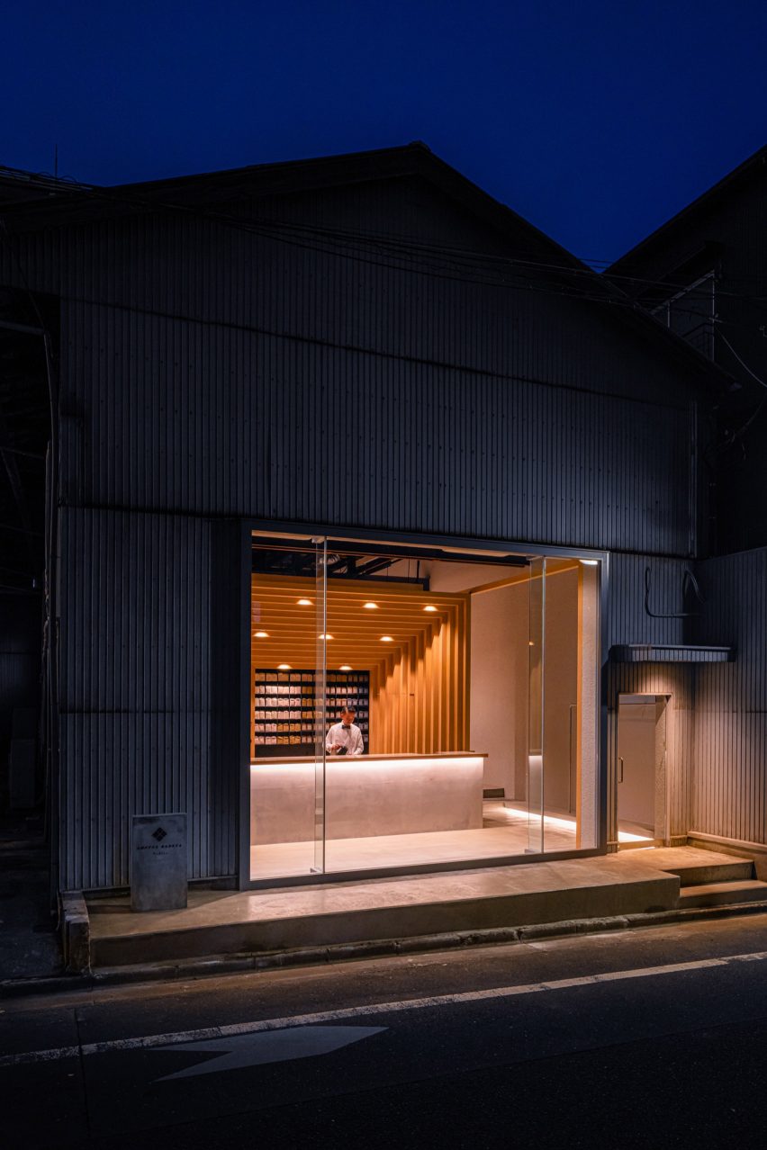
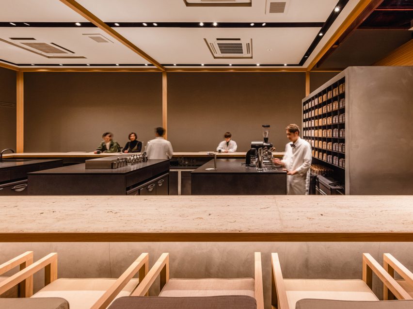
Set in the Kiyosumi Shirakawa area of Tokyo, the coffee shop occupies a warehouse which Fourteen Stones Design renovated and extended “to preserve the appearance of the old warehouse as much as possible”.

Koffee Mameya Kakeru cafe by Fourteen Stones Design
Koffee Mameya Kakeru is in an old warehouse

The studio removed the shutters from the front of the warehouse, adding a glass facade. The rest of the building, including the interiors, remains as it was – with minimal repairs made to the walls.

It aimed “to make everyday coffee an extraordinary experience” with a full “course of coffee” served by baristas and the renovation has been designed to facilitate this.

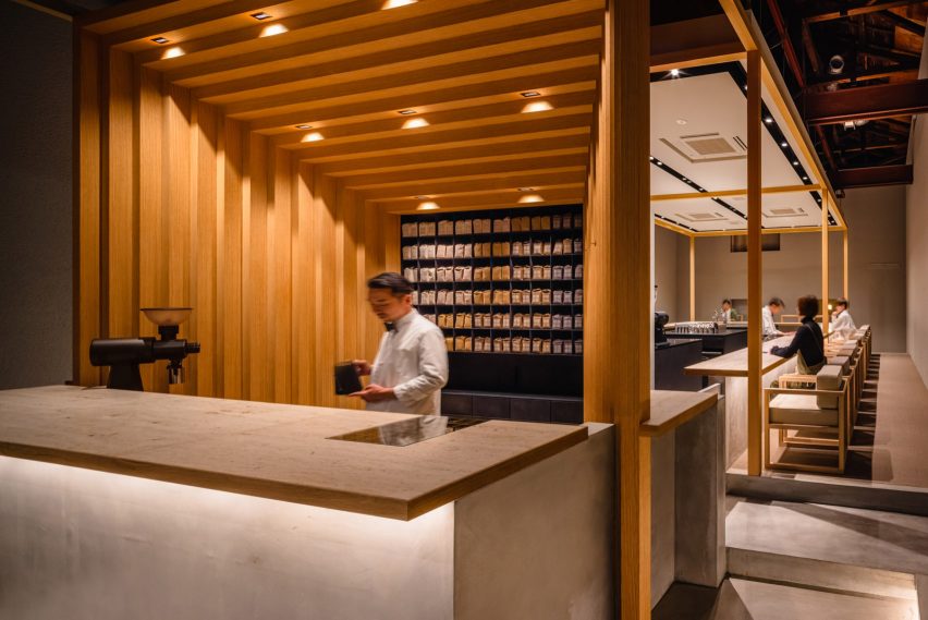
A coffee counter in black granite with a timber frame
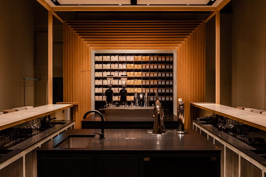
The white oak structure frames the coffee bar

A staggered rectangular frame of white oak at the entrance of the cafe, which echoes the coffee package design, dominates the interior space and provides a central visual motif for the scheme.

This frame divides the entrance space from the main cafe where a U-shaped bar surrounding the barista workstations was placed.

The barista’s workbenches, which were made from black granite, were deliberately placed at the centre of the space to create “a stage set-up, which enables baristas to fully demonstrate their skills”.

Besides the new seating area, restrooms, a kitchen, a laboratory and office space have all been renovated.

Baristas work at black granite counters

The service and bar countertops were made from “Jura Yellow” limestone. Featuring fossils from the Jura period, it was chosen for its texture and also for allusions to the passage of time – not only echoed in the coffee growing, roasting and brewing processes but also the journey of the brand from its inception 10 years ago.

Fourteen Stones Design’s Yosuke Hayashi designed the custom furniture for the cafe in the same white oak as the frame structure. It was manufactured by Japanese company E&Y for the project.

Barista working at coffee bar with staggered timber frame
The space aims to create a “gastronomic experience” for coffee drinkers

The cafe’s owner Kunitomo believes baristas “act as a bridge between the customer and the roastery” and should be given “a social status comparable to that of a sommelier”.

Baristas at Koffee Mameya Kakeru will serve single cups of coffee through to full courses of coffee, “elevated by the newly designed space to the realm of gastronomy”, according to the practice.

Fourteen Stones Design has been shortlisted in the restaurant and bar interior category of this year’s Dezeen Awards. Other projects in the running include a rattan restaurant in Bangkok by Enter Projects Asia Co. and YODEZEEN’s Japanese restaurant in Kyiv’s city centre.

The photography is by Ooki Jingu.

Reference

Daughter cafe has stepped seating that mimics brownstone stoops
CategoriesInterior Design

Daughter cafe has stepped seating that mimics brownstone stoops

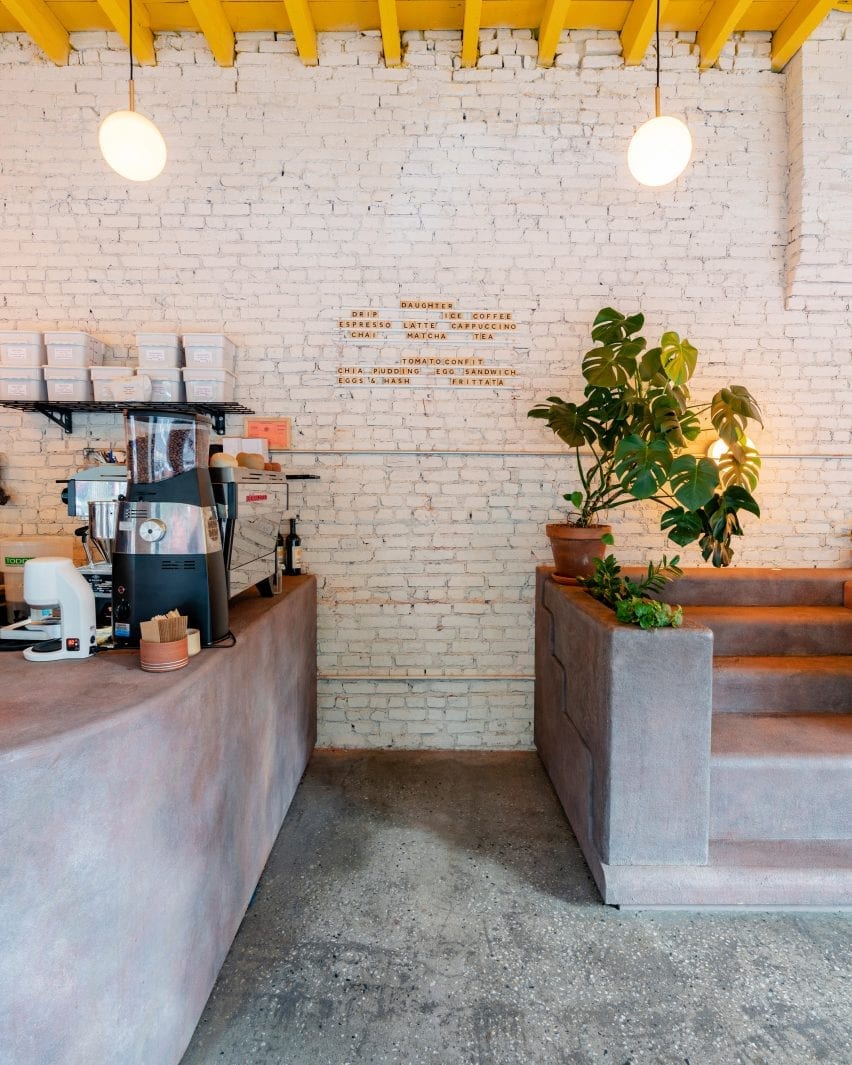
Designer Christopher Al-Jumah has created Daughter, a community-oriented cafe in Brooklyn’s Crown Heights with interiors informed by the staircases of local brownstone buildings.


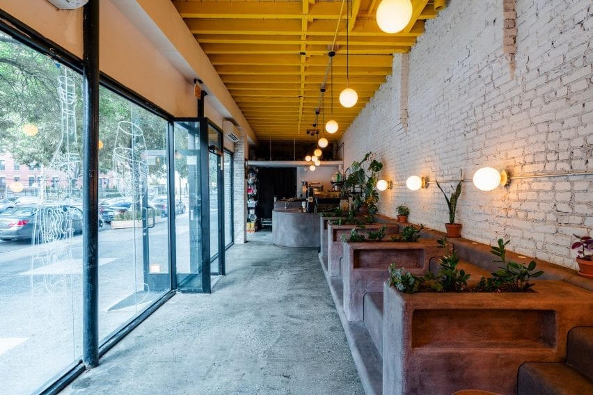
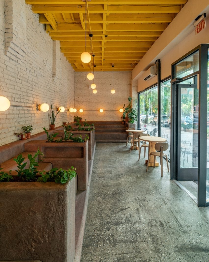
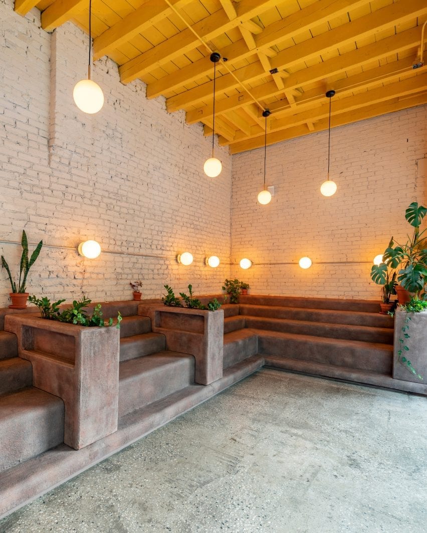
Daughter is a long and narrow space defined by an L-shaped block of brown seating that can be seen from the street through the cafe’s large windows.

The cafe has stooped seating
The cafe is in Brooklyn’s Crown Heights neighbourhood

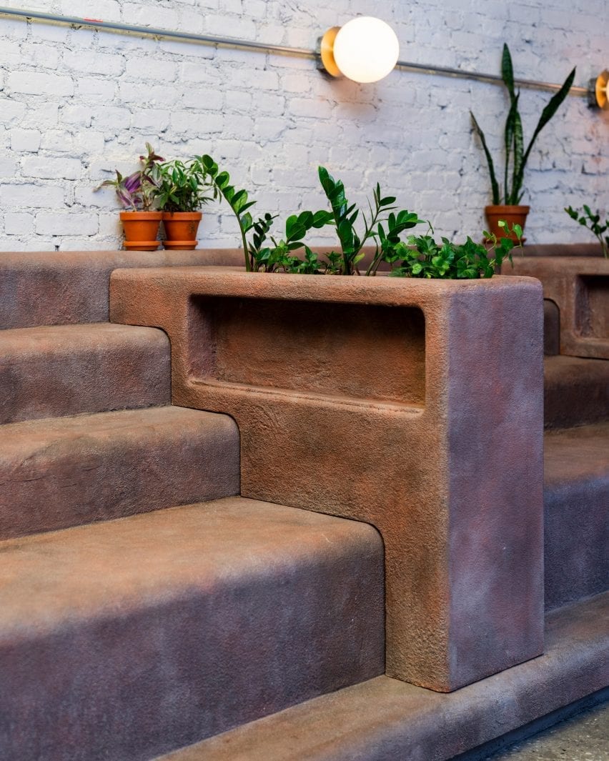
Interior designer Christopher Al-Jumah said that the seating, which was informed by the stoops – small staircases – of local brownstone buildings, is Daughter’s standout design feature.

The indoor stoops are made from a plywood base that was given a coating of concrete and sand with a top resin coat for durability.

“We spent months researching and testing different combinations of concrete, sand, plaster and resin to get the right look, feel and durability,” Al-Jumah told Dezeen.

Planters sit between the stooped seating in Daughter
Planters divide the step-like seating

Interspersed with planters, the casual seating aims to invite people into the cafe and also influenced the rest of the project’s design decisions.

“Everything started from the brownstone stoop. Once a representative brownstone colour was selected, everything else in the space was designed around it to complement,” explained Al-Jumah.

Daughter has exposed brick walls
A curved bar sits next to the stoops

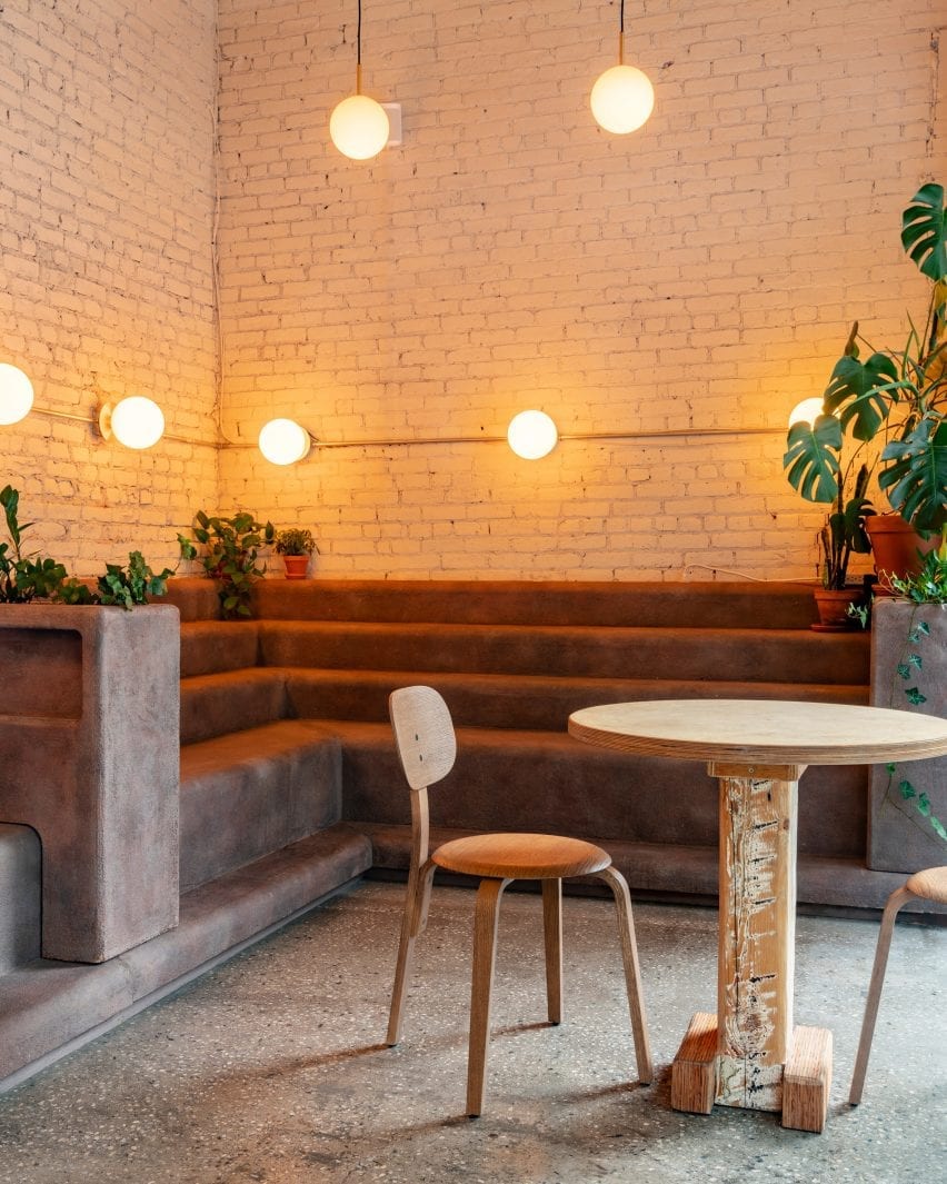
Custom-made tables with chairs by Danish brand Menu are placed opposite the stoops, next to the cafe’s large windows that feature playful illustrations.

A curved bar designed in the same brown material as the stoops is tucked into a corner, while orb-like lights, also from Menu, glow above the stepped seating.

The furniture is positioned against exposed brick walls that are painted white in contrast to the cafe’s bright yellow ceiling.

With their rough texture and appearance, the stoops are juxtaposed against smoother elements throughout the space.

“The walls have a soft white, tan colour to soften the space. Natural wood furniture and plants work as an organic complement to the stoop,” said Al-Jumah.

The stooped seating is juxtaposed with smoother elements
A bright yellow roof contrasts with neutral walls

The designer explained how the vernacular architecture of the Crown Heights area informed Daughter’s interior, which was designed to create an inviting community atmosphere.

“Daughter is partly black-owned and is situated in a historically black neighbourhood, so it was important to capture the local culture and ethos and implement it into the cafe,” explained Al-Jumah.

Daughter is partly black-owned
Custom chairs are positioned across from the stepped seating

“Stooping, or sitting on the large steps in front of the local brownstone buildings, is a staple outdoor activity for the local community,” he added.

“With ‘community’ and ‘gathering’ being central to the ethos of Daughter, we decided to bring the idea of stooped seating into the cafe itself.”

In line with its aim to include the local community in its culture, Daughter plans to donate 10 per cent of its quarterly profits to various organisations including Ancient Song Doula, a group that seeks to eliminate infant mortality rates in the black community.

The cafe intends to include the local community
Lighting from Menu illuminates the space

Christopher Al-Jumah is a New York-based architect and designer.

Other cafe designs include a doughnut-themed cafe in Russia with walls that look almost edible and a cafe in Tokyo with brick-like tiles made from volcanic ash by design duo Formafantasma.

Photography is by Sean Davidson.

Reference

Dezeen presents cafe bar designed by Michael Young at Design Shanghai
CategoriesInterior Design

Dezeen presents cafe bar designed by Michael Young at Design Shanghai

Dezeen has partnered with Design Shanghai to present a cafe and bar designed by Michael Young at the 2021 edition of the trade show, which opened in Shanghai this week.


The cafe and bar is located at booth K207 in Hall 2 at Design Shanghai 2021, which takes place at the Shanghai World Expo Exhibition and Convention Center in Shanghai, China, until 6 June.

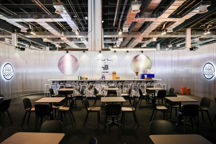
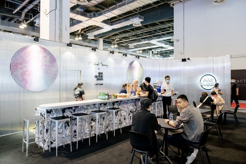
The space features grey corrugated walls with splashes of colour and is furnished with previews of furniture pieces designed by Young that will be launched later in the year.

Michael Young x Dezeen cafe and bar at Design Shanghai
Dezeen has partnered with Design Shanghai to present a cafe and bar designed by Michael Young

According to Young, the concept for the space is loosely based on a bar he created last year at his office in Shekou, Shenzhen.

“I ended up with an opportunity to create a bar last year beneath our studio but with only a few weeks to build the concept I decided to throw in anything I could get hold of – samples, prototypes and things from the studio that we have collected from around the world,” the Hong Kong-based British designer told Dezeen.

“I basically scavenged the studio together like a magpie so it became a real beer shack and a place that was not designed but created organically.”

The bar has grey walls
The bar features ribbed walls with splashes of colour and pattern

Citta Design has contributed pieces of Young’s new Acre Chair for the New Zealand brand, which will be launched in Auckland in September. The space is also furnished with new editions of Young’s Stool 4a for EOQ Design, which will be launched in December.

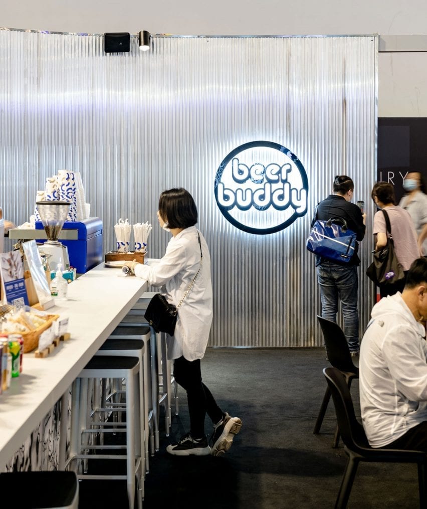
The bar is being used to launch Young’s new drinks brand Beer Buddy, which developed a new pilsner called House for the event.

The beer brand is specifically designed to connect creatives at events, trade shows and gatherings around Asia. Drinkers can scan a QR code on the beer packaging to connect with other creatives attending the event.

It is serving Beer Buddy
Young is launching his new Beer Buddy drinks brand at the bar

The dark grey exterior walls of the space are decorated with swirling patterns based on the graphics on the Beer Buddy cans and bottles.

Colourful versions of this pattern have been used to add splashes of colour to the interior walls and enclose private seating areas.

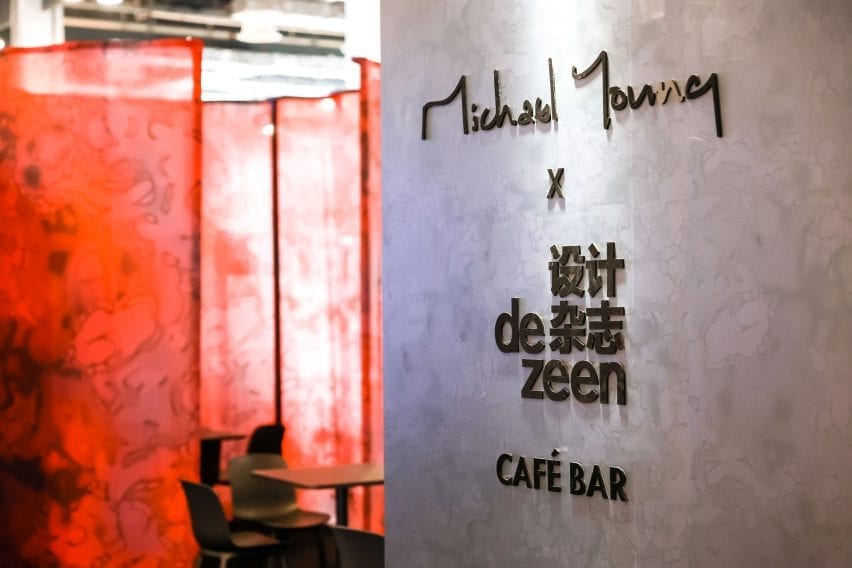
The space is co-branded with Young’s studio logo and the Chinese version of Dezeen’s logo. The walls also feature the QR code for people to follow Dezeen’s official WeChat account, which features news and features about the latest architecture, design and interiors written in Simplified Chinese.

Michael Young x Dezeen cafe and bar at Design Shanghai
The interior and exterior of the bar features swirling patterns based on the Beer Buddy packaging

Dezeen is a media partner for Design Shanghai 2021.

The show presents over 400 local and international brands across eight different sections alongside a programme of installations, exhibitions and the return of its annual talks programme, which this year explores the topic of regenerative design.

Design Shanghai takes place from 3 to 6 June at the Shanghai World Expo Exhibition and Convention Center. See Dezeen Events Guide for an up-to-date list of architecture and design events taking place around the world.

Reference