Red Dunes Playtopia features “cave-like” play spaces and undulating hills
CategoriesArchitecture

Red Dunes Playtopia features “cave-like” play spaces and undulating hills

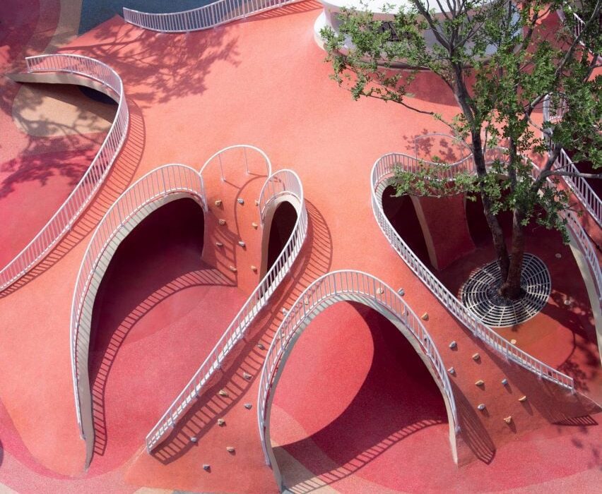
Sloping red dunes and cavernous spaces feature in this playground, which local studio XISUI Design has created in a residential area in Guangzhou, China.

Built above an underground parking unit, the play area takes cues from natural forms including mountains and caves and comprises a playful arrangement of hills and arches designed for climbing and discovery.

“The design revolves around utilising the undulating red dunes to provide an attractive terrain for children to come and engage in activities such as running, jumping, and playing,” studio design director Hu Yihao told Dezeen.
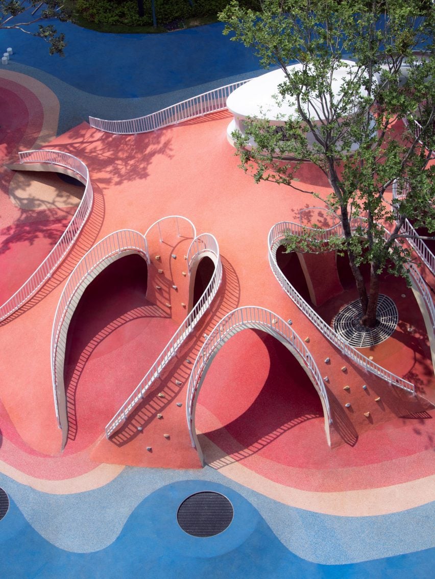
Image of Red Dunes Playtopia
Red Dunes Playtopia was designed by XISUI Design

The studio used a load-bearing concrete shell for the structure of the playground, arranging the openings so that the loads are transferred to the supporting columns of the building below.

“Through concealed structural supports beneath the main weight-bearing concrete shell, the upper weight is precisely transferred to the supporting columns of the underground garage,” said Hu.

“This reduces the amount of earthwork volume used, reducing the weight of the load, and ensuring safety and stability.”
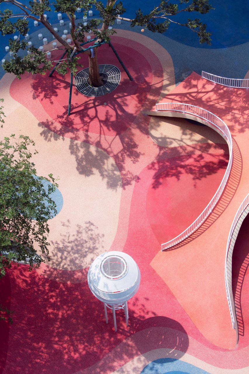
Photo of Red Dunes Playtopia by XISUI Design
The playground consists of hill-like structures

A variety of areas were hidden beneath the concrete shell, where the undulating topography of the land underneath helps to form organic landscapes designed to evoke the atmosphere of a cave.

Accessed through curved openings between sloping bridges, the covered play space is punctuated by a central white column, where a ladder leads to a white playhouse that sits above the concrete shell and connects to a metal slide.
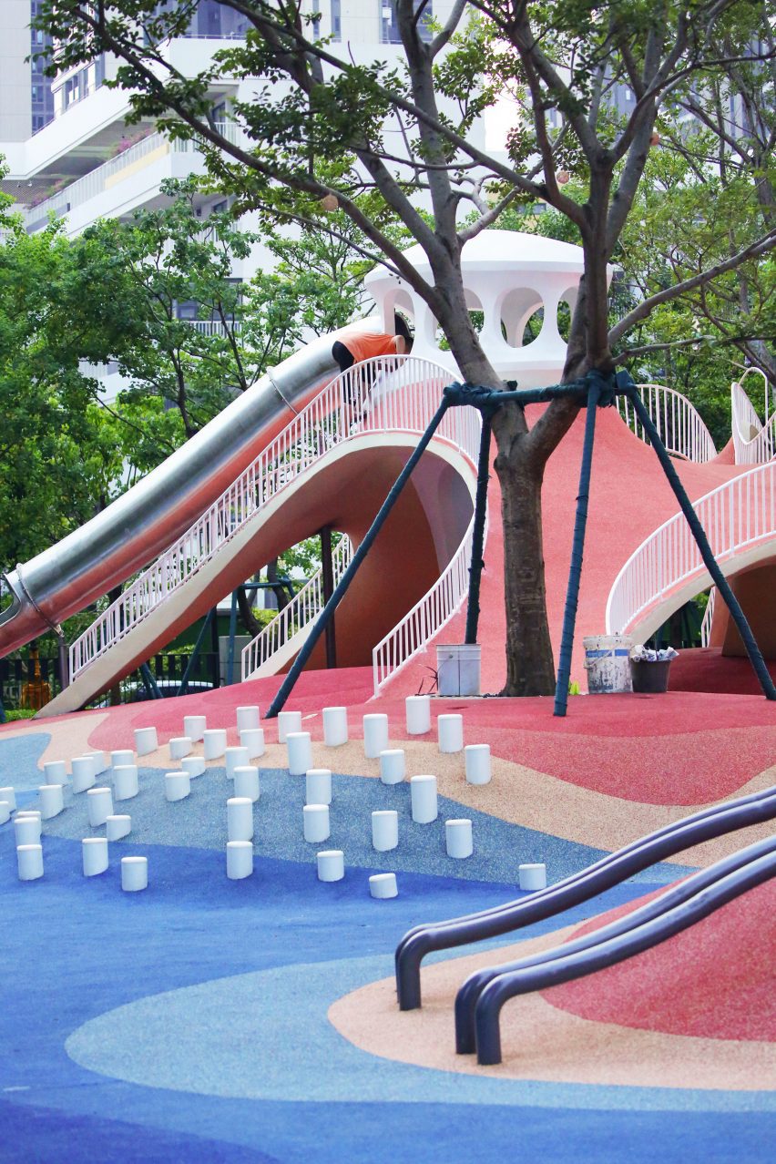
Photo of the Red Dunes Playtopia by XISUI Design
It has a concrete shell

“The use of undulating concrete shell structures creates cave-like spaces that blend harmoniously with the terrain, offering both climbing opportunities and fantastic sheltered areas,” said Hu.

“This design approach ensures seamless integration with the natural topography while minimising structural elements and maximising space utilisation.”

The landscape was coloured with a range of red and blue tones arranged in a blocky pattern of curving shapes that follows the topography of the playground.

“Our client expressed an interest in incorporating a celestial theme into the children’s play area, specifically referencing the concept of Mars,” said Hu.

“To balance the overall colour scheme and avoid excessive dominance of red tones, we also incorporated complementary blue hues to enhance contrast and visual interest.”
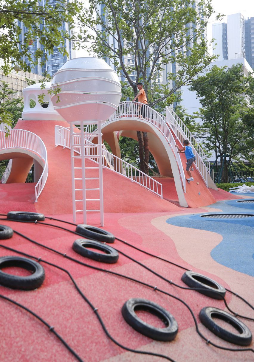
Photo of the playground
Climbing walls, slides and walkways cover the hills

Up the sides of the shell, ropes and climbing walls provide access to the top of the hill, with white railings placed along the edges of the arches to provide additional safety.

Play equipment, including tunnels, stepping stones, slides, and tactile climbing frames, has been arranged across the rest of the site into zones suited towards different age groups, ranging from toddlers to teenagers.

“We aimed to provide a balanced range of activities that cater to different stages of child development, including exercises that enhance upper and lower body strength, balance, social interaction, and parent-child bonding,” added Hu.
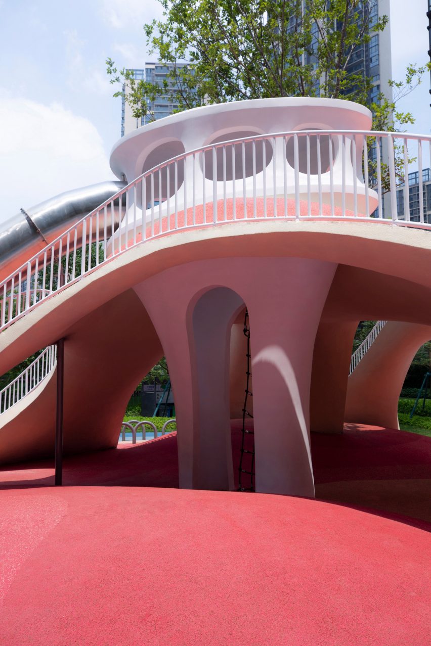
Photo of the playground
The playground has an undulating topography

Flattening out towards the edges of the site to simplify access, the topography was designed around these zones, with a smaller hill to one side of the site catering to toddlers and the larger shell on the other end providing more challenging terrain for older children.

While trees are dotted around the play area, the main green spaces were placed around the edges of the site where the ground dips to absorb draining rainfall.
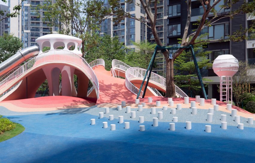
Photo of Red Dunes Playtopia by XISUI Design
Trees surround the playground

“Meticulous calculations and simulations have ensured a comprehensive natural drainage system, effectively managing rainwater flow despite the undulating terrain,” said the studio.

“This innovative approach eliminates the need for surface drainage outlets, allowing rainwater to naturally disperse into green spaces and designated peak drainage outlets.”

Other playgrounds recently featured on Dezeen include a tree-inspired office playground in Tel Aviv and a series of giant rocks on wheels designed to encourage adventurous play.

The photography is by Hu Yihao.

Reference

Eight cave-like interiors that celebrate curved forms
CategoriesInterior Design

Eight cave-like interiors that celebrate curved forms

A spa with a spherical swimming pool and holiday homes with sloping plaster walls feature in our latest lookbook, which showcases eight cavernous Greek interiors.

Cave-like interior designs are becoming increasingly popular, as seen in the Gilder Center by Studio Gang – a recently completed museum extension in New York with a large grotto-like atrium.

In Greece, which is known for its caves, there is a wide variety of cave-like architecture either built from existing geological structures or designed to mimic these natural dugouts. Thick, curved walls are often chosen to protect interior spaces from the country’s Mediterranean climate.

As the weather becomes warmer in the northern hemisphere, here are eight cave-like interiors from Greece that are defined by their curved shapes.

This is the latest in our lookbooks series, which provides visual inspiration from Dezeen’s archive. For more inspiration see previous lookbooks featuring homes with striking bookshelves, outdoor showers and offbeat bakeries.


Two holiday residences in Fira by Kapsimalis Architects
Photo is by Yiorgos Kordakis

Summer houses, Santorini, by Kapsimalis Architects

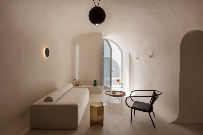
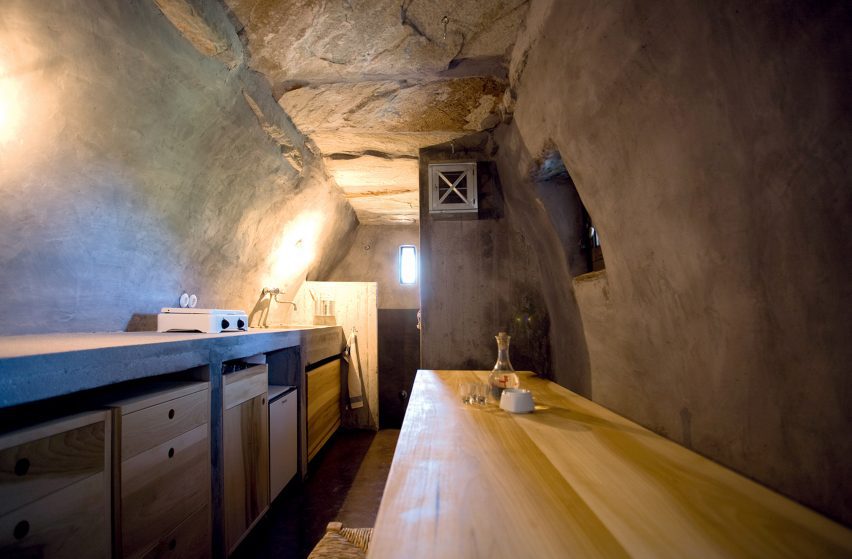
Local studio Kapsimalis Architects converted two underground caves at an old property in Santorini into summer houses with bright white facades.

Inside, the homes are characterised by smoothed-out interiors finished with earthy-hued plaster, while arched doorways and niches nod to the property’s history.

Find out more about these summer houses ›


Interior of house on the island of Nisyros
Image is courtesy of Greg Haji Joannides

Sterna Nisyros Residences, Nisyros, by Greg Haji Joannides

Designer Greg Haji Joannides renovated the interior of an earthquake-damaged house on the island of Nisyros using historic photographs as a guide.

On the ground floor, wide brick archways create an open-plan layout that allows the space to double as an exhibition site for artists in residence.

“The inspiration behind this design was to keep as much as possible of the original way the Nisyrians would build houses,” Joannides told Dezeen. “They would use the ground floor as a storage or working space.”

Find out more about this island house ›


Wooden Cave by Tenon Architecture
Photo is by Spyros Hound Photography

Wooden Cave, Trikala Korinthias, by Tenon Architecture

Wooden Cave is a timber-clad suite that forms part of Hyades Mountain Resort – a hotel in the mountainous village of Trikala Korinthias.

Tenon Architecture split the suite into two sections that intend to mirror the appearance and experience of entering a cave. The front half features ashy black tiles arranged in a linear formation, while the rear half is made from almost 1,000 pieces of curved hand-cut spruce.

“This division intends to create a clear distinction between the hard, ‘protective’ shell and the curved, ‘inviting’ interior, reminiscent of the form of a cave,” explained the architecture studio.

Find out more about Wooden Cave ›


Curved interior of hotel in Santorini
Photo is by Giorgos Sfakianakis

Saint Hotel, Santorini, by Kapsimalis Architects

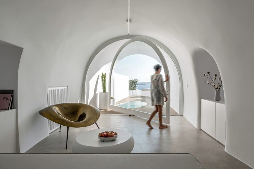
Kapsimalis Architects converted a cluster of former homes, barns and cellars in Santorini into the Saint Hotel – the volumes of which are arranged in a stepped formation down a sea-facing cliffside.

Inside, smooth cavernous walls were finished in white plaster that creates a subtle backdrop for minimal fittings and amorphous furniture.

Find out more about Saint Hotel ›


House interior in former stable on Greek island
Photo is by Sylvia Diamantopoulos

Retreat in Tinos Island by Ioannis Exarchou

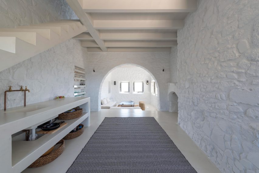
Retreat in Tinos Island is a 100-year-old stable that was transformed into a cosy holiday home for two by architect Ioannis Exarchou.

Exarchou set large stones and thick tree branches into the dwelling’s ceiling, clad the walls in smooth white plaster and covered the floors in coloured concrete.

“My main objective was to retain and preserve the cavernous unique feeling of the space,” the architect told Dezeen.

Find out more about Retreat in Tinos Island ›


Santorini holiday home by Kapsimalis Architects
Photo is by Yiorgos Kordakis

Holiday home, Santorini, by Kapsimalis Architects

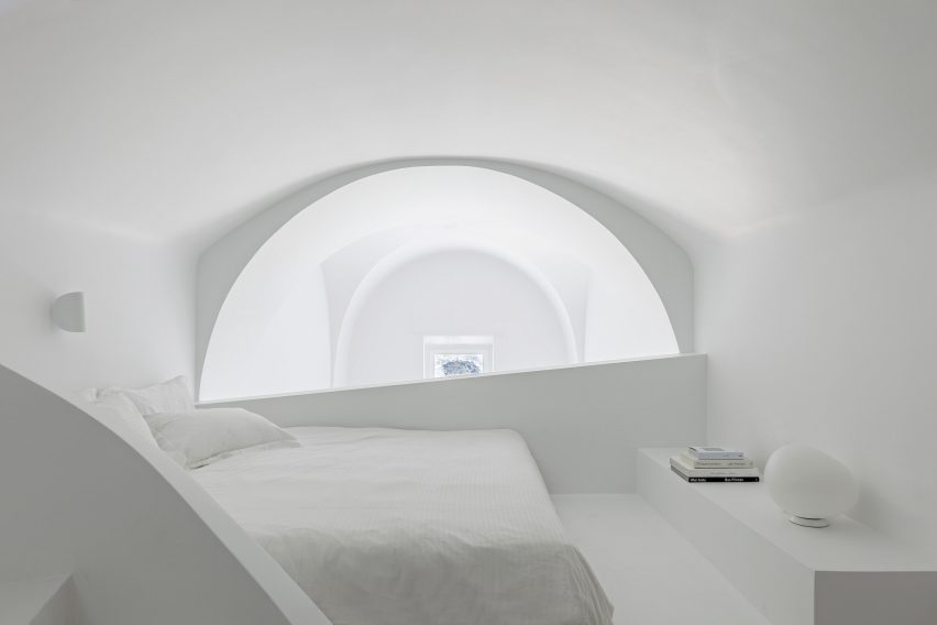
The cave-like subterranean spaces and vaulted rooms within this Santorini holiday home were renovated by Kapsimalis Architects to retain the building’s existing architecture.

The studio worked to simplify the complex interior layout, which features a labyrinthine arrangement of spaces that are brightened by all-white plaster walls.

Find out more about this holiday home ›


Euphoria spa in the Euphoria retreat by decaARCHITECTURE
Image is courtesy of DecaArchitecture

Euphoria Spa, Mystras, by DecaArchitecture

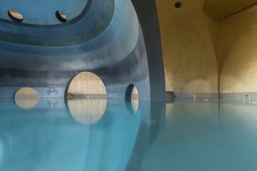
Carved into the base of a mountain in Mystras, Euphoria Spa is made up of differently scaled elliptical spaces that are connected by a web of catacomb-style passages.

One of these areas contains an indoor spherical pool that is characterised by a dark central structure that can be accessed via curved archways.

“Floating in the centre of this dark orb there is a sense of being suspended in the void of a platonic volume, but also a sense of womb-like calmness,” said DecaArchitecture.

Find out more about Euphoria Spa


Santorini apartment
Photo is by Julia Klimi

Holiday apartments, Santorini, by Kapsimalis Architects

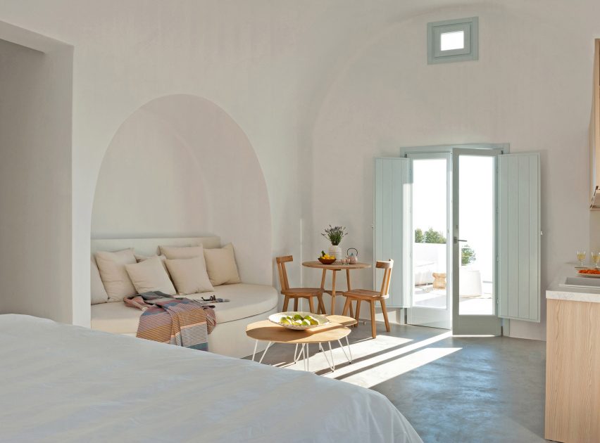
Arched niches and grey cement plaster floors create neutral living spaces within these four holiday apartments, which were built near Santorini’s highest point.

The complex’s terraces and retaining walls were formed from rocks excavated from the site to create a continuity between the architecture and the surrounding mountains.

Find out more about these apartments ›

This is the latest in our lookbooks series, which provides visual inspiration from Dezeen’s archive. For more inspiration see previous lookbooks featuring homes with striking bookshelves, outdoor showers and offbeat bakeries. 

Reference

Plantea Estudio creates cosy cave-like room within bar Gota in Madrid
CategoriesInterior Design

Plantea Estudio creates cosy cave-like room within bar Gota in Madrid

A red “cave” hides behind the main dining space of this wine and small plates bar in Madrid designed by interiors studio Plantea Estudio.

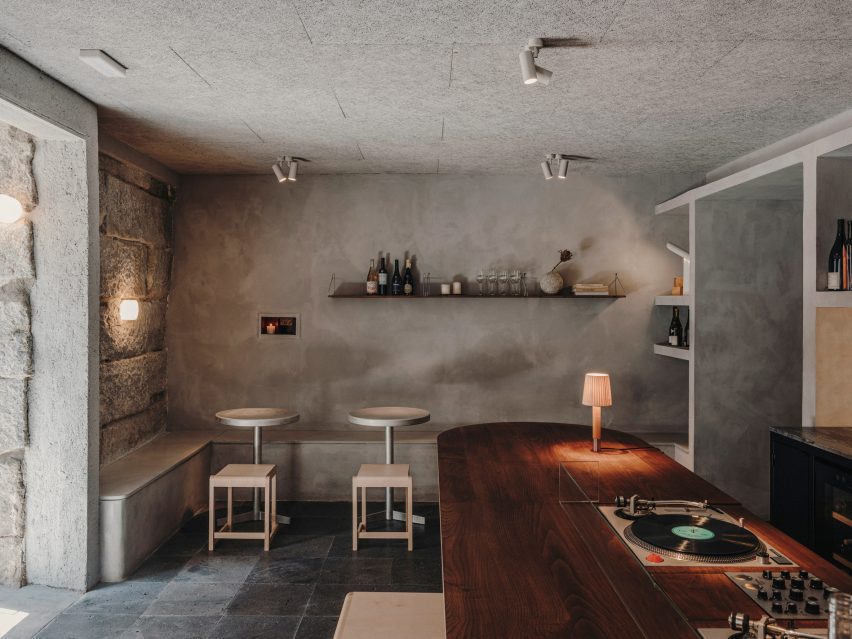
Located on the ground floor of a neoclassical building in Madrid’s buzzy Justicia neighbourhood, Plantea Estudio designed Gota to appear “dark, stony and secluded”.

Interior of Gota bar in Madrid designed by Plantea Estudio
Gota sits on the ground floor of a neoclassical building in the Justicia neighbourhood

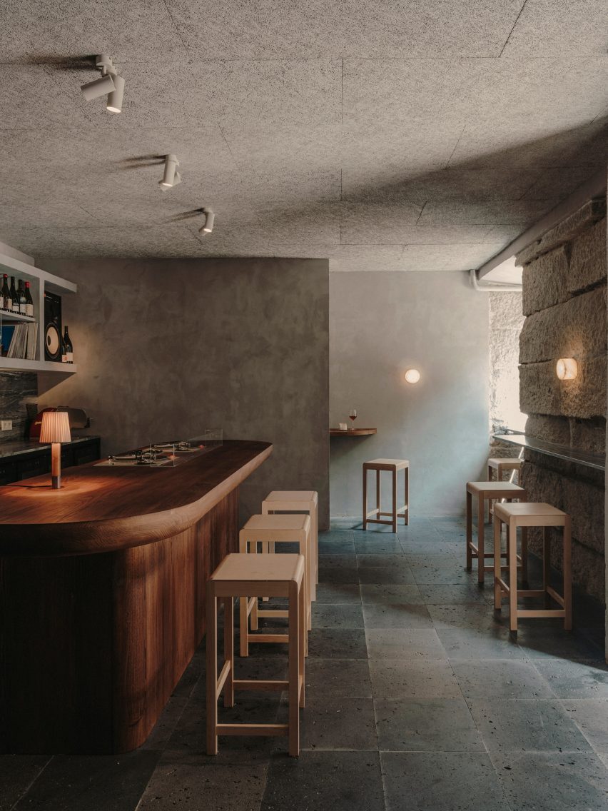
Guests ring a bell to enter the 70-square-metre bar, and are then welcomed into a dining room enclosed by thickset granite ashlar walls. While some of the walls were left exposed, others have been smoothly plastered over and washed with grey lime paint.

The floor was overlaid with black volcanic stone tiles that the studio thought were suggestive of a “newly discovered terrain”.

Interior of Gota bar in Madrid designed by Plantea Estudio
A counter in the first dining space is inbuilt with a record player

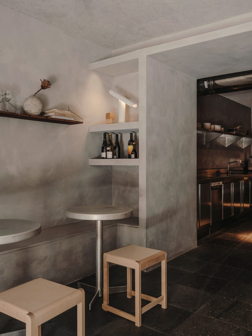
A bench seat runs down the left-hand side of the bar, accompanied by lustrous aluminium tables and square birchwood stools from Danish design brand Frama.

Guests can alternatively perch on high stools at the peripheries of the room, where lies a slender stone ledge for drinks to be set down on.

Interior of Gota bar in Madrid designed by Plantea Estudio
Shelving displays wine bottles, vinyls, and other objects

More seating was created around a bespoke chestnut counter at the room’s centre; its surfacetop has an in-built turntable on which the Gota team plays a curated selection of music.

Behind the counter is a storage wall where wine bottles, vintage vinyl records and other music-related paraphernalia are displayed.

Gota bar in Madrid includes red cave-like room
A cave-like dining room hides at the bar’s rear

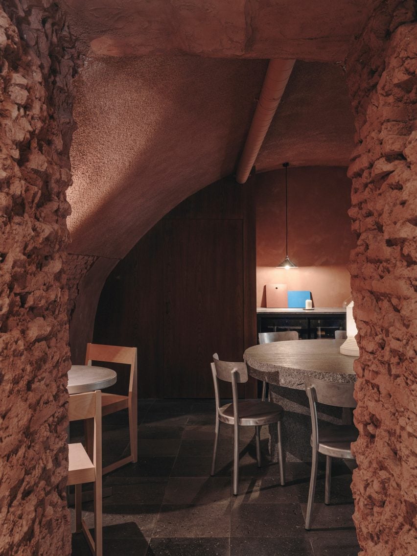
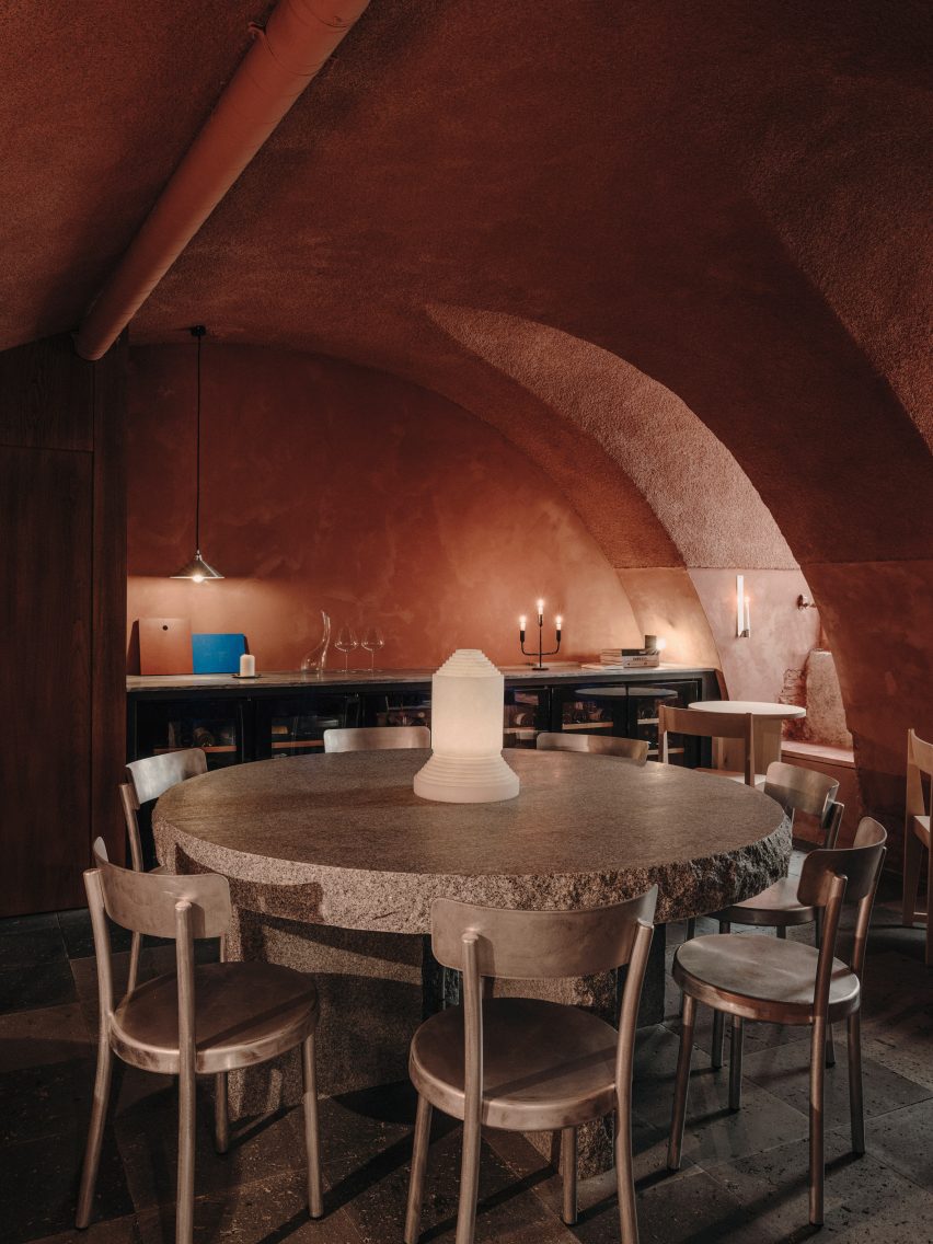
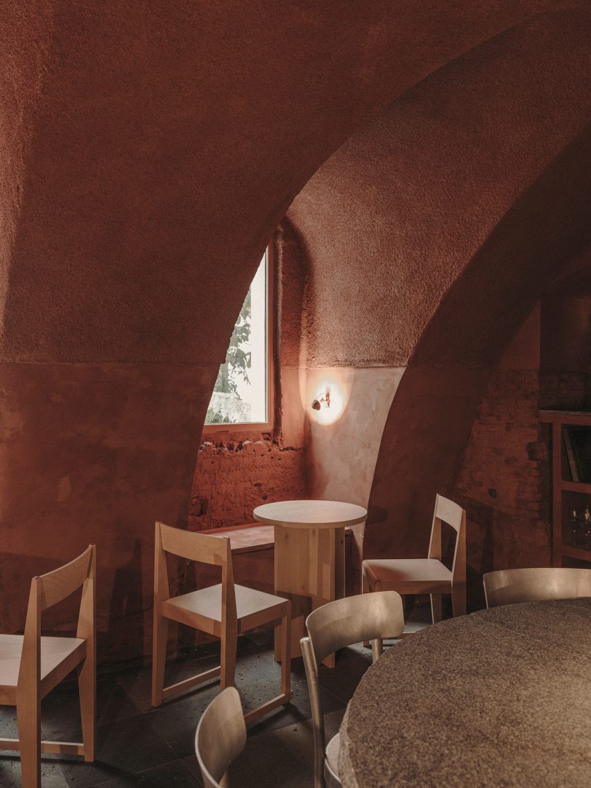
An open doorway takes guests down a short corridor to a secondary cave-like dining space, which boasts a dramatic vaulted ceiling and craggy brick walls. It has been almost entirely painted red.

“It’s relatively common to find this kind of vaulted brick space in the basements of old buildings in Madrid – this case was special because it’s on the ground floor with small openings to a garden,” the studio told Dezeen.

“It was perfect for a more quiet and private area of the bar,” it continued.

“The red colour is an abstract reference to the brick of which the cave is really made, and also a reference to wine.”

Gota bar in Madrid includes red cave-like room
The space is arranged around a huge granite table

At the room’s heart is a huge 10-centimetre-thick granite table that’s meant to look as if it has “been there forever”, surrounded by aluminium chairs also from Frama. Smaller birch tables and chairs custom-designed by the studio have been tucked into the rooms corners.

To enhance the cosy, intimate feel of the bar, lighting has been kept to a minimum – there are a handful of candles, reclaimed sconces and an alabaster lamp by Spanish brand Santa & Cole.

Gota bar in Madrid includes red cave-like room
Red paint covers the space’s vaulted ceiling and brick walls

Established in 2008, Plantea Estudio is responsible for a number of hospitality projects in Madrid.

Others include Hermosilla, a Mediterranean restaurant decked out in earthy tones, and Sala Equis, a multi-purpose entertainment space that occupies a former erotic cinema.

The photography is by Salva López.

Reference

AIA Estúdio designs cave-like interior for clothing store in Rio de Janeiro
CategoriesInterior Design

AIA Estúdio designs cave-like interior for clothing store in Rio de Janeiro

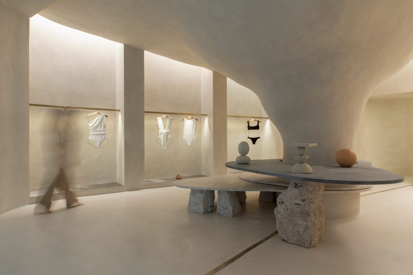
Organic shapes and stone-like surfaces characterise the interior of the Haight clothing store in Rio de Janeiro, which was designed by interior and landscaping design practice AIA Estúdio.

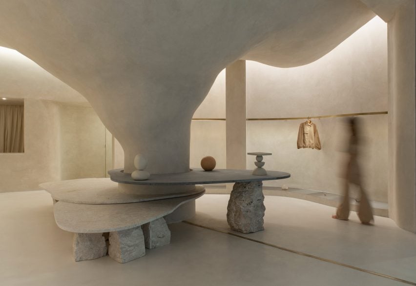
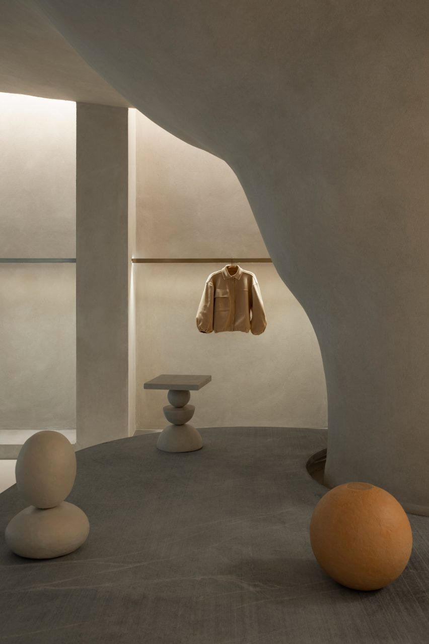
A large pillar with a rough, textured surface dominates the 110-square-metre shop interior, expanding as it ascends before merging into the ceiling to create a cave-like space.

Haight clothing store by AIA Estúdio
A pillar transforms into a cave-like structure

“Its height starts small and in the back part it ends higher in a nonlinear form, just like a cave,” AIA Estúdio founder Alice Tepedino told Dezeen.

“The infinite and diverse processes of erosion that form cliffs, caves, stalactites, sands, stones and the movements of water with its tracks and shapes led to our creative process being part of the concept developed for the store’s spatiality.”

Haight clothing store by AIA Estúdio
Stone slabs around the pillar are used to display objects

Rather than being a cumbersome obstacle, the pillar helps organise the shop’s circulation and movement of shoppers, according to the studio.

“It is from the occupation around the pillar that the space fluidity is achieved. This disposition is enhanced by curved lines that define the path inside the store,” said Tepedino.

Haight clothing store by AIA Estúdio
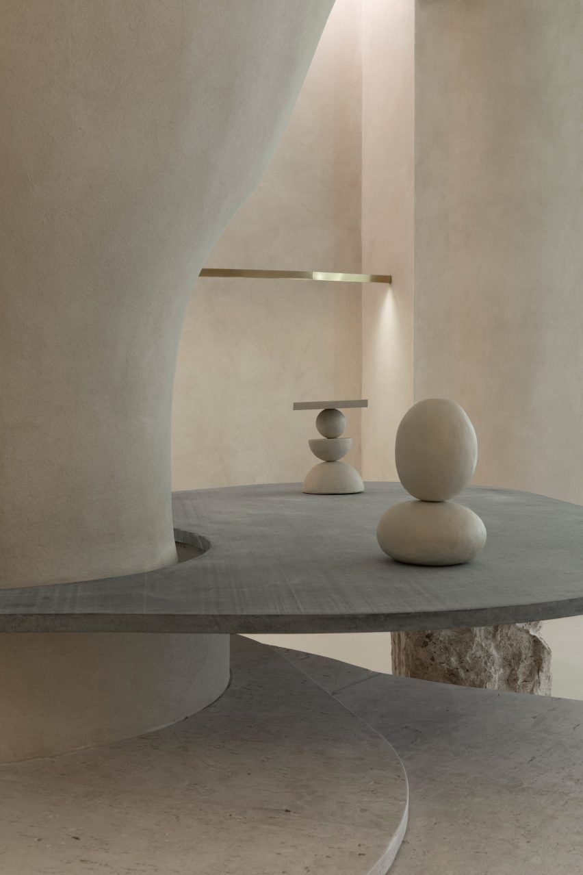
Curved stone plates balance on rocks

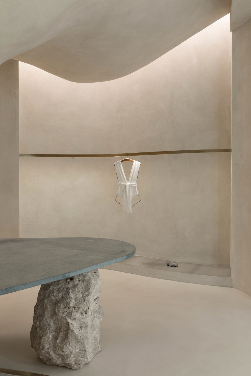
Slabs of soapstone and Bahia beige marble encircle the pillar at different heights and are propped up by Bahia beige marble rocks that create a display surface and a place for shoppers to sit.

On the perimeter walls, niches with stainless steel bases display Haight’s clothing on brushed-brass rails.

The metallic surfaces and straight edges of the niches contrast with the organic shapes and materials in the centre of the shop, which is located in the Shopping Leblon retail centre.

Tepedino used indirect lighting in the niches to illuminate the space, mimicking cracks in cave walls where sunlight can seep through.

Interior of the Haight clothing store
Clothing is displayed on brushed-brass rails

“The exhibition interspace was thought of as a cut in the walls, an operation emphasised by the transition of materiality,” said Tepedino.

“Inside, there are exhibition racks in brushed brass, which, with their more solar aspect, contribute to subtly warming up the store’s ambience, together with the soapstone and its greyer tone.”

Haight clothing store by AIA Estúdio
The bottoms of wall niches are lined with steel

Tepedino’s design is the first of Haight‘s stores to be located inside a shopping centre, which prompted the designer to approach the project in a different way.

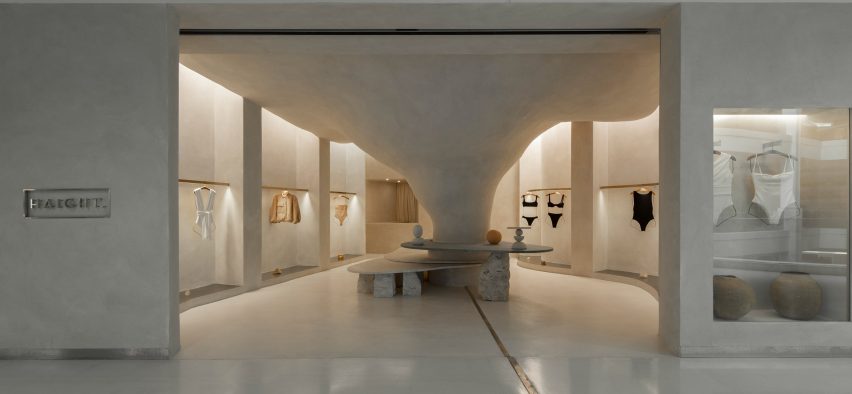
The entrance to the shop is a large opening that provides open access from the shopping centre to the nature-inspired shop interior.

Exterior of the Haight clothing store
It is the first Haight store to be located in a mall

“The design adopted a contrasting strategy between the store and mall, which, despite the rigid and controlled environment, offers opportunities such as the possibility of not having a door,” said Tepedino.

The brand’s conceptual basis is related to natural landscapes but when you are inside the mall, you find a language that is the opposite of Haight’s conceptual basis, with artificial elements and cold materiality.”

Stone surfaces at the Haight clothing store
Natural materials and surfaces were used throughout the shop interior

“Once you’re inside the store you get disconnected from the artificial atmosphere of the rest of the building,” Tepedino continued.

The project has been shortlisted in the small retail interiors category of Dezeen Awards 2022, alongside a surfaces showroom in Helsinki with colourful terrazzo-like walls and an oxblood red shop interior with walls decorated with Victorian-style balusters.

The photography is by Maira Acayaba.

Reference