Feel the Burn: 6 Strategically Scorched Buildings That Celebrate Shou Sugi Ban
CategoriesArchitecture

Feel the Burn: 6 Strategically Scorched Buildings That Celebrate Shou Sugi Ban

The latest edition of “Architizer: The World’s Best Architecture” — a stunning, hardbound book celebrating the most inspiring contemporary architecture from around the globe — is now available. Order your copy today.  

Fire can cause unfathomable destruction, yet when its power is harnessed, it can be a source of extraordinary creativity too. Shou sugi ban, originally known as yakisugi, is an ancient wood-burning technique developed in Japan centuries ago. The surface of the wood is exposed to a flame and charred, rendering it a striking charcoal black. Far from merely decorative, the practice preserves and fortifies the wood — the carbon surface layer forms a natural defense against the elements, wood rot and insect damage, as well as acting as a fire retardant.

Prized for its dual protective and aesthetic qualities, this time-honored material treatment is now utilized all over the world. While it’s commonly seen across exterior wood siding, its applications are wide-ranging and extend to interior paneling, furniture, decking and other architectural elements. At the 11th A+Awards, architects embraced the burn with contemporary twists on this storied technique. From firehouses to restaurants and residences, discover the exceptional new spaces rising from the ashes…


By NICOLEHOLLIS, Napa, California

Popular Choice Winner, 11th Annual A+Awards, Residential Interiors (<3000 sq ft)
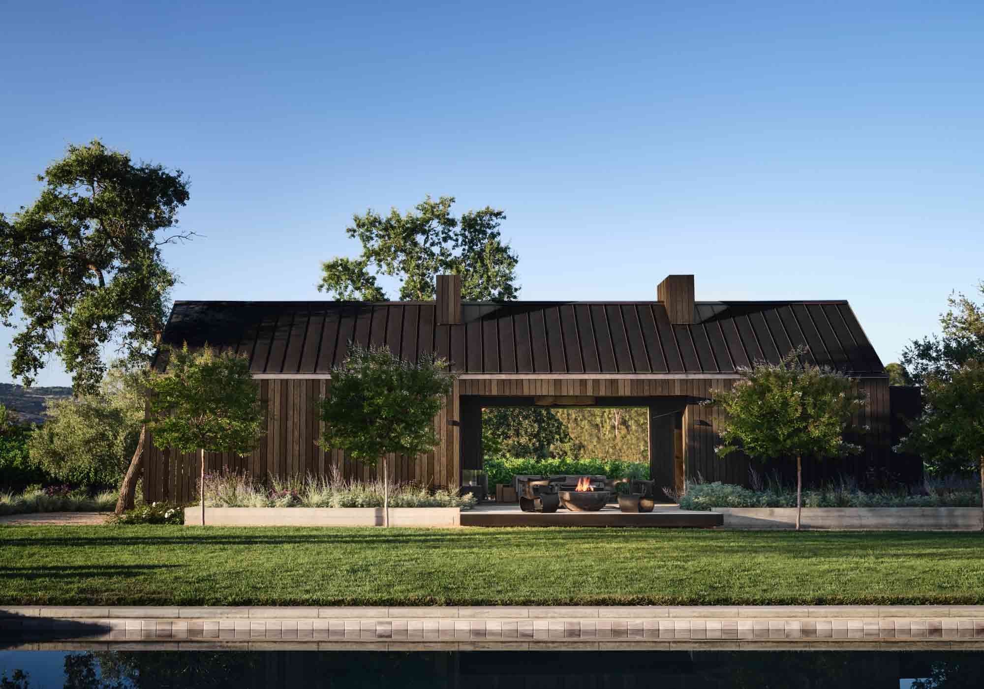
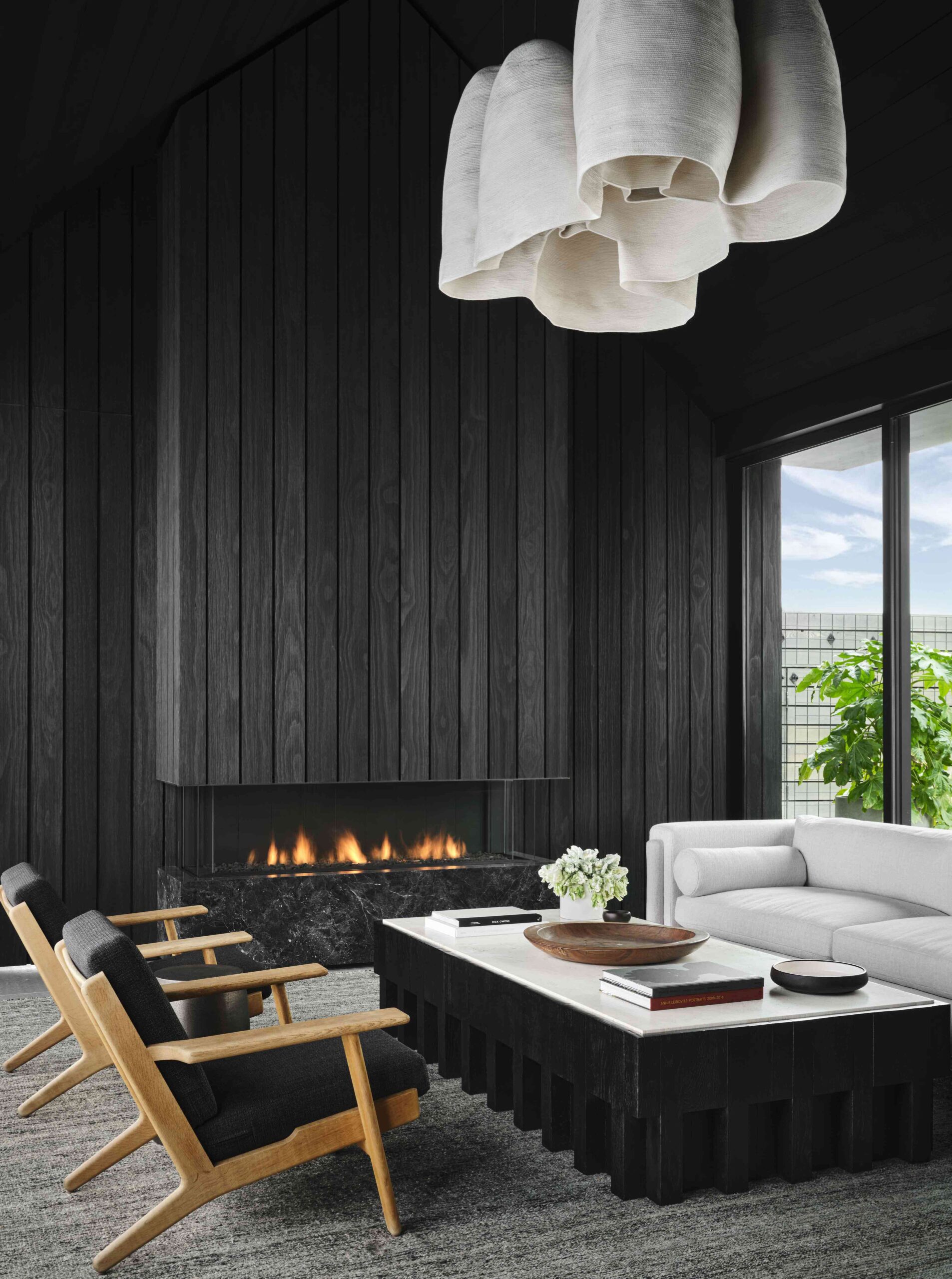
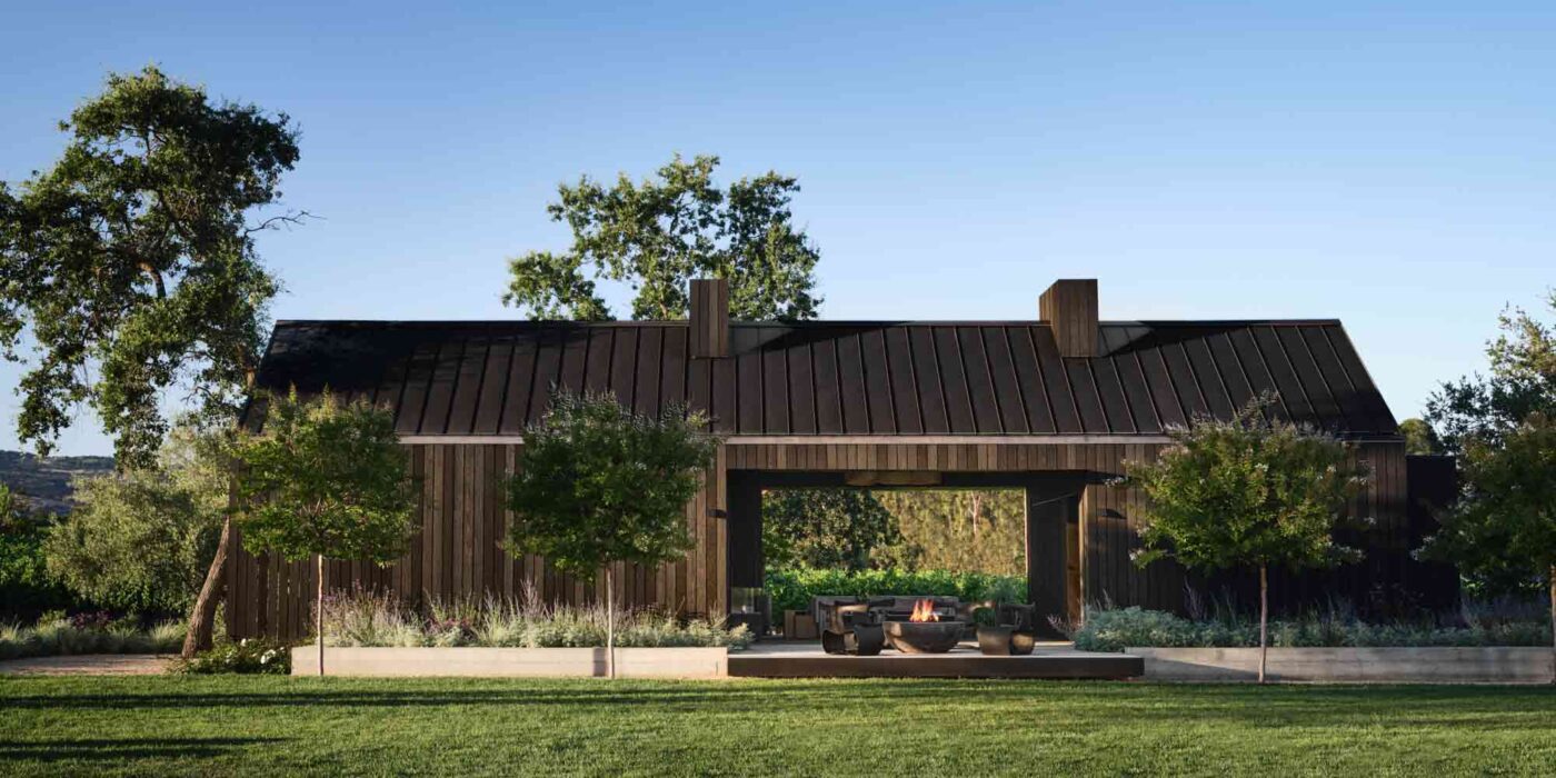
Napa Valley Residence by NICOLEHOLLIS Napa Valley Residence by NICOLEHOLLISSequestered in Napa Valley’s verdant wine country, this daring guest house combines a natural material palette with dark and dramatic hues. From a distance, the structure reads like an agricultural barn, its charred wooden cladding seemingly patinated and matured into the rural landscape. Yet up close, it’s a different story…

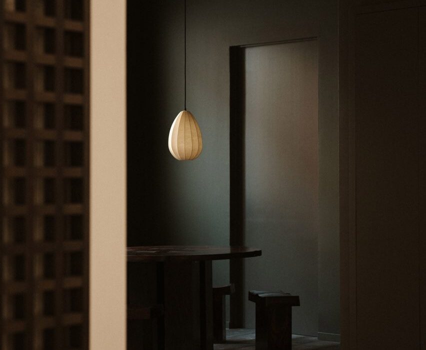
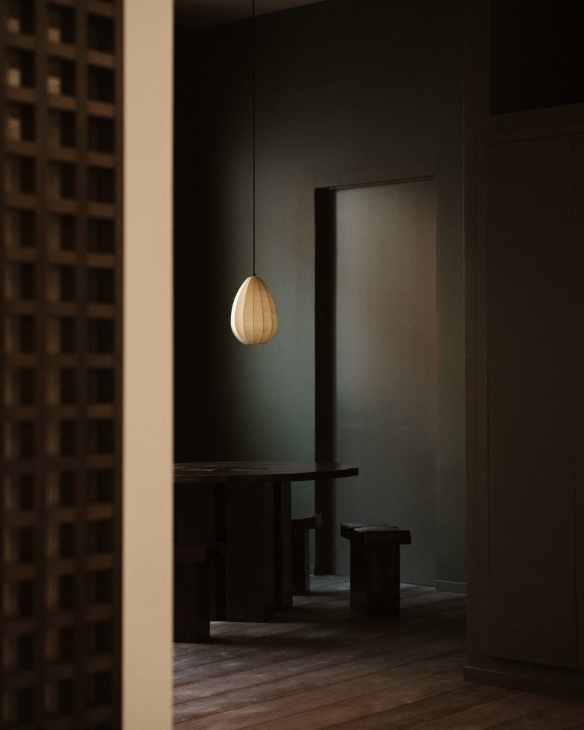
The exterior shou sugi ban siding seeps inside this remarkable retreat. The charcoal living areas feel striking modern, yet they’re deeply rooted in the organic environment, complemented by raw wood furnishings and light fixtures crafted from thick cotton. Conceived as a flexible space for hosting and entertaining, multifunctionality is built into the bold design. At the back of the lounge, the blackened wall panels can conceal or reveal a built-in kitchenette thanks to an innovative triple-folding door system.


By Design Opera Architects, Tijuana, Mexico

Special Mention, 11th Annual A+Awards, Restaurants (S <1000 sq ft)
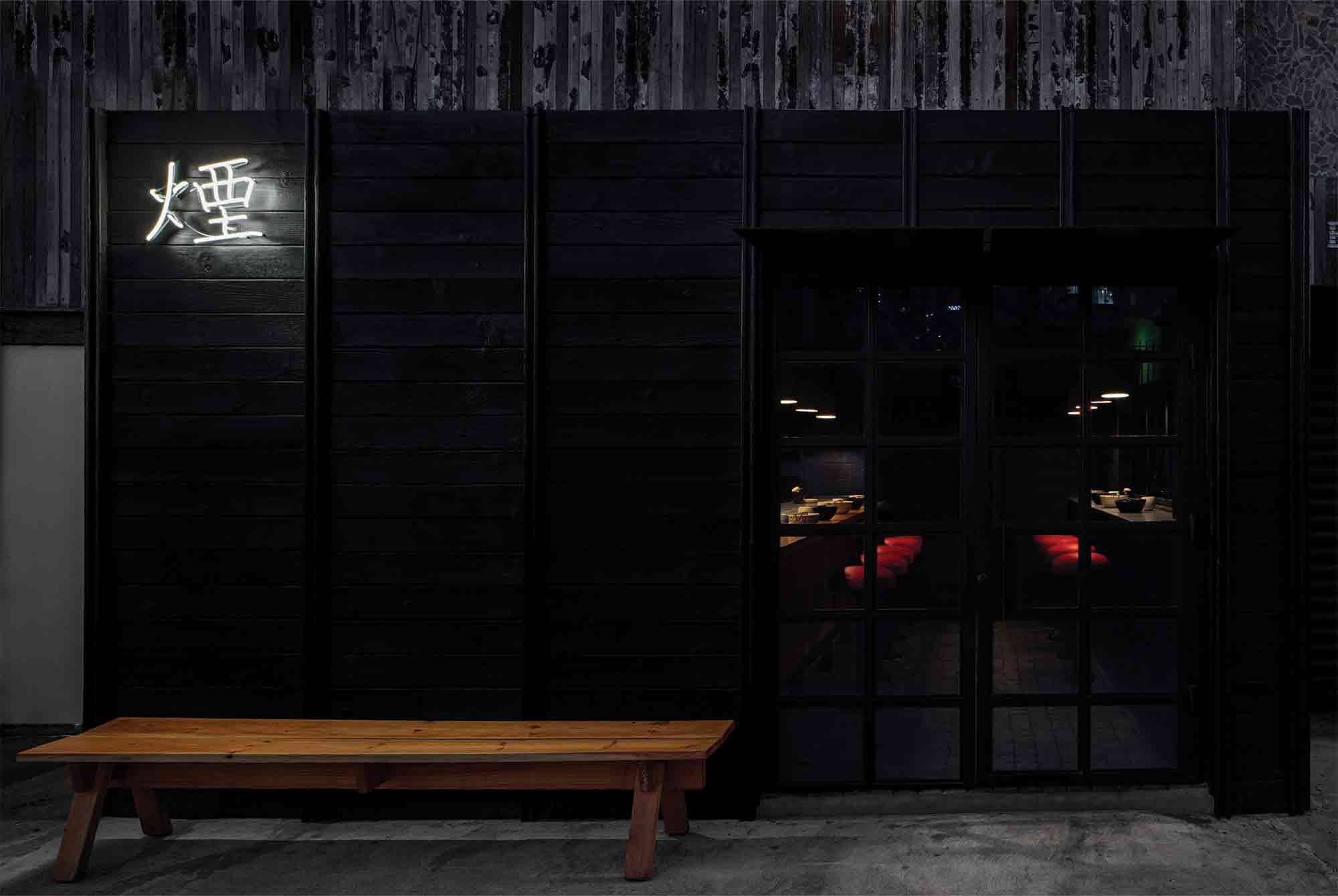
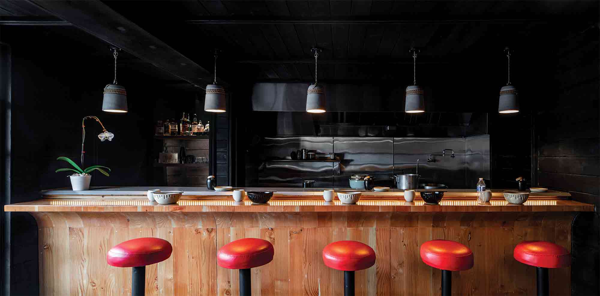
Kemuri by Design Opera Architects Kemuri by Design Opera ArchitectsThis extraordinary new restaurant in an up-and-coming Tijuana neighborhood seeks to transport the culinary and architectural traditions of Japan onto the streets of Mexico. Inspired by the chef’s passion for culinary smoking, shou sugi ban siding offers an eloquent, material articulation of this cooking technique, while paying homage to the restaurant’s cultural heritage.

Inside, black wood-clad walls envelop patrons and create an intimate, cocooning atmosphere. The restaurant’s exceptional material details summon the topography of historic Japan. Cobblestone flooring conjures up the ancient, meandering streets of Ichinenzaka and Ninenzaka, while the exposed grain of the cypress butcher-block bar evokes the country’s native woodland terrain. 6,700 miles away from its roots, a palpable inner world unfurls.


By Laney LA, Inc., Concept

Jury Winner, 11th Annual A+Awards, Unbuilt – Private House (L >3000 sq ft)
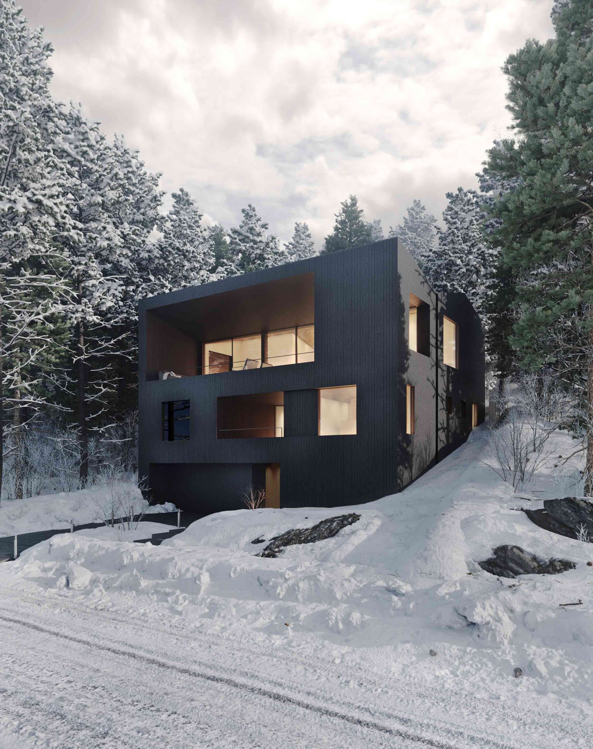
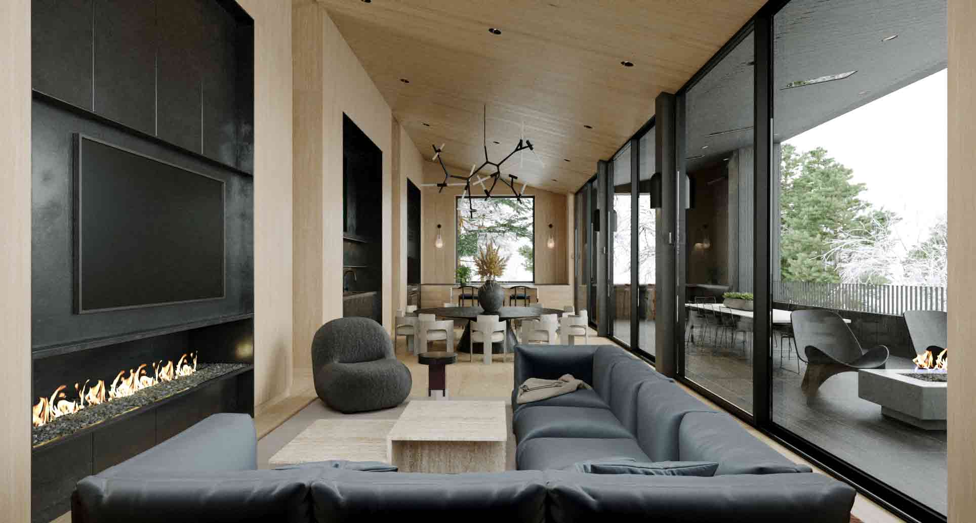
SQ Residence by Laney LA, Inc. SQ Residence by Laney LA, Inc.Rising like a boulder on a wooded incline in Lake Tahoe, this ambitious concept envisages a monolithic residence that’s at one with its natural surroundings. A shell of charred cedar siding encases the home, a skin that will shift and weather in tandem with the adjacent trees. Meanwhile, vast apertures frame snapshots of the domestic spaces within.

An evocative interplay of dark and light takes center stage throughout the floor plan. A swathe of glass divides the external covered deck, clad in shou sugi ban, with the pale oak walls of the main living space. Patagonia granite defines the kitchen surfaces, another tactile anchor that cements the home’s positioning as an architectural extension of the mountain.


By IwamotoScott Architecture, Burlingame, California

Finalist, 11th Annual A+Awards, Architecture +Small Projects
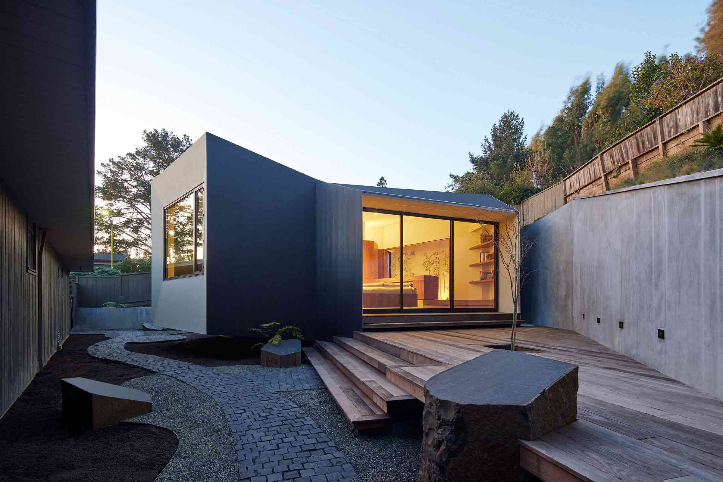
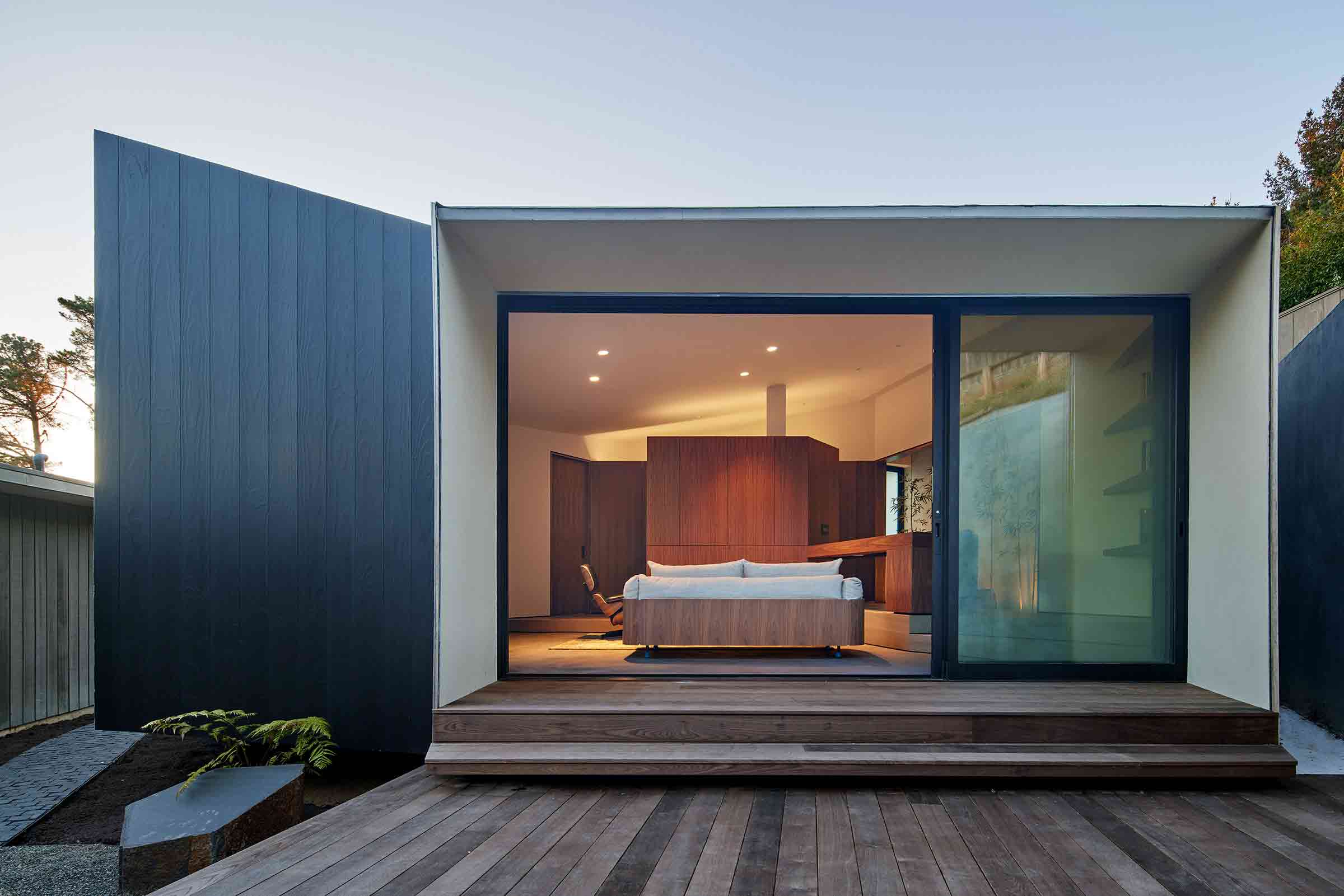
Geode ADU by IwamotoScott Architecture Geode ADU by IwamotoScott ArchitectureThis compact ADU was designed as a guest studio and writing retreat that would fit snuggly alongside the site’s main dwelling. At once a “place apart” from the primary property and quietly referential of its mid-century modern architecture, the result is a striking, sculptural space that makes a big statement across a small square footage.

The 1950s butterfly roof has been artfully reinterpreted to maximize the site’s views. One wing follows the slope of the neighboring bank, while the other angles the roofline upward, lifting a section of the building above the ground. Viewed as a two-dimensional line, it’s an inversion of the gabled roof of the main Eichler house. Sleek shou sugi ban siding contrasts with white stucco across the cantilevered face and overhang, imparting an effortlessly contemporary edge.


By OPN Architects, Marion, Iowa

Special Mention, 11th Annual A+Awards, Government & Civic Buildings
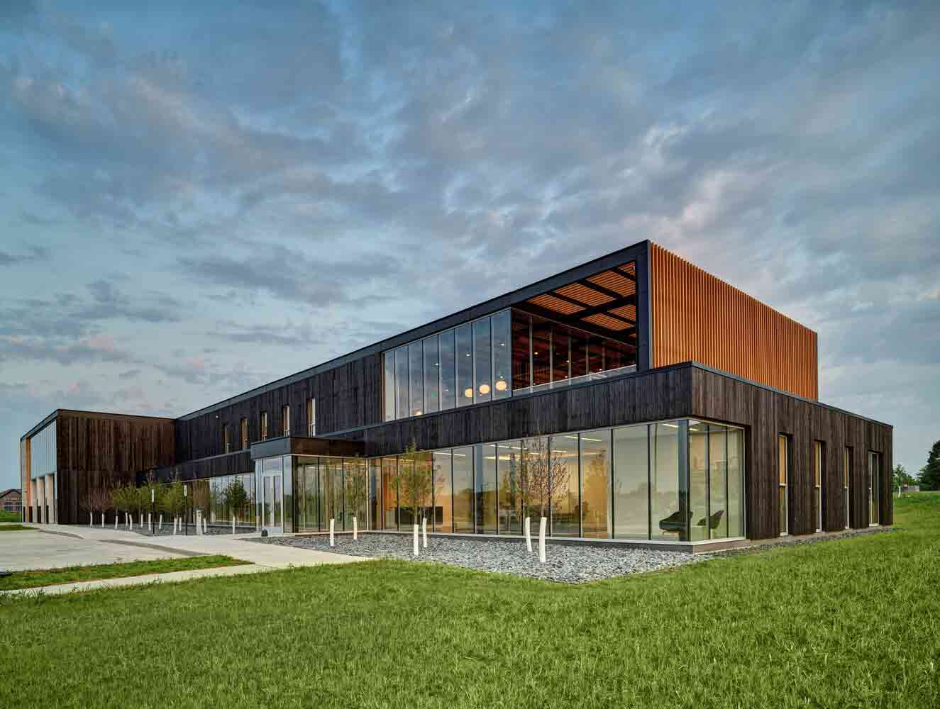
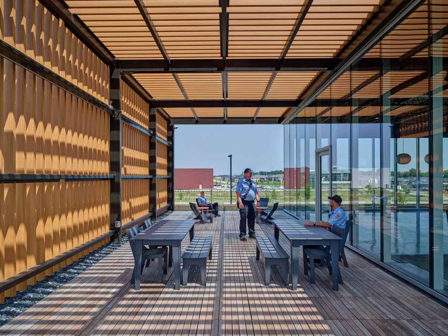
Marion Fire Station No. 1 by OPN Architects Marion Fire Station No. 1 by OPN ArchitectsThe first responders that staff this innovative new fire station in Iowa are all too familiar with the devastating effects of fire. However, the building’s tactile façade somewhat subverts the narrative of destruction. Clad in rich, charred timber, the structure demonstrates the creative potential of fire too, when utilized in a controlled environment.

Organic materials are just one facet of the station’s pioneering biophilic design. In a bid to support firefighters’ physical and mental health, pockets of connection with the natural world have been skillfully inserted throughout. A series of terraces are framed by trellises that let dappled sunlight filter in, while a green roof punctuates the voids between living and sleeping zones. This thoughtful scheme expands the firehouse’s life-saving infrastructure to address the well-being of first responders too.


By Measured Architecture Inc., Mayne Island, Canada

Popular Choice Winner, 11th Annual A+Awards, Sustainable Private House
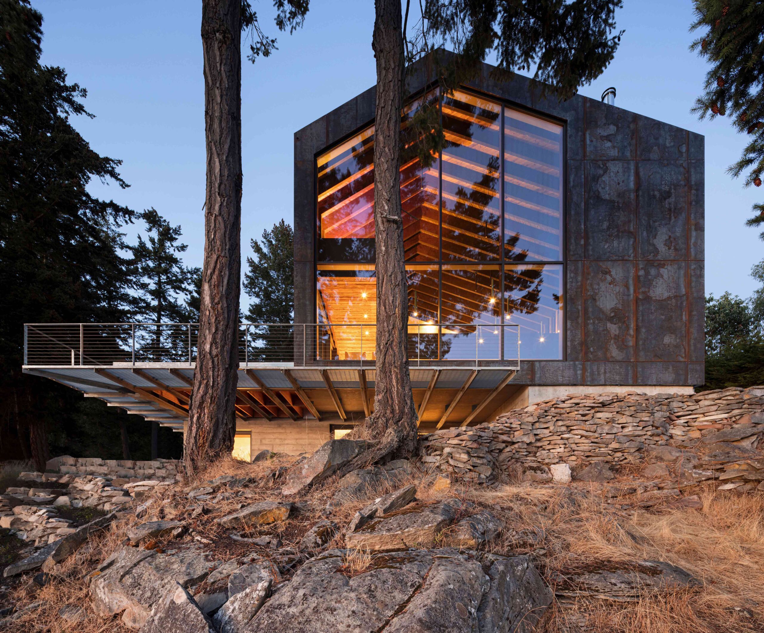
Shor House by Measured Architecture Inc. Shor House by Measured Architecture Inc.
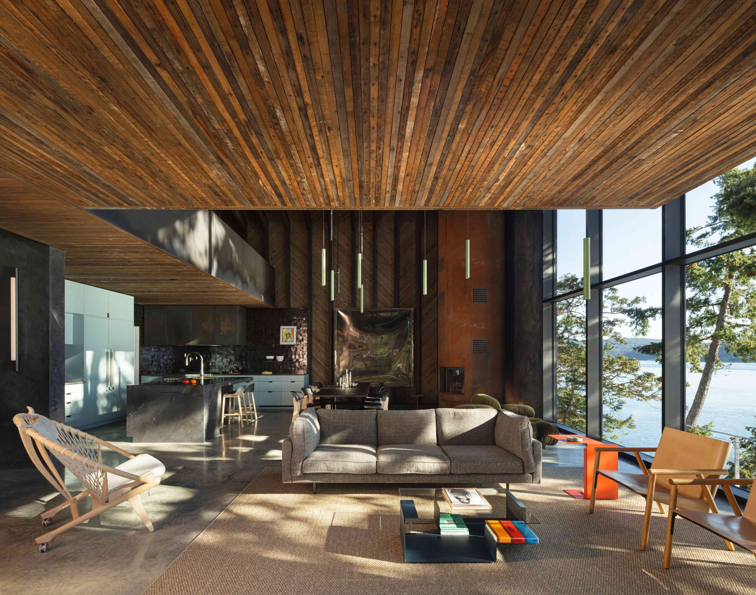
A magnificent architectural melting pot, this astonishing residence perched on the shoreline of Mayne Island takes its cues from the principles of alchemy: transforming discarded materials into something rare and valuable. By salvaging the wood from the house and barn that originally stood on the plot and reassembling these elements in a striking, modern form, the project sets out a blueprint for truly sustainable construction.

Glimmers of the past structures are still visible across the weathered internal cladding and floorboards. Where new timber was required, it was treated with shou sugi ban, the scorched surface analogous to the home’s dark corten steel exterior. The blackened surface not only imparts character to the younger wood, but also seals the grain from moisture and insects. Here, materials and techniques of the past intermingle in an exciting new iteration.

The latest edition of “Architizer: The World’s Best Architecture” — a stunning, hardbound book celebrating the most inspiring contemporary architecture from around the globe — is now available. Order your copy today.  

Reference

Eight cave-like interiors that celebrate curved forms
CategoriesInterior Design

Eight cave-like interiors that celebrate curved forms

A spa with a spherical swimming pool and holiday homes with sloping plaster walls feature in our latest lookbook, which showcases eight cavernous Greek interiors.

Cave-like interior designs are becoming increasingly popular, as seen in the Gilder Center by Studio Gang – a recently completed museum extension in New York with a large grotto-like atrium.

In Greece, which is known for its caves, there is a wide variety of cave-like architecture either built from existing geological structures or designed to mimic these natural dugouts. Thick, curved walls are often chosen to protect interior spaces from the country’s Mediterranean climate.

As the weather becomes warmer in the northern hemisphere, here are eight cave-like interiors from Greece that are defined by their curved shapes.

This is the latest in our lookbooks series, which provides visual inspiration from Dezeen’s archive. For more inspiration see previous lookbooks featuring homes with striking bookshelves, outdoor showers and offbeat bakeries.


Two holiday residences in Fira by Kapsimalis Architects
Photo is by Yiorgos Kordakis

Summer houses, Santorini, by Kapsimalis Architects

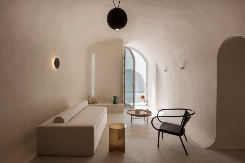
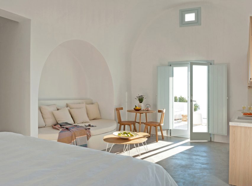
Local studio Kapsimalis Architects converted two underground caves at an old property in Santorini into summer houses with bright white facades.

Inside, the homes are characterised by smoothed-out interiors finished with earthy-hued plaster, while arched doorways and niches nod to the property’s history.

Find out more about these summer houses ›


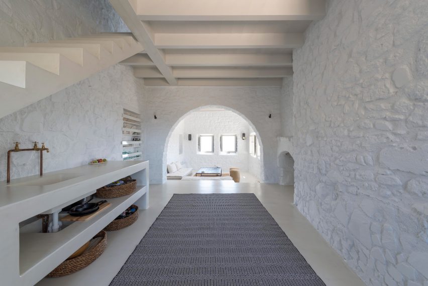
Interior of house on the island of Nisyros
Image is courtesy of Greg Haji Joannides

Sterna Nisyros Residences, Nisyros, by Greg Haji Joannides

Designer Greg Haji Joannides renovated the interior of an earthquake-damaged house on the island of Nisyros using historic photographs as a guide.

On the ground floor, wide brick archways create an open-plan layout that allows the space to double as an exhibition site for artists in residence.

“The inspiration behind this design was to keep as much as possible of the original way the Nisyrians would build houses,” Joannides told Dezeen. “They would use the ground floor as a storage or working space.”

Find out more about this island house ›


Wooden Cave by Tenon Architecture
Photo is by Spyros Hound Photography

Wooden Cave, Trikala Korinthias, by Tenon Architecture

Wooden Cave is a timber-clad suite that forms part of Hyades Mountain Resort – a hotel in the mountainous village of Trikala Korinthias.

Tenon Architecture split the suite into two sections that intend to mirror the appearance and experience of entering a cave. The front half features ashy black tiles arranged in a linear formation, while the rear half is made from almost 1,000 pieces of curved hand-cut spruce.

“This division intends to create a clear distinction between the hard, ‘protective’ shell and the curved, ‘inviting’ interior, reminiscent of the form of a cave,” explained the architecture studio.

Find out more about Wooden Cave ›


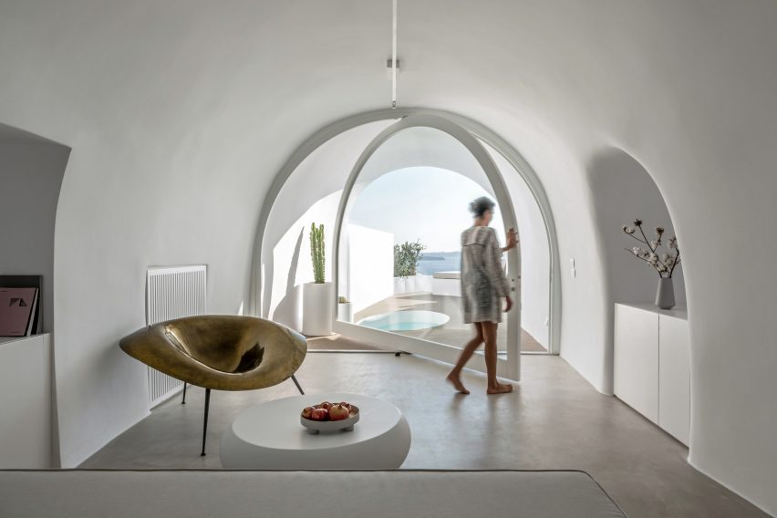
Curved interior of hotel in Santorini
Photo is by Giorgos Sfakianakis

Saint Hotel, Santorini, by Kapsimalis Architects

Kapsimalis Architects converted a cluster of former homes, barns and cellars in Santorini into the Saint Hotel – the volumes of which are arranged in a stepped formation down a sea-facing cliffside.

Inside, smooth cavernous walls were finished in white plaster that creates a subtle backdrop for minimal fittings and amorphous furniture.

Find out more about Saint Hotel ›


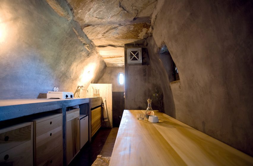
House interior in former stable on Greek island
Photo is by Sylvia Diamantopoulos

Retreat in Tinos Island by Ioannis Exarchou

Retreat in Tinos Island is a 100-year-old stable that was transformed into a cosy holiday home for two by architect Ioannis Exarchou.

Exarchou set large stones and thick tree branches into the dwelling’s ceiling, clad the walls in smooth white plaster and covered the floors in coloured concrete.

“My main objective was to retain and preserve the cavernous unique feeling of the space,” the architect told Dezeen.

Find out more about Retreat in Tinos Island ›


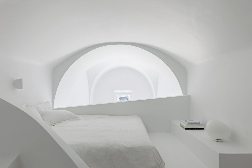
Santorini holiday home by Kapsimalis Architects
Photo is by Yiorgos Kordakis

Holiday home, Santorini, by Kapsimalis Architects

The cave-like subterranean spaces and vaulted rooms within this Santorini holiday home were renovated by Kapsimalis Architects to retain the building’s existing architecture.

The studio worked to simplify the complex interior layout, which features a labyrinthine arrangement of spaces that are brightened by all-white plaster walls.

Find out more about this holiday home ›


Euphoria spa in the Euphoria retreat by decaARCHITECTURE
Image is courtesy of DecaArchitecture

Euphoria Spa, Mystras, by DecaArchitecture

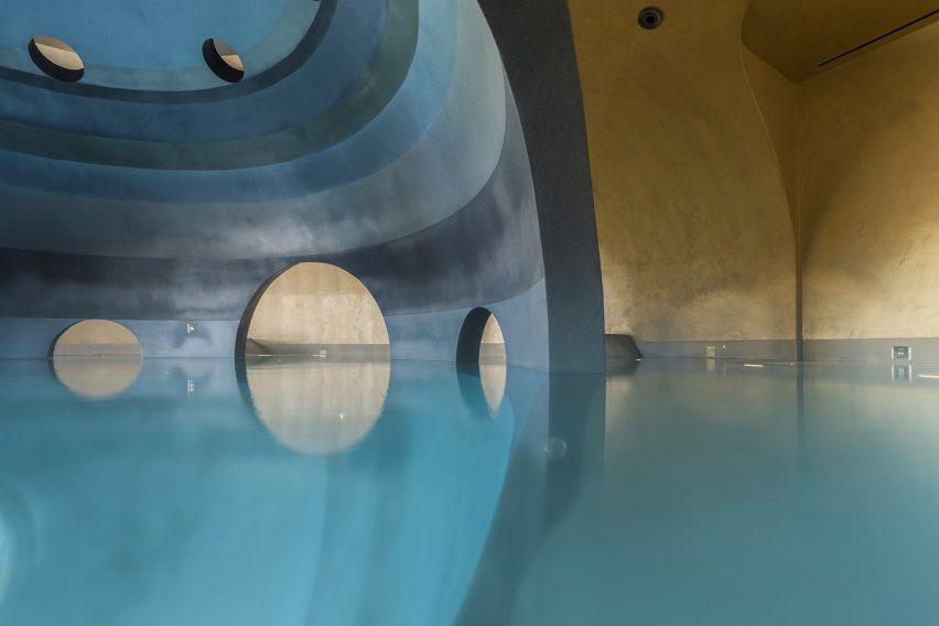
Carved into the base of a mountain in Mystras, Euphoria Spa is made up of differently scaled elliptical spaces that are connected by a web of catacomb-style passages.

One of these areas contains an indoor spherical pool that is characterised by a dark central structure that can be accessed via curved archways.

“Floating in the centre of this dark orb there is a sense of being suspended in the void of a platonic volume, but also a sense of womb-like calmness,” said DecaArchitecture.

Find out more about Euphoria Spa


Santorini apartment
Photo is by Julia Klimi

Holiday apartments, Santorini, by Kapsimalis Architects

Arched niches and grey cement plaster floors create neutral living spaces within these four holiday apartments, which were built near Santorini’s highest point.

The complex’s terraces and retaining walls were formed from rocks excavated from the site to create a continuity between the architecture and the surrounding mountains.

Find out more about these apartments ›

This is the latest in our lookbooks series, which provides visual inspiration from Dezeen’s archive. For more inspiration see previous lookbooks featuring homes with striking bookshelves, outdoor showers and offbeat bakeries. 

Reference

BC designs Francis Gallery LA to celebrate Korean art and culture
CategoriesInterior Design

BC designs Francis Gallery LA to celebrate Korean art and culture

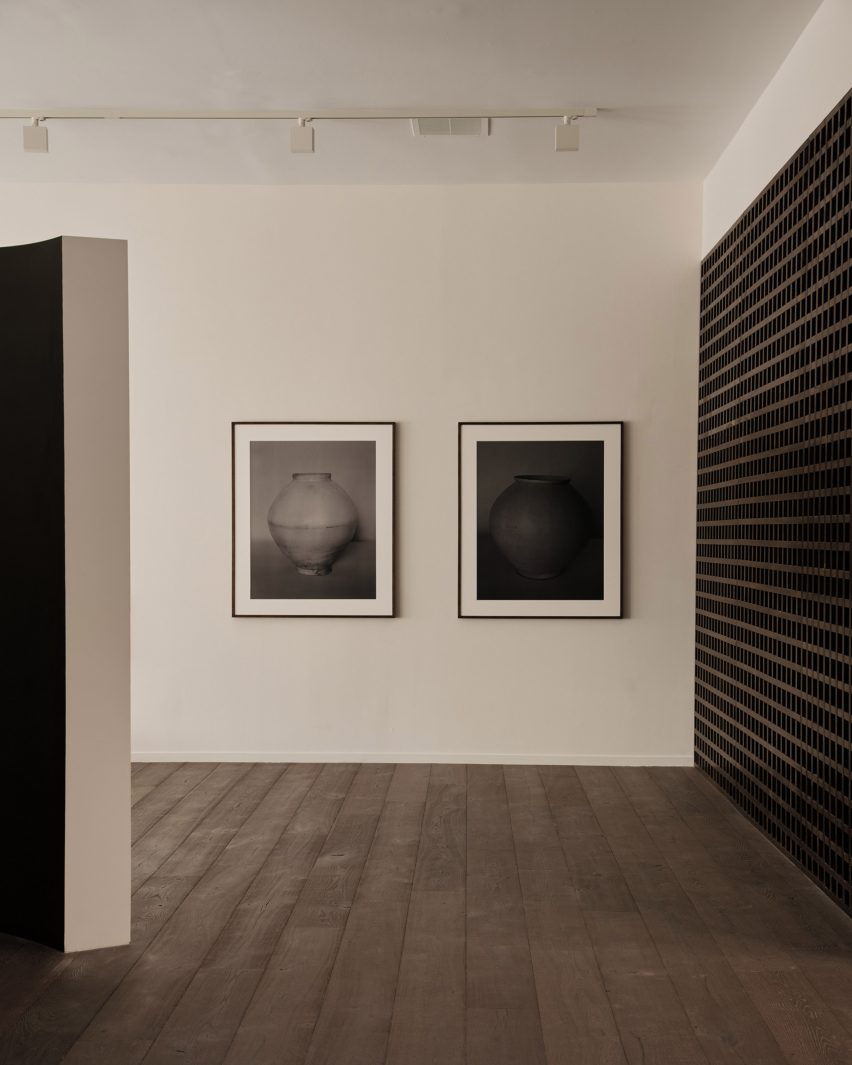
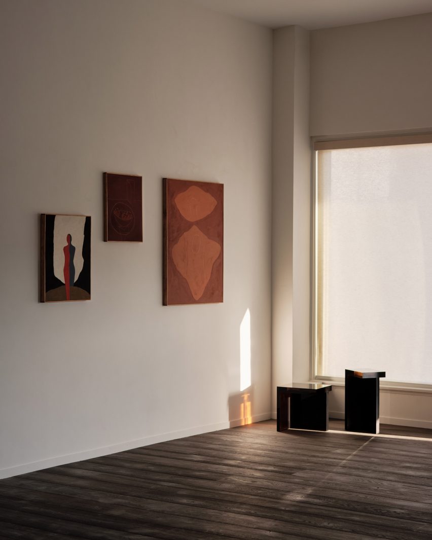
Gallerist Rosa Park has opened a space in Los Angeles to showcase the work of Korean artists and designers, with interiors by local studio BC intended to reflect the country’s visual culture.

Francis Gallery LA is Park’s second location and is an expansion of her original gallery in Bath, UK – both presenting the work of emerging Korean artists.

Dark walls at Francis Gallery LA
Places of worship informed the interiors of the gallery on Melrose Avenue

Situated on Melrose Avenue in West Hollywood, the new space was designed with Lindsey Chan and Jerome Byron, founders of LA-based BC.

The duo preserved the building while transforming the inside with references to traditional Korean architecture and art.

Paintings hung on walls
The inaugural exhibition displays the work of six artists, including photography by Koo Bohnchang

These include a curved partition wall influenced by a moon jar and a contemporary re-interpretation of a hanok courtyard.

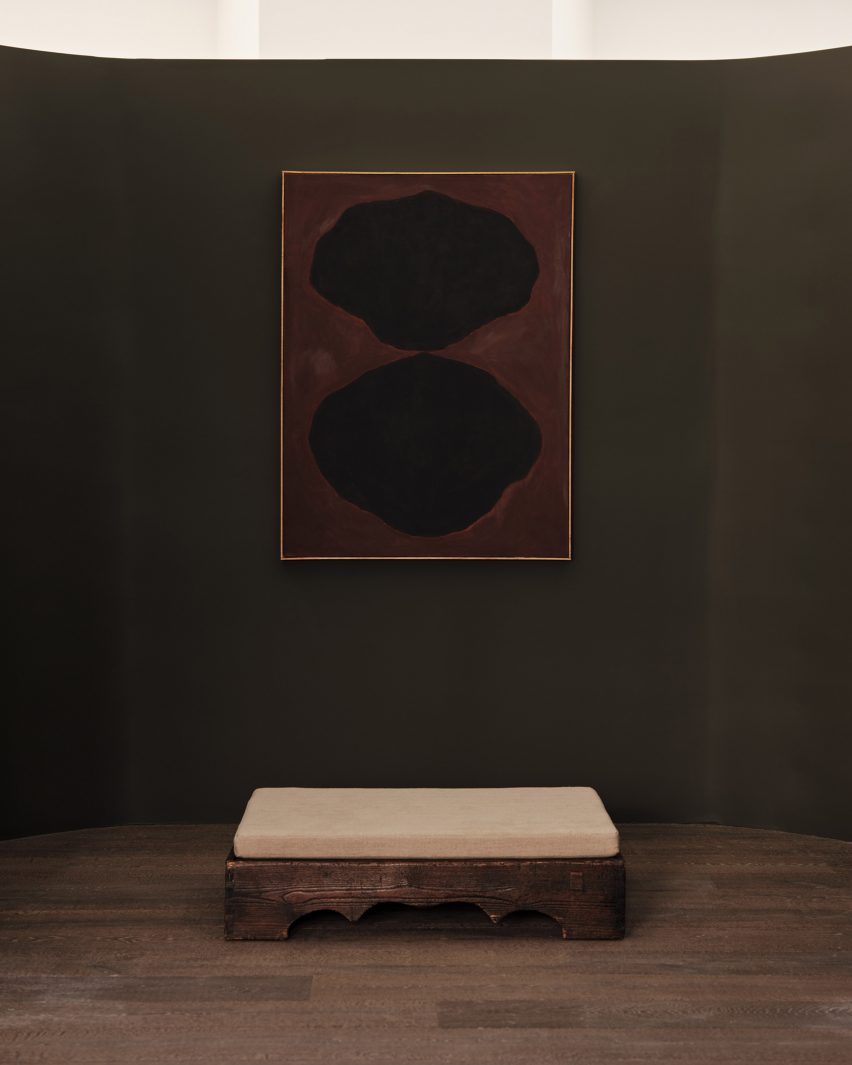
“The space was conceived to pay homage to Korean art and design in subtle ways – whether it was in the curve of a partition wall, the colour palette of the interior paints, or the profile of a low bench in the courtyard,” said Park.

Corner view with window
BC designed the gallery to be pared-back yet warm

Places of worship like chapels and monasteries were also referenced in the design. These were accentuated by the use of “humble materials” and pared-back forms.

Although minimal, the intention was to ensure the gallery still felt warm and inviting, as well as provide an appropriate setting for the pieces on show.

Resin stools
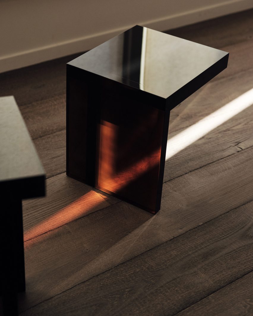
Rahee Yoon’s translucent acrylic blocks are among the works on show

“I think this emotional connection to a space, to a work, is central to what I’m doing with Francis,” Park said.

“It was of great importance to me that the space acted as the ideal framework to house works that I hope will move people.”

The inaugural exhibition at Francis Gallery LA is titled Morning Calm, on view until 7 January 2023, and features the work of six artists of Korean descent.

Bo Kim, John Zabawa, Koo Bohn Chang, Nancy Kwon, Rahee Yoon and Song Jaeho are all at different stages in their careers.

Stones VI by John Zabawa
An abstract painting by John Zabawa hangs on a dark wall

Their painting, photography, sculpture and ceramics all explore Korean identity in an international context and offer insights into the artists’ cultural heritage.

“With Los Angeles being home to the largest Korean community in the United States and Park having roots in both Seoul and LA, the debut show seeks to explore the nuanced connections between the two places,” said a statement from the gallery.

Courtyard with low bench
References to Korean architecture at the gallery include a contemporary interpretation of a traditional hanok courtyard

LA’s art scene has grown exponentially over the past decade, and the city is now home to many new galleries and exhibition spaces.

Well-known names that have opened their own locations there include Hauser & Wirth and The Future Perfect, while others like Marta are using modernist buildings like Neutra’s VDL II House to exhibit.

The photography is by Rich Stapleton.

Reference

London Fire Brigade presents exhibition of artwork to “celebrate bravery”
CategoriesInterior Design

London Fire Brigade presents exhibition of artwork to “celebrate bravery”

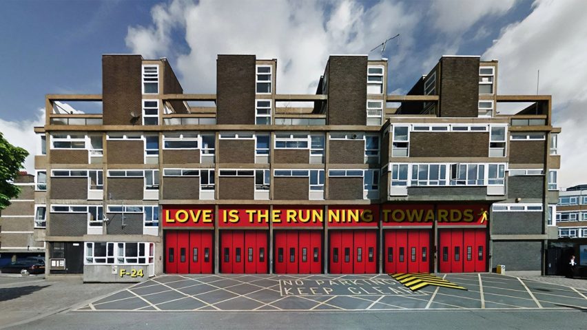
The London Fire Brigade has unveiled its updated typeface designed by Studio Sutherl& and The Foundry Types at the Running Towards exhibition of graphic artworks informed by the organisation’s design heritage.

The Running Towards exhibition took place at the Shoreditch Fire Station during the London Design Festival, with visitors entering through the building’s big red shutters into a display of artworks created by UK designers.

Exterior of Shoreditch Fire Station with bright red shutters
The exhibition took place at Shoreditch Fire Station

The new Fire Brigade Sans typeface, created by Studio Sutherl& and The Foundry Types, was displayed on the exterior of Shoreditch Fire Station.

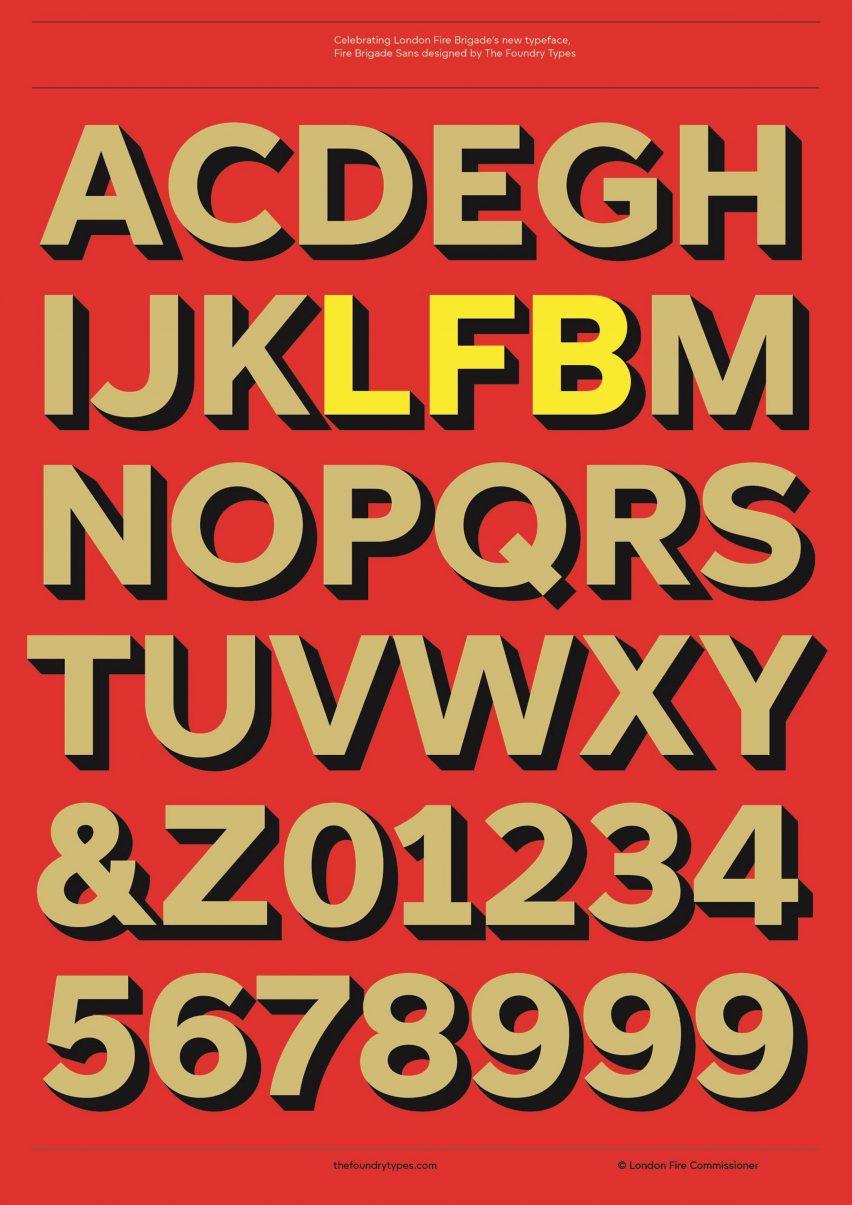
Its design was informed by the lettering of old fire engines and on the facade, the typeface was printed in the red, yellow and gold colours synonymous with fire engines.

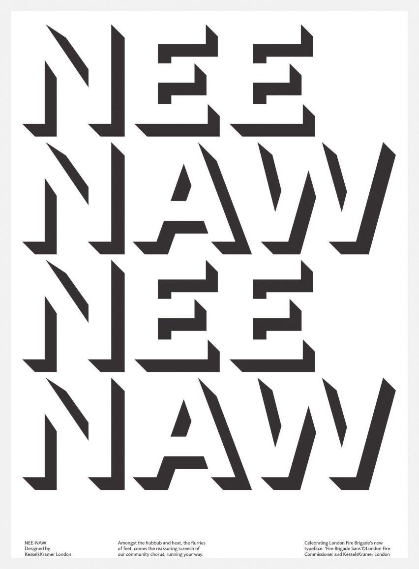
Black and white poster that reads 'Nee Naw Nee Naw'
Studio Sutherl& designed London Fire Brigade’s new typeface

To celebrate the typeface, London Fire Brigade collaborated with communications agency KesselsKramer, writer Thomas Sharp, Studio Sutherl& and carpet manufacturer Brintons on the exhibition, which saw designers create their own interpretations of the organisation’s design heritage.

Among the pieces on show were graphic interpretations of the Danger Risk of Fire safety sign, a bespoke carpet with a pattern informed by the universal fire exit sign and firefighting objects and items from Shoreditch Fire Station’s own collection.

Red poster with London Fire Brigade's new typeface in gold lettering
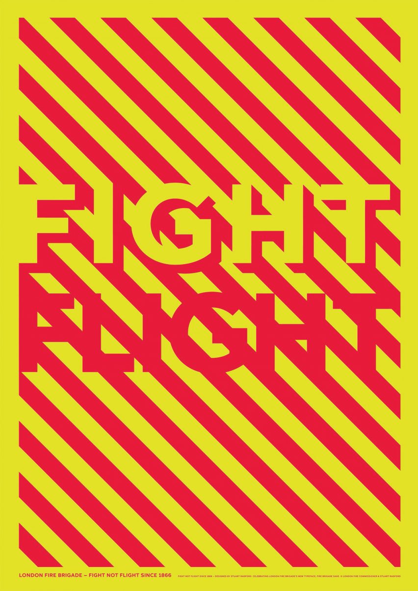
London Fire Brigade’s typeface Fire Brigade Sans was featured on posters

KesselsKramer described the showcase as “a celebration of London Fire Brigade’s bravery, aiming to inspire that very same spirit within ourselves.”

The studio invited 25 London-based designers to recreate the fire safety symbol for their display, titled ​​Warning: Risk of Fire.

“It felt appropriate that for London Fire Brigade’s inaugural Design Festival exhibition, a piece of graphic design synonymous with the fire service became the focus,” said KesselsKramer.

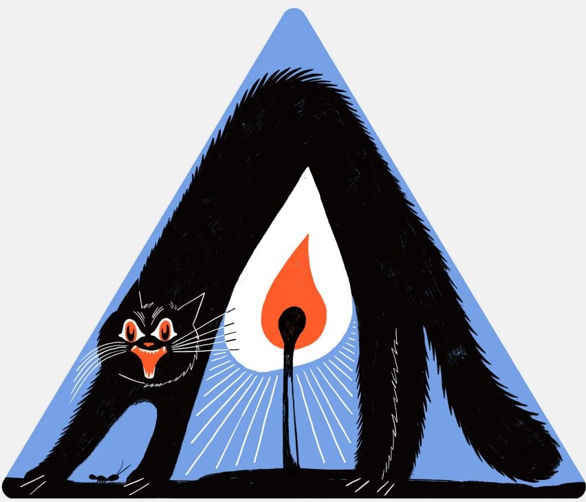
Black cat illustrated on a blue triangle with a lit match
Franz Lang’s design tells the story of her grandma’s cat

Presented on triangular signs, each artwork was designed to tell a story of firefighting bravery. Graphic artist Jimmy Turrell‘s interpretation was dedicated to his father who was a firefighter.

Illustrator Franz Lang‘s entry represented the story of her grandma’s cat, who was rescued from a tree by the fire brigade.

“This is such an iconic location for an art show,” said Lauren Coutts, art director at KesselsKramer. “To get a rare glimpse into a fire station is very exciting in itself so to then be able to celebrate bravery here, in so many forms, feels very special.”

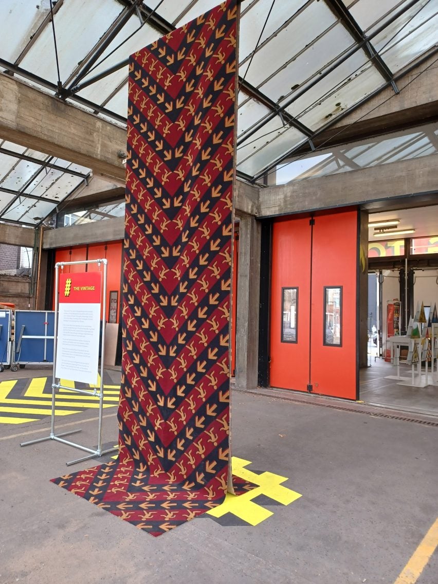
Brintons created a bespoke wool carpet for The Running Towards exhibition, which features a pattern informed by the universal fire exit symbol.

Rug hanging from the beams at Shoreditch Fire Station
Brintons designed a carpet to display at The Running Towards exhibition

Burgundy and navy chevrons repeat along the length of the carpet with arrows and stick figures that reference the fire exit sign. According to Brintons, the carpet is made from wool to exemplify the material’s naturally fire-retardant properties.

“As a material, wool contains a higher water and nitrogen content than other man-made fibres making it a naturally fire-retardant material,” said Brintons.

“Another benefit is that it does not emit smoke or fumes, often one of the main causes of serious health issues following a fire.”

Yellow and red poster with the text 'fight flight'
The exhibition showcased graphic posters in a colour palette that references fire engines

Other exhibitions that took place during London Design Festival include a collection of wooden objects made from a dying ash tree and a sculptural stone installation that references Stonehenge.

The photography is courtesy of the London Fire Brigade.

The Running Towards took place between 20 and 24 September as part of London Design Festival. See Dezeen Events Guide for an up-to-date list of architecture and design events taking place around the world.


Reference