Community centre by WORKac and Ignacio Urquiza Architects
CategoriesArchitecture

Mexico City community centre has blue-tinted concrete walls

Community centre by WORKac and Ignacio Urquiza Architects

Design firms WORKac and Ignacio Urquiza Architects have created a multi-level, concrete community centre in an underserved neighbourhood that is meant to “promote the regeneration of social life”.

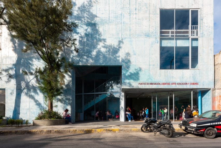
The building by New York’s WORKac and local studio Ignacio Urquiza Arquitectos – officially called PILARES Lomas de Becerra — is located in a hilly area and rises up from a dense intersection surrounded by active streets.

Community centre by WORKac and Ignacio Urquiza ArchitectsCommunity centre by WORKac and Ignacio Urquiza Architects
The community centre is located in Mexico City

Located in Mexico City’s Lomas de Becerra neighbourhood, the building was created as part of a government initiative called PILARES, which stands for Points of Innovation, Freedom, Art, Education and Knowledge.

For a slender, irregularly shaped site, the team devised a multi-storey facility that encompasses 5,059 square feet (470 square metres).

Blue concrete walls within the community centreBlue concrete walls within the community centre
WORKac and Ignacio Urquiza Architects designed the multi-level structure

“In appearance, the volume is simple and compact, with a strong character that confirms its presence as a public building,” the team said.

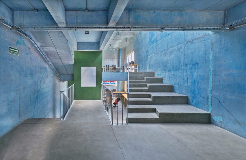
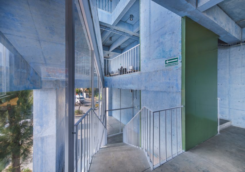
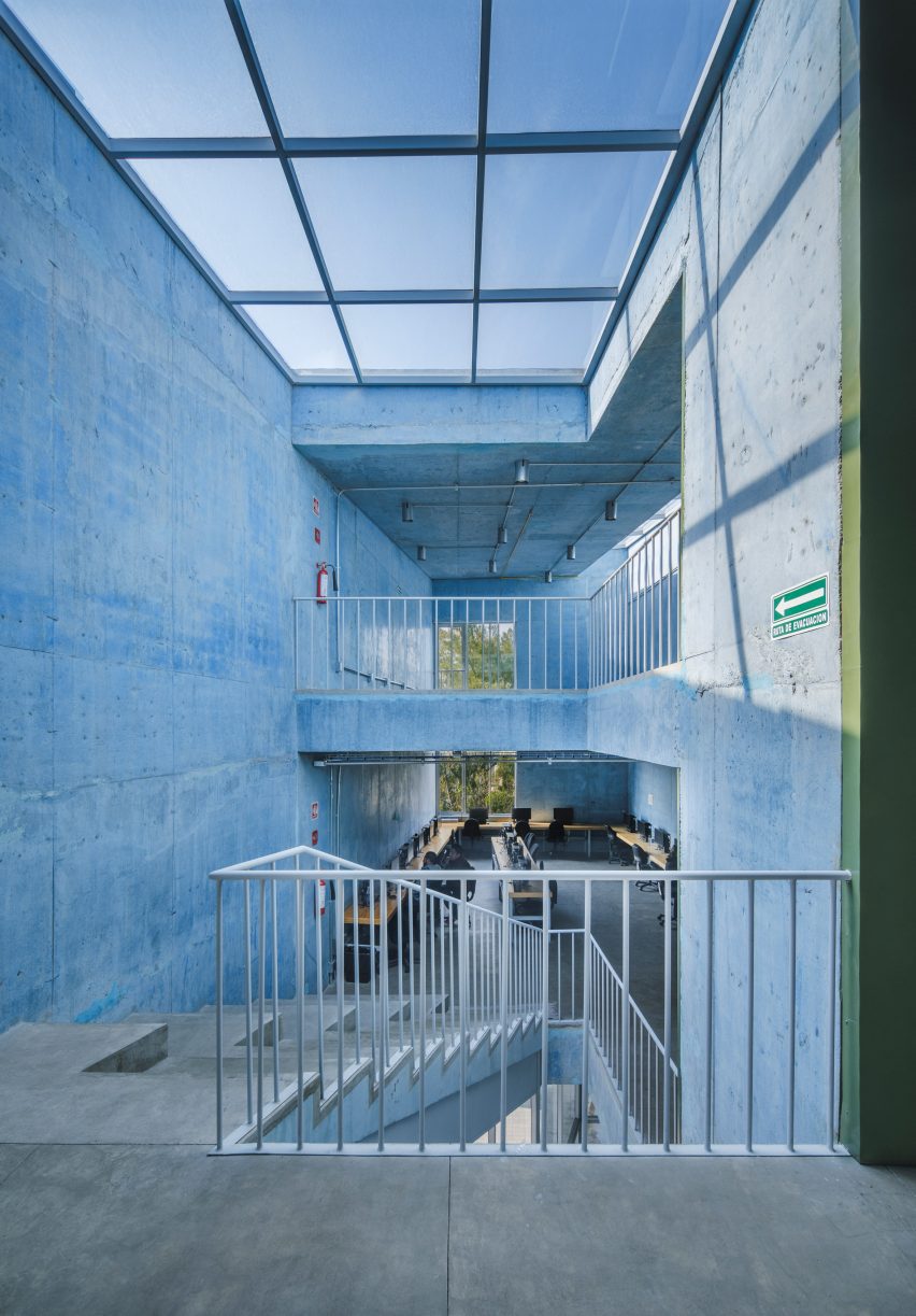
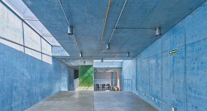
Walls are made of concrete – a material chosen for its construction and structural efficiencies, as well as its thermal and aesthetic qualities, the team said.  The concrete was dyed blue, a decision informed by the vibrant colours found in the surrounding area.

Coloured concrete building in Mexico CityColoured concrete building in Mexico City
The team devised the building for a slender, irregularly shaped site

Launched in 2018, the PILARES programme aims to create opportunities for residents in underserved areas.

“Each PILARES building is designed to support various kinds of classes and workshops in support of skill building, as well as bringing cultural programming, learning opportunities, and safe spaces for leisure and cross-generational gathering to each neighbourhood,” said New York’s WORKac.

“The sites selected for their construction create new landmarks in the urban fabric, enabling the population to identify them as community meeting centres that promote the regeneration of social life.”

Blue concrete walls and a geometric skylightBlue concrete walls and a geometric skylight
Walls are made of blue concrete

Mexico City’s government enlisted local and international design studios to create 26 facilities under the programme.

Buildings are meant to respond to the local context and follow programming guidelines developed through extensive community engagement.

Blue concrete wallsBlue concrete walls
The building is meant to respond to its local context

The team tried to reflect the community and its values in the architecture.

“The use of colour in Mexican architecture is an element that has been transformed and reinterpreted in the hands of many artists and architects across generations,” the team said.

The building is fronted by a plaza that is shaded by pre-existing trees.

Street with trees outside Mexico City community centreStreet with trees outside Mexico City community centre
The building is fronted by a plaza with trees

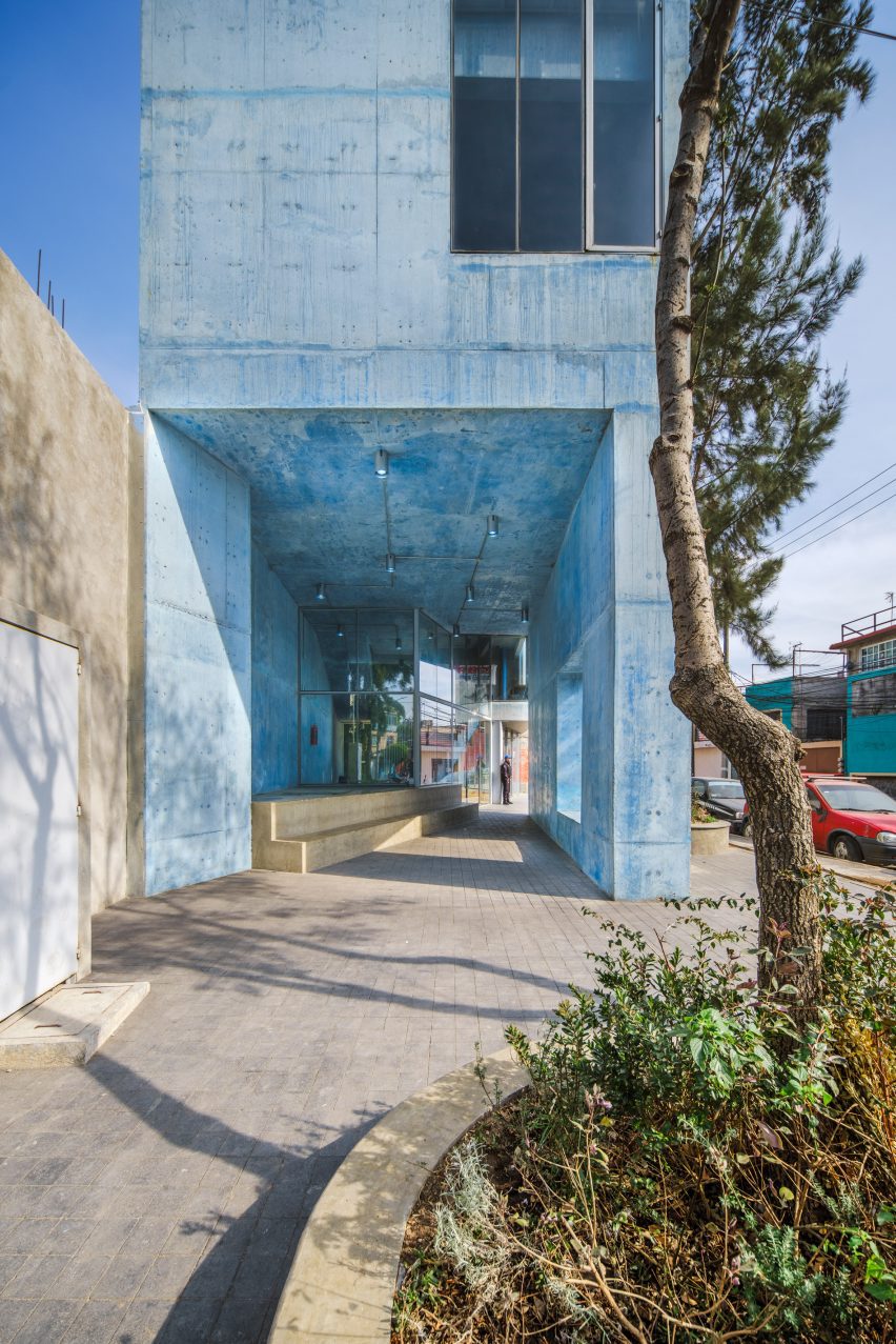
Part of the ground floor is sliced away to form an angled, glazed entry wall, which helps “the transition between exterior and interior spaces”, the team said.

“The diagonal opening on the ground floor provides clear and free-flowing pedestrian routes in every direction, inviting users to walk around the plaza and enter the building,” the team said.

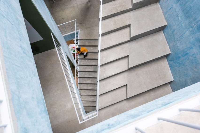
Inside, the building contains three split levels, all of which are connected by a central staircase. Rooms are designed to be fluid and adaptable.

“This flexible approach leaves open the possibility for changes to the programme over the lifetime of the building and allows it to freely evolve and adapt,” the team said.

Central staircase from an aerial viewCentral staircase from an aerial view
Three split levels are connected by a central staircase

WORKac and Ignacio Urquiza Architects have designed a second PILARES building, in the borough of Azcapotzalco, that follows a similar design vocabulary.

Other PILARES buildings include a community centre in Iztapalapa by Rozana Montiel Estudio de Arquitectura that features a series of bridges, walkways and exterior staircases.

The photography is by Arturo Arrieta and Ramiro del Carpio.


Project credits:

Architect: WORKac and Ignacio Urquiza Architects (IUA)
Team: Amale Andraos, Dan Wood, Ignacio Urquiza Seoane, Michela Lostia di Santa Sofía, Eder Hernández, María del Mar Carballo, Ana Laura Ochoa, Anet Carmona, Noé García, León Chávez, Fernando Tueme, Sacha Bourgarel
Interior design and lighting: WORKac, IUA and APDA
Structure and engineering: BVG (César Barquera, Eduardo Barquera); Ecomadi
Landscape: Genfor Landscaping (Tanya Eguiluz)
Development: Mexico City government and ZV Studio (Carlos Zedillo)
Digital visualizations: Israel Levy
Client: Mexico City government

Reference

Back-lit glass brick bar at the Studio Frantzén restaurant
CategoriesInterior Design

Wooden elements “take centre stage” in Studio Frantzén restaurant

Back-lit glass brick bar at the Studio Frantzén restaurant

Scandinavian and Japanese influences come together at Studio Frantzén, a restaurant in London’s Harrods department store designed by Joyn Studio.

Stockholm-based Joyn Studio created the sleek interiors for Studio Frantzén – the latest restaurant opened by chef Björn Frantzén.

Back-lit glass brick bar at the Studio Frantzén restaurantBack-lit glass brick bar at the Studio Frantzén restaurant
Top: visitors enter via a domed reception area. Above: the bar is characterised by back-lit glass bricks

The two-storey eatery is arranged across a main restaurant and bar on the fifth floor, as well as on an additional mezzanine and rooftop terrace on the sixth floor of Harrods.

In stark contrast to the department store’s famed Edwardian baroque terracotta facade, Studio Frantzén features a contemporary palette that takes cues from both Scandinavian and Japanese design – a trend known as Japandi.

Bar at Harrods by Joyn StudioBar at Harrods by Joyn Studio
Studio Frantzén is located across two levels at Harrods

Visitors enter the restaurant at a domed reception area, which references Scandinavian churches and forest chapels, according to the studio.

The curved walls were clad with blocky cherry wood while illustrations of Nordic animals by Ragnar Persson decorate the ceiling and a Swedish wooden Dala horse was perched on the welcome desk.

“Undoubtedly, wood takes centre stage in this restaurant,” Joyn Studio founding partner Ida Wanler told Dezeen.

Main restaurant with bespoke timber seating by Joyn StudioMain restaurant with bespoke timber seating by Joyn Studio
The main restaurant is composed of two dining halls

The reception area gives way to a “glowing” bar composed of stacks of glass bricks bathed in amber light, which is mirrored by a ceiling of gridded copper.

Informed by traditional Japanese izakaya – a type of casual watering hole serving snacks – the large main restaurant is composed of two dining halls with bespoke geometric terrazzo and marble flooring.

Bespoke timber seating illuminated by a chandelierBespoke timber seating illuminated by a chandelier
One features bespoke timber seating

One hall features an open kitchen and Joyn Studio-designed chunky seating booths and sofas carved out of end-grain wood. This was sourced from a large Hungarian pine tree, cut into cubes and then glued together piece by piece.

This double-height space is illuminated by a spindly oversized chandelier by Swedish studio Front.

Gridded ceiling within dining hallGridded ceiling within dining hall
The other follows the same gridded geometry as the bar

The other dining hall, tucked around the corner and connected to a wine cellar, follows the same geometry as the bar.

Sliding timber doors and a gridded wooden ceiling are interrupted by ultramarine benches in booths and delicate, ribbed paper lampshades.

“To create a distinctive Nordic dining experience with Asian influences within a historic London building, we delved into the architectural and design legacy of the early 20th century,” explained Wanler.

“Inspired by the journeys of our predecessors to the far east, where they assimilated influences and pioneered a style known as Swedish Grace, we embraced the resonances between traditional Japanese and Nordic architecture and craftsmanship,” she continued.

Mezzanine level by Joyn StudioMezzanine level by Joyn Studio
Mirrored artwork by Caia Leifsdotter was included in the mezzanine

On the upper floor, the mezzanine includes three intimate dining booths accentuated by a burnt orange carpet and a wall-mounted Psychedelic Mirror by designer Caia Leifsdotter.

Characterised by marble, rattan and wooden accents, the rooftop terrace offers expansive city views.

Rooftop terraceRooftop terrace
The rooftop terrace offers views of London

“Aiming to infuse creativity into the traditional luxury context of Harrods, we envisioned a relaxed and comfortable ambiance with sparks of richness created in unexpected ways,” said Wanler.

In 2022, Joyn Studio was longlisted for the title of emerging interior design studio of the year at the Dezeen Awards.

Elsewhere at Harrods, fashion house Prada recently opened a green-hued pop-up cafe that referenced one of Milan’s oldest patisseries.

The photography is by Åsa Liffner.


Reference

Henning Larsen mass-timber logistics centre
CategoriesArchitecture

Henning Larsen unveils design for world’s largest timber logistics centre

Henning Larsen mass-timber logistics centre

Danish architecture studio Henning Larsen has revealed plans for a mass-timber logistics hub on Flevopolder island, the Netherlands, that will be the largest of its kind in the world.

Designed by Henning Larsen, the 155,000-square-metre hub will contain offices, shuttle storage and pallet shuttle, as well as a restaurant and roof garden.

Henning Larsen mass-timber logistics centre
Trees will provide shaded seating on the roof

Expected to be completed by 2026, the Logistics Center West will be built largely from glued laminated timber (glulam) and cross-laminated timber (CLT) along with other biogenic materials.

Internally, the timber structure will have oversized columns and exposed beams complimented by light-coloured floors and furniture. Externally, the facade will be divided by rhythmic timber fins and regular openings.

Timber warehouse
Timber interiors flooded by natural daylight

The building will be surrounded by a wetland habitat and forest with a 30,000-square-metre  meadow placed on its roof to increase the site biodiversity.

Planting beds, fruit trees and bushes on the building’s rooftop will provide a green outdoor space for the employees, as well as attract local species.

Regular timber fins on facade
Regular timber fins decorate the facade

A boardwalk will serve as a scenic route across the wetland, while also providing educational tools for the employees, reinforcing the integration of nature into the workplace.

With just over 40 per cent of the site to be dedicated to greenery, access to certain areas of the site will be restricted to reduce human impact and promote wildlife growth.

According to the studio, the project’s biodiversity will work to absorb CO2, filter air pollutants and mitigate heat absorption to create “a more comfortable and sustainable environment”.

Rainwater from the rooftop will be collected and stored for sustainable reuse around the building.

Logistics centre in wetland
The mass-timber proposal will feature a constructed wetland

According to the studio the project will be the world’s largest timber logistics centre. The design will aim to create an atmosphere that prioritises employee well-being through the integration of nature into the workplace. Natural light, green spaces and clean air will work to “invigorate the space and enhance focus”.

Henning Larsen is an international studio for architecture, landscape, and urbanism. Other projects set to be completed by the studio include a ferry terminal in Faroe Islands that draws on traditional Viking boats and a wooden Ørestad church with trapezoidal roofs.

The renders are by Henning Larsen


Project Credits:

Client: Bestseller
Architect: Henning Larsen (services: architecture, interior design)
Landscape architect: Henning Larsen
Engineers: Ramboll, Denc and Pelecon

Reference

Plot 10 children's centre in London
CategoriesArchitecture

Arched forms enliven Central Somers Town children’s centre

Plot 10 children's centre in London
Inverted brick arches crown the Central Somers Town children’s community centre near King’s Cross, London, created by local studio Adam Khan Architects.

The project forms the home of Plot 10, a community children’s play project established in the 1970s that previously occupied a series of self-built timber structures on the site.

It sits adjacent to an apartment block, also designed by Adam Khan Architects and completed with matching arched motifs.

Plot 10 children's centre in London
Adam Khan Architects has created Central Somers Town children’s centre

Adam Khan Architects was tasked with creating the buildings as part of the Central Somers Town masterplan, developed by architecture studio DSDHA.

The aim is to provide community facilities and housing for one of the London Borough of Camden’s most deprived areas.

Both buildings are finished in London brick, concrete and red metalwork, and are enlivened by arched forms chosen to evoke a variety of references.

Facade of Central Somers Town children's centre in Camden
It is the home of community children’s play project Plot 10

“We like architecture that is rich in associations and open to being interpreted by people in multiple, diverse ways and by people of diverse backgrounds and levels of interest and engagement,” founder Adam Khan told Dezeen.

“If you see a palace, a mosque or a sandcastle, that’s fine. If you’re keen on eighteenth-century Parisian hôtel particuliers you’ll notice some affinities. Or, if you live locally you’ll already be familiar with arched openings giving glimpses into planted courtyards,” he added.

Central Somers Town children's centre by Adam Khan Architects
It is decorated with arched motifs. Photo by Lewis Khan

In order to provide privacy to the children’s centre, Adam Khan Architects sandwiched the building between two external play areas that are wrapped by brick walls.

Where the centre faces directly onto the street, the studio positioned a series of arched “shopfront” windows that provide an opportunity to display children’s work while obscuring the play areas from view.

Brick-clad housing by Adam Khan Architects
The project also includes a block of social housing

“A hierarchy of openings, glimpses into courtyards and deep window reveals quietly satisfy the many and stringent safeguarding and privacy demands, whilst projecting welcome and vitality,” explained the studio.

Inside, the “creative improvisation” that has characterised Plot 10’s history informed a double-height space for “free-form play” across a variety of scales, developed through exploratory workshops with the organisation.

Exterior of Central Somers Town housing by Adam Khan Architects
The arched motifs also feature in the housing

In the corner of the building, a timber toilet block is topped by a more private, glazed room, overlooking the play areas below.

On the roof, a crown of inverted brick arches surrounds a playing field, with the parapet framing views out across the surroundings.

“It is difficult to self-build or improvise big, high-excitement structures, so we built two big towers that provide exciting high-level play – including wheelchair-accessible play at higher levels, which is unusual,” explained Khan.

“Then, we made a strong timber armature framing the rest of the playground, allowing easy slinging up of swings, ropes and theatre drapes,” he continued.

Rooftop playing field
There is a rooftop playing field. Photo by Lewis Khan

In the adjacent residential block are 10 social-rented apartments. Each one is triple-aspect, with day-lit hallways, large windows and generous balconies.

The arched motifs of the children’s centre are subtly reflected in an arched entranceway and the gentle wave-like form of a concrete canopy where the apartment block faces the street.

Social housing at Central Somers Town
The block contains 10 apartments

Elsewhere in the Central Somers Town development, Hayhurst & Co created the Edith Neville Primary School, which features a landscaped playground.

Other arched buildings recently featured on Dezeen include a row of six brick-clad townhouses in London and a Mexican holiday home by CO-LAB Design Office.

The photography is by David Grandorge unless stated otherwise. 

Reference

Dining area of Landaburu Borda by Jordi Hidalgo Tané
CategoriesInterior Design

Eight open-plan interiors where dining tables take centre stage

Dining area of Landaburu Borda by Jordi Hidalgo Tané

A brutalist apartment in Belgium and a coastal house in Australia feature in this lookbook, which collects open-plan interiors where dining tables are the focal point.

With dining rooms often forming part of larger, multipurpose living areas in our homes, tables are an easy way to create a focal point that subtly breaks up space.

As demonstrated by this lookbook, dining tables also present an opportunity for homeowners to bring personal style into a room while carving out an intimate setting to entertain guests.

This is the latest in Dezeen’s lookbooks series, which provides visual inspiration from Dezeen’s archive. For more inspiration see previous lookbooks that feature interiors with reclaimed materials, art deco influences and sunny yellow finishes.


Dining area of Landaburu Borda by Jordi Hidalgo Tané
Photo by Jose Hevia

Landaburu Borda, Spain, by Jordi Hidalgo Tané

A dining table takes centre stage in this house extension, which architecture studio Jordi Hidalgo Tané added to Landaburu Borda in rural Navarra.

Supported by chunky metal legs, the table is formed of two giant pieces of wood and paired with bright red chairs that help it pop against a backdrop of concrete walls.

Find out more about Landaburu Borda ›


Interior of Riverside Tower apartment, Belgium, by Studio Okami Architecten
Photo by Olmo Peeters

Riverside Tower apartment, Belgium, by Studio Okami Architecten

Studio Okami Architecten used the dining table as an opportunity to inject colour into this concrete apartment, which is located in a brutalist tower in Antwerp.

The bright aquamarine tabletop was married with slender red-metal legs, which draw the eye to the dining area with the help of a black ceramic chandelier plunging overhead.

Find out more about the Riverside Tower apartment ›


Pared-back dining room in Barwon Heads House
Photo by Timothy Kaye

Barwon Heads House, Australia, by Adam Kane Architects

Slabs of travertine form this monolithic table, located in the large living and dining room at a coastal home in Barwon Heads.

It brings a lavish aesthetic to the otherwise understated room, which features black wooden chairs, sheer curtains and a pared-back colour palette.

At one end is a sink, allowing the table to also be used as an island for food preperation.

Find out more about Barwon Heads House ›


Pink dining table
Photo by Megan Taylor

Sunderland Road house, UK, by 2LG Studio

Pink was used throughout this renovated Edwardian house in London by 2LG Studio, including in the playful dining room set.

Set against white walls and a baby-blue vitrine, the statement table has a top made from waste wood chips and resin and matching sculptural pink chairs.

Find out more about the Sunderland Road house ›


Interior of Three Chimney House by T W Ryan Architecture
Photo by Joe Fletcher

Three Chimney House, USA, by T W Ryan Architecture

A mottled-brass chandelier was suspended over this big eight-seater table, which sits at the heart of Three Chimney House in Virginia.

Its minimalist yet striking wooden form stands boldly against white walls, a pale-brick chimney and delicate spindle-back chairs.

Find out more about Three Chimney House ›


Wooden dining table
Photo by Read McKendree

Sag Harbor 2, USA, by Kevin O’Sullivan + Associates

Smooth edges and a curved cut-out give a sculptural look to the wooden legs beneath this chunky dining table.

Teamed with vintage Fresco dining chairs by G Plan, it brings a mid-century-style focal point to the contemporary interior of Sag Harbor 2.

Find out more about Sag Harbor 2 ›


Exposed ceiling beams in Nieby Crofters Cottage by Jan Henrik Jansen and Marshall Blecher
Photo by Jose Campos

Nieby Crofters Cottage, Germany, by Jan Henrik Jansen and Marshall Blecher

Architects Jan Henrik Jansen and Marshall Blecher designed this dining table as an extension of the island in the kitchen at Nieby Crofters Cottage.

Illuminated by low-hanging pendant lights, the table was surrounded by eight of Hans Wegner’s Wishbone chairs and creates an opportunity for the owner to entertain guests while preparing food.

Find out more about Nieby Crofters Cottage ›


Television Centre apartment interior
Photo by Michael Sinclair

Television Centre apartment, UK, by Waldo Works

Flanked by a black fireplace and kitchen cabinetry, this dining table stands out because of its glossy pine-green top.

Waldo Works contrasted it with saffron-coloured chairs a mustard-yellow rug, which helps establish it as the focal point and social heart of the open-plan room.

Find out more about the Television Centre apartment ›

This is the latest in Dezeen’s lookbooks series, which provides visual inspiration from Dezeen’s archive. For more inspiration see previous lookbooks that feature interiors with reclaimed materials, art deco influences and sunny yellow finishes.

Reference

Norman Foster looking through a circular hole in a large sculptural structure at his exhibition in the Centre Pompidou
CategoriesInterior Design

Norman Foster retrospective exhibition opens at Centre Pompidou in Paris

Norman Foster looking through a circular hole in a large sculptural structure at his exhibition in the Centre Pompidou

An exhibition dedicated to the work of British architect Norman Foster has opened at the Centre Pompidou in Paris, showcasing drawings and original models produced by the architect over the last six decades.

The exhibition, which according to the Norman Foster Foundation is the largest-ever retrospective display of Foster’s work, features around 130 of the architect’s projects including the Hong Kong and Shanghai Banking Corporation Headquarters, Hong Kong International Airport and Apple Park.

Norman Foster looking through a circular hole in a large sculptural structure at his exhibition in the Centre Pompidou
The exhibition was designed by Norman Foster

Designs that informed Foster’s work are also exhibited, including works by Chinese artist Ai Weiwei, French painter Fernand Léger, Romanian sculptor Constantin Brancusi and Italian painter Umberto Boccioni, and even cars, which the architect is passionate about.

The exhibition, simply called Norman Foster, was designed by Foster with his architecture studio Foster + Partners and nonprofit organisation the Norman Foster Foundation.

Model of a yellow structure by Norman Foster at the Centre Pompidou
On display are sketches, drawings and models of the architect’s buildings

Curated by Centre Pompidou deputy director Frédéric Migayrou, the exhibition aims to showcase examples of Foster’s innovation and technology, his approach to sustainability and his ideas for the future of the built environment.

“This exhibition traces the themes of sustainability and anticipating the future,” said Foster.

“Throughout the decades we have sought to challenge conventions, reinvent building types and demonstrate an architecture of light and lightness, inspired by nature, which can be about joy as well as being eco-friendly.”

Architecture and cars models at the Norman Foster exhibition at the Centre Pompidou
Examples of Foster’s work are interspersed with cars that have inspired him

The 2,200-square-metre exhibition begins with a room dedicated to Foster’s sketches and drawings, a practice he uses to communicate ideas and log design inspiration.

“For me, design starts with a sketch, continuing as a tool of communication through the long process that follows in the studio, factories and finally onto the building site,” said Foster.

“In 1975 I started the habit of carrying an A4 notebook for sketching and writing – a selection of these are displayed in the central cabinets, surrounded by walls devoted to personal drawings.”

Architectural drawings in the Centre Pompidou in Paris
Visitors begin the exhibition in a room filled with Foster’s sketches

The exhibition continues in a large space with partition walls that separates it into seven themes: Nature and Urbanity, Skin and Bones, Vertical City, History and Tradition, Planning and Place, Networks and Mobilities, and Future Perspectives.

The Nature and Urbanity section explores Foster’s approach to preserving nature by building “dense urban clusters, with privacy ensured by design,” the studio said.

Referencing a critic’s comment that the external appearance of Foster’s projects could be categorised as having a smooth “skin” facade or expressing its skeletal structure, the Skin and Bones portion of the exhibition showcases projects that illustrate the relationship between structure, services and cladding.

In the Vertical City section, the studio showcases how it created “breathing” towers by designing open, stacked spaces.

Architectural models and drawings in the Centre Pompidou in Paris
The exhibition features around 130 Norman Foster projects

“We were the first to question the traditional tower, with its central core of mechanical plant, circulation and structure, and instead to create open, stacked spaces, flexible for change and with see-through views,” said Foster.

“Here, the ancillary services were grouped alongside the working or living spaces, which led to a further evolution with the first ever series of ‘breathing’ towers.”

Architectural models and drawings at the Norman Foster exhibition in the Centre Pompidou in Paris
It showcases projects spanning Foster’s six-decade-long career

“In the quest to reduce energy consumption and create a healthier and more desirable lifestyle, we showed that a system of natural ventilation, moving large volumes of fresh filtered air, could be part of a controlled internal climate,” the architect continued.

The History and Tradition section aims to provide insight into examples of historic and vernacular architecture that influenced Foster, while the Planning and Places portion explores masterplanning and placemaking in urban spaces.

Architectural models and drawings in the Centre Pompidou in Paris
The exhibition is on display at the Centre Pompidou in Paris

Towards the open exhibition space’s exit, the Networks and Mobility section displays examples of transport and infrastructure and leads to the final room, Future Perspectives, which exhibits concepts for future methods of travel and communication.

On display are details of autonomous self-driving systems and designs for habitats on Mars and the moon that were developed with NASA and the European Space Agency.

Foster recently spoke with Dezeen about his views on sustainability in architecture, in which he said “there are lots of dangerous myths”.

The photography is by Nigel Young from Foster + Partners.

The Norman Foster exhibition is on display at the Centre Pompidou in Paris, France, from 10 May to 7 August 2023. See Dezeen Events Guide for an up-to-date list of architecture and design events taking place around the world.

Reference

Exterior of the Book Depository building transformed by Gensler for the Newlab Detroit headquarters
CategoriesArchitecture

Gensler and Civilian transform Detroit post office into technology centre

Exterior of the Book Depository building transformed by Gensler for the Newlab Detroit headquarters

American architecture studio Gensler and interior design studio Civilian have restored the historic Book Depository building in Detroit and transformed it into the headquarters for technology company Newlab.

Gensler and Civilian transformed the art deco building to be usable by tech companies, adding purpose-built prototyping labs, open-plan co-working spaces and outdoor green spaces.

Exterior of the Book Depository building transformed by Gensler for the Newlab Detroit headquarters
Gensler and Civilian transformed a 1930s post office into a workspace and technology centre

The 270,000-square-foot (25,083 square metres) building will be used as a centre for startups, entrepreneurs, engineers and scientists working in mobility technology.

The Book Depository building was originally built in 1936, designed by American architect Albert Kahn as a post office and mail-sorting facility. It was later used as a place to store books by Detroit Public Schools, from which it draws its name.

Exterior of the Book Depository building transformed by Gensler for the Newlab Detroit headquarters
The building will be used as Newlabs Detroit headquarters

The building now includes an exhibition space, an event space, a robotics and prototyping facility, and two open studio spaces with desks, lounge areas, classrooms and meeting rooms.

The interior has an industrial appearance with concrete floors and exposed services.

Lounge chairs, circular tables and planting fill the central atrium space, which provides a collaborative workspace lit by the skylight above.

Interior atrium space with large skylight and open-plan co-working space
An atrium space lets natural light into co-working spaces

“The building has been repositioned to meet the demands of the city’s top innovators, including ample access to daylight, open internal connectivity and destinations for exchange, and an engaging ground floor as a connective intersection within the overall development, serving as a boulevard for the community, industry partners, and the neighbourhood,” said Gensler.

“Embracing the rich history of the building, juxtaposing design elements with the industrial strength and structure associated with Albert Kahns work, Gensler reimagined the building with a focus on connection and collaboration,” added Newlab.

Newlab has an existing headquarters in Brooklyn, New York, and hopes that transforming the Book Depository building into the company’s Detroit headquarters will attract jobs to the area.

“Building on its success in Brooklyn, Newlab is scaling its model of applied innovation to create the conditions for a sustainable high-tech startup ecosystem to take hold in the region,” said the company.

Technology labs at the Newlab Detroit headquarters by Gensler
The building includes and robotics and prototyping facility

“Projected to attract thousands of new jobs to Michigan Central, the campus will offer high-design innovation and collaborative workspace, dozens of acres of green and open space for the community,” Newlab continued.

Architecture studio Ghafari assisted Gensler and Civilian with the interior design of the project and landscape design studio MYK created the landscaping scheme.

Interior of the Newlab Detroit headquarters
The interior has an industrial appearance

The building is situated on the Michigan Central campus, a district dedicated to mobility innovation that also includes Ford’s restoration and transformation of the Michigan Central Station.

Other large-scale projects set to be built in Detroit include a slanted glazed building designed by Kohn Pedersen Fox for the Detroit Center for Innovation campus and OMAs design to transform a derelict bakery into a mixed-use art and education facility.

The exterior photography is by Jason Keen. The interior photography is by Brian Ferry.

Reference

Farrell Centre in Newcastle
CategoriesInterior Design

Farrell Centre opens with exhibition showcasing mycelium and fake fur

Farrell Centre in Newcastle

An architecture centre founded by British architect Terry Farrell has opened in Newcastle, England, with an exhibition exploring building materials of the future and “urban rooms” for local residents.

The Farrell Centre is an exhibition gallery, research centre and community space that aims to provoke conversation about architecture and planning, both in the city and at a global scale.

The project was instigated by Farrell, who donated his architectural archive and put £1 million towards the build.

Farrell Centre in Newcastle
The Farrell Centre occupies a former department store building in Newcastle

The inaugural exhibition, More with Less: Reimagining Architecture for a Changing World, looks at how buildings might adapt to the climate crisis.

Fake fur, mycelium and wool insulation feature in a series of installations designed to challenge traditional methods of producing architecture.

Elsewhere, three urban rooms host workshops and other events where locals can learn about the past and future of Newcastle and voice their opinions on development plans.

Staircase in Farrell Centre in Newcastle
The ground floor is designed to encourage people in, with glazed facades on two sides

“The centre is here to bring about a better, more inclusive and more sustainable built environment,” said Farrell Centre director and Dezeen columnist Owen Hopkins during a tour of the building.

“The belief that underpins everything we do is that we need to engage people with architecture and planning, and the transformative roles that they can have,” he told Dezeen.

“Architecture and planning are often seen as something that’s imposed from above. We need to shift that perception.”

Staircase in Farrell Centre in Newcastle
Seating bleachers create an informal space for talks and presentations

Forming part of Newcastle University, the Farrell Centre occupies a four-storey former department store building in the heart of the city.

Local studios Space Architects and Elliott Architects oversaw a renovation that aims to make the building feel as open and welcoming as possible.

HBBE installation at More with Less exhibition at the Farrell Centre
The exhibition More with Less includes an installation by HBBE made from mycelium, sawdust and wool

The ground floor has the feel of a public thoroughfare, thanks to glazed facades on two sides, while bleacher-style steps create a sunken seating area for talks and presentations.

A colourful new staircase leads up to the exhibition galleries on the first floor and the urban rooms on the second floor, while the uppermost level houses the staff offices.

McCloy + Muchemwa installation at More with Less exhibition at the Farrell Centre
McCloy + Muchemwa’s installation is a table filled with plants

According to Hopkins, the launch exhibition sets the tone for the type of content that visitors can expect from the Farrell Centre.

The show features installations by four UK architecture studios, each exploring a different proposition for future buildings.

“We wanted to create something that expands people’s understanding of what architecture is, beyond building an expensive house on Grand Designs,” Hopkins said, referencing the popular television show.

Dress for Weather installation at More with Less exhibition at the Farrell Centre
Dress for the Weather has created a mini maze of insulation

Newcastle University’s Hub for Biotechnology in the Built Environment (HBBE) has created Living Room, a cave-like structure made by cultivating a mixture of mycelium and sawdust over a giant wool blanket.

Next, a mini maze created by Glasgow studio Dress for the Weather aims to showcase the thermal and experiential qualities of building insulation, with varieties made from low-grade wool and plastic bottles.

Office S&M installation at More with Less exhibition at the Farrell Centre
Office S&M’s installations include a silhouette of the head of Michelangelo’s David made from pink fur and a chaise longue covered in expanding foam

London-based Office S&M proposes low-tech but fun solutions for making buildings more comfortable.

These are represented by a silhouette of the head of Michelangelo’s David made from pink fur, a metallic space blanket, a chaise longue topped covered in expanding foam and a dichroic-film window covering that casts colourful reflections onto the floor.

“This whole room is about actually doing really simple mundane stuff, but in a way that is joyful and tells a story,” said Hopkins.

In the final room, an installation by London-based McCloy + Muchemwa brings nature indoors with a boardroom table covered in plants.

Urban rooms at the Farrell Centre
The urban rooms host events where people can learn about the development of the city

On the floor above, the three urban rooms have been fitted out by Mat Barnes of architecture studio CAN with custom elements that make playful references to building sites.

They are filled with historic maps, interactive models, informal furniture, display stands made from scaffolding poles, and architecture toys that include building-shaped soft play and Lego.

Urban rooms at the Farrell Centre
In one of the rooms, planning proposals are displayed on stands made from scaffolding poles

The idea of setting up an urban room in Newcastle was the starting point for the creation of the Farrell Centre.

A decade ago, Farrell was commissioned by the UK government to produce a report on the state of the UK’s architecture and planning system.

One of the key recommendations in the Farrell Review, published in 2014, was to create an urban room in every major city, giving local people of all ages and backgrounds a place to engage with how the city is planned and developed.

Urban rooms at the Farrell Centre
One urban room contains a model of a Terry Farrell-designed masterplan for Newcastle

As Farrell grew up in the Newcastle area and studied architecture at the university, he became keen to make this concept a reality in this city.

Although the Farrell Centre is named in his honour, Hopkins said that Farrell is happy for the facility to forge its own path in terms of programme and approach.

“He established the idea and vision for the centre, but he is happy for us to build out that vision in the way that we think is best,” added Hopkins.

Farrell Centre in Newcastle
The Farrell Centre forms part of Newcastle University

The director is optimistic about the centre’s potential to engage with the community.

“Newcastle is a city like no other,” he said. “The civic pride here is off the scale. People have such a deep-rooted love of where they live.”

“It’s amazing to be able to tap into that as a way of creating a better built environment.”

More with Less: Reimagining Architecture for a Changing World is on show at the Farrell Centre from 22 April to 10 September 2023. See Dezeen Events Guide for more architecture and design events around the world.

Reference

centre pompidou to host the largest retrospective of norman foster's work
CategoriesArchitecture

centre pompidou to host largest norman foster retrospective

centre pompidou to host the largest retrospective of norman foster's work

the ‘norman foster’ retrospective will span six decades


The largest retrospective spanning the entire oeuvre of Norman Foster’s work over the last six decades will open at the Centre Pompidou in Paris this coming May. Covering nearly 2,200 sqm, the exhibition reviews the different periods of the architect’s work, highlighting seminal projects, such as the headquarters of the Hongkong and Shanghai Banking Corporation (Hong Kong, 1979-1986), the Carré d’Art (Nîmes, 1984-1993), Hong Kong International Airport (1992-1998) and Apple Park (Cupertino, United States, 2009-2017). Running from May 10 to August 7, 2023, the retrospective is being designed by Norman Foster and executed in collaboration with Foster + Partners and the Norman Foster Foundation.

centre pompidou to host the largest retrospective of norman foster's work
Marseille Vieux Port | image © Edmund Sumner


exploring the architect’s work through seven themes 


The Norman Foster retrospective at Centre Pompidou explores the architect’s work through the prism of seven themes: Nature and Urbanity; Skin and Bones; Vertical City; History and Tradition; Planning and Place; Networks and Mobility and Future. ‘This exhibition traces the themes of sustainability and anticipating the future,’ shares Foster.


The birth of the practice in the 1960’s coincided with the first signs of an awareness of the fragility of the planet. These were the green shoots of what would later be named The Green Movement. These principles may now be mainstream, but more than half a century ago, they were revolutionary and anticipated the reality of today. Throughout the decades, we have sought to challenge conventions, reinvent building types and demonstrate an architecture of light and lightness, inspired by nature, which can be about joy as well as being eco-friendly.

centre pompidou to host the largest retrospective of norman foster's work
Millau Viaduct | image © Daniel Jamme/Eiffage


a unique display of 130 major projects 


Drawings, sketches, original scale models, dioramas, and many videos will enable visitors to delve into 130 significant projects. Indeed, welcoming visitors at the entrance to the Norman Foster retrospective, a drawing gallery showcases items never seen before in France, consisting of drawings, sketchbooks, sketches, and photographs taken by the architect. Illustrating a resonance with Foster’s architecture, the display includes works by Fernand Léger, Constantin Brancusi, Umberto Boccioni, and Ai Weiwei, along with industrial creations, such as a glider and several classic automobiles, which have often served as sources of inspiration.


Lastly, a 264-page catalog accompanies the exhibition, depicting eighty of the architect’s most significant projects. This monograph features three portfolios showcasing Foster’s early sources of inspiration, projects conducted in collaboration with Richard Buckminster Fuller, and other drawings and sketches. This collective volume is published by Editions du Centre Pompidou under the direction of Frédéric Migayrou, curator of the retrospective.

centre pompidou to host the largest retrospective of norman foster's work
Newport School | © The Norman Foster Foundation

centre pompidou to host the largest retrospective of norman foster's work
Carré d’Art, Nîmes | image © James Morris


Reference

Aerial view of Chaohu Natural and Cultural Centre by Change Architects
CategoriesArchitecture

Undulating concrete conceals Chaohu Natural and Cultural Centre in China

Aerial view of Chaohu Natural and Cultural Centre by Change Architects

A flowing landscape of grass-topped, terracotta-coloured concrete animates the Chaohu Natural and Cultural Centre designed by Chinese studio Change Architects to reference mountains in Anhui province.

Commissioned by OCT Group, the centre provides a community hub and restaurant for the Bantung Hot Spring Town resort, which forms part of a new economic development zone at the foot of a mountain to the north of the city of Chaohu, China.

Aerial view of Chaohu Natural and Cultural Centre by Change Architects
Change Architects has created the Chaohu Natural and Cultural Centre

Its design is informed by both mountains and wormholes, with a series of performance and restaurant spaces punctured by large openings that allow visitors to see the surrounding landscape in new ways.

“The logic of the architectural concept derived from the idea of natural elements,” explained Change Architects.

View of restaurant at the Chaohu Natural and Cultural Centre by Change Architects
It is concealed by a flowing landscape of terracotta-coloured concrete

Winding across the site between a small lake and a path, the concrete structure incorporates walkways and viewing points and rises up at its western end to conceal a large restaurant beneath a grass-topped mound.

This artificial landscape was constructed using a steel frame, which was then covered with concrete poured in situ, and finished with a green roof and anti-slip surface finishes.

Holes and curved openings that puncture the roof create skylights and open courtyards below, where sunken areas of amphitheatre-like seating provide informal areas for outdoor performances.

The sinuous walkways provide multiple routes to the restaurant entrance, where visitors can either descend into a lounge space or move upwards towards the dining area.

Red-concrete walkways in Chinese cultural centre
Its form incorporates sinuous walkways

Once inside the restaurant, a fully-glazed wall looks out over an adjacent lake to the south. At night, the building is reflected in the water, creating a “moment where mountains, water and buildings meet”.

The dining area is housed in a rectangular form that projects from the northern side of the large mound, with a mirrored exterior designed to blend in with the surroundings and a balcony to provide views of the nearby mountains.

Courtyard surrounding by red-concrete walls
Holes in its surface form skylights to spaces below

The interiors of the Chaohu Natural and Cultural Centre’s restaurant are defined by smooth, white-painted concrete surfaces and extensive planting. Designed by the German-based studio Ippolito Fleitz Group, they are intended to echo the flowing form of the exterior.

Elsewhere in China, a Team BLDG created a cluster of grass-topped, artificial mounds to conceal facilities for a riverfront park in Pazhou.

The photography is by Qingshan Wu.

Reference