epiphany architects’ public installation in chengdu undulates like a petal
CategoriesArchitecture

epiphany architects’ public installation in chengdu undulates like a petal

A Petal in the Urban Oasis by epiphany architects in chengdu


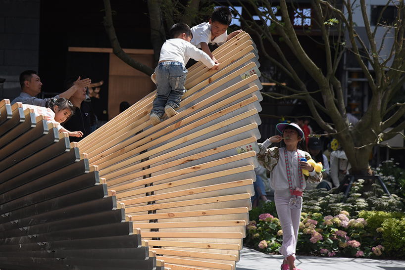
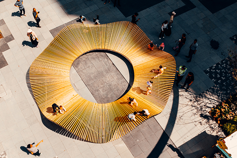
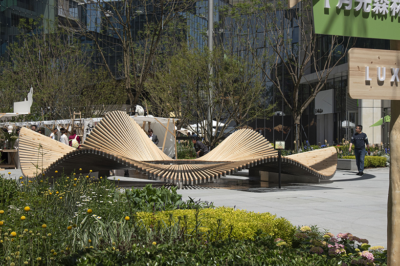
Sited in Chengdu‘s Luxezone Plaza, A Petal in the Urban Oasis is a new public installation completed by Chinese studio Epiphany Architects. The wooden design gracefully flows and undulates amid the lush urban greenery, creating playful light and shadow effects for visitors to enjoy. ‘Through interaction with the surrounding environment, it flexibly adjusts its shape to present itself in the most suitable way. This petal welcomes every resident and visitor with open arms,’ shares the studio. At its center, a circular void offers a uniform height to create a comfortable social space. At the same time, its outer, undulating body reveals different heights that lead to a more lively and dynamic appeal and more opportunities for interaction — namely playing, sitting, leaning, gathering, and resting. The children’s engagement brings a particularly more interesting dimension to the dynamics. 
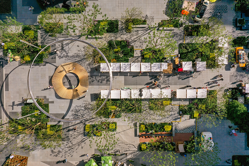
a petal in the urban oasis 2
A Petal in the Urban Oasis | all images courtesy Epiphany Architects


using 300 wooden pieces of varying lengths


Supporting the installation by Epiphany Architects (see more here) are six mirror bases cleverly designed to align with six points where the petal ‘drops’. This design visually integrates the bases with the petals, echoing its image of lightness and buoyancy. In addition to the bases, the installation utilizes curved steel trusses to support the entire form. These trusses are connected to the lightbox using a snap-fit method, ensuring the overall structure’s stability while effectively concealing the trusses between the wood and stainless steel lightboxes. This unique petal is meticulously composed of 300 wooden elements of varying lengths and stainless steel light boxes. Each lightbox has a different angle of connection with the trusses, resulting in 600 other forms of connectors. In the production process, the sequence of node design, data output, data organization, CNC machine input and output, and overall assembly showcases the perfect integration of technology and art.
a petal in the urban oasis 1
creating varying light and shadow effects
a petal in the urban oasis 4
the undulating wooden installation mimics the movement of a petal
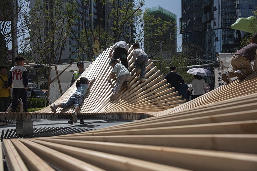
a petal in the urban oasis 6
children exploring the structure by Epiphany Architects
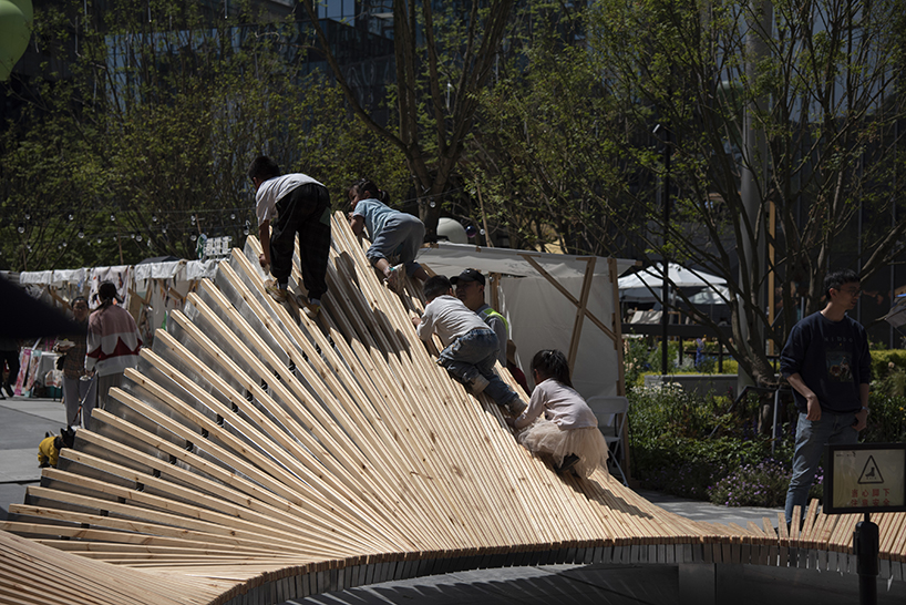
a petal in the urban oasis 7
climbing to the top

a petal in the urban oasis 8
a continuous wave-like surface

Reference

Halleroed combines the futuristic and the primitive for Chengdu Acne store
CategoriesInterior Design

Halleroed combines the futuristic and the primitive for Chengdu Acne store

Fashion brand Acne Studios has opened its latest store in China, which was designed by Stockholm studio Halleroed and is located in the submerged SKP department store designed by Sybarite in Chengdu, China.

The 338-square-metre store has a discrete sandstone exterior marked by a red LED sign displaying the brand’s logo.

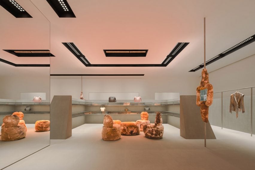
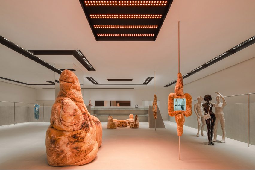
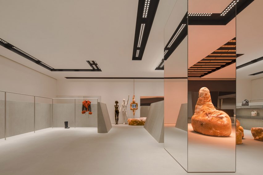
Inside, grey sandstone walls contrast against sculptural tie-dye furniture in earthy tan hues by British designer Max Lamb.

Acne Studios store designed by Halleroed
The store is located inside Chengdu’s SKP department store

“Our inspiration was aesthetically playing with design from the 1980s and 90s, and how that period looked at the future,” Halleroed founder Christian Halleroed told Dezeen.

“The inclined stone clad walls, the futuristic lighting together with the Daniel Silver mannequins – we thought of a futuristic space/computer age feel, but in a contemporary way of putting it together,” he added.

“We clashed this with the Max Lamb sculpture-like furniture that has a more primitive, earthy feeling.”

Bic fabric sculpture by Max Lamb in Acne Studios store
It features tactile, soft seating by Max Lamb

As well as the furniture, Lamb designed four fabric-clad touchscreens that are mounted on slim poles throughout the store and provide an overview of the brand’s current collection and stock availability.

Expressive mannequins by artist Daniel Silver and a light installation by designer Benoit Lalloz help to add a futuristic feel to the space.

Interior of Acne Studios store in SKP Chengdu
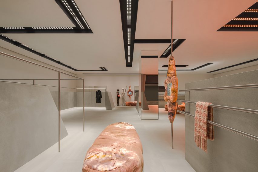
Lighting was designed to feel “like a spaceship”

Halleored, which has designed a number of Acne Studios‘ stores, normally works with Lalloz on the lighting but said the Chengdu store lights have a different feel to those in other stores.

“These were done a bit differently than previous since they are recessed in the ceiling, but still has the typical look of Benoit Lalloz,” Halleroed said.

“We wanted the lighting to feel like a spaceship,” he added.

A large mirrored column in the middle of the store reflects its pared-down interior, which features a colour palette informed by the grey hues used for early computer designs.

Large mirror inside Acne store designed by Halleroed
A large mirrored column sits in the centre of the sandstone room

“We used a very restrained palette with the grey, monochrome sandstone on the floor and angled walls, high gloss white walls and ceiling, the black coves in the ceiling, and for the fixtures brushed stainless steel,” Halleroed said.

“The Max Lamb and Daniel Silver pieces contrast this, with their brown batik fabric and the white with patina and silver mannequins.”

Previous Acne Studios store designs featured on Dezeen include a “monolithic” store in Paris and a pink-ceiling flagship store in Milan’s Brera district.

The photography is courtesy of Acne Studios.

Reference