Coil Coatings: Architects’ Secret to Brighter Metal Building Façades
Architects: Want to have your project featured? Showcase your work through Architizer and sign up for our inspirational newsletters.
The best architecture is tied to community and local contexts. The products manufacturers create for a building bring ideas to life through shapes, colors and materials. As metal structures and product applications have become more commonplace, so too have the variety of ways to express design concepts. This is especially true for metal coatings, used in everything from curtain walls and metal wall panel systems to roofing, louvers and sunshades. Today, manufacturer Sherwin-Williams is reimagining color and expression through coil coatings.
As the manufacturer states when describing their approach to factory-applied coil coatings for architecture, they can “create nearly any color or effect you can dream up.” Coil coating, sometimes called pre-painted metal, is an efficient way to produce a uniform, high-quality, coated finish. The key is that the metal is painted before rather than after fabrication. The types of paint curing used in the coil industry include thermal, infrared, induction and UV cure. Exploring these coatings through color and specific products, the following projects showcase the range of applications created by Sherwin-Williams. Together, they represent a technology that is versatile and high quality, with a range of cost, environmental and performance benefits.
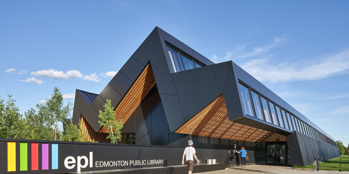
Edmonton Public Library
Designed by Patkau Architects, Edmonton, Canada
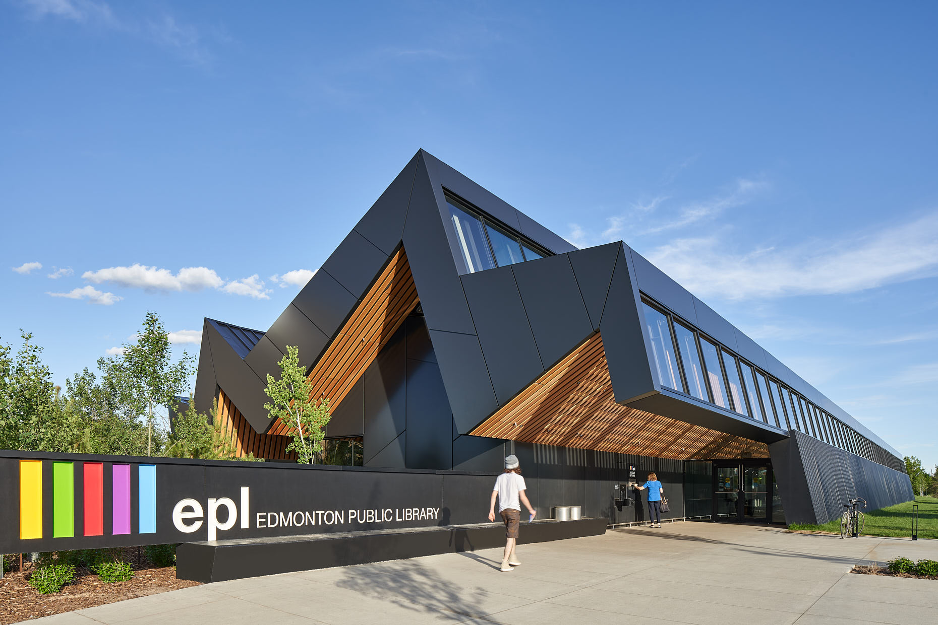
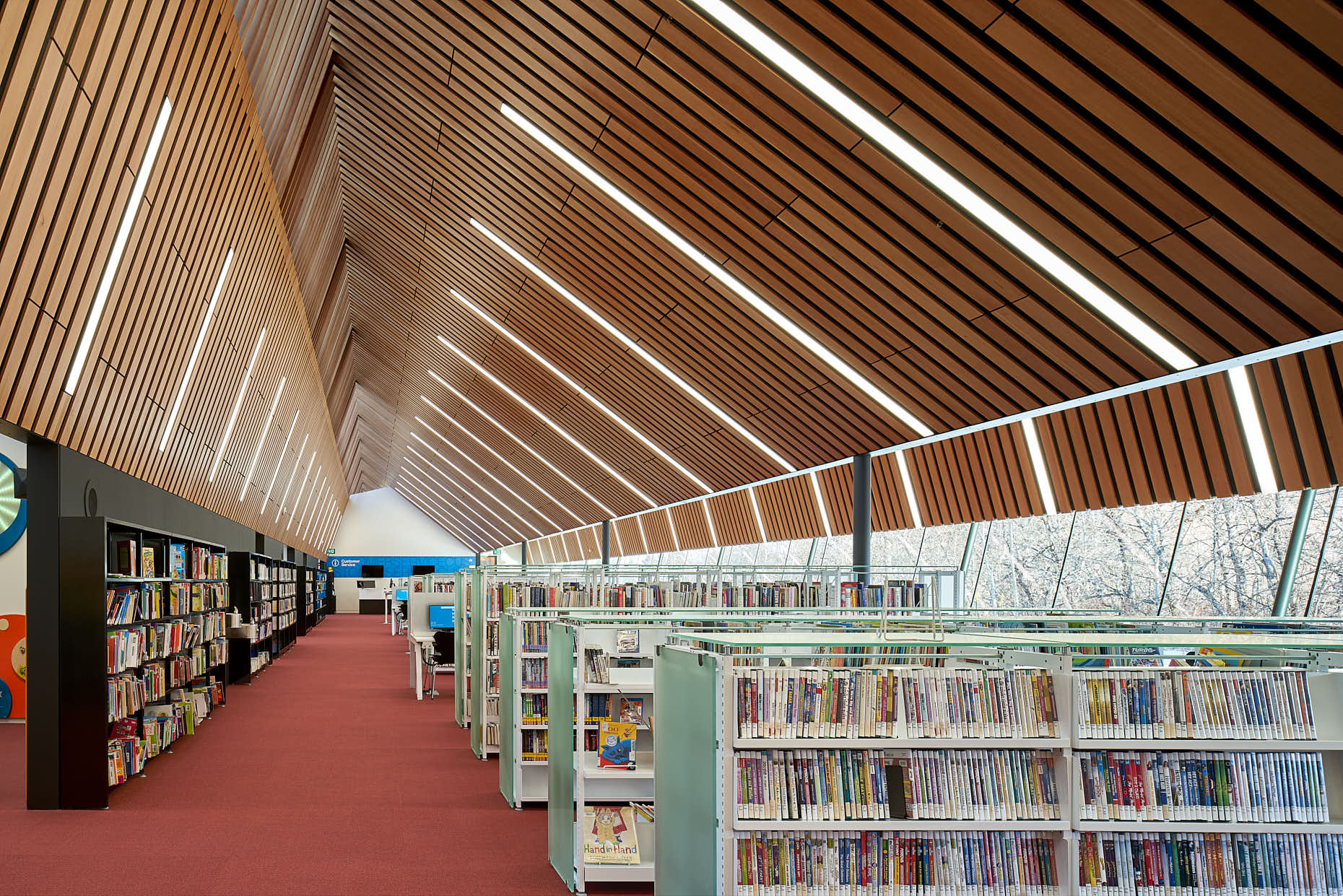 The Capilano Library connects its suburban community to nature. The library form is developed from its cross section, which is folded to form three peaks across the site, each with a different scale. Each of the three peaks responds to scale, function, natural light and view. The western peak reflects the scale of the neighborhood with a quiet edge of support spaces along the street. The eastern peak is intimately scaled, with varied seating along a serene window overlooking the nearby ravine. The design is enhanced by the mix of rectangular and polygonal ALPOLIC metal panels that were installed around the library’s exterior.
ALPOLIC metal composite materials deliver excellent flatness and exceptional formability to give the library a sophisticated exterior aesthetic. The metal panels are coated in a Valflon finish supplied by Sherwin-Williams Coil Coatings. The rich, vibrant and high-gloss color is a fluoropolymer FEVE resin-based coating that offers color consistency, protection against weathering, chalking and fading, and excellent overall adhesion. This finish also meets the highest performance standards, including AAMA 2605 specifications. In time, the Edmonton Public Library Capilano Branch has become a central space for the community.
Wolf Creek Library
Designed by Leo A Daly, Atlanta, GA, United States
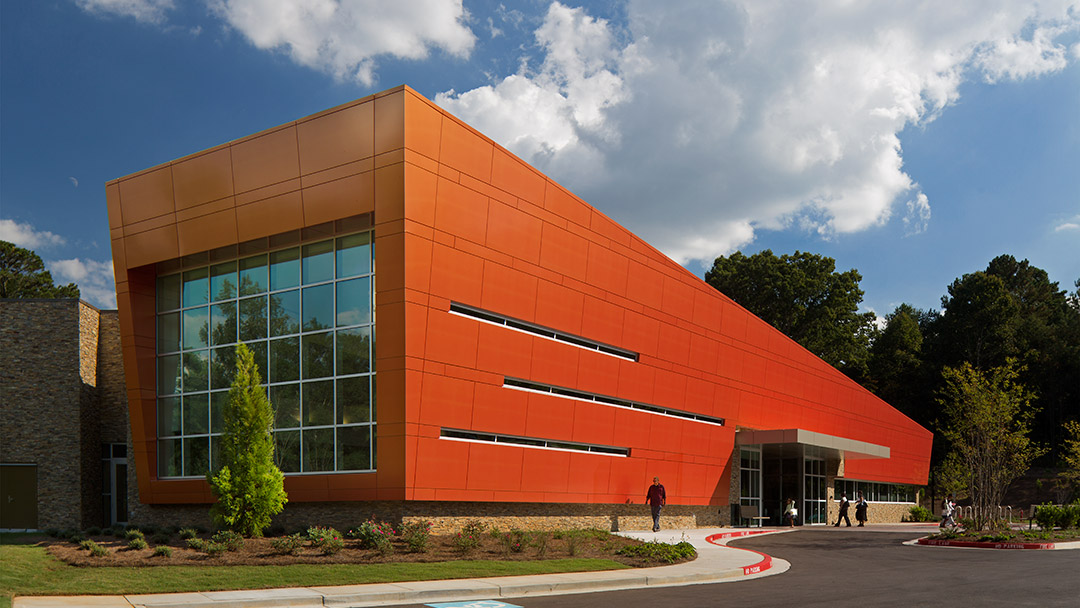
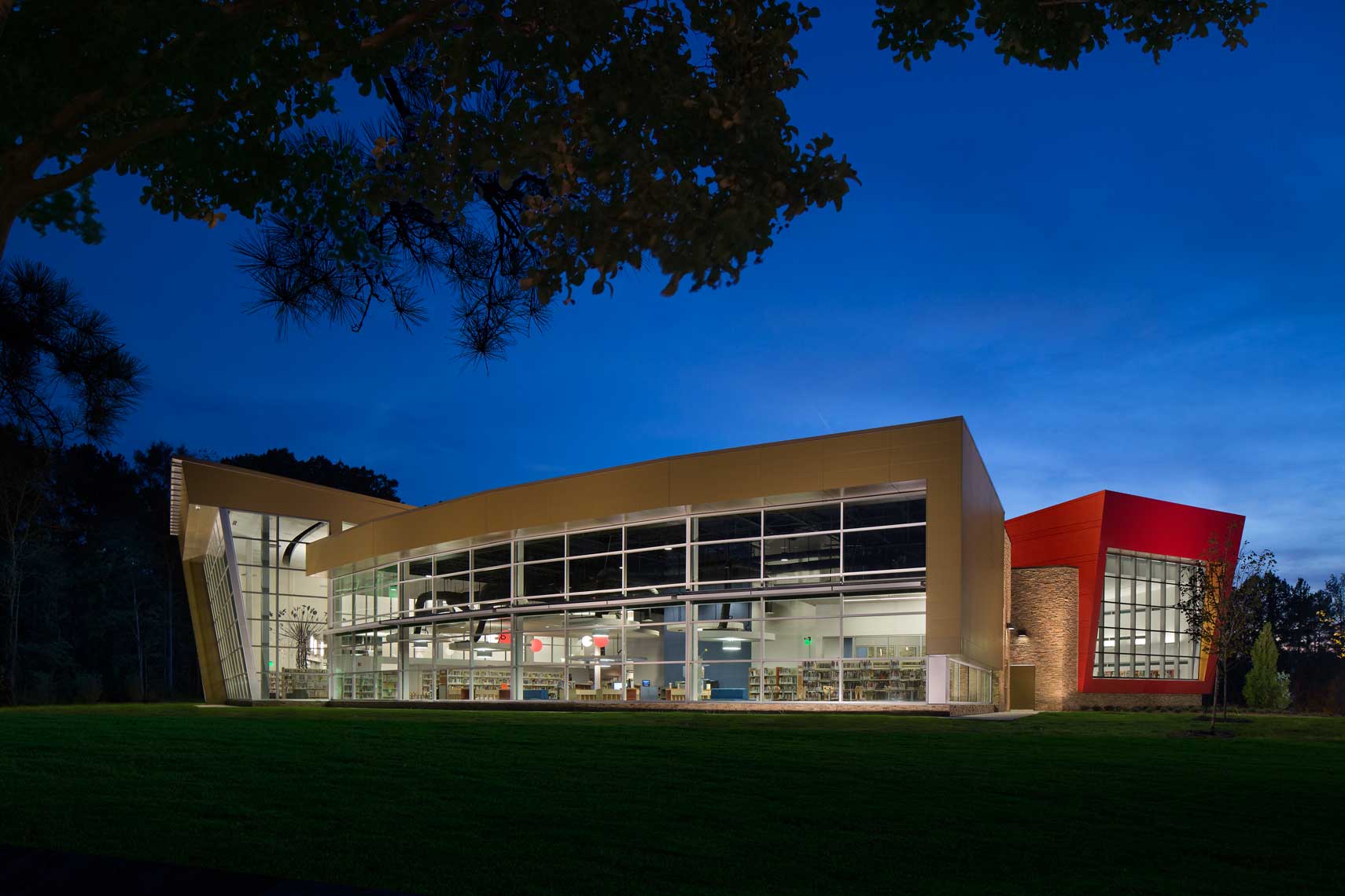 The Wolf Creek Library design was made as a community destination and as a catalyst for growth. The exterior features an outdoor reading garden and terraced seating. The library houses 5,700 square feet of adult collections, 5,000 square feet of children’s collections, a computer/learning station room, teen area, music room, sub-dividable community meeting room for 125 people and two conference rooms with smart boards and projectors. Originally, copper was considered as cladding material for the building’s iconic wedge-shaped façade. But, ultimately, it was determined that ALPOLIC’s aluminium composite material (ACM) was a superior solution.
The custom MRT Prismatic Magma finish would evoke the original copper intent, but offer a more vibrant visual experience. Sherwin-Williams Valflon coating provides the shimmer and shifting colour the architects desired. The simple but geometric design is at once bold but refined and enhanced by the Valflon coil coating. Durable with excellent adhesion and flexibility properties, the FEVE resin allows each prismatic color to have an intense brightness of shade and a high-gloss quality. In the daytime, the Wolf Creek Library’s appearance shifts from copper to red to orange, depending on the time of day, weather conditions and viewing angle.
St. Nicholas Eastern Orthodox Church
Designed by Marlon Blackwell Architects, Springdale, AR, United States
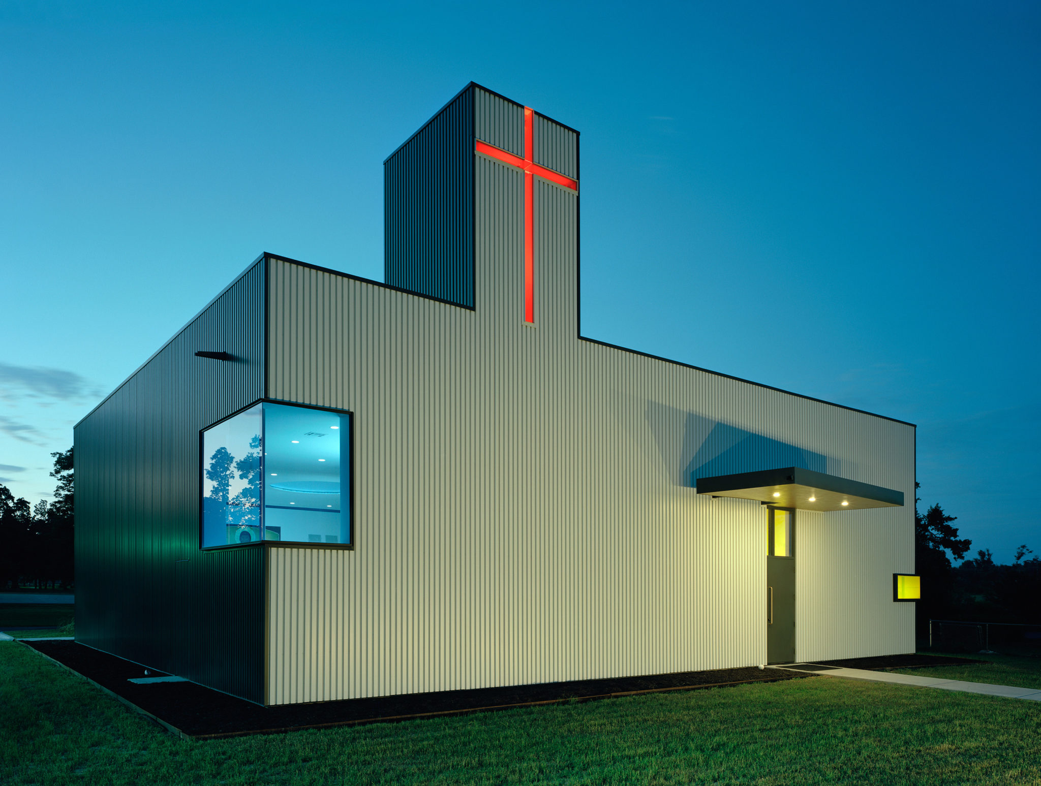
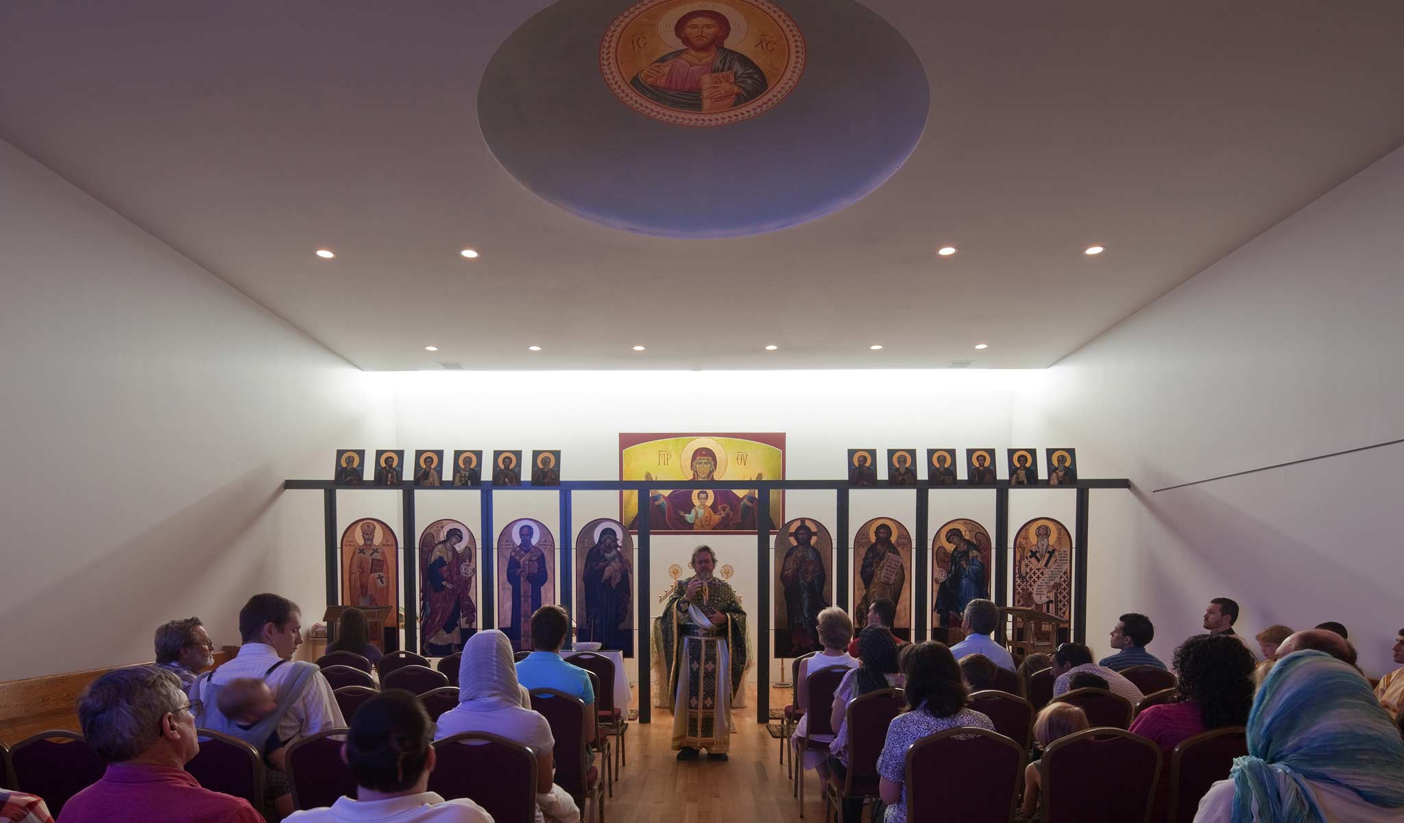 The Saint Nicholas Eastern Orthodox Church transformed a generic shop building into a place of worship and fellowship. The architects kept the interior simple but utilized box rib metal panels for the exterior. Metal Sales manufactured the T-10A metal walls panels, which are coated in Metallic Silver and Dark Bronze Fluropon colors from Sherwin-Williams Coil Coatings. A thin cross, lit up in red, is also visible on the western side of the church.
Marlon Blackwell created an addition on the western side of the 3,600 square-foot building in order to orient the structure toward the eastern axis, which is typical for Greek Orthodox churches. The skylit tower pours red light down into the transition between the narthex and the sanctuary, giving a moment of pause before entering to worship. A narrow cross is suspended on the western side of the tower, backlit by the morning sun to become a beacon for arriving parishioners. Once inside the sanctuary, a transom that spans the entire width of the space faces east and bathes the space in soft morning light during Sunday morning services.
Formosa1140
Designed by Lorcan O’Herlihy Architects [LOHA], West Hollywood, CA, United States
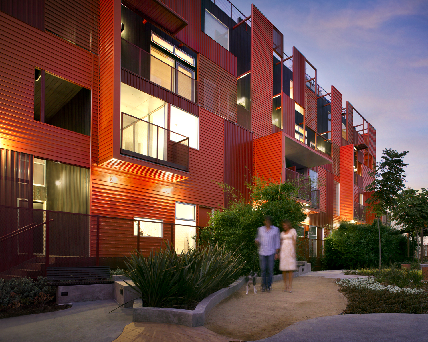
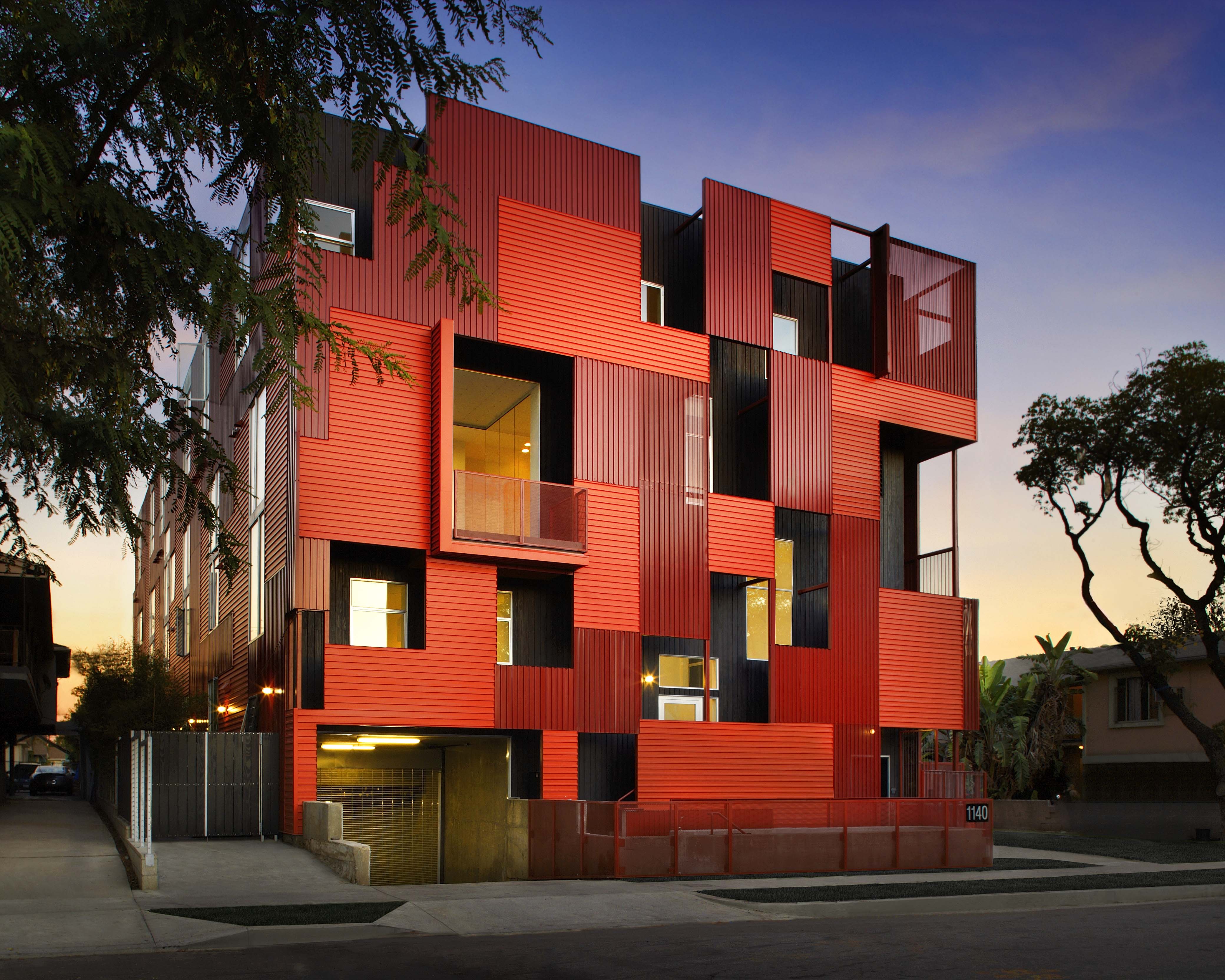 Located in the heart of Los Angeles, this new eleven unit housing project emphasizes the central importance of shared open space for the residents and the community. Formosa takes what would be the internalized open space of the courtyard and moves it to the exterior of the building to create a park. This plan, O’Herlihy’s firm says, “simultaneously creates density and green space and models a replicable prototype for incremental community-driven city development.” Completed in 2008, the 16,000-square-foot building features a red corrugated metal exterior. Sherwin-Williams was chosen for its flagship Fluropon coating to be the product of choice for Formosa.
Using Sherwin-Williams 70% PVDF Fluropon coating, a custom red color — Coronado Red — was inspired by the iconic nearby Formosa Café, and not only highlighted the texture and pattern of the exterior, but also contrasted with the green shades of the park. The metal façade is made of 12,900 square feet of perforated T16-E panels from Metal Sales Manufacturing Corporation, which conceal and shade outdoor walkways on the three-story building, giving residents a sense of privacy in spite of the structure’s openness to the park and street.
National Museum of African American History and Culture
By The Freelon Group, Adjaye Associates, Davis Brody Bond LLP, Washington, DC, United States
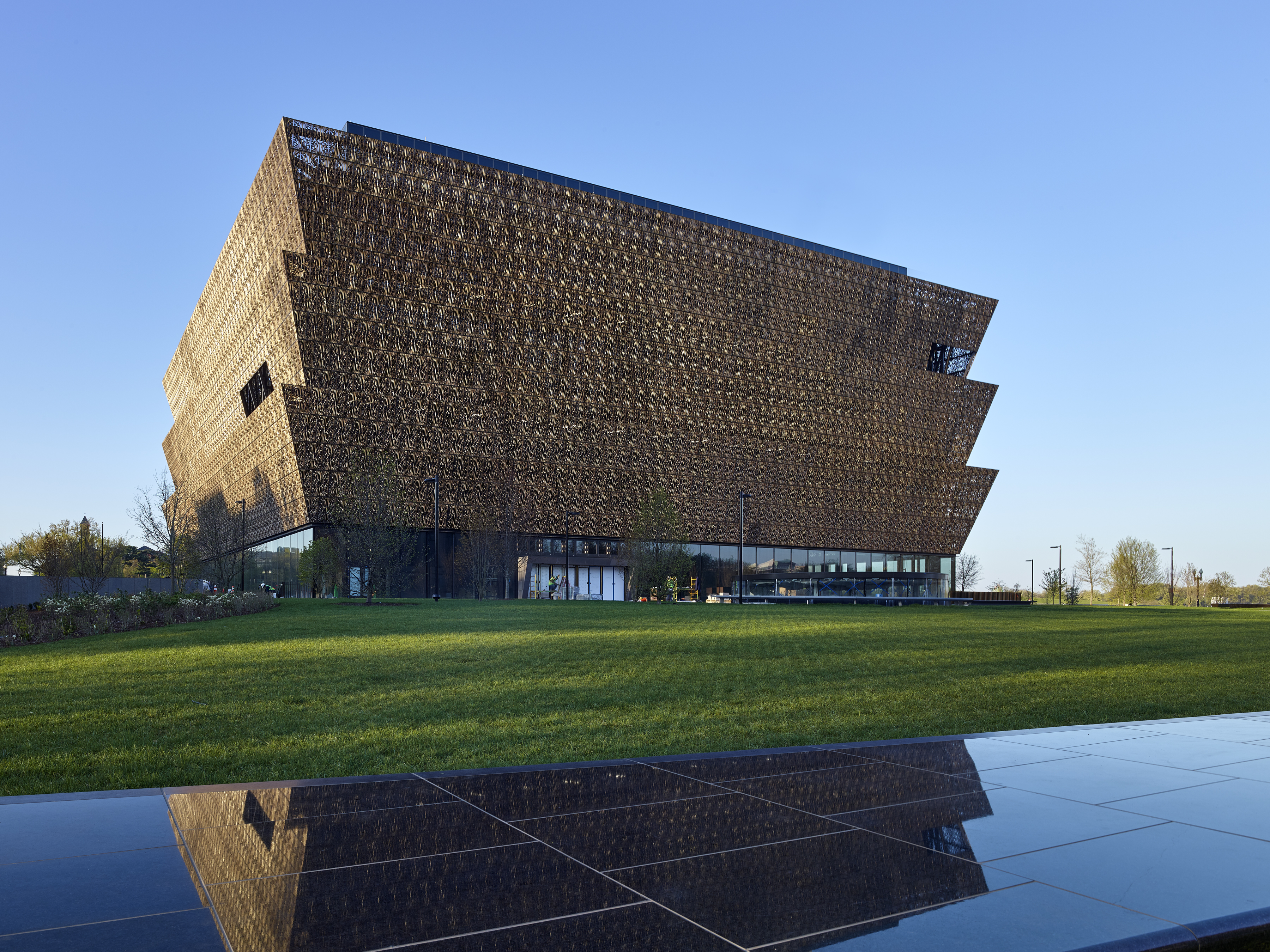
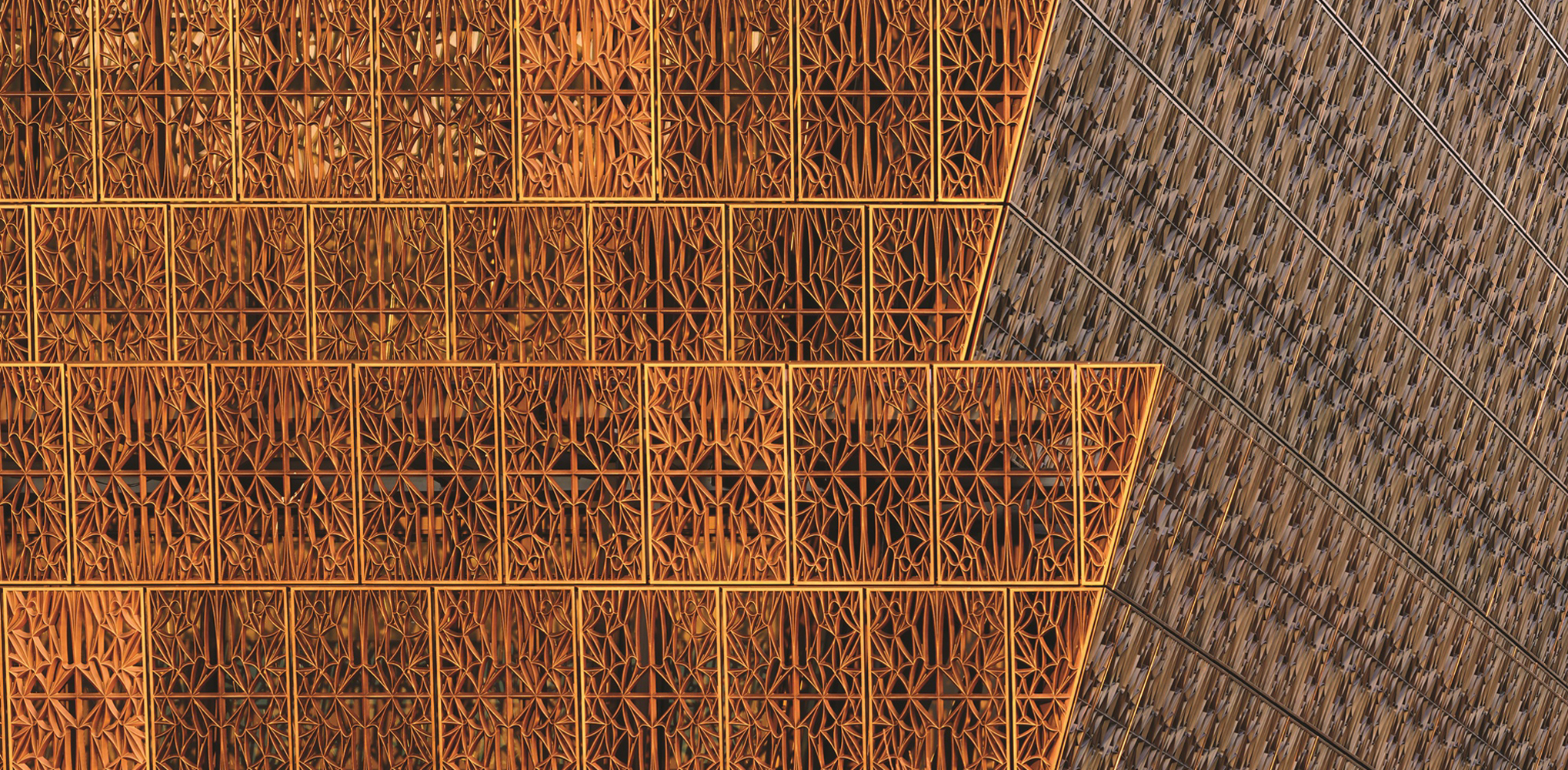 The National Museum of African American History and Culture (NMAAHC) holds a prominent place on the National Mall. As the team outlines, the primary architectural idea for the museum was derived from the classical tripartite column with its base, shaft and capital. In Yoruban art and architecture, the column or wooden post was usually crafted with a capital resembling a crown. This crown or corona form is the central idea which has driven the design of the museum.
Reaching toward the sky, the bronze clad corona expresses faith, hope and resiliency. Once the final color idea was identified, the new challenge of obtaining the perfect hue began. Three custom shades, African Sunset, African Sunrise and African Rose, and one standard shade of Black Sherwin-Williams Fluropon coating were used on these massive aluminum panels, each weighing around 200 pounds and stretching 4 by 5 feet. Each panel that was custom cast by Morel Industries was finished with five different coating layers, each a different color of the Fluropon coating, to achieve the exact bronze shade desired by the design team. Eventually, the final color was created, called “Artisan 3.5.”
Central Arizona College, Maricopa Campus
Designed by SmithGroup, Maricopa, AZ, United States
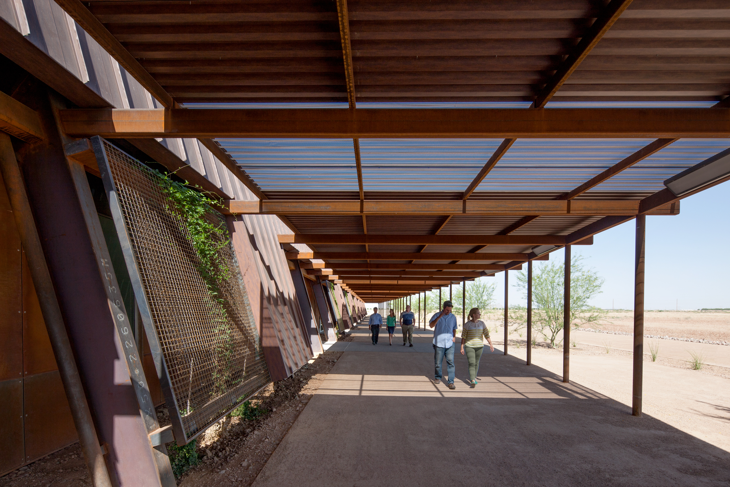
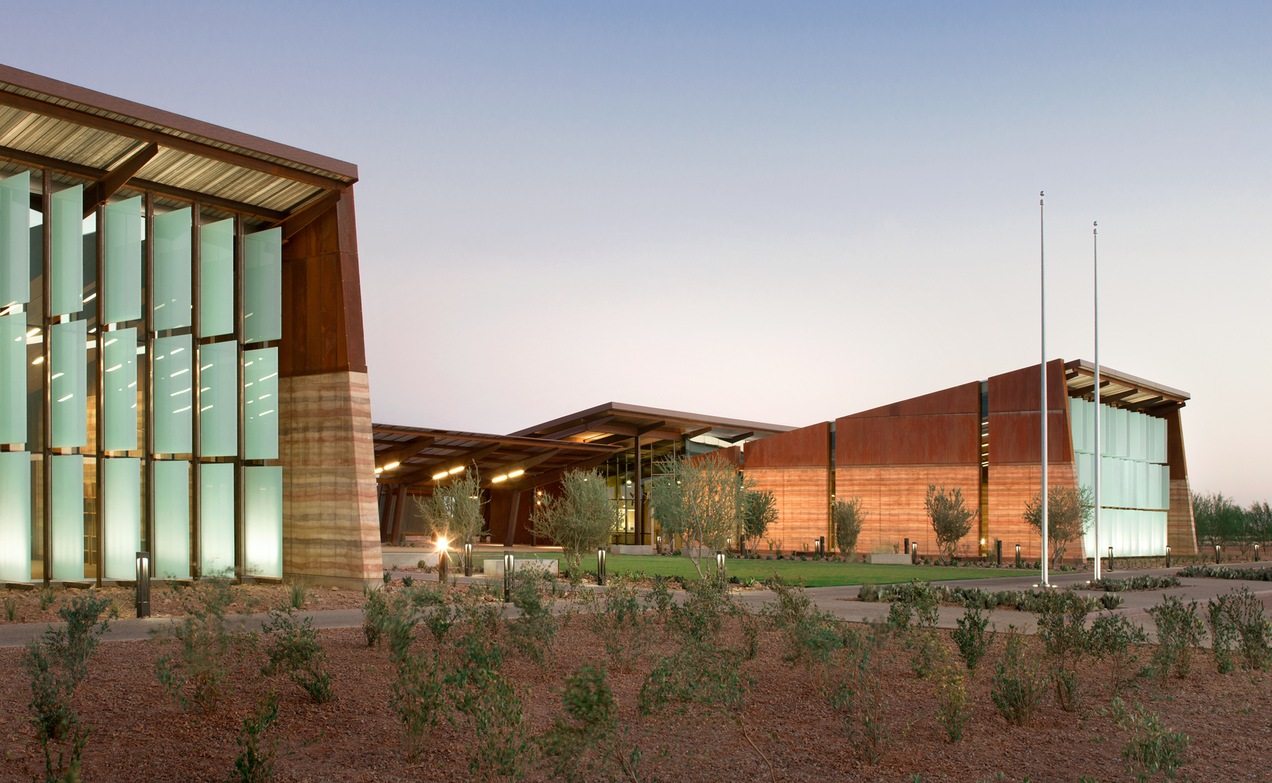 This new ground up campus was designed to create a unique and authentic identity for the growing Central Arizona College. The three building campus is conceptually rooted in its historic agricultural roots and Native American legacy. Structures are conceived as a series of honest, spare and no maintenance ‘academic sheds.’ Deep overhangs let interior academic spaces flow outdoors seamlessly. Corten steel and rammed earth create the primary exterior language eliminating the need for long term maintenance.
The diverse program includes teaching laboratories, classrooms, culinary arts, a café, bookstore, library, learning center, interactive distance learning classrooms, student services, administration and a multipurpose community room. To ensure the unique appearance, Sherwin-Williams Fluropon coating in Cor-Ten AZP was chosen to adorn the facility. This coating achieves the look of Cor-Ten Steel through a two-step process using a print effect Floropon coating. The coating, containing 70% PVDF resins, provides the strongest protection against weathering, aging and pollution for color retention to preserve the beautiful aesthetic of the facility for years to come.
Architects: Want to have your project featured? Showcase your work through Architizer and sign up for our inspirational newsletters.

