Dekton Ukiyo: Cosentino’s New Material Collection Celebrates the Aesthetic Wisdom of Japan
Most people who love design also love Japan. In fact, it is impossible to truly appreciate the modern history of Western art and design without recognizing Japan’s influence. From the woodblock prints of Hiroshige that inspired Van Gogh to the Zen tea rooms that laid the foundation for minimalist architecture, Japanese aesthetics paved the way for modernism.
It is not just that Japanese design is beautiful. The nation has a long tradition of thinking carefully about aesthetics, and how the contemplation of beauty contributes to human flourishing. Consider the concept of wabi-sabi, or the art of imperfection, that was recently explored in an Architzer op-ed. Centuries before American architects lamented the homogeneity of the clean and orderly suburbs, Japanese philosophers recognized the paradoxical truth about beauty: that it requires flaws.
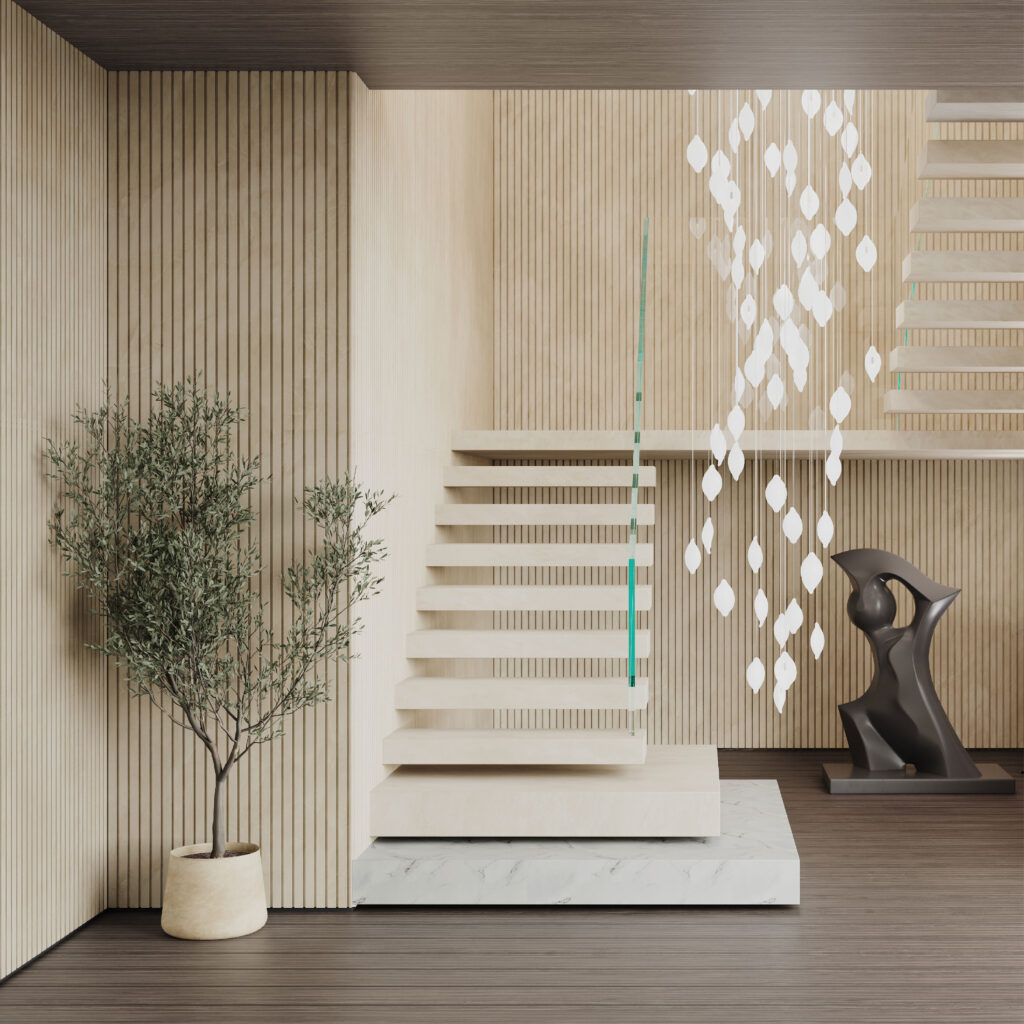
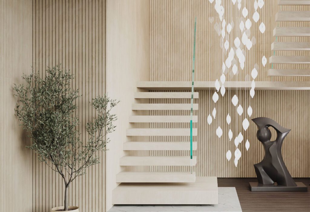
Dekton Ukiyo NACRE. Image courtesy Cosentino
It is this aspect of Japanese aesthetics — the theoretical side — that most inspired world-renowned interior designer Claudia Afshar in the development of her new collaborative collection with Cosentino, Ukiyo. The tagline for the series is “The Inner Texture,” which speaks to the Japanese understanding of interior design as an art that evokes a mental atmosphere of inner serenity. In the Japanese tradition, beauty and well-being go hand in hand.
The collaboration consists of a series of new patterns and textures for Cosentino’s versatile Dekton surfaces, a product we love and have profiled many times in the past. Scratch resistant, stain resistant, and able to endure the elements, Dekton is the surface of choice for designers looking for a material that is both resilient and visually alluring. The introduction of Dekton into the marketplace in 2013 completely upended the old conventional wisdom that natural materials are more beautiful than composites.
With Ukiyo, Claudia Afshar showcases the extraordinary potential of Dekton. Most Westerners recognize the term ukiyo as referring to a genre of woodblock prints that flourished in the 19th century, epitomized by the work of artists like Hokusai and Hiroshige. But in the promotional materials for this new collection, Afshar and Cosentino have chosen to emphasize the literal meaning of this term, listing the dictionary definition on the top of the collaboration webpage: “[u-key-yo], Japanese, (n). Living in the moment, detached from the bothers of life. ‘The floating world.’” The idea is drawn from Zen. It means that paradise is always at hand; all it takes is a choice to live in the moment.
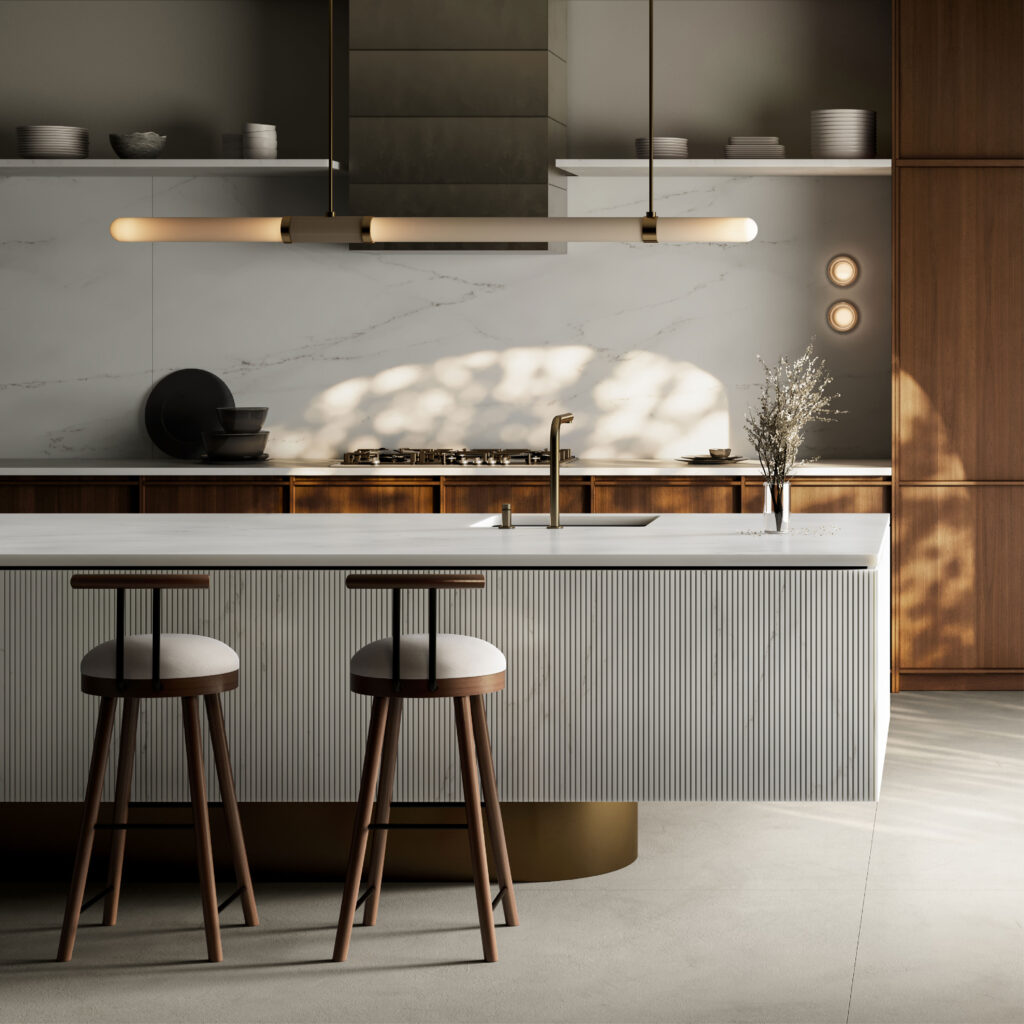
Dekton Ukiyo KRETA. Image courtesy Cosentino
In a recent webinar hosted by Architizer, Cosentino’s Lauren Dron quoted Coco Chanel’s statement that “An interior is the natural projection of the soul”, emphasizing the depth of the question architects and designers must ask every time they take on a project. “Meaningful design in the built environment continues to be rooted in our minds and in our emotions,” she declared. “Design is a reflection and enhancement of the human experience.”
This second part — enhancement — is key, and it is the place where architects can really have an impact on the world. In a social environment dominated by stress, conflict, and speed, architects can create environments of serenity and calm. They can remind people that “the floating world” is alway at hand if one is willing to adjust their perspective.
This, then, is the noble aim of Ukiyo, which features textures and colors that are simple, yet rich. As lush as any natural stone, and as meditative as a pool of still water, these surfaces bring serenity into all sorts of interiors, from domestic to commercial. Each Dekton color features the same delicate ribbed texture, which is reminiscent of the wood slats one often finds in Japanese homes. The texture also evokes the delicate patterns one finds raked into the sands of Zen gardens.
There are two different options when it comes to the size and spacing of the grooves. Ukiyo GV2 is wider, with 25 mm slats and grooves that are 5 mm wide and 3 mm deep. GV3 is finer, with 11 mm slats and grooves that are 4 mm wide and 4 mm deep.
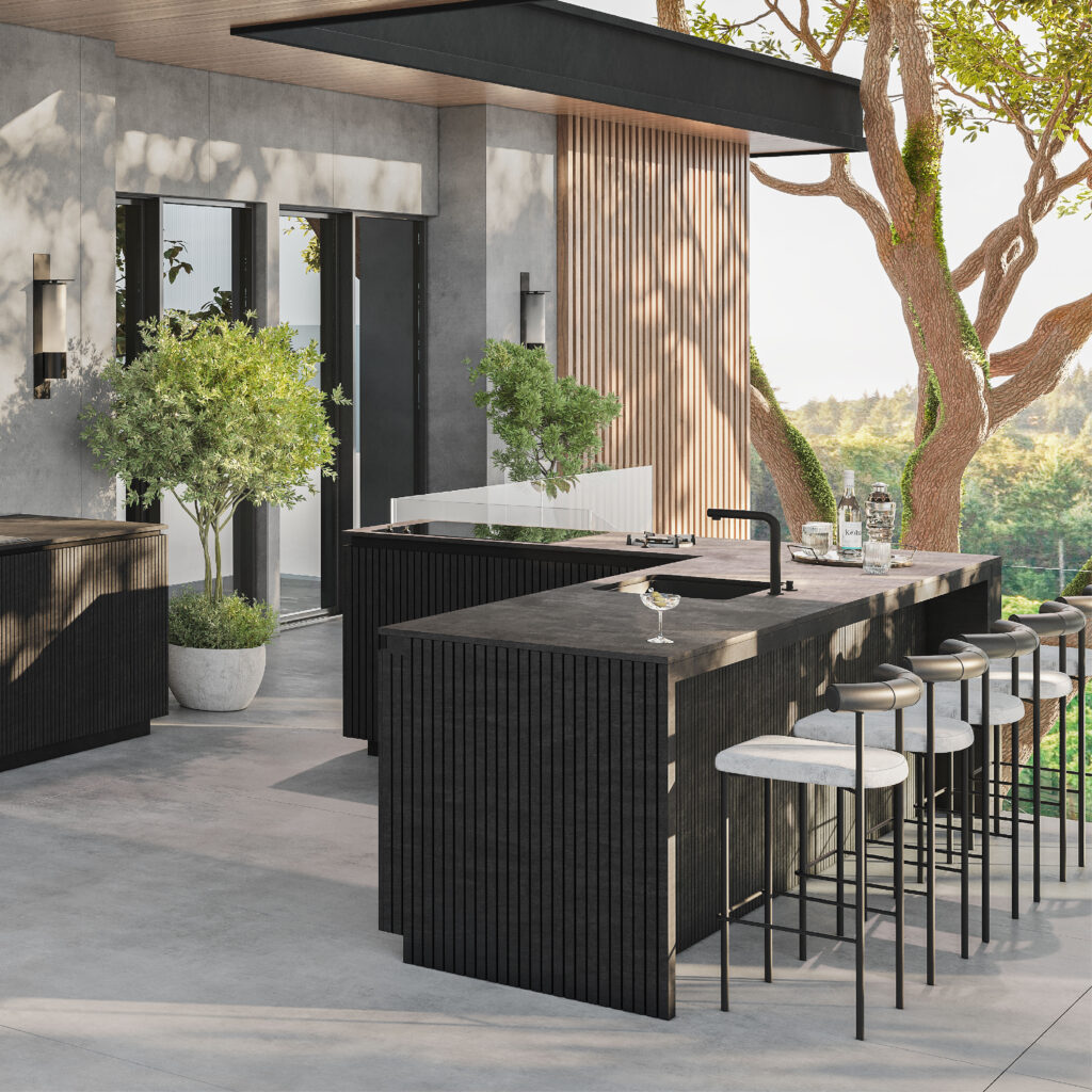
Dekton Ukiyo BROMO. Image courtesy Cosentino
BROMO is the first color in the series. It is described as “a dark gray shade inspired by slate featuring subtle faded graphics and a carefully crafted texture with a natural aesthetic.” The graphics are really key here. The material is actually deeper and richer than slate, yet it has the same soothing matte finish, exuding sophistication.
The next color, KRETA, is inspired by concrete, a material that retains modernist cache despite its ubiquity. Some of the most lyrical architecture ever made with raw concrete was created by Japanese architects, including Tadao Ando. Cosentino notes that KRETA can “create lighter or darker spaces.” In this way, it plays off the light conditions in its environment, just like real concrete — a true neutral.
NACRE and REM are both shades of cream or beige. NACRE is the lighter of the two, and can even be considered an off-white. It is a great choice for designers looking for a minimalist finish but wary of stark brightness. This tone is both light and warm. REM has a similar impact but is marked by more dramatic veining patterns. There is a luxe quality here that is perfect for commercial interiors.
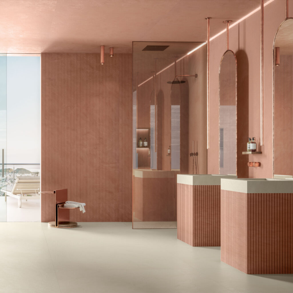
Dekton Ukiyo UMBER. Image courtesy Cosentino
Finally there is UMBER, the most adventurous and unique color in the series. It is hard to look at this delicately textured terracotta without imagining the rooms one could create with this tone. Unlike the other colors, which are notable for their versatility, UMBER is a showstopper. It is the kind of color you build a room around.
Ukiyo is a truly inspiring series of surfaces. It is also ethically manufactured. Dekton is the only “Cradle-to-Grave Carbon Neutral surface” as Cosentino offsets 100% of their CO2 emissions over the product’s life cycle. This too is very Zen. Dekton exists in harmony with its surroundings.
To learn more about Dekton Ukiyo and talk with Cosentino about how to integrate it into your next project, visit their website.

