8 Contemporary Ways to Resurrect Art Deco Glamor
CategoriesArchitecture

8 Contemporary Ways to Resurrect Art Deco Glamor

Browse the Architizer Jobs Board and apply for architecture and design positions at some of the world’s best firms. Click here to sign up for our Jobs Newsletter.

Art Deco, which is short for Arts Décoratifs, emerged as a design style in France just before World War I and predated the more minimal and functional Mid Century design. Characterized by bold sleek forms, geometric patterns, reflective finishes, metallic and inlaid wood embellishments as well as luxurious materials, the aesthetic later gained popularity in the 1920s and 1930s, where it was showcased across architecture, interiors, fashion, automobiles and more.

The style married high-quality opulence and dramatic simplicity while also paying homage to technological advancements and mass manufacturing. In addition to Cubism and Viennese Succession, Art Deco also draws inspiration from cultures across India, China, Egypt and Mesopotamia. For many in North America, it is epitomized by icons like the Chrysler and Empire State buildings, completed when America was on the brink of the Great Depression. When America emerged from the crisis, the world had changed and so had aesthetic preferences. Today, we’re exploring how 21st century architects and designers are reviving Art Deco sensibilities and adapting them for the contemporary era.
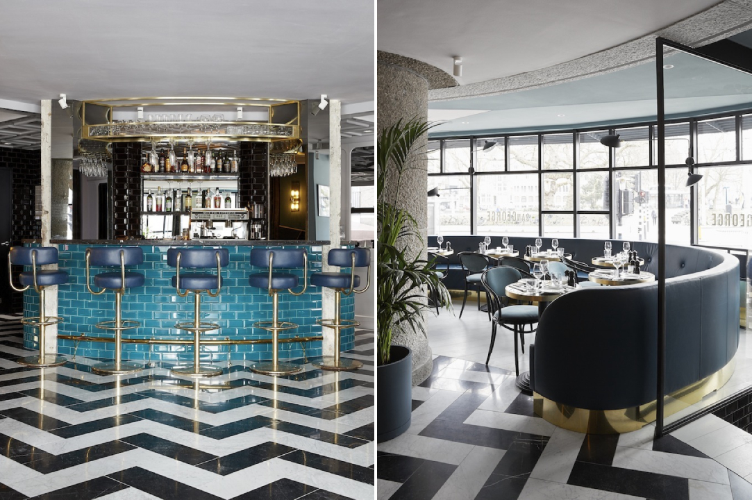
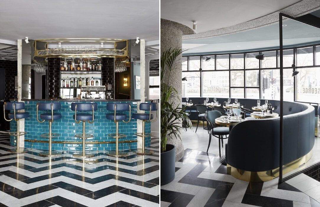
San George by Framework Studio, Amsterdam, Netherlands

Chevrons and starbursts were some of the most defining elements of the Art Deco style. These patterns can be used in walls, furniture and even floors. Statement zig-zag floors in a high-gloss black and white pattern create a neutral base to place colorful furniture while also adding a stylistic layer to the design. In the San George restaurant, the bold floors come together with bright turquoise and rich emerald tones to create a retro aesthetic without it being too overwhelming.
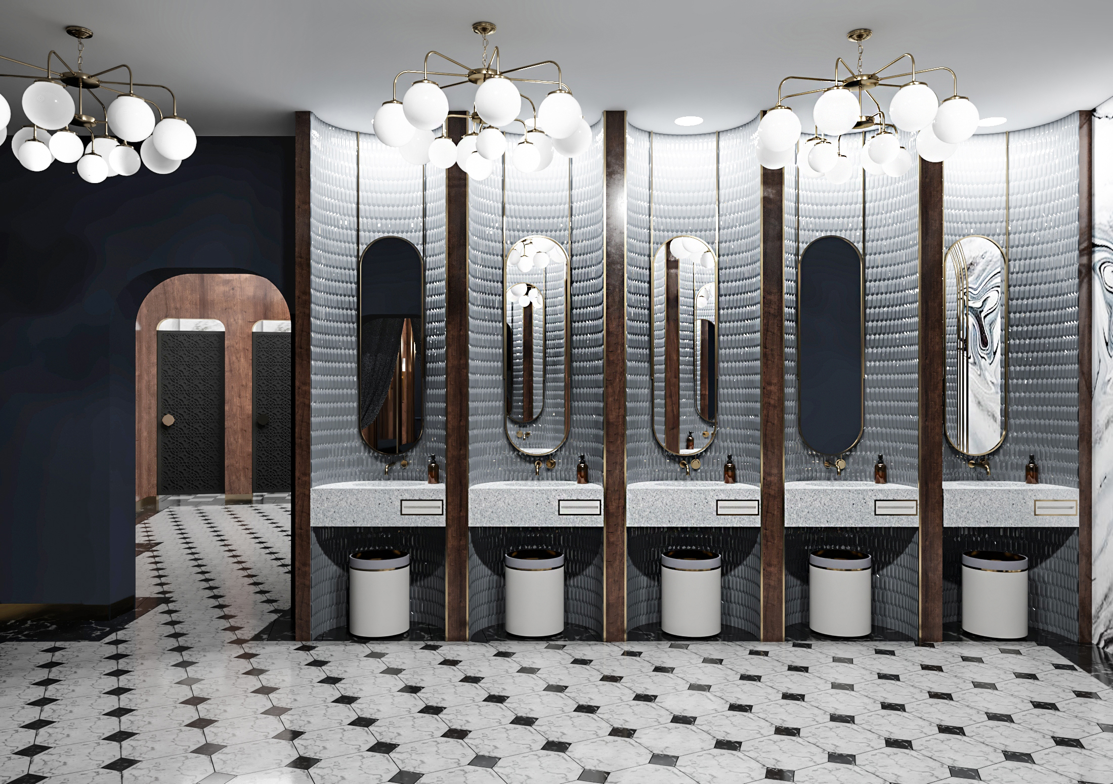
Restroom in Art Deco Style by Futuris Architects, Yerevan, Armenia

Gold is an easy way to bring in the glamour of the roaring 20s. Instead of large metallic furniture pieces, the color can be introduced in a subtle way by using it in the edges or outlines of décor and furniture pieces, molding, lighting or handles. In this restroom, the studio added oblong mirrors with gilded frames and then reinforced this design language with gold-finished lights and matching accessories. The dark tones of the walls and furniture also help the metal stand out more.
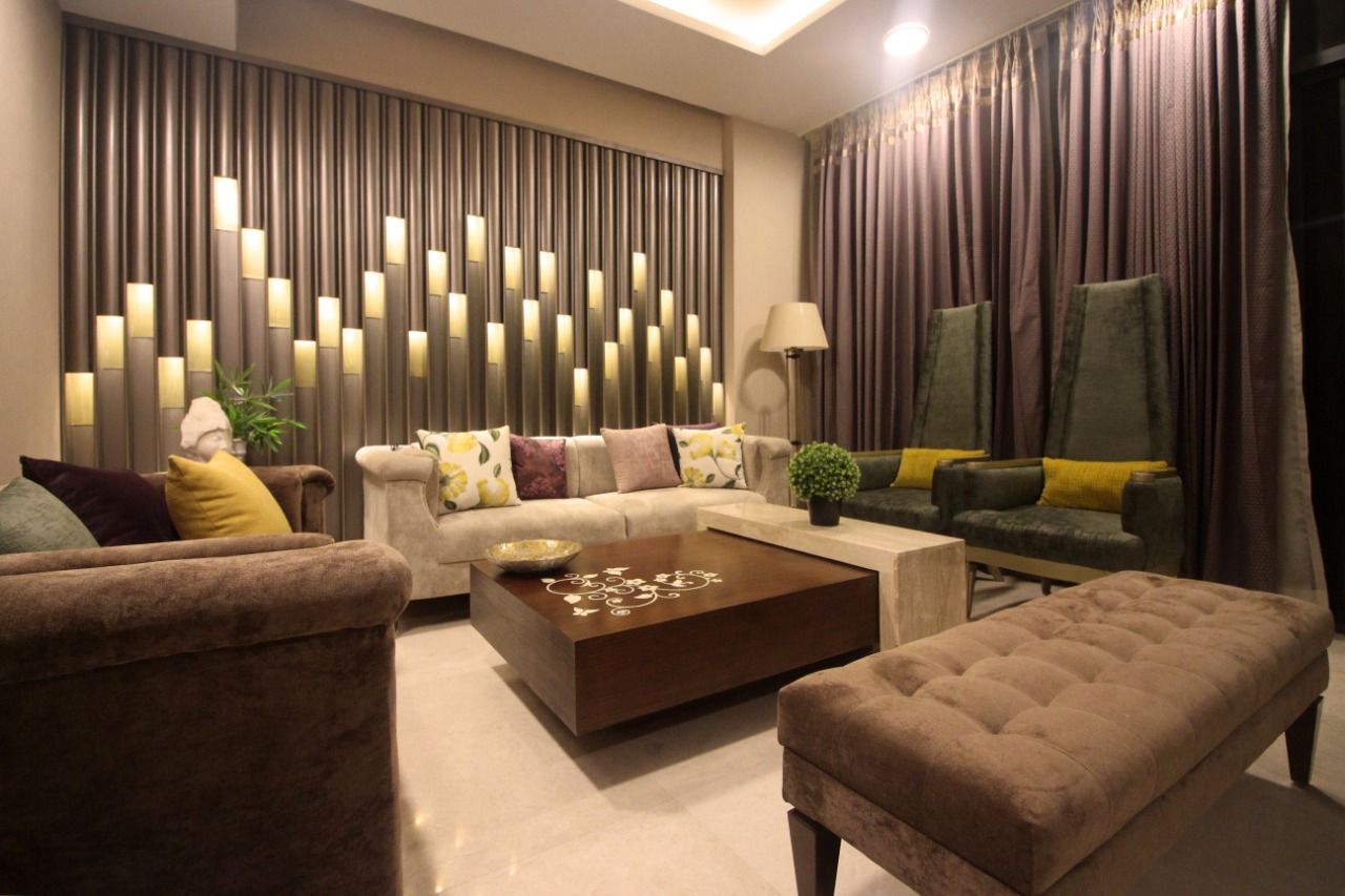
Jazz Billet by Envisage, Gurugram, India

Starburst, solar forms, and stepped patterns are other characteristic elements from this era. These geometric forms were often used in wallpapers, moldings, mirrors and even building exteriors. An Art Deco-style apartment in India showcases these patterns in the form of wall paneling. A dramatic living room wall arrangement is achieved by staggering curved and flat panels of different lengths with recessed light fixtures.
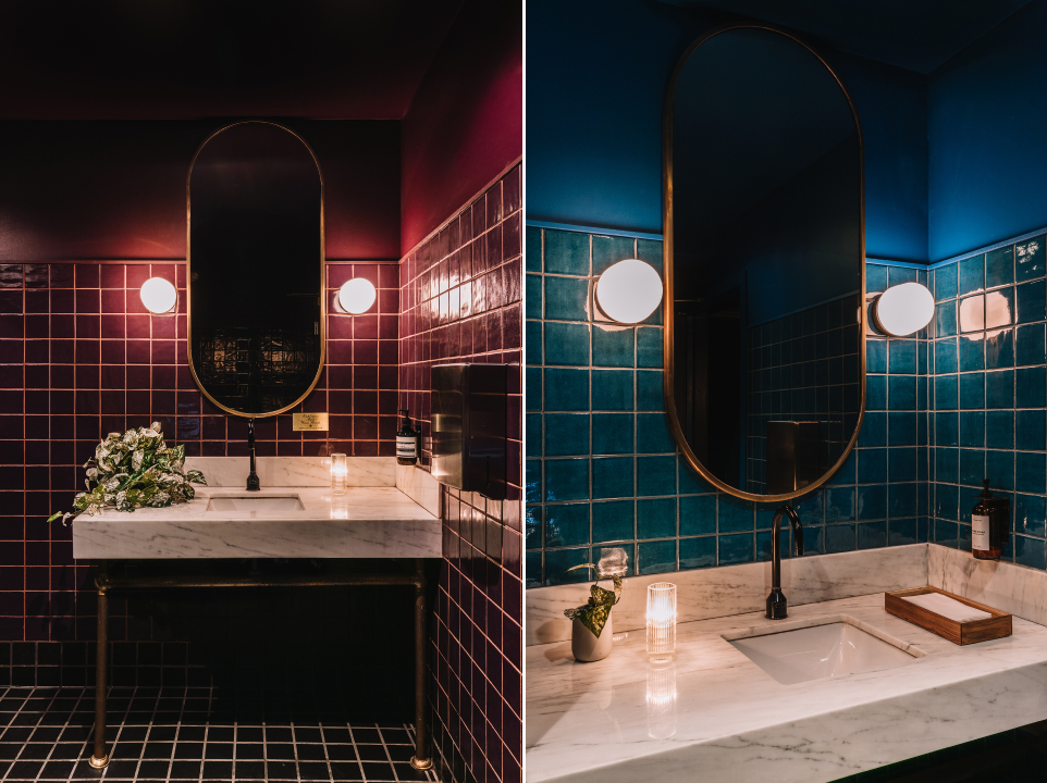
Death & Company Los Angeles by AAmp Studio, Los Angeles, California

Jewel tones have long been associated with wealth and grandeur. Deep shades of red, green, navy or purple can either act as a backdrop or be used in furniture as accents. In Death & Company Los Angeles, these rich hues create a moody atmosphere that is part nostalgic but also contemporary. These colors are juxtaposed with dark wooden panels, light natural stone, metallic accents and floors with geometric tiles.
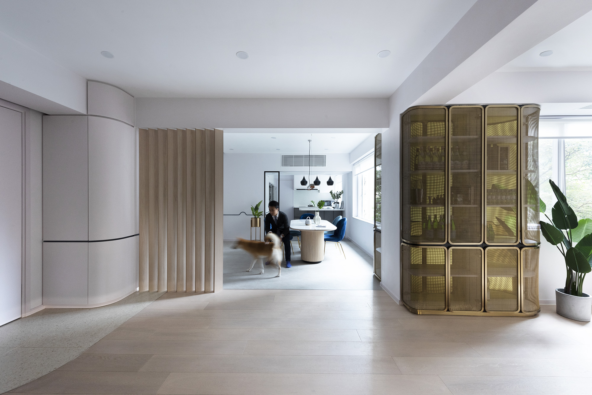
Beau Cloud Mansion / The Cascade by Bean Buro, Hong Kong Island, Hong Kong

Taking inspiration from the automobiles and ocean liners in that era, curvilinear forms and clean lines also became a part of the style in the 1930s. The Bean Cloud Mansion / The Cascade does the same in a modern way. Corners, wall edges and furniture profiles have all been given smooth edges or curved profiles. This is even replicated in cabinet doors and wall dividers. The curved lines are also incorporated at a smaller scale by adding fluting to the dining table.
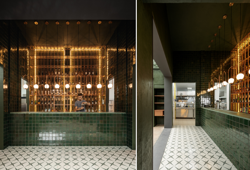
Santomate by Daniela Bucio Sistos // Taller de Arquitectura y Diseño, Morelia, Mexico

Art Deco is the epitome of making a statement, and lighting can be a big part of this. Illuminators with sleek or geometric forms can easily spruce up simple spaces. This is exhibited in the design of Santome — a restaurant and bar in Morelia Mexico. Globe lights attached to oblong profiles are suspended in a row over the bar. The setup also comprises recessed lighting in the same warm hue to create a halo effect.
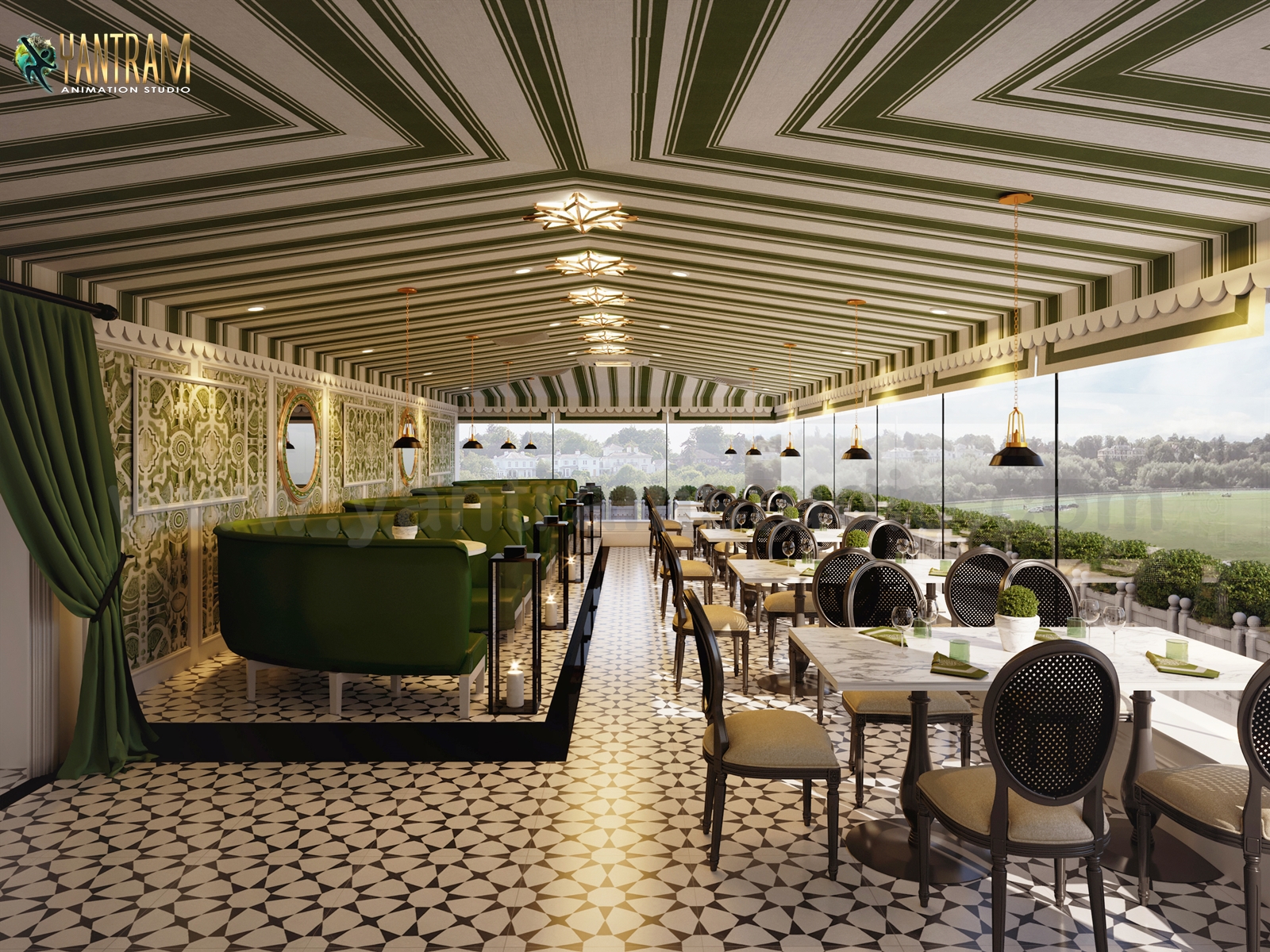
Project 1874: Photorealistic 3D Rendering Restaurant by Yantram Architectural Design Studio, Rio Rancho, New Mexico

In addition to floors or walls, patterns can also be introduced on the ceiling. In a conceptual design for a restaurant in New Mexico, the firm used a striped pattern in green and ivory to decorate the ceiling. The Art Deco theme is further reinforced with the addition of geometric starburst lights.
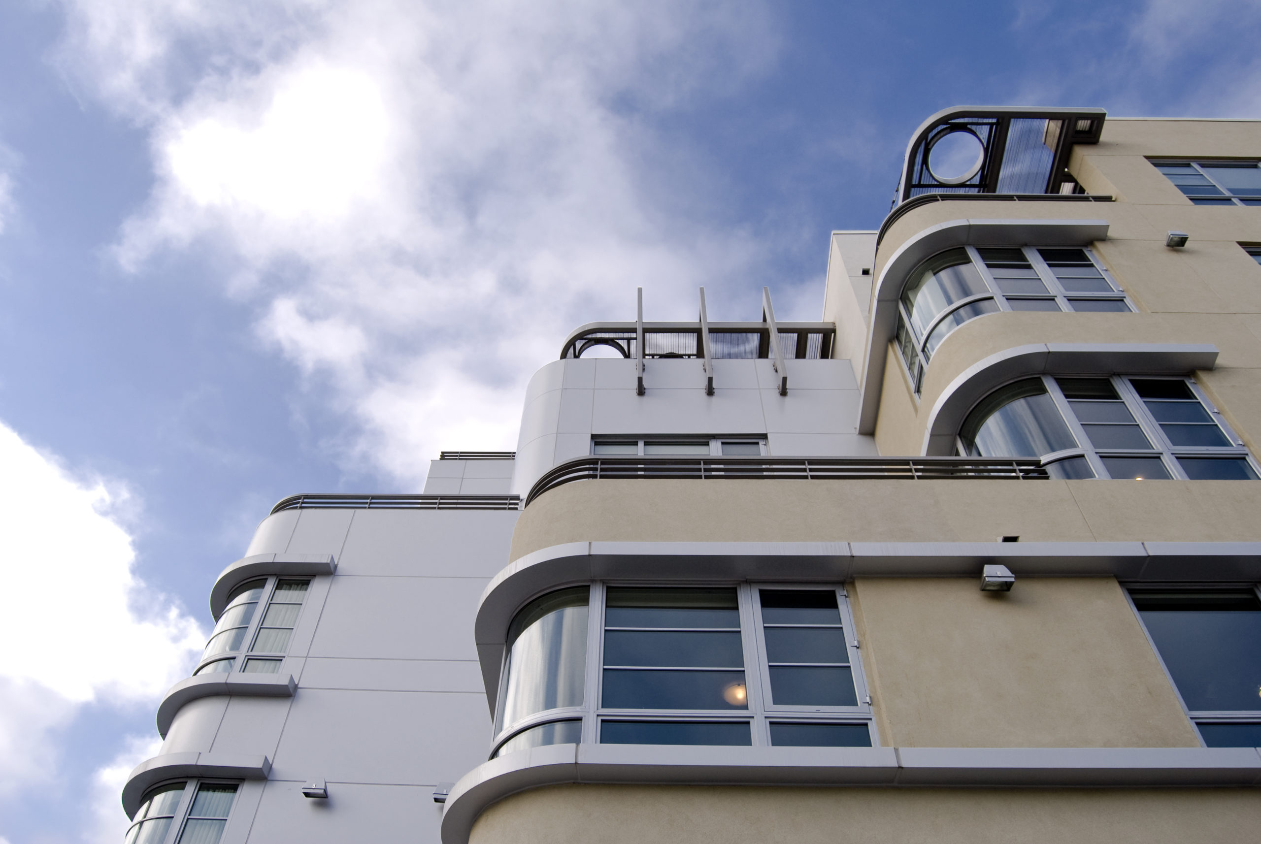
5550 Wilshire by TCA Architects, Los Angeles, California

The style manifests in different forms for the exteriors as well. The most iconic Art Deco buildings across the world often mimic lines and forms of old ocean liners. Curved edges, flat roofs, bands of windows, circular openings, horizontal bands, ship railings and ziggurat-shaped decorations are just a few examples. The 5550 Wilshire is a building that encapsulates this style masterfully. The horizontal mass of the structure is further broken up with vertical divisions to create the illusion of height.

Browse the Architizer Jobs Board and apply for architecture and design positions at some of the world’s best firms. Click here to sign up for our Jobs Newsletter.

Reference

7 Restaurants Serving Up an Industrial Aesthetic
CategoriesArchitecture

7 Restaurants Serving Up an Industrial Aesthetic

Architects: Want to have your project featured? Showcase your work through Architizer and sign up for our inspirational newsletter.    

Unfinished concrete surfaces, metal pipes, visible ducts, high ceilings and exposed structural systems are common sights in old factories and warehouses. However, in recent years, we have seen an increasing demand for this aesthetic in both residential and commercial spaces. Those remodeling old warehouses or pre-war buildings into homes have been choosing to preserve elements of their older structures. Some offices are incorporating similar design elements to make their spaces more trendy, and less clinical or formal.

The industry that has seen a massive adoption of this trend is the hospitality sector, especially in the past two decades. Restaurants and bars across the world are taking cues from old factories and playing with unfinished surfaces, metallic accents, industrial lights and heavy-duty hardware to create an atmosphere that is both nostalgic and modern. Designers have found several ways to soften these harsh materials and craft spaces that are welcoming. Below are just a few examples.

Images by Mikael Axelsson

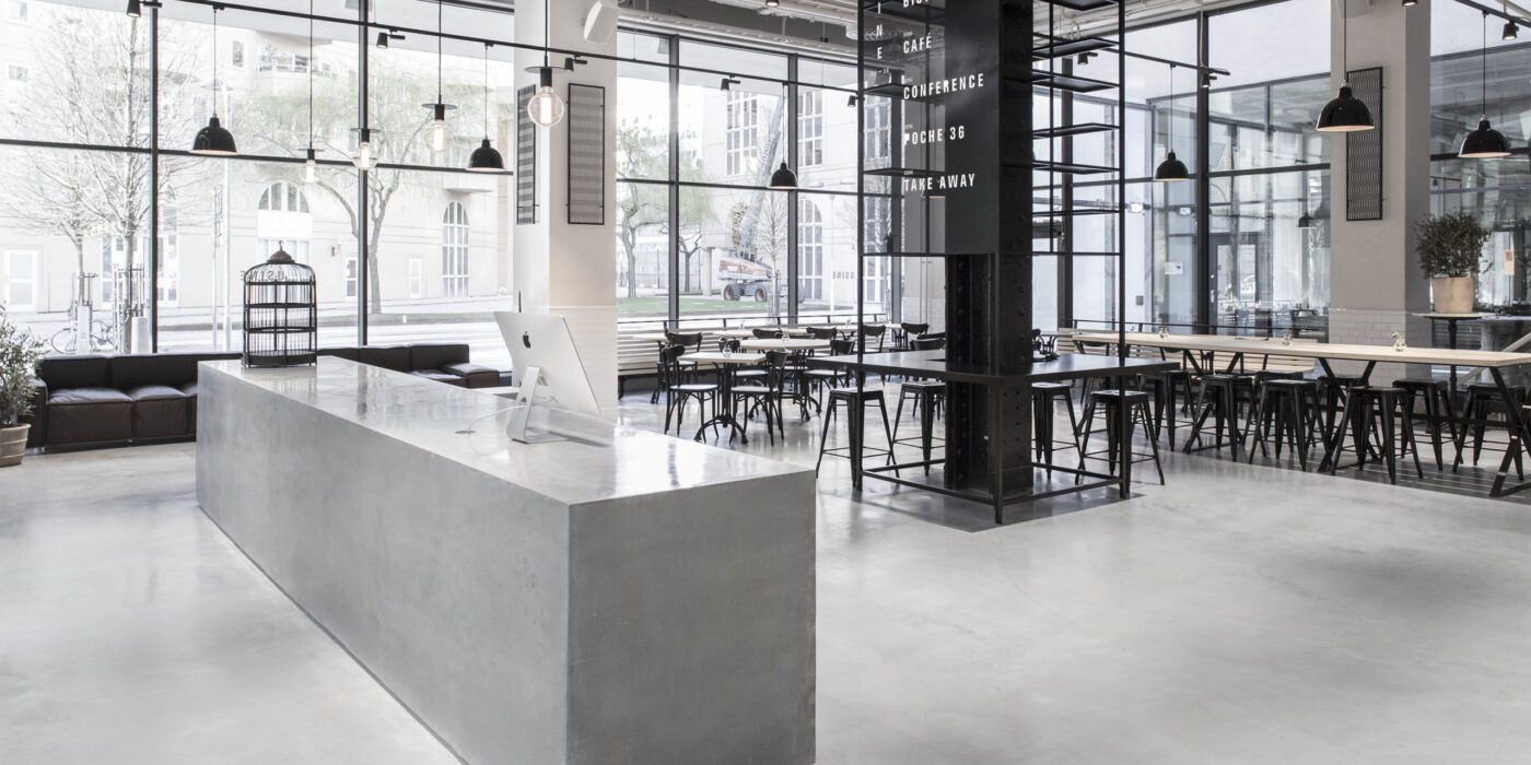
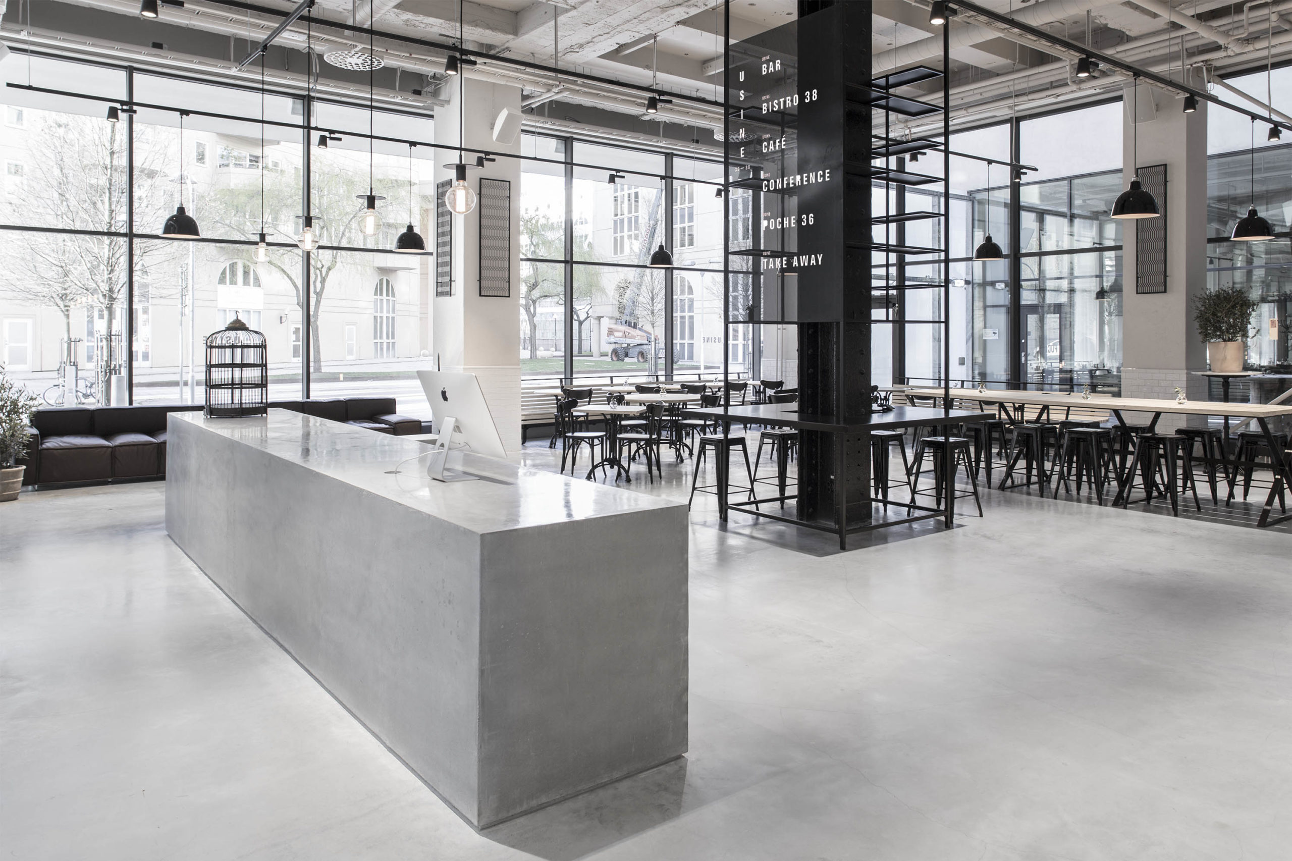
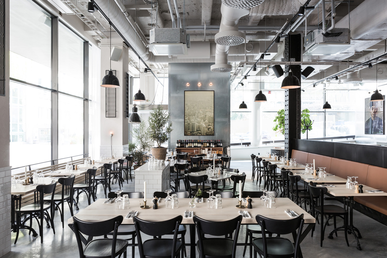
USINE by Studio Richard Lindvall, Stockholm, Sweden

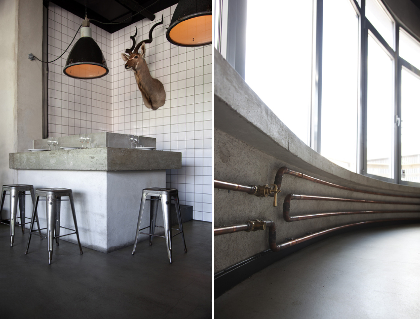
It is hard to tell that this restaurant and meeting area was once a sausage factory. The remodeled space combines Scandinavian minimalism with a more industrial aesthetic, while also referencing hotels in Shanghai, New York and Amsterdam. Materials like concrete, galvanized steel and black cast iron are softened with cognac leather and maple wood. All the ventilation systems are left exposed and painted in white. Light fixtures with bold black details are juxtaposed against this lighter canvas to strengthen the aesthetic.

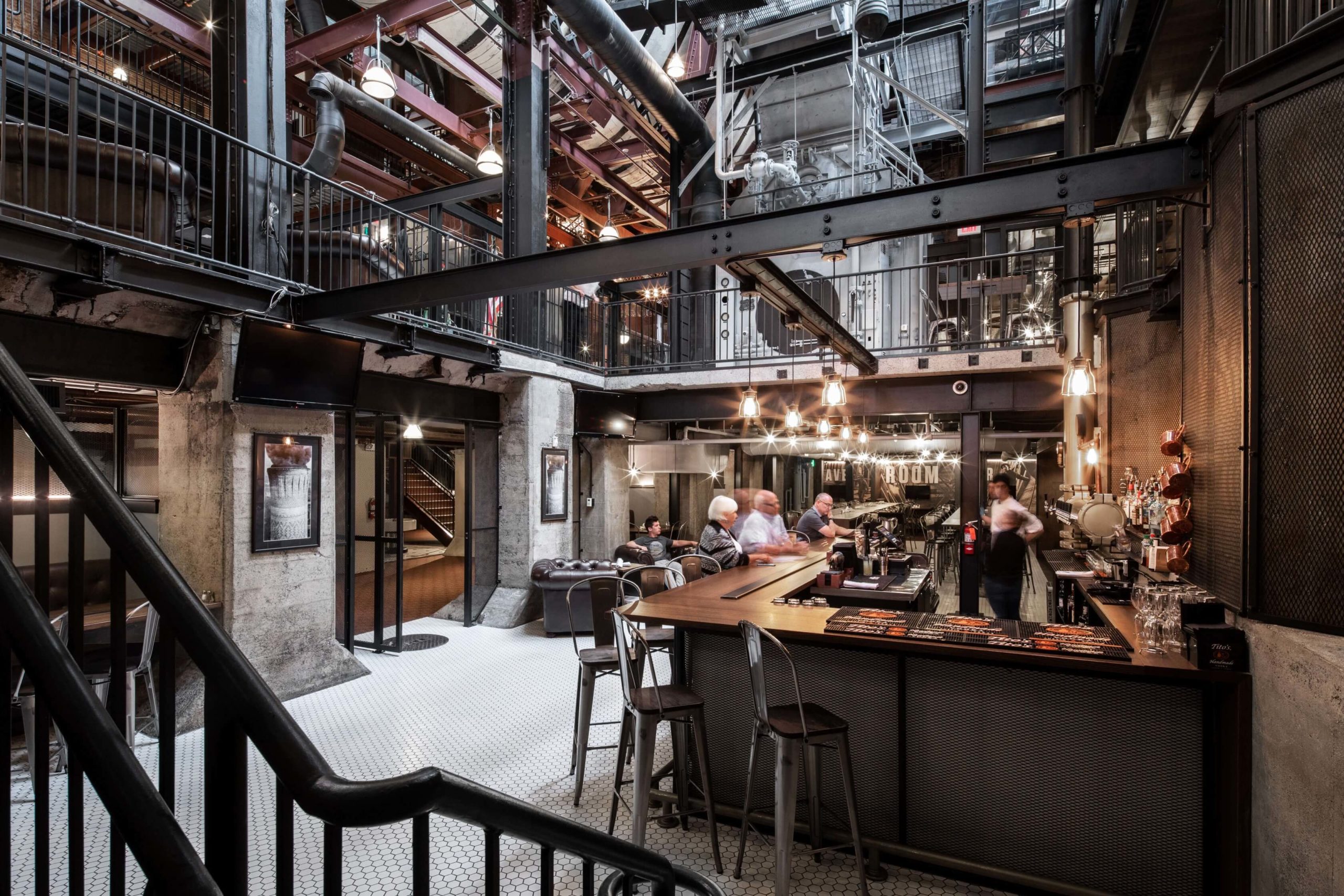
Spokane Steam Plant by HDG Architecture, Spokane, Washington
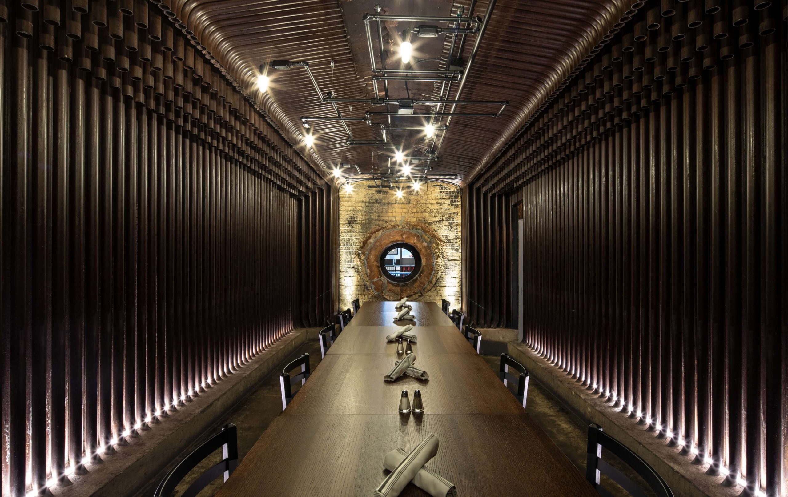
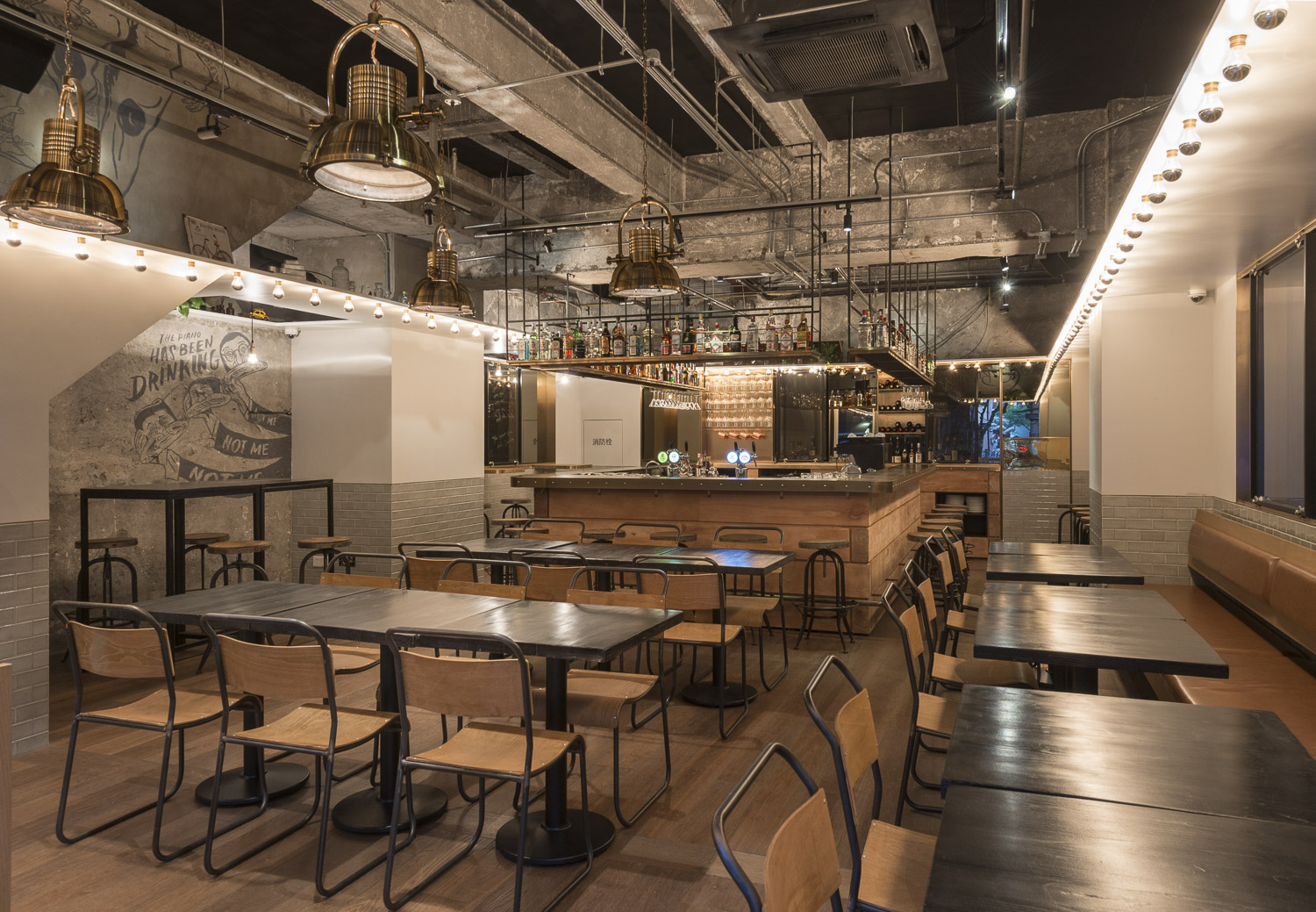
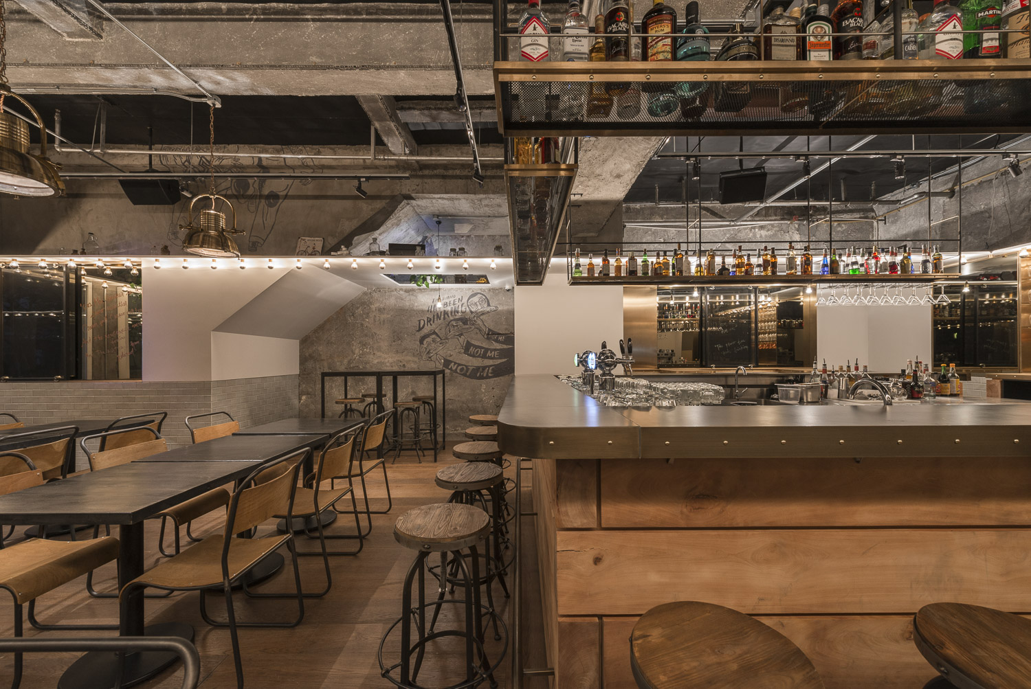
This restaurant design is conscious of the century-long history of the steam plant in Spokane. The metal columns and beams are not only left exposed but also painted in black to have them blend ini. These structural details are joined by black-tinted furniture, mesh-covered concrete walls, metal-backed chairs and dramatic pendant lights. Furthermore, the studio also used copper-toned pipes to create a drink dispenser at the bar.

Bicycle Thieves by Pierce Widera, Northcote, Australia
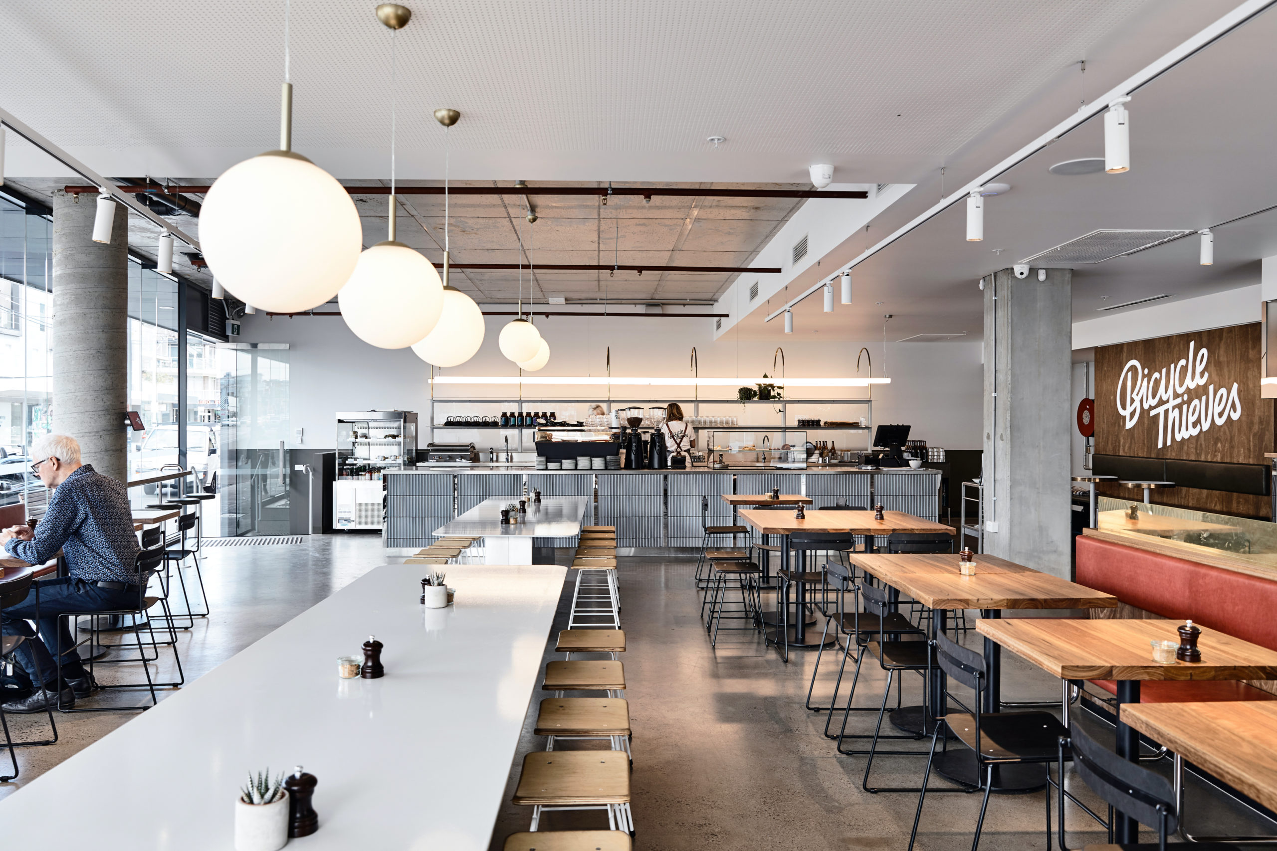
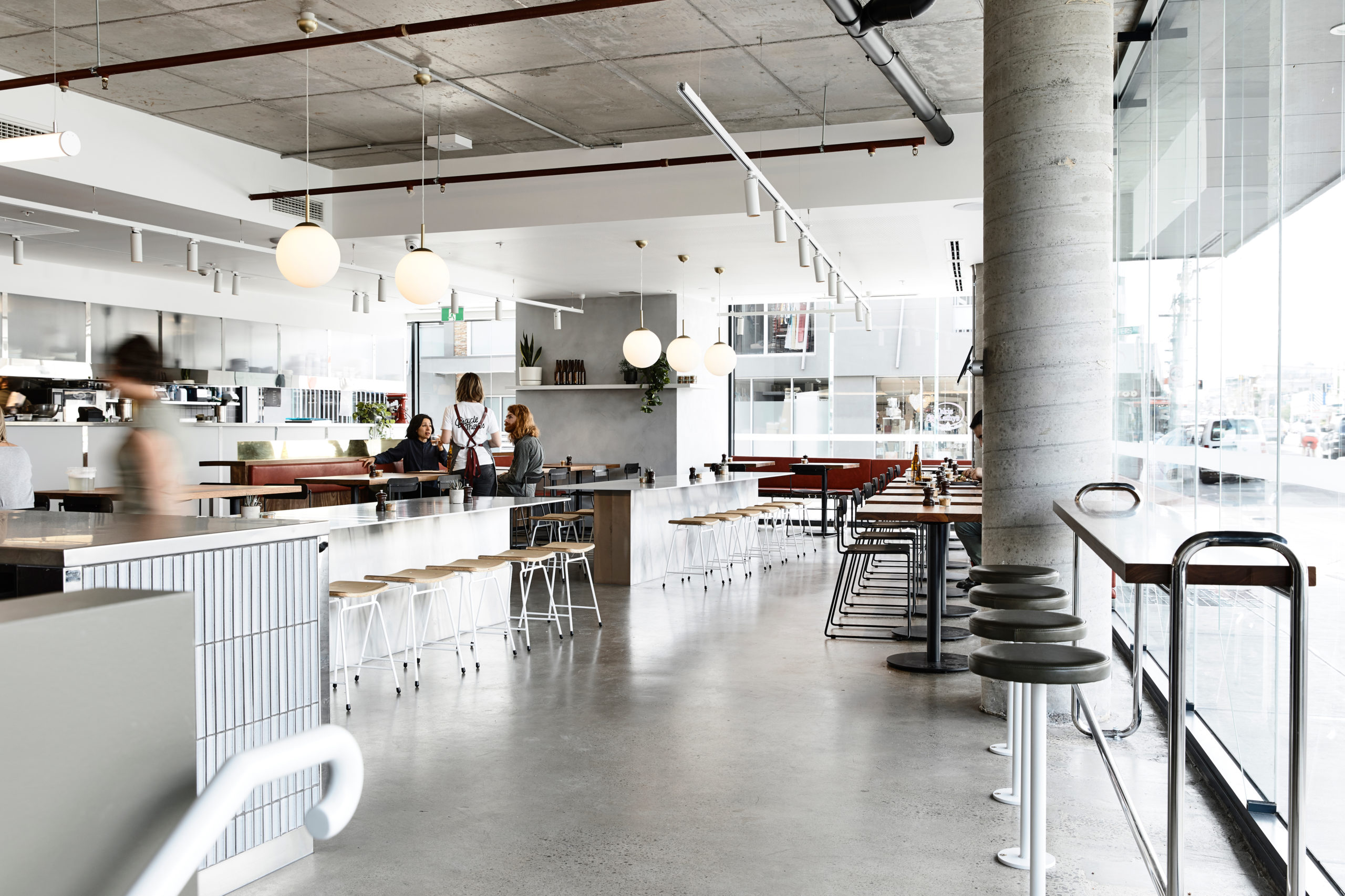
Named after the best-known film of Italian neorealism, this eatery is a lighter and fresher take on the traditional industrial style.  It references the late 1940s (when the film was released) with the use of mid-century modern materials and details. Suspended lighting acts as dividers, breaking up the open plan into smaller seating areas. Linear pendant lights are used above the bar, Globe lights over the communal tables and track lights around the periphery where the smaller tables are placed. Exposed concrete and cement finishes cove the walls, columns, floors as well as the ceiling.

Images by Dirk Weiblen

Tribeca by Linehouse, Shanghai, China

The New York-style gastropub evokes images of drinks with friends, city streets and late-night food cravings. The ceiling drops down in different parts to separate spaces. White false ceilings form the periphery whereas a suspended shelf canopy hangs over the bar. Mirror bulbs frame the entire space to infuse old-world glamour.

Restaurant & Bar Nazdrowje by Studio Richard Lindvall, Stockholm, Sweden
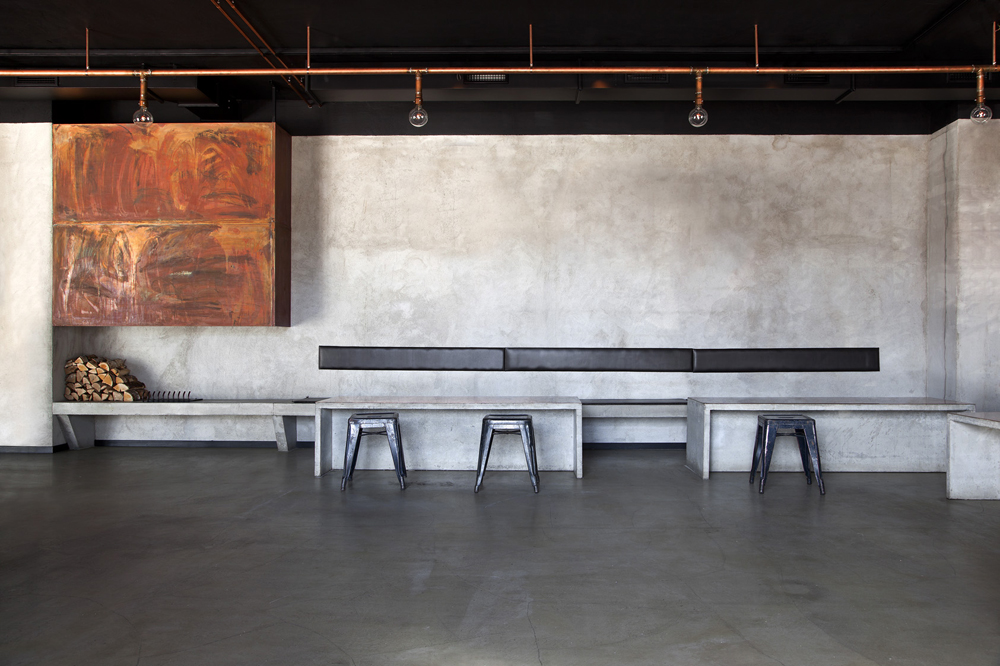
Minimal, raw and timeless: these words encapsulate the essence of Nazdrowje. The restaurant was initially a parking lot and the studio decided to use the natural atmosphere of the space as inspiration for the final design. Concrete is the predominant material in the space. The light grey concrete seats were cast and mounted directly into the walls, tying them with the concrete floors. The space also includes a large copper fireplace and visible copper pipes throughout.

Images by Andres Martellini

Victoria Brown Bar & Restaurant by Hitzig Militello arquitectos, Buenos Aires, Argentina

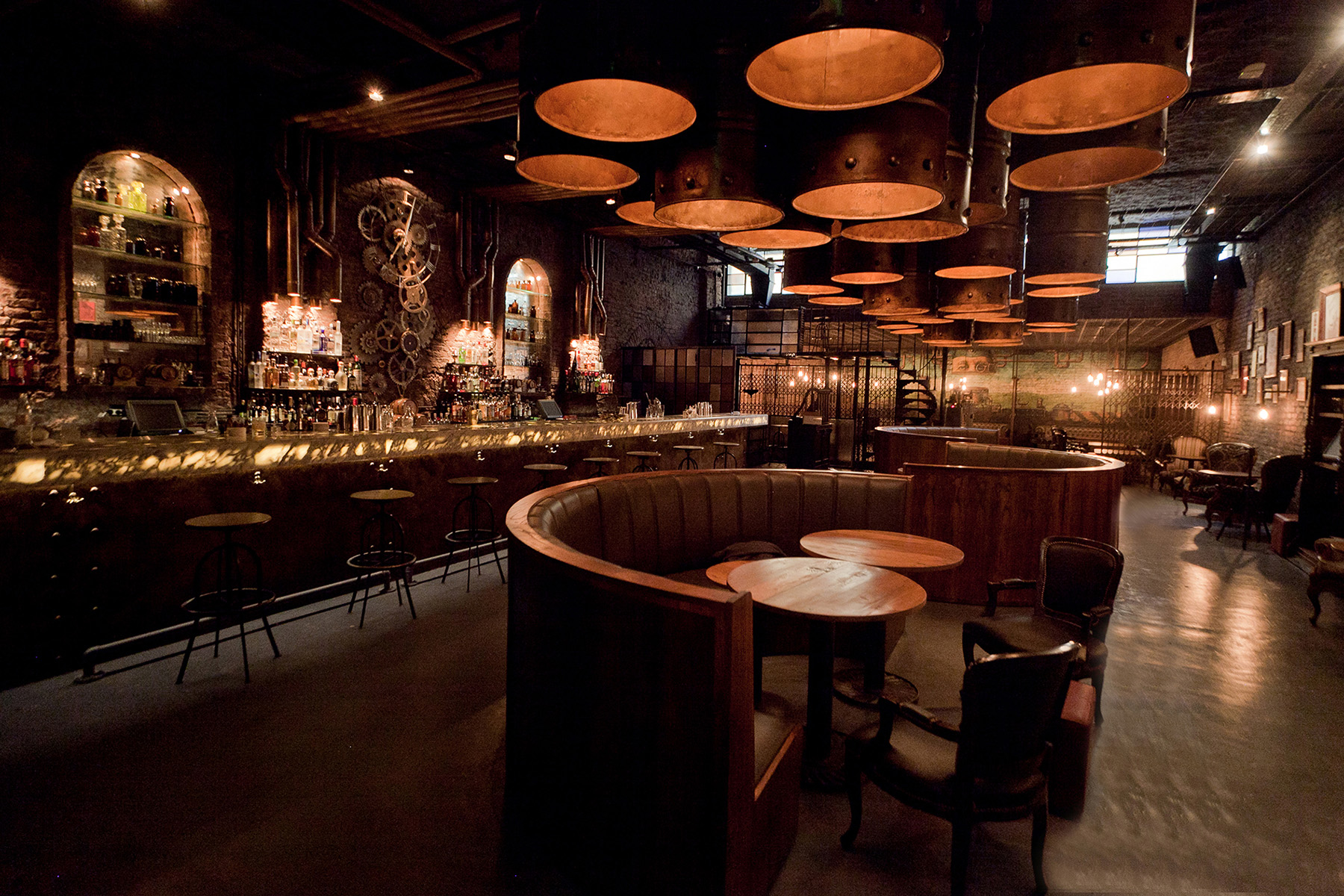
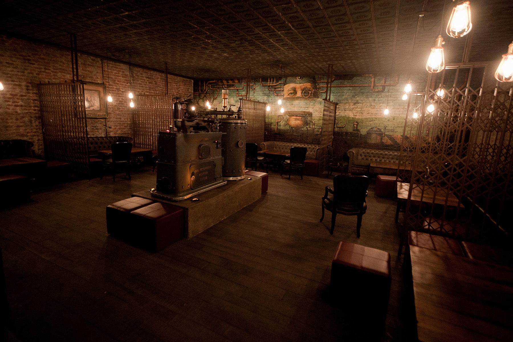
The bar has the mysteriousness of a speakeasy and the flash and flair of a private social club from the 19th century. Staying true to the theme, it also features a secret entrance through a coffee shop in the front. The space evokes nostalgia with a combination of elements like aging barrels, uneven brick walls, rich leather, vintage seating and suspended light bulbs. In one room, scissor screens break up the larger area into intimate pockets for small groups.

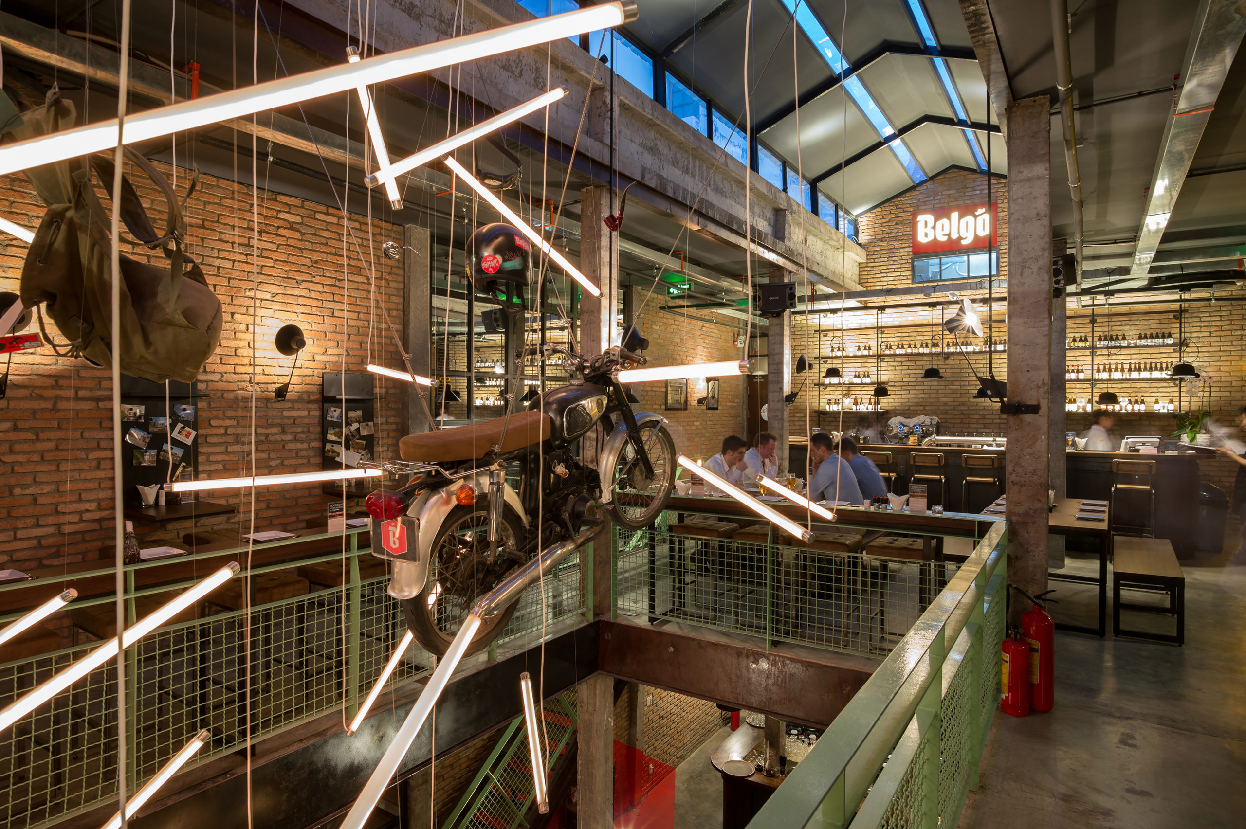
Industrial Brewery Pub in Saigon by T3 Architects, Ho Chi Minh City, Vietnam


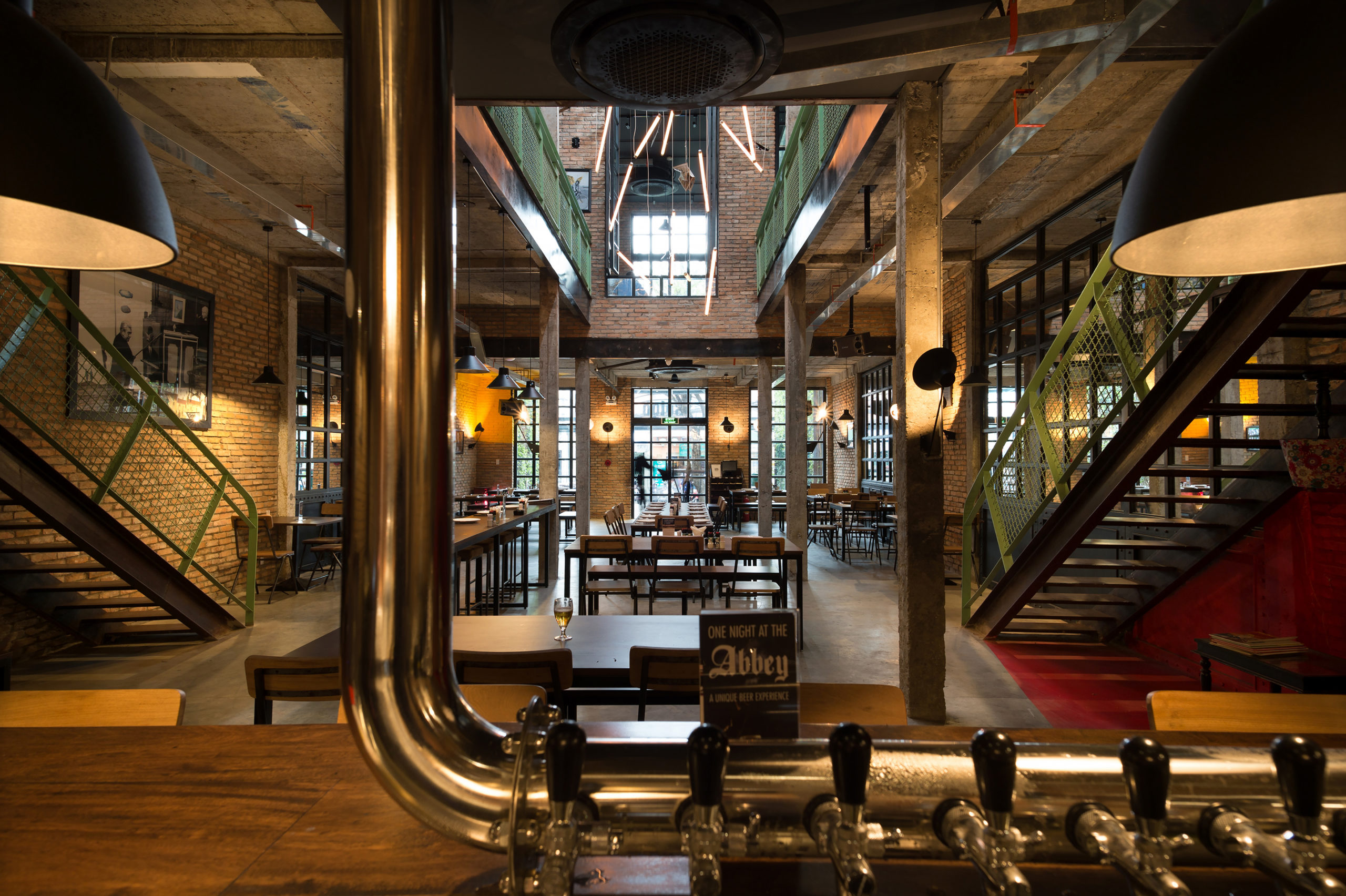
The studio wanted to adopt the industrial aesthetic from 20th century Europe given that the brewery serves Belgian beers and food. Traditional European elements have been given a tropical twist by using local ventilation mechanisms and ceiling fans. The design also uses second-hand bricks sourced locally to reduce the carbon footprint. Pops of green, black and white posters and photographs, hanging backpacks and a suspended motorcycle also bring in the humorous side of the Belgian culture.

Architects: Want to have your project featured? Showcase your work through Architizer and sign up for our inspirational newsletter.    

Reference

The Architecture of Escapism: 8 Dreamlike Renderings That Showcase Bold Utopian Environments
CategoriesArchitecture

The Architecture of Escapism: 8 Dreamlike Renderings That Showcase Bold Utopian Environments

Send Us a Rendering. Tell Us a Story. Win $2,500! Architizer’s 3rd Annual One Rendering Challenge is open for entries, with a Regular Entry Deadline of March 11th, 2022Submit a rendering.

Renderings are more than simple computer-generated images; they tell a story and help us envision how a space feels, is used and interacts within the surrounding environment. Architizer’s annual Rendering Competition the inspiring and striking architectural ideas made possible by architectural visualization. This rendering challenge provides designers with an opportunity to showcase their individual talents and distinctive imaginations.

At its best, ArchViz allows designers to explore the expansive potentiality of what architecture can be through surreal imageries that engage with the absurd, the paradoxical, and escapism. Each of the eight renderings offers a dreamlike vision. Whether it be an idyllic setting, a fascinating paradox, or a dream-like scene, each rendering highlights the fantastical possibilities of bold utopic environments and pushes the boundaries of what an architectural rendering can be — a chance to escape reality. 

Floating Vestiges by Timlok Li

Timlok Li’s rendering takes the viewer off-ground and into the sky. His rendering challenges the notion of architecture as permanent and site-specific, encouraging us to engage in the idea of impermanence. Floating Vestiges is hard to categorize as it flees from a defined architectural style. Instead, it embraces various styles and practices from different eras and periods. From American roadside architecture to imperial China, this floating structure is an amalgamation of historical periods and thus creates an inviting space for all walks of life.

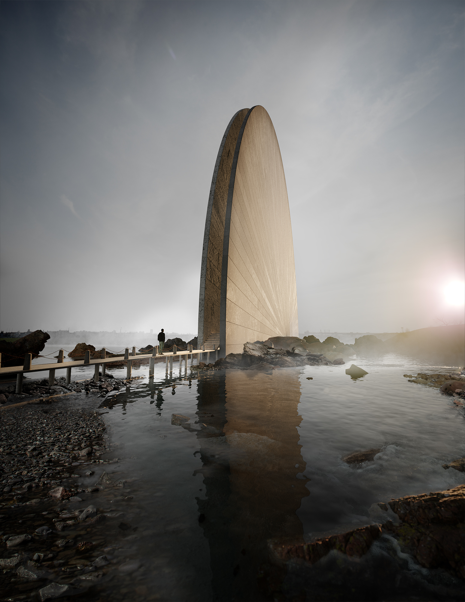
The House of the Rising Sun by Bogdan Begmat

Bogdan Begmat’s paradoxical rendering is seemingly warm as it is brutalist. Made of poured concrete, this monolithic design boasts a warm brutalist aesthetic with a reflective façade. The rounded structure is at once muted through its monochrome appearance and, yet, defiant as it stands tall within the skyline. The building reflects onto the water surface below in what amounts to an almost subliminal effect. The juxtaposition of harsh and warm effects speaks to a surrealist aesthetic. Still, with the help of the surrounding peaceful landscape, a warm and inviting atmosphere is imagined.

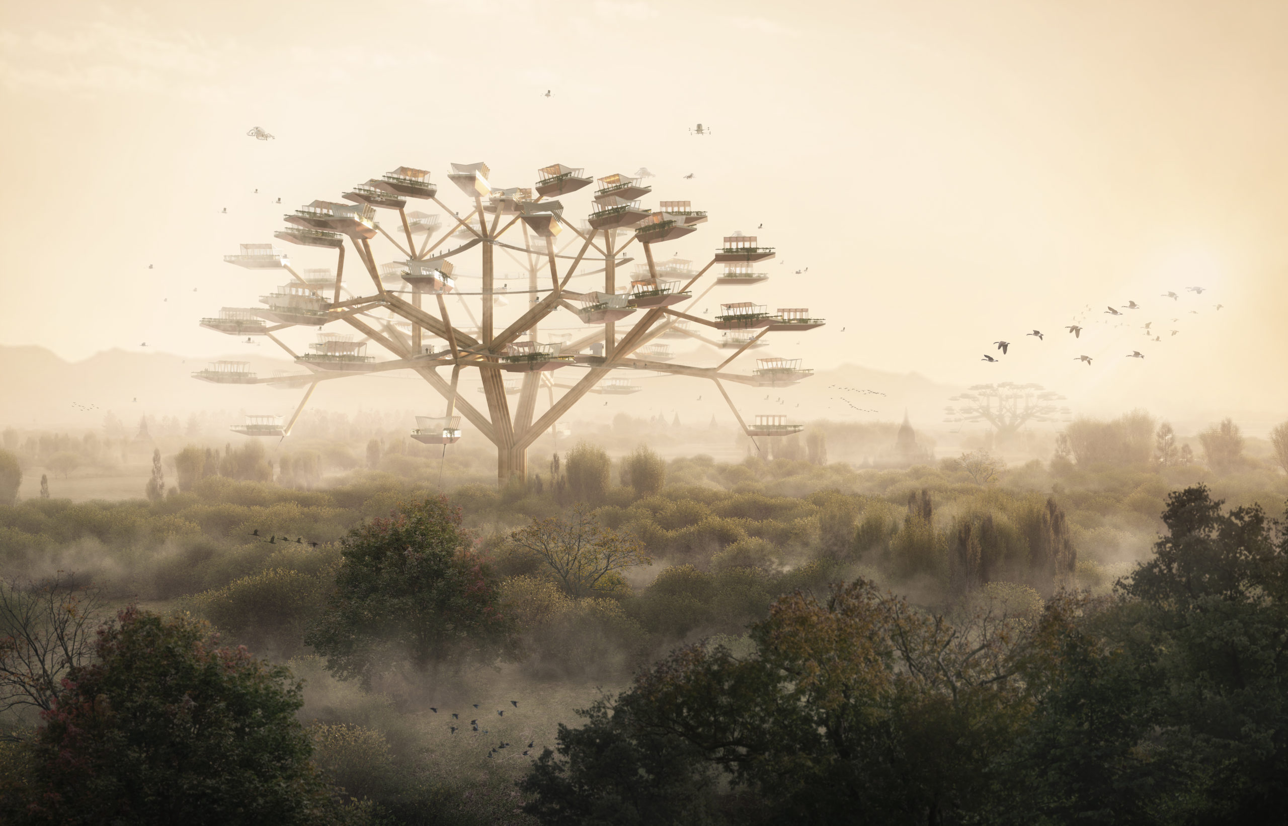
Joint Structures by Nash Hurley, Jean-Pierre Monclin and Sonja Guth

A collaborative effort by three architects produces a rendering that responds to society’s ever-changing work culture. Remote work currently dominates over the traditional office space, and this change has required designers to pivot and evolve their practices. This rendered design concept imagines a healthy, functional, and environmentally-conscious workspace. It consists of a skyscraper made of a cluster of separate volumes, all of which are attached in a motif that creates a tree-like design. The workspaces within the structure offer ample daylight and access to fresh air, which encourages good work habits and good health. Moreover, the separated volumes are ideal for small workgroups while equally remaining connected to the others and thus creating a sense of communal belonging.

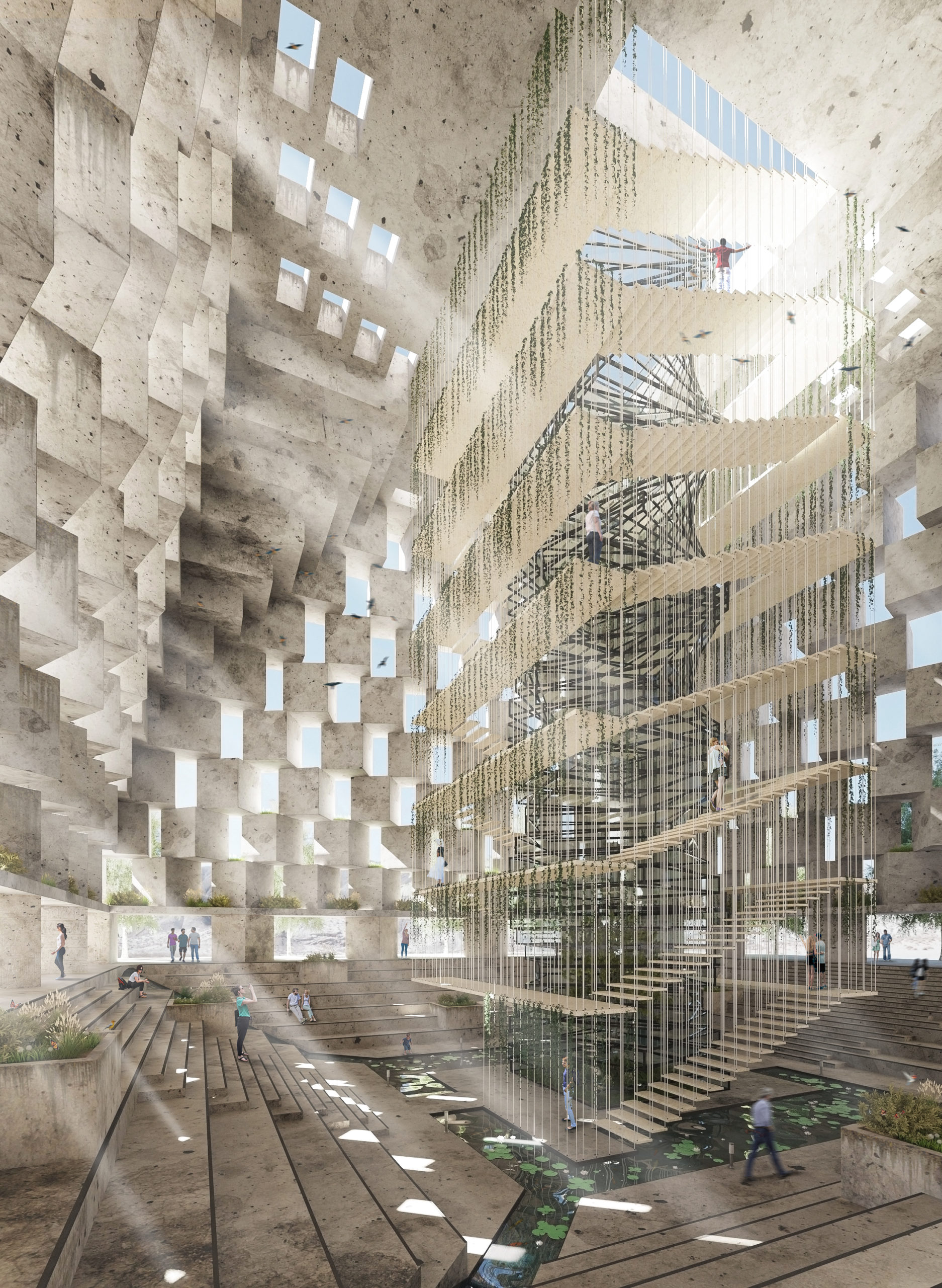
The Oasis by Nuno Salgueiro

Nuno Salgueiro’s rendering features a pyramid within the middle of a desert and reveals a surreal and oxymoronic design. It employs the traditional tomb structure — a space once used to commemorate the dead — but instead designs an environment for the living. The Oasis is a structure that provides shelter, rest, and a chance to appreciate the surrounding desert topography. The interior is a light spectacle, a space where visitors can appreciate the radiating sunlight that shines through a series of intricately-cut openings. The focal point is the grand staircase, which leads guests to the top of the pyramid and where they can contemplate the surrounding desert landscape.

ISAURA, A city that moves entirely upward by Maria Karim
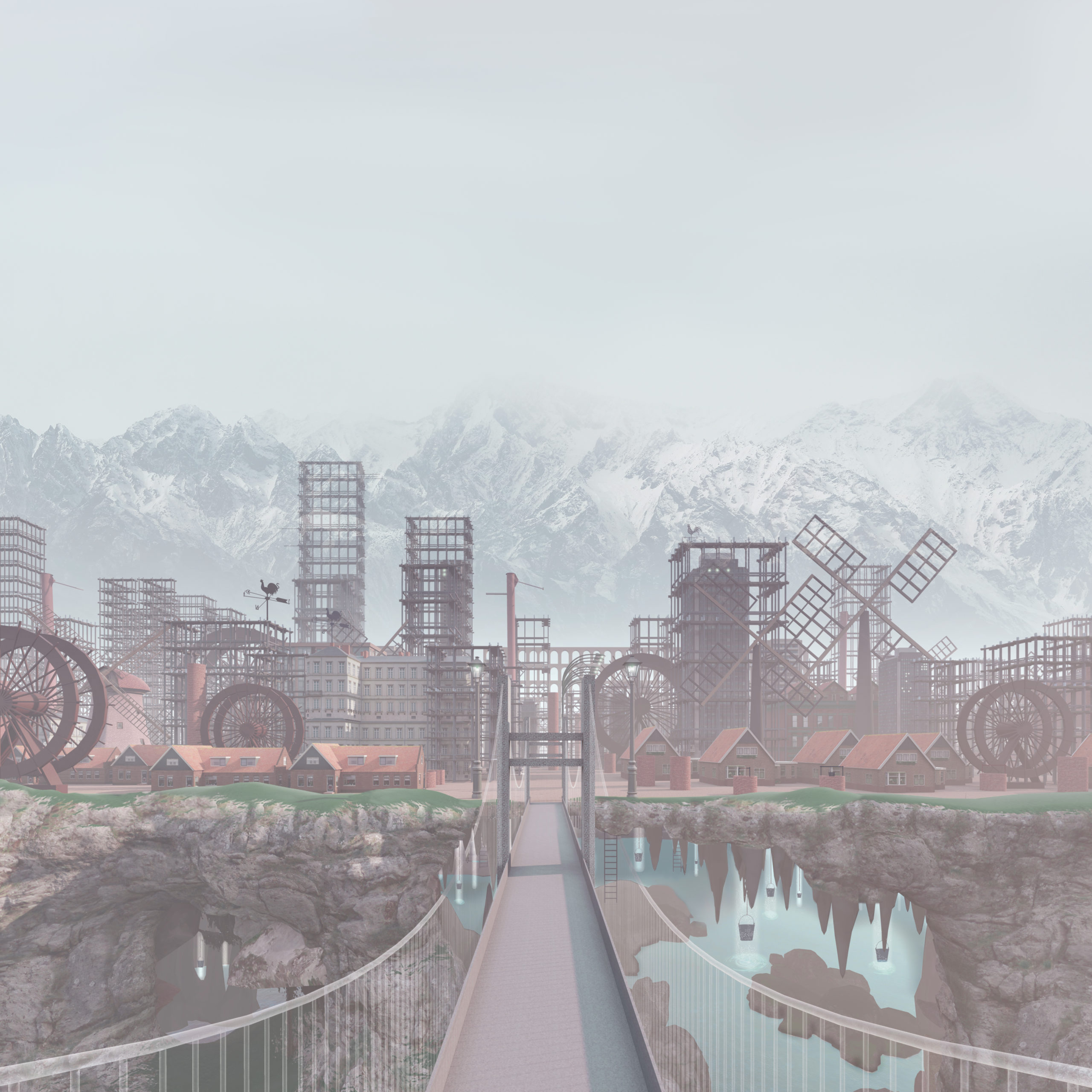
Maria Karim’s city design takes inspiration from the works of Italian writer Italo Calvino. His imaginative writing and description of cities influenced Karim to design ISAURA, a city that is oriented upwards. Karim’s city design is built above a subterranean like — just as Calvino describes it to be. The lake provides residents with fresh drinking water and also houses many of the city’s gods. This unconventional city organization speaks to Calvino’s vivid imagination and excites our surreal senses.

The Crevasse by Yeong Joon Ko

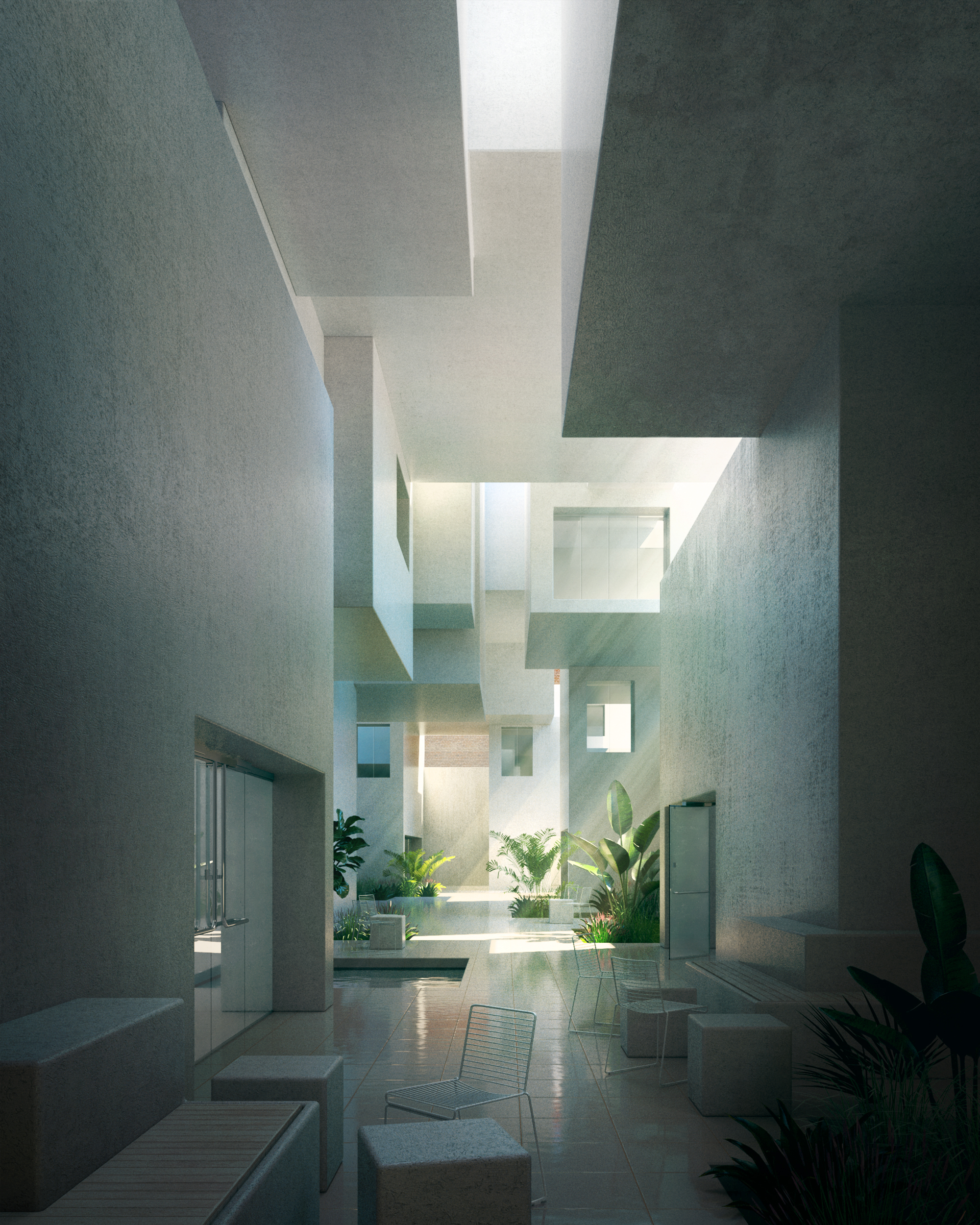
Yeong Joon Ko’s light-filled gallery was intended for Hongik University in Seoul, South Korea. The space is cubic, boxy and exudes a tranquil morning atmosphere. A series of box-shape volumes were assembled in such a way that creates an arched path that leads visitors to a public space below. A sequence of crevasses and cut-outs connect the space with the outdoors and allows streams of sunshine to brighten the interior space. The rectangular shapes work together with the soft beams of lights to create a calm and warm gallery space.

Enter the Garden by Zana Bamarni

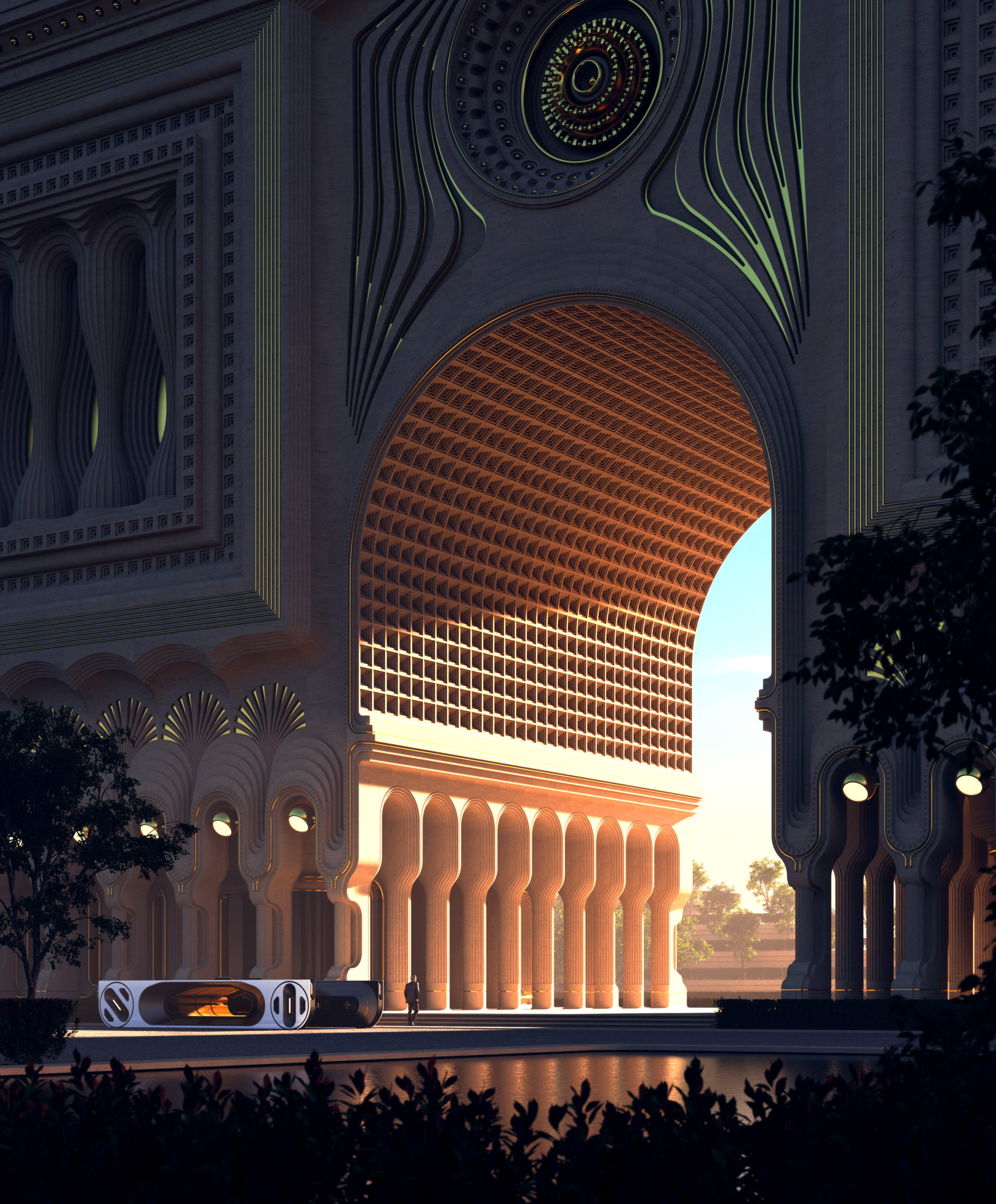
Zana Bamarni’s rendering invites the viewer to a light-filled haven. Enter the Garden is designed to be a tranquil space where for those in need to escape their chaotic and often frustrating work lives. The structure consists of a rounded archway that is deeply ornamented and stands with grandeur. Shining through the archway is a radiating, almost blinding light. What lies beyond the archway is unknown, but the fierce light and large scale create a sense of mystery and a deep urge to explore what may be lying ahead.

Solivagant No More by Joe Parayno

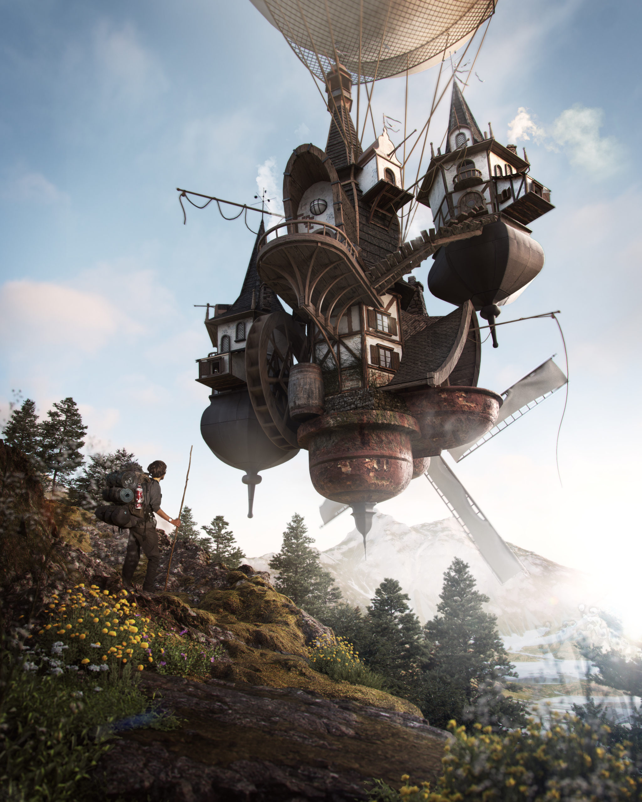
Joe Parayno rendering embodies the widely-felt fear of the pandemic, the intense fatigue of isolation and the desperate desire to travel. This design consists of a home hitched on a giant balloon, which allows the structure to fly freely in the sky. This illustrative rendering depicts a hiker who comes across the flying house and joins the owner of the home on a traveling adventure. Both individuals connected over their shared urgency to travel and see the world. The home is a surreal take on the human necessity for freedom and mobility.

Send Us a Rendering. Tell Us a Story. Win $2,500! Architizer’s 3rd Annual One Rendering Challenge is open for entries, with a Regular Entry Deadline of March 11th, 2022Submit a rendering.

Reference