Architizer’s new image-heavy daily newsletter, The Plug, is easy on the eyes, giving readers a quick jolt of inspiration to supercharge their days. Plug in to the latest design discussions by subscribing.
Amidst the ever-changing urban landscapes characterized by towering structures and bustling streets, there is a captivating force that deserves attention: color. In these concrete jungles, color holds the key to turning ordinary public spaces into vibrant havens that capture the imagination and uplift the spirits of passersby.
From the soothing blues that bring tranquility to the energetic bursts of red that ignite passion, color plays a vital role in shaping our emotions. It’s no wonder that architects and urban planners are constantly on the lookout for new and innovative ways to harness its transformative potential.
In this article, we’ll showcase six inspiring use cases that celebrate the magic of color and serve as a testament to its ability to create dynamic and engaging environments. From China to Canada, these chromatic interventions will demonstrate how color breathes life into spaces and offers enjoyable experiences for all.
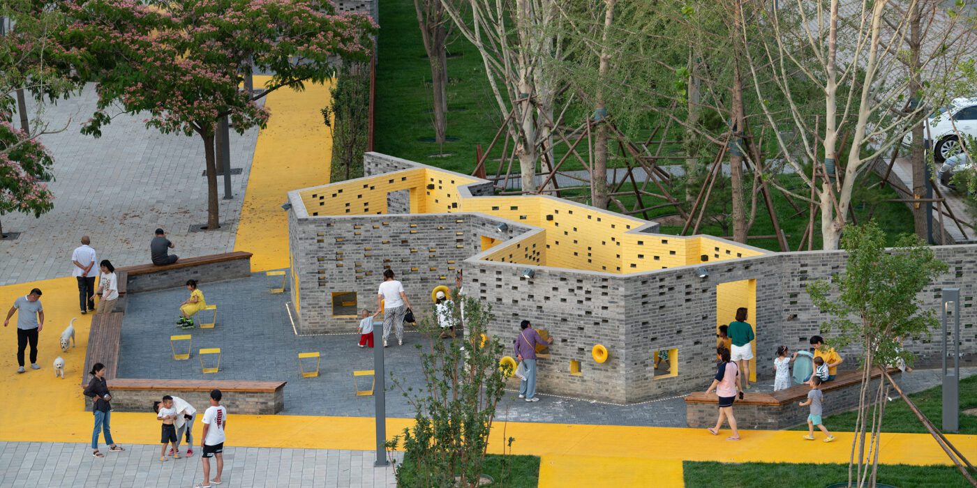
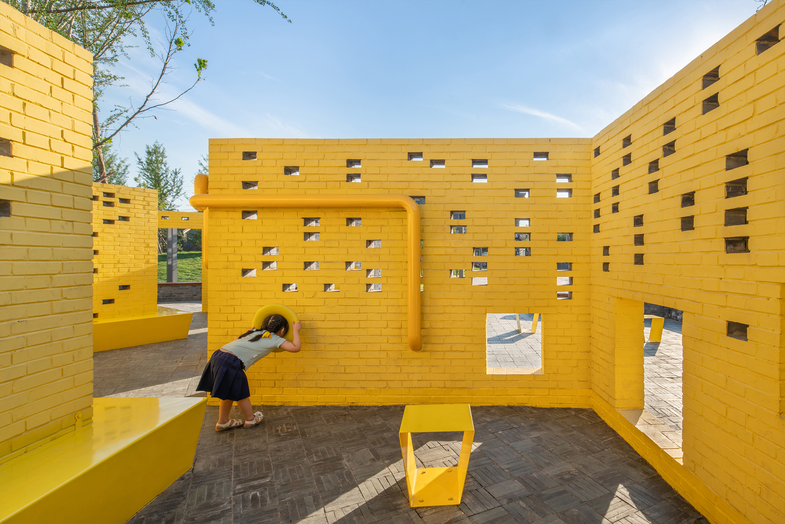
Songzhuang Micro Community Park
By Crossboundaries, Tongzhou, Beijing, China
Popular Choice, 2022 A+Awards, Architecture +Community
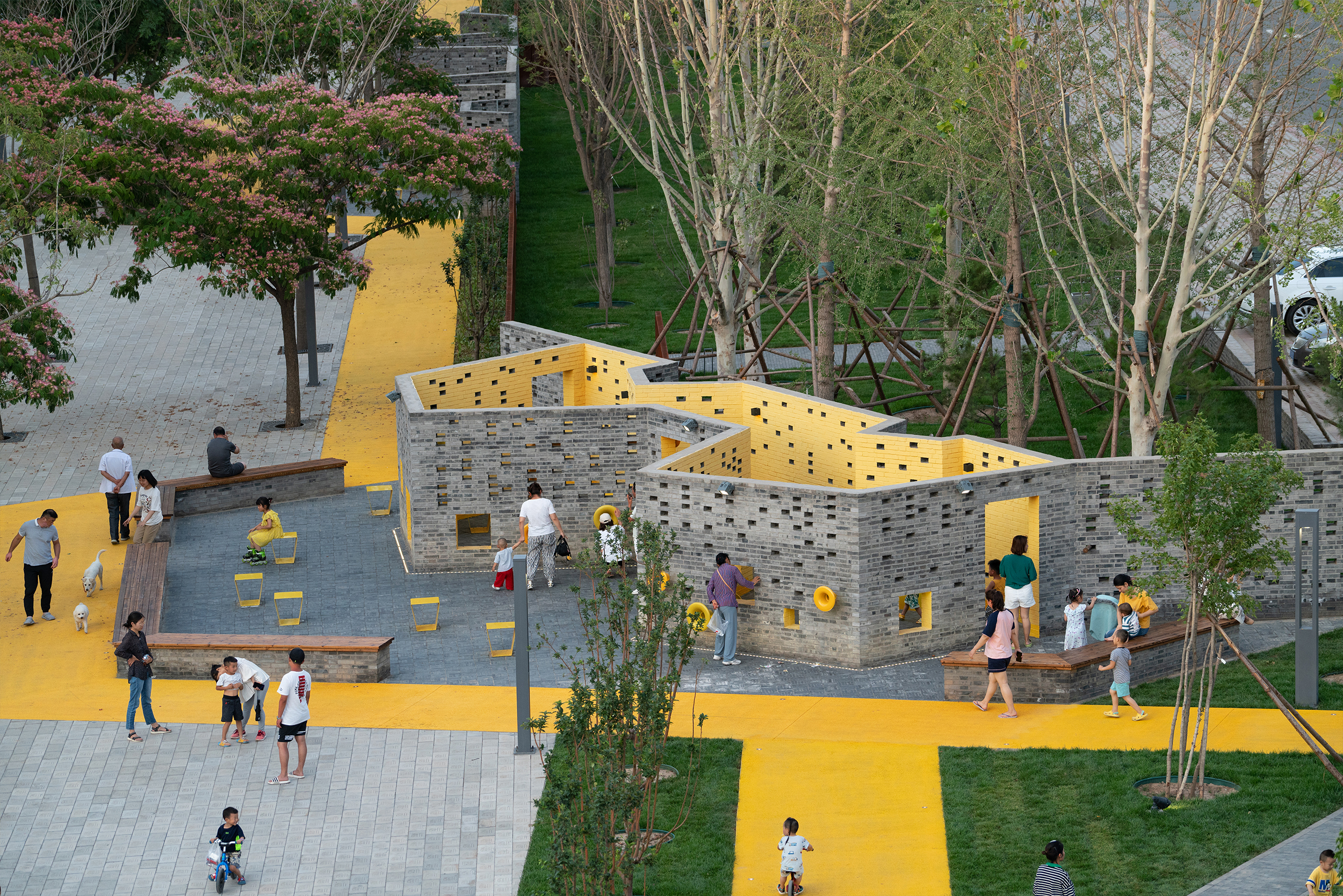
 Situated in the vibrant art village of Songzhuang, this park was specifically designed to cater to the diverse needs of both artists and the local population. Color plays a pivotal role in capturing attention and creating an inviting atmosphere within the park.
Along with connecting various outdoor “rooms,” a yellow track serves as a visual link between different areas. This track not only physically connects the spaces but also injects vibrancy and dynamism into the overall design. The park incorporates colorful accents, such as a vivid yellow room for children’s play and alternating perforated grey brick walls with double layers of perforated Corten steel. Through strategic color choices, the Songzhuang Micro Community Park stands out as an exemplary well-designed public space that promotes well-being, social interaction and artistic engagement within the community.
POPCourts!
By Lamar Johnson Collaborative, Chicago, IL, United States
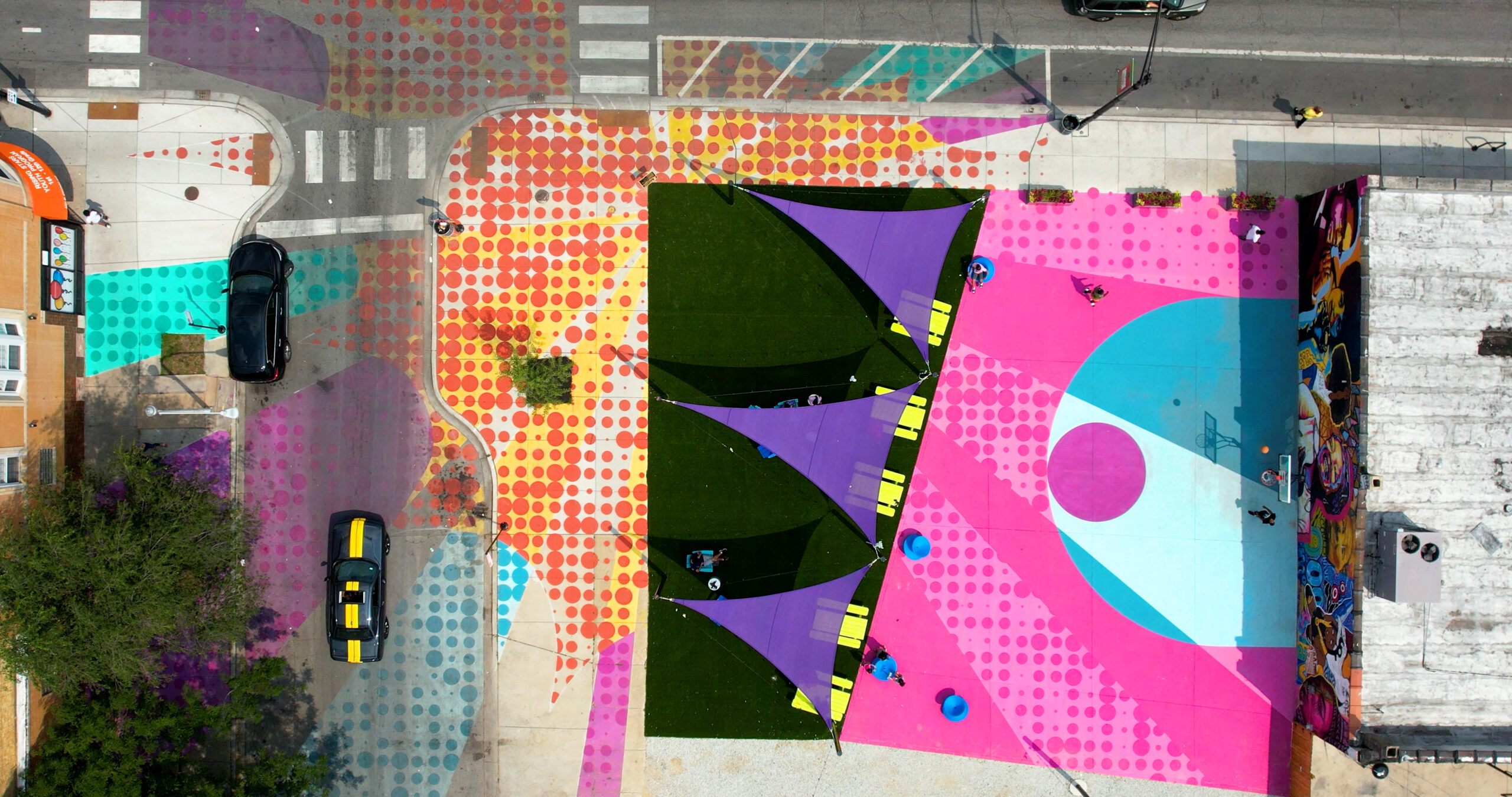
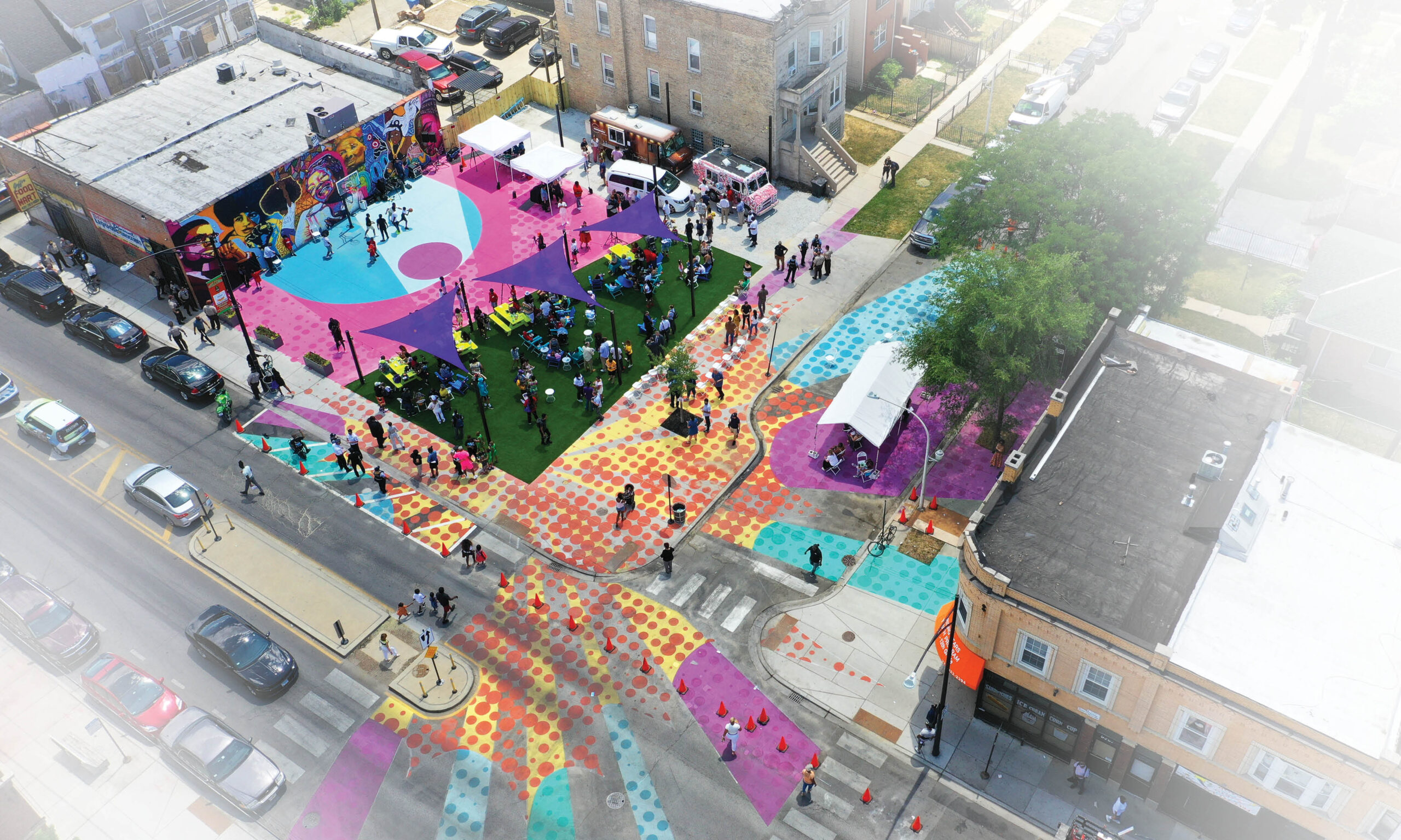 PopCourts is a vibrant pop-up park in Chicago’s Austin neighborhood that served as an outdoor haven during the pandemic. It exemplifies the transformative power of community, collaboration and innovative design in revitalizing underutilized spaces. Color plays a central role in PopCourts, reflecting the neighborhood’s energy and cultural identity. The bold color palette creates an engaging backdrop for community events. Divided into three zones, the park offers versatile spaces. The basketball court doubles as a community plaza, while the gravel drive hosts food trucks and vendors. The shaded lawn becomes a food court with seating. Artwork, including murals of influential figures and a Pop Art theme, unifies the space and celebrates the community’s history.
Paint Drop
By 100architects, Shanghai, China
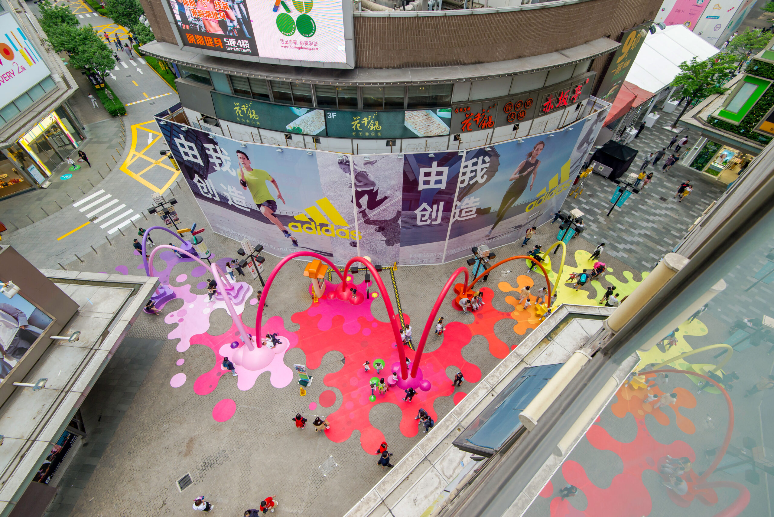
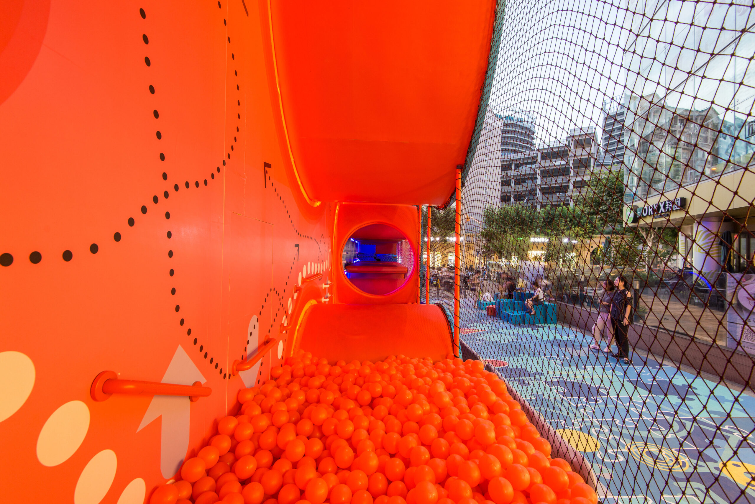
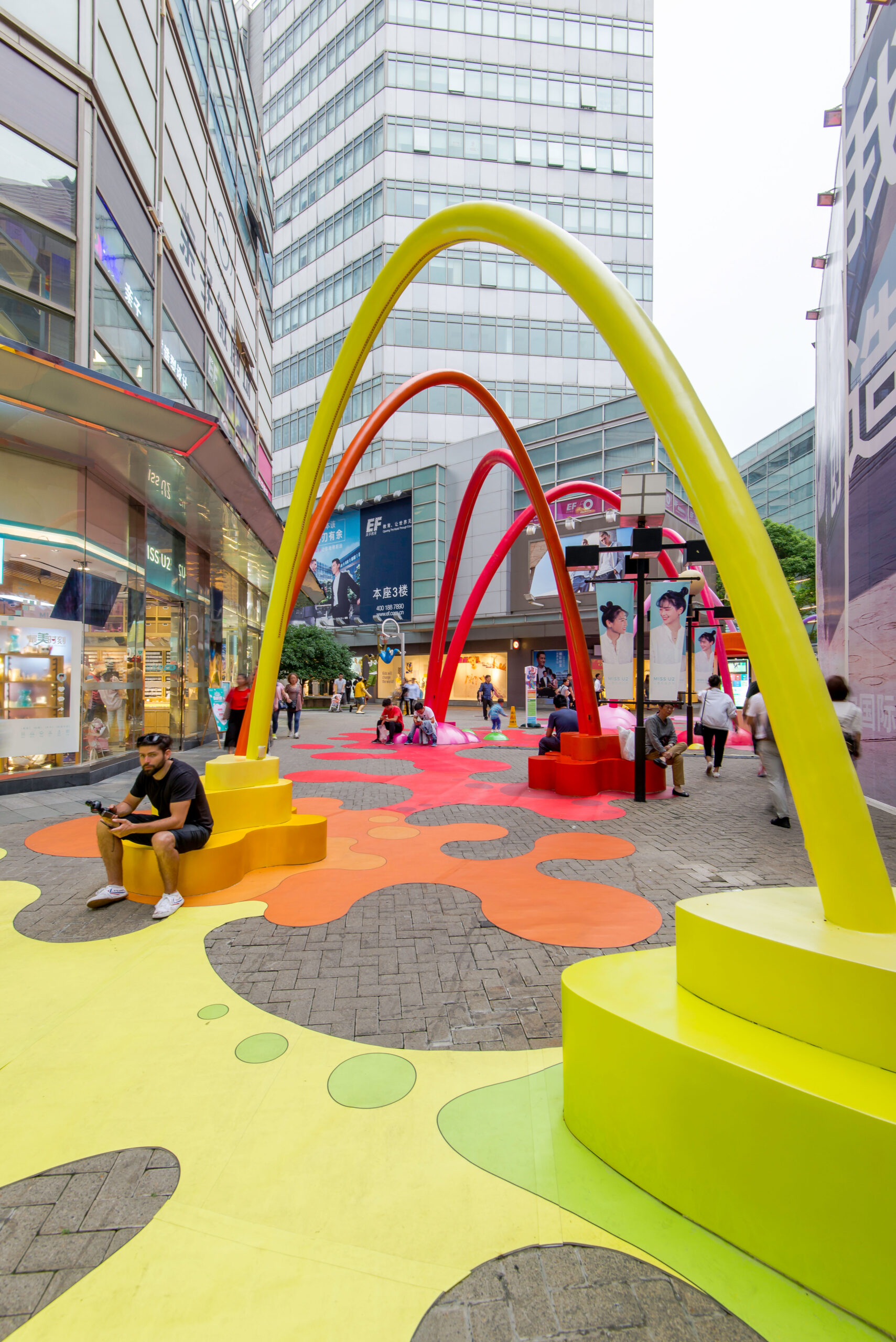 The Paint Drop project is a visually captivating public space intervention that effectively utilizes color to create a noticeable, attractive and vibrant environment. The primary goal of the installation was to draw attention to a newly opened retail space and entice pedestrians to explore it. To achieve this, a tunnel of splashing color paint was designed as the central theme.
The installation features a series of interconnected catenary arches that span along the intended path, resembling paint dropping from above. As the arches reach the ground, vibrant splashes of color form functional seating features and resting areas. The immersive floor graphics further enhance the experience, creating an engaging and visually striking atmosphere. To add an interactive element, the arches are equipped with a lighting system that is triggered by movement sensors, illuminating flexible LED strips embedded within the arches as people pass by. This combination of dynamic colors, interactive lighting and playful design successfully transformed the area into a hotspot, attracting both children and adults and increasing pedestrian circulation in the desired location.
Face to Face | Tête à Tête
By PLANT Architect Inc, Toronto, Canada
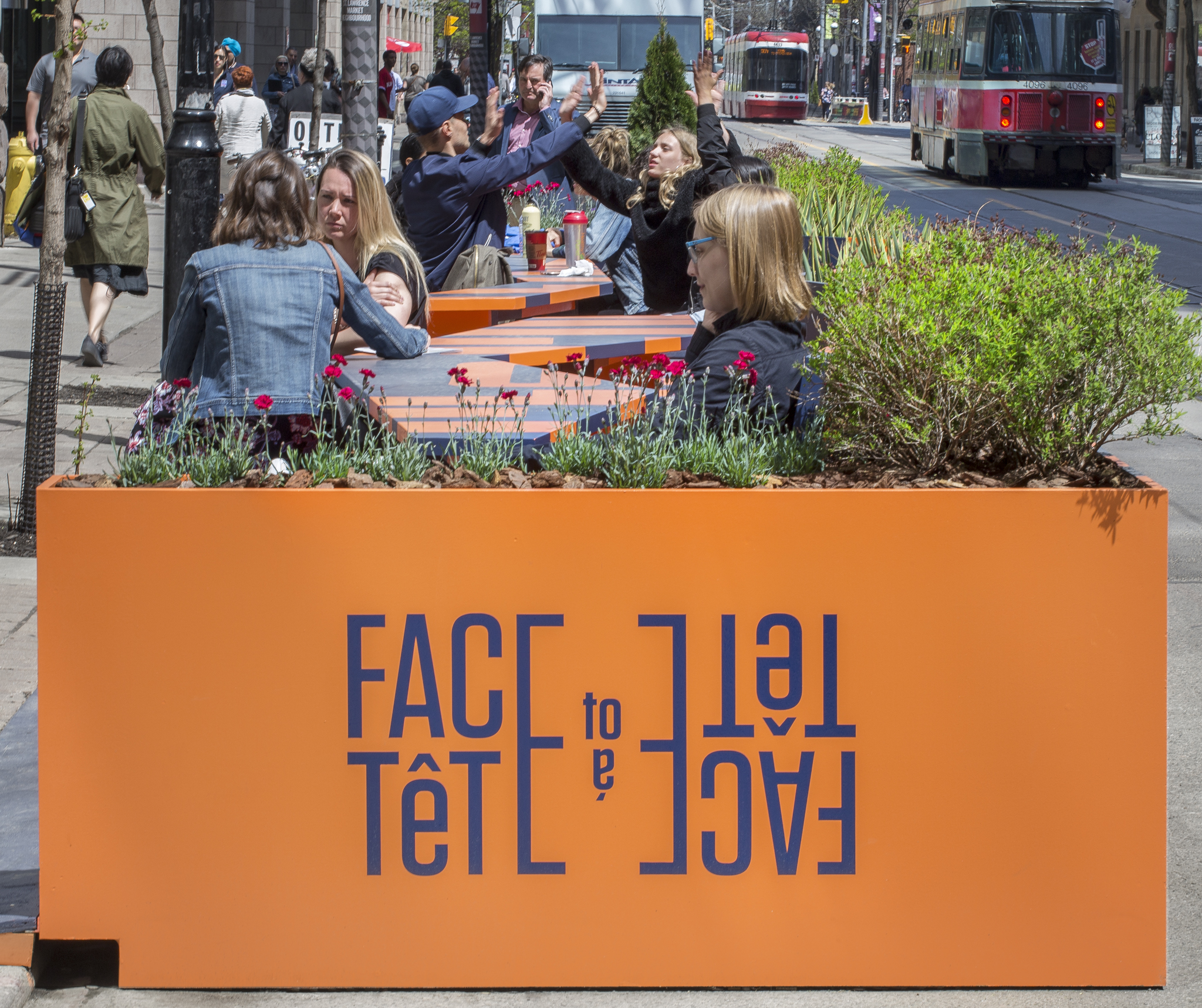
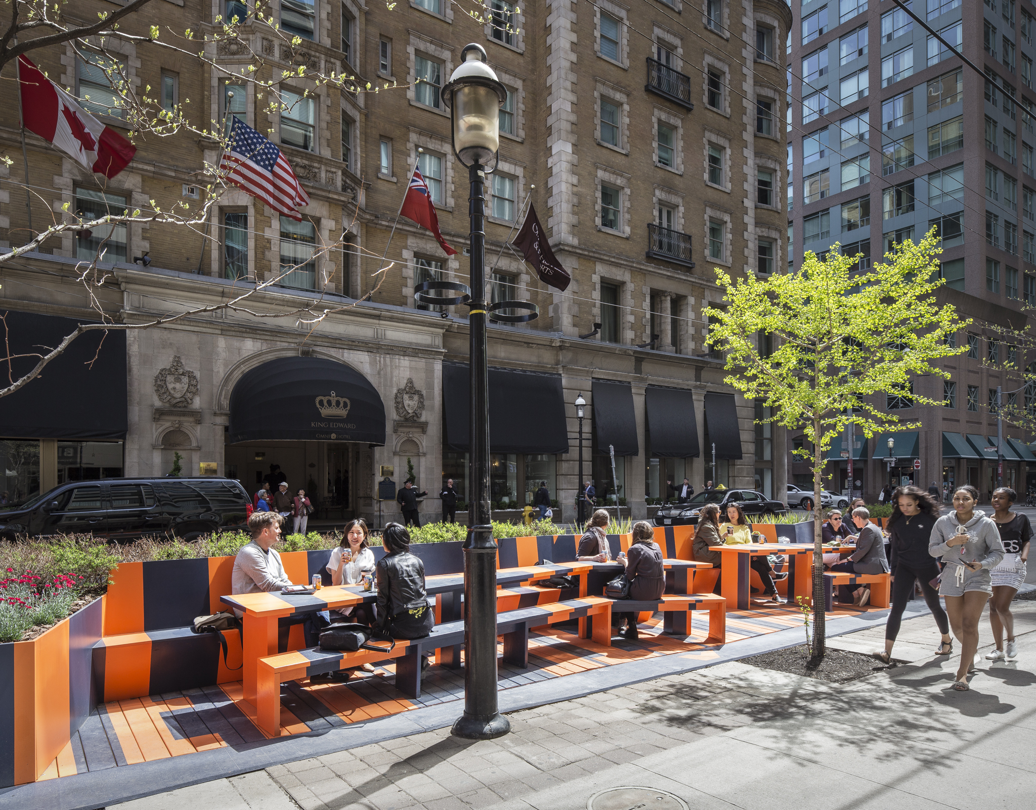 The Face to Face/Tête à Tête project is a charming installation that creates a space for shared conversation along a 44-foot (13-meter) roadway. Featuring two remarkably long tables accompanied by continuous benches and surrounded by lush greenery, its design stands out. Yet, what truly distinguishes this project is its brilliant utilization of color.
The narrow room is adorned with captivating blue and orange tones, which not only make it noticeable but also infuse it with vibrancy and a sense of excitement. With the combination of these bold colors and projections, the installation manages to catch the eye, even amidst the bustling King Street. By purposefully incorporating color and visual elements, an intimate atmosphere is created within the busy surroundings, enticing people and intensifying the ongoing conversations. The design accommodates individual occupations as well as larger collective gatherings, making it an appealing and welcoming space for various activities, from co-working to simply enjoying the lively ambiance.
Puzzle Maze
By 100architects, Shanghai, China
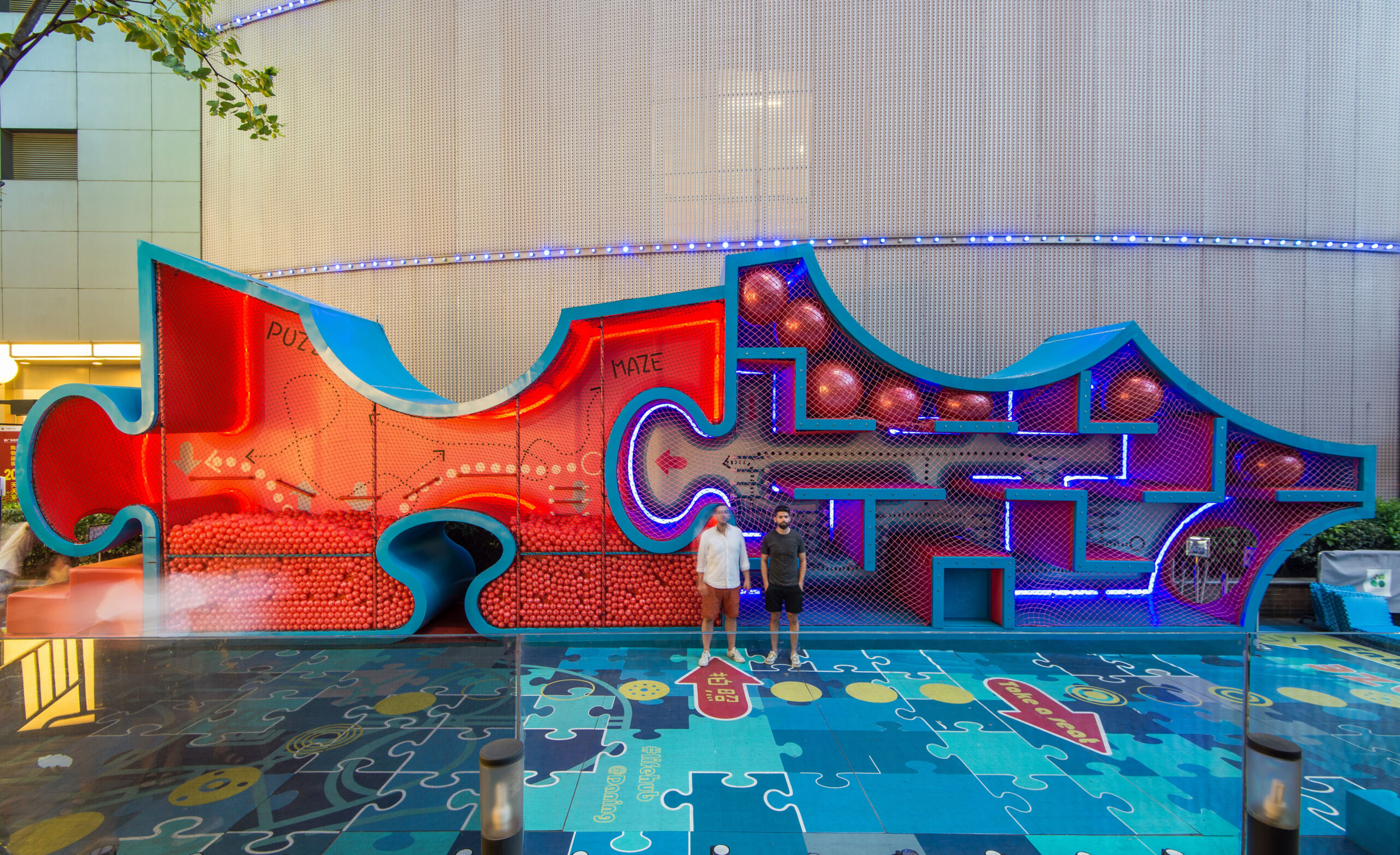
 As an urban intervention within an open-air Retail Street, the Puzzle Maze project aims to transform a privately-owned public space into an engaging and lively area. To create an innovative kids’ playground that surpasses traditional expectations, the marketing team of Life Hub @ Daning sought to turn a stagnant pedestrian street into an attractive and bustling space.
The installation is a gigantic puzzle designed as a walkable urban object, serving as both a game and an openly used urban element. The use of color in the maze adds vibrancy and excitement, capturing the attention of children and families. By employing a vertical design, the maze optimizes the limited space available and allows for proper circulation along the corridor. The colors utilized in the maze not only make it visually appealing but also contribute to its role as an interactive and engaging play area, inviting visitors to explore, interact and have a memorable experience.
Industry City Courtyard 5-6
By terrain-nyc, Brooklyn, Kings County, NY, United States
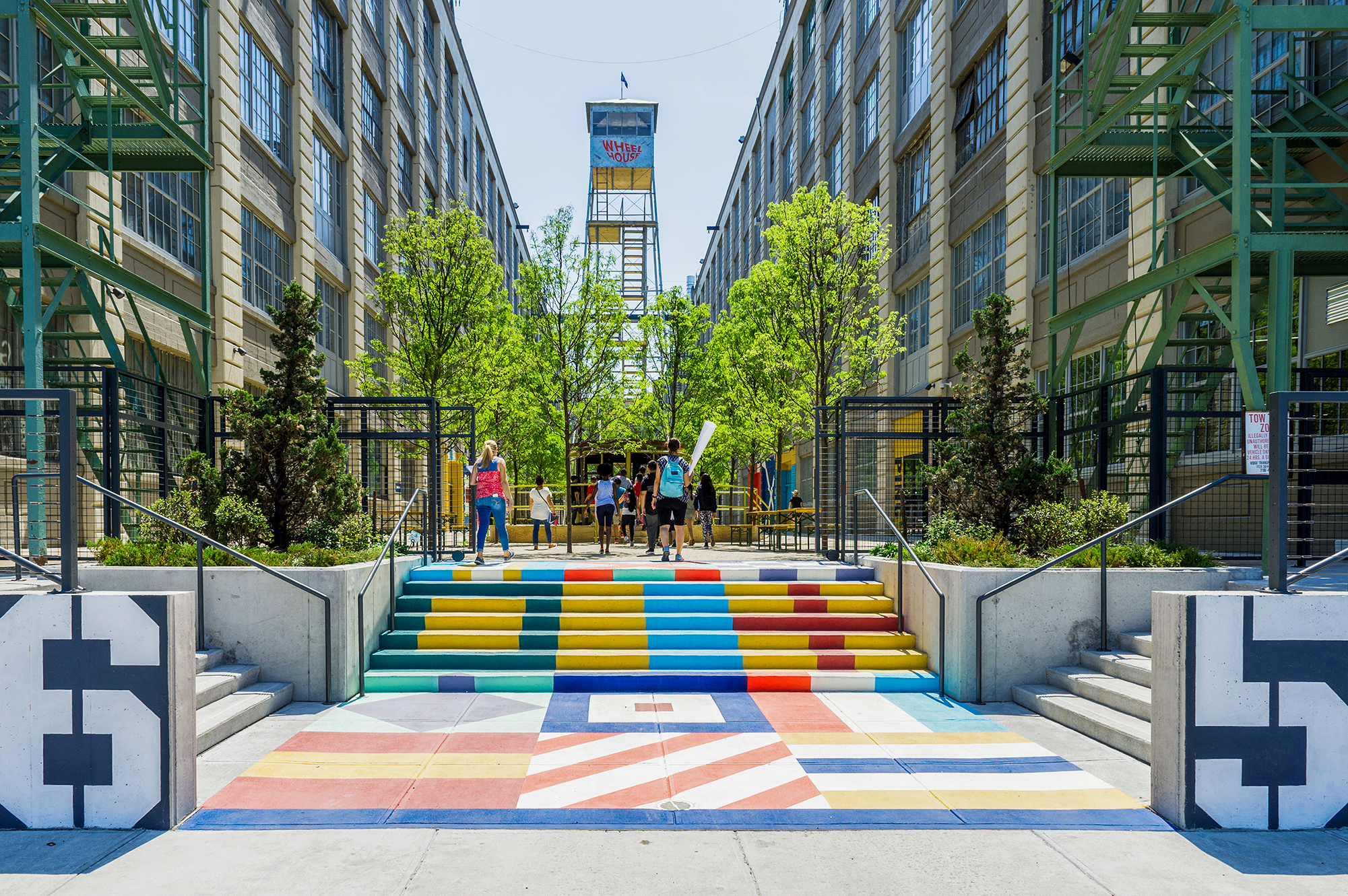
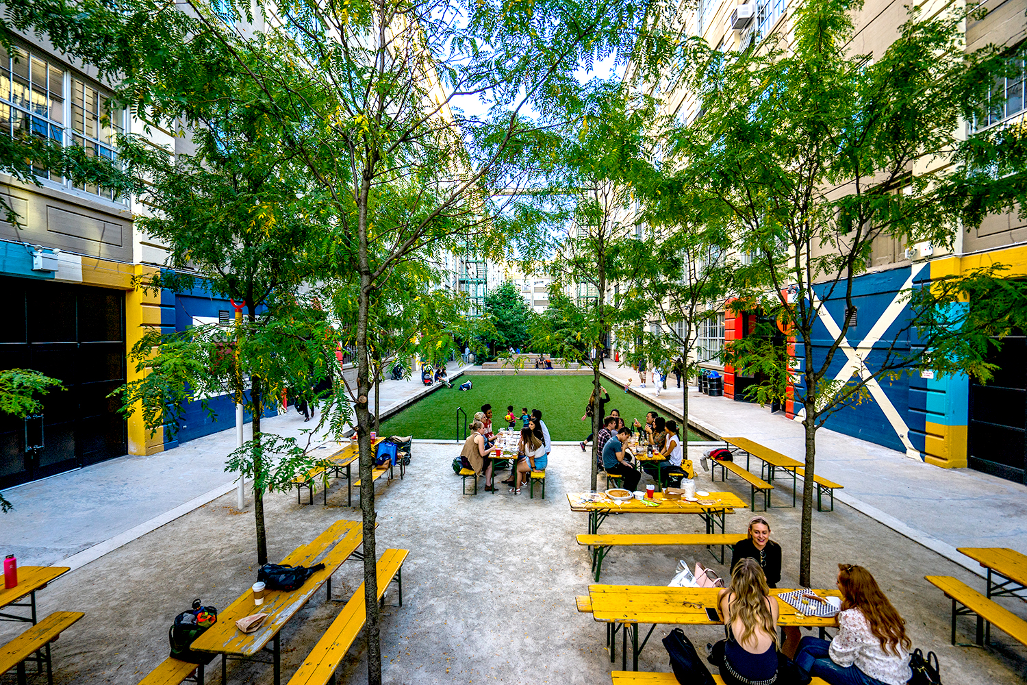 Once a cargo loading dock, this space within the historic manufacturing complex has been reborn as a vibrant and diverse landscape, breathing new life into the old factory. Serving as a vital public green space for over 600 creative businesses and the local community, Courtyard 5-6 stands apart from the surrounding buildings with its captivating colors and an array of design elements.
The landscaping boasts a spectrum of hues, infusing the space with energy and visual allure. A welcoming grove of Honey Locusts creates a bright and shaded area for outdoor dining and work. For performances, relaxation and children’s play, a flexible turf and timber bleacher space accommodates diverse activities. Additionally, a native forest with meandering walkways hides scenic vistas and offers secluded seating nooks. The deliberate use of color throughout the courtyard cultivates an inviting and visually stimulating environment, fostering social interaction and contributing to the overall revitalization of the site.
Architizer’s new image-heavy daily newsletter, The Plug, is easy on the eyes, giving readers a quick jolt of inspiration to supercharge their days. Plug in to the latest design discussions by subscribing.