Orange desk in Univers Uchronia apartment
CategoriesInterior Design

Uchronia founder designs own home as “love letter to French craft”

Orange desk in Univers Uchronia apartment

Glossy walls, ruched curtains and oversized flower-shaped cushions characterise this eclectic 1970s-style Paris apartment, designed and owned by Uchronia founder Julien Sebban.

Called Univers Uchronia, the apartment is in the city’s 18th arrondissement, close to the Uchronia office – a Parisian architecture and interiors studio known for its bold application of shape, colour and reflective surfaces.

Orange desk in Univers Uchronia apartmentOrange desk in Univers Uchronia apartment
Julien Sebban designed Univers Uchronia as his home

Sebban designed the dwelling as his home, which he shares with his husband and Maison Royère artistic director Jonathan Wray.

The Uchronia founder created the apartment as an extension of his studio – “it’s truly a manifesto of our universe,” he told Dezeen.

Colourful living room with pink curtainsColourful living room with pink curtains
Colourful interiors anchor the apartment

Sebban worked with local studio Atelier Roma to create all the walls and ceilings, which are either lacquered and glossy or made of matte pigmented concrete, respectively reflecting or absorbing light throughout the day.

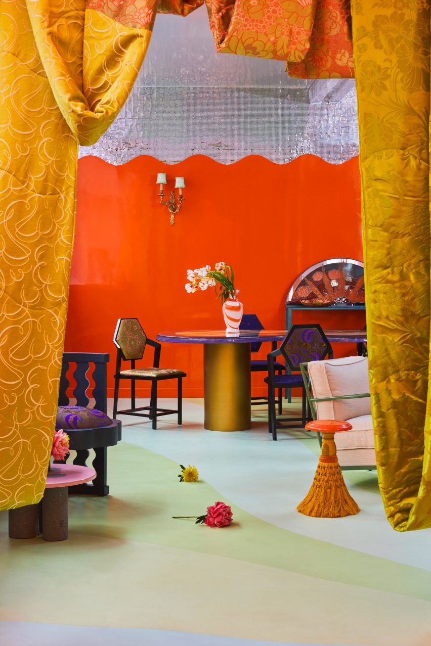
Finished in hues ranging from cloud-like pale blue to lemony yellow, the walls and ceilings complement the poured-in-place resin floor that spans the apartment and features a bold motif that “waves and moves in relation to the architecture”.

Open-plan kitchen in Univers UchroniaOpen-plan kitchen in Univers Uchronia
A metallic island features in the open-plan kitchen

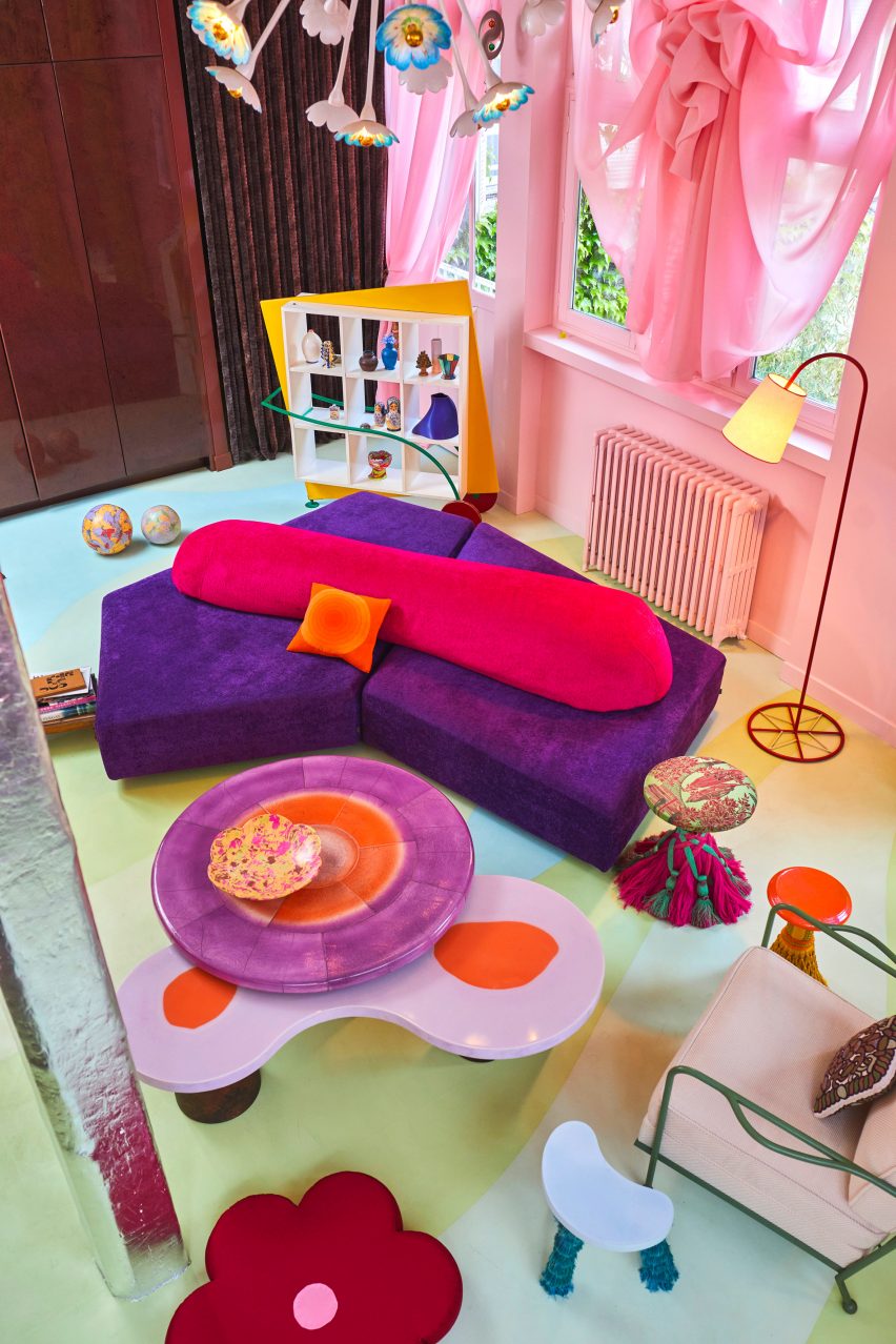
The home is anchored by a predominantly pink living space, which includes Uchronia-designed pieces such as low-slung interlocking coffee tables made from walnut burl and orange resin.

Translucent and gathered pink curtains were paired with a geometric vintage bookshelf and a blocky but soft sofa finished in purple and orange.

Onyx dining tableOnyx dining table
A bespoke onyx dining table was created for the home

“The apartment is very colourful with ’60s and ’70s inspirations and a mix of our contemporary pieces and vintage objects,” said Sebban.

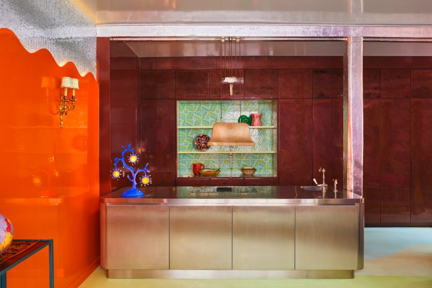
In the open-plan kitchen and dining room, a veiny Van Gogh onyx table was positioned next to a metallic kitchen island, illuminated by a blobby seaweed-shaped table lamp.

Home office with orange and yellow wallsHome office with orange and yellow walls
Ornamental jellyfish decorate the home office

A portion of the otherwise orange wall was clad with tiny, mirrored tiles. Reflected in the gleaming ceiling, the tiles have the same effect as a shimmering disco ball.

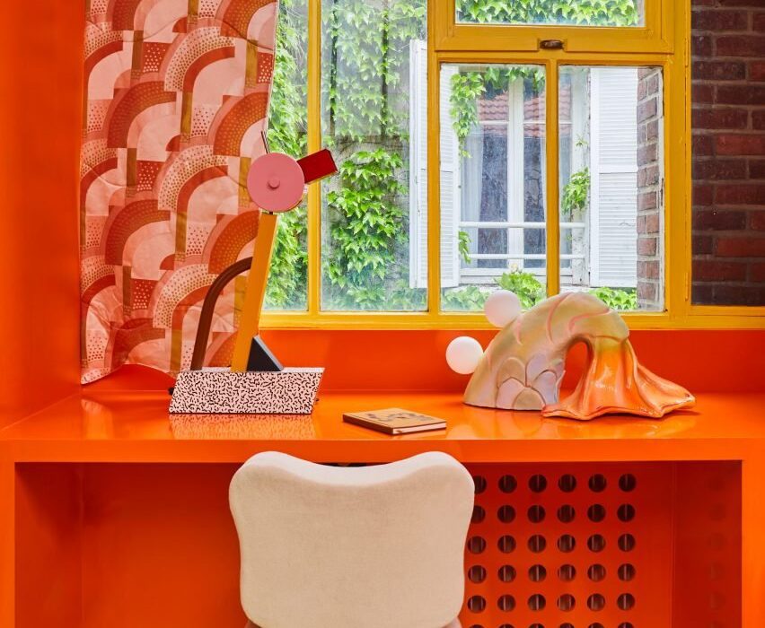
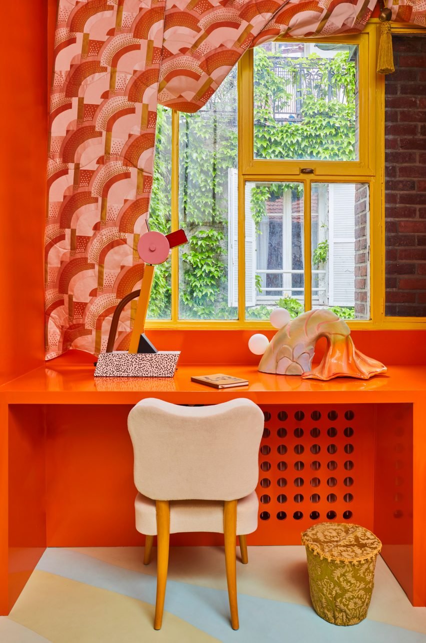
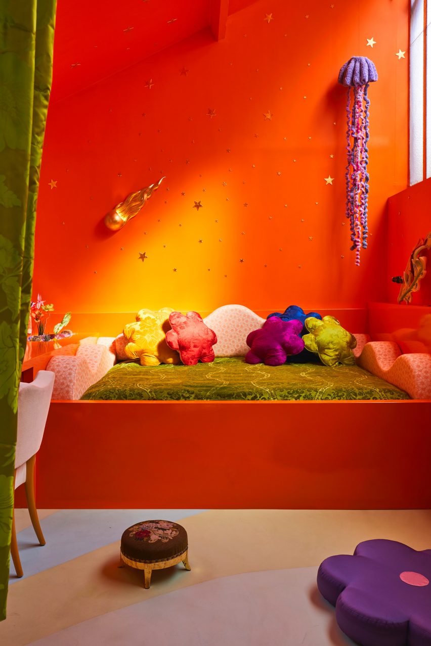
Opposite the dining area is Sebban and Wray’s home office, characterised by a bright orange, built-in day bed topped with silk flower-like cushions and a wave-shaped backrest.

Bathroom with pink bathtub Bathroom with pink bathtub
The dwelling’s bathrooms follow a similar design

Above the bed, ornamental jellyfish were suspended like planets against a constellation of gold stars, which decorate the ombre orange and yellow wall that nods to the colour-drenched interior of the city’s Cafe Nuances – also designed by Uchronia.

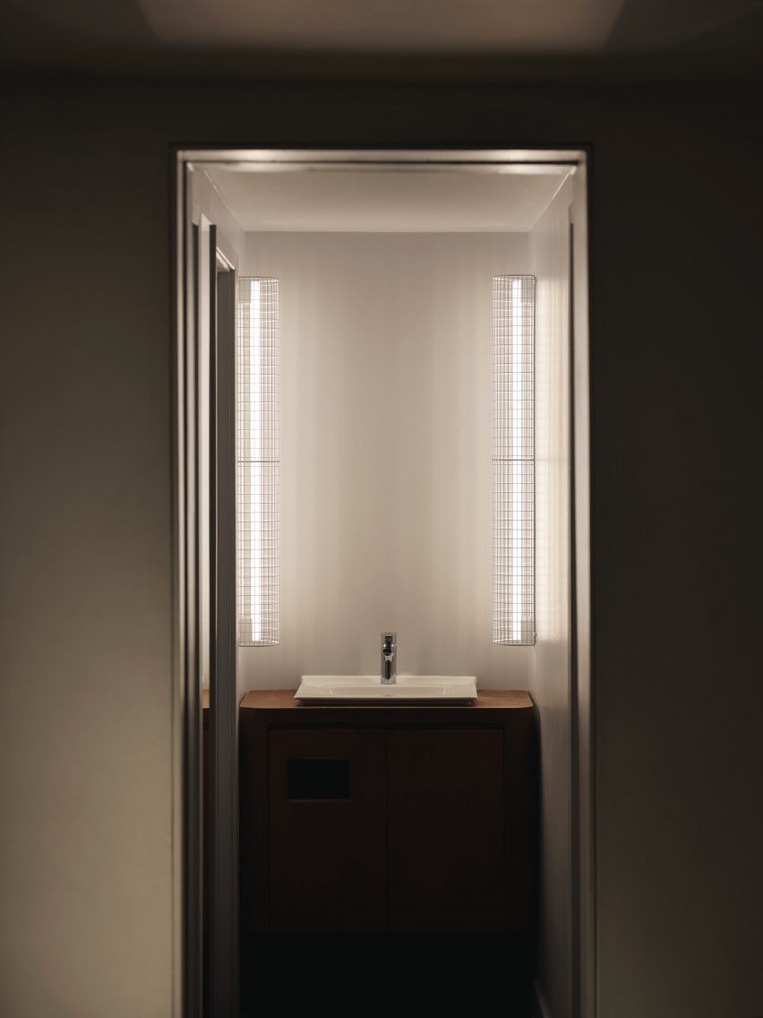
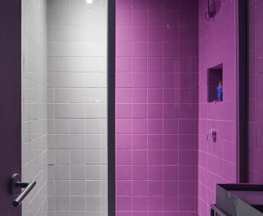
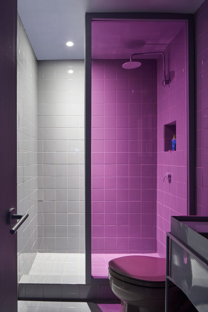
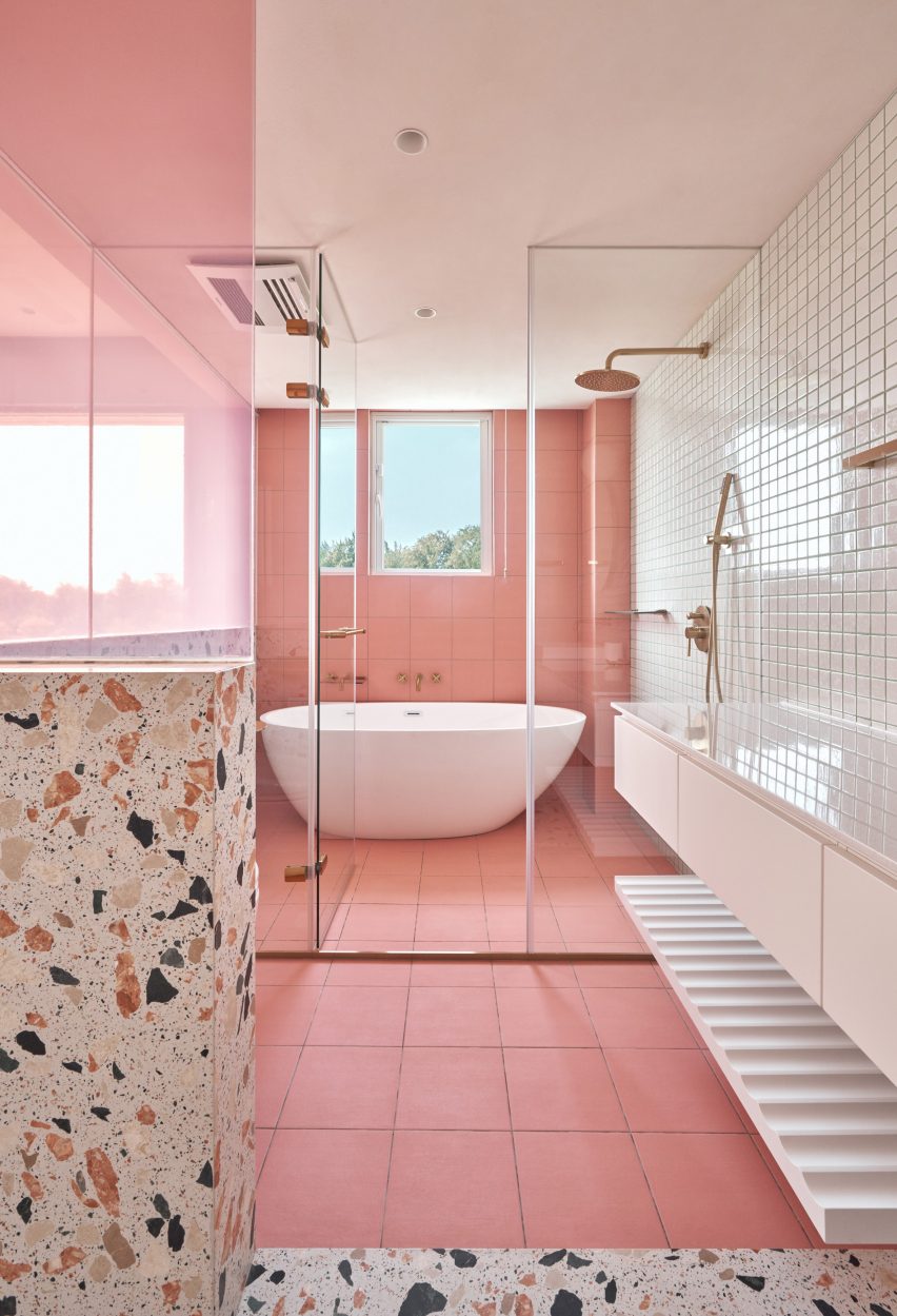
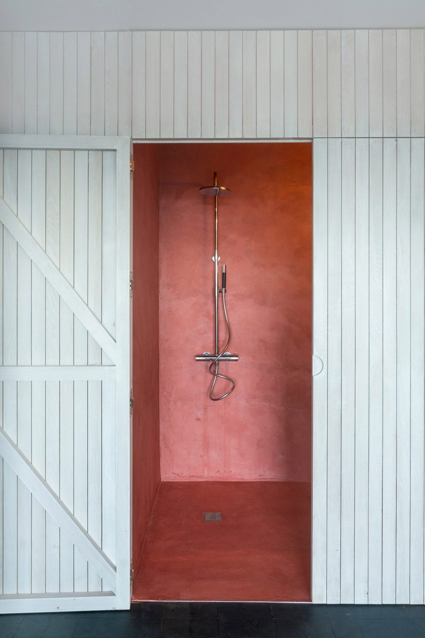
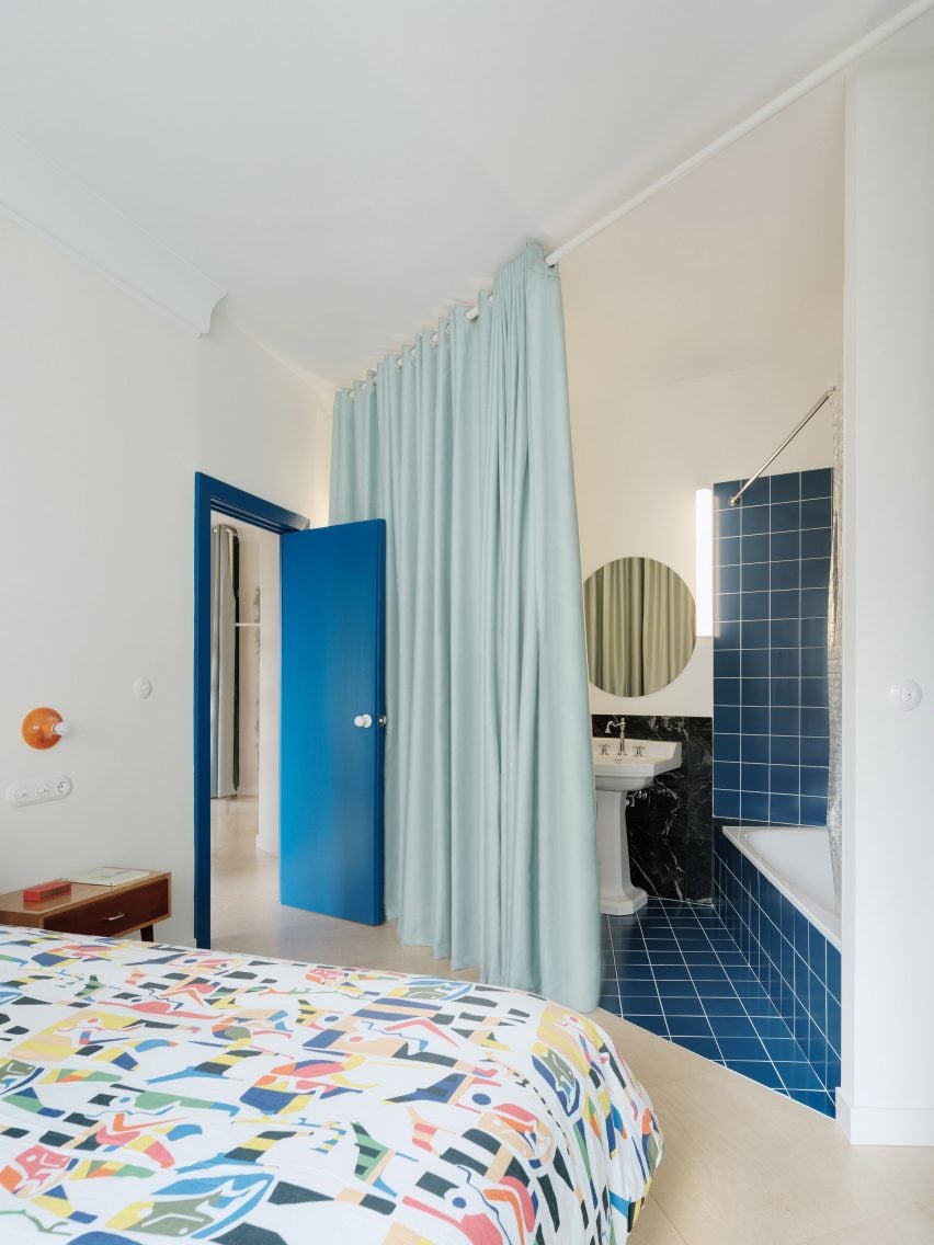
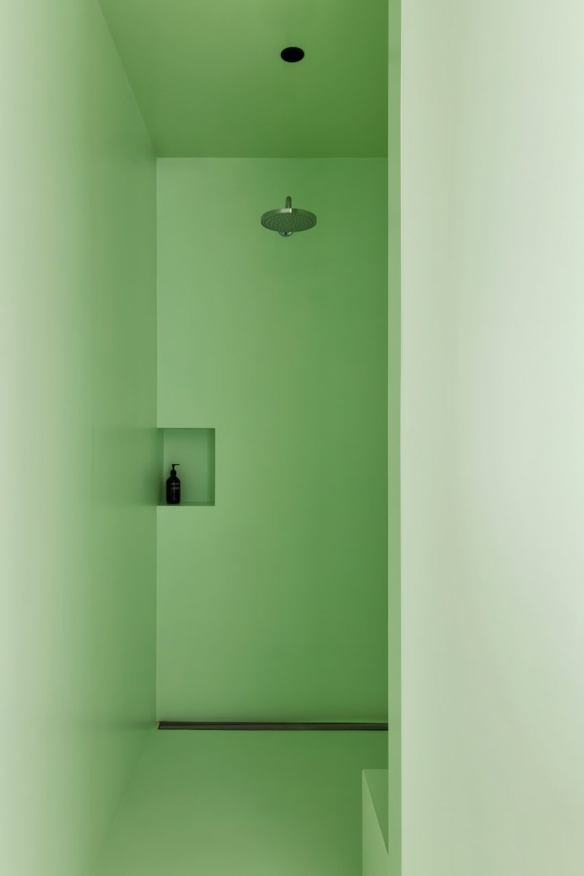
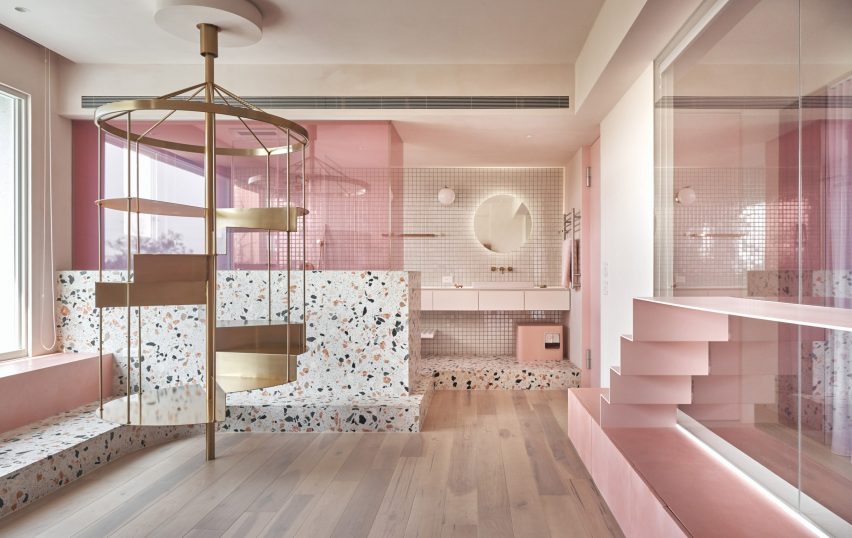
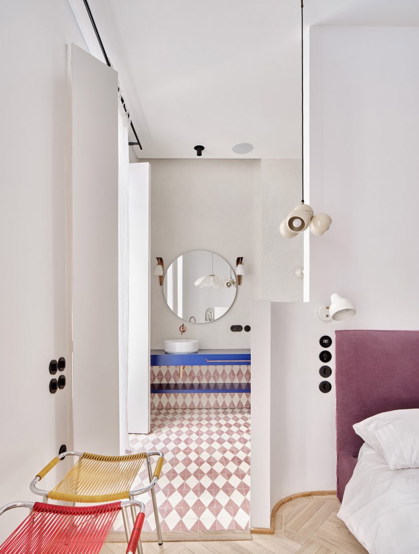
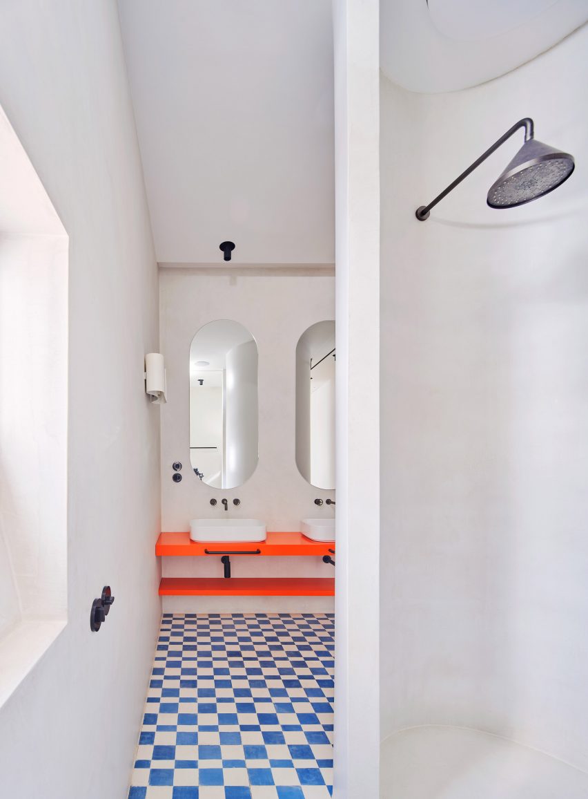
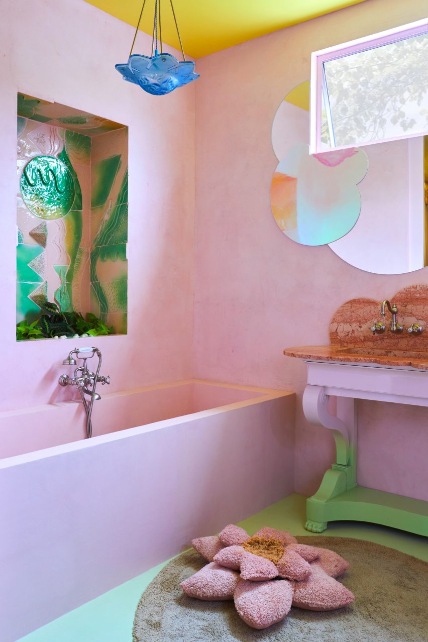
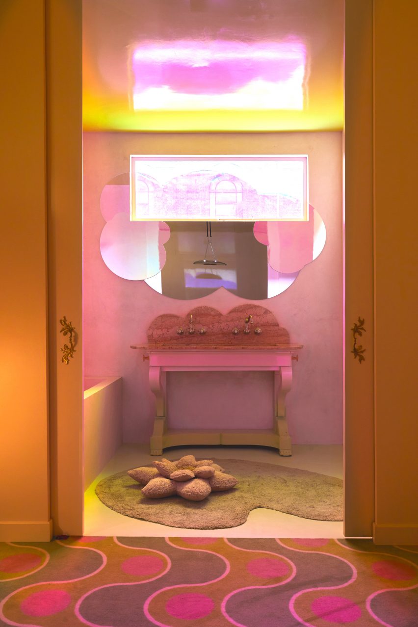
The dwelling’s bathrooms follow a similar design. Accents include dusty pink alcoves and ceramic tiles depicting underwater scenes, as well as a lily pad-shaped rug and a mirror resembling a cluster of clouds.

“The apartment defines the codes we have tried to develop at Uchronia over the last four years,” concluded Sebban.

“It’s a play on colours, textures and materials, and a love letter to French craft.”

Pink-hued bathroom by UchroniaPink-hued bathroom by Uchronia
Univers Uchronia is “a love letter to French craft”

Uchronia was named emerging interior designer of the year at the Dezeen Awards 2023. The studio previously renovated a Haussmann-era apartment for a pair of jewellery designers with multifaceted furniture pieces created to mirror the appearance of precious stones.

Various architects have designed their own homes, such as John Pawson, who created this minimalist second home in the Cotswolds in the UK.

The photography is by Félix Dol Maillot

Reference

A small square piece of leather-like material, in a mottled hue of caramel brown
CategoriesSustainable News

Food-waste dyes bring colour to mycelium leather by Sages and Osmose

A small square piece of leather-like material, in a mottled hue of caramel brown

Two British materials companies, Sages and Osmose, have collaborated to dye sheets of mycelium with natural food waste, mimicking the appearance of tanned leather and suggesting a colourful future for the biomaterial.

Osmose is a company making a leather alternative from mycelium – the fibrous underground root network of mushrooms – while Sages makes natural dyes from food waste such as avocado pits, blueberries, red cabbages and onion skins, which are normally applied to textiles.

The two believe they’ve achieved a world first with their collaboration, combining two emerging areas of sustainable material development to colour mycelium without resorting to petroleum-based synthetic dyes, thereby keeping the product non-toxic and able to biodegrade safely in soil.

A small square piece of leather-like material, in a mottled hue of caramel brown A small square piece of leather-like material, in a mottled hue of caramel brown
Sages and Osmose have developed a natural dying process for mycelium leather

“There are lots of different types of vegan leather alternatives to traditional leather but the majority of them use either synthetic colourations or they use plasticisers, so they’re non-biodegradable,” said Sages CEO Emily Taylor.

“We wanted to explore an option where we could have a fully biodegradable leather that has also been coloured in a biodegradable and sustainable manner,” she continued.

Companies that prioritise biodegradability have offered mycelium in its natural shades of white and brown or black, which Osmose CEO Aurelie Fontan says is much easier to achieve naturally.

“I think the challenge for mycelium leather was that the offering just wasn’t there in terms of aesthetic,” she said. “When you’re presenting for brands and you’re like ‘we can only do brown’, it’s a little bit boring for them.”

Photo of swatches of mycelium dyed in different shades of tan, pale violet and mulberryPhoto of swatches of mycelium dyed in different shades of tan, pale violet and mulberry
The companies experimented with different food wastes in the dyeing process

“The colour sector is somewhere where you can develop your USP, essentially, which is why working with Sages is so interesting,” Fontan added.

Osmose and Sages have created tan-coloured mycelium sheets using avocado waste, which Sages sources from an importer and guacamole factory in Milton Keynes, where tens of tonnes of leftover pits and skins are produced each week.

It was a new area for both companies, as the food waste dye takes differently to mycelium leather than it does to the usually cellulose-based textiles that Sages has worked with.

The duo collaborated with materials science researchers at the UK’s Cranfield University on the project, for which the researchers focused on how to transfer and fix the dye to the material using “green chemistry” – an area of chemistry that aims to cut out hazardous substances.

In this case, the researchers sought to replace the formic acid and fluorinated acids that are often used in tanning to dissolve the polymers of the leather so it can be infused with dye. Instead, the team developed a method, which they say is significantly less toxic.

After working with Cranfield University, Sages and Osmose expanded the experiment and trialled other waste streams such as blueberries and onion skins to see what colours they could get, producing mycelium swatches in shades of violet and bordeaux.

Taylor and Fontan say they are trying to develop a process for mycelium that is akin to leather tanning, where both colour and durability properties are added in one or two steps. Their equivalent, they say, would be to dye and waterproof the material at the same time.

Close-up of vegan mycelium sheet showing its similarity to the texture of tanned leatherClose-up of vegan mycelium sheet showing its similarity to the texture of tanned leather
The tan colour was created by using waste avocado pits and skins

Osmose’s focus now is on developing a waterproof coating for their mycelium that, like the dye, is bio-based, non-toxic and able to biodegrade safely in soil. This is notoriously a challenge for plant-based leather alternatives, which almost always rely on a protective synthetic coating.

“It’s really hard to design a solution that fits all materials, which is basically what everyone is struggling with,” said Fontan. “Someone might have pineapple leather and they have their own coating but it doesn’t mean it’s going to work on mushroom and so on.”

Unlike some companies, however, Osmose says it does not want to bring a product with a non-biodegradable coating to market.

“If you’re doing a composite, it will not biodegrade at the end of life, which is compromising all the good work that you’ve been doing before that step,” Fontan said.

Mycelium is one of the most popular emerging leather alternatives. It has already appeared in luxury goods such as a bag by Hermes, clothing by Stella McCartney and trainers by Adidas.

Reference

Apartment with green bedroom, blue kitchen and pink storage
CategoriesInterior Design

Ideas of Order selects bright colours for New York apartment renovation

Apartment with green bedroom, blue kitchen and pink storage

Bright hues define the different interventions that New York architecture studio Ideas of Order has made in this apartment at the northern tip of Manhattan.

The 1,000-square-foot primary residence in Hudson Heights was partially renovated for a couple, who had been living in the space for several years before deciding to invest in making it better suited to their needs, rather than buying another apartment.

Apartment with green bedroom, blue kitchen and pink storageApartment with green bedroom, blue kitchen and pink storage
One side of this Manhattan apartment was overhauled by Ideas of Order to make it function better for its owners

“Their sons had been sharing a room, but were beginning to need their own spaces,” Ideas of Order told Dezeen.

“They also wanted a space that could be designed for flexibility for when their children left for college.”

Bedroom with lime green built-ins housing a bed, a desk and storageBedroom with lime green built-ins housing a bed, a desk and storage
In the newly created bedroom, a lime green built-in houses a bed, a desk and storage

The kitchen also needed updating, to make it more suitable for entertaining, and more efficient storage space was required in the entryway.

So the architects reworked one side of the open living area, adding a bedroom on one side of the kitchen and refreshing the other areas.

Blue and purple kitchen cabinets behind a concrete counterBlue and purple kitchen cabinets behind a concrete counter
A new wall divides the bedroom from the kitchen

The husband is French, and the couple spent several years living together in France.

During this period, they both became enamoured by the midcentury architecture and design in the country and wanted to apply this style to their own home.

Raspberry and periwinkle cabinets surrounding a cooking area, which also features aluminium panelsRaspberry and periwinkle cabinets surrounding a cooking area, which also features aluminium panels
Raspberry and periwinkle cabinets surround the cooking area, which also features aluminium panels

“Inspired by their stories and the history of how colour was used by French midcentury designers like Charlotte Perriand, we suggested a series of polychrome millwork pieces inspired by Perriand’s design language, but updated for a contemporary home,” said Ideas of Order.

The different areas of the home were therefore given their own identities by applying bright hues.

Kitchen with cabinets on two sides and a porthole in the end wallKitchen with cabinets on two sides and a porthole in the end wall
A porthole looks through from the bedroom into the kitchen, which has rubber flooring

Lime green is used in the bedroom across a full wall of built-ins that incorporate a single bed, a workstation and plenty of storage.

Sliding doors with fritted glass panels pull across to enclose the slightly raised room, while a porthole window with double shutters looks through the new wall that separates the kitchen.

Pink and grey built-in storage in an entrywayPink and grey built-in storage in an entryway
Storage in the entryway was made more efficient by new pink and grey built-ins

This adjacent space is denoted by raspberry and periwinkle millwork, which surrounds a small preparation area with an aluminium backsplash and matching panels above.

The same metal also fronts the bar counter between an arched opening to the living area, which is topped with concrete.

Kitchen viewed through an arched openingKitchen viewed through an arched opening
Archways between spaces throughout the apartment have curved corners

Rubber flooring in the kitchen offers a practical alternative to the wood used through the rest of the apartment.

Finally, in the entryway – which is again raised slightly higher than the living area – an L-shaped cabinet system was constructed in a corner beside the door.

Pale pink is applied to the frames, while the doors and drawer fronts are finished in light grey and walnut is used for the trim. Choosing the right hues was a challenge that took many iterations to find the right balance, according to the architects.

“It was important that each pair of colours in the millwork work together, but that the colours also harmonise when viewed as a whole,” they said. “We wanted the colours to be bright, but not overpowering. And we wanted the colour pairings to feel timeless and not too trendy.”

Lime green bedroom to the left and blue kitchen to the rightLime green bedroom to the left and blue kitchen to the right
The architects went through many iterations to find the right balance of colours

Another challenge was the budget, which was modest by New York City standards and required some conscientious spending – particularly on small details that would make a big impact.

“We love the custom pulls for the millwork, the shutters for the circular window, and the rounded end to the partition between bedroom and kitchen, which reflects the rounded openings throughout the apartment,” the architects said.

Wide view of an apartment with wooden floors, white walls and colourful accentsWide view of an apartment with wooden floors, white walls and colourful accents
The couple had been living in the space for several years before deciding to invest in making it better suited to their needs

Ideas of Order was founded by Jacob Esocoff and Henry Ng, who are both Fosters + Partners and WORKac alumni.

Their renovation is one of the most colourful interiors we’ve featured in New York City of late, compared to a neutral show apartment inside the One Wall Street skyscraper and a loft in Dumbo with a subdued palette.

The photography is by Sean Davidson.

Reference

Blue doorway in alleyway
CategoriesArchitecture

Bright colours fill converted brick structure in San Miguel de Allende

Blue doorway in alleyway

Architecture studios Oficina de Diseño Colaborativo and Atelier TBD have created a cultural space that preserves the “self-built essence” of San Miguel de Allende.

Created in collaboration with interior studio Maye Colab, Santa Tere Espacio is a cultural space and office that will primarily serve to foster reading in the surrounding neighbourhoods.

Blue doorway in alleywayBlue doorway in alleyway
OCD, Atelier TBD and Maye Colab have created a brightly coloured cultural space in Mexico

Santa Tere Espacio emerged from the idea of creating architecture through renovation, reuse, repair, and repurposing,” said the team. 

Based on the self-built essence of the neighbourhood, Office of Collaborative Design, TBD Atelier, and Maye Colab joined forces with a shared vision to propose a project that engages with the site’s legacy.”

A blue door open to red-tiled kitchenA blue door open to red-tiled kitchen
Located in San Miguel de Allende, the team sought to preserve the “self-built” nature of the city

According to the team, self-construction is a “common building practice in Latin America”, a technique they sought to preserve by repurposing both the existing architecture and materials from the site, which was a former six-room, single-story dwelling.

For Santa Tere Espacio, the team distributed several meeting rooms, a kitchenette, a bathroom and a central courtyard along the structure’s lateral plan with a second, detached bathroom tucked into a corner of the site. 

yellow chairs in front of a blue dooryellow chairs in front of a blue door
The site was a former single-story residence

A long alleyway, marked with a curving concrete path, runs along the length of the exterior and provides access to each space.

The intervention primarily involved demolitions to bring in light and allow ventilation of the spaces, and the incorporation of new elements such as doors, windows, and tile finishes that contrast with the pre-existing structure,” said the team.

Yellow walls facing a blue colored doorYellow walls facing a blue colored door
The team preserved much of the existing architecture and repurposed material found on-site

Openings were created in the form of doors, windows, and domes, and some walls were demolished to make way for the central courtyard.”

Colab worked with a palette of red, yellow and pink on the interior, based on hues found during construction.

primary colored officeprimary colored office
The interior palette was informed by colours found during the construction

“The idea of capturing the site’s essence is also reflected in the project’s colour palette, designed based on the colours found in the construction, with a contrasting colour being the blue of the ironwork.”

Bright blue windows and doors were distributed across the space and finished with geometric handles.

A red table and office chairA red table and office chair
Red was primarily used for furnishings

Interior furnishings were finished primarily in red, with the kitchenette covered in bright red tile and desks throughout the space trimmed in the same shade.

In a desk at the front of the building, the stalk of a plant grows through an opening carved in its surface, while a silver of a triangular skylight sits above.

Triangular skylightTriangular skylight
It features a central courtyard

The project’s landscape design incorporates both native plants and others commonly found around the neighbourhood’s rooftops, patios and facades.

A spindly palo verde plant was planted in the courtyard to provide shade, a species considered sacred to the Aztecs and associated with the feathered serpent god, according to the team. 

Santa Tere Espacio will act as a co-working and cultural space and will host OCD, Maye Colab and the bookstore Una Boutique de Libros.

Programming will focus on “reading, feminism, design and diversity”. 

Blue metal doorBlue metal door
Blue ironwork was used for windows and doors

Founded by Nadyeli Quiroz Radaelli, OCD and Maye Colab are design studios based in Mexico, while Atelier TBD, founded by Victor Wu, is an architecture office based between Brooklyn, Taipei and San Miguel.

Elsewhere in San Miguel de Allende, design studio Mestiz opened a studio to showcase its collaborations with local craftspeople.

The photography is by Leandro Bulzzano.


Project credits:

Architecture: Oficina de Diseño Colaborativo OCD, Atelier TBD
Interior design: Oficina de Diseño Colaborativo OCD, Atelier TBD, Maye Colab
Furniture and colorimetry: Maye Colab
Landscape architecture: Oficina de Diseño Colaborativo OCD, Atelier TBD
Principals: Maye Ruiz, Nadyeli Quiroz, Victor Wu
Design team: Alejandra Skinfield, Paola Bravo, Sara Lopez Farias
Structural consultant: Formula+, Yoyo Wu
Sources:
Steelwork: Crónica Estudio


Reference

Colourful interior of studio for Method Architecture
CategoriesInterior Design

Method Architecture outfits own Houston studio with vibrant mural

Colourful interior of studio for Method Architecture

Texas studio Method Architecture has completed an office for itself in Houston with maximalist design, vibrant colours and a mural at its centre.

The 8,612-square foot (800-square metre) studio was completed in 2023 with a reception area, open office plan, private and collaborative meeting spaces and staff lounges.

Colourful interior of studio for Method ArchitectureColourful interior of studio for Method Architecture
Method Architecture has completed its self-designed studio

Located in the mixed-use East River development, designed by architecture studio Page, the office was designed to serve as an inspiration source for the studio’s clients.

“Our approach was to pursue maximalism with the goal of creating an environment where our clients would feel safe expressing their bold and innovative ideas with us,” Ashley Bettcher, Research and Design Specialist with Method Architecture told Dezeen.

Table tennis table in Method Architecture's studioTable tennis table in Method Architecture's studio
The office was designed to serve as an inspiration source

“Creativity has no limits and great design doesn’t necessarily need to cost more. Method’s new Houston office perfectly encapsulates that mantra.”

The “ego-free” focus of the design is a nearly 50-foot multi-wall mural by local artist David Maldonado, known for creating nearly 20 pieces of public artwork throughout Houston.

Multi-wall mural by David MaldonadoMulti-wall mural by David Maldonado
David Maldonado created a multi-wall mural for the studio

With pops of magenta, cobalt, and yellow, the mural features icons from the city and state like the skyline, a rocket for Johnson Space Center, a bluebonnet as the Texas state flower, and the neighbouring Buffalo Bayou.

The artwork also slips in custom motifs representing the studio, such as Method’s rubber duck mascot.

Acoustic baffles suspended from the ceilingAcoustic baffles suspended from the ceiling
Light grey flower-like acoustic baffles hang from the ceiling

“This feature piece of artwork helps set the tone for the remainder of the office including bold colors, geometric patterns and shapes and a secondary mural designed and installed by Maldanado featuring drip paint in mirroring colorways located at the back of the office,” the team said.

The mural is complemented by a 3D-printed wall installation behind the reception desk composed of the studio’s signature “M” logo and the raw ceiling with exposed mechanical lines all painted a vibrant shade of fuchsia.

Half-arched portal at Method Architecture officeHalf-arched portal at Method Architecture office
Clients pass through a half-arched portal

Light grey flower-like acoustic baffles hang from the ceiling adding to the maximalist design. Light blue bicycles are mounted on one wall as another unique installation.

From the reception area lounge, clients pass through a half-arched portal – created with custom millwork and embedded lights – into the main office space which includes rows of desks over custom greyscale carpet.

Desks and geometric carpet in self-designed studioDesks and geometric carpet in self-designed studio
Hotel desk stations accommodate hybrid work styles

Hotel desk stations accommodate hybrid work styles for both in-office and at-home work.

“Cozy architectural work booths are nestled amid the bustling breakroom and office areas, offering a quiet refuge for more private work, private conversations or meals with coworkers,” the team said.

The workspace is flanked by six meeting rooms: a large creative conference space, three medium-sized conference rooms and two smaller huddle spaces.

The all-white conference room was left intentionally blank to showcase the client’s material selections with tunable white lights to adjust the light temperature for each project.

M-shaped window cutoutM-shaped window cutout
An M-shaped window cutout opens the conference room to the rest of the office

An M-shaped window cutout opens the conference room to the rest of the office.

In the break room, bright blue suede fabric adorns the walls to provide an unexpected texture and pale blue lamp shades – reminiscent of the shape of inverted cupcake liners – serve as a geometric juxtaposition to the rounded banquette boxes.

Bright blue-walled break roomBright blue-walled break room
Bright blue suede fabric adorns the walls in the break room

“Plush, psychedelic-inspired fabrics in meeting booths and distinctive light fixtures keep the space feeling light and fun to inspire creative design,” the studio said.

In addition to being designed for flexible workflows and teams, the space features multiple sustainable and WELL features like ample daylighting, repurposed materials and ergonomic furniture.

Other recently completed projects in Houston include Nelson Byrd Woltz’s grassed park that bridges a six-lane highway and Modu’s design for a wellness building with a self-cooling exterior.

The photography is by Ana Larranaga, Method Architecture.


Project credits:

Architecture: Method Architecture
MEP: Telios Engineering
General contractor: Burton Construction
Furniture: AGILE Interiors, MDI, OP,
Flooring: Interface, Shaw Contract
Tile: Trinity Surfaces, La Nova
Textiles: Knoll Textiles
Masonry: Upchurch Kimbrough
Demountable partitions: DIRTT
Countertops: CAMBRIA
Mural: David Maldonado
Lighting: Lighting Associates Inc.
Signage: ARIA Signs


Reference

Tall tubular chairs at A Bar with Shapes for a Name by Cake Architecture
CategoriesInterior Design

Cake Architecture draws on Bauhaus principles for Hoxton bar

Tall tubular chairs at A Bar with Shapes for a Name by Cake Architecture

Cake Architecture has renovated A Bar with Shapes for a Name, an east London cocktail bar featuring “utilitarian” interiors.

A Bar with Shapes for a Name owes its title to the yellow triangle, red square and blue circle that are emblazoned on its facade in a nod to the primary colours and understated geometry commonly associated with the Bauhaus.

Tall tubular chairs at A Bar with Shapes for a Name by Cake ArchitectureTall tubular chairs at A Bar with Shapes for a Name by Cake Architecture
Tall tubular chairs feature on the ground floor

When creating the bar’s minimalist interiors, Dalston-based Cake Architecture took cues from the influential German art and design school that was established in 1919 and advocated for an emphasis on functionality, among other similar principles.

Located at 232 Kingsland Road in Hoxton, the cocktail bar was renovated by the studio to serve as a multipurpose venue.

Reddish plywood barReddish plywood bar
Cake Architecture created a smooth ground-floor bar from reddish plywood

Cake Architecture doubled the bar’s capacity by adding a basement, which acts as a “kitchen-bar” room, and refurbished the ground floor’s existing seating area as well as a classroom-style space that offers a location for rotating events or workshops.

“These spaces have specific functional requirements and we selected colours and materials to suit,” studio director Hugh Scott Moncrieff told Dezeen.

Rectilinear light installation within bar by Cake ArchitectureRectilinear light installation within bar by Cake Architecture
It was positioned opposite a rectilinear light installation

Upon entering the bar, visitors are greeted by the main seating area or “showroom”, which was designed to be warm and inviting.

Tall tubular chairs finished with neutral rattan were positioned around chunky geometric tables made from birch ply stained to a rich, reddish-brown hue.

Glass-topped central table in the basementGlass-topped central table in the basement
The renovation included the addition of a new basement

The team also used the same timber to create the space’s curving bar, which is illuminated by a squat, cordless table lamp by lighting brand Flos.

Opposite the bar, a glowing rectilinear light installation by photographer Steve Braiden was fitted to the wall underneath bench-style seating reminiscent of early Bauhaus furniture designs.

Close-up of the steel, glass-topped tableClose-up of the steel, glass-topped table
A steel, glass-topped table sets an industrial tone

“We looked in particular at projects by the Bauhaus founder Walter Gropius,” reflected Scott Moncrieff.

“Gropius is a master of this elegant zoning through the application of colour and form,” he added.

Steel-framed tables in the classroomSteel-framed tables in the classroom
The “classroom” includes steel-framed tables

Downstairs, the low-lit basement was created to house additional seating as well as “all of the crazy machinery they use to prepare the drinks,” the designer said.

The basement is characterised by a bespoke central table by Cake Architecture and furniture designer Eddie Olin.

Sculptural, colourful lampSculptural, colourful lamp
Red, yellow and blue accents define a sculptural lamp

Consisting of a steel frame that “floats” over a central leg, the table was topped with a glass surface and its base was clad in phenolic-coated plywood to match the floor and walls.

“This new basement is predominantly a production space – so the palette reflects this with hardwearing, utilitarian and industrial materials,” said Scott Moncrieff.

A thick, felt curtain in ultramarine adds a pop of colour to the otherwise pared-back space.

With its pale blue walls and Valchromat-topped, steel-framed tables, the ground-floor “classroom” pays homage to the Bauhaus as an educational institution.

Tall blackboard in the classroomTall blackboard in the classroom
A tall blackboard provides space to learn in the classroom

Brighter blue vinyl covers the floors while a sculptural lamp featuring red, yellow and blue circles echoes the bar’s logo.

A tall blackboard and overhead strip lighting add to the classroom feel of the space, which is used for various group events.

Illuminated bathroom sinkIlluminated bathroom sink
Thin vertical lights frame the bathroom sink

Cake Architecture worked closely with the bar’s founders Remy Savage and Paul Lougrat when creating the interiors, which were primarily informed by the duo’s way of working.

“The team has a conceptually driven ethos drawn from the theory and practice of Bauhaus embedded in everything they are doing. We found that incredibly exciting,” explained Scott Moncrieff.

Sconce lighting on the wallSconce lighting on the wall
A Bar with Shapes for a Name is located on London’s Kingsland Road

“The Bauhaus phrase ‘party, work, play’ was pertinent to some early ideas and this carried through all our design discussions,” noted the designer.

“The space enables these three things. Separately as individual functions and simultaneously as a representation of the overall atmosphere of a bar!”

Cake Architecture previously worked with interior designer Max Radford to create a curtain-wrapped speakeasy in London’s Soho. The studio also designed a workspace for London agency Ask Us For Ideas in the same part of the city.

The photography is by Felix Speller


Reference

Harry Nuriev and Tyler Billinger Residence
CategoriesInterior Design

Eight bold showers that add a pop of colour to the bathroom

Harry Nuriev and Tyler Billinger Residence

Showers enclosed in dichroic glass and wrapped in speckled terrazzo are featured in our latest lookbook, which showcases eight unique showers that bring a touch of colour to the bathroom.

Bathtubs often hold the spotlight in a bathroom, but this round-up proves showers can be just as showstopping – and luxurious.

From an all-pink shower in Taiwan to a minty-green shower in an Antwerp apartment, these colourful showers add a bold touch to brighten up the surrounding space.

This is the latest in our lookbooks series, which provides visual inspiration from Dezeen’s archive. For more inspiration see previous lookbooks featuring pared-back loft conversions, lattice screens and outdoor showers.


Harry Nuriev and Tyler Billinger Residence
Photo is by Dylan Chandler

Crosby Studios apartment, USA, Crosby Studios

Crosby Studios founder Harry Nuriev and partner Tyler Billinger outfitted their New York City apartment in a palette of purple and grey.

The bold colour scheme was carried into the bathroom, where the shower was clad in grey tile and enclosed with a purple shower screen.

Find out more about the Crosby Studios apartment ›


The Siren Hotel by ASH NYC
Photo is by Christian Harder

The Siren Hotel, USA, Quinn Evans Architects

The Siren Hotel in Detroit was originally built in 1926 by architect Robert Finn before being refreshed by design development firm ASH NYC with the help of Quinn Evans Architects in 2018.

The renovation included the addition of pastel hues and an assortment of rich textiles, while the hotel’s showers were updated with red-speckled terrazzo and a glass-brick divider.

Find out more about The Siren Hotel ›


Concrete bathroom in Habitat 67 building
Photo is by Maxime Brouillet

Unit 622, Canada, Rainville Sangaré 

Unit 622 by Rainville Sangaré is located inside architect Moshe Safdie’s famous brutalist Habitat 67 in Montreal, Canada.

Sangaré updated the apartment to include walk-in showers enclosed in dichroic glass that appears to change colour when viewed from different angles.

Find out more about Unit 622 ›


A bathroom with pink tile
Photo is by Hey! Cheese

Cats’ Pink House, Taiwan, KC Design Studio

Not only does the Cats Pink House by KC Design Studio include an entire room dedicated to the owner’s cats, but it also contains a spacious pink bathroom.

Large pink tiles cover the walls and floor of a walk-in shower, which is also outfitted with a stand-alone tub.

Find out more about Cat’s Pink House ›


Spinmolenplein apartment by Jürgen Vandewalle
Photo is by Karen Van der Biest

Spinmolenplein penthouse, Belgium, Jürgen Vandewalle

Located on the top floor of the tallest residential building in Ghent, Belgium, the 60-square-metre Spinmolenplein penthouse updated by Jürgen Vandewalle was designed to maximize space.

A bathroom unit clad in white wood panels opens to reveal a colourful shower stall finished with a micro-cement in a muted red.

Find out more about Spinmolenplein penthouse ›


A bathroom with shower and bathtub clad in blue tile
Photo is by Luis Díaz Díaz

Ready-made Home, Spain, Azab

Located in an apartment building in Spain built in the 1960s, the Ready-made Home by Azab features a colourful palette of soft pinks, blues and yellows.

A corner bathroom in the main bedroom is partitioned by a light blue curtain, while a deeper shade of blue was carried into the tiles that cover the floor and walls of the bathtub and shower.

Find out more about Ready-made Home ›


Apartment A by Atelier Dialect
Photo is by Piet-Albert Goethals

Apartment A, Belgium, Atelier Dialect 

While an en-suite shiny steel tub makes quite the statement in this Antwerp apartment updated by Belgian design studio Atelier Dialect, the shower is equally intriguing.

Contrasted by the stark white and black palette of the surrounding bedroom, the shower was wrapped in minty green, with a single shelf cut into the wall for toiletries and a bench installed opposite.

Find out more about Apartment A ›


Louisville Road house designed by 2LG
Photo is by Megan Taylor

Louisville Road house, England, 2LG Studio

Located in Tooting, south London, interior design studio 2LG overhauled a period home with blue tilework and coral-orange cabinetry.

The walk-in shower features baby blue floor tiles and matching hardware, as well as sky-blue bordering that surrounds the fluted-glass shower screen.

Find out more about Louisville Road house ›

This is the latest in our lookbooks series, which provides visual inspiration from Dezeen’s archive. For more inspiration see previous lookbooks featuring basement apartments, mid-century homes and textural kitchens.

Reference

Hallway of Sunderland Road house
CategoriesInterior Design

2LG Studio brings colour and personality into London family home

Hallway of Sunderland Road house

Ornately corniced ceilings were preserved and painted pastel inside this detached Edwardian house in southeast London, which local firm 2LG Studio has renovated for a returning client.

Set in the leafy residential area of Forest Hill, the house on Sunderland Road belongs to a couple who needed space for their three young children to grow and play.

Hallway of Sunderland Road house
2LG has completed Sunderland Road house in Forest Hill

“Having designed this couple’s previous home, we had a strong sense of their tastes and wanted to evolve that for them in this house,” 2LG Studio founders Jordan Cluroe and Russell Whitehead told Dezeen.

“We wanted to bring out their characters by emboldening their love of colour and finding ways to build pattern and joy into the materiality of the home,” the duo added.

“The intent here was to respect the period elements of the building, whilst reflecting the modern style of the family who live there.”

Open-plan living room and kitchen in London house by 2LG
Hand-printed wallpaper by Custhom Studio features in the lounge and hallway

Throughout the house, playful elements are in balance with a more serious aesthetic.

Instead of treating the home’s elaborate ceiling mouldings separately – as tradition dictates – 2LG Studio applied a colour-block philosophy and painted them in the same pastel tones used across the upper walls and ceilings.

The studio drew on a range of references for the interior, from 1980s colours to Italian design elements such as marble and Murano glass lighting, all the way to the Scandinavian influences seen in the natural materials and minimalist approach to furnishing.

Kitchen and dining room of Sunderland Road house
The kitchen is defined by sky-blue cabinetry and marble countertops

Creating impact in the entrance hall is a hand-printed wallpaper, designed by 2LG Studio with long-term collaborator Custhom Studio and used here in a bespoke calamine-pink colourway that’s repeated in the connecting spaces throughout the house, as well as in the rear living area.

“It creates a welcoming, human feel as soon as you enter,” the design team said.

This ballet-slipper colour is paired with a brighter candy pink, bringing calm and warmth to the overall scheme.

Lounge of Sunderland Road house
2LG painted ceilings, mouldings and upper walls in pastel colours

Pink-heavy palettes have become a signature for 2LG, also reflected in the natural pink undertones of the extra-wide Douglas fir floorboards that feature throughout the house alongside a grey poured-resin floor in the kitchen.

“The floorboards set the tone with a nod to Scandi minimalism, adding a natural soul throughout that unites the bolder elements,” said 2LG Studio.

In the kitchen, sky-blue cabinetry is used alongside marble countertops and splashbacks, with arched forms uniting the two finishes while pink elements such as bar stools pop against this calm backdrop.

“The colours are a key part of the atmosphere and identity of this house,” said 2LG. “The blues gets deeper and bolder as you move upstairs into the study and the family bathroom.”

“Primary red details give structure to the colour palette in the living room. Pastel green in the baby’s room is serene and fresh, warmed up with a mix of wood tones and creams.”

Bedroom of house in London by 2LG
Pink details feature throughout the home’s interiors

The project features bespoke joinery including a playhouse on stilts in one of the kids’ rooms alongside existing 2LG pieces such as the Luca bedhead in the loft bedroom and the Tilda sofa, both designed for London furniture company Love Your Home and upholstered here in Kvadrat x Raf Simons fabric.

“The fitted elements of the furniture give a sense of coherent design and function to the spaces whilst the classic design pieces bring a curated gallery feel, not unlike a contemporary luxury fashion store,” said 2LG Studio.

Children's bedroom of house in London by 2LG
2LG designed custom joinery including a stilted playhouse

Various recycled materials provide textural interest throughout the house, among them the recycled plastic wall lights in the living room by Spark and Bell.

2LG Studio also added a pink Foresso top made using waste wood chips and resin to the dining table, while the bespoke bathroom cabinet was made using leftover Douglas fir floorboards with recycled plastic details by UK company Smile Plastics.

Children's bedroom in Sunderland Road house
Pastel green was used to finish the baby’s room

Since Cluroe and Whitehead founded their design practice in 2014 under the name 2 Lovely Gays, the studio has completed a number of residential projects in the British capital.

Among them is the couple’s own home and office – to which they recently added a garden pavilion with a “touch of Beetlejuice” – and an equally colour-led renovation of a period property in the Heaver Estate conservation area.

The photography is by Megan Taylor.

Reference

Living room of Minimal Fantasy, a pink apartment in Madrid
CategoriesInterior Design

Eight interiors where Barbiecore pink adds a playful touch of colour

Living room of Minimal Fantasy, a pink apartment in Madrid

As the upcoming Barbie film has created a shortage of pink colour and launched a real-life dollhouse in Malibu, we gathered eight pink interiors to exemplify the Barbiecore aesthetic for this lookbook.

The pink hues that are usually associated with Barbie, a children’s toy first launched by manufacturer Mattel in 1959, are influencing both clothes and interiors ahead of Great Gerwig’s live-action Barbie film.

The style, which has become known as Barbiecore, can add a joyful touch of colour to otherwise pared-back interiors, or be used as a hyper-bright nod to 1980s opulence.

Here, we have gathered eight interiors where pink was used to give interiors additional warmth and a touch of whimsy.

This is the latest in our lookbook series, which provides visual inspiration from Dezeen’s archive. For more inspiration see previous lookbooks featuring rustic interiors, Wes Anderson-style interiors and welcoming wood-panelled dining rooms.


Living room of Minimal Fantasy, a pink apartment in Madrid
Photo by JC de Marcos

Minimal Fantasy, Spain, by Patricia Bustos Studio

The Minimal Fantasy apartment is anything but minimalist – instead, Patricia Bustos Studio aimed to create an “aesthetic madness” for the interior of this Madrid rental in a 1950s residential building.

The holiday home features 12 different shades of pink, with the entire living room covered in a pastel bubblegum pink.

“Pink vindicates the fall of stereotypes – everything is possible, nothing is planned or established and that’s the beauty of it,” the studio told Dezeen.

Find out more about Minimal Fantasy ›


San Francisco Residence by Jamie Bush
Photo by Matthew Millman

San Francisco house, US, by Jamie Bush

A more discrete take on adding pink to an interior can be found in this San Francisco house by architect Jamie Bush, who gave it an overhaul using an eclectic array of furniture.

Bush added pink walls to the dining room, where they contrast against dark-wood vintage furniture and white details including a lamp and sheer curtains to create a playful, yet elegant atmosphere.

Find out more about San Francisco House ›


Pink bedroom in Barbie's Malibu Dreamhouse
Photo by Hogwash Studios

Barbie’s Malibu Dreamhouse, US, by Ken

The most Barbiecore interior of them all can naturally be found in the Barbie Malibu Dreamhouse, which is being rented out by the doll’s boyfriend Ken on Airbnb.

Inside the California mansion, located beachside in Malibu, guests can enjoy pink rooms including the bright-fuchsia bedroom that has been decorated with cowboy hats, boots and cowhide rugs to add more “Kenergy”.

Find out more about Barbie’s Malibu Dreamhouse ›


Mixtape Apartment by Azab
Photo by Luis Díaz Díaz

Mixtape apartment, Spain, by Azab

A dusky baby-pink kitchen decorates the Mixtape apartment in Bilbao, which was designed by architecture studio Azab.

The white and pink cupboards are boarded by light timber strips, and the appliances in the room have also been painted pink. A multicoloured floor with pale green and yellow as well as darker red herringbone tiles give the space a vibrant feel.

Find out more about Mixtape apartment ›


13 Square Metre House By Studiomama
Photo by Rei Moon of Moon Ray Studio

130-square-metre-house, UK, by Studiomama

“London’s smallest house”, a conceptual design by Studiomama, features an abundance of pink details throughout, including in its plywood-clad kitchen.

Here, the clever fold-out seating has been decorated with blush-pink cushions and pillows, with a pink cushion also forming a cosy backrest.

Find out more about 130-square-metre house ›


Pink interior of Moco shop in Barcelona, designed by Isern Serra and Six N. Five
Photo by Salva Lopez

Moco Barcelona, Spain, by Isern Serra

A computer-generated image was transformed into a real-life interior for the Moco Barcelona store, a rose-coloured shop inside the city’s Moco Museum.

Designer Isern Serra used pink micro-cement to achieve the same uniform, ultra-smooth surfaces as those of the computer-generated image, creating a dream-like interior filled with rounded corners and arches.

Find out more about Moco Barcelona ›


Interior of Pigment House by Unknown Works
Photo by Lorenzo Zandri

Pigment House, UK, by Unknown Works

London studio Unknown Works went all in on the pink for Pigment House, a Hampstead home that was renovated to add a pink-toned patio area.

While not technically part of the interior, it adds a splash of colour to the ground floor area, and is used for indoor-outdoor living in the summer months. The choice of pink was a reference to the colourful buildings of Mexican architect Luiz Barragán.

Find out more about Pigment House ›


Cats' Pink House by KC Design Studio
Photo by Hey! Cheese

Cats’ Pink House, Taiwan, by KC Design Studio

This holiday home in Taiwan got its name, Cats’ Pink House, as it includes cat ladders, a rotating carousel-shaped climbing frame and a fluffy pink cat swing.

KC Design Studio used a mineral-based paint to create the pink walls throughout the home, which also features a pink bathroom – with a pink cat litter box.

Find out more about Cats’ Pink House ›

This is the latest in our lookbook series, which provides visual inspiration from Dezeen’s archive. For more inspiration see previous lookbooks featuring rustic interiors, Wes Anderson-style interiors and welcoming wood-panelled dining rooms.

Reference

Kitchen with chrome counter in JJ16 apartment by Lucas y Hernández-Gil
CategoriesInterior Design

JJ16 apartment in Madrid features curves and colour blocking

Kitchen with chrome counter in JJ16 apartment by Lucas y Hernández-Gil

Madrid studio Lucas y Hernández-Gil has completed a family home that makes the most of every inch, with details including a yellow storage wall, a corridor kitchen and a hidden closet.

JJ16 is a three-bedroom apartment in Madrid’s Salamanca district, but until recently it had been used as an office.

Kitchen with chrome counter in JJ16 apartment by Lucas y Hernández-Gil
JJ16 is a three-bedroom apartment for a family of four

Lucas y Hernández-Gil, a specialist in interior architecture, converted the property back into a residence for a family that includes a mother, three teenage children and their dog.

The challenge was not only to make it feel like a home again but also to create space for everyone’s personality within the 165 square-metre footprint.

Kitchen with chrome counter in JJ16 apartment by Lucas y Hernández-Gil
The kitchen occupies a corridor space between the entrance lobby and the living room

The designers achieved this by combining space-saving strategies with statement details, providing both functionality and character.

“Everyone had a clear idea of what they needed, which translated directly into the spaces,” said studio founders Cristina Domínguez Lucas and Fernando Hernández-Gil Ruano.

“Far from generating a conflict, different colours and materials give the house a richness, a harmonic heterogeneity,” they told Dezeen.

Pink, grey and chrome Kitchen in JJ16 apartment by Lucas y Hernández-Gil
The room is defined by shades of soft pink and grey

Optimising JJ16’s layout was crucial but difficult given the irregularity of the floor plan.

Lucas y Hernández-Gil’s strategy was to make every space, including the corridors, as useful as possible.

Utility area in corridor of JJ16 apartment by Lucas y Hernández-Gil
The utility area also occupies a corridor space

The kitchen now occupies a connecting space between the entrance lobby and the living room, freeing up space at the front of the apartment for a spacious main bedroom.

Meanwhile, the corridor leading to the main bathroom and the third bedroom incorporates a mini library and a utility area.

“The main challenge was the deep layout and long corridor,” said the architects.

“We provided circulation with content by creating spaces within it. This turned out to be one of the best design decisions of the project.”

Bedroom with curved wall in JJ16 apartment by Lucas y Hernández-Gil
A curved wall frames the main bedroom

Curved partitions create variety within JJ16’s layout. The largest of these separates the living room from the main bedroom, but other curves can be found in the second bedroom and a shower room.

Many spaces have their own colours, which contrast with the bright white tones that otherwise dominate the interior.

Bedroom with orange walk-in closet in JJ16 apartment by Lucas y Hernández-Gil
The third bedroom is a twin room with a hidden walk-in closet

The bright yellow bookshelf wall is the most striking, while the adjacent kitchen offers a two-tone effect with shades of soft pink and grey, and matt chrome finishes.

Bedrooms have a minimal feel, but they boast colourful dressing rooms and en-suites. Bright orange was chosen for the hidden walk-in closet, located in the twin third bedroom, while deep purple adds a luxury feel in the main bedroom.

Bedroom and en-suite with patterned floor tiles
Patterned tiles feature in the bathroom and en-suite areas

Floor surfaces provide more visual interest. Living spaces feature oak parquet, while bathrooms are all finished with patterned cement tiles.

This bold approach to colour and texture is a common feature in the work of Lucas y Hernández-Gil, whose other recent projects include the sunset-inspired Naked and Famous bar and the stylish Casa A12.

Bathroom with orange counter and chequered tiles
The main bathroom also features a curved shower room

“The approach to colour is a constant in our design process,” said Lucas and Hernández-Gil Ruano.

“It is about activating spaces and achieving a warm and joyful domestic atmosphere.”

The photography is by Jose Hevia.


Project credits

Architecture: Lucas y Hernández-Gil
Collaborators: Lucía Balboa, María Domínguez, Sara Urriza

Reference