Barn House by Jon Danielsen Aarhus 
CategoriesInterior Design

Ten cherry red interiors that make colour their focus

Barn House by Jon Danielsen Aarhus 

For our latest lookbook, we’ve picked eight interiors that are blanketed in shades of red that include an office in Belgium, a bar toilet in London and a mansion in Mexico.

The colour red is most commonly associated with activity, passion, sexuality, love and joy. In this lookbook Dezeen has highlighted ways in which interior designers and architects have used the colour in different interior settings.

Red terracotta tiles cover the interior of a home in Barcelona and red-tinted glass creates a glowy magma-like hue within the interior of a home located at the base of a volcano.

This is the latest in our lookbooks series, which provides visual inspiration from Dezeen’s archive. For more inspiration see previous lookbooks featuring terraces and balconies, marble-lined bathrooms and cave-like interiors.


Barn House by Jon Danielsen Aarhus 
Photo by Knut Bry

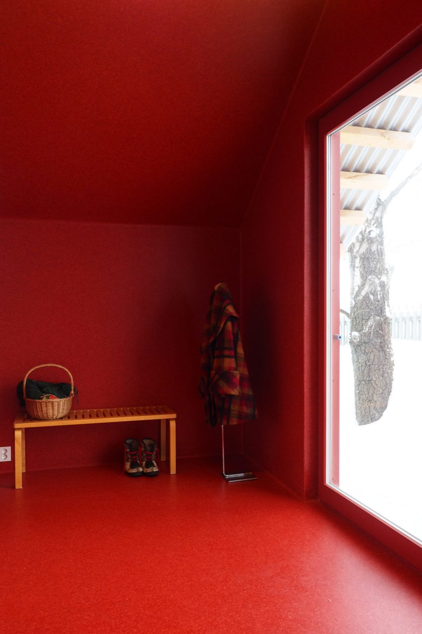
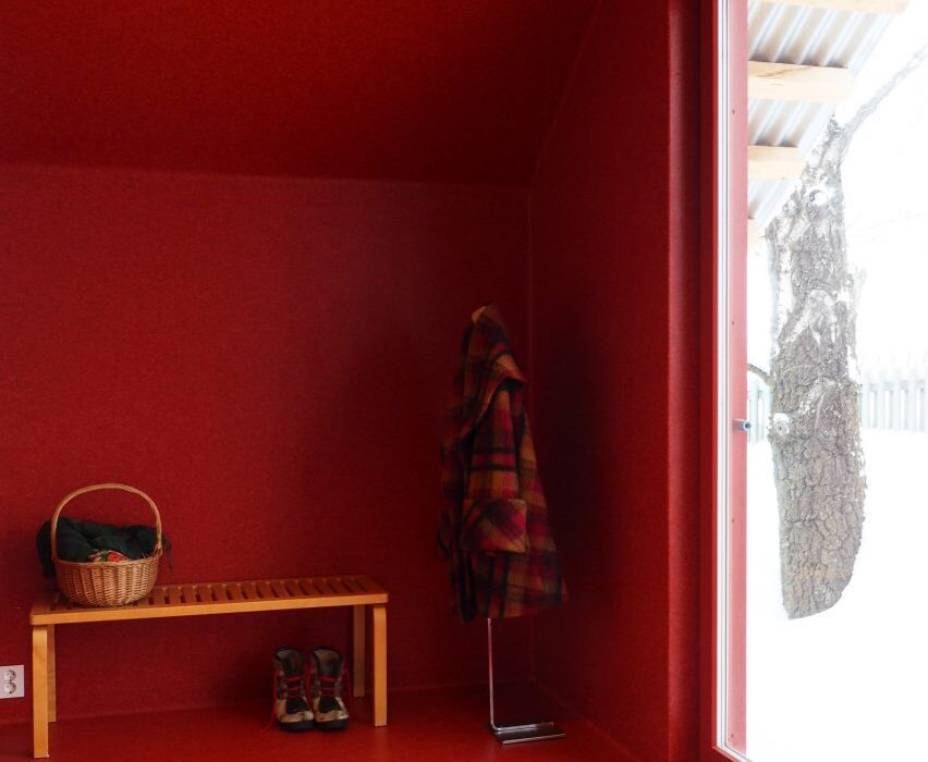
Barn House, Norway, by Jon Danielsen Aarhus 

Oslo based-architect Jon Danielsen Aarhus designed a gabled shed that sits on the grounds of a retired couple’s home in Lillehammer, Norway, which is used for painting, sculpting, craft and as additional living space.

The entrance hall of the gabled shed was covered entirely in red, including its window frames. The colour was chosen specifically to contrast against the structure’s raw timber exterior.

Find out more about Barn House ›


AEtelier office by Studio Anton Hendrik Denys
Photo by Hannelore Veelaert

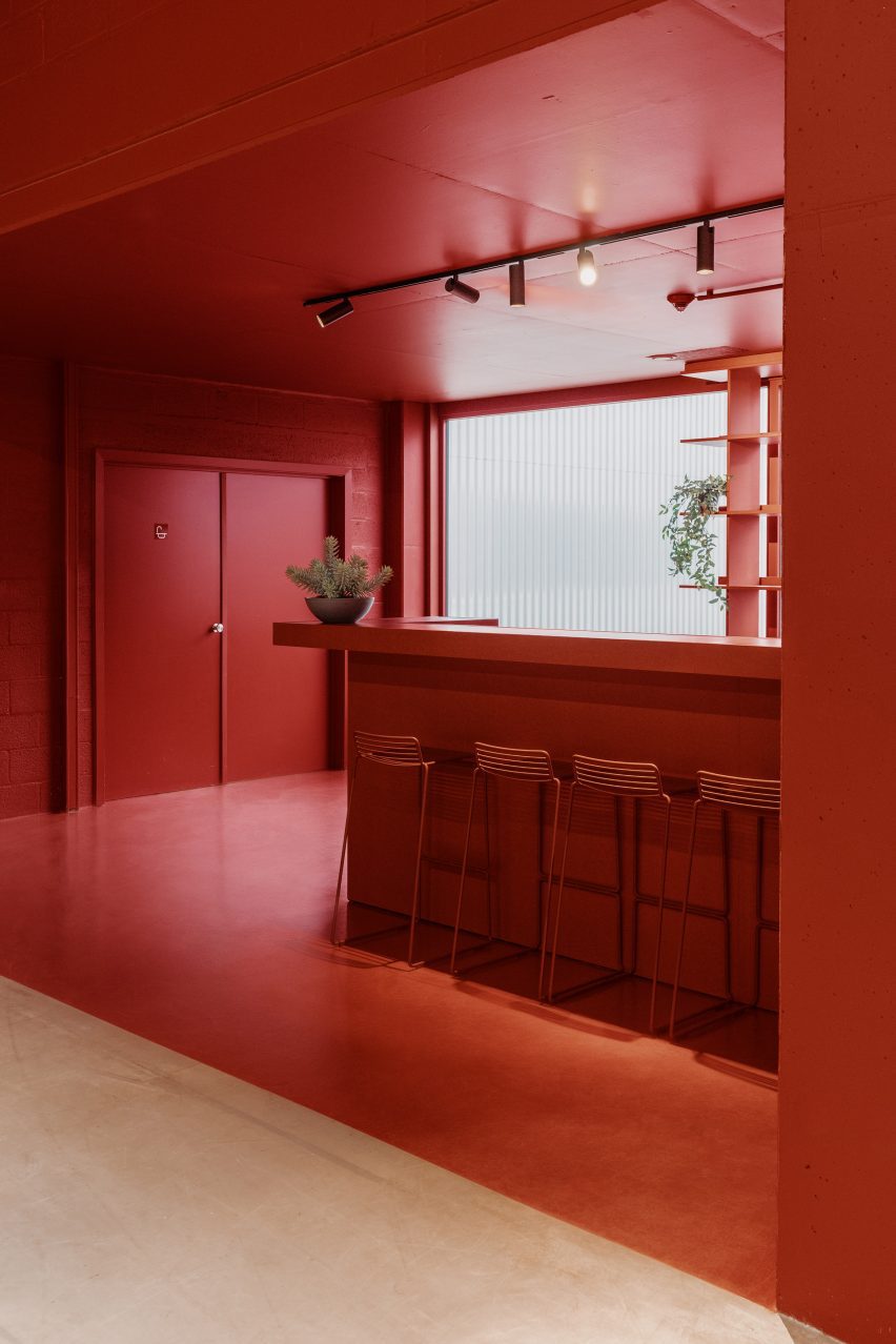
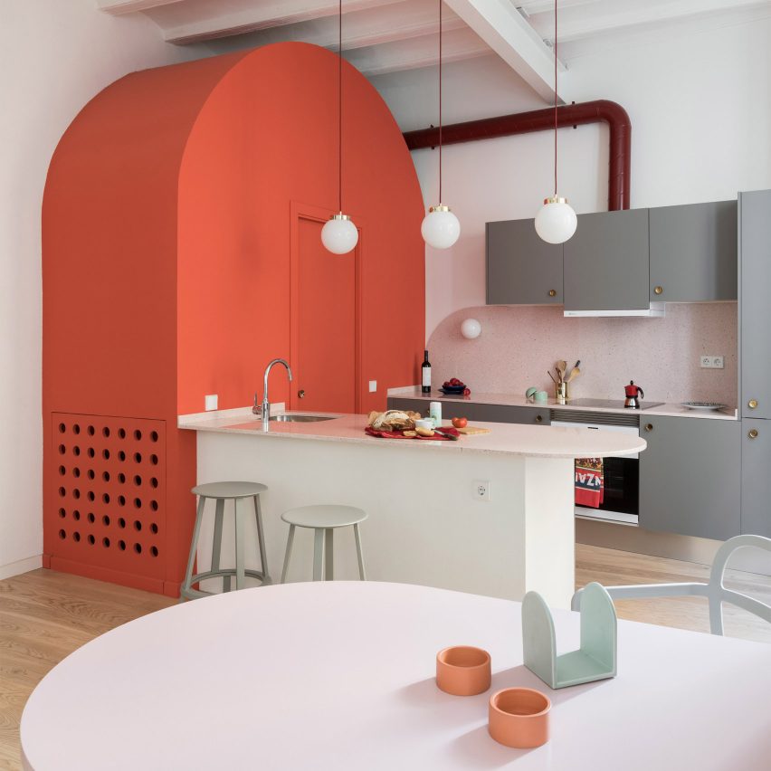
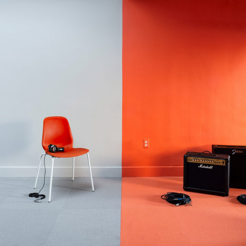
AEtelier office, Belgium, by Studio Anton Hendrik Denys

In Belgium, Studio Anton Hendrik Denys and Steen Architecten transformed an industrial office building and added colourful graphics and bold hues to define areas across the interior.

The kitchen-cum-bar of the office was blanketed in an orangey-red hue, including its floor, walls, ceiling, fixtures and furnishings, which signifies and zones areas of the interior without the need for partition walls.

Find out more about AEtelier office ›


Social House by WAW Architects
Photo by Tim Van de Velde

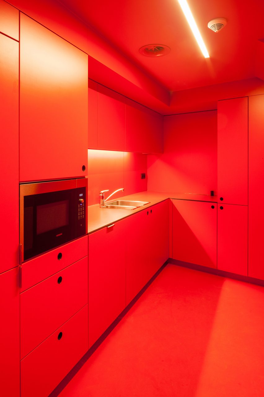
Social House, Brussels, by WAW Architects

A vibrant red covers cabinet doors, drawers, floors, walls and the ceiling of a shared staff kitchen at a social services centre in Brussels, which was designed by WAW Architects.

The centre is located within a former orphanage and was converted into offices by the architecture studio. Bright hues were used throughout the interior to colour code the office space with red extending from a kitchen to an adjoining corridor.

Find out more about Social House ›


SOMA by Cake Architecture and Max Radford
Photo is by Felix Speller

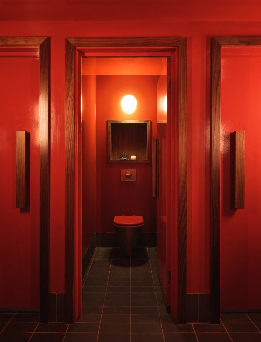
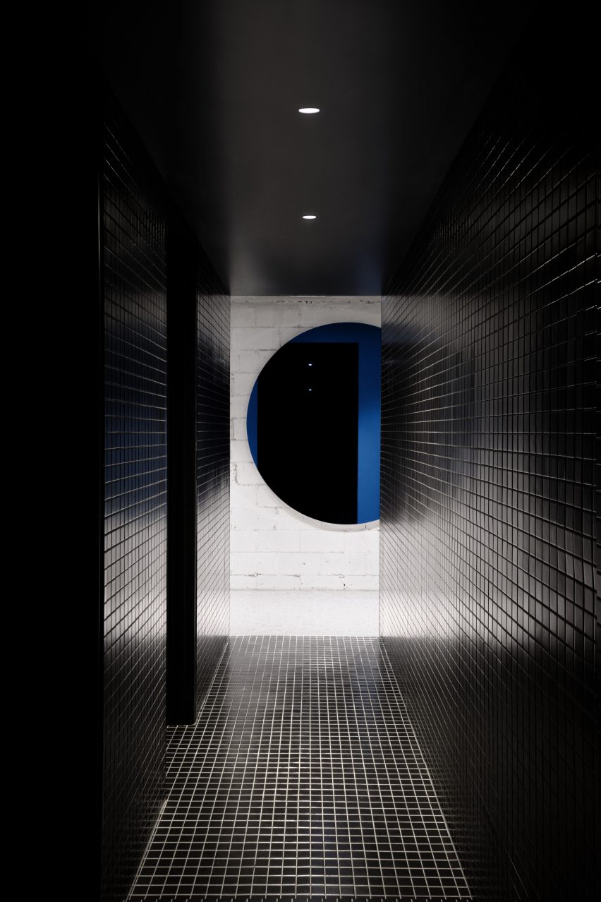
SOMA, UK, by Cake Architecture and Max Radford

Located within a basement in London’s Soho, speakeasy-style bar SOMA was designed by Cake Architecture and Max Radford.

The restroom of the underground bar was painted bright red and paired with wooden fixtures and trimmings that were used to surround doorframes and recessed shelving in each of the cubicles.

Find out more about SOMA ›


House in Sant Antoni de Vilamajor by Arquitectura-G
Photo is by José Hevia

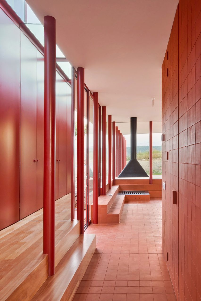
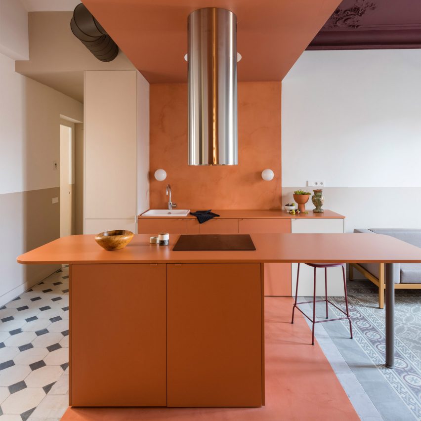
House in Sant Antoni de Vilamjor, Spain, by Arquitectura-G

Red was used as a running theme across this family home on the outskirts of Barcelona. It was designed by local studio Arquitectura-G and sits directly on top of a pre-existing garage.

Red features both inside and outdoors with many materials used across the exterior similarly used to decorate the interior, such as red bricks, red corrugated panelling and clay tiles.

Find out more about House in Sant Antoni de Vilamjor ›


Collective/Collectible by Masa
Photo is by Genevieve Lutkin

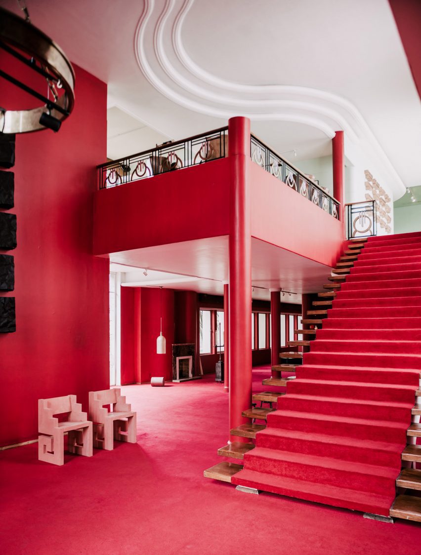
Collective/Collectible, Mexico, by Masa

Rich tones of red blanket the walls and floors of this abandoned mansion in the Lomas neighbourhood of Mexico City, which was used as the setting for an exhibition by gallerist Masa.

The 1970s home was decorated with furniture designed by 16 Mexico City-based designers and architects, including Esrawe, EWE Studio and Frida Escobedo. The interior features a grand staircase that was topped with a red runner.

Find out more about Collective/Collectible ›


Lookout House by Faulkner Architects
Photo is by Joe Fletcher

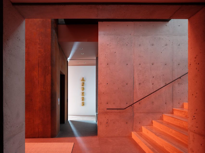
Lookout House, US, by Faulkner Architects

Although this room has no physical red elements Lookout House was fitted with red-tinted glass that provides the interior with a glowing red hue when light penetrates through the home.

The home is located in Truckee, California at the foot of Lookout Mountain volcano. It was designed by Faulkner Architects who wanted to mimic the colour of cooling magma within the home.

Find out more about Lookout House ›


Fox Head Inc office by Clive Wilkinson Architects

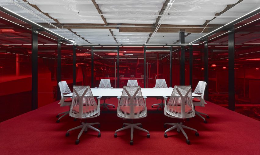
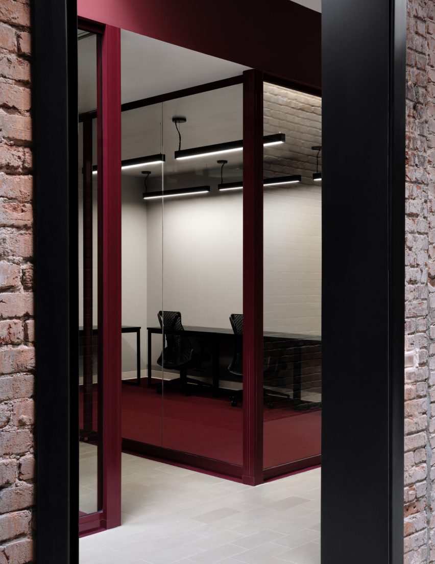
Fox Head Inc, US, by Clive Wilkinson Architects

A bright red interior was selected as a focal feature for the offices of a motocross apparel company in California. The headquarters was designed by Clive Wilkinson Architects which transformed a 7,600-square-metre warehouse into a flexible workplace.

A conference room at the headquarters was enclosed with red-tinted glass and fitted with a deep red carpet. A large white table and matching chairs, which have a bright red upholstered seat, were placed at the centre of the space.

Find out more about Fox Head Inc office ›

This is the latest in our lookbooks series, which provides visual inspiration from Dezeen’s archive. For more inspiration see previous lookbooks featuring terraces and balconies, marble-lined bathrooms and cave-like interiors.

Reference

A wound dressing that changes colour to reveal infection
CategoriesSustainable News

A wound dressing that changes colour to reveal infection

A wound dressing that changes colour to reveal infection

Spotted: The World Health Organization (WHO) identifies antibiotic resistance as one of today’s biggest threats to global health, food security, and development. One way to reduce the need for antibiotics is to lessen the number of infections requiring additional care. With a lot of outpatient healthcare resources spent on wound treatment, a reduction in the rate of infection would drastically affect the amount of antibiotics prescribed.  

A team of Linköping University researchers, in collaboration with colleagues from Örebro and Luleå Universities, has created a new material that helps reduce infections in healing wounds. Traditionally, healthcare workers lift a dressing to visually evaluate the healing process. With each exposure, there is an increased risk of infection. Continual disturbance of the wound also slows the healing process.  

The new material is a tight mesh made of nanocellulose that allows gases and liquids through. Loaded onto the material is a nanoscale silica compound containing bromthymol blue dye. The dye reacts to a pH level of more than seven by turning from yellow to blue. Non-infected wounds have a pH level of approximately 5.5, meaning that any increase will begin to cause a reaction in the dressing. 

As the dressing changes colour, healthcare teams can consider treatments far earlier than if they had to wait for a full-blown infection to develop. Because the dressing allows air to pass through, it is designed to stay on the wound during the entire healing process. In a best-case scenario, a patient wouldn’t ever have to change the dressing, meaning that wounds could heal faster because the scabbing process is never disturbed.  

The flexible material is ideal for use in hard-to-reach and hard-to-bandage areas of the body. Alongside the dressing, the researchers are also developing anti-microbial substances to further strengthen the dressings. The dressing could be available in five to ten years, depending on the speed with which it can pass through the required healthcare regulatory checks.  

Smart bandages are being tested out in a multitude of ways, with Springwise spotting innovations that include a dressing that releases antibiotics when bacteria are detected and a bandage that glows when an infection develops.

Written By: Keely Khoury

Reference

Maximalist interior of Hotel Les Deux Gares
CategoriesInterior Design

Ten maximalist interiors that are saturated with colour and pattern

Maximalist interior of Hotel Les Deux Gares

Clashing colours, statement furnishings and mismatched patterns feature in this lookbook, which rounds up ten flamboyant interiors that embody the maximalist aesthetic.

Maximalism is a style of art and design that rejects the rules of minimalism. Instead, exuberance is celebrated and anarchic use of pattern, colour and texture are encouraged.

According to Claire Bingham, author of the book More is More, the style can be attributed to the Memphis Group – the 1980s design and architecture collective known for their bold postmodern creations.

However, as demonstrated by this roundup, maximalism continues to make its mark today, as designers apply the aesthetic to the interiors of our homes as well as to public spaces.

This is the latest in our lookbooks series, which provides visual inspiration from Dezeen’s archive. For more inspiration see previous lookbooks showcasing brutalist interiors, walk-in wardrobes and colourful living rooms.


Maximalist interior of Hotel Les Deux Gares
Photo is by Benoit Linero

Hotel Les Deux Gares, France, by Luke Edward Hall

Contemporary pea-green walls stand in stark contrast to chintzy wallpaper and soft velvet sofas in the rooms of the Hotel Les Deux Gares in Paris.

According to its designer Luke Edward Hall, the aesthetic is intended to be “anti-modern” – harking back to a Paris of the past.

Find out more about Hotel Les Deux Gares ›


Kitchen and dining room of Casa TEC 205 in Mexico
Photo is by Adrián Llaguno

Casa TEC 205, Mexico, by Moneo Brock

The bright-coloured works of Mexican architect Luis Barragán informed the look of this maximalist-style home in Monterrey, designed by architecture studio Moneo Brock.

Inside, striking wallpaper prints are juxtaposed with geometric tiling and colour-blocked walls, such as in the kitchen and dining room where a large floral mural takes centre stage.

Find out more about Casa TEC 205 ›


Maximalist interior of Rookies optician in Munich
Photo is by Günther Egger

Rookies, Germany, by Stephanie Thatenhorst

Designer Stephanie Thatenhorst challenged the conventional look of healthcare facilities when designing this kid-friendly optician in Munich.

Intended as a “noisy, wild and unique paradise for children”, it marries a bright blue carpet with geometric wall tiles, U-shaped neon lights and display areas covered in apricot-coloured fabric.

Find out more about Rookies ›


Interiors of VIP centre at Schiphol airport by Marcel Wanders

Schiphol airport lounge, Netherlands, by Marcel Wanders

The flamboyant rooms of the Schiphol airport lounge were all given a distinct look when renovated by Marcel Wanders, a creative best known for his uninhibited maximalist style.

Among them is an animated seating area that references canal houses in Amsterdam. Its finishes include wall panels resembling giant stained-glass windows and a cartoonish lamp that mimics a street light.

Find out more about Schiphol airport lounge ›


Goldie's Sunken Bar at Austin Proper Hotel and Residences by Kelly Wearstler
Photo is by The Ingalls

Austin Proper Hotel and Residences, USA, by Kelly Wearstler

Interior designer Kelly Wearstler teamed local art and textiles with one-off vintage details when creating the eclectic interior for Austin Proper Hotel and Residences.

This includes the hotel’s drinking establishment, which occupies a room with high ceilings covered in decorative wallpaper. Below, a cobalt blue-painted bar sits against low stuffed armchairs, chunky wooden tables and stone plinths.

Find out more about Austin Proper Hotel and Residences ›


Hallway of members' club Annabel's by Martin Brudnizki Design Studio

Annabel’s, UK, by Martin Brudnizki Design Studio

This dim hallway features in London members’ club Annabel’s, which was recently overhauled by Martin Brudnizki Design Studio to make visitors feel as though they have been “transported somewhere else”.

Similarly to the rest of the building, the corridor features clashing animal prints across all its surfaces and is overlooked by a sculpture of a gorilla on a seat – just one of the fanciful features hidden inside.

Find out more about Annabel’s ›


Pool area at the Mondrian hotel in Qatar

Mondrian hotel, Qatar, by Marcel Wanders

Marcel Wanders also applied his signature maximalist style to the interior of the Mondrian hotel in Doha, which is filled with mismatched patterns and oversized furnishings.

Among its standout spaces is the swimming pool on the 27th floor. Crowned by a floral-patterned stained-glass dome, it features bulbous white seating, a tactile grass-like bridge and monochrome tiling.

Find out more about Mondrian hotel ›


Maximalist bedroom inside the Studio Job office

Studio Job office, Belgium, by Studio Job

Studio Jobs’ founder Job Smeet describes his maximal self-designed home and office in Antwerp as being “like a visual assault”.

Encased by an exposed concrete shell, it comprises a central gallery space, kitchens, bathrooms and bedrooms – one of which clashes paint-splattered walls with shark-patterned wallpaper, a maze-like rug and spaghetti-print bed sheets.

Find out more about Studio Job office ›


A round bar at Esme Hotel with stools around it
Photo is by Christian Harder

Esme Hotel, USA, by Jessica Schuster Design

In an overhaul of the boutique Esme Hotel in Miami, New York studio Jessica Schuster Design opted for saturated tones and sculptural furnishings to “create an artful collage of bohemian grandeur”.

Among its decadent spaces is a mahogany cocktail bar that is encircled by fringed stools and sculptural pendant lighting, set against a checkered floor and a wooden ceiling.

Find out more about Esme Hotel ›


Living room of Polychrome House by Amber Road
Photo is by Prue Ruscoe with styling by Alicia Sciberras

Polychrome House, Australia, by Amber Road and Lymesmith

Pops of bright primary colours feature in every room of this 1960s house in Sydney, which was recently renovated by studio Amber Road and colour consultant Lymesmith.

When extending the ground floor, the team introduced an open-plan living space with graphic paved floors modelled on aerial photographs of the surrounding terrain, which contrasts with white-painted brick walls that are partly covered by an abstract mural.

Find out more about Polychrome House ›

This is the latest in our lookbooks series, which provides visual inspiration from Dezeen’s archive. For more inspiration see previous lookbooks showcasing brutalist interiors, walk-in wardrobes and colourful living rooms.

Reference

Colour of the Year interior
CategoriesInterior Design

This week we revealed Wild Wonder as 2023’s Colour of the Year

Colour of the Year interior

This week on Dezeen, the Colour of the Year 2023 –  a pale yellow that is described as “a soft gold with hints of green” – was announced.

To mark the announcement by paint company Dulux, we created a lookbook that showcases interiors that have used the pale yellow hue.

Revamp of Venturi Scott Brown's National Gallery
Selldorf Architects has proposed a redesign of the Sainsbury Wing

This week, architects, critics and academics raised concerns about the plans to remodel Robert Venturi and Denise Scott Brown’s postmodern Sainsbury Wing at the National Gallery in London. They described the plans, which have been drawn up by Selldorf Architects, as an “act of vandalism”.

In an opinion piece for Dezeen, Catherine Slessor wrote that “history now seems to be repeating itself at the Sainsbury Wing”.

Atomik Architecture staff who are balloting to strike
Workers at Atomik Architecture are balloting to strike

Also in London, staff at architecture studio Atomik Architecture announced a “historic strike ballot”.

Workers at the studio notified their employers that they were initiating a strike ballot to demand improvements to both their pay and working conditions.

Lightyear 0 solar-powered car silhouetted against a black backdrop
Lightyear developed “the world’s first production-ready solar car”

Continuing our Solar Revolution series we interviewed Emanuele Cornagliotti, who is the lead solar engineer at car company Lightyear, which developed “the world’s first production-ready solar car”.

Solar cars will be “normal within 20 years,” he told Dezeen.

King Charles III on architecture
No 1 Poultry was the result of a King Charles intervention

Following King Charles III becoming Britain’s new monarch, we took a look back at his impact on architecture while he was the Prince of Wales.

In his previous role, Charles exerted significant influence on the built environment through campaigning, building traditional towns and torpedoing modernist projects.

Dezeen Awards 2022 public vote
Dezeen Awards 2022 public vote opened this week

This week we opened the Dezeen Awards 2022 public vote to allow readers to pick their favourite projects and studios. Readers can now vote for the best projects shortlisted in the architecture, interiors and design categories, as well as our media and sustainability categories.

Voting closes on 10 October with winning projects receiving a special Dezeen Awards 2022 public vote certificate.

PMA madhushala wraps Indian home in perforated wall of brick and stone
Indian studio PMA Madhushala designed a brick and stone house

Popular projects this week include an Indian home wrapped in a perforated wall of brick and stone, a hotel resembling an upside-down village in the Alps and a rammed-earth retreat in São Paulo.

This week’s lookbooks showcased eateries that showcase the potential of terrazzo and kitchens with polished granite surfaces.

This week on Dezeen

This week on Dezeen is our regular roundup of the week’s top news stories. Subscribe to our newsletters to be sure you don’t miss anything.

Reference

A bedroom interior with one golden wall
CategoriesInterior Design

Wild Wonder named Dulux Colour of the Year 2023

A bedroom interior with one golden wall

Paint brand Dulux has revealed Wild Wonder, a pale yellow paint colour that it described as “a soft gold with hints of green” as its Colour of the Year for 2023.

Wild Wonder was selected for its close association with nature. The brand said this echoes the global shift toward sustainability, reconnecting with the outdoors and wanting to be more grounded, particularly following the recent period of uncertainty.

A bedroom interior with one golden wall
Wild Wonder is a golden green paint colour

“Our relationship with the natural world feels more precious and precarious than ever,” said Dulux UK.

“Wild Wonder is a soft gold with hints of green inspired by fresh seed pods and harvest grain,” the brand added.

A pink and yellow wall in a cafe
The colour was selected for its association with nature

As well as its affiliation with nature and raw materials, Wild Wonder is also intended to capture the collective quest for better mental health, which has become increasingly important in light of global events such as the climate crisis and coronavirus lockdowns.

“As people search for support, connection, inspiration and balance in the world today, they’re diving into the wonders of the natural world to find it,” said the brand.

“Wild Wonder is a positive, natural tone that, by connecting us with the natural world, can help us feel better in our homes,” it continued.

“As well as understanding the value of nature more keenly, with climate change becoming a reality for all of us, we also feel the urgency of reconnecting with nature and the necessity of working with rather than against it.”

According to the brand, the colour can be used to add colour to areas in the house, such as living rooms, that require warmth and light. The brand also said that the hue is suitable for commercial spaces across all sectors including schools and hospitals.

“Wild Wonder and four complementary, versatile colour palettes can be used to create stunning spaces across all sectors,” explained Dulux.

Wild Wonder Colour of The Year by Dulux
The paint colour is suitable for all commercial sectors as well as residential interiors

Dulux’s parent company AkzoNobel decided on the shade, which is the 20th colour to be chosen as a Dulux Colour of the Year, after a three-day workshop with a panel of industry experts from across the globe and months of researching with the paint company.

Wild Wonder is a slightly more upbeat hue than Brave Ground, an earthy beige that Dulux selected as its colour of the year for 2021 against the backdrop of the coronavirus pandemic.

The colour is a marked change from last year’s sky blue colour Bright Skies, which the brand said captured collective desires for a fresh start.

The images are courtesy of Dulux.

Reference

Duck-egg blue kitchen with pink terrazzo breakfast bar
CategoriesInterior Design

Ten home kitchens that use colour to make a statement

Duck-egg blue kitchen with pink terrazzo breakfast bar

In our latest Dezeen Lookbook, we’ve rounded up 10 residential kitchens by designers who have experimented with bright tiles and coloured cabinets to challenge the ongoing trend of all-white cooking spaces.


Duck-egg blue kitchen with pink terrazzo breakfast bar

Plaster Fun House, Australia, by Sans-Arc Studio

A pink-terrazzo breakfast bar is complemented by duck-egg blue cabinetry, spherical pendant lights and abundant brass detailing in this kitchen by Sans-Arc Studio.

It was built as part of an extension to a cottage in Torrensville and takes its cues from art deco and P&O architecture – a style that emerged following the popularity of cruise liners in the 1930s.

Find out more about Plaster Fun House ›


Mustard yellow kitchen with orange splashback tiles

Delawyk Module House, UK, by R2 Studio

R2 Studio introduced mustard-yellow cabinets to the cooking space of this 1960s home on a London council estate, as part of a playful redesign of the dwelling for a young family.

The kitchen units are teamed with retro, orange splashback tiles, minimal silver handles and an oak floor has been stained dark for contrast.

Find out more about Delawyk Module House ›


Bubblegum-pink kitchen with parquet blue tiles

Nagatachō Apartment, Japan, by Adam Nathaniel Furman

A bubblegum-pink kitchen suite sits at the heart of this Tokyo apartment that Adam Nathaniel Furman designed as “a place of happiness, joy and lightness” for a retired couple.

The units are paired with slender, blue wall tiles that are arranged in a herringbone pattern and a stripy watermelon-green floor. There is also an adjoining breakfast nook with a lilac carpet that is intended to resemble icing.

Find out more about Nagatachō Apartment ›


Bright yellow and turquoise kitchen

House P, China, by MDDM Studio

MDDM Studio combined vibrant yellow walls with earthy terrazzo fixtures made from green, orange and beige stones to create this colourful kitchen in a Beijing apartment.

Contrasting turquoise accents, seen on the cabinets and sliding doors to the room, were also added to accentuate the colour of the green stone in the terrazzo.

Find out more about House P ›


Terracotta-coloured kitchen and breakfast bar

Klinker Apartment, Spain, by Colombo and Serboli Architecture

Terracotta-coloured cement lines the ceiling, wall and floor of the kitchen inside of Klinker Apartment, a holiday home by Colombo and Serboli Architecture in an art-nouveau building in Barcelona.

These warm surfaces are complemented by matching cabinetry and a central breakfast island but contrasted with the surrounding patterned floor tiles that were saved from the flat’s previous fit-out.

Find out more about Klinker Apartment ›


Seaweed-coloured kitchen with marble worktops

Belgian Apartment, Belgium, by Carmine Van Der Linden and Thomas Geldof

The birch-wood cabinets and shelving that line this apartment’s kitchen have been stained a murky shade of green to evoke seaweed and marram grasses, paying homage to its setting on the Belgian coast.

They are paired with a dusky plaster wall finished in the same colour, alongside chunky industrial steel detailing, light marble worktops and a speckled grey floor.

Find out more about Belgian Apartment ›


Multi-coloured kitchen with concrete countertops

Kennington House, UK, by R2 Studio

Kennington House’s multi-coloured cooking space was designed by R2 Studio as “a kitchen that doesn’t scream ‘kitchen'” by avoiding the use of cold and shiny surfaces.

Instead, it is lined with birchwood cupboards that have cobalt blue, lemon yellow and sage green matt finishes, adorned with coral-hued stools and concrete countertops.

Find out more about Kennington House ›


Plum-purple kitchen with green cabinetry

Esperinos, Greece, by Stamos Michael

This kitchen is one of several rooms in a guest house in Athens that Greek designer Stamos Michael overhauled to evoke a gallery-style space.

Warm plum-purple walls are animated by a large piece of modern art and set against emerald-hued cabinetry and black, industrial-style shelves.

Find out more about Esperinos ›


Blush-pink kitchen with grey cabinets

Apartment in Born, Spain, by Colombo and Serboli Architecture

Blush-coloured quartz was used to craft the flecked breakfast island and splashback inside this kitchen in a 13th-century apartment in Barcelona.

They are offset with grey kitchen units with brass handles, exposed oxblood-hued extraction ducting and a coral-coloured arched volume on one side that conceals a small toilet.

Find out more about Apartment in Born ›


Bright green kitchen with terrazzo detailing

White Rabbit House, UK, by Gundry & Ducker

A large green kitchen island with an overhanging monochrome worktop made from terrazzo is positioned at the centre of this kitchen in Gundry & Ducker’s White Rabbit House.

The island is teamed with a backdrop of matching built-in wall cabinets, arched windows and doorways, and a floor lined with large slabs of luminous white, blue and grey terrazzo.

Find out more about White Rabbit House ›

Reference

Colour-blocking in Milanese burger restaurant
CategoriesInterior Design

Ten bright and bold interiors that make use of colour theory

Colour-blocking in Milanese burger restaurant

For our latest lookbook we’ve selected ten examples of interiors enlivened by contrasting or analogous hues and colour-blocked walls.


The chosen projects all make use of colour theory, some by using analogous colours – colours that are close or next to each other on the colour wheel – while others use complementary colours, which are on opposite sides of the wheel.

The latter approach is often referred to as colour-blocking, a technique first attributed to Dutch artist Piet Mondrian and which later spread to fashion and interiors.

This is the latest roundup in our Dezeen Lookbooks series providing visual inspiration for the home. Previous articles in the series feature interiors with internal glazing, relaxing courtyards, outdoor seating areas with firepits and decorative printed wallpaper.


Colour-blocking in Milanese burger restaurant

Bun, Italy, by Masquespacio

This Milanese burger restaurant was created by Valencian creative studio Masquespacio, which used a lilac and avocado-green colour scheme to give it a youthful feel.

The colour-blocked interior features two complementary colours which were cleverly used to mark different functions. The purple colour is used for the serving area and the pale green for the restaurant’s dining space.

Find out more about Bun ›


Colour theory defines these interior spaces

Haussmann-era apartment, France, by Sophie Dries

Designed for clients who are “really into colour,” French architect Sophie Dries chose strong colours as the backdrop for this Paris apartment filled with street art.

The kitchen is a mix of grey cabinets and soft orangey-red floors, ceilings and walls. The designer used the colour-blocking technique of pairing orange with a darker colour, but swapped out the blue that is its traditional opposing colour on the wheel for the dark grey hue.

Find out more about this Haussmann-era apartment ›


Interiors which use colour theory can adopt colour-blocking

London townhouse, UK, by R2 Studio

R2 Studio transformed this 19th-century terraced house in the London area of Kennington into a set of colourful, light-filled rooms.

The London-based studio wanted to create a spacious and uncluttered living environment, livened up with splashes of blue, orange, yellow and green.

In the kitchen, the studio used colour-blocking by combining complementary bright yellow and bright blue cabinets for an example of how opposing colours can go well together.

Orange Miura bar stools take centre-stage against plainer concrete countertops and match the green colour of the floor and walls for another colour-block touch.

Find out more about this London townhouse ›


Colour-blocking explored in rooms at Yale University

Rooms for Yale University’s student-run radio station, US, by Forma

New York firm Forma used blocks of grey and orange to create colourful spaces in the Yale University rooms that house the student body’s radio station.

Forma painted its recording studio and performance space in segments of grey and vibrant orange, while bright chairs in a similar orange hue nod to the colour theme.

Find out more about the rooms at Yale University ›


Colour theory is an approach used by many interior designers

Resa San Mamés student accommodation, Spain, by Masquespacio

Another project by Masquespacio, which designed the interiors for student accommodation in Bilbao with baby pink seating and floors set against dark red walls.

Red and pink are traditionally not used together but instead of clashing, the analogous colours give the room a warm, inviting feel.

Designed as a welcoming community-led environment, the entire Resa San Mamés accommodation featuring various bright shades of colour.

Find out more about Resa San Mamés student accommodation ›


A colourful townhouse in Islington

Mo-tel House, England, by Office S&M

This London townhouse by local studio Office S&M features a multicoloured staircase, complete with a bright yellow banister that complements its dark blue hue and is livened up by bold pink accents.

The studio injected an abundance of vivid hues into Mo-tel House, a property with previously dark and cramped spaces in the London area of Islington.

The use of recycled materials led the design of the project, which was completed for a client who works in sustainable fashion.

Find out more about Mo-tel House ›


Colour theory in Wine and Eggs in Los Angeles

Wine and Eggs, US, by Adi Goodrich

Wine and Eggs is a Los Angeles grocery store with a checkerboard green and blue floor, designed by Adi Goodrich.

The hardwearing floor’s tones are echoed by a bright green wall featuring a circular window, and a bold blue roof, both of which were designed “as a monument to colour,” said Goodrich. The analogous colours also pick up the greenery that’s dotted around the store in the form of plants and vegetables.

The shop’s interior was informed by eclectic European grocery stores. In particular, Italian tabacchis, or tobacco shops, and Parisian cafes and Portuguese storefronts.

Find out more about Wine and Eggs ›


An office in Belarus

Minsk workspace, Belarus, by Studio11

In a more discrete example of how you can decorate with blocks of colours, Belarusian design firm Studio11 added strips of muted colour to the interior of their own workspace in Minsk, the country’s capital.

Flashes of plum and teal blue line the architecture and design office, which also features a pale pink kitchen island and rough concrete screed floors painted in a delicate shade of grey.

Find out more about Studio11’s workspace ›


Colour theory adopted in China

His House and Her House, China, by Wutopia Lab

Chinese firm Wutopia Lab renovated two houses in Dameisha Village, an urban slum, into pink and blue buildings designed to explore gender constructs for an architecture biennale in Shenzhen.

The houses themselves became separate blocks of colour, a theme that was also replicated in each building’s interiors. Inside the blue building, analogous green walls and blue ceilings were informed by the work of French artist Henri Matisse.

Find out more about His House and Her House ›


A Japanese apartment

Nagatachō Apartment, Japan, by Adam Nathaniel Furman

A formerly “claustrophobic” Tokyo apartment was transformed by designer and colour-lover Adam Nathaniel Furman into a space defined by a sugar-sweet palette of shapes.

Complete with a lilac carpet informed by icing on a cake, the pastel apartment uses complementary colour-blocking for the bright, light yellow doors with a pale pink border.

Find out more about Nagatachō Apartment ›


This is the latest in our series of lookbooks providing curated visual inspiration from Dezeen’s image archive. For more inspiration see previous lookbooks showcasing spa-like bathrooms, terrazzo kitchens and lush rooftop gardens.

Reference

Ivy Studio designed the project
CategoriesInterior Design

Ivy Studio adds pops of colour to Spacial co-working office in Montreal

Ivy Studio designed the project

Mint green and burgundy are among the hues incorporated into a Montreal co-working space that Canadian firm Ivy Studio designed to “stand out from its competitors.”


The office is located on the second floor of a 743-square-metre building in Verdun, one of city’s trendiest neighbourhoods. The space formerly housed a Jiu Jitsu gym and a beauty salon.

Ivy Studio designed the project
Spacial co-working office includes mint and burgundy hues

This is the first location for the new co-working brand Spacial. Local practice Ivy Studio was charged with designing a flexible work environment for up to 120 people.

“Being the first of its brand, this space had to stand out from its competitors by offering a unique vision for co-working,” the team said.

Local firm Ivy Studio added dashes of colour to the space
The project was designed by Ivy Studio

The team divided the rectangular space into two distinct zones.

The front portion encompasses public areas that are largely used for informal working, socialising and relaxing. In the rear, the team created a more private area with about two dozen rentable offices in varying sizes.

Throughout the space, contemporary finishes and decor are paired with original building elements, such as exposed ceiling joists and brick surfaces.

In many areas, the team coated the walls with an off-white plaster and covered the floors with light-grey terrazzo. Much of the furniture is black, although dashes of colour are sprinkled throughout.

Rainbow-coloured elements feature in the office
Dashes of colour are set against monochrome walls

Upon entering, one encounters a rounded reception desk made of zinc with a rainbow-coloured finish. Hanging on a wall is a blue, circular mirror – one of several rounded elements in the venue.

To one side of the foyer is a lounge and a trio of conference rooms, each with a wall-mounted screen.

Ivy Studio created a mixture of light and dark areas
Brick walls feature in the office

“In the conference rooms, televisions are camouflaged in front of matching, circular black mirrors, each backlit to put forward the white-washed brick wall,” the team said.

To the other side of the foyer is a second public area. This one encompasses a kitchen and dining space, including private booths that are well-suited for small groups.

Bathrooms have black tiles and pops of colour
Bathrooms have black ceramic tiles

The kitchen features curved cabinetry with a glossy mint-green finish, and a backsplash and island covered with Rosso Levanto marble. The base of the island is made of stainless steel, which mimics the chrome planters found throughout the office.

Situated near the kitchen are the bathrooms, which have black ceramic tiles and matching plumbing fixtures.

Ivy Studio put a glass-brick wall in the reception
The reception area has a blocky glass brick wall

Behind the reception desk is a glazed-block wall that separates the public zone from the private offices, while still enabling light to pass through.

The offices are arrayed along corridors with tile flooring and brick walls. Both fixed and sliding glass panels enclose the work spaces. A dark burgundy hue was chosen for the carpeting and mullions.

Skylights throw light onto the office's corridors
Skylights bring extra light into the office’s interior

To ensure the private area felt bright and welcoming, the team installed 20 skylights above the corridors.

“With the exposed brick walls, sandstone floor tiles and abundance of natural light pouring into the hallways, the general feeling resembles that of working in an exterior courtyard,” the team said.

Other co-working spaces in Canada include an office designed by Henri Cleinge within Montreal’s old Royal Bank, and a women-only space in Toronto that was designed by MMNT Studio to feel peaceful yet playful.

Photography is by Alex Lesage.


Project credits:

Architecture and design: Ivy Studio Inc
Construction: Gestion Gauthier Construction
Furniture: Ivy Studio Inc.

Reference