Apartment with green bedroom, blue kitchen and pink storage
CategoriesInterior Design

Ideas of Order selects bright colours for New York apartment renovation

Bright hues define the different interventions that New York architecture studio Ideas of Order has made in this apartment at the northern tip of Manhattan.

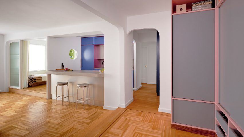
The 1,000-square-foot primary residence in Hudson Heights was partially renovated for a couple, who had been living in the space for several years before deciding to invest in making it better suited to their needs, rather than buying another apartment.

Apartment with green bedroom, blue kitchen and pink storageApartment with green bedroom, blue kitchen and pink storage
One side of this Manhattan apartment was overhauled by Ideas of Order to make it function better for its owners

“Their sons had been sharing a room, but were beginning to need their own spaces,” Ideas of Order told Dezeen.

“They also wanted a space that could be designed for flexibility for when their children left for college.”

Bedroom with lime green built-ins housing a bed, a desk and storageBedroom with lime green built-ins housing a bed, a desk and storage
In the newly created bedroom, a lime green built-in houses a bed, a desk and storage

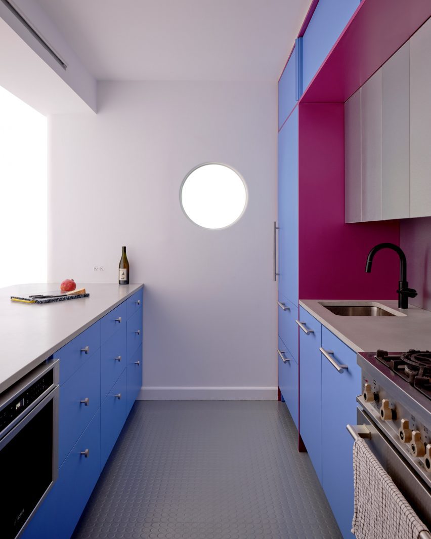
The kitchen also needed updating, to make it more suitable for entertaining, and more efficient storage space was required in the entryway.

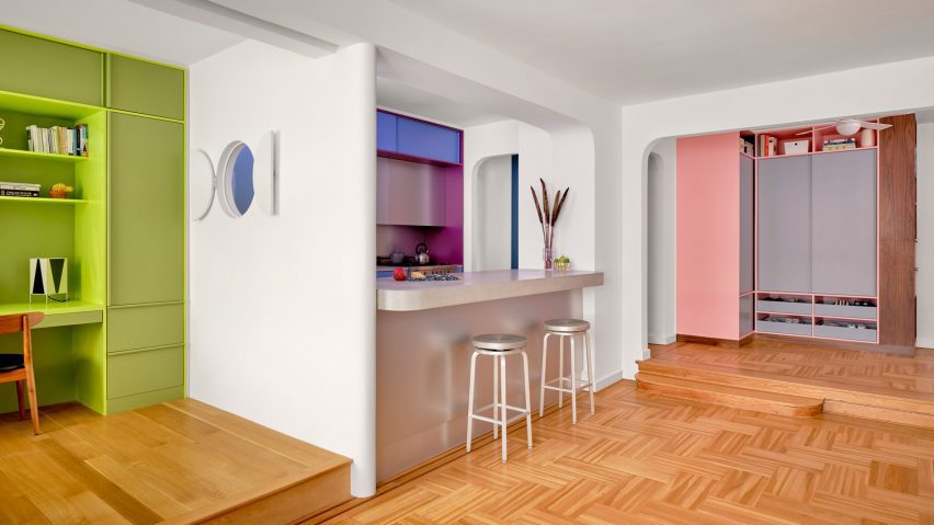
So the architects reworked one side of the open living area, adding a bedroom on one side of the kitchen and refreshing the other areas.

Blue and purple kitchen cabinets behind a concrete counterBlue and purple kitchen cabinets behind a concrete counter
A new wall divides the bedroom from the kitchen

The husband is French, and the couple spent several years living together in France.

During this period, they both became enamoured by the midcentury architecture and design in the country and wanted to apply this style to their own home.

Raspberry and periwinkle cabinets surrounding a cooking area, which also features aluminium panelsRaspberry and periwinkle cabinets surrounding a cooking area, which also features aluminium panels
Raspberry and periwinkle cabinets surround the cooking area, which also features aluminium panels

“Inspired by their stories and the history of how colour was used by French midcentury designers like Charlotte Perriand, we suggested a series of polychrome millwork pieces inspired by Perriand’s design language, but updated for a contemporary home,” said Ideas of Order.

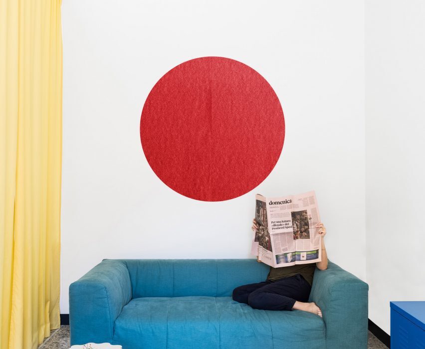
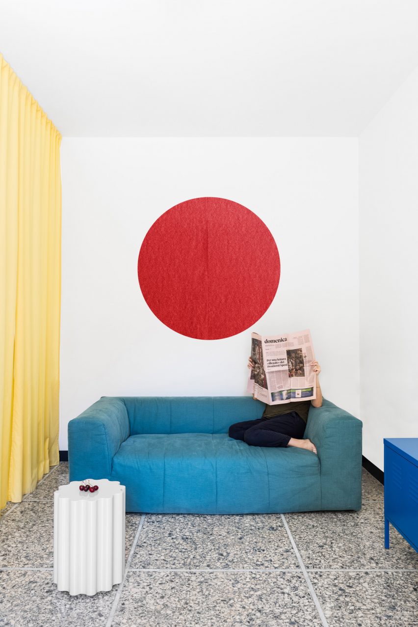
The different areas of the home were therefore given their own identities by applying bright hues.

Kitchen with cabinets on two sides and a porthole in the end wallKitchen with cabinets on two sides and a porthole in the end wall
A porthole looks through from the bedroom into the kitchen, which has rubber flooring

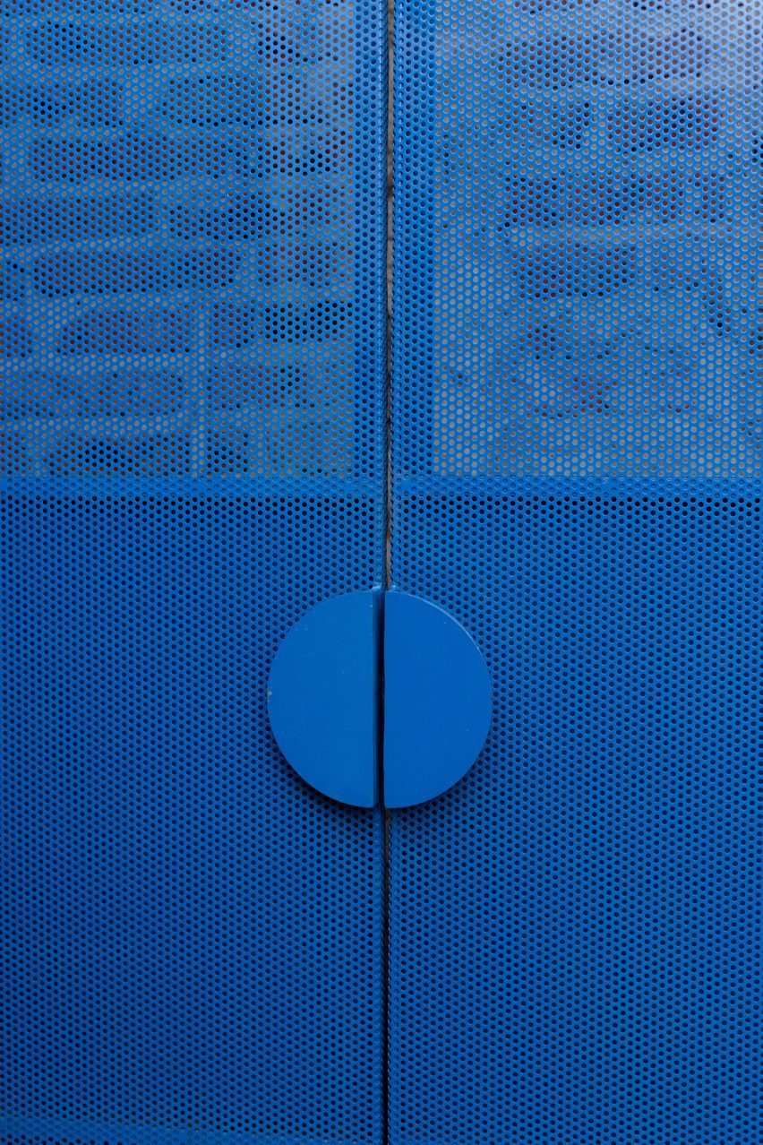
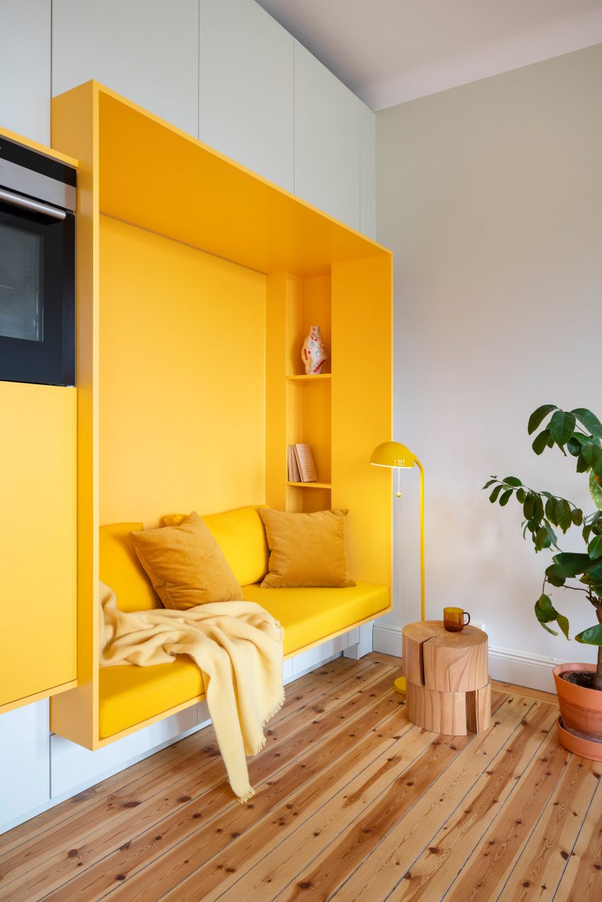
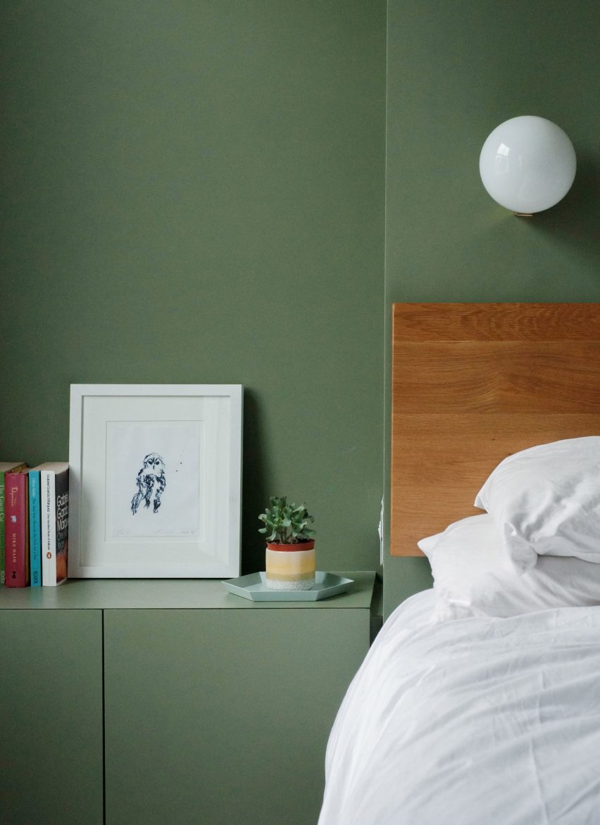
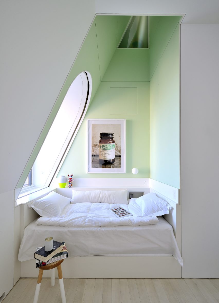
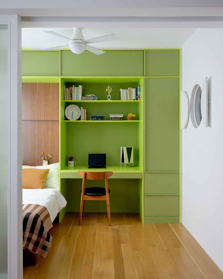
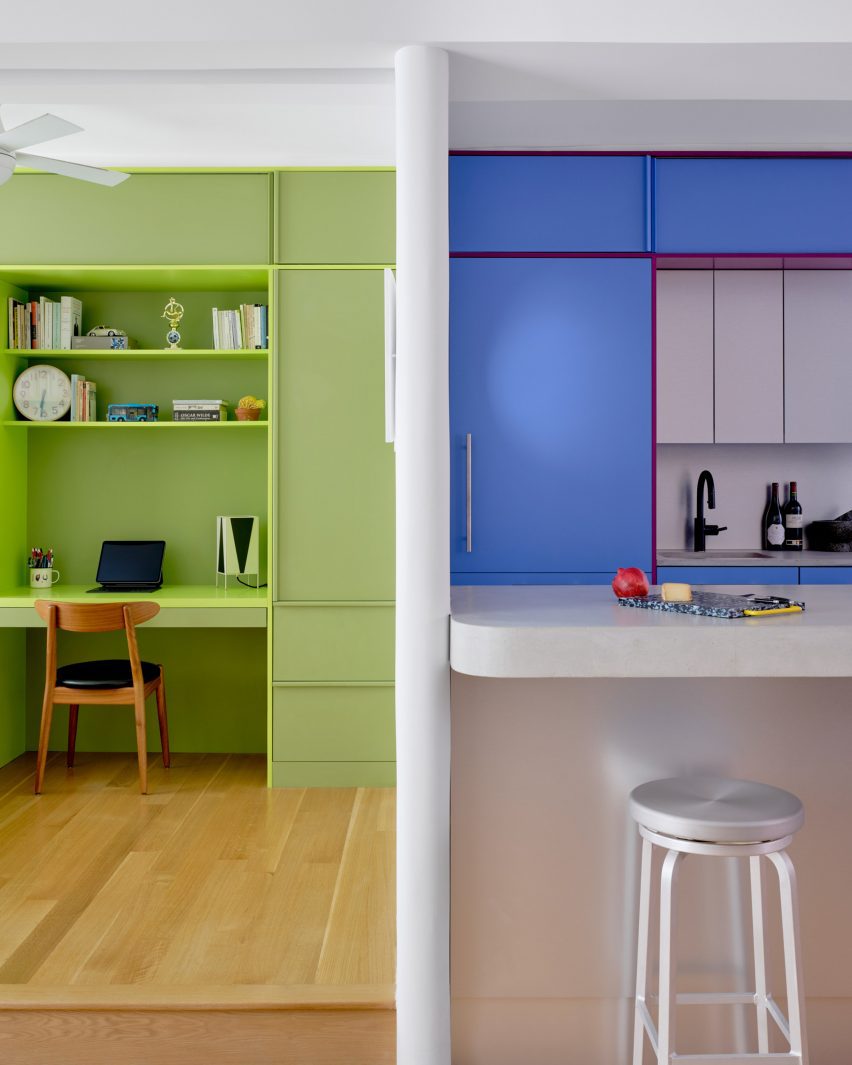
Lime green is used in the bedroom across a full wall of built-ins that incorporate a single bed, a workstation and plenty of storage.

Sliding doors with fritted glass panels pull across to enclose the slightly raised room, while a porthole window with double shutters looks through the new wall that separates the kitchen.

Pink and grey built-in storage in an entrywayPink and grey built-in storage in an entryway
Storage in the entryway was made more efficient by new pink and grey built-ins

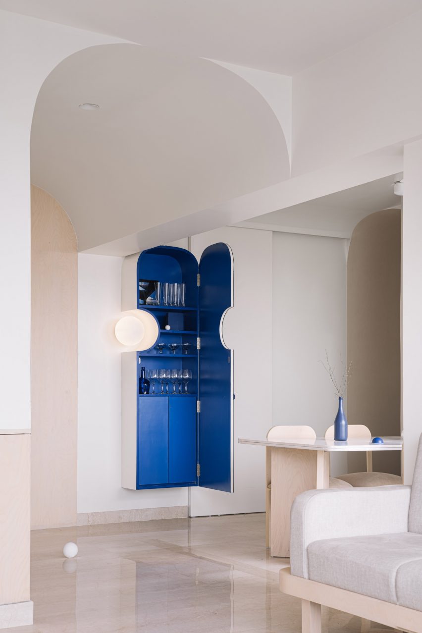
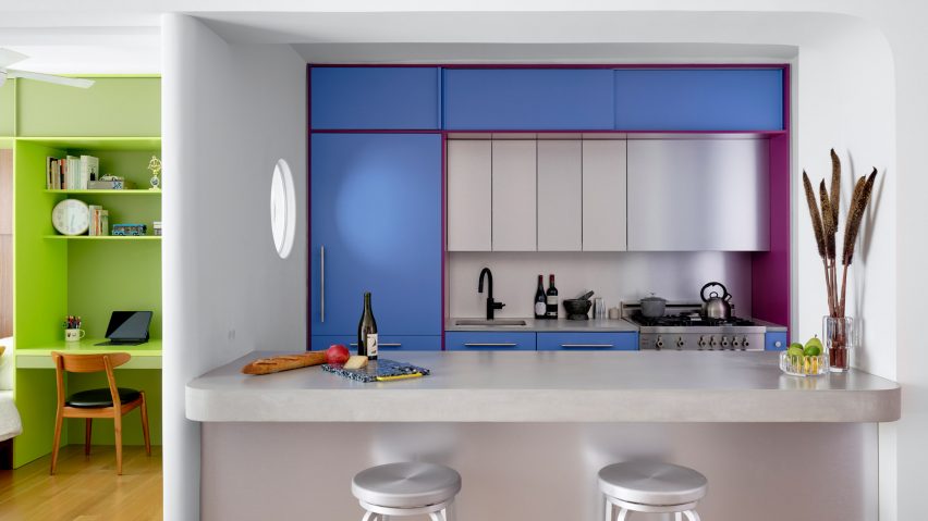
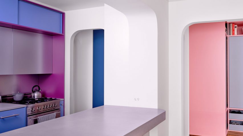
This adjacent space is denoted by raspberry and periwinkle millwork, which surrounds a small preparation area with an aluminium backsplash and matching panels above.

The same metal also fronts the bar counter between an arched opening to the living area, which is topped with concrete.

Kitchen viewed through an arched openingKitchen viewed through an arched opening
Archways between spaces throughout the apartment have curved corners

Rubber flooring in the kitchen offers a practical alternative to the wood used through the rest of the apartment.

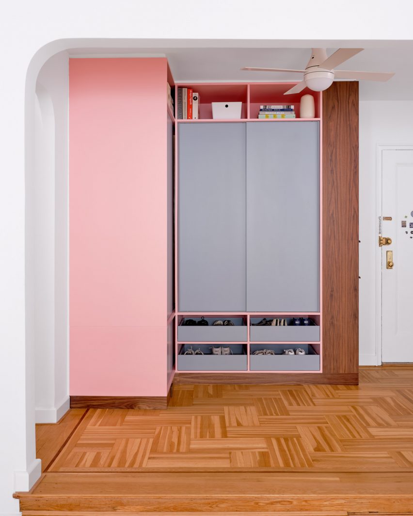
Finally, in the entryway – which is again raised slightly higher than the living area – an L-shaped cabinet system was constructed in a corner beside the door.

Pale pink is applied to the frames, while the doors and drawer fronts are finished in light grey and walnut is used for the trim. Choosing the right hues was a challenge that took many iterations to find the right balance, according to the architects.

“It was important that each pair of colours in the millwork work together, but that the colours also harmonise when viewed as a whole,” they said. “We wanted the colours to be bright, but not overpowering. And we wanted the colour pairings to feel timeless and not too trendy.”

Lime green bedroom to the left and blue kitchen to the rightLime green bedroom to the left and blue kitchen to the right
The architects went through many iterations to find the right balance of colours

Another challenge was the budget, which was modest by New York City standards and required some conscientious spending – particularly on small details that would make a big impact.

“We love the custom pulls for the millwork, the shutters for the circular window, and the rounded end to the partition between bedroom and kitchen, which reflects the rounded openings throughout the apartment,” the architects said.

Wide view of an apartment with wooden floors, white walls and colourful accentsWide view of an apartment with wooden floors, white walls and colourful accents
The couple had been living in the space for several years before deciding to invest in making it better suited to their needs

Ideas of Order was founded by Jacob Esocoff and Henry Ng, who are both Fosters + Partners and WORKac alumni.

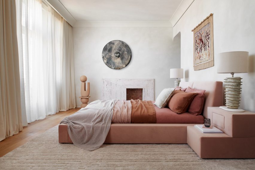
Their renovation is one of the most colourful interiors we’ve featured in New York City of late, compared to a neutral show apartment inside the One Wall Street skyscraper and a loft in Dumbo with a subdued palette.

The photography is by Sean Davidson.

Reference

Blue doorway in alleyway
CategoriesArchitecture

Bright colours fill converted brick structure in San Miguel de Allende

Architecture studios Oficina de Diseño Colaborativo and Atelier TBD have created a cultural space that preserves the “self-built essence” of San Miguel de Allende.

Created in collaboration with interior studio Maye Colab, Santa Tere Espacio is a cultural space and office that will primarily serve to foster reading in the surrounding neighbourhoods.

Blue doorway in alleywayBlue doorway in alleyway
OCD, Atelier TBD and Maye Colab have created a brightly coloured cultural space in Mexico

Santa Tere Espacio emerged from the idea of creating architecture through renovation, reuse, repair, and repurposing,” said the team. 

Based on the self-built essence of the neighbourhood, Office of Collaborative Design, TBD Atelier, and Maye Colab joined forces with a shared vision to propose a project that engages with the site’s legacy.”

A blue door open to red-tiled kitchenA blue door open to red-tiled kitchen
Located in San Miguel de Allende, the team sought to preserve the “self-built” nature of the city

According to the team, self-construction is a “common building practice in Latin America”, a technique they sought to preserve by repurposing both the existing architecture and materials from the site, which was a former six-room, single-story dwelling.

For Santa Tere Espacio, the team distributed several meeting rooms, a kitchenette, a bathroom and a central courtyard along the structure’s lateral plan with a second, detached bathroom tucked into a corner of the site. 

yellow chairs in front of a blue dooryellow chairs in front of a blue door
The site was a former single-story residence

A long alleyway, marked with a curving concrete path, runs along the length of the exterior and provides access to each space.

The intervention primarily involved demolitions to bring in light and allow ventilation of the spaces, and the incorporation of new elements such as doors, windows, and tile finishes that contrast with the pre-existing structure,” said the team.

Yellow walls facing a blue colored doorYellow walls facing a blue colored door
The team preserved much of the existing architecture and repurposed material found on-site

Openings were created in the form of doors, windows, and domes, and some walls were demolished to make way for the central courtyard.”

Colab worked with a palette of red, yellow and pink on the interior, based on hues found during construction.

primary colored officeprimary colored office
The interior palette was informed by colours found during the construction

“The idea of capturing the site’s essence is also reflected in the project’s colour palette, designed based on the colours found in the construction, with a contrasting colour being the blue of the ironwork.”

Bright blue windows and doors were distributed across the space and finished with geometric handles.

A red table and office chairA red table and office chair
Red was primarily used for furnishings

Interior furnishings were finished primarily in red, with the kitchenette covered in bright red tile and desks throughout the space trimmed in the same shade.

In a desk at the front of the building, the stalk of a plant grows through an opening carved in its surface, while a silver of a triangular skylight sits above.

Triangular skylightTriangular skylight
It features a central courtyard

The project’s landscape design incorporates both native plants and others commonly found around the neighbourhood’s rooftops, patios and facades.

A spindly palo verde plant was planted in the courtyard to provide shade, a species considered sacred to the Aztecs and associated with the feathered serpent god, according to the team. 

Santa Tere Espacio will act as a co-working and cultural space and will host OCD, Maye Colab and the bookstore Una Boutique de Libros.

Programming will focus on “reading, feminism, design and diversity”. 

Blue metal doorBlue metal door
Blue ironwork was used for windows and doors

Founded by Nadyeli Quiroz Radaelli, OCD and Maye Colab are design studios based in Mexico, while Atelier TBD, founded by Victor Wu, is an architecture office based between Brooklyn, Taipei and San Miguel.

Elsewhere in San Miguel de Allende, design studio Mestiz opened a studio to showcase its collaborations with local craftspeople.

The photography is by Leandro Bulzzano.


Project credits:

Architecture: Oficina de Diseño Colaborativo OCD, Atelier TBD
Interior design: Oficina de Diseño Colaborativo OCD, Atelier TBD, Maye Colab
Furniture and colorimetry: Maye Colab
Landscape architecture: Oficina de Diseño Colaborativo OCD, Atelier TBD
Principals: Maye Ruiz, Nadyeli Quiroz, Victor Wu
Design team: Alejandra Skinfield, Paola Bravo, Sara Lopez Farias
Structural consultant: Formula+, Yoyo Wu
Sources:
Steelwork: Crónica Estudio


Reference

La Casa de los Olivos in Valencia by Balzar Arquitectos
CategoriesInterior Design

Eight restful bedrooms decorated in the colours of autumn leaves

In this lookbook, Dezeen has selected eight bedrooms that feature shades of green, yellow, orange, red and brown to create cosy environments with an autumnal feel.

As the northern hemisphere settles into the autumn season and the days get colder, this roundup showcases examples of how to create serene and restful bedrooms by using colours similar to the changing hues of leaves.

This is the latest in our lookbooks series, which provides visual inspiration from Dezeen’s archive. For more inspiration see previous lookbooks featuring airy loft conversions, kitchen islands with waterfall countertops and art-filled living rooms.


La Casa de los Olivos in Valencia by Balzar Arquitectos
Photo by David Zarzoso

La Casa de los Olivos, Spain, by Balzar Arquitectos

Spanish studio Balzar Arquitectos designed a copper-toned home in rural Valencia with an interior colour palette informed by the colours of the surrounding landscape.

Taking cues from the leaves of the surrounding olive trees, green cupboard doors feature in the bedrooms and kitchen, while terracotta-toned flooring throughout the home mimics the colour of the reddish soil.

Find out more about La Casa de los Olivos ›


Bedroom in Zero House with wood-panelled walls and an orange carpet
Photo by Mariell Lind Hansen

Zero House, UK, by Ben Garrett and Rae Morris

Informed by the mid-century period this London home was built in, recording artists Ben Garrett and Rae Morris renovated Zero House with a warm-toned material palette.

Timber ceilings were stained a dark red hue, while the walls were stained a lighter yellow tone.

A rusty red carpet covers the floor in the main bedroom, complementing the orange velvet upholstery on the dark wood bed frame.

Find out more about Zero House ›


Bedroom with brown curtains covering a glass door leading outside
Photo by Derek Swalwell

Somers House, Australia, by Kennedy Nolan

Australian studio Kennedy Nolan finished the interior of Somer House in Victoria with shades of dark down and pops of red, mirroring the dark timber cladding and red-hued render used on the exterior.

A range of textures in the tactile flooring, curtains and wood-lined walls create variation in this deep-brown bedroom, which is accented by red bedding.

Find out more about Somers House ›


Canal Saint-Martin apartment by Rodolphe Parente
Photo by Giulio Ghirardi

Canal Saint-Martin apartment, France, by Rodolphe Parente

A palette of warm neutrals was chosen to enhance the classical heritage of this 19th-century Parisian apartment, which French interior designer Rodolphe Parente renovated in a contemporary style.

Caramel-coloured walls and a leafy green throw in the bedroom create a warm and inviting environment, which is juxtaposed by a vivid purple rug and lavender-hued bed sheets.

Find out more about the Canal Saint-Martin apartment ›


Brown bedroom with custom leather headboard
Photo by Fabian Martinez

Colonia Condesa house, Mexico, by Chloé Mason Gray

Local interiors studio Chloé Mason Gray renovated a mid-20th century house in Mexico City, embracing the lack of natural light in the home by flooding the walls with deep shades of brown and green.

The bedroom has a moody atmosphere, with brown textured plasterwork walls accompanied by a leather headboard and green linen bedding and curtains.

Find out more about the Colonia Condesa house ›


Hygge Studio by Melina Romano
Photo by MCA Estúdio

Hygge Studio, Brazil, by Melina Romano

Named after the Danish word describing a sense of cosiness and contentment, Hygge Studio is a São Paulo apartment designed by Brazilian designer Melina Romano.

Creamy brick walls, terracotta flooring and warm-toned accents feature throughout the home, including in the oversized upholstered headboard in the bedroom.

Romano also added nature-inspired elements to the bedroom in keeping with the cosy, bucolic feel of the home, including branches speckled with lichen and insect-shaped wall art.

Find out more about Hygge Studio ›


Bedroom with lime plaster walls in Hybrid House by Sketch Design Studio
Photo by Purnesh Dev

Hybrid House, India, by Sketch Design Studio

Architecture firm Sketch Design Studio used vernacular building techniques from both north and south India to create the three-bedroom Hybrid House.

The house was made from pink-toned rammed-earth walls, which were partly covered with lime plaster in the interior, and terracotta floors feature a kolam inlay created using rice flour.

Find out more about Hybrid House ›


Bedroom, Casa Tres Árboles in Valle de Bravo by Direccion
Photo by Fabian Martinez

Casa Tres Árboles, Mexico, by Direccion

Varying shades of brown define the interior of Casa Tres Árboles, a holiday home in Valle de Bravo designed by Mexican studio Direccion to be a “monastic sanctuary”.

Darker, cool-toned shades were used for the bedrooms to create a tranquil atmosphere and counterpoint to the warmer tones in the exposed timber ceiling beams.

Find out more about Casa Tres Árboles ›

This is the latest in our lookbooks series, which provides visual inspiration from Dezeen’s archive. For more inspiration see previous lookbooks featuring airy loft conversions, kitchen islands with waterfall countertops and art-filled living rooms.

Reference

Retroscena apartment renovation by La Macchina Studio in Rome, Italy
CategoriesInterior Design

Ten living spaces that are punctuated by saturated primary colours

Our latest lookbook compiles residential living rooms that have been given an air of playfulness through their use of the three primary colours.

In design, the primary colours are yellow, blue and red. They usually appear in this context as strong cobalt blues, vivid sunshine yellows and intense fire-engine reds.

This trio of colours is prevalent throughout design history and can be seen in paintings by Dutch artist Piet Mondrian and suspended mobiles by American sculptor Alexander Calder.

They are often used when designing products for children due to the visually stimulating nature of their bright, dense hues.

In interior design, they have a similarly invigorating effect, whether applied directly to structural elements such as walls and columns or found in soft furnishings and accessories.

They primary colours help to bring energy into living areas both when used in isolation and when appearing in tandem with one another.

This is the latest in our lookbook series, which provides visual inspiration from Dezeen’s archive. For more inspiration see previous lookbooks featuring four-poster beds, split-level living areas and colourful bathrooms.


Retroscena apartment renovation by La Macchina Studio in Rome, Italy
Photo by Paolo Fusco

Retroscena apartment, Italy, by La Macchina Studio

Vibrant pops of blue, yellow and red are set against a neutral backdrop of white walls and terrazzo stone floors in the living room of this mid-century one-bedroom apartment in Rome.

The space represents the distilled interior scheme devised by Italian architecture practice La Macchina Studio that characterises the apartment, which is also home to floor-to-ceiling citrus-toned curtains and bright blue doorways.

Find out more about Retroscena ›


Living room in red House in Sant Antoni de Vilamajor by Arquitectura-G
Photo by José Hevia

House in Sant Antoni de Vilamajor, Spain, by Arquitectura-G

A monochromatic red colour scheme dominates both the exterior and interior of this rural house near Barcelona designed by Spanish design studio Arquitectura-G.

The split-level living space features a rhythm of striking red-painted columns and ceiling-height cupboard doors combined with rosy clay tiles.

Find out more about House in Sant Antoni de Vilamajor ›


Lounge in Red House by David Kohn Architects
Photo by Will Pryce

Red House, UK, by David Kohn Architects

Red House in Dorset, England, was given its name by David Kohn Architects in reference to its red brick facade, however, splashes of the colour also appear throughout its eclectic interior.

Primary coloured furnishings – including a blue rug and footstool, red wall hanging and yellow upholstered armchair – are dotted around the living space, offset by white-painted cinderblock walls and warm wooden accents.

Find out more about Red House ›


Living room interior of Out of the Blue apartment in India
Photo by The Fishy Project

Out of the Blue, India, by The Act of Quad

Renovated by Mumbai-based studio The Act of Quad, this apartment in the Indian city of Thane is defined by its consistent use of cobalt blue in an otherwise neutral interior.

Soothing splashes of the colour appear in pieces of bespoke furniture – including hemispherical and spherical inclusions on light fittings and tables – and line the inside of a wall-mounted drinks cabinet.

Find out more about Out of the Blue ›


Living room interior with red cupboards and blue table
Photo by Jesper Westblom

Apartment renovation, Sweden, by Westblom Krasse Arkitektkontor

The full trio of primary colours is used across this apartment in Stockholm by local practice Westblom Krasse Arkitektkontor.

Blue, yellow and red are seen in both full saturation and muted hues on walls, ceilings, soft furnishings and furniture, creating a colourful yet cohesive interior.

Find out more about apartment renovation ›


Duplex in Sant Gervasi by Arquitectura-G
Photo is by José Hevia

Apartment renovation, Spain, by Arquitectura-G

Spanish studio Arquitectura-G used a colour palette governed by shades of yellow in its refurbishment of this apartment in Barcelona.

The living space contains a sunny yellow modular sofa and matching kitchenette, with the spaces united by a backdrop of small golden wall tiles, a honey-coloured wooden floor and white plasterwork.

Find out more about this apartment renovation ›


Interior of Fàng Sōng houseboat in Berlin by Crossboundaries
Photo by Johanna Link

Fàng Sōng, Germany, by Crossboundaries

Beijing-based architecture practice Crossboundaries reconfigured the interior of a houseboat moored in Berlin, which features modular furniture and storage solutions all finished in either red or yellow in reference to the Chinese imperial colours.

An adaptable living area onboard contains a lemon-yellow sofa that folds away to support a double bed, as well as a cantilevered desk integrated into a wall panel that can be stowed away when not in use.

Find out more about Fàng Sōng ›


Point Supreme Athens apartment
Photo by Yiannis Hadjiaslanis and Point Supreme

Ilioupoli Apartment, Greece, by Point Supreme

Graphic primary-coloured details are scattered around this 56-square-metre subterranean apartment in Athens renovated by local architecture studio Point Supreme.

The rough concrete walls and ceilings of the small living area are contrasted by red items – including a bench and window panes – as well as a trio of deep blue flags suspended in the entryway.

Find out more about Ilioupoli Apartment ›


Function Walls apartment, designed by Lookofsky Architecture
Photo by Mattias Hamrén

Function Walls, Sweden, by Lookofsky Architecture

This apartment in Stockholm, which was renovated by local studio Lookofsky Architecture, is designed around a multifunctional wall that snakes through the interior.

In the living area, the zesty yellow structure contains a sofa snuggled inside an extruded frame, accompanied by integrated shelving and matching golden upholstery.

Find out more about Function Walls ›


Interiors of Polychrome House, designed by Amber Road
Photo by Prue Ruscoe

Polychrome House, Australia, by Amber Road and Lymesmith

Australian design studio Amber Road worked with colour consultants Lymesmith on this house in suburban Sydney, which is charactertised by its excessive use of colour.

The aptly named Polychrome House is finished in a kaleidoscopic spectrum of colours, including in its living room where a wall mural of abstract shapes featuring red, blue and yellow is echoed by red and blue seating.

Find out more about Polychrome House ›

This is the latest in our lookbook series, which provides visual inspiration from Dezeen’s archive. For more inspiration see previous lookbooks featuring four-poster beds, split-level living areas and colourful bathrooms.

Reference

Brown bedroom in house in Mexico City by Chloe Mason Gray
CategoriesInterior Design

Ten earthy bedrooms that use natural colours and textures

In our latest lookbook, we highlight 10 bedroom interiors that introduce earthy colour palettes and natural materials to evoke a sense of calm and tranquility.

Warm tones of earthen brown and light neutrals were used alongside colourful pops of terracotta and leafy greens on soft furnishings, headboards and decorations to create a peaceful atmosphere in these bedrooms.

Stone surfaces, timber panelling, linen fabric, accents of clay and limewash finishes add subtle textures to the interior spaces.

This is the latest in our lookbooks series, which provides visual inspiration from Dezeen’s archive. For more inspiration see previous lookbooks featuring jewel-toned hotel interiors, kitchens with marble surfaces and biophilic homes.


Brown bedroom in house in Mexico City by Chloe Mason Gray
Photo by Fabian Martinez

Colonia Condesa House, Mexico, by Chloé Mason Gray

For the renovation of this mid-20th century house in Mexico City, local interiors studio Chloé Mason Gray embraced the lack of natural light coming into the space by introducing dark, earthy colours and textures.

The walls of the primary bedroom were coated in brown plaster, and the space was finished with a brown leather headboard and linen furnishings in deep shades of forest green.

Find out more about Colonia Condesa House ›


Interior of Casa Maiora by Studio Andrew Trotter in Puglia
Photo by Salva López

Casa Maiora, Italy, by Studio Andrew Trotter

Designed to mimic the surrounding landscape, Italian architecture practice Studio Andrew Trotter created this villa in Puglia with sandstone and limestone walls coated in a pink lime wash.

Stone floors complement the warm-toned walls while in the bedrooms, locally-sourced wooden antique furniture and large woven rugs add hints of deeper earthen shades.

Find out more about Casa Maiora ›


Bedroom interior of Dumbo Loft by Crystal Sinclair Designs
Photo by Seth Caplan

Dumbo Loft, USA, by Crystal Sinclair Designs

New York interiors studio Crystal Sinclair Designs punctuated the pale white backdrop of this bedroom in a Brooklyn loft apartment with caramel shades of brown and natural textures.

A yellow-brown velvet chair, rustic tiles that wrap around the lower half of structural columns, and a wooden batten wall help to make the space cosier and more inviting.

Find out more about Dumbo Loft ›


De Beauvoir Townhouse by HÛT
Photo by Emanuelis Stasaitis

De Beauvoir Townhouse, UK, by HÛT

As part of the overhaul of a home in London, British architecture studio HÛT finished the surfaces and joinery in the main bedroom in sage green, nodding to the use of green shades in the kitchen and living room downstairs.

According to the studio, the muted green colour was chosen for its timelessness and longevity, as well as for its visual appeal when paired with exposed timber.

Find out more about De Beauvoir Townhouse ›


Interior of Hygge Studio by Melina Romano
Photo by MCA Estúdio

Hygge Studio, Brazil, by Melina Romano

Brazilian designer Melina Romano used a myriad of earthy colours, textures and decorations to achieve a modern interior with “rustic charm” in this São Paulo apartment.

Terracotta flooring and creamy brick walls were complemented with comfy furniture and soft furnishing in earthy tones, including the rust-coloured bed frame and elongated headboard in the bedroom.

Romano also added a tropical leafy plant, branches speckled with lichen and insect-shaped wall art to the space.

Find out more about Hygge Studio ›


Custom bed in Twentieth house by Woods and Dangaran
Photo by Joe Fletcher

Twentieth, USA, by Woods + Dangaran

Wood panelling, vintage furnishings and earthy-brown colours characterise the interior spaces of the Twentieth house in Santa Monica by Los Angeles studio Woods +Dangaran, which was built around an olive tree.

The primary bedroom was designed to feel flush and luxurious, with a Mehraban silk shag rug, brass fixtures and a custom bed recessed into a wooden surround.

Find out more about Twentieth ›


Bedroom in Flat#6 by Studio MK27
Photo by Fran Parente

Flat #6, Brazil, by Studio MK27

Also featuring a custom-made wooden bed surround is this bedroom designed by local architecture and design practice Studio MK27.

The practice added tactile rugs, blankets and fabric wall panels in various shades of brown and light neutrals to contrast with the basalt stone flooring in the São Paulo apartment.

“Natural light warms up every piece and every corner, letting the woods, the velvets and the stones speak louder,” said Studio MK27.

Find out more about Flat #6 ›


Escondido Oaxa Hotel by Decada Muebles
Photo by Undine Pröhl

Escondido Oaxaca Hotel, Mexico, by Decada Muebles

Interiors studio Decada Muebles finished the bedrooms of this boutique hotel in Oaxaca City with woven palm leaf headboards and sabino wood furniture pieces made by local artisans, including side tables, bed frames and shutters.

Alongside the wood accents, stucco walls help to add warmth and texture to the space and create a relaxing place for vacationers to stay.

Find out more about Escondido Oaxaca Hotel ›


The Palace Gate by Tala Fustok
Photo by Michael Sinclair

The Palace Gate Apartment, UK, by Tala Fustok Studio

Local interior design practice Tala Fustok Studio transformed this west London apartment into a “calm sanctuary” with a mixture of stone textures, earthy fabrics and a soft-warm colour palette.

The centrepiece of the bedroom is a 1960s-style velvet bed in a dusty pink hue. Decorative items surrounding it include a wall tapestry, a modern stone fireplace and an organically-shaped ceramic statue.

Find out more about The Palace Gate Apartment ›


Lom Haijai by Studionomad
Photo by Supee Juntranggur

Lom Haijai, Thailand, by Studionomad

Lom Haijai is an apartment block in Bangkok designed by architecture practice Studionomad, which features trees growing through the facade’s louvres.

Each bedroom in the apartment block has a Juliet balcony that looks over an internal courtyard. Wooden flooring and wall panelling add to the nature-inspired theme of the design.

Find out more about Lom Haijai ›

This is the latest in our lookbooks series, which provides visual inspiration from Dezeen’s archive. For more inspiration see previous lookbooks featuring jewel-toned hotel interiors, kitchens with marble surfaces and biophilic homes.

Reference

Hidden Hiues by Note Design Studio
CategoriesInterior Design

Ten interiors with pastel colours that freshen up the home for spring

For this lookbook, we’ve rounded up ten home interiors decorated in pastel tints that show how ice-cream colours can give spaces a fresh, calming look.


The selection from our archive, which includes bathrooms to bedrooms and kitchens, shows how pastels – made by adding white to pure colours to make them more luminous and less saturated – can create a spring-like feeling.

Never really out of fashion, pastels have strong psychological associations with new life with their pale, cheery tints representing a midway stage between the darkness of winter and the full-blown colour of summer.

This is the latest roundup in our Dezeen Lookbooks series providing visual inspiration for the home. Previous articles in the series feature rooftop gardens, bright kitchens, interiors with statement plants, terrazzo kitchens, and stylish home offices.


Hidden Hiues by Note Design Studio

Hidden Tints, Sweden, by Note Design Studio

A warm, yellow tint covers the walls of this Stockholm apartment designed by Note Design Studio, which is filled with different pastel colours. A pale, spring-like green complements the yellow and is picked up in the plants dotted around the space.

Wooden furniture matches the gleaming wooden floors, while a pale orange Mango lounge chair by Note Design Studio for Wendelbo adds a touch of colour. The light above the table is SILO Trio by Note Design Studio for Zero.

Find out more about Hidden Tints ›


Longhouse in Victoria, Australia designed by Partners Hill

Longhouse, Australia, by Partners Hill

The dining room of this shed-style home in Australia has been decorated in a pale blue colour that contrasts with its wooden floor and wooden door frame, as well as the rolling plains of bushland outside the windows.

Tomato-red dining chairs give the room a contemporary, vibrant feel and stand out against the soothing blue walls.

Find out more about Longhouse ›


Suburban Canny by Tribe Studio

Suburban Canny, Australia, by Tribe Studio

Each bathroom in this Sydney home is tiled in a different colour – pink, teal and blue. The almost apricot-pink shade of the tiles is matched with a pale pink, wall-hung basin as well as the door and door frame.

The geometric shapes of the small tiles create a graphic pattern on the wall that adds interest to the monochrome interior.

Find out more about Suburban Canny ›


Foyer in Cleveland by Beauty Shoppe

Co-working space, US, by Beauty Shoppe

While the walls have been kept a discrete grey colour, pastel colours were used for other parts of the interior in this Cleveland co-working space. A Tulip side table by Eero Saarinen for Knoll sits between two of West Elm’s Thea chairs in a very pale pink shade.

Green and pink is used throughout the space, on a reception desk in pistachio green and the apricot-coloured curtains, as well as a comfy green sofa accessorised with a pink pillow.

Find out more about the co-working space ›


High House by Dan Gayfer Design

Melbourne extension, Australia, by Dan Gayfer Design

A banana-leaf ficus (ficus maclellandii) peaks in from the courtyard at this tile-clad blue bathroom in Melbourne. The tiles match the exterior of the house, which is also clad in pale blue tiles.

White-tiled walls and wooden drawers complete the clean, simple interior of the bathroom.

Find out more about the Melbourne extension ›


Green pastel bedroom

Skyhouse, US, by David Hotson and Ghislaine Viñas

This comfy sleeping nook in a Manhattan penthouse has been livened up with a very pale, almost pear-green colour that creates a peaceful feeling.

Light streaming in from a large window in the slanted wall adds to the fresh, crisp feel of the space which has been decorated with a small, practical stool as well as selected art pieces.

Find out more about Skyhouse ›


Paris apartment by Les Ateliers Tristan & Sagitta

Paris apartment, France, by Les Ateliers Tristan & Sagitta

Colour was used generously throughout this Paris flat and used in a clever way to divide the children’s room for two brothers.

One side of the space has pale blue paintwork and beige carpet, while the other has white walls and wooden floorboards laid in a zigzagging pattern. The same pale blue was also used on the side with white walls to create a decorative geometric design on the wall.

Find out more about Paris apartment ›


A Brockley Side London house extension and renovation by CAN

A Brockley Side, UK, by CAN

Architecture studio CAN added a blue and white striped extension to a Victorian terrace in London and used a pastel pink curtain to give added privacy to the kitchen and dining space inside.

Pale turquoise Eames DSW chairs are set around a white dining table, with the colour picked up by the speckled sink splashback and the blue accessories on the shelves above it.

Find out more about A Brockley Side ›


Architecture studio Nimtim renovate a Victorian terrace in London into a space saving apartment

London flat, UK, by Nimtim

Hans J Wegner’s sculptural Wishbone chair for Carl Hansen & Søn functions almost as a piece of art in this bedroom in a London flat, which has wooden fitted wardrobes and a fold-down bed.

The kitchen and dining space next to it has colourful turquoise cabinetry and a grey marble wall, which adds a luxurious touch to the space.

Find out more about London flat ›


Leman Locke hotel

Leman Locke, UK, by Grzywinski + Pons

Pale blue was used in this bedroom of the Leman Locke hotel in London, which was designed to bridge the gap between a home and a hotel stay.

Sami Kallio’s In Between chair for &Tradition matches the elegant wooden bed, and the natural wood – which is also used on the bedside table – gives the sleek space a more organic feel.

Find out more about Leman Locke ›


This is the latest in our series of lookbooks providing curated visual inspiration from Dezeen’s image archive. For more inspiration see previous lookbooks showcasing peaceful bedrooms, calm living rooms and colourful kitchens

Reference

Pastel plastic installation
CategoriesInterior Design

ASKA uses organic shapes and pastel colours for Maria Nila hair salon

Swedish architecture studio ASKA has refurbished haircare brand Maria Nila’s headquarters and salon in Stockholm, creating an undulating ceiling installation that looks like dripping shampoo.


The Stockholm-based firm used a palette of soft pink, peach and turquoise colours that reference Maria Nila’s products to transform its headquarters in a four-storey townhouse.

Pastel plastic installation
A plexiglass installation decorates the entrance

“The interior space before the renovation had a very neutral, impersonal feel to it and followed a white and grey colour scheme,” ASKA co-founder Madeleine Klingspor said.

“At ASKA, to the contrary, we always strive to create strong and flavoured environments by defining and highlighting the unique essences within each project.”

Green-checked marble floor
The chequered marble floor was preserved

The studio preserved some of the original details in the building, including a green chequered marble floor and a wooden staircase, while the rest of the space was fully refurbished.

“To add a layer of the uniqueness of Maria Nila as a brand most other parts of the interior was changed,” Klingspor said.

“Some thinner interior walls were torn down, most surfaces were repainted, new flooring was partly added as well as all bathrooms fully renovated.”

Maria Nila salon in Stockholm
Pastel shelving with undulating shapes decorate the salon

The 650-square-metre building has 30 rooms, including five bathrooms, and houses both Maria Nila‘s public and private spaces.

Though each room has a unique look, all were designed to create a coherent relationship between the existing architecture and the new interior details.

Specially designed shelves for beauty products
The colour scheme was informed by the brand’s product packaging

“The program is distributed in a way where the entrance floor is the most public and then gradually the spaces become more private and workspace-oriented the higher up that you get,” ASKA co-founder Polina Sandström said.

“The reception, salon, beauty bar, conference and meeting areas make up the first floor while the second floor is well adjusted for larger gatherings and events including a kitchenette, a viewing room and a bigger break-out space,” she added.

Art installation made from plexiglass
The four-storey townhouse has 30 rooms

At the entrance, ASKA installed a pale-pink art installation made from form-cut plexiglass designed to resemble shampoo dripping from the ceiling.

Much of the furniture was specially designed for the project, including product shelves, sofas and a beauty bar made from wood and MDF.

“Besides that, we chose to bring in products from companies that use sustainable materials, for example, a custom-made tabletop from Smile Plastic, a company that only uses waste materials in their products,” Klingspor said.

The new interior design was informed by the haircare brand’s own products, an influence that is most notable in the pastel colour palette.

Pastel colour palette
Existing architecture was incorporated into the design

“The colour scheme chosen for the different spaces throughout the building refers to the different haircare lines of Maria Nila,” Sandström said.

“These pastel colours are one of the main identities of the brand and we decided early on that this was one of the unique essences that were important to bring to the surface through our design.”

Lounge room in Maria Nila headquarters
Playful tables by Gustaf Westman add a fun touch to the lounge space

ASKA also designed numerous undulating wall shelves to hold haircare products. Painted in matching gradient hues, these were informed by nature.

“The organic shapes are inspired by elements found in nature such as the forest, ocean, coral reefs and caves,” Sandström said.

Pink mirror in hallway
An upstairs hallway has modern furniture in soft peach hues

“This soft and playful architectural language together with the pastel colours gives the interiors a unique visual identity,” she added.

Other playful hair salon interiors include Studio Roslyn’s design for a salon that is the “lovechild of art deco and Cyndi Lauper” and an avocado-green Beijing salon informed by space-age design.

Photography is by Mikael Lundblad.

Reference