Timber exterior of Two Sisters holiday home in Finland
CategoriesArchitecture

MNY Arkitekter completes “down-to-earth” house for two sisters in Finland

Timber exterior of Two Sisters holiday home in Finland

Finnish studio MNY Arkitekter has completed Two Sisters, a timber holiday home in Salo that is designed to allow two siblings to live “together separately”.

To create a dedicated space for each of the two sisters, MNY Arkitekter divided the home into two standalone units joined by a central terrace overlooking the surrounding rocks and pine trees on Finland’s west coast.

Timber exterior of Two Sisters holiday home in FinlandTimber exterior of Two Sisters holiday home in Finland
The two units are joined by a central terrace

“In many ways the site is one of typical Finnish inner archipelago terrain and vegetation, and one of the main goals was to preserve as many trees and visible rocks as possible,” MNY Arkitekter founder Mathias Nyström told Dezeen.

“Equality of the views from the two units was also important and had a significant impact on the layout.”

Living area within Two Sisters in FinlandLiving area within Two Sisters in Finland
Each unit has large windows. Photo by Mathias Nyström

The home’s two units “fan out” to provide privacy and avoid the surrounding trees, while making space for an existing sauna, utility room and overnight shelter on the site.

Each block features large windows at its western end, looking towards the sea and pine trees to the west. Openings facing the central terrace have been placed to minimise overlooking.

Kitchen interior of holiday home by MNY ArkitekterKitchen interior of holiday home by MNY Arkitekter
Black kitchen counters feature in each living space

“Being in one of the units you can only see the other from certain points, otherwise you mostly sense the existence of the other part,” said Nyström.

“You are on your own, but feel part of a bigger entity,” he added.

Each living space at Two Sisters has been finished with black kitchen counters, a dining table and a large freestanding fireplace. Built-in bench seating provides space to sit and look out over the landscape.

In the northern block, a bed is housed in a small nook off this living space backed by a full-height window, while to the south the slightly larger unit provides a double bedroom and two single bedrooms alongside the living space.

Bedroom interior within timber holiday home in Finland by MNY ArkitekterBedroom interior within timber holiday home in Finland by MNY Arkitekter
A small bed is backed by a full-height window in the larger unit

Two Sisters has a prefabricated structure of glue-laminated timber, finished externally with vertical planks of spruce. Internally, pale timber walls, floors and ceilings are treated with lye.

“The aim for the atmosphere was to create a uniform, serene space where nature plays a big part – the end result is very uplifting,” said Nyström.

“The weathered silver-grey wood will fuse the building in the landscape with rocks and pines. All in all it is a down to earth and subtle building,” he added.

Living space interior within Two Sisters holiday homeLiving space interior within Two Sisters holiday home
The home is constructed from glued-laminated timber

Elsewhere in Finland, MNY Arkitekter created a home on the shoreline of a small lake in Tenala using seven different varieties of timber.

Other recent projects in the country include a sauna and restaurant on the edge of Lake Saimaa by Studio Puisto and the steel-clad Dance House by JKMM and ILO architects in Helsinki.

The photography is by Multifoto Ab unless otherwise stated.

Reference

Wall niche with stainless steel shelving in Gigi Studios office
CategoriesInterior Design

Isern Serra completes “serene” office for eyewear brand Gigi Studios

Wall niche with stainless steel shelving in Gigi Studios office

Sculptural custom-made furniture adds artistic flourishes to this otherwise minimal showroom and head office, designed by Spanish interiors studio Isern Serra for eyewear brand Gigi Studios.

Isern Serra was tasked with creating a holistic scheme for the 900-square-metre headquarters, occupying one floor of a building in the town of Sant Cugat del Vallès just north of Barcelona.

Wall niche with stainless steel shelving in Gigi Studios office Wall niche with stainless steel shelving in Gigi Studios office
Isern Serra has filled the Gigi Studios headquarters with custom furniture

The brief called for a design that creates a sense of spaciousness and comfort while reflecting founder Patricia Remo’s vision of Gigi Studios as a brand.

“It is also serene, warm and elegant and conceptually close to the idea of a studio and away from the concept of a traditional office, without losing the practicality and functionality,” Isern Serra explained.

Workspaces in office in Spain by Isern SerraWorkspaces in office in Spain by Isern Serra
Rows of desks were replaced with more intimate work areas

The building’s rectangular floor plan features a central service core housing the lifts and toilets, with the workspaces, meeting rooms, kitchen and showroom occupying the surrounding O-shaped open space.

Serra and his team positioned the kitchen and showroom at one end of the plan and placed the meeting rooms and client areas at the other, leaving the longer sides open to optimise circulation.

Table with stools in Gigi Studios office Table with stools in Gigi Studios office
Concrete bases for the work tables were cast in situ

Various bespoke furniture pieces, conceived by Isern Serra as “small works of art”, bring a distinct personality to the different formal and informal spaces.

These interventions were designed to embody Gigi Studios’ design ethos while standing out against the warm and minimal backdrop.

“The project aims to experiment with the limits of the workspace and seek a new concept that goes hand in hand with the idea of domus and museum,” Isern Serra explained.

Table and lounge area inside office in Spain by Isern SerraTable and lounge area inside office in Spain by Isern Serra
Curtains can be used to cordon off the lounge area

A large circular sofa framed in stainless steel provides a bold statement in one of the reception areas.

The sculptural piece fulfils a dual function as a seating area and a space for working, with tables and book storage integrated into the backrest around the perimeter.

Similarly, the building’s central core is wrapped in a layer of built-in storage units including circular stainless-steel niches that incorporate shelves for displaying books and materials.

Rather than a typical office layout with rows of workstations, the large open spaces are separated into more intimate zones with a more domestic scale.

Lounge area inside Gigi Studios office Lounge area inside Gigi Studios office
A Boa Pouf by Sabine Marcelis provides informal seating

Next to the lobby is a design area featuring tables made from concrete that was cast in situ. Task seating surrounds the work table and a taller table is accompanied by stools, while lenses for the different glasses are stored in a custom-made unit.

The second workspace features a large C-shaped sofa with a concrete base that was also cast in situ. Custom-made tables and one of Sabine Marcelis’s Boa Poufs complete this lounge-style space, which can be visually separated from the rest of the office using curtains on either side.

Look at eyewear showroom through circular windowLook at eyewear showroom through circular window
The showroom is visible from the office through a circular window

A circular window with rounded edges provides a glimpse of the showroom, which is dominated by two sculptural tables with concrete tops supported by rough chunks of travertine stone.

A built-in tiered display is used to highlight different Gigi Studios’ eyewear. The rest of the collection is housed in a backlit cabinet, while a mirror-fronted unit conceals a large screen used for presentations.

The kitchen is located next to the showroom so that the two spaces can easily be used together for events. Here, a homely, Mediterranean feel is created via a five-metre-long sharing table, custom-made alongside the accompanying stools.

Showroom inside Gigi Studios headquartersShowroom inside Gigi Studios headquarters
Display tables in the showroom are held up by rough chunks of travertine

The sizeable kitchen island is finished in micro-cement and features a curved base that enhances its sculptural presence.

A curved corridor incorporating a sofa niche on one wall provides access to offices and a meeting room positioned to have the best views of the surrounding countryside.

Internal columns are used to support one end of concrete tables built in each of the workspaces, furnished with classic designs including Marcel Breuer’s Wassily and Cesca chairs.

Office inside eyewear brand headquarters in Spain by Isern SerraOffice inside eyewear brand headquarters in Spain by Isern Serra
Large sharing tables allow for communal eating in the kitchen

Interior designer Isern Serra founded his self-titled studio in Barcelona in 2008 and works across architecture, interiors and industrial design.

Previous projects including a rose-coloured shop for Barcelona’s Moco Museum that was based on a computer-generated image and a minimalist office for digital artist Andrés Reisinger, which was named small workplace interior of the year at the 2023 Dezeen Awards.

The photography is by Salva López with art direction by Aasheen Mittal.

Reference

migliore+servetto restores historic venetian structure for human safety net bookstore
CategoriesArchitecture

migliore+servetto completes human safety net bookstore in venice

migliore+servetto restores historic venetian structure for human safety net bookstore

migliore+servetto completes multimedia bookstore


Tucked away in Venice’s Saint Mark’s Square, the Bookstore of The Human Safety Net Foundation by Migliore+Servetto sits at the intervention of work, dialogue, discovery, and community experience. Housed within the historical building of Procuratie Vecchie, the compact 14 square meter space reveals a warm interior, an exhibition titled A World of Potential, a multimedia experience, and welcoming areas throughout. The intervention preserves and refreshes historic spatial features including windows and flooring while new furniture and subtle design elements were introduced to inject modernity and reinforce The Human Net’s brand identity. Inclusivity and accessibility were additionally key pillars for the design team, influencing even the design of the open-shelved bookcase serving as the storefront display visible to all passersby.

migliore+servetto restores historic venetian structure for human safety net bookstore
all images courtesy of Milgiore+Servetto


a multimedia community experience in saint mark’s square


Externally, the foundation’s name and logo are marked in new signage and graphics on the entry door and mezzanine window, subtly connecting this intimate space to The Human Safety Net’s broader presence on the third floor. Within, embracing the space along the walls, a series of red, steel bookshelves form a modular display system with integrated light featuring different dimensions and angulations. Each insert is mobile and interchangeable to ensure maximum flexibility, with the shelves converging to form a 90° angle and host the sales counter. The central aisle and window display case complete the furniture ensemble, their lightness and flexibility echoing the foundation’s identity to provide an unambiguous homogeneity to the space.


Migliore+Servetto’s intervention involved the replacement of existing furniture, false walls, and suspended ceilings, while historic elements such as the original Venetian flooring, windows, and shutters were preserved and renovated. Light grey plasterboard now forms the suspended ceilings and false walls, complemented by a natural stone band countering potential high-water impacts as it spans the whole perimeter. For the lighting design, the Italian designers opted for Targetti spotlights which offer flexible planes of light to create different accents for different display by running along ceiling-recessed tracks. A restored door opens onto Corte Maruzzi, flanked by and a luminous wall and a vertical monitor that adds digital dimensions to the space, facilitating broader communication and narratives.

migliore+servetto restores historic venetian structure for human safety net bookstore

migliore+servetto restores historic venetian structure for human safety net bookstore

migliore+servetto restores historic venetian structure for human safety net bookstore

 the human safety net foundation bookstore

 the human safety net foundation bookstore


project info:


name: Bookstore of The Human Safety Net Foundation
designer: Migliore+Servetto Architects

location: Procuratie Vecchie, Saint Mark’s Square, Venice


designboom has received this project from our DIY submissions feature, where we welcome our readers to submit their own work for publication. see more project submissions from our readers here.


edited by: ravail khan | designboom

Reference

moreau kusunoki berlier paris
CategoriesArchitecture

moreau kusunoki completes ‘le berlier,’ a timber tower in paris

moreau kusunoki berlier paris

la berlier: A Timber Tower Redefines Architecture of paris


In the heart of Paris‘ thirteenth arrondissement, a new addition to the urban fabric has emerged with Le Berlier timber tower, designed by locally-based architecture studio Moreau Kusunoki. This forward-thinking tower rises fifty meters (165 feet) above the streets of the French capital city, and represents an harmonious blend of architectural innovation and a deep understanding of its site. Positioned at the intersection of various urban flows, networks, and scales, this residential project stands at the intersection between the monumental and the domestic.

moreau kusunoki berlier parisimages © Maris Mezulis | @mariocee


The ‘Inhabited Wall’ facade


The essence of Moreau Kusunoki’s design for the timber tower Le Berlier lies in its concept of the ‘inhabited wall.’ The building’s facade takes shape with a grid that introduces both a rhythmic texture and a functional filter. This grid, born from the design team‘s deep understanding of the site, plays a crucial role in preserving the tower’s sense of domestic tranquility amidst the densely-built urban environment. It’s a marriage of form and function, where the grid both complements the architectural aesthetics and shields the residents from the surrounding urban chaos.


The design of Le Berlier’s frame and its proportions exemplifies structural necessity and aesthetic intent. The tower’s verticality, an intentional choice made by the architects, results from the elongation of its proportions — the tower confidently stands its ground against the towering heights that encompass it, effectively becoming a part of the monumental Parisian landscape. This contrast between the tower’s massive, introverted inhabited wall and its transparent base is a feature that defines its architectural identity.

moreau kusunoki berlier paris
Le Berlier timber tower reaches new heights in Parisian architecture


moreau kusunoki emphasizes verticality


In contrast to the tower’s towering presence, the transparent base of Le Berlier opens itself up to the city. This public space serves as a welcoming gesture to the bustling urban environment that surrounds it. It aspires to seamlessly integrate with the cityscape, forging a strong connection between the tower and its vibrant surroundings. This dichotomy between introverted privacy and extroverted openness adds a layer of complexity to the narrative.


Moreau Kusunoki’s careful attention to detail extends to the choice of materials, with charred and pre-weathered wood being a prominent feature. This choice adds a layer of texture and depth to the tower’s aesthetic, evoking a sense of timelessness. This commitment to materiality is echoed in the thoughtful layout of the residential units. Each unit opens onto a private exterior space, effectively weaving a discreet and respectful connection between the interior and exterior. This decision fosters an harmonious relationship between nature and the city, private and public spaces, and ultimately, the growing neighborhood and its inhabitants.

moreau kusunoki berlier paris
a transparent base welcomes the city into the heart of the tower
moreau kusunoki completes 'le berlier,' a charred-timber tower in paris
the ‘inhabited wall’ is a grid facade that balances form and function


Reference

Our Place pots and pans displayed on a tiered stand covered in cream tiles
CategoriesInterior Design

Ringo Studio completes colourful store for Our Place in Los Angeles

Our Place pots and pans displayed on a tiered stand covered in cream tiles

Brooklyn-based Ringo Studio designed a store for kitchenware brand Our Place that features colourful tile displays and expressive drapery that hangs from the ceiling.

The Our Place Melrose store is the brand’s second location in Los Angeles, following the inaugural shop in Venice, and is situated in West Hollywood’s busy shopping district.

Our Place pots and pans displayed on a tiered stand covered in cream tiles
The Our Place store is designed to showcase the brand’s colourful cookware

The interiors by Ringo Studio are based on the identifiable colour palette of Our Place cookware sets, which are known for in a variety of pastel, neutral and jewel-toned hues.

“It retains the warmth and intricacy of Our Place’s first store in Venice, concepted by Mythology, while also taking Our Place’s design ethos into new and unique expressions,” said the team.

Cookware displayed on three shelves and cabinets below, against a tiled wall
Many of the surfaces are covered in long rectangular tiles laid in a straight stack pattern

Elements derived from classical architecture were included, from fluted columns that support a wavy-topped table to arches that curve over shelving units and form punctured openings for showcasing small items.

Storage cabinets have rounded corners, as do the doors that front them, and many of the built-in elements also feature filleted edges.

An entirely terracotta-coloured space with a dining table laid with Our Place products
At the back is a space coloured entirely terracotta, which features a table displaying the brand’s products

Long rectangular tiles laid in straight stack patterns cover several of the walls and display stands.

Each tiled block or surface is a different colour, with large panels including terracotta, lilac and cream, and smaller sections in pale blue and green.

An area towards the back is decorated entirely in terracotta, which covers the floor and walls, as well as matching strips of fabric hung in rows from the ceiling.

There’s also a side room where Our Place products are laid out on a dining table with mirrors on three sides, creating infinite reflections intended to “welcome everyone to have a seat at the table”.

A small room with a dining table and two purple chairs, with mirrors on three sides
A side room features mirrors on three sides to create infinite reflections of a dining table setup

Covered in mosaic tiles and with an undulating front, the table is accompanied by a pair of purple velvet chairs, and from the ceiling hangs purple drapery.

“Infused with the cozy feeling of home, the streamlined suite of products are artfully displayed throughout the store, making them feel like chic, sculptural objects,” said the Our Place team.

The exterior of the Our Place store on Melrose Avenue
Our Place Melrose is located in West Hollywood’s busy shopping district and is the brand’s second location in LA

Ringo Studio was founded by architectural designer Madelynn Ringo, who has created retail experiences for companies such as Glossier, Studs and Funny Face Bakery.

Last year, the studio completed a store for fitness brand Bala in New York City, which includes scaled-up versions of its products.

The photography is by Jenna Peffley.

Reference

Living room by FrenchCalifornia
CategoriesInterior Design

One Wall Street completes conversion from offices to apartments

Living room by FrenchCalifornia

Work to convert an art deco skyscraper from offices to residential use has completed, becoming the largest building in New York City to undergo this type of adaptive reuse.

A total of 566 homes now occupy One Wall Street, designed by Ralph Walker and completed in 1931, in Lower Manhattan’s Financial District.

Living room by FrenchCalifornia
The completion of One Wall Street’s conversion was marked by the reveal of a new model apartment

Developer Harry Macklowe of Macklowe Properties is behind the transformation, which encompasses one million square feet (92,900 square metres) of residential and 250,000 square feet (23,200 square metres) of commercial amenities.

“In the heart of the iconic financial district, One Wall Street, one of New York City’s most significant buildings, both in history and sheer size, has set the standard for residential conversions, marking yet another historic success,” said Macklowe.

Office with Lower Manhattan view
The apartment was designed by Guillaume Coutheillas of FrenchCalifornia

“The goal was to incarnate empty spaces into thoughtfully redesigned residences that will stand the test of time and continue to answer future demands of modern living.”

The building’s opening was marked by the reveal of a new model residence, designed by Guillaume Coutheillas of FrenchCalifornia.

Bedroom within FrenchCalifornia's model residence
Residence 3404 features three bedroom and multi-aspect views

Residence 3404, one of the building’s largest, includes three bedrooms and multi-aspect views of New York harbour.

Coutheillas envisioned the interiors as if Macklowe himself were to live there, blending European influences using warm neutral colours.

Sky Pool
Amenities in the tower include a “sky pool” with a glass ceiling

Many of the furniture and decor items were sourced from Mexico City studio Atra and are debuting in the space.

Other model residences completed last year were designed by Elizabeth Graziolo of Yellow House Architects and French architect and designer Cyril Vergniol.

A 6,500-square-foot (600-square-metre) co-working space available exclusively to residents and their guests was outfitted in partnership with architect Deborah Berke.

More amenity spaces cover the 38th and 39th floors, including a 75-foot (23-metre), glass-enclosed Sky Pool with a wraparound terrace, and a private restaurant, bar and dining room for residents.

One Wall Street entrance
One Wall Street was designed by Ralph Walker and completed in 1931

The Financial District, known locally as FiDi, is named for being home to the New York Stock Exchange and many global banking headquarters.

However, the area has gradually seen a rise in residential developments over the past decade.

One Wall Street art deco skyscraper
The skyscraper is the largest office building to be converted for residential use in New York City’s history

Many of Manhattan’s office buildings are still struggling with low occupancy rates following the Covid-19 pandemic, so this type of office-to-residential conversion may become more common in the near future.

The photography is by Colin Miller.


Reference

Bar with painted mural by Carissa Marx
CategoriesInterior Design

Gin Design Group completes The Lymbar restaurant in Houston

Bar with painted mural by Carissa Marx

Houston-based Gin Design Group has combined various mid-century references at a local restaurant, which celebrates its chef’s family history and is “a tribute to all grandmothers”.

Located at The Ion business centre in Midtown Houston, The Lymbar‘s design was heavily influenced by the upbringing of chef David Cordúa, whose menu is based on Latin-Mediterranean cuisine.

Bar with painted mural by Carissa Marx
The Lymbar’s bar features a mural by Carissa Marx influenced by the colours of the chef’s family home

The 4,000-square-foot (370-square-metre) establishment is named after Lymbar Drive, the street where Cordúa’s grandparents settled in Houston from Nicaragua.

It was designed by Gin Braverman of Gin Design Group, who was the chef’s childhood babysitter.

The Lymbar dining room
Tones used for the plush furniture were taken from the bar mural

“The Lymbar is my grandmother’s house,” Cordúa said. “The house stayed in our family, and it’s where we perfected our family’s hospitality.”

“It’s a tribute to all grandmothers,” he added of the restaurant, which is intended to feel both elevated and cosy, achieved through warm lighting, deep red curtains and plush furnishings.

A life-like tree in the middle of the dining room
Greenery is introduced by a life-like tree in the centre and globe-shaped planters above the bar

“We wanted to capture the bustle of a hotel lobby, the polish of a private club and the hospitality of the Cordúa family in the design,” Braverman said.

“Mixed with a confluence of Latin American, Lebanese and Mediterranean textures and art layered over a backdrop of classic mid-century materials such as warm woods, earthy colors and lush greenery.”

Shelving above banquette seating
The shelving above the banquette seating displays mementos from the chef’s childhood

The colour palette for the interiors was drawn from the Cordúa family home.

Orange, red and olive hues were used as a starting point for a mural painted on the front of the bar by local artist Carissa Marx.

Dining tables and a collage by Vernon Caldera
Artworks in the space in include a collage by Vernon Caldera, while the scalloped floor pattern was hand-painted by Carissa Marx

Influenced by the work of Brazilian modernist Roberto Burle Marx, no relation to Carissa, the mural then informed the tones chosen for the lounge-style furniture.

Marx also hand-painted a black and white scalloped pattern across the concrete floor.

Red velvet curtains and warm lighting
Red velvet curtains and warm lighting evoke the appearance of a hotel lobby

Other nods to mid-century design in the restaurant include the shelving at the main bar, which was inspired by Gio Ponti’s Planchart Villa in Venezuela.

The shelves display a collection of nostalgic objects and mementos from Cordúa’s childhood.

Greenery is introduced through a life-like tree that sits at the centre of the dining area and large globe-shaped planters above the bar created in collaboration with locally based Nicaraguan artist Vernon Caldera and The Flora Culture.

Caldera also helped to curate The Lymbar’s art collection, and one of his collages hangs in the dining room.

Private dining room
A private dining room is decorated entirely in a red-purple shade

The restaurant’s open kitchen is framed by a concrete counter and faceted breeze blocks that incorporate lighting. There’s also a private dining room decorated entirely in a red-purple shade.

Gin Design Group focuses on hospitality interiors primarily in the Houston area. The studio recently completed a barbershop in the Southside Place neighbourhood, which features a radial layout and a hidden cork-like bar.

Open kitchen
The open kitchen is framed by a concrete counter and faceted breeze blocks that incorporate lighting

Other restaurants to open in the city over the past year include cosy Japanese spot Uchiko Houston and lively smokehouse Loro Heights – both designed by Michael Hsu.

The photography is by Leonid Furmansky.


Reference

Steinway tower interiors with modern furniture and view of central park
CategoriesInterior Design

Studio Sofield completes interiors on world’s skinniest supertall skyscraper

Steinway tower interiors with modern furniture and view of central park

Studio Sofield has completed the interiors of 111 West 57th Street, also known as Steinway Tower – a supertall skyscraper designed by SHoP Architects in New York City.

The interiors mark the full completion of the 1,428-foot-tall (435-metre) skyscraper, which is the second tallest in the Western Hemisphere, and the skinniest in the world with a height-to-width ratio of 24:1.

Steinway tower interiors with modern furniture and view of central park
Studio Sofield completed interiors for Steinway Tower in Manhattan

Sited on a street bordering Central Park in Midtown that has come to be known as Billionaire’s Row, the skyscraper has views looking north and south.

New York-based Studio Sofield designed the interiors for the skyscraper as well as the adjacent Steinway Hall, which is connected to the tower.

The 91-storey skyscraper has 46 residences, with an additional 14 held in Steinway Hall, as well as a variety of amenities, and was developed by JDS Development Group and Property Markets Group.

Steinway Tower lobby inteirors with pianos
The design included interiors for the lobby spaces that connect the tower and Steinway Hall

“With 111 West 57th Street, I set out to create interior architecture that was unmistakably and quintessentially New York,” said Studio Sofield founder William Sofield.

“While celebrating the vibrancy of today, I am a historian by nature and sought to honor and evoke the splendor of our city’s gilded age.”

Steinway Tower lobby interiors gilded frames
Studio Sofield wanted the public interiors to reflect the “gilded age” of New York City

Interiors designed by Sofield includes the “block-long lobby sequence” that connects the two aspects of the tower. Here, the studio restored the original flooring of the Steinway Hall and used limestone, marble, blackened steel and velvet accents.

Murals in bas-reliefs of gold and silver leaves depict architectural landmarks of New York, and elephants were depicted elephants roaming through the city as a”tribute to the history of pianos”.

Steinway Hall swimming poool
The swimming pool room has full-height windows

Another room in the lobby sequence was outfitted with bronze mirror cladding that leads to a “domed salon” lined with banquet seating.

On 58th street, a residence entrance featuring a granite porte-cochere with grillwork doors inspired by “the bronze filigree on the building’s exterior”.

Steinway hall room
Steinway Hall was renovated using themes from the original building

The bar area and the swimming pool are also in the hall structure. According to the studio, the bar was based on the “legendary King Cole Bar with its chic bar” with an ornamental balcony and skylights that further the material references to the original building.

Elevator vestibules for the tower were completed using custom-made doors by artist Nancy Lorenz. The swimming pool is 82 feet long (25 metres) and is housed in a double-height room with floor-to-ceiling windows.

In the skyscraper, the residences each occupy at least a single floor. Each home has a central room where the views to the north and south are prioritised, and these rooms lead to a “signature great hall, which often spans the full width of the tower,” according to the studio.

Grey oak and macauba stone were used for the flooring and nine-foot-tall doors separate the room.

Steinway Skyscraper interiors
The skyscraper’s residences have wooden and stone floor

Hardware for the doors as well as other features like the freestanding bathtubs and the fixtures were sourced from long-standing US manufacturers such as PE Guerin, which, according to the studio, is the “country’s oldest architectural hardware firm”.

Other supertall skyscrapers – defined as one between 984 and 1,969 feet (300 and 600 metres) – designed by SHoP Architects include the Brooklyn Tower in Downtown Brooklyn, which is nearing its way to completion, having topped out earlier this year.

Billionare’s Row – the name for the luxury skyscrapers on 57th Street near Central Park in Manhattan, continues to see new developments, with New York studio ODA announcing the construction of a “fractal” skyscraper on the street.

The interior photography is by Adrian Gaut with exterior photography by David Sundberg.

Reference

Perkins&Will el paso recreation
CategoriesArchitecture

new recreation center by perkins&will completes in el paso

Perkins&Will el paso recreation

global firm perkins&will takes to el paso


Perkins&Will celebrates the completion of its Eastside Regional Recreation Center in El Paso. In the heart of the Chihuahuan Desert, about forty miles from central El Paso, is the Hueco Tanks — an area of clustered rock formations home to hollows of water and petroglyphs dating back to 6000 BCE. The colors, forms, and light of the Hueco Tanks have sparked human creativity for centuries.


Adding to this rich history, Perkins&Will’s Dallas studio drew inspiration from the site for El Paso’s new Eastside Regional Recreation Center, now known as ‘The Beast,’ a name selected by community vote. Located in a fast-growing part of the desert, the recreation center and water park is the first component of a 92-acre regional park, transforming an extreme, high-altitude desert basin into an inviting oasis for the historically underserved multigenerational community.

Perkins&Will el paso recreation


a state-of-the-art recreational center


Seeking to enhance the quality of life for residents, the city of El Paso engaged the architects at Perkins&Will to spearhead the development of the recreation center alongside local architecture firm, In*Situ. With a population of over 150,000, East El Paso is the fastest growing town in Texas but is also the least developed in terms of community resources, making this project a significant milestone for the community.


The first phase included a state-of-the-art natatorium — swimming center — community center, fitness center, gymnasium, and an outdoor waterpark. Informed by numerous stakeholder meetings, the designers addressed the community’s need for an oasis to escape the heat, creating swimming areas as both a temporary escape from the weather as well as an activity that promotes wellbeing and connectivity.

Perkins&Will el paso recreation


responding to the natural context


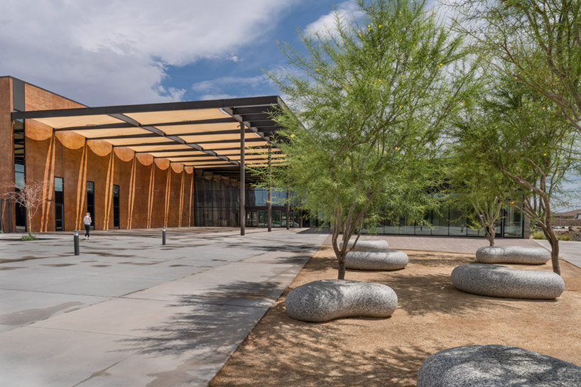
Entering the recreational grounds, guests encounter a public art display referencing the Hueco Tanks State Park. Dallas-based artist Brad Goldberg embraced elements of the surrounding environment in the piece, incorporating Palo Verde trees and large granite boulders shaped into outdoor seating, creating an area of respite for guests at the front of the recreation center.


A wide selection of local species helps conserve irrigation water throughout the landscape, with grading designed to accommodate periods of intense rainfall. Arroyos surround the building as a clear reminder of the desert environment.


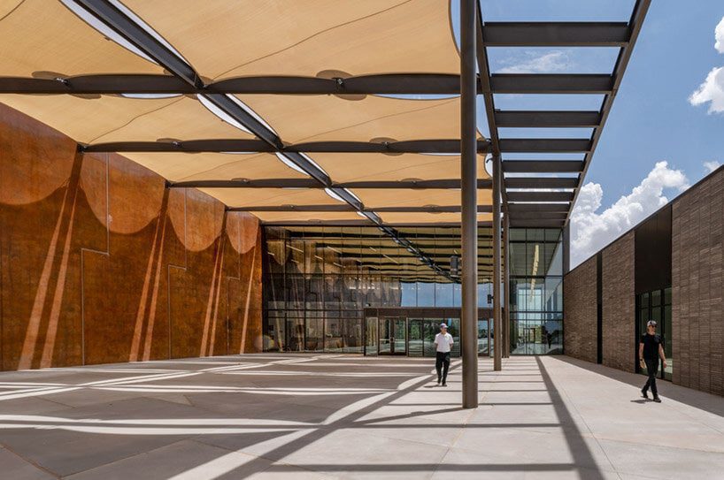
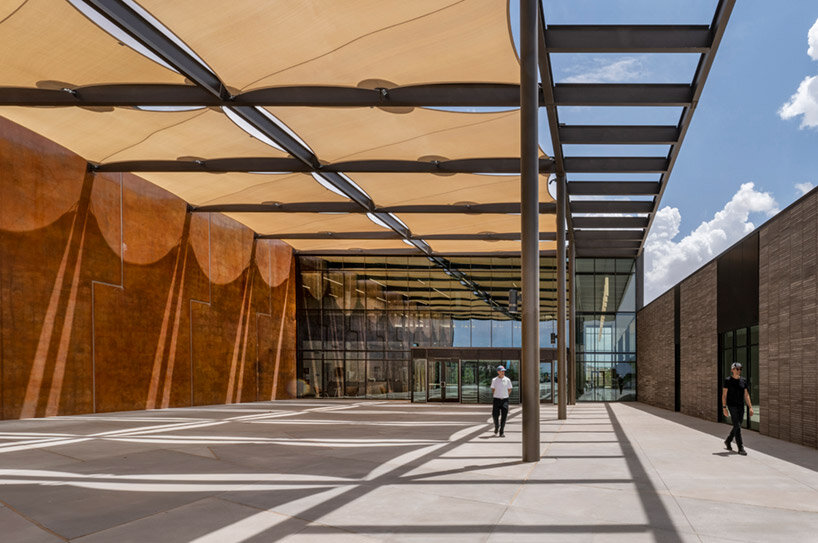
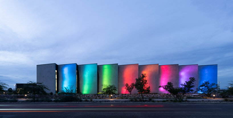
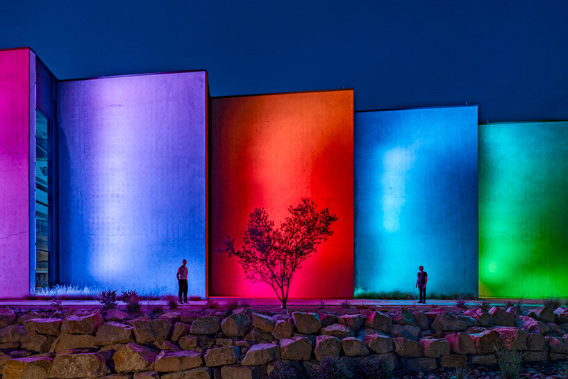
A large plaza serves as a community civic space and gateway to other areas of the center. On the west side of the building is the entrance to the multigenerational community center, built with a long format brick that provides a much-needed breakdown in scale for a residential, welcoming feel. In support of a city-led regional colored lighting initiative, the south façade is illuminated at night, transforming into a beacon for the neighborhood.

Perkins&Will el paso recreation


Modulation of the intense, dynamic desert light guided the design concept. The design team carefully articulated humble materials, creating a range of experiences with modest cost implications throughout the building. Shade structures allow for exterior activities, providing relief from the desert sun and creating a transition between indoors and out.


Sight-lines and connectedness also served as a driver of the design. Inside, light enhances the vitality of people in motion. The shade structures, tilt-wall concrete, wood slats, and perforated metal filter light and views throughout the interior in ways appropriate to the desert context.


The north façade panels allow indirect sunlight into the building and provide relief from the potentially monolithic wall panels. In the indoor natatorium, a saw-tooth panel arrangement provides indirect natural light without creating dangerous reflections that might impact a lifeguard’s ability to monitor underwater conditions. At night, the south façade is animated with light in support of a city-led lighting initiative.

Perkins&Will el paso recreation


The state-of-the-art natatorium includes a competition-ready fifty-meter pool, a 25-yard lap pool, and two diving boards (one meter and three meters) with associated diving well. The pool can host up to 400 athletes on the deck and has support functions to hold regional competitive swim meets. Ascending to the second floor, patrons have access to spectator seating that accommodates up to 800 people.


Above the spectator seating, acoustic panels help minimize echoes and reverberation in a color palette inspired by the Hueco Tanks’ flora. Also on the second floor is a fully-equipped fitness center with a walking track, a gym with a main basketball court, and two side courts holding up to 250 people. The outdoor waterpark is separated from the natatorium. It includes a wave simulator, a 25-foot-tall water slide, a lazy river, rentable shaded cabanas, and a rock-climbing wall with an associated plunge pool.

Perkins&Will el paso recreation


Throughout the project, the design team prioritized the health and wellbeing of its users. The team utilized energy modeling to optimize HVAC and envelope performance, learning a counterintuitive lesson along the way. By removing interior insulation and wall finish at the aquatic center and gym, the team freed up budget dollars that could then be applied to enhanced HVAC systems for overall better energy performance.


Additionally, the concrete interior surfaces require less maintenance than traditional painted gyp board. In support of the wellness goals for the center, an efficient method for removing harmful chloramines from the air in the pool was utilized. A continuous evacuation chamber embedded in the pool deck extracts these chloramines. This works in tandem with the perimeter HVAC duct layout in sweeping the air towards the evacuators, ensuring the air is as clean and healthy as possible.

Reference

Electric flying car completes public exhibition flight
CategoriesSustainable News

Electric flying car completes public exhibition flight

Electric flying car completes public exhibition flight

Spotted: Flying cars are becoming a reality. China’s XPENG mobility technology experts recently completed a public flight of the electric flying car XPENG X2 at an event at the Dubai World Trade Centre. The zero-emission vehicle is a two-seater car that uses vertical lift-off and landing to transition from road travel to air. Designed specifically for the complexities of urban driving, the X2 flies at low altitude and can be driven manually or autonomously.

XPILOT is the company’s advanced driver assistance system. It provides guided options specifically for city or highway driving, including intelligent cruise, on- and off-ramp assistance, and speed limit adjustments. The car is made from carbon fibre in order to reduce the weight for flying.

In the future, the XPENG X2 will be suitable for low-altitude city flights, particularly over short distances. Medical transportation and sightseeing are therefore two promising potential applications for the technology.

Supported in its exhibition flight by the Dubai Civil Aviation Authority, the success of the recent trip shines a light on the need for regulatory bodies to keep pace with technological developments. Cities will need to build new air travel codes for high volumes of low-altitude flights.

Other types of autonomous travel that Springwise has spotted include last-mile delivery robots and marine research observation drones.  

Written By: Keely Khoury

Reference