Toothbrush pops open for recycling in Seymourpowell’s Un-Made concept
CategoriesSustainable News

Toothbrush pops open for recycling in Seymourpowell’s Un-Made concept

British design studio Seymourpowell has put cheap electronic goods under the spotlight with Un-Made, a project imagining four possible ways to design for quick disassembly and recycling.

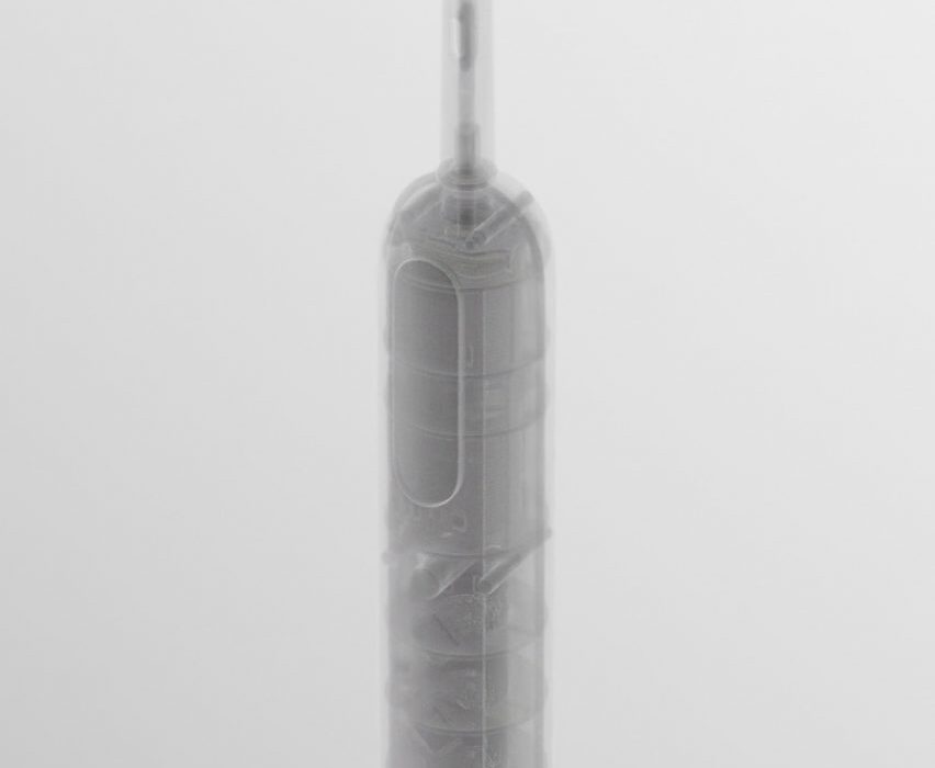
As part of the project, Seymourpowell devised four automated disassembly mechanism concepts using an electric toothbrush as an example for their animated graphics.

Each of the mechanisms could be built into a product during manufacturing and then activated in a factory at the end of the item’s life.
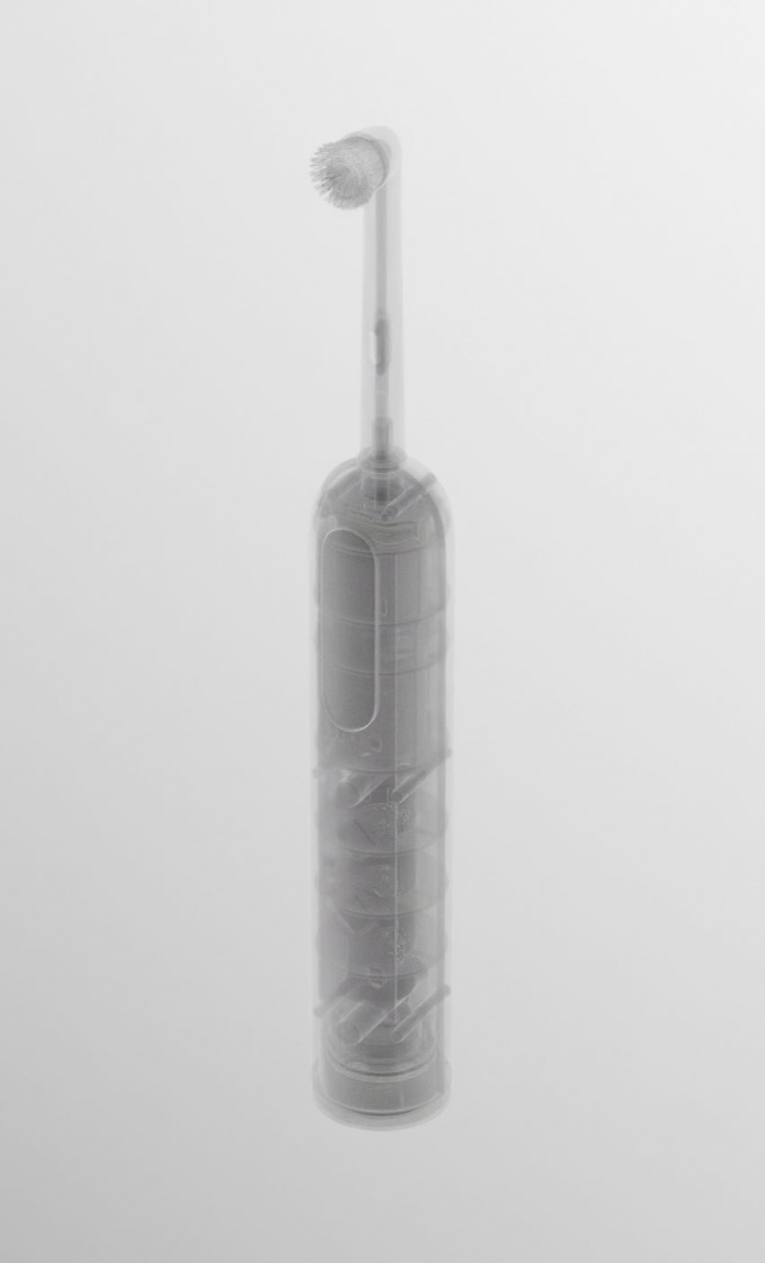
Rendering of a toothbrush on a white backdrop from Seymour Powell's Un-Made conceptRendering of a toothbrush on a white backdrop from Seymour Powell's Un-Made concept
Un-Made suggests automated disassembly mechanisms for an electric toothbrush

The first Un-Made concept is a pin mechanism. Similar to the action of opening a SIM card slot on a smartphone, it involves poking a pin into a small, sealed pinhole on the rear of the product to release the internal components.

The second concept is a vacuum mechanism. It involves placing the product into a vacuum, causing closed cell foams and air-sealed features within it to expand and bust the external housing open.

Third, there is a piston mechanism that works by pushing a piston through a cap on the bottom of a device and forcing all of the internal components upwards until they emerge through the top.
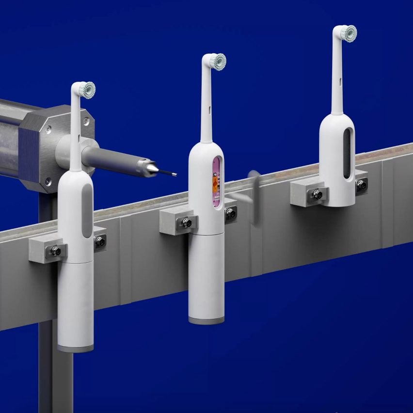
3D graphic showing a conveyer belt of electric toothbrushes being disassembled in Seymour Powell's Un-Made concept3D graphic showing a conveyer belt of electric toothbrushes being disassembled in Seymour Powell's Un-Made concept
The first concept includes a pin-triggered release mechanism

The final concept involves using UV glue – a type of adhesive that deactivates under ultraviolet light. In this concept, the product is placed into a specially lit chamber to release the clamshell construction.

The Un-Made project was led by Eddie Hamilton, a senior industrial designer at Seymourpowell, who was driven to make the work after researching what electric toothbrush to buy for himself.

“Inevitably I went for the cheap one, at which point Amazon smugly pointed out they’d sold 10k+ of that model last month alone,” said Hamilton.
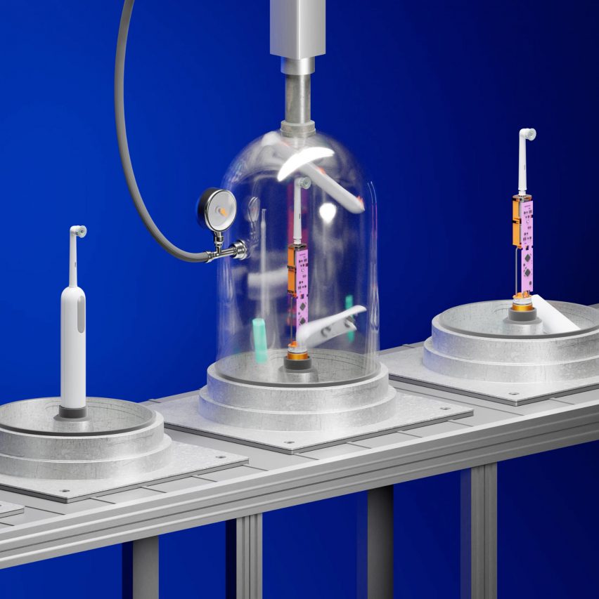
3D graphic of a series of electric toothbrushes on a conveyer belt. The one on the left is whole, the one in the middle is having its casing stripped from it under a clear dome, and the one on the right has its interior components exposed3D graphic of a series of electric toothbrushes on a conveyer belt. The one on the left is whole, the one in the middle is having its casing stripped from it under a clear dome, and the one on the right has its interior components exposed
Another mechanism uses a vacuum to burst open the product’s external housing

“As an industrial designer, I spend time obsessing over the product I’m working on, typically thinking of it in isolation,” he added.

“But one thing I occasionally fail to remember or adequately picture is the true scale of that product once manufactured. 10,000 units sold per month seems vast.”

Using Amazon’s bestsellers list, Hamilton ascertained that fabric shavers, steam irons, wireless doorbells, wireless computer mice, digital tyre inflators and USB-C adaptors were all items selling in their thousands each month, at a price of less than £20.

While designing products so they can be repaired is important, the associated expense may not be something that customers can justify for small items sold at this price point, Hamilton said.

“Even if we change societal attitudes, the bottom line is whether you should open that cheap toothbrush to replace a failing battery when you only paid £24.99 for it two years ago,” he said.

“I’m optimistic for some product categories to get the ball rolling, namely expensive and bulky items. But I’m also a realist that we need alternative strategies adjacent to repair. This is where we must design for disassembly.”

In Hamilton’s view, disassembly and recycling is a worthy “next best option” to repair for cheaper objects, as it keeps the materials in a circular material flow.
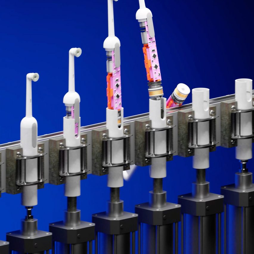
3D graphic showing a conveyer belt of electric toothbrushes being disassembled by a piston mechanism pushing their internal components out from the bottom to the top of the casing from Seymour Powell's Un-Made concept3D graphic showing a conveyer belt of electric toothbrushes being disassembled by a piston mechanism pushing their internal components out from the bottom to the top of the casing from Seymour Powell's Un-Made concept
The piston mechanism disassembles a product by pushing its components up and out

The Un-Made design team took inspiration from Agency of Design’s Design Out Waste project, which looked at three strategies for keeping a toaster out of landfill. But they particularly wanted to explore just how efficient the disassembly process could be made through automation.

The cheaper and easier the process, they say, the more motivation there is for companies to pursue this approach and recover the components and materials inside their devices.

“A huge part of the reason e-waste ends up in landfill is because of product complexity and the inherent challenges involved in their disassembly,” Seymourpowell lead designer Alex Pearce told Dezeen.

“To date, because e-waste has been considered too time-consuming and costly to disassemble – there has been no (commercial) incentive strong enough to make it a viable option.”
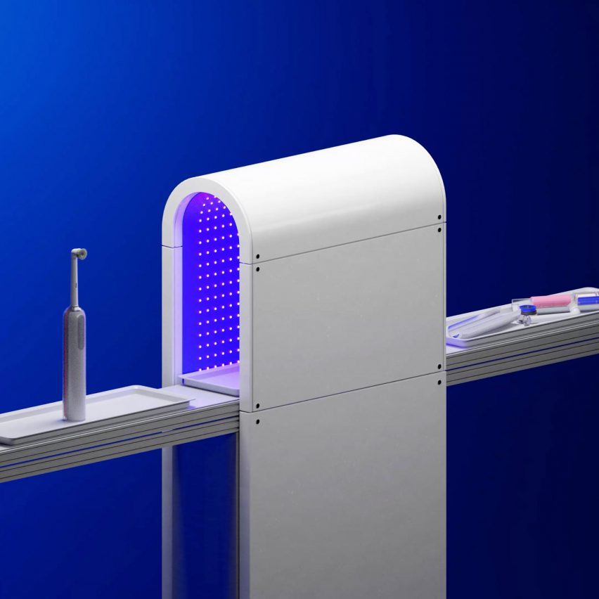
3D graphic showing a conveyer belt of electric toothbrushes going into a purple-lit tunnel and emerging on the other side in pieces3D graphic showing a conveyer belt of electric toothbrushes going into a purple-lit tunnel and emerging on the other side in pieces
The fourth Un-Made concept uses UV light to dissolve the glue holding the device together

The materials inside even cheap devices are valuable, Pearce points out, particularly when there are supply shortages or when it comes to rare-earth minerals.

“When you consider that more gold exists within a ton of e-waste than within a ton of gold ore dug from the ground, a straightforward economic imperative becomes clear for companies who are able to recover and reuse these materials,” said Pearce.

Seymourpowell imagines disassembly taking place either at the manufacturer’s facilities following a take-back procedure, or potentially at a public recycling centre if disassembly processes have been sufficiently standardised.

The London-based studio is known for its innovative product and transport designs, as well as concepts that challenge current norms. Recent projects from the studio have included the two-in-one reusable Bottlecup and a spaceship cabin for Virgin Galactic.

Reference

COS unveils “most sustainable store concept from to date”
CategoriesInterior Design

COS unveils “most sustainable store concept from to date”

COS architectural creative lead Marcus Cole explains how more sustainable design principles were used in its recently opened concept stores, in this exclusive video produced by Dezeen for the brand.

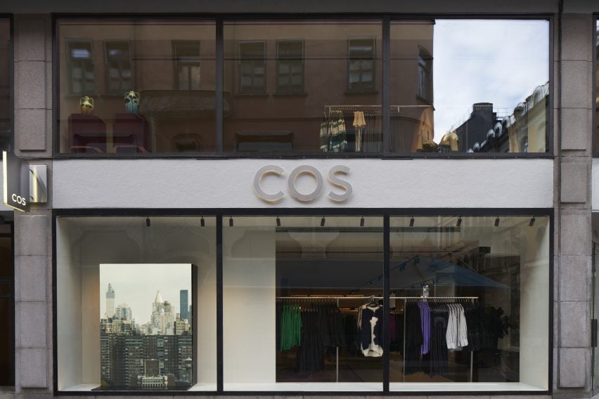
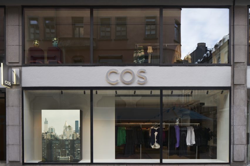
The brand recently opened two stores, located in Stockholm and Mexico City, which according to COS exemplify its commitment to sustainable building and circular design. Cole talked to Dezeen about the brand’s approach when creating the new retail spaces.

“This flagship store in Stockholm is the first in Europe to adopt the most sustainable store concept from COS to date,” he said.

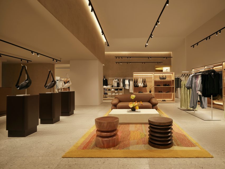
The Stockholm flagship store reflects the brand’s promise to lower CO2 emissions. Photograph by Åke Lindman

At 566 metres square and spread over two floors, the store, located on Biblioteksgatan, is also the brand’s largest concept store.

When creating the space, COS wanted to address their existing waste flows, finding ways in which byproducts that would traditionally be categorised as waste could be reused and repurposed.

“The design focuses on circularity in both our material selection and our design strategy,” explained Cole.

“The floor throughout our sales area is a terrazzo tile that has been made from 90 per cent quarry waste from our own suppliers’ production line. The majority of the rugs are a collaboration using waste yarn from our suppliers’ chain, each bespoke in their own way.”

“We prioritised materials that can be easily repaired, and are designed for disassembly by avoiding mixing materials that are hard to decouple later down the line,” Cole added.

The Stockholm store uses 66 per cent more recycled materials than the original store design. Photograph by Åke Lindman

The brand also took the same approach when creating the furniture and fixtures used in the store, choosing to prioritise more sustainable and recycled materials.

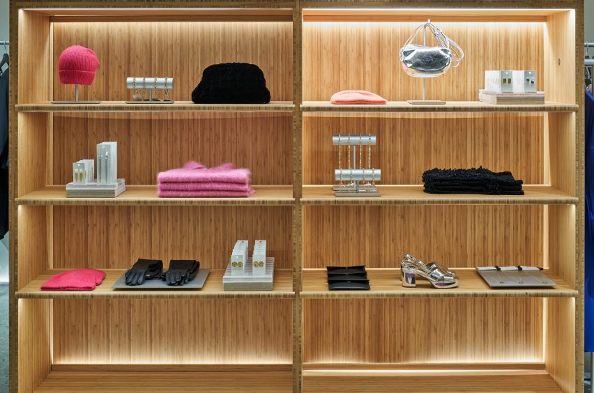
“Our vitrines and wardrobes are made from a combination of recycled acrylic and bamboo,” said Cole.

“Bamboo is a more renewable choice than traditional hardwoods, because of the speed at which it grows, its carbon storage capacity, and also its durability,” he continued.

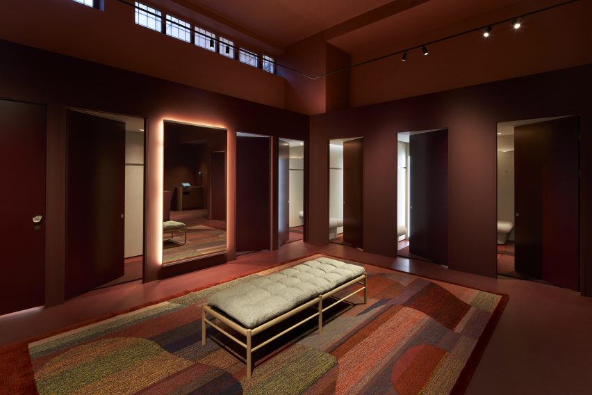
“If we look to our fitting rooms and some of the softer fixtures in our stores, the panels are made from 60 per cent recycled plastic bottles that have been spun into felt, [and] the floor consists of a PVC free linoleum, which is made from a mixture of recycled and natural materials.”

Sustainable and recycled materials were prioritised during the design process. Photograph by Åke Lindman

Other changes include 30 per cent recycled aluminium rails, 100 per cent recycled mannequins and the removal of all concrete fittings.

The brand also found it important to make use of the existing building where possible to reduce unnecessary CO2 emissions and to give new life to unused materials.

“This concept store is actually a rebuild of an existing store,” Cole explained. “We were able to reallocate and reuse 50 per cent of our interior elsewhere in our portfolio, making sure we have as much emphasis on what we’re taking out of the store as what we’re putting in it as well.”

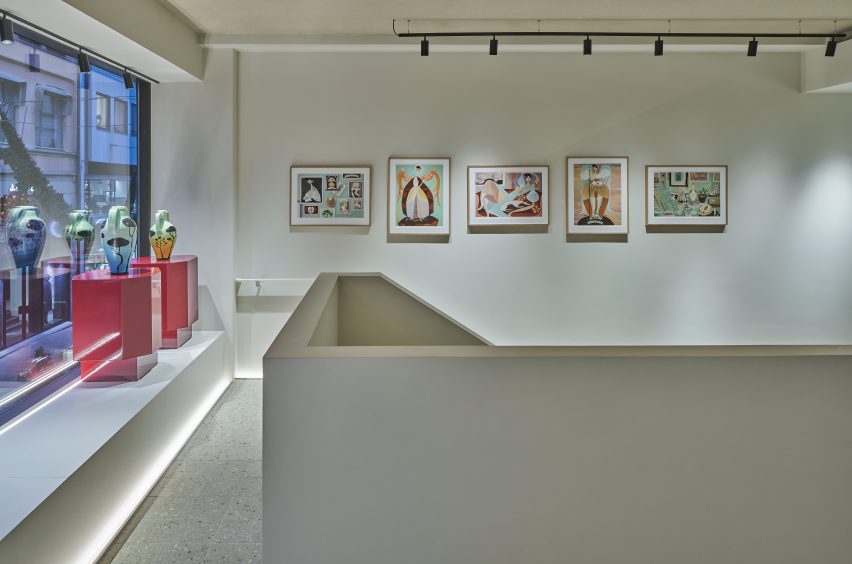
A selection of paintings and sculptures by visual artist Liselotte Watkins decorate the store interior. Photograph by Åke Lindman

Following on from the Stockholm store, the brand also unveiled another sustainable concept store in Mexico City. The store is located in the Polanco neighbourhood, and the interior references Mexico’s artisan craft traditions.

In addition to operating as a fashion store, the shop also exhibits artworks by local creators, such as Caralarga, a female-led enterprise which focuses on sustainability and female empowerment.

The Mexico City store is the first in the Americas to embrace COS’s sustainable store concept. Photograph by Fernando Marroquin

“We have very ambitious plans to bring this sustainable approach and all of our learnings from it to more stores in the future,” Cole said.

“The stores that have adopted our new concept now have an average of 68 per cent recycled materials. And this is a percentage that we’re both really proud of because of how far we’ve come, but also challenged by because of where we want to get to,” he continued.

“Whether it’s a flagship store or a smaller activation, we worked hard to embed agility into the core of our interiors so that we’re not wasteful in the future.”

COS is a London-based fashion brand. The brand has 252 stores, spanning 47 physical markets.

Partnership content

This video is produced by Dezeen for COS as part of a partnership. Find out more about Dezeen’s partnership content here.

Reference

Isern Serra turns renderings into reality to form pink Moco Concept Store
CategoriesInterior Design

Isern Serra turns renderings into reality to form pink Moco Concept Store

Design studio Isern Serra has transformed a computer-generated image by digital artist Six N Five into a rose-coloured retail space for the Moco Museum in Barcelona.

Situated in Barcelona’s El Born neighbourhood, the Moco Museum exclusively exhibits the work of modern artists such as Damien Hirst, Kaws, Yayoi Kusama and Jeff Koons.

The institution’s eponymous concept store has a similarly contemporary offering, selling a mix of design, fashion and lifestyle goods.

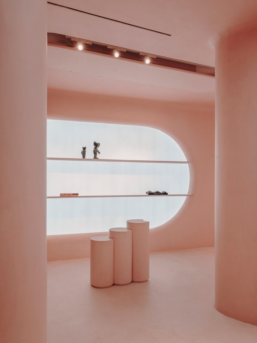
Pink interior of Moco shop in Barcelona, designed by Isern Serra and Six N. Five
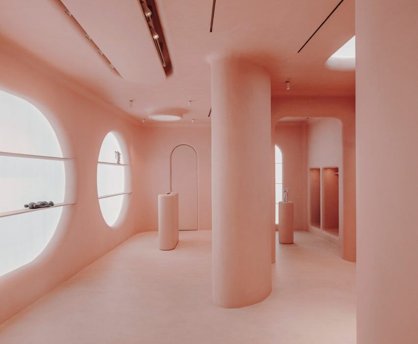
The store’s interior is completely covered in pink micro-cement

Its surreal pink interior started out as a computer-generated image by Six N Five, a digital artist known for envisioning other-worldly dreamscapes in pastel hues.

Barcelona-based design studio Isern Serra then brought the image to life, using pink micro-cement to achieve the same uniform, ultra-smooth surfaces seen in the drawing.

Pink interior of Moco shop in Barcelona, designed by Isern Serra and Six N. Five
Products are displayed inside huge circular display niches

“The Moco Concept Store represented an interesting challenge, as I had to combine the purpose of the store with actual architecture remaining true to our original dreamy world I had built in CGI,” explained Six N Five, whose real name is Ezequiel Pini.

“But these concepts were able to go one level further, both in decisions and execution, thanks to Isern Serra who brought its extraordinary talent and experience.”

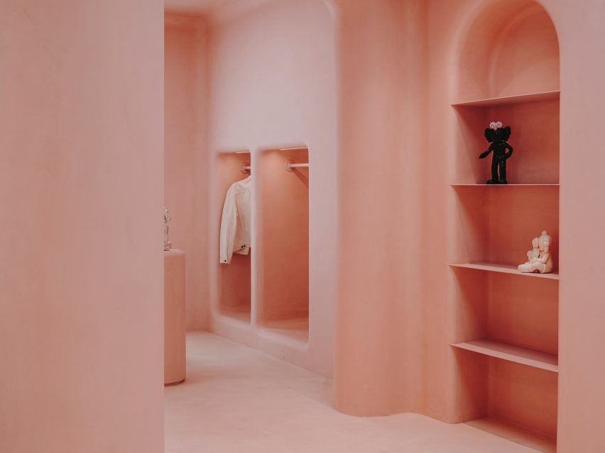
Pink interior of Moco shop in Barcelona, designed by Isern Serra and Six N. Five
Arched and square niches have also been punctured into the walls

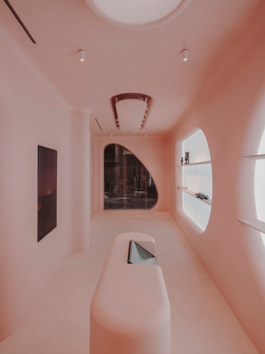
The store’s rosy interior can be seen through two large openings in its facade – one of them is rectangular, while the other is slightly curved and contains the entrance door.

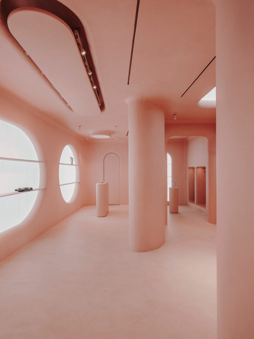
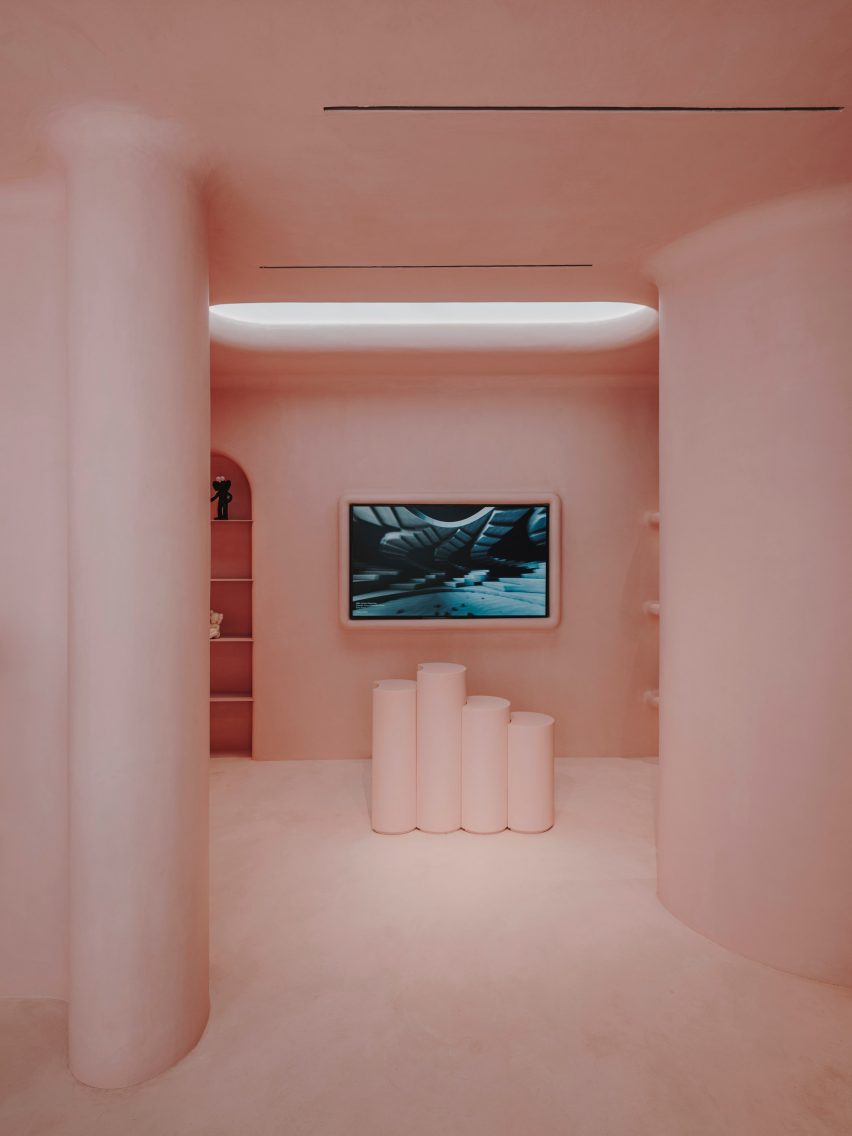
A series of chunky columns run through the middle of the space. Surrounding walls have been punctured with arched, square and circular display niches, some of which are dramatically backlit.

Rows of shelves and a frame for a tv screen have also been made to project from the wall.

Pink interior of Moco shop in Barcelona, designed by Isern Serra and Six N. Five
A faux skylight sits directly above pink display plinths

The store’s largely open floor plan is only interrupted by a few pink cylindrical plinths used to showcase products, and a bespoke pink cashier desk with an integrated computer system.

Custom spotlights have been installed on the ceiling, along with a faux skylight.

Pink interior of Moco shop in Barcelona, designed by Isern Serra and Six N. Five
The store’s custom furnishings, like the cashier desk, are also rendered in pink

An increasing number of creatives are making their virtual designs a reality.

Last year, digital artist Andres Reisinger collaborated with furniture brand Moooi to produce a physical version of his Instagram-famous Hortensia chair, which was initially a rendering.

The piece is covered with 20,000 pink fabric petals, emulating the almost fluffy appearance of a hydrangea flower.

In Sweden, designer Christoffer Jansson passed off a virtual apartment as an Instagram home renovation project.

The photography is by Salva Lopez.


Project credits:

Authors: Six N Five and Isern Serra
Builder: Tegola Rosso SL

Reference

Alberghi Diffusi: Architects Should Embrace Italy’s Decades-Old Design Concept
CategoriesArchitecture

Alberghi Diffusi: Architects Should Embrace Italy’s Decades-Old Design Concept

Architects: Want to have your project featured? Showcase your work through Architizer and sign up for our inspirational newsletters.

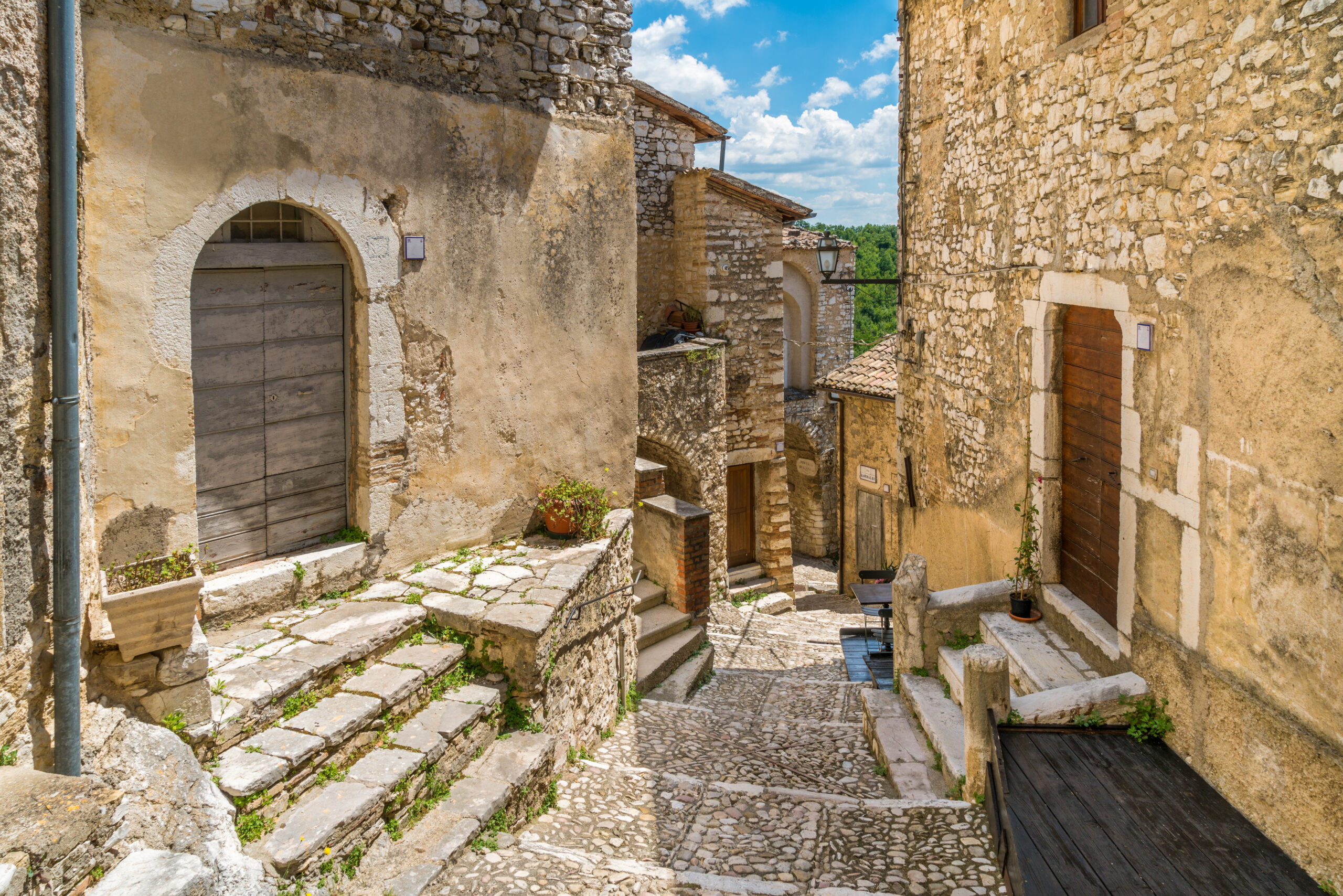
Across the iridescent olive groves, vine-laden hills and skyline of sunflowers that intertwine to become the breathtaking Italian countryside, there lies a number of rural gems unblemished by modernity. Their façades bare the marks of many lives lived, and their cobblestone streets chatter with centuries of traditions and tales. While you venture through the quiet alleys, under clotheslines laden with laundry, you’ll find the remarkable concept of “alberghi diffusi” — Italy’s answer to sustainable tourism.

An idea that expertly juxtaposes the past with the present, marrying rustic charm with modern luxury, preserving heritage while showcasing rural sophistication. Here, amongst the charm and romanticism of rural Italy, hospitality takes on a different meaning: it’s not about visiting, it’s about belonging, and these “scattered hotels,” a constellation of repurposed dwellings, are the lifeblood of these otherwise semi-deserted hamlets. As more and more architects embrace adaptive reuse and renovation is increasingly celebrated as preferable to new-builds, Italy’s model for sustainable tourism is set to gain further traction beyond the Mediterranean country’s borders. 

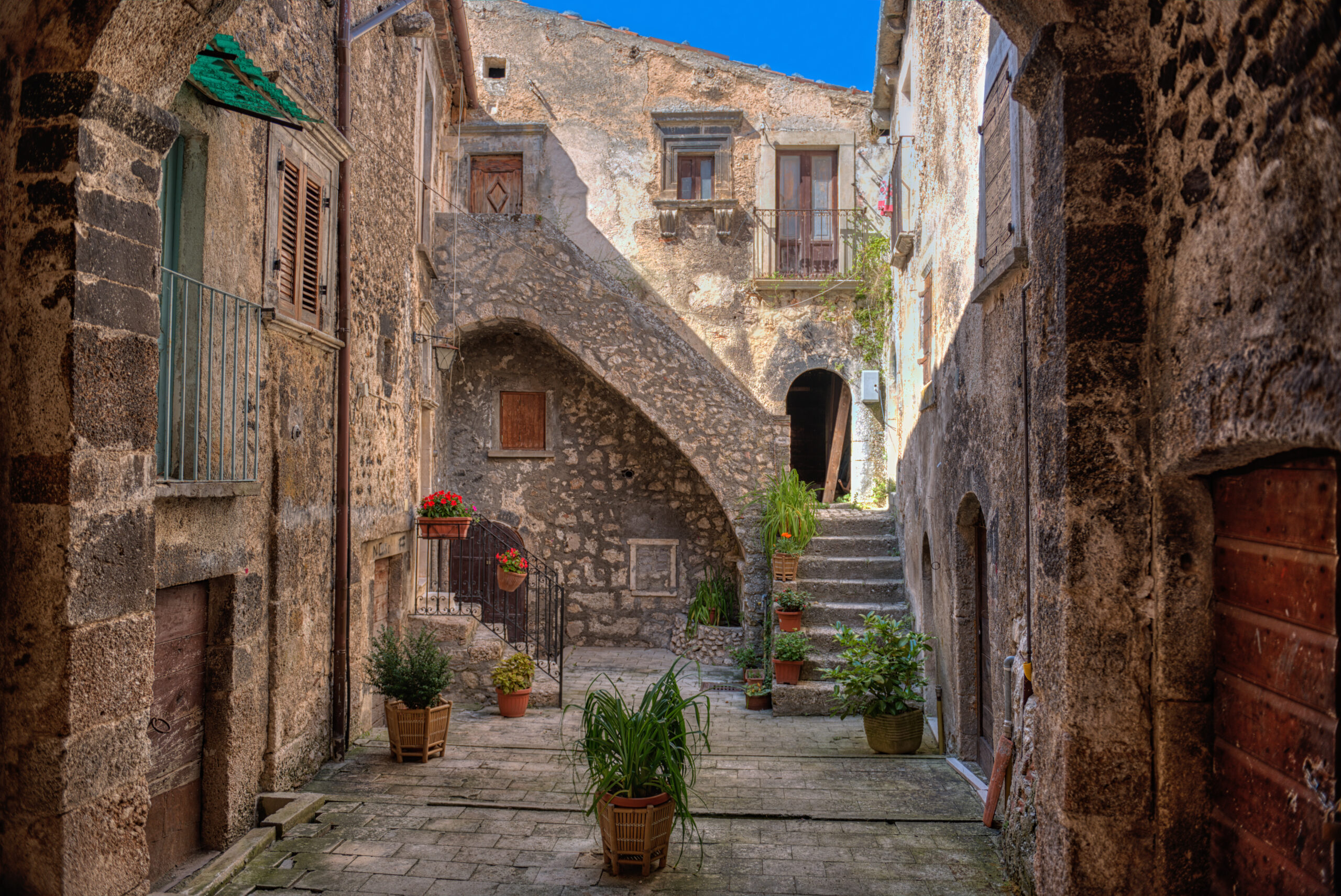
Santo Stefano di Sessanio Village, Abruzzo, L’Aquila, Italy. Photograph by Stefano Pellicciari

The albergo diffuso model is by no means a new concept. It was initially conceived in the late 1970s or early 1980s (an exact year cannot be pinpointed). Some attribute the model to the aftermath of the May 1976 earthquakes, when the idea was utilized to revitalize the impacted villages and was then later championed by Giancarlo Dall’Ara, a pioneering figure who is now-President of the Alberghi Diffusi National Association.

The philosophy of the albergi diffusi model is rooted in the notion that a hotel’s room should not have to be contained within a single structure but, in fact, can be spread throughout the houses and buildings of an entire town, and it is the service and amenities in the proximity to the room that establishes it as being part of a hotel.

Cividale del Friuli, Italy Photograph by milosk50

A “scattered hotel,” as it translates in English, creates visitor accommodation by reusing and restructuring existing properties, with one crucial factor — it must be located around an inhabited town center. It is the inhabitants of the albergo diffuso that serve as the draw for the guests that are so enthralled by these places in their search for authentic experiences.

In the heart of Friuli Venezia Giulia, the model found fertile ground in Comeglians, a village of approximately 400 inhabitants that became one of Italy’s first albergo diffuso’s. By the mid-1990s, under careful orchestration and with cooperation from the residents, a transformative project began to unfurl. A handful of the nearly 300 houses, left vacant after a decades-long exodus of youth searching for urban opportunities, were repurposed into an albergo diffuso. This revitalization not only safeguarded the village’s heritage but also reinvigorated the local economy by creating jobs and stimulating tourism that continues to thrive to this day.

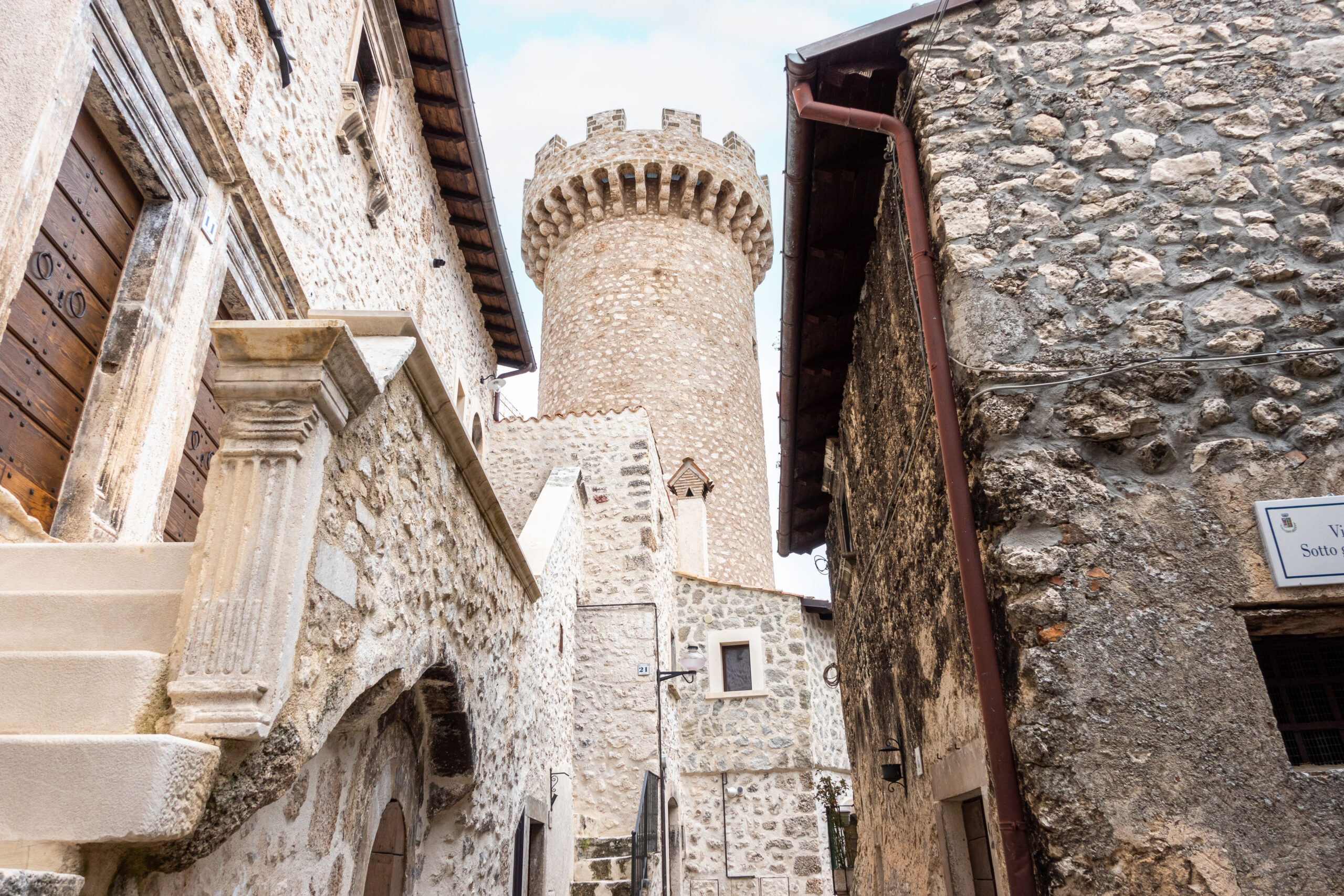
Santo Stefano di Sessanio, Abruzzo, Italy. Photograph by Giulio Benzin

Meanwhile, down in the rugged terrain of Abruzzo, the town of Santo Stefano di Sessanio harbored a latent opportunity despite its population dwindling to under 100 by the late 1990s. Swedish-Italian entrepreneur Daniele Kihlgren, recognizing the town’s potential, made considerable investments to meticulously restore its ancient, stone-walled structures. The project, which converted 27 medieval buildings into 27 rooms of the Sextantio Albergo Diffuso, not only rekindled the town’s historic charm but also spawned a variety of jobs, reducing unemployment and re-populating this once-deserted gem.

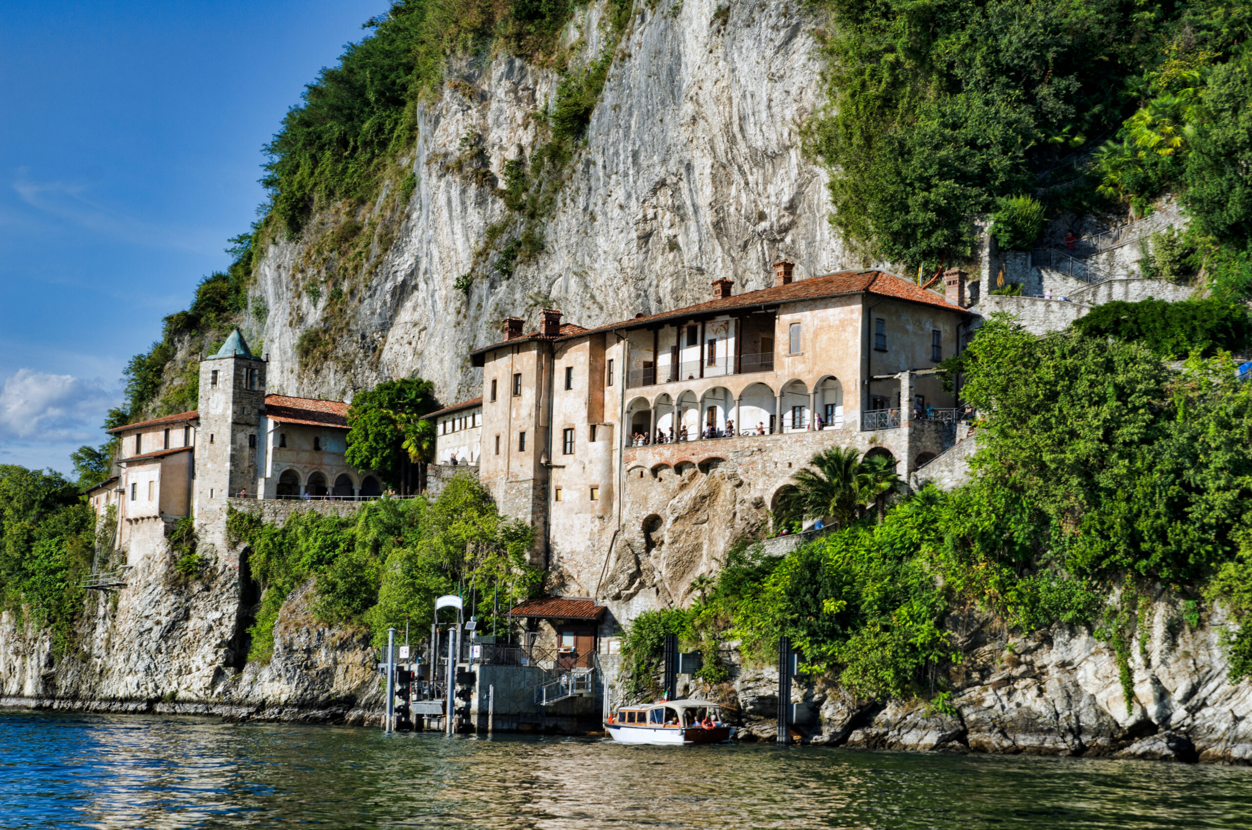
Santa Caterina dello Lonio, Catanzaro, Calabria, Southern Italy. Photograph by Fabio

The tale took a southern twist in Sicily, where the historic borough of Borgo Santa Caterina witnessed a similar resurgence. Here, the alberghi diffusi’s model breathed new life into the town’s decaying structures, emblematic of diverse eras, including the Arab, Norman and Byzantine epochs. The regeneration of these architectural marvels into Albergo Diffuso Borgo Santa Caterina attracts a steady stream of tourists, bolstering the local economy and enhancing the livelihood of its residents, who had endured years of economic stagnation. These enduring transformations underscore the alberghi diffusi’s ability to fuse architectural preservation with socio-economic regeneration.

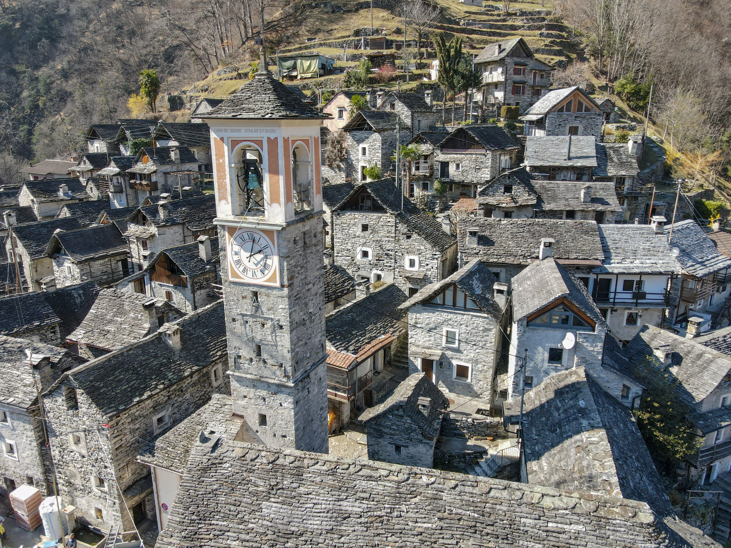
Corippo, Verzasca valley, Switzerland. Photograph by fotoember

The ripple effects of this ingenious model are palpable even beyond the Italian borders, in Switzerland’s Verzasca Valley, further underscoring its potential as a global blueprint for rural revitalization, in the Italian-speaking canton of Ticino, renowned for its emerald-green river flowing past miles of winding canyons, lofty peaks and forests. Corippo, a tiny 800-year-old hamlet of handcrafted stone homes, rises nearly 2,000 feet (610 meters) above the valley floor, and in June 2022, Corippo became the home of Switzerland’s first certified albergo diffuso. The lodging is part of a multiyear plan to preserve and revitalize the medieval village hit hard by depopulation, which follows the all-too-familiar story where its inhabitants have emigrated to other parts of the world in search of a better life.

Corippo’s new albergo diffuso consists of ten cozy rooms spanning five restored residences. Adjacent to the main piazza is a terraced osteria (restaurant) with sweeping canyon views that doubles as a lobby. Distinctive architectural details, such as original exteriors and dimensions, were preserved using local materials and traditional methods.

Labro, Rieti, Latium, Italy. Photograph by e55evu

Beyond Corippo’s historical significance and ideal landscape for outdoor activities, its appeal is its sense of solitude. Locarno’s promenade of boutiques, cafes, and Lugano’s art museums and galleries are a magnet to all who visit the secluded yet stunning secret.

Sauntering through these resilient, reborn hamlets, we can encounter an enduring testament to the power of sustainable innovation with the Alberghi Diffusi model. These scattered hotels are not merely establishments offering accommodation; they are a vibrant tapestry of community life, a profound immersion into authentic Italian culture and heritage.

Each albergo diffuso emerges as a phoenix from the ashes of urbanization and economic stagnation. They are the robust threads reconnecting frayed populations, providing gainful employment and a renewed sense of pride in the people of their historical legacy. In this innovative reinterpretation of hospitality, we find the courage of countless small towns standing tall against time, breathing new life into their narrative, heritage and future.

Architects: Want to have your project featured? Showcase your work through Architizer and sign up for our inspirational newsletters.

Reference

Architects’ Guide To Midjourney: An Adventure in AI-Generated Imagery for Concept Development
CategoriesArchitecture

Architects’ Guide To Midjourney: An Adventure in AI-Generated Imagery for Concept Development

Architizer’s Vision Awards is celebrating the innovative minds propelling architectural visualization forward with a special AI-Generated Visualization Category. Learn more and start your submission before the Early Entry Deadline on May 5th.  

You’ve probably heard by now: the AI revolution is well and truly upon us. And while it doesn’t quite resemble Spielberg and Haley Joel Osment’s 2001 vision, it’s clear that AI is moving in, and its moving in faster than your first love into that studio apartment you used to have.

While some industries rush to bolster their roles and justify their positions as AI proves that, in many instances, it can comfortably complete tasks to the same and often higher standards than its human counterparts, architects and the design industry as a whole are pondering with enthusiasm, how we can most effectively adopt this groundbreaking technology to explore, enhance, and streamline our practice.

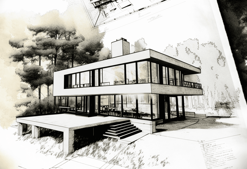
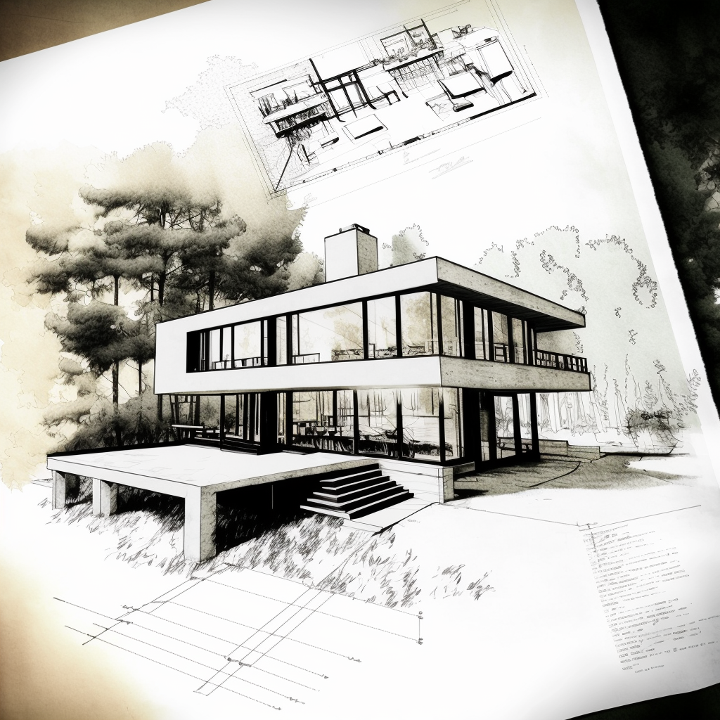
Prompt: /imagine Architecture, concept sketch and plan, residential, modern, contemporary, handdrawn, in the style of Alvar Aalto

Change is daunting, and it’s safe to say we’re on the cusp of one of the most significant workflow conversions many of us have ever experienced, perhaps since the transition from drafting to CAD. So, in case you feel like you’re out of your depth or just haven’t yet had the time to explore the wonders of Midjourney, we thought it was important to show you why and how AI can be used to support your creative vision.

Let us start at the beginning. Midjourney is the brainchild of David Holz, the visionary mind behind Leap Motion. The company is a pioneering research lab that specializes in text-to-image AI technology. It offers a refreshingly simple and user-friendly interface through a platform named Discord. Users can seamlessly communicate with the AI “bot” using elementary commands without any coding experience whatsoever (phew!). The mission is to “expand the imaginative powers of the human species.” To say this tool has been popular is an understatement: The new company is making an indelible mark in the AI realm and proudly announced its profitability within a month of its open beta release in 2022.

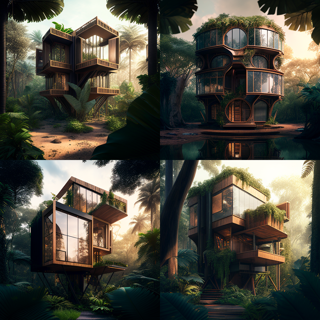
Prompt: /Imagine Contemporary architecture, treehouse hotel, luxury, tropical jungle, hyperrealism, hyperrealistic, photorealistic, daylight, 8K Ultra HD

Now, where does architecture come into all this? Well, as we all know, as architects and designers, we regularly use imagery to express our vision, harnessing photographs, sketches and all sorts of visual aids to interpret and represent our ambitions. Yet, it can be tricky when the thing in your head doesn’t exist yet; how can you show what you mean using vague and abstract similarities, especially if your vision is unique? It’s the skill that has separated the good designers from the great designers, and Midjourney is here to make you even better.

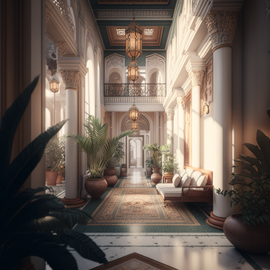
Prompt: /imagine Hotel lobby, Moroccan, luxury, serene, wellness, airy, bright, hyperrealism, hyperrealistic, photorealistic, cinematic lighting, 8K Ultra HD

Midjourney offers a groundbreaking solution to some of these challenges by incorporating AI-generated images into our design process, we can dictate our thoughts using descriptive language to generate images that can loosely interpret our ideas. I say loosely because, understandably and thankfully, in my opinion — AI can’t read your mind. Your images are only as good as your descriptions, and even then, often, the results are far from what you imagined. However, we’re still in the early stages and with time, practice and further technological development, these things will surely improve rapidly.

So down to the fun part, how do we actually use it? Honestly, it’s pretty simple once you’ve gone over it a couple of times. Midjourney has been designed to be user-friendly, and it takes only a few steps to create your first image.

To begin your adventure with Midjourney, simply follow these steps:

1. Install Discord and create a free account.

You can use a desktop or a mobile device. I’ve found the mobile interface a little more comprehensive for novices, but both work equally as well.


2. Visit Midjourney’s website and click on the “Join the Beta” to be given access to their Discord channel.


Once you’re all set up, head back to Discord and from the list on the left-hand side, locate the Midjourney Channel (a white icon with a sailboat) and select a Room in the Newcomer Rooms section within the channel.

These channels are available to use without any sort of subscription while your first getting started. Your free trial gives you about 25 image creations to start out. Subscriptions start at $10 a month, depending on your requirements.
Be aware that these rooms are public, so everyone else in the room can see your creations.


3. Activate the AI bot

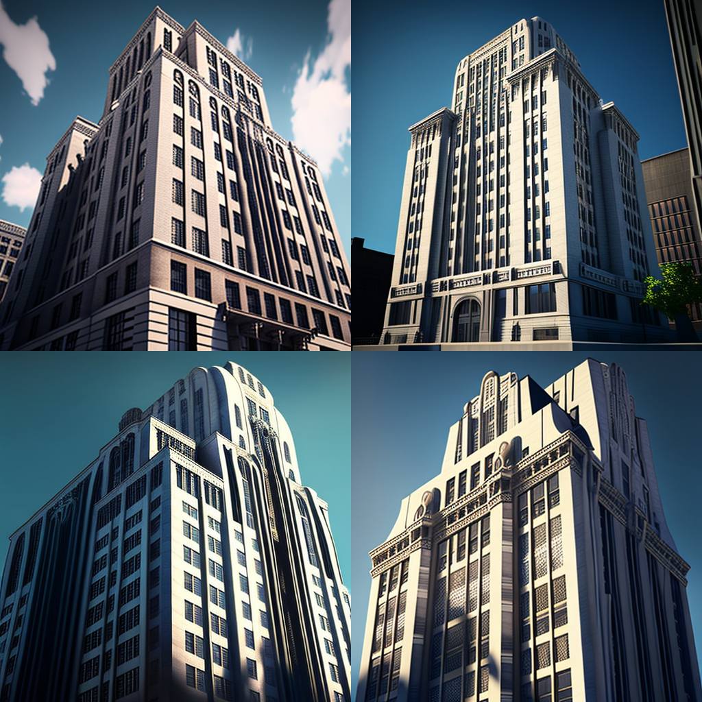
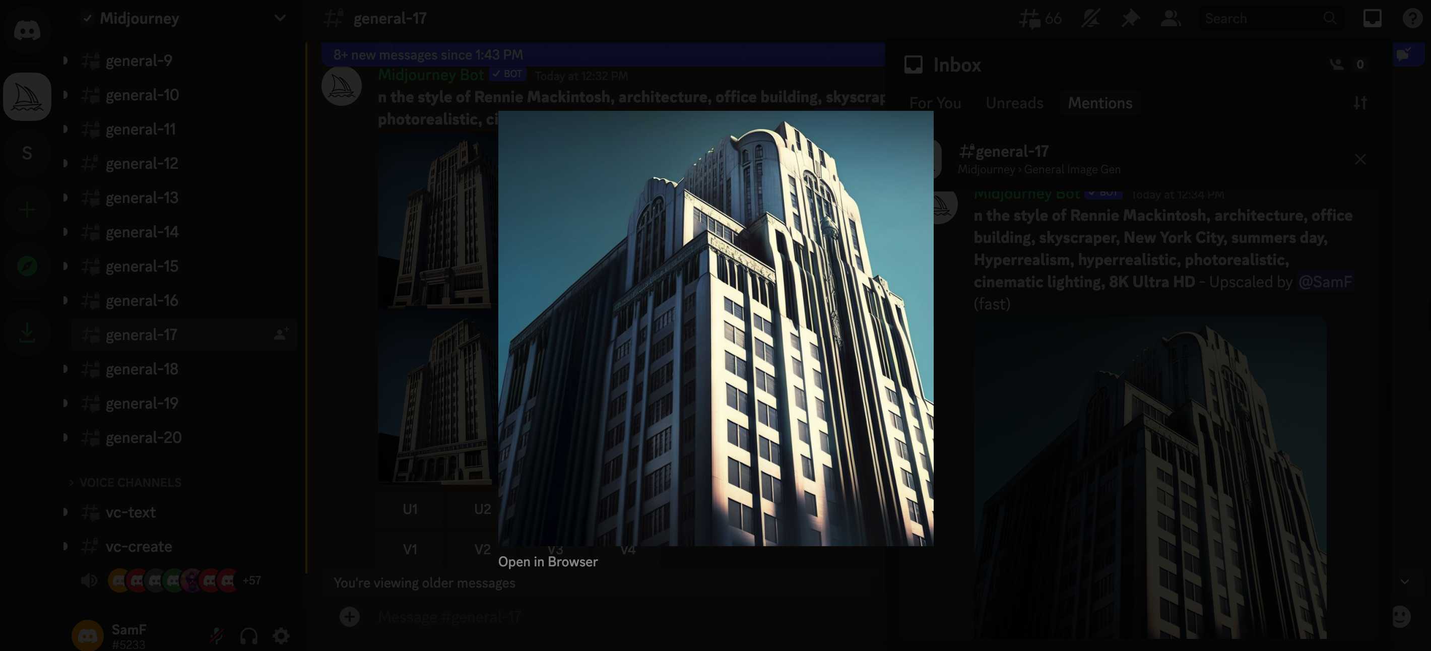
Prompt: /imagine In the style of Rennie Mackintosh, architecture, office building, skyscraper, New York City, summers day, Hyperrealism, hyperrealistic, photorealistic, cinematic lighting, 8K Ultra HD

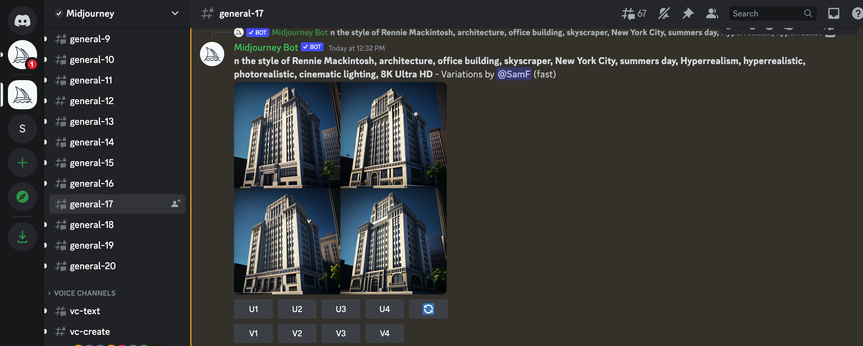
Once you’re all set up and settled in, you can get started by typing “/imagine” into the messaging bar at the bottom of the conversation window, followed by a spacebar. This starts your “prompt” and you can let your imagination go wild from here. Enter any descriptive words that come to mind, and let the magic unfold as the program renders an image based on your input.


4. Select your preferred image

Image 3 – Upscaled

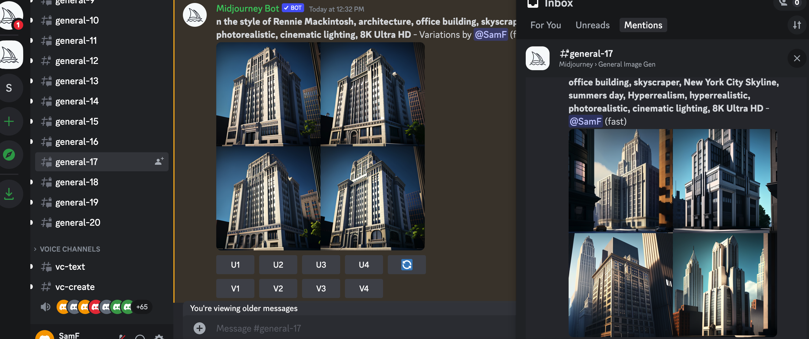
Midjourney will give you a grid of four images with several commands beneath it. U means “upscale,” and V means “Variation.” Upscale will provide you with a better quality and larger image. Variation will give you an additional four images similar to your chosen one. The numbers correspond from left to right. The top left is U1, and the bottom right is U4.


5. Keep track of your image in the constantly evolving message

With all the users on Midjourney it’s really easy to lose track of your message. If this happens, just head to the top right corner of your window, look for your inbox and hit mentions. Here you’ll see all the messages you have been tagged in, including your images, variations and upscales.

6. Integrate Midjourney into your creative process

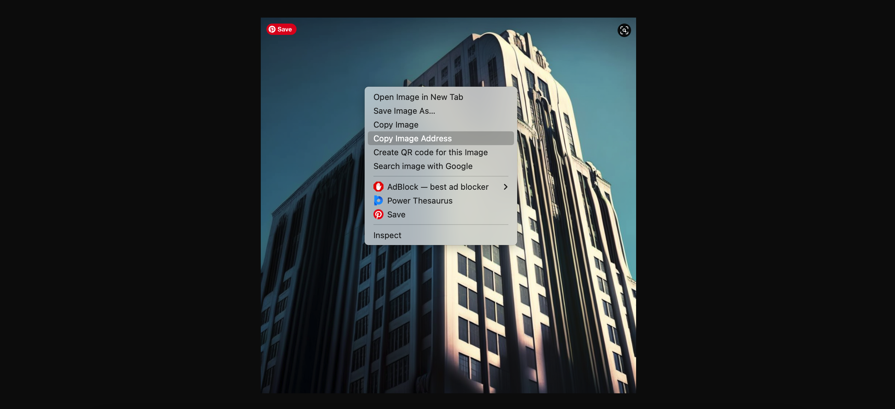
From this point on, you’re free to develop and adjust to your heart’s content. Simply open up you upscaled image into a browser window, copy the URL, start a new /imagine prompt and post the URL followed by any adjustments.

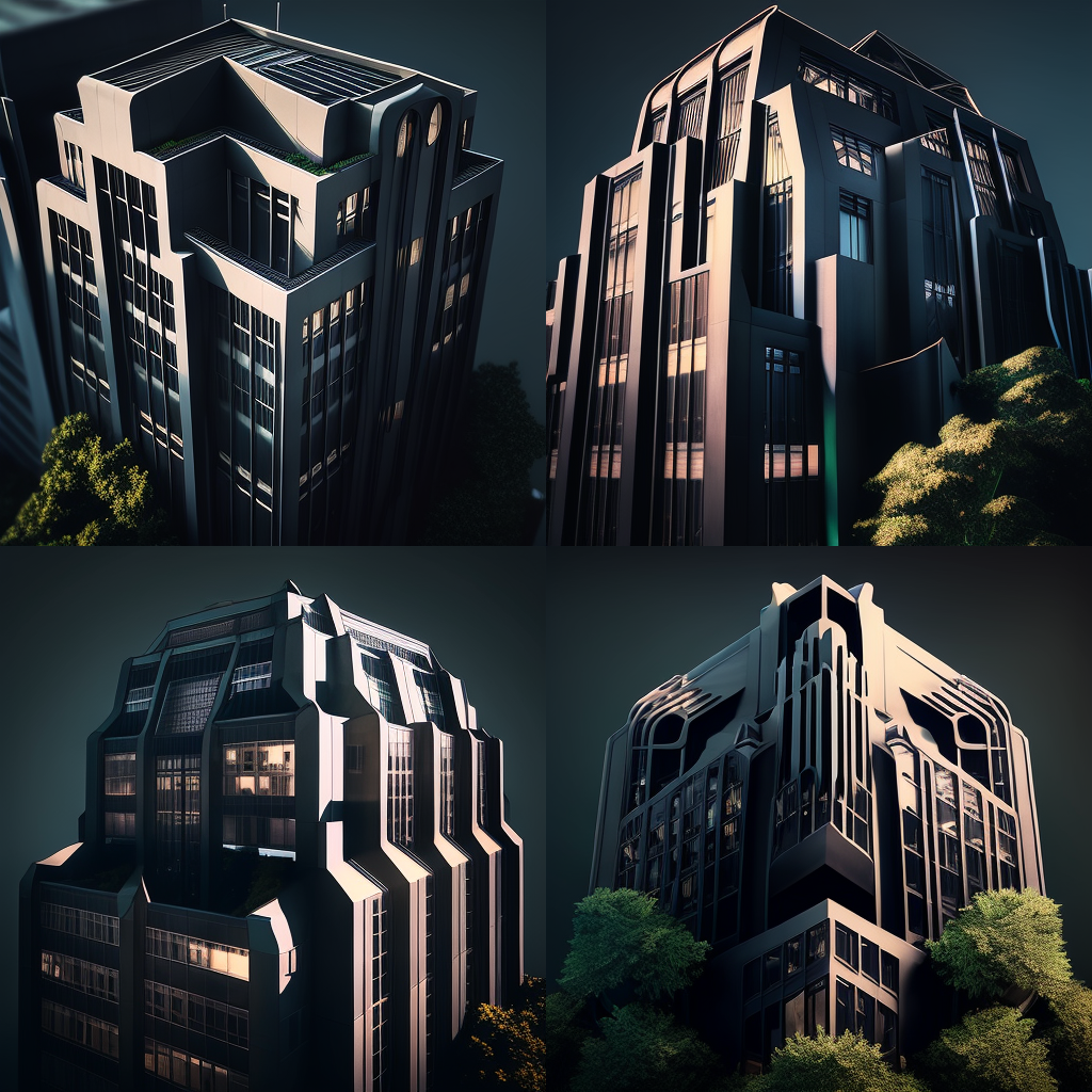
Prompt: /imagine (ORIGINAL IMAGE URL) Black facade, biophilia, sustainable architecture, drone view, Hyperrealism, hyperrealistic, photorealistic, cinematic lighting, 8K Ultra HD


It’s that simple. As you hone your prompts, you can develop your technique to get the desired image style you are looking for. A single change of word can create an entirely new set of images.

As the AI-generated images from Midjourney continue to inspire architects worldwide, real-world applications are becoming more common. From initial mood boards to fully realized designs, architects have found new ways to incorporate AI-generated visuals into their creative processes. The innovative approach pushes the boundaries of conventional architectural design, allowing architects to explore ideas faster and more effectively, bypassing the need for exhaustive online image searches.

As we become more familiar with the software, daring architects are venturing even further by crafting AI-encouraged designs, generating photorealistic renderings of architectural structures using Midjourney, and creating 3D models based on the AI-generated concepts. With the development of these models in familiar architectural software, AI generated concepts can quickly become reality. Watch this space!

Architizer’s Vision Awards is celebrating the innovative minds propelling architectural visualization forward with a special AI-Generated Visualization Category. Learn more and start your submission before the Early Entry Deadline on May 5th.  

The images used are all author’s own.

Reference

SoHo’s 49 Greene Street Embraces the Modern Concept of Loft Living
CategoriesArchitecture

SoHo’s 49 Greene Street Embraces the Modern Concept of Loft Living


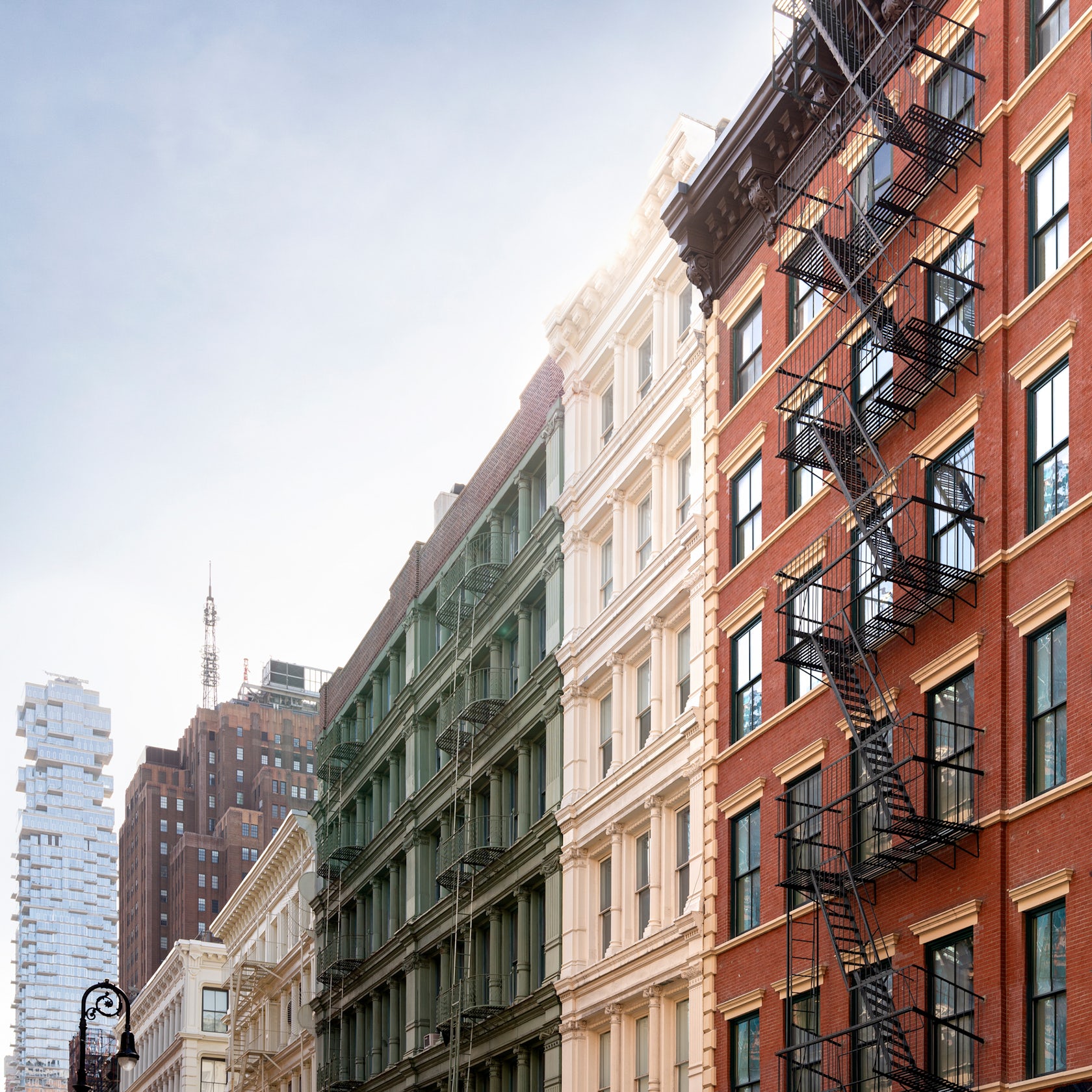
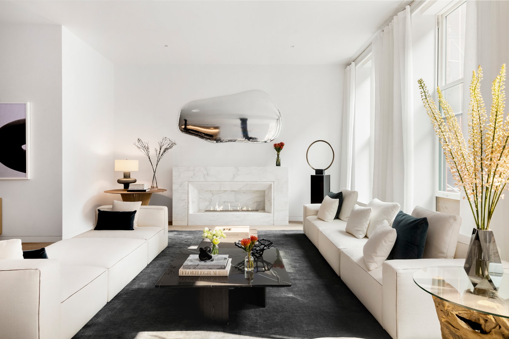
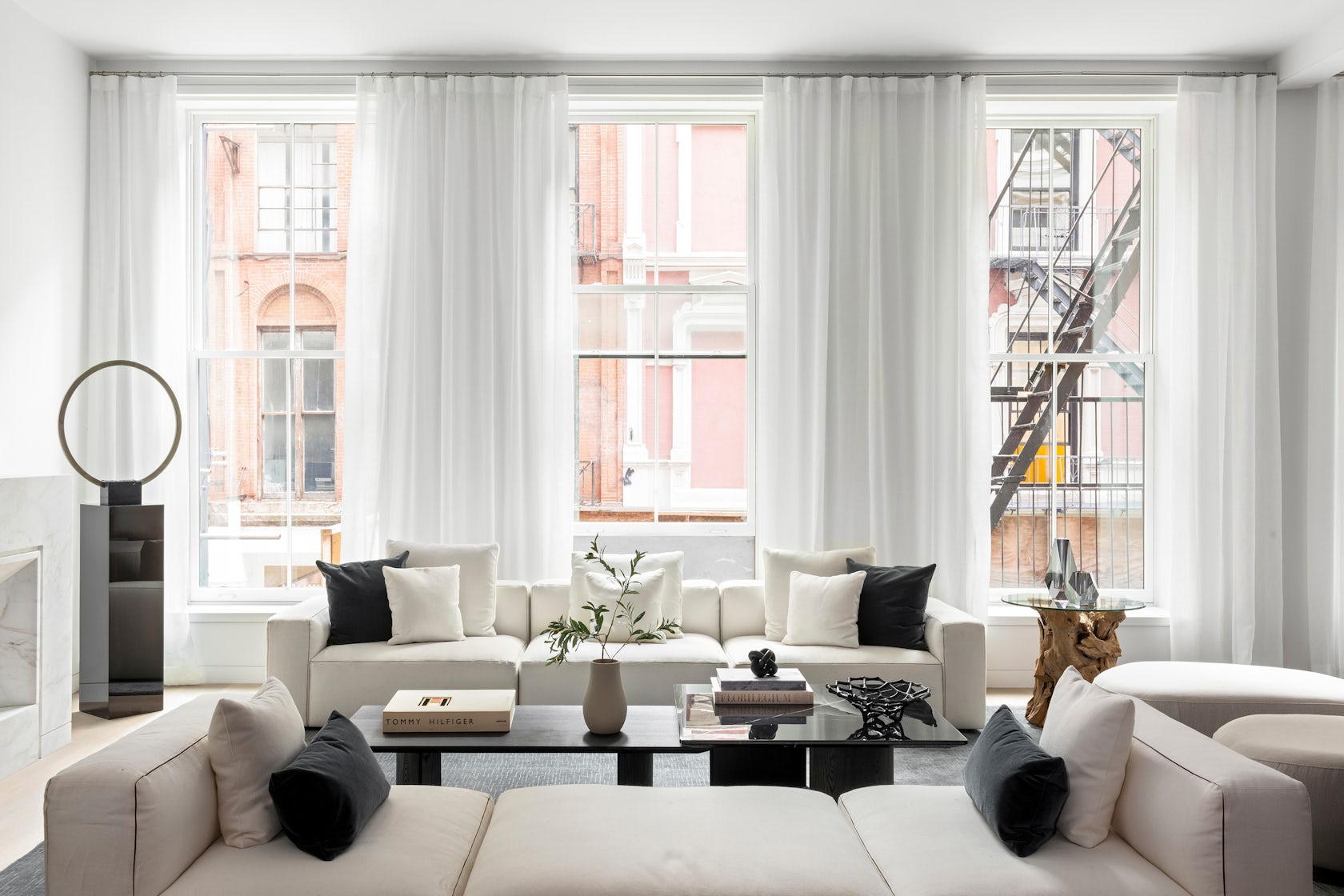
49 Greene Street – a 6-story building in NYC’s historic SoHo district, is an extant example of the mixed iron-and-masonry construction of the post-Civil War era. The client’s brief was to restore the building’s masonry façade and cast-iron storefront, and to convert the interiors into four high-end residential units. To do this, we drew inspiration from the makers and artist ls that once occupied this previously manufacturing building to create units that embrace modern concept of ‘loft living’, in which open, non-programmed flexible spaces meet highly crafted, millworked moments, adding warmth throughout with the use of woods, marbles, and ironwork.

Architizer chatted with Jordan Rogove, Co-Founder and Principal of DXA studio, to learn more about this project.

Architizer: What inspired the initial concept for your design?

Jordan Rogove: We wanted to speak to the various movements that helped form SoHo’s unique character and charm. Much like the artists who were attracted to the neighborhood’s empty lofts in the 1960’s, we too were drawn to the building’s high ceilings, abundant light, and expansive floor plates. For this reason, we are committed to leaving the spaces as open, fluid, and customizable as possible.

However, we were acutely aware that we were designing a home, so introducing a residential scale was important to make the otherwise large space comfortable and inviting. To achieve this, we lowered the ceiling in select rooms and introduced a high level of craft and tactility – our way of communicating with the by-gone manufacturing era of SoHo.

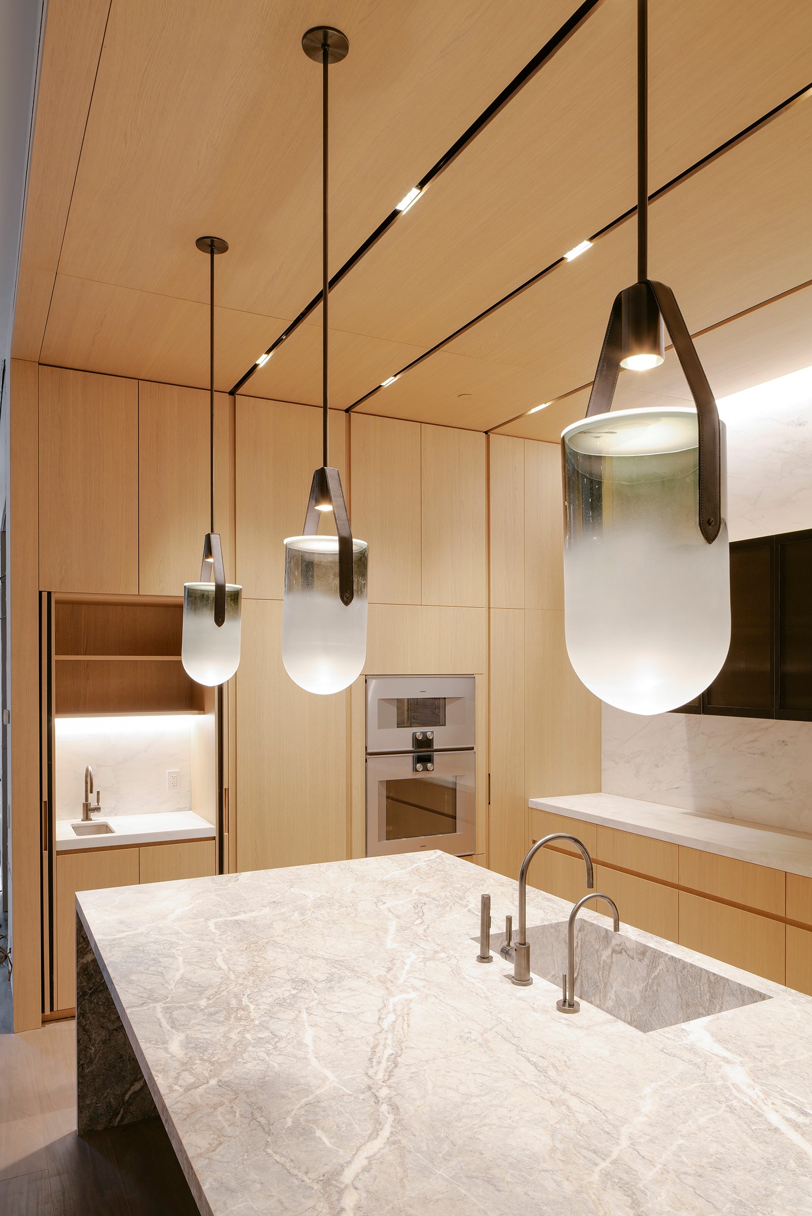
Throughout these rooms, we created a material theme of oak wood paneling, blackened steel, fluted glazing and various marbles. These materials are not only visually exquisite, but very in their tactile qualities, which we believe to be crucial adding warmth and comfort to a home.

© DXA studio

© DXA studio

© DXA studio

© DXA studio

© DXA studio

© DXA studio

This project won in the 10th Annual A+Awards! What do you believe are the standout components that made your project win?

The kitchen and den–the hearth of the home–are the showpieces of each unit, as they are not only beautiful and practical, but speak to each other in their materiality and detailing.

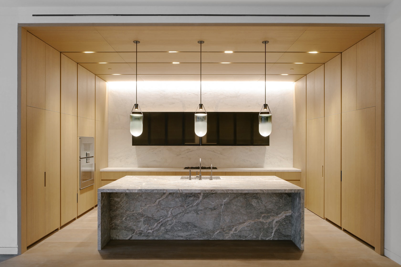
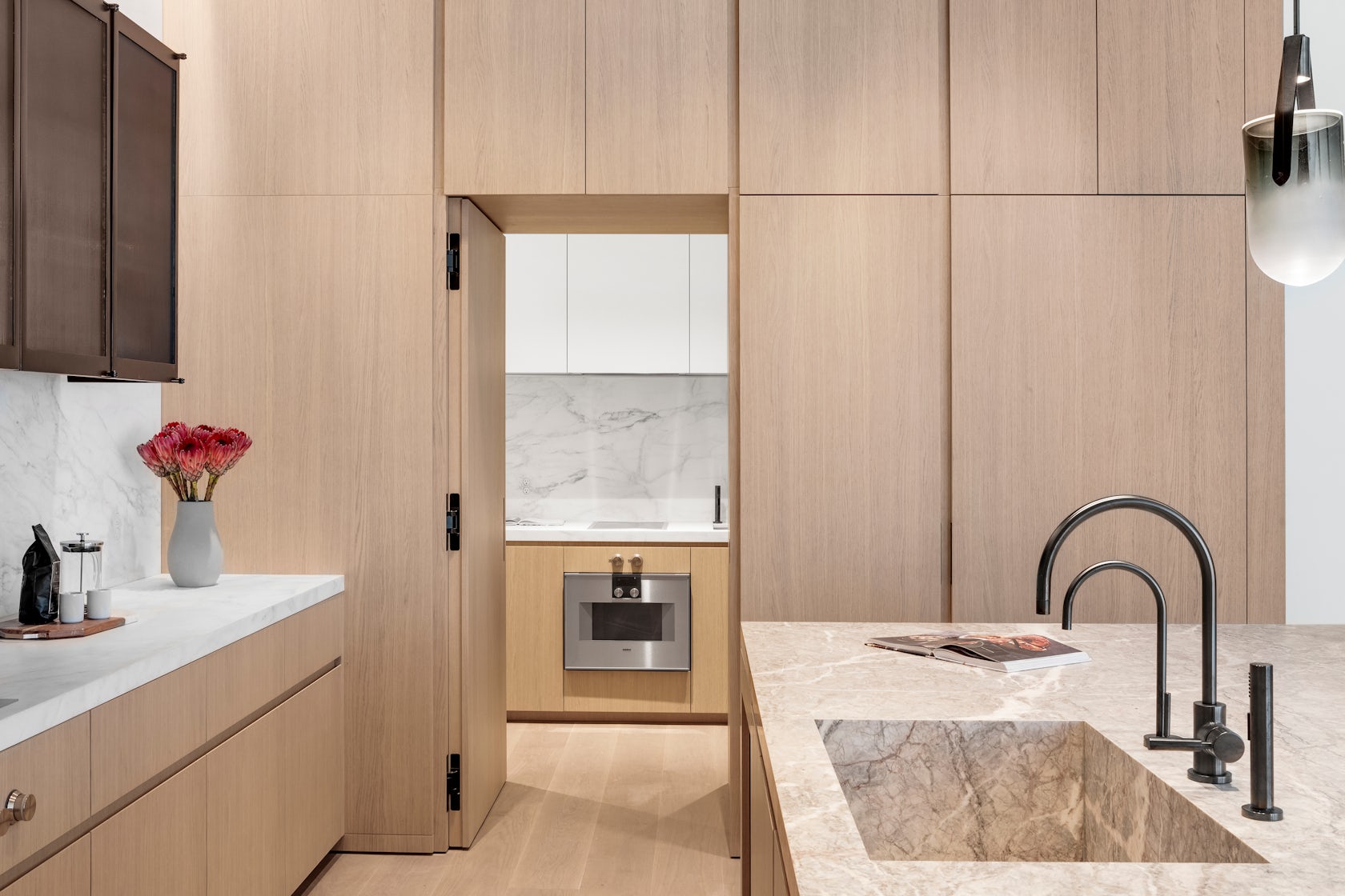
In the kitchen, the appliances, storage, and secondary scullery kitchen are all seamlessly hidden behind white oak paneling with beautifully crafted integrated pulls. This paneling wraps onto the ceiling to cleverly integrate recessed lighting and HVAC diffusers. The island is crafted out of a single slab of Fior di Pesco marble, known for its ability to add calm and serenity to a space, while the upper cabinetry is clad in blackened steel and fluted glass.

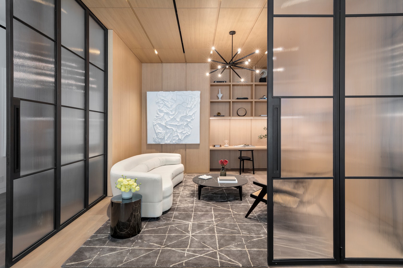
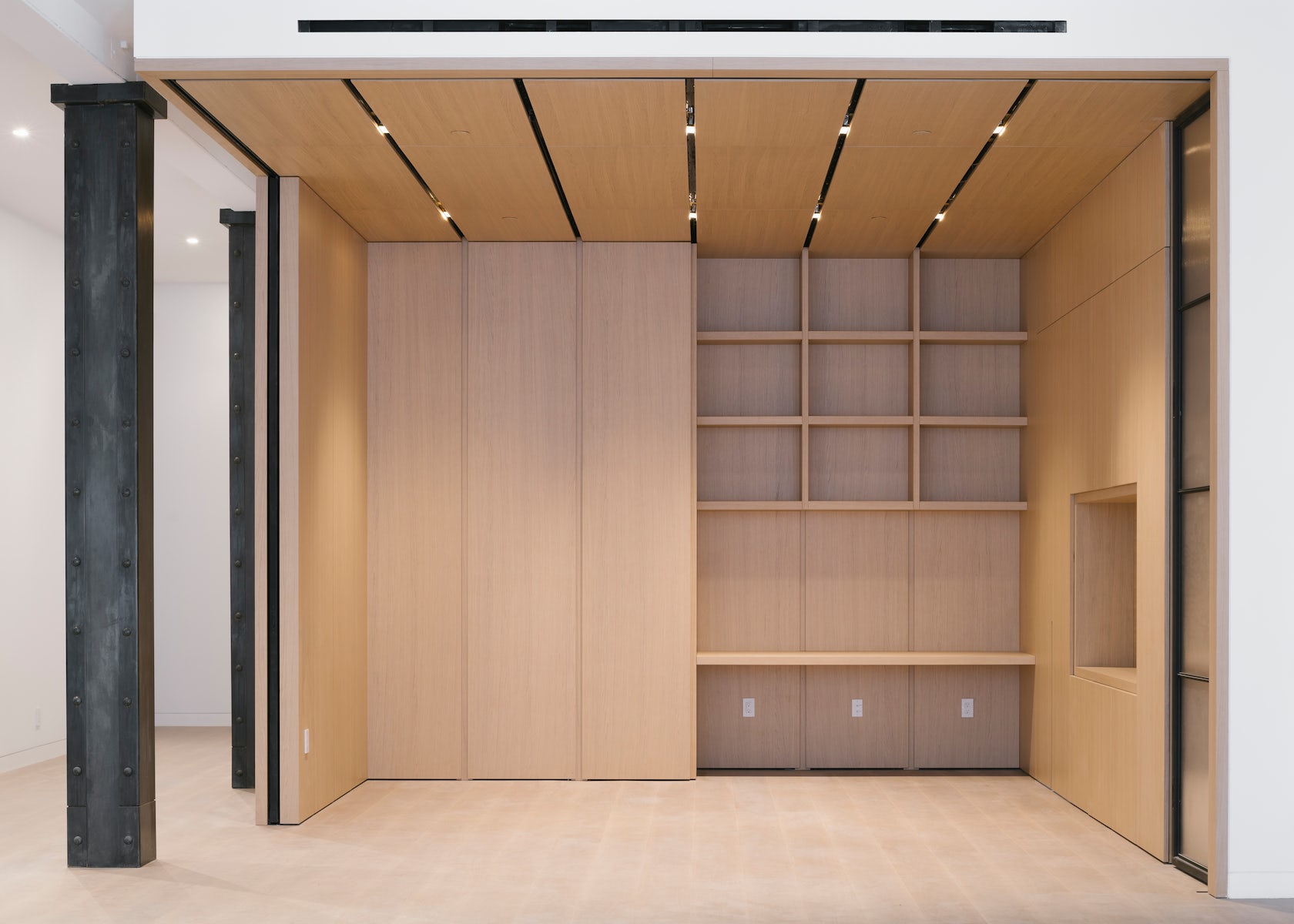
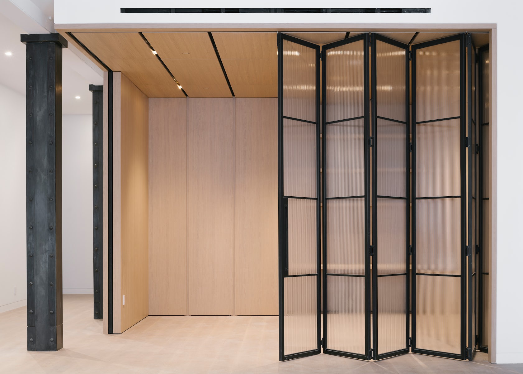
This millwork detailing continues into the den, where white oak paneling and a built-in desktop can be closed off from the main living spaces by large blackened steel and fluted glass doors. Alternatively, these doors can perfectly tuck away into the oak millwork to allow flexible space programming.

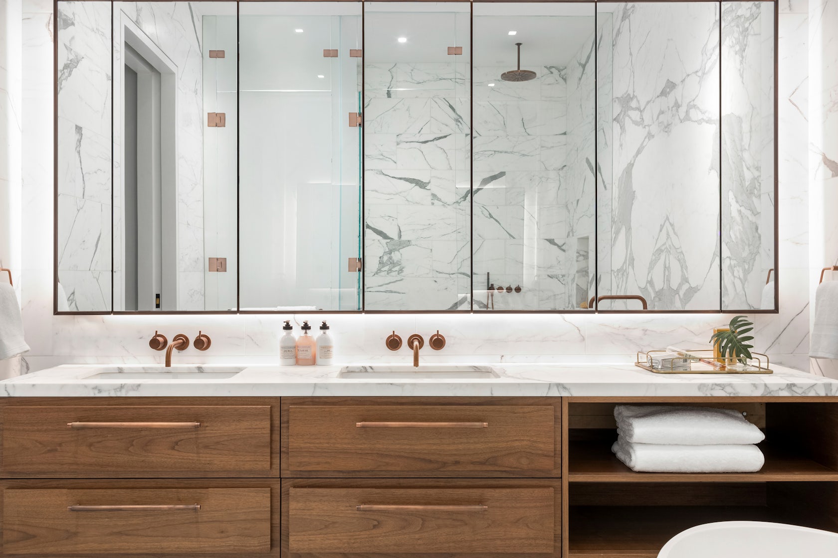
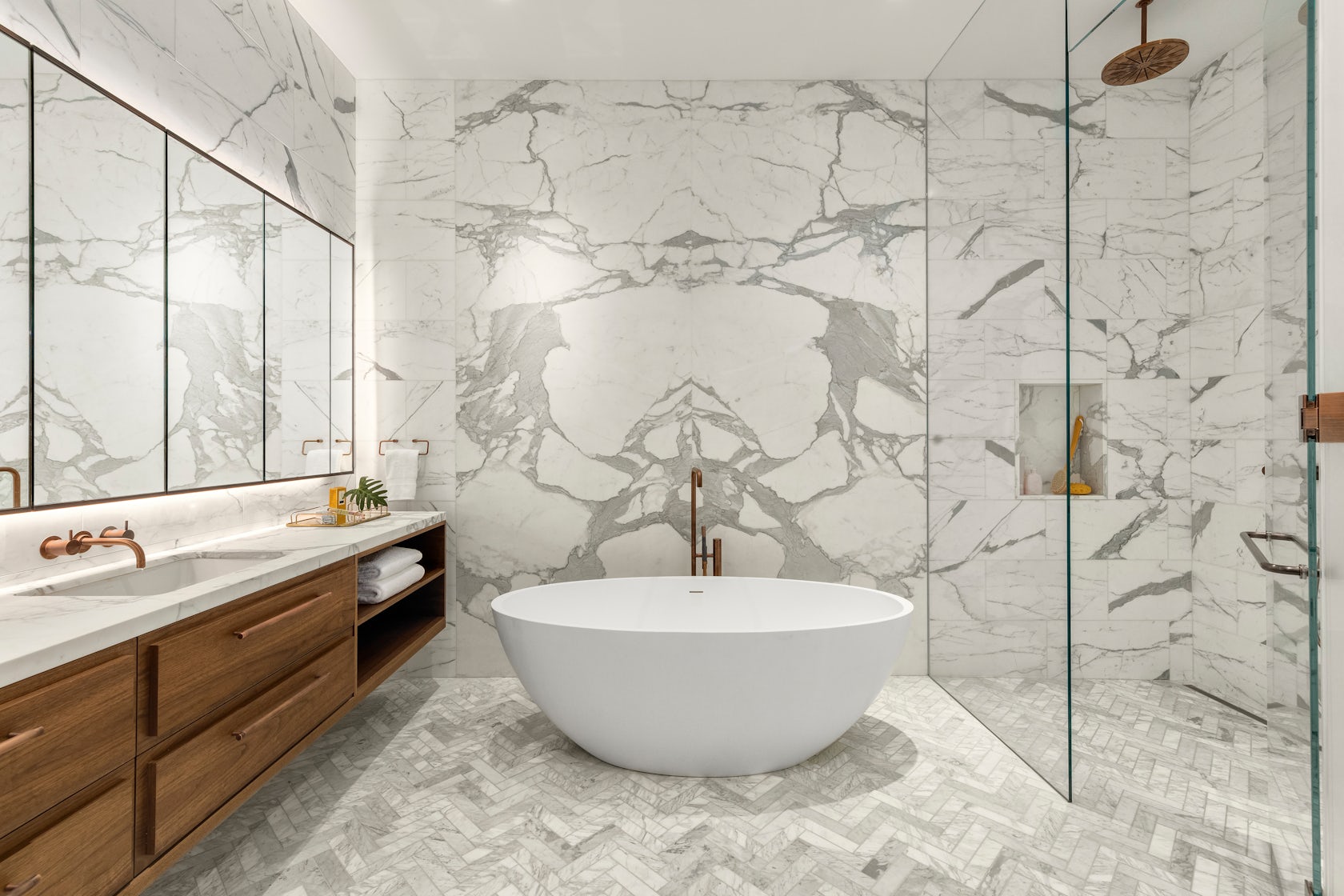
Many of these materials can be found throughout the unit, creating an overarching theme. For instance, the blackened steel of the den’s custom doors is mirrored in the steel frames of the bathroom vanities, the plumbing fixtures, and even the column cladding.

© DXA studio

© DXA studio

© DXA studio

© DXA studio

What was the greatest design challenge you faced during the project, and how did you navigate it? 

Renovating a manufacturing building from the 1800’s was an exciting challenge, both in terms of design and coordination. On the design side, we believe that as architects, it is our duty to celebrate the area’s rich history in an authentic yet contemporary manner. This is why we wanted to keep the open nature of these spaces as much as possible. It is also why we used wood and iron in a way that is reminiscent of previous eras, while using contemporary detailing to bring these materials to the present day.

On the coordination side, working with existing buildings in NYC is always a challenge. As precisely as we survey all historic projects, we often encounter surprises during construction that require us to tweak our design on the fly–and 49 Greene was no exception. Furthermore, we had to design an entirely new roof structure, as the existing roof was significantly sloped, which meant giving the 200-year old structure upgrades to account for modern building technologies.

© DXA studio

© DXA studio

© DXA studio

© DXA studio

What is your favorite detail in the project and why? 

Although it is one of the smallest rooms in each unit, we think the powder room really packs a punch. The vanity and sink are entirely made out of Fior di Bosco marble, which marries well with the ebony black wood veneer panels to create a dark yet calming atmosphere.

© DXA studio

© DXA studio

© DXA studio

© DXA studio

In what ways did you collaborate with others, and were there any team members or skills that were essential in bringing this Award winning project to life?

The nature of this project required us to closely collaborate with millworkers, iron workers, and various craftspeople to get the detailing down. We worked with Canova on all of the millwork, Manhattan Steel Door Co. on the large den doors, and with Sage Construction on the stonework and other general detailing. We had many pencil sessions and back-and-forth shop drawing reviews to better understand how to achieve the level of craftsmanship that we envisioned–and we really refined our knowledge of interior detailing along the way.

© DXA studio

© DXA studio

© DXA studio

© DXA studio

For more on 49 Greene Street, SoHo, please visit the in-depth project page on Architizer.

49 Greene Street, SoHo Gallery

Reference

Floating home concept made from recycled materials
CategoriesSustainable News

Floating home concept made from recycled materials

Spotted: Floating homes are increasingly seen as a viable housing option. Copenhagen-based MAST architecture studio’s concept of modular structures makes the idea sustainable by building with recycled materials and incorporating marine-friendly shapes into the design.

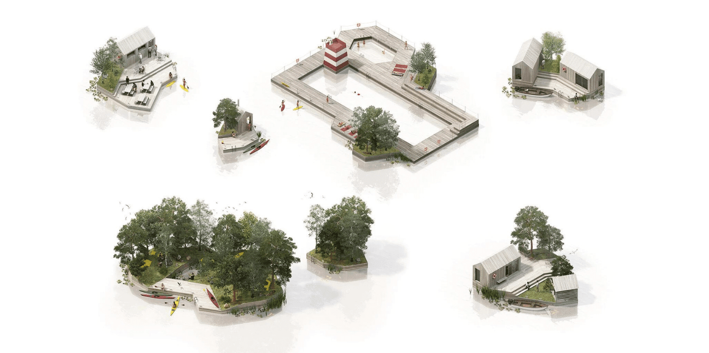
Called Land on Water, the studio’s concept uses flat-packed modules made from recycled plastic to create the floating base. Designed to be easy to ship and assemble, the system is customisable. Once the bases are built, they can be connected in a variety of configurations, providing everything from a floating pool to homes and recreation space. More or less support can be added as needed as a community develops and changes.

MAST uses gabion construction for the bases, which is a series of mesh cages filled with flotation supports. In this case, the studio recommends locally sourced, recycled materials. Sea creatures can live safely in, on, and around the cages, and the studio explicitly eliminates harmful chemicals and other materials from the design in order to better support and live in partnership with marine life.

Currently working on a prototype, the studio seeks partners interested in developing the concept for a range of projects.

As well as floating homes, Springwise has spotted floating work pods and floating solar farms taking advantage of the flexibility of working with water, rather than against it.  

Written By: Keely Khoury

Reference

Universal Design Studio models Biotherm’s Monaco concept store on a lab
CategoriesInterior Design

Universal Design Studio models Biotherm’s Monaco concept store on a lab

The visual language of scientific laboratories informed the look of this blue-lit concept store in Monaco, which London firm Universal Design Studio has devised for skincare brand Biotherm.

Set inside Monaco’s historic Oceanographic Institute, Blue Beauty Lab is where buyers and other industry insiders can come to expand their knowledge of the science underpinning Biotherm‘s skincare line.

Biotherm concept store in Monaco has blue interiors with science lab-inspired details
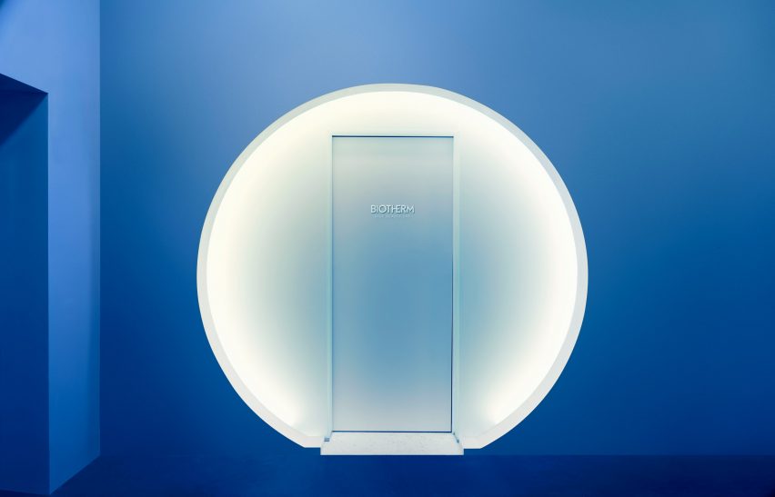
Visitors enter the Blue Beauty Lab via a circular doorway

Although the 30-square-metre concept store showcases a selection of the brand’s products, none of them are for sale. Instead, visitors can fully immerse themselves in the experience of being in the “lab”.

“Brands are increasingly looking to physical presence for means above and beyond selling products,” explained Satoshi Isono, creative director at Universal Design Studio.

“They’re harnessing spaces to storytell their core brand messaging in unique ways and ultimately connect with customers in a more impactful way.”

Biotherm concept store in Monaco has blue interiors with science lab-inspired details
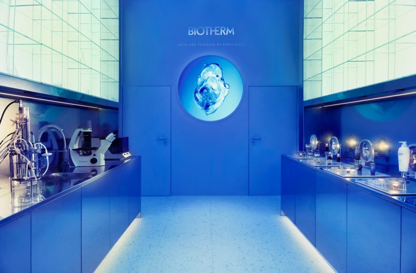
The first section of the store is set up like a science lab

As the outer walls of Blue Beauty Lab back onto water tanks harbouring various aquatic creatures, Universal Design Studio had to keep architectural interventions to a minimum. As a result, the store’s floor plan is fairly simple.

To enter, visitors walk through a circular doorway and a short mirrored tunnel. The interior is washed in sea-blue light and split into two parts.

Biotherm concept store in Monaco has blue interiors with science lab-inspired details
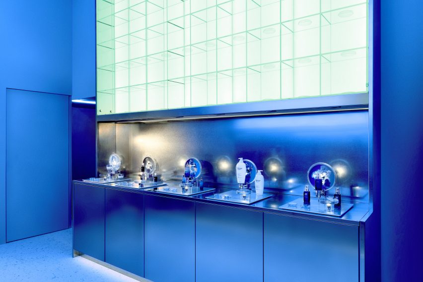
Steel worktops and petri dishes add to the lab-like feel of the space

The first is an area reminiscent of a research lab that gives an insight into the production process of Life Plankton – an extract containing 35 different nutrients that Biotherm incorporates throughout some of its moisturisers, serums and skin peels.

Stainless steel counters and glass shelving units run down the sides of the space, dotted with science paraphernalia like microscopes, petri dishes, test tubes and measuring flasks.

A small workshop forms the second part of the store, centred by a round table. Directly above is a large ring light emitting a bright white glow that enhances the lab-like feel of the space.

Interactive visuals produced by multimedia design studios Superbien and AC3 Studio are projected on the surrounding walls.

Biotherm concept store in Monaco has blue interiors with science lab-inspired details
Measuring flasks and test tubes are also displayed on the shelves

The clinical aesthetic of laboratories has also inspired a number of other interiors.

Among them is a bike shop in Copenhagen by local designer Johannes Torpe and a cafe in Tokyo with a white-lacquered steel ceiling grid.

Reference

Covid-19 test concept by Morrama is recyclable and biodegradable
CategoriesSustainable News

Covid-19 test concept by Morrama is recyclable and biodegradable

Design agency Morrama has devised a concept for a Covid-19 test that is biodegradable and fully recyclable, right down to its packaging – potentially eliminating a common source of plastic waste.

The ECO-FLO test – which is, for the time being, a concept design only – would be the first in the world to be 100 per cent recyclable and biodegradable, according to Morrama.

The design agency devised the solution to cut down on the amount of single-use plastic generated by the pandemic. While both face masks and Covid-19 tests are at least partially recyclable, it is only through specialised facilities and not through residential collection, so must users have been advised to place them in the waste bin.

A rendering of Morrama's biodegradable Covid-19 test concept beside a photo of the NHS Covid-19 lateral flow test
The ECO-FLO test has fewer parts than today’s lateral flow test (left)

“At Morrama, we were inspired to create a test kit that doesn’t contribute to the amount of plastic ending up in our landfills, so ECO-FLO was born,” said the agency’s founder and creative director Jo Barnard.

Morrama’s proposal achieves this goal by making the test itself from moulded paper pulp, and its outer packaging from biodegradable NatureFlex film, which would both break down in approximately four to six weeks.

The other plastic elements – the swab, test tubes and their associated packaging – are all eliminated, as the agency rethought every step of the testing process to minimise materials and maximise ease of use.

Rendering of the Eco-Flo pulp paper covid-19 test next to its biodegradable film sachet packaging
The test would be made from paper pulp and the sachet from biodegradable film

Instead of the two mainstream test types on the market, polymerase chain reaction (PCR) and rapid antigen (lateral flow), ECO-FLO applies a new method called the Parallel Amplified Saliva rapid POint-of-caRe Test (PASPORT).

It works with only a saliva sample, so there is no need for buffer solution or a nasal swab – an element that can be difficult to use for those with disabilities or impairments, or when testing children.

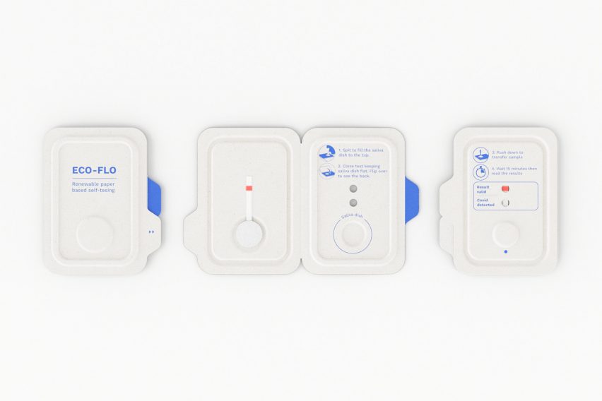
The user would only need to spit on ECO-FLO’s absorbent pad, close the test package and push the moulded button to transfer the sample from the absorbent pad to the test strip.

Rendering of Eco-flo tests showing every surface printed with instructions
All of the instructions are printed directly on the test

All of the instructions are printed directly on the test so there is no need for additional leaflets, and it is made more readable by replacing the currently used scientific notations – such as “C” for “control” and “T” for test – with simple checkboxes. In Morrama’s conceptualisation, the packaging is the product.

“Thinking about the test as less of a product and more a piece of functional packaging really influenced the direction,” Barnard told Dezeen.

“Packaging by its nature should always be designed for end-of-life, so we started not with a design, but with materials that can be recycled and recaptured.”

While the need for Covid-19 tests may be in decline, Barnard says the ECO-FLO design remains relevant for countries still undertaking mass testing, such as China, which is disposing of over a million kits a day.

It would also assist groups with accessibility requirements, such as the young, old and those with mental health or learning difficulties.

Collage of a person's hands holding the Eco-Flo test marked positive for "result valid" and "covid detected"
Results in simple English make the test easier to read

However, Morrama is also positioning ECO-FLO as a provocation for the world to start thinking about sustainable design for future pandemics now.

“Whilst much of the Western world has moved on from mass testing of Covid-19, there has been regular warnings from experts that pandemics are only set to become more likely,” said Barnard.

“With the failures from our response to Covid still fresh in our mind, we need to act now to ensure we are better prepared in the future.”

Gif showing how to push the button on the Eco-flo concept design to activate the Covid-19 test
The moulded paper design includes a push button to activate the test

For the concept to become a reality, PASPORT would need to be approved for use in at-home test; currently, it is still in trials. Cost should not be a barrier, as Morrama expects the required paper injection moulding or dry moulded fibre processing to be cost-competitive with plastic injection moulding at volume.

In the more immediate future, another British company, SureScreen Diagnostics, has announced it will start making a biodegradable Covid-19 test cartridge from plant-based materials, eliminating one source of plastic from the kits.

Morrama was founded in 2015. The agency’s past projects include the minimal Angle razor, also aimed at reducing plastic waste, and a series of “smarter phone” concepts aimed at improving wellbeing.

Dezeen is on WeChat!

Click here to read the Chinese version of this article on Dezeen’s official WeChat account, where we publish daily architecture and design news and projects in Simplified Chinese.

Reference