monolithic concrete volume houses sports hall in switzerland
CategoriesArchitecture

monolithic concrete volume houses sports hall in switzerland

COMAMALA ISMAIL takes over the design of Sports hall in Vernayaz


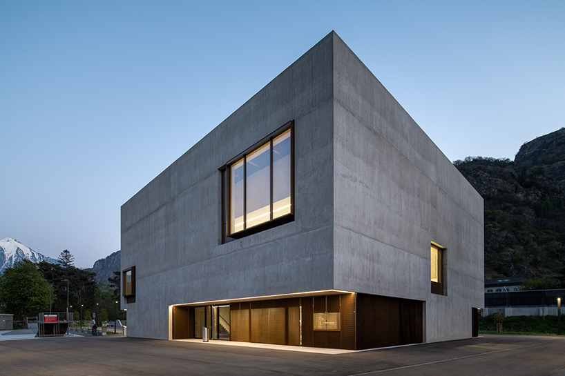
Vernayaz commune in Switzerland initiated the construction of a new sports hall dedicated to school sports activities through an open architectural competition. Awarded in spring 2015, the planning by Comamala Ismail commenced, incorporating additional spaces for FC Vernayaz. By August 2017, construction began, concluding in spring 2020. The architectural approach focused on placing the sports hall on the east side of the Swiss Federal Railway line within the sports area. The building’s design prioritized practicality and simplicity, developing non-standard solutions to address community needs while maintaining elementary yet diverse spatial qualities.

monolithic concrete volume houses sports hall in vernayaz of switzerland
all images courtesy of Comamala Ismail


stone and concrete interact with the neighboring mountains


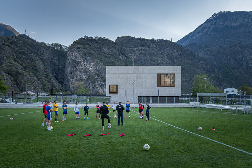
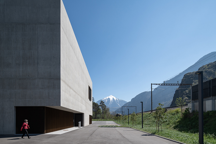
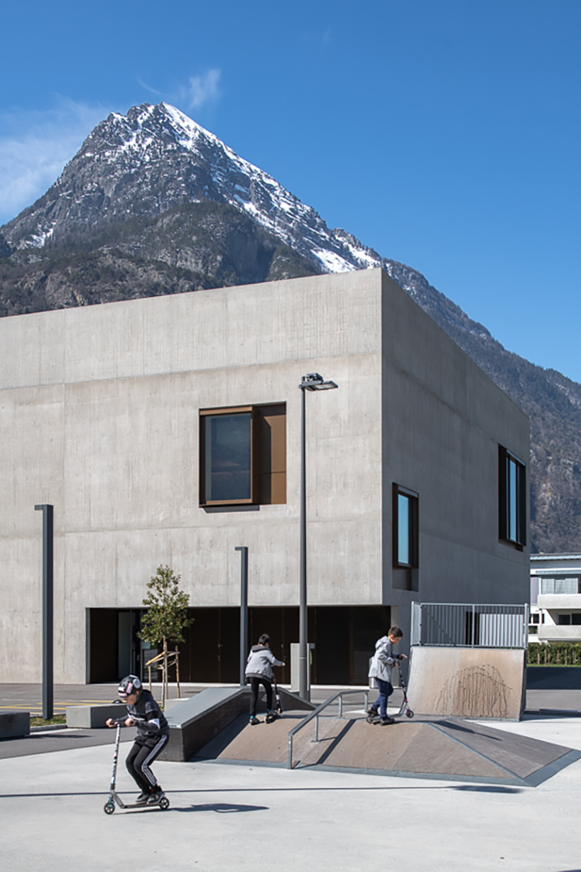
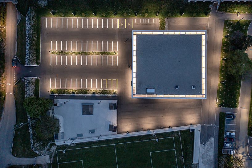
The project by Comamala Ismail centered on two vital aspects: reinforcing the connection between public spaces on either side of the rail tracks and establishing a dialogue with the neighboring mountainous character. The sports hall, strategically positioned at the main entrance to Valais, serves as both the head of the sports complex and a connecting element to the village center, creating a new public space for sports activities.


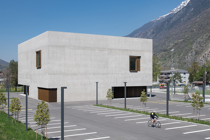
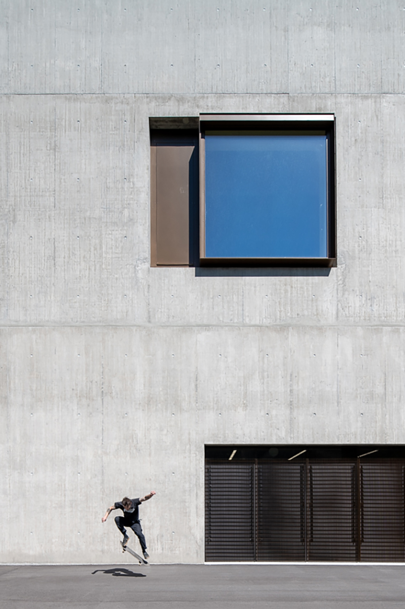
Materials employed in the project engage with the distinctive mountain environment, establishing a dialogue with the stone and nature of the mountains. The monolithic concrete volume, featuring a single opening per facade, is complemented by warm wooden cladding on the interior, contributing to a balanced and comprehensive architectural perception that prioritizes light and acoustic comfort. Synthetic building materials were minimized in favor of emphasizing the inherent characteristics of raw materials.

monolithic concrete volume houses sports hall in vernayaz of switzerland
Comamala Ismail’s project emphasizes practicality while maintaining diverse spatial qualities

monolithic concrete volume houses sports hall in vernayaz of switzerland
initiated by Vernayaz commune, the sports hall project was designed through an architectural competition

monolithic concrete volume houses sports hall in vernayaz of switzerland
two key aspects include reinforcing connections across rail tracks and engaging with the mountainous environment

monolithic concrete volume houses sports hall in vernayaz of switzerland
the sports hall acts as a head of the sports complex and connects to the village center

monolithic concrete volume houses sports hall in vernayaz of switzerland
the monolithic concrete volume features a single opening per facade

monolithic concrete volume houses sports hall in vernayaz of switzerland
the design establishes a new public space for sports activities while engaging with the mountain environment

Reference

Using AI to design out excess concrete
CategoriesSustainable News

Using AI to design out excess concrete

Spotted: Global macroeconomic activity is putting pressure on the world’s construction industry, with growth in many regions slowing and in other areas, reversing. One method contractors and owners can use to mitigate the volatility of markets and rising costs of supplies is to reduce the amount of materials used in a build. 

Many in the construction industry believe that concrete structures are frequently ‘over-designed’, meaning too much concrete is used for the purpose of the building. Constraints on time are one of the main reasons that this happens, as architects and builders would rather overdesign for safety than not use enough. 

Israeli construction technology company Structure Pal has an intelligent solution. An artificial-intelligence-powered (AI) software tool provides structural engineers, project managers and designers with a range of options for the use of concrete in a project. From the type of concrete to placement and volume needed, the tool helps to reduce costs and the amount of concrete used by around 15 per cent. Use of the tool can cut design time in half, and by the end of a build, the tool can reduce construction carbon emissions by up to 30 per cent. 

Designers integrate the tool into their usual building information modelling (BIM) platforms, and the AI analyses the many different configurations possible. Structure Pal’s system provides options for different loads on different levels, recommends the minimum number of columns for the required slab thickness, and ensures that each iteration of a design includes and meets local building code requirements. The Structure Pal team estimates that the software can do in one hour what it would take a civil engineer to do in four weeks. 

Structure Pal offers four levels of access to the tool. There is a pay-per-project option that costs $2 (around €1.88) per square metre of a floor plan, and for larger businesses, companies can pay per 100,000 square metres, with the option to pay in advance for future projects to receive the largest discount. 

Other recent innovations in concrete Springwise as spotted in the database include a light-sensitive concrete that cleans the air in road tunnels and an AI tool that optimises concrete use based on what other materials will be used in a build.

Written By: Keely Khoury

Reference

Electrifying cement production for kiln-free concrete
CategoriesSustainable News

Electrifying cement production for kiln-free concrete

Spotted: Cement is a vital component in construction, with an estimated 4 billion tonnes produced each year. Yet at the same time, cement production is also a huge contributor to global warming, generating 1.67 billion tonnes of CO2 in 2021. Clearly, getting the world to net zero is going to require reducing emissions from cement. One of the companies working to achieve this is Sublime Systems.

In conventional cement making, limestone is heated to 1400 degrees Celsius until it decomposes, releasing CO2 as a by-product. The fossil fuels used to power the kilns and the CO2 released through limestone decomposition are responsible for almost all of cement’s carbon emissions.

Sublime’s technology uses an electrochemical process, instead, to break down non-carbonate rocks and other raw materials (such as industrial wastes) that don’t release CO2 when decomposed. This can run at room temperature and be powered by renewable electricity, making Sublime’s process net zero while also reducing manufacturing costs and complexity. The resulting Sublime Cement can be used in place of ordinary Portland cement for any use.

The company recently announced the closing of a $40 million (around €38 million) series A funding round, led by climate-tech-focused fund Lowercarbon Capital, and with participation from Siam Cement Group, the largest cement producer in Southeast Asia.

Reducing emissions from cement manufacture is crucial to reaching net zero. Luckily, there is no shortage of innovators working on ways to help with this. Recent advances spotted in the Springwise archive include using artificial intelligence (AI) to optimise concrete recipes and using fly ash to reduce cement emissions.

Written By: Lisa Magloff

Reference

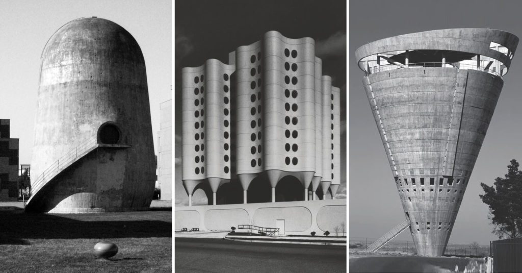
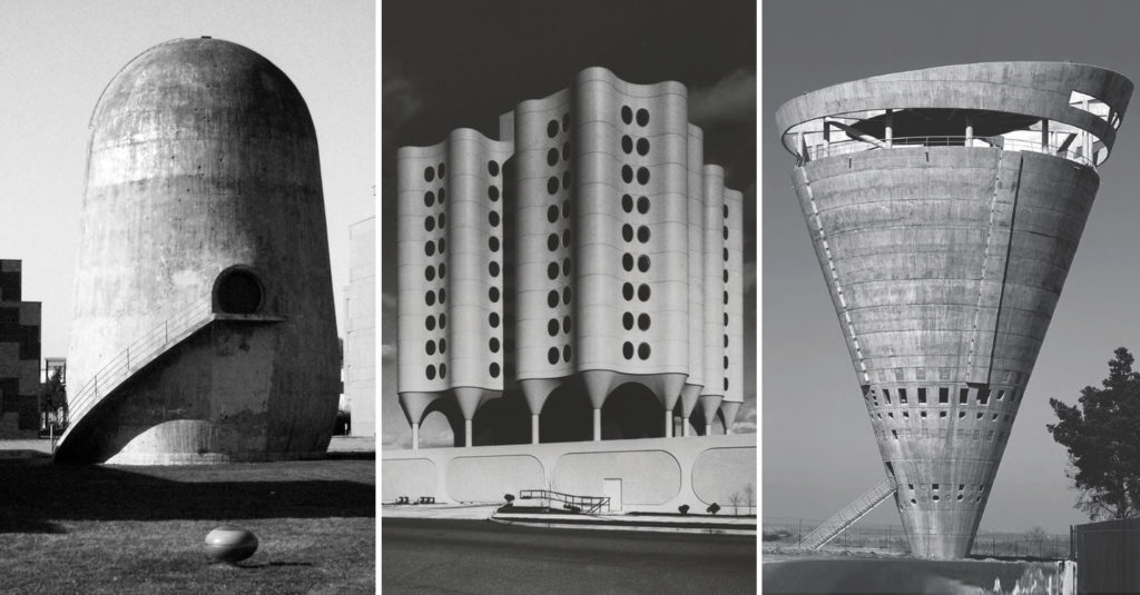
Architects Should Continue Using Concrete. Change My Mind.
CategoriesArchitecture

Architects Should Continue Using Concrete. Change My Mind.

Architizer’s new image-heavy daily newsletter, The Plug, is easy on the eyes, giving readers a quick jolt of inspiration to supercharge their days. Plug in to the latest design discussions by subscribing. 

“What’s nice about concrete is that it looks unfinished.” 

– Zaha Hadid 

Before embarking on my argument, I want to get something out of the way: I believe that climate change is real. I also believe that mitigating climate change by lowering carbon emissions in as many areas of human life as possible is an urgent necessity in our century. Doing so is the only way to preserve the chance that future generations will be able to enjoy a decent and dignified existence. 

Another point to add in the preamble: I agree that concrete is an enormous contributor to climate change. It would be silly to try to deny it. The facts are there for anyone who cares to look. 

According to the Princeton Student Climate Initiative, the manufacture of concrete produces 4 billion tonnes of carbon dioxide annually, about 8% of global emissions. By comparison, transportation accounts for 29% of global emissions. The reason concrete is so carbon-heavy has to do with the manufacture of cement, the binding agent that, when mixed with water and gravel or sand, creates concrete – that magical liquid stone that enabled the creation of modern cities and remains the most consumed product on Earth after water. (Food is not even in spitting distance). 

To create cement, limestone, clay and other materials are fired in massive kilns at over 1,200 degrees fahrenheit. And again, this is done a lot, all over the world, as concrete is used in almost every aspect of construction worldwide, from roads to sidewalks to bridges to pipes and more. Even most wood frame buildings have concrete foundations. As the architect Sarah Nichols put it, concrete is in “almost everything” and can be found “almost everywhere” in the modern world. 

In a brilliant 2022 essay for Noema, author Joe Zadeh explains that “such a monstrous scale of production has monstrous consequences.” He adds that “concrete has been like a nuclear bomb in man’s conquest of nature: redirecting great rivers (often away from the communities that had come to rely on them), reducing quarried mountains to mere hills, and contributing to biodiversity loss and mass flooding by effectively sealing large swathes of land in an impermeable gray crust.” 

It is no wonder that some writers have advocated abandoning concrete altogether, arguing that new techniques of engineering wood and other materials obviate the need for all this gray sludge. Right here in Architizer, Francesca Mercurio asserted bluntly that “architects should stop using concrete.” She writes that “we should be striving toward a mindset shift, one where humans understand their place on Earth and respect their ecosystems and natural terrains. We must shift our priority from grandeur and excess to preserving the Earth’s natural resources and ultimately, close the chapter on the concrete era.” 

Because it can be cast into any shape, concrete opened up new possibilities for architects.

Because it can be cast into any shape, concrete opened up new possibilities for architects, essentially enabling the development of modern architecture as we understand it. Via Phaidon and Architizer.

However, even Mercurio admits that “there is certainly no clear path” to abandoning concrete altogether, as there are no real substitutes that are as cheap and versatile to meet the needs of a world that is still in the process of urbanizing. And here is my worry. 

At times, the broadsides against concrete seem to be attacks on modernity itself, a claim that the time has come to scale back and learn to live with less. It is often linked to a call to repair existing infrastructure instead of always building more. But that is not an option for the developing world, where necessary infrastructure is still being constructed and the process of industrialization and economic growth is lifting millions out of poverty. When people say that “concrete built the modern world,” it almost seems to imply that the modern world has already been built, which is far from the case. Politically, economically, physically, and morally, humanity remains involved in a period of growth and transformation. 

As a democratic socialist, I am not happy with where we are. I do not want to stop building and go back to nature, as doing so would require an enormous amount of sacrifice on the part of the world’s most vulnerable people. A sustainable future is key, but it must be a high-tech future, one that is able to provide for the needs of a global population that continues to grow. To do this, we are going to need to move mountains — literally. Certainly, innovations toward a greener concrete should be commended, as should building practices that allow architects to use less concrete. In this vein, Philippe Block’s research into how architects can use vaulting to limit the amount of concrete used even in high rise structures is particularly fascinating. But until a real alternative to concrete presents itself, we are very much still in the “concrete era.”

Architizer’s new image-heavy daily newsletter, The Plug, is easy on the eyes, giving readers a quick jolt of inspiration to supercharge their days. Plug in to the latest design discussions by subscribing. 

Cover image: RW Concrete Church by NAMELESS Architecture, Seoul, South Korea

Reference

GOSIZE wraps japan home in concrete walls of varying height
CategoriesArchitecture

GOSIZE wraps japan home in concrete walls of varying height

gosize melds external and internal spaces at ashiya s house


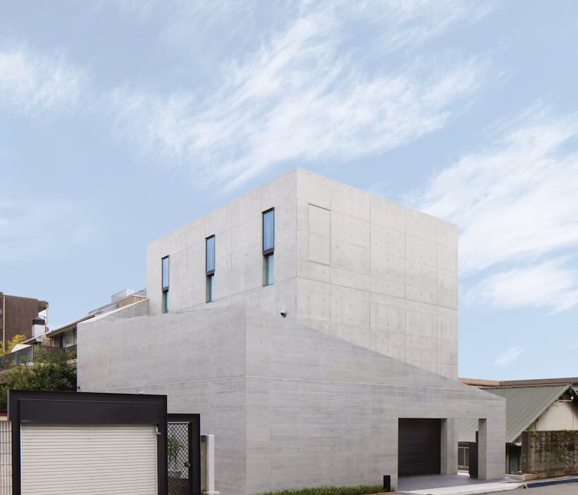
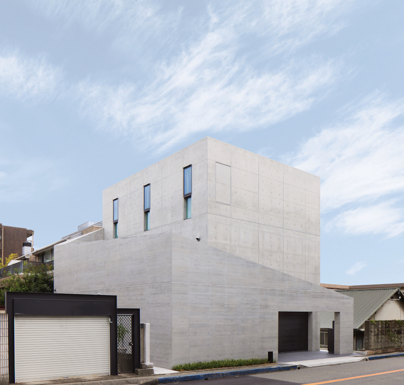
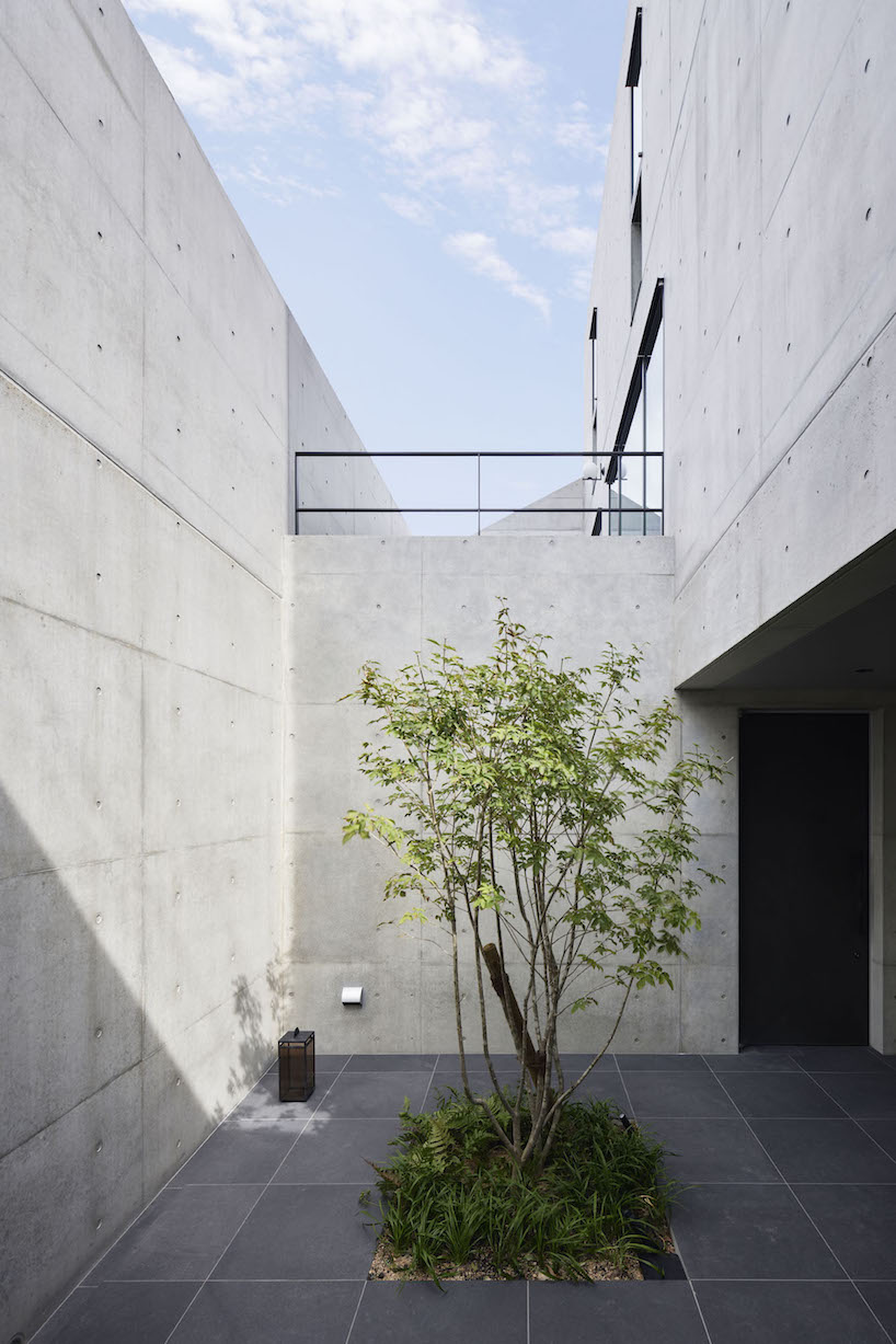
Amid an upscale residential neighborhood in Hyogo Prefecture, Japan, the Ashiya S House stands as a three-story block of concrete infused with a dynamic sequence of spaces. The home, conceived by Go Fujita of studio GOSIZE, fuses traditional Japanese perspectives with modern aesthetics, resulting in a space that blurs the boundaries between interior and exterior, motion and stillness, and yin and yang.


Situated in close proximity to neighboring apartment buildings and a busy road, the architects placed emphasis on blocking sightlines and noise, prioritizing privacy and tranquility for residents. The spatial solution devised a series of outer walls surrounding the building, each varying in height and strategically positioned to create an open space that fosters intimacy while inviting natural light and views inside.

dynamic curtain of concrete walls of varying heights engulfs japanese home by GOSIZE in tranquility
height-changing walls envelop the building | all images courtesy of Go Fujita / GOSIZE


fusion of traditional japanese design with modern aesthetics


Approaching the entrance, residents are guided along a semi-external path formed by gaps between overlapping exterior walls, marking a transition from public to private. Stepping inside, rough yet delicate tatami-finished walls adorned with contemporary art fuse traditional and modern elements, creating a serene ambiance that sets the tone for the rest of the Ashiya S House.


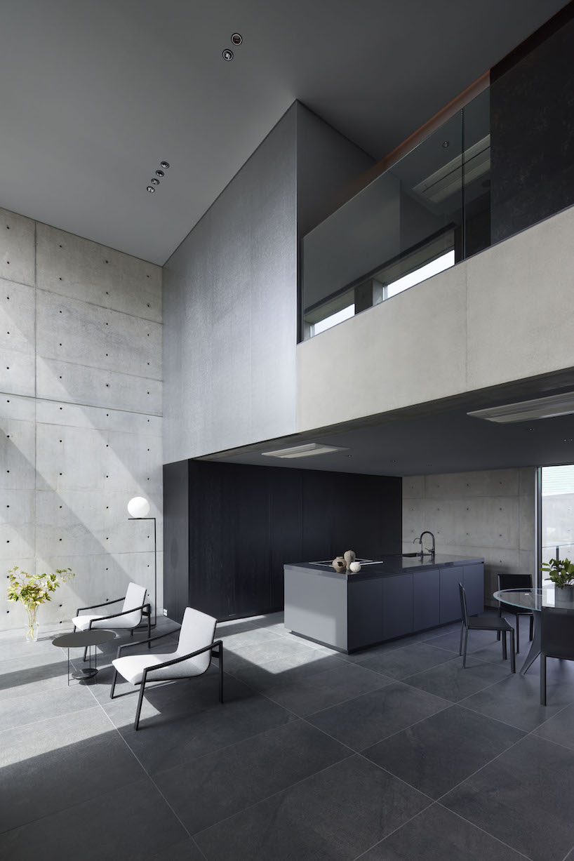
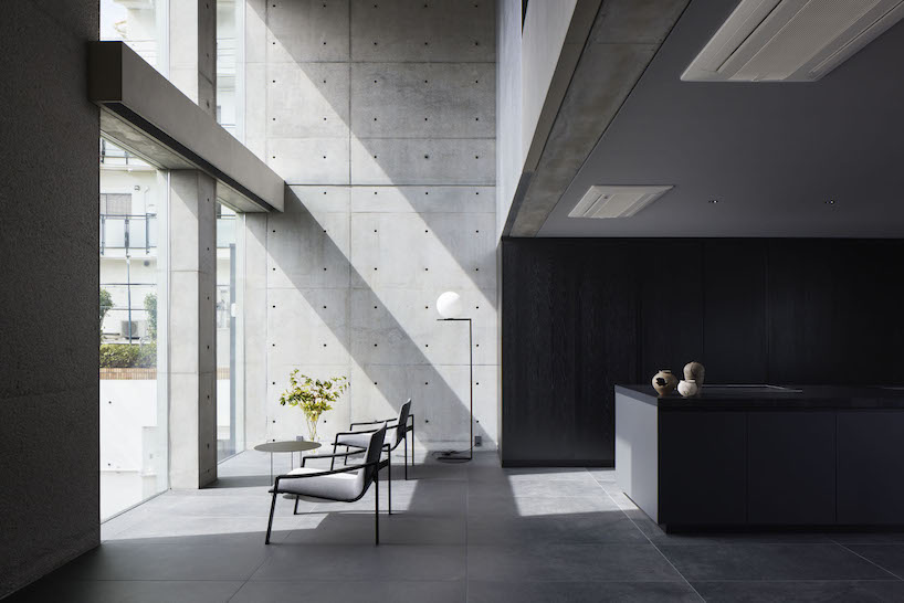
Ascending the stairs, guided by subtle indirect lighting, unveils a living area that exudes a sense of openness. The double-height windows allow sunlight to stream in, softly reflecting off the tin wallpaper and diffusing into every corner of the living space. The team at GOSIZE has carved these expansive openings into the thick walls to also serve as screens, framing the ever-changing views of the outside world, effectively merging the indoor and outdoor experiences.

dynamic curtain of concrete walls of varying heights engulfs japanese home by GOSIZE in tranquility
a walled courtyard and porch marking a transition from exterior to exterior

dynamic curtain of concrete walls of varying heights engulfs japanese home by GOSIZE in tranquility
GOSIZE’s design concept fuses traditional Japanese perspectives with modern aesthetics

dynamic curtain of concrete walls of varying heights engulfs japanese home by GOSIZE in tranquility
the living space is infused with light and openness despite the home’s location in a bustling area

Reference

Material researchers create biodegradable concrete casting using sawdust
CategoriesArchitecture

Material researchers create biodegradable concrete casting using sawdust

A research team at the University of Michigan has created biodegradable formwork out of sawdust in an attempt to mitigate wood waste in the process of laying concrete.

The wood-based material is a result of the BioMatters project by the Digital Architecture Research and Technologies (DART) Lab at Taubman College of Architecture and Urban Planning.

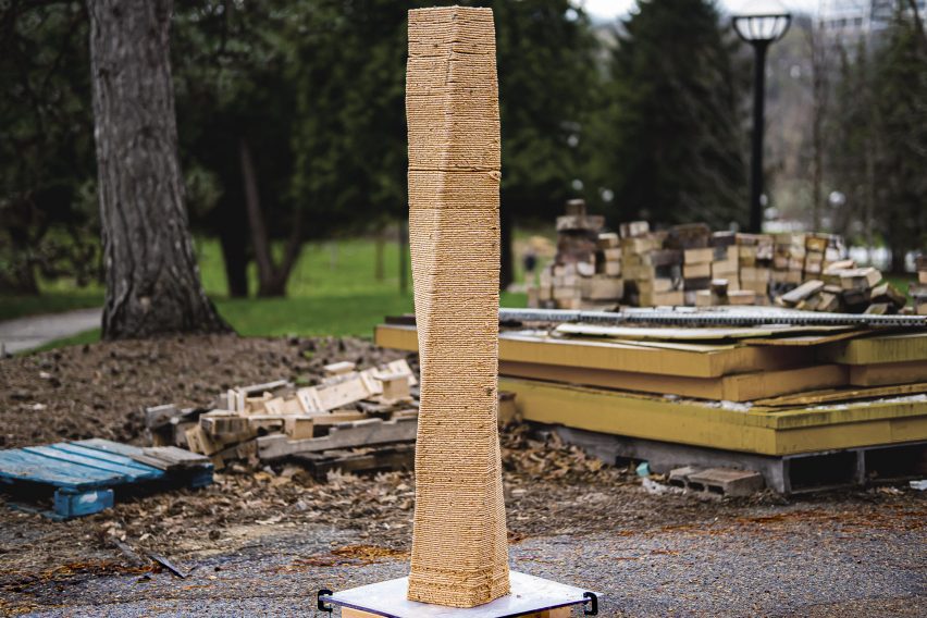
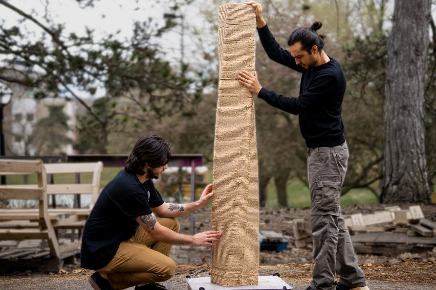
A 3D-printed column made of sawdust
A research team at the University of Michigan has created a sawdust material for concrete formwork

Led by DART director Mania Aghaei Meibodi along with researchers Muhammad Dayyem Khan and Tharanesh Varadharajan, the team sought to create a material to reuse industrial sawdust in order to lessen the waste created by formwork used in concrete construction.

The team mixed sawdust with biopolymers and additives to create its material, which can be moulded or 3D-printed into various shapes. In order to demonstrate its capabilities, the team used the material to create concrete formwork.

Two people hold a 3D-printed sawdust column
The material can be 3D-printed in order to create structural columns

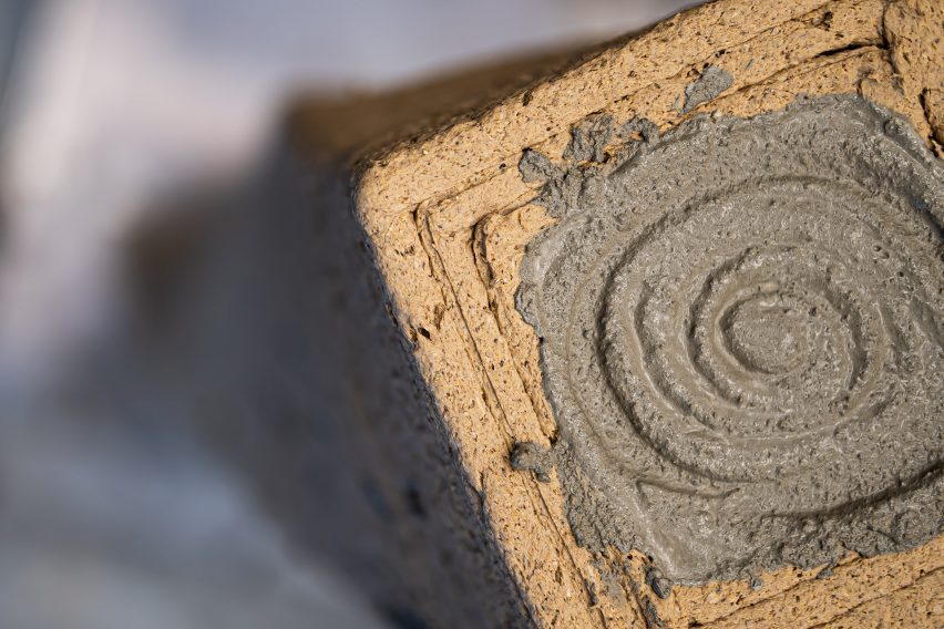
The team 3D-printed a 1.8-metre structural column, pouring concrete into its centre incrementally. After the concrete was dry, the sawdust formwork was peeled off to reveal the column.

The sawdust material was then saved and recycled by adding water in order to recreate the viscosity level required for 3D printing. Using this process, the team successfully reused the same material over 25 times to create additional columns.

Concrete poured into a a column of sawdust casting
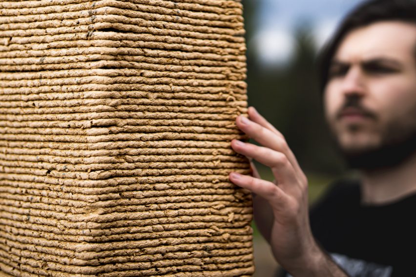
The material is created using a mixture of sawdust and biopolymers

According to the team, 15 billion trees are cut down worldwide per year, which results in three million pounds of sawdust dumped into landfills in the United States.

The sawdust may often be burned as an alternative, which can cause environmental pollution.

A column made of sawdust and bio polymers
It can be recycled by adding water

“It’s like a precious material for me because you’re cutting down a tree,” said researcher Muhammad Dayyem Khan. “I think every particle of that tree should be reused if you’re cutting it down.”

According to DART Lab, formwork contributes to up to 40 per cent of concrete construction expenses and is usually constructed from wood. After its use on construction sites, the formwork is often discarded.

The team also plans to experiment with making larger structures with the material.

“For example, some structures can be printed in a big warehouse and then you just turn them back up,” said Khan. “Just rotate them 90 degrees and you’ve got a bigger structure.”

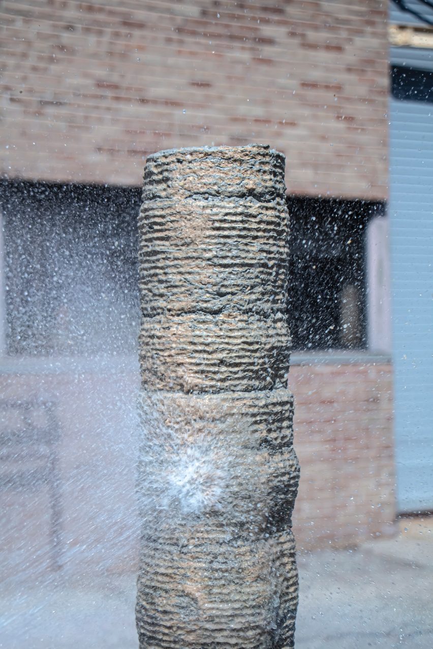
A concrete column getting sprayed with water
The material is used to mitigate waste produced by the concrete industry

While the BioMatters team initially experimented with the material for formwork, it suggested that the potential reaches beyond just concrete construction.

“It can be anything,” said Khan. “It can be small, decorative items. It can be furniture. It can be your walls, doors, windows.”

The material can also be sanded and stained similar to wood in order to create a smoother finish. The team has yet to explore what woods perform best for the material.

For more projects that utilize sawdust, Designer Oh Geon also used it to create a blocky stool while Mater Design utilised the material for a re-released version of the Conscious Chair. 

Photography courtesy of DART Lab. 

Reference

edition office’s fenwick homes balance concrete & delicate copper
CategoriesArchitecture

edition office’s fenwick homes balance concrete & delicate copper

fenwick st: design-focused homes for hew, australia


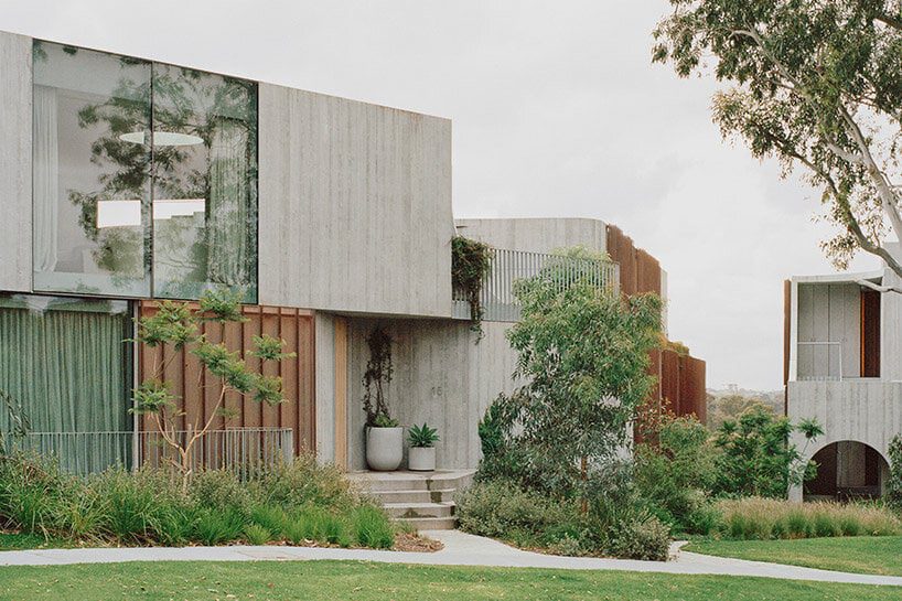
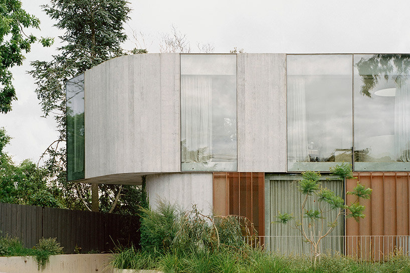
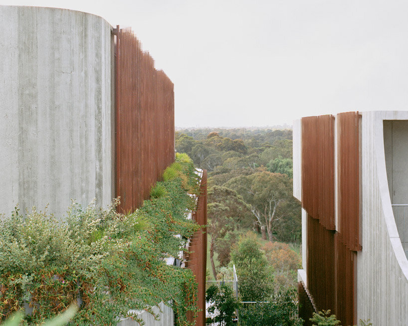
Melbourne-based architecture studio Edition Office presents Fenwick St, a newly completed residential development situated on the edge of the Birrarung/Yarra River in Kew, Australia. This location offers unobstructed connections to breathtaking landscapes rarely found in such close proximity to the city. With the site surrounded by well-preserved 1950’s and 1960’s post-war houses, the architects sought to create the concrete complex as a contextually sensitive addition that balances density with visual porosity, while ensuring a connection to the lush natural surroundings.

edition office fenwickimages © Rory Gardiner@arorygardiner


a trio of residential pavilions


To maintain a strong connection to the distant vista while preserving the link between Fenwick St and the public realm, Edition Office emphasized drawing these connections deep into the plan and through the site to the street. In order to achieve this, the architects designed three visually independent pavilions rather than a single large structure. This approach allowed for a balance of similar scaled forms with neighboring houses and enabled the framing of views within the site itself.


The pavilions, connected by a common basement, were strategically positioned to optimize the site’s characteristics. Located at a sharp bend in the street, the split between the pavilions occurs at the fulcrum, creating a dynamic arrangement. As the pavilions extend past the site, they lower in scale at the street level, aligning with the neighboring residences, while gradually increasing in height as they integrate with the terrain leading to the escarpment.

edition office fenwick
nine new dwellings are created on a site that previously accommodated only one


edition office Integrates the lush landscape


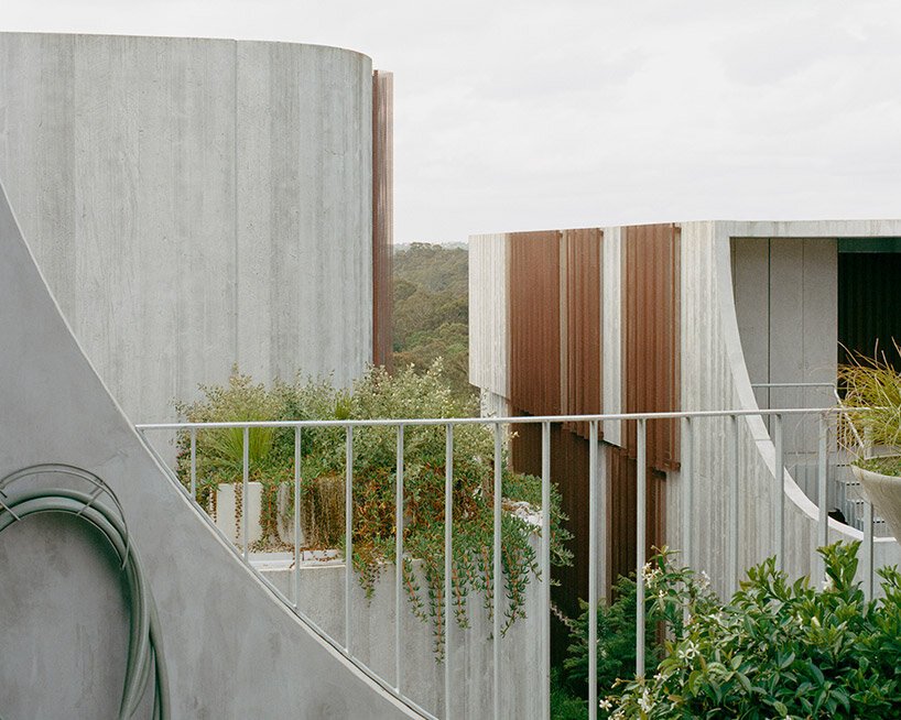
The living spaces within Fenwick St were carefully planned to open towards the north, the river, and the valley, allowing the distant landscape to become an integral part of the internal experience. Circulatory paths were strategically designed to draw the surrounding environment deep into the plan, while bedrooms and ancillary spaces opened to the green spaces between pavilions, offering views through a copper mesh privacy veil. This nature inspired the team to blend the architecture into into its surroundings, with landscape designed by Eckersley Garden Architecture.


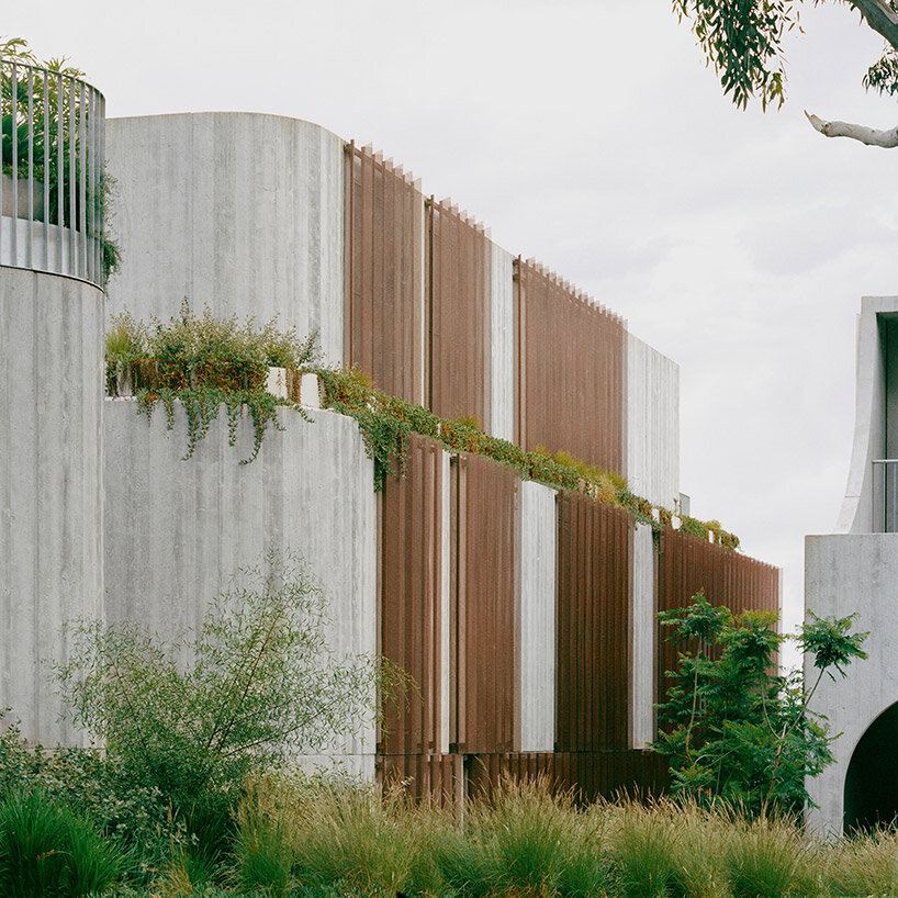
The need to anchor the building into the site led to a construction that appears rooted to the ground. By slightly shifting and rotating each floor plate, movement was introduced to the shear walls, softening the overall mass and scale. Copper screening was used to bring delicacy to the purposefully heavy pre-cast concrete construction, with the screens expected to age gracefully over time.

edition office fenwick
copper screening delicately balances the heavy pre-cast concrete construction


In addition to connecting with the landscape, creating light-filled private spaces filled with comfort and attention to detail was a key driver for Edition Office in the design of Fenwick St. Flack Studio, responsible for the interiors, imbued the spaces with warmth, calmness, and moments of dramatic nuance. Material tactility and the evolving patina of surfaces, such as the weathering copper screens and the maturation of the surrounding gardens, added depth and character to the interiors. The careful craftsmanship of junctions and thresholds enhanced the joy of navigation throughout the spaces.

edition office fenwick
the complex takes shape as three visually independent pavilions rather than a single large structure


The project brief called for the creation of nine new dwellings on a site that previously accommodated only one. In order to respect the immense environmental and cultural value of the location, Edition Office aimed to minimize the perceived mass of a single large volume. Instead, the design resulted in three distinct forms that conform to the domestic patterns and scale of the existing streetscape. These wedge-shaped pavilions meet at their narrowest points, creating moments of architectural exuberance and unobstructed sight-lines both within the site and towards the horizon.

edition office fenwick
the environment is drawn deep into the plan, while interiors open to the in-between green spaces


Reference

Sustainable Practice: How To Create a Concrete Oasis in a Forgotten Public Space
CategoriesArchitecture

Sustainable Practice: How To Create a Concrete Oasis in a Forgotten Public Space

Architizer is thrilled to announce the winners of the 11th Annual A+Awards! Interested in participating next season? Sign up for key information about the 12th Annual A+Awards, set to launch this fall.

Now home to 1.4 billion people, India, the most populous nation on Earth, is under immense pressure across numerous socio-economic factors. This is rarely more evident than the challenge of developing urban areas in livable ways. 

The United Nations predicts that by 2030 around 40% of the country will be living in cities, a four-fold increase on figures from the turn of the 20th century and significantly more than the 28% recorded in a 2001 census. An astounding rate of urbanization, according to a 2019 study by Manish Ramaiah and Ram Avtar, “Urban Green Spaces and Their Need In Cities of Rapidly Urbanizing India,” these booming centers of human activity are struggling when it comes to public realms and natural assets. 

Looking across India’s densest cities with populations over one million, none offer more than 410 square feet (38 square meters) of green space per capita. In Mumbai, it’s less than 110 square feet (10 square meters). We tend to think about the introduction of parkland as a major undertaking that needs vast amounts of potentially profitable real estate to realize, but there’s much to be said about smaller interventions that reuse and rethink infrastructure to address the imbalance between built and living environment. 
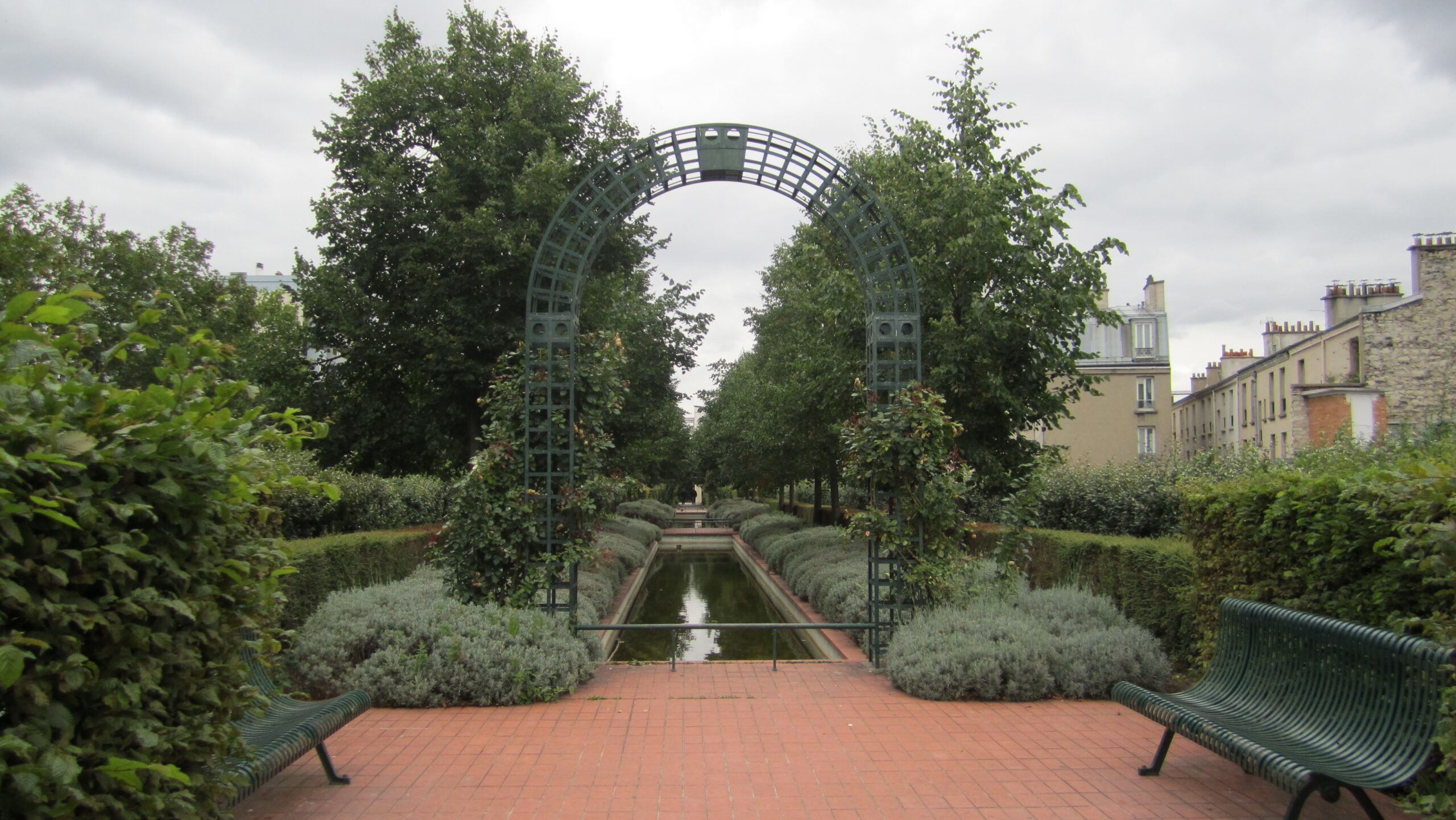
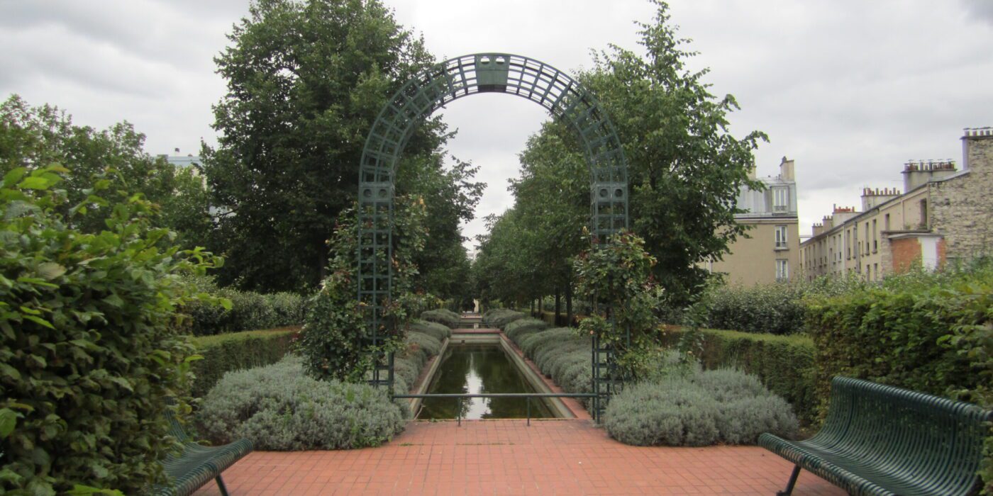
Promenade Plantée in Paris (C) La Citta Vita

Arguably the most famous example in recent memory is New York’s High Line. A 1.5 mile (2.5 kilometer) stretch of former elevated rail turned into a greenway, although actually modelled on Promenade Plantée in Paris, which opened 20 years earlier, the Big Apple take made the biggest noise and catalyzed similar ideas in other cities.  From Atlanta and Los Angeles to Manchester, taking disused transportation routes and creating gardens or parks on them is now relatively commonplace. 

Others — for example Toronto and San Francisco — have set out to place modern green spaces on the roof of in-service interchange hubs. Rather than looking up, Mumbai’s One Green Mile offers a narrow 1-mile-long (2-kilometer) public realm at ground level because the street offers one of few potential spaces in the locality. Winning the Jury Award for Built Sustainable Transport at this year’s Architizer A+Awards, the project is located partly beneath the flyover of a major commuter route and alongside a busy street.
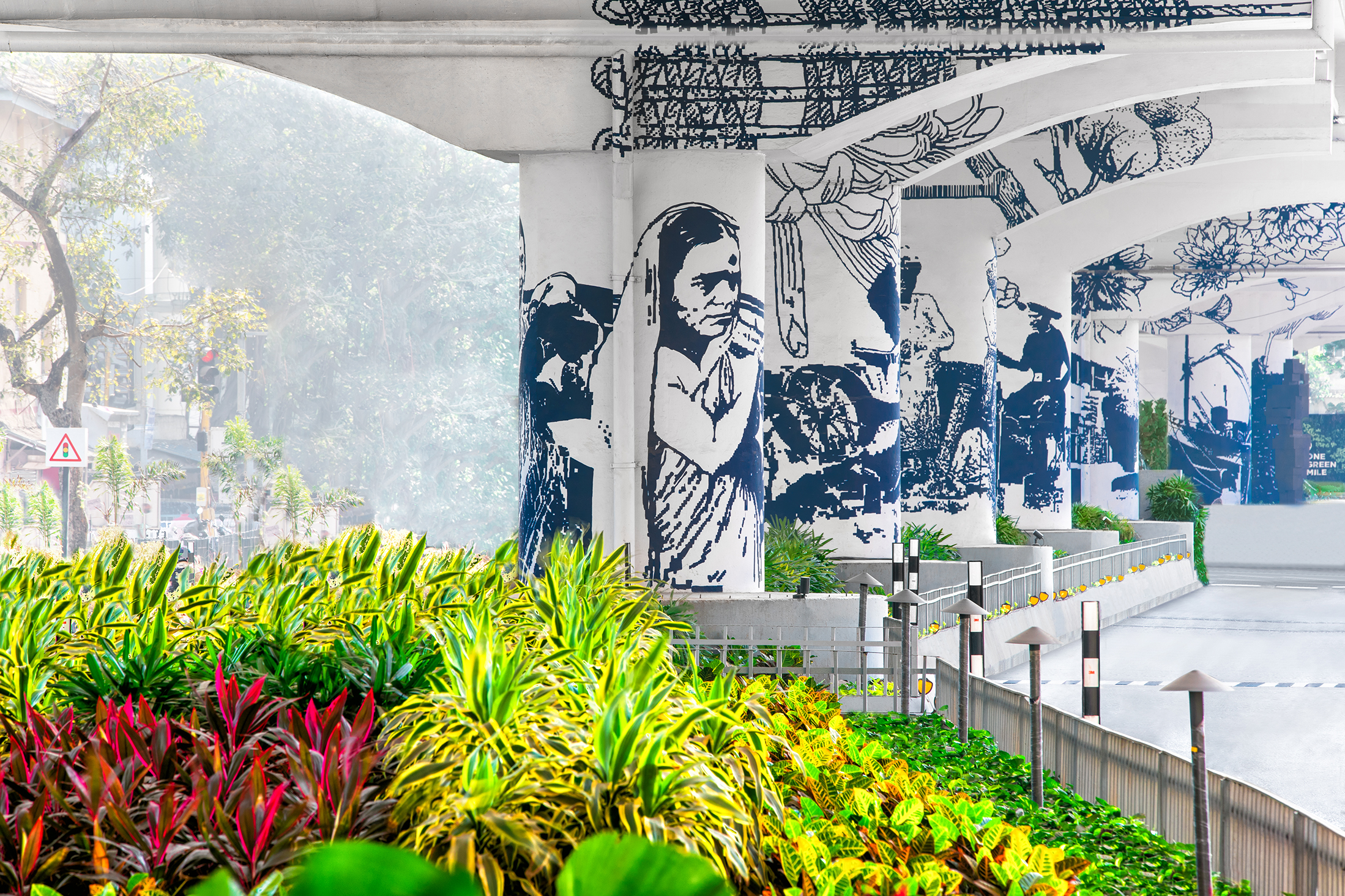
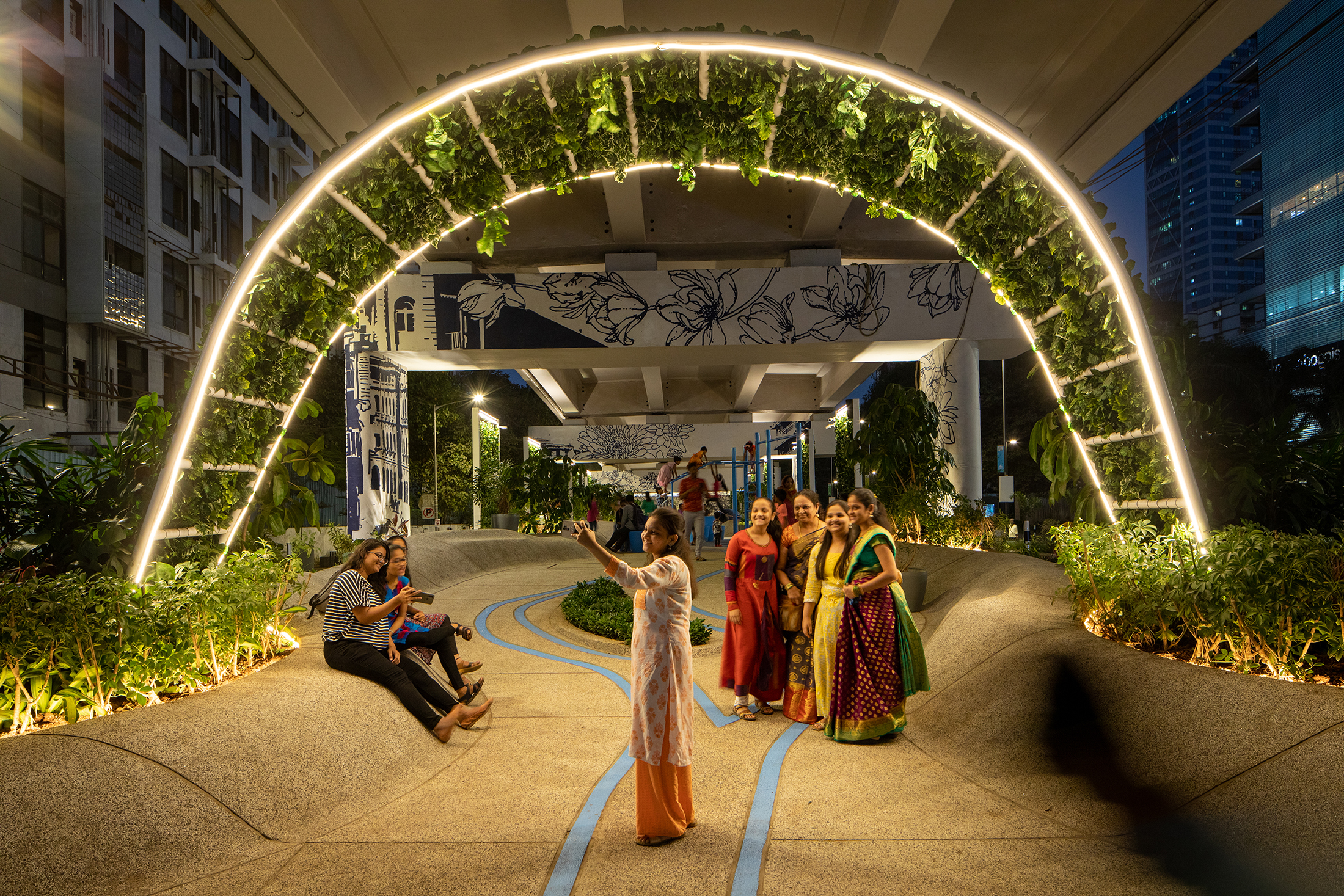
Artwork, planting and public realms within One Green Mile, Mumbai, by StudioPOD

Efforts began with an analysis of existing conditions in the area, unsurprisingly concluding there was a severe shortage of open space. Stakeholder consultations also offered an insight into how interventions should and could be made. Three priorities were identified: streamlining traffic movement and street geometry, equitable allocation of space for all and the creation of high quality public realm beneath the road. 

Designed by StudioPOD, and completed in 2022, the results are impressive. Play and seating areas, an amphitheatre, Vachanalaya and 130 trees now sit under the flyover. Vertical sections are painted with imagery reflecting the story of the Lower Parel district and have been extensively planted with native species.

Back out on the street, road capacity has been reduced to allow more room for people, to add greenery, open up space for bus stops and to lay street furniture in place. In total, 2.3 acres (1 hectare) of public space has been added to the area, with 21, 500 square feet (2,000 square meters) under the flyover alone. A route taken by more than 150,000 people each day, in the centre of Mumbai’s frantic financial district, has been not only improved but turned into a destination in itself.
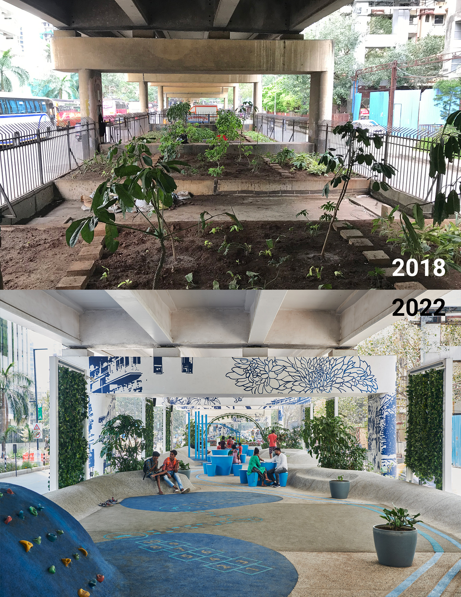
One Green Mile public realm interventions

One Green Mile’s covered public realm, before the project began in 2018 and today, by StudioPOD

Countless studies have identified a strong link between access to urban space and health, not least in terms of green areas. Physically, we know exercise and active lifestyles keep our bodies in better condition, and One Green Mile clearly answers a call for active travel in Mumbai. But the benefits are also evident in terms of psychological wellbeing, too.

Earlier in 2023, Finish researchers presented one of the latest studies on this subject, concluding that visiting urban green space three or four times a week significantly reduces the likelihood of drug use to combat mental health, high blood pressure and respiratory illness. Rates fell by one third, asthma dropped by a quarter. This was true of parks and community gardens.
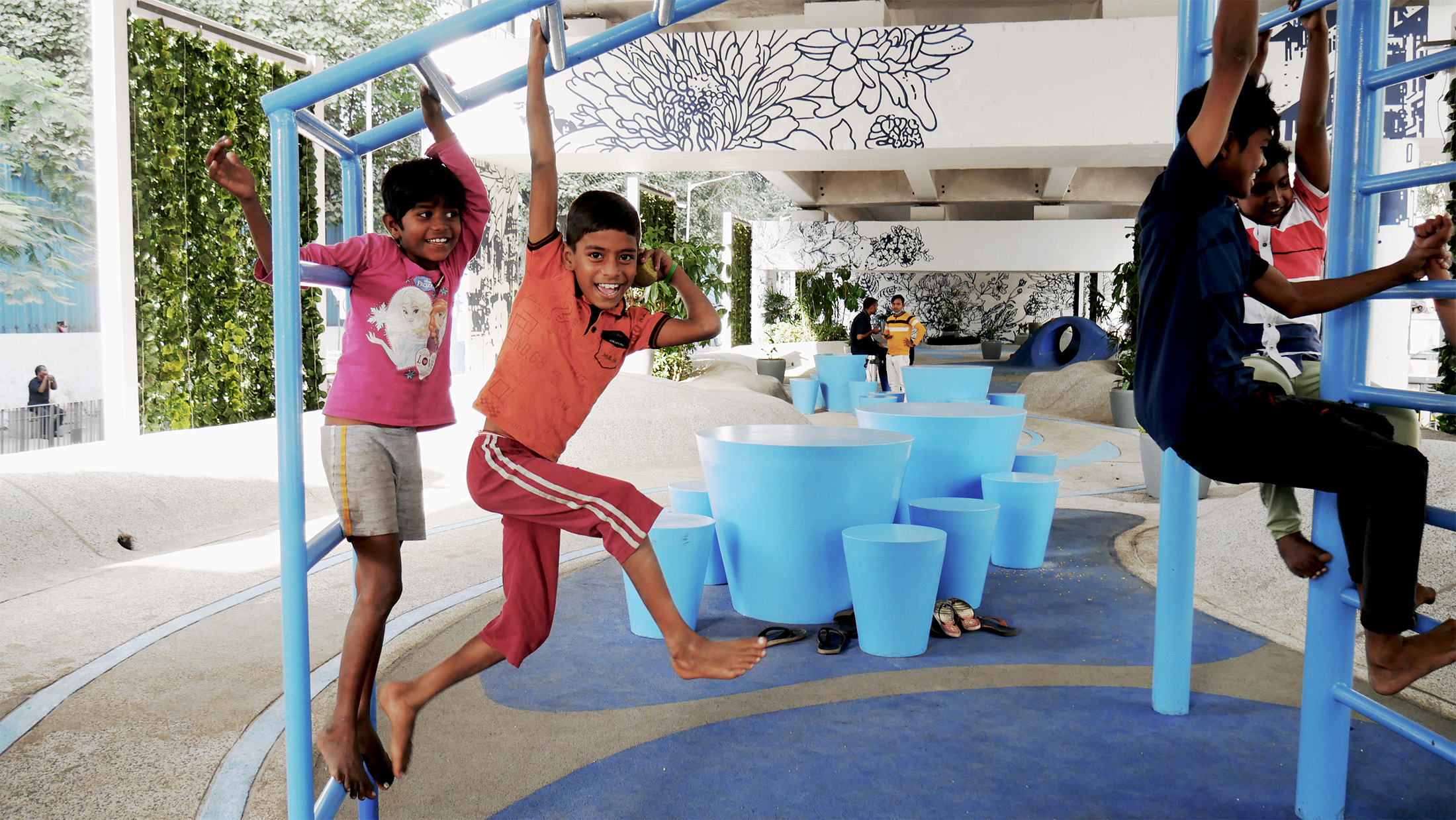
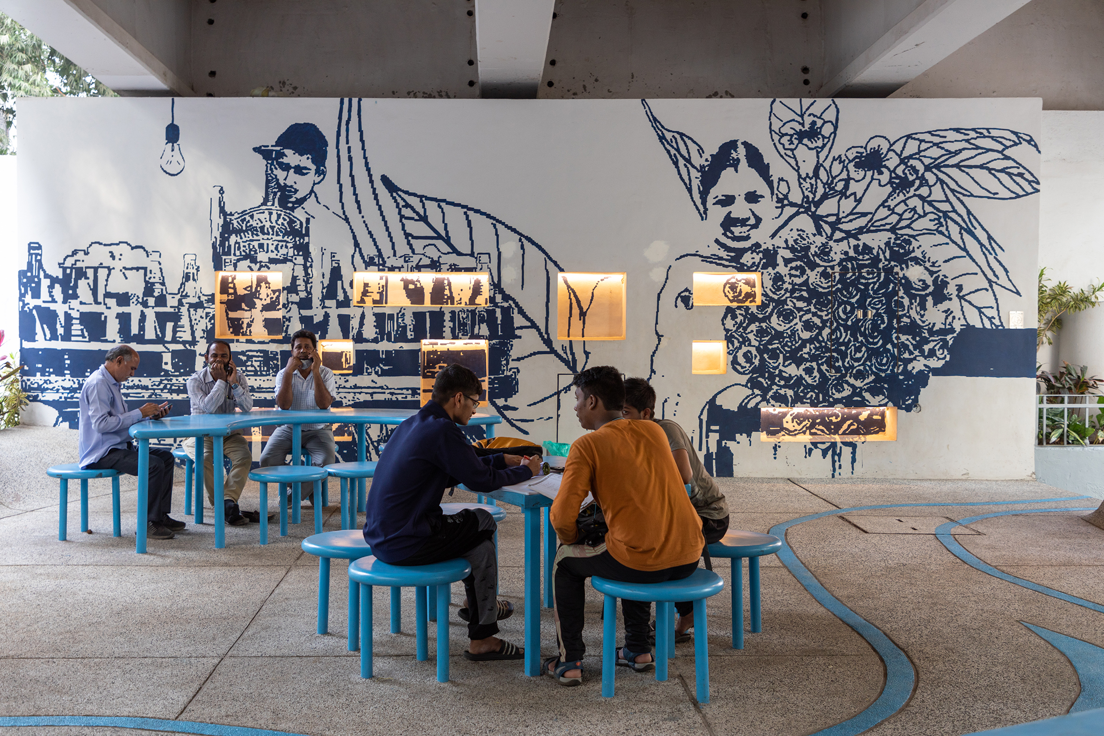
One Green Mile public realm interventions

A children’s play area (top) and communal seating form part of Mumbai’s One Green Mile, by StudioPOD

Adding further evidence to the benefit of smaller interventions of this type, in 2019 University of Wollongong experts published a paper that showed a tree canopy alone can lower psychological distress by as much as 31%. It’s also important to consider the specifics of One Green Mile’s masterplan when gauging its success. Of course there are designated areas — the children’s playground is specifically for children to play — but much of the space is adaptable.

Sites of loose congregation, to some extent they reflect the public realms celebrated in the book Designing for Disorder. A conversation between architects Pablo Sendra and Richard Bennett responding to the former’s 1970 publication, The Uses Of Disorder, both texts and practitioners see static, planned and specific as negative public realm planning because they do not reflect human life, nor evolution. Truly worthwhile interventions must offer use cases that become apparent in the eye of the beholder ,or risk falling into neglect, effectively becoming another waste of space. 

Architizer is thrilled to announce the winners of the 11th Annual A+Awards! Interested in participating next season? Sign up for key information about the 12th Annual A+Awards, set to launch this fall.
Reference

studeny architekti embeds concrete shell house into hillside of pernek, slovakia
CategoriesArchitecture

studeny architekti embeds concrete shell house into hillside of pernek, slovakia

an underground mountain house


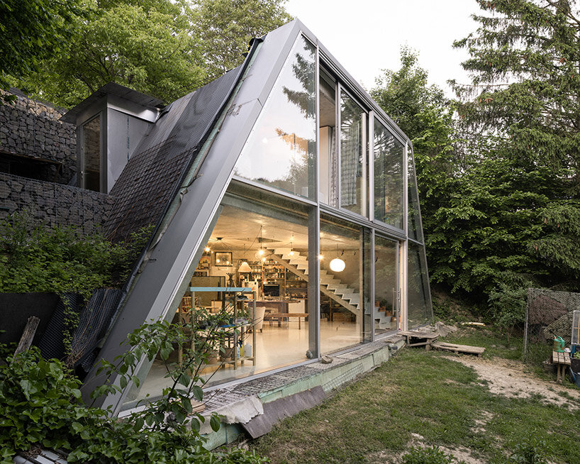
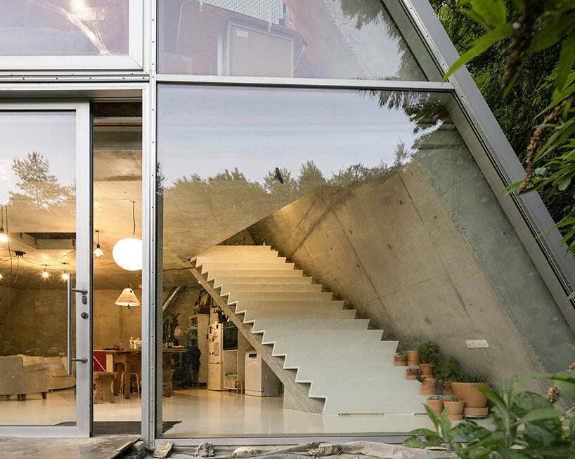
Design studio Studeny Architekti has recently completed a contemporary house in the scenic village of Pernek, Slovakia. Embedded into the earth a vast plot of land surrounded by the pristine beauty of the Small Carpathians, the Family House in Pernek embodies the studio’s vision of a simple dwelling existing in dialogue with its natural surroundings.


The primary objective of this project was to create a residence that makes use of the contours of the land but also harmonizes with the environment. By strategically placing the concrete house beneath a slope below the road, the architects ensured that the residents would have unobstructed views of the opposite forest, allowing them to connect with nature effortlessly. This underground placement also freed up the flat portion of the plot, which was reserved for a wide, open front yard.

studeny architekti embeds concrete shell house into a hillside in pernek, slovakiaimages © Alex Shoots Buildings @alex.shoots.buildings


the concrete shell structure by studeny architekti


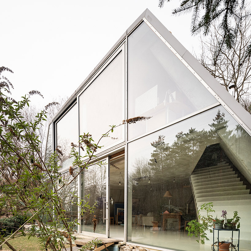
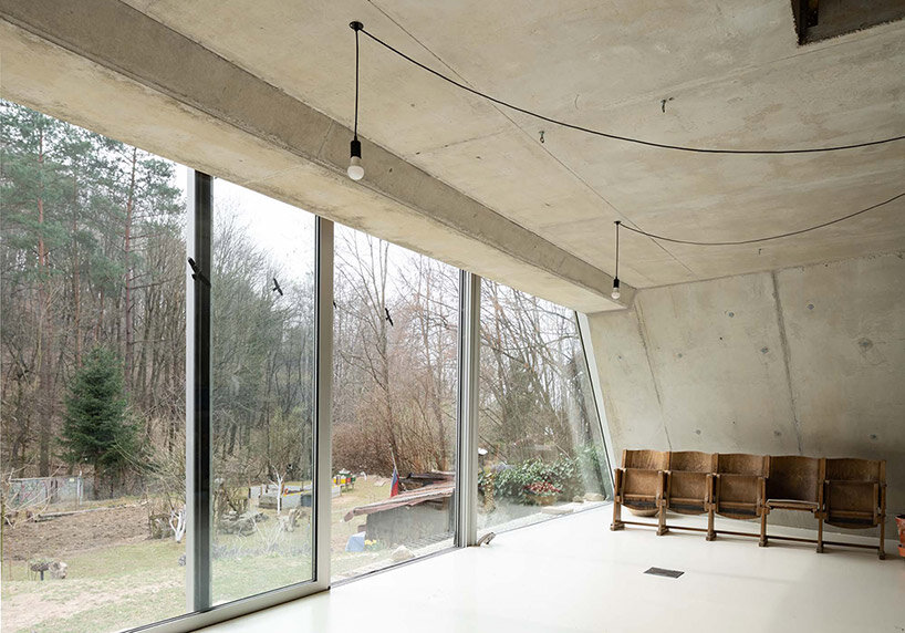
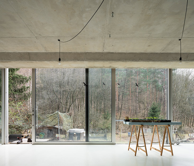
Studeny Architekti constructs its Family House in Pernek with a unique design element — a monolithic concrete shell without internal supports. This choice not only adds structural integrity to the building but also contributes to its aesthetic appeal. Inside the house, the concrete shell remains exposed, creating a distinct visual feature. However, the facade opening out toward the south is defined by its large glass wall, opening the interior spaces broadly outward to gaze onto the wooded mountains beyond.

studeny architekti house pernek


inside the family house in pernek


Studeny Architekti organizes the floor plan of its Family House in Pernek in the shape of an isosceles trapezoid, mirroring its longitudinal profile. This unique layout results in an interior space that feels open and free-flowing. The house consists of two floors interconnected by a stylish staircase.


The ground floor, in direct contact with the garden, encompasses a multifunctional area housing the living room, a work corner, the parents’ bedroom, a kitchen with a dining room, and the technical facilities of the house. On the upper floor, two children’s bedrooms, a bathroom, and an entrance area can be found. All the living spaces benefit from ample natural light and are oriented towards the garden and the forest through expansive windows.

studeny architekti house pernek
the house is built as a concrete shell with no internal supports studeny architekti house pernek
full height glazing opens onto the forest beyond through a trapezoidal frame studeny architekti house perneksliding glass doors fills the underground home with natural breezes and sunlight


Reference

concrete residence in latvia unfolds two distinct dynamic volumes
CategoriesArchitecture

concrete residence in latvia unfolds two distinct dynamic volumes

The House in Jurmala by Chado responds to the natural context


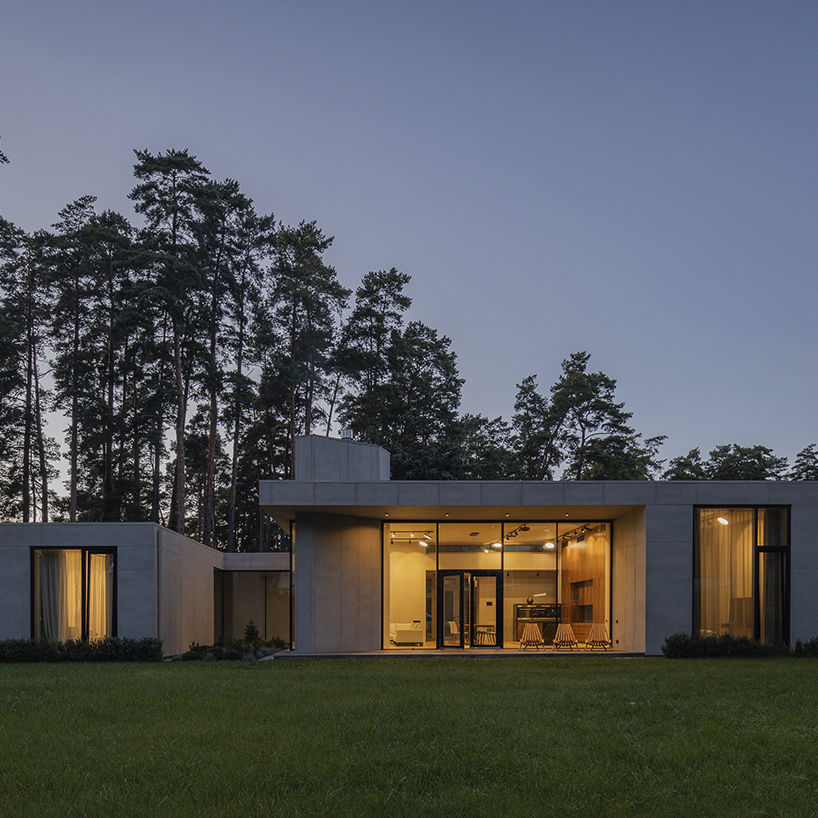
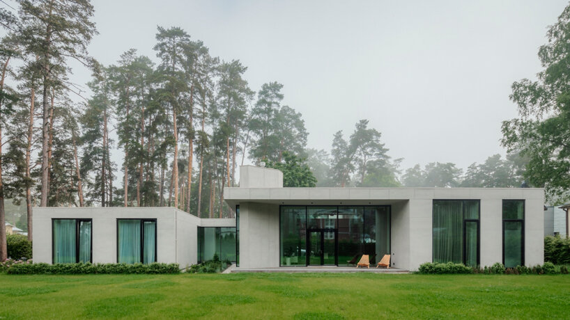
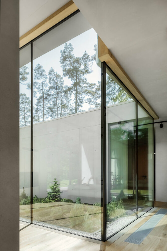
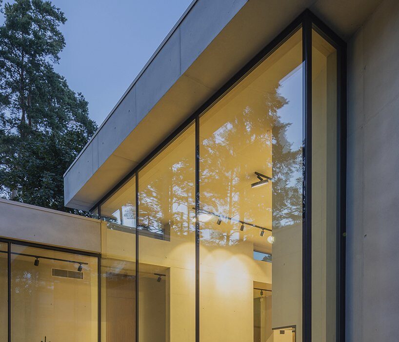
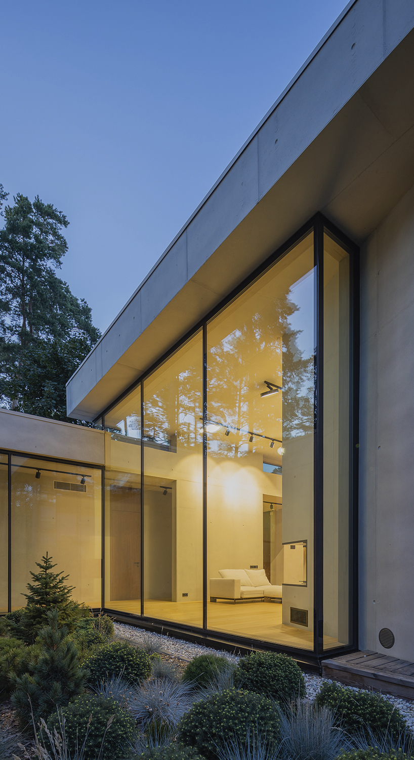
Nestled amidst a grove of ancient pines, The House in Jurmala by architectural studio Chado effortlessly responds to the surrounding landscape and Latvian climate. Facing southward, its facade embraces the views, while the rugged texture of concrete walls forms a unique composition. The formation of a planted patio cuts through the structure separating the private sleeping zones from the common living spaces. The building unfolds two volumes, each boasting a distinct height and purpose. The lower part hosts the children’s and guests’ rooms, while the upper volume reveals a large living room, dining area, kitchen, and master bedroom.

concrete residence in latvia unfolds two distinct volumes with dynamic cantilevers
all images by Alvis Rozenbergs


design composes an interplay of concrete forms and volumes


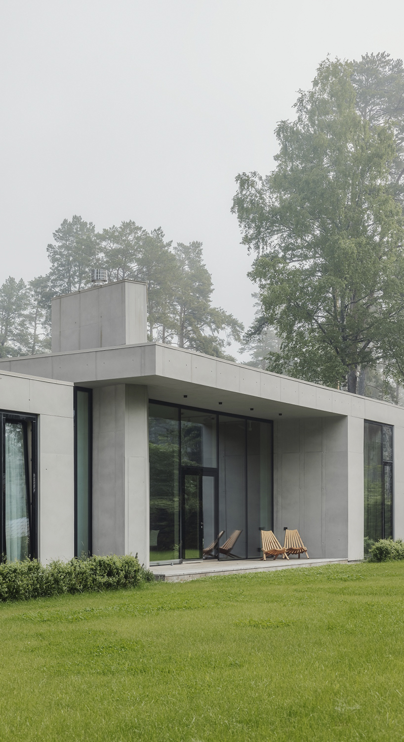
Within the heart of the house, the central public area exudes an intriguing contrast to the monumental volumes of the private spaces. Here, the console roofing boldly extends, creating dynamic cantilevers. As an elegant focal point, a vertical fireplace tube provides the area with a sense of verticality and warmth. The design team at Chado composes an interplay of forms and volumes developing a harmonious design narrative, where the concrete embraces the landscape responding to the natural context.

concrete residence in latvia unfolds two distinct volumes with dynamic cantilevers
the structure is nestled amidst a grove of ancient pines in Jurmala

concrete residence in latvia unfolds two distinct volumes with dynamic cantilevers
the architecture effortlessly responds to the surrounding landscape

concrete residence in latvia unfolds two distinct volumes with dynamic cantilevers
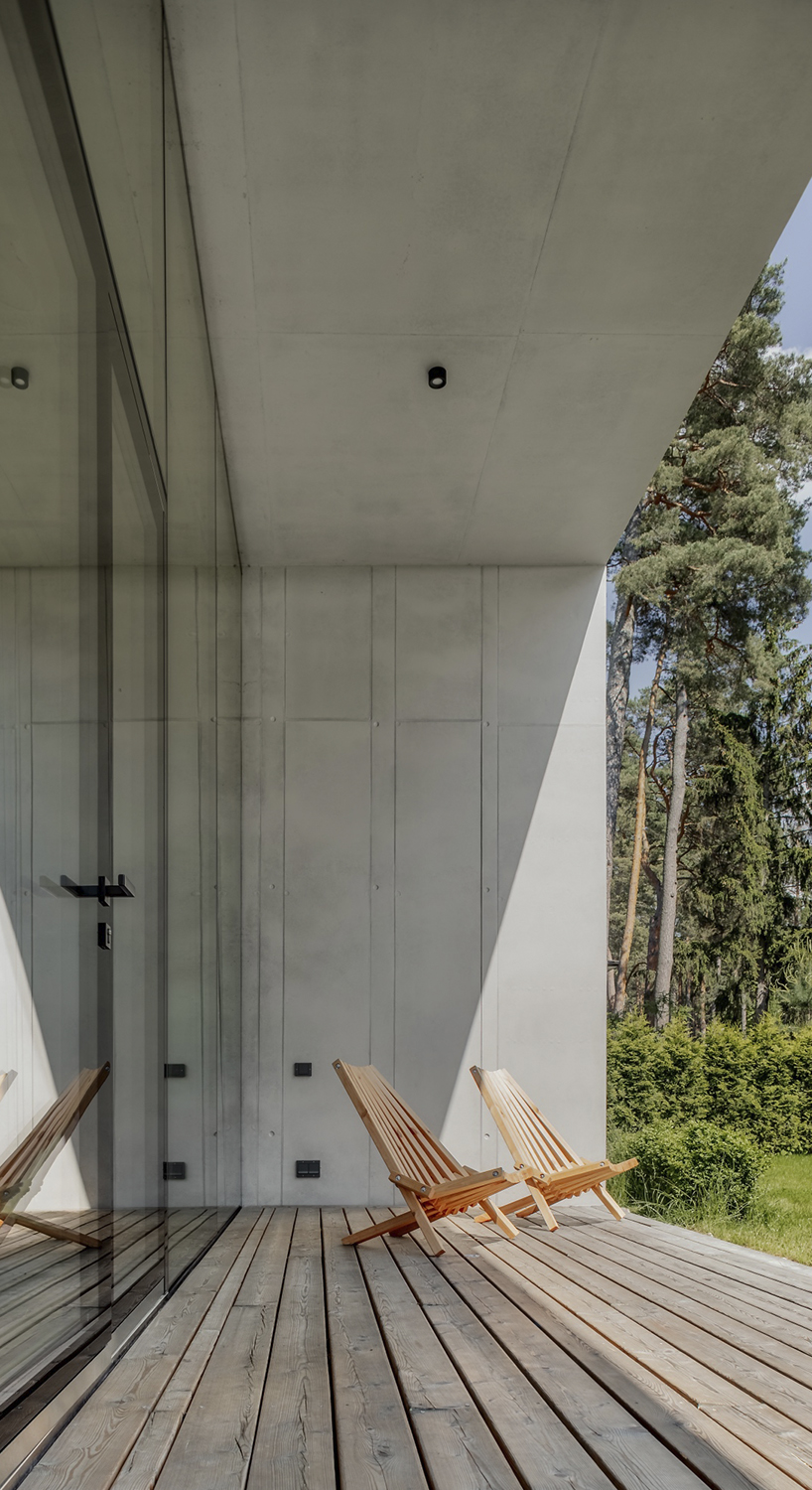
the rugged texture of concrete walls forms a unique composition

concrete residence in latvia unfolds two distinct volumes with dynamic cantilevers
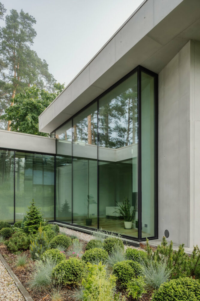
the formation of a planted patio cuts through the concrete structure

concrete residence in latvia unfolds two distinct volumes with dynamic cantilevers
the concrete embraces the landscape responding to the natural context

concrete residence in latvia unfolds two distinct volumes with dynamic cantilevers
the glazed atrium separates the private sleeping zones from the common living spaces

Reference