Modern Minarets: 6 Contemporary Mosques Celebrating Cultural Diversity
CategoriesArchitecture

Modern Minarets: 6 Contemporary Mosques Celebrating Cultural Diversity

Modern Minarets: 6 Contemporary Mosques Celebrating Cultural Diversity

The judging process for Architizer’s 12th Annual A+Awards is now away. Subscribe to our Awards Newsletter to receive updates about Public Voting, and stay tuned for winners announcements later this spring.   

“Islam is like a crystal-clear river that takes the color of the riverbed it flows over.”

Through those words, Dr. Umar Faruq Abd’Allah described the religion of Islam and the way it reflects the different cultures and regions it spreads in and flows through. In architectural terms, this analogy extends to mosques and their designs. Over time, mosque designs have been influenced by the diverse cultures, climates, building materials and traditions of the various regions in which mosques were built.

This amalgamation has led to a multitude of designs and typologies for mosques worldwide, evolving alongside cultures, populations and advancements in building technologies. These designs preserve core Muslim values while simultaneously celebrating the diversity of the different cultures and communities. Through this collection, six mosques from around the world are showcased to show how the design of Muslim sacred buildings has evolved and what mosques look like in this time and age.


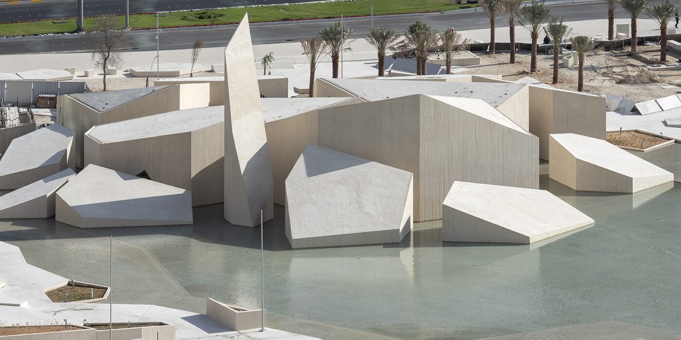
Al Musalla – The Mosque – Al Hosn Area

By CEBRA and DCT Abu Dhabi, Abu Dhabi, United Arab Emirates

Jury Winner, 2020, A+ Awards, Architecture +Ceilings

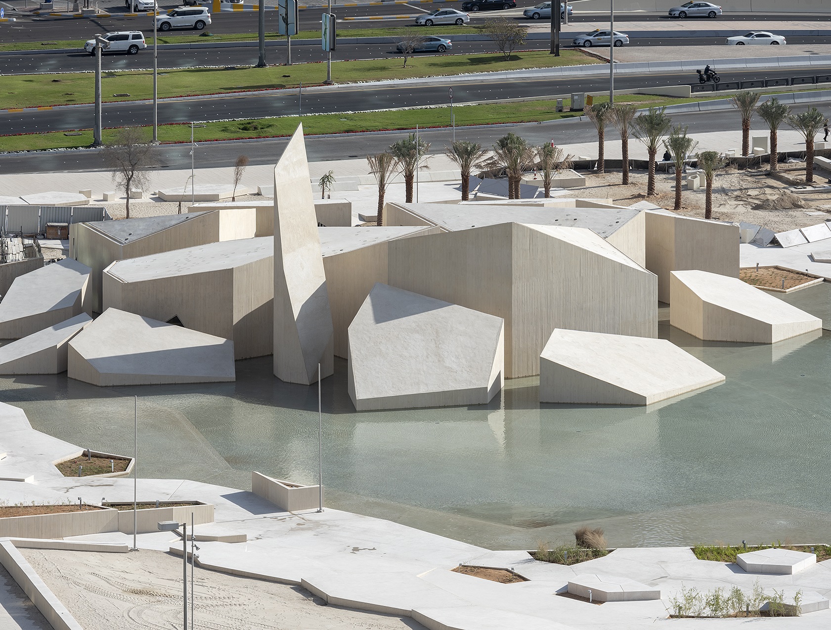
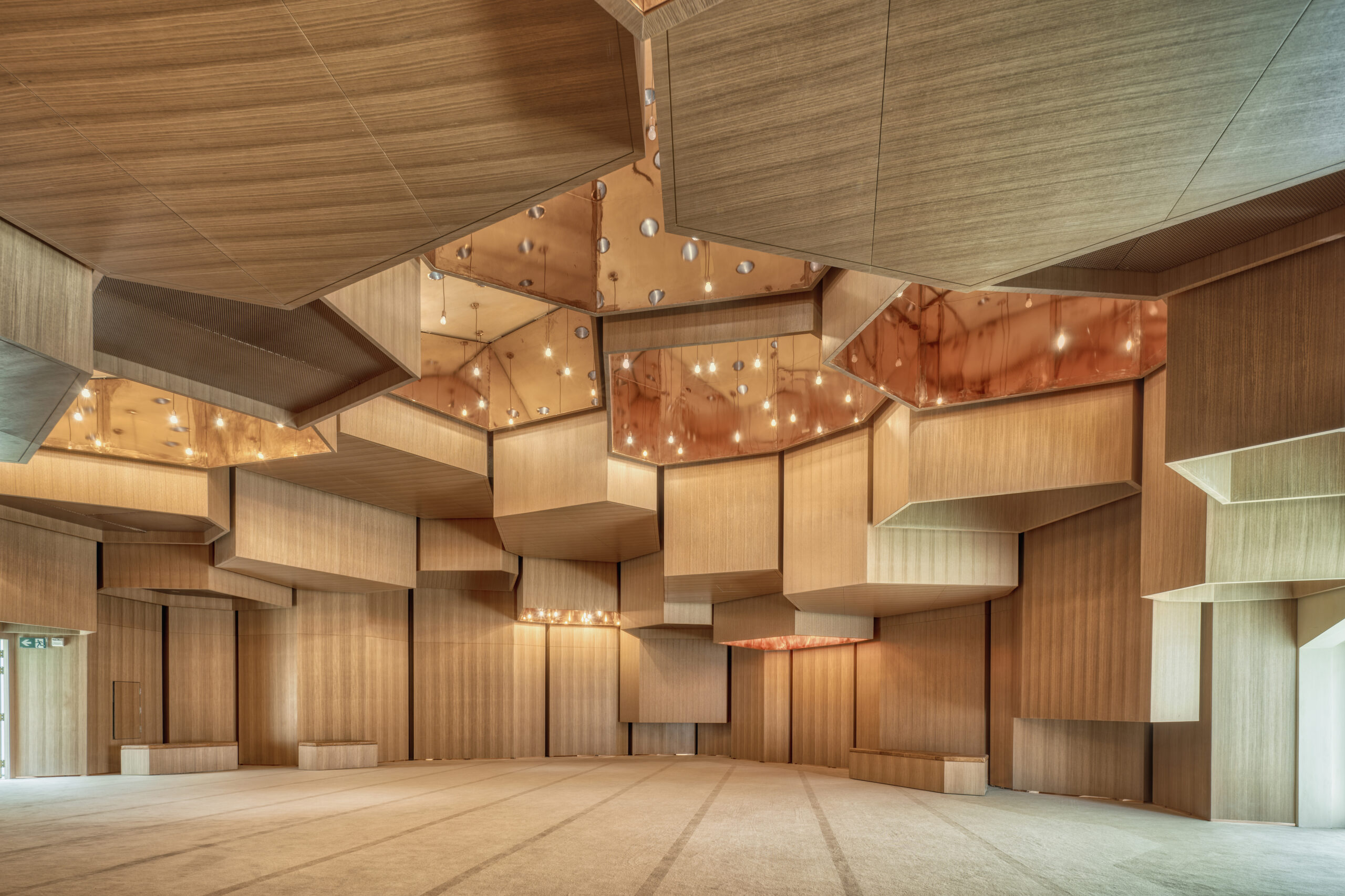
Photo by Department of Culture and Tourism, DCT Abi Dhabi

Inspired by the geology of the area, this mosque has the design of what could be described as manmade nature, appearing as a group of rocks emerging out of water. To enter the mosque, worshippers traverse a network of pathways that wind around the water, symbolically cleansing them before prayer while also shielding them from the noise and commotion of the nearby streets.

The mosque is located within a historically significant site with a number of landmarks, managing to calmly integrate into the park while also offering a remarkable experience to its users. Inside, the distinctive geometrical shapes of the exterior are reflected on different elements of the design including the ceiling, complemented by lighting design that aimed to represent a desert sky adorned with stars, in a manner that does not only connect the mosque with earth and water, but also with the sky and what’s beyond.
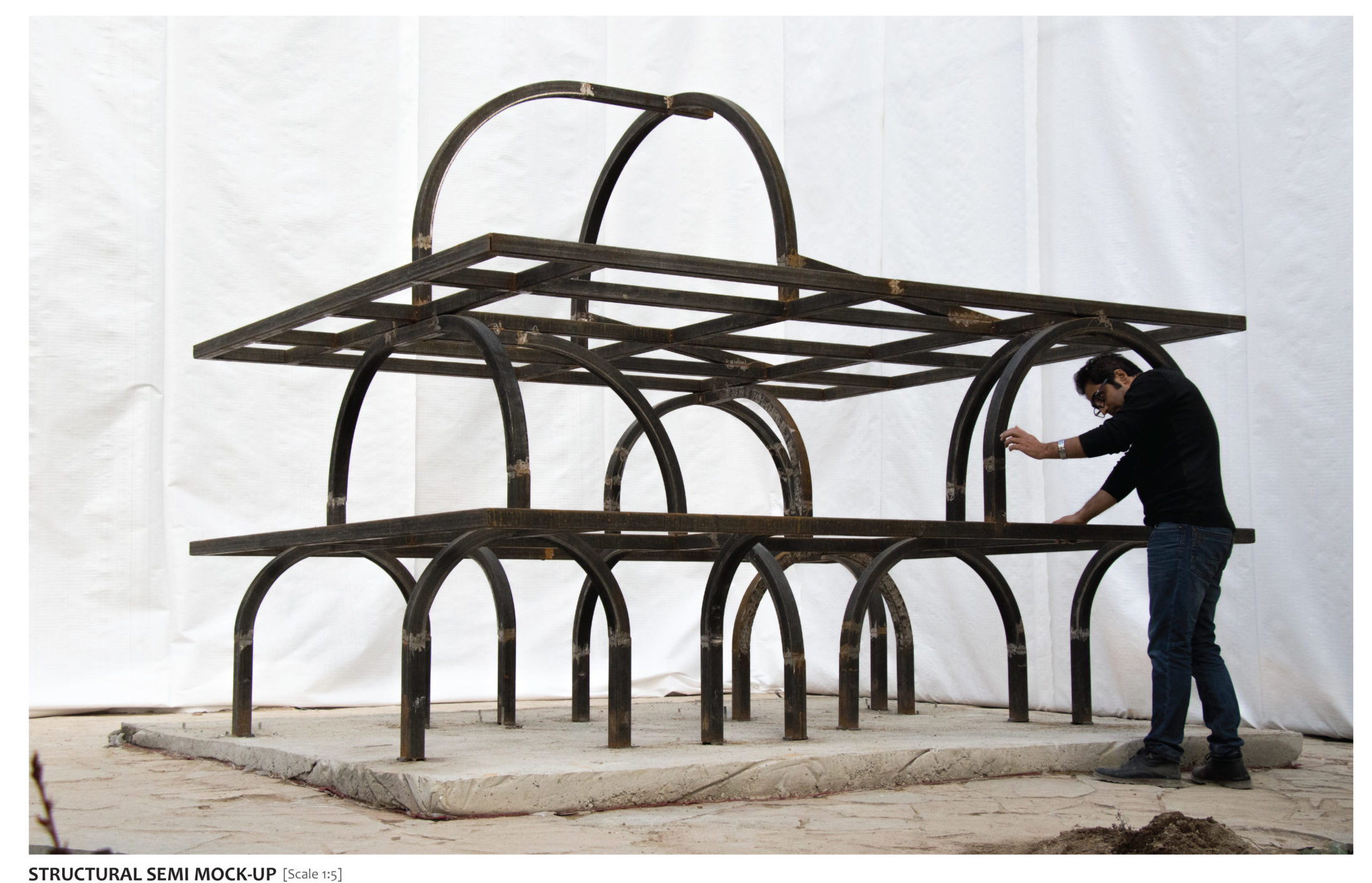
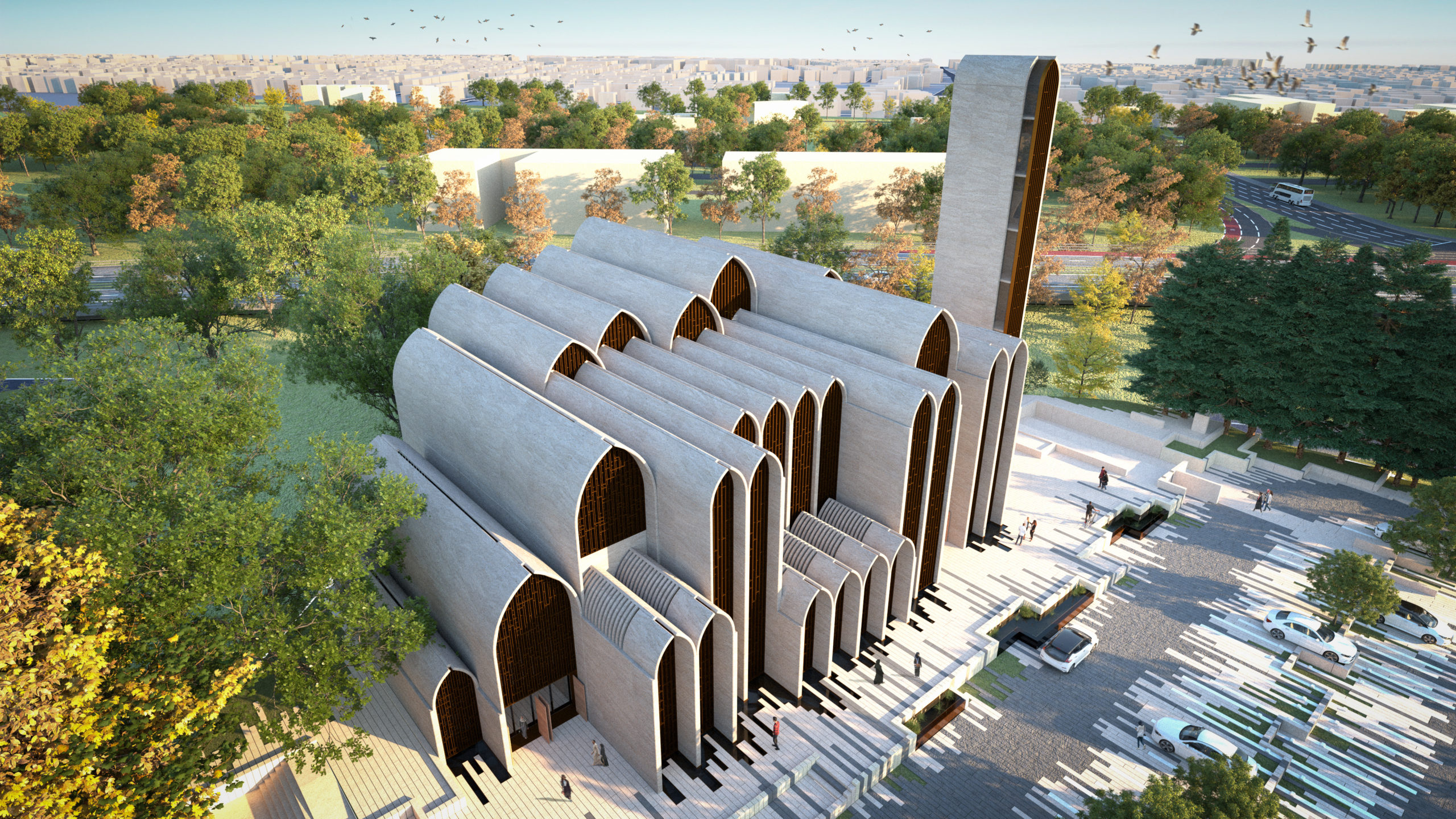
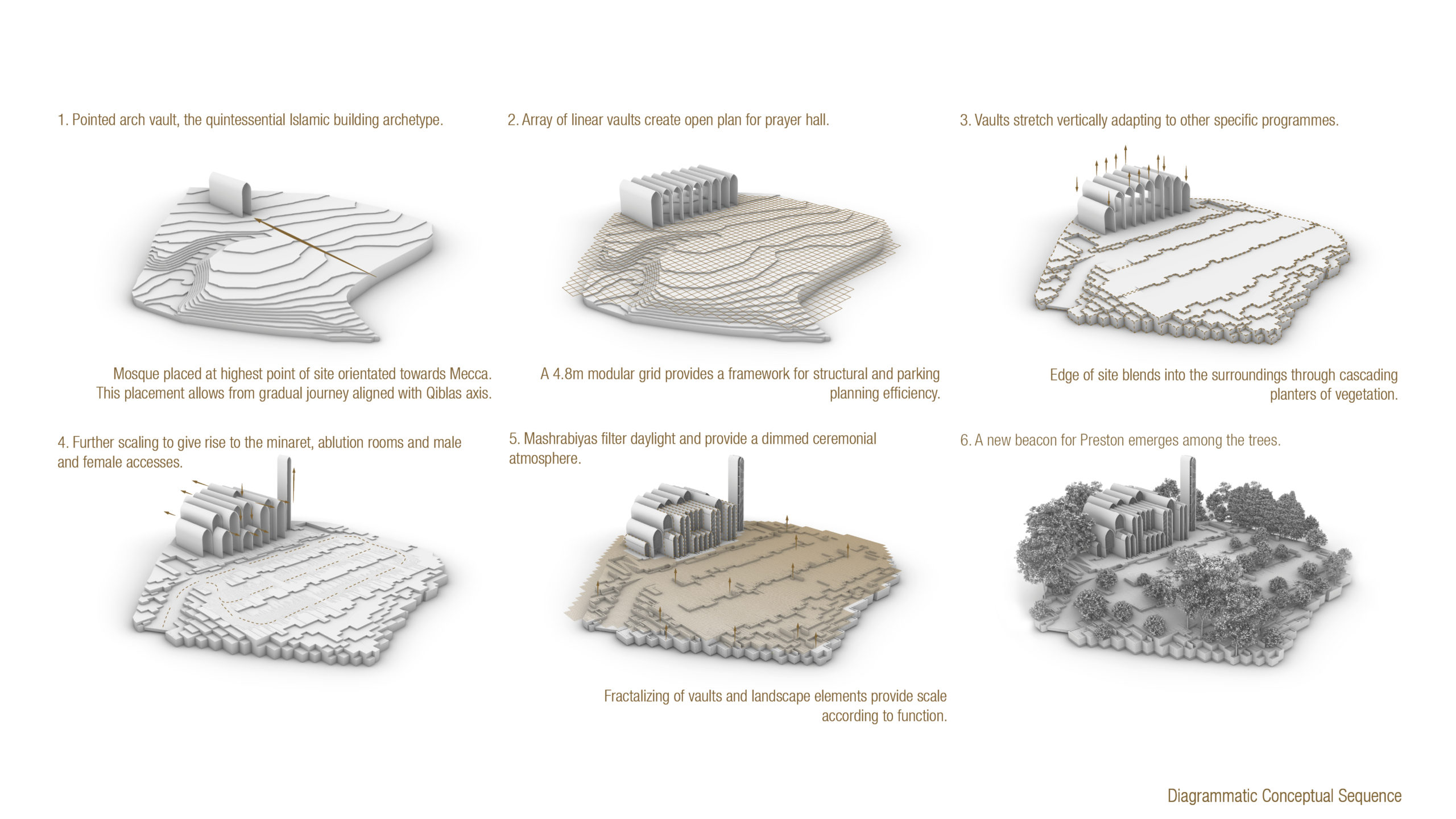
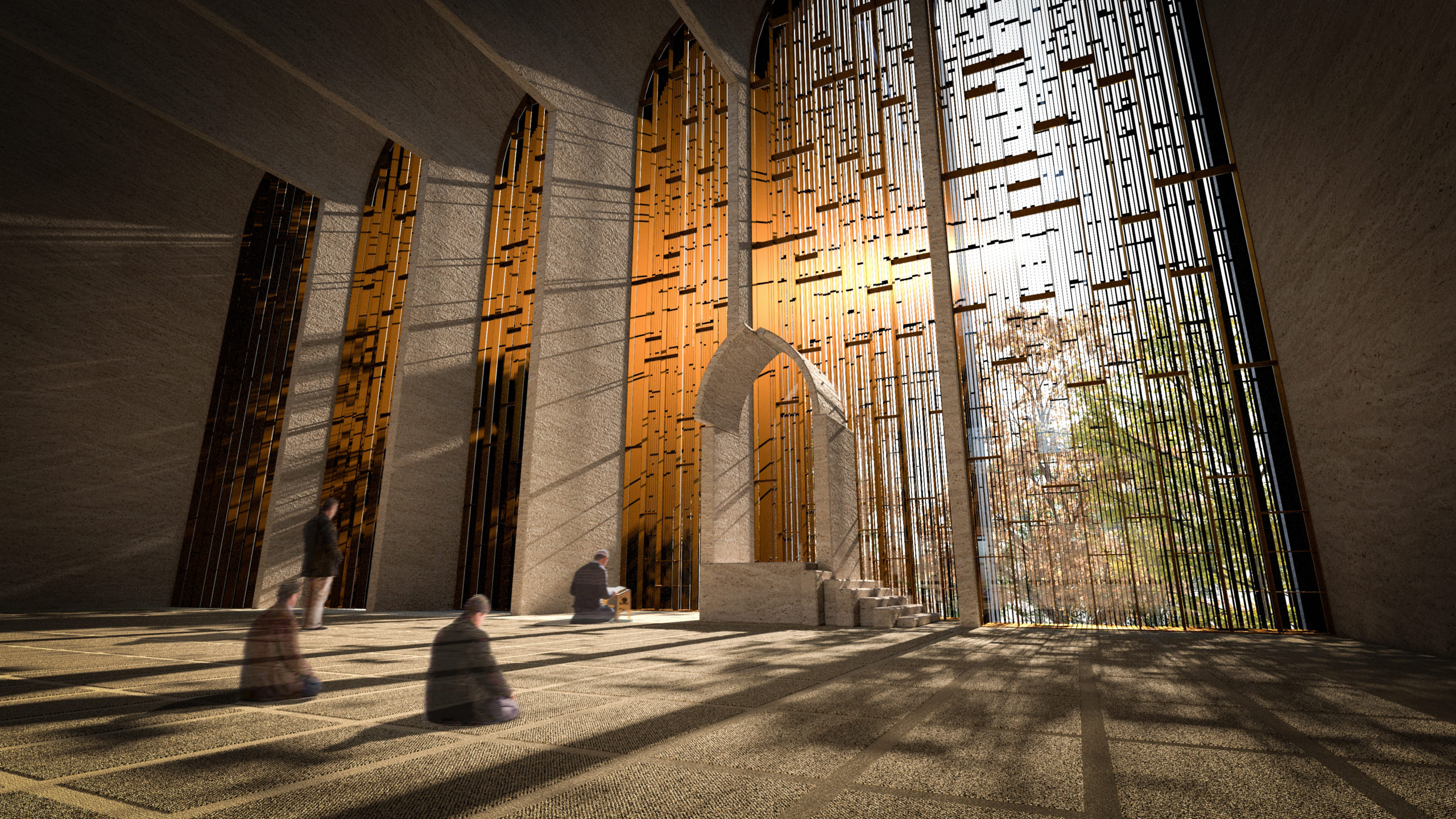
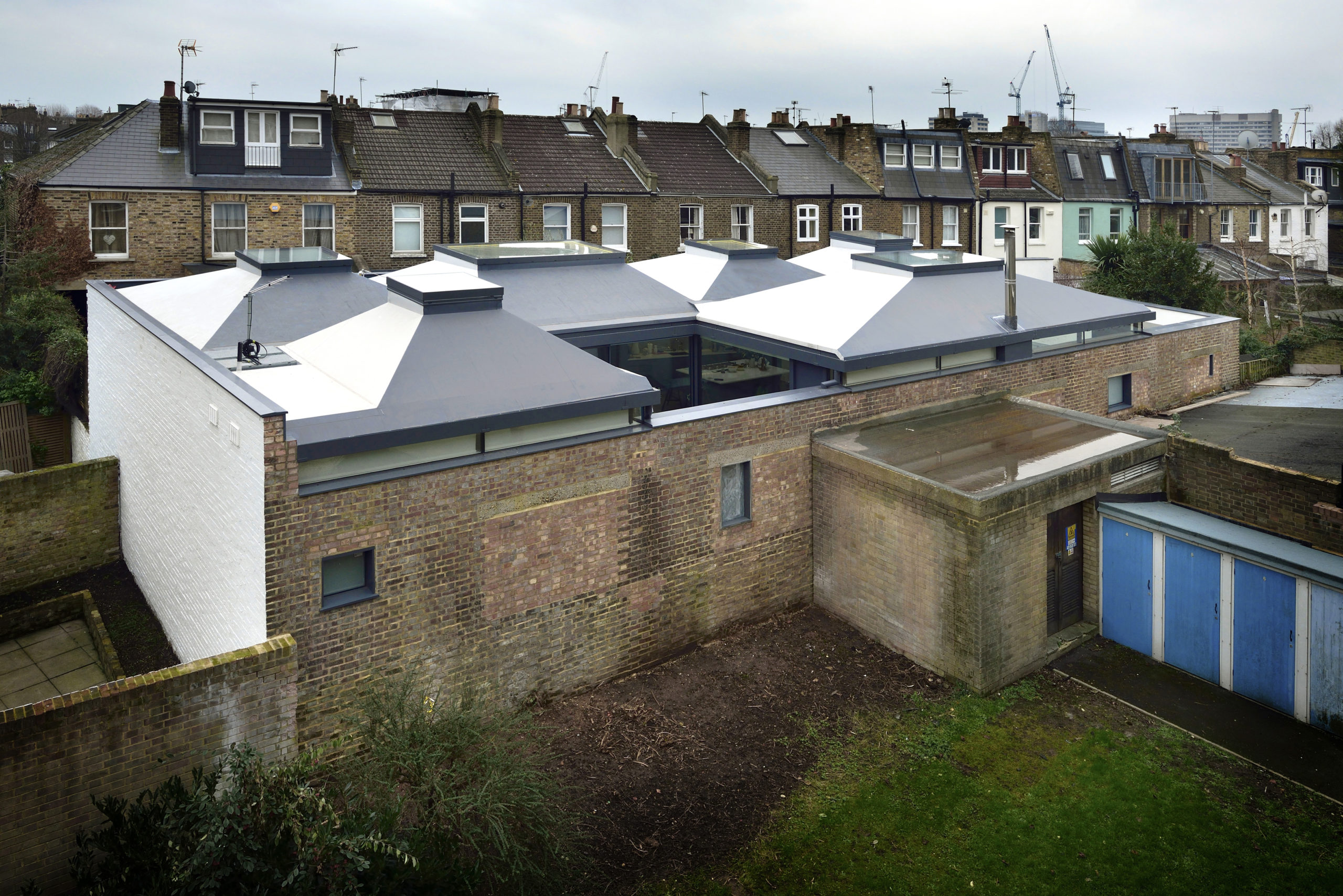
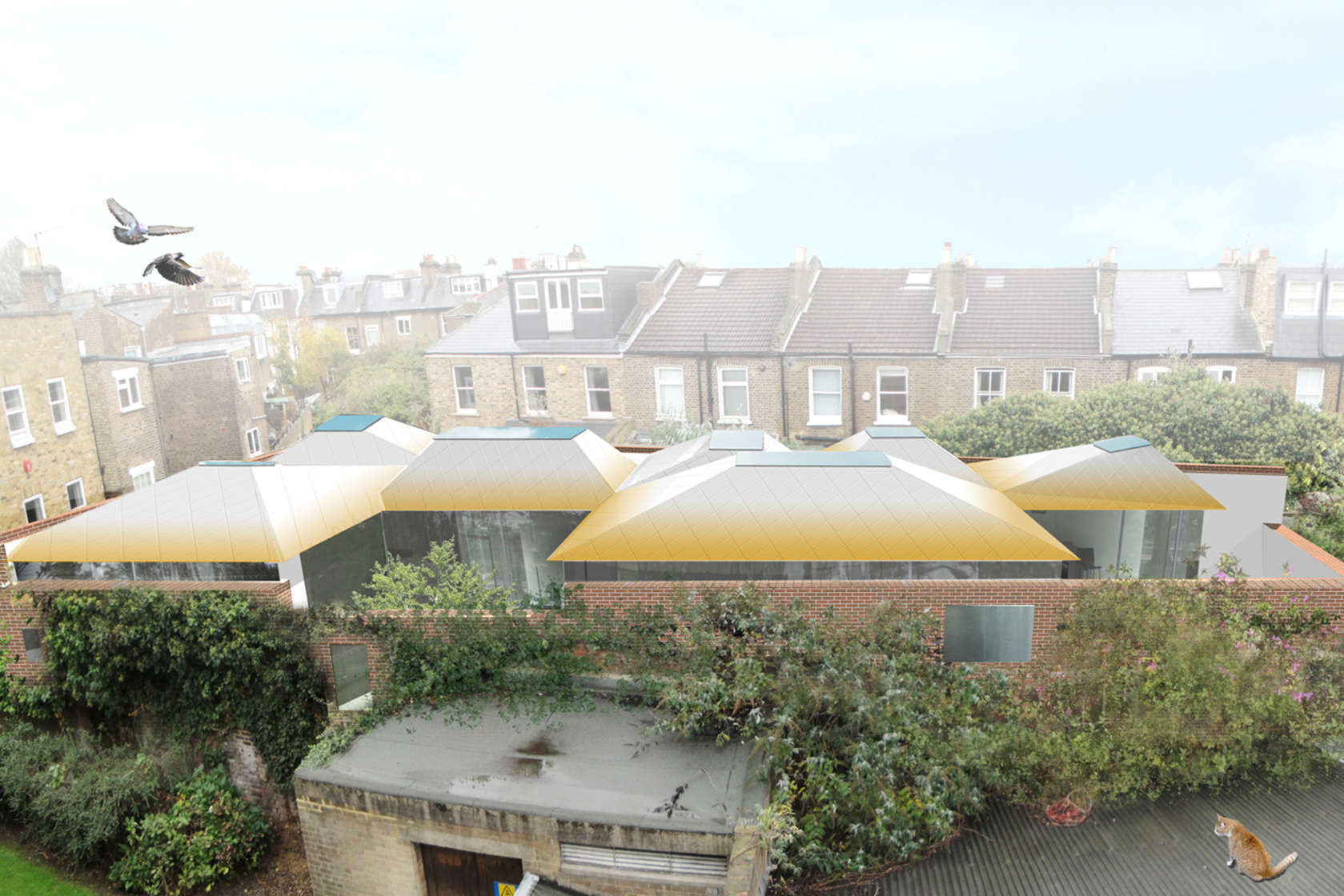
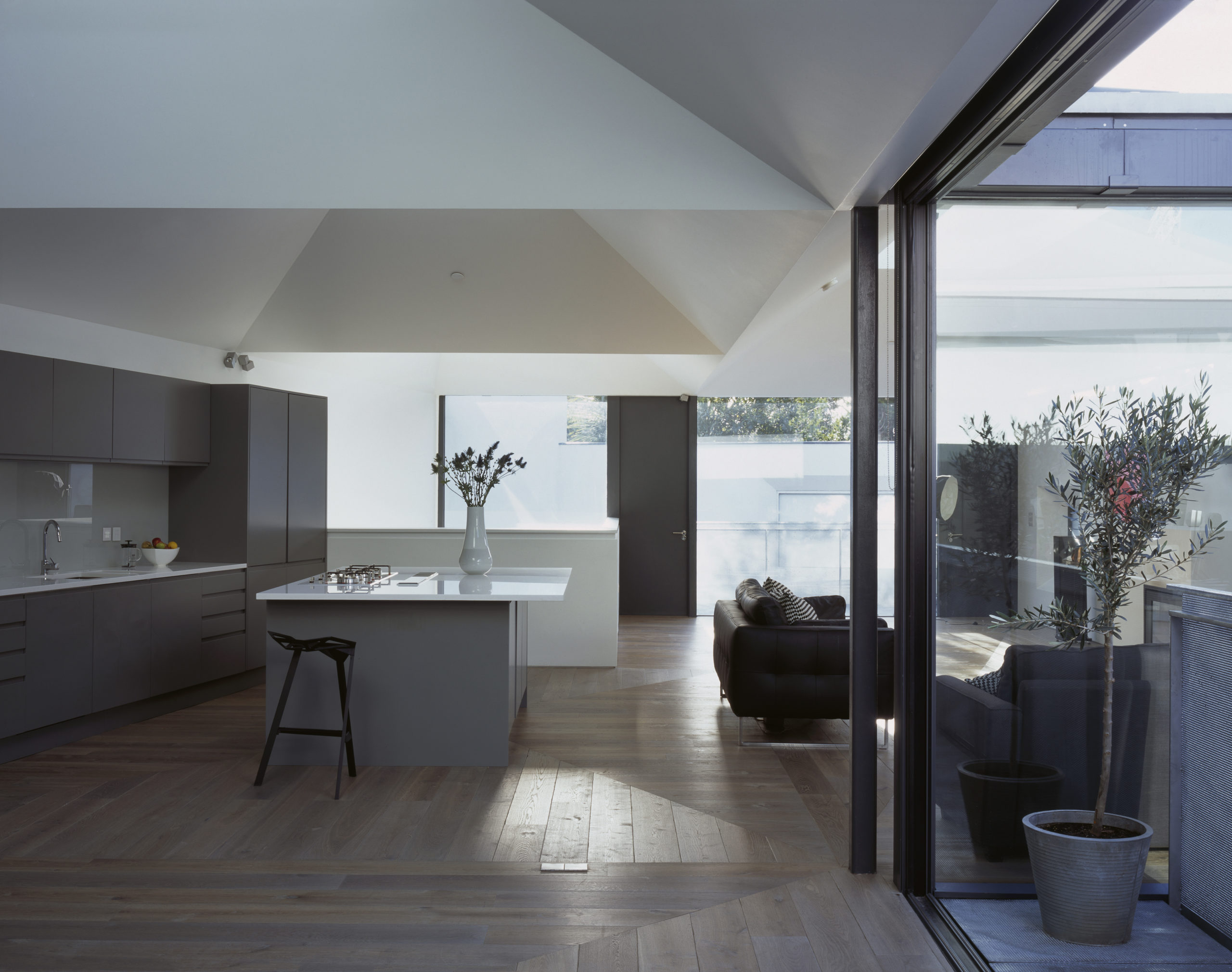
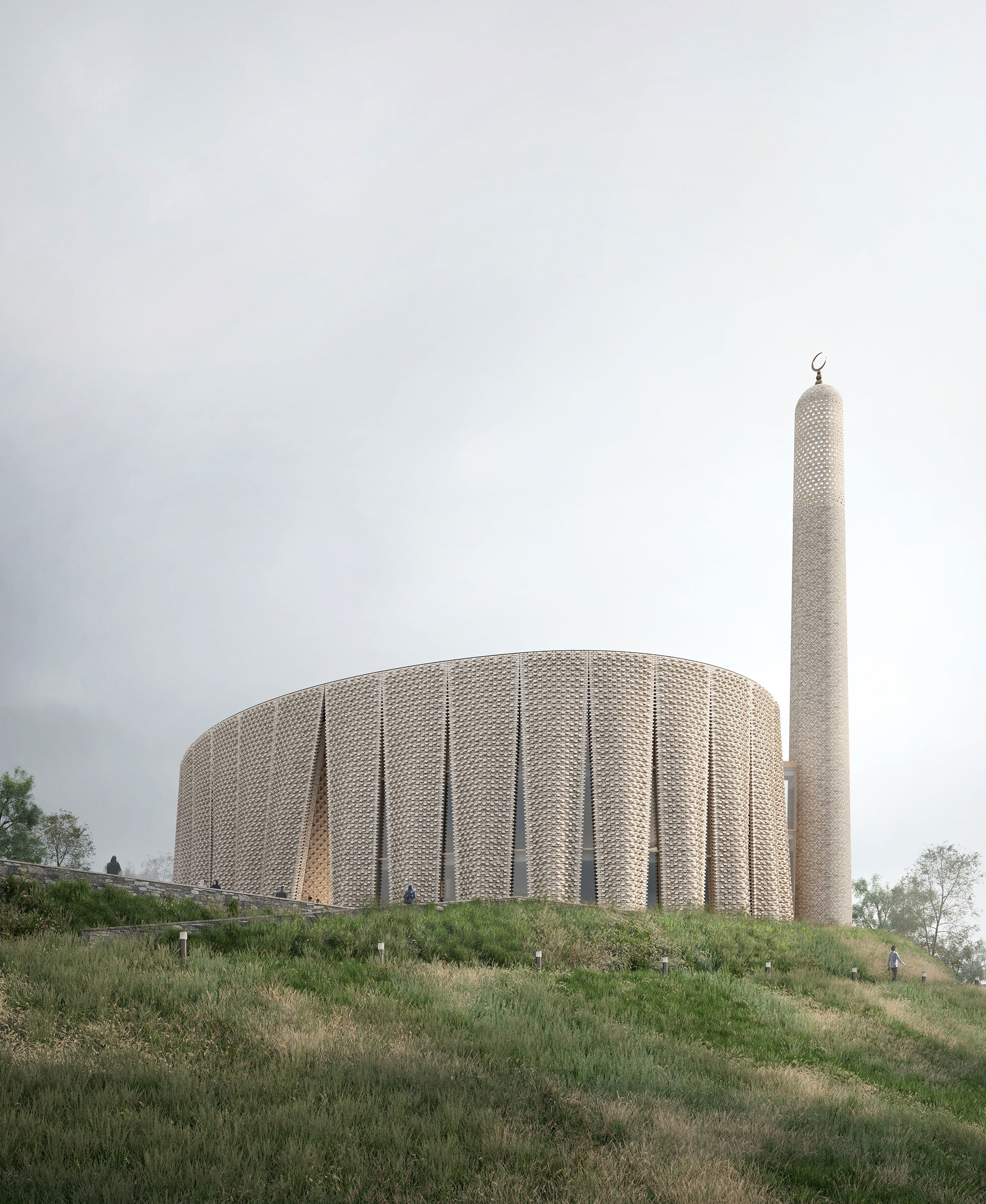
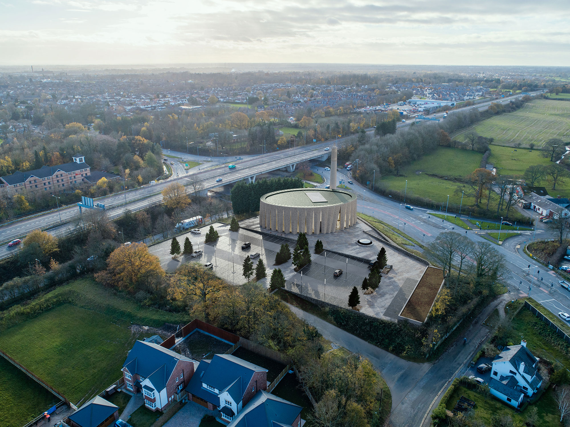

BRICK VEIL

By LUCA POIAN FORMS, Preston, United Kingdom

Produced through an artful stitching between the Islamic traditions and the history of the area, between the universal values and the local culture, this mosque design was conceptualized as a landmark within the existing site, through its scale, meticulous façade design, building materials and relationship with the surrounding.

Inspired by the textile manufacturing history of the region, the pleated brick façade gives the building a strong sculptural appearance, while also referencing the traditional design of Mashrabiyas, which is a traditional element in Islamic architecture used to enhance privacy. Erected at the south western end of the hill, the mosque is reached through a processional ramp that slowly disconnects the arriving worshippers from the city and the gradually welcomes them into the sacred space of the mosque.
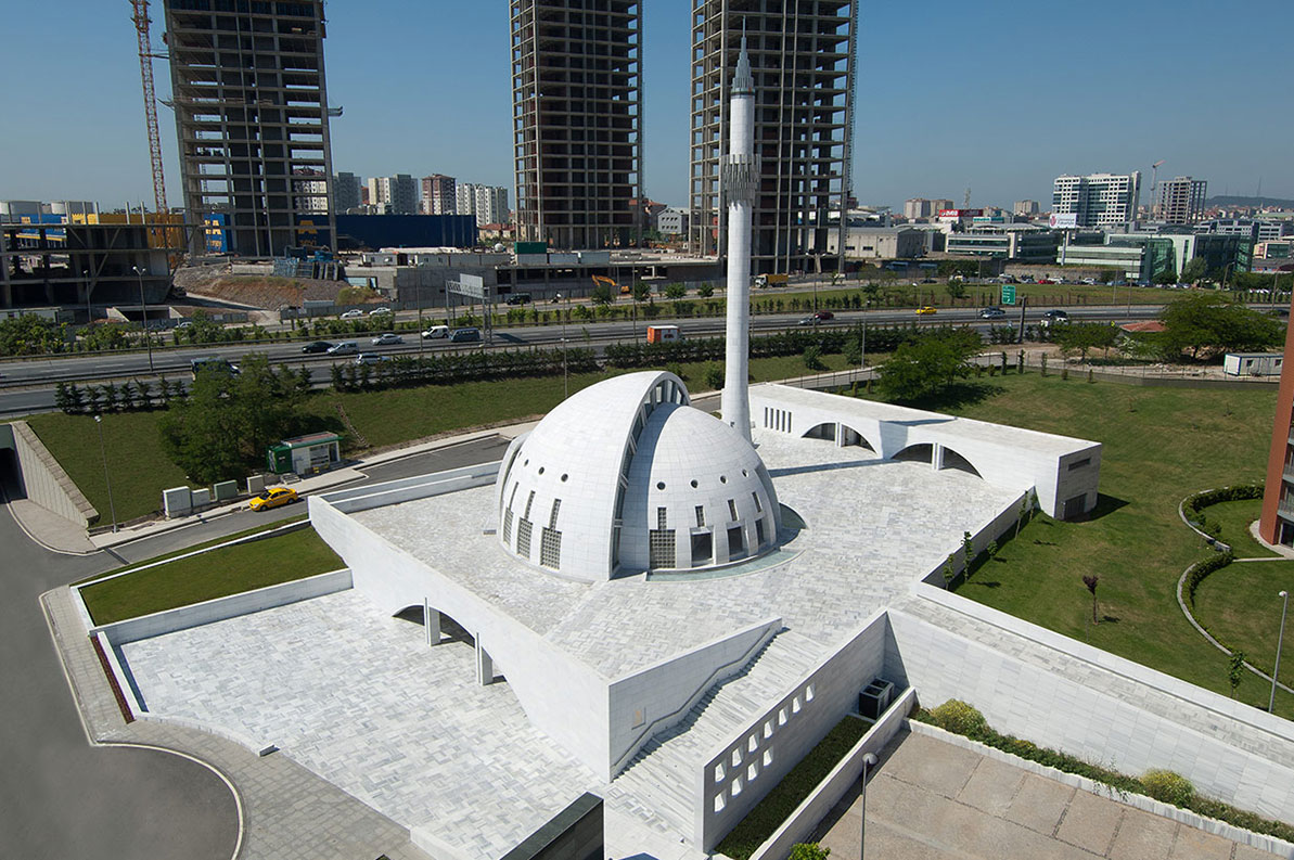

Yesilvadi Mosque

By Adnan Kazmaoğlu Mimarlık Araştırma Merkezi, İstanbul, Turkey

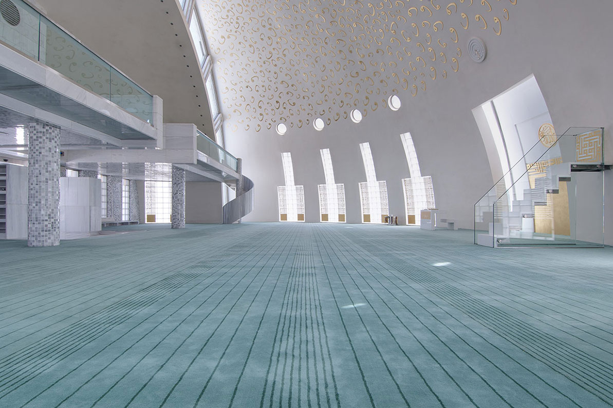
Harmoniously nested into the site, the Yesilvadi Mosque is conceptualized as a social space that gathers people and brings them together, through its variety of functions that include the prayer hall, a meeting hall, a library, a courtyard and a square, inspired by the social role mosques and their courtyards have traditionally played in the design of Islamic cities.

The bold geometry of the mosque, where the volume of the dome is also the volume of the building, is inspired by Ottoman mosques which typically have circular forms, while also symbolically using the shape of the circle to represent infinity and unity. The seamless use of white for the building’s exterior was achieved through the use of White Marmara marble, which aimed to represent purity and good virtue, standing in contrast with the green landscaping and the complexity of the surrounding context.


Al-Islah Mosque

By Formwerkz Architects, Punggol, Singapore

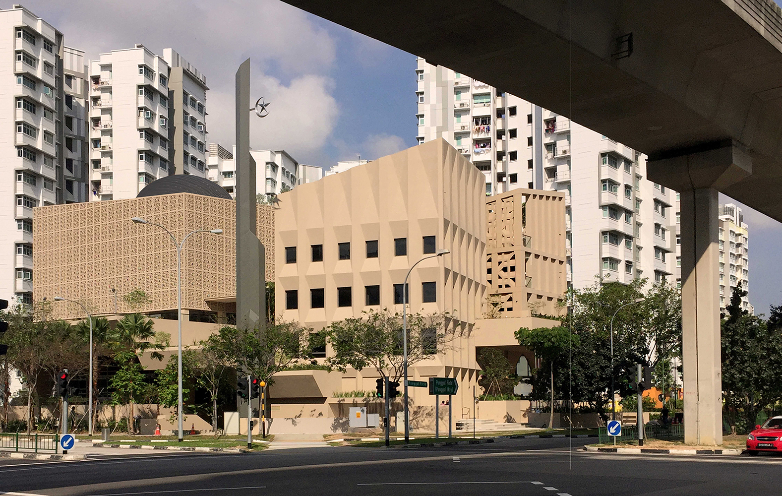
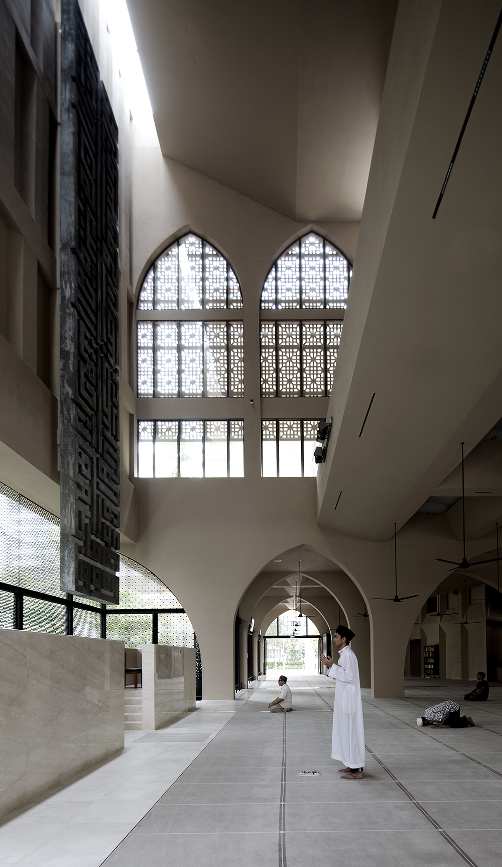
Photo by Albert Lim Koon Seng

Situated in a densely populated residential area, this mosque demonstrates a harmonious connection with its surroundings, achieved through a meticulously crafted façade adorned with a range of openings and perforations These features serve to regulate indoor climate and invite worshippers inside, while also reflecting the difference in functions in each building.

Comprising three distinct volumes, the mosque includes facilities such as a seminar building and an administrative center, in addition to the main prayer hall that flows dynamically with its open design and vast area. These architectural elements are thoughtfully designed to mirror the permeability of Islamic principles and aspirations within the context of Singapore today.


Mohammad Rasul- Allah Mosque

By Paya Payrang Architectural Group, Shiraz, Iran

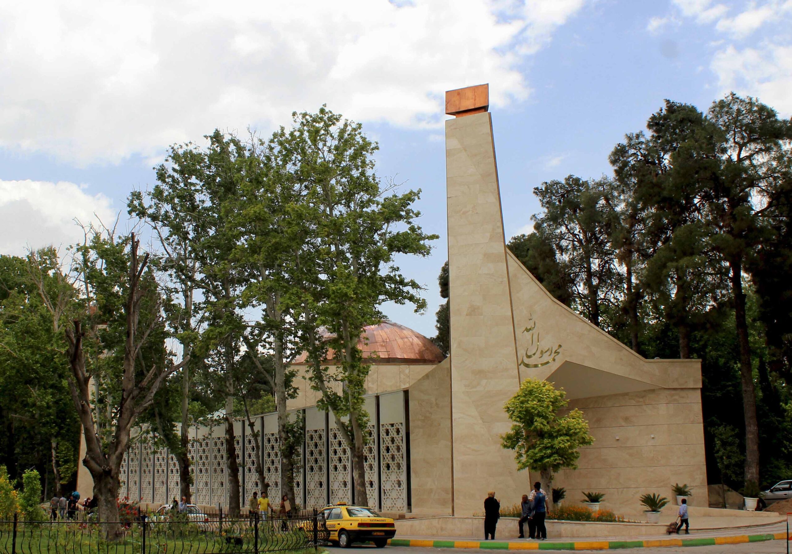
Photo by Ahmad Mirzaee

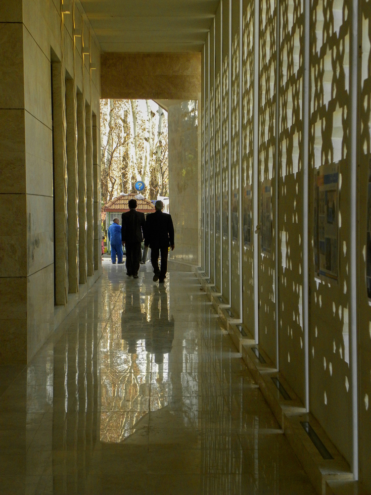
Photo by Samaneh Motaghipishe

The new volume of this mosque grew in the space between an array of old trees and the existing historic prayer hall at the center of the site, delicately engaging in a conversation between the old and the new, the natural and the built, the communal and the religious, as well as solidity and openness.

A long spine connects the two entrances at the opposite sides, encompassing the traditional “Riwagh” element that is common in the design of mosques in Iran, adorned with two minarets that vertically extend parallel to the huge old trees, and generously welcoming prayers in from the busy main road. Built out of stone, the design of the mosque is simple yet sculptural, standing out within its context and making a statement with its dynamic geometry and copper dome.
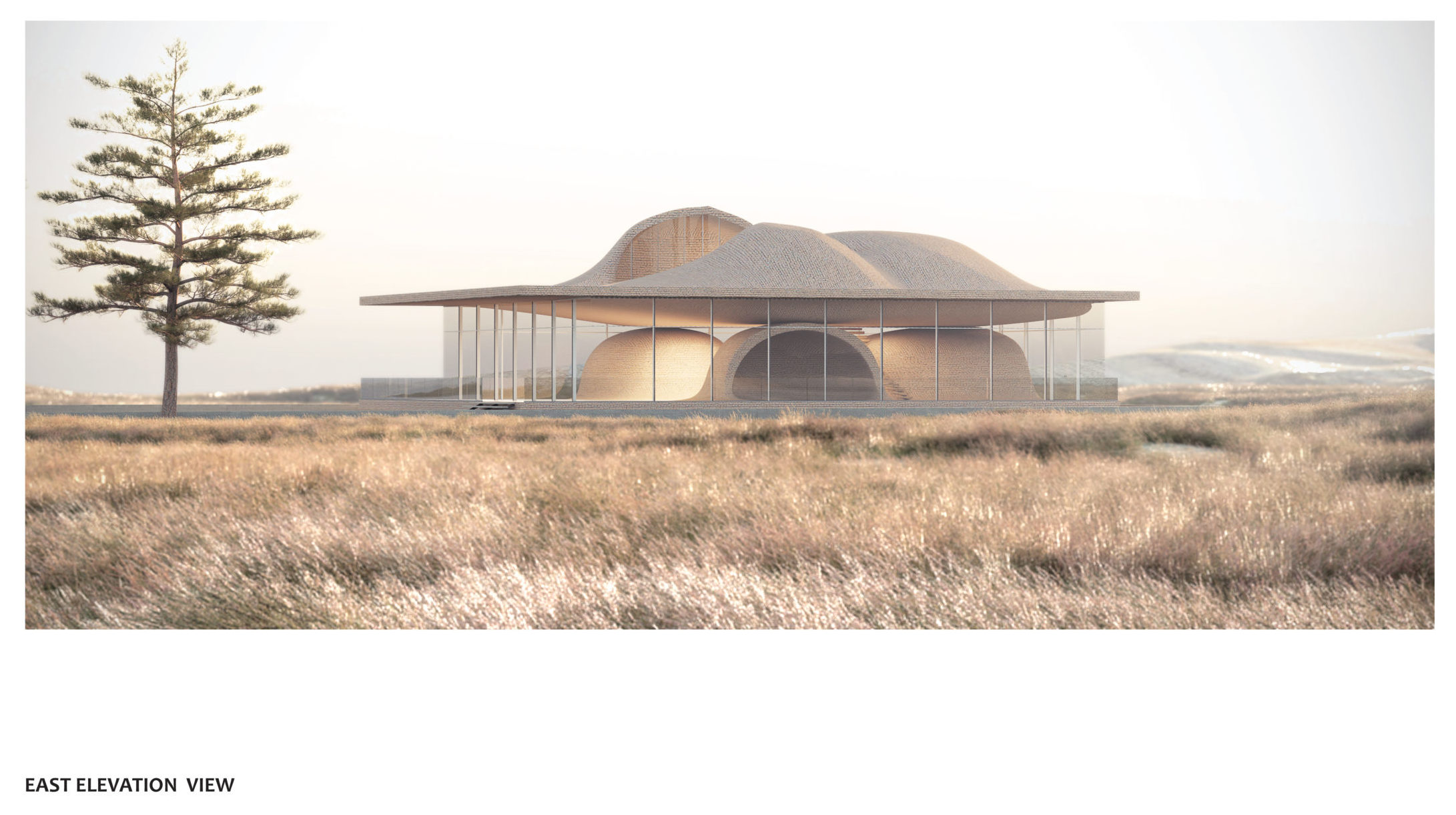
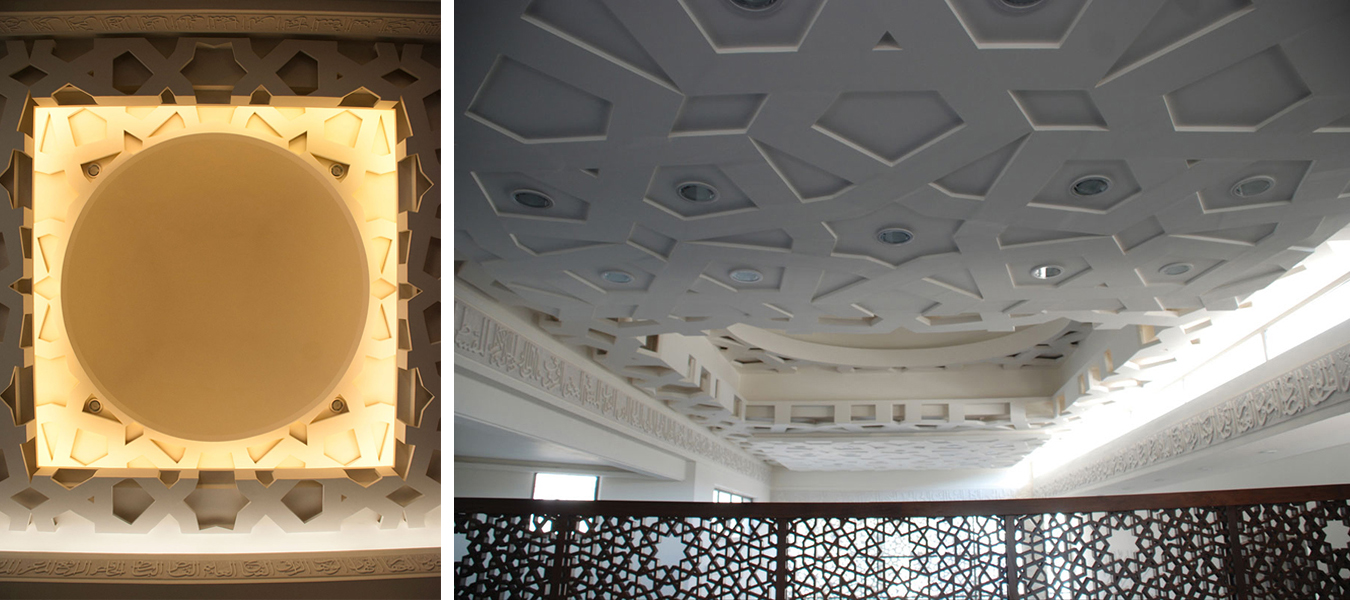

Al Rawda Mosque

By Uraiqat Architects, Amman, Jordan


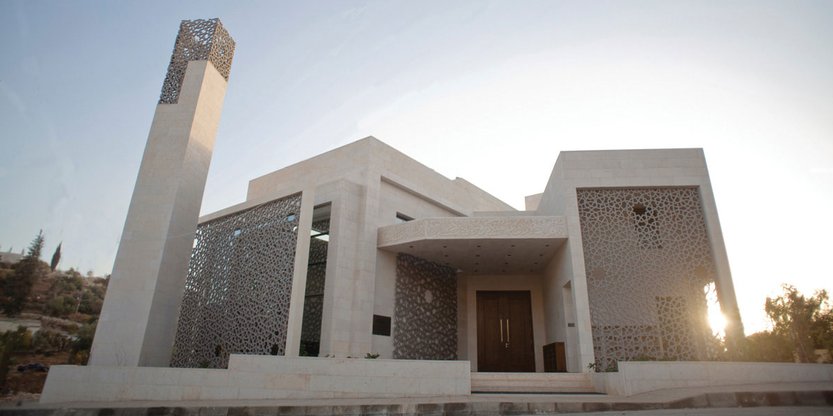
The dynamic design of Al Rawda Mosque in Amman aimed to move beyond the limitations of the traditional mosque designs of the region and envision what a contemporary mosque could look like. Through a process of extensive research, the designing team engaged in an intellectual pursuit that studied and abstracted the different elements of a mosque, before reinterpreting them and combining them in this design.

The ornamented screens on the inside and the outside of the building created a rich interplay of shade and shadow and blurred the boundary between the inside and the outside, while also having environmental benefits that enhanced the indoor climate and user experience.

The judging process for Architizer’s 12th Annual A+Awards is now away. Subscribe to our Awards Newsletter to receive updates about Public Voting, and stay tuned for winners announcements later this spring.   

Reference

Exterior of Dutch home by Barde vanVoltt
CategoriesInterior Design

Barde vanVoltt gives historic Haarlem house a contemporary update

Exterior of Dutch home by Barde vanVoltt

Interiors studio Barde vanVoltt has renovated this early 1900s house in the Dutch city of Haarlem to forge a strong connection between the building’s past and present, grounding the space with warm woods and tactile textures.

The owners – a young family of four – wanted a home that would stand the test of time while telling Dutch practice Barde vanVoltt to “surprise us”.

Exterior of Dutch home by Barde vanVolttExterior of Dutch home by Barde vanVoltt
Barde vanVoltt had overhauled an early 20th-century house in Haarlem

In answer, the studio worked to create an interior that fuses the past and the present.

“Stepping into this house is a journey through time, a reminder that architecture is a dialogue between generations,” the studio told Dezeen.

“Meticulously preserving its historical charm, the house’s design seamlessly integrates contemporary features, creating a harmonious blend that transcends eras.”

Extension of Haarlem House Extension of Haarlem House
The studio added an extension to the rear of the home

To address the narrow footprint of the house – a typically Dutch feature – internal walls were either removed, widened or replaced with glass panel doors.

The back of the property was transformed with an extension and concertina glass doors to maximize the sense of light and space.

Kitchen of Dutch home by Barde vanVolttKitchen of Dutch home by Barde vanVoltt
The extension houses the kitchen and dining area

“With the extension on the ground floor, we wanted to create contrast with the original architecture,” said Barde vanVoltt. “The understated square modern architecture, due to its shape and angular position, blends perfectly with the past.”

“With the historic facade at the front, we took advantage of the space at the rear, extending the kitchen and living areas into the garden.”

Living room of Haarlem HouseLiving room of Haarlem House
A vintage sandstone table centres the living room

The practice carefully aligned the new design elements with shapes drawn from the architectural features of the house, with the new full-height door openings echoing the proportions of the living room’s original windows.

In the attic, a guest room doubles as a playroom. Barde vanVoltt infused this once-dark space with natural light via a skylight, “allowing guests to sleep under the stars”.

Hallway with stained glass windows inside Haarlem HouseHallway with stained glass windows inside Haarlem House
Barde vanVoltt retained Haarlem House’s original stained glass windows

“Dutch houses are noted for their sloping attic roof lines,” the studio said. “For the children’s bedrooms, we followed this structural line and created custom bunk beds that combine sleep, storage, and space for play.”

The material palette includes a range of mid- and dark-toned timbers that bring a sense of warmth and tactility to the home.

These are complemented by natural materials including stone and linen.

“Our colour scheme always consists of earthy colours like moss green, a faded terracotta, grey concrete and off-whites,” the studio said. “For this residence, we brought them in line with the original colours from the existing tiles and stained glass.”

Children's bedroom inside Dutch home by Barde vanVolttChildren's bedroom inside Dutch home by Barde vanVoltt
Custom bunk beds feature in the children’s bedrooms

The furniture edit features Barde vanVoltt’s favoured mix of statement pieces alongside handmade and bespoke elements.

Selected pieces reflect the architectural style of the building such as the Lot table by Tecta in the study, as well as Gerrit Thomas Rietveld’s 1934 Zig Zag chair and his Steltman chair from 1963, which was the last chair ever created by the Dutch designer.

The playroom, dining area and bedroom all have specially-made seating upholstered in Kvadrat fabrics, while the bedrooms and study feature bespoke beds and closets.

Bathroom inside Dutch home by Barde vanVolttBathroom inside Dutch home by Barde vanVoltt
Wooden blinds mirror the linear pattern of the bathroom tiles

“We love creating interiors full of handmade, bespoke furniture pieces with refined details,” said Barde vanVoltt. “The headboard of the master bedroom is an art piece in itself. The walnut slats are slightly curved and give it a very sophisticated look.”

The square coffee table in the living room – made from a single piece of sandstone – is a vintage piece from Atelier Uma.

Bedroom inside Haarlem HouseBedroom inside Haarlem House
Barde vanVoltt created a custom headboard in the primary bedroom

For the lighting scheme, Barde vanVoltt set out to create the right balance between functional and decorative lighting, collaborating with lighting experts PSLab to create a “warm and cosy atmosphere.”

Other Dutch homes that have recently been featured on Dezeen include a house with a hexagonal footprint in Amsterdam and a Hobbit-style residence that is partially buried underground.

The photography is by Thomas de Bruyne.

Reference

Mid-century renovation of City Beach residence in Perth by Design Theory
CategoriesInterior Design

Eight mid-century home renovations that embrace contemporary details

Mid-century renovation of City Beach residence in Perth by Design Theory

From a modernist villa in Beverly Hills to a flat in one of Brasília’s iconic Superquadra apartment blocks, the mid-century renovations in this lookbook are a masterclass in updating a period home while retaining its distinctive character.

Originally constructed in the post-war period between 1945 and 1969, mid-century homes have proved enduringly popular due to their prescient emphasis on natural light, clean lines, open floor plans and humble materials such as wood, stone and concrete.

The renovations below see many of these original features retained and restored, supplemented with contemporary additions such as double-height ceilings and furniture by the likes of Tadao Ando and Mario Bellini.

This is the latest in our lookbooks series, which provides visual inspiration from Dezeen’s archive. For more inspiration see previous lookbooks featuring art deco homes, sunny yellow interiors and serene bedrooms with striking natural views.


Mid-century renovation of City Beach residence in Perth by Design Theory
Photo by Jack Lovel

City Beach Residence, Australia, by Design Theory

Australian studio Design Theory looked to preserve the “considerable mid-century charm” of this home on the coast of Perth during its renovation (top and above), remaining true to the rich palette of natural materials found in the original design.

Contemporary furniture and lighting with gently curving forms were chosen to soften the rigorous lines of the original architecture and prevent the interiors from feeling like a period pastiche.

Find out more about City Beach Residence ›


Brandaw Residence, US, by 180 Degrees Design + Build and CBTWO Architects
Photo by An Pham

Brandaw Residence, US, by 180 Degrees Design + Build and CBTWO Architects

A new double-height living room with a pitched roof and full-height glazing was added to modernise this 1960s home in Phoenix, creating sightlines up and out towards nearby Camelback Mountain.

Modernist touches remain on the interior in the form of plentiful wood panelling alongside finishes and furnishings in muted primary colours ranging from teal to mustard-yellow.

Find out more about Brandaw Residence ›


Mid-century renovation of Hampstead House by Coppin Dockray in London
Photo by James O Davies

Hampstead House, UK, by Coppin Dockray

This house in Hampstead was originally designed by British architect Trevor Dannatt in 1960 as London’s answer to the post-war Case Study Houses built by the likes of Richard Neutra and the Eameses in California.

When renovating and extending the property for a growing family, local studio Coppin Dockray contrasted vintage and contemporary furniture for a “domestic, lived-in” feel, with pieces ranging from a Togo chair to Mia Hamborg’s Shuffle table for &Tradition.

Find out more about Hampstead House ›


Beverly Hills villa, US, by Heusch
Photo by Gerhard Heusch

Beverly Hills villa, US, by Heusch

Historical images helped architecture firm Heusch to restore this Beverly Hills villa to its former glory and reverse some of its “unfortunate transformations” over the years.

Existing terrazzo floors on the ground floor were restored and complemented with fluted glass details and dark timber furnishings, both new and old, including Ando’s cantilevered Dream Chairs and a bookshelf by Italian architect Augusto Romano from the 1950s.

Find out more about Beverly Hills villa ›


Mid-century renovation of Palermo house, US, by OWIU
Photo by Justin Chung

Palermo house, US, by OWIU

California studio OWIU retained several original elements during the renovation of this 1955 home in LA’s San Rafael Hills, among them the glass-block walls and wooden ceiling beams, which were exposed from under false ceilings and sanded down to reveal their natural colour.

These were contrasted with more neutral contemporary elements such as pale oak flooring and walls coated in Venetian plaster, with assorted lights by Isamu Noguchi and George Nelson – one of the founding fathers of American modernism.

Find out more about Palermo house ›


308 Apartment by Debaixo do Bloco Arquitetura
Photo by Joana France

Brasília apartment, Brazil, by Debaixo do Bloco Arquitetura

This apartment is located inside Brasília’s historic Superquadra 308 Sul, the first “superblock” apartment complex constructed as part of architect Lucio Costa’s 1957 master plan for the new Brazilian capital.

Local studio Debaixo do Bloco Arquitetura cut open the building’s exposed concrete walls, opening up its layout to meet the needs of a modern family while preserving period details such as the building’s distinctive white breeze-block screens and its granilite flooring.

Find out more about Brasília apartment ›


Mid-century renovation of Malibu Surf Shack, US, by Kelly Wearstler
Photo by Ingalls Photography

Malibu Surf Shack, US, by Kelly Wearstler

When interior designer Kelly Wearstler turned this 1950s beachfront cottage in Malibu into a bohemian retreat for herself and her family, she retained the original wood-panelled walls and selected finishes that were “hand-crafted, rustic and raw” to match the existing material palette.

The interiors feature abundant planting, alongside an eclectic mix of period-agnostic furnishings including a 1980s green marble table by Bellini, paired with a plaster-covered Caféstuhl chair by contemporary Austrian designer Lukas Gschwandtner.

Find out more about Malibu Surf Shack ›


Golden House, US, by SHED Architecture and Design
Photo by Rafael Soldi

Golden House, US, by SHED

Seattle architecture firm SHED had to make several aggressive interventions when renovating this 1950s building in nearby Shoreline, which was originally constructed as a family home but had previously been divided up to serve as a retirement home.

Working around the existing post-and-beam structure, the studio updated the interior to maximise views of the Olympic Mountains and Puget Sound while enlarging the kitchen and reorganising it around a central island.

Find out more about Golden House ›

This is the latest in our lookbooks series, which provides visual inspiration from Dezeen’s archive. For more inspiration see previous lookbooks featuring art deco homes, sunny yellow interiors and serene bedrooms with striking natural views.

Reference

Villa Kuro by Mini Inno
CategoriesInterior Design

Eight interiors that strike a balance between rustic and contemporary

Villa Kuro by Mini Inno

For our latest lookbook, Dezeen has selected eight examples of rustic yet contemporary interiors, including but not limited to an apartment in Sao Paulo and a Tuscan boutique hotel.

Rustic interiors have a strong focus on natural and aged materials as well as traditional wooden or stone furnishings.

These material choices are often used to create a homely and welcoming atmosphere that is somewhat reminiscent of a farmhouse style.

From an inn with nautical-leaning decor to a mid-century home in Joshua Tree, here are eight examples of how interior designers are bringing rustic design tropes into the 21st century.

This is the latest in our lookbook series, which provides visual inspiration from Dezeen’s archive. For more inspiration see previous lookbooks featuring wood-panelled dining rooms, statement headboards and homes with pergolas.


Villa Kuro by Mini Inno
Photo is by Stanley Yang

Villa Kurno, US, by Mini Inno

Los Angeles interior design studio Mini Inno renovated this mid-century ranch-style home in Joshua Tree National Park and converted it into a holiday home.

The studio opted for a neutral interior scheme that serves as the background for various wooden furnishings and fixtures.

Wood beams were left exposed across the ceiling of the living area while wooden barstools, shelving and cupboard doors are contrasted against the white-painted walls and floors.

Find out more about Villa Kurno ›


Monteverdi Tuscany boutique hotel by Michael Cioffi and Ilaria Miani

Monteverdi Hotel, Italy, by Michael Cioffi

Located in a hamlet in Val d’Orcia, a UNESCO World Heritage Site in Tuscany, Monteverdi Hotel was transformed from a crumbling building to a 29-room hotel over a 14-year renovation.

Materials and finishes throughout the interior were chosen for their textural quality and walls feature uneven surfaces with indents and niches. Salvaged wood was used for ceiling beams, timber archways and closet doors, which were constructed from old farm doors.

Find out more about Monteverdi Hotel, ›


Captain Whidbey Inn
Photo is by Alexander Ribar

Whidbey Inn, US, by Mike and Matt French

Mike and Matt French collaborated with friends and local designers to update this historic inn on Widbey Island near Seattle.

The team renovated the property, which was built in 1907, and decorated the interior with a contemporary yet rustic approach with subtle nautical influences. Wood panelling in various shades was used across the interior and paired with timber furnishings.

Find out more about Whidbey Inn ›


Carriage House by Workstead
Photo is by Jeff Holt

Carriage House, US, by Workstead

This home is set inside a converted kitchen house in South Carolina – a small outbuilding that was originally used to prepare food for the main residence.

Workstead decorated its interior using an imperfect approach that saw the US studio make a feature of exposed, paint-splattered brickwork and crumbling plaster walls.

In one of the home’s living areas, cypress and woven cane cabinets with an integrated window seat were built around a window, extending from the wooden floors up to the white-washed ceilings.

Find out more about Carriage House ›


Interiors of La Ganea restaurant, designed by Studio Mabb
Photo is by Carola Merello

La Ganea, Italy, by Studio Mabb

A material palette of plaster, timber and iron defines the rustic interiors of this restaurant in Brescia, Italy, which was designed by interiors practice Studio Mabb.

The former farmhouse dates back to the 16th century and was renovated to have a simple aesthetic with earthy components. Large wooden beams stretch across the ceiling above a tiled floor and grey-washed walls while dark wood and iron furnishings complete the moody atmosphere.

Find out more about La Ganea ›


Tea House Italy by Lorenzo Guzzini
Photo is by Giorgio Marafiot

Japanese tea house, Italy, by Lorenzo Guzzini

At this home on Lake Como, which was informed by Japanese architecture, materials were chosen for their likeness to the surrounding nature and the vernacular architecture of the historic village of Dizzasco.

Textural wall finishes in earthy tones and stone-lined floors were combined with exposed wooden ceilings, pine skirting boards and doors in an effort to reference the rustic look of traditional tea houses.

Find out more about Japanese tea house ›


House V designed by Martin Skoček
Photo is by Matej Hakár

House V, Slovakia, by Martin Skoček

Slovakia-based architect Martin Skoček used salvaged and time-worn materials in the interior of this gabled home near Bratislava.

Bricks walls are exposed in the open-plan living area at the centre of the home beneath a wood-gabled ceiling that spans the entire length of the space.

Contemporary additions such as a steel breakfast island and oak storage wall anchor the kitchen area, providing a contrast with the raw brick walls and wooden ceiling.

Find out more about House V ›


GM Apartment by NJ+
Photo is by Fran Parente

GM Apartment, Brazil, by Nildo José Architects

Brazillian studio Nildo José Architects highlighted many of the existing architectural features when renovating this two-bedroom apartment in a condominium tower in Sao Paulo.

The interior scheme draws on a more contemporary idea of rustic, using exposed concrete elements combined with bleached wood and glazed tiles.

“The kitchen is open and funky, blending rustic and modern with colours, design and materials,” the studio said.

Find out more about GM Apartment ›

This is the latest in our lookbooks series, which provides visual inspiration from Dezeen’s archive. For more inspiration see previous lookbooks featuring wood-panelled dining rooms, statement headboards and homes with pergolas.

Reference

Humble Roots: 6 Contemporary Architecture Projects Grounded In Vernacular Design
CategoriesArchitecture

Humble Roots: 6 Contemporary Architecture Projects Grounded In Vernacular Design

Humble Roots: 6 Contemporary Architecture Projects Grounded In Vernacular Design

The latest edition of “Architizer: The World’s Best Architecture” — a stunning, hardbound book celebrating the most inspiring contemporary architecture from around the globe — is now available. Order your copy today.  

Architects often strive for innovation and seek to push the bounds of design into uncharted territory. But there is much to learn from the ground already trodden. Revisiting the typologies of the past through a contemporary lens can yield exciting, fresh perspectives.

Vernacular architecture is a product of its locality. It’s a patchwork of design languages, native materials and building traditions informed by centuries of lives before us. This distilled knowledge is part instruction manual, part storybook — it summons rich cultural tales and imparts the blueprints for building on unique, regional terrain. Evoking the vernacular is a form of time travel — a way of colliding the past and present.

These six A+Award-winning projects each draw inspiration from historic, localized design and reimagine the vernacular spirit for the 21st century.


Komera Leadership Center

By BE_Design, Rwinkwavu, Rwanda

Popular Choice Winner, 11th Annual A+ Awards, Community Centers
Jury Winner, 11th Annual A+ Awards, Architecture +Community
Jury Winner, 11th Annual A+ Awards, Architecture +For Good
Jury & Popular Choice Winner, 11th Annual A+ Awards, Architecture +Low Cost Design

Komera Leadership Center by BE_Design
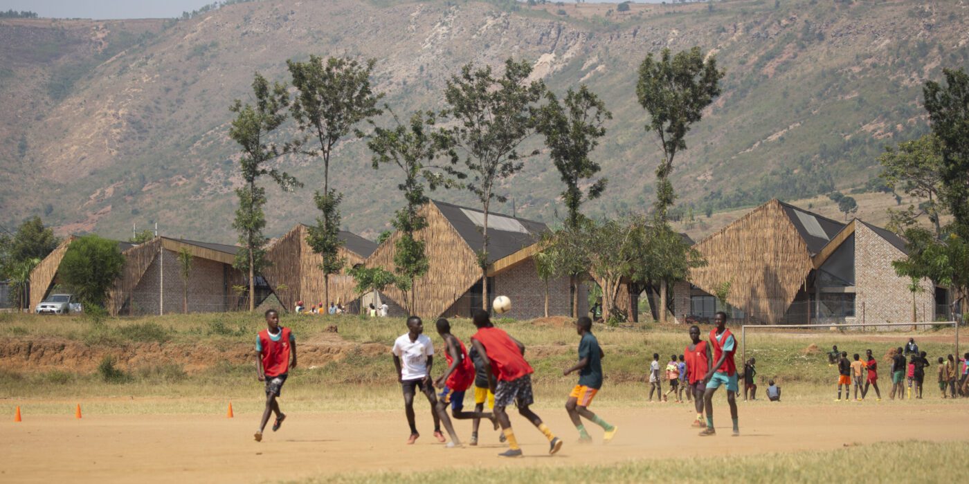
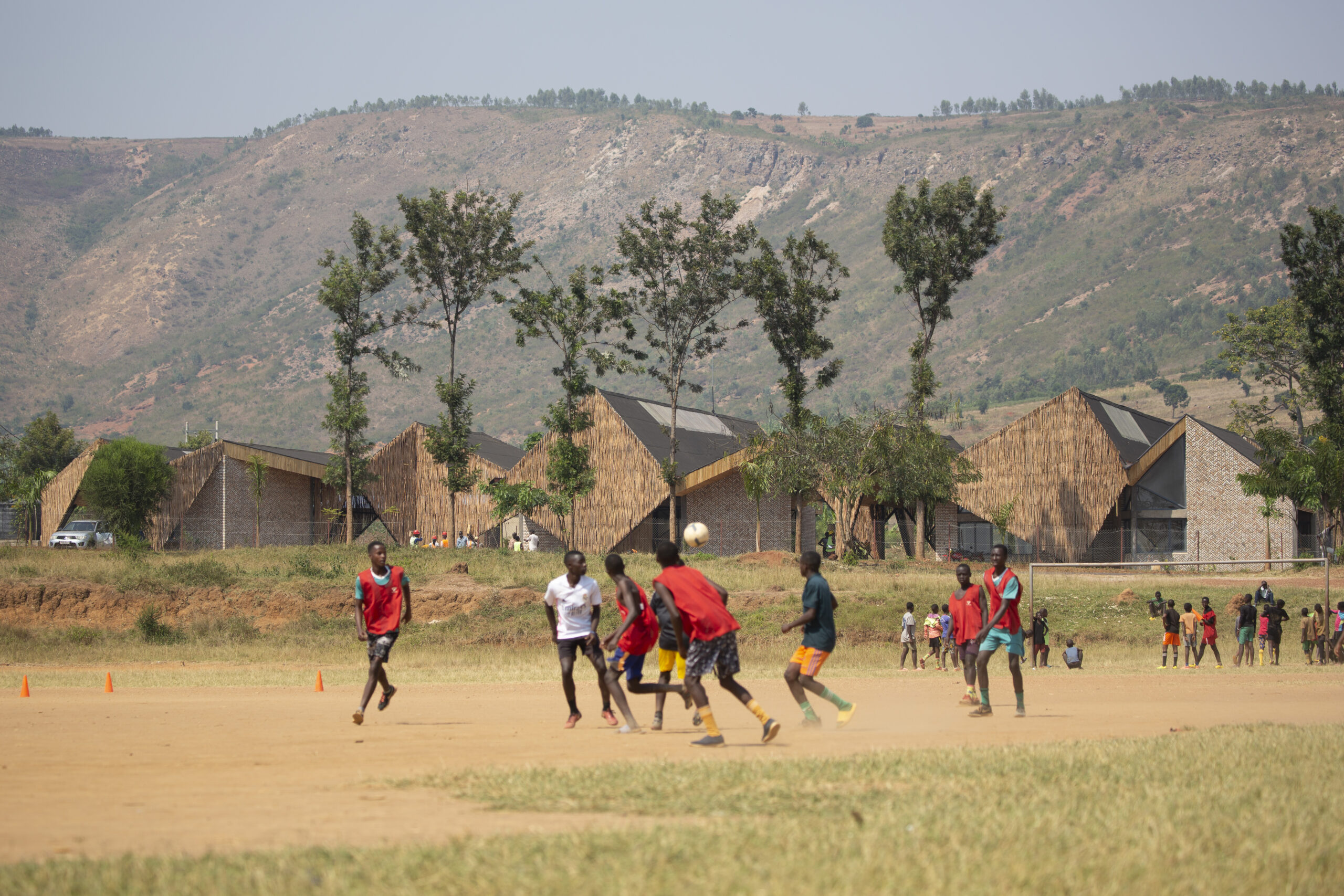
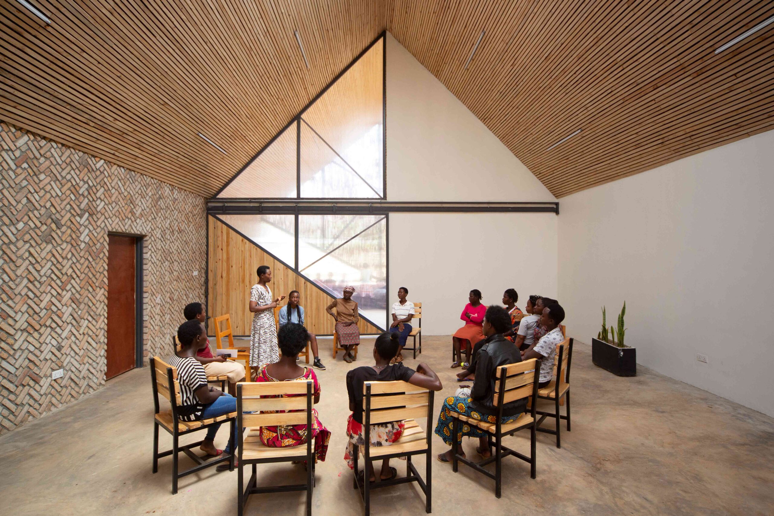
This remarkable women’s community and health center in Rwanda’s rural eastern province is as dynamic in its design as it is in its plight. Set against a mountainous backdrop, the building itself is an architectural topography of angular peaks, shaped from patterned brickwork and woven eucalyptus screens. This graphic silhouette was inspired by the region’s traditional imigongo art, which emphasizes bold, geometric shapes. Deeping rooted in the cultural landscape, the vernacular art form has become a powerful symbol of resilience thanks to its resurgence in recent decades.

At the core of the center is a succession of airy, vaulted halls. Hinging translucent panels segment the spaces and offer impressive multifunctionality. When closed, they carve out three classrooms for more intimate teaching and mentorship. When the panels are retracted, the interior transforms into a vast meeting hall for large community gatherings and events.


Super Paradise beach club

By Omniview Design, Mykonos, Greece

Popular Choice Winner, 11th Annual A+ Awards, Bars & Wineries

Super Paradise beach club by Omniview Design Super Paradise beach club by Omniview Design
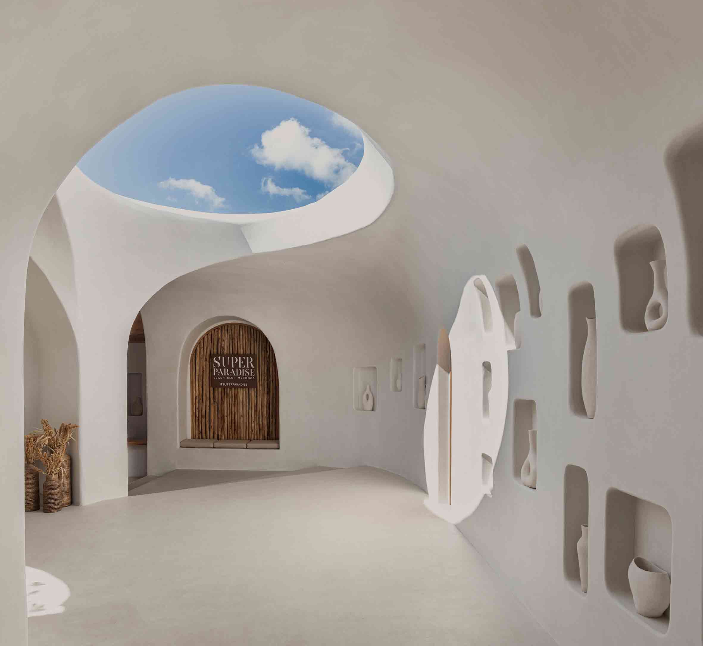
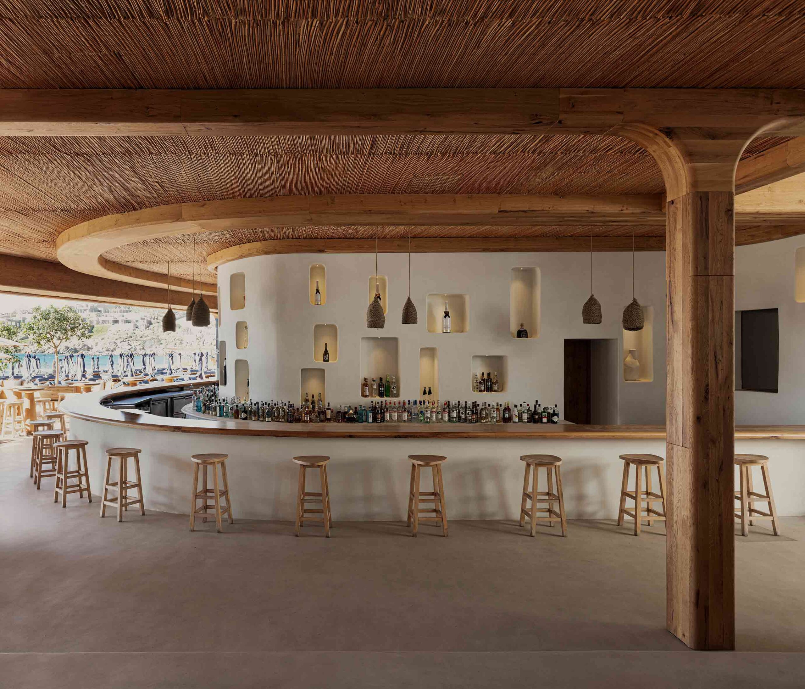
The landscape of Mykonos is bristling with new development, however, this enigmatic beach bar harks back to the Greek island’s architectural roots. Its crisp white form, articulated in organic, flowing lines, is reminiscent of the Cycladic vernacular. Allusions to historic motifs are playfully incorporated — recessed pockets in the walls have been reincarnated as presentation spaces for the work of local artists, as well as storage nooks for the bar.

Traditional materials abound throughout the scheme, yet their handling is deftly modern. The project’s curvilinear geometry, seamless and sophisticated in its finish, is a product of cutting-edge design technology. The result is an aesthetic the architects call future retro. It’s a space that straddles different temporal plains, and in doing so, finds itself somewhat timeless.


The Kaleidoscope

By Inrestudio, Quang Binh Province, Vietnam

Jury Winner, 11th Annual A+ Awards, Low Rise (1 – 4 Floors)

The Kaleidoscope by Inrestudio The Kaleidoscope by Inrestudio
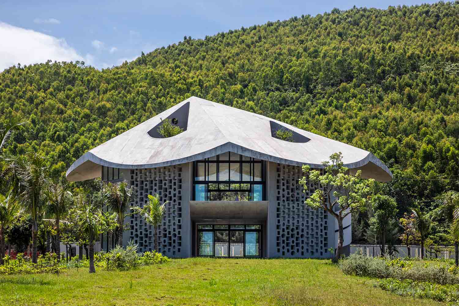
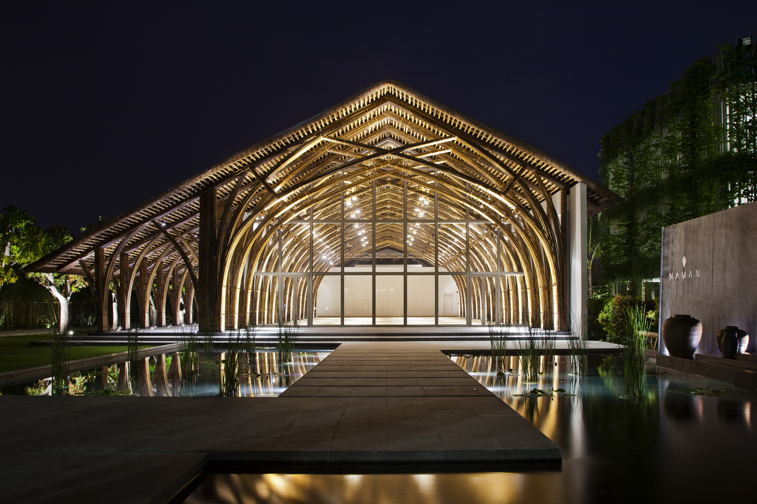
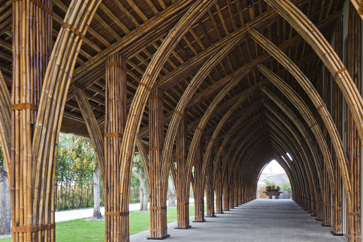
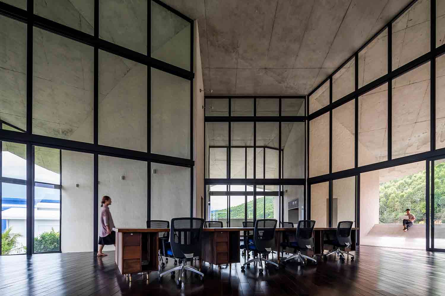
Constructed on a remote factory site in central Vietnam, this pioneering live-work project has a wonderfully whimsical inspiration. Capped with a conical roof, the building was modeled after a traditional Vietnamese farmer’s hat, known as a nón lá. Vernacular fashion is something of an unconventional architectural influence, yet the unusual form was mindfully chosen.

The surrounding region is known for its fiercely hot winds in the dry season. Consequently, the structure’s walls are placed perpendicular to the undulating roof periphery, creating channels of natural ventilation throughout the building. Intricate perforated block walls, a common design feature in tropical regions, help to moderate the extreme temperatures too. Constructed by a diverse team of experienced craftspeople and inexperienced farmer-builders, the project itself facilitated a valuable exchange of regional construction knowledge.


Marlboro Music Reich Hall

By HGA, Marlboro, Vermont

Jury Winner, 11th Annual A+ Awards, High Education & Research Facilities

Marlboro Music Reich Hall by HGA Marlboro Music Reich Hall by HGA
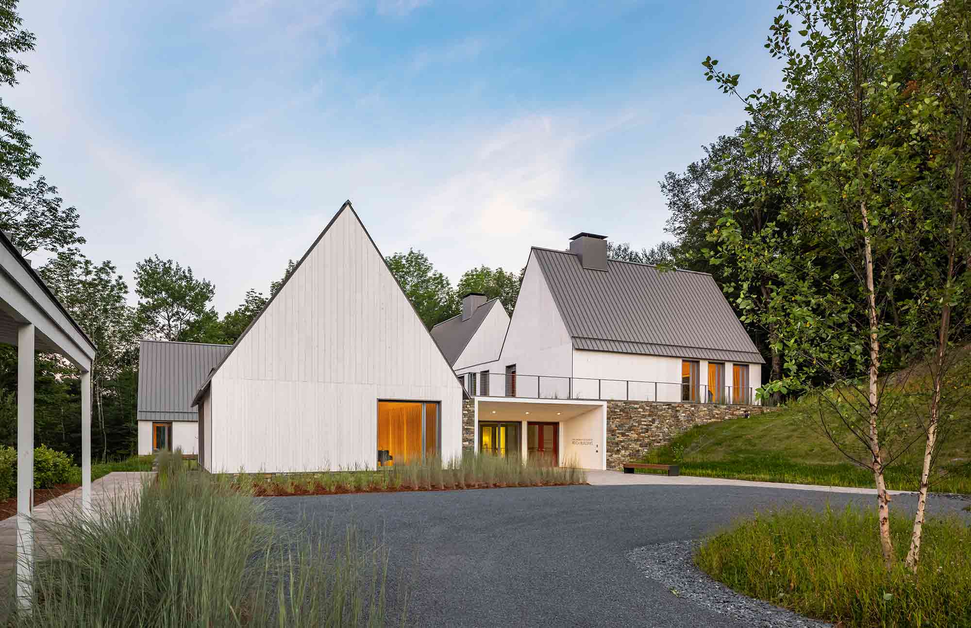
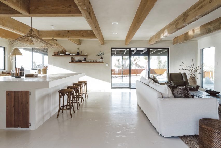
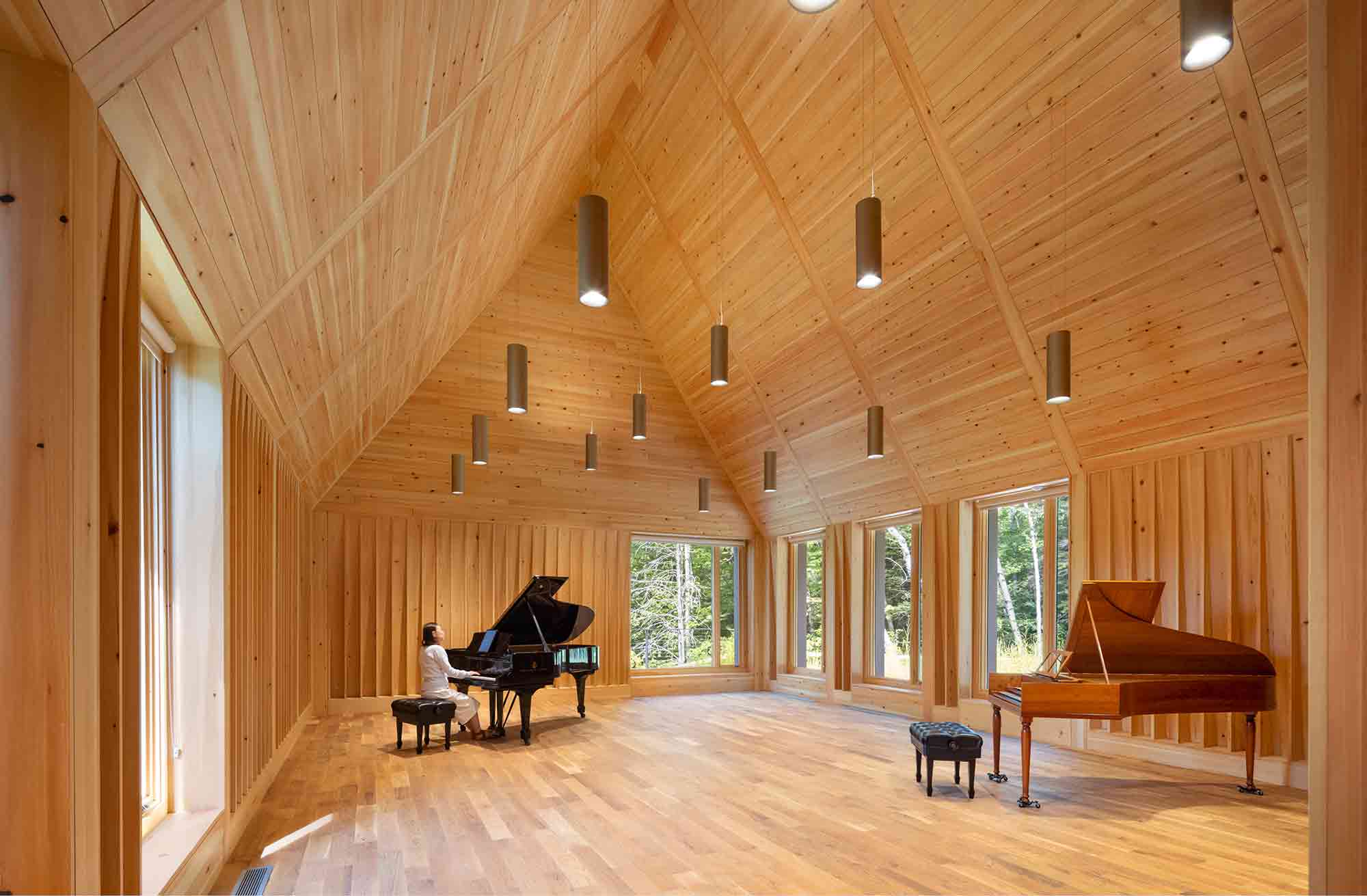
Nestled on the historic Marlboro College campus in the foothills of Vermont’s Green Mountains, four newly constructed gabled volumes stand harmoniously amid a collection of centuries-old former farm buildings. With its rectangular box structures and pitched roofs, the Reich Hall complex is a stunning modern iteration of a historic Cape Cod cottage. This classic vernacular has been sensitively reimagined with crisp, minimalist lines and contemporary vertical cladding.

Respectful of the site’s organic terrain, the stepped forms follow the natural incline of the hillside. Inside, the new lofty rehearsal spaces are enveloped in warm-hued wood to clarify the acoustics. Vast, floor-to-ceiling windows merge the stripped-back interior with the rugged mountains and woodlands beyond. The project’s simplicity pays homage to the architectural past, while celebrating the vitality of the landscape.


Locust Grove Event Pavilion

By de Leon & Primmer Architecture Workshop, Louisville, Kentucky

Jury Winner, 11th Annual A+ Awards, Pavilions

Locust Grove Event Pavilion by de Leon & Primmer Architecture Workshop Locust Grove Event Pavilion by de Leon & Primmer Architecture Workshop
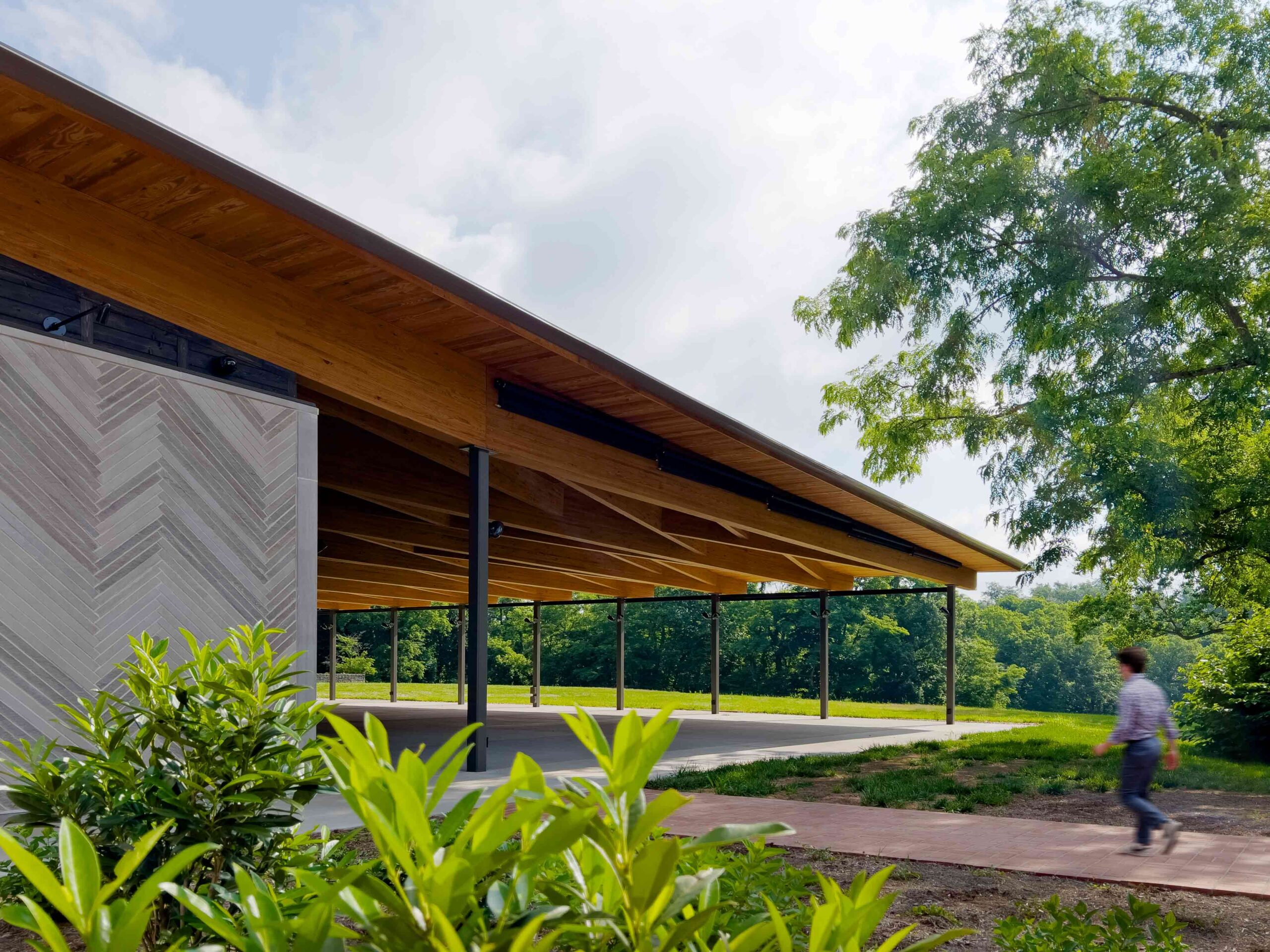
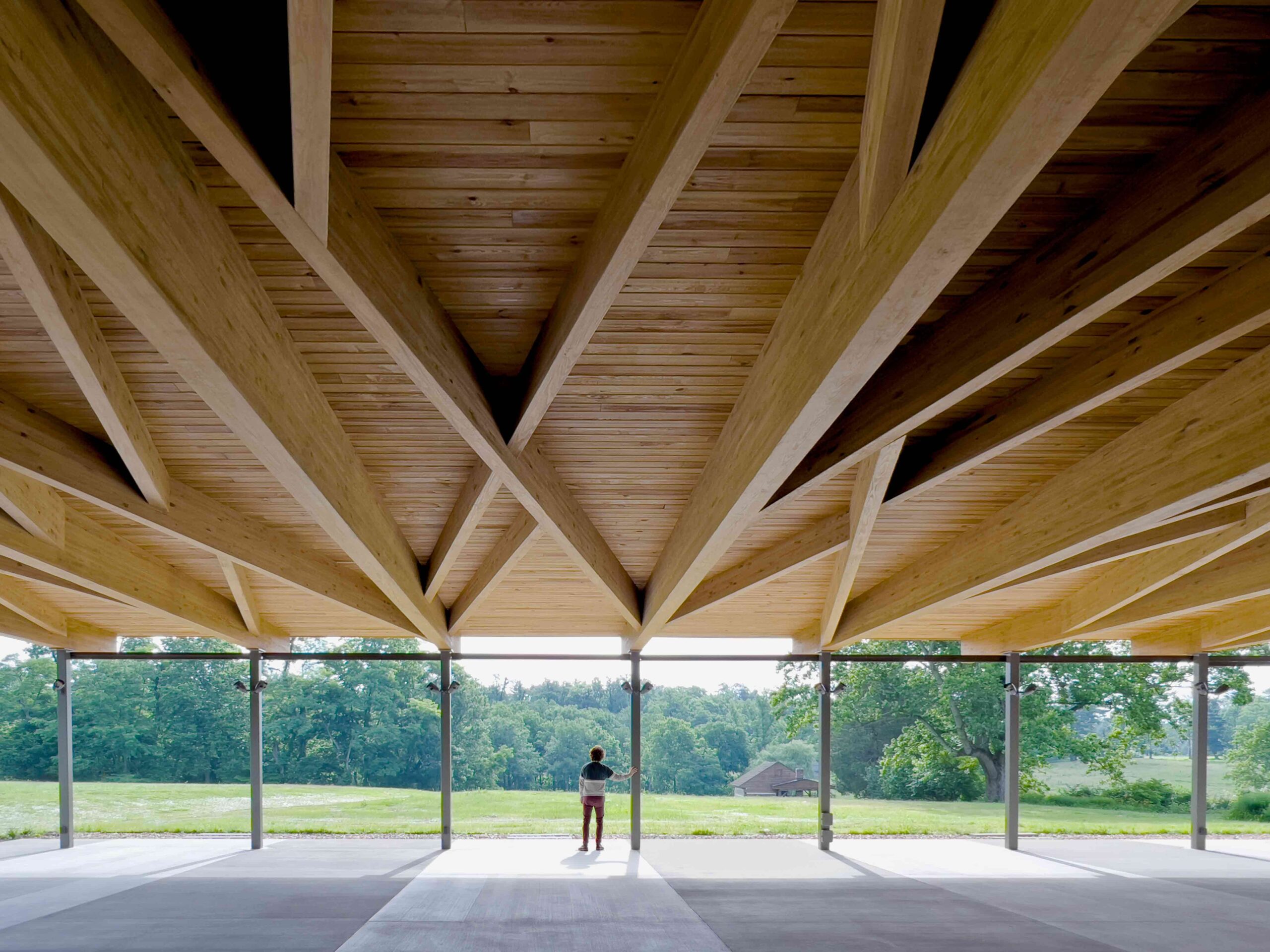
Located on the grounds of Locust Grove, an 18th-century agricultural estate and National Historic Landmark, this experimental pavilion is an artful interpretation of the surrounding acreage. The structure was conceived as a sweeping, large-scale porch, an exaggerated feature of the nearby Georgian farmhouse. In keeping with its vernacular inspiration, the pavilion has been masterfully positioned to frame picturesque views across the grounds. The project is anchored in stone and timber, reinforcing the material connection with the property’s historic buildings.

The pavilion is a porous space, simultaneously offering shelter yet open to the elements. Fittingly then, domestic symbolism is balanced by articulations of the external environment. The structure’s roof is coffered with a tangle of glulam beams, an allusion to the sinuous bark of the surrounding black locust trees, the farm’s namesake. Meanwhile, restrooms and storage spaces are concealed within volumes clad in a herringbone limestone skin. The undulating design recalls the repetitive stonework of the historic ha-ha walls that delineate the estate.


Hub of Huts

By NOA, Trentino-South Tyrol, Italy

Popular Choice Winner, 11th Annual A+ Awards, Spa & Wellness

Hub of Huts by NOA Hub of Huts by NOA
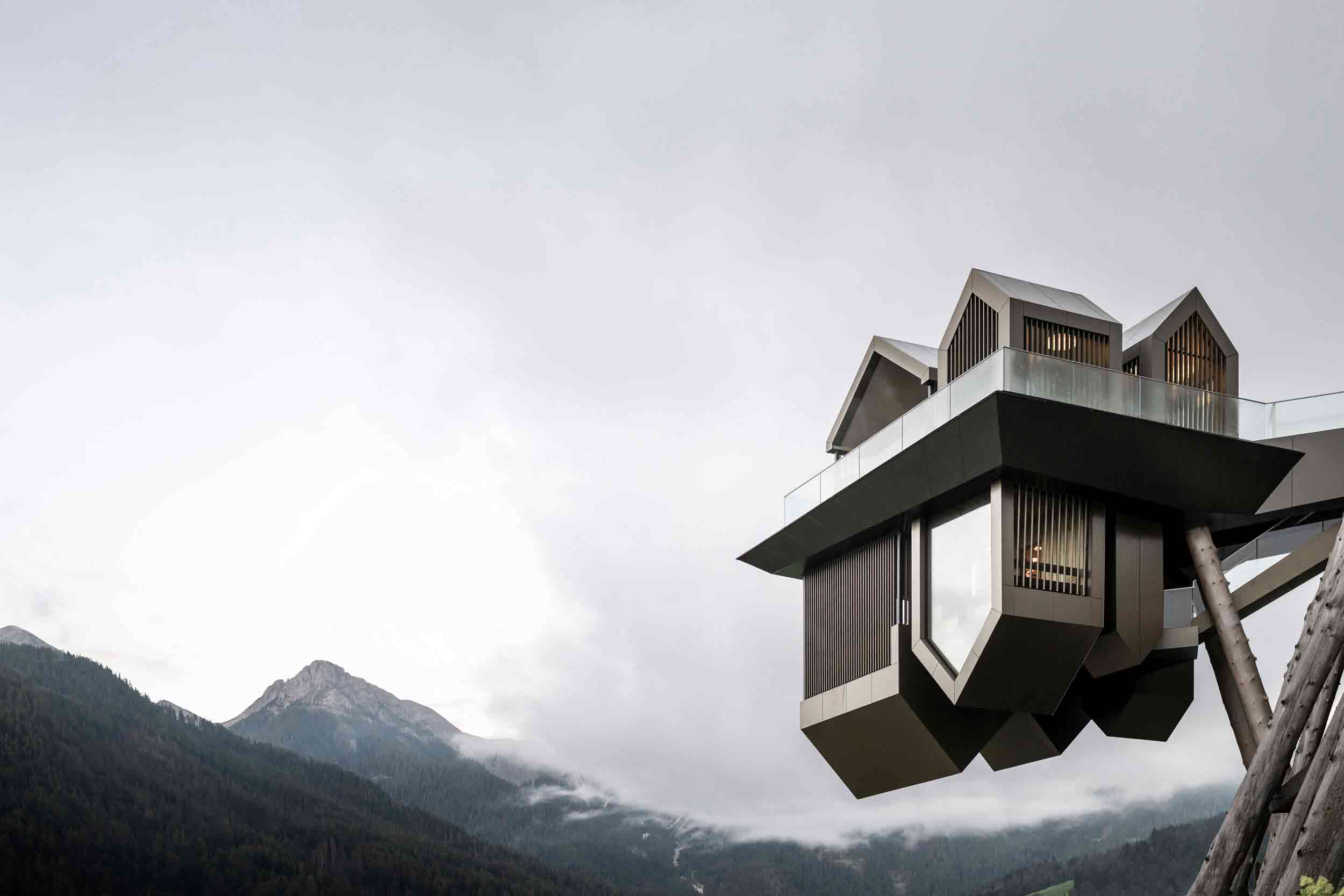
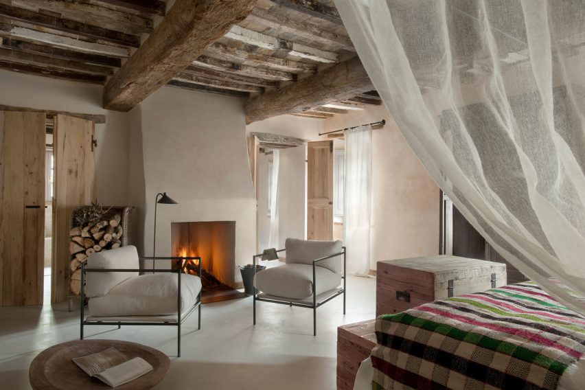
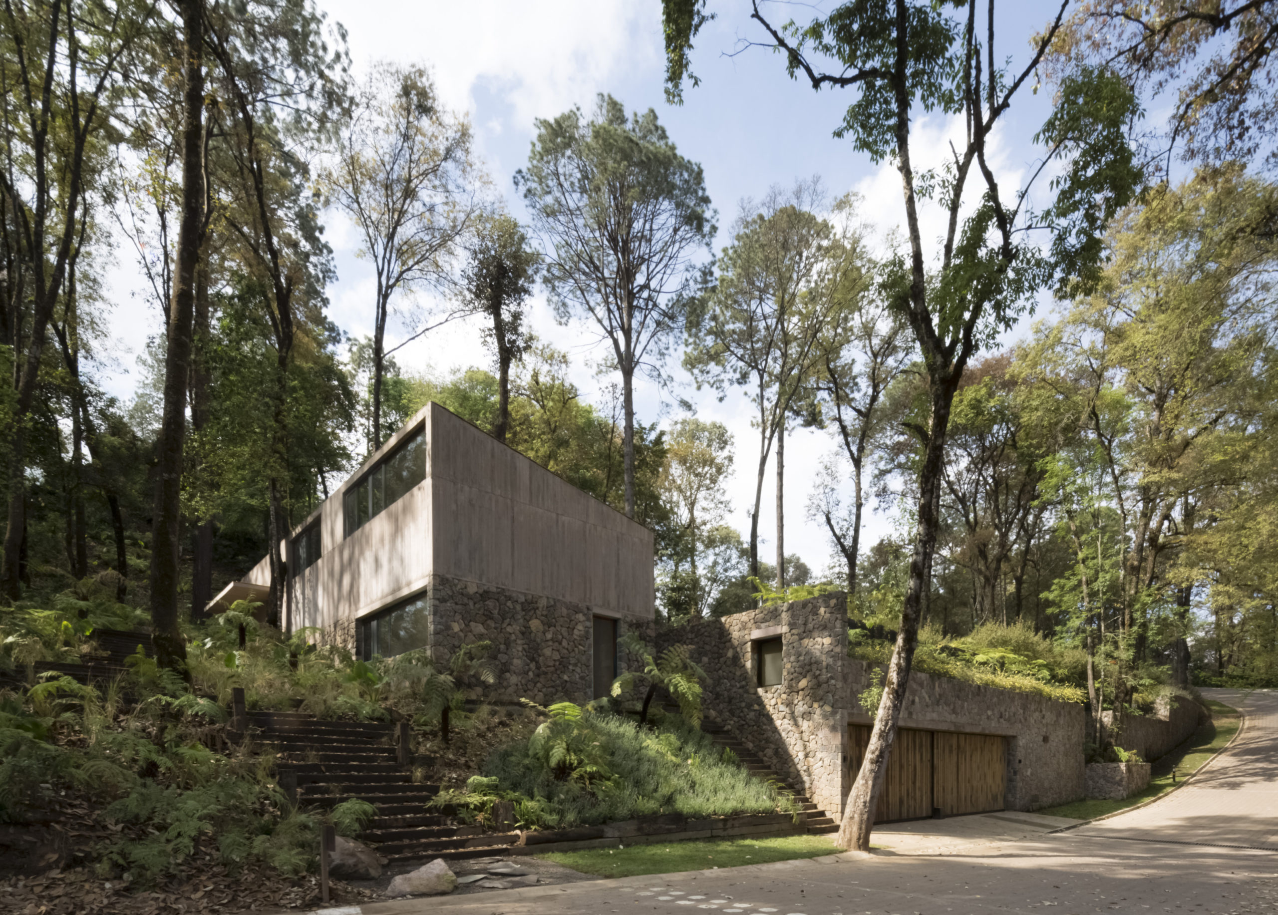
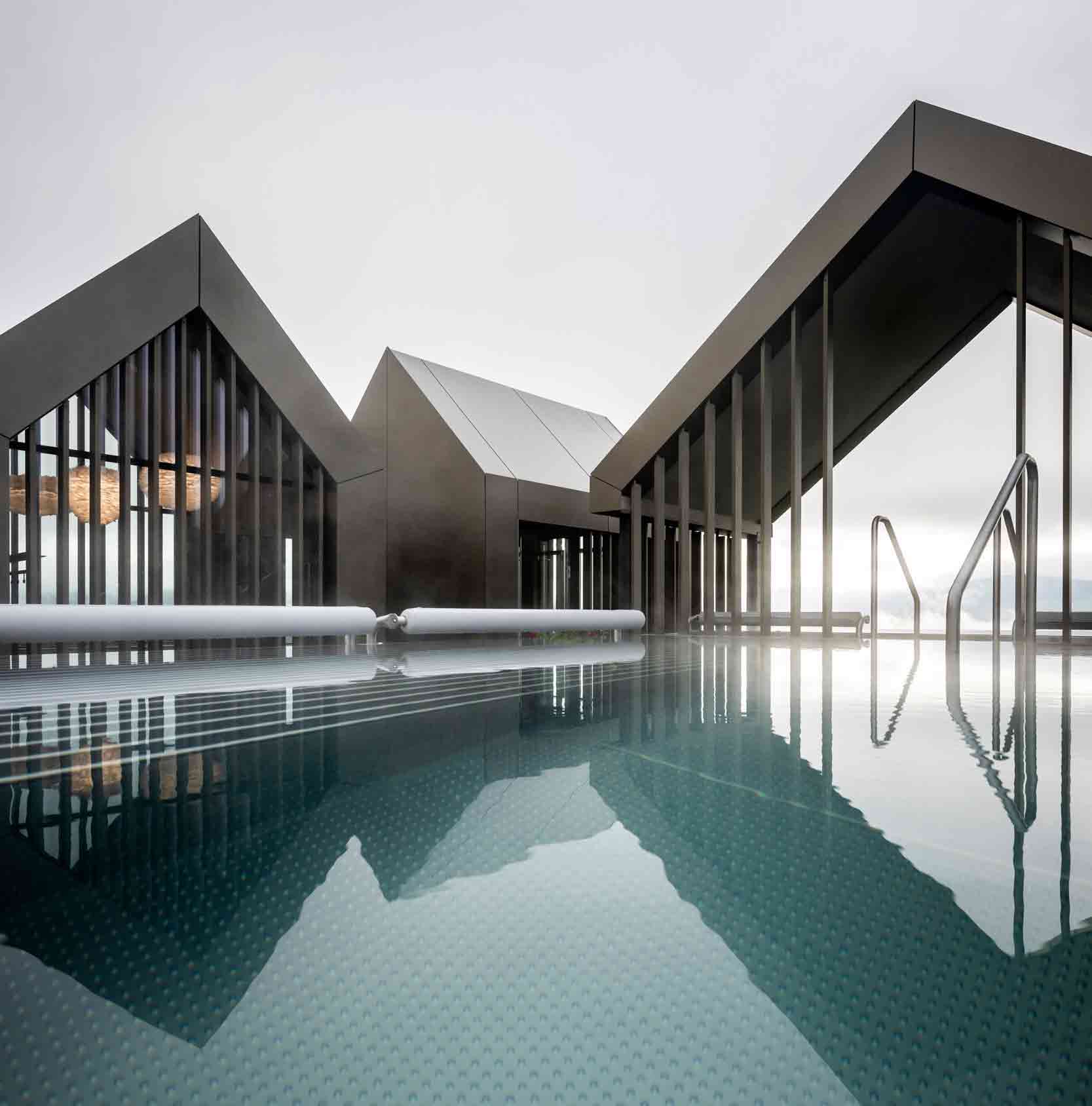
At first glance, this wellness complex manifests as a floating village, reflected in a covert mirror line in the clouds. Looming in mid-air, the extraordinary cantilevering structure subverts perception. The project was envisaged as a traditional Italian hamlet in the mountains, pared back to its simplest gabled form — and turned on its head. These simplistic silhouettes conjure up childlike notions of shelter and protection, though their purpose is two-fold.

While the open upper-level cabins house two jacuzzis, outdoor showers and a changing room, the inverted lower level hides the swimming pool’s water purification system and the sauna’s tiered seating, along with other amenities. The complex is fantastical in appearance, yet the cabins’ light brown aluminum panels channel the hues of the surrounding valley. It’s at once a masterpiece forged in the mountains and a product of an otherworldly realm. Here, the humble vernacular form has been elevated to dazzling new heights.

The latest edition of “Architizer: The World’s Best Architecture” — a stunning, hardbound book celebrating the most inspiring contemporary architecture from around the globe — is now available. Order your copy today.  

Reference

Bread counter at Pan cafe
CategoriesInterior Design

Studio Wok designs bakery Pan as contemporary take on Japanese culture

Bread counter at Pan cafe

Architecture practice Studio Wok has created a matcha-green counter and Japanese-style fabric panels for bakery and wine bar Pan in Milan’s Acquabella district.

The studio created the eatery, which is led by Japanese chefs Yoji Tokuyoshi and Alice Yamada, to have an interior that would represent a meeting between Japan and Milan.

“There are references to Japanese culture, non-literal and far from stereotypes,” Studio Wok said. “The intention was for a deeper understanding, working on the concept of quality, both in materials and in details.”

Bread counter at Pan cafe
A fibreglass counter sits at the centre of the bakery

A central bread counter is the “protagonist piece” in Pan’s interior design.

The counter was constructed from panels of fibreglass grid and its eye-catching colour was informed by the vivid green of matcha, an ingredient widely used in Pan’s food, the studio said.

Fibreglass was also used to create an external bench, linking the bakery with the wider neighbourhood.

Fibreglass bench outside Milan bakery
Fibreglass was also used for an external bench

“We did a lot of research looking for a ‘poor’ material that could be ennobled by being used in an innovative way,” Studio Wok told Dezeen.

“Fiberglass grating is a material used in industry but little used in interiors and it seemed perfect to us.”

Ceiling fins in Pan cafe
Fabric hangs from the ceiling

The green of the fibreglass is echoed in vertical fins of hanging fabric that define the ceiling, creating a dialogue between hard and soft elements within the space.

These suspended sheets of fabric are a contemporary update of the traditional Japanese design element of ‘noren’, meaning curtains or hanging divider panels.

Ceiling inside Pan bakery
Wooden seats have views of the street

“The ceiling sheets have the main function of creating a three-dimensional covering to make the environment more welcoming and also to work from an acoustic point of view,” the studio said.

“They create a suspended three-dimensional world, both continuous and ephemeral. Furthermore, they dialogue with natural light during the day and with artificial light in the evening.”

Bathroom sink by Studio Wok
The bathroom has a decorative stone sink

In the bathroom, the green theme continues with a wall and sliding door featuring translucent panels of pressed cellulose, which have been fixed onto a wooden grid frame.

“We were looking for a translucent material to allow natural light to pass through the anteroom. It also reminded us of the rice paper walls, typical of Japan,” Studio Wok said.

The effect of these materials is to create “a green monochromatic box from which the monolithic element of the sink emerges,” Studio Wok said.

The sink was made of a grey-tinted natural stone called Moltrasio.

In the main space, light grey walls and floors in hand-trowelled cementitious resin amplify the sense of light, while chestnut was used in both its pale natural form and stained black across integrated and freestanding furniture.

Interior of Pan, Milan
Black-stained chestnut was used for the bar area

The bar area has a more serious, less playful atmosphere, informed by the black-stained chestnut wood of the counter and cabinetry.

Here, a rough-hewn natural stone boulder serves as a water counter, introducing a freeform, sculptural element to the space.

Bar at Pan in Milan
Studio Wok designed the bakery and wine bar with references to Japan

To anchor the space in the local neighbourhood, Studio Wok designed large windows with pale chestnut frames that open the bakery up towards the street.

Seating in the window areas “project the interiors of the venue outwards, creating a hybrid threshold space between the domestic and the urban,” the studio said.

“Our vision for the material palette at Pan was to seek a balance between elements with a contemporary and industrial flavour, with others that are more natural and timeless,” said Studio Wok.

“It’s a celebration of Japan and its dualism between innovation and wabi-sabi spirit.”

Studio Wok has previously designed a cavernous pizza restaurant and transformed a barn into a country home.

The photography is by Simone Bossi.

Reference

Made in Mexico: 6 Captivating Contemporary Concrete Constructions
CategoriesArchitecture

Made in Mexico: 6 Captivating Contemporary Concrete Constructions

Made in Mexico: 6 Captivating Contemporary Concrete Constructions

Architects: Want to have your project featured? Showcase your work through Architizer and sign up for our inspirational newsletter. 

Mexican uses of concrete span thousands of years, stretching as far back as the Aztecs to the present day. It is no surprise then that the country has a rich culture of architectural styles that incorporate the age-old material; whether through a deep understanding of cement’s varied textures and patterns or a knowledge of how cement interacts with the country’s diverse climactic conditions, which range from lush vegetation to arid deserts.

Mexico’s concrete architecture is as varied as the country’s geography. The recent projects below illustrate how architects are drawing from this rich natural and historical heritage to create unique styles of concrete construction.


Casa Candelaria

By Cherem Arquitectos, Mexico

Popular Choice Winner, 2020 A+Awards, Private House (XL > 5000 sq ft)

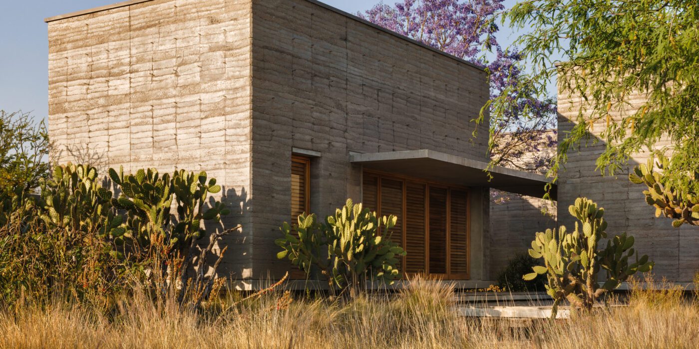
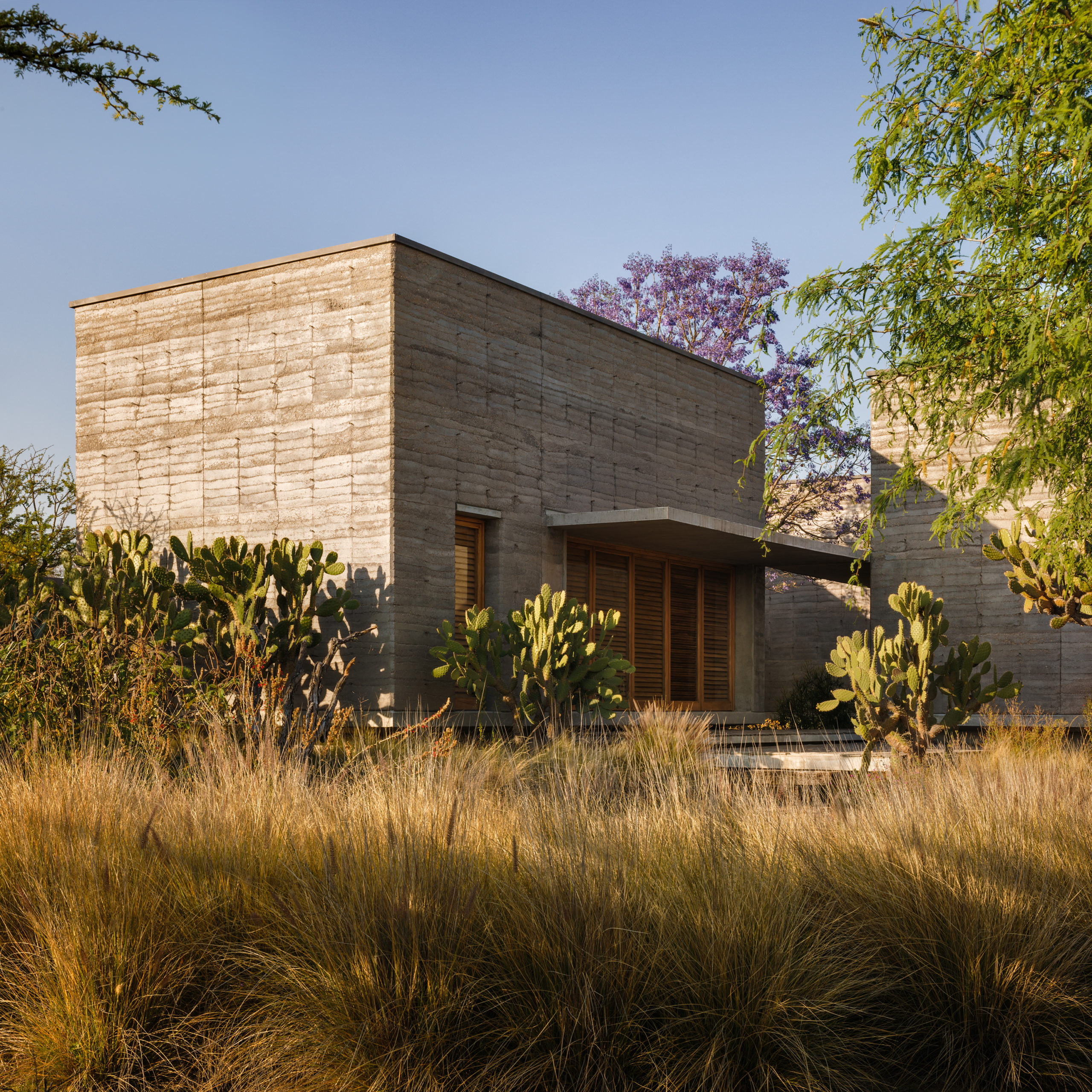
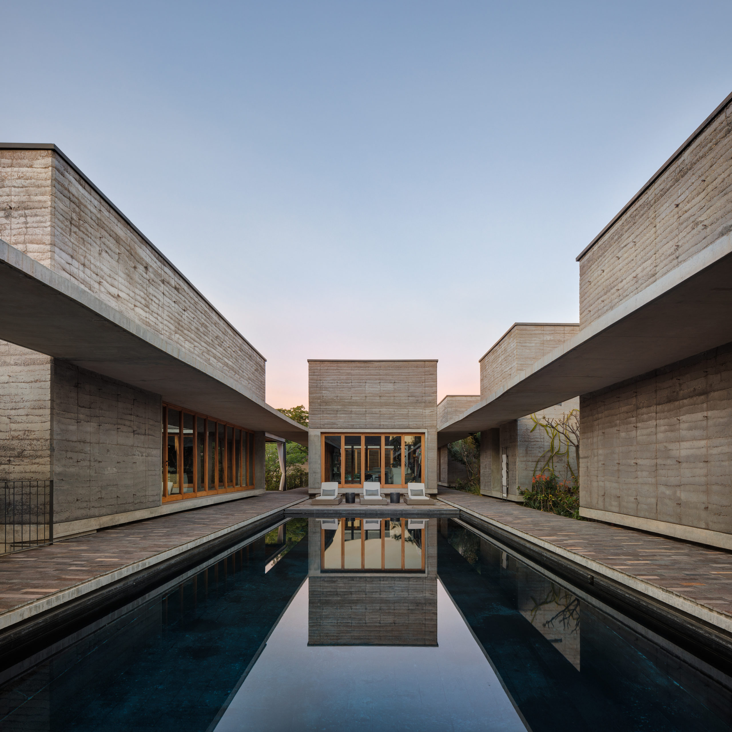
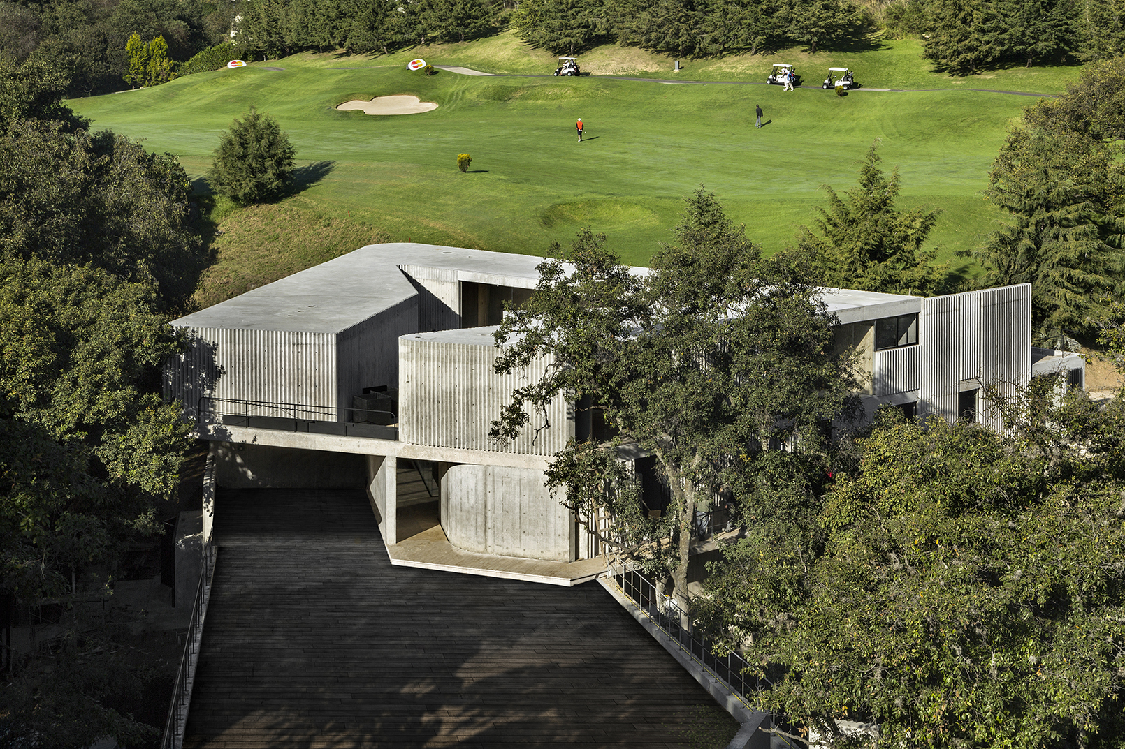
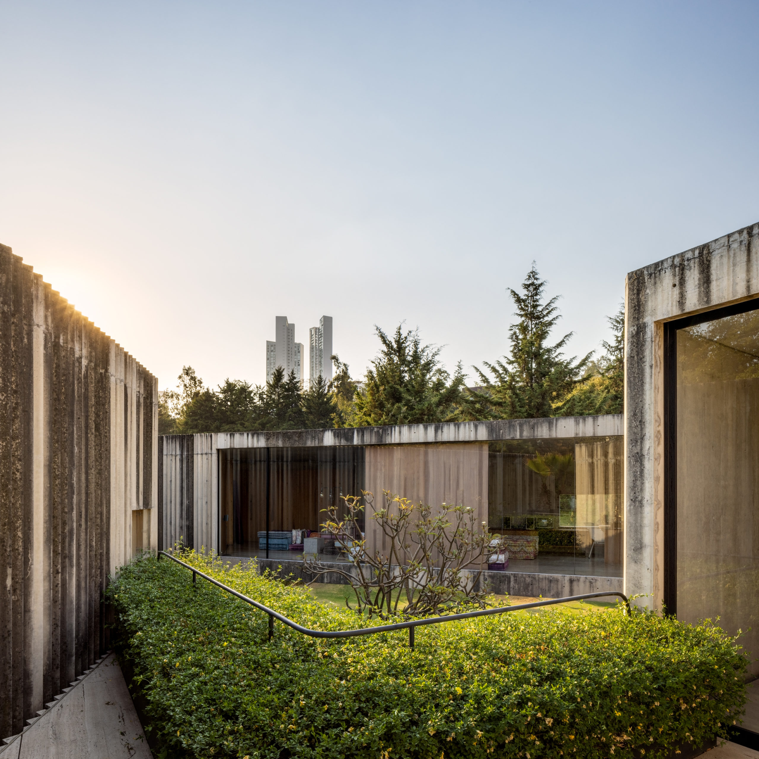
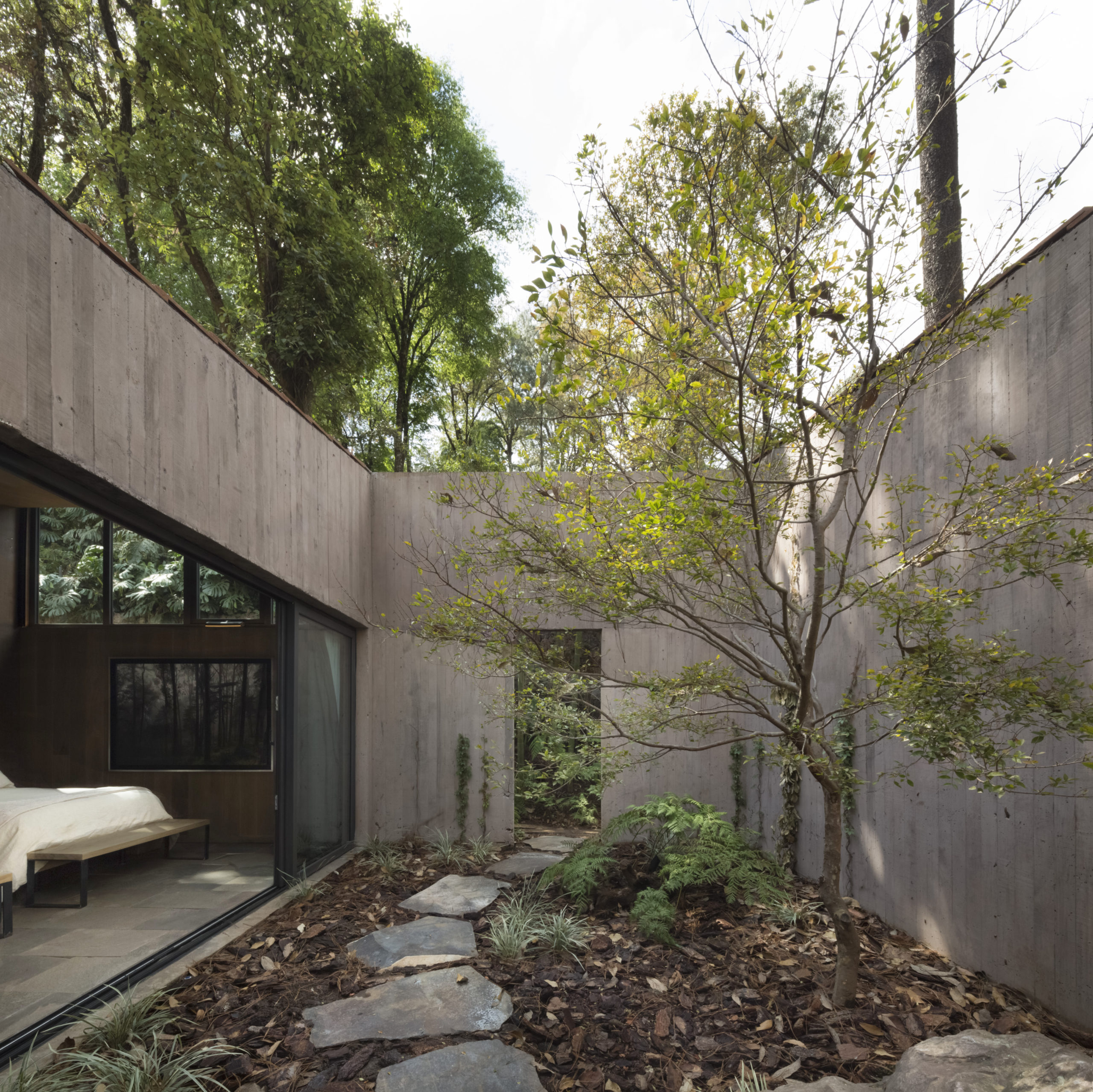
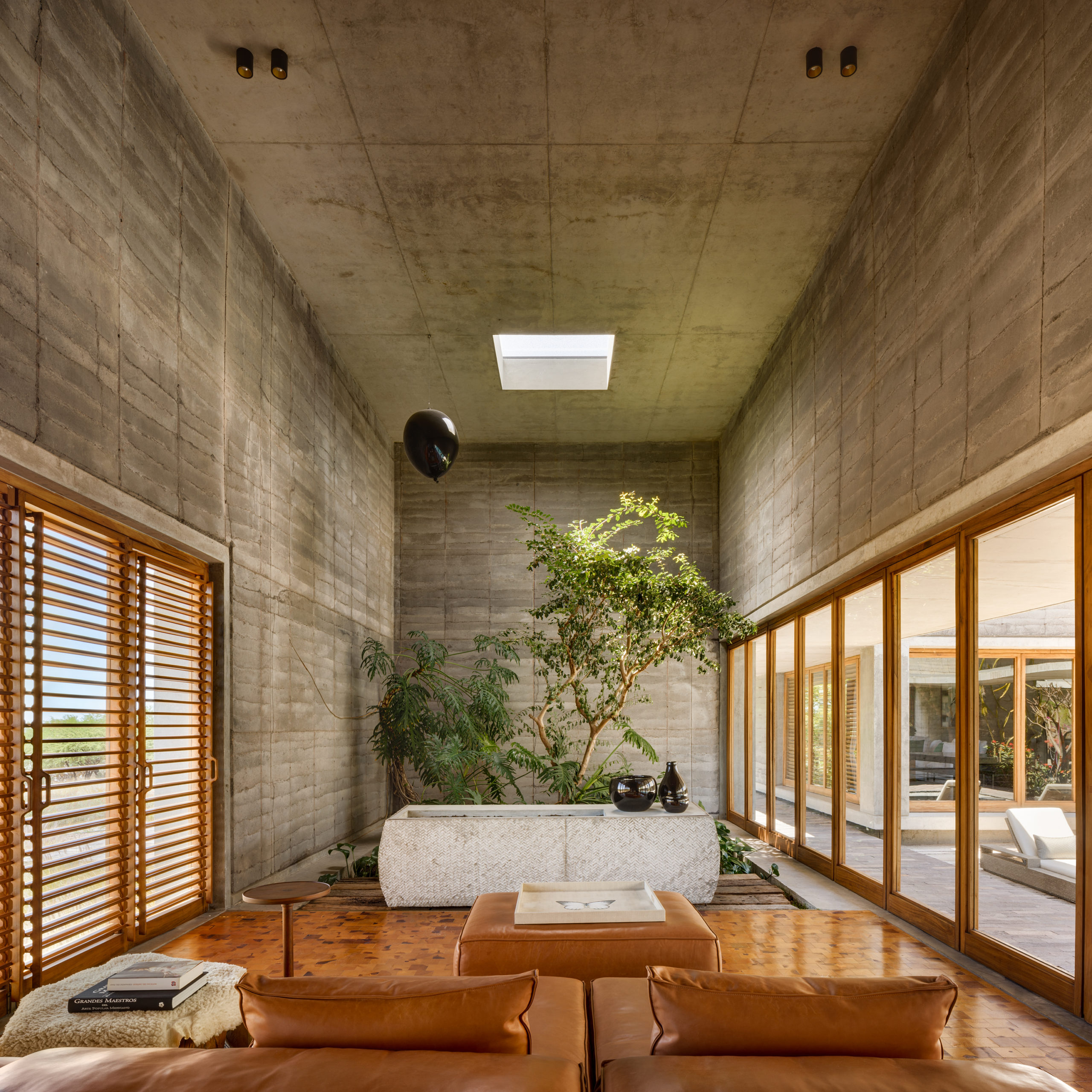
This multi-residential project by Cherem Arquitectos on the outskirts of Mexico City is the contemporary equivalent of the traditional Mexican Hacienda. The project consists of a dozen flat roofed buildings interspersed by three main courtyards and large, lush gardens. Inside, the firm aimed to create a strong contrast between the large paneled concrete walls and the natural light entering from skylights. This is accentuated by the rich display of plants and native artwork throughout, suggesting an artisanal quality to the houses’ rough concrete finishes.


House P

By Cherem Arquitectos, Mexico

Photos by Enrique Macias Martinez

This house ensconced among trees in the state of Mexico plays with theatricality in many ways. The open triangular shape of the house — appearing to be folded onto itself — opens onto a large, dramatic luminous courtyard overrun by bushes and stooping trees. For their part, the exterior walls are like concrete curtains framing the free-reigning nature. The overall result is a house which engages dynamically with its surrounding environment: a concrete canvas onto which nature can play a starring role.


Pabellón 3E

By TACO Taller de Arquitectura Contextual, Mérida, Mexico

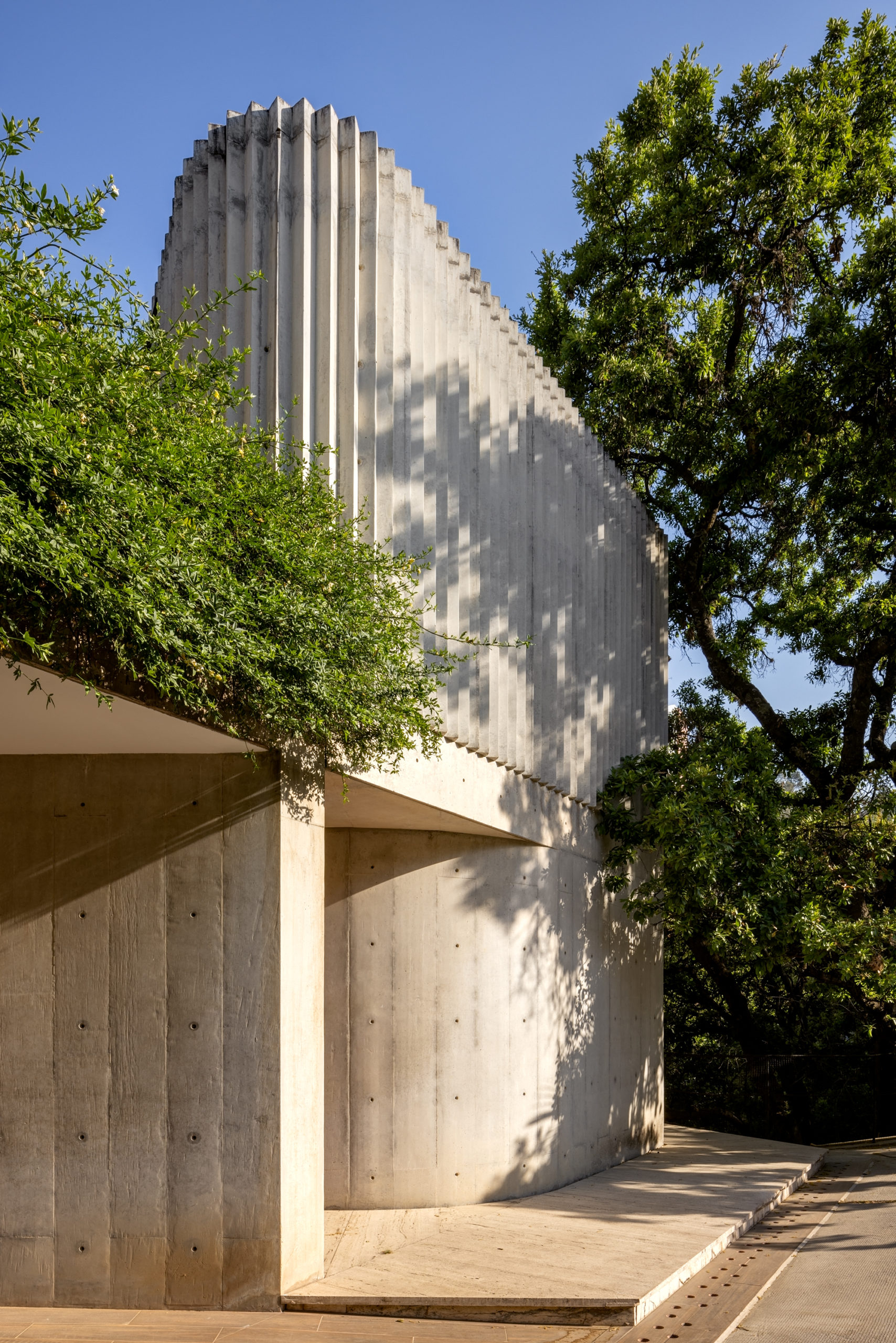
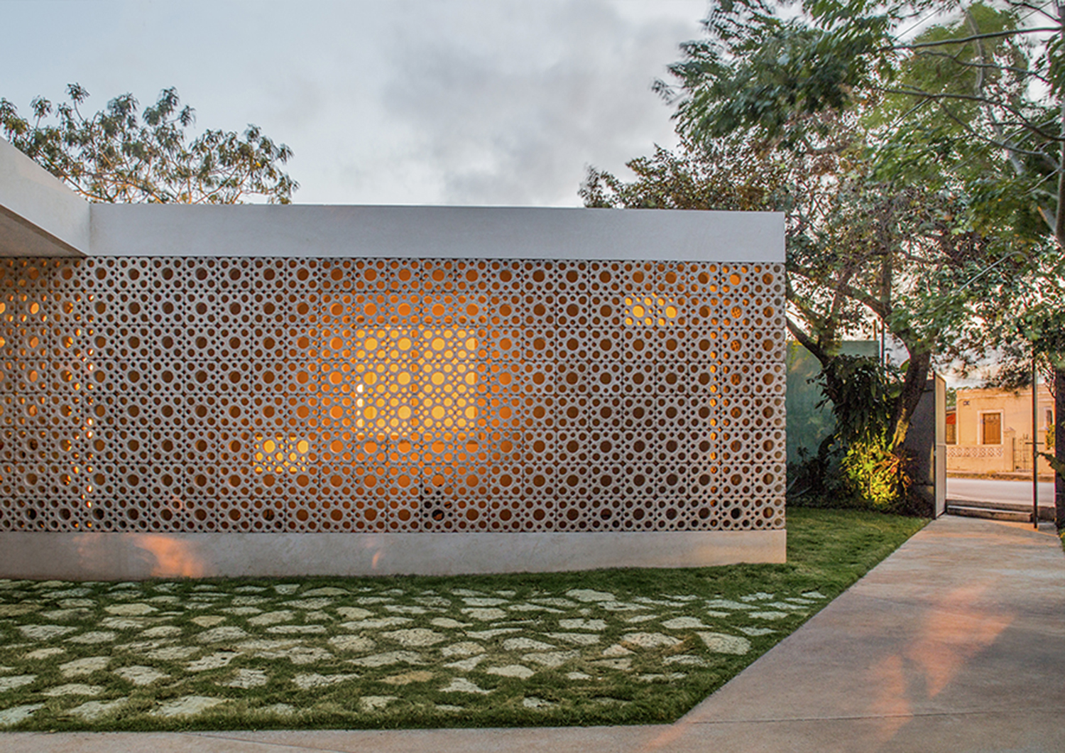
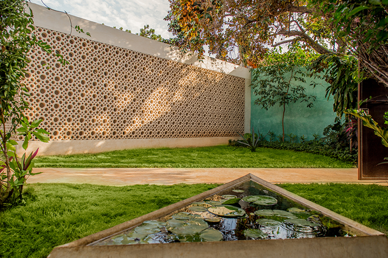
This 1960s suburban house in Mérida, Yucatán was recently renovated by TACO Taller de Arquitectura Contextual to accommodate the accessibility needs of the aging property owners. As part of the renovation, the firm gave a nod to the original era of the house with a new second skin: a lattice of compressed white cement made with discontinued molds from the sixties. The semi-permeable walls provide a new textured intermediary between interior and exterior, where both sunlight and interior light play in unique ways with the circular patterns.


L House

By Dellekamp Schleich, Mexico

Photos by Sandra Pereznieto

This L-shaped house goes to extreme lengths to preserve the pre-existing trees on the wooded lot by incorporating them quite literally into the building’s footprint. The house includes a series of small courtyards that interweave pre-existing vegetation and offer ample privacy for each section of the building. Meanwhile, the faded smooth paneled concrete quietly blends in with the house’s stone walls, adding to the house’s peaceful harmony with the surrounding forest.


Nuestro sueño

By Espacio 18 Arquitectura, Oaxaca, Mexico

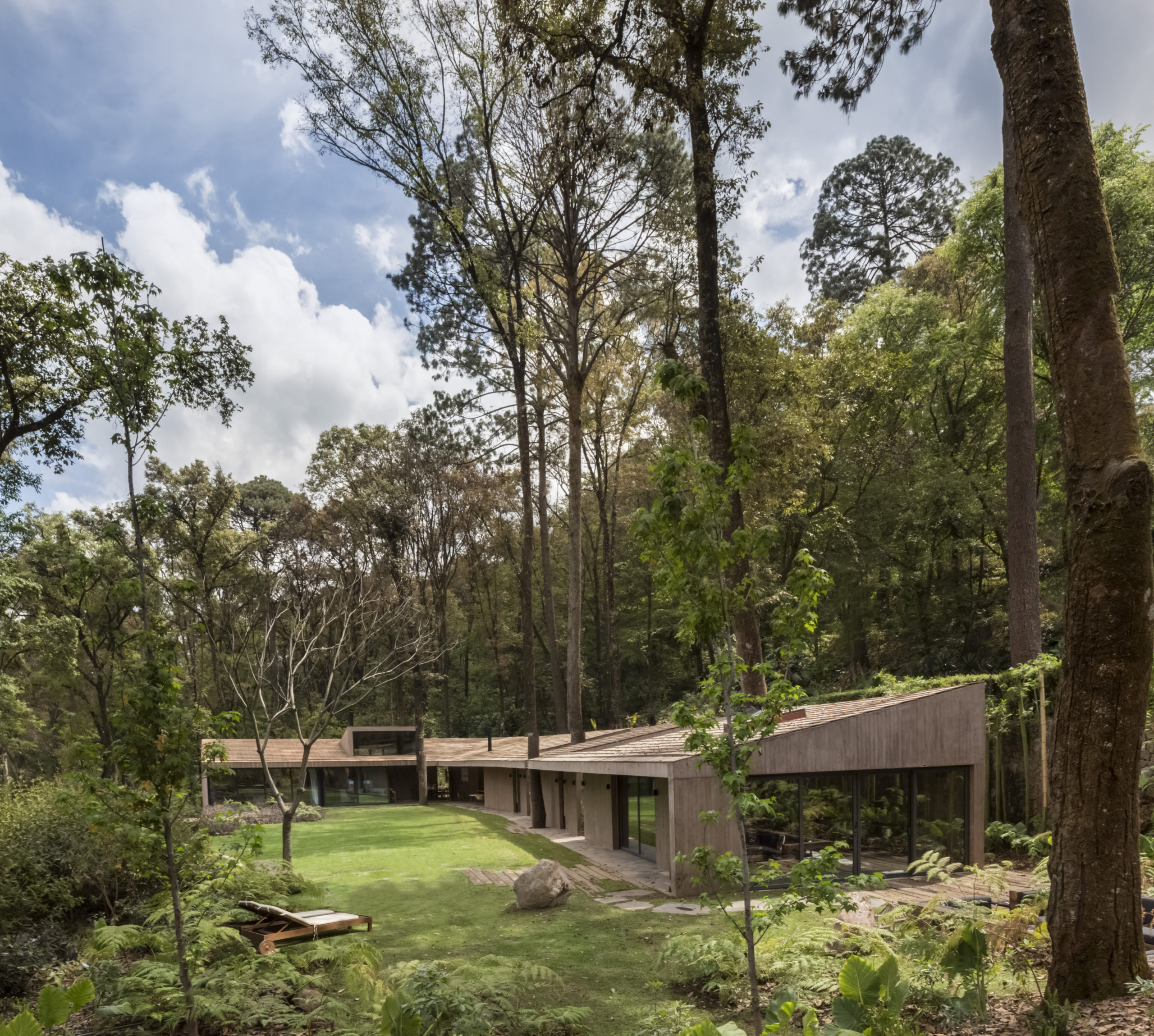
This new home designed for a retired couple on the outskirts of Oaxaca is what the firm Espacio 18 Arquitectura has described as “an oasis at the city limits”. The house is modeled like an old colonial house from downtown Oaxaca with a floorplan centered around the kitchen and the central patio, where the couple hopes to host numerous social events. Likewise, the architectural combination of smooth concrete, timber and bright red clay brick creates a warm, hospitable atmosphere in the house’s congregation spaces. No doubt the homeowners will be recurring dinner party hosts.


Casa Estudio

By Intersticial Arquitectura, Santiago de Querétaro, Mexico

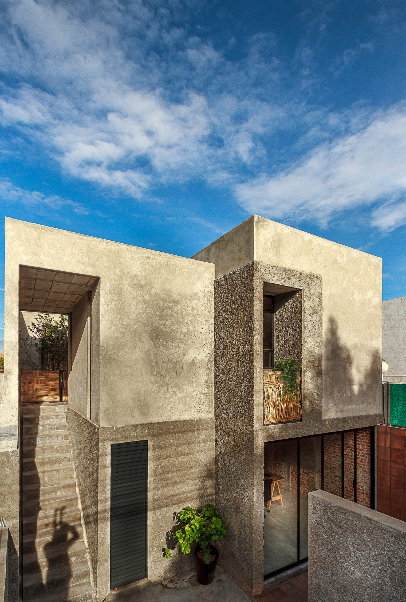
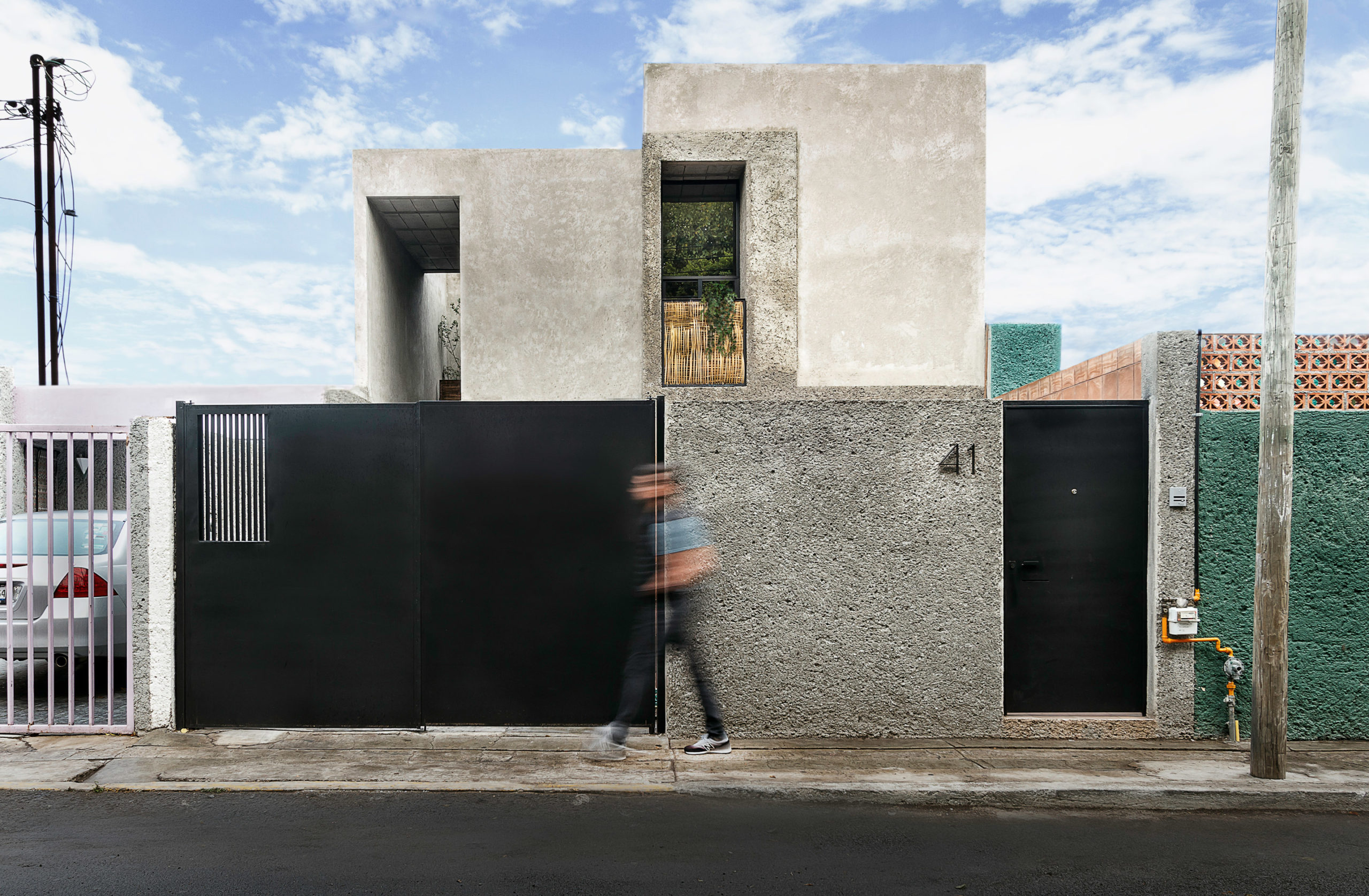
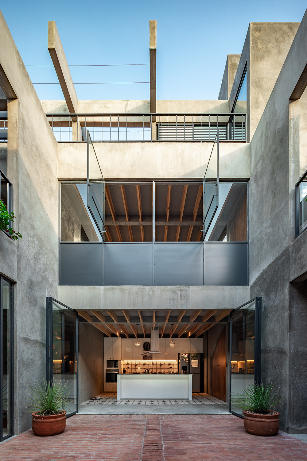
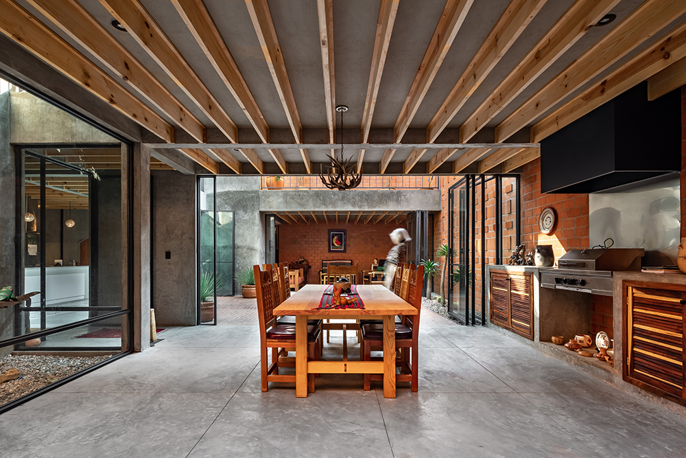
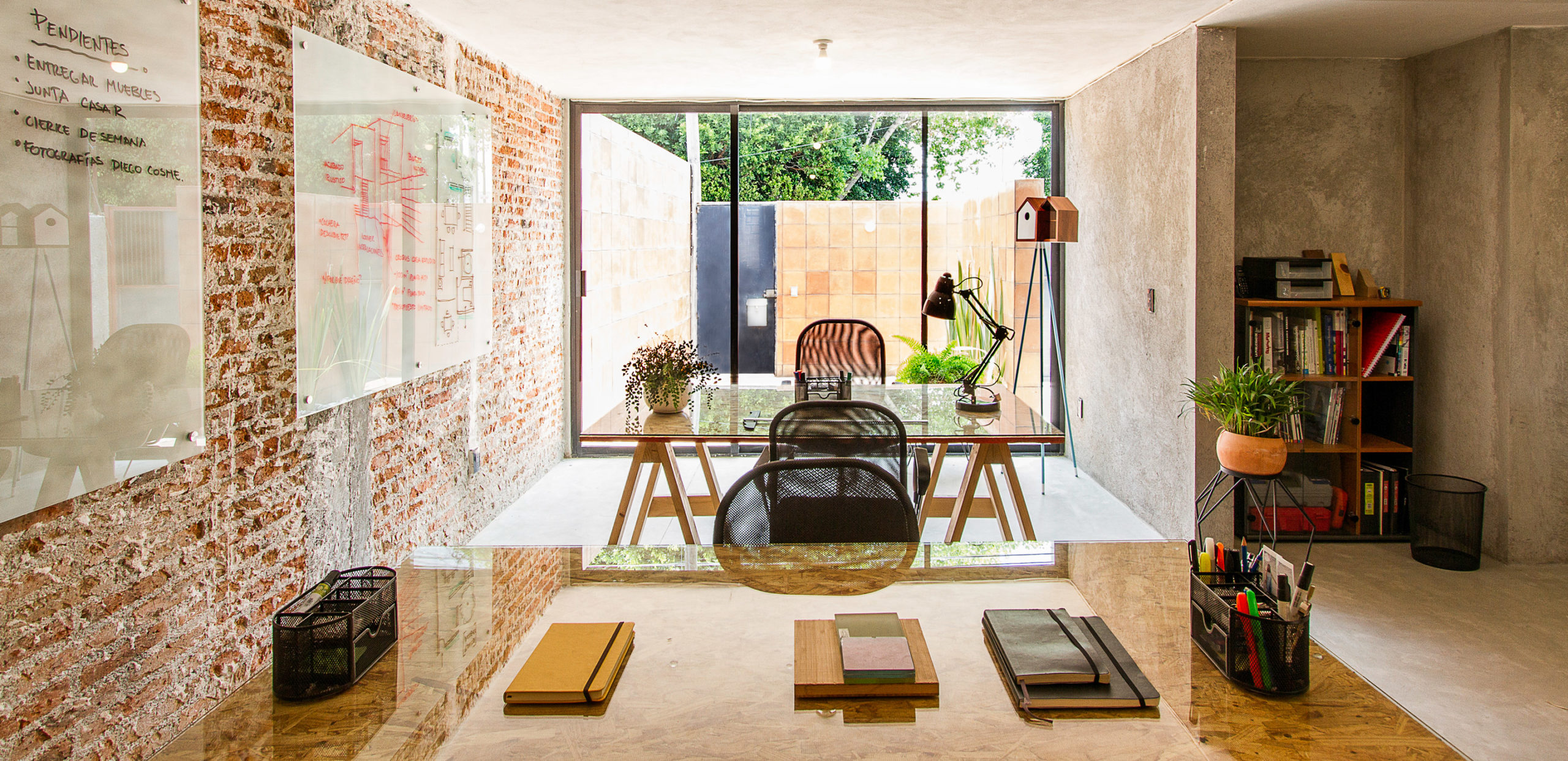
This modestly sized house located in an industrial neighborhood of Santiago de Querétaro manages to look rugged and hospitable at the same time. Intersticial Arquitectura undertook major renovations to this once deteriorating one-story concrete house, decluttering the space with the addition of a luminous and well-ventilated second floor. The renovation also combines rugged and smooth concrete sections for the new walls – a play of textures that pays homage to the local industrial heritage without losing the warm touch of the former building.

Architects: Want to have your project featured? Showcase your work through Architizer and sign up for our inspirational newsletter. 

Reference

Contemporary Vaults: 6 Modern Iterations of a Age-Old Architectural Classic
CategoriesArchitecture

Contemporary Vaults: 6 Modern Iterations of a Age-Old Architectural Classic

Contemporary Vaults: 6 Modern Iterations of a Age-Old Architectural Classic

Architects: Want to have your project featured? Showcase your work through Architizer and sign up for our inspirational newsletter. 

Vaults have existed in architecture for thousands of years. Essentially an extrusion of an arch along an axis, the structural value of the self-supporting form has made it a popular motif across typologies and around the world: from the construction of homes, religious buildings and more. Additionally, arches can be created using a variety of materials such as stone, brick, timber and even bamboo. Some examples of traditional vault forms include smooth barrel vaults, complex groin vaults, pointed arch vaults and decorative rib vaults, among others. These systems not only act as a structural framework but also help elevate plain ceilings. With each innovation in arch-building technology came new aesthetic styles and forms of architectural expression.

Yet, despite their versatility, vaults and domes remain widely associated with more traditional design styles or religious architecture. The projects below break away from the stereotype and show how these time-tested forms can be adapted to suit modern homes and public spaces.


Waffled Spaces

Bean to Bar Chocolatier by STUDIO TOGGLE, Salmiya, Kuwait

It was tricky to create brightness, storage and openness in a narrow, enclosed site. One solution, as showcased in the Bean to Bar Chocolatier store, introduces a waffle vault throughout the length of the space. A waffle vault can add dimension and interest to the ceiling without reducing the height in the way a false ceiling would. In this case, it can also extend to the floors and create room for display shelves. These pixels, which were sized based on the dimensions of the chocolate packaging, can be changed to create different patterns as and when needed. In other cases, waffle vaults such as this one can also be used to conceal lighting fixtures.


Organic Forms

Guyim Vault House by Nextoffice, Concept

While vaults are traditionally elements that prominently enhance the interiors, they can also be used to redefine form on the outside. Using vaults in a skeletal cuboidal framework restrains the geometry while also creating a contoured form that clearly defines spaces and gives the structure a strong identity. In Guyim Vault House, Nextoffice uses semi-vaulted structural elements to create mounds in the different levels of the home. The system creates a very unique structural network that makes way for unique spatial blocks inside. These vaulted forms intersect with each other to create both public and private zones. For example, three domes face each other on the first floor to create a semi-private quadrangle. Taking this a step further, the forms on the upper level open up to allow light to enter the home.


Pointed Patterns

New Preston Mosque by AIDIA STUDIO

The pointed arch, which is commonly associated with Gothic architecture, found its origins in Islamic and Indian architecture. These arches were used to create doorways and ornate windows in religious or important structures. The team at AIDIA STUDIO used this historical reference and gave it a contemporary twist to create this conceptual mosque. Using a pointed arch form to create a vault allows the form to span more considerable lengths with more stability. It also allows for bigger column-free floor spans. Here, the studio turned this element into a fractal pattern that gets repeated across different levels and scales throughout the mosque.


Geometric Ceilings

Vaulted House by vPPR Architects, London, United Kingdom

When curved ceilings don’t work with the overall design scheme, there is always an option to turn them into geometric arrangements that create a similar experience. This can be seen in Vaulted House by vPPR Architects. The roof of the entire home is divided into geometric vaults that coincide with the spatial distribution within the home. These sharp inclines completely mask the huge steel beams that are used to hold them up. The vaults are also capped with skylights to maximize the amount of natural light entering the home. To broaden the scope of this design, this trapezoidal geometry is further expanded to multiple objects around the house including the fireplace, windows, floors and the entrance.


Bamboo Lattice

Naman Retreat Conference Hall by Vo Trong Nghia Architects, Ngũ Hành Sơn, Vietnam | Images by Hiroyuki Oki

A way of adapting the vault form for tropical regions is constructing it using locally-acquired materials such as bamboo. The flexibility of bamboo stems allows them to be bent and bundled together to create a sturdy framework that can hold up a large column-free roof. In Naman Retreat Conference Hall, two types of bamboo are used to create the central hall and an adjoining vaulted corridor. The enclosed hall spans about 44 feet and goes as high as 31 feet. A large glass plane is placed three arches in to create an arched canopy outside. These curved frames are prefabricated on ground to ensure quick and easy assembly, while being very affordable and offering more control.


Asymmetrical Systems

FaBRICKate by ADAPt, Isfahan, Iran | Images by Soroosh

Modern fabrication methods and materials have expanded the possibilities of buildable forms and architectures. And so, while it was often taken as a given that vaults were symmetrical structures in the past, architects are now exploring new ways of looking at them by using manual and digital technologies. FaBRICKate is an experimental free-form compression-only vault system that reverses the mechanism used by the tension-dependent catenary form. Using different 3D modeling plugins, the team devised this asymmetrical form and used a waffle structure combining a grid mesh and steel rods to construct it. This reinterpretation of the classic vault opens up new ways of carving spaces that are transcendental and unique.

Architects: Want to have your project featured? Showcase your work through Architizer and sign up for our inspirational newsletter. 

Reference

Digital technology and a floating museum bring contemporary art and culture to the people
CategoriesSustainable News

Digital technology and a floating museum bring contemporary art and culture to the people

Digital technology and a floating museum bring contemporary art and culture to the people

Spotted: The impact of digital technologies on the world of art has been nothing short of transformative. From online platforms that make it easier for amateur artists to connect with their audience, to virtual tours that allow us to experience historical works up close, technology has completely redefined how we interact with, understand, and appreciate art in all its forms.

Perhaps no organisation embodies this shift better than Art Explora, a cutting-edge initiative that is shaking up the art world by making contemporary art accessible to everyone. The French foundation was created in November 2019 by entrepreneur Frédéric Jousset. Its mission is to reduce the cultural divide by bringing works of art to new, large, and diverse audiences.

Art Explora has developed a groundbreaking digital art history platform in collaboration with Sorbonne Université. This cutting-edge platform is designed to be accessible to users around the globe and offers intuitive interfaces that make it easy for anyone to explore art from all periods and styles. Through its unique journeys of discovery—which range from ancient Egyptian art to contemporary works—users of Art Explora are able to explore a wide variety of artistic styles and techniques in an engaging and interactive way. And by testing their knowledge through a series of quizzes and challenges, users can earn a valuable certificate that shows their level of expertise.

Another recent initiative from Art Explora is a new mobile museum, which has been christened the ‘MuMo’ and is a joint effort between Art Explora, the Centre Pompidou, and the MuMo Foundation. The truck will tour France in 2022 and Europe in 2023, bringing two themed annual exhibitions to each location. The exhibitions will be curated from the collections of the Centre Pompidou, as well as from other major European institutions. The MuMo will also host educational programs and workshops for children and adults alike. This unique opportunity to experience art from around the world will be an invaluable addition to the cultural landscape.

Art Explora also plans to bring art to the waves by converting one of the world’s largest catamarans into a mobile digital art museum. The floating museum is due to set sail from Marseille for various locations in the Mediterranean basin in September 2023.

Other Art Explora initiatives include the installation of ‘short story dispensers’ at the Armand Trousseau Children’s Hospital, and a residency programme enabling artists and researchers to carry out research and creation work in the heart of one of the most iconic and vibrant districts of Paris.

Other recent art and culture innovations spotted by Springwise include an online storytelling platform for female and under-represented filmmakers, an AR art exhibition embedded in the London landscape, and remote art tours via robots.

Written By: Katrina Lane

Website: artexplora.org

Contact: artexplora.org/en/contact

Reference

8 Contemporary Ways to Resurrect Art Deco Glamor
CategoriesArchitecture

8 Contemporary Ways to Resurrect Art Deco Glamor

8 Contemporary Ways to Resurrect Art Deco Glamor

Browse the Architizer Jobs Board and apply for architecture and design positions at some of the world’s best firms. Click here to sign up for our Jobs Newsletter.

Art Deco, which is short for Arts Décoratifs, emerged as a design style in France just before World War I and predated the more minimal and functional Mid Century design. Characterized by bold sleek forms, geometric patterns, reflective finishes, metallic and inlaid wood embellishments as well as luxurious materials, the aesthetic later gained popularity in the 1920s and 1930s, where it was showcased across architecture, interiors, fashion, automobiles and more.

The style married high-quality opulence and dramatic simplicity while also paying homage to technological advancements and mass manufacturing. In addition to Cubism and Viennese Succession, Art Deco also draws inspiration from cultures across India, China, Egypt and Mesopotamia. For many in North America, it is epitomized by icons like the Chrysler and Empire State buildings, completed when America was on the brink of the Great Depression. When America emerged from the crisis, the world had changed and so had aesthetic preferences. Today, we’re exploring how 21st century architects and designers are reviving Art Deco sensibilities and adapting them for the contemporary era.

San George by Framework Studio, Amsterdam, Netherlands

Chevrons and starbursts were some of the most defining elements of the Art Deco style. These patterns can be used in walls, furniture and even floors. Statement zig-zag floors in a high-gloss black and white pattern create a neutral base to place colorful furniture while also adding a stylistic layer to the design. In the San George restaurant, the bold floors come together with bright turquoise and rich emerald tones to create a retro aesthetic without it being too overwhelming.

Restroom in Art Deco Style by Futuris Architects, Yerevan, Armenia

Gold is an easy way to bring in the glamour of the roaring 20s. Instead of large metallic furniture pieces, the color can be introduced in a subtle way by using it in the edges or outlines of décor and furniture pieces, molding, lighting or handles. In this restroom, the studio added oblong mirrors with gilded frames and then reinforced this design language with gold-finished lights and matching accessories. The dark tones of the walls and furniture also help the metal stand out more.

Jazz Billet by Envisage, Gurugram, India

Starburst, solar forms, and stepped patterns are other characteristic elements from this era. These geometric forms were often used in wallpapers, moldings, mirrors and even building exteriors. An Art Deco-style apartment in India showcases these patterns in the form of wall paneling. A dramatic living room wall arrangement is achieved by staggering curved and flat panels of different lengths with recessed light fixtures.

Death & Company Los Angeles by AAmp Studio, Los Angeles, California

Jewel tones have long been associated with wealth and grandeur. Deep shades of red, green, navy or purple can either act as a backdrop or be used in furniture as accents. In Death & Company Los Angeles, these rich hues create a moody atmosphere that is part nostalgic but also contemporary. These colors are juxtaposed with dark wooden panels, light natural stone, metallic accents and floors with geometric tiles.

Beau Cloud Mansion / The Cascade by Bean Buro, Hong Kong Island, Hong Kong

Taking inspiration from the automobiles and ocean liners in that era, curvilinear forms and clean lines also became a part of the style in the 1930s. The Bean Cloud Mansion / The Cascade does the same in a modern way. Corners, wall edges and furniture profiles have all been given smooth edges or curved profiles. This is even replicated in cabinet doors and wall dividers. The curved lines are also incorporated at a smaller scale by adding fluting to the dining table.

Santomate by Daniela Bucio Sistos // Taller de Arquitectura y Diseño, Morelia, Mexico

Art Deco is the epitome of making a statement, and lighting can be a big part of this. Illuminators with sleek or geometric forms can easily spruce up simple spaces. This is exhibited in the design of Santome — a restaurant and bar in Morelia Mexico. Globe lights attached to oblong profiles are suspended in a row over the bar. The setup also comprises recessed lighting in the same warm hue to create a halo effect.

Project 1874: Photorealistic 3D Rendering Restaurant by Yantram Architectural Design Studio, Rio Rancho, New Mexico

In addition to floors or walls, patterns can also be introduced on the ceiling. In a conceptual design for a restaurant in New Mexico, the firm used a striped pattern in green and ivory to decorate the ceiling. The Art Deco theme is further reinforced with the addition of geometric starburst lights.

5550 Wilshire by TCA Architects, Los Angeles, California

The style manifests in different forms for the exteriors as well. The most iconic Art Deco buildings across the world often mimic lines and forms of old ocean liners. Curved edges, flat roofs, bands of windows, circular openings, horizontal bands, ship railings and ziggurat-shaped decorations are just a few examples. The 5550 Wilshire is a building that encapsulates this style masterfully. The horizontal mass of the structure is further broken up with vertical divisions to create the illusion of height.

Browse the Architizer Jobs Board and apply for architecture and design positions at some of the world’s best firms. Click here to sign up for our Jobs Newsletter.

Reference