Daytrip channels Margate beach in revamped Turner Contemporary store
CategoriesInterior Design

Daytrip channels Margate beach in revamped Turner Contemporary store

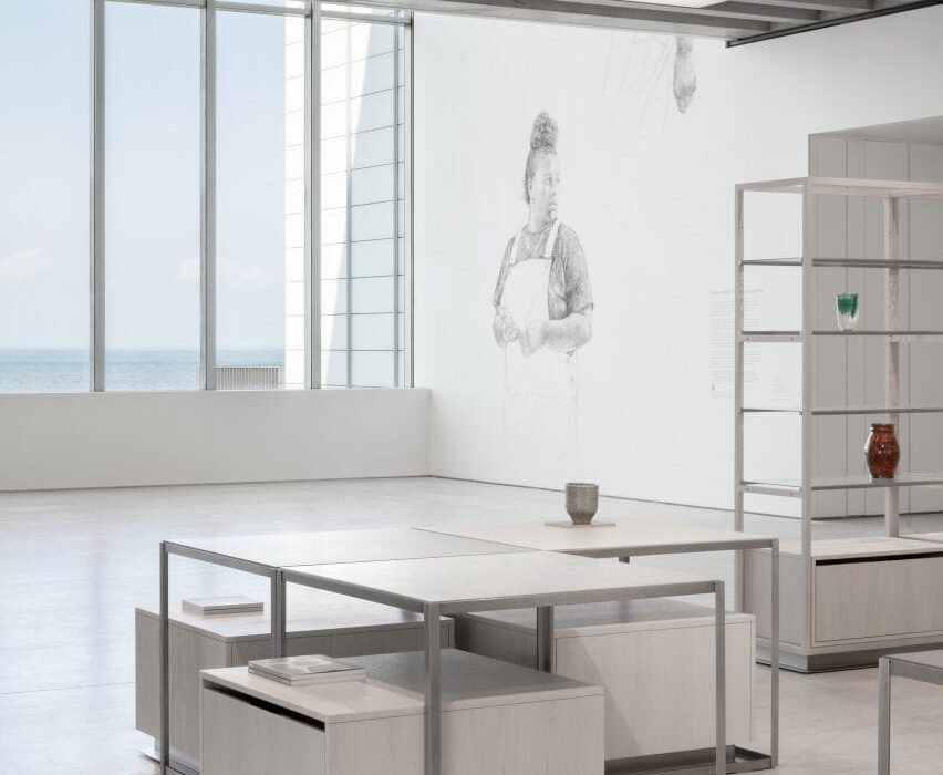
Design studio Daytrip looked to Margate’s dramatic beach landscape when designing this shop for the Turner Contemporary gallery, which sits perched on the town’s seafront.


The David Chipperfield-designed gallery, distinguished by its opaque glass shell and expansive ocean views, recently reopened after a renovation project that included the shop along with a new cafe and common areas.
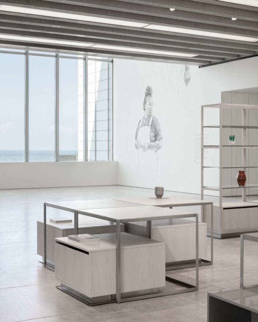
Store with panoramic view of ocean and vases on display shelves in interior designed by Daytrip
The revamped Turner Contemporary store looks out over Margate beach (top and above)

Located in the lobby, the shop’s existing retail shell was designed to be highly flexible and to reflect the building’s gallery spaces, with poured screed flooring, linear glazing and a prominent ribbed concrete ceiling.

Daytrip designed a new fit-out for the store that reflects both the building’s architecture and the lifelong admiration that the gallery’s namesake, landscape painter JMW Turner, held for Margate and its surrounding landscape in southern England.
Interior of Turner Contemporary
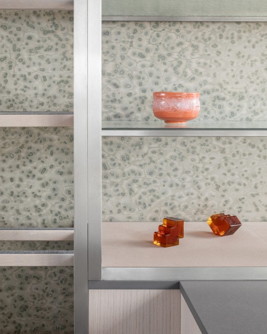
Pigment-dyed timber panels were inspired by Margate beach

“As we began putting materials together for the scheme, we wanted to capture the light and patterning of the beach,” Daytrip studio co-founder Iwan Halstead told Dezeen.

“Margate beach and its seafront changes dramatically from season to season. As the tide pushes out, the beaches transform into radical landscapes of striation and patterning,” he added.

“On a sunny day, the rippled beaches are captured with shadows and glistening pools of water. We also noticed the effect of the salt spray and rainwater on the metal architectural elements – a dappled weathering effect that adds natural patina and cloudy lustre to the exterior.”
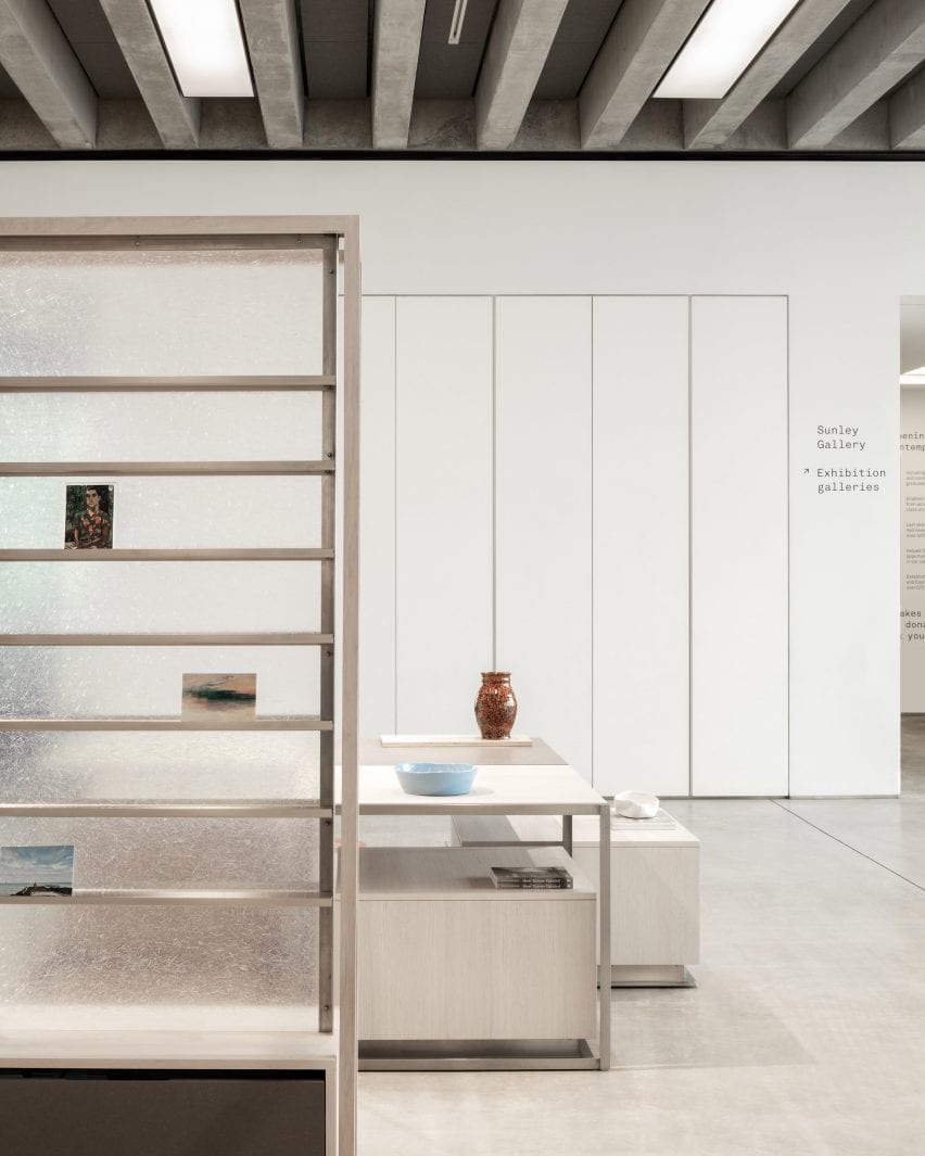
Magazine display and low tables with vases in Turner Contemporary Store
Display stands are backed with clear, textured fibreglass

This natural texture is referenced in the mottled grey veneer panels that line a portion of the walls.

Their unique, painterly pattern was created using a method developed by Berlin studio Llot llov, which involves covering pigment-dyed timber with salt crystals that absorb a portion of the colour.

“It felt naturally appropriate and subtle enough to line the display wall of the gallery and a number of the tables’ surfaces,” said Halstead.

“We paired this with textured cathedral glass shelving, chosen for its fluid, water-like appearance that allows light to transfer dappled shadowing on the veneered surfaces and the existing Chipperfield concrete floor.”
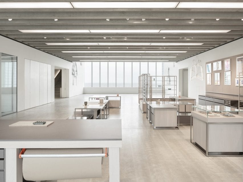
Overview of shop interior by Daytrip with simple grey display tables
All of the elements in the store can be moved to make space for events

A vertical shelving system, which showcases artworks, prints and posters, is backed with a translucent layer of fibreglass.

“Its inherent gossamer nature when illuminated by the sunlight creates beautiful patterning and highlights its fibrous textures – cloudy and ethereal – like many of JMW Turner’s artworks,” Halstead explained.

The store’s furniture was constructed from “humble” materials such as grey Valchromat – a wood fibreboard that is treated with several coats of lacquer to create a high, reflective sheen. This is paired with matt, white-oiled oak, which the studio chose for its sandy hue.
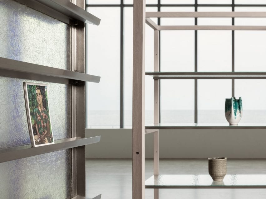
Fibreglass-backed shelf displaying artwork in Turner Contemporary Store
Rippled glass shelves reflect the light streaming in through the panoramic windows

Daytrip’s renovation also includes the creation of a merchandising system based on the approach of a magazine editorial.

The display tables and plinths can be organised into formations that create narratives with and around the products, linking back to Margate’s wider creative community and its makers.
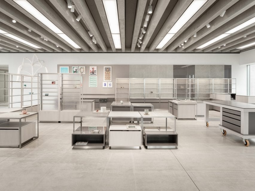
Shop interior by Daytrip with low display tables and a row of shelves
The building’s ribbed concrete ceiling is left exposed

The display system also includes a workbench that is used for group discussions and workshops and invites visitors to congregate. All of the fixtures can be moved to accommodate large-scale events and talks.

Previously, Daytrip has created an eclectic office for a media company in London’s Clerkenwell and renovated a five-storey townhouse in Clapton.

Photography is by Ståle Eriksen.


Reference

10 contemporary living rooms with calm interiors
CategoriesInterior Design

10 contemporary living rooms with calm interiors

In our latest Dezeen Lookbook, we’ve rounded up 10 living rooms with calm, relaxing interiors, including rooms with soothing colours and natural materials that create a peaceful environment.


This is the latest roundup in a series providing visual inspiration for the home. Previous articles in the series showcased peaceful bedrooms, dining rooms in American homes, and kitchens and domestic bathrooms designed by architects.


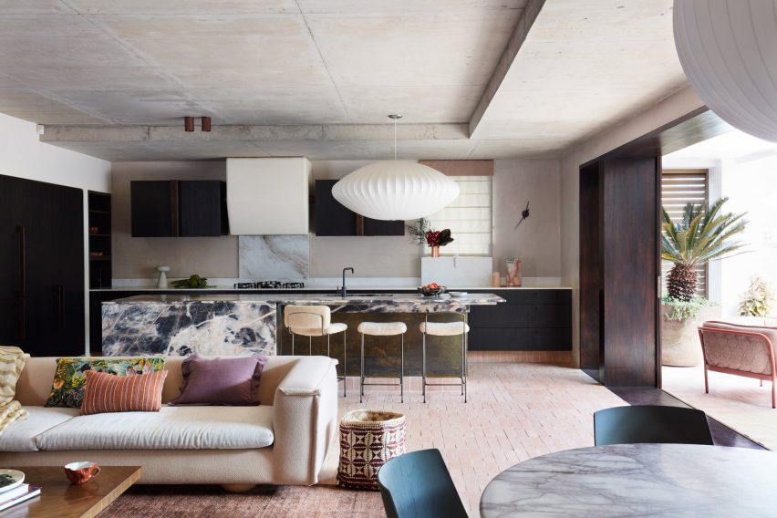
Living room in Budge over Dover house

Budge Over Dover house, Australia, by YSG

Interior design studio YSG opened up the kitchen and living room into one large, open-plan space that connects to the garden to create a “fluid” sense of space in the Budge Over Dover House in Sydney.

The studio used warm, deep colours to create a sense of calm, including dark wood detailing and aubergine hues. Marble surfaces add a luxury touch and look intriguing next to the simple brick floor.

Find out more about Budge Over Dover house ›


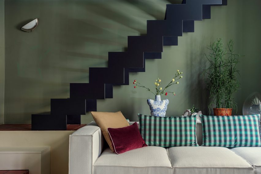
Living room in Esperinos guesthouse in Greece

Esperinos Guesthouse, Greece, by Michael Stamos

Greek designer Michael Stamos used a moss-green colour for the living room walls in the Esperinos guesthouse in Greece. The colour gives the room a relaxing feel and picks up the green from the plants that are dotted around the space.

A nearby staircase has been painted black as a contrast, creating a moody atmosphere that’s contrasted by the colourful cushions on the large sofa.

Find out more about Esperinos Guesthouse ›


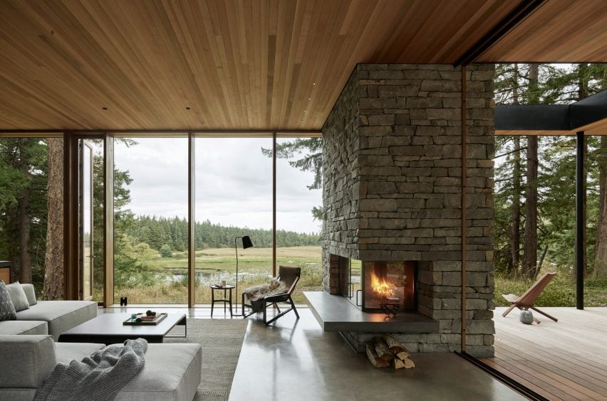
Living room of Whidbey Island

Whidbey Island Farm, USA, by MW Works

MW Works wisely designed Whidbey Island Farm to make the most of the surrounding nature, with large windows and a pared-back interior design that lets the view speak for itself.

Simple wooden furniture sits both inside the living room and on the connected terrace, while woven blankets and a furry throw adding a cosy touch. The open fire means the owners can enjoy the view of the surrounding forest in comfort even in the depths of winter.

Find out more about Whidbey Island Farm ›


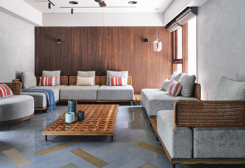
Living room of VS House, India, by Sãrãnsh

VS House, India, by Sãrãnsh

Architecture studio Sārānsh used local Kota tiles in the living room of the VS House in Ahmedabad to create a sense of tactility. The interior was kept minimalist, but the studio created interest by combining a range of different natural materials.

The discrete grey hues of the plush furniture cushions work well against the rattan armrests and wooden furniture bases, while a decorative wall in dark wood adds a refined touch.

Find out more about VS House ›


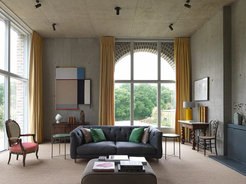
Living room in Nithurst farm by Adam Richards Architecture

Nithurst Farm, UK, by Adam Richards

Nithurst Farm might have been inspired by both Roman architecture and Soviet-era science fiction, but its living room has a more traditional look.

Architect Adam Richards, who designed Nithurst Farm as his own home, took advantage of the high, concrete ceilings as a calm background onto which he’s projected bright splashes of colour in the form of paintings and curtains. A baroque-style chair and a fabric-clad footstool help soften the space.

Find out more about Nithurst Farm ›


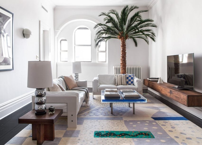
Living room in White Arrow schoolhouse

Williamsburg schoolhouse, US, by White Arrow

The living room of this schoolhouse in Brooklyn, which studio White Arrow’s founders designed for their own home, has plenty of patterned textiles, but their creamy pastel hues means the space still doesn’t feel busy.

A large palm tree is a fun detail and picks up the dark wood of a small sideboard and a floating TV-bench. Clean, white walls and a selection of modernist white lamps, as well as glass sofa table, create a restful atmosphere.

Find out more about Williamsburg schoolhouse ›


Living room in Bismarck House by Andrew Burges Architects

Bismarck House, Australia, by Andrew Burges Architects

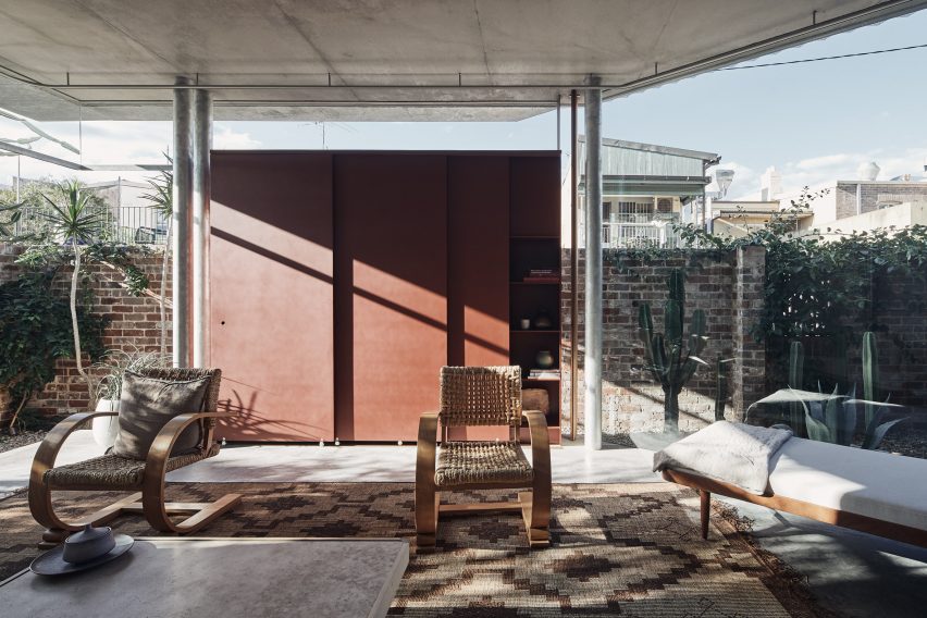
With its floor-to-ceiling glass walls that open out onto a garden in Bondi, Sydney, the living room of Bismarck House has the feel of a terrace. Andrew Burges Architects kept the details simple, adding galvanised steel columns and a concrete floor to “reinforce a robust outdoor character.”

Furniture is in the same laid-back style with wooden chairs and a daybed creating comfortable resting spots. A terracotta-coloured wall lends the space more privacy and adds to the comfortable holiday-vibe of this inviting living room.

Find out more about Bismarck House ›


Living room of riverside apartment

Riverside Apartment, US, by Format Architecture Office

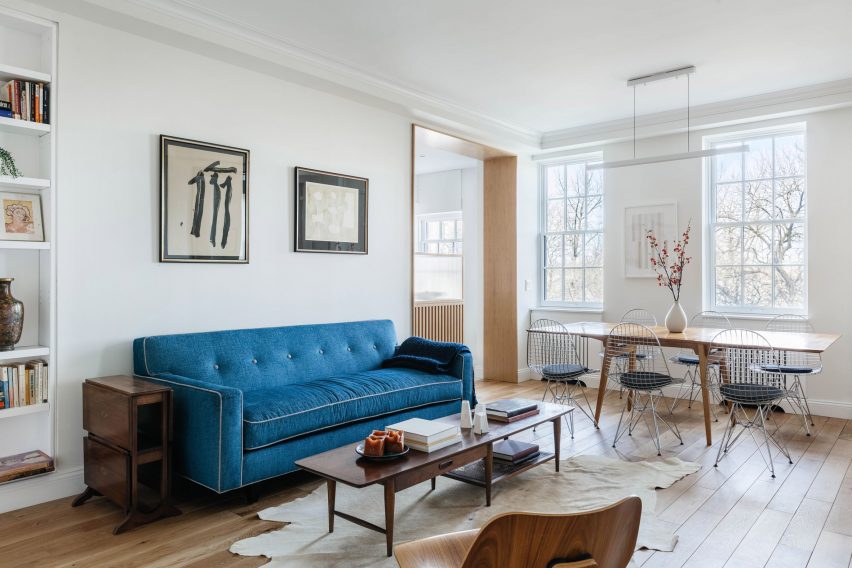
The living room of Riverside Apartment, set within a 1920s building on New York’s Upper West Side, owes much of its quiet charm to the beautiful wooden floorboards. The theme was taken up in both furniture in various types of wood and a woodclad doorway.

Crisp white walls are decorated with graphic art that perfectly matches the mid-century modern furniture to create a soothing environment.

Find out more about Riverside Apartment ›


Living room of Casa Meco

Casa Meco, Portugal, by Atelier Rua

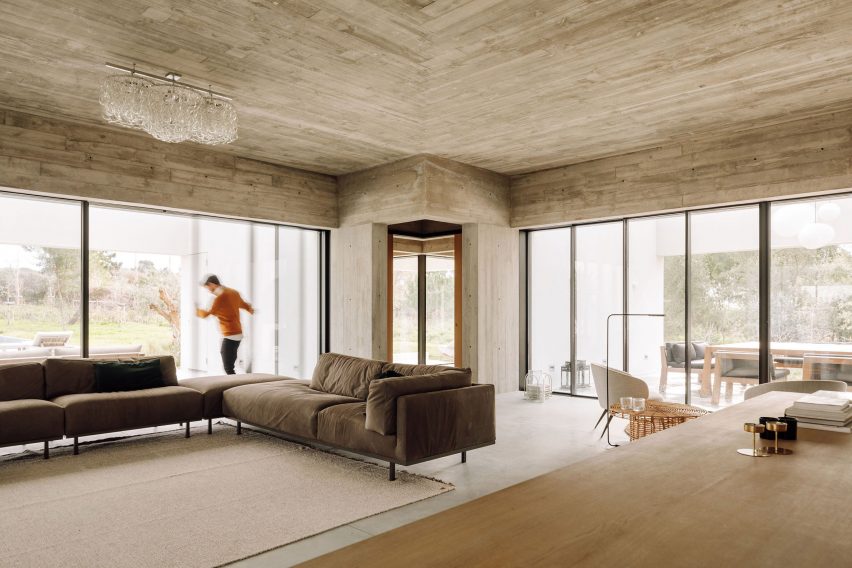
The enormous sitting room in Casa Meco, a holiday home south of Lisbon, Portugal, has three different vistas surrounding it and plenty of space for socialising and relaxing.

Earthy colours were used for the interiors, which work well with the exposed-concrete ceiling and floor and make for a laid-back space. Glazed panels can be slid open for easy outdoor access.

Find out more about Casa Meco ›


View from Residence for Two Collectors by Wheeler Kearns Architects

Residence for Two Collectors, US, by Wheeler Kearns Architects

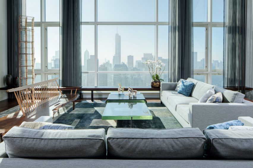
The living room of this Chicago penthouse is filled with art, collected by its owners, and features a striking view of the city skyline.

In front of the floor-to-ceiling windows, a sofa group in pale colours is combined with a matching rug in calm grey and white hues, while a seagreen glass coffee table picks up the light from the windows.

A Georg Nakashima bench from the owners’ collection adds an organic touch to the elegant space.

Find out more about Residence for Two Collectors ›


This roundup is part of our interior inspirations series that aims to provide ideas for people renovating or decorating their homes. For more inspiration read our pieces focused on bathrooms, bedrooms, dining rooms and home offices.

Reference

Ten contemporary bathrooms designed to take advantage of the view
CategoriesInterior Design

Ten contemporary bathrooms designed to take advantage of the view

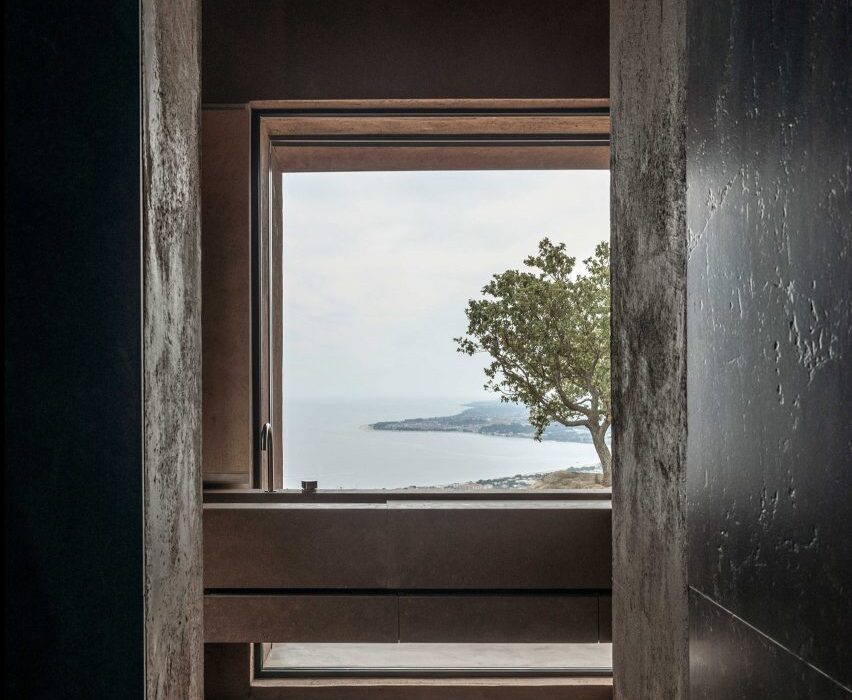
In our latest Dezeen Lookbook, we’ve rounded up 10 minimal bathrooms with incredible views, including a house on the Isle of Skye with a bath overlooking a loch and a jungle cabin with a glass-walled shower.


This is the latest roundup in a series providing visual inspiration for the home. Previous articles in the series showcased living rooms with calm interiors, peaceful bedrooms and domestic bathrooms designed by architects. Read more “Ten contemporary bathrooms designed to take advantage of the view”

Ten contemporary children’s bedrooms
CategoriesInterior Design

Ten contemporary children’s bedrooms

For this interior design lookbook we’ve chosen 10 stylish kids’ bedrooms featuring bunk beds, raised beds and whimsical cloud-shaped lights.


This is the latest roundup in our Dezeen Lookbooks series providing visual inspiration for the home. Previous articles in the series feature inspiring outdoor living spaces, calming green kitchens, and living rooms with beautiful statement shelving.


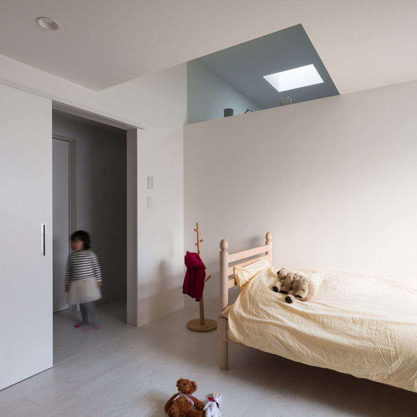
Calm child's bedroom

Adorable House, Japan, by Form

Skylights funnel daylight into this family residence in Tokyo, which has a main living space along with a bedroom on its first floor. Its pared-back children’s room features white walls and simple wooden furniture.

Find out more about Adorable House ›


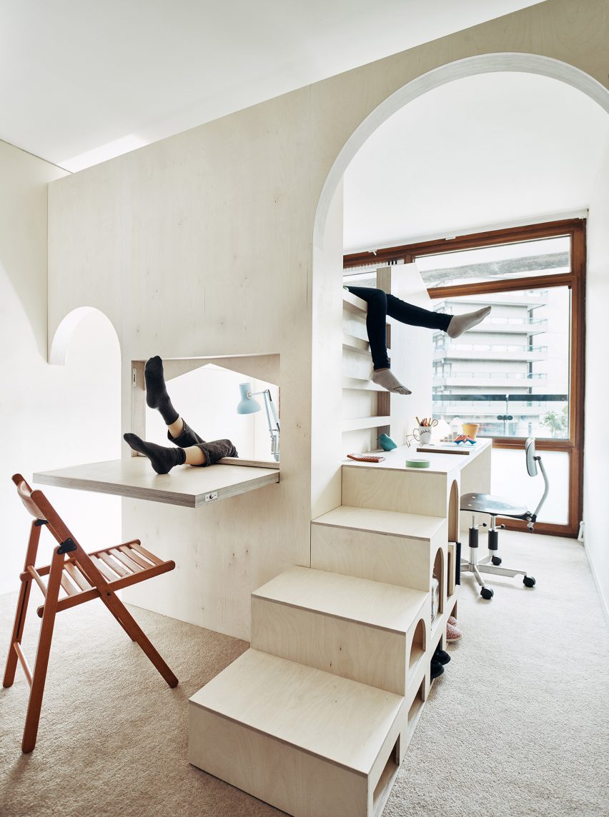
Plywood bunkbed

A Room for Two, London, UK, by Studio Ben Allen

An elaborate plywood structure built inside one of the rooms of this flat in London’s Barbican Estate turns it into a bedroom for two children.
Designed by Studio Ben Allen the structure contains two beds and a desk as well as playful archways, steps and a fold-down desk.

Find out more about A Room for Two ›


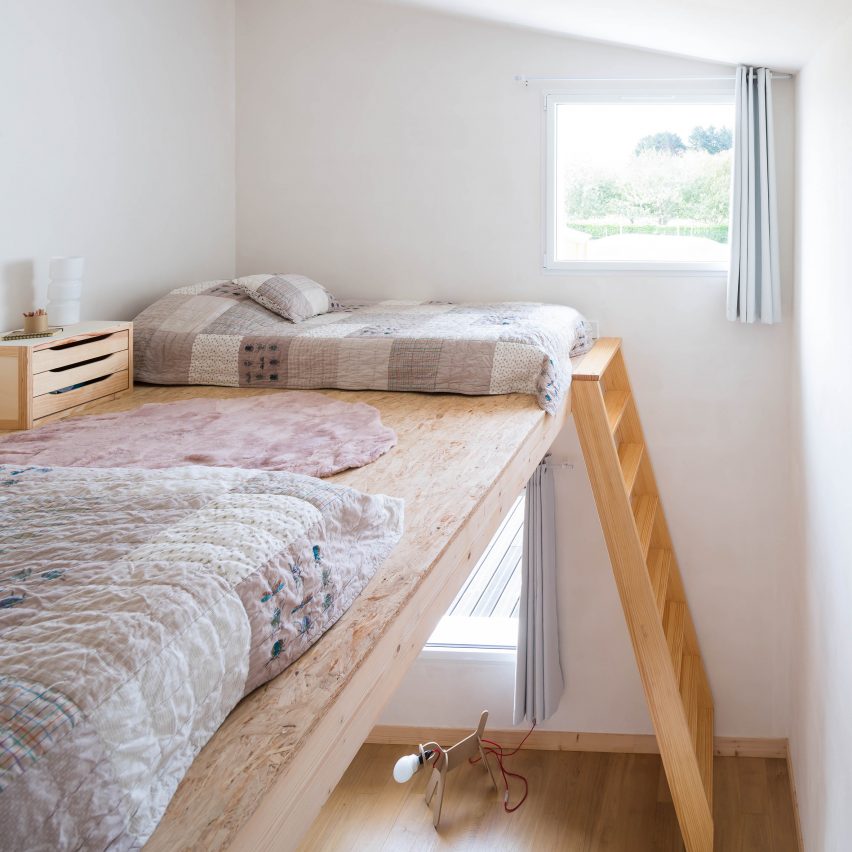
Raised bed

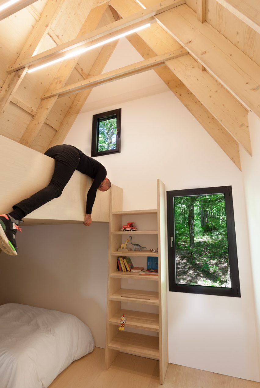
Fahouse, Quebec, Canada, by Jean Verville

Canadian architect Jean Verville designed this holiday home on a gently sloping site in a hemlock forest in southeastern Quebec. At the back of the home, the children’s bedroom is located in the pointed roof space.

Find out more about Fahouse ›


Kid's bedroom with roll-away bed

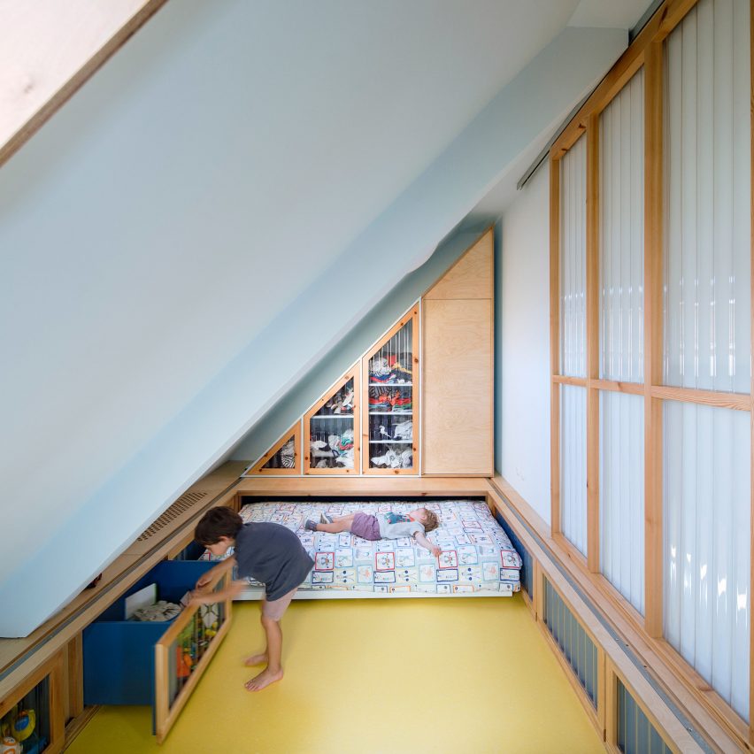
100.60 Apartment, Bilbao, Spain, by Azab

As part of the refurbishment of this apartment in Bilbao, architecture studio Azab created a pair of triangular-shaped children’s bedrooms underneath the sloping roof.

Both bedrooms have beds that can be rolled away to create more space for playing and are fronted with corrugated plastic walls.

Find out more about 100.60 Apartment ›


Blush-pink child's bedroom

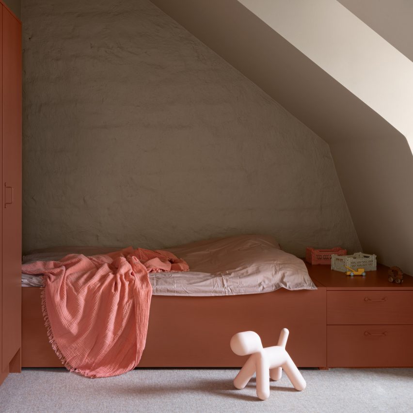
The Mantelpiece Loft, Stockholm, Sweden, Note Design Studio

Stockholm-based Note Design Studio reconfigured this loft apartment so that the parents and both children could have their own room.

The children’s bedrooms are on mezzanine levels and include inbuilt wardrobes and a bed painted in blush pink.

Find out more about The Mantelpiece Loft ›


Colourful bunk bed

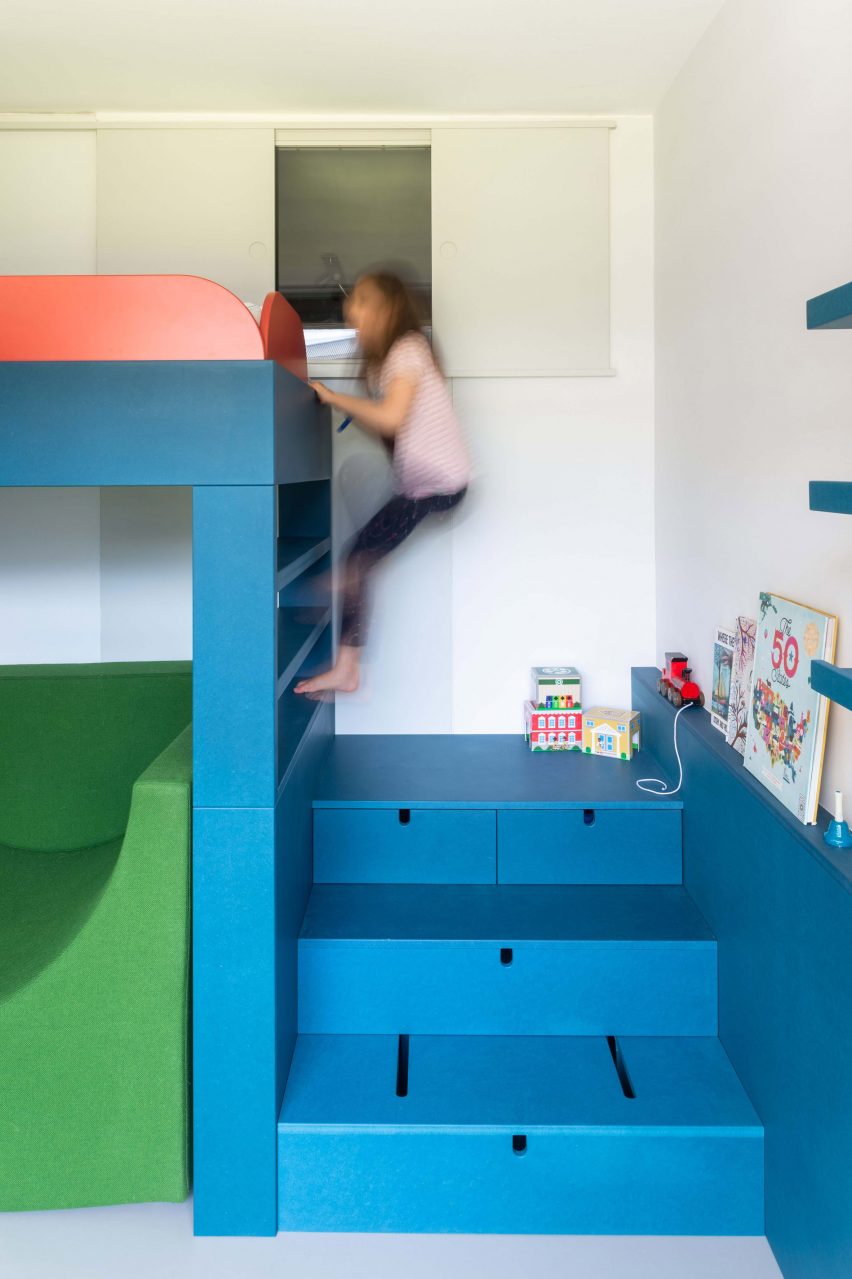
Room for One More, London, UK, by Studio Ben Allen

Studio Ben Allen updated this apartment in the Barbican Estate by reconfiguring it to include a child’s bedroom – a feature that lends the project its name of Room For One More.

The bedroom has a raised teal bed that is accessed by a short flight of stairs, which can be pushed in to form a small desk. A chunky armchair upholstered in grass-green fabric sits beneath the practical bed.

Find out more about Room for One More ›


Raised beds in kids room

House for a Photographer, France, by Alireza Razavi

Paris architect Alireza Razavi designed this summer house in Brittany for a photographer.

A mezzanine level added to the attic room contains beds for two children and is connected by a ladder to the children’s play area below.

Find out more about House for a Photographer ›


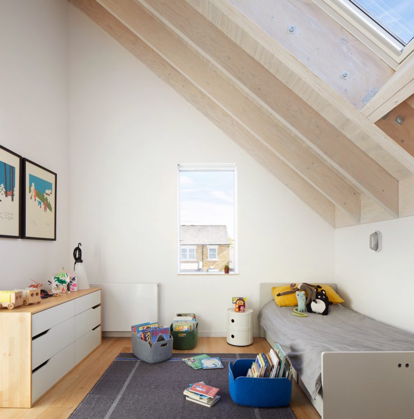
Contemporary children's bedroom in London

House-within-a-House, London, UK, by Alma-nac

Architecture studio Alma-nac has extended a 1950s property in Brockley, south London, to create a contemporary family home.

Its second floor contains three bedrooms beneath the peak of the roof, including one for a child, which the studio describes as having “cathedral-like proportions”.

Find out more about House-within-a-House ›


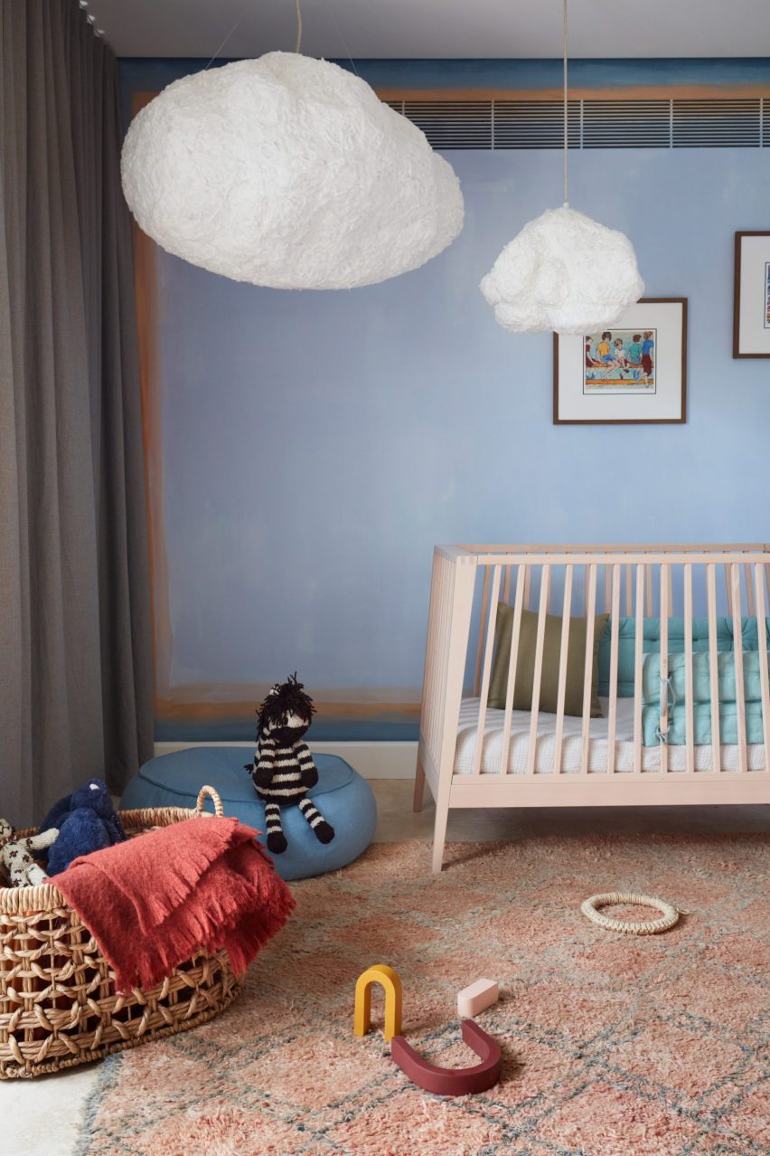
Bedroom with cloud-shaped lights

Budge Over Dover, Sydney, Australia, by YSG

Interior design studio YSG has revamped a house in Sydney using terracotta brick, aged brass and aubergine-hued plaster.

The children’s bedroom has lighter tones with sky-blue walls and whimsical cloud-shaped lamps hanging from the ceiling.

Find out more about Budge Over Dover ›


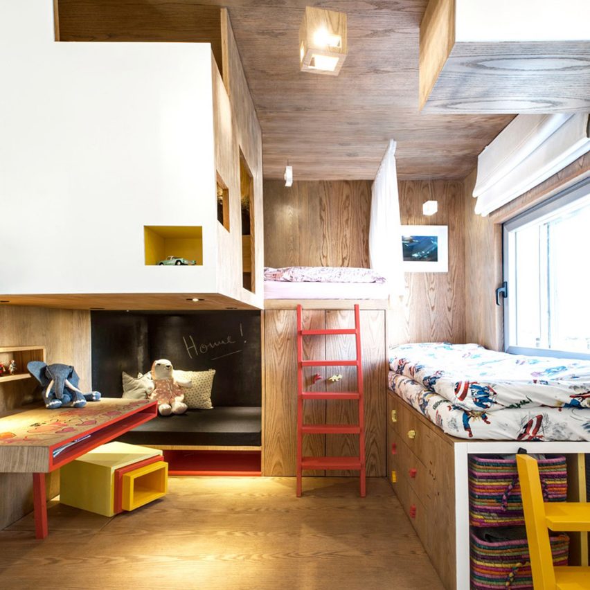
Bedroom with plywood cabin

Tel Aviv apartment, Israel, by Toledano Architects

This apartment in Tel Aviv has a plywood cabin located in its children’s bedroom.

Toledano Architects designed the space, which is laid out like a playground and filled with objects that promote creativity, to be a nook for the home’s youngest residents to escape to.

Find out more about Tel Aviv apartment ›


This is the latest in our series of lookbooks providing curated visual inspiration from Dezeen’s image archive. For more inspiration see previous lookbooks showcasing peaceful bedrooms, calm living rooms and colourful kitchens.

Reference

Twelve contemporary bathrooms with a spa-like feel
CategoriesInterior Design

Twelve contemporary bathrooms with a spa-like feel

For our latest lookbook, we have selected 12 spa-like bathrooms created by architects and designers to relax and unwind in.

These bathrooms are characterised by a minimalist aesthetic that makes them resemble spas and feature open spaces, natural materials, textural surfaces, earthy hues and oversized fixtures.

Keeping accessories and decoration to a minimum creates soothing surroundings and draws attention to the luxurious textures and materials used in these bathrooms.

This is the latest roundup in our Dezeen Lookbooks series providing visual inspiration for the home. Previous articles in the series feature inviting courtyards, outdoor spaces with fireplaces and fire pits, and pastel-hued interiors.


Spa-like bathroom in Cloister House by MORQ 

Cloister House, Australia, by MORQ 

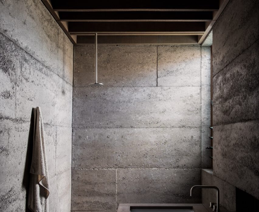
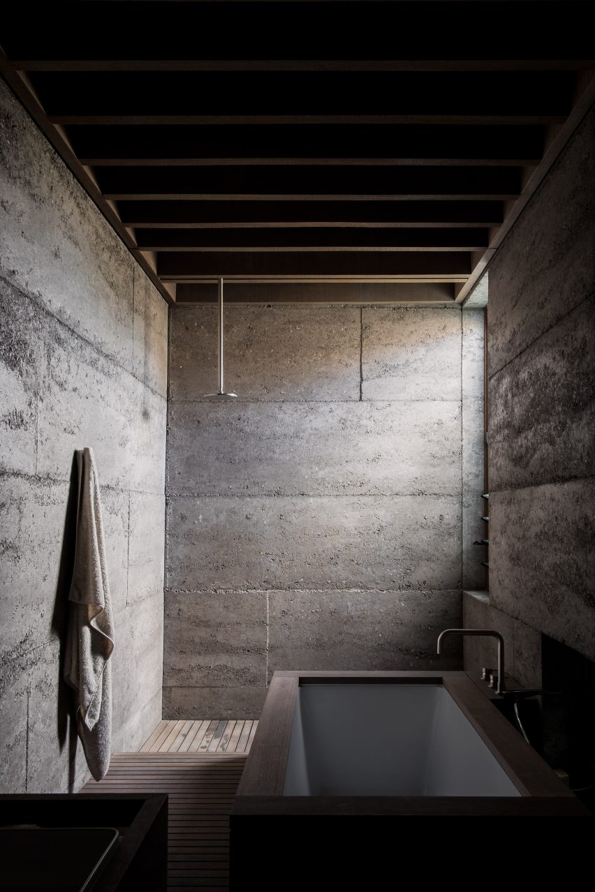
The rammed concrete that was used for the walls of this home were left exposed in its bathroom, providing the space with a textural, brutalist quality.

Red hardwood was used across the ceiling and joinery to add warmth, framing the bathtub, sink and storage areas.

Find out more about Cloister House ›


Spa-like bathroom in Borden House by Studio AC

Borden House, Toronto, by StudioAC

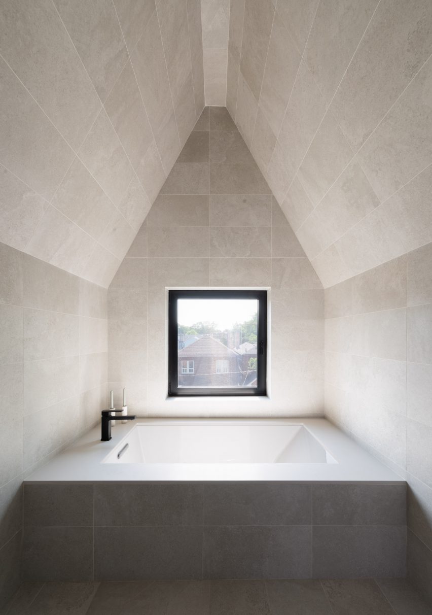
In the 14-foot-wide (4.3 metres) Borden House by StudioAC, an en-suite bathroom was given a symmetric design and a neutral, grey palette to create a relaxing, spa-like look.

Grey concrete tiles cover the floor, walls and pitched roof and envelope a large inset bath that takes up the width of the room. A square black-framed window provides symmetry to the space and offers views out to the surrounding Toronto cityscape.

Find out more about Borden House ›


Spa-like bathroom in House with Three Eyes by Innauer-Matt Architekten

House with Three Eyes, Austria, by Innauer-Matt Architekten

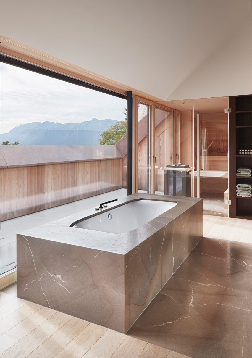
A glazed wall with views of the mountainside encloses this tranquil bathroom in Austria. Pale wood lines the walls of the space and expands out onto a small terrace.

Veined stone encases the bathtub in the middle of the room and extends across the floor between light wood floorboards.

Find out more about House with Three Eyes ›


Spa-like bathroom in Art Villa by Formafatal and Refuel Works

Art Villa, Costa Rica, by Formafatal and Refuel Works

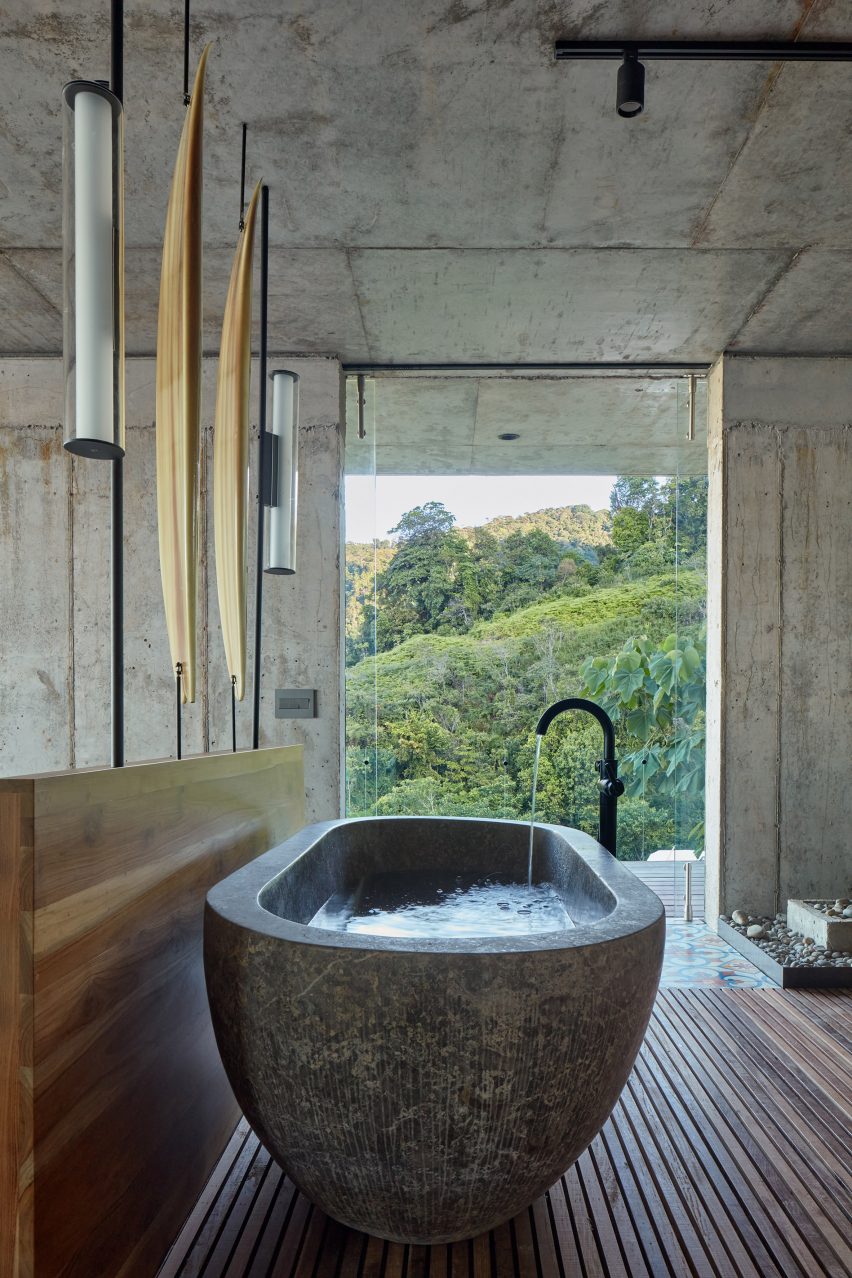
A mismatched material palette of concrete, wood and tile was used throughout the bathroom of this Costa Rican holiday home.

A freestanding stone bathtub sits atop slatted wooden floors and is positioned near a floor-to-ceiling window. Sculptural lights were mounted within a wooden half wall to create a decorative feature and zone spaces.

Find out more about Art Villa ›


Submariner's House by Jonathan Tuckey Design

Submariner’s House, London, by Jonathan Tuckey Design

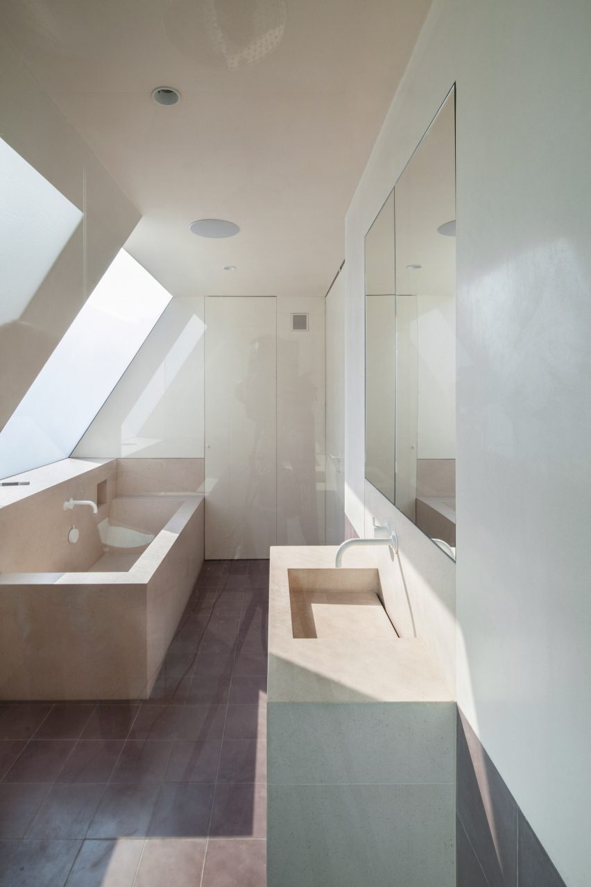
This limestone bathroom in Submariner’s House by Jonathan Tuckey Design is a light-filled space that combines dark and pale-hued stone.

Angular limestone fixtures were used throughout the space and a limestone bath occupies the corner of the room beneath an opacity-adjustable skylight. Throughout the space, concealed cupboards and mirrored cabinets provide a clean and minimalist look.

Find out more about Submariner’s House ›


Whidbey Island Farm by MW Works 

Whidbey Island Farm, United States, by MW Works 

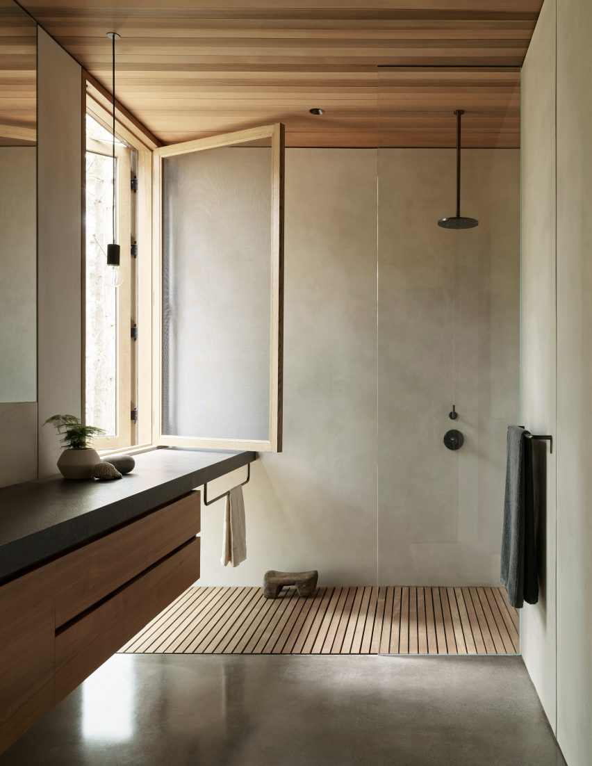
Polished concrete and wood lines the walls and floors of this bathroom, which was designed for a home that overlooks a meadow where cattle graze.

A glass screen encloses a walk-in shower and a dark stone surface-top stretches the length of the room, concealing cabinetry and storage.

Find out more about Whidbey Island Farm ›


Harrison Residence by Jeffrey Dungan Architects

Harrison Residence, Florida, by Jeffrey Dungan Architects

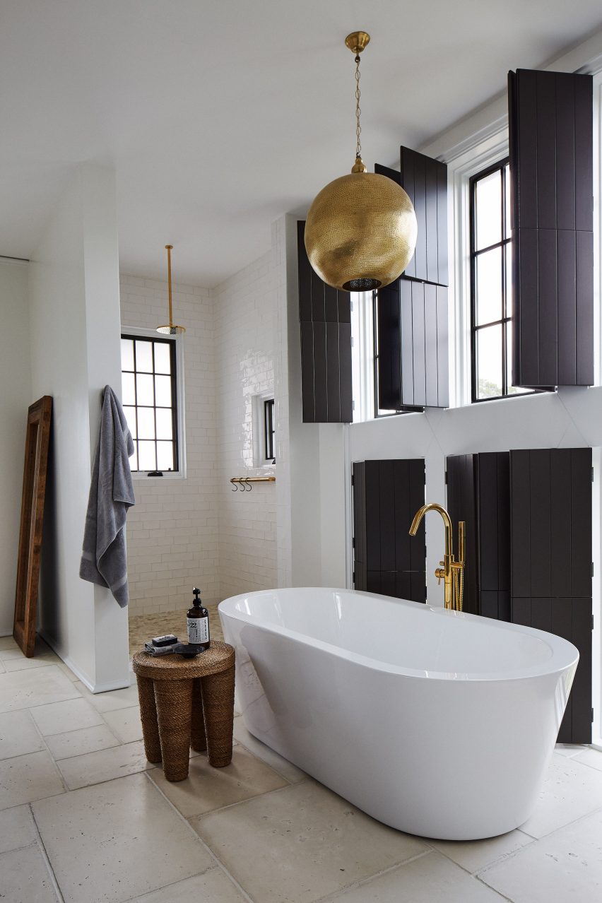
This bathroom owes its spa-like aesthetic to the European farmhouse style of the house it sits in, a three-storey family home located near the Gulf of Mexico.

A freestanding bathtub and a large walk-in shower are illuminated by natural light that enters the room between dark wood shutters. Gold-coloured fixtures were used throughout and a spherical Moroccan-style pendant light hangs above the bathtub.

Find out more about Harrison Residence ›


Japanese informed bathroom at Nobu Hotel by WATG and Studio PCH

Nobu Hotel, Mexico, by WATG and Studio PCH

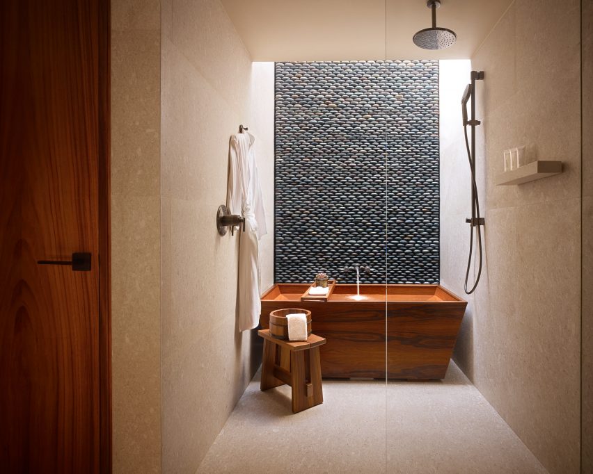
Rich woods, sand-hued tiles and a pebble-stone feature wall line the walls of this wet room, which was designed by WATG and Studio PCH for Mexico’s Nobu Hotel.

A wooden Japanese-style bath was placed beneath a skylight at the rear of the space. Light stone clads the walls of the wet room, where the darker stacked pebble-stone wall contrasts with the warm tones of the bathroom.

Find out more about Nobu Hotel, Mexico ›


spa-like bathroom in Kenwood Lee House by Cousins & Cousins

Kenwood Lee House, London, by Cousins & Cousins

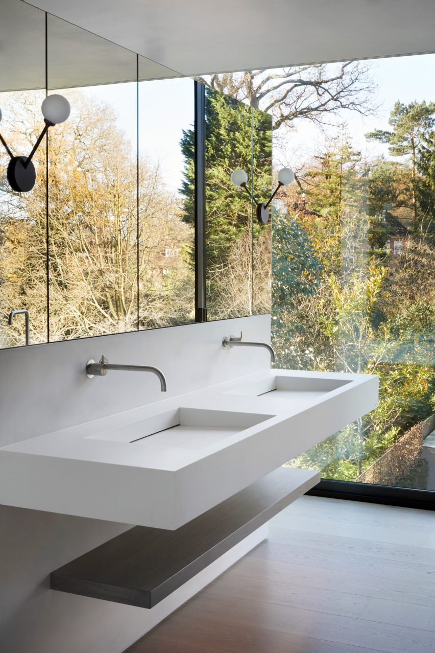
Bright white walls and floor-to-ceiling windows enclose this bathroom in Kenwood Lee House designed by Cousins & Cousins.

It used clean lines and symmetry to create a minimalist, clean look. A floating double-basin sink is suspended below wide mirrored cabinetry, which makes the bathroom feel bigger by reflecting the foliage and treeline of the garden.

Find out more about Kenwood Lee House ›


black tiled bathroom in Screen House by Carter Williamson Architects

Screen House, Sydney, by Carter Williamson Architects

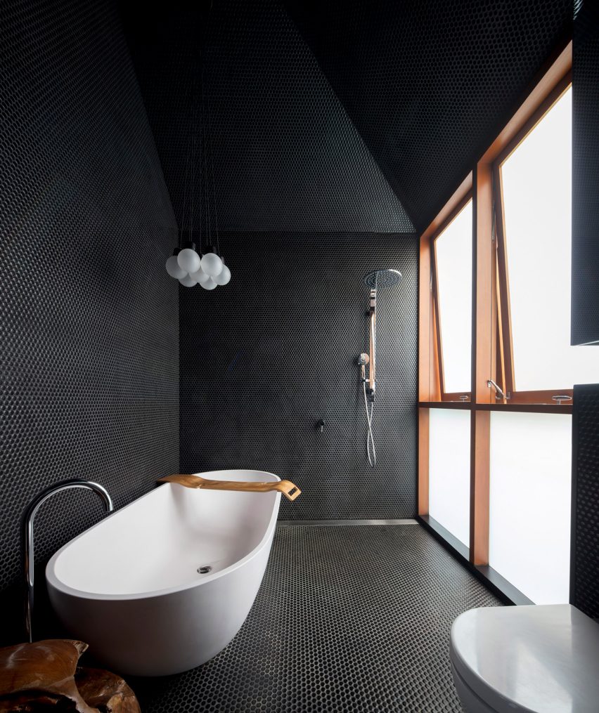
Black circular tiles blanket the walls, floors and pitched roof of this bathroom designed by Carter Williamson Architects.

Slivers of wood are incorporated into the space through rich-toned window frames and a wooden sink basin. Frosted windows provide the bathroom with privacy, while also adding a softness to the light.

Find out more about Screen House ›


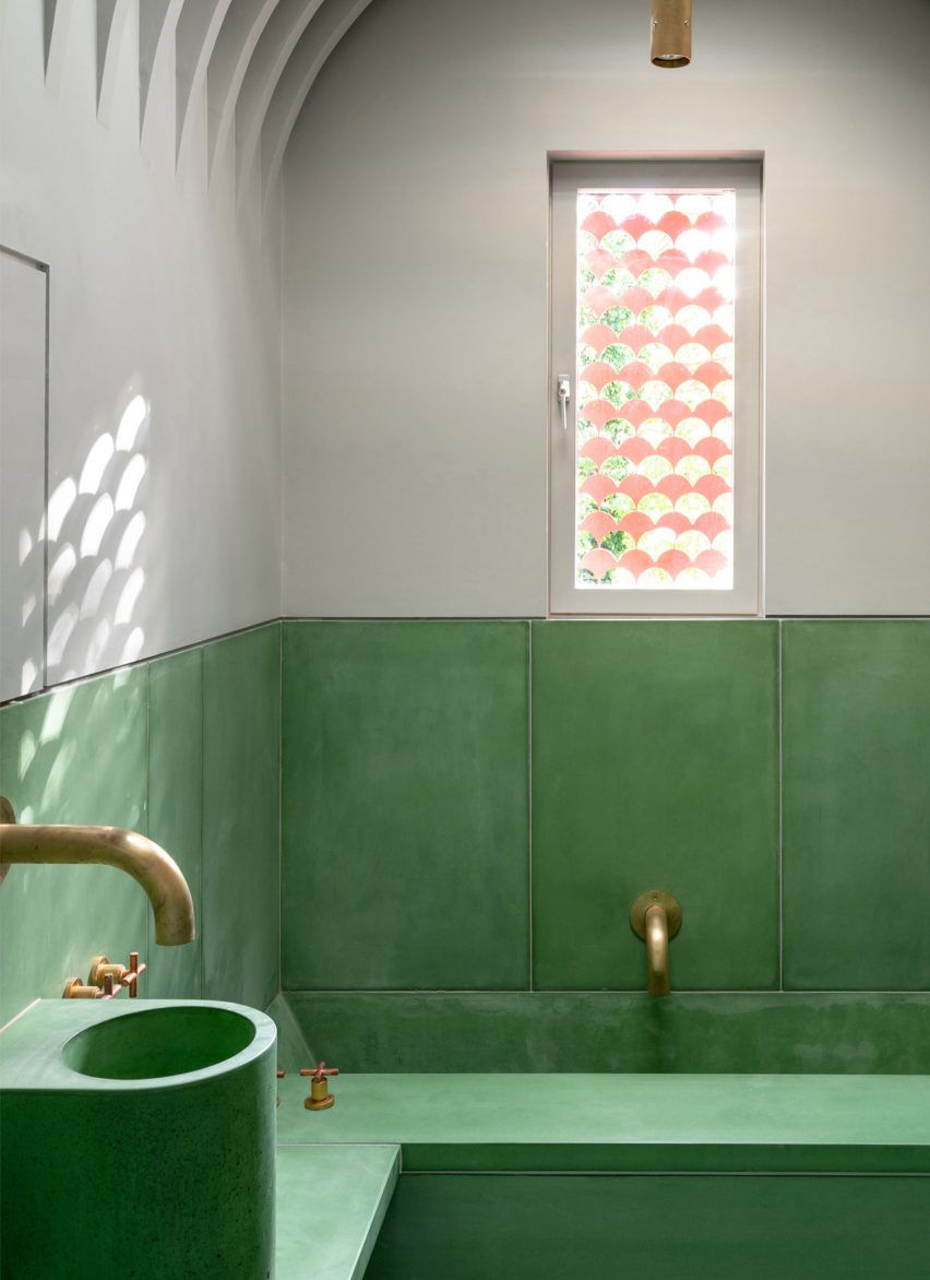
green tiled bathroom by Studio Ben Allen

The House Recast, London, by Studio Ben Allen

Bright green was used in this bathroom of Studio Ben Allen’s The House Recast in London, which was nominated as one of London’s best house renovations.

Green tiles form a wainscotting-style baseboard across the bathroom and blend into the green-patinated fixtures, such as an inset bathtub and a cylindrical sink basin.

Shaded areas on a small window in the centre of the room dapple light entry, mimicking the curved corner details between the walls and ceiling.

Find out more about The House Recast ›


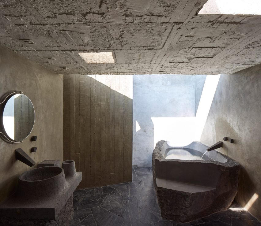
concrete bathroom in Reyes House by Pedro Reyes and Carla Fernandez

Pedro Reyes House, Mexico City, by Pedro Reyes and Carla Fernandez

This textural stone bathroom has a moody, monument-like aesthetic. It was designed by Mexican sculptor Pedro Reyes and fashion designer Carla Fernandez.

It has coarse concrete walls and includes a bathtub carved from stone to resemble a rock pool. A skylight above the bathroom allows light to flood into the space and reflect off the textural concrete walls.

Even the sink has an organic look and was moulded to reflect pottery forms.

Find out more about Pedro Reyes House ›


This is the latest in our series of lookbooks providing curated visual inspiration from Dezeen’s image archive. For more inspiration see previous lookbooks showcasing welcoming living rooms, interiors with statement plants, and terrazzo kitchens.

Reference