Schaum/Shieh conforms house “gently” to contours of steep Virginia site
CategoriesArchitecture

Schaum/Shieh conforms house “gently” to contours of steep Virginia site

US architecture studio Schaum/Shieh has embedded a Virginia house with irregularly shaped volumes into the contours of a steep site.

Located in the Allegheny Mountains, the 2,750 square foot (255 square metre) Shenandoah House conforms to the topography of its hillside site “gently”, as Schaum/Shieh neither wanted to add a cantilever nor flatten the topography.

A white home overlooking Virginia mountains
Schaum/Shieh has embedded a residence into a steep Virginia site

“We didn’t have the inclination to make dramatic use of the steepness with a cantilever, and we didn’t want to flatten any portion of the site to erase the slope, so we decided to build along the contours as much as we could,” said Schaum/Shieh co-principal Rosalyne Shieh.

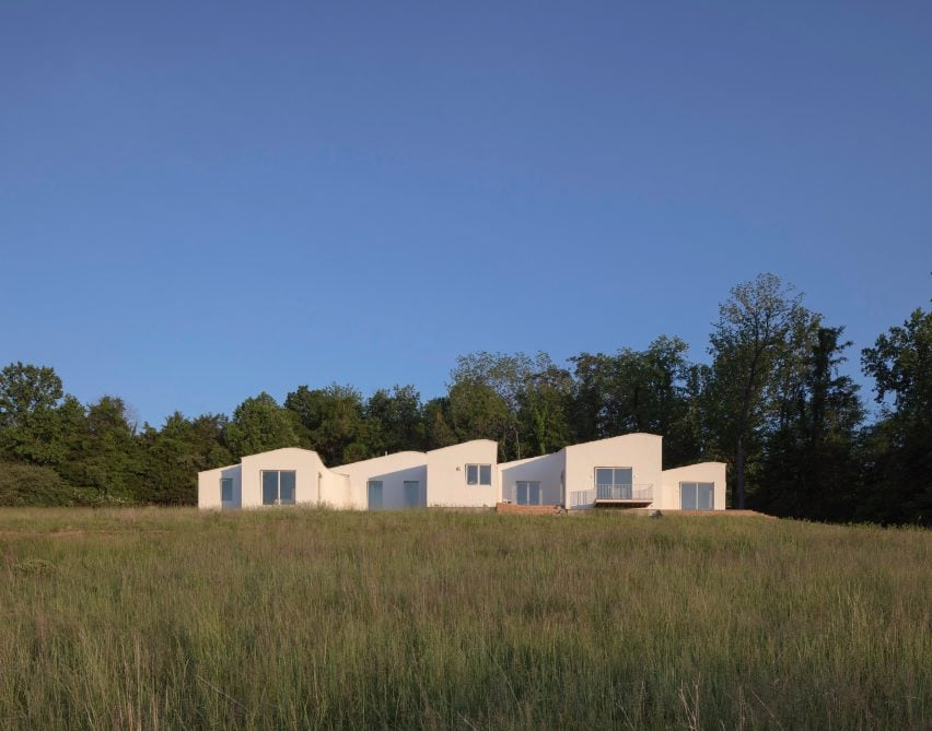
The one-story home unfurls in a 120-foot-long (36-metre) horizontal line that runs parallel to the topography, with its front elevated to meet wooden terraces, and portions of the back sitting flat on the slope.
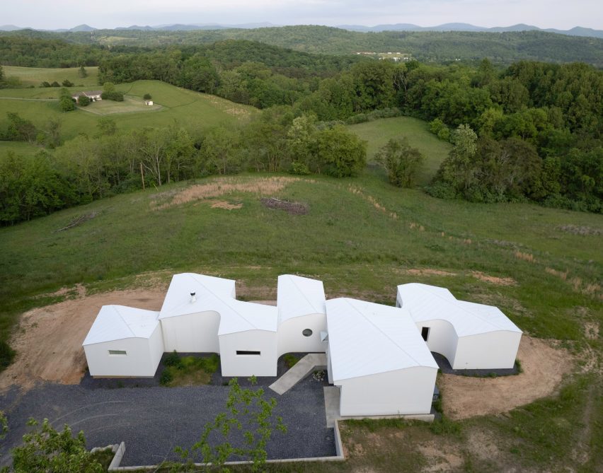
A long horizontal home made of various volumes
The studio wanted to avoid “dramatic” cantilevers

Along the footprint, three bedrooms, three bathrooms, a dining room, a living room, a study and a garage branch off a slim, central corridor in irregularly shaped volumes – or pods.

The spaces between each pod create room for gardens, outdoor nooks and wooden terraces along the house, while a parking area was carved out of the hillside at the back.
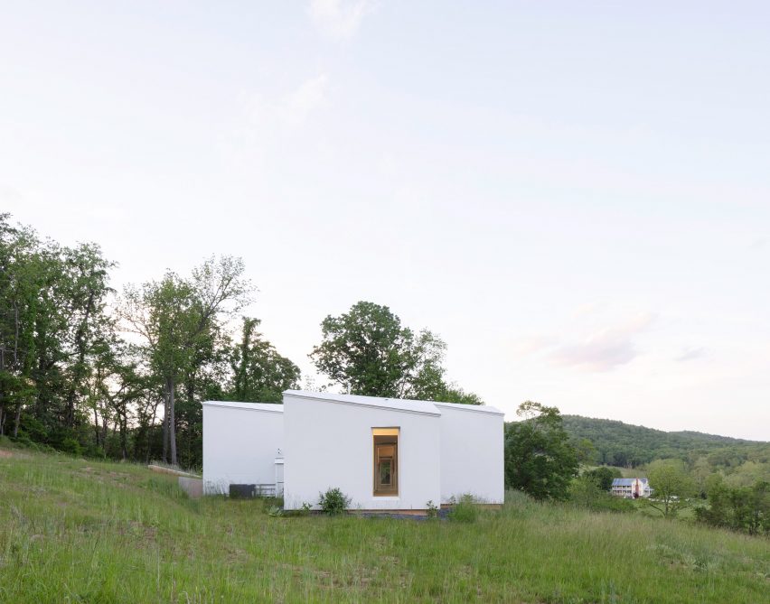
A white house in a meadow
The house is organized along one long horizontal line

The grey metal roof reflects the area’s rolling hills. Each individual volume is topped with a rounded gable roof that runs diagonally across its centre so that the profiles dip and rise with the surrounding environment

“We discovered that by doubling the ridgeline and rounding the peak we could create a softness that reflects the sloped surroundings,” said Schaum/Shieh co-principal Troy Schaum.
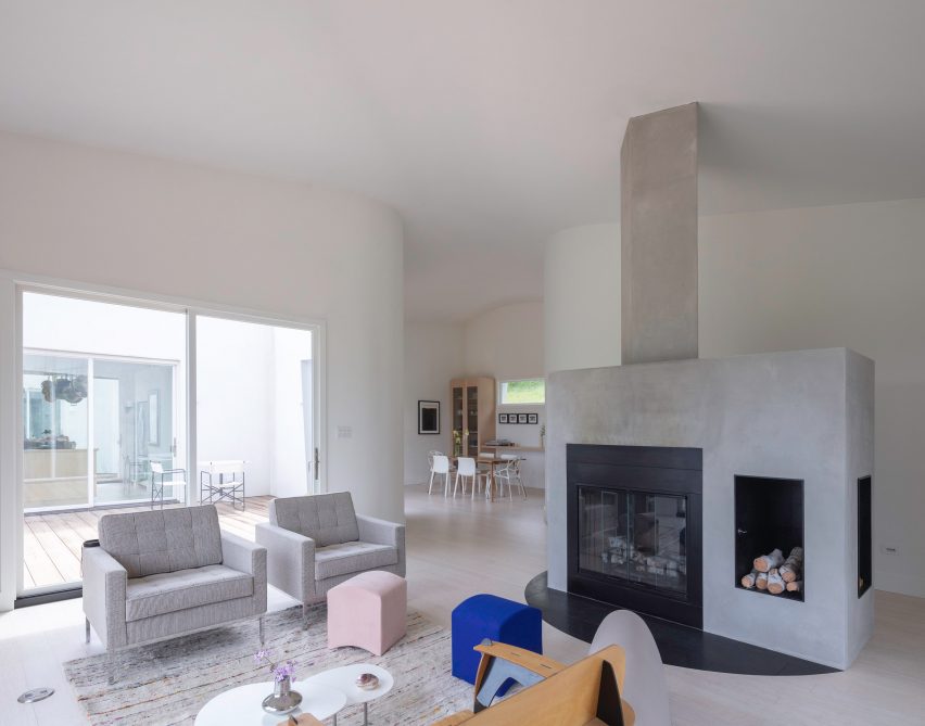
A large concrete fireplace in a white house with curved walls
Irregularly shaped volumes are connected by a slim central corridor

“It seemed appropriate on the hillside and took what was a simple, more functional logic and grounded it in the dynamic, undulating nature of the site.”

Rectangular windows on either end of the horizontal plan create an interrupted view through the centre of the house and large sliding glass doors and picture windows were installed on the facade.
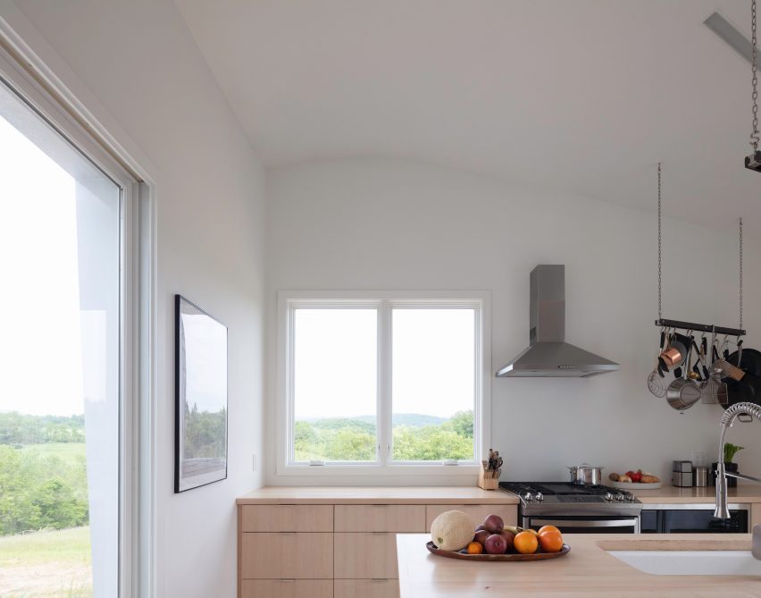
A kitchen with light cabintry
Rounded corners and integrated lighting bring softness to the interior

Small clerestory and porthole windows were placed on the uphill side.

Rounded corners on the home’s exterior are reflected on the interior, further softening a largely white interior palette.
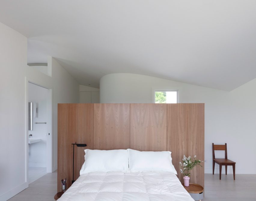
A wooden bed frame in the middle of a room
Concrete, wood and soapstone were used for furniture pieces

“Lighting was also subtly integrated to create interrupted lines throughout the house,” said the team.

“No lights or other features interrupt the ceilings; instead, lighting emerges through slots at the ceiling edge and on the quasi-furniture objects that provide texture across the home.”

These furniture elements include bespoke wooden cabinetry, a large island, a wooden bed frame and a central wood stove unit made of concrete and soapstone.

The house is finished with bamboo wood floors and insulated stucco.
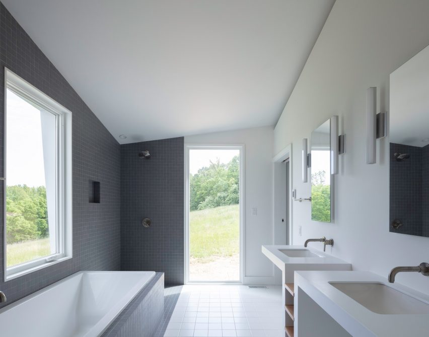
Gray tiles in bathroom
The house is clad in insulated stucco

“The hillside as an old problem in house design was a major motivator. Our clients knew many hilly sites from growing up in the area and their time in Greece. We wanted to intervene gently but opportunistically into the hill,” said Shieh.

“They wanted a house that fit organically but was not derived from the local vernacular materials or solutions in a straightforward way. We focused on the hill, the seasons, the distant view, and the intimate life of the site.”

Other recently completed projects by Schaum/Shieh include a Houston art galley covered in white sculptural panels and a concert venue designed to endure “rough handling”.

The photography is by Naho Kubota.


Project Credits: 

Architect: Schaum/Shieh
Design team: Troy Schaum, Rosalyne Shieh, Giorgio Angelini, Andrea Brennan, Tucker Douglas, Ane Gonzalez
Contractor: Blue Ridge Green – Jonathan Kuntz
Structural: Truesdell Engineering- Jordan Truesdell, PE

 

Reference

THAD draws on contours of nearby mountains for visitor centre in China
CategoriesArchitecture

THAD draws on contours of nearby mountains for visitor centre in China

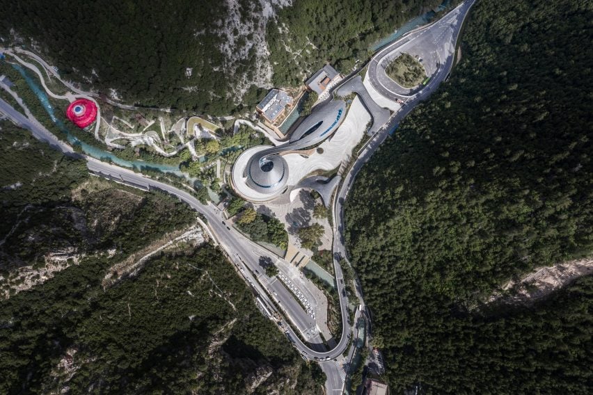
Spiralling tiled roofs informed by the contours of the surrounding mountains cover the Jiuzhai Valley Visitor Centre in Sichuan Province, China, designed by The Architectural Design and Research Institute of Tsinghua University.

Located at the entrance to the UNESCO World Heritage-listed Jiuzhai Valley National Park, the centre provides a new exhibition space, visitor centre and offices as part of the area’s reopening following an earthquake in 2017.

Aerial image of the Jiuzhai Valley Visitor Centre
Jiuzhai Valley Visitor Centre was designed by THAD

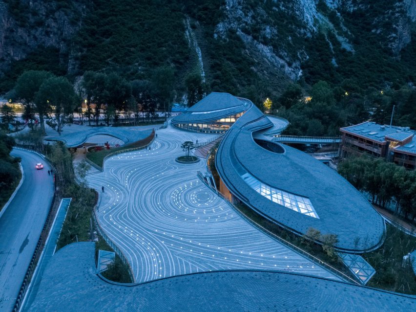
Designed to sit harmoniously in the landscape both in terms of its earthquake resilience and visual appearance, The Architectural Design and Research Institute of Tsinghua University (THAD) created a cluster of low-lying volumes organised around a central plaza paved with a contour pattern.

“The project explores how artificial construction can be accommodated in natural scenic spots,” said the practice.

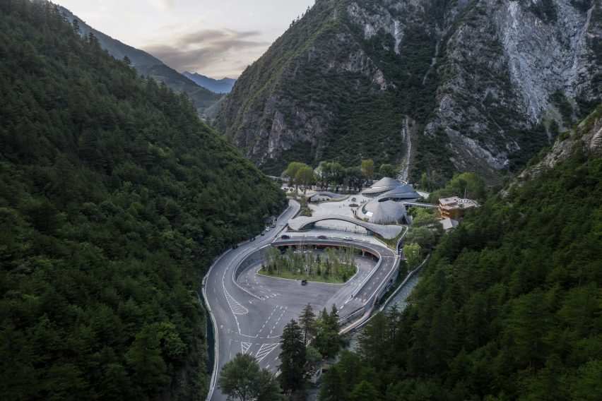
Image of Jiuzhai Valley Visitor Centre between the feet of mountains
The building is nestled within a mountain valley

“The aerodynamic architectural language moves through the narrow site smoothly, concealing the visitor centre with a sprawling and smooth curved form which spatially echoes the surrounding mountains,” it continued.

Taking advantage of a six-metre difference between the level of the entrance and the park, the centre was split to create separate access routes for vehicles and pedestrians, reducing the risk of congestion from the large number of tourists visiting the site.

Image of Jiuzhai Valley Visitor Centre and its swirling roof forms
It has a swooping curved design

The pedestrian plaza is elevated atop 36 branching steel columns above the tourist transport centre, where a fast drop-off area leads into a brightly-lit entrance hall and up to the level of the park via lifts and stairs.

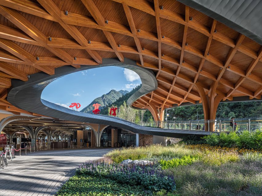
At ground level, visitors enter under a gently arching wooden gateway, passing the curving Intelligence Management Centre to reach the circular Exhibition Centre, where an entrance hall and small exhibition provide an introduction to the park.

The landscaping leading into the park was informed by the Tibetan concept of lingka – a tradition that involves camping in parks – with a winding path between the existing pine trees leading to a bright red flag tent.

For the structure and materials, THAD contrasted traditional finishes such as slate, wood and paving at ground level with more contemporary steel and stone for the lower-level spaces.

Image of a curving wooden canopy at Jiuzhai Valley Visitor Centre
Parametricism was used to create its roof forms

“Parametric design technology is applied for a combination of local features and modern techniques,” said the practice.

“Tourists not only experience a gentle transition space before entering and exiting the national park, but also a distinctive space full of local culture,” it continued.

Interior image of a brightly lit space with steel columns at the visitor centre
Branching steel columns line a pedestrian plaza

Previous projects by THAD responding to a similarly sensitive landscape include an undulating shelter designed by the practice to cover the historic Peking Man cave and protect the archaeological site from weathering.

In 2019, the design and research institute referenced caved dwellings and used stacked stone and concrete to build the campus of Yan’an University in China.

Reference