Exterior of converted monastery building with a bell tower, surrounded by landscaping
CategoriesInterior Design

Archiloop converts Italian monastery into hotel Vocabolo Moscatelli

Exterior of converted monastery building with a bell tower, surrounded by landscaping

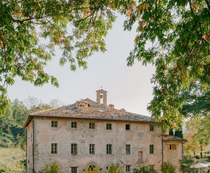
A 12th-century monastery in Italy’s Umbria region has become a boutique hotel in the hands of Florence studio Archiloop, which aimed to retain the site’s “rustic simplicity” during its renovation.

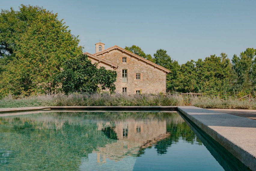
Vocabolo Moscatelli sits in the countryside near the hamlet of Calzolaro, close to the Tuscan border, on a remote estate surrounded by woodland.

Exterior of converted monastery building with a bell tower, surrounded by landscapingExterior of converted monastery building with a bell tower, surrounded by landscaping
Vocabolo Moscatelli occupies a converted monastery in Umbria

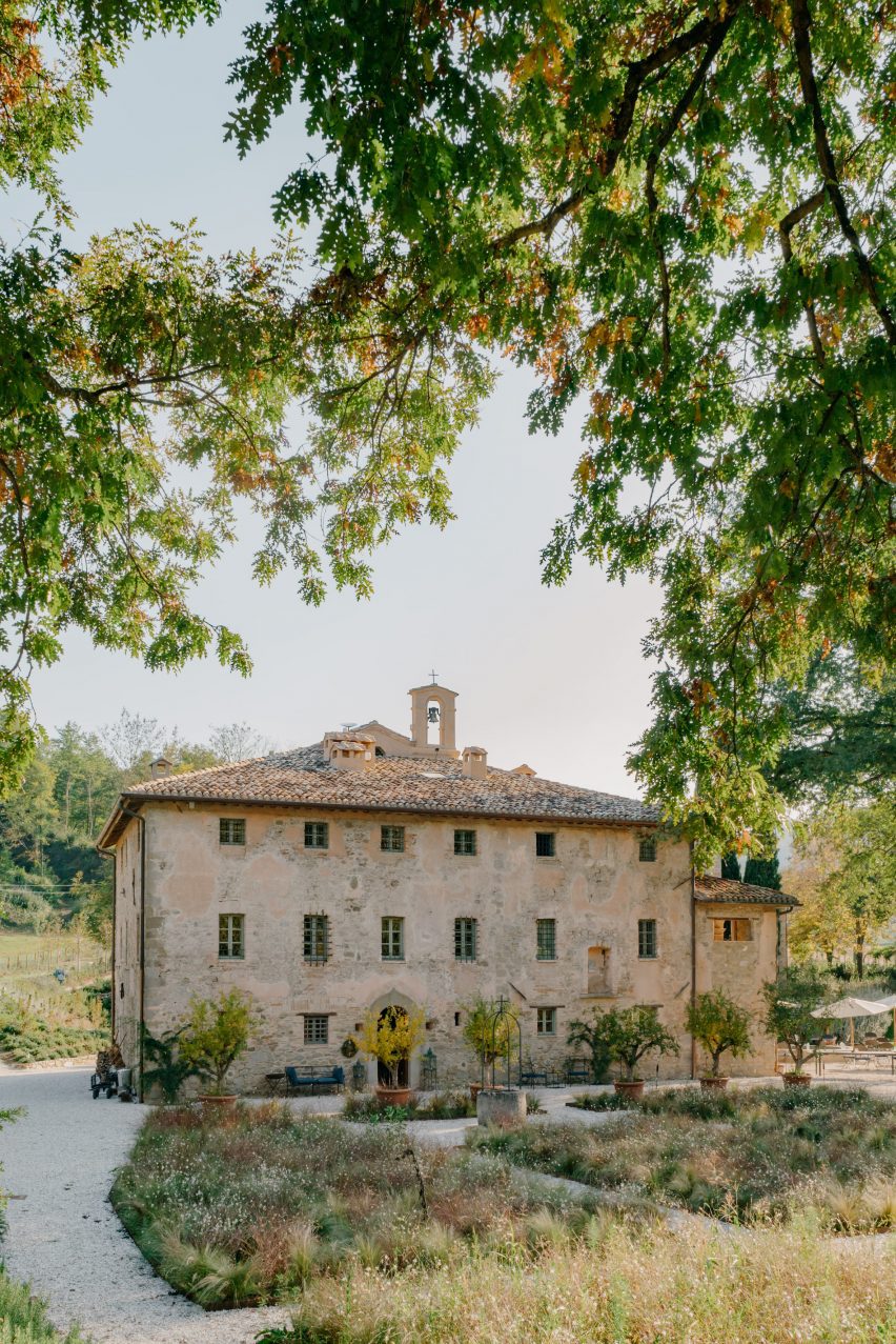
The property was discovered by chef concierge Frederik Kubierschky and his partner Catharina Lütjens, who set about restoring the various 800-year-old stone buildings with the help of architect Jacopo Venerosi Pesciolini of Archiloop.

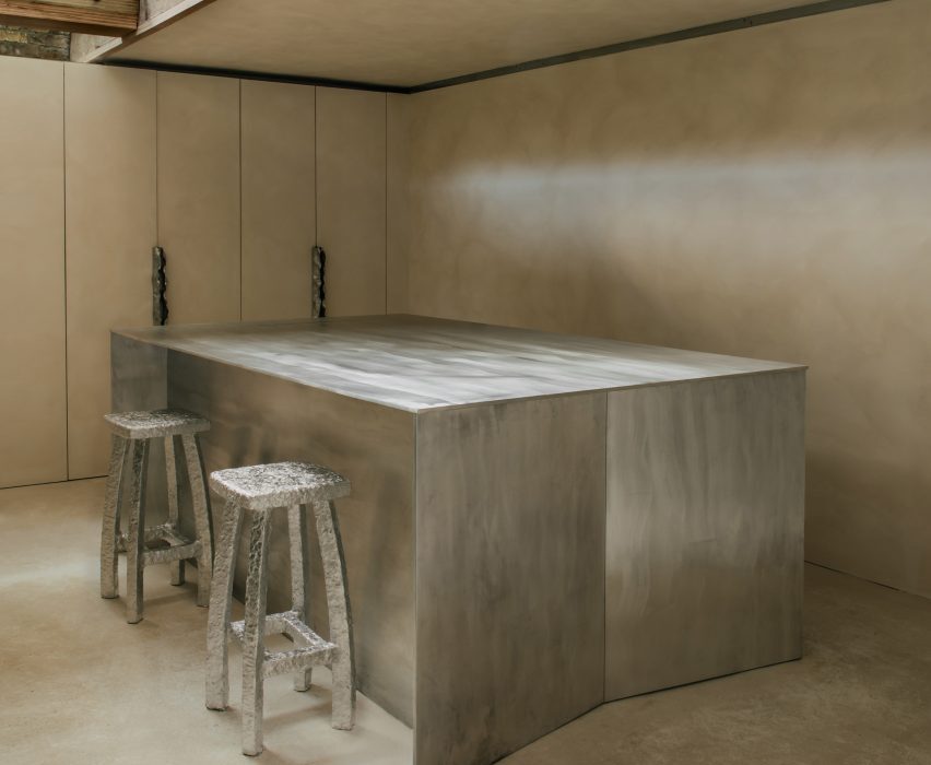
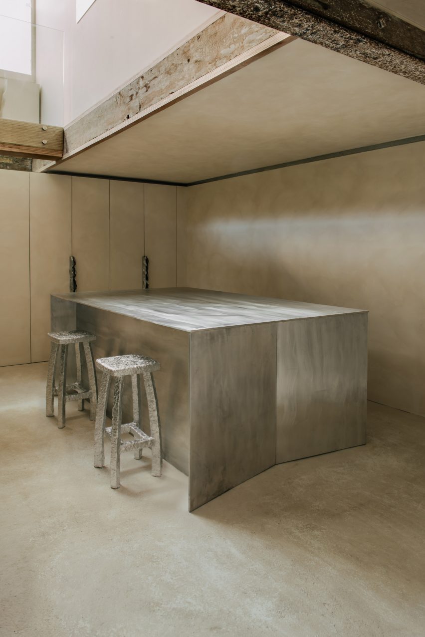
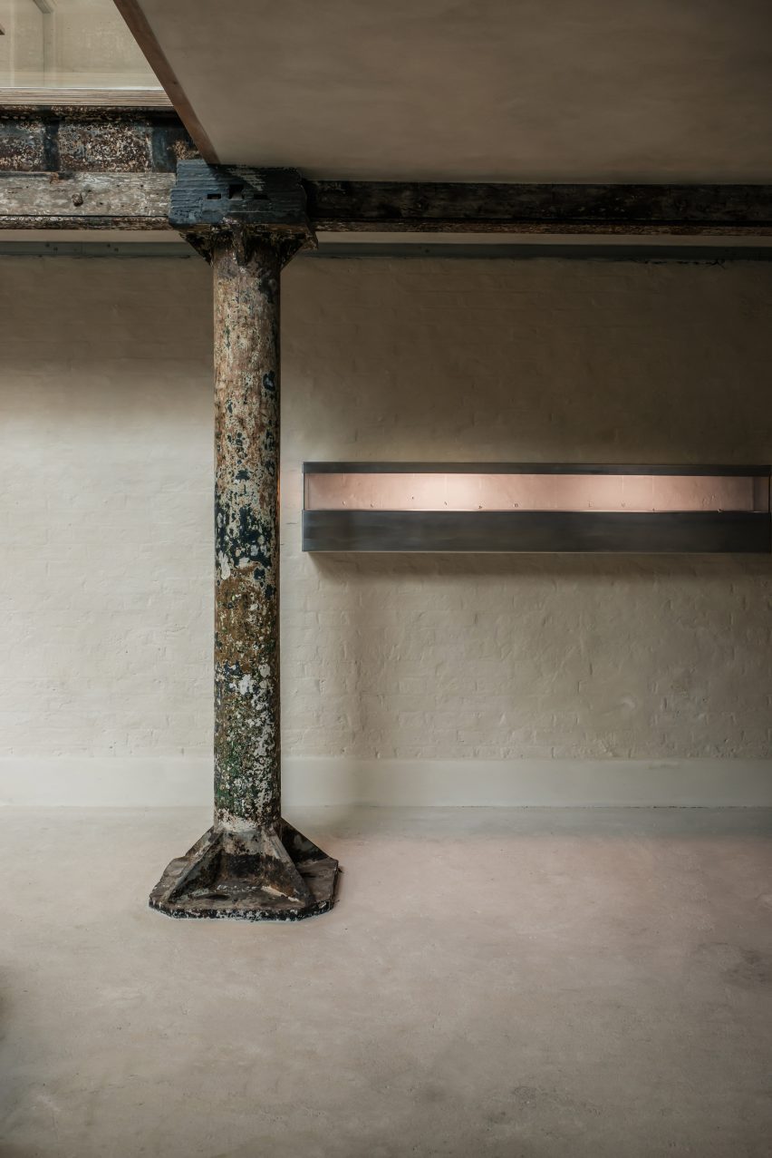
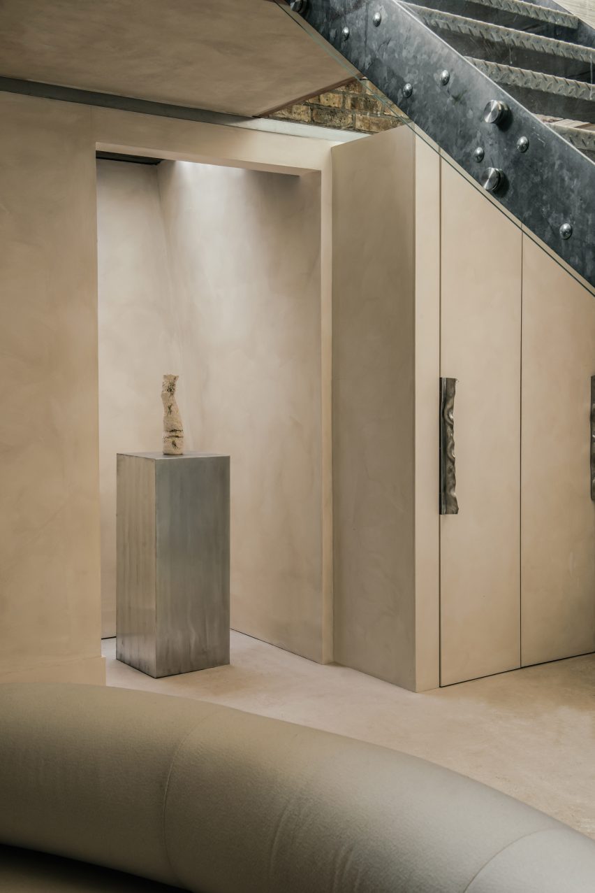
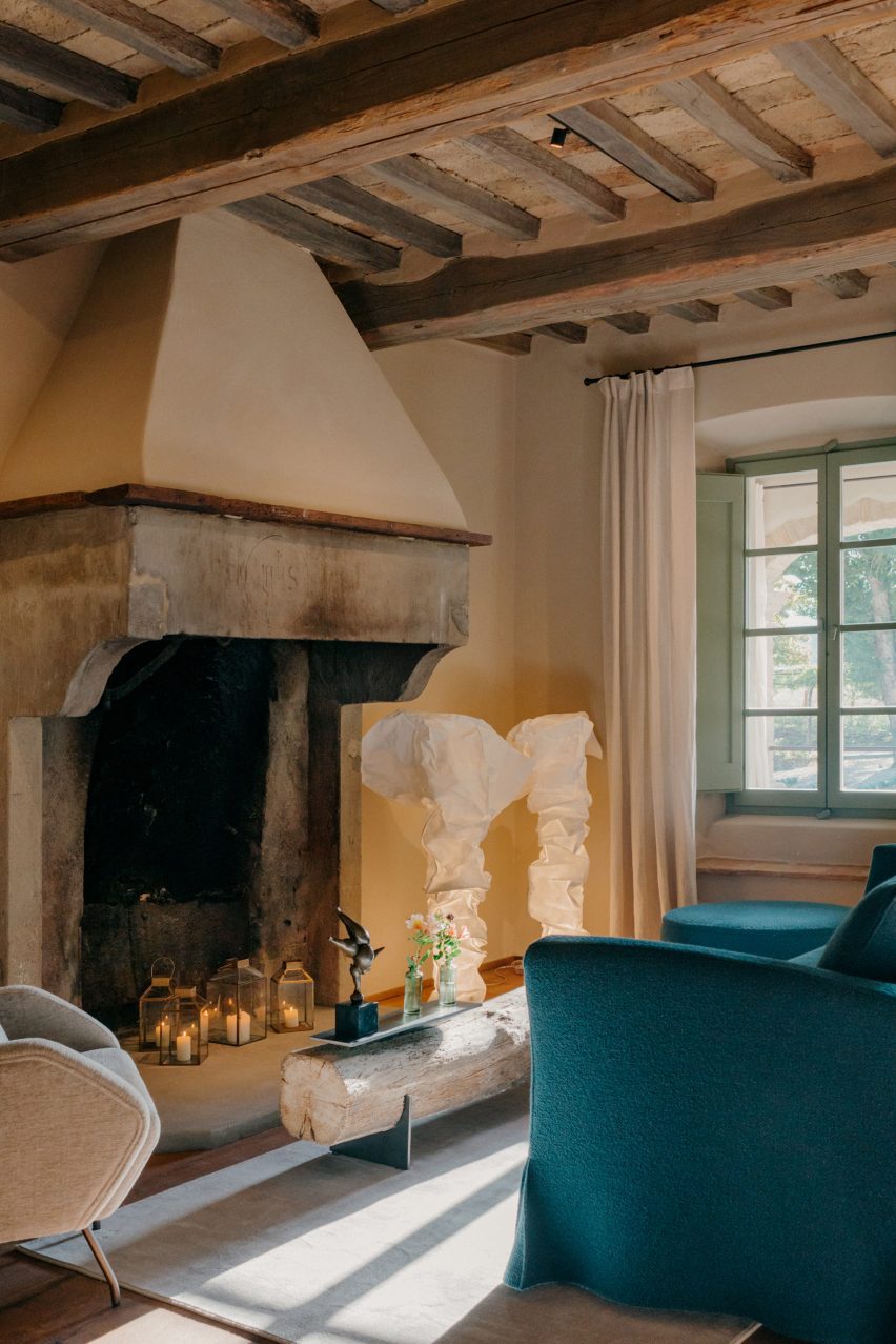
Aiming to retain the historic charm and as much of the original features as possible, the team kept the original wooden floors, exposed terracotta brickwork and ceiling beams, alongside brass, iron and stone details.

Stairs leading up to Vocabolo Moscatelli hotel in converted monasteryStairs leading up to Vocabolo Moscatelli hotel in converted monastery
The original brick and stone buildings were restored by Archiloop

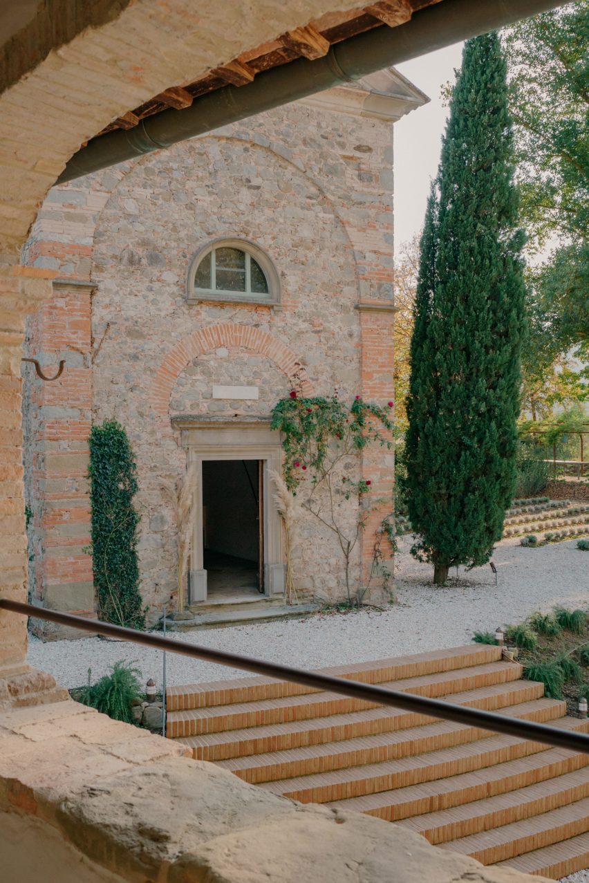
They worked with local craftspeople on the restoration of these elements and incorporated new pieces by artists and designers from across the region, too.

“Vocabolo Moscatelli brings together the stone mason, blacksmith and woodworker with the artisan makers: ceramicists, tile makers and painters, creating a boutique style canvas that plays homage to the past while bringing in the design references of the now,” said the hotel team.

Seating area with fireplace inside Hotel Vocabolo Moscatelli in Umbria by ArchiloopSeating area with fireplace inside Hotel Vocabolo Moscatelli in Umbria by Archiloop
Timber ceiling beams are left exposed throughout the hotel

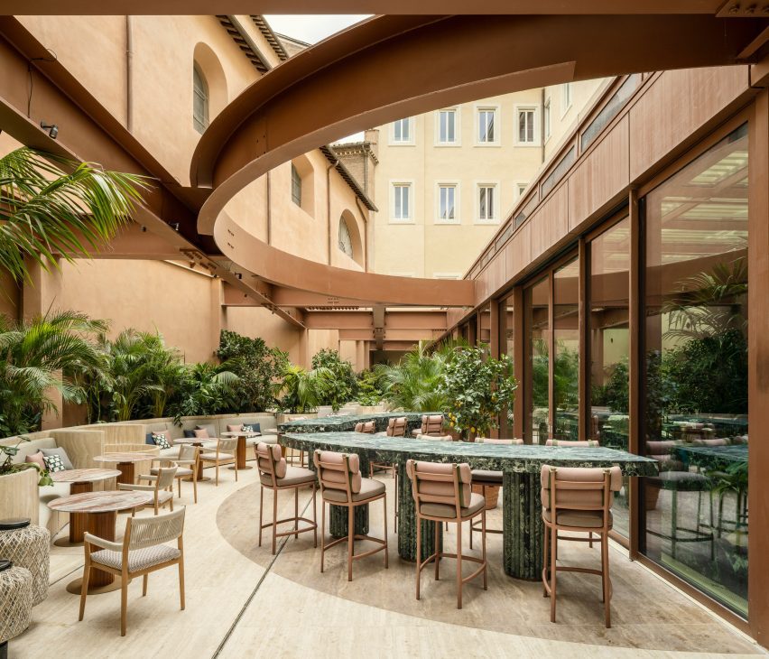
New additions to the site include a travertine swimming pool, coloured to match the surrounding woodland and Mediterranean landscaping by Fabiano Crociani.

“Threaded smoothly together, the effect is a template of rustic simplicity with heart,” the team said.

Bedroom with a red-framed, four-posted bedBedroom with a red-framed, four-posted bed
Each of the property’s 12 guest suites is unique and includes a custom bed frame

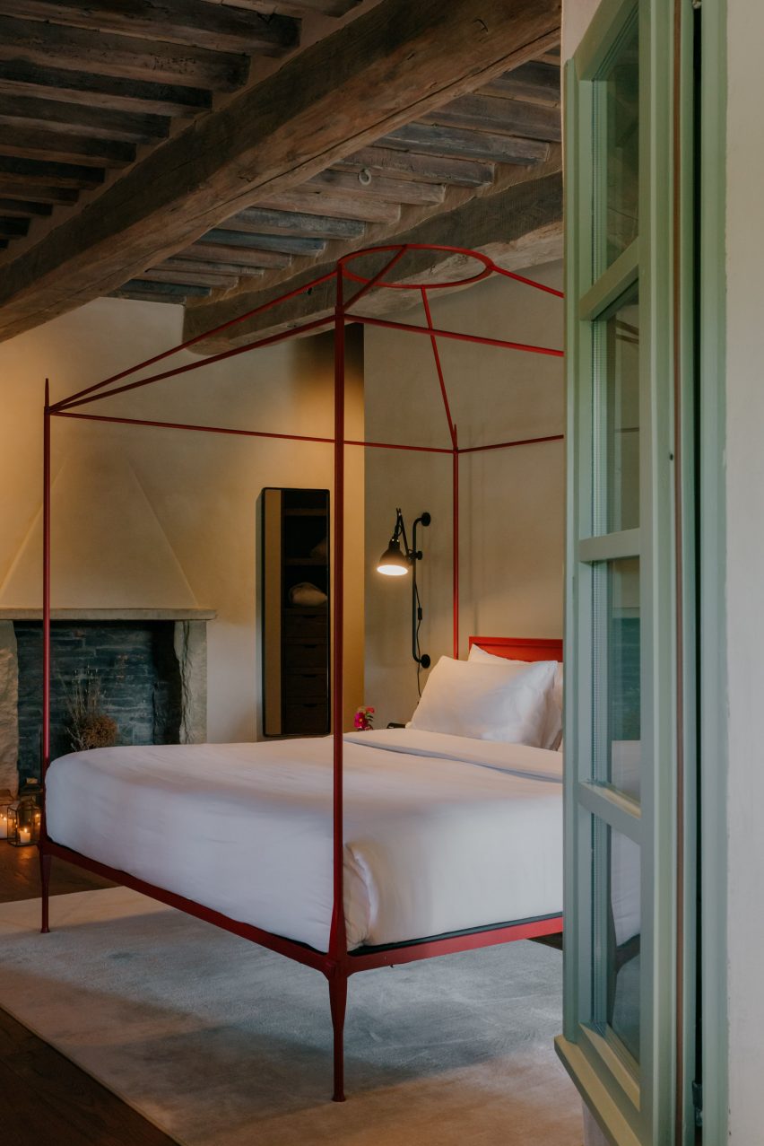
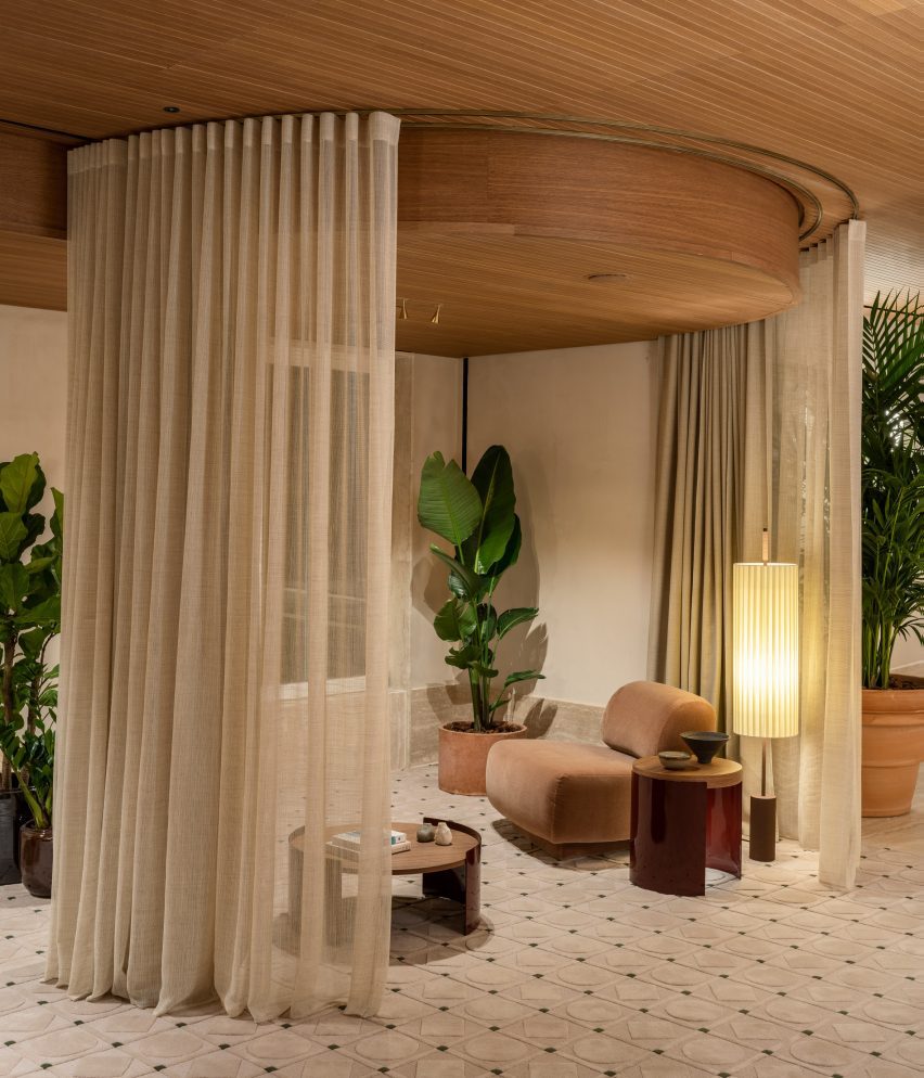
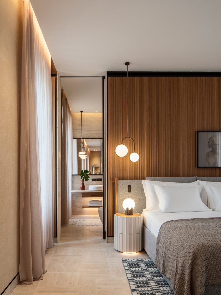
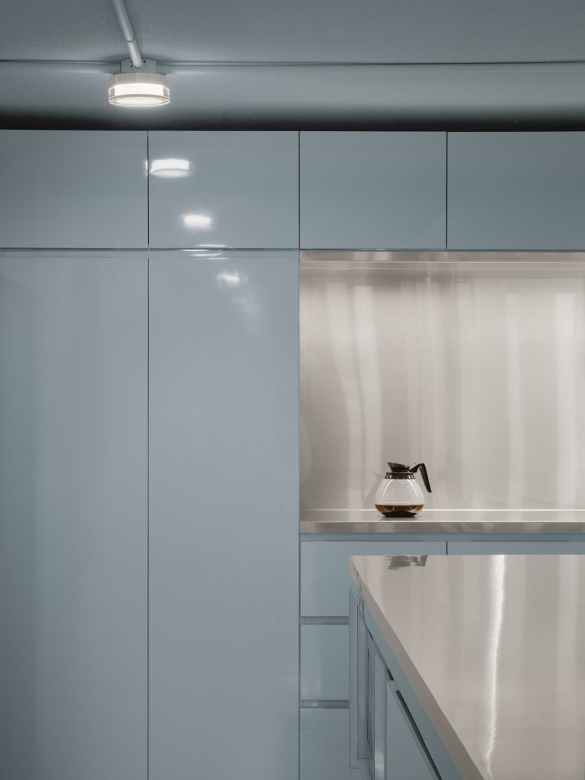
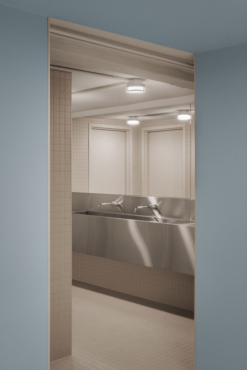
Vocabolo Moscatelli offers 12 spacious guest suites: eight in the main building and four more dotted around the landscaped grounds, all with a “monastic chic” style.

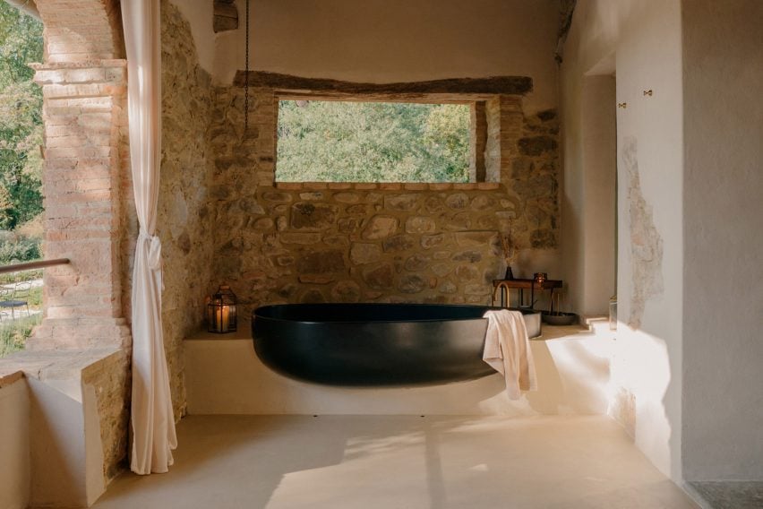
Each includes a unique colour palette and collection of design pieces, like a sculptural black two-person bathtub on one of the terraces and the various handmade beds.

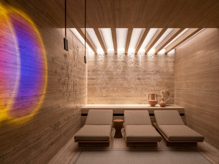
The Bridal Suite includes a round canopy bed and a private garden, while the Spa Suite has its own sauna and jacuzzi.

Bathtub on a terraceBathtub on a terrace
Some of the suites have sculptural al fresco bathtubs

Furniture and products were sourced from Italian brands, such as outdoor furniture by Paola Lenti and lighting from Davide Groppi and Flos.

Handmade glazed tiles by local Umbrian company Cotto Etrusco adorn the bathrooms, contrasting the rough stonework of the building’s thick walls.

Vocabolo Moscatelli is part of hotel group The Aficionados, which brings together 90 design-led properties across Europe.

Swimming pool of Vocabolo Moscatelli by ArchiloopSwimming pool of Vocabolo Moscatelli by Archiloop
New additions to the estate include a travertine swimming pool

Many historic buildings across Umbria have been converted into guest accommodations, from remote holiday homes like the Torre di Moravola watchtower to sprawling rural estates like Castello di Reschio.

Several monasteries in Italy have also found new life as hotels, including the Monastero Arx Vivendi near Lake Garda.

The photography is by Fabio Semeraro.

Reference

Open lobby with pockets of seating between potted plants in Six Senses Rome hotel by Patricia Urquiola
CategoriesInterior Design

Patricia Urquiola converts historic palazzo into Six Senses Rome hotel

Open lobby with pockets of seating between potted plants in Six Senses Rome hotel by Patricia Urquiola

Milan-based designer Patricia Urquiola has converted a palazzo in Rome into a hotel and spa, filled with circular elements and traditional Italian materials.

The Six Senses Rome is located within the Palazzo Salviati Cesi Mellini, close to historic sites like the Pantheon and the Trevi Fountain in the city centre.

Open lobby with pockets of seating between potted plants in Six Senses Rome hotel by Patricia Urquiola
The lobby of the Six Senses Rome is an open social space with multiple seating areas

Adjacent to the Church of San Marcello al Corso, the building was first constructed in the 15th century before being updated in the 18th-century baroque style by architect Tomaso De Marchis.

An impressive central staircase and the building’s main UNESCO-listed facade, which overlooks the bustling Via del Corso, are among the period details that were restored during the renovation works led by Studio Urquiola.

Lounge seating in front of restaurant counter
The Bivium restaurant connected to the lobby offers all-day dining

The entrance to the Six Senses Rome from Piazza di San Marcello leads into an open lobby and social area, furnished with a variety of sofas and lounge chairs from Urquiola’s oeuvre alongside classic Italian designs.

These are positioned in groupings with tables and decorative objects on circular rugs, between potted plants spread across the travertine floors.

Lounge seats on a circular rug, in front of an opened glass partition in Six Senses Rome hotel by Patricia Urquiola
Circular elements appear throughout the hotel, including rugs and tables in the lobby

“At every turn, the craftsmanship, the finishes, the materials and the graphics create a union with nature while staying true to both Roman classicism and Palazzo Salviati Cesi Mellini’s rich history,” said Urquiola.

A curved green marble bar is positioned near the windows, forming an incomplete circle with the matching counters in the courtyard, which are visible through the glazing and follow the shape of earth-toned steelwork overhead.

Courtyard with green marble bar counter below steelwork in Six Senses Rome hotel by Patricia Urquiola
In the courtyard, a green marble bar counter continues from inside

The courtyard also features benches built into planters along the back wall and additional seating, where diners can enjoy food and drinks from the trattoria-style Bivium restaurant.

Circular forms and motifs continue throughout the hotel, including in the Six Senses Spa and Roman baths on the first floor.

Spa waiting area featuring seating within sheer curtain enclosures
The spa waiting area features seating within sheer curtain enclosures

Here, sheer curtains encircle small seating areas for those waiting for treatments or preparing to enter the travertine-lined bathhouse, which offers multiple pools for soaking and relaxing.

Bedrooms across the central levels have “quirky” layouts and a soft neutral decor, including tambour panelling, patterned rugs and a variety of spherical light fixtures.

Travertine lines the walls and ceiling inside the spa and Roman baths in Six Senses Rome hotel by Patricia Urquiola
Travertine lines the walls and ceiling inside the spa and Roman baths

Several of Six Senses Rome’s 96 guest rooms and suites have balconies, and all enjoy either a courtyard or city view.

Plasterwork in the rooms is made from an ancient Roman material known as cocciopesto, which comprises fragments of earthenware or brick mixed with lime and sand.

“The legacy of antiquity is also honoured with the choice of cocciopesto, which decorates the plaster of the rooms and gives a nod to Roman architect Vitruvius,” said the studio.

The hotel also features a roof terrace and bar called Notos that offers views across the city and serves botanical cocktails and light bites.

Bedrooms with soft neutral decor
The bedrooms at the Six Senses Rome have a soft neutral decor

Artworks such as watercolours, sculptures, textile works and canvases throughout the interior are curated by art advisor Federica Sala and are all unique to the hotel.

Six Senses Rome is shortlisted in the hotel and short stay interior category of Dezeen Awards 2023, while Studio Urquiola is shortlisted for interior designer of the year.

Lounge area within a guest room suite in Six Senses Rome hotel by Patricia Urquiola
Plasterwork in the bedrooms and suites is made from cocciopesto

Originally from Spain, Urquiola is one of Europe’s most sought-after designers and has released furniture and product collections with brands like Moroso, Cassina, Kettal and Boffi among many more.

Other hotels designed by her studio include the Haworth Hotel in Michigan, the Hotel Il Sereno on the shores of Lake Como and the Room Mate Giulia in Milan.

The photography is by Luca Rotondo.


Project credits:

General contractor: CDS Holding
Architecture: Starching and professor Paolo Micalizzi
Interior design: Patricia Urquiola

Reference

Green trimmed concrete reuse project
CategoriesArchitecture

Productora converts Mexico City textile factory into artist spaces

Green trimmed concrete reuse project

Mexican architecture studio Productora has restored a concrete industrial complex in Mexico City into a series of studios including its own office.

Productora has been gradually renovating the building, which was originally a textile factory built in the 1920s, since it moved its offices to the structure following an earthquake in 2017.

Green trimmed concrete reuse project
Productora has renovated an industrial site in Mexico City where it has an office

The studio originally took up residence in an empty “nave” in the factory in Mexico City’s Doctores neighbourhood along a furniture company.

Since then, the studio has been “slowly rebuilding the complex while inhabiting it” and more than twenty other companies have moved into the complex, which is now called Laguna,

Concrete and green trim in Mexico City
New buildings were added to the cleared courtyards in the middle of the complex

For the renovation, the studio focused on the interior of the complex while leaving the street-facing, painted-concrete exterior, generally untouched so that one might not know the complex is there at all.

The complex is now orientated around two courtyards that were cleared of existing structures to create new circulation and gathering areas.

Green metal screen with concrete breeze blocks
The site was once a textile factory

Within these courtyard spaces, a mix of newly built concrete workshops and the renovation of existing brick-and-mortar and concrete buildings will continue to take place over the next several years. The studio said it hopes that the project will be one of “constant adaptation and transformation”.

Now, the most significant aspects of the renovation have been the cleared courtyards and added buildings, as well as expressive walkways and a new freight elevator that towers above the site.

Green detailing was chosen because it was prominent in the trim of the windows and roof on the facade of the original structure, and these green details continue along the causeways and in the gridded window frames.

People on benches in Mexico City art space
Gathering spaces have been included in the courtyards. Photo by Camila Cossio

Social spaces have been installed in the courtyards so that members of the various companies can gather.

In the future, Productora plans to build wooden workshops on top of the preexisting structure to create flexible and modular extensions to the current program.

Jozz Gómez, a coordinator for Laguna, said that the presence of the complex has also positively changed the environment around the complex.

“It started to bring more employment, but also changed the neighbourhood,” she told Dezeen.

“It was known to be a very dangerous neighbourhood, but after the project started, you can see foreigners, students, and young people walking around the streets.”

Office spaces in industrial spaces
It holds office space for creative studios. Photo by Camila Cossio.

Productora was founded in 2006 and has additional offices in Brooklyn. Recent projects include a hotel in San Miguel de Allende clad in red and green tile as well as a bright-blue cohousing project in Denver, Colorado, USA.

The photography is by Pablo Manjarrez. Top photo by Camila Cossio. 

Reference

saint of athens converts 1920s apartment into the eclectic 'upper house' in kypseli
CategoriesArchitecture

saint of athens converts 1920s flat into eclectic ‘upper house’

saint of athens converts 1920s apartment into the eclectic 'upper house' in kypseli

step inside saint of athens’ renovated upper house in kypseli


Located in the heart of Kypseli, one of Athens’s most historic urban areas, the floor-through Upper House apartment occupies the first level of an iconic building designed and constructed in the 1920s following the architectural style of eclecticism. Saint of Athens founder Nikos Palaiologos teamed up with A&O Architects to renovate his understatedly luxurious 220 sqm property, devising an interior space reminiscent of New York’s Upper East Side apartment houses of the aristocratic flats on the 7th arrondissement of Paris. The house was originally built for the family of a wealthy Greek industrialist of the previous century, which explains many of its rare and inherent features, such as the five-meter high ceilings, the intricate plaster motifs, and the genius overall layout offering easy access to all spaces and a soothing, flowing sense of comfort.

saint of athens converts 1920s apartment into the eclectic 'upper house' in kypseli
all images © Giagkos Papadopoulos


combining retro aesthetics and modern convenience.


The Upper House apartment’s recent renovation by Saint of Athens (see more here) and A&O Architects (more here) joins together a selection of premium materials and appliances — chevron wood flooring, Greek marbles, Internet of Things (IoT), state-of-the-art heating and cooling technology — resulting in a sui generis combination of retro aesthetics and modern convenience. ‘A perfectly preserved one century-old wooden staircase, two reception rooms (living rooms), a dining area, a master bedroom with a walk-in bathroom, a guestroom and a guest bathroom, a library, a kitchen, and a pantry constitute parts of a functional home synthesis that blends practicality with fine craftsmanship and unique taste,’ writes Nikos Palaiologos. 

saint of athens converts 1920s apartment into the eclectic 'upper house' in kypseli
first reception room of the eclectic Upper House in Kypseli


Furthermore, the design team introduced upscale custom-made creations like the one-of-a-kind closet, the Japanese wallpaper, and the boiseries gracing the walls give the house an eye-pleasing added value, while lavish bits and pieces — from designer furniture and light fixtures to hip ceiling fans and memorabilia/works of art — bless every single space with a careful touch of arty elegance. ‘The Upper House is the epitome of a modern house experience grounded in the finest aesthetic principles of a glorious past,’ concludes Nikos Palaiologos. 

saint of athens converts 1920s apartment into the eclectic 'upper house' in kypseli
Saint of Athens teamed up with A&O Architects to renovate the 220 sqm property

saint of athens converts 1920s apartment into the eclectic 'upper house' in kypseli
preserving the historic aesthetic

saint of athens converts 1920s apartment into the eclectic 'upper house' in kypseli
preserved one century-old wooden staircase


Reference

Steel mesh mezzanine within historic bank building
CategoriesInterior Design

Ivy Studio converts historic bank into offices for Montreal ad agency

Steel mesh mezzanine within historic bank building

The offices that Montreal’s Ivy Studio has designed for digital advertising agency Cardigan include a mesh-wrapped mezzanine and a “futuristic” basement within a former bank building.

For Cardigan‘s expanding team, Ivy Studio has renovated a stone building that was built as a bank in 1907, in the Rosemont area of Montreal.

Steel mesh mezzanine within historic bank building
Ivy Studio inserted a steel mesh mezzanine inside the historic bank building to provide additional space

The structure has had many uses, including most recently a religious establishment, and boasts plenty of historic architectural details.

While the upper floor is a residential condo, Cardigan occupies 1,250 square feet (116 square metres) across the ground and basement levels – spaces with very different ceiling heights and light conditions.

Steel mesh partitions beside an oak staircase and counter
The mesh was painted white to accentuate the bright and airy feel in the office space

“One of the main challenges of working with the building was the contrasting ceiling heights between each floor,” said Ivy Studio. “This made the spacial blocking very important at the start of the project.”

To benefit from the 16.5 foot (5 metres) clearance and abundance of natural light, all the workstations are positioned on the ground level.

Glass-walled phone booth behind steel mesh
Under the mezzanine sit multiple phone booths and meeting rooms

However, the floor plate was not sufficient to accommodate all 25 employees as well as meeting rooms, so the studio took advantage of the ceiling height and added a mezzanine.

This addition was placed in a corner to avoid blocking the arched windows, and was painted entirely white to accentuate the bright and airy atmosphere of the space.

Large arched windows in office space
During the renovation, the building’s large arched windows were fully uncovered to let in more light

The structure is made from perforated steel mesh, allowing light to enter the phone booths and meeting rooms tucked underneath, and a gap was left between the mesh and the glass partitions behind to make space for planters.

Additional workstations are located on top of the mezzanine, which is curved at its corner. “The newly-built mezzanine structure interprets the curves of the existing space without competing with them,” Ivy Studio said.

To let even more light in, the boarded window arches were reopened to their original form, while the parquet flooring was replaced with natural oak to retain the warmth.

Meanwhile, in the basement, low ceiling heights and a lack of windows called for an entirely contrasting strategy.

“It is a different universe of its own,” said Ivy Studio, which took a “futuristic, in your face” approach to the sub-grade space.

Baby blue kitchen with orange portal on one side and mirror on the other
In the windowless basement, a contrasting “futuristic” aesthetic was chosen

This level accommodates the bathrooms, kitchen, lounge and storage, and features a mix of plastered ceilings, ceramic walls and epoxy floors.

In the kitchen, all of the surfaces are coloured baby blue, while the adjacent bathroom block is completely grey.

Blue kitchen with orange room beyond
The spaces are colour-blocked to heighten their visual impact

Across the kitchen island, a circular mirror faces an opening that’s exactly the same shape and leads into a room painted in orange.

“The spaces are all monochromatic, to increase the visual impact of their intense colors but also help camouflage the imperfections of the existing building,” said Ivy Studio.

Baby blue kitchen with stainless steel island and backsplash
Baby blue and stainless steel cover the kitchen

The office’s levels are linked by two staircases: an older one made from wood and a newer minimal design that emerges from under an arched portico.

Both are painted navy blue and are intended to reflect Cardigan’s contradicting “hard-working yet playful values”.

Bathroom with grey tiles viewed from blue room
The adjacent bathroom is executed entirely in grey

Ivy Studio’s portfolio of projects in its home city spans from workspaces and restaurants, to a spinning studio and a dry cleaners.

Recently completed interiors by the firm include a creative hub populated with pink and purple elements, and a renovated eatery that was damaged in a fire.

The photography is by Alex Lesage.


Project credits:

Design and architecture: Ivy Studio
Construction: Group Manovra

Reference

Converted car showroom
CategoriesArchitecture

Johnston Marklee converts historic Los Angeles car showroom into gallery

Converted car showroom

A vaulted ceiling punctured with skylights features in a 1940s auto dealership that architectural studio Johnston Marklee has converted into a bright home for the Roberts Projects art gallery.

Roberts Projects chose the local studio to transform the brick and cinder-block building into its new home as it moved from Culver City to the mid-Wilshire district, which has seen an influx of art galleries in recent years.

Converted car showroom
Johnston Marklee has converted a Los Angeles car showroom into an art gallery

The architects conceived a total overhaul of the 10,000-square-foot (929-square-metre) former auto dealership, which was built in 1948 and features an arched, 30-foot-high (nine-metre) ceiling.

For many years, the building housed a Chrysler-Plymouth dealership known as the “Auto Dealer to the Stars”, as it drew celebrity clients such as actors Fred Astaire, Lucille Ball and Bob Hope.

Gallery renovation by Johnston Marklee
Roberts Projects acquired a historic building in the area

“We searched for a space for over four years and felt this building was ideal due to the raw talent of the structure, incredible ceiling height and great location,” said Roberts Projects co-owner Julie Roberts.

The exterior of the building – which once featured large stretches of glass for the display of cars – was replaced with solid walls in grey stucco, which suits the “gallery’s minimalist aesthetic”, the gallery said.

Solid grey stucco walls
The exterior was replaced with solid walls in grey stucco

Marking the entrance are a glazed garage door and an existing ficus tree.

“The elemental facade and building mass will integrate the new gallery into the cultural landscape of the arts and architecture across the city,” Johnston Marklee founding partner Sharon Johnston said.

Johnston Marklee conceived a total overhaul of the car showroom

Inside, the building houses four exhibition spaces, offices, study areas and a reception with a bookshop.

Throughout the building, “cavities of light” reveal architectural elements and enhance the viewing experience, the architects said.

Glazed garage door by Johnston Marklee
A glazed garage door marks the entrance

The main exhibition space sits under the vaulted ceiling, which was given a fresh layer of paint.

Here, skylights usher in daylight. In other areas, illumination is provided by “clearstories” made of panels uplit by LEDs.

Concrete flooring and bright white walls lend to the gallery’s austere character. Furnishings include pieces by Alvar Aalto, Gijs Bakker and Jean Prouvé. Shelving is made of birch plywood.

Illuminated shop area of Roberts Projects gallery
Illumination is provided by “clearstories” made of panels

In the office area, the flooring consists of red-tinted concrete with exposed aggregate, which is original to the space. The concrete was polished and given a terrazzo-like appearance.

The gallery’s new home was inaugurated with an exhibition of colourful portraits by renowned US painter Kehinde Wiley, whom Roberts Projects has represented for over two decades.

“This new space is the next chapter in our long history of being at the forefront of the Los Angeles art scene,” said gallery co-owner Bennett Roberts, who said that LA is in the midst of a “creative renaissance”.

“With access to outstanding exhibitions year-round, dedicated collectors, and creative energy from those who call this city home, Los Angeles is poised to be one of the most important creative hubs for years to come,” he added.

Red-tinted concrete flooring in the office area
In the office area, the flooring consists of red-tinted concrete with exposed aggregate

The opening of Roberts Projects’s new home follows a period of continual growth for the city’s arts scene.

Galleries such as Hauser & Wirth and The Future Perfect have recently opened venues in Los Angeles, and an annual edition of the Frieze Art Fair was introduced here in 2019.

Other art-related buildings in Los Angeles include a new home for auction house Phillips that was designed by local studio Formation Association, and the recent completion of a 20-year renovation and expansion of the Hammer Museum that was overseen by Michael Maltzan Architecture.

The photography is by Eric Staudenmaier.


Project credits:

Architecture: Johnston Marklee
Lighting design: Buro Happold
Furnishings consultant: Ellen Brill

Reference

Exterior of the The Alvarado homeless shelter in LA with a graphic blue and white-painted facade
CategoriesArchitecture

Kadre Architects converts Los Angeles motel into homeless shelter

Exterior of the The Alvarado homeless shelter in LA with a graphic blue and white-painted facade

California studio Kadre Architects has used bold graphics and vibrant colours to transform a dilapidated motel into The Alvarado, which offers beds for families experiencing homelessness.

Designed by local firm Kadre Architects, the adaptive reuse project involved converting a 20,000-square-foot (1,858-square-metre) motel built in 1984 into a shelter for families transitioning out of homelessness in LA’s Westlake neighbourhood, one block north of MacArthur Park.

Exterior of the The Alvarado homeless shelter in LA with a graphic blue and white-painted facade
Kadre Architects transformed a former motel into a homeless shelter

The Alvarado project was led by Los Angeles County and its nonprofit partner, Hope the Mission. It was designed and completed in eight months.

The four-storey building contains 43 units with a total of 172 beds, along with support spaces and offices.

Exterior of the The Alvarado homeless shelter in LA with a graphic blue and white-painted facade
The building has a graphic blue and white facade that spells HOPE

The Alvarado project was led by Los Angeles County and its nonprofit partner, Hope the Mission. It was designed and completed in eight months.

The four-storey building contains 43 units with a total of 172 beds, along with support spaces and offices.

Interior corridor with green and white glossy walls
Bold colours feature throughout the building

The majority of tenants are single mothers and children. The project is part of the state of California’s Project Homekey initiative, which provides funding for local governments to rapidly create housing for the homeless.

Working on a limited budget, the architects opted to use bold colours and graphics to bring “new life to the blighted building”.

The entrance facade formerly had a pale green colour and Italianate-style detailing. The team replaced it with a blue-and-white graphic that spells out “Hope”.

“Paint goes a long way when budgets are low, and the welcoming graphic greets each resident with an inspiring message, creating a sense of belonging and dignity,” the team said.

Graphics in hues such as yellow, purple and green are also found indoors, providing a sense of “moving through a colourful composition”.

Yellow and white interior with yellow shelving along the wall and a wall-mounted TV
The shelter contains space for 172 beds, offices and support spaces

“[We] used the palette to enliven spaces and bring about a sense of ownership, with each floor having its own graphic identity throughout each of the rooms, floors, walls and furnishings – like one’s own neighborhood,” the team said.

The ground level holds a covered gathering area and support spaces. The upper three levels encompass the living units, each of which has bunk beds, a bathroom, a microwave and small refrigerator. The units average 280 square feet (26 square metres).

Interior corridor with purple and white glossy walls
The building was originally built in 1984

An outdoor area has been transformed into a dining deck for tenants, who are provided three meals each day.

The project has a number of sustainable features, including drought-tolerant landscaping and a white-painted roof that helps reduce heat gain. A photovoltaic array meets about half of the building’s energy needs.

Large open venue space with a white, yellow and black graphic design on the walls and floor
A gathering space is located on the ground floor

“Collaborating closely with the contractors and specialty consultants, the architects were able to eliminate fossil fuels completely and switch the entire building to electric power, in-step with the goals of the California Energy Commission,” the team said.

The project marks the first of three designed by Kadre Architects and Hope the Mission. The other two are slated to open later this year.

Green and white interior with green shelving along the wall and a wall-mounted TV
It forms part of California’s Project Homekey initiative

They are all part of the state’s Project Homekey initiative, which aims to address California’s escalating homelessness crisis. In 2022, there were over 171,000 homeless people in the state. About 30 per cent of the nation’s homeless population lives in California, according to a federal government report.

The founder of Kadre Architects, Nerin Kadribegovic, is a third-generation architect who has experienced “chaotic social and environmental disruption” due to being a refugee of the wars in Yugoslavia and Bosnia.

His refugee experience ignited his interest in addressing complex urban problems like homelessness.

Exterior of the The Alvarado homeless shelter in LA with a graphic blue and white-painted facade
It is located in the Westlake neighbourhood in Los Angeles

“This awareness evokes deep empathic connection to critical issues facing metropolitan urban centers around the world,” said his studio.

Prior to launching Kadre, Nerin was a partner at the LA-based studio Lehrer Architects, which has designed a number of housing projects for the homeless in Los Angeles. These include an apartment complex in the Willowbrook neighbourhood with shared patios and splashes of yellow, and a tiny home village on a narrow plot in North Hollywood.

The photography is by Nerin Kadribegovic.

Reference

Completedworks studio designed by Hollie Bowden features minimalist interior
CategoriesInterior Design

Hollie Bowden converts London pub into Completedworks showroom

Completedworks studio designed by Hollie Bowden features minimalist interior

Lime-washed walls meet aluminium display fixtures in this minimalist studio and showroom that designer Hollie Bowden has devised for London brand Completedworks.

Set over two floors of a former pub in Marylebone, it provides space for Completedworks to design and display its jewellery and ceramics, as well as to host an array of craft-focused classes.

Completedworks studio designed by Hollie Bowden features minimalist interior
Hollie Bowden has designed a studio and showroom for Completedworks

The brand was established in 2013 and up until now, has largely been sold via high-end department stores such as Dover Street Market and Liberty. But founder Anna Jewsbury felt it was time for Completedworks to have its own brick-and-mortar space.

“We increasingly had clients asking to come and see our pieces in person but felt that we didn’t have a space that felt considered and reflected our vision,” she said. “We wanted people to be able to enter our world and get to know us, and for us to get to know them.”

Completedworks studio designed by Hollie Bowden features minimalist interior
Display shelving was crafted from lustrous aluminium

For the design of the showroom, Jewsbury worked with London-based designer Hollie Bowden, who naturally looked to the brand’s jewellery for inspiration.

This can be seen for example in the hammered-metal door handles that appear throughout the studio and directly reference the creased design of the gold Cohesion earrings.

Completedworks studio designed by Hollie Bowden features minimalist interior
A modular display system in the showroom is clad in lilac linen

“[Completedworks] is known for the beauty of the textural surfaces and flowing almost baroque forms,” Bowden explained. “We developed a display language that played off that, with minimal details and strict lines.”

Almost every surface throughout the studio is washed in beige-toned lime paint, with only a few slivers of the original brick walls and a worn metal column left exposed near the central staircase.

Bowden used brushed aluminium to create a range of display fixtures, including chunky plinths and super-slender shelving units supported by floor-to-ceiling poles.

The space also houses a couple of angular aluminium counters for packing orders that include discrete storage for boxes and subtle openings, through which tissue paper or bubble wrap can be pulled.

Completedworks studio designed by Hollie Bowden features minimalist interior
Shoji-style storage cabinets can be seen in the office

A slightly more playful selection of colours and materials was used for the studio’s custom furnishings.

In the main showroom, there’s a modular display island sheathed in lilac linen. Meanwhile in the office, designer Byron Pritchard – who is also Bowden’s partner – created a gridded wooden cabinet inlaid with translucent sheets of paper, intended to resemble a traditional Japanese shoji screen.

Completedworks studio designed by Hollie Bowden features minimalist interior
Hammered-metal door handles in the studio resemble Completedworks’ earrings

This isn’t Bowden’s first project in London’s affluent Marylebone neighbourhood.

Previously, the designer created an office for real estate company Schönhaus, decking the space out with dark-stained oak and aged leather to emulate the feel of a gentleman’s club.

The photography is by Genevieve Lutkin.

Reference

Startup converts existing buildings to net-zero with innovative process
CategoriesSustainable News

Startup converts existing buildings to net-zero with innovative process

Startup converts existing buildings to net-zero with innovative process

Spotted: One of the big challenges to reaching net zero is converting existing buildings to reduce their carbon footprint. It is simply not feasible to tear down existing structures and replace them with purpose-built net zero buildings, and in many cases, it is also not economically viable to add elements such as insulation or heating pumps to older buildings. In response, German startup Ecoworks is tackling this problem from the outside . The company develops a second skin with built-in insulation designed to help buildings radically cut energy use.

Ecoworks begins with a 3D scan of the building, which is used to create a digital twin. Using this twin, the company develops plans for panels which will fit over the existing walls. Robots then assemble the panels, which are complete with windows, ventilation, channels for pipes, and solar panels on the roof. On-site, skilled workers can install the panels rapidly, completing the project in a few weeks.

This approach works best with buildings that have a simple exterior structure, such as apartment complexes. However, Ecoworks has plans to expand the concept to less uniform buildings, such as schools and single-family homes. In one project—which involved a 1930s apartment complex—the building went from using 450 kilowatt-hours of energy per square metre, to having negative emissions and feeding excess energy back into the grid.

The push to decarbonise existing buildings is just getting started, but already we are seeing some fascinating innovations in this space. Springwise has already covered a number of these, including an SaaS platform geared to helping real estate investors lower their environmental impact, as well as zero carbon buildings made from ceramics. 

Written By: Lisa Magloff

Website: ecoworks.tech

Reference