Jonas Bohlin and Christine Ingridsdotter create reusable bar Underbar
CategoriesSustainable News

Jonas Bohlin and Christine Ingridsdotter create reusable bar Underbar

Interior architect Jonas Bohlin has designed a bar featuring a wall made from dress shirts and a ceiling decorated with emergency blankets at Stockholm Furniture Fair.

Bohlin worked closely with Christine Ingridsdotter, who previously designed the colouring and textiles for restaurants by Bohlin, on the project.
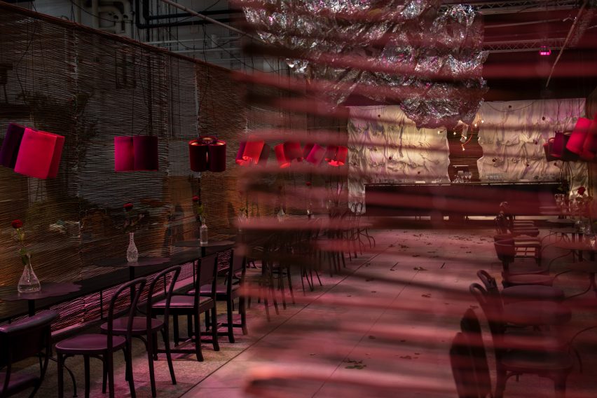
Underbar at Stockho;m Furniture Fair by Jonas Bohlin and Christine Ingridsdotter
Silvery emergency blankets decorate the ceiling

Called Underbar, a pun on the word bar that means wonderful in Swedish, the space is located at the centre of the Stockholm Furniture Fair trade show and was made from materials that will be reused once the fair is over.

Its design was based on a previous bar that Bohlin created for the furniture fair in the early 1980s, which had the same proportions.
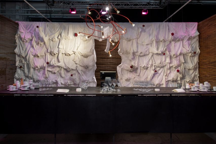
Wall made from dress shirts at Underbar bar at Stockholm Design Week
The back wall is made from dress shirts

All of the bar’s furniture was designed by Bohlin and made in Sweden, and all the materials used for Underbar were chosen so that they could be reused after the fair closes.

“As a designer, there are three things that are of interest: nature, life and the future,” Bohlin told Dezeen. “We wanted to create a space where everything could be reused, nothing would be allowed to be thrown away afterward.”

“We borrowed the shirts for the dress shirt wall from friends who will get them back, while the vases are from second-hand store Myrorna and will be given back to it when the bar closes,” he said.

“The willow mats used for the walls will be used at garden fair Trädgårdsmässan; the chairs I’ve borrowed from restaurants I’ve designed, the tables have already been sold, and the bench was made from wooden flooring and a steel frame that can also be reused.”
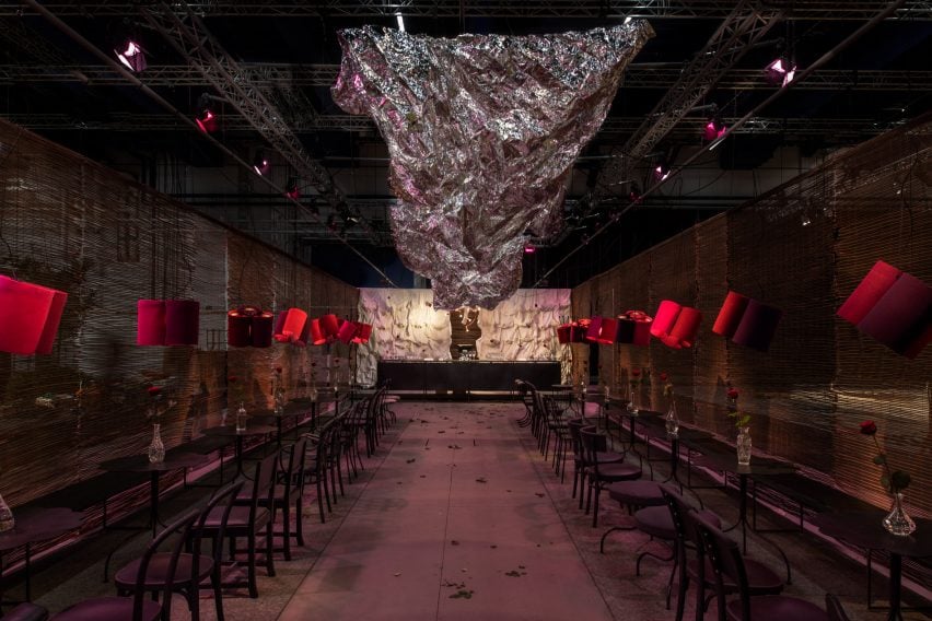
View of Underbar at Stockholm Furniture Fair by Jonas Bohlin
Bohlin constructed the lamps for the space himself

The felt lamps were designed by Bohlin for a lighting company that didn’t want to produce them, blaming a lack of time.

“That made me slightly annoyed as I’d already envisioned the lamps here, so I had to sit down and make them all myself,” Bohlin said.

“The idea was that they would be good for the acoustics,” he added. “The best thing is to dampen the sound close to the source, the mouth, which is why I made the lamps from felt and in these half-circle shapes that catch the sound. Some of these will go to a restaurant after and I’ll sell the rest of them.”
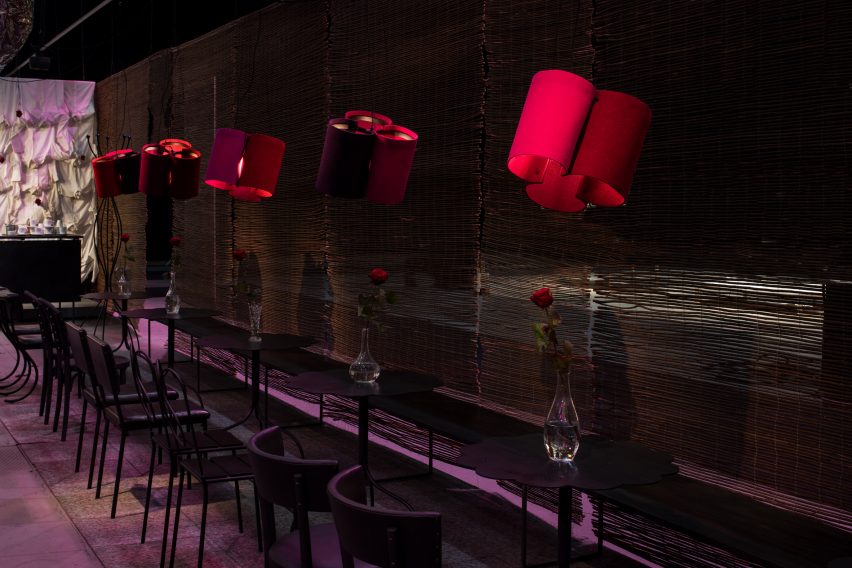
Lamps made from felt by designer Jonas Bohlin
Vases were bought from a second-hand store

The bar was made from leather on a steel frame in collaboration with Ahls Mekaniska in Småland, which also helped make the tables.

The ceiling was decorated with emergency blankets that will be donated after the end of the fair, potentially to Ukraine, Bohlin said. His lamps Andromeda and Atom were used to create sculptural lighting designs in the bar.
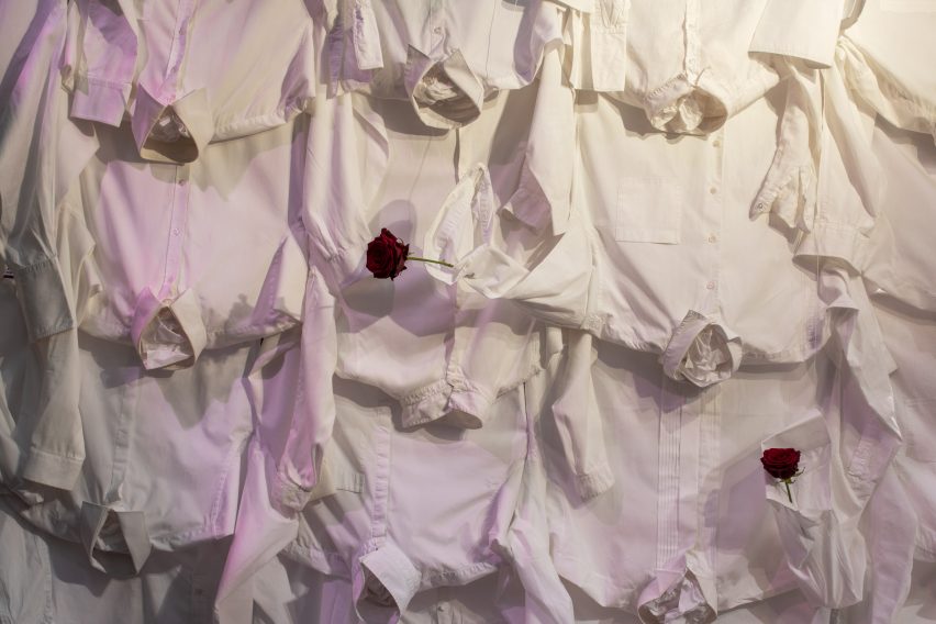
Close-up of dress shirts used for Underbar bar
Shirts were leant by friends and will be returned

“When I design something I try to relate to the space, play on the space as if it is Chinese chequers – I want to keep something of the history of the space when I create something new and respect the history that has been,” Bohlin said.

“But I also try to create a landscape of dreams,” he added. “We’re all different, and I think it’s important in a public space for everyone to find something – in the colour or form – that they feel safe with or recognise, something they can talk about.”

“Fancy restaurants may target just one typical audience, while I want everyone who comes here to feel welcome and for everyone to have an experience, both of the food and of the spatiality.”

Other projects on show during Stockholm Design Week include a pavilion by Daniel Rybakken in the waters of Stockholm and an exhibition that visualizes the carbon emissions of common materials.

Underbar is on show until 11 February as part of Stockholm Design WeekBrowse our digital guide to the festival here and see Dezeen Events Guide for details of other architecture and design events taking place around the world.

Reference

Jaqui Seerman updates interiors of LA bank building to create Hotel Per La
CategoriesInterior Design

Jaqui Seerman updates interiors of LA bank building to create Hotel Per La

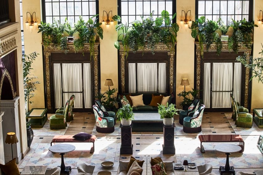
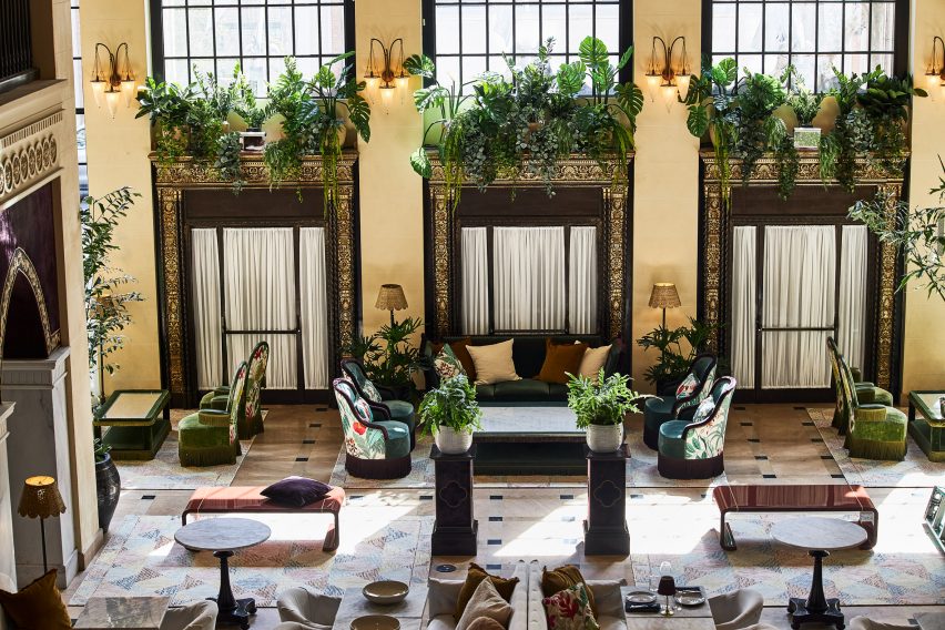
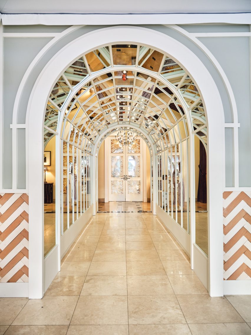
A new hotel occupies 1920s bank headquarters in Downtown LA, where Jaqui Seerman refreshed public spaces to include a botanical-themed lounge and a mirror-lined arched gallery.

Hotel Per La is housed in the neoclassical Giannini Building, built in 1922 as the headquarters for the Bank of Italy, and takes the place of the NoMad Los Angeles which closed its doors in March 2021.

Double-height lounge
Hotel Per La replaces the Nomad Los Angeles in the 1920s bank headquarters

Its 10,000 square feet (930 square metres) of public and event spaces have been refreshed by local interior designer Jaqui Seerman, who used the 12-storey property’s Italian connection to inform her updates.

“A nod to the building’s storied beginning as a bank for the people, the ‘Per La’ name translates to ‘for the’ in Italian,” said the hotel.

“[The bank’s] founder, Amadeo Pietro Giannini, believed in the dignity and abilities of those commonly overlooked, signifying the hotel’s inclusive spirit and name, essentially meaning ‘for Los Angeles, and people like you’.”

A mirror-lined arched gallery
A mirror-lined arched gallery opens into the main lobby

Demarcated by a pale blue awning, the hotel’s entrance has been relocated from 7th Street to Olive Street, leaving the doric columns across the grand facade fully visible.

Through the doors, guests find themselves in a double-height lounge filled with plants and comfy chairs covered in botanical patterns.

Reception
The custom front desk is by Voila Creative Studio and the hand-painted tapestry behind is by Jessalyn Brooks

An arched gallery lined with mirrors leads to the lobby, situated in what was once the main banking hall.

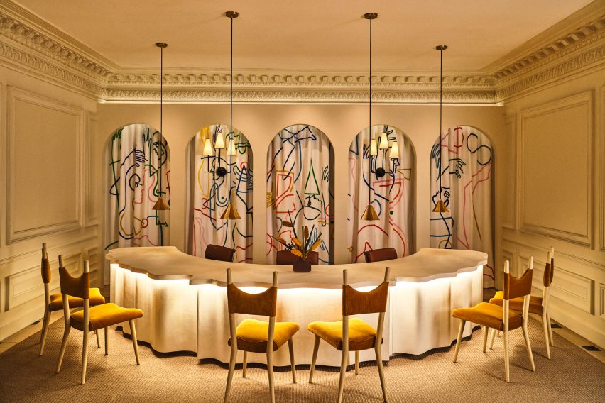
In the reception area, a custom-made curved plaster front desk influenced by linen fabric was designed by Voila Creative Studio, while a hand-painted tapestry that hangs in the niches behind was produced by LA muralist Jessalyn Brooks.

Purple games room
A purple games room features commissioned art and furniture from local artisans

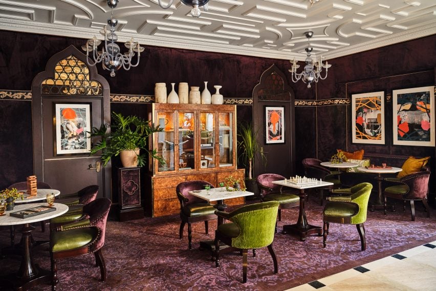
A rich purple lounge features a new game cabinet, as well as commissioned art and furniture sourced from local artisans.

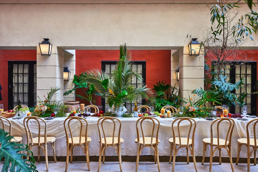
Event spaces range from a second-floor courtyard for private outdoor dinners, to larger spaces for up to 850 people.

Dining table in outdoor courtyard
A second-floor courtyard hosts private outdoor dinners

Dining options within the hotel include Per L’Ora, which serves Italian cuisine and features a light colour palette across curvaceous design elements influenced by the early 2000s.

“The bar of the restaurant acts as a dramatic centerpiece, with a custom-made marble top in shades of green, grey, and white, and globe-shaped light fixtures, while custom white plasterwork on the front of the bar offers a new sense of texture,” said the hotel operators.

Adjacent to the restaurant is a casual cafe modelled on a Venetian coffee shop, serving beverages, pastries and snacks.

On the rooftop, Bar Clara offers cocktails for poolside lounging and hosts live performances with the LA skyline as a backdrop.

Guest room
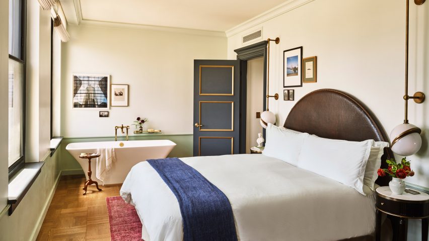
Guest rooms are decorated to echo the ornate blue and gold ceiling in lobby

The 241 guest rooms and suites have retained much of the aesthetic created by French architect Jacques Garcia for the NoMad, referencing the restored gold and blue ceiling in the lobby.

Downtown LA, the city’s most walkable neighbourhood, has experienced a cultural renaissance over the past decade.

The hotel occupies the neoclassical Giannini Building
The hotel occupies the neoclassical Giannini Building in Downtown LA

The area is now home to several design-forward hotels including Kelly Wearstler’s Proper – which was just named hotel and short-stay interior of the year at the 2022 Dezeen Awards – a Soho House, and an Ace Hotel.

Per La is the latest hotel in the US to open in a converted bank building, following the likes of The Durham in North Carolina and The Quoin in Wilmington, Delaware.

The photography is by The Ingalls.


Reference

Ten living rooms that use warm neutrals to create a cosy ambience
CategoriesInterior Design

Ten living rooms that use warm neutrals to create a cosy ambience

As the days get darker in the northern hemisphere, our latest lookbook spotlights 10 living rooms rendered in warm yet discrete colour palettes, proving that neutrals don’t have to feel clinical.

Mixing tactile natural materials with toasty shades of chocolate brown, creamy beige and blush pink can help to create a sense of homeliness in a room without being overbearing.

From a São Paulo apartment filled with Brazilian modernist design to a converted biscuit factory in Los Angeles, here are 10 American homes that show how it’s done.

This is the latest in our lookbooks series, which provides visual inspiration from Dezeen’s archive. For more inspiration see previous lookbooks featuring bathrooms with statement sinks, homes with Eames chairs and contemporary living rooms in Victorian and Georgian houses.


Formal lounge in Twentieth house by Woods and Dangaran
Photo is by Joe Fletcher

Twentieth, USA, by Woods +Dangaran

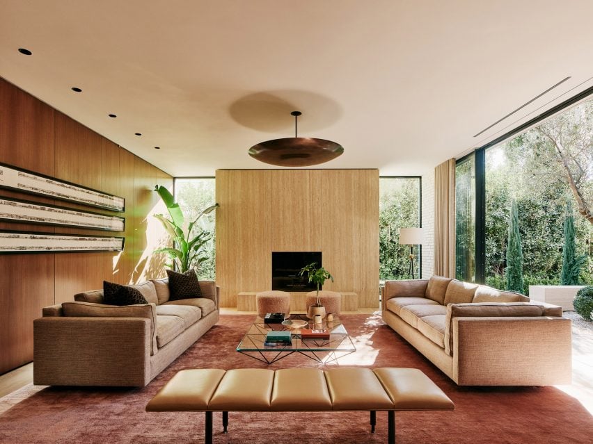
This Santa Monica home features two separate living areas – a family room (top image) and a formal living room (above) – which flank a central courtyard housing a decades-old olive tree.

Despite being framed by glazing, the rooms maintain a homely atmosphere with the help of an earthy material palette ranging from the travertine fireplace to a rose-gold cashmere rug and club chairs finished in tactile chocolate-brown corduroy.

Find out more about Twentieth ›


A living room inside Amity Street Residence with warm neutral colour palette
Photo is by Sean Davidson

Amity Street Residence, USA, by Selma Akkari and Rawan Muqaddas

Architectural designers Selma Akkari and Rawan Muqaddas used warm oak floors and cream-hued walls, contrasted against dark stone and stained-wood bookshelves, to enliven this “neglected” apartment in a 20th-century building in Brooklyn.

“A dialogue of opposites was the main theme behind the creation; minimal but warm, understated yet rich,” Muqaddas told Dezeen.

Find out more about Amity Street Residence ›


Hygge Studio by Melina Romano
Photo is by Denilson Machado of MCA Estúdio

Hygge Studio, Brazil, by Melina Romano

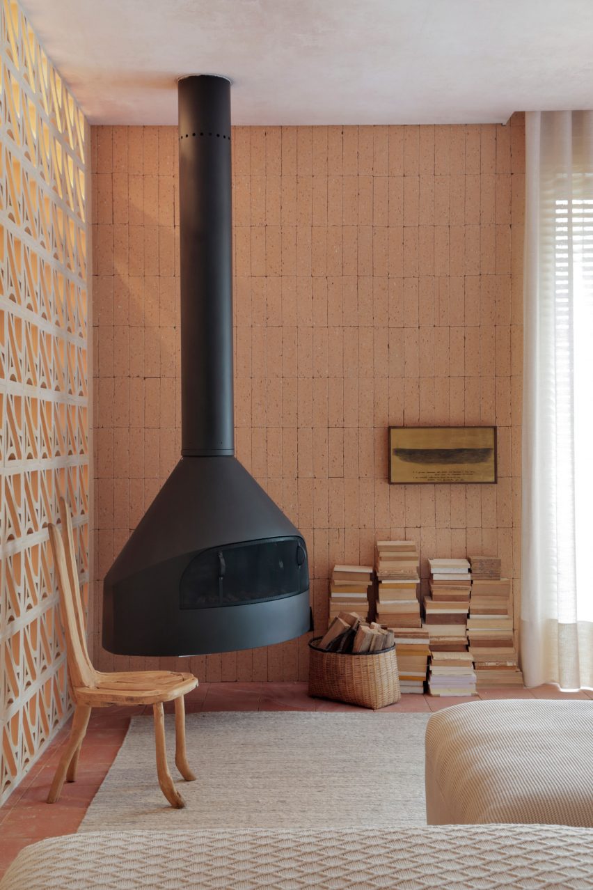
A black fireplace is suspended from the ceiling in this living room to contrast with the otherwise soft colour scheme of the interior, reflected in everything from the cream sofa and woven rug to the cobogó block screen that acts as a room divider.

Walls and floor throughout the São Paulo apartment are covered in terracotta tiles, chosen by local designer Melina Romano to strike a balance between “modern and bucolic”.

Find out more about Hygge Studio ›


Living room with full storage wall with warm neutral colour palette
Photo is by Nicole Franzen

East Village Apartment, USA, by GRT Architects

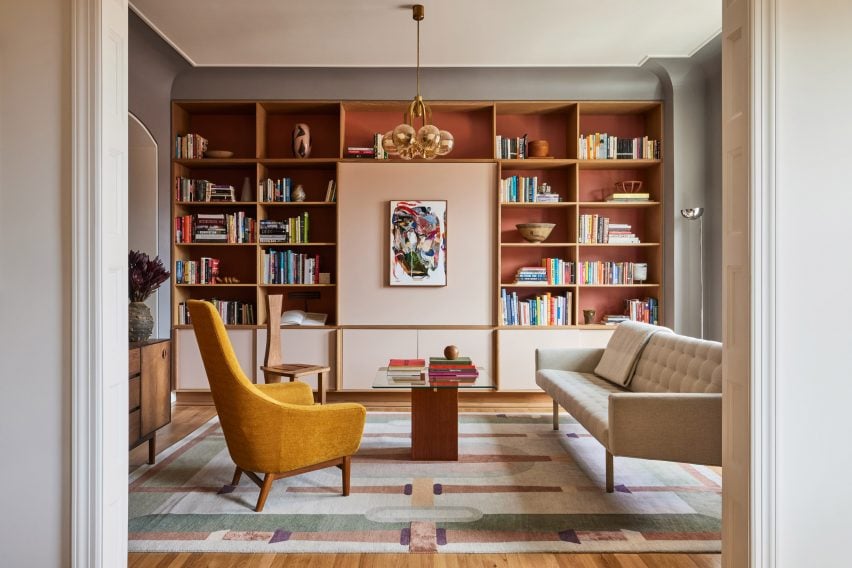
New York-based GRT Architects used warm tones and materials to modernise this renovated East Village apartment – set in a Beaux-Arts building on Second Avenue – while “preserving its turn-of-the-century disposition”.

In the lounge, this was achieved by adding a storage wall backed with sienna-coloured panels and complementing it with a geometric, art deco-style rug rendered in muted shades of sage green and dusty rose.

Find out more about this East Village Apartment ›


Kelly Wearstler's interiors for Santa Monica Proper Hotel
Photo is by The Ingalls and Matthieu Salvaing

Santa Monica Proper, USA, by Kelly Wearstler

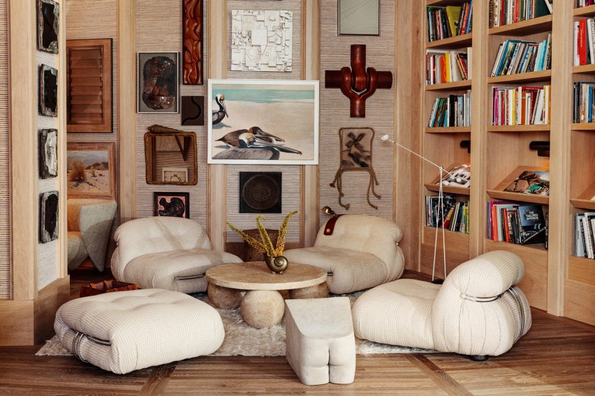
Although not technically a living room, the lounge of the Santa Monica Proper hotel features all the trappings of a cosy den – timber bookshelves, creamy-white Soriana lounge chairs and a Coulmier limestone coffee table with three orbs for legs.

Interior designer Kelly Wearstler used natural materials and neutral colours throughout the hotel to reference its seaside setting.

“Organic materials, neutral colour stories, everything has a texture,” Wearstler told Dezeen. “There’s a patina, there’s a hand, there’s something that feels very warm.”

Find out more about Santa Monica Proper ›


Olivier Garcé apartment with warm neutral colour palette
Photo is by Sean Davidson

West Village apartment, USA, by Olivier Garcé

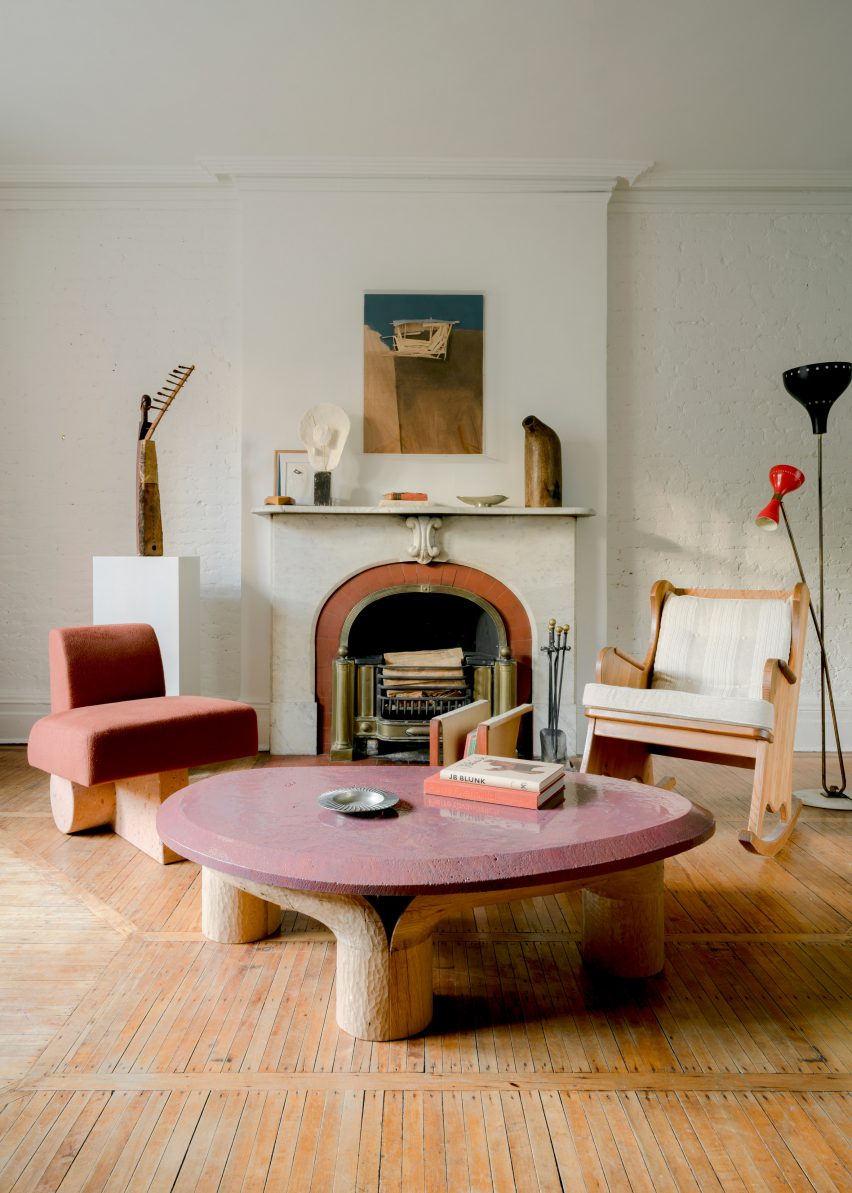
American interior designer Olivier Garcé found a creative outlet during last year’s coronavirus lockdown by working remotely with friends and colleagues to transform his West Village home into a show space for contemporary art and design.

His lounge now houses a vintage Axel Einar Hjorth rocking chair, paired with a lava-stone coffee table and side chair upholstered in alpaca wool by New York designer Ian Felton, complementing the terracotta-coloured tiling on the building’s original fireplace surround.

Find out more about this West Village apartment ›


Living room of 20 Bond apartment by Home Studios
Photo is by Brian Ferry

20 Bond apartment, USA, by Home Studios

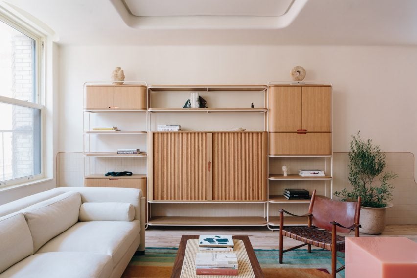
Curves feature liberally throughout this family apartment in New York’s NoHo neighbourhood, from its copper-edged skirting to the rounded oak-and-brass shelving unit in the living room, which was made bespoke by interior practice Home Studios.

The muted tones of the timber are complemented by a set of antique Danish armchairs with woven leather seats and a blush-coloured version of designer Sabine Marcelis’s Candy Cube side tables.

Find out more about 20 Bond apartment ›


Gale Apartment living room with warm neutral colour palette
Photo is by Fran Parente

Gale Apartment, Brazil, by Memola Estudio

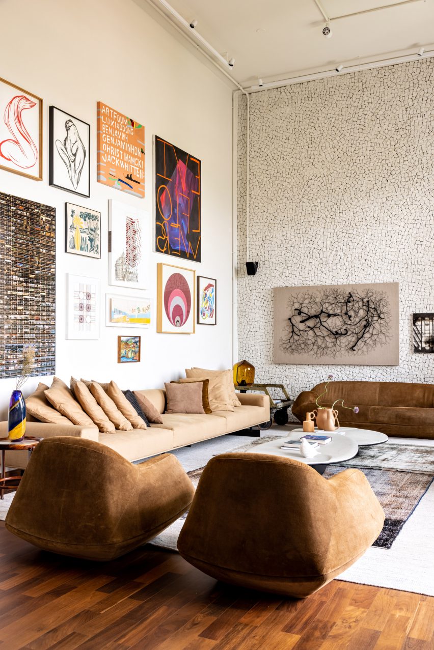
Furnishings are coloured in grounding, earthy hues inside this lounge flanked by two double-height statement walls – one housing the owners’ art collection and the other clad in a broken-edge stone mosaic.

“Furniture has been reupholstered to match the new colour palette, inspired by the autumn and the sunset colours found in the horizon,” said design practice Memola Estudio, which was responsible for renovating the São Paulo apartment.

Find out more about Gale Apartment ›


Photo is by Justin Chung

Biscuit Loft, USA, by OWIU Studio

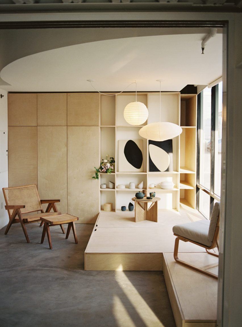
Japanese design informed this apartment in a converted 1920s biscuit factory in Downtown Los Angeles, with a guest room modelled on a traditional Ryokan inn that also functions as a space for hosting gatherings and tea ceremonies.

Local practice OWIU Studio added Noguchi pendant lights to bathe the room in a warm glow, while a convertible platform made from pale wood conceals extra storage and functions as a base for a futon when guests are staying over.

Find out more about Biscuit Loft ›


Sao Paolo apartment by BC Arquitetos with warm neutral colour palette
Photo is by Denilson Machado

DN Apartment, Brazil, by BC Arquitetos

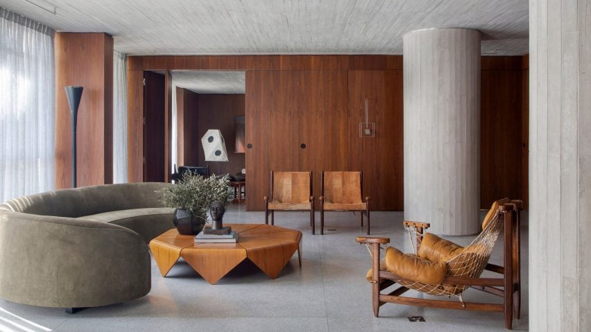
Walnut wood panelling and soft furnishings upholstered in caramel-coloured leather help to temper the chunky concrete columns of this apartment, housed in a 1970s building in São Paulo’s traditional Jardins neighbourhood.

Local practice BC Arquitetos describes the home as a “gallery apartment” as it houses an extensive collection of mid-20th century Brazilian art and design, ranging from the net-backed Janguada armchair by Jean Gillon to Jader Almeida’s Verde Corvo sofa, which is finished in a faded olive green.

Find out more about DN Apartment ›

This is the latest in our lookbooks series, which provides visual inspiration from Dezeen’s archive. For more inspiration see previous lookbooks featuring bathrooms with statement sinks, homes with Eames chairs and contemporary living rooms in Victorian and Georgian houses.

Reference

Les Archinautes and 3AE create Lipno Lakeside Cabin in Czech Republic
CategoriesArchitecture

Les Archinautes and 3AE create Lipno Lakeside Cabin in Czech Republic

Timber interiors and larch cladding reference the surrounding Bohemian Forest at this pared-back cabin in the Czech Republic, designed by French practice Les Archinautes in collaboration with local practice 3AE.

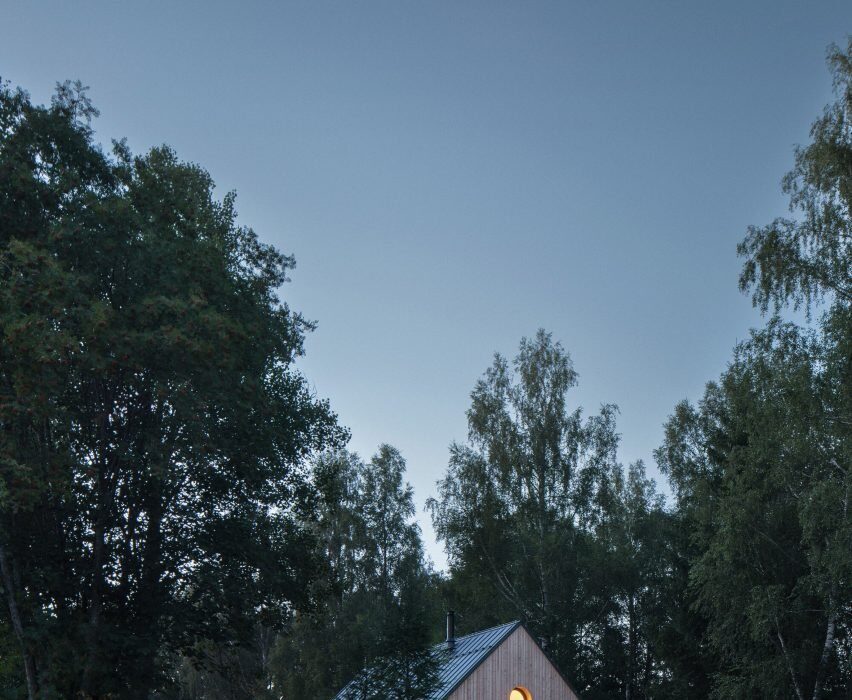
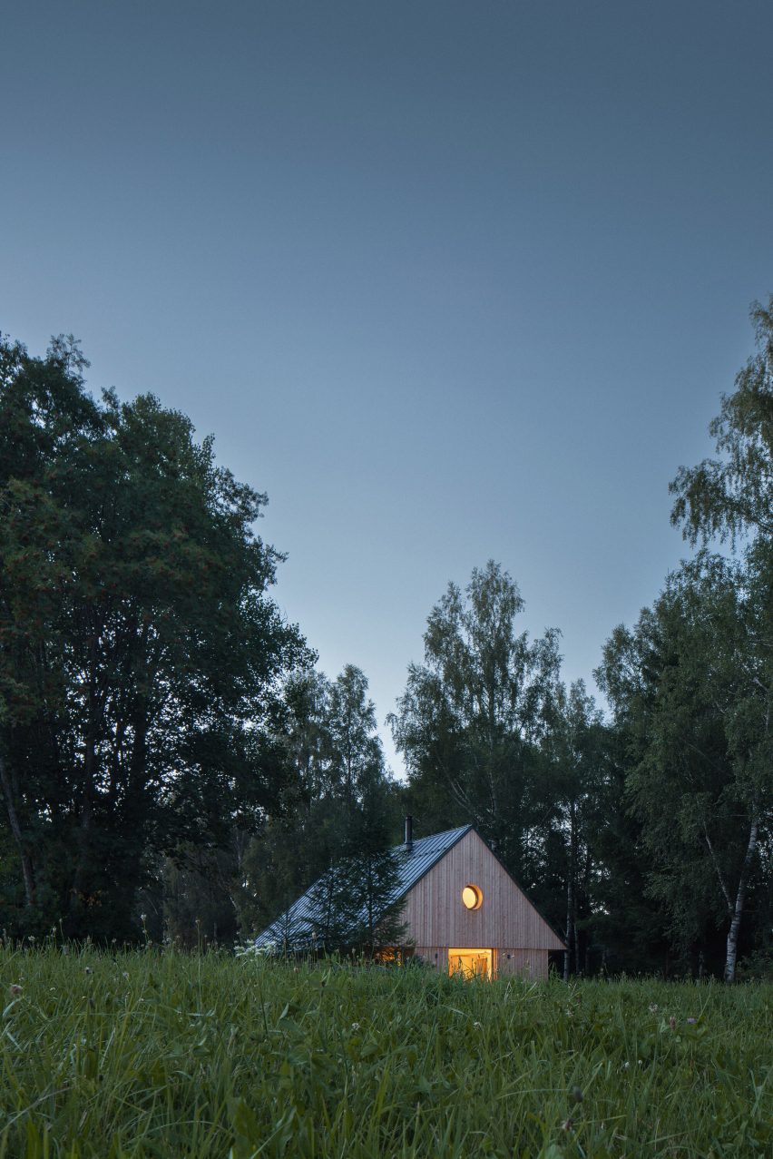
Overlooking Lipno lake close to the Czech Republic’s border with Germany and Austria, the cross-laminated timber (CLT) cabin was designed to provide a rest stop for people who come to ski and hike in the nearby mountain ranges.

Exterior image of Lipno Lakeside Cabin surrounded by forest
Lipno Lakeside Cabin is a cabin in the Czech Republic

Informed by a wooden dwelling that once stood on the site, the cabin’s simple design drew from the architecture typical to the area, which Lyon-based Les Archinautes describes as “wooden, compact and cozy.”

“The morphology of the house stands on several principles of Bohemian Forest architecture: rectangular floor plan, compact shape, orientation along the contour line, creation of a covered porch and more pronounced articulation of the gable,” said the practice.

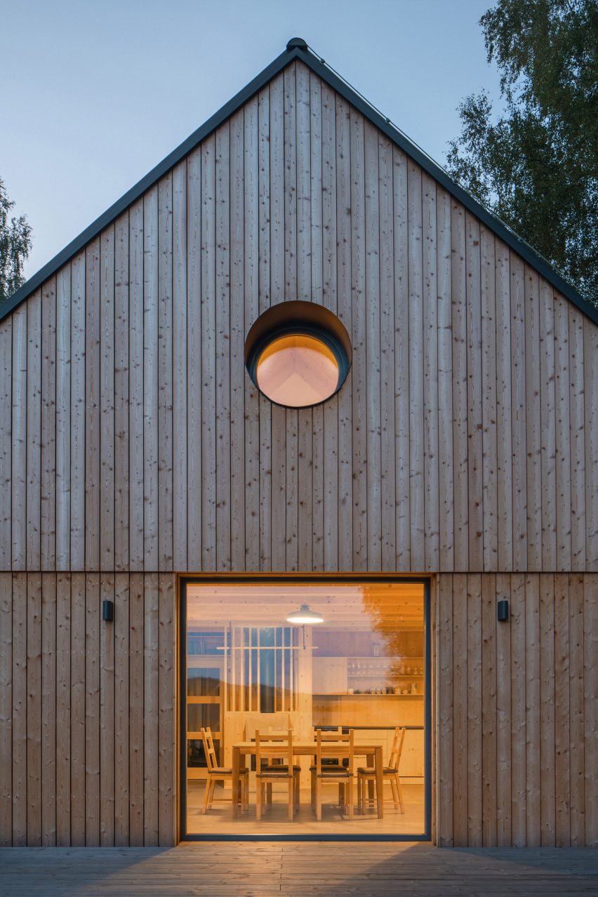
Exterior image of the facade of Lipno Lakeside Cabin with views of the interior
It has been clad in larch planks

Clad in thin larch planks, the cabin is raised on a low wooden platform, which extends to create a terrace along two sides of the home sheltered by the oversized eaves of the roof.

Seeking to bring the surrounding forest into the cabin as a “material, smell, and colour,” the CLT structure has been left exposed throughout the interiors, which are organised to capture views of the landscape.

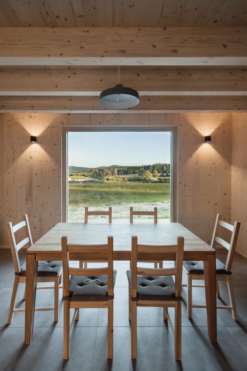
The focal point of the cabin is the ground floor living and dining space, where a large table, kitchen counters and concrete fireplace sit underneath wooden beams and overlook the lake through a large square window.

Alongside this space, the main ground-floor bedroom and two smaller first-floor bedrooms tucked beneath the roof capture glimpses of the forest and mountains through skylights and small, round windows in each gable end.

Interior image of the timber-lined dining area at Lipno Lakeside Cabin and its lakeside views
The interior of the cabin was similarly clad in timber

“The view of Lipno lake, with two major peaks in the background, becomes the main point of the project, centred around the dominant gabled square window facing toward the lake,” said the practice.

“Wooden walls in the interior create a pleasant and warm atmosphere. The exposed wood is painted with hard wax oil, white pigment and a UV filter, ensuring the wood retains its fresh colour for decades to come,” it continued.

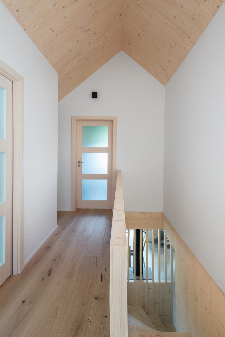
Interior image of the upper level of the wooden cabin
It was designed by Les Archinautes in collaboration with 3AE

Complementing the exposed CLT walls and ceilings, the minimal interiors are finished with oak flooring, simple light fittings and white tilework in the bathrooms.

Elsewhere in the Czech Republic, architecture studio Atelier SAD and interior designer Iveta Zachariášová recently completed a cork-clad home set in a rural landscape and local studio KLAR created a V-shaped timber house in the Czech countryside.

Photography is by Petr Polak.

Reference

JKMM and ILO architects create Dance House in Helsinki factory
CategoriesArchitecture

JKMM and ILO architects create Dance House in Helsinki factory

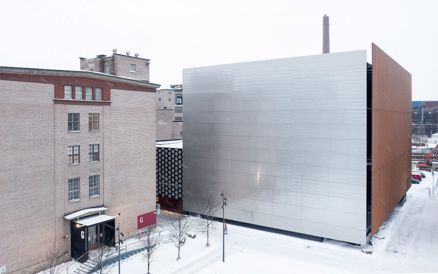
A large steel-clad cube encloses the Dance House in Helsinki, which local architecture studios JKMM and ILO architects have created by converting and extending part of a former cable factory.

Providing over 7,000 square metres of space, the Dance House forms part of a wider redevelopment of the old industrial building that was acquired by the city in 1991 to create the Kaapelitehdas, or Cable Factory, which is Helsinki’s largest cultural centre.

Metal-clad centre for dance in Helsinki
JKMM and ILO architects have created the Dance House. Photo is by Hannu Rytky

JKMM and ILO architects were tasked with reconfiguring part of the existing structure while adding new spaces to its eastern end, housed inside a steel-clad cuboid informed by the “gravity, lightness and weight” of dance.

“The Dance House adds a striking contemporary layer to the history of the former factory and its surroundings,” said JKMM.

Corner of Dance House by JKMM and ILO architects
The centre occupies part of a former cable factory

“The new and old are placed in contrast, but also in dialogue with each other. Together, the Dance House and the Cable Factory create a meaningful destination and a revived neighbourhood,” JKMM continued.

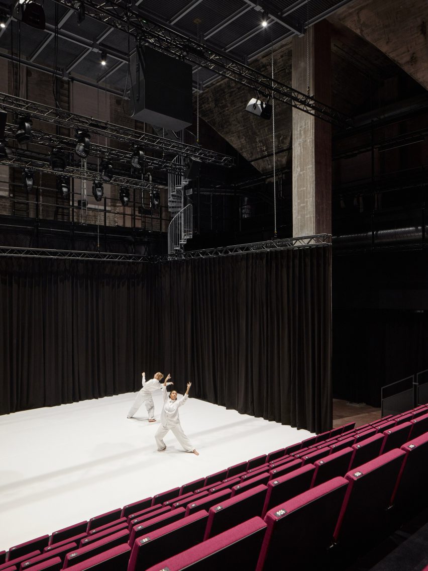
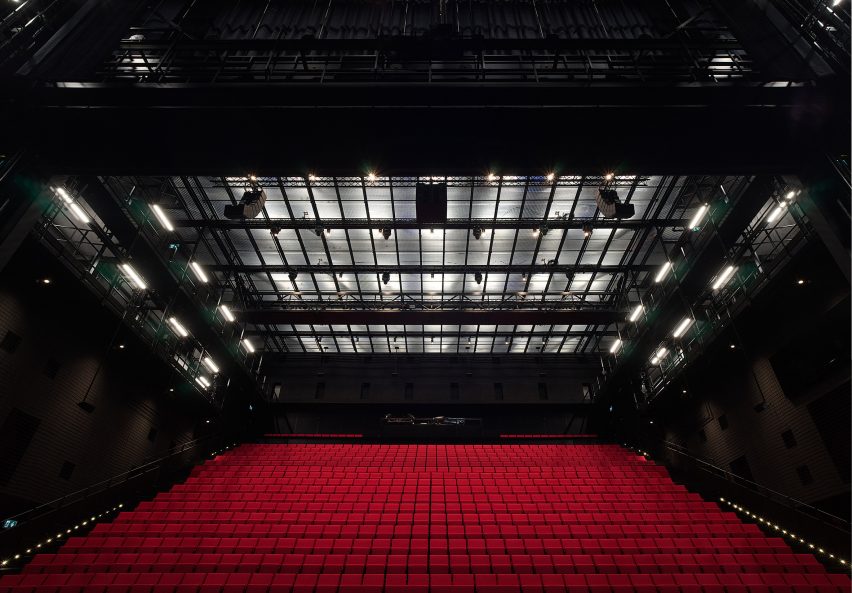
Inside are two black-box dance studios. One of them is housed in the Cable Factory’s redesigned Pannu Hall, which now seats up to 400 people, and the second is the new 1,000-seat Erkko Hall – the largest dance performance space in the Nordic countries.

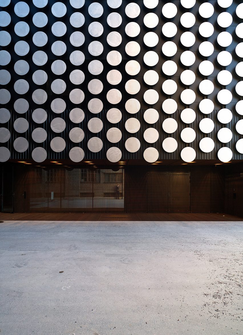
Detail image of the circular metal cladding panels
Metal clads the exterior of the building

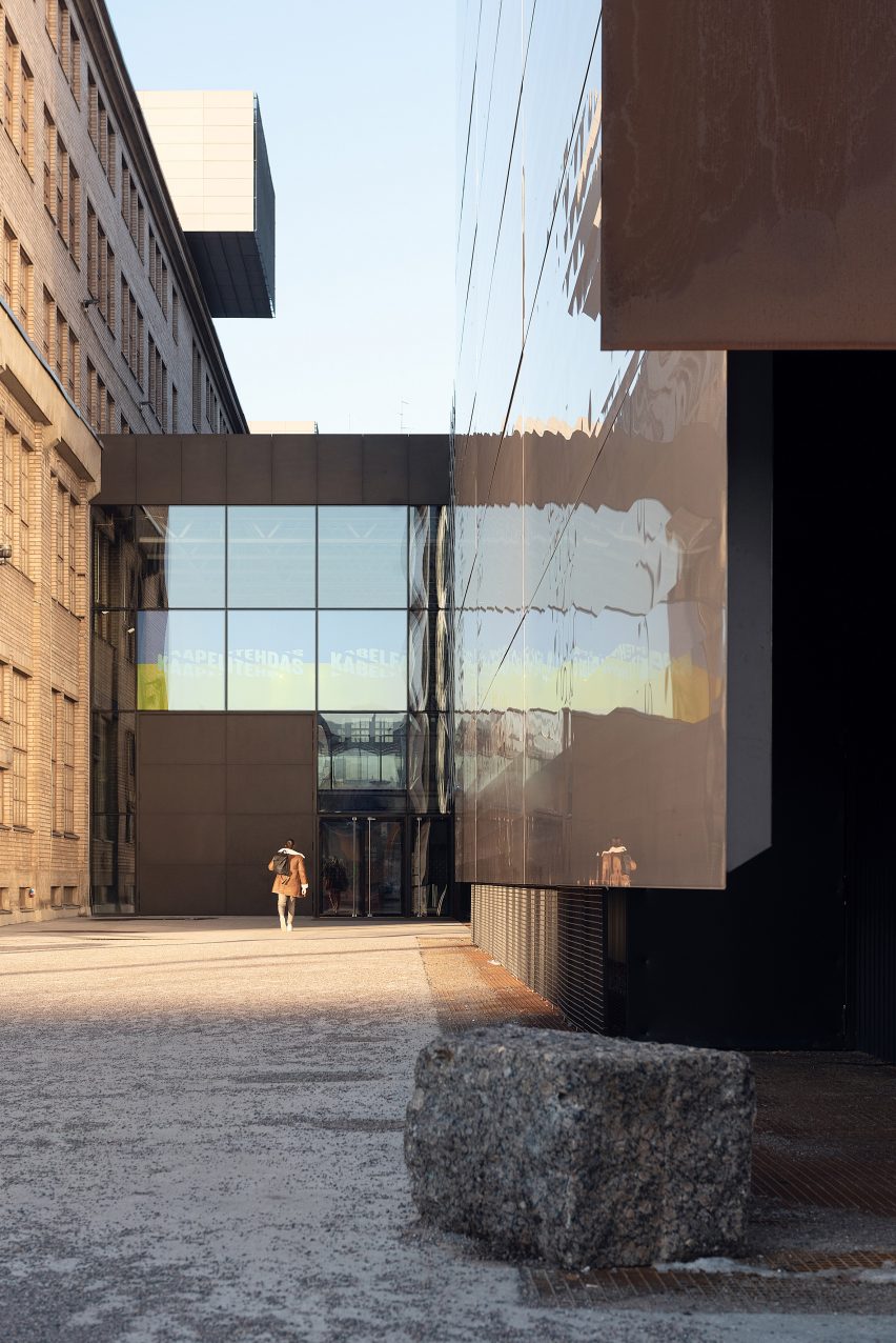
These two performance spaces sit on either side of an entrance lobby, which connects to an enclosed street-like space between two existing facades, described by JKMM as a “glass courtyard”.

An underground club, cloakroom facilities, restaurant, rehearsal and back-of-house spaces are organised across the building’s five levels, with all of the circulation spaces designed to have the potential to be used for performance.

“All the public spaces in the Dance House have been designed with performance in mind,” explained JKMM’s project architect Harri Lindberg.

“It is possible for dance to take over, for example, the entire Cable Factory for the duration of a performance,” he continued.

Exterior image of an entrance to Dance House in Helsinki
An entrance links to an enclosed street-like space. Photo is by Hannu Rytky

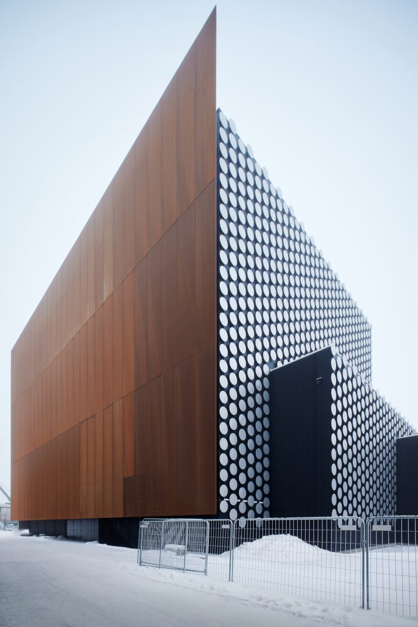
Large steel panels, one of them highly reflective and one weathered, form the facade of the extension, hung slightly above the ground and at different levels to give the effect of them shifting away from one another.

On the building’s north elevation facing a nearby park, the stacked levels have been covered in hundreds of small aluminium discs, designed to create an “abstract rhythm” against the sky.

Interior view of Dance House in Helsinki by JKMM and ILO architects
There are two black-box dance studios. Photo is by Tuomas Uusheimo

“Dance deals with gravity, lightness, and the weight of the human body,” explained JKMM.

“The ‘floating’ metal facades were custom designed by using laser welding technology, to create bespoke sandwich panels with the biggest possible surface,” it continued.

“Dance performers also create illusions. The light, satin-like steel surface can be transformed with light, becoming part of the scenery of dance events.”

Auditorium by JKMM and ILO architects in Helsinki
It has the largest dance performance space in the Nordic countries

Inside, robust materials such as raw steel and concrete have been chosen to complement the existing structure of the former factory.

JKKM recently incorporated heritage structures into another of its designs in the Finnish capital, creating a new home for the University of Arts Helsinki that partially occupies an old soap factory and silo building.

The photography is by Peter Vuorenrinne unless stated otherwise.

Reference

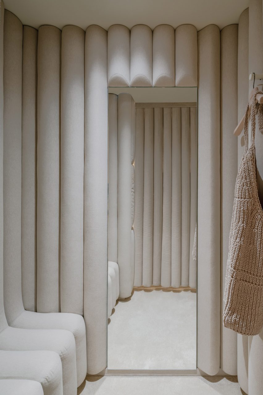
AMO cocoons Jacquemus store in pillows to create “bedroom-like” interior
CategoriesInterior Design

AMO cocoons Jacquemus store in pillows to create “bedroom-like” interior

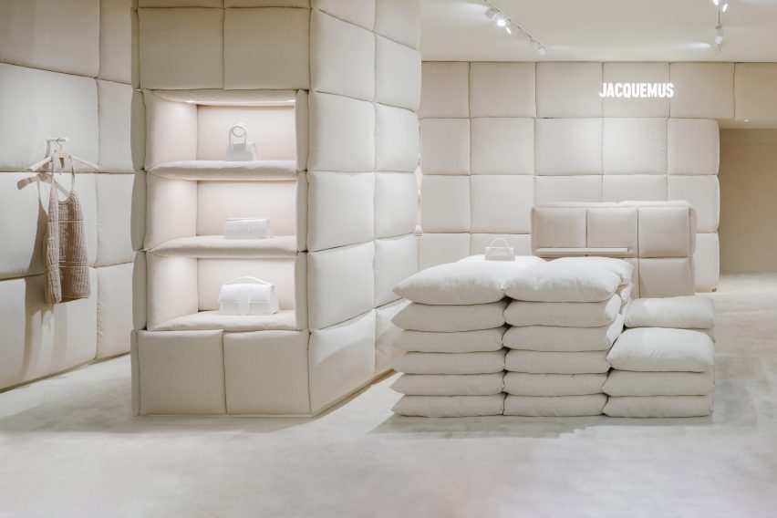
Dutch studio AMO has used pillows to form the display stands and line the walls in this tactile womenswear boutique by fashion brand Jacquemus in Paris, France.

The 60-square-metre shop, set in the department store Galeries Lafayette Haussmann, was designed to feel like a bedroom according to AMO, which is the research and design arm of architecture firm OMA.

A store interior filled with cream pillows
AMO has lined a Jacquemus store with large cream-coloured pillows

“The location of the shop within the Galleries Lafayette – without windows or daylight – led to the idea of creating a bedroom-like environment: a room entirely made of pillows,” said OMA partner Ellen van Loon.

“It is a cocooning and relaxed atmosphere, inviting customers to lounge and browse for as long as they want,” she told Dezeen.

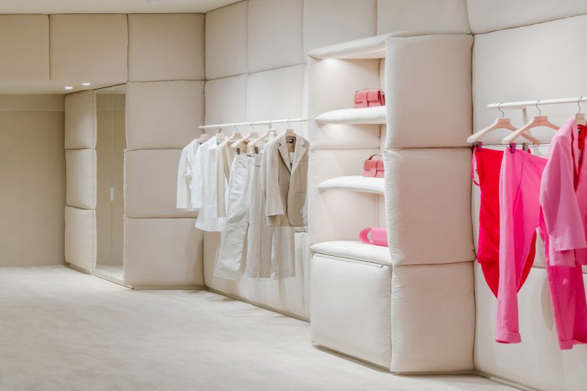
Pink and white clothes displayed in a Jacquemus store
The store is designed to feel like a bedroom

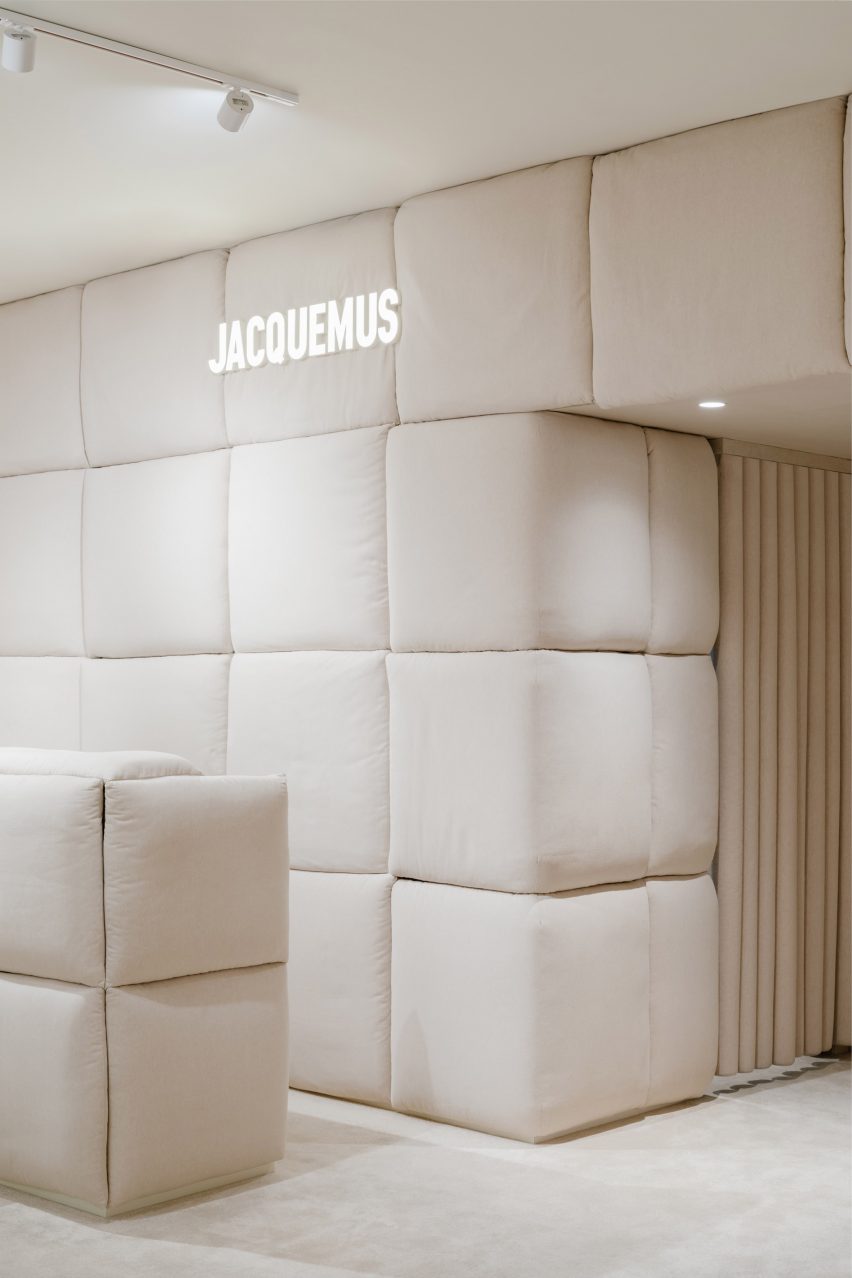
The linen pillows were designed to reference the textiles of Provence, where Jacquemus founder Simon Porte Jacquemus grew up.

“We explored a material palette that aims to capture the atmosphere of Provence,” said OMA architect Giulio Margheri.

“The fabric of the pillows is a reference to the linens of the South of France,” he told Dezeen.

Cream pillows and a Jacquemus sign
Linen pillows reference the textiles of Provence

AMO also added a stack of pillows to serve as a seating area for shoppers, as well as a spot to showcase Jacquemus’ signature tiny bags.

The studio completed the store’s easy-going atmosphere with the help of a stripped-back scheme, including cream-coloured carpet, soft lighting and clothing rails in a milky beige hue.

AMO previously designed another store for Jacquemus inside the London department store Selfridges. Much like the brand’s Paris outpost, the shop was wrapped entirely in a single material – clay.

“The design of the Jacquemus boutiques in London and Paris began with the idea of testing the limits of working with a single material,” Van Loon explained.

“Instead of working on the design first and deciding on the materials afterwards, we let the materials dictate their presence in the space.”

A cream coloured changing room
Changing rooms are coloured in the same creamy hue

The Jacquemus store is one of many retail interiors AMO has designed in Paris.

Among them is a pop-up shop by Tiffany & Co that showcases an array of jewellery pieces and a flagship store for clothing brand Off-White that features abstract interpretations of Parisian courtyards and flea markets.

Project credits
Partner: Ellen van Loon
Architect: Giulio Margheri
Team: Valerio Di Festa, Camille Filbien and Mattia Locci

The photography is by Benoit Florençon, courtesy of AMO.

Reference

A startup using open banking to create a loyalty programme for the planet
CategoriesSustainable News

A startup using open banking to create a loyalty programme for the planet

Spotted: Swedish fintech startup Gokind has set out to transform consumer awareness of brand sustainability. The company aims to encourage ethical, and environmentally conscious decisions by reaching customers through something they use every single day – their bank account.

The Stockholm-based startup has developed what they claim to be the world’s first loyalty programme for the planet. Leveraging expertise in behavioural science, software development, sustainability reporting, and business law, Gokind is making it easier for consumers to become eco-conscious. The startup encourages consumers to buy from more ethical and eco-friendly companies through rewards and loyalty incentives – using open banking to help customers understand which brands have sustainable practices.

To use the app, customers simply connect Gokind to their existing bank or credit accounts. With every purchase from an ethical or sustainable brand, customers will earn ‘impact credits’. The more ethical the brand, the more credits they get. The credits can then be exchanged for products and services, or put towards donations.

Thanks to the financial data they can access through open banking, Gokind can give consumers personalised advice and nudge them to make changes in their consumption habits – such as switching to a greener electricity provider or building credit with companies that support more diverse leadership.

Next steps in the company’s development include expanding beyond Sweden to provide sustainability insights to consumers across the world. 
Gokind is just the latest example of a fintech innovation that encourages sustainability. Others spotted by Springwise include a fintech app that powers the circular economy, and a credit card that tracks the carbon emissions associated with purchases.

Written By: Katrina Lane

Email: hi@gokind.co

Website: gokind.co

Reference

Ten interiors by architects that use internal glazing to create space and light
CategoriesInterior Design

Ten interiors by architects that use internal glazing to create space and light

For our latest lookbook, interiors expert Michelle Ogundehin has selected ten examples of interiors with glazed internal windows, doors and partitions that create clever zoning and add privacy while still letting the light through.


“In the ongoing search for work-from-home space, walls are making a return as open-plan layouts are found wanting,” writes architect, author and TV presenter Ogundehin, who has curated this selection of images from Dezeen’s archive.

“But walls block out natural light as well as potentially making spaces feel poky and claustrophobic,” adds Ogundehin, who joins Dezeen’s lookbooks team as occasional guest editor.

“Instead, consider an internal window or semi-glazed partitioning. The latter could be fixed or moveable, in the form of concertina partitions or pocket doors, so they can be slid or folded away at the end of the working day.”

“Either way, this selection of projects proves that zoning the contemporary home for work, rest and play doesn’t necessarily mean creating solid walls.”

This is the latest roundup in our Dezeen Lookbooks series providing visual inspiration for the home. Previous articles in the series feature interiors with printed wallpaper, spa-like bathrooms, inviting courtyards, outdoor spaces with fireplaces and fire pits, and pastel-hued interiors.

Read on for Ogundehin’s selection of great examples of internal glazing:


99 square-metre apartment by Lera Brumina

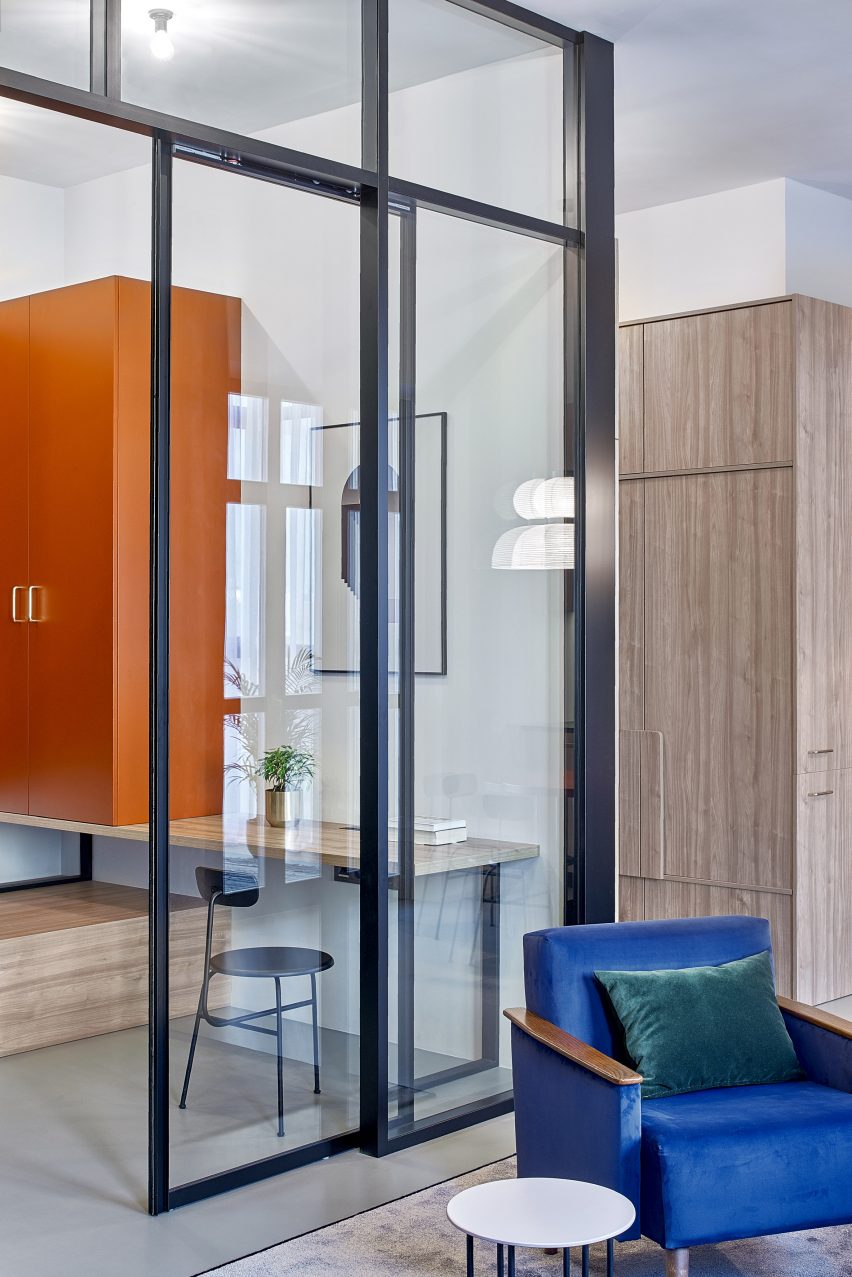
Minsk apartment, Belarus, by Lera Brumina

Interior designer Lera Brumina chose to use internal glazing as a clever solution to a problem with the light in this Minsk apartment, where one side is extremely bright and the rear half is much darker.

Instead of walls, she used sliding glass doors to separate the rooms, letting the light from the windows on one side of the apartment flow through the whole space. Colourful furniture and details also make the rooms brighter.

Find out more about Minsk apartment ›


Internal glass window in Beaconsfield Residence

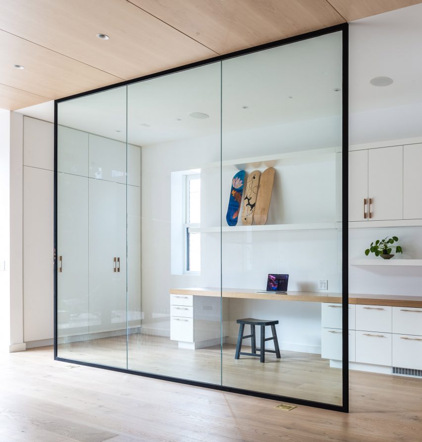
Beaconsfield Residence, Canada, by StudioAC

The renovation of this Victorian-era house in Toronto entailed overhauling and opening up the interior, including creating a glassed-in office at the rear of the house.

Located next to the kitchen, the office is shielded from it by a simple glass wall in a black frame, which is both decorative and creates a second room without making the kitchen feel smaller.

Find out more about Beaconsfield Residence ›


Teorema Milanese apartment, designed by Marcante Testa

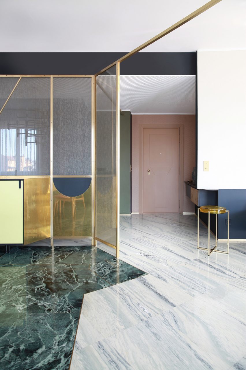
Teorema Milanese, Italy, by Marcante-Testa

A rich mix of materials and colours, including green and grey marble, feature in this luxurious-looking Milanese apartment by Marcante-Testa.

A partition wall was knocked out to create an open-plan living and dining room, with the different rooms demarcated by a golden metal frame that holds decorative glazed windows. This also separates the dining area from the hallway.

A lens table by McCollin Bryan with a glass tabletop picks up both the glass and the gold colour of the frame.

Find out more about Teorema Milanese ›


Makepeace Mansions Apartment by Surman Weston

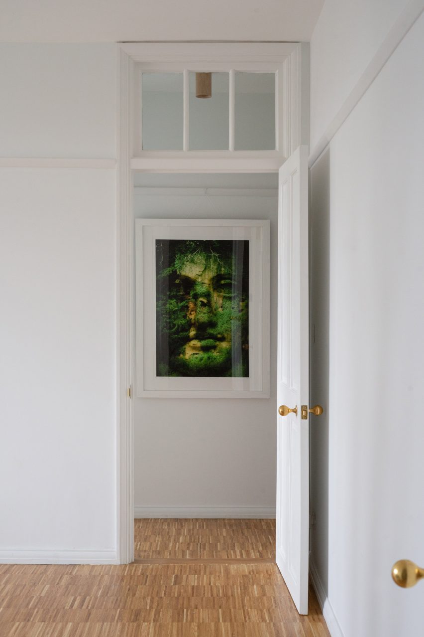
Makepeace Mansions, UK, by Surman Weston

In rooms with high ceilings, such as this London apartment that was given a refresh by Surman Weston, using glazed internal windows above doors is a clever way to let more light into the room.

A number of the rooms in the 1920s residential block feature these windows, which are both decorative and practical.

Find out more about Makepeace Mansions ›


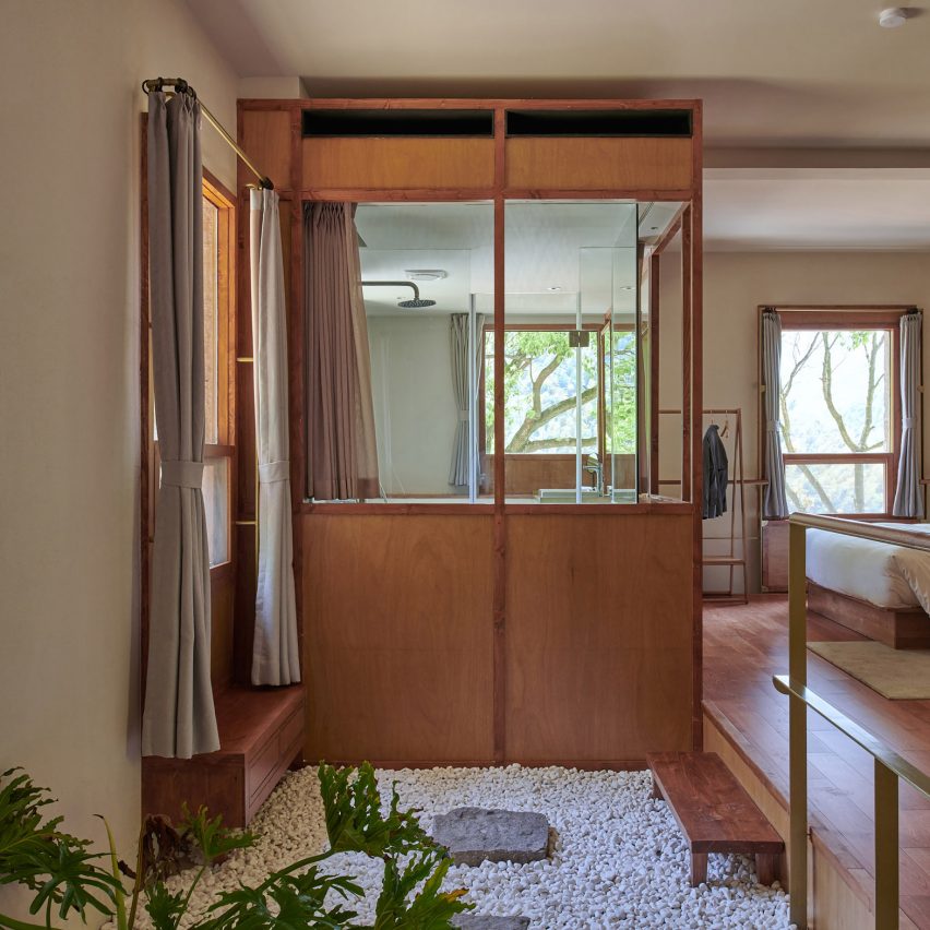
Glazed interior window in Chinese hotel

Lostvilla Qinyong Primary School Hotel, China, by Atelier XÜK

Atelier XÜK has turned a former primary school in China into a boutique hotel, with guest bedrooms that feature wooden floors and beds.

Wood-clad bathroom cubes hold showers and other facilities, which sit within wooden frames that have been glazed in some places to protect from the water. This creates a light-filled bathroom that still has a sense of privacy.

Find out more about Primary School Hotel ›


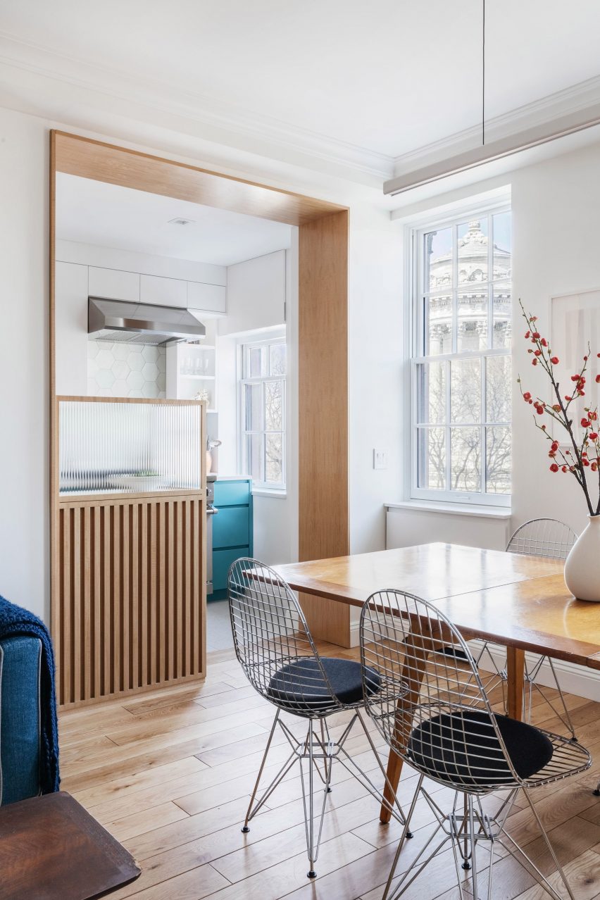
Riverside apartment by Format Architecture Office

Riverside Apartment, US, by Format Architecture Office

A small glazing solution shields the kitchen from the dining space in this New York apartment, adding a restaurant-like feel to the kitchen design.

Ribbed glass has been inserted into a wooden frame, hiding the prep-work space in the kitchen from the more relaxed living space and adding a nicely textured detail to the pared-down aesthetic of the flat.

Find out more about Riverside Apartment ›


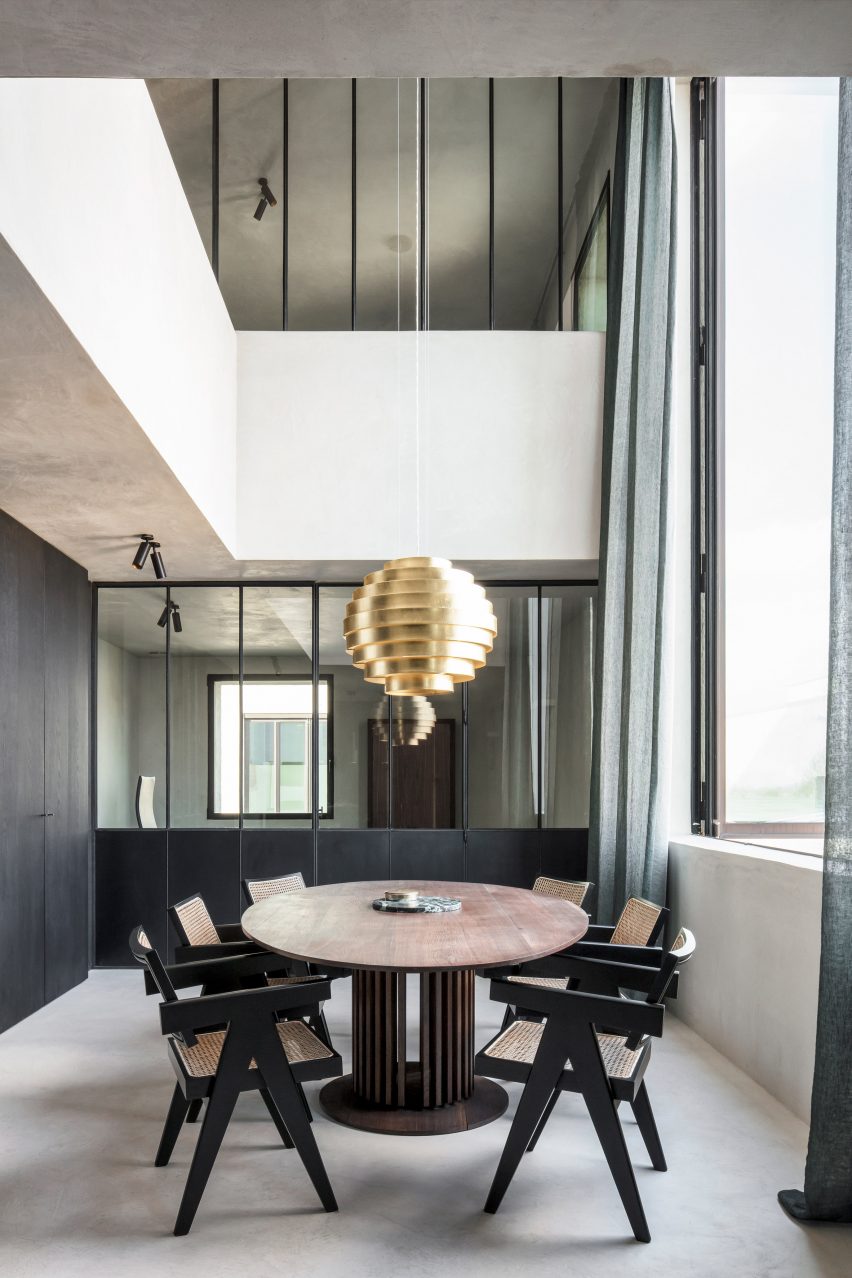
Lawyers office by Arjaan De Feyter

Lawyer’s office, Belgium, by Arjaan de Feyter

Professional spaces can also benefit from internal glazing, such as in this lawyer’s office in Belgium. Large glazed internal walls and windows help break up the rooms while making sure the moody colour palette doesn’t feel too dark.

Partition walls of glass and blackened steel create closed-off meeting rooms and contrast against the whitewashed walls.

Find out more about Lawyer’s office ›


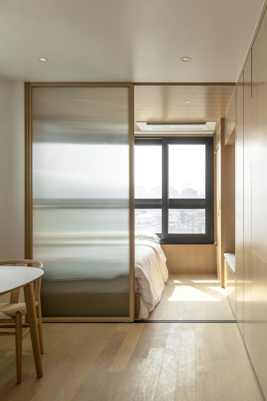
Wood-clad bedroom with interior window

LIFE micro-apartments, South Korea, by Ian Lee

This co-living building in Seoul has micro-apartments that tenants can customise however they want, with interiors that were designed to feel simple and timeless.

Sliding glass partitions have been used to divide the rooms in some of the apartments, with frosted glass to add more privacy between bedrooms and social spaces.

Find out more about LIFE micro-apartments ›


Bedroom of Botaniczna Apartment by Agnieszka Owsiany Studio

Botaniczana Apartment, Poland, by Agnieszka Owsiany Studio 

Designer Agnieszka Owsiany aimed to create a tranquil apartment for a couple with high-pressure jobs, and used a simple material palette and natural colours to do so.

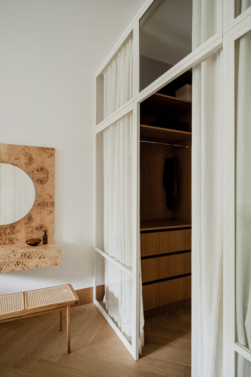
A floor-to-ceiling glass wall between the apartment’s hallway and the bedroom has a white frame that matches the plain white walls and has been hung with white curtains, a clever way to create a more intimate space when desired.
Find out more about Botaniczana Apartment ›


Hackney Mews by Hutch Design

Mews house, UK, by Hutch Design

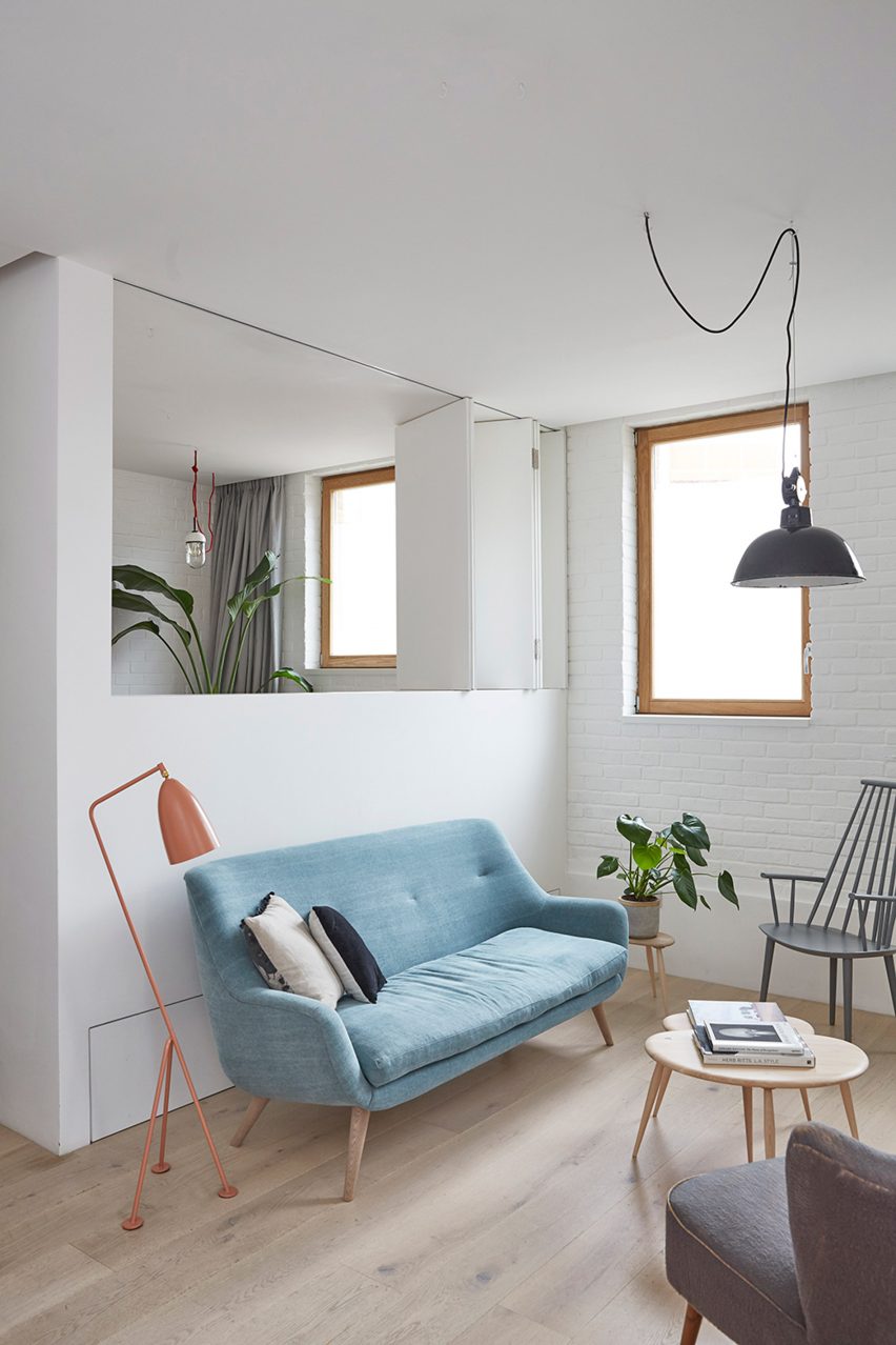
Even without glazing, internal windows help open up adjacent rooms and create a sense of space. Hutch Design’s renovation of this London mews house includes a side extension with a concertina partition in the upper section of the dividing wall.

This can be open or closed as needed, creating a room that can be adapted depending on its usage.

Find out more about Mews house ›


This is the latest in our series of lookbooks providing curated visual inspiration from Dezeen’s image archive. For more inspiration see previous lookbooks showcasing printed wallpapers, contemporary bathrooms, calm living rooms and colourful kitchens.

Reference