Pascali Semerdjian creates Aurora Apartment to hold “two universes”
CategoriesInterior Design

Pascali Semerdjian creates Aurora Apartment to hold “two universes”

Gut-renovating this São Paulo apartment has allowed Brazilian studio Pascali Semerdjian Arquitetos to incorporate the personalities of it occupants, particularly in the bedrooms of the family’s two children.

The Aurora Apartment is home to a family of four, and sits on a private street in the Alto de Pinheiros neighbourhood to the west of the city.

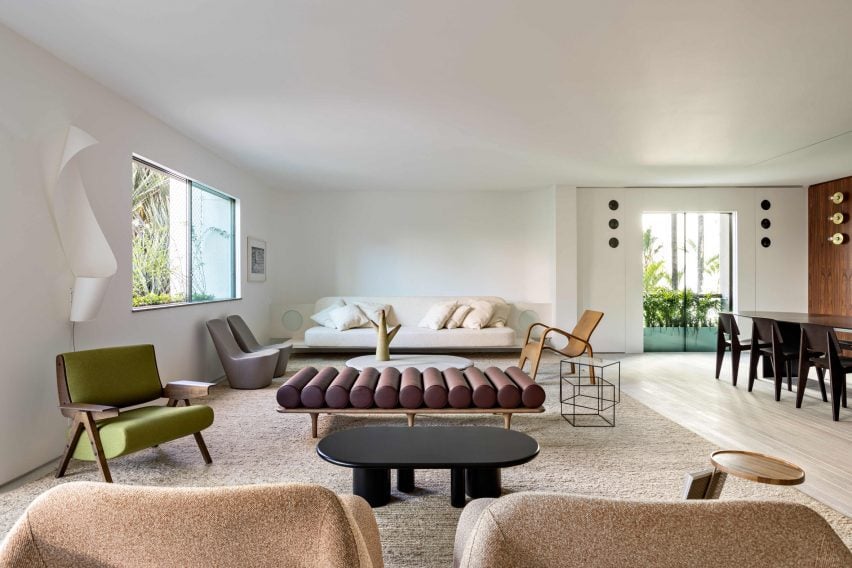
Open living room with a variety of midcentury and contemporary furniture
Renovating the Aurora Apartment involved opening up the living spaces

A total overhaul of the residence was needed to open up its spaces, bring in more light, and incorporate new materials and decor that reflect the owners’ tastes.

Without complete structural plans of the apartment or building, the demolition process revealed multiple hidden elements.
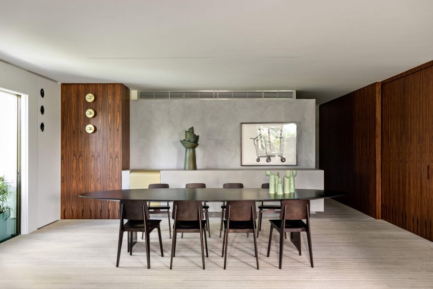
Dining room with oval table, Jean Prouvé chairs and dark wood panelling
The dining room is sometimes used for business meetings and dinners

Only when the apartment had been fully stripped back to its bare bones was Pascali Semerdjian Arquitetos able to design the floor plan to work around the structure.

“When we saw the remaining columns and slabs, we were able to continue sketching the client’s necessities as well as our ideas onto paper,” said the studio.
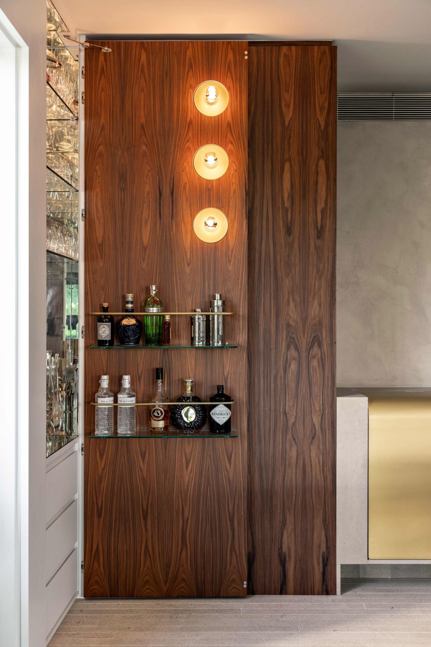
Wood door opened to reveal a hidden bar
A wall panel opens to reveal a hidden home bar

Once the layout was “settled”, the architects began to examine the walls and space volumetrically to discover ways to add interesting design moments that would reveal more about the family.

“One of the most important things about this project is how every single space, both social and private, has the family personality, with a unique design that results in harmony with the whole,” said Pascali Semerdjian Architects.
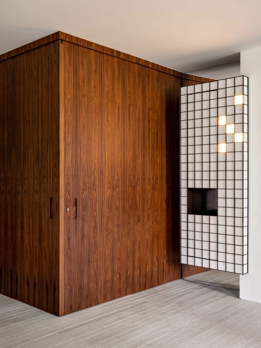
Floor-to-ceiling wood panelling and a gridded cabinet
Close to the entrance, a gridded cabinet houses a coat closet

The apartment is divided into a large, open social space that’s occasionally used for hosting business meeting and dinners, and a private area that contains the bedrooms and bathrooms.

“We wanted to create two universes in the same apartment: an intimate and cozy one, and another minimalist and social,” the studio said.
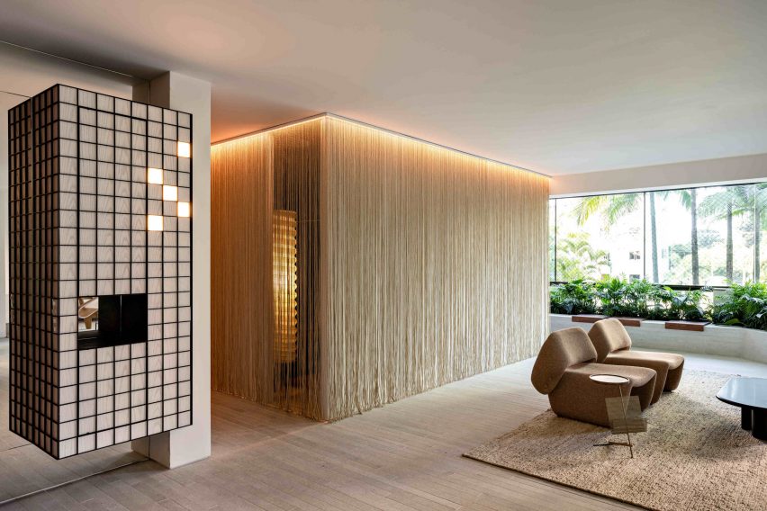
Room wrapped with thin fibrous curtains
Pascali Semerdjian Arquitetos has played with volumes and materials throughout the apartment

Dark wood panelling lines the entryway, concealing a storage area for keys and shoes, and the same floor-to-ceiling wood panels are used in the corner of the dining room. Here, a hidden door swings open to reveal a bar, and a brass container built into a plastered counter serves as a cooler for bottles.

Stone flooring in the living area is laid in thin planks to match the pattern of the wooden boards that run through the private spaces.
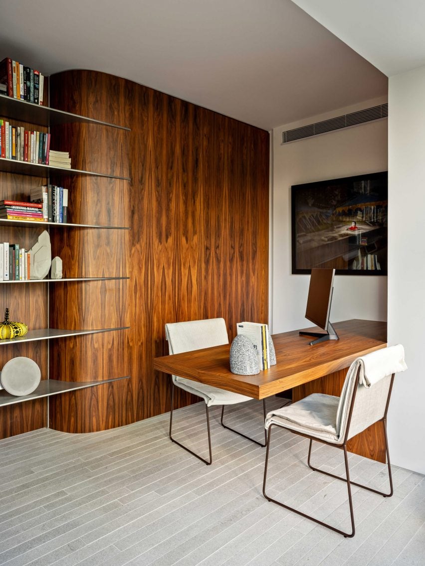
Home office with wood panelling and matching desk
Designed during the pandemic, the apartment contains several multifunctional spaces

Several classic midcentury designs were chosen for the living space, including Jean Prouvé dining chairs and a pair of salmon-coloured Ondine armchairs by Jorge Zalszupin.

These are mixed in with contemporary furnishings like the Thin Black side tables by Nendo and a leather chaise by Studiopepe.

A variety of furniture and lighting pieces custom-designed by Pascali Semerdjian also feature in the apartment, such as the main sofa, the office chairs, and the bar sconces.

There’s also a coat closet housed within a gridded cabinet, which is affixed to a mirror and features a cluster of square lights in its top right corner.
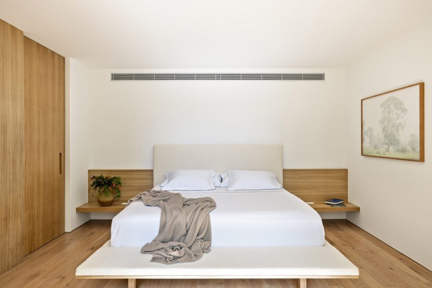
Minimal bedroom with wood and white surfaces
In the home’s private section, the primary bedroom is minimally decorated

In the private quarters, the primary suite is minimally finished in white and wood surfaces, while the children’s rooms are much more expressive.

For example, the younger son’s room is designed to resemble a small house, formed from wood panelling that covers the walls and is pitched on the ceiling.
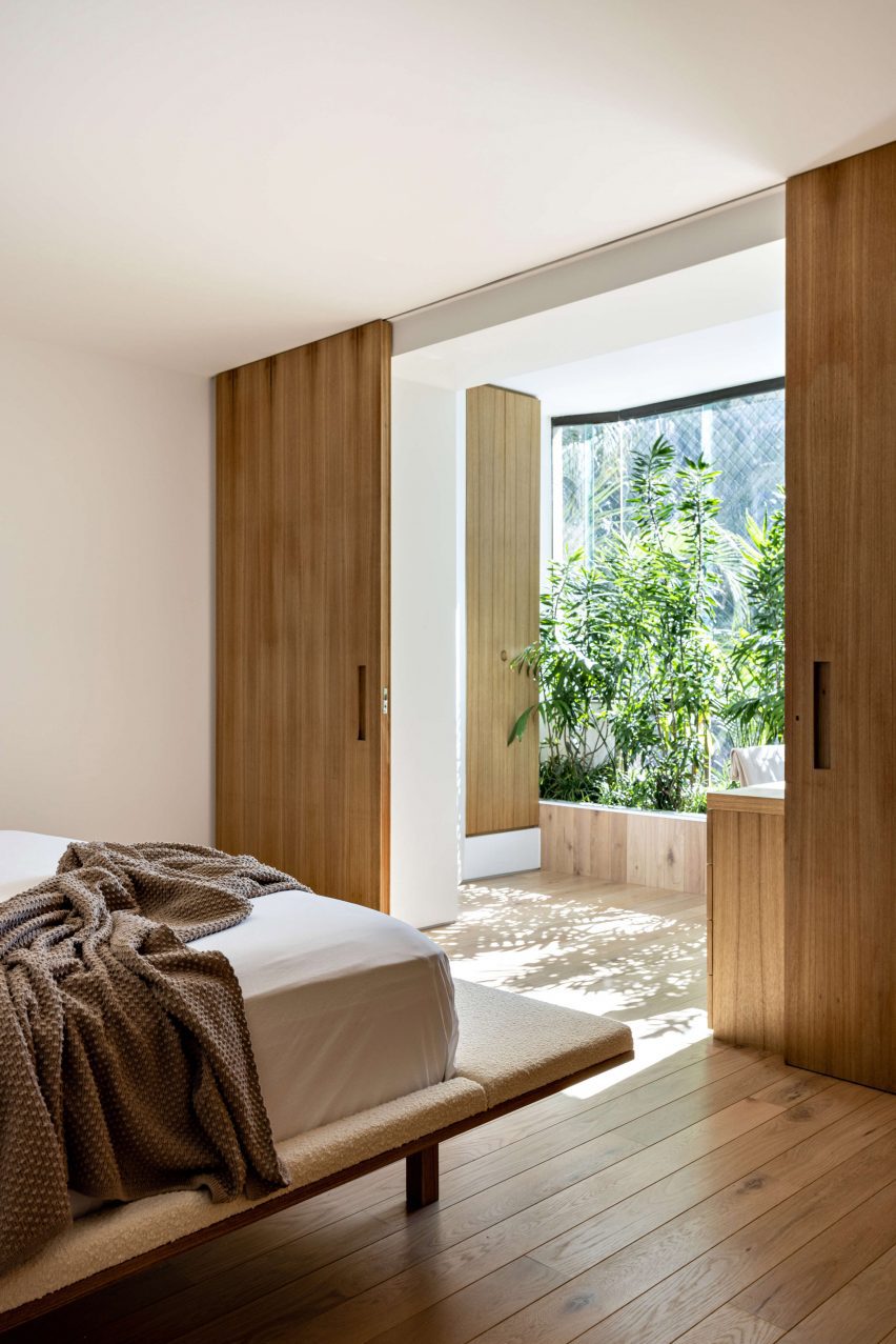
View from bedroom through sliding doors to a planted area
Natural light floods the primary bedroom when its sliding wooden doors are opened

His bed and a sofa are raised to create space for a “hide-and-seek” tunnel underneath, while the older daughter’s room includes arched white closets.

“We seek to bring originality to all rooms, with special attention to the children’s room, where we’ve pursued solutions that are close to playful, without exaggeration,” Pascali Semerdjian said.
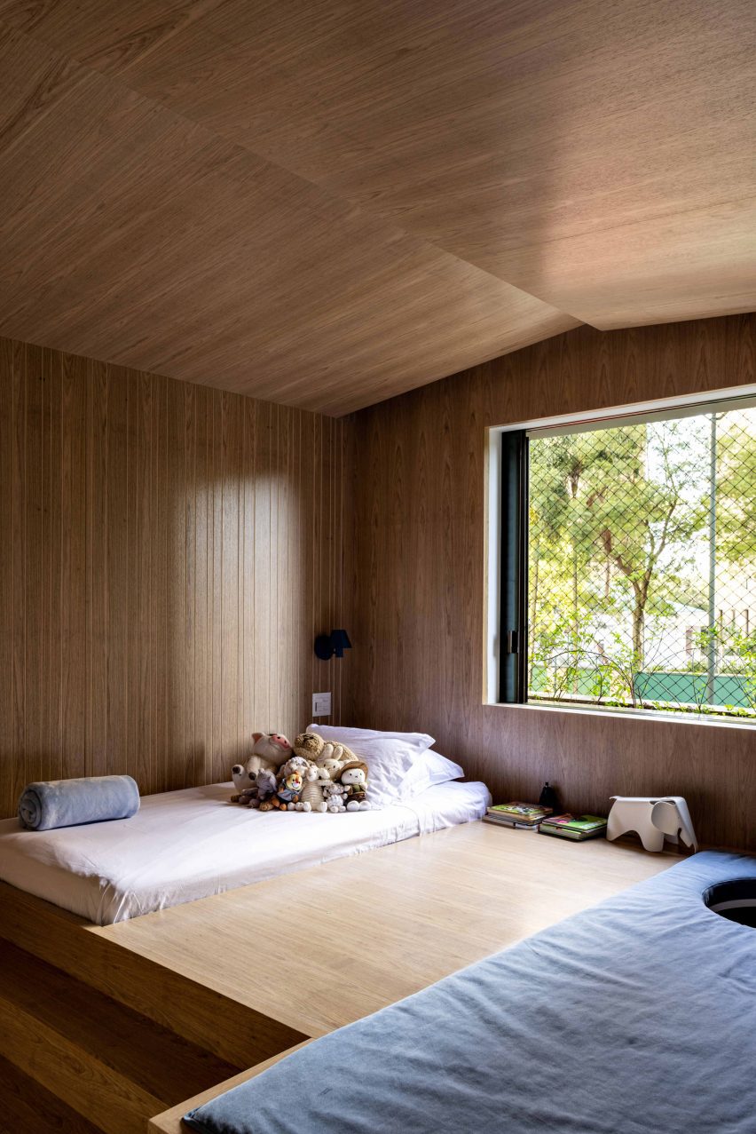
Bedroom shaped like a house using wood panelling
The bedroom of the family’s younger son is designed like a house

The renovation work began during the height of the Covid-19 pandemic in 2020, so special attention was paid to creating multifunctional spaces.

“The project seeks to balance and bring fluidity between the different possible uses of a house, allowing residents to experience moments together as well as the possibility of having privacy, including the couple,” said the architects.
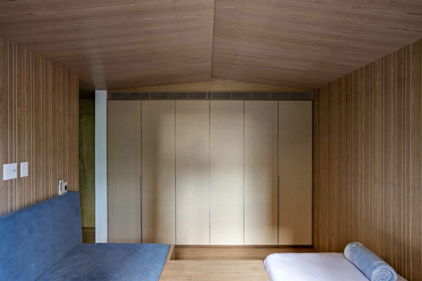
House-shaped wood volume with bed and sofa inside
The son’s bed and a sofa are raised to accommodate a hide-and-seek tunnel underneath

Pascali Semerdjian Arquitetos was founded by Domingos Pascali and Sarkis Semerdjian in 2010, and the studio has renovated many apartments across São Paulo.

They include a residence imbued with a “deeply Brazilian and vividly cosmopolitan” flavour and a home organised around a semi-circular wooden library.

The photography is by Fran Parente.


Project credits:

Project and interiors: Pascali Semerdjian Architects
Team: Sarkis Semerdjian, Domingos Pascali, Ana Luisa Cunha, Fernando Spnola
Production: VC Artwork
Execution: S Macedo Engenharia

Reference

Alp Bozkurt creates “calming” interior for Brooklyn tattoo parlour
CategoriesInterior Design

Alp Bozkurt creates “calming” interior for Brooklyn tattoo parlour

Arched niches provide stations for tattoo artists at Atelier Eva, located in a former Brooklyn hardware store transformed by designer Alp Bozkurt.

The Atelier Eva Grand Street parlour is the second in Brooklyn run by tattoo artist Eva Karabudak, who is renowned for her detailed, micro-realism tattoos.

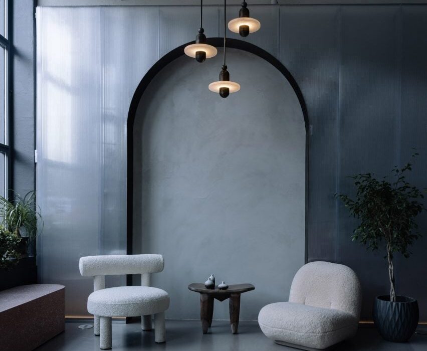
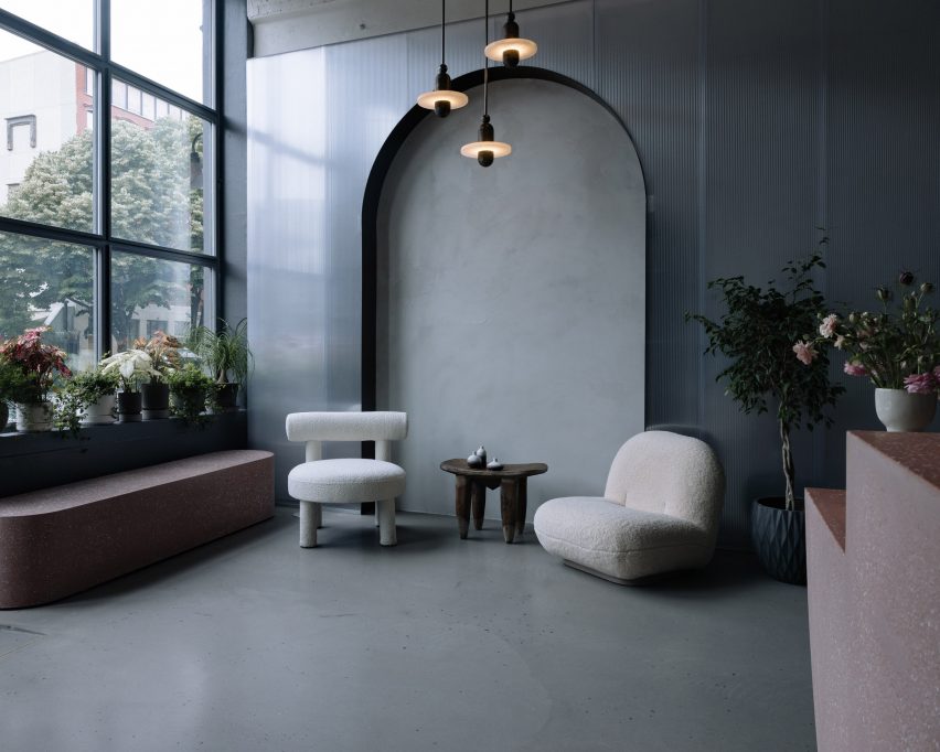
Boucle seats and Apparatus lights in front of an arched niche
Polycarbonate panels punctured by arched niches line the interior of Atelier Eva’s Grand Street studio

“Created with an ambitious vision to reimagine tattoo culture following Eva’s own experiences feeling uncomfortable and unsafe as a woman in her early work environments, Atelier Eva offers a new kind of tattooing experience with the goal of providing an inclusive and welcoming environment for all people,” said the studio.

While her first location on Havemeyer Street was designed in house, Karabudak turned to Alp Bozkurt for the Grand Street space – which at 3,000 square feet (280 square metres) is almost twice the size.

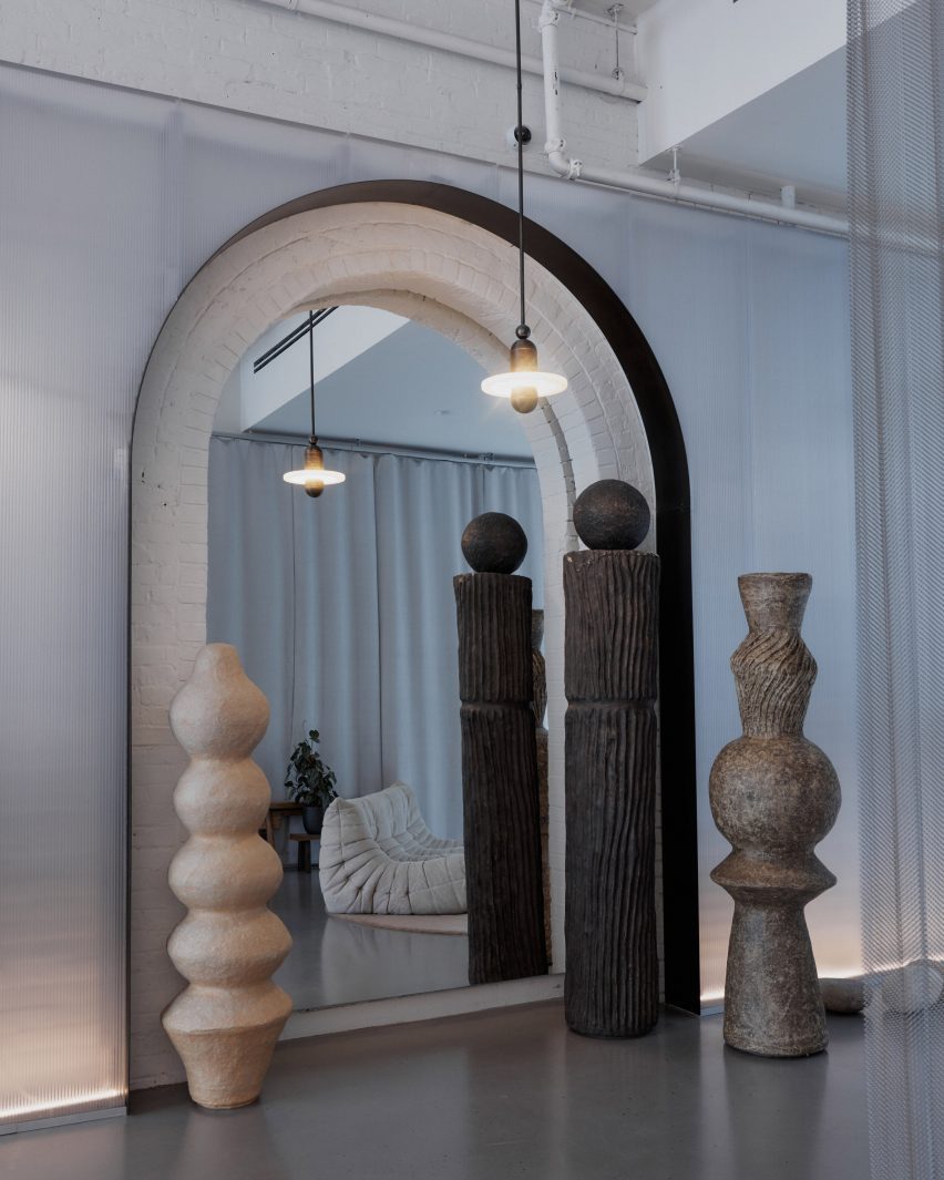
Arched niche with a mirrored back and totem-like sculptures
The arches reveal details of the original building, which was formerly a hardware store

The building dates back to 1895 and was originally constructed as a hardware store, occupying a single story space that extends 115 feet back from the street facade.

Original features such as large roof trusses, skylights and brick walls were all restored and highlighted during the renovation work.

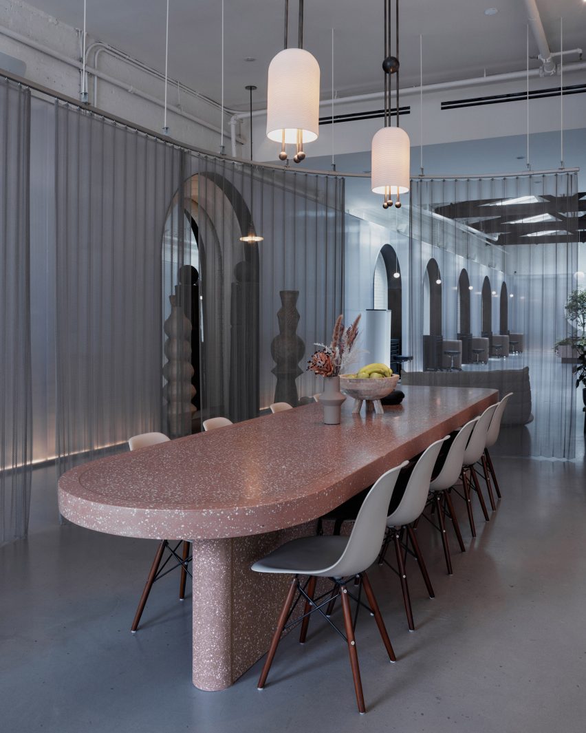
A pink-concrete table shrouded by a sheer curtain
A pink-concrete table used for tattoo consultations is shrouded by a sheer curtain

The trusses are painted black, drawing the eye up to the ceiling, while the remaining structural elements are whitewashed for a clean look.

“A distilled material palette is deployed to create a warm and calming environment from otherwise industrial materials retaining the building’s original ethos,” said Bozkurt.

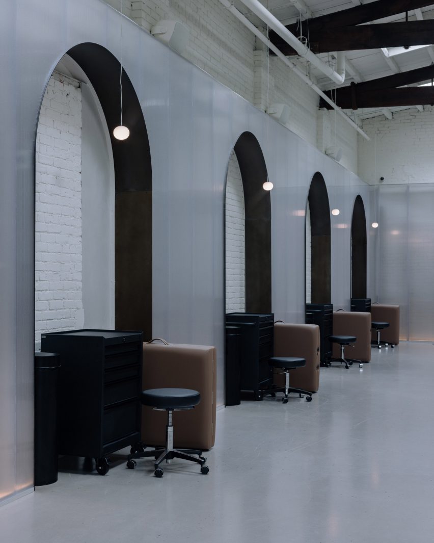
Row of arched niches with tables and cabinets tucked inside
In the main space, the arched niches provide areas for the tattoo artists to store their equipment

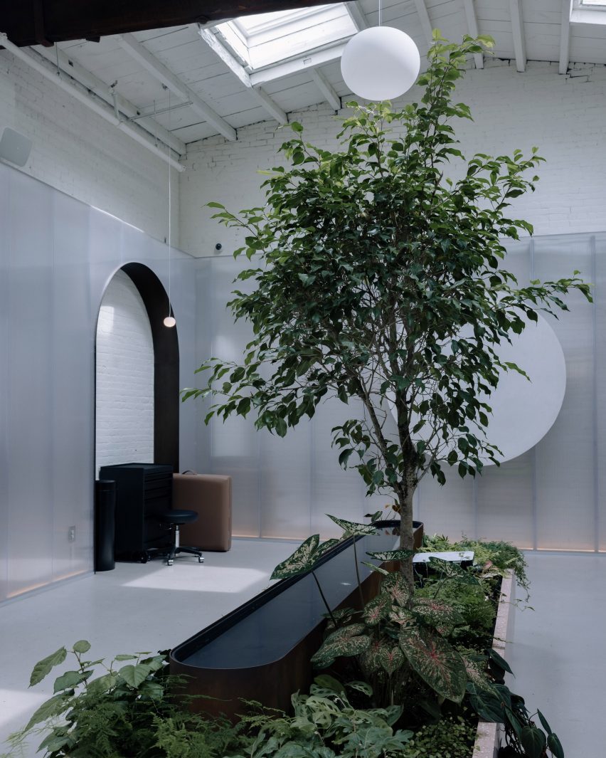
Wrapping the perimeter of the interior are translucent polycarbonate panels that sit a few inches in front of the brickwork, unifying the sequence of spaces.

All the way around, arches puncture the panels to frame original corbeling, and reveal other historic elements.

A planter with a small tree and water feature
A planter is positioned in the centre of the otherwise sparsely populated space

In the front of the studio, beside the floor-to-ceiling glass facade, one arch provides a backdrop for a seating area with boucle-covered chairs, and pendant lights by Apparatus above.

Behind a pink-concrete reception counter is a consultation area, shrouded by a sheer curtain suspended from a curved metal track.

“Visitors are offered glimpses of activity in the studio flooded by natural light while the artists and their clients maintain privacy,” Bozkurt said.

The group of artists offering a range of tattoo styles and piercings work in the large space beyond, where each is allocated a station aligned with an arch.

Pink concrete furniture either side of a seating area
Pink concrete is also used for the reception counter and other furniture

Foldable padded tables for clients to lay on, stools for the artists and cabinets for storing equipment all tuck neatly into these niches when not in use.

The open space – which also hosts creative gatherings and events – is sparsely populated, other than a central pink-concrete planter that matches the consultation table and the counter.

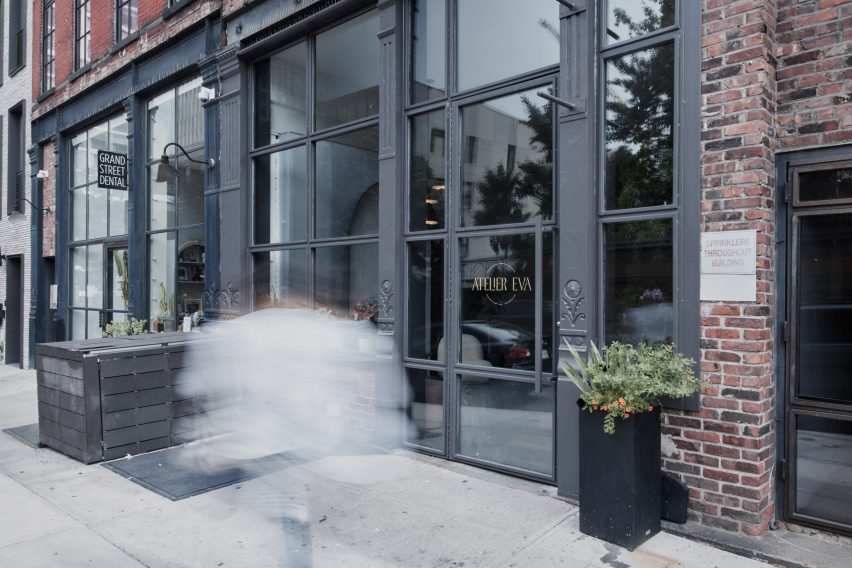
Exterior view of Atelier Eva studio on Grand Street, Brooklyn
The location on Grand Street is Atelier Eva’s second in Brooklyn

Together, Bozkurt’s interventions create “a carefully choreographed sequence of experiences through varying degrees of transparency offered by various design elements”.

Other tattoo parlours with unconventional interiors include a minimalist space in Kyiv with holes slashed through its walls, a stark monochromatic space in New York and a studio in Paris featuring curtains printed with Hieronymus Bosch paintings.

The photography is by Atticus Radley.


Reference

Neri&Hu creates a tactile fashion boutique in Shanghai with fabrics screens
CategoriesInterior Design

Neri&Hu creates a tactile fashion boutique in Shanghai with fabrics screens

Chinese studio Neri&Hu has completed a store interior for Ms MIN in Shanghai, China, to showcase the fashion brand’s diverse use of materials.

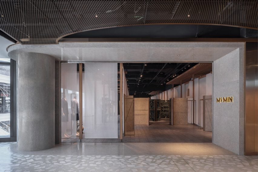
Located at the Taikoo Li shopping complex in central Shanghai, the 195-square-metre store was designed to evoke a sense of traditional home-based atelier that places materials and craftsmanship at its centre.

Neri&Hu Ms MIN shop Shanghai
Neri&Hu designed the store in Taikoo Li

“Before the Industrial Revolution, textiles were made by hand in villages across China by individual families; carding, spinning and weaving all took place in farmhouses, indeed a loom could be found in every well-conditioned homestead,” Neri&Hu explained.

“We harken back to the notion of a traditional fabric atelier, showcasing craftsmanship, rich materiality, and a domestic sensibility.”

Neri&Hu Ms MIN shop Shanghai
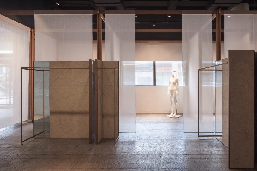
White fabric sheets were hung to divide the space

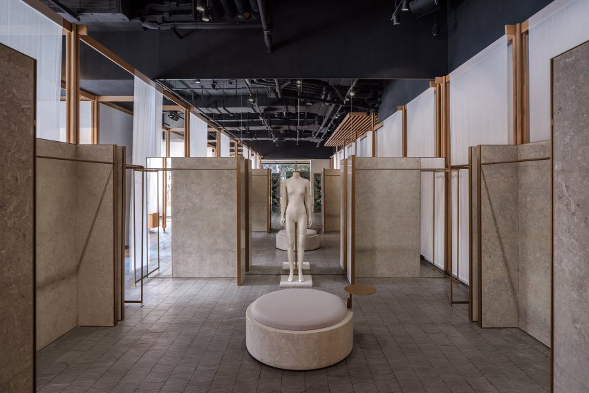
The space was divided into several zones by a series of floor-to-ceiling open grid wooden structures.

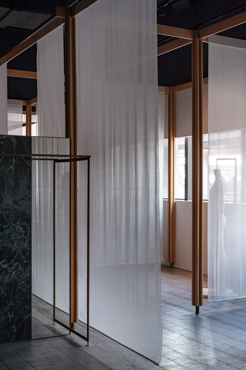
White fabric sheet was hung in between a wooden grid to serve as lightweight semi-transparent partitions situated on left and right side of the shop. These were designed to allow plenty of natural daylight into the store.

“Natural daylight and the chaos of the shopping mall are filtered by the sheer fabric screens, giving the space an overall sense of calmness,” Neri&Hu said.

Neri&Hu Ms MIN shop Shanghai
The flexible panels can be re-arranged and interchanged with different materials

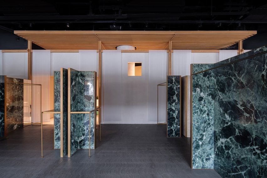
The same wooden structures with overhanging eaves to the right side of the shop form a series of more private rooms.

These are used as a reception at the front of the store along with a VIP lounge, VIP fitting room and studio area at the rear of the shop.

Neri&Hu Ms MIN shop Shanghai
An internal courtyard was formed that can accommodate exhibitions

The central display area was arranged by a series of panels, either made with micro-cement or marble and framed in brass, which form an internal courtyard that can be used as an exhibition space.

These panels can be re-arranged and interchanged to suit the changing fashion trends in motifs every season.

The entire shop was paved with curved roof tiles stacked and inlaid, a traditional pavement commonly found in the region.

Neri&Hu also created custom mannequin figures for Ms MIN. According to the studio, the linen-made mannequins have a skin-like subtle texture.

Neri&Hu Ms MIN shop Shanghai
The lightweight semitransparent partitions allow natural daylight into the shop

Neri&Hu was founded by Lyndon Neri and Rossana Hu in 2004 in Shanghai. Other recent interior projects completed by the studio include cafe brand Blue Bottle’s latest shop and a flexible office space, both in Shanghai.

The photography is by Zhu Runzi.


Project credits:

Partners-in-charge: Lyndon Neri, Rossana Hu
Associate-in-charge: Sanif Xu
Design team: Muyang Tang, Zhikang Wang, Amber Shi, Yoki Yu, Nicolas Fardet
Lighting: Viabizzuno (Shanghai)
Contractor: Shanghai Yali Design Decoration Co.

Reference

USM Haller creates “techno-chic” Coperni retail space in Paris
CategoriesInterior Design

USM Haller creates “techno-chic” Coperni retail space in Paris

Photo of the Coperni USM retail space

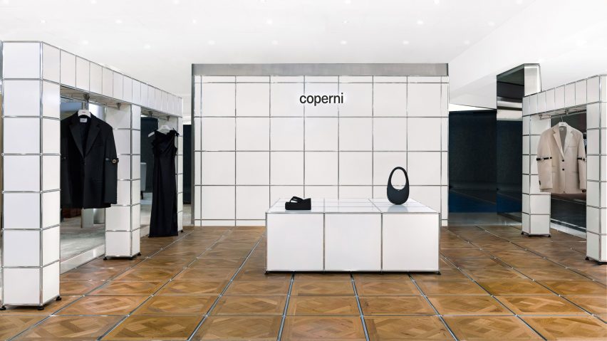
Parisian fashion brand Coperni has collaborated with Swiss furniture company USM Haller to create its first-ever boutique, a shop-in-shop at French department store Printemps Haussmann.

The shop-in-shop, installed at Printemps Haussmann in Paris, marks Coperni’s first-ever physical retail location and will be replicated at London’s Selfridges store and China’s Duty Free Mall in Hainan Island.

Photo of the Coperni retail space
Coperni collaborated with Swiss furniture brand USM

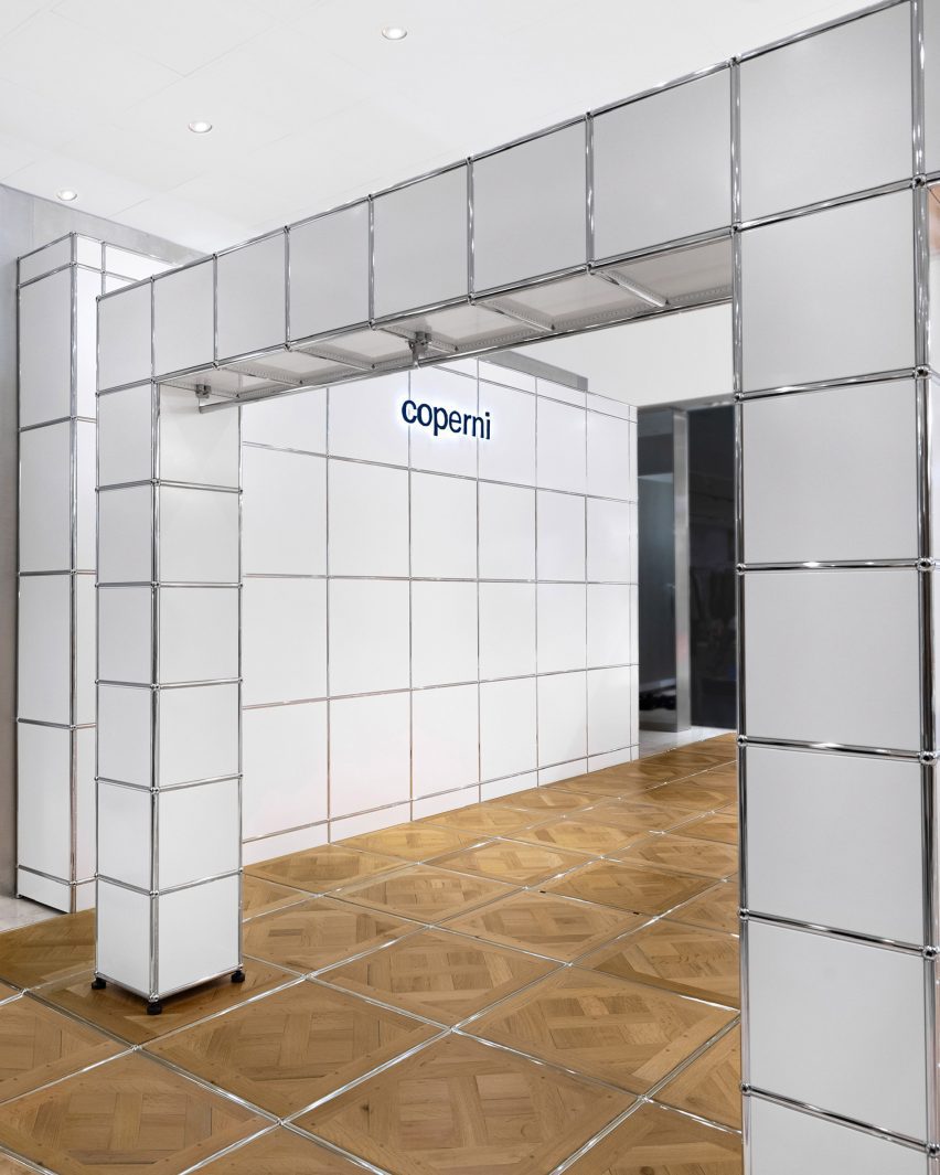
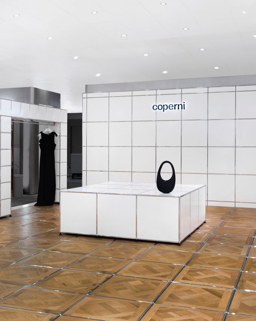
Described by Coperni‘s co-founder as “techno-chic”, the interior is defined by its cubic, space-age-style look that was achieved by reinterpreting USM Haller‘s cubic storage systems as tables, walls and display areas.

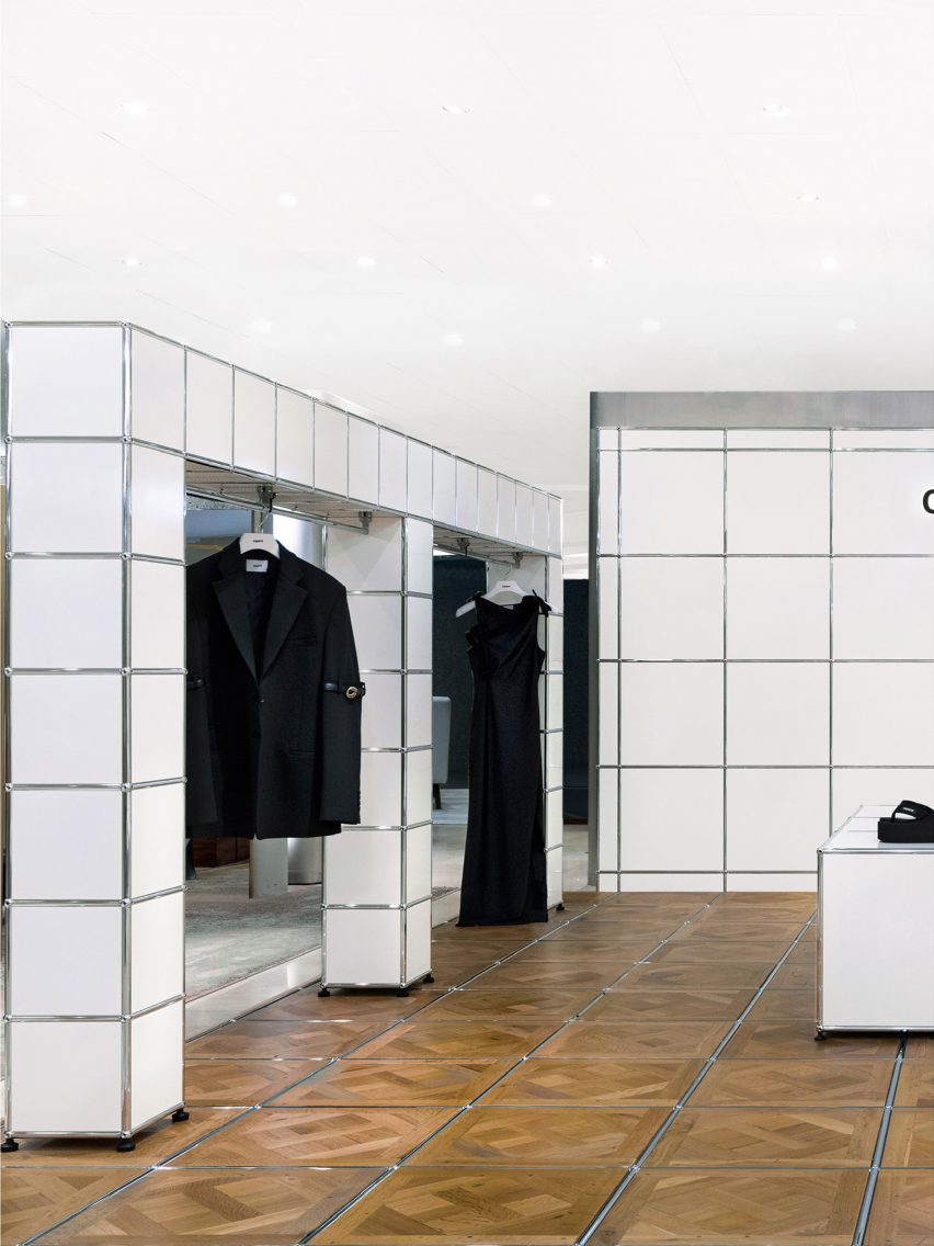
The floor of the retail space was covered in Versailles parquet flooring, with each of the wooden floor panels separated by USM Haller’s silver tubing. This typically lines the corners and edges of its storage systems and furniture.

Photo of items on display at the Coperni space
USM reinterpreted its iconic modular storage systems

The Versailles parquet flooring was chosen for its artisanal and timeless spirit that draws on Parisian craftsmanship, which Coperni said pays homage to its ethos as a brand.

The use of USM Haller’s silver tubing within the Versailles parquet flooring system marks the first time that USM has adapted and reinterpreted its modular systems into a wooden material.

USM Hallers modular systems also form arch-shaped display units along the perimeter of the shop-in-shop, which were fitted with rails allowing Coperni’s ready-to-wear collection to be displayed.

A display table constructed from larger cubic modules was placed at the centre of the space, while a wall behind was branded with the Coperni logo.

Photo of the retail space
It marks the first time USM used its silver tubing in a wooden system

In 2022, Coperni’s Spring Summer 2023 show during Paris Fashion Week went viral for live spraying a dress onto the body of supermodel Bella Hadid using Fabrican’s sprayable liquid fibre.

AMO recently created a terracruda-clad shop-in-shop for Parisian fashion brand Jacquemus in Selfridges, London, that was designed to have a “Provence atmosphere.”

The photography is courtesy of Coperni.


More images

Reference

Mork-Ulnes creates house in San Francisco that “breaks from tradition”
CategoriesArchitecture

Mork-Ulnes creates house in San Francisco that “breaks from tradition”

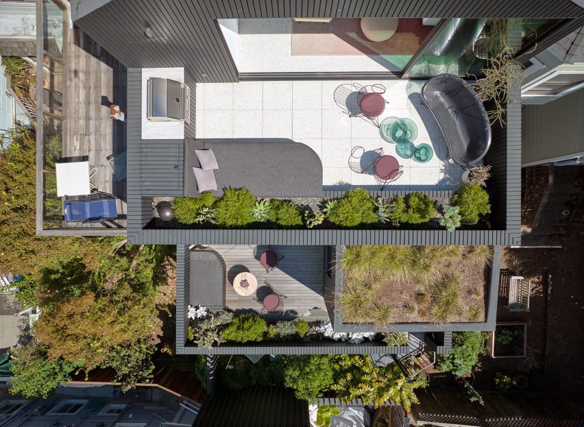
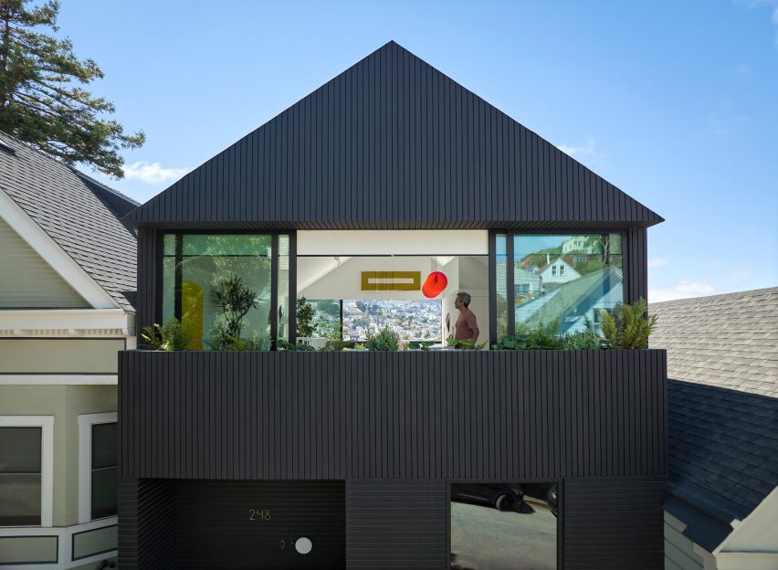
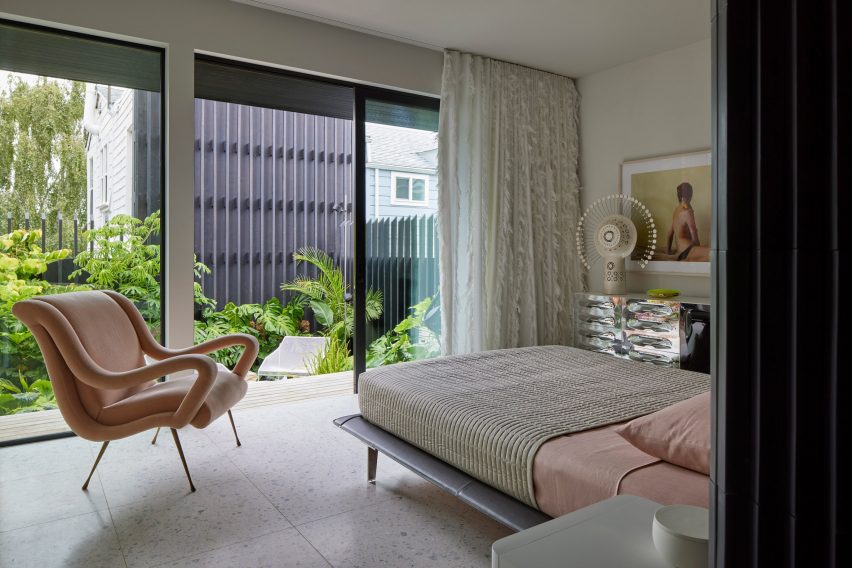
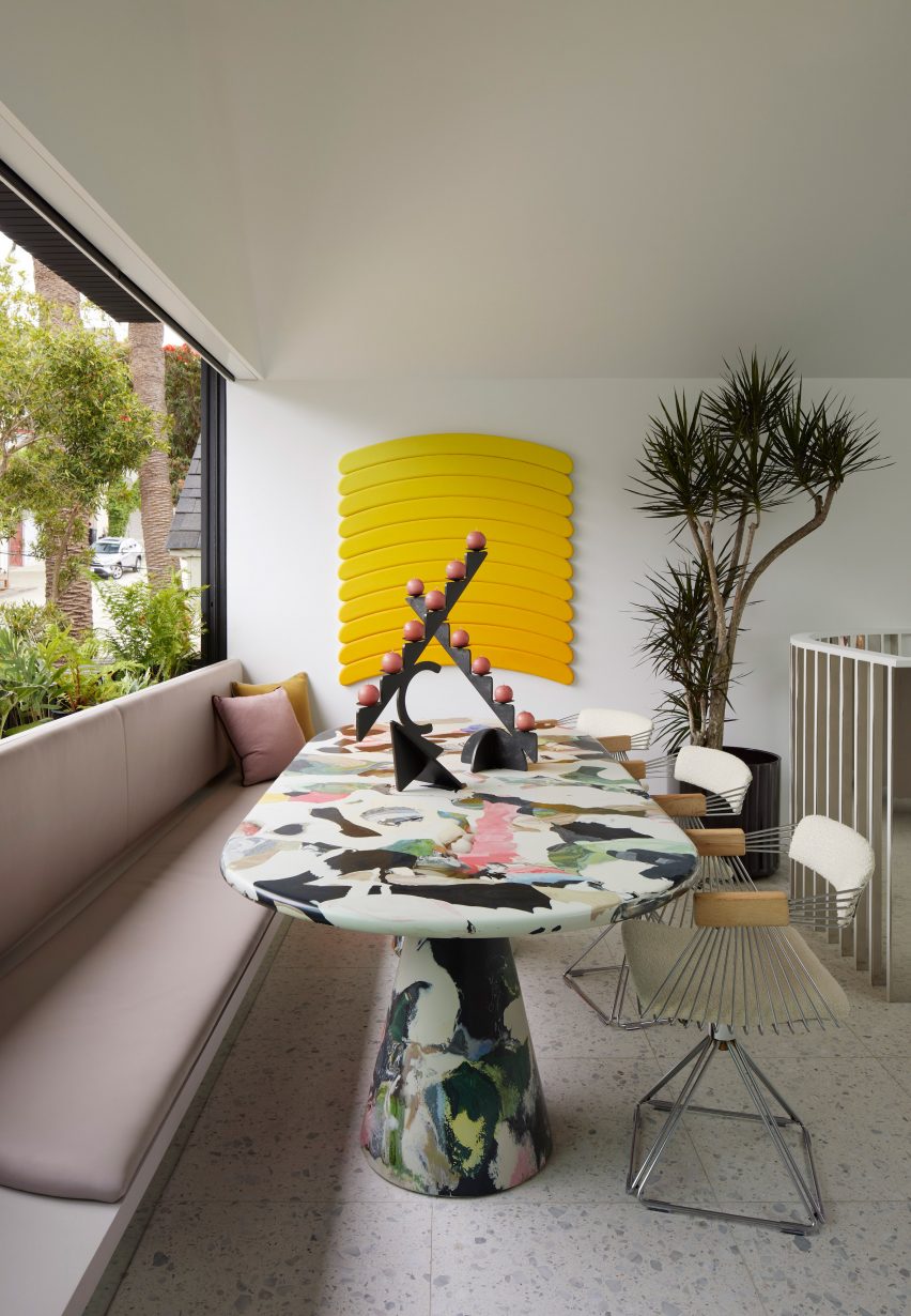
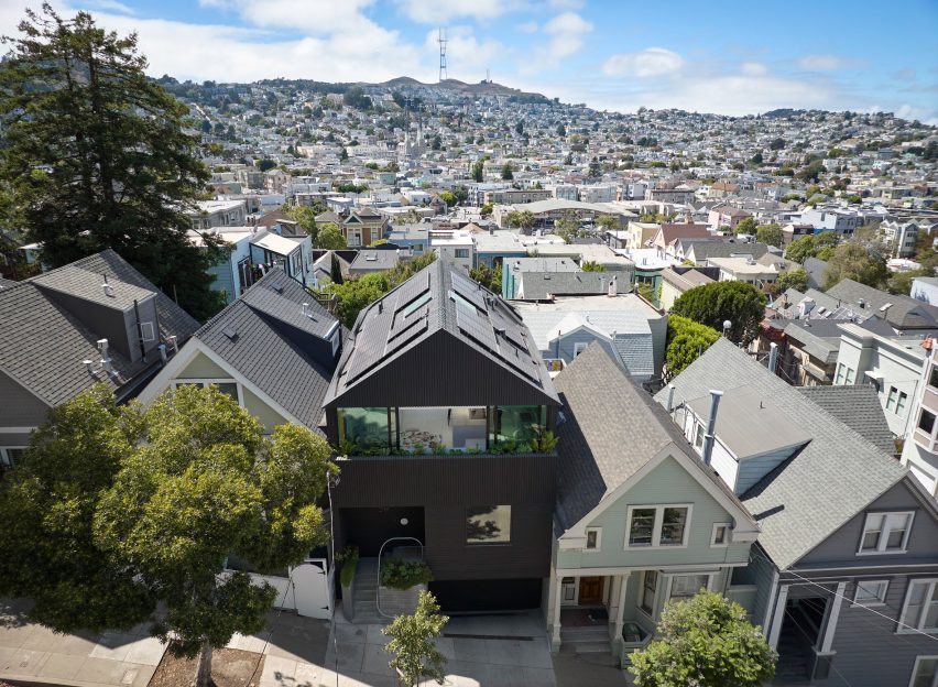
Mork-Ulnes Architects has completed the Silver Lining House, a crisp, gabled home clad in black-stained cedar that was designed for an architectural photographer and interior designer.

Located on a sloped site in San Francisco’s Bernal Heights neighbourhood, the house sits among Victorian and Edwardian homes that line the area’s hilly streets.

Aerial view of Silver Lining House
Silver Lining House is a black-stained cedar dwelling in San Francisco

The project was designed for architectural photographer Bruce Damonte and interior designer Alison Damonte, who have long been friends with architect Casper Mork-Ulnes, founder of Mork-Ulnes Architects.

The couple, who are avid collectors, desired a home that showcased their treasured belongings and supported their creative work.

Gabled home by Mork-Ulnes
Mork-Ulnes Architects designed the home with a gabled roof

“We knew from the outset that this project would be an interesting collaboration, balancing our reductive tendencies with the more exuberant and maximalist impulses of our client/friends, whose style we had always admired and wanted to celebrate,” said Casper Mork-Ulnes.

The architect and his team at Mork-Ulnes Architects – which has offices in San Francisco and Oslo – conceived a home for the Damontes that “conceptually functions as a container for their furniture and art collections and a laboratory for their work”.

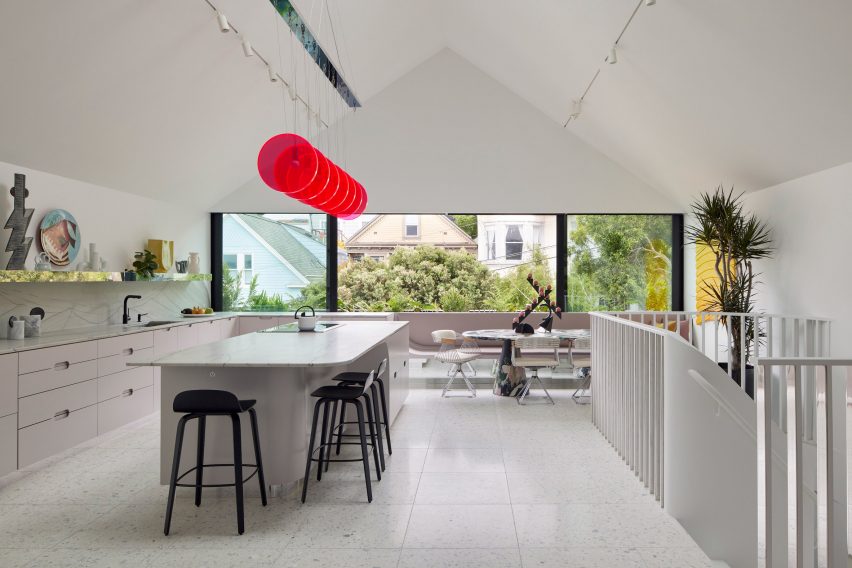
Penthouse-style white kitchen with gabled roof
The top level was envisioned as a penthouse-type space

Rectangular in plan, the home rises three levels and features a crisp, gabled form. Facades are clad in strips of black-stained cedar and are punctured with openings of varying sizes.

The architects took cues from the surrounding context when deciding on key design elements such as scale, massing and cladding – but they also strayed from the norm.

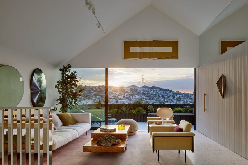
Living room interior design in San Francisco home by Mork-Ulnes
It feature a living space

“While replicating the roof forms, entry portal/stoop and massing of the Victorian homes, the new house also breaks from tradition with a black-painted facade and ribbon windows that visually connect the interior of the house to the neighbourhood,” the team said.

“Tradition is reinterpreted here with a decidedly contemporary perspective, where formal research and construction techniques are integral to creating an original and innovative outcome that engages its surroundings while also prompting further inquiry,” the team added.

Primary bedroom suite
The ground level holds a primary bedroom suite

Totalling 2,818 square feet (261 square metres), the home has a “flipped floor plan”, in which private quarters are found on lower levels and communal spaces are placed up high.

The ground level holds a garage, primary bedroom suite, laundry room and sunken garden. The main entrance is found on the first floor, where the team placed a guest suite, a home office, two bathrooms and intimate spaces for relaxing and entertaining.

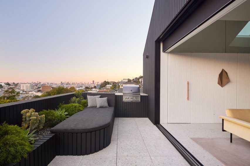
Rooftop terrace
A terrace offers sweeping views of the city

The top level – envisioned as a penthouse-type space – encompasses a kitchen, dining area, living room and powder room. A terrace offers sweeping views of the city.

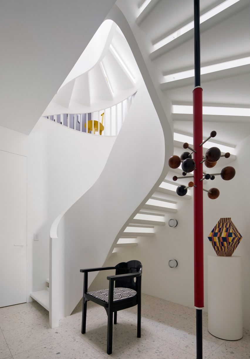
Floors are linked by a curved staircase topped with a skylight. Half-polished chrome slats bounce reflections around the stairwell, an effect meant to “mimic the experience of walking through a disco ball”.

Curved staircase topped with a skylight
Floors are linked by a curved staircase topped with a skylight

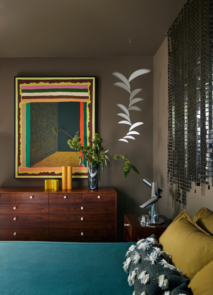
Mirrored surfaces are found in other parts of the house, lending a feeling of playfulness while also producing spacial and light-generating effects, the team said.

Overall, the home’s interior design – overseen by Alison Damonte – offers a mix of colours, textures and patterns that “reflect the owners’ collective creative spirit”, the team said.

Sustainability was in mind throughout the project, leading to the inclusion of elements such as high-performance windows, exterior solar shading and energy-efficient appliances.

Rooftop solar panels generate electricity that can be stored in a Powerwall battery system, and unused electricity is sent back to the power grid.

Interior design by Alison Damonte
The home’s interior design was overseen by Alison Damonte

The home’s completion marks the end of a journey spanning more than a decade.

In 2010, the Damontes purchased a modest residence in Bernal Heights dating to the early 1900s.

Colourful table inside Silver Lining House by Mork-Ulnes Architects
Silver Lining House includes various colourful accents

Several years later, they enlisted Mork-Ulnes to renovate the house, and just when plans were being finalized in 2017, the house caught fire and was partly destroyed.

The team salvaged what they could and reworked the design.

Silver Lining House by Mork-Ulnes Architects
The home’s completion marks the end of a journey spanning more than a decade

“While the incident forced a reevaluation of scope and scale of the redesign, the couple’s goal remained the same – to create a home that acted as a capsule of art and inspiration,” the team said.

Other projects by Mork-Ulnes include an eight-sided house in Oregon that was built using cross-laminated timber and a California residence clad in Corten steel to protect the building from wildfire.
The photography is by Bruce Damonte


Project credits:

Architect: Mork-Ulnes Architects
Project design team: Casper Mork-Ulnes, Lexie Mork-Ulnes, Phi Van Phan, Gregoriy Ladigin
Interior designer: Alison Damonte
Construction manager: Raffi Nazarian
Landscape architect: Terremoto
Structural engineer: Santos & Urritia
Lighting design: PritchardPeck
General contractor: Rico’s General Construction, Inc
Cabinetmaker: Hopebuilt

Reference

Kustaa Saksi creates vivid tapestries to explore “reality and illusion”
CategoriesInterior Design

Kustaa Saksi creates vivid tapestries to explore “reality and illusion”

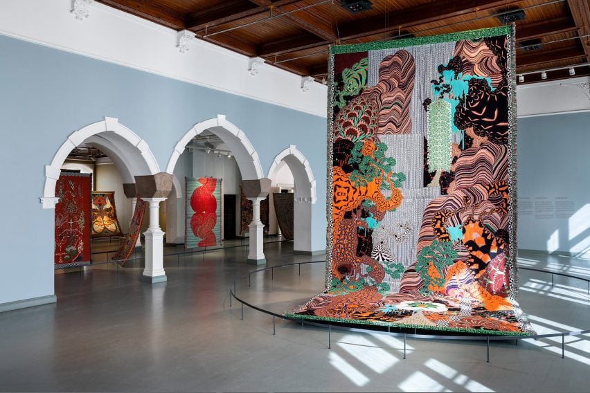
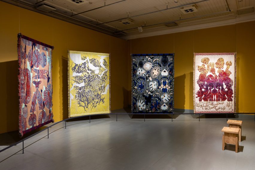
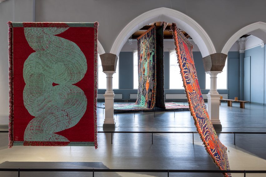
Multidisciplinary designer Kustaa Saksi has unveiled In the Borderlands, an exhibition of jacquard textiles at the Helsinki Design Museum, which includes a piece featuring scenery generated by AI software.

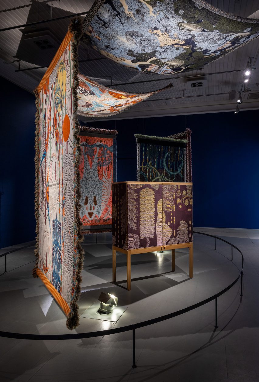
Conceived as objects that straddle both art and design, Saksi’s large-scale textiles were hung from the ceilings and arranged across various rooms within a gallery at Helsinki’s Design Museum.

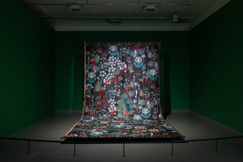
Ideal Fall tapestries
Ideal Fall is a duo of tapestries featuring AI-generated imagery

To create his pieces, the designer uses jacquard weaving – a technique invented in 1804 where patterns are woven with yarn using a loom to create a textile, rather than printed, embroidered or stamped onto fabric.

Ideal Fall is a single oversized tapestry featuring bright and abstract forms depicting waterfall- and plant-style forms.

Large-scale colourful textiles by Kustaa Saksi
Kustaa Saksi also created a series exploring migraines

Saksi created the colourful textile using AI software, which he instructed to generate images that would depict “ideal” scenes of nature. The designer then picked his favourite suggestions and used the imagery as a stimulus for the tapestry’s patterns.

“The exhibition explores moments between reality and illusion, which are the starting point for many of Saksi’s works,” said the Design Museum.

Dramatically lit tapestry at Helsinki Design Museum
The tapestries were suspended from the ceiling at the Design Museum

Migraine Metamorphoses is another series of textiles featuring similarly bold designs, which Saksi created to refer to the various phases of migraines – intense headaches that the designer has suffered since the age of seven.

According to the museum, the soft texture of the textiles intends to “mitigate the painful subject matter”.

Colourful textiles
Monsters and Dreams is a series informed by stories about hallucinations

Often influenced by the boundaries between dreams and imagination, Saksi’s first-ever tapestry series was also on show at the Design Museum.

Called Monsters and Dreams, it is characterised by striking patterns that take cues from hallucinations experienced by one of the designer’s family members. These textiles were draped across or hung from the ceiling of a single room with dark blue walls, which had been painted to enhance the pieces’ dramatic theme.

Saksi has created his pieces in collaboration with Dutch studio TextileLab since 2013.

“The jacquard technique can be referred to as one of the early precursors to the computer,” said the Design Museum.

“It was the first mechanised technique which enabled the transfer of information about a particular pattern to a weaving machine with the help of a punched cylinder, to eventually become a piece of textile.”

In the Borderlands exhibition by Kustaa Saksi
The exhibition is on display in Helsinki until mid-October

Throughout the gallery, the textiles were illuminated with controlled levels of lighting in order to preserve their appearance, according to the museum.

In the Borderlands is on display until 15 October as part of the museum’s 150th-anniversary programme. Elsewhere at Helsinki Design Week, designer Didi NG Wing Yin presented a series of amorphous timber furniture while last year’s edition of the event featured projects including plant-based textiles.

The photography is by Paavo Lehtonen.

Helsinki Design Week takes place from 8 to 17 September 2023 in Helsinki, Finland. See Dezeen Events Guide for an up-to-date list of architecture and design events taking place around the world.

Reference

Studio Becky Carter creates “distinctly New York” interiors for Cecchi’s
CategoriesInterior Design

Studio Becky Carter creates “distinctly New York” interiors for Cecchi’s

Brooklyn-based Studio Becky Carter has pulled varied references, from Bauhaus luncheonettes to comedic characters, for the interiors of a bistro in Manhattan’s West Village.

Art deco dining rooms, 1960s Milanese architecture and “a distinctly New York feel” are all evoked at Cecchi’s, the first establishment from veteran restaurant maitre d’ Michael Cecchi-Azzolina.

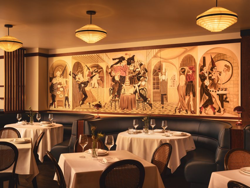
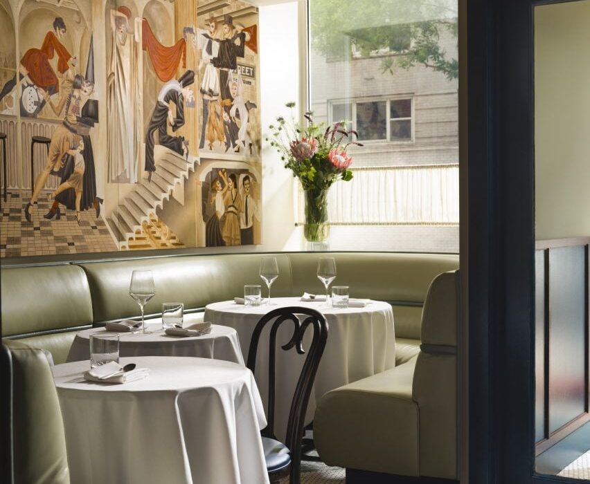
Dining area with pistachio banquettes and wall mural
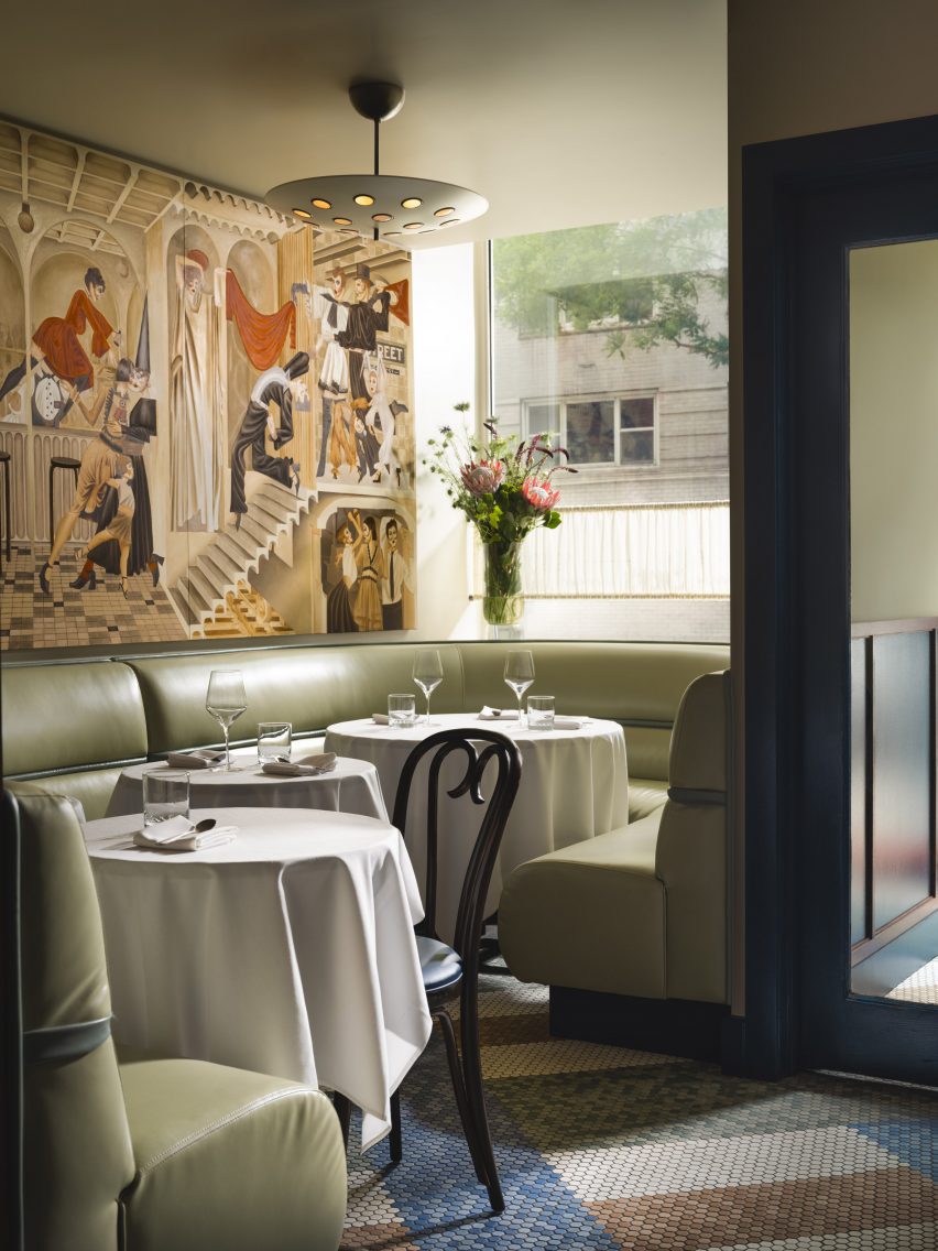
At the entrance to Cecchi’s, pistachio leather banquettes sit below a mural by Jean-Pierre Villafañe

Studio Becky Carter was given creative control to produce an environment that felt distinctively New York, but also presented a departure from the typical bistros.

“My style is retro-futurist, so I take strong cues from historic design narratives and process them through the lens of an imagined future society,” Carter told Dezeen. “When people enter Cecchi’s, I want them to feel like they’ve stepped into old-school, underground, NYC exclusivity, only this time everyone is invited.”

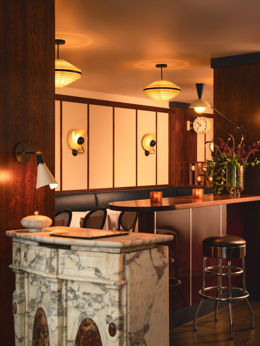
Marble lectern used as a host stand
Elements retained from the space’s previous iteration as Café Loup include a marble lectern used as a host stand

A starting point for the design was the whimsical murals of artist Jean-Pierre Villafañe, who was brought on early in the process to create scapes for the restaurant’s walls.

His “transportational” depictions of lively party scenes helped to inform the colour palette for the rest of the space, a mix of reds, blues and tonal browns.

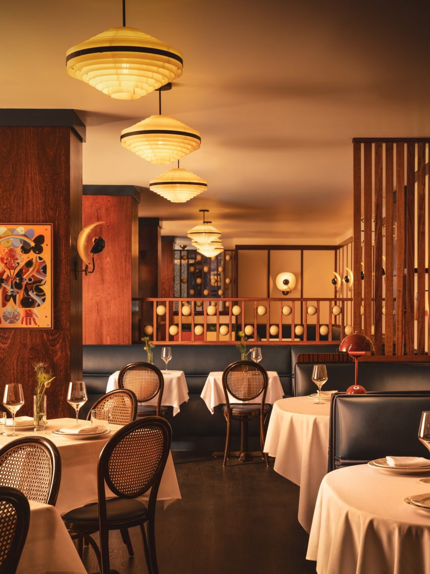
Dining area with navy banquettes, caned bistro chairs and 1970s lighting
Villafañe’s murals informed the colour palette for the restaurant’s interiors

Some of the dancing figures appear as historic European comedic characters, so Carter also looked to these for influences.

The spheres placed within dividing screens, for example, are reminiscent of those found on a Pierrot costume, a figure in French pantomime theatre, while mosaic floor tiling at the entrance is adapted from Harlequin patterns.

View down the dining room with multiple space dividers
Large columns and louvred dividers break up the space into different yet visually connected areas

“The beautifully finished spheres are just so tactile,” said Carter.”I can’t not touch them every time I’m in the restaurant.”

The long, narrow space posed several challenges, such as the lack of natural light towards the rear and large structural columns that interrupted the flow.

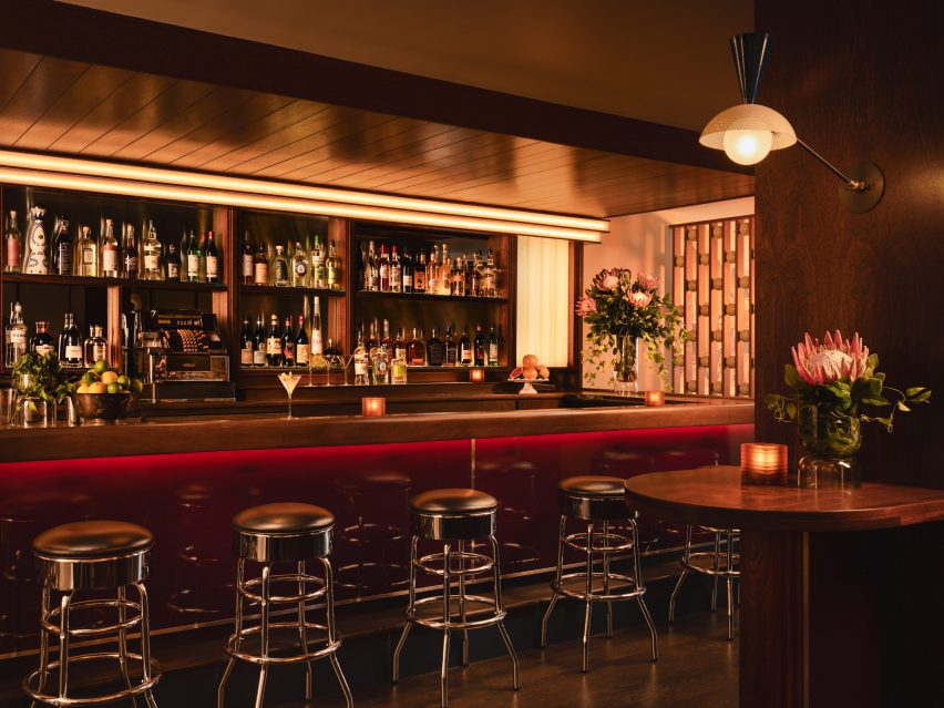
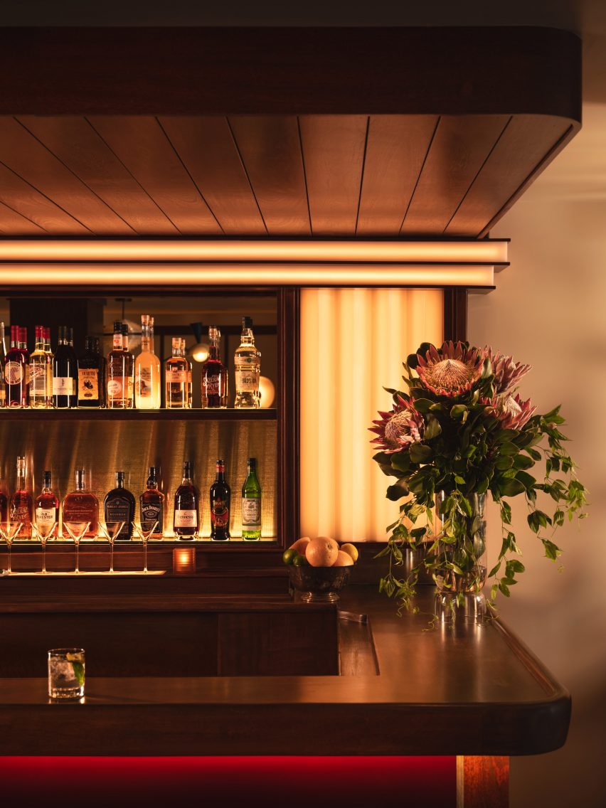
Bar with mahogany top and burgundy lacquered front
The mahogany bar top was also retained, while high-gloss burgundy lacquer was added to the front

Carter’s approach involved dividing up the restaurant into multiple areas, demarcated by the wood-wrapped columns, louvred dividers and built-in seating – all at different heights to allow visual connections across them.

At the entrance, pistachio green leather banquettes occupy the bright window niches, then the mood shifts to darker and cosier as guests venture further inside.

Bar corner with wood panelling and custom lighting
Soft lighting around the bar adds to the mood in the space

Several elements from the space’s previous iteration as Café Loup were retained or refinished as part of the new design, including the mahogany bartop and the restored caned bistro chairs.

The marble lectern that serves as the host stand and a chrome cash register were also saved, while 1970s Czech lighting was introduced overhead.

White tablecloths lend to the classic, old-school atmosphere, while contemporary details like custom wall sconces and the burgundy lacquered bar front add a more casual twist.

“Michael envisioned the servers being able to pull up a chair and have a conversation about the menu in a convivial manner, and the style was to reflect this,” Carter said.

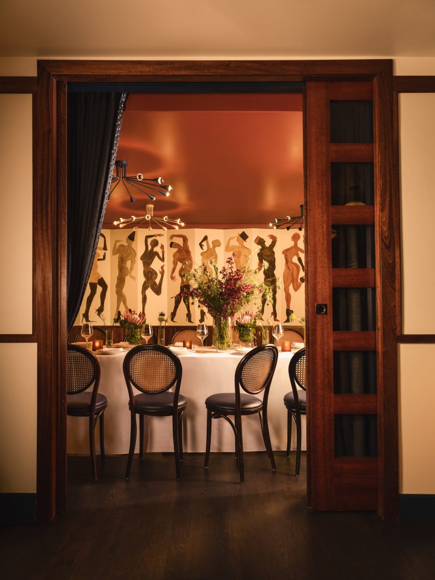
Doorway looking into a private dining room
A private dining room for parties is located at the back of the restaurant

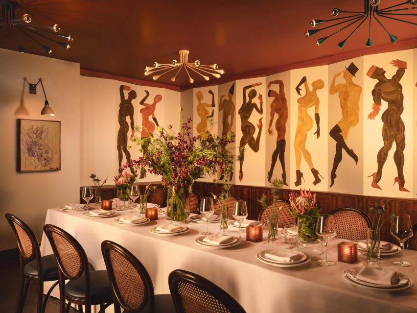
A private room for parties at the back features another Villafañe mural, as well as a rust-coloured ceiling and sci-fi lighting.

Overall, Cecchi’s offers a fine-dining experience that still feels approachable, warm and not too serious.

Long dining table laid for a party in front of a wall mural
The private room features another Villafañe mural, as well as a rust-coloured ceiling and sci-fi lighting

Carter founded her eponymous studio in 2016 and has completed a mix of residential and hospitality spaces on both coasts.

Other recently completed restaurants in the US that feature retro-futurist interiors include 19 Town, a Chinese eatery in Los Angeles by Jialun Xiong, while new openings in the West Village include the worker-owned Donna designed by Michael Groth.

The photography is by Joseph Kramm.

Reference

Leddy Maytum Stacy Architects creates low-energy school in California
CategoriesArchitecture

Leddy Maytum Stacy Architects creates low-energy school in California

Leddy Maytum Stacy Architects has designed a school building that prioritises low-carbon solutions and water retention on restored woodlands outside of San Francisco.

Called The Science and Environmental Center, the structure is an expansion of the campus for the Nueva School in Hillsborough, Silicon Valley.

The campus comprises an 11,600-square-foot (1,077 square-metre) two-storey building on a 33-acre site, with an oak forest that was restored as part of the project.

Leddy Maytum Stacy Architects Environmental School
Leddy Maytum Stacy Architects has created an expansion to a California primary school campus

“The design integrates straightforward, appropriate, and cost-effective sustainable design solutions that provide practical and poetic connections between people and the natural world,” Leddy Maytum Stacy Architects told Dezeen.

“The building shape echoes the landform, following the topography of the hillside to minimize excavation and maximize outdoor education space that extend ground floor classrooms.”

“The narrow floor plate minimizes impacts to the existing natural features of the site, while maximizing daylighting and natural ventilation within the classrooms.”

Solar array on semi-circular school
It includes a number of passive and electric energy strategies

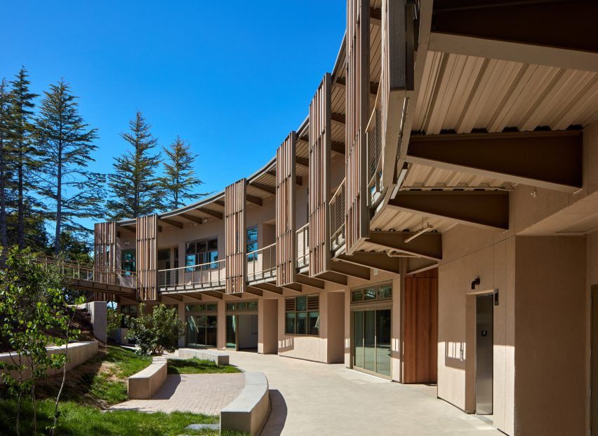
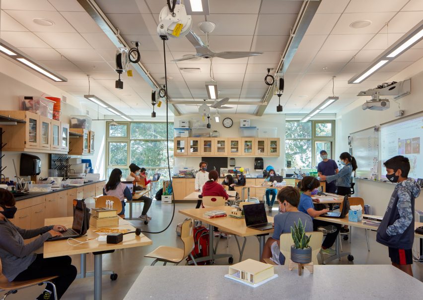
The building has a semi-circular form that allows for the eight classrooms to be exposed to light from two sides. With the inclusion of ceiling fans, this form allowed for mechanical heating and cooling to be mostly eliminated from the project, according to the studio.

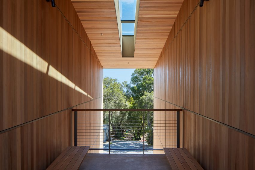
Wood cladding wraps one side of the structure almost completely, and was also used generously for the classroom interiors. The wood was chosen based on FSC certifications.

Elevated walkway with school in background
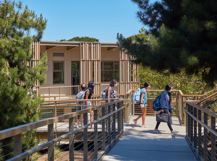
An elevated walkway connects the new structure to the other campus buildings

The inside of the semi-circle was clad in steel and aluminium. As much as 15 per cent of these materials – as well as the cotton insulation – were garnered from recycled materials, Leddy Maytum Stacy Architects said.

In order to connect the new structure with previous school buildings on the site, the studio included an elevated walkway called the Canopy Walk, which connects to the upper level of the centre and expands outward into the forested site to provide a vantage point for the students.

This second-floor circulation also acts as a sunshade for the classrooms below.

The Science and Environmental Center was designed to be a net zero campus and the school runs only on electricity, with much of the power generated from a 70-kilowatt array of solar panels placed on its roof.

Wood lookout
It features FSC-certified wood cladding

In response to the water shortage issues in California, the design also features a number of water retention strategies.

“As climate change continues to impact California’s potable water supply, the project takes an active role in reducing potable water use by 89 per cent below baseline,” said the studio.

Classroom in environmental school
It has eight classrooms for young students

The goal of the centre, which serves the school’s 500 students, is to “foster social acuity and environmental citizenship”, according to the studio.

The Nueva School‘s Hillsborough campus serves primary school children, while its San Mateo campus serves high school students.

Leddy Maytum Stacy Architects has designed other buildings in the region that prioritise strategies geared towards environmental and social ends, including a design centre in Berkeley and a housing complex for people with autism.

The photography is by Richard Barnes and Bruce Damonte.

Reference

Ramy Fischler creates Moët Hennessy’s first cocktail bar
CategoriesInterior Design

Ramy Fischler creates Moët Hennessy’s first cocktail bar

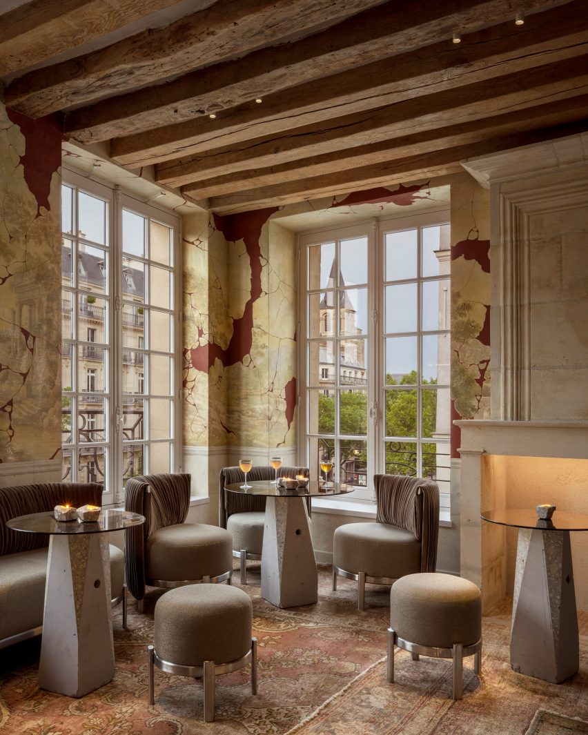
Belgian designer Ramy Fischler has collaborated with Moët Hennessy and cocktail creator Franck Audoux to create the Cravan cocktail bar in the heart of Paris’ Saint-Germain-des-Prés.

Named Cravan, the bar for luxury drinks group Moët Hennessy was a collaboration between architect Fischler and restaurateur, author, historian and cocktail aficionado Audoux.

Ramy Fischler designed the Cravan bar for Moët Hennessy

“The objective of the design was to amplify a story by Franck Audoux originating from his small bar in the 16th arrondissement of Paris and transforming it into a cocktail house over five levels in the centre of the capital – to imagine the creation of a new house of the Moët Hennessy group,” Fischler told Dezeen.

“This is not a one-shot but the beginning of a long adventure. It was therefore necessary to define a harmony, a coherence, between all the ingredients of the project, whether it is the decoration, the service, the music or the lighting.”

Cravan cocktail bar for Moët Hennessy
The building features three separate bars

The space takes its name from the avant-garde poet-boxer and sometime art critic, Arthur Cravan, a free-spirited figure greatly admired by Audoux, with whom Fischler worked closely on this project.

“We share a common vision, based essentially on cultural references from literature and cinema, and above all a taste for scenic impact, framing a context, point of view, or narrative,” said Fischler.

“We started with the desire to freely assemble codes, eras, and styles to craft a new repertoire which made sense to us and expressed the essence of Cravan.”

Set in a 17th-century building in the heart of this historic and literary district, the space was arranged over five floors, with a small invitation-only space on the roof.

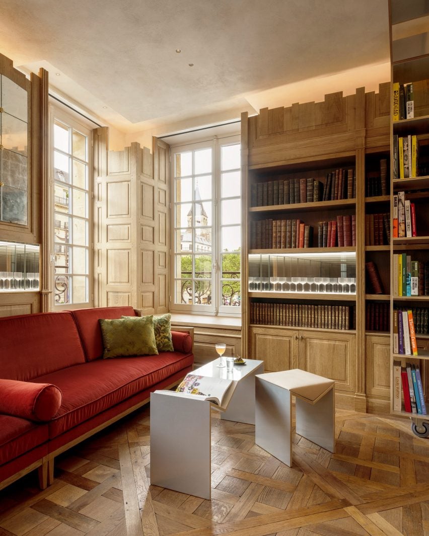
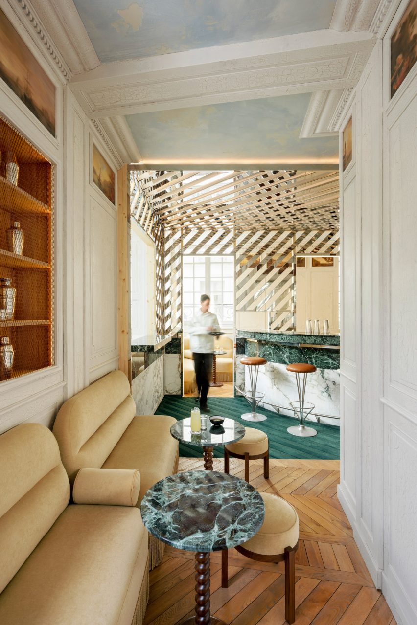
The building has separate bars, each with its own distinct character on the ground, first and third floors, while the second floor hosts the Rizzoli bookstore-cum-library, where guests can come with their drinks to leaf through and buy books. On the fourth floor, there’s another invitation-only atelier-style space.

Cocktail bar in Paris
Each of the spaces was designed to combine modern elements with the building’s historic fabric

According to Fischler, the whole project took its cues from the concept of the cocktail.

“I would never have imagined this project in its current state if it were not a question of drinking cocktails” he said.

“There are a number of ingredients that we blend together to create a unique whole, that seems offbeat but is actually very controlled,” he continued.

“I thought of the spaces as cinematic scenes, hence the individual atmospheres on each floor which form different sets. You can sit in front of the stage, on the stage, or behind the stage, depending on the experience and viewing angle you prefer.”

Moët Hennessy bar in Paris
The bar is Moët Hennessy’s first

To create these different scenes, the project makes use of a wide range of materials, often reclaimed salvaged pieces including parquet floors, stone floors and wood wall coverings, painstakingly installed by a large team of craftspeople.

In Ramy Fischler’s projects, the textiles always play an important role and the practice features its own in-house textile designer.

“For Cravan, we tried to use as much re-used material as possible, and in particular textiles from Nona Source, a start-up that makes available leftover, unused fabrics from the fashion houses of the LVMH group.”

Cravan cocktail bar
Historic elements were retained throughout the space

The practice strived to create a contrast between the warm and natural colours of the historic fittings, and the colder and metallic colours of the contemporary furniture and fittings, “which cohabit one alongside the other”.

“Depending on the level, the colour palette is totally different, and since no room is alike, and each colour has been chosen according to the universe we have sought to compose,” said Fischler.

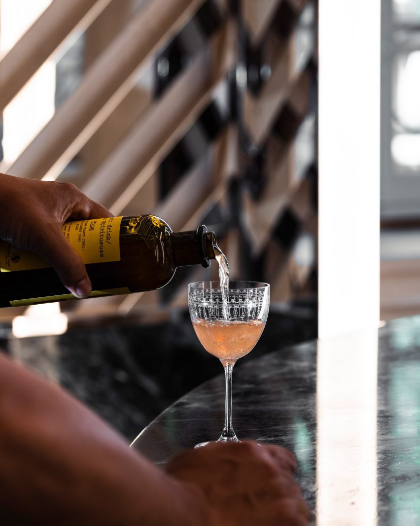
Glasses designed by Fischler
Fischler also designed glasses for the bar

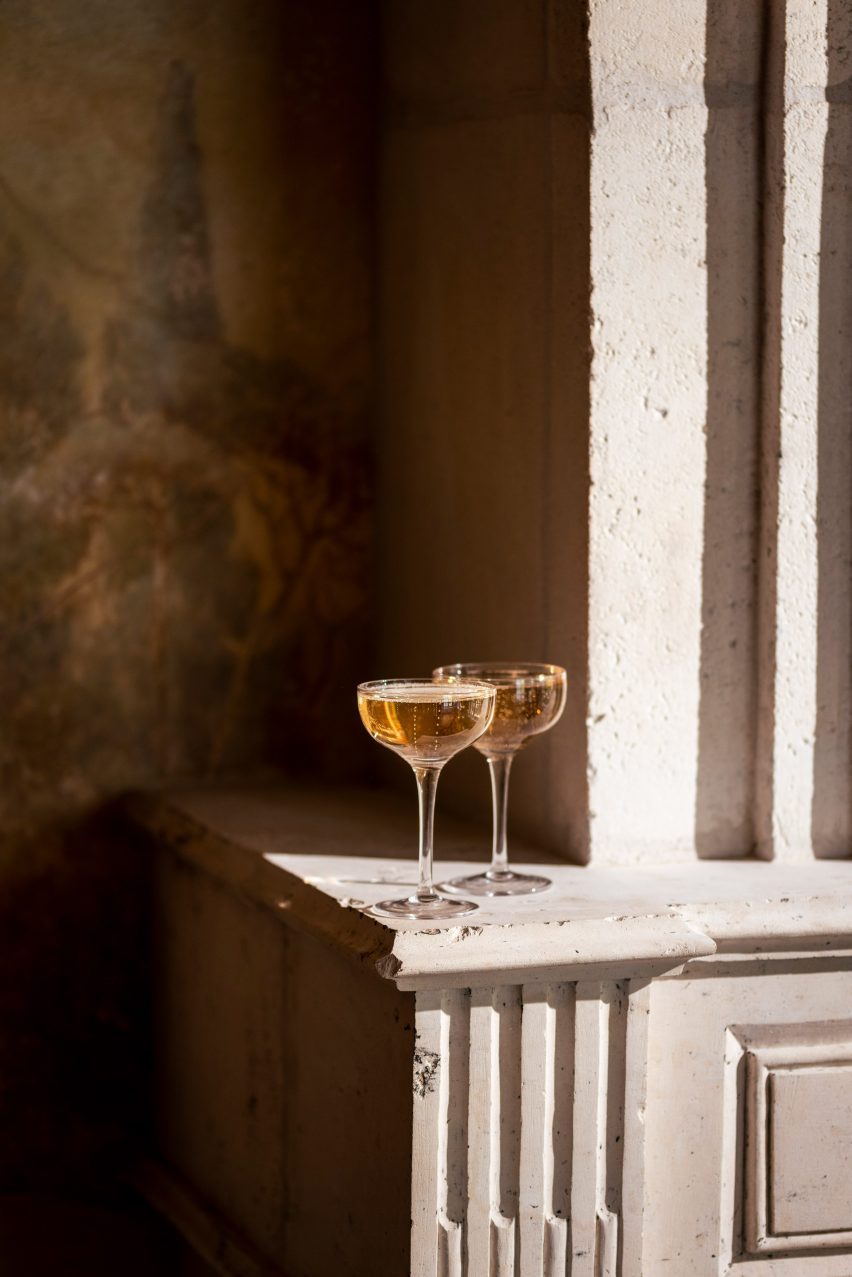
All of Cravan’s furniture was custom designed and Fischler’s holistic approach extends to the cocktail glasses, which the practice designed for Cravan and which are displayed in the library.

“Rather than creating new shapes, we preferred to select, from the history of glassware over the past 300 years, the models that we liked and that we wanted customers to rediscover,” explained Fischler.

Other recent bars featured on Dezeen include an eclectic cocktail in Los Angeles designed by Kelly Wearstler to feel “like it has been there for ages” and the Ca’ Select bar and distillery in Venice.

The photography is by Vincent Leroux and Alice Fenwick

Reference

Most Architecture creates Charge Cars factory with “everything on display”
CategoriesInterior Design

Most Architecture creates Charge Cars factory with “everything on display”

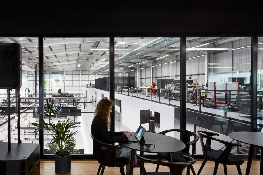
UK studio Most Architecture has converted an industrial shed in west London into an all-black-and-white showroom and production facility for electric car start-up Charge Cars.

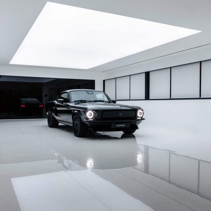
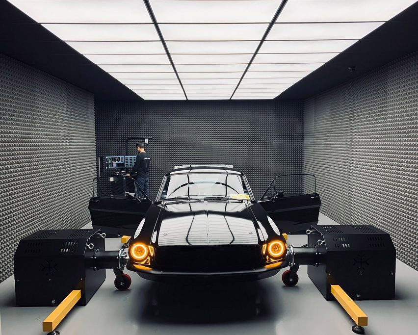
Created to manufacture Charge Cars‘ first vehicle the ’67 – an all-electric version of the 1960s Ford Mustang Fastback built using components from electric vehicle brand Arrival – the facility also acts as an office and showroom.

Charge Cars factory by MOST Architecture
Most Architecture has created a factory for electric car start-up Charge Cars

“Charge designs and makes its unique cars in a single facility,” said Most Architecture founder Olga McMurdo. “Like an open-kitchen restaurant, everything is on display to the staff and customers.”

“So we created an environment that allows immediate access to every aspect of the process from design through to production,” she told Dezeen. “The factory, and all of its contents, are at once an agile design and manufacturing centre, a customer showroom, and a design statement.”

'67 by Charge Cars
The building is arranged around the workshop

The facility in Stockley Close, west London, was designed around the idea of promoting a connection between Charge Cars’ clients and the engineers building and customising the cars.

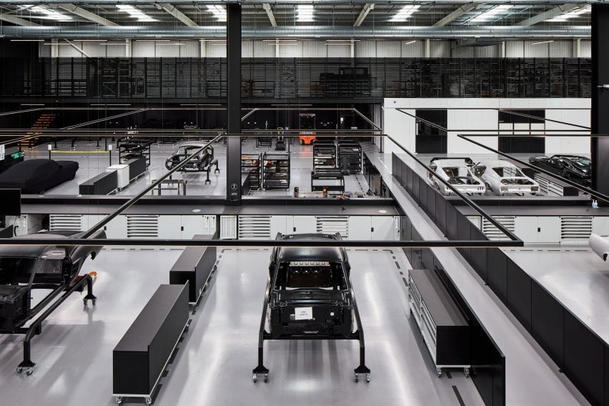
At its centre is a large open workshop where the cars are built and customised, which is overlooked by various offices and meeting spaces.

The '67 by Charge Cars will be manufactured in the factory
Charge Cars’ ’67 will be manufactured in the factory

“Our client came to us with an ambition to re-define a classic design icon using cutting-edge electric vehicle technology and to create a customer experience that engenders a visceral response to the product, and the process of creating it,” said McMurdo.

“Their space had to accommodate both the manufacturing and the design process, facilitating teamwork and recreation, testing, a showroom, and areas for customer engagement,” she continued.

“All that had to happen within one architectural volume, and so the primary challenge was to facilitate all of these activities simultaneously and symbiotically, whilst projecting a clear and coherent design statement reflecting the client’s philosophy.”

Office in a car factory
Office spaces overlook the workshop

Unlike the majority of car factories, the Charge Cars facility was designed so that its customers can visit at any time to observe how the vehicle is designed and assembled.

“Charge wanted the customer journey to be mapped out by the design of the building,” said McMurdo.

“The customer’s access to, and experience of, the factory is an integral part of the product,” she continued.

“They have a personal relationship with the engineers that are making their car, and are able to see the car as it is being constructed.”

Black and white car factory
The Charge Cars factory is almost entirely black and white

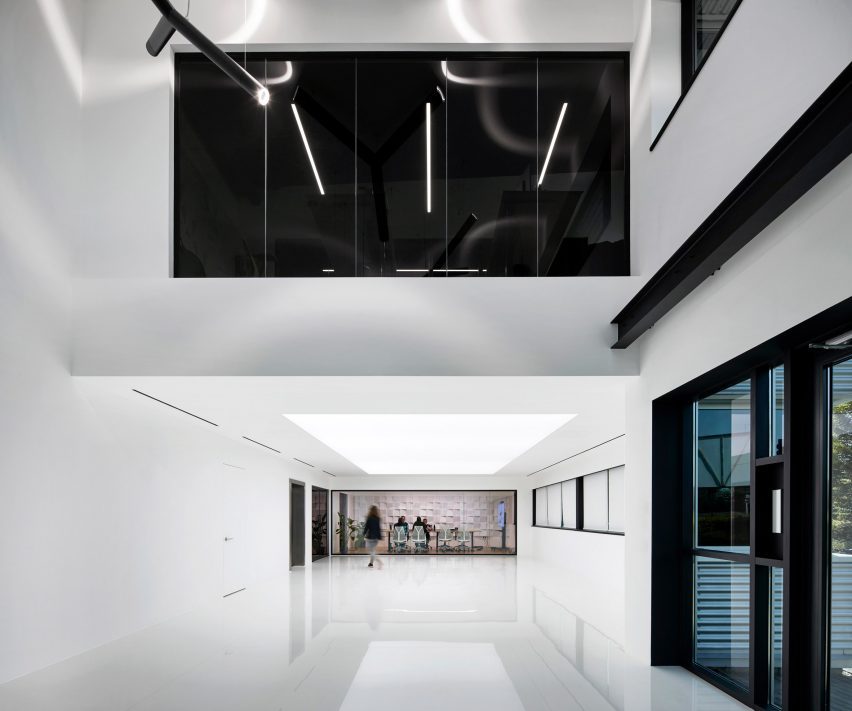
Most Architecture designed the spaces with a stripped-back aesthetic united by a largely white and black colour palette, including a black light fixture above the building’s entrance.

“The white and the black amplify each other by contrast, representing the fusion of a laboratory and a garage, and the constant dynamic between research and production,” explained McMurdo.

“Using this pallet we also wanted to make an impactful design statement on entry to the building. The result was a large anamorphic light fixture, which coalesces into a Feynman diagram from a single vantage point, becoming a composition of independent pieces.”

Test facility for Charge Cars
Cars are designed, built and tested at the facility

Other recent electric car factories featured on Dezeen include a black steel and glass facility designed by Snøhetta for car brand Polestar in Chengdu, China. In Sweden, Danish architecture studio Cobe is designing a development centre for Chinese car manufacturer Geely, which it describes as a “chamber of secrets”.

The photography is by Paul Riddle.


Project credits:

Client: Charge Cars
Lead architect: Most Architecture
Interior concepts: Evgeniy Bulatnikov
Mechanical engineer: Airon
Electrical engineer: Smart Techno Systems
Structural engineer: HLS Structural
Lighting: Gaismas Magija
Building control: The Building Inspectors
Wind consultant: Buro Happold
Fire engineer: QFSM
CDM advisor: Andrew Goddard Associates
Main contractor: Hansa Group
Steel mezzanine contractor: System Store Solutions
Lighting manufacturer: Esse-Ci

Reference