Snøhetta creates Holzweiler’s store informed by Norwegian coastline
CategoriesInterior Design

Snøhetta creates Holzweiler’s store informed by Norwegian coastline

Architecture studio Snøhetta has completed a shop for fashion and lifestyle brand Holzweiler in Chengdu, China, informed by its Norwegian heritage.

Located in Taikoo Li mall in central Chengdu, the 130-square-metre store is Norwegian brand Holzweiler‘s first outpost outside of Scandinavia.

Holzweiler Chengdu store by Snøhetta
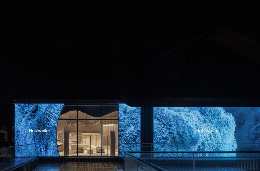
The exterior of the store is covered with LED screen

“The store features recurring themes of currents, reflections and contrasts inspired by landscapes and coastal movements, a bespoke concept of the forces of norwegian nature playing on our shared heritage,” Snøhetta explained.

“With the aim of transporting Holzweiler’s love and deep respect for its origins, there is an immediate and consistent reference to the natural world that harks to the brand’s home country.”
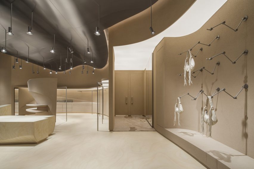
Holzweiler Chengdu store by Snøhetta
The interiors nod to the Norwegian coastal lines

The exterior of the store features a full-size LED screen, which will be used to display campaigns that showcase that brand’s connection to nature.

A glass wall framed with wavy lines divides the LED screen into two parts, revealing the store’s warm clay-toned interiors to visitors.
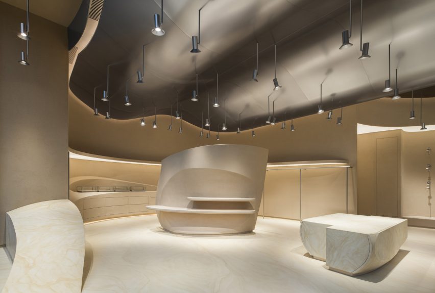
Holzweiler Chengdu store by Snøhetta
The reflective surface of the ceiling resembles sky and ocean

The entrance of the store was crafted from floor-to-ceiling sand-blasted stone that extend to the product display area where mechanical arms present Holzweiler’s signature silk, lambswool and cashmere scarf designs.

Wavy lines were widely adopted inside the store, as a nod to to the shorelines along Norway’s extensive coastline. A series of hanging lights were suspended from the reflective surface of the ceiling, which was clad in steel with a sandblasted finish.

The clothing racks made with the same steal material run along the curved wall, while the forms of the display tables placed in the centre of the space were designed to evoke coastal rock formations.

Natural materials were used throughout the store, sourced locally from China. Meanwhile, all fixtures within the store were designed to be flexibly dissembled and repurposed in the future.
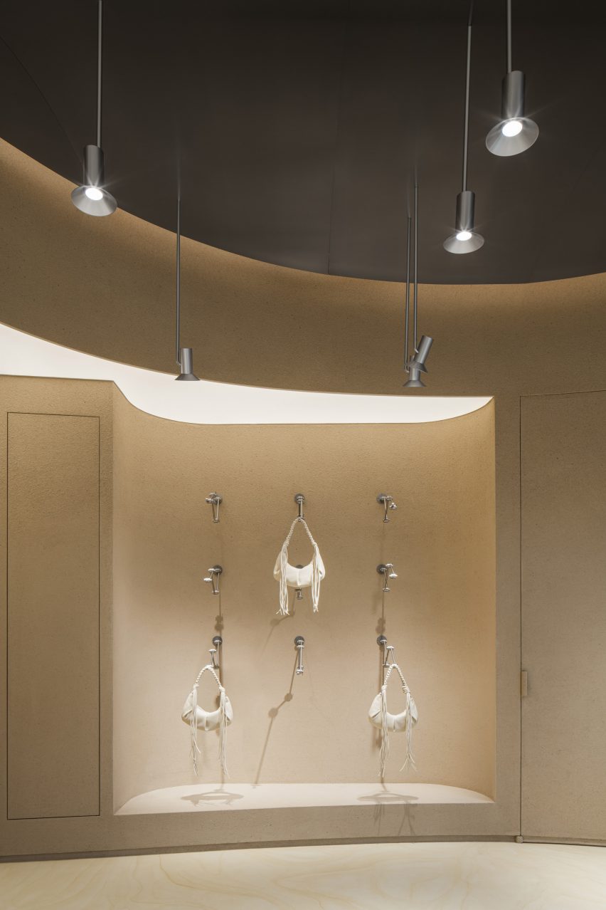
Holzweiler Chengdu store by Snøhetta
A hero wall with mechanical arms is used to present Holzweiler’s signature products

The point of sale area is tucked away at the back of the store separated from the main shopping area to provide privacy for customers.

Snøhetta is a long-term collaborator of Holzweiler’s, having designed the company’s flagship store and showroom in Oslo, as well as its first international outpost in Copenhagen.

The Studio has recently completed a planetarium in France, featuring two domes surrounded by sweeping wooden walls and a shingle-clad viewing tower in Austria.

The photography is courtesy of Holzweiler.

Reference

Mitsubishi Jisho Design creates food-waste teahouse in Venice
CategoriesSustainable News

Mitsubishi Jisho Design creates food-waste teahouse in Venice

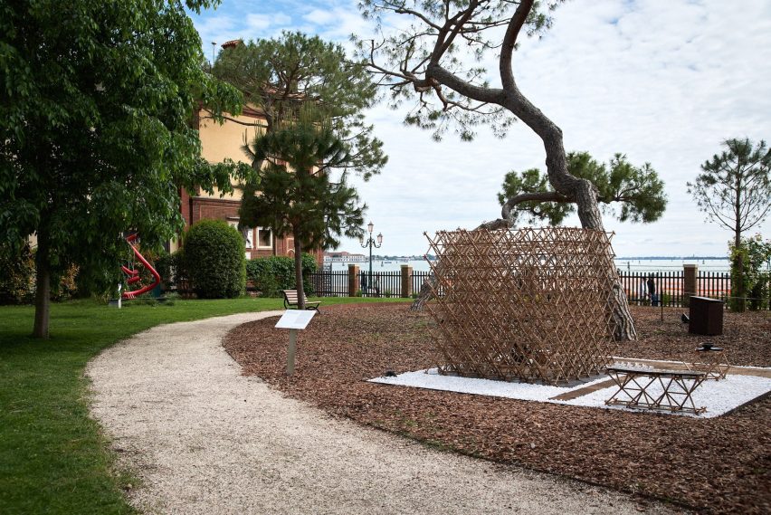
Tokyo-based Mitsubishi Jisho Design has made a teahouse from food-waste-based materials at the Venice Architecture Biennale.

Architects Takaaki Fuji, Hiroya Inage and De Yuan Kang from Mitsubishi Jisho Design designed the teahouse for the Time Space Existence exhibition held by the European Cultural Center during this year’s Venice Architecture Biennale.

Food-waste tea house
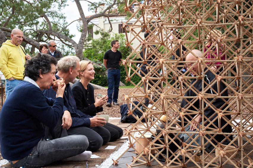
Mitsubishi Jisho Design created a tea house for the Venice Architecture Biennale

The teahouse was named Veneti-An – a combination of the words Venetian and An, which means a small hut in Japanese and is often used in names of  teahouses.

It was designed to offers visitors a place to experience a Japanese tea ceremony and reflect on how people connect following the Covid pandemic.

“The point of this exhibition is to explore, to use it as a lab, to make people think,” said De Yuan Kong said.

“It’s all about creating conversations.”

Pavilion made from cardboard and food waste for Time Space Existence exhibition
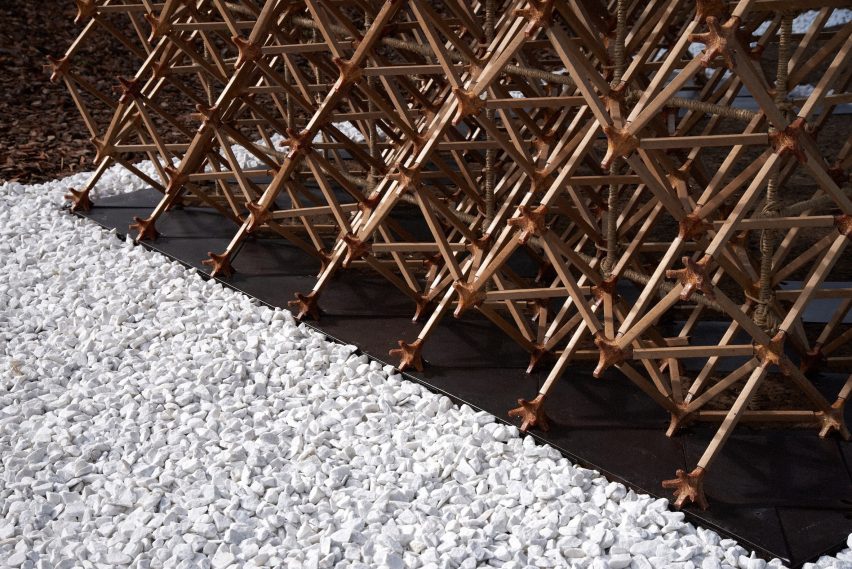
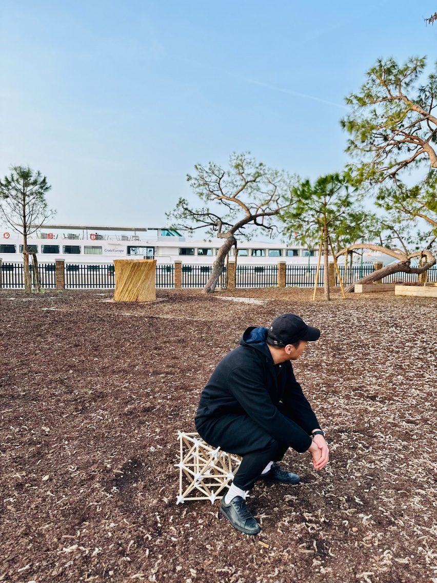
It was constructed with food-waste joints

The tea house was built from varied of materials made from food waste including coffee grounds and pasta, who are common foods in Venice.

Along with 7,165 paper tubes and 128 cork floor panels, it includes 74 coffee-ground-made panels and 2,324 joint components made from discarded pasta. According to the architects, the pasta-based joint components produced by Fabula are as durable as concrete.

“I feel that the exterior material in architecture is limited,” said Fuji.

“Our intent is to explore new technologies in construction, which could result in stronger regional identities and expression.”

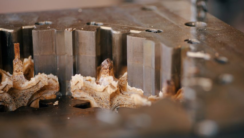
Pasta being moulded into architectural components
Pasta was moulded to form the joint components

The angle of the struts that make up the pavilion was set at 45 degrees. This was determined by the city’s latitude to further connect it to the city.

“By adapting the joint shape to the latitude of the place where it is placed, a distinctive identity is created in the form, as well as a teahouse that optimally lets in or shields it from sunlight in response to the local environment,” said the architects.

Cardboard and food waste chairs
The pavilion will be disassembled into pieces of furniture after the exhibition

Veneti-An is waterproof as its components were treated with a silicon-based liquid by Japanese silica coating producer SilicaGen.

The team will measure and record changes to the materials used during the six month exhibition as part of its research on sustainable materials, responding to the overall biennale’s theme – Laboratory of the Future.

To build the pavilion, the architects packed the components, a total weight of 255.5 kilograms, into seven 87-litre suitcases and took them from Japan to Italy.

Following the biennale, the teahouse will be dismantled and rebuilt into pieces of furniture.

“Neither 100 per cent manufactured nor 100 per cent self-built, it is a piece of furniture that allows for modification and addition of a personal touch,” said the designers.

“The dimensions of the parts were determined on the premise of turning into furniture, or perhaps it would have been better to describe it as furniture transformed into a teahouse for the exhibition’s duration only.”

Time Space Existence exhibition at Venice Architecture Biennale
It forms part of the Time Space Existence exhibition

The tea house is located in Marinaressa Gardens alongside a concrete emergency housing prototype developed by the Norman Foster Foundation and Holcim as part of the Time Space Existence exhibition.

The group show presents work by architects, designers and artists from 52 different countries in venues across the city. Also as part of the show SOM and Princeton University used AR to construct a self-balancing arch.

The photography is by Yuta Sawamura.

Time Space Existence takes place from 20 May to 26 November 2023 at various locations across Venice, Italy. See Dezeen Events Guide for an up-to-date list of architecture and design events taking place around the world.

Reference

Fred Rigby Studio creates dried flower meadow inside Lestrange store
CategoriesInterior Design

Fred Rigby Studio creates dried flower meadow inside Lestrange store

Forest sounds and furnishings made from storm-stricken trees bring elements of nature into this menswear boutique in London’s King’s Cross, designed by local practice Fred Rigby Studio.

The store is the fourth outpost from men’s fashion brand Lestrange and was conceived based on blueprints by biophilic design expert Oliver Heath, combining greenery with reclaimed and natural materials to forge a greater connection to the outdoors.

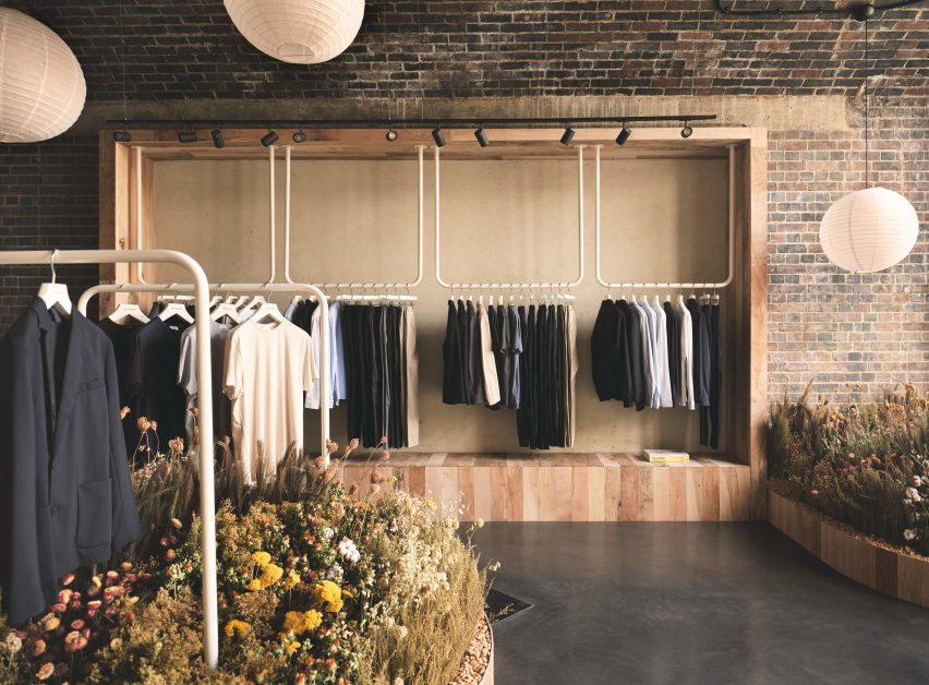
White clothes rails inside Lestrange store in Coal's Drop Yard
Fred Rigby Studio has designed the latest Lestrange boutique in London

According to Fred Rigby Studio, this approach was chosen to reflect the brand’s philosophy of using renewable and recycled fibres to produce clothing with longevity.

“We wanted to create a sense of calm within the space, which didn’t feel like a generic shop but an interior which told a story behind the clothing and the brand’s ethos,” explained the studio’s eponymous founder.

Overview of wood-lined London shop interior by Fred Rigby Studio and Oliver Heath
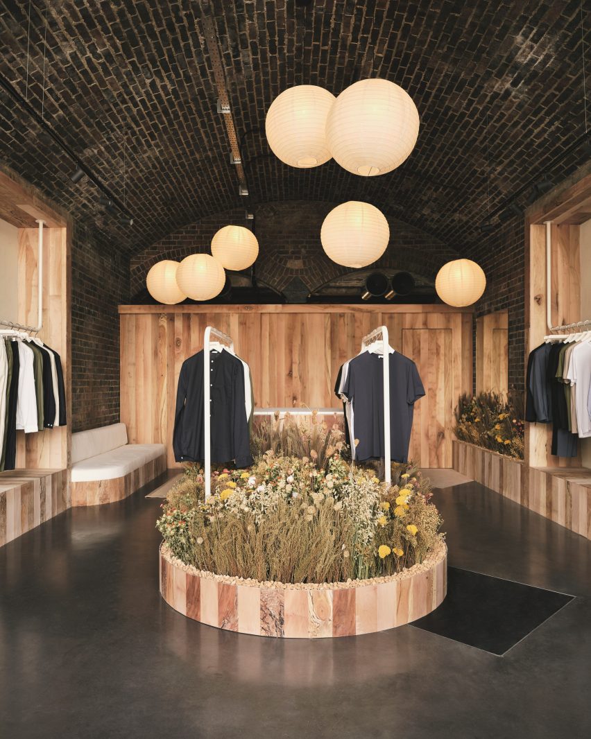
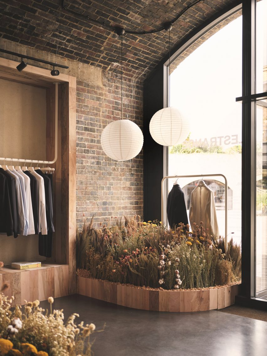
Rice paper lanterns are suspended at varying heights throughout the space

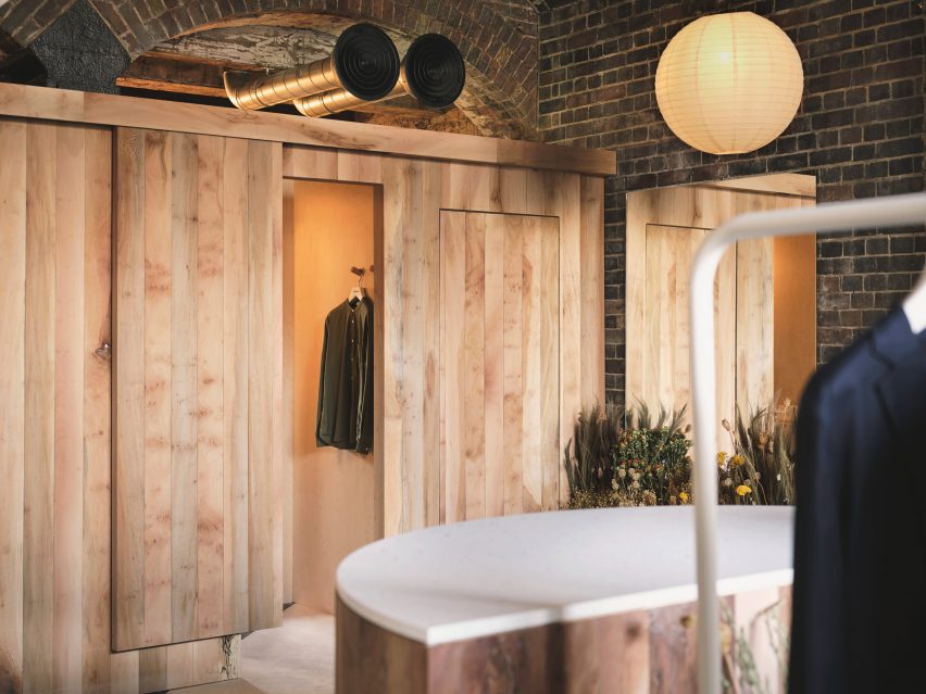
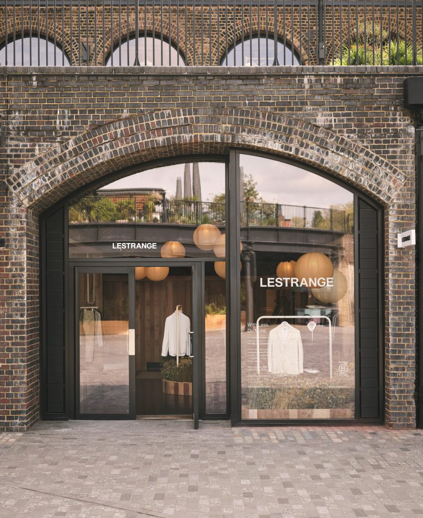
The Lestrange store is set inside the Thomas Heatherwick-designed Coal Drops Yard shopping centre, formed of two converted warehouses that were originally built in the Victorian era to store the vast quantities of coal needed by the capital.

Rigby wanted to incorporate this imposing brick structure into his final design.

Shelves inside Lestrange store in Coal's Drop Yard
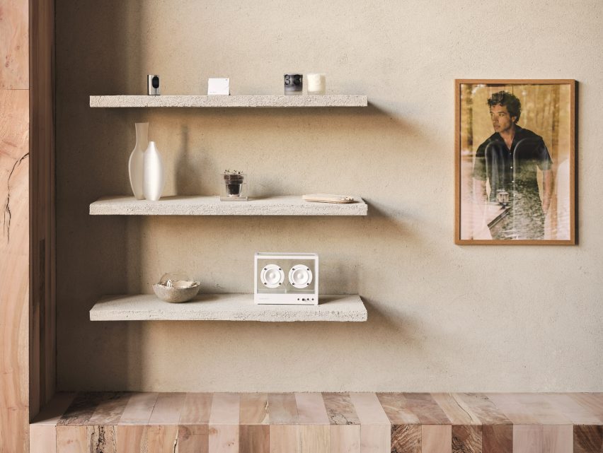
Tactile plaster was used to cover the walls

“We didn’t want to hide this history by covering it up, which would have also entailed using construction materials,” he told Dezeen.

“So we celebrated it, breaking the space up using timber walls and cladding, then adding the rice paper lights to give the space a more intimate feel.”

Speaker on a plaster-covered shelf
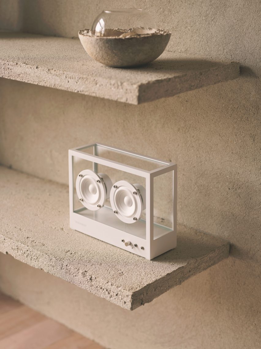
The same finish was also applied to a trio of display shelves

Using the existing site as his canvas, Rigby focused on sourcing a tight edit of natural and reclaimed materials.

“There are lots of new materials on the market, but finding those that are produced in quantity and applicable to commercial use can be a challenge,” he said.

London plane timber – harvested from “storm-stricken and diseased trees” within a few miles of King’s Cross – was used to form the partitions that define the store’s display and changing areas, as well as some bespoke furniture pieces.

British manufacturer Clayworks blended unfired clays with minerals and natural pigments to create the tactile wall finishes, while the terrazzo-style countertops were made by Welsh company Smile Plastics using a mix of recycled plastics from discarded mobile phone casings and chopping boards.

Lestrange store in Coal's Drop Yard by Fred Rigby Studio and Oliver Heath
The changing rooms are clad in panels of London plane timber

As the ultimate counterpoint to the mass and severity of the brick, Rigby conceived the idea of an indoor meadow that meanders through the Lestrange store.

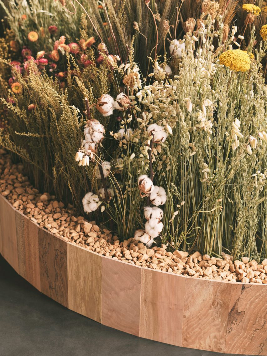
The arrangement of natural dried flowers and grasses was realised by award-winning garden designer Lottie Delamain, integrating a carefully chosen mix of species to reflect the fibres commonly used in apparel manufacture such as cotton and flax.

“We wanted to bring nature inside, using plants linked to the clothes while creating a touch point to the materiality,” said Rigby.

Dried flowers and grasses in a bed of stones inside Lestrange store in Coal's Drop Yard
Garden designer Lottie Delamain created a dried flower meadow for the store

Clothes are displayed on simple white metal rails and the capacious open-topped dressing rooms feature speakers playing forest sounds, complemented by discreet wall lights that cast a subtle glow.

There are also subtle nods to Japanese design in the form of the rice paper lampshades that float at varying heights throughout the store.

Mini dried flower meadow inside London shop by Fred Rigby Studio and Oliver Heath
The flowers are set in wood-framed stone beds

“We started with a mixture of initial references, one of which was a teahouse designed by Charlotte Perriand,” said Rigby.

“We wanted to create a material-focused space with nods to natural materials such as the rice paper lights, which we felt would add to the space and create a sense of calm and stillness.”

Lestrange store in Coal's Drop Yard by Fred Rigby Studio and Oliver Heath
The Lestrange shop is set inside the Coal Drops Yard shopping centre

Previous projects from Rigby, who founded his studio in 2008, include bespoke furnishings for a renovated 1920s office building in London as well as the interiors of Bath’s Francis Gallery, which is set inside a Georgian townhouse.

The photography is by Felix Speller.
Reference

EFFEKT creates treetop walkway accessible to “all nature lovers”
CategoriesArchitecture

EFFEKT creates treetop walkway accessible to “all nature lovers”

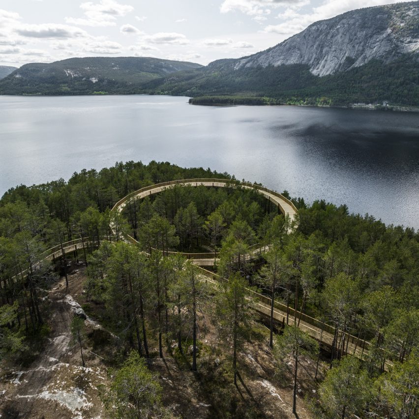
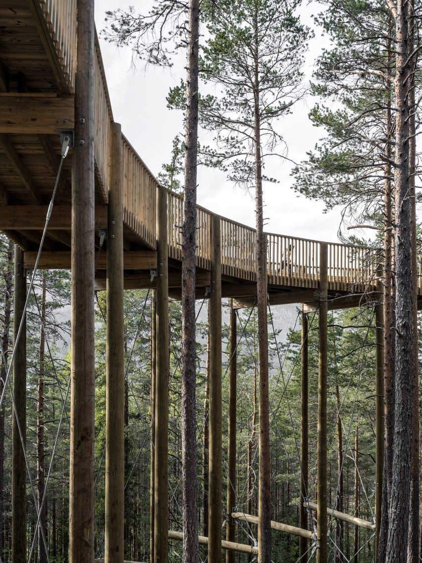
Architecture studio EFFEKT has completed Norway’s first treetop walkway, which winds up through Hamaren Activity Park in Fyresdal and ends at a circular viewpoint.

Raised 15 metres high in the air, the platform was designed with a gentle incline accessible to people of all ages and physical abilities, as well as cyclists, pushchairs and wheelchairs.

Norway's first treetop walkway
EFFEKT has completed Norway’s first treetop walkway

“The treetop walk in Hamaren Activity Park offers all nature lovers, regardless of age, disability or physical limitation, a new perspective on the natural landscape of Fyresdal,” said Danish studio EFFEKT.

“It grew out of a heartfelt desire to give all people, regardless of physical abilities, the sensational feeling of walking amongst the treetops.”

Aerial view of Hamaren Activity Park in Norway
It winds up through Hamaren Activity Park in Fyresdal

Hamaren Activity Park opened in Fyresdal in 2017. Alongside the new treetop walk, it has cycling and nature trails, and facilities for activities including trampolining and climbing.

The treetop walkway is one kilometre in length and is placed along the ascent of Klokkarhamaren – a hill with an elevation of 338 metres.

Aerial view of Hamaren Activity Park treetop walkway by EFFEKT
It is built from pinewood

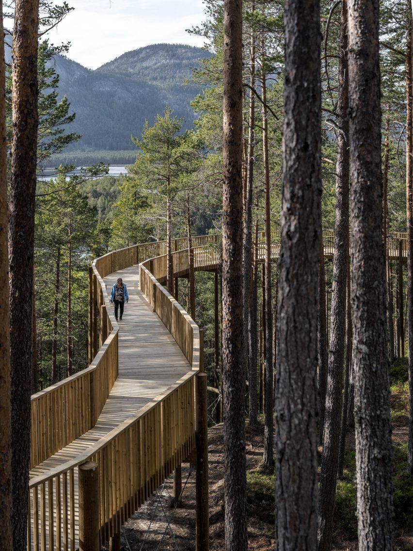
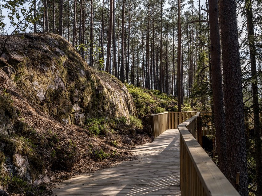
Visitors to the walkway are guided from the pine forest floor, along past a lake and up between the treetops to the summit of Klokkarhamaren.

At the end of the trail, EFFEKT has incorporated a circular viewpoint that measures 50 metres in diameter and provides a panoramic view of the natural landscape surrounding it.

Aerial view of Hamaren Activity Park treetop walkway by EFFEKT
It ends at a circular viewpoint

“Reconnecting with nature is an important part of the great change we are undergoing now,” studio co-founder Tue Foged told Dezeen.

“Although being a small gesture in the bigger picture, we hope that granting people free and universal access to experience the sublime nature of this site, can serve as an example for others.”

Walkway through pine forest
The walkway weaves through a pine forest

The structure is two metres wide throughout most of its length but widens into balconies at certain points to spotlight specific views or provide rest areas. It is raised on pillars that align with “the natural curves and gradients of the terrain”.

Its boardwalk-like appearance was made from locally sourced pinewood, chosen to blend in with the surroundings.

“It uses only small and straight prefabricated elements that can easily be handled with small machinery and by hand on-site to protect nature during the building process,” explained Foged.

“When joined together the segments form an organic shape that bends around the trees and along the mountain,” he said.

“The structure literally blends in with existing trees on the mounting, sometimes giving the visual impression that the boardwalk levitates through the forest.”

Hamaren Activity Park treetop walkway
It is designed to blend with its surroundings

This structure was developed by EFFEKT in collaboration with local contractor Inge Aamlid.

According to the team, this was to ensure the design also nodded to the area’s history of pinewood construction by using local craftsmanship techniques.

Treetop walkway by EFFEKT
It begins at the forest floor

“The region has a long history with logging and tradition of building with pinewood structures,” said Foged.

“The premise of the design was, therefore, to use the local predominant material of the pine tree. Pinewood is used as the loadbearing structure as well as the boardwalk and railing,” he explained.

Wooden walkway
It follows the ascent of Klokkarhamaren

Based in Copenhagen, EFFEKT is an architecture studio founded by architects Sinus Lynge and Foged in 2007.

Other projects by the studio include Camp Adventure, a spiralling tower in the midst of a forest, and the transformation of an abandoned windmill factory into a skatepark and youth centre.

The photography is by Rasmus Hjortshøj.

Reference

Takt creates flat-pack sofa that is “designed for repair”
CategoriesSustainable News

Takt creates flat-pack sofa that is “designed for repair”

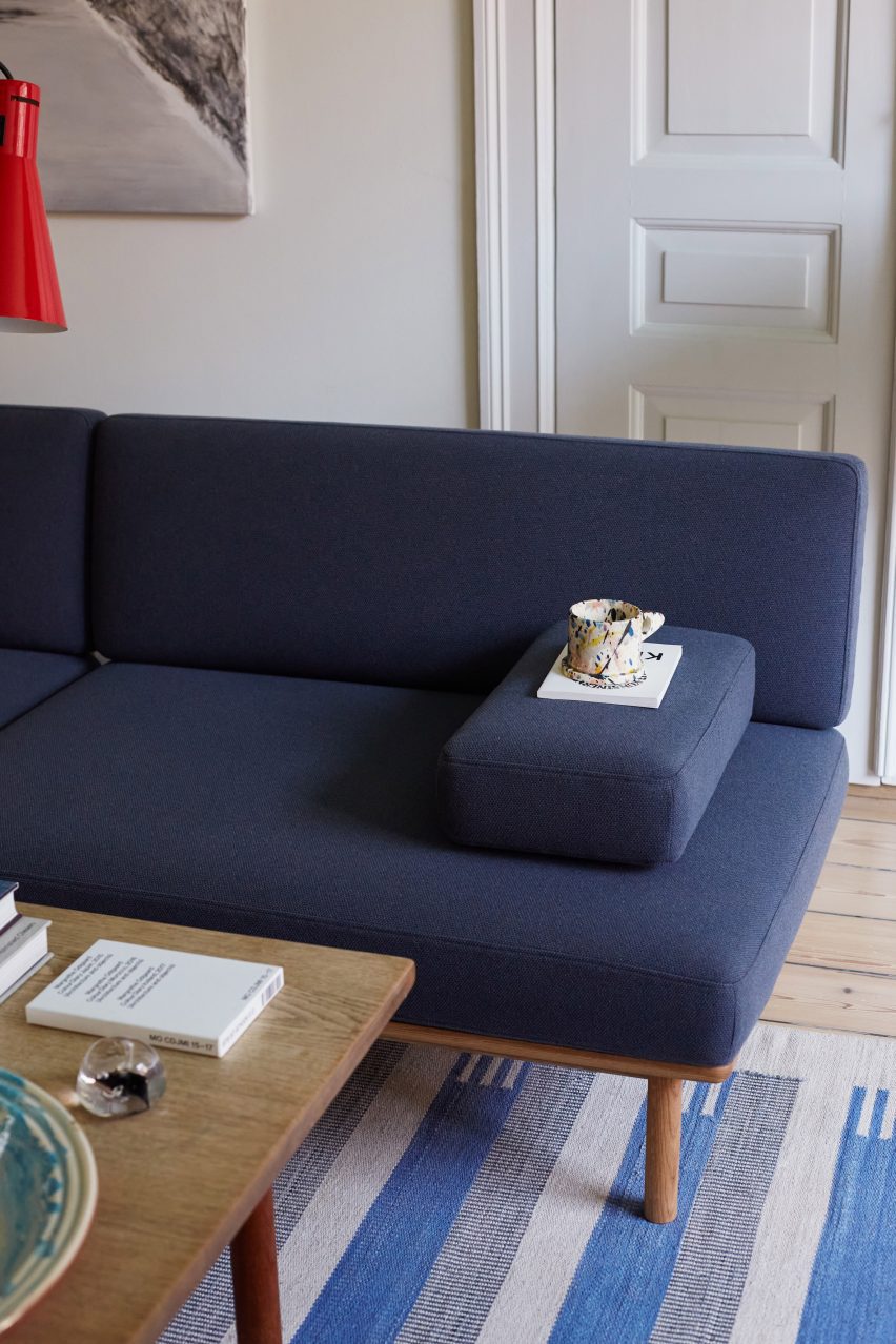
Danish furniture company Takt has launched Spoke Sofa, a sofa that can be fully disassembled and have its parts replaced and recycled, in Copenhagen for 3 Days of Design.

Spoke Sofa, which is the brand’s first sofa, was developed in collaboration with Norwegian studio Anderssen & Voll.

Rooted in circular principles, it aims to provide an alternative to conventional sofas, which are “notoriously wasteful,” according to the brand.

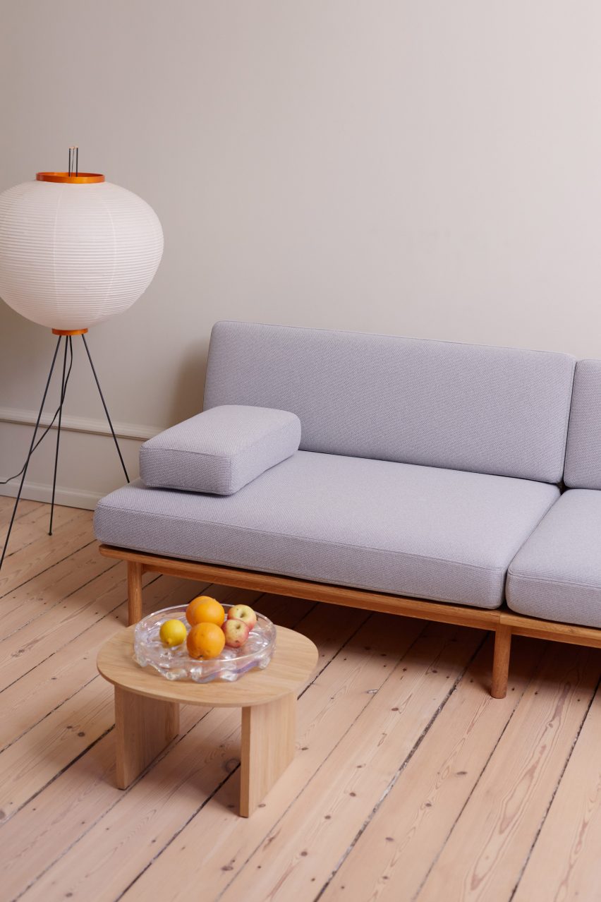
Blue sofa in Scandi-style interior
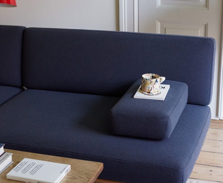
All elements of the Spoke Sofa can be replaced by hand

The brand intends for the Spoke Sofa to be passed down through generations by undergoing maintenance when required.

Rather than disposing of the entire seat and replacing the sofa, users can take the sofa apart and replace parts of it themselves.

“All of the joints are exposed and mechanical, so simple tools can be used to disassemble the sofa, then you can order a replacement part from our website to repair it yourself,” said the brand.

“Spoke is fully EU Ecolabelled – the official European Union label for environmental excellence – and has been designed for repair, so that all components and upholstery can be replaced with spare parts, extending the life of the sofa indefinitely,” Takt added.

Lilac sofa in Scandi-style interior
The cushions can be upholstered in a choice of seven coloured fabrics

Takt chose to focus on the sofa as a product as they can be difficult to recycle.

“The sofa category is notoriously wasteful, so we always had our eye on it as one to address,” Takt founder and CEO Henrik Taudorf Lorensen told Dezeen.

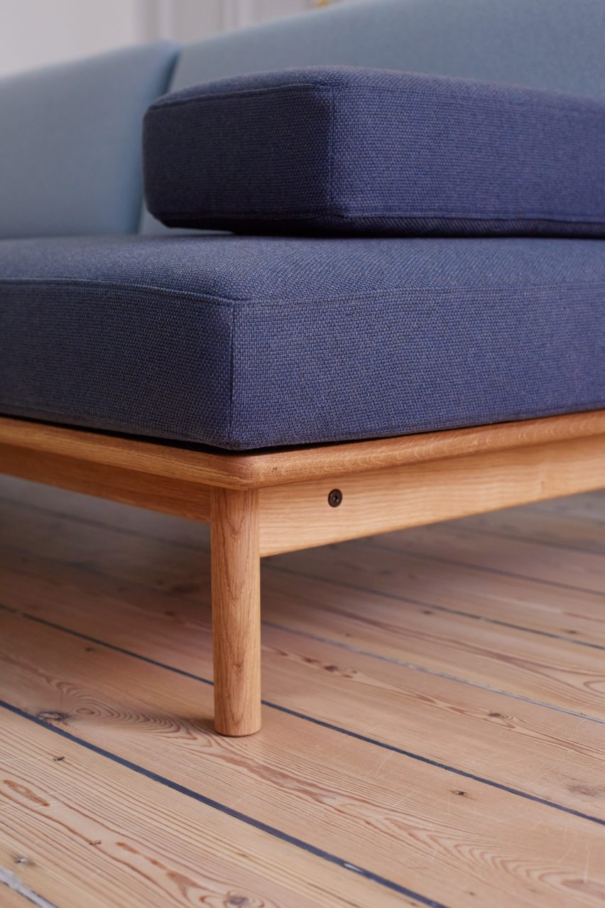
The Spoke Sofa’s base is made from a choice of responsibly sourced beech or oak grown in Europe.

Its upholstery is deliberately loose-fit, allowing easy removal for cleaning purposes, and was made by textile brand Gabriel from 98 per cent post-consumer recycled polyester.
The material itself is 100 per cent recyclable, the brand said.

“We designed and specified the upholstery to ensure the user could actually take it off, wash it at home at 40C and mount it again – or replace it with a new set if it’s damaged or you want to change the appearance,” Takt said.

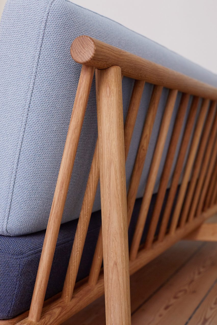
Detail of back of sofa with wooden spokes visible
Wooden spokes along the back of the sofa give it its name

The three-seater sofa is topped by lozenge-shaped cushions that can be moved freely to accommodate a range of uses, including socialising, lounging and as a day bed.

The frame itself is characterised by the rhythmically placed tapered spokes that run along the back of the seat.

“Spokes such as these are an age-old means of creating a flat supporting surface and have been a feature of English and Scandinavian utility chairs for centuries,” said Takt.

“Spoke Sofa takes this traditional craft technique and incorporates it into a distinctly contemporary aesthetic expression, foregrounding simplicity, comfort and natural materiality.”

Detail of sofa legs
The sofa was designed to be passed down

The brand hopes that the sofa’s design will give it a longer life.

“We believe that furniture should be loved, cared for and handed down to future generations,” Taudorf Lorensen continued.

“This is why all of our furniture is designed for repair. Our customers become familiar with every component during the surprisingly enjoyable assembly process. So when life happens, they can identify the right part to repair or replace.”
Other recent sustainable furniture designs include outdoor seating with woven seats made from old fire hoses by Local Works Studio and furniture and accessories for a restaurant made from its own food waste by Carolina Härdh.

The photography is by Claudia Vega.

Spoke Sofa is on view at at Original Coffee, Store Kongensgade 124 as part of 3 Days of Design 2023, from 7 June to 9 June 2023. See Dezeen Events Guide for information about the event, plus a list of other architecture and design events taking place around the world.

Reference

Pirajean Lees creates Arts and Crafts-style interior for Mayfair restaurant
CategoriesInterior Design

Pirajean Lees creates Arts and Crafts-style interior for Mayfair restaurant

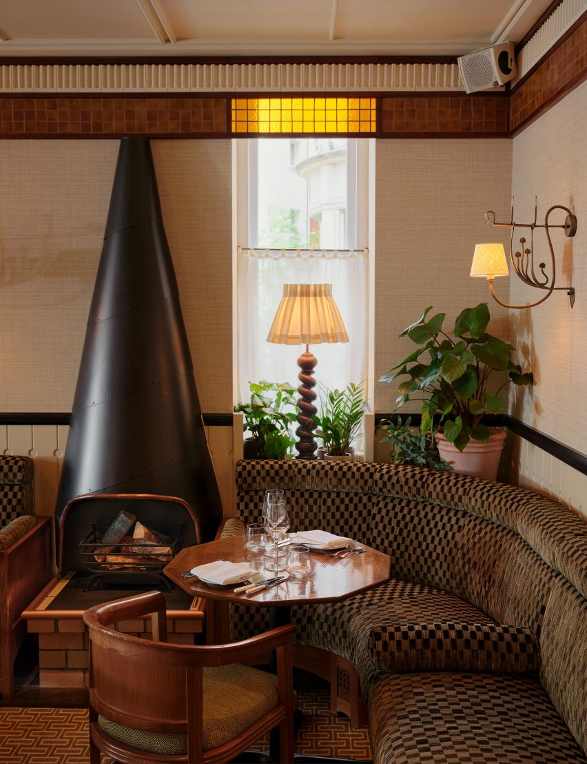
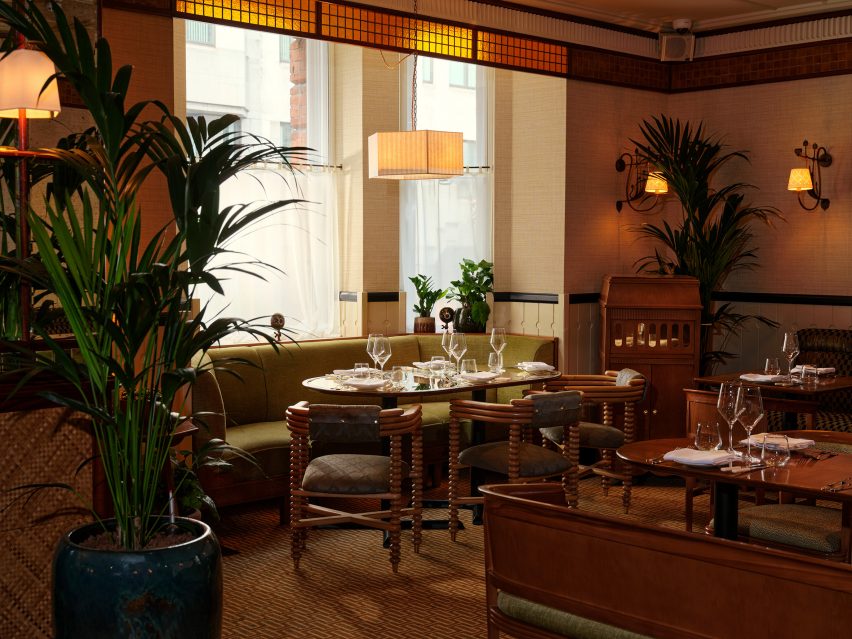
London design studio Pirajean Lees referenced Mayfair’s pastoral past and created a series of spaces that nod to the idea of a Georgian manor house when designing restaurant 20 Berkeley.

Pirajean Lees aimed to build a story around the space and its sequence of many small rooms, while tapping into the restaurant’s British produce-led culinary approach.

Seating area in main dining room of 20 Berkeley
Pirajean Lees has completed the 20 Berkeley restaurant in Mayfair

“The restaurant is situated in the heart of Mayfair, a place once on the cusp of the city and countryside,” Pirajean Lees told Dezeen.

“The farming history of the area and its connection to the surrounding rural lands is prevalent throughout the project and paramount to the dining experience.”

Dining area in restaurant in London by Pirajean Lees
The restaurant features a series of cosy rooms on the first floor

Pirajean Lees wanted to put nature and craft at the heart of this design project to align it with the ethos of Creative Restaurant Group, the restaurant’s founders.

“This led us to build on the strong connection of an imagined Mayfair Georgian manor house and its rural lands, which would have been used to grow produce,” the studio said.

“A central staircase leads to rooms usually found in a traditional family home, such as the drawing room, music room, pantry, orangery and salon. Each room has its own character whilst belonging to the one property.”

Seating banquette in 20 Berkeley restaurant
Among them is the music room

On the upper-ground floor are the richly designed reception and main dining rooms.

The lower-ground level houses a 14-seat private room with its own exclusive lounge and dining area, alongside the kitchen, wine cellar and main bar, The Nipperkin.

The design of the interiors references the arts and crafts movement of the late 19th and early 20th centuries.

Seating booth in restaurant in London by Pirajean Lees
Stained glass features in the drawing room

“At 20 Berkeley, we have developed a layered story of handmade details and tactile finishes that exude elegance,” said Pirajean Lees.

“The project’s expression is rooted in the traditions of craftsmanship and how the process of making decorative objects and furniture should showcase the beauty of both its materials and construction.”

Table at restaurant in London by Pirajean Lees
Antique mirrors were used to surround the building’s columns

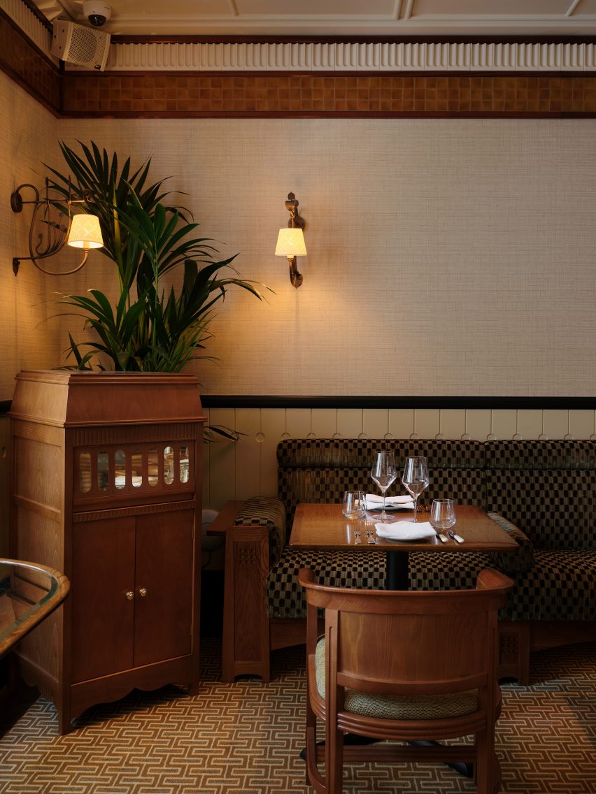
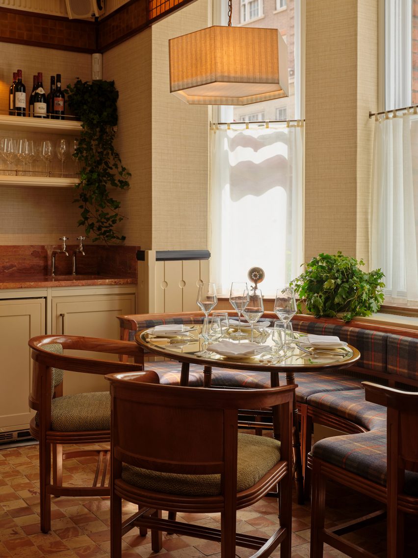
The resulting aesthetic is detailed, with a palette of rich, warm tones including ambers, ochres and dark reds, used across upholstery and textural wallcoverings. Floor tiles have been hand-crafted in Wales and feature clay embedded with fossils.

Bespoke joinery work was utilised throughout the space, including for the wall panelling, dowelled ceilings and an English oak staircase.

The project also features bespoke elements that were added to bring a sense of opulence to the various spaces.

These include a pantry, in painted timber, that provides a strong focal point of the upper floor. Here, chefs prepare dishes on the pantry island, “inviting guests to witness the chefs’ craft, as one would do in one’s home, whilst hosting guests for dinner,” said Pirajean Lees.

In the orangery, a bespoke pickling cupboard, made from sapele wood and marble, serves as “a pleasing curiosity”, used by the chefs to store jars of vegetables for their recipes.

Staircase in 20 Berkeley restaurant
An English oak staircase leads down to 20 Berkeley’s lower ground level

The bespoke dining tables and chairs were made of oak, while the chairs have been traditionally upholstered for maximum comfort.

“The bespoke and craft elements bring depth to the project, anchoring it in its strong narrative and creating timeless interiors,” said Pirajean Lees.

Private dining area in 20 Berkeley restaurant
A private dining room is located on the lower ground floor

Bespoke stained glass, handcrafted in a North London studio, is another of the restaurant’s features.

Used in the reception and drawing room, the stained glass has been strategically positioned, backing onto the busy central bar to give a sense of movement and energy.

In front of the windows, it warms the light coming into the rooms to create an immersive atmosphere.

Table in private dining area of restaurant in London by Pirajean Lees
Mixed clay tiles are laid across the floor

“The stained glass introduces shadows and reflections, which change throughout the day and are different in each room,” said Pirajean Lees.

“As per each of our projects, the tailored finishes, joinery and surfaces here, have been carefully created to ensure optimum use of the space by the restaurateur and their guests.”

Other hospitality projects from the studio include an ornate sushi restaurant in Dubai with interiors informed by 1920s Japan and a members club in London, housed inside the iconic music venue Koko.

The photography is by Polly Tootal.

Reference

JUJU Studio creates flagship for Miss Circle in New York
CategoriesInterior Design

JUJU Studio creates flagship for Miss Circle in New York

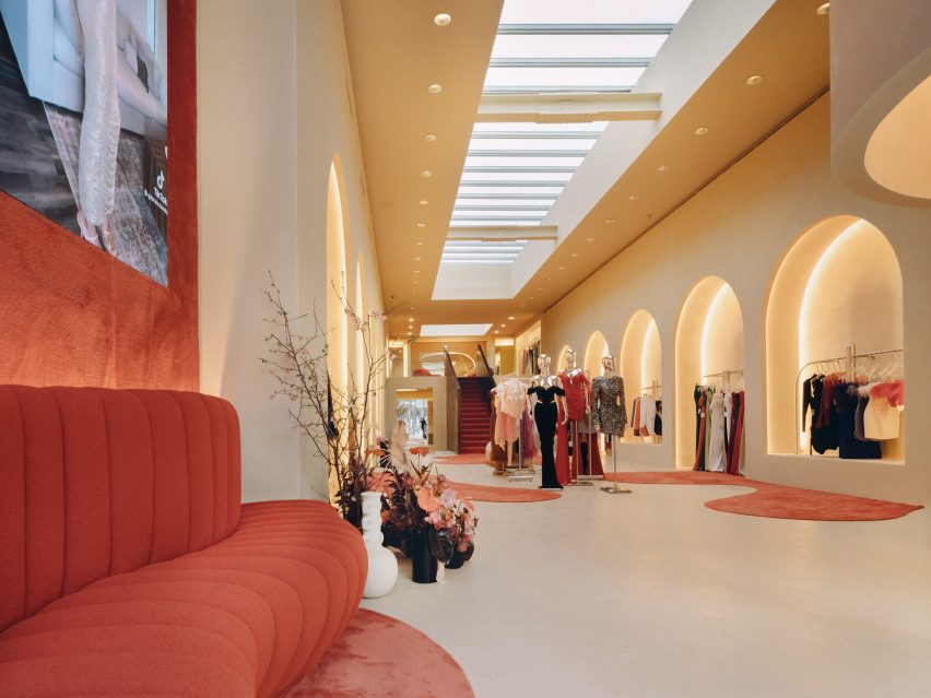
Pools of red carpet spill across the floor of this women’s fashion boutique designed by JUJU Studio in New York City.

For fashion brand Miss Circle, New York-based JUJU Studio created the interiors of its 2,600-square-foot (242-square-metre) store on West Broadway in SoHo.

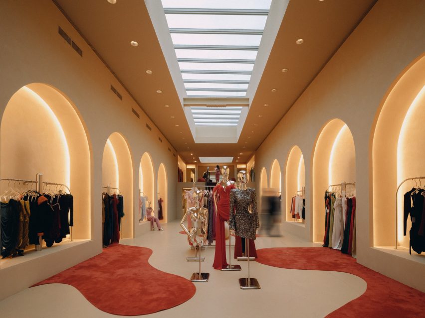
Rows of arched colonnades displaying garments on both sides of the store
The Miss Circle flagship in occupies a long, narrow space designed by JUJU Studio

The space has a long, narrow footprint, so studio founder Jing Ju devised a variety of display techniques for the brand’s womenswear garments.

“Unlike typical fashion retail spaces, the Sensorial Flagship Store is inviting and relatable, encouraging customers to engage with the brand in a fully stimulating way,” said the studio.

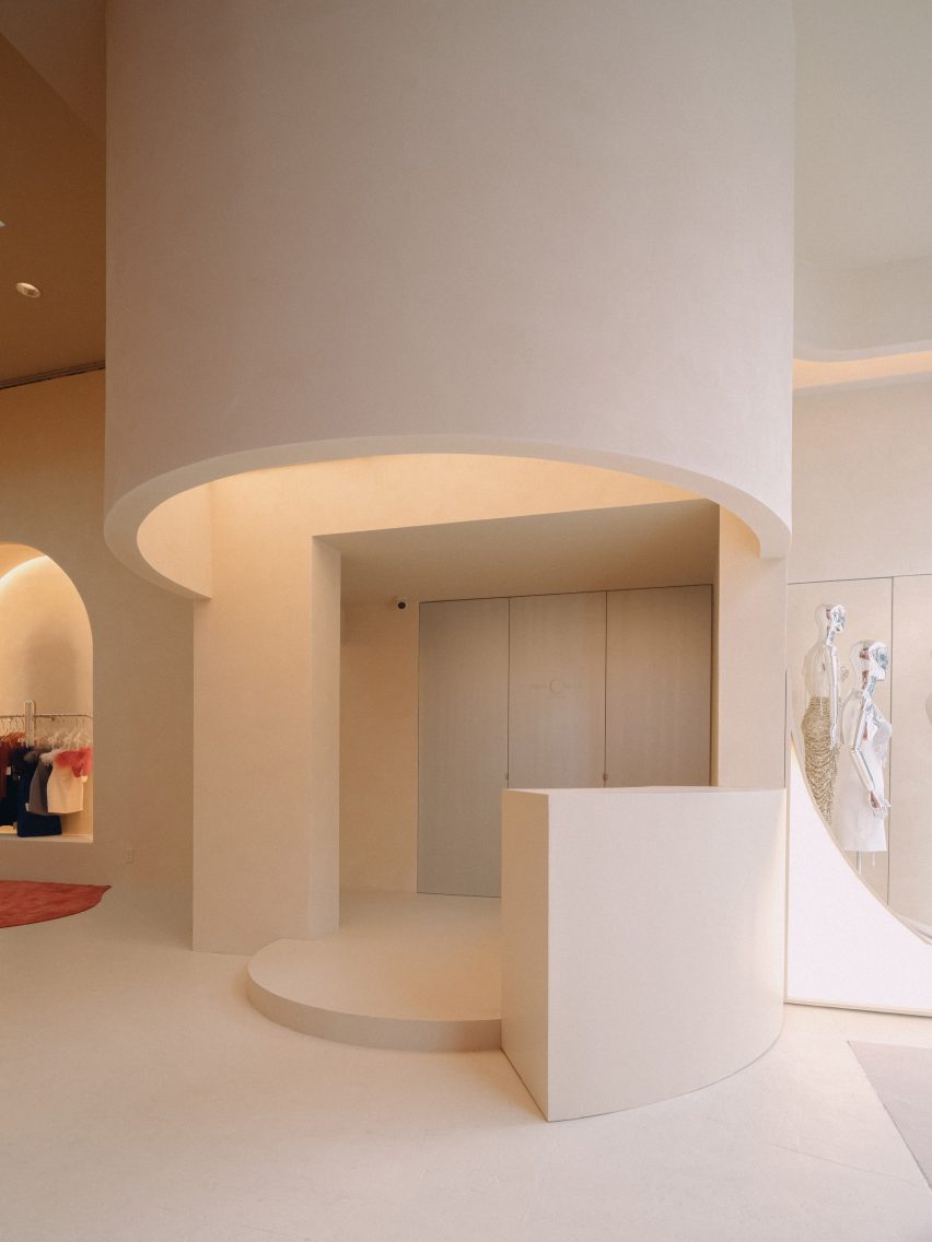
Minimal sliding counter
At the front of the store, a sliding counter can be used for multiple purposes

The majority of surfaces are finished in beige plaster, providing a neutral backdrop for more dramatic moments.

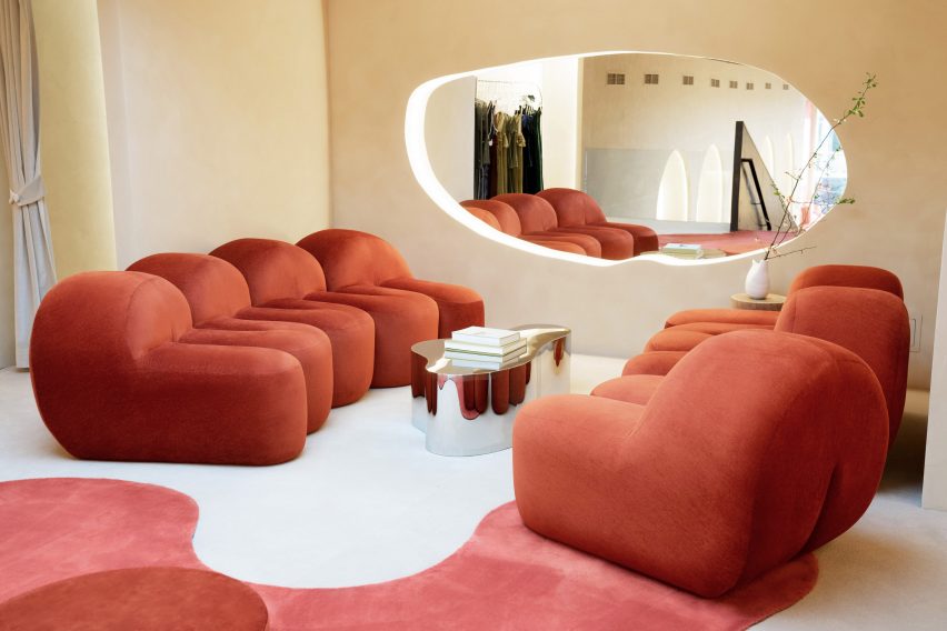
These include areas where red carpet appears from the walls in fluid forms and spreads across the floor to look like pools of liquid.

Carpet on walls, floor and ceiling beside the entrance
Red carpet extends from the floor to the ceiling beside the entrance

“The smooth yet durable surfaces add texture and visual interest to the space, while the beige hue creates a sense of lightness and spaciousness,” the studio said.

“This helps to create an accommodating atmosphere in the closed retail environment, where customers are likely to take their time browsing through the store’s selection of clothing and accessories.”

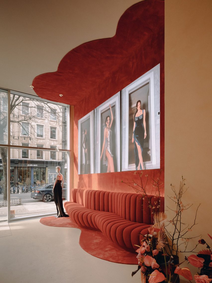
Ribbed red seating and carpet on the wall
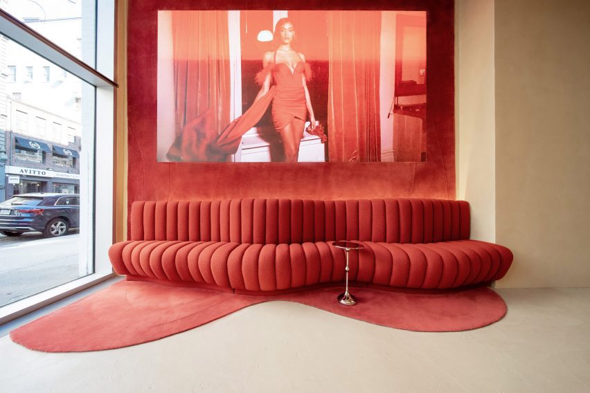
Matching the carpet is a curvaceous red sofa

At the front of the store, carpet also extends up the wall behind a curvaceous sofa of the same colour and seeps onto the ceiling.

A sliding counter can be used for checking in guests during events, or for displaying accessories at other times.

View of the store from the front
Garments are displayed in niches formed by arched colonnades on either side of the store

“The sleek and minimalistic design of the counter complements the overall aesthetic of the store and demonstrates a thoughtful and efficient use of space,” said the studio.

Along both sides of the store are arched colonnades, with cove-lit niches that each display a selection of clothing designs.

More outfits are presented on chrome railings and mannequins in the centre of this double-height space, above which a long skylight is positioned.

Towards the back of the boutique is a carpeted staircase that leads up to a mezzanine level, where the fitting rooms are located.

Red furniture in the fitting room area
Fitting rooms and a lounge area for customers is located upstairs

Red satin furniture, designed by Thehighkey, forms a seating area for customers to relax beneath another skylight, while plenty of mirrors are provided for those trying on garments.

“The warm lighting adds to the overall golden atmosphere, and the use of red provides a poetic and romantic sensation, making for a truly captivating experience,” the studio said.

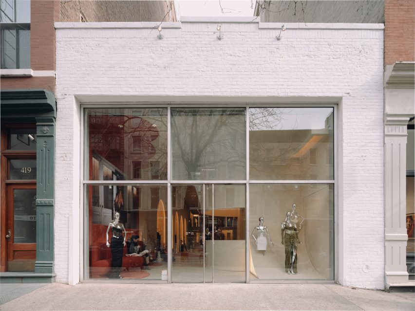
Store exterior on West Broadway
The Miss Circle store is on West Broadway in SoHo

SoHo is renowned as a shopping destination for both fashion and furniture, and new stores are always appearing in the neighbourhood.

Recent openings include a Khaite flagship with a tree planted in the centre, an outpost for Road to Awe that includes red fitting rooms and a lofty Moroso showroom.

The photography is by David Luo and Justin Missner.

Reference

Yuma Kano creates ForestBank material out of unusable wood
CategoriesSustainable News

Yuma Kano creates ForestBank material out of unusable wood

Japanese designer Yuma Kano has created a decorative material that resembles terrazzo from wood, foliage, bark, soil and seeds that was shown at Milan design week.

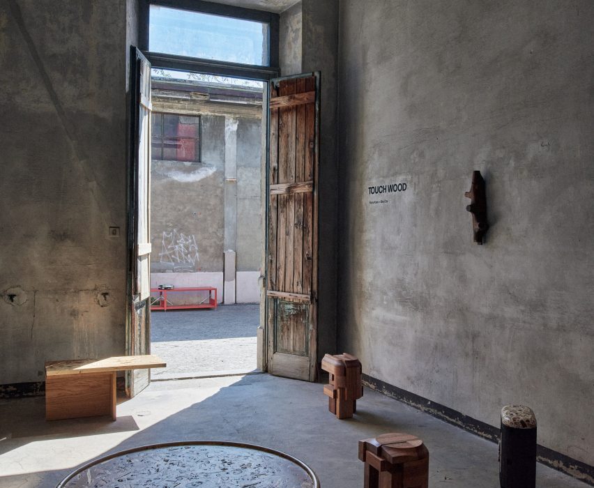
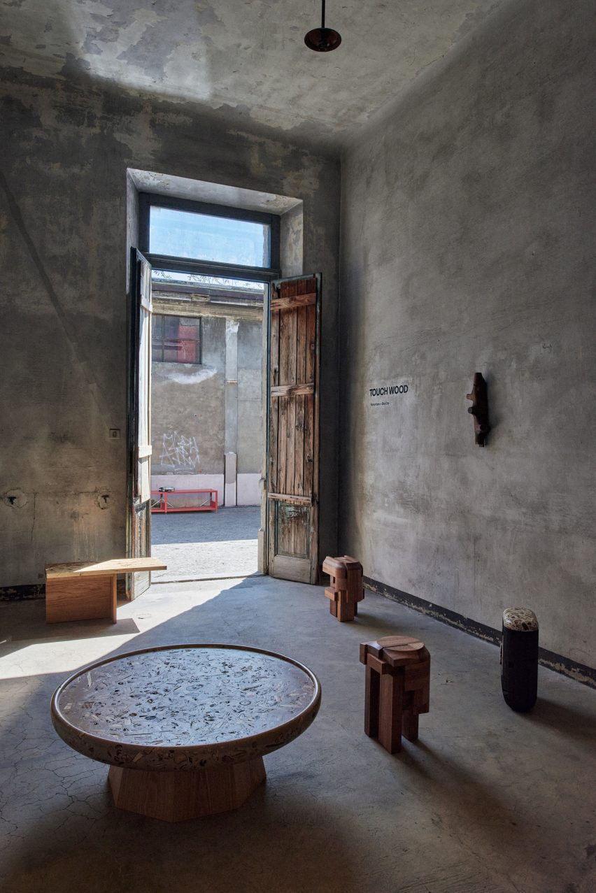
Kano, who showed his work together with fellow designer Sho Ota as part of the Touch Wood exhibition at the Alcova venue, says the idea behind the project was to find value in not just lumber, but all of the forest.

Interior of Touch Wood exhibition
ForestBank was shown at Alcova in Milan

After gathering unusable wood and other forest materials, he mixes them with a water-based acrylic resin that does not use any reactive mineral bases or volatile organic solvents.

“In the Japanese forest industry, these small pieces of wood are a waste material,” Kano told Dezeen. “I wanted to reuse the waste.”

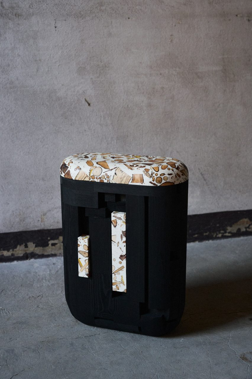
Seat by Yuma Kano
The material is made from waste wood

The technique invented by Kano creates a material with patterns that vary depending on the angle and depth of the cut into it, as well as on what ingredients – such as foliage, wood, bark, soil and seeds – were combined.

It means that the furniture made from the trademarked ForestBank material might also change how it looks as it grows older.

“The green leaves mixed in change to orange and brown as the seasons change,” Kano said.

“In addition, earth from the forest floor can be mixed in, adding browns and blacks, you can see the complex patterns of the cross sections of roots and seeds ordinarily hidden in the earth, and take notice of the different coloring that different species of trees have.”

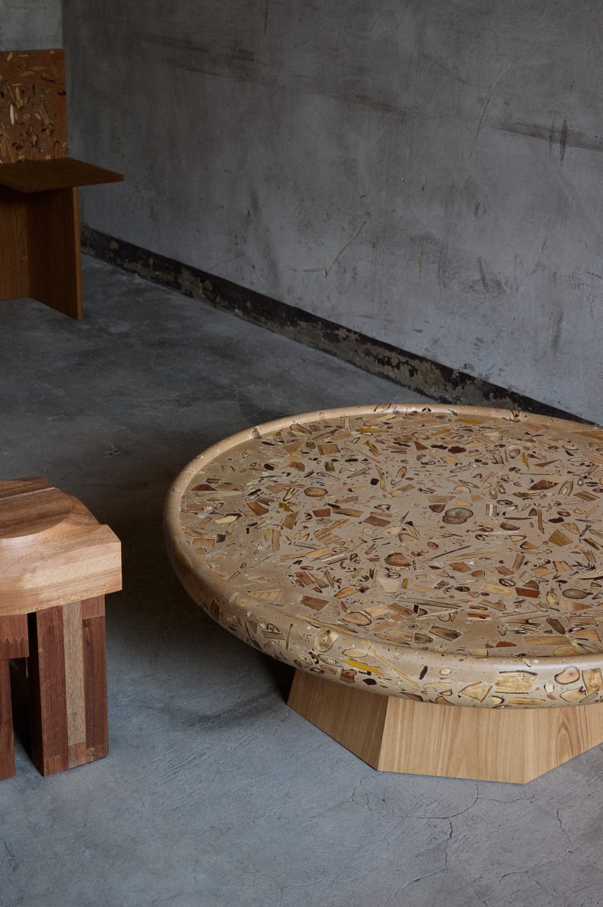
ForestBank table by Yuma Kano
The finished material resembles terrazzo

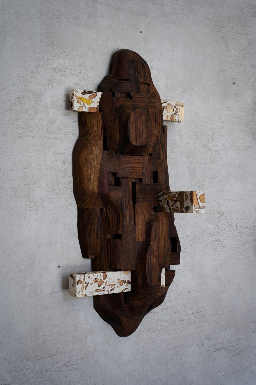
Kano has made a collection of furniture from the material that includes a table, seats and a clothes hanger, and said the pieces can eventually be recycled to create more ForestBank material.

“I’m actually reusing the dust from the original pieces for future pieces,” he explained.

Hanger at Touch Wood exhibition
A sculptural hanger was on show at Touch Wood

The focus of the Touch Wood exhibition in Milan was to showcase ways of using wood that would have otherwise gone to waste.

Here, Kano’s furniture pieces were juxtaposed with Ota’s furniture collection, called Surfaced, which is made using wood that was scheduled to be discarded from workshops and factories.

The designers hoped that the exhibition would showcase designs that mass-production cannot achieve.

“The material can show the uniqueness of each little piece of wood,” Kano said.

ForestBank seat
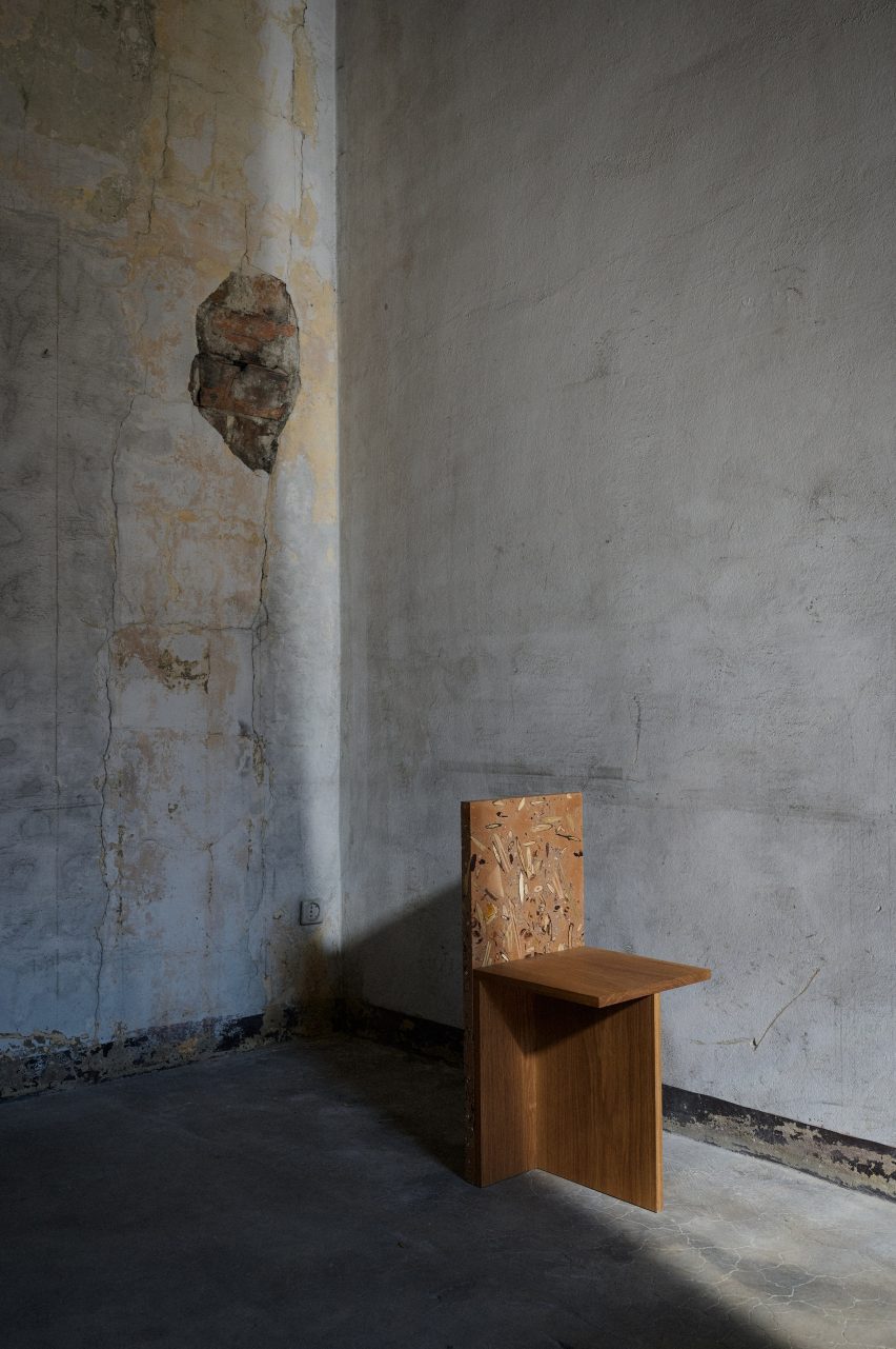
A chair has a back made from ForestBank

This year’s Milan design week featured a number of projects by emerging designers. We looked at five emerging designers showing in Salone del Mobile’s Salone Satellite section and rounded up ten standout installations in Milan as part of our coverage.

Touch Wood was on show from 17 to 23 April 2023 as part of Milan design week. See Dezeen Events Guide for more architecture and design events around the world.

Reference

Vives St-Laurent creates Billie Le Kid boutique in Mont-Tremblant ski resort
CategoriesInterior Design

Vives St-Laurent creates Billie Le Kid boutique in Mont-Tremblant ski resort

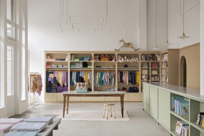
Harnessing soft colours and gentle curves, interior design studio Vives St-Laurent has completed a shop for children’s boutique Billie Le Kid in Mont-Tremblant – a Canadian ski resort known for its colourful architecture.

Following on from Billie Le Kid‘s first store in Montreal, the brand brought in Vives St-Laurent to create a new outpost that captured the spirit of the brand while reflecting its location.

Storefront of Billie Le Kid Boutique by Vives St-Laurent
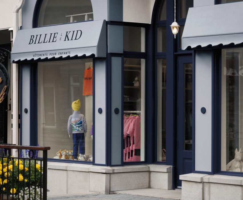
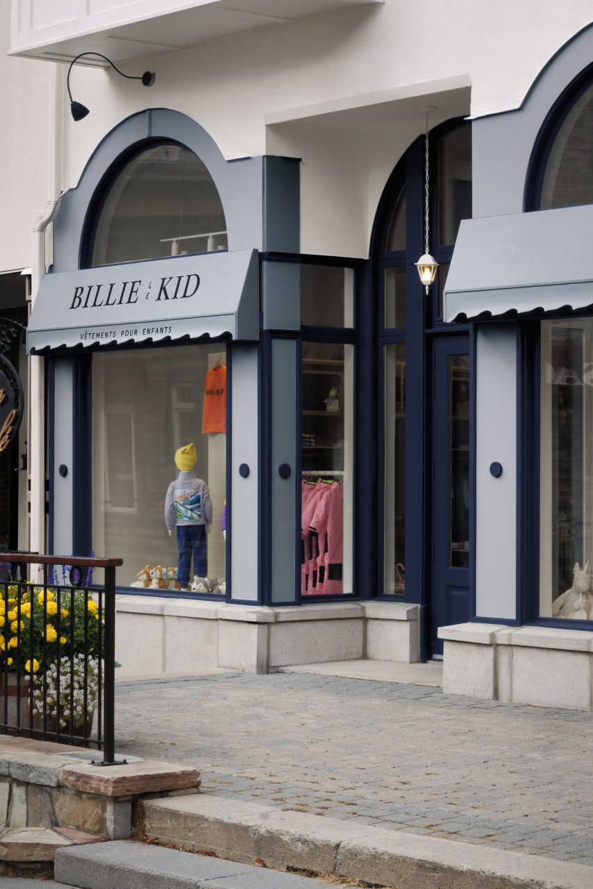
Vives St-Laurent designed the interiors for Billie Le Kid’s Mont-Tremblant boutique

Its storefront was designed to resemble a theatre, showcasing the brand’s wholesome edit of children’s clothes, toys and books.

Custom-made awnings recall the idea of a general store, while the front was repainted in a vibrant blue-on-blue palette to reflect Mont-Tremblant’s colourful charter.

Counter and changing room in boutique by Vives St-Laurent
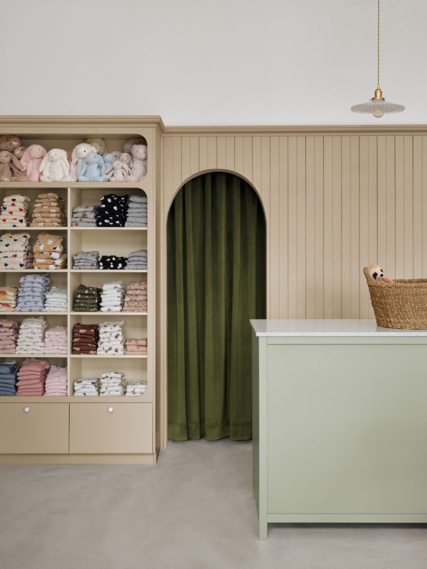
Painted tongue-and-groove panelling adds a touch of nostalgia

Referencing the facade, arched openings throughout the boutique bring a whimsical touch to the transitions between different sections.

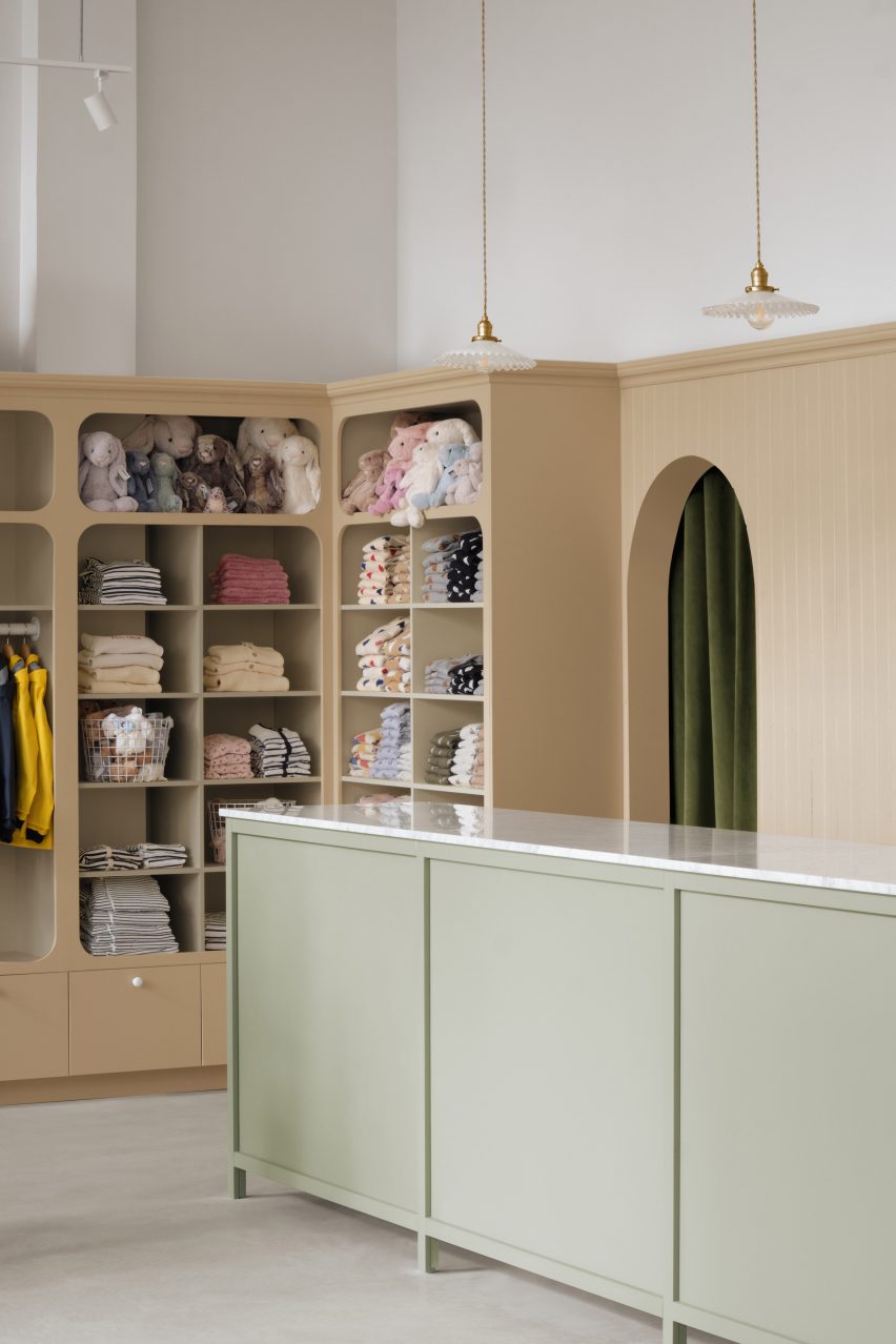
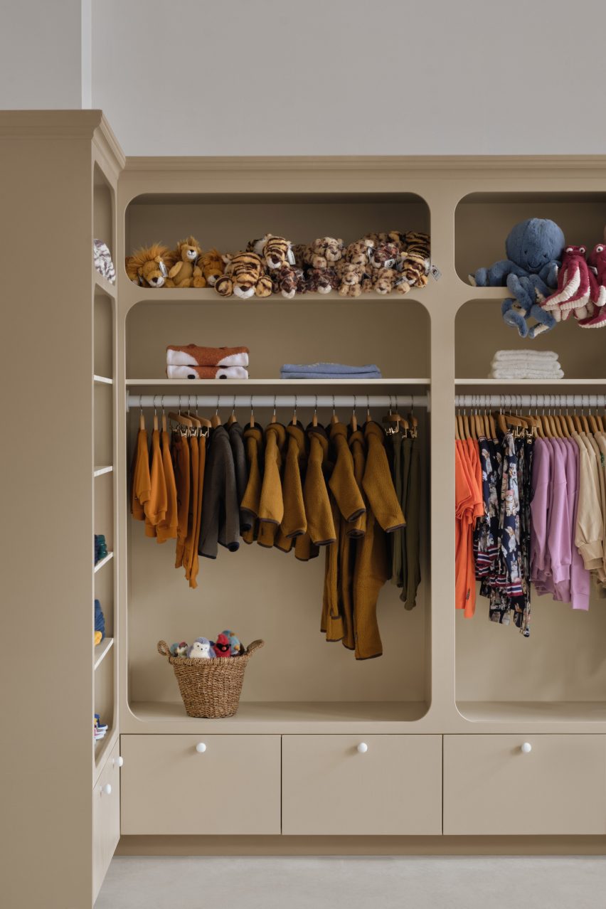
Rounded corners were used to soften the edges of the display cabinets, adding character and creating a playful and welcoming atmosphere.

Storage wall in Billie Le Kid Boutique
Integrated display cabinets provide plenty of storage

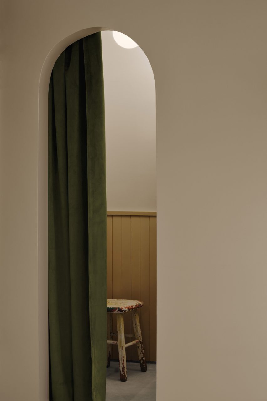
Bianco Carrara marble was used on top of the checkout counter to convey a sense of timeless luxury, while moss-coloured velvet changing room curtains reference the theatre concept and bring softness and tactility to the space.

The polished concrete floor was a practical choice, as the low-maintenance material allows skiers to visit the store in their ski boots.

Storage cupboard and counter in store interior by Vives St-Laurent
Bianco Carrara marble covers the store’s counter

Painted tongue-and-groove panelling was added to give the boutique a touch of nostalgia.

“We combined classic and contemporary materials to create a harmonious yet unique ambience,” Vives St-Laurent’s interior designer Léa Courtadon told Dezeen.

Courtadon said she chose the store’s calming colour palette of stone beige and sage green to create “a whimsical mood that recalls the playful world of childhood while maintaining sophistication and ensuring the products stand out”.

Sturdy vintage Canadian furniture was chosen to draw on the idea of the general store and family home. Long wooden refectory tables were repurposed as displays for toys and clothing, adding visual interest while paying homage to the brand’s Canadian heritage.

A row of vintage frilled-glass pendant lights creates a feature above the counter.

“The lamps’ rippled globes resemble ballerina tutus, adding a delicate touch to the overall design,” Courtadon said.

Integrated storage in Billie Le Kid Boutique
Rounded corners give the storage units a playful edge

In contrast, the main lighting system with its matt white finish was chosen to blend seamlessly with the store’s high ceiling. The railing system allows for precise positioning to highlight different items within the display cabinets.

Vives St-Laurent used baskets for storage to contribute to the nostalgic, homespun aesthetic as well as offering a practical way to store and display plush toys.

Changing room of Billie Le Kid Boutique
Changing rooms are hidden behind velvet curtains

“They create an impression of abundance and allow children to interact with the toys, promoting a sense of independence and autonomy,” said Courtadon. “It all contributes to a playful and engaging atmosphere that’s ideal for a kids’ store.”

Since its founding in 2018, Vives St-Laurent has completed a range of projects across Canada. Among them is a tactile home in Montreal with a grey-heavy colour scheme.

The photography is by Alex Lesage.

Reference

MRDK creates a “journey through nature” at Attitude boutique in Montreal
CategoriesInterior Design

MRDK creates a “journey through nature” at Attitude boutique in Montreal

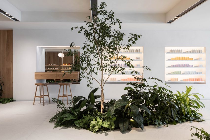
Blocks of granite among planted beds are used to display plastic-free beauty products at this Montreal store, designed by local architecture firm MRDK.

MRDK, also known as Ménard Dworkind, designed the interiors of the Attitude boutique to reflect the sustainable focus of the cosmetics for sale.

Planted beds surrounded by raised ceramic floor
Planted beds are surrounded by a raised ceramic floor at the Attitude store

“From the moment you step inside, the design of the space reflects their commitment to sustainability and a connection to nature,” said the studio.

Located on Saint Denis Street in the Plateau Mont-Royal neighbourhood, the 1,000-square-foot (93-square-metre) shop is laid out to evoke a “journey through nature” according to MRDK.

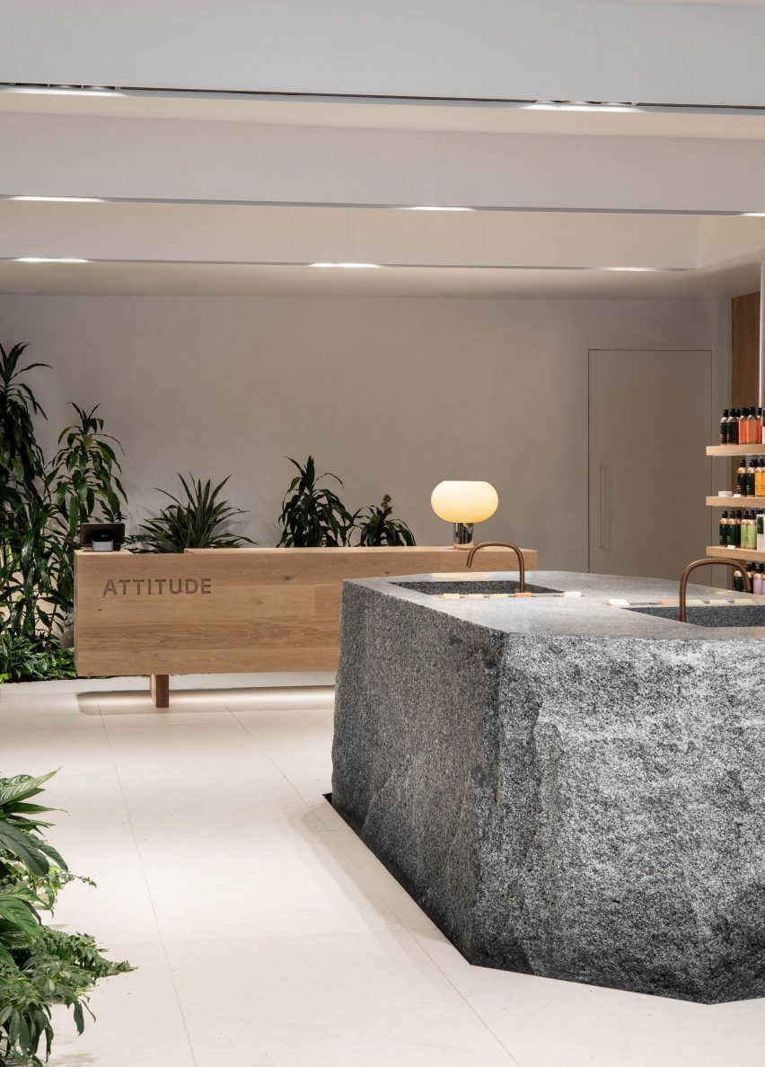
Sinks carved out of a granite block
A large granite block at the centre has two sinks carved into its top

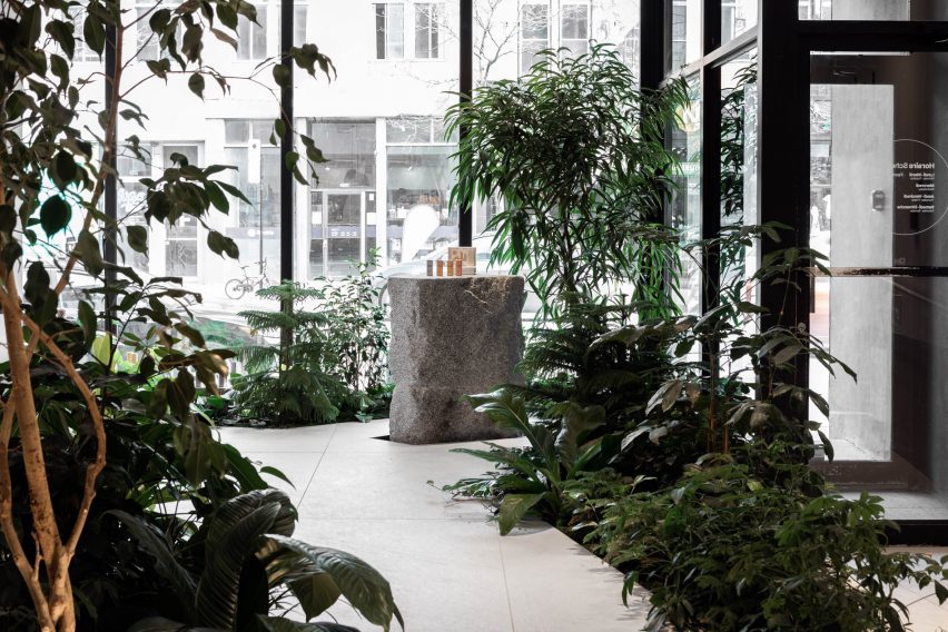
Planted beds in the store window and around the space overspill with greenery, and a raised ceramic floor creates the impression of traversing a boardwalk between them.

“This subtle elevation change immediately transports you into a new space, a forest floor full of life and colour,” MRDK said.

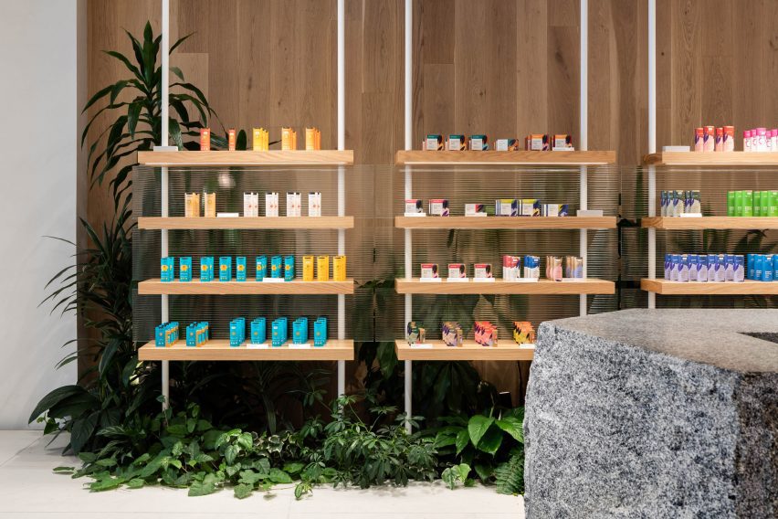
Oak shelves display products
The brand’s plastic-free beauty products are display on oak shelves that emerge from the greenery

Chunks of granite are used as pedestals for displaying products in the window, while a much larger block in the centre has a pair of sinks carved into its flat top.

“The boulder-like shape and texture of the island suggest a natural element, as if it has been carved by the forces of nature over time,” said MRDK.

“This centerpiece perfectly complements the natural theme of the space, giving customers the sense of being in a nature surrounded by rock formations.”

The majority of Attitude’s products are presented on white oak shelves that emerge from the plant beds on both sides of the store.

Granite plinth surrounded by plants
The raised floor is designed to create a boardwalk between the planted beds

Suspended on white poles and backed by fritted glass, these shelves match the rectangular cashier’s desk at the back, into which the brand’s name is hewn.

There’s also a refill station that customers can use to replenish the aluminium bottles, further promoting sustainability.

Attitude storefront on Saint Denis Street
Smaller blocks of granite are used as plinths to showcase the products in the storefront

MRDK was founded by partners Guillaume Ménard and David Dworkind in 2010, and has completed a wide variety of projects in and around Montreal.

These include a 1970s-themes pizza restaurant, a colossal Chinese brasserie and a wine bar that takes cues from bottle labels, as well as a renovated 1980s home and a cedar-clad hideaway.

The photography is by David Dworkind.


Project credits:

Architecture: MRDK
Team: David Dworkind, Benjamin Lavoie Laroche
Contractor: Groupe STLC


Reference