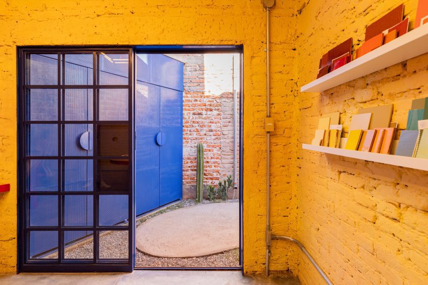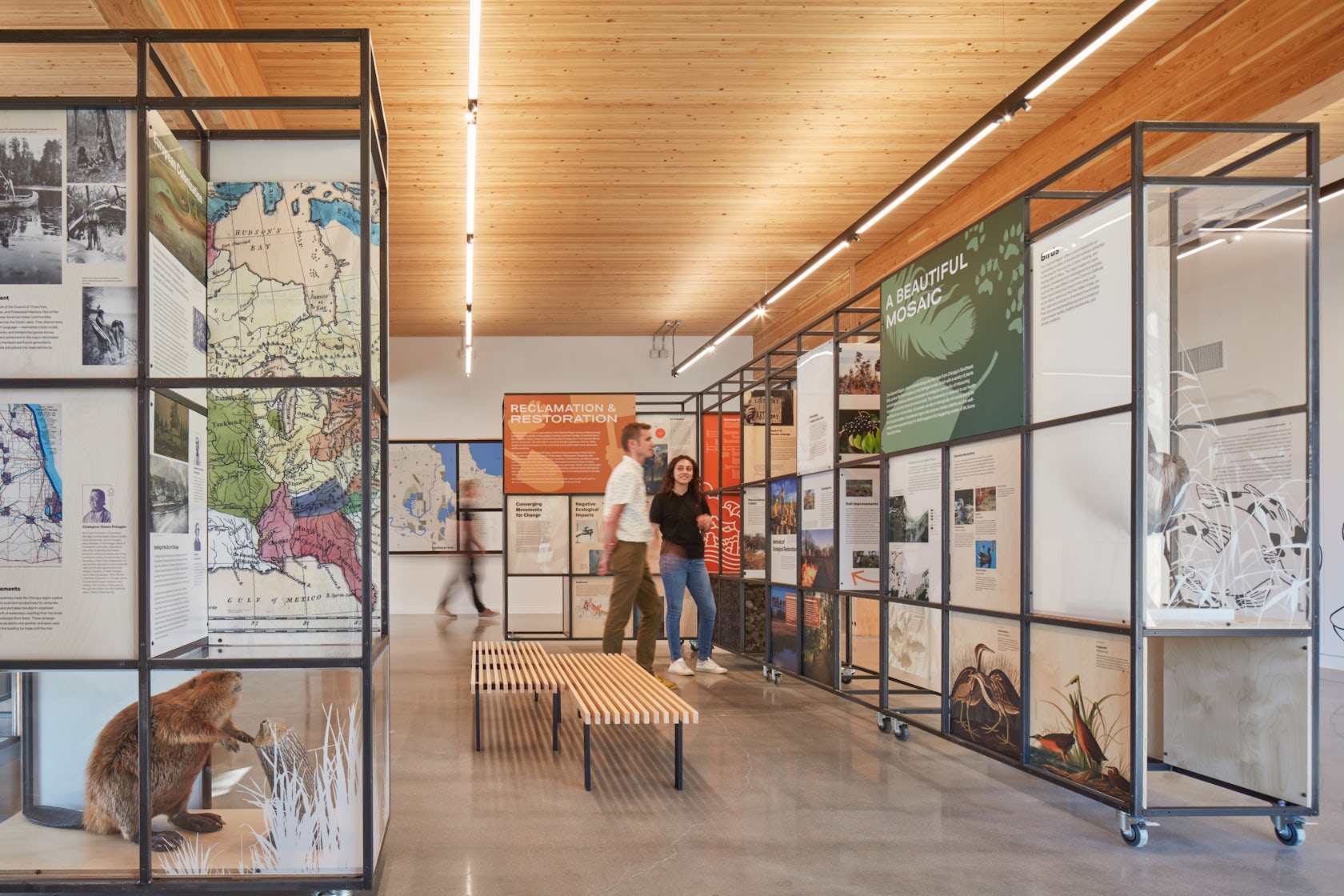
Modern Minarets: 6 Contemporary Mosques Celebrating Cultural Diversity
The judging process for Architizer’s 12th Annual A+Awards is now away. Subscribe to our Awards Newsletter to receive updates about Public Voting, and stay tuned for winners announcements later this spring.
“Islam is like a crystal-clear river that takes the color of the riverbed it flows over.”
Through those words, Dr. Umar Faruq Abd’Allah described the religion of Islam and the way it reflects the different cultures and regions it spreads in and flows through. In architectural terms, this analogy extends to mosques and their designs. Over time, mosque designs have been influenced by the diverse cultures, climates, building materials and traditions of the various regions in which mosques were built.
This amalgamation has led to a multitude of designs and typologies for mosques worldwide, evolving alongside cultures, populations and advancements in building technologies. These designs preserve core Muslim values while simultaneously celebrating the diversity of the different cultures and communities. Through this collection, six mosques from around the world are showcased to show how the design of Muslim sacred buildings has evolved and what mosques look like in this time and age.
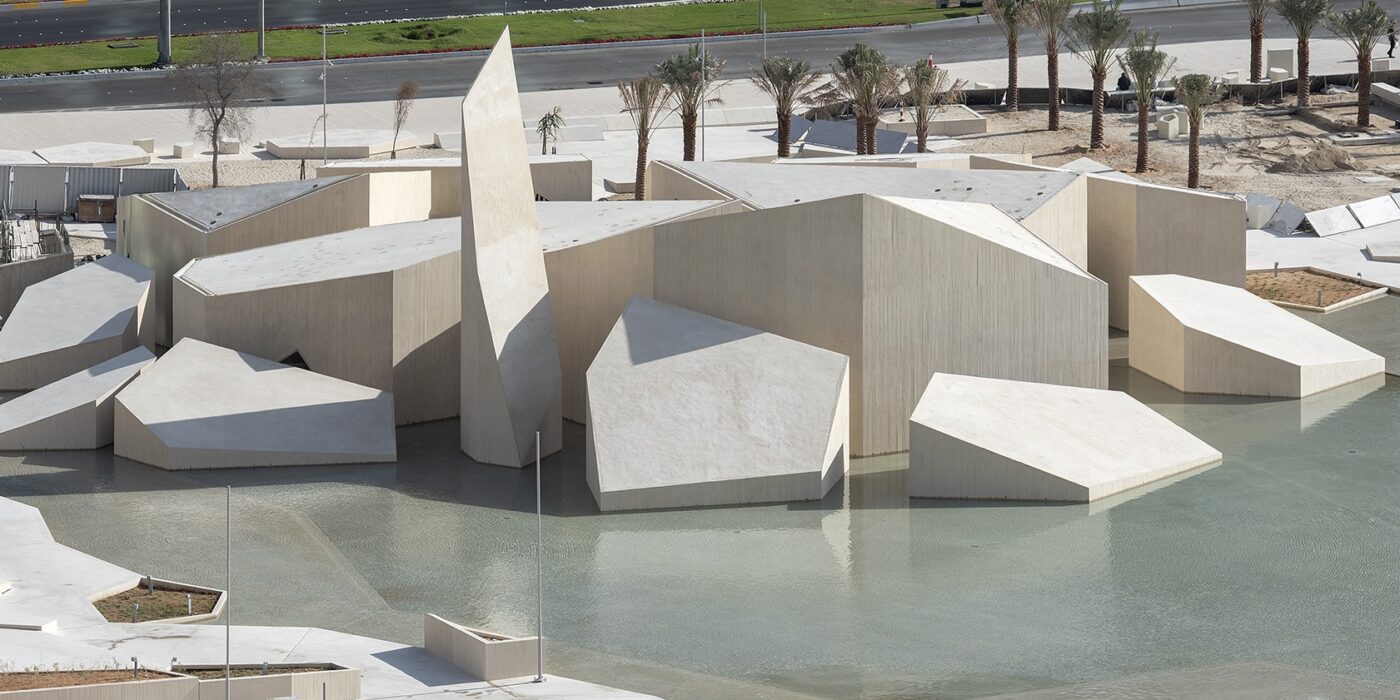
Al Musalla – The Mosque – Al Hosn Area
By CEBRA and DCT Abu Dhabi, Abu Dhabi, United Arab Emirates
Jury Winner, 2020, A+ Awards, Architecture +Ceilings
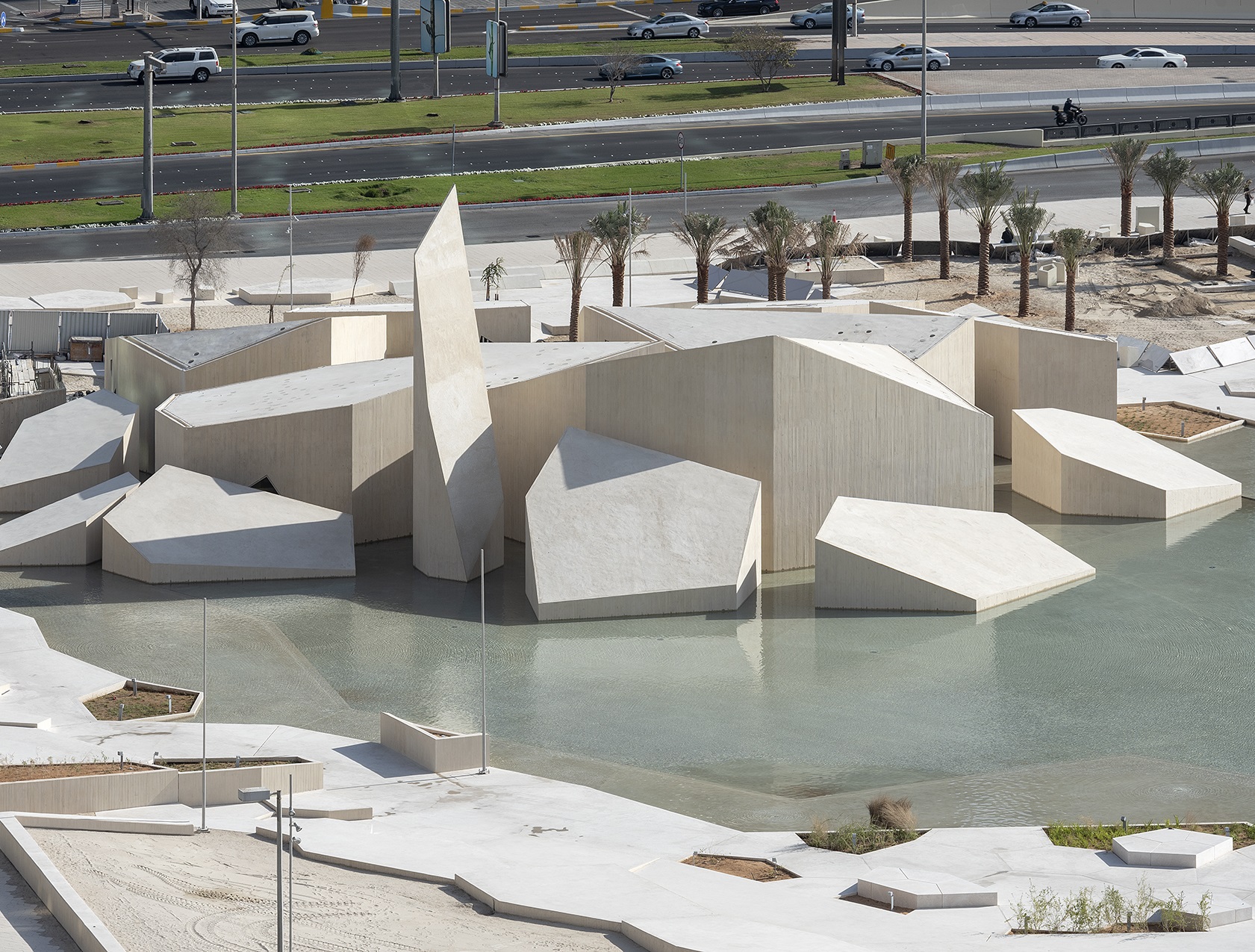
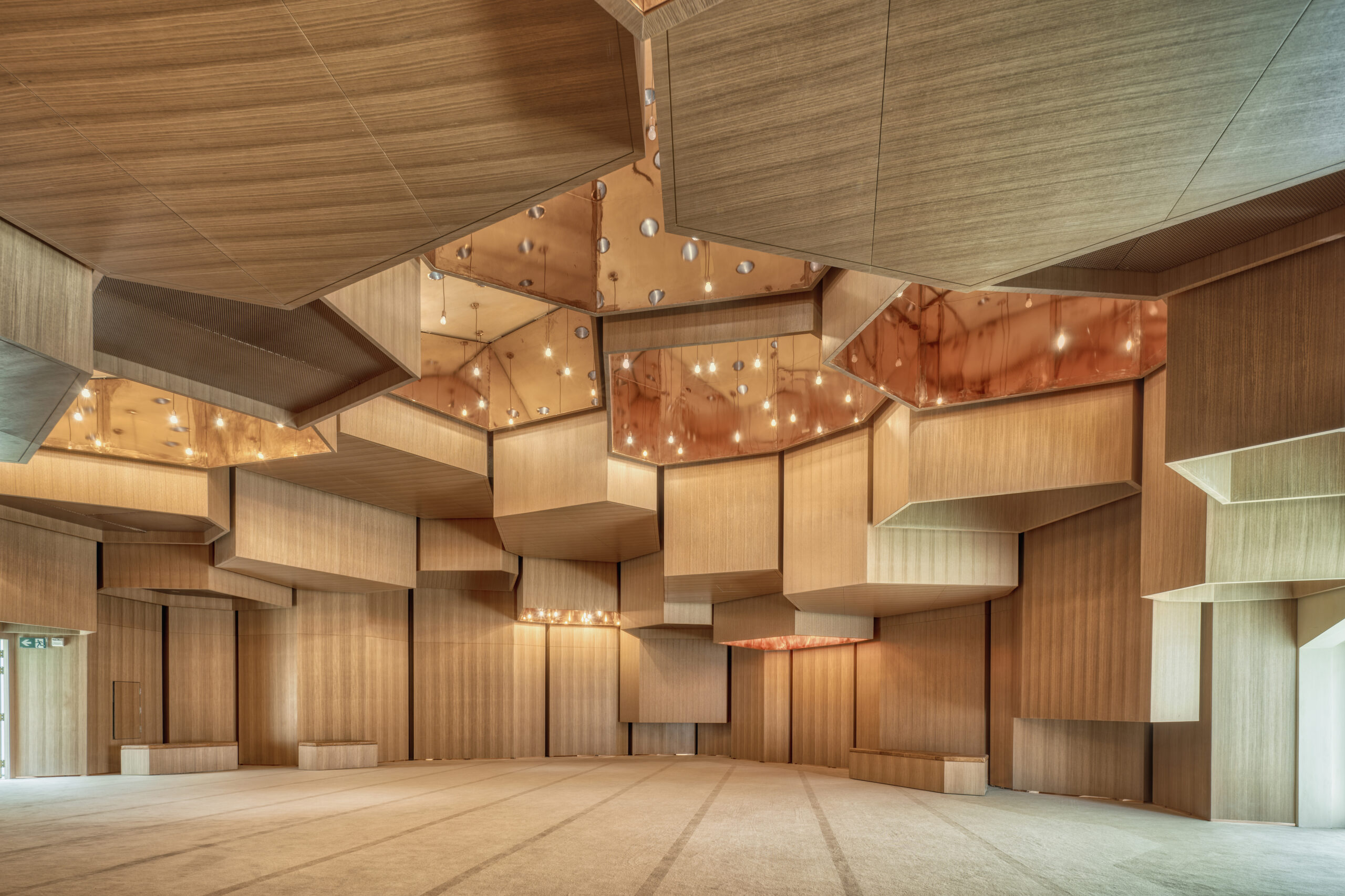
Photo by Department of Culture and Tourism, DCT Abi Dhabi
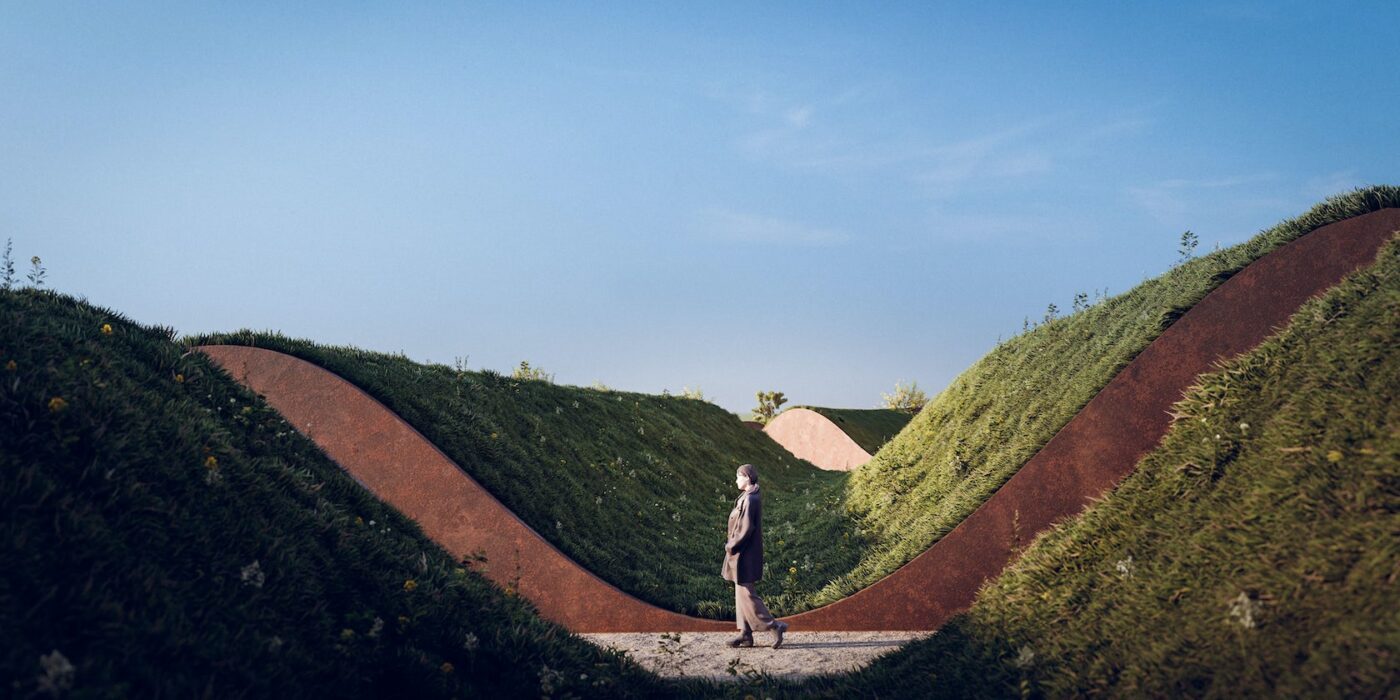
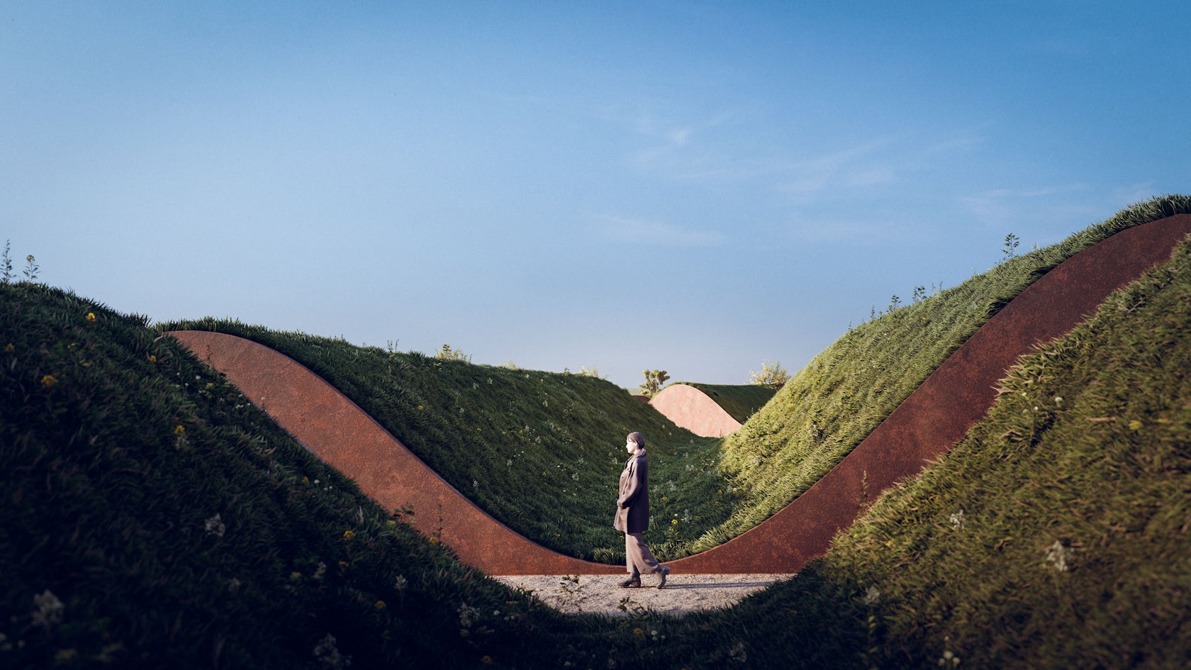
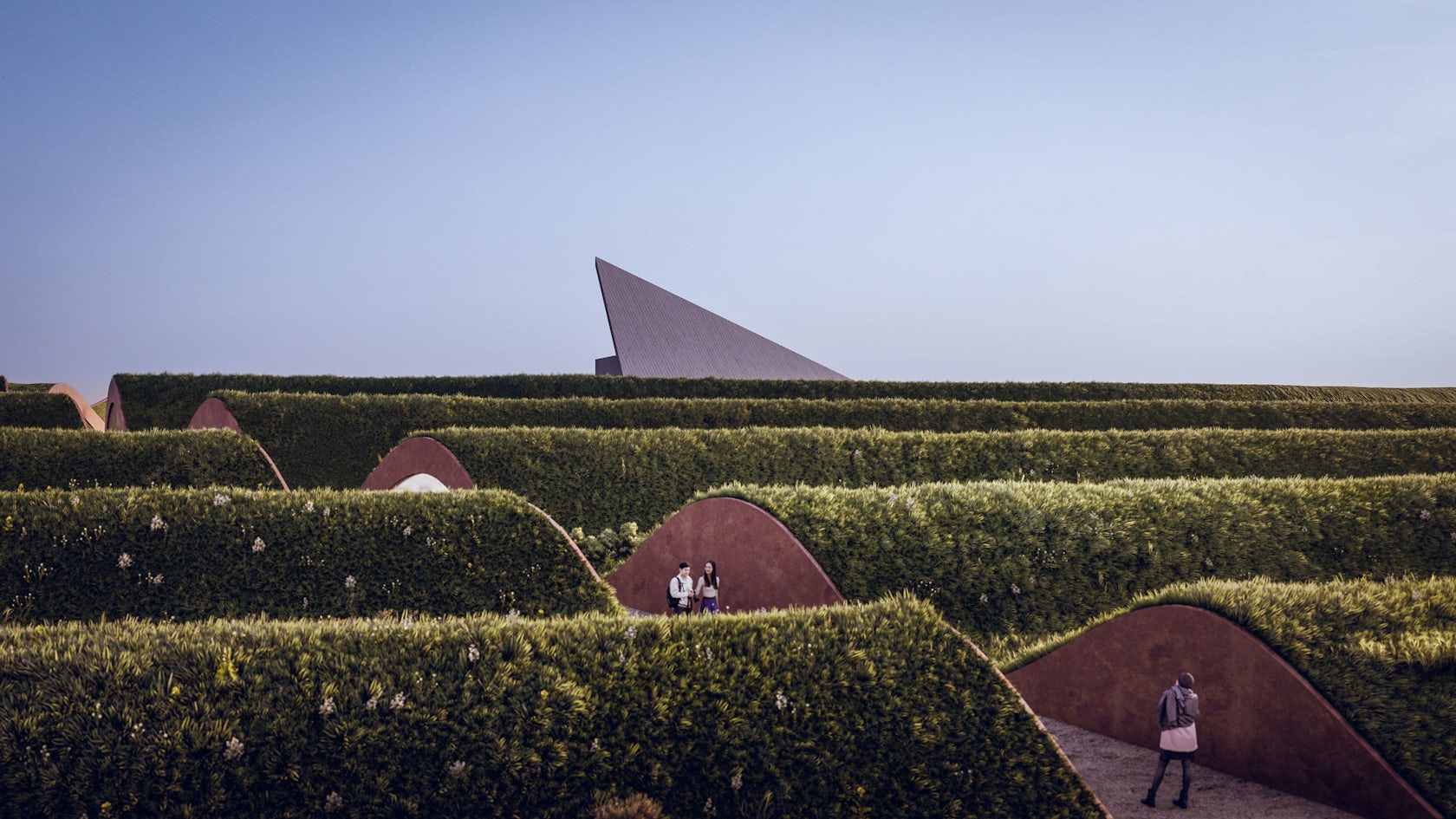
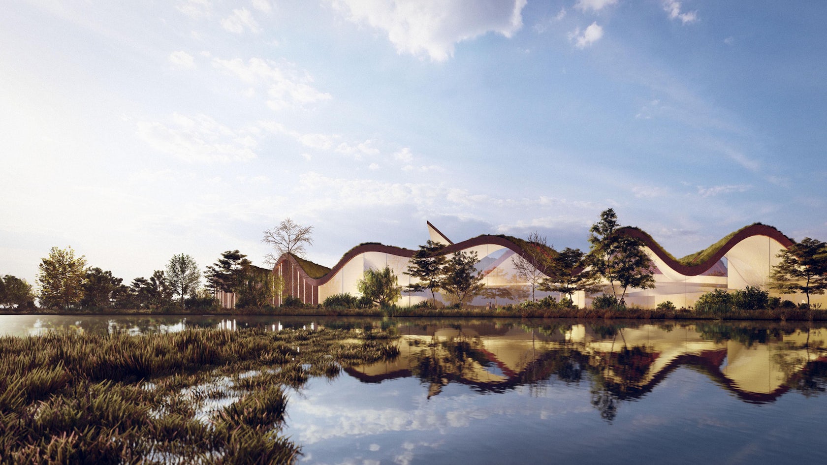
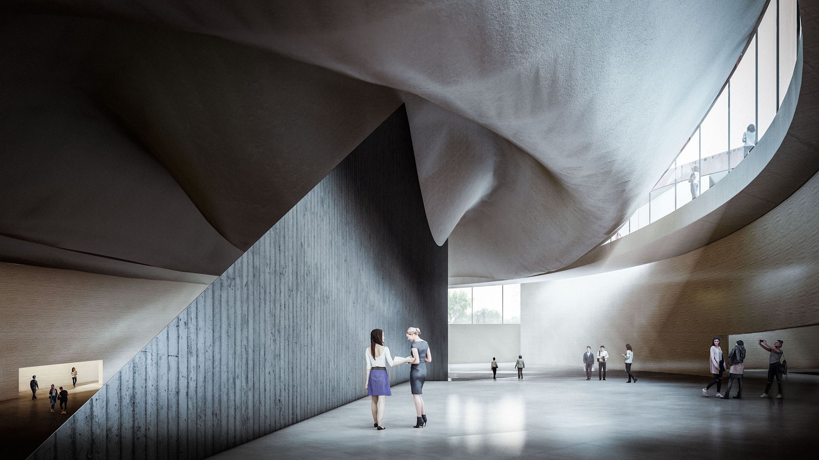
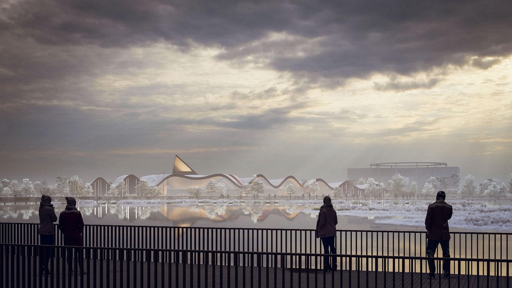
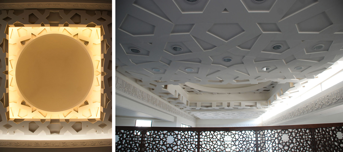
Inspired by the geology of the area, this mosque has the design of what could be described as manmade nature, appearing as a group of rocks emerging out of water. To enter the mosque, worshippers traverse a network of pathways that wind around the water, symbolically cleansing them before prayer while also shielding them from the noise and commotion of the nearby streets.
The mosque is located within a historically significant site with a number of landmarks, managing to calmly integrate into the park while also offering a remarkable experience to its users. Inside, the distinctive geometrical shapes of the exterior are reflected on different elements of the design including the ceiling, complemented by lighting design that aimed to represent a desert sky adorned with stars, in a manner that does not only connect the mosque with earth and water, but also with the sky and what’s beyond.
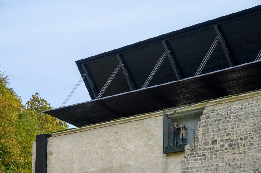
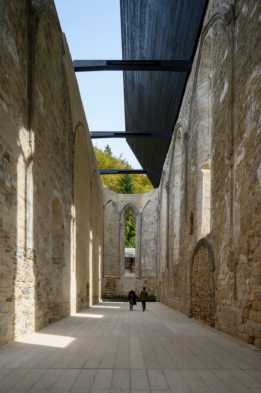
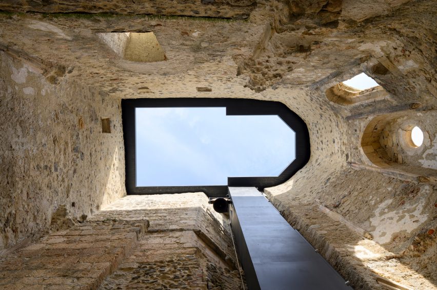
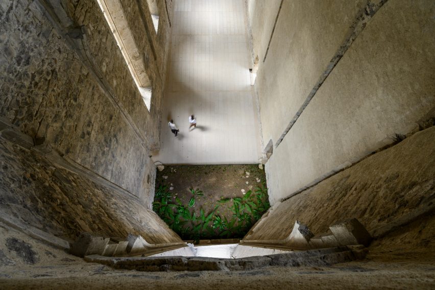
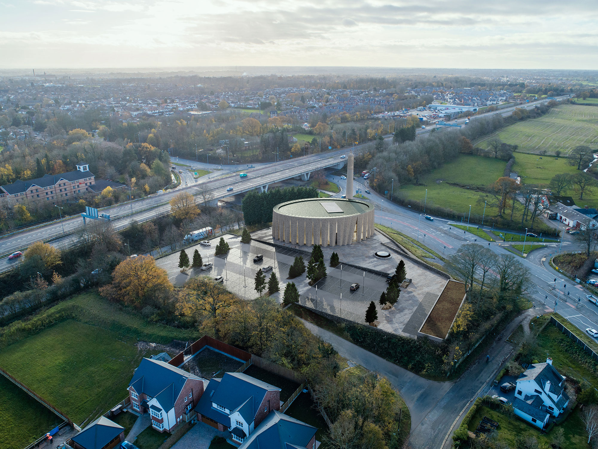
BRICK VEIL
By LUCA POIAN FORMS, Preston, United Kingdom
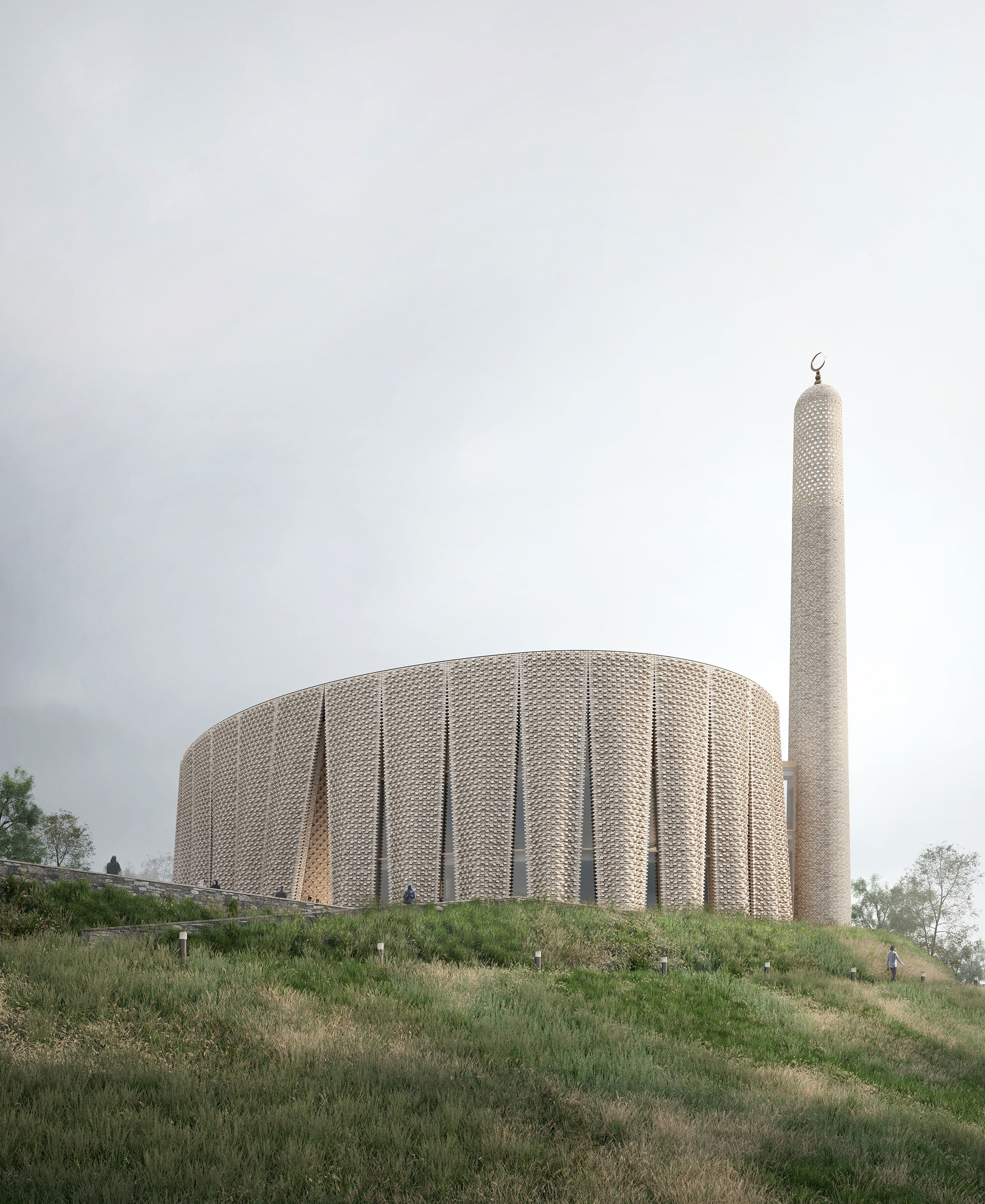
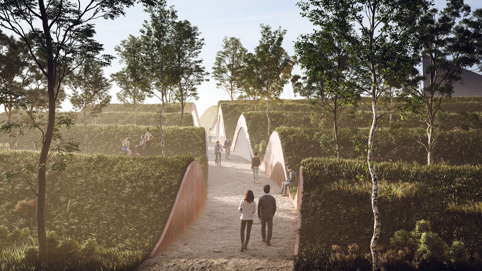
 Produced through an artful stitching between the Islamic traditions and the history of the area, between the universal values and the local culture, this mosque design was conceptualized as a landmark within the existing site, through its scale, meticulous façade design, building materials and relationship with the surrounding.
Inspired by the textile manufacturing history of the region, the pleated brick façade gives the building a strong sculptural appearance, while also referencing the traditional design of Mashrabiyas, which is a traditional element in Islamic architecture used to enhance privacy. Erected at the south western end of the hill, the mosque is reached through a processional ramp that slowly disconnects the arriving worshippers from the city and the gradually welcomes them into the sacred space of the mosque.
Yesilvadi Mosque
By Adnan Kazmaoğlu Mimarlık Araştırma Merkezi, İstanbul, Turkey
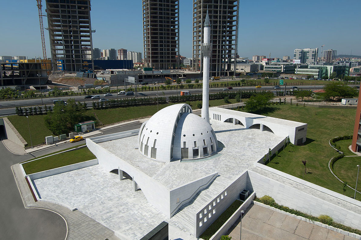
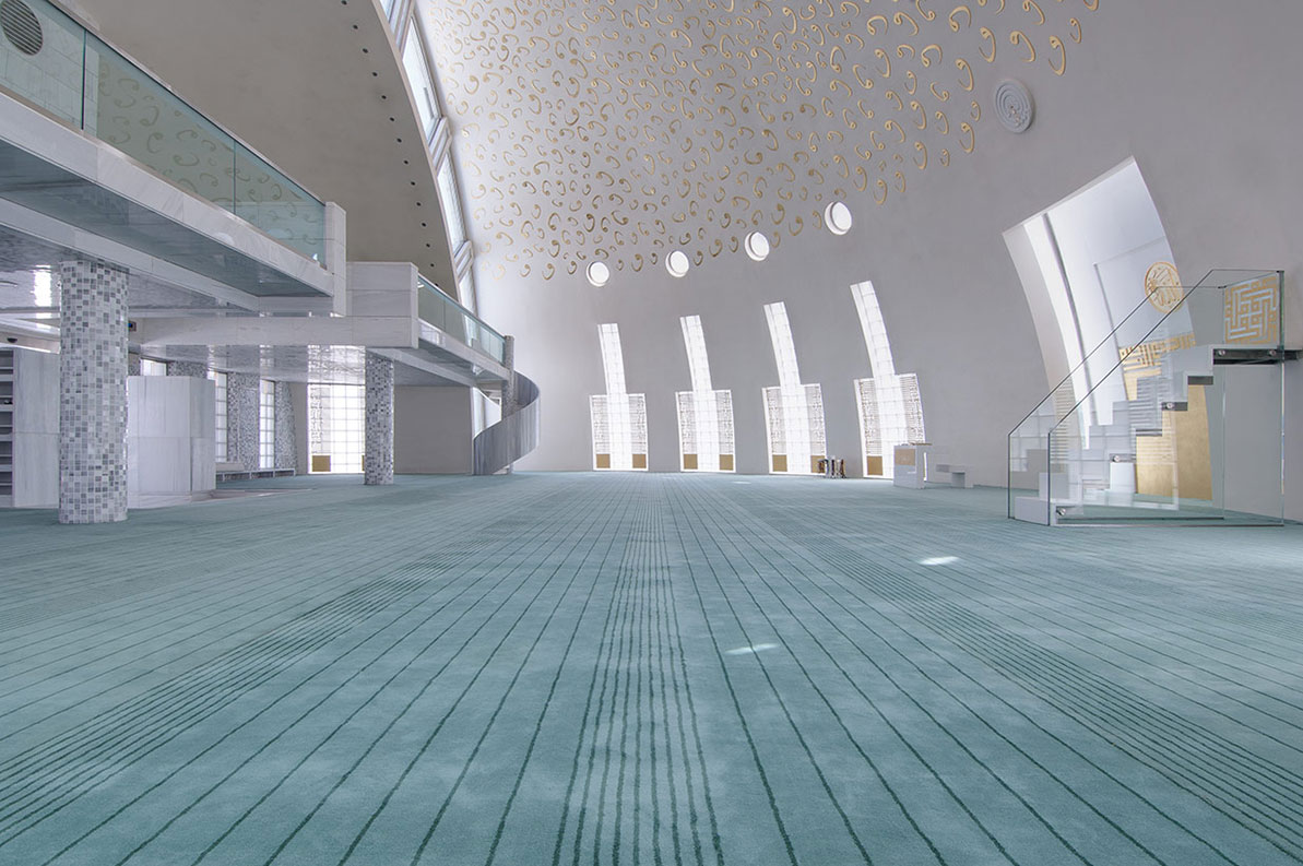 Harmoniously nested into the site, the Yesilvadi Mosque is conceptualized as a social space that gathers people and brings them together, through its variety of functions that include the prayer hall, a meeting hall, a library, a courtyard and a square, inspired by the social role mosques and their courtyards have traditionally played in the design of Islamic cities.
The bold geometry of the mosque, where the volume of the dome is also the volume of the building, is inspired by Ottoman mosques which typically have circular forms, while also symbolically using the shape of the circle to represent infinity and unity. The seamless use of white for the building’s exterior was achieved through the use of White Marmara marble, which aimed to represent purity and good virtue, standing in contrast with the green landscaping and the complexity of the surrounding context.
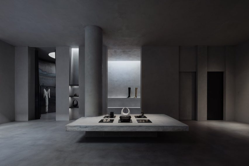
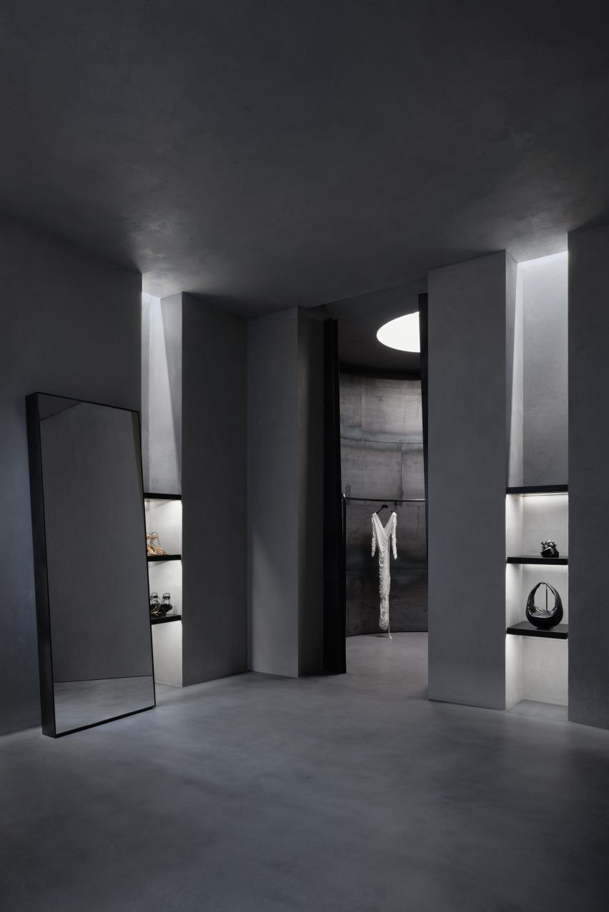
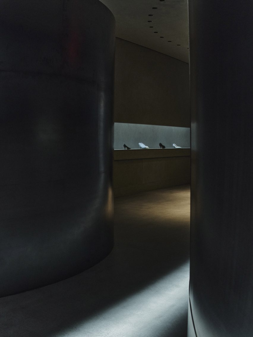
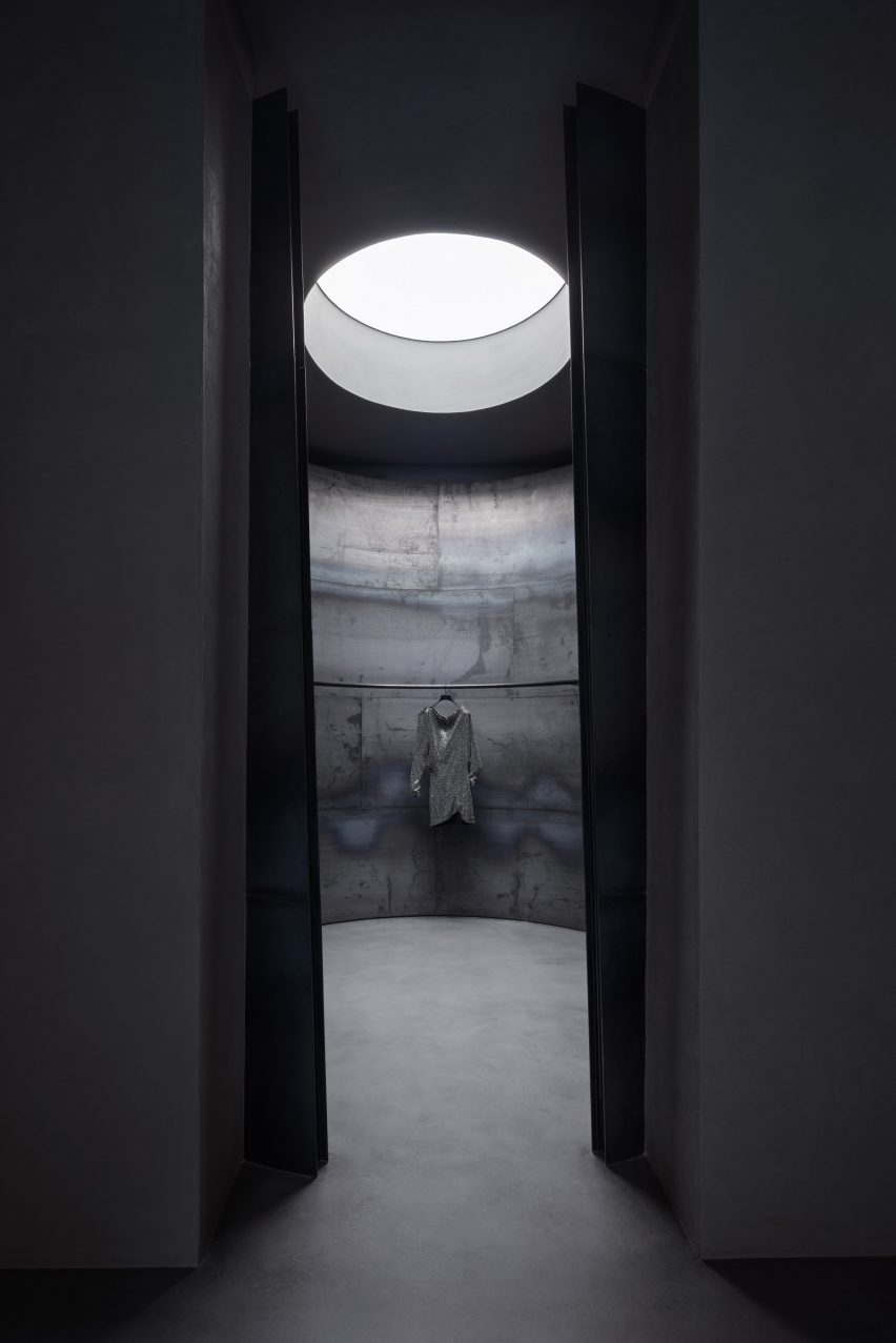
Al-Islah Mosque
By Formwerkz Architects, Punggol, Singapore
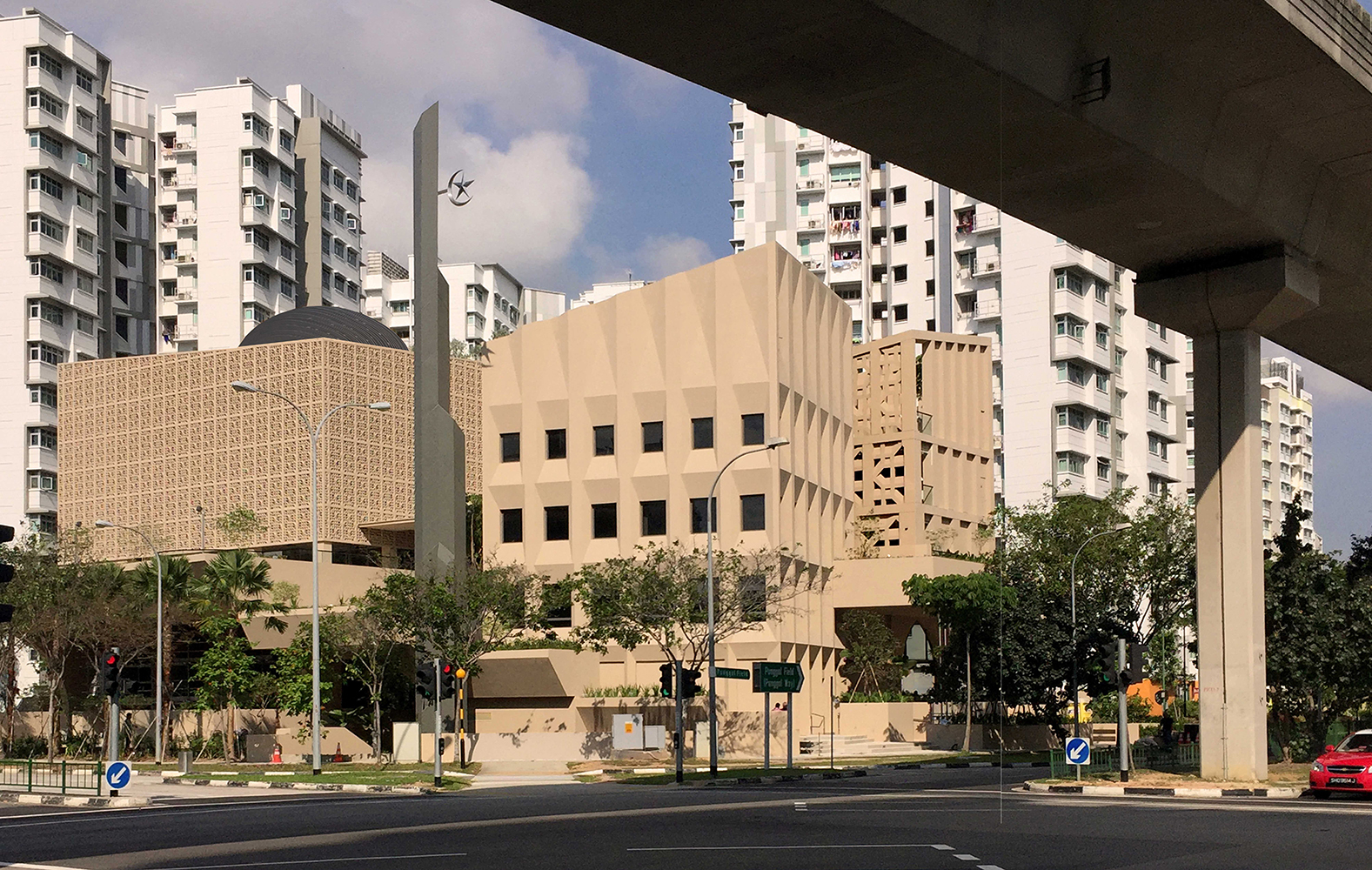
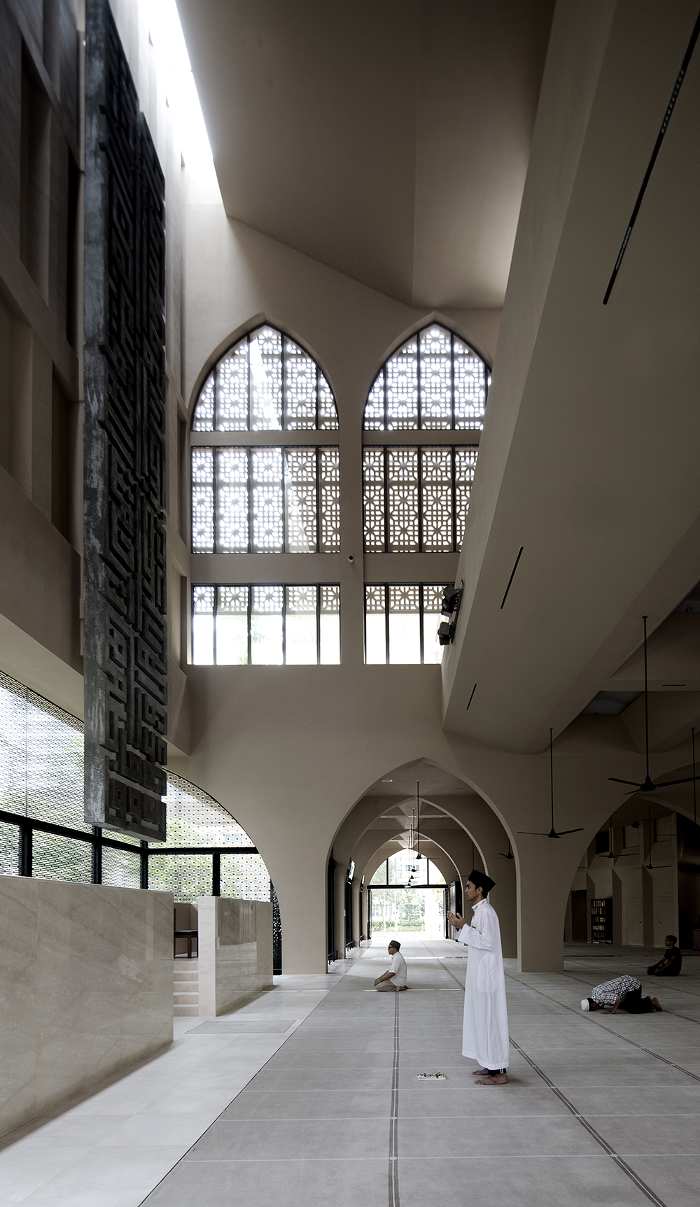
Photo by Albert Lim Koon Seng
Situated in a densely populated residential area, this mosque demonstrates a harmonious connection with its surroundings, achieved through a meticulously crafted façade adorned with a range of openings and perforations These features serve to regulate indoor climate and invite worshippers inside, while also reflecting the difference in functions in each building.
Comprising three distinct volumes, the mosque includes facilities such as a seminar building and an administrative center, in addition to the main prayer hall that flows dynamically with its open design and vast area. These architectural elements are thoughtfully designed to mirror the permeability of Islamic principles and aspirations within the context of Singapore today.
Mohammad Rasul- Allah Mosque
By Paya Payrang Architectural Group, Shiraz, Iran
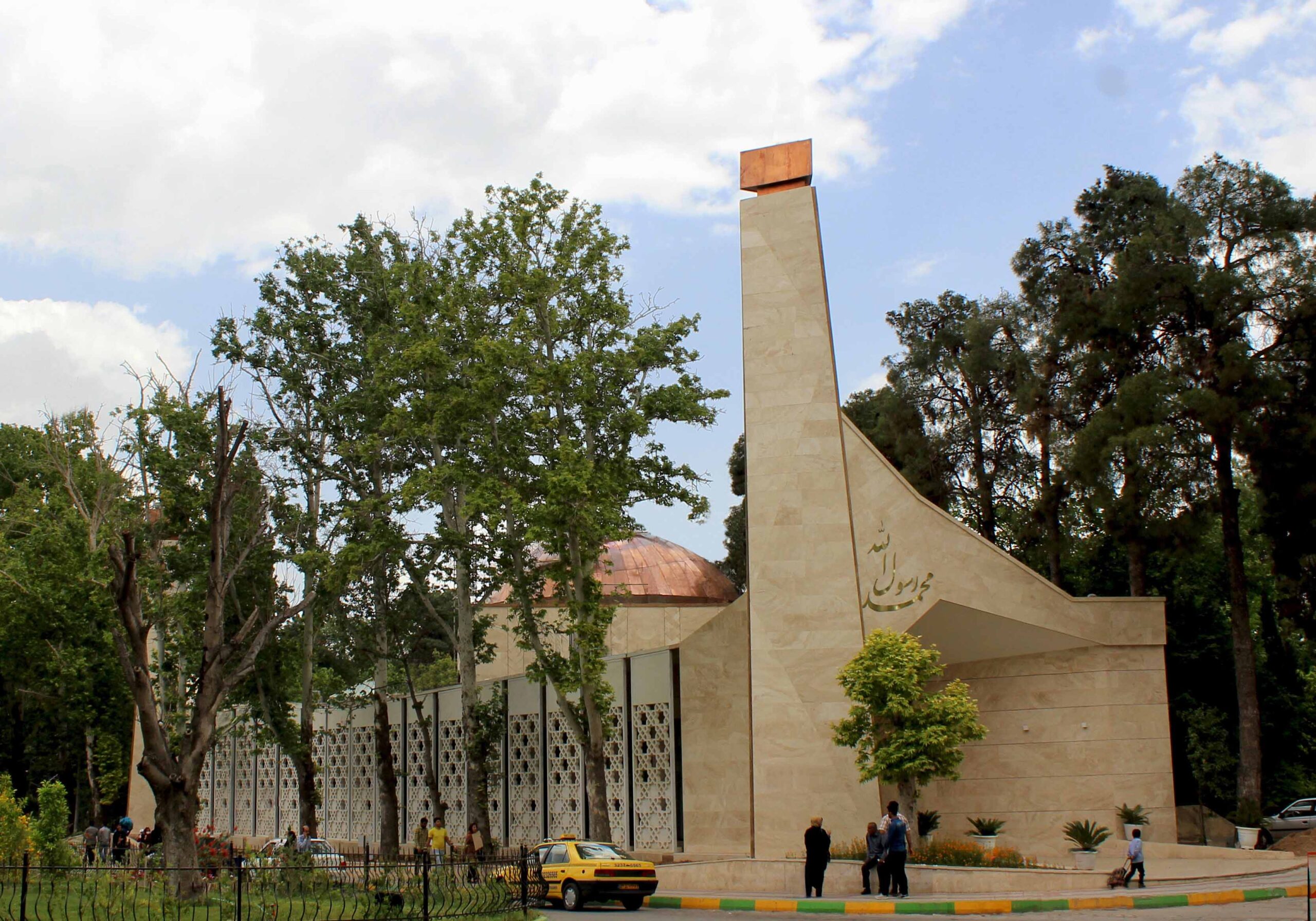
Photo by Ahmad Mirzaee
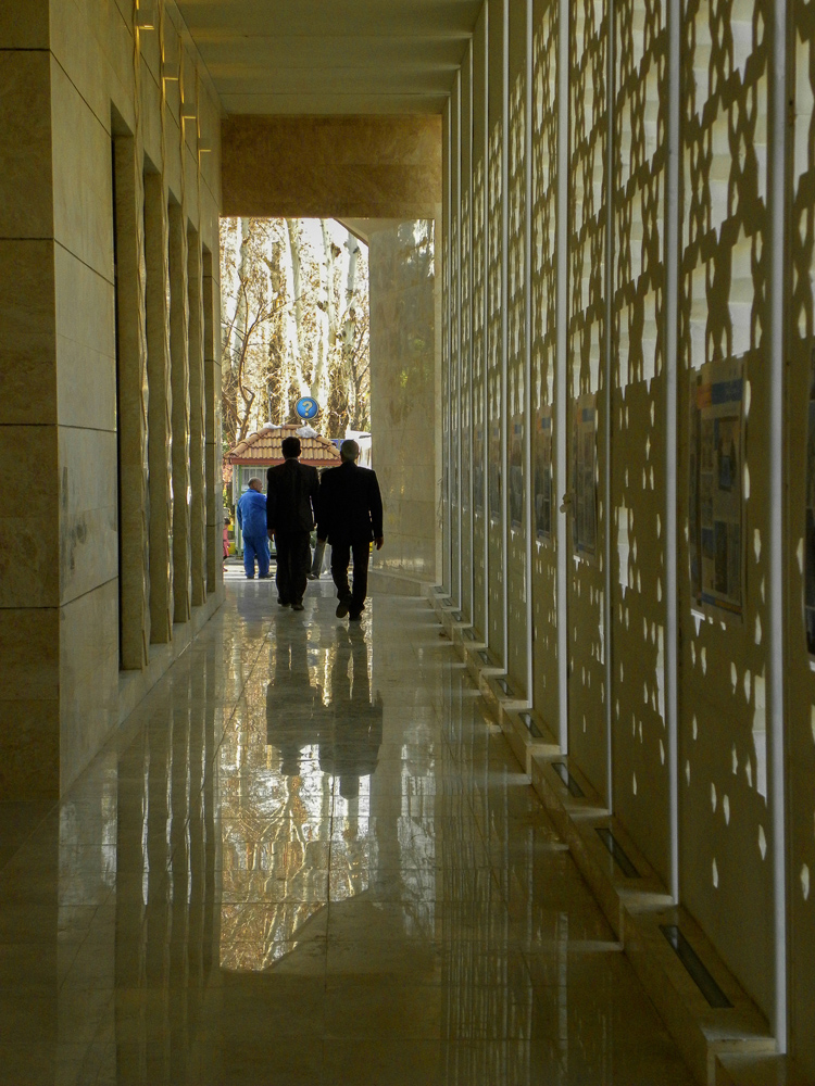
Photo by Samaneh Motaghipishe
The new volume of this mosque grew in the space between an array of old trees and the existing historic prayer hall at the center of the site, delicately engaging in a conversation between the old and the new, the natural and the built, the communal and the religious, as well as solidity and openness.
A long spine connects the two entrances at the opposite sides, encompassing the traditional “Riwagh” element that is common in the design of mosques in Iran, adorned with two minarets that vertically extend parallel to the huge old trees, and generously welcoming prayers in from the busy main road. Built out of stone, the design of the mosque is simple yet sculptural, standing out within its context and making a statement with its dynamic geometry and copper dome.
Al Rawda Mosque
By Uraiqat Architects, Amman, Jordan
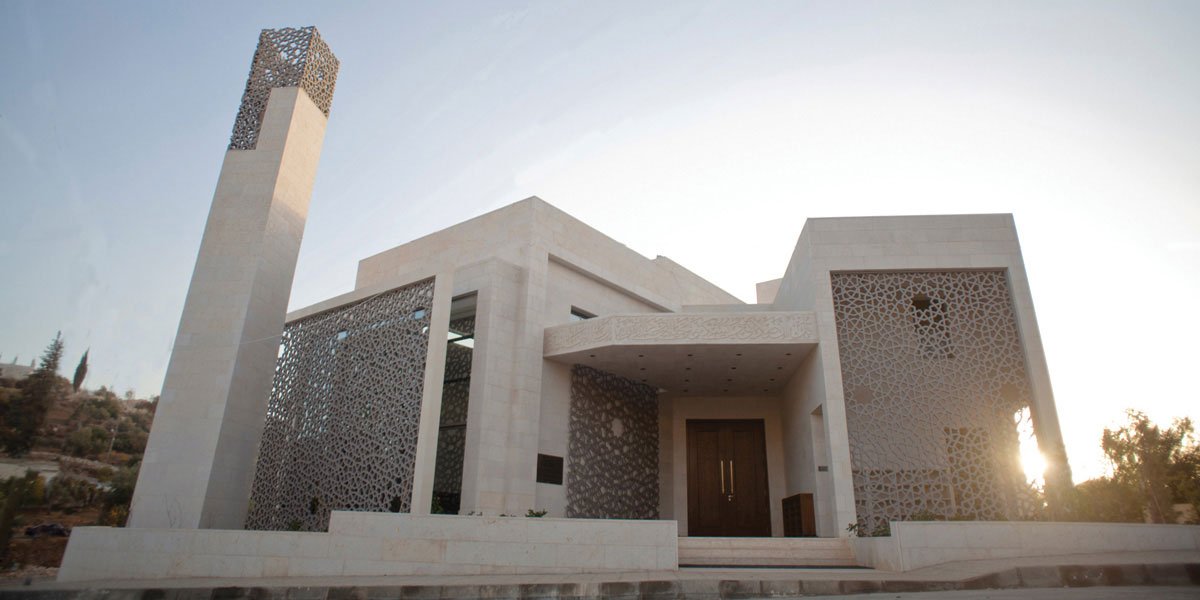
 The dynamic design of Al Rawda Mosque in Amman aimed to move beyond the limitations of the traditional mosque designs of the region and envision what a contemporary mosque could look like. Through a process of extensive research, the designing team engaged in an intellectual pursuit that studied and abstracted the different elements of a mosque, before reinterpreting them and combining them in this design.
The ornamented screens on the inside and the outside of the building created a rich interplay of shade and shadow and blurred the boundary between the inside and the outside, while also having environmental benefits that enhanced the indoor climate and user experience.
The judging process for Architizer’s 12th Annual A+Awards is now away. Subscribe to our Awards Newsletter to receive updates about Public Voting, and stay tuned for winners announcements later this spring.
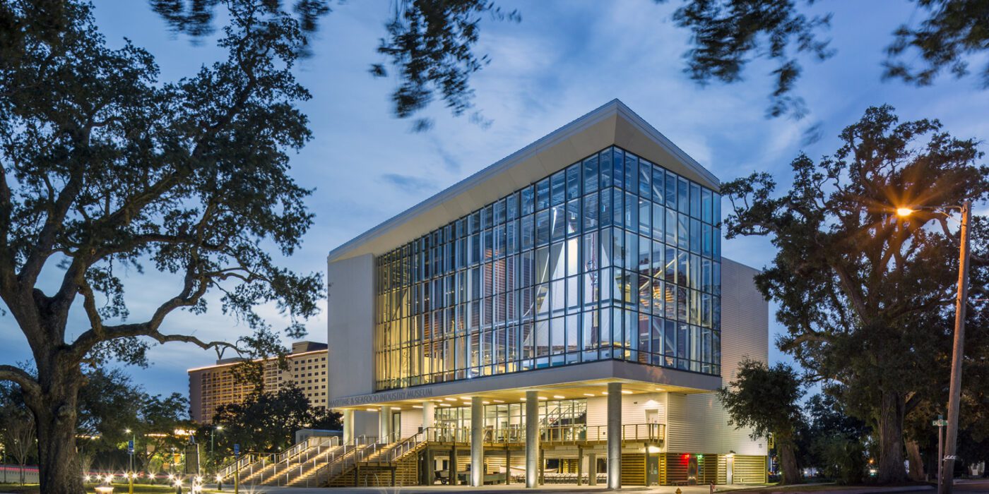
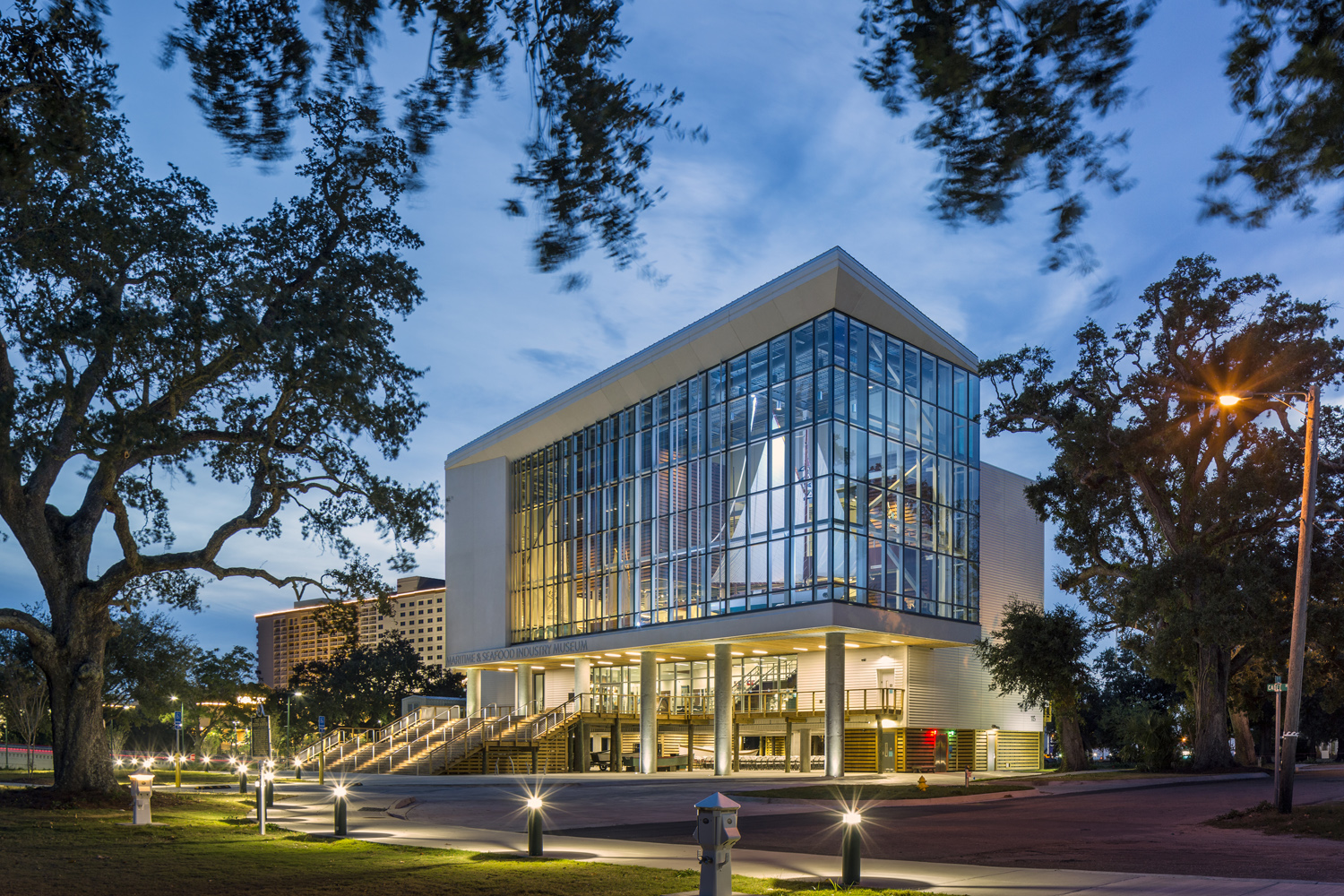
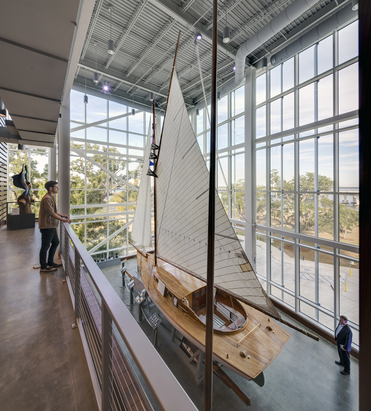
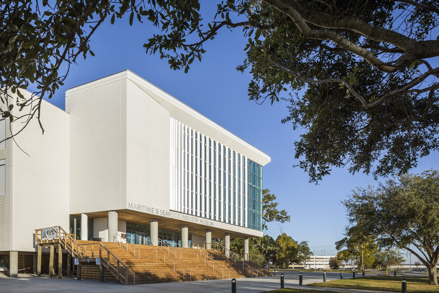 The Maritime & Seafood Industry Museum in Biloxi, Mississippi, preserves and interprets the region’s maritime history. Destroyed by Hurricane Katrina, the museum now resides in a new 19,580 square foot building, featuring exhibits, meeting rooms, administrative areas, and storage. The main gallery showcases the 30’s loop Nydia, enclosed in glass to create a striking “ship in a bottle” effect. Adjacent, smaller boats are suspended in a double-height gallery for multiple viewing angles.
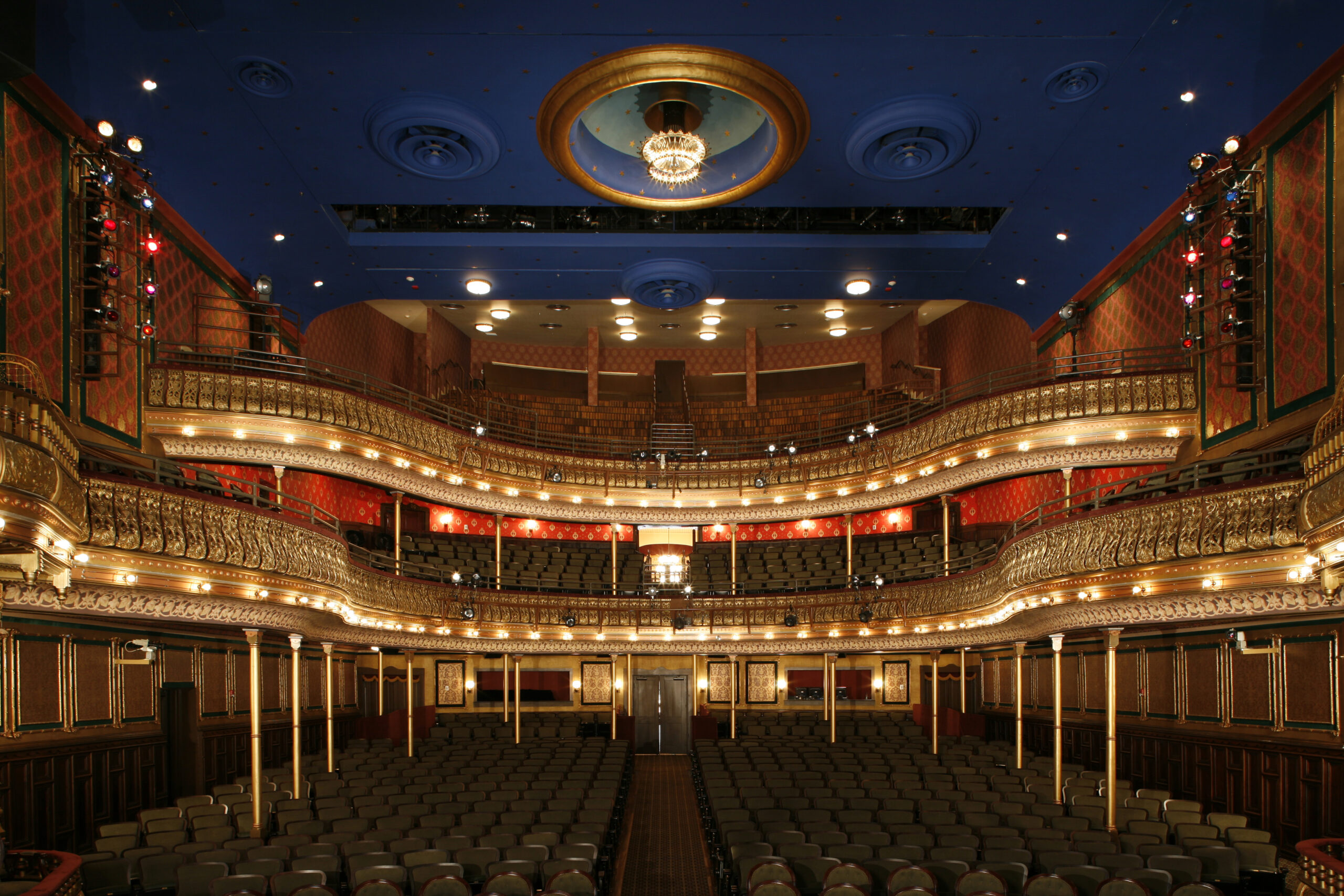
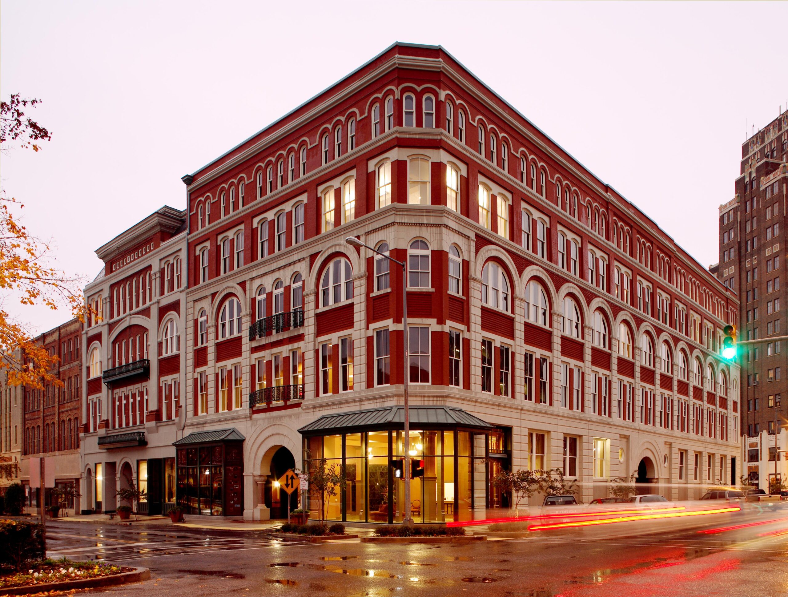 Meridian has emerged as a cultural destination thanks to the restoration of the 1891 Grand Opera House and the conversion of the interlocking 1890s Marks, Rothenberg Department Store, and Newberry Building into The Riley Center. These historic buildings, long vacant, were transformed into a center for education and the performing arts by Mississippi State University, with federal funding and oversight. Martinez+Johnson led the complex project, updating the Grand Opera House for modern use and planning an educational center around it.
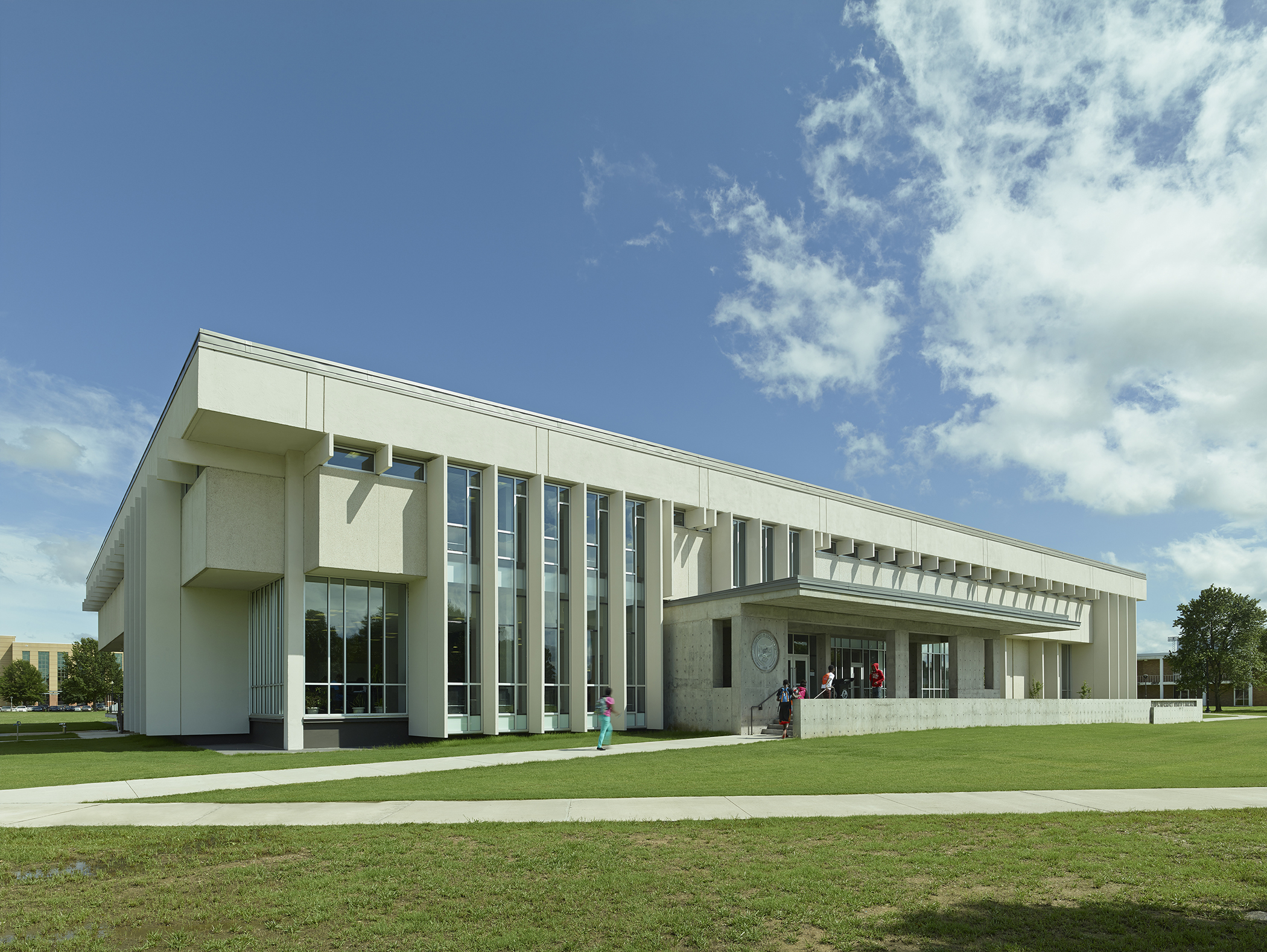
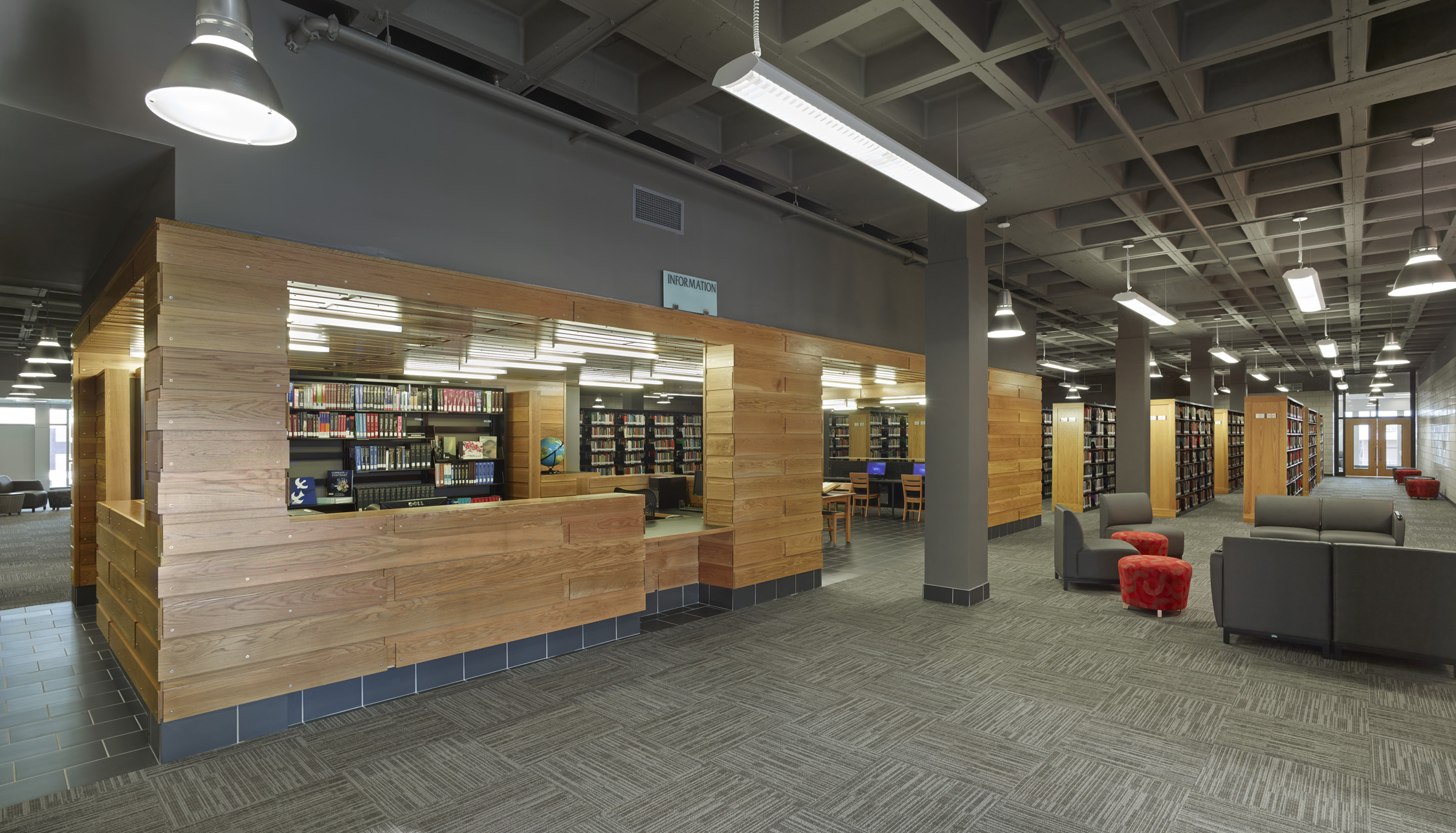
 The James H. White Library at Mississippi Valley State University faced challenges in integrating with the campus and enhancing student life. Despite its functional use, the library’s solid exterior and central location left surrounding green spaces feeling disconnected. With limited funds, the university sought strategic interventions to transform the building.
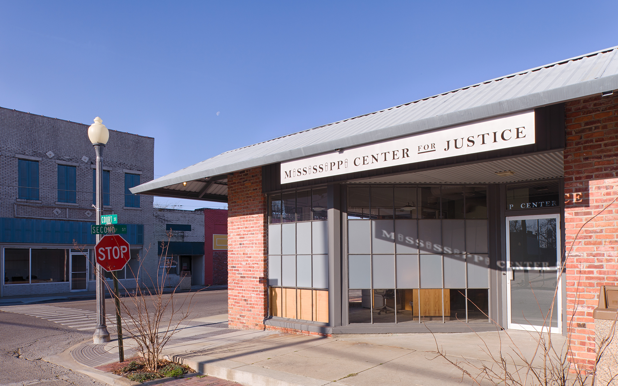
 The Mississippi Center for Justice’s Indianola office underwent a 6,000 square foot renovation to provide legal counsel to residents of the Mississippi Delta. Facing significant barriers to legal services, these residents are often exploited and marginalized. The project aimed to embody respect and hope for these individuals, offering storefront access to attorneys while ensuring privacy and dignity.
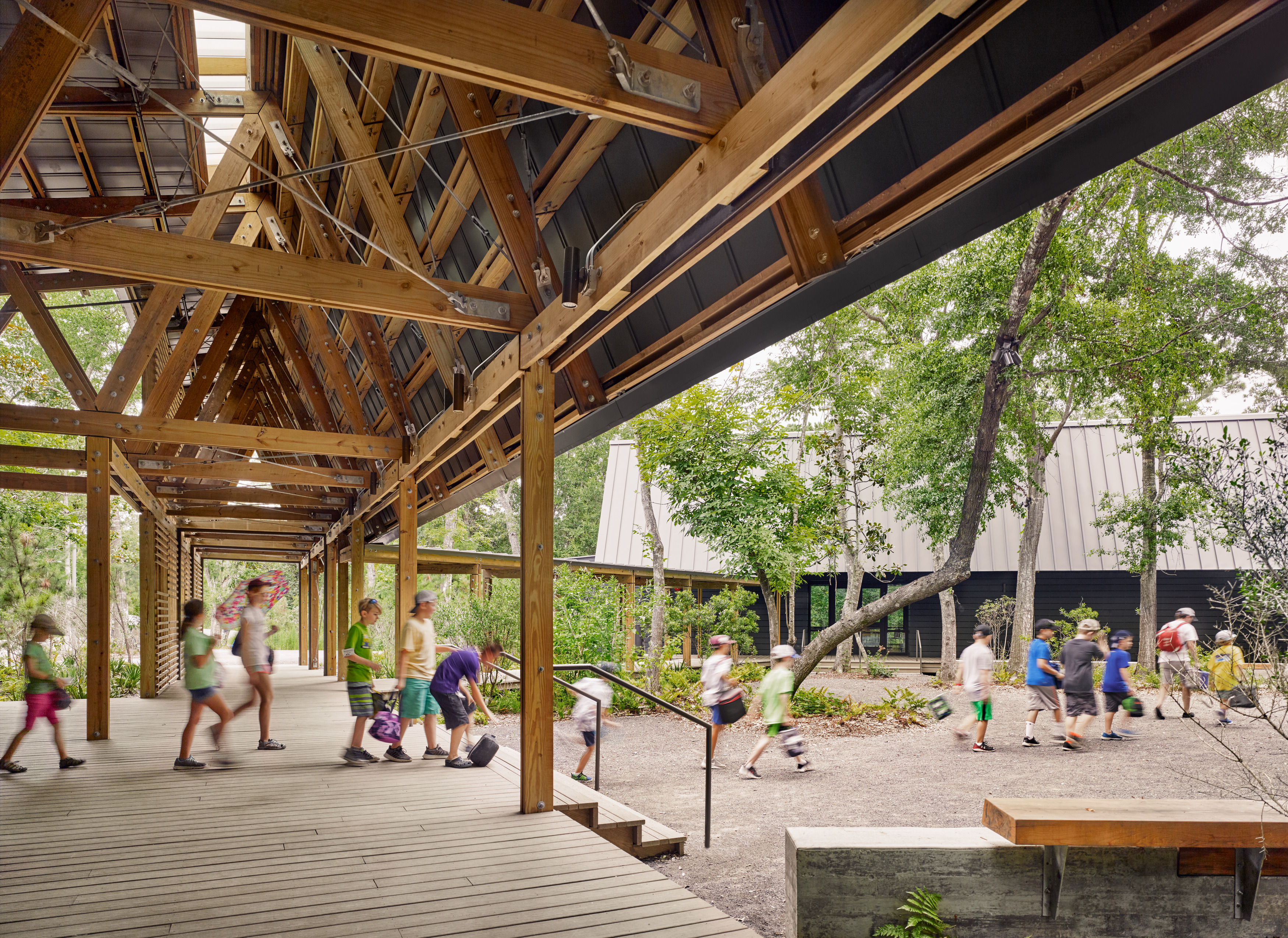
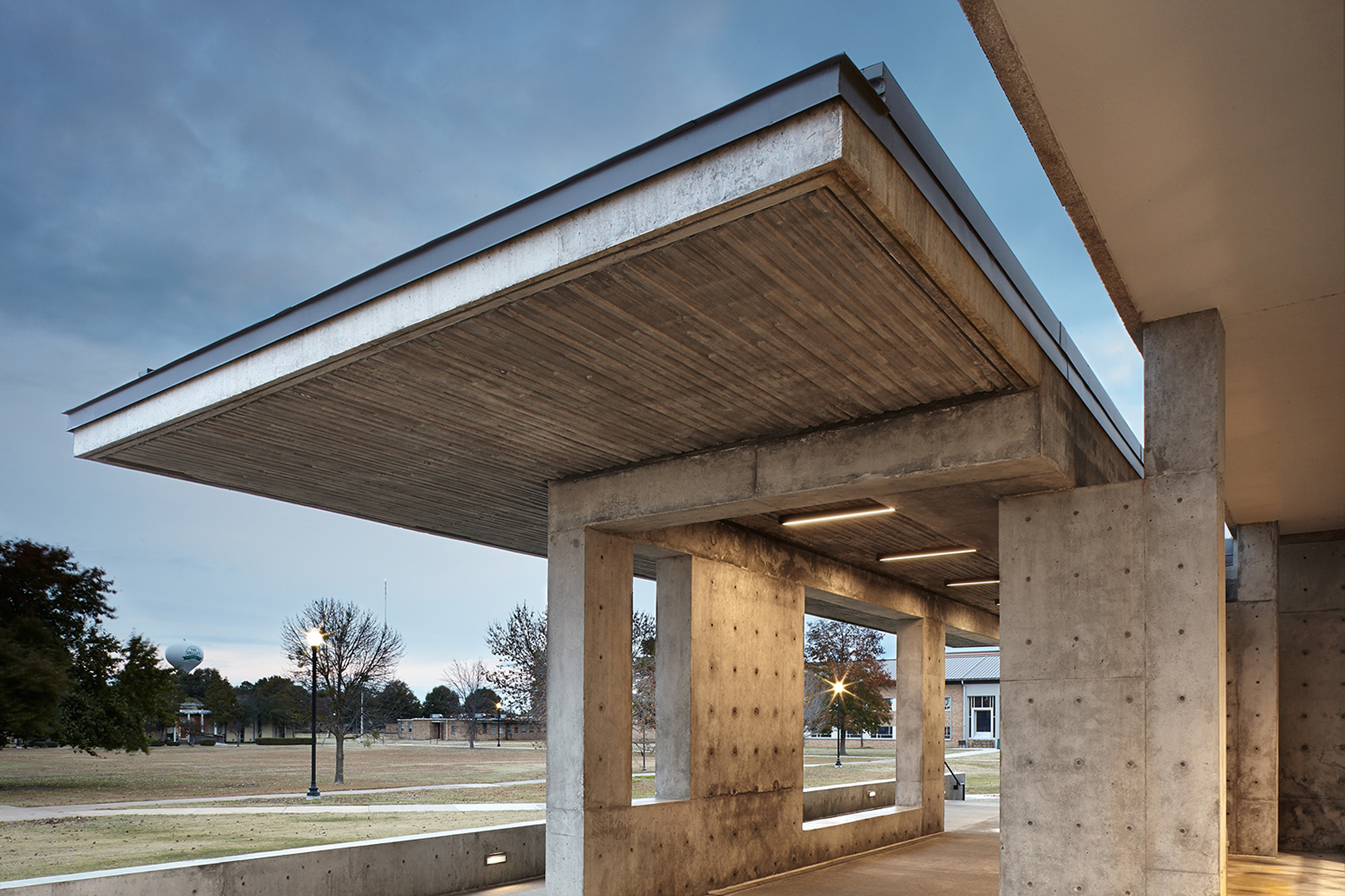
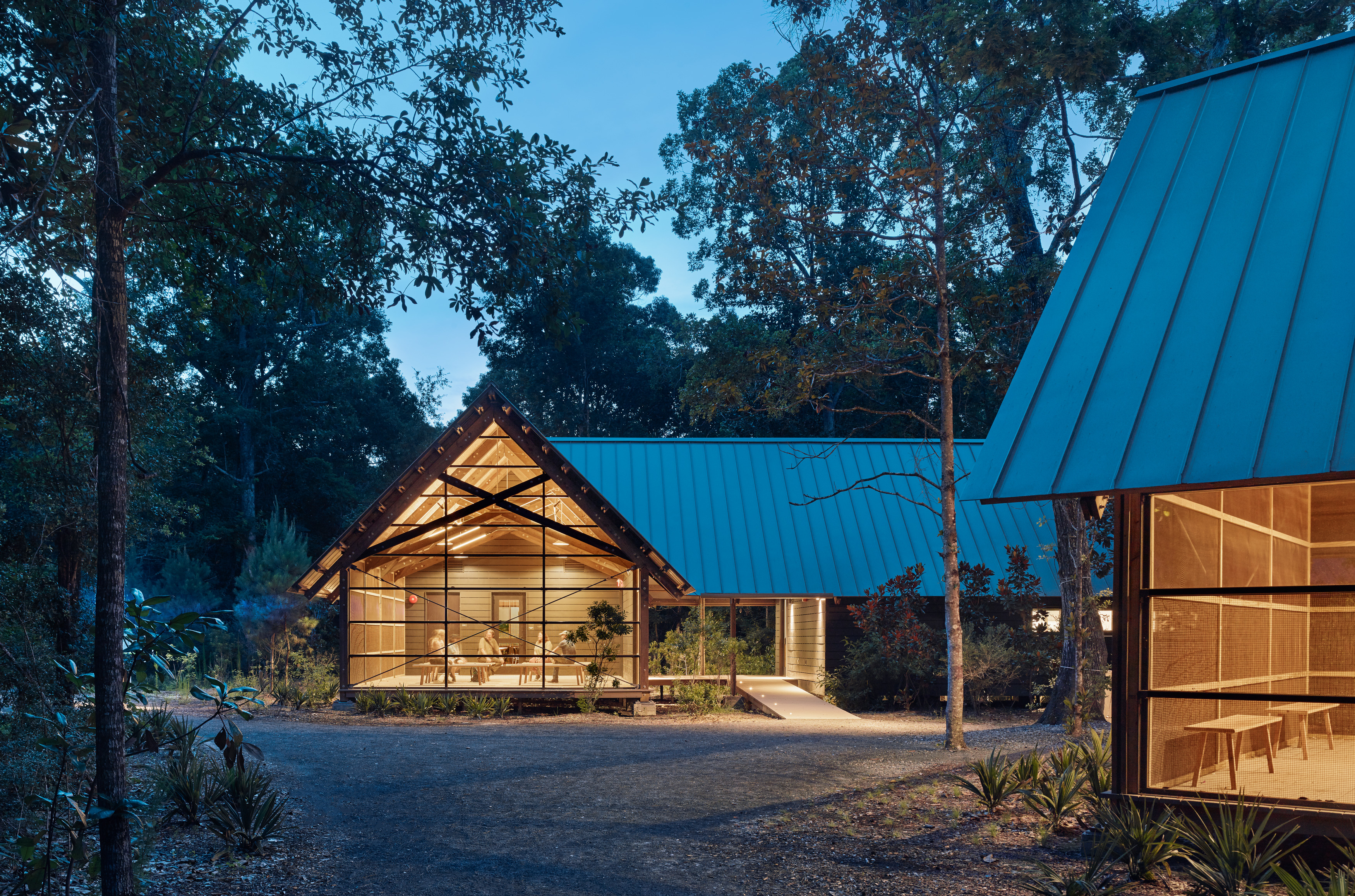 In 2005, Hurricane Katrina destroyed the previous Marine Education Center at the Gulf Coast Research Laboratory in Ocean Springs. The new facility faced additional challenges, with Hurricane Nate striking during construction. To ensure resilience, sustainability and durability, the new center was designed to withstand natural disasters. The center showcases sustainable coastal building techniques, emphasizing the use of wood to blend with the adjacent pine flatwood forest.
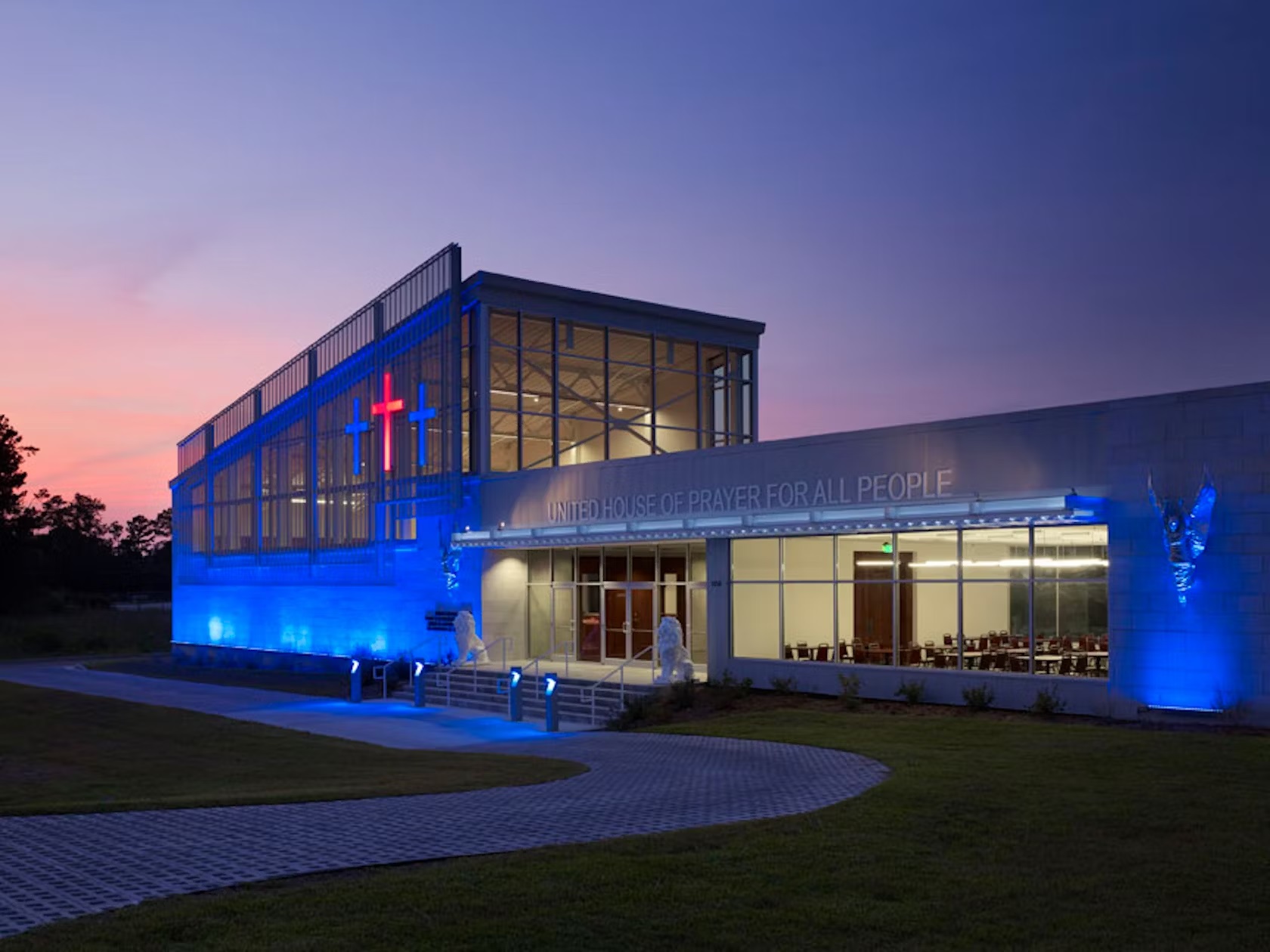
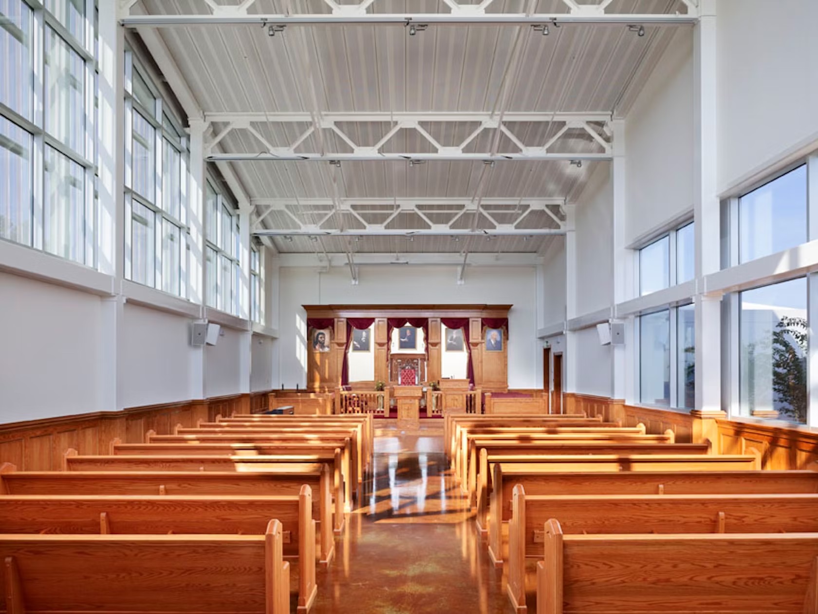 The House of Prayer, a new church in Hattiesburg, was designed and built for a small congregation. The sanctuary features polished concrete floors, wooden pews, and a large pendant light above the altar, creating a bright and welcoming space. Steel joists with track lighting form the ceiling, and high storefront windows provide natural light and privacy.
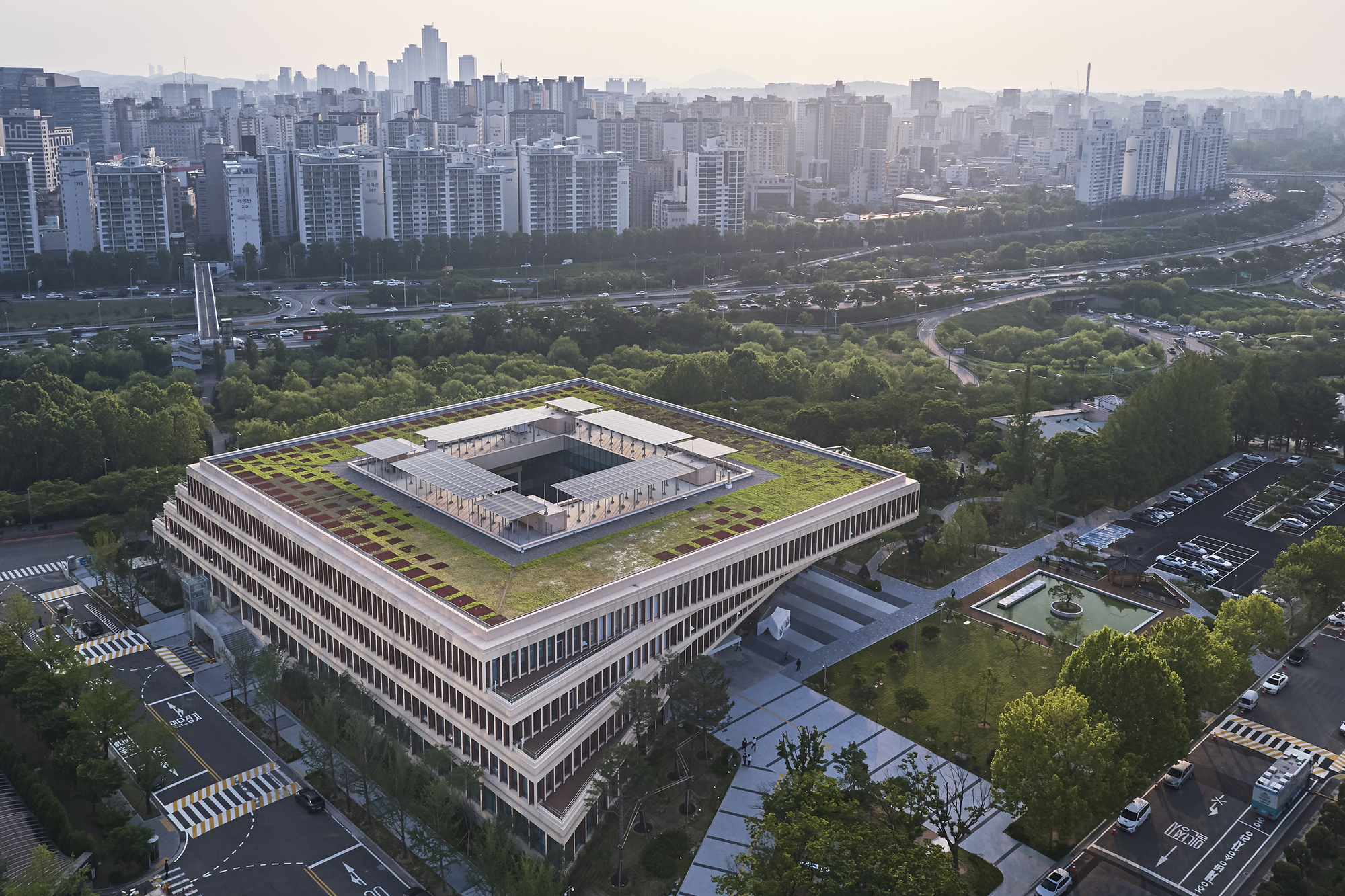
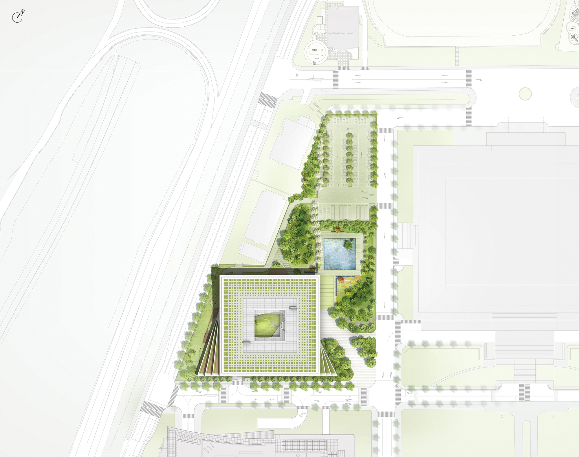
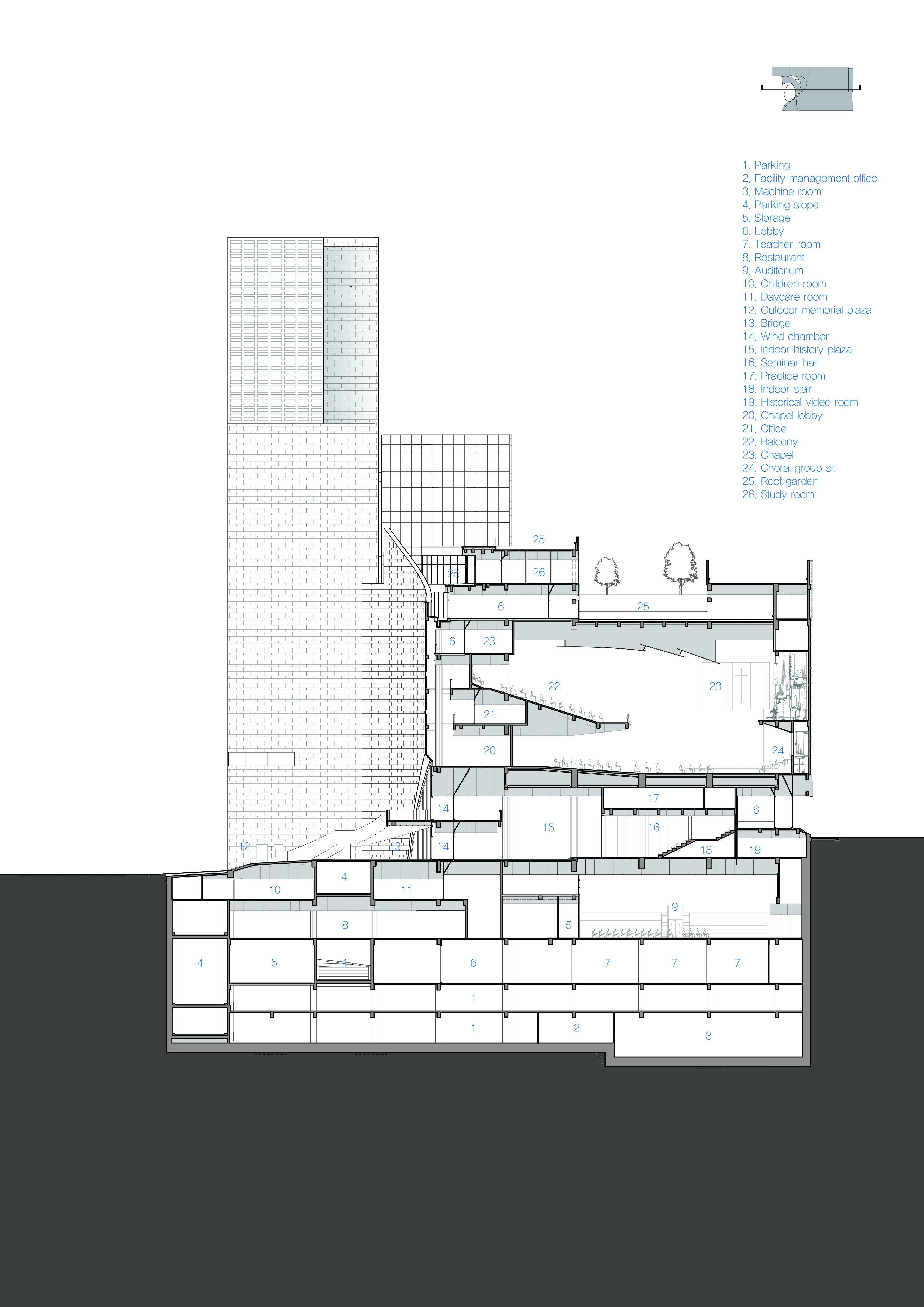
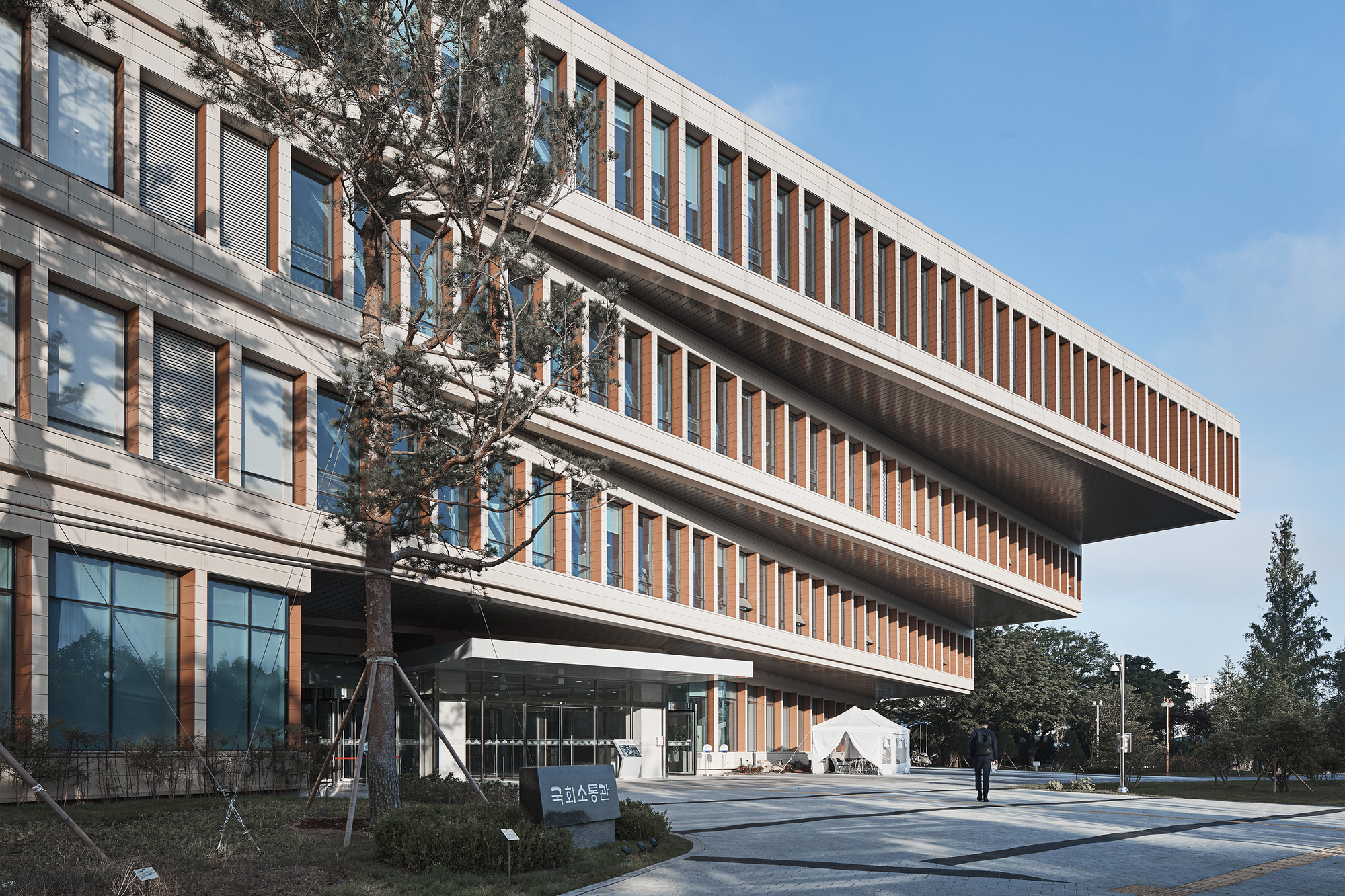 The National Assembly Communication Building at the Republic of Korea Complex embodies the ideals of flexibility and openness. It integrates seamlessly with the existing monumental masterplan while catering to daily activities. The four-story structure is designed to blend into its surroundings, respecting the existing tree line and maintaining a height of 30 to 40 feet. The building’s layout is organized into horizontal zones to accommodate diverse users, ensuring privacy and efficiency.
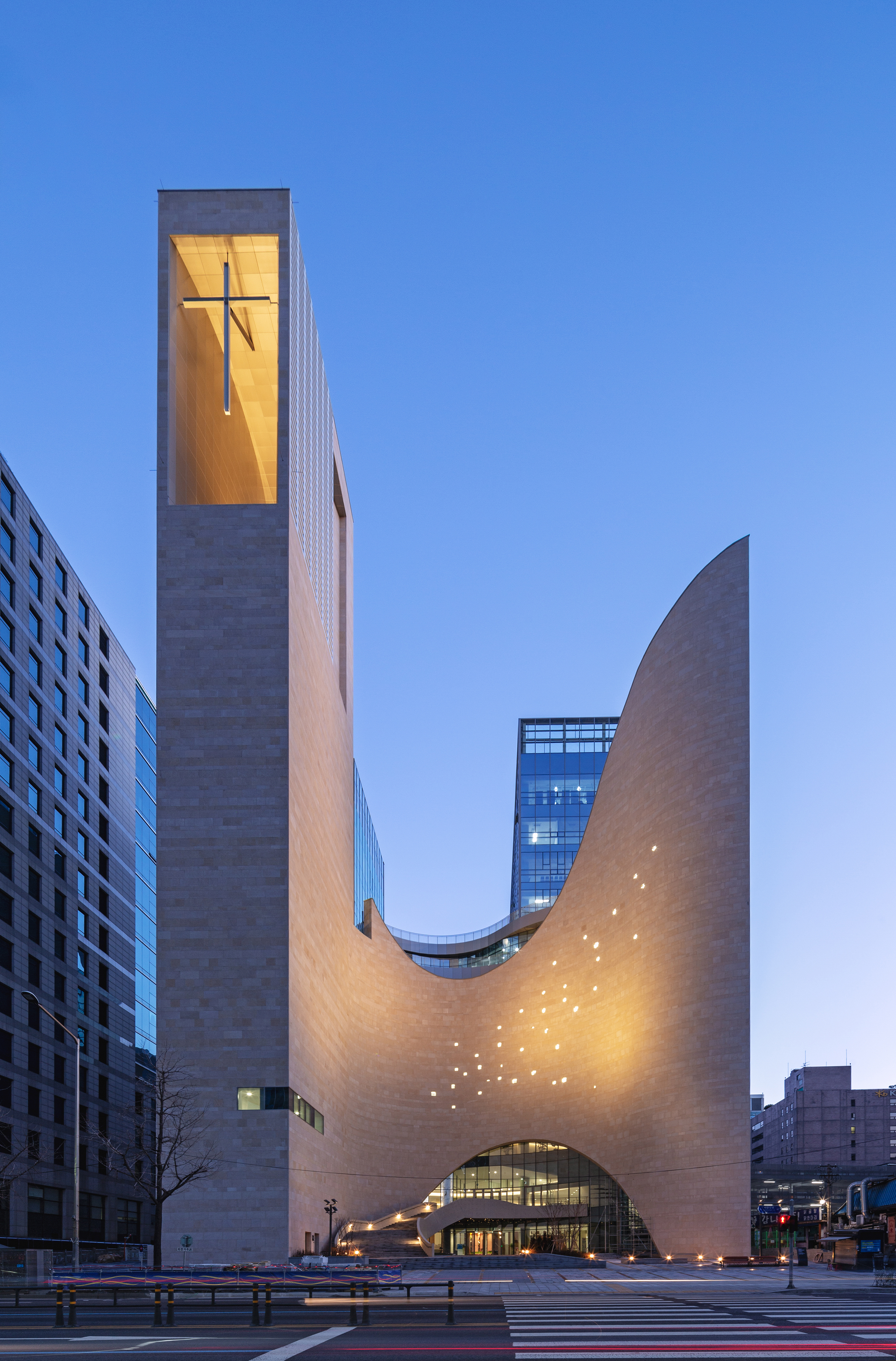
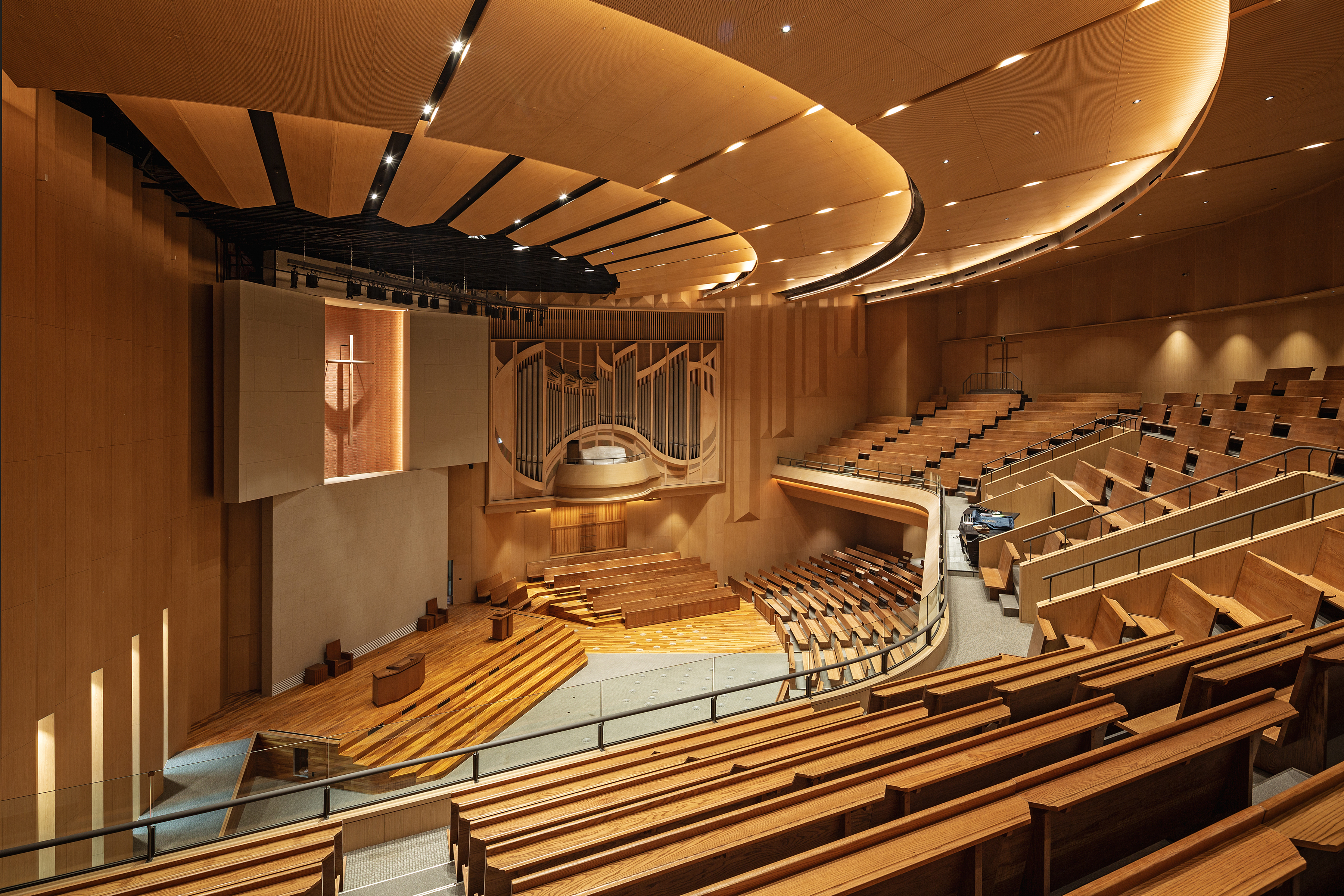 Saemoonan Church, the first Korean Protestant church, celebrated its 132nd anniversary and opened a new church in Gwanghwamun Sinmunno. The design, resembling a mother’s embracing arms reaching toward the sky, breaks from traditional spire and Gothic architecture, a significant shift in modern church design. The new church focuses on four themes: historicity, symbolizing its role as the mother church of the Korean Protestant Church; spatiality, portraying Christ as light through an open door to heaven; a water space representing baptism’s meaning; and harmony. These themes were revised to incorporate God’s love and neighborly love into the design, emphasized through spatial symbolism and outward appearance.
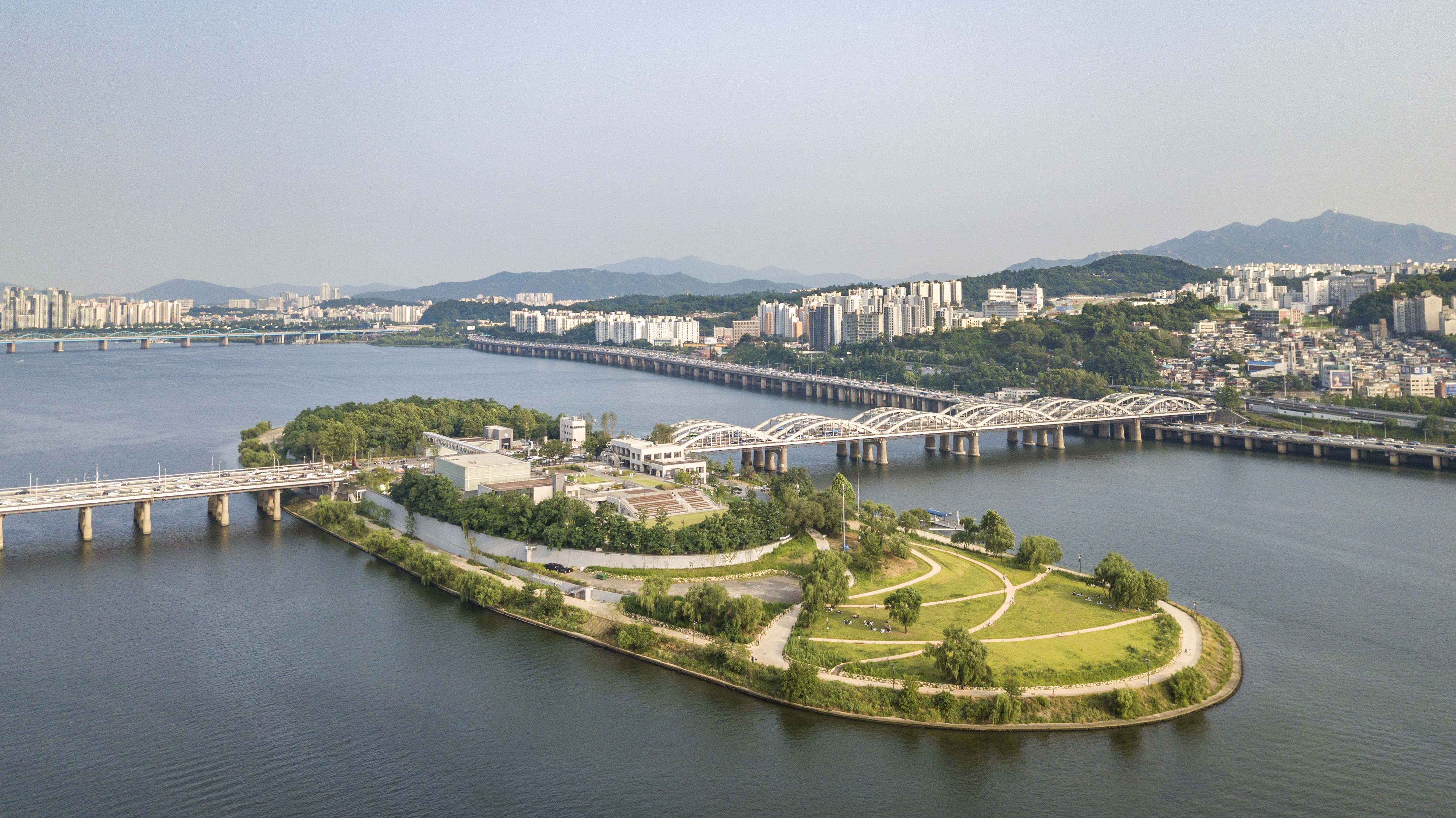
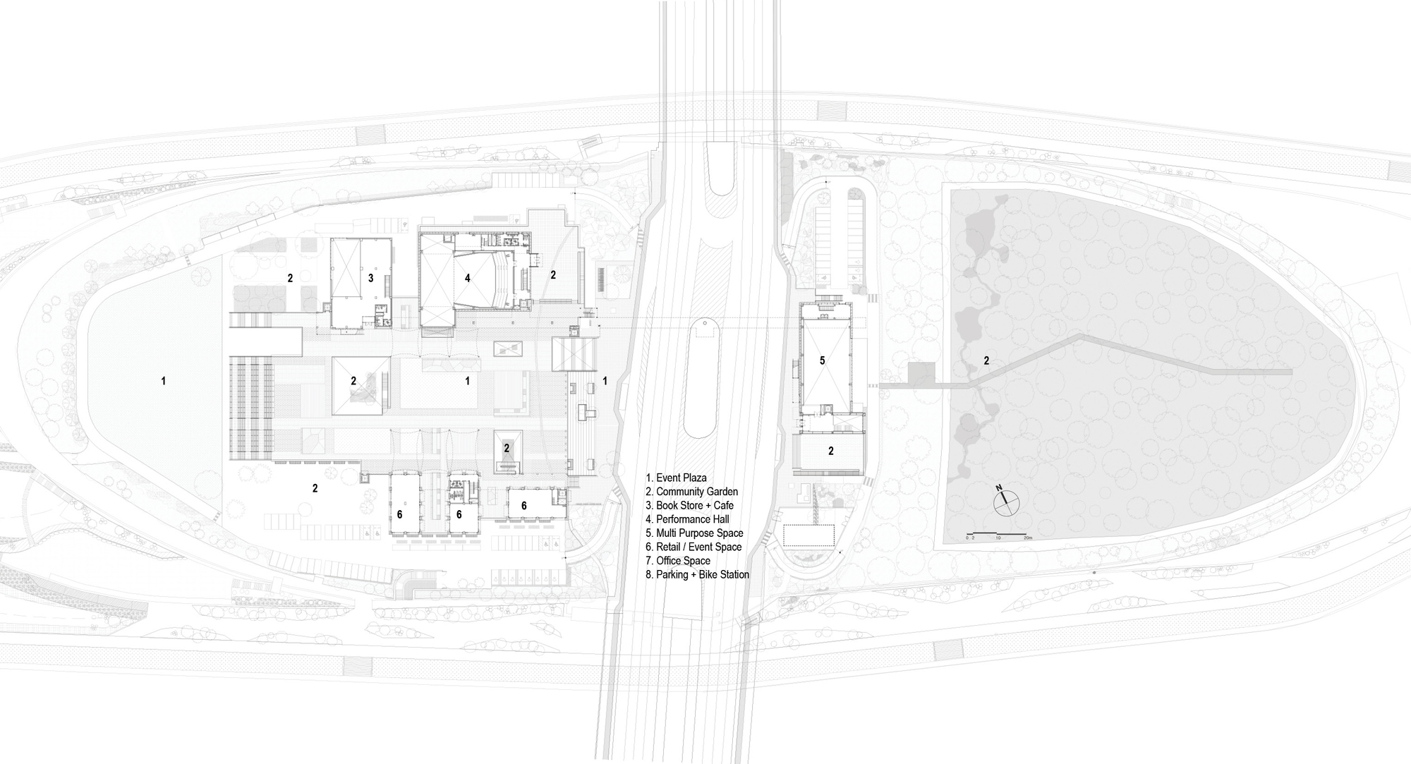
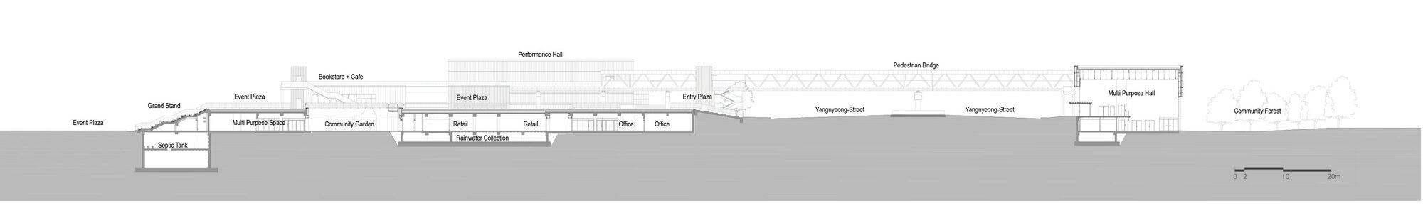
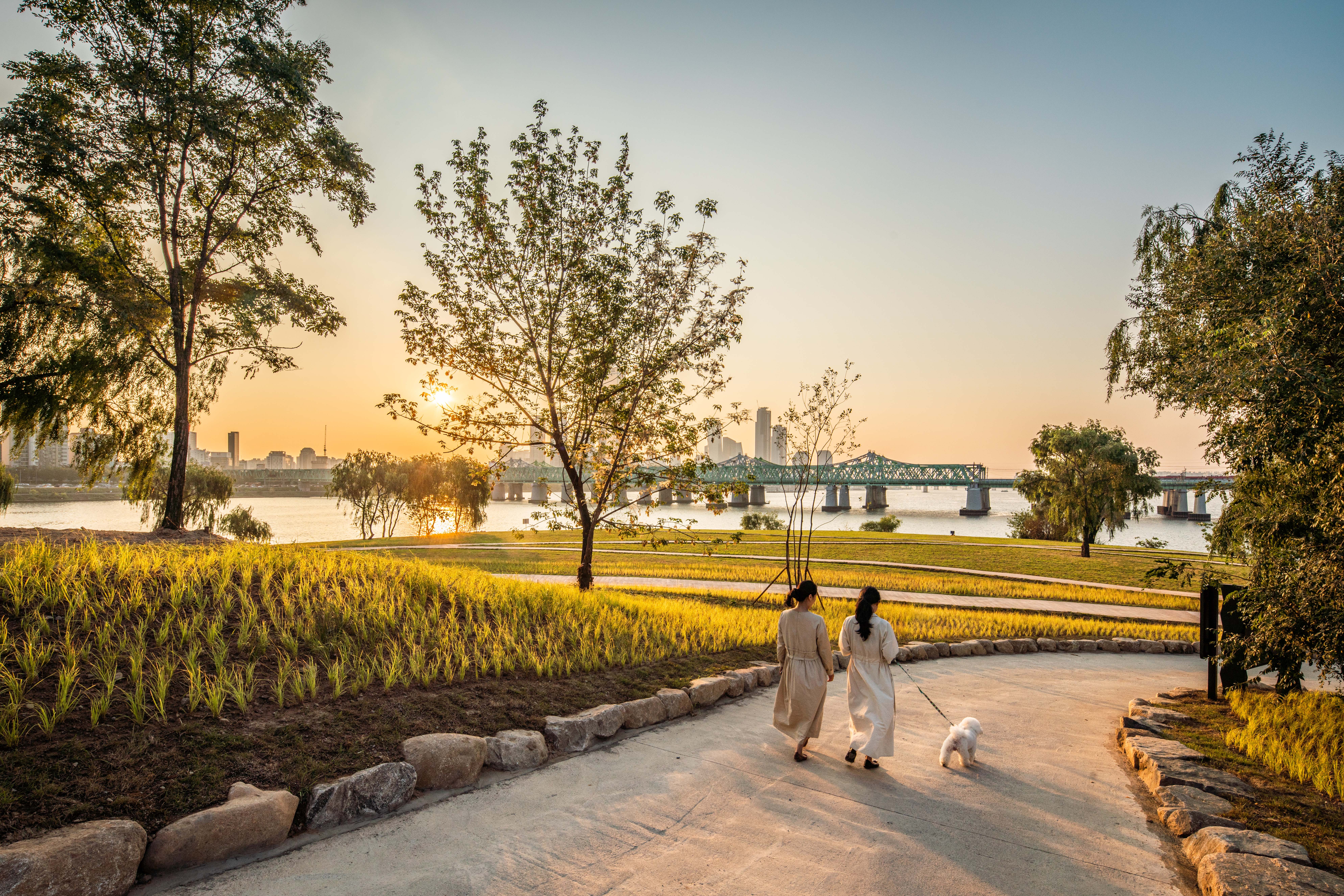 Nodeul Island, an artificial island in Seoul’s Han River, was long neglected despite its natural beauty and central location. This project revitalizes the island, creating multi-level public spaces with cultural programs that honor its history. The redesigned island offers diverse activities and fosters a connection between visitors and the city’s landscape. The island features two main levels: the original ground level hosts cultural venues, while an upper platform provides public plazas and viewing decks.
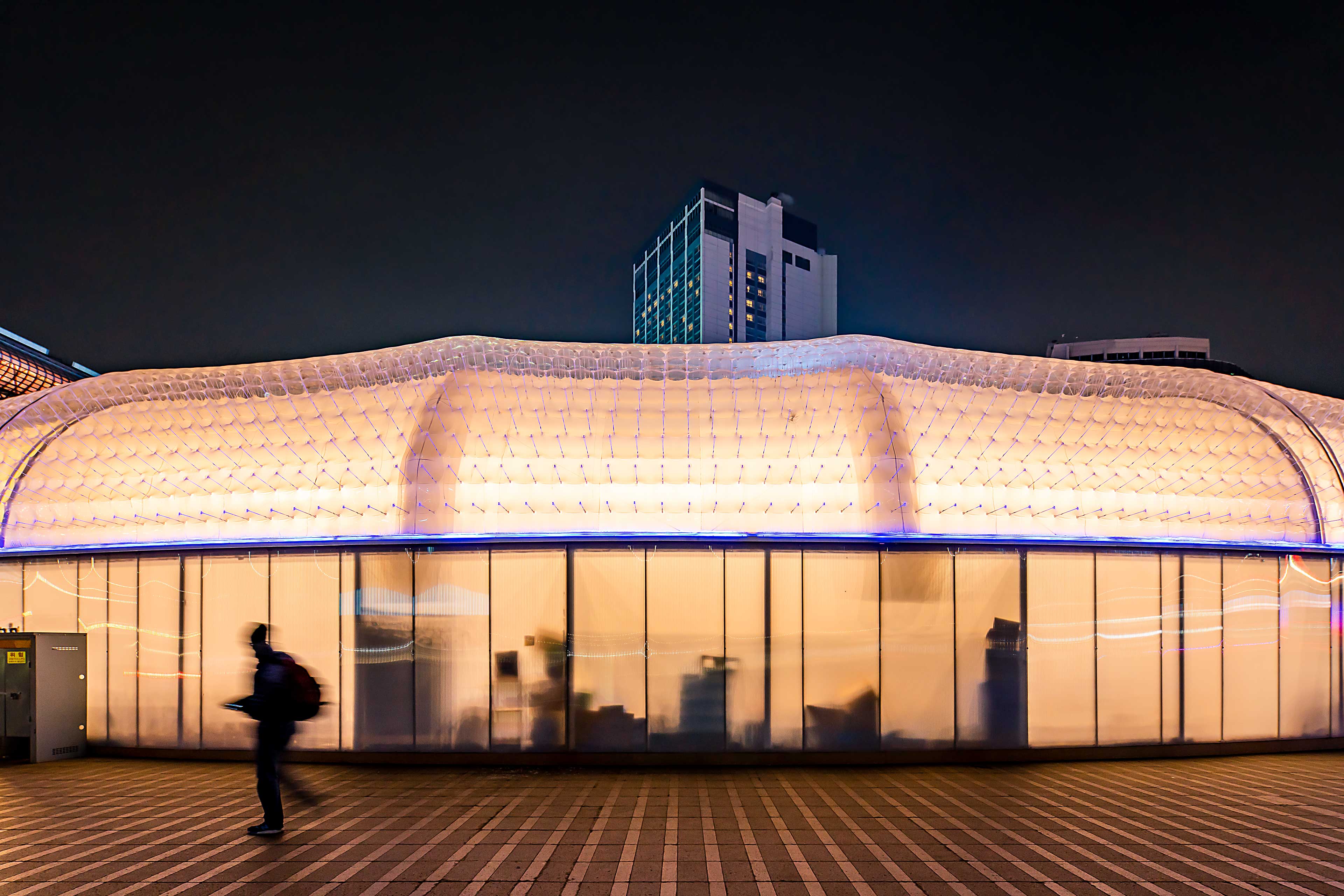
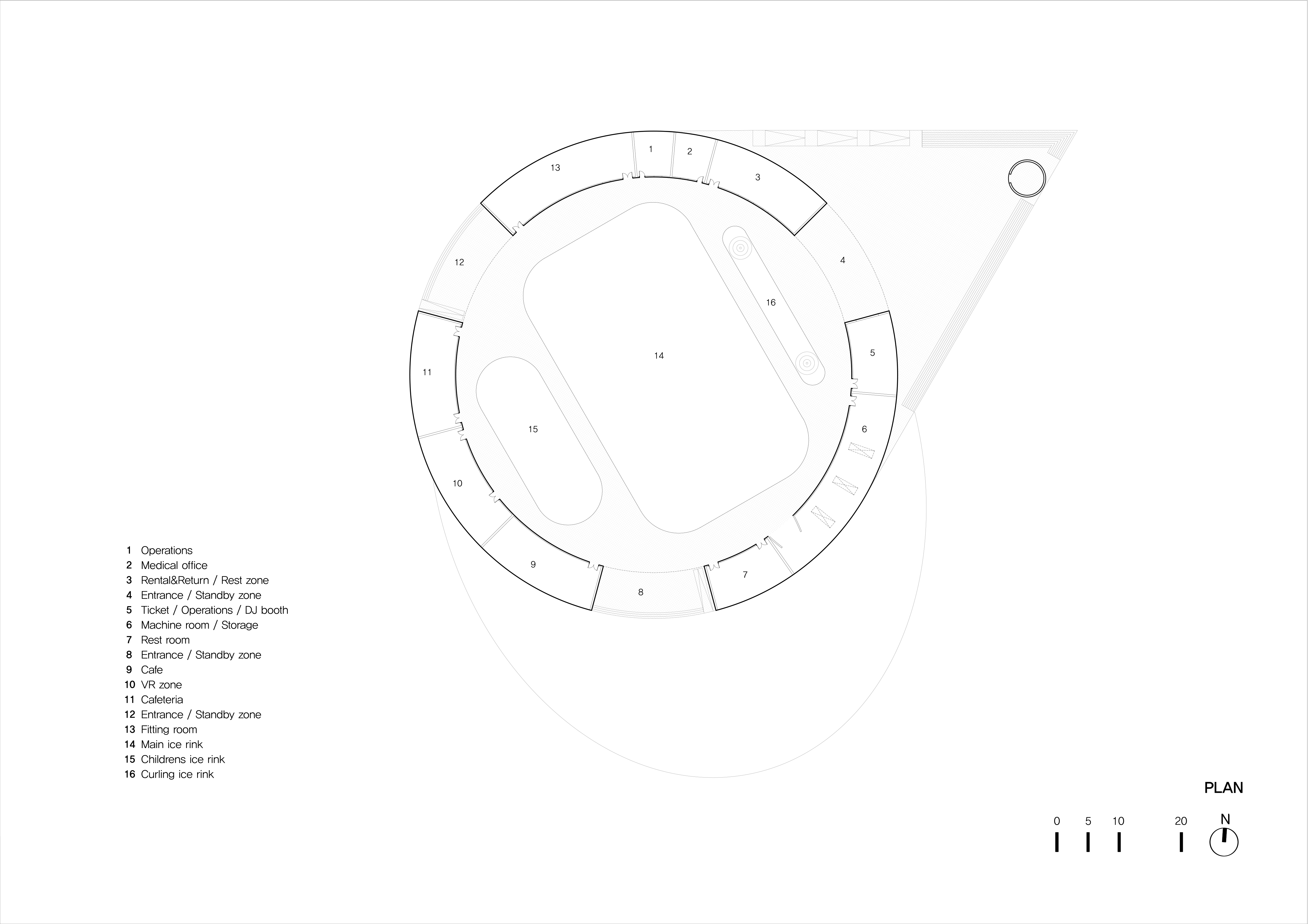
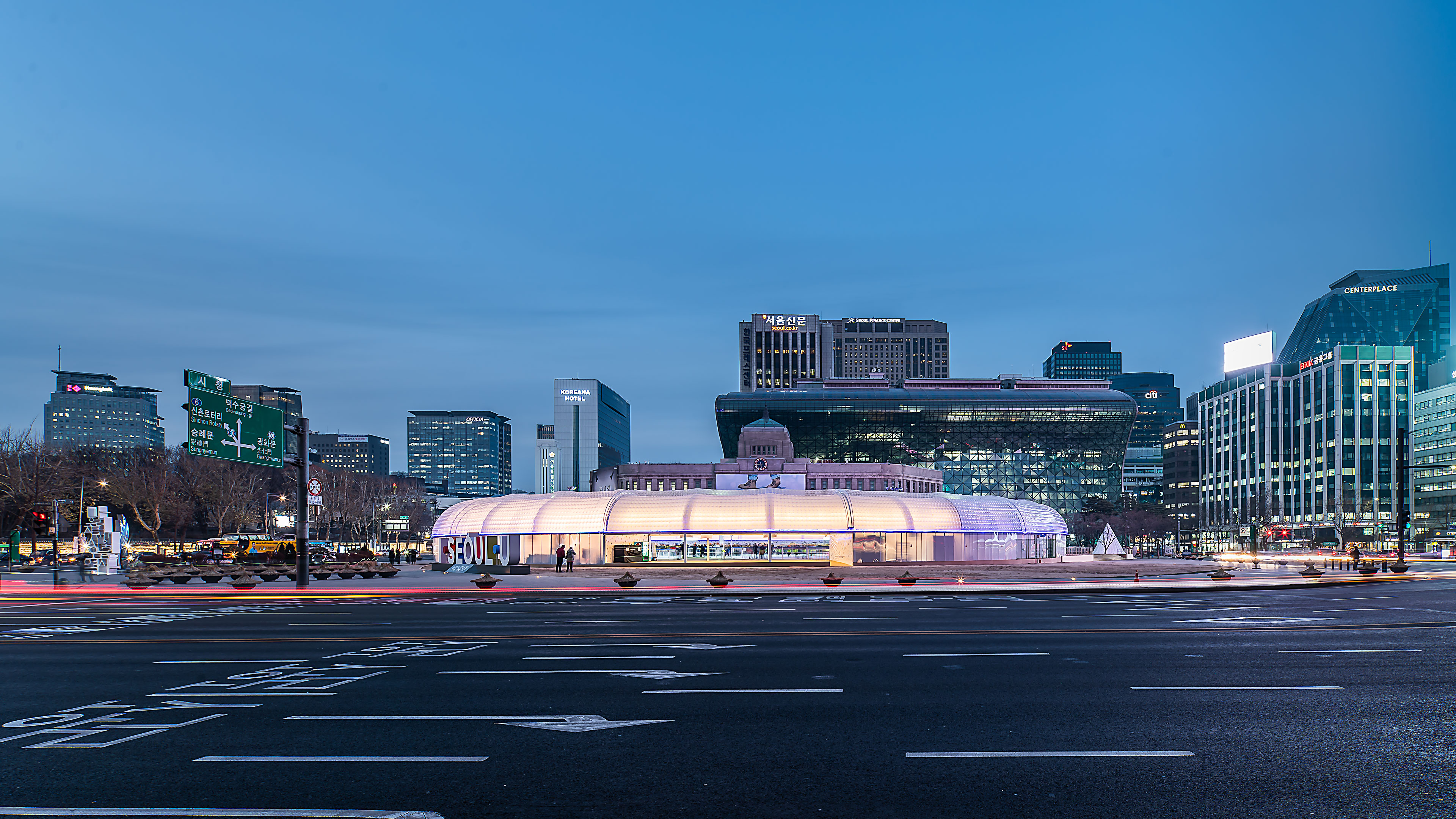 Seoul Plaza transforms into a winter sports hub for citizens from Christmas through February, featuring skating and curling. The skating rink, redesigned and reopened in 2018 through a public competition, introduces a new, easily recyclable structural concept. Unlike previous years, that year’s rink boasted a “new structural alternative” that could be swiftly installed and recycled. Originally conceived as a light vinyl house, it evolved into a double air-dome system for easier reuse or recycling.
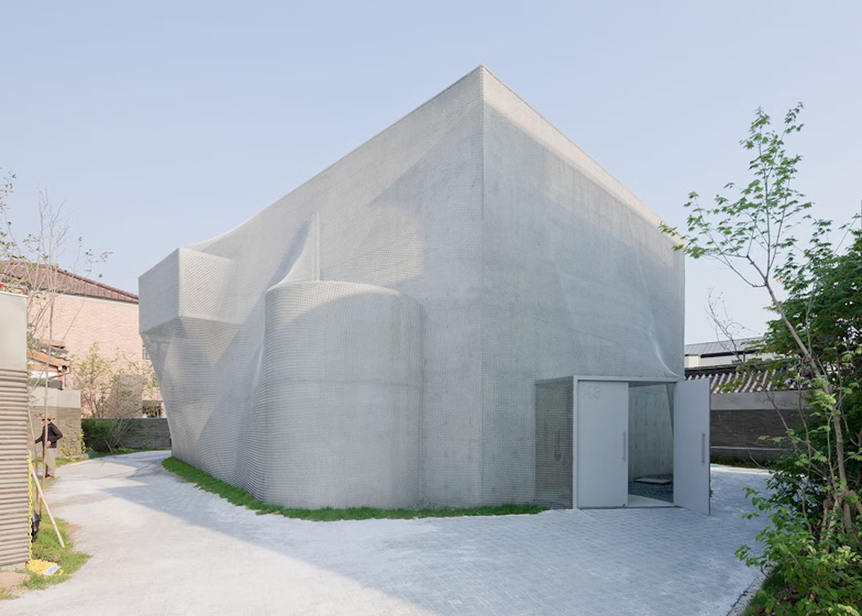
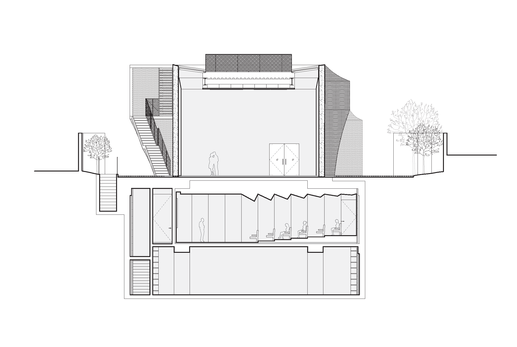
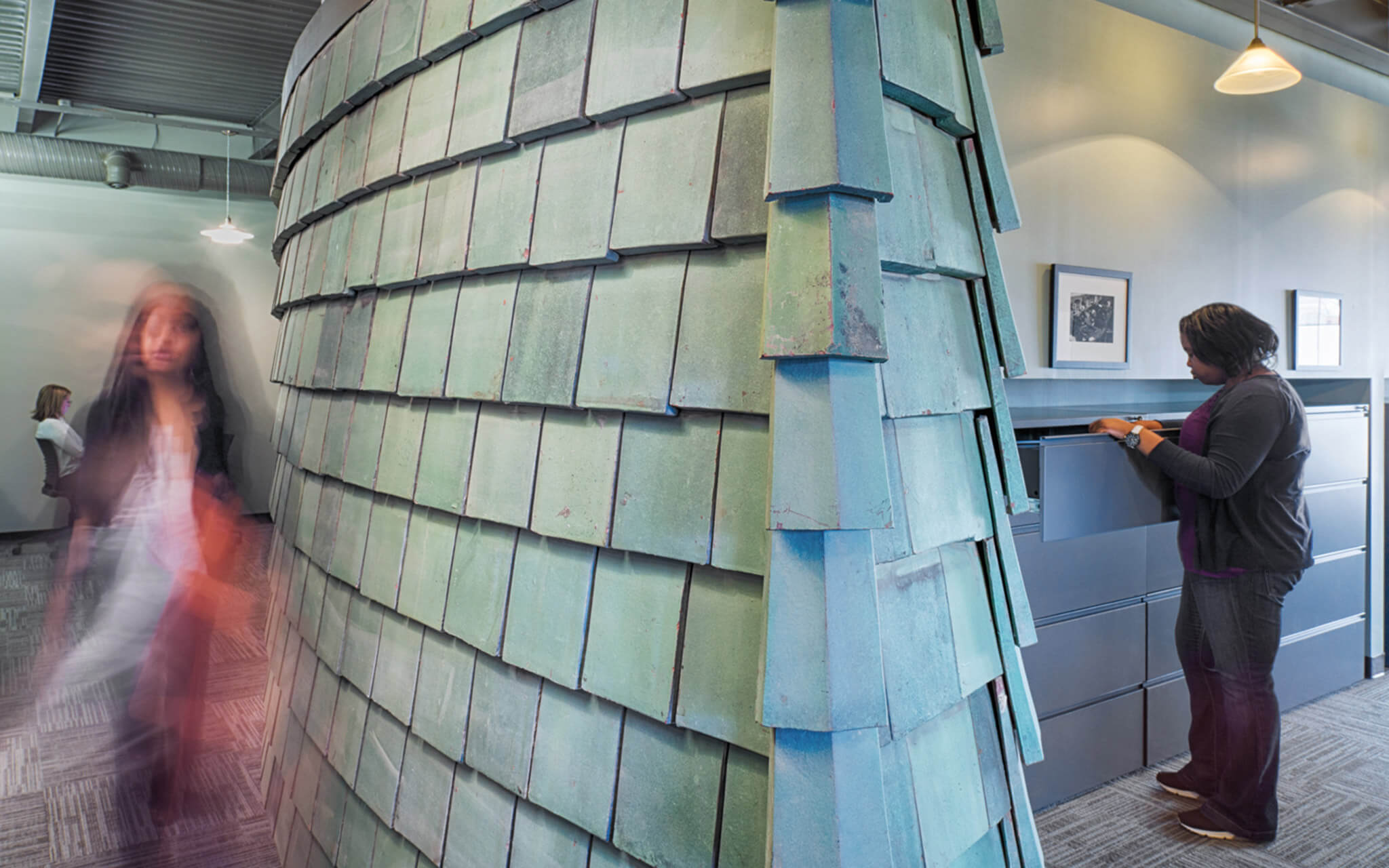
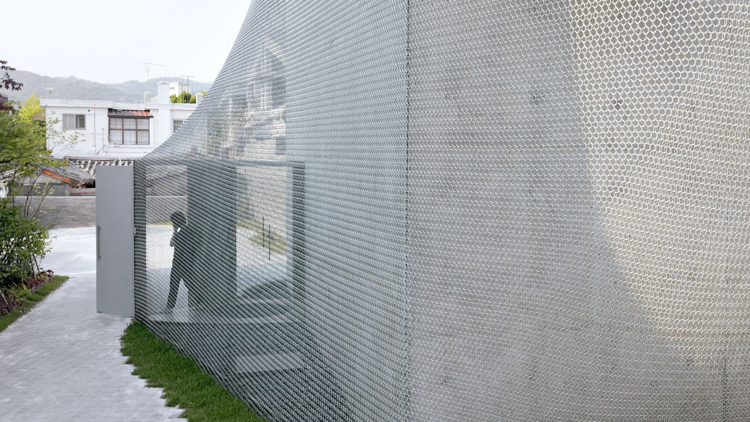 The project aims to enhance Korea’s cultural presence globally while harmonizing with the historic surroundings of northern Seoul. The design blends modern aesthetics with traditional techniques, featuring a unique chainmail veil façade made of 510,000 metal rings. To integrate seamlessly into the historic urban fabric, the gallery’s circulation is pushed to the edges, and the entire structure is wrapped in the hand-fabricated veil. This approach, developed in collaboration with engineers at Front Inc., marries computational processes with traditional craftsmanship.
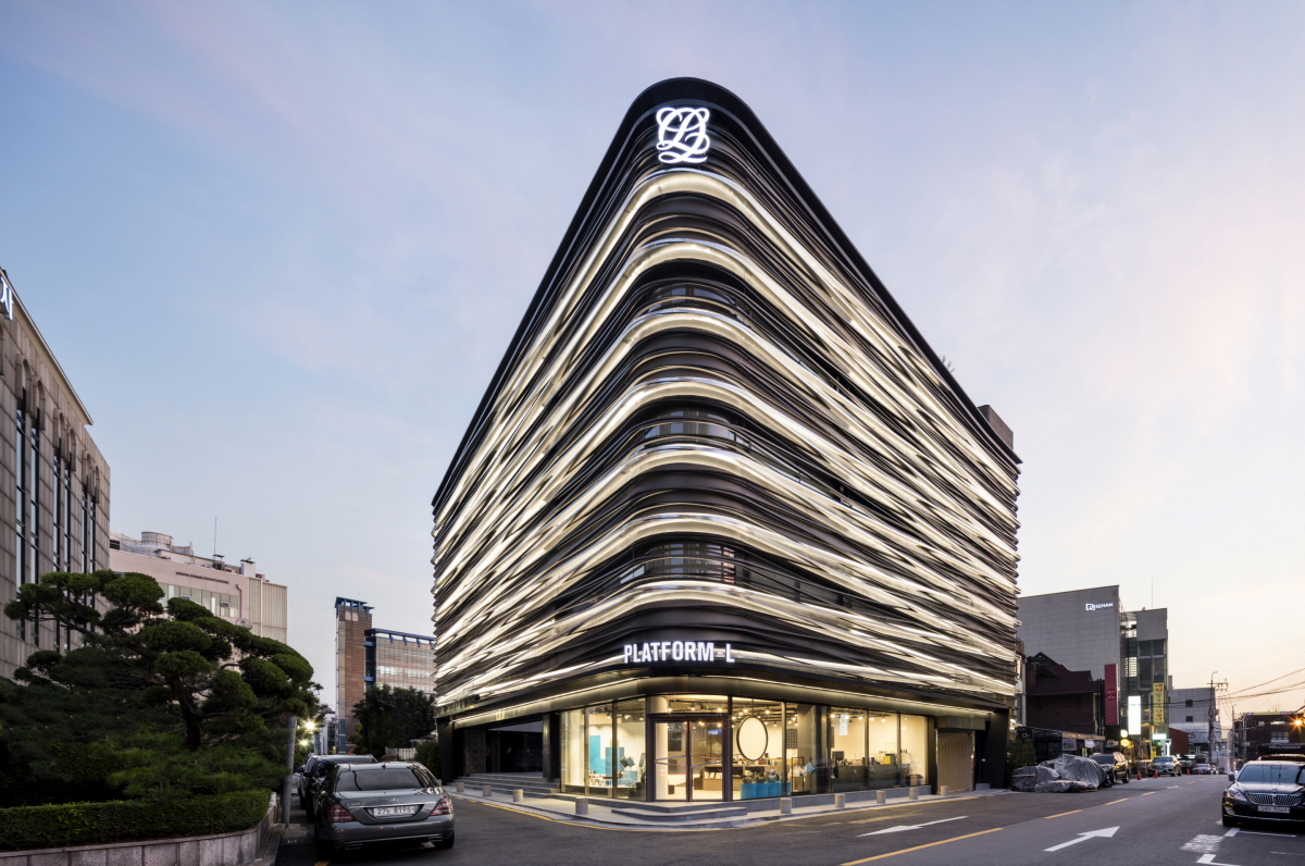
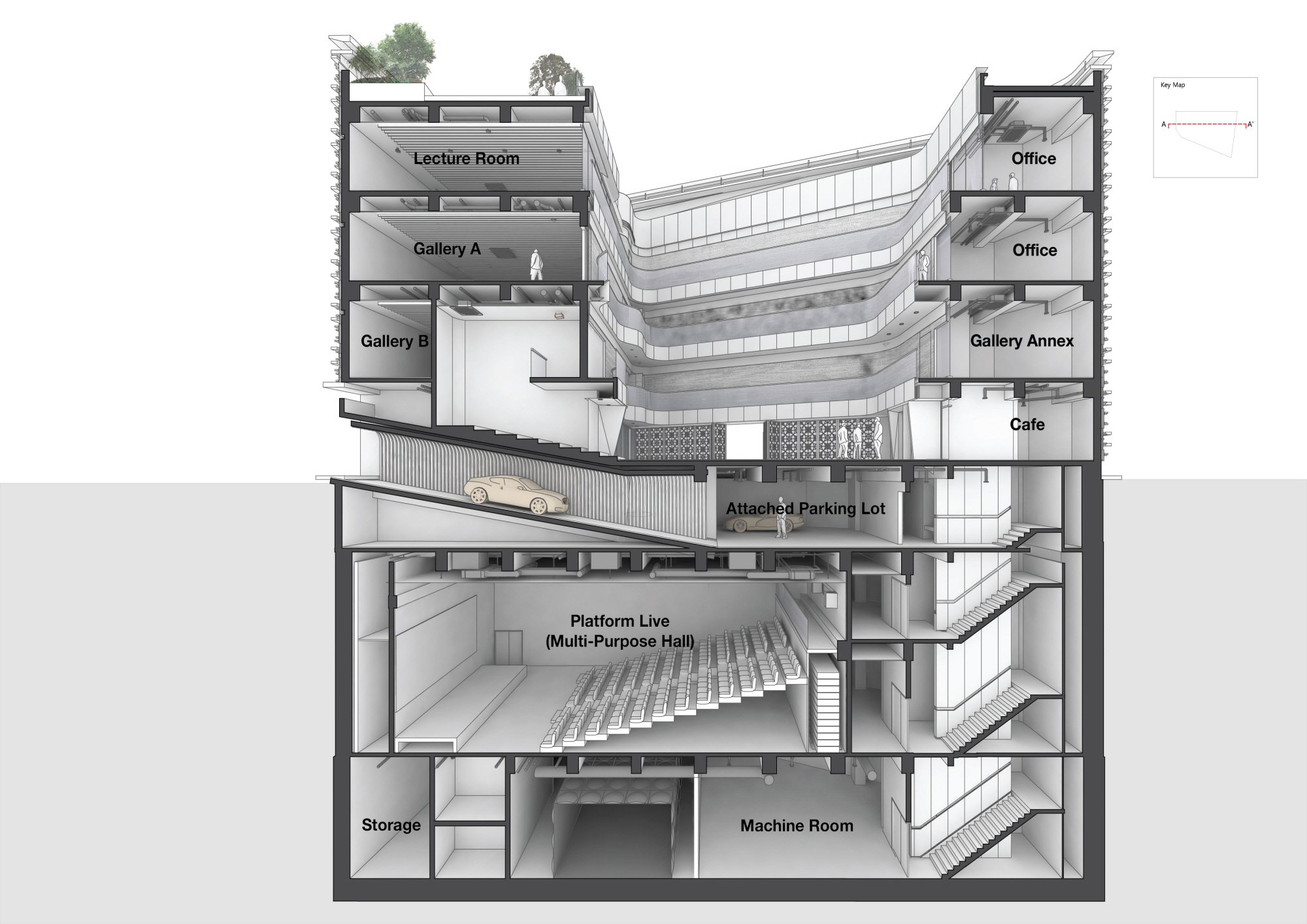
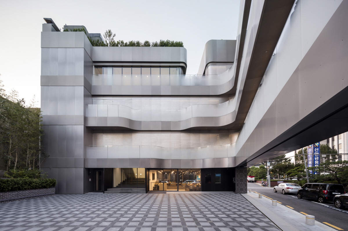 Platform-L Contemporary Art Center is situated in Seoul’s Gangnam district, nestled in a residential area. The site’s unique irregular trapezoid shape, surrounded by streets on three sides, posed a distinctive design challenge. Adhering to architectural regulations limiting the building ratio to 60% of the total site area, Platform-L took a unique approach by placing parking underground, creating a voided space on grade.
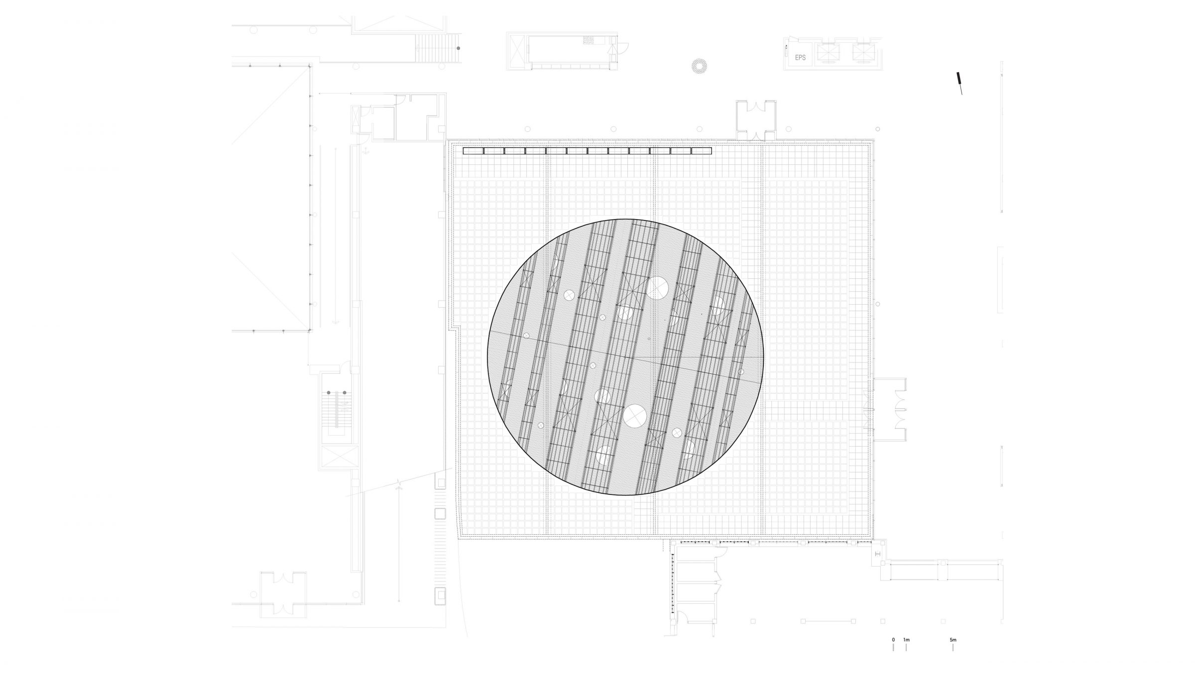
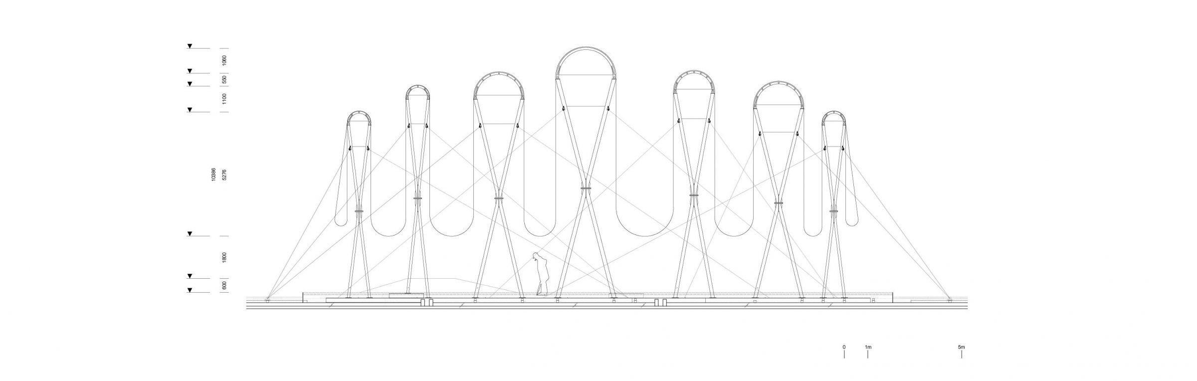
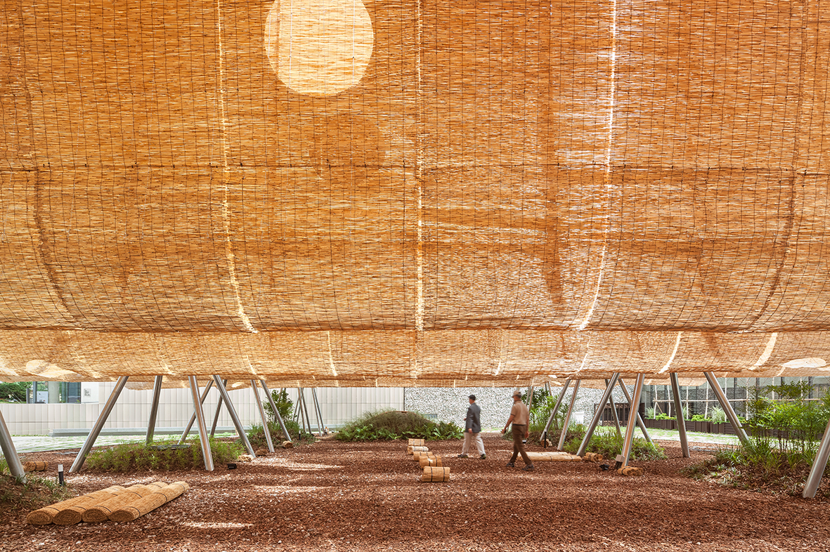 The front yard of MMCA Seoul faces the Gyeongbokgung Palace, a strong site-specific context. This space, once part of the Jongchinbu (Office of the Royal Genealogy in the Lee dynasty), is now an open public area of MMCA Seoul and serves as a platform for Y.A.P in the summer. Traditional architecture in Gyeongbokgung Palace is characterized by its prominent roofs. Han-ok (traditional Korean style-house) roofs were large and heavy to support the wooden pillars, creating a high and deep space underneath.
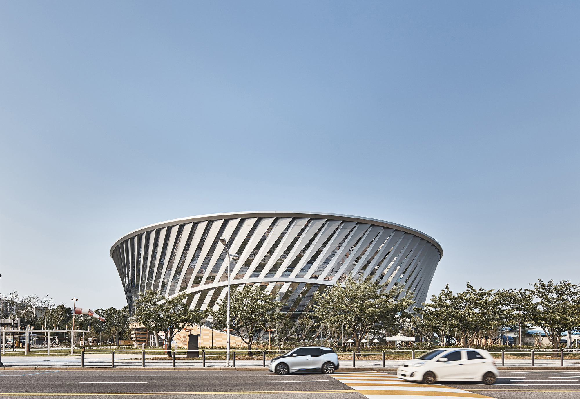
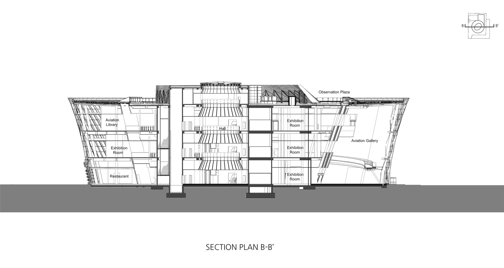
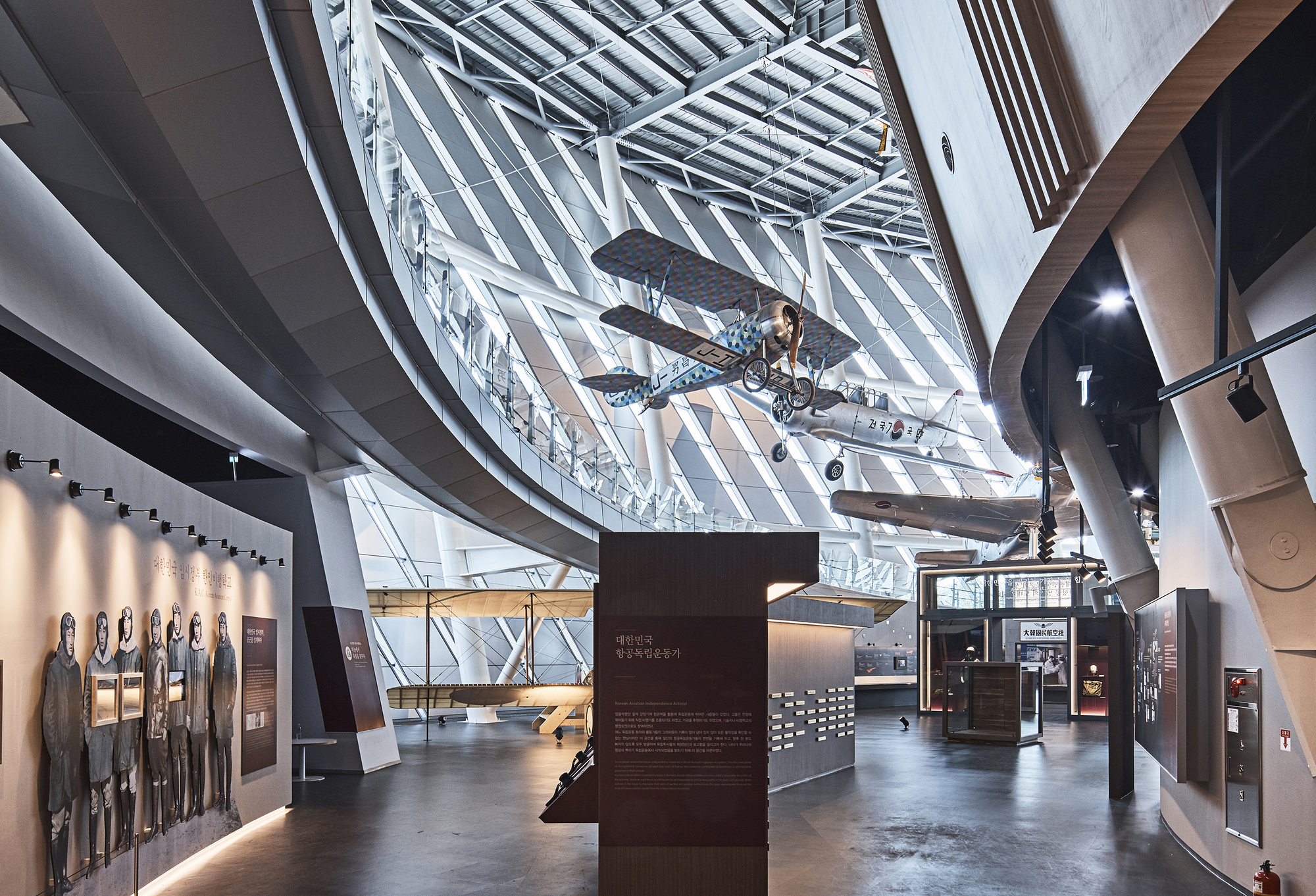 The National Aviation Museum, located in Gimpo Airport, aimed to elevate the Korean aviation industry’s status through a multi-cultural space promoted by the Ministry of Land, Infrastructure, and Transport. The museum’s design reflects three core ideas: “Air Turbine,” inspired by airplane turbines, symbolizes the integration of mechanical aesthetics and science technology; “Air Show,” an aviation gallery, presents the history of Korean aviation in a dynamic, panoramic exhibition space; and “Air Walk,” a three-dimensional walkway, offers a dynamic experience amid the architectural structure’s shining lights.