A Look into the Design of 416 Memorial Park
CategoriesArchitecture

A Look into the Design of 416 Memorial Park


416 Memorial Park – The purpose of the project is to design an optimal plan to create a cultural park consisting of a complex of exhibition and educational facilities and a columbarium to commemorate and share the pain of the victims of the Sewol ferry disaster. When the passenger ferry MV Sewol sank off the coast of South Korea in 2014, over three hundred people lost their lives, most of them schoolchildren. Years later, the victims’ families and survivors are still demanding justice from national authorities.

Architizer chatted with Sang Dae Lee, Assoc. AIA, LEED AP, and principal at UNITEDLAB Associates, to learn more about this collaborative project.

Architizer: What inspired the initial concept for your design?

Sang Dae Lee: As the form and space of ‘416 memorial park’ embody the moment of the sinking of the Sewol ferry, there were challenges as follows.

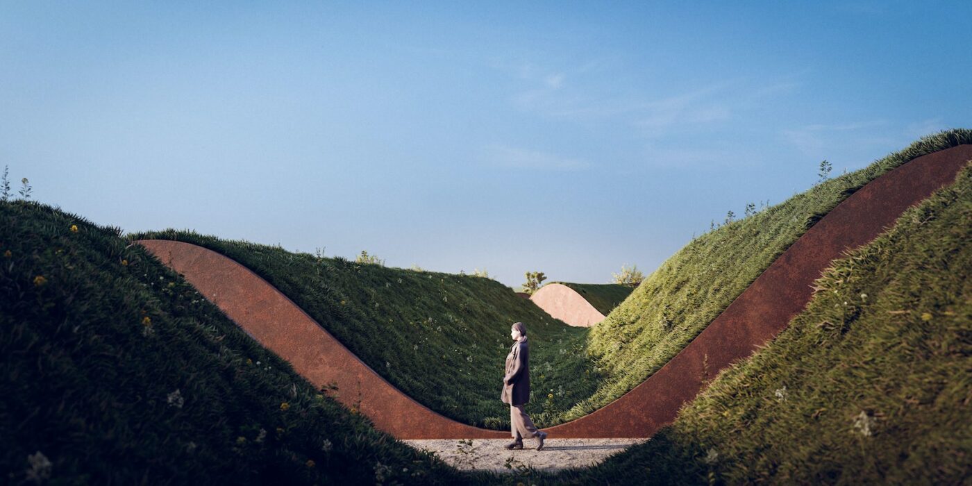
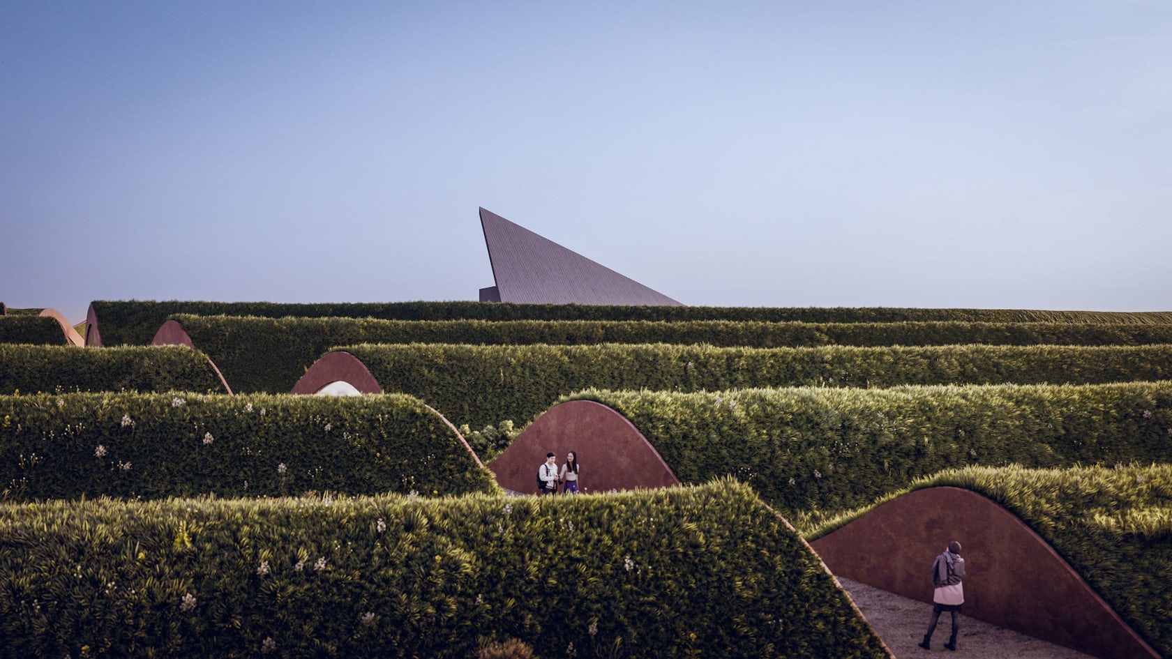
Spatial sequence: How to spatially implement emotional tension and sequence from the entrance to the enshrinement space? As a gradual and vertical entry into space, it was attempted to represent the space of the Sewol at the time of the accident. This gradual movement into space begins from the park to the entrance to the memorial. Since these internal and external ramps are on the same slope, vertical movement is hidden and horizontality is emphasized instead. Visitors walk from the entrance through the education space on the middle level, then reach the exhibition and AV theater. While walking down the path through a narrow, closed ramp corridor, visitors will ultimately arrive in an enshrinement space with emotional tension.
© treceuve

© treceuve

© treceuve

© treceuve

This project won in the 10th Annual A+Awards! What do you believe are the standout components that made your project win?

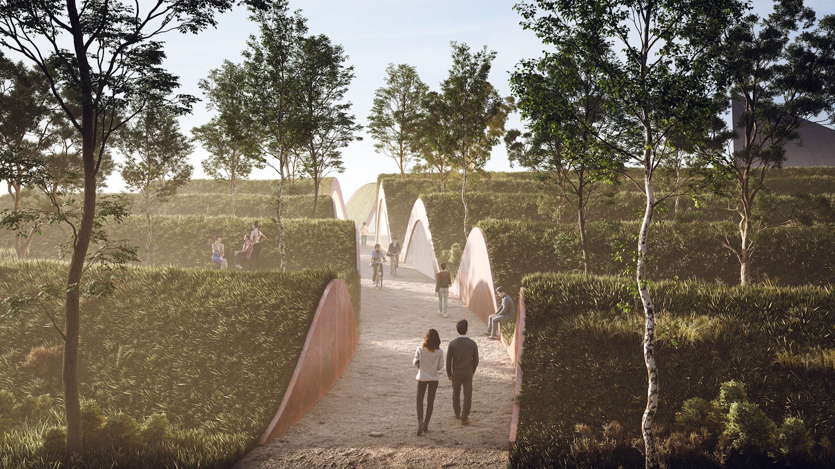
Architecture and landscaping as a figure-ground play a significant role in place-making. The architecture will invite visitors to programs such as education, cultural activities, enshrinement space, amenities, and a shop, and the landscape will serve social events, promenades, gardens, and memorial park. The 250 birch trees commemorate the victims with a metaphor for eternity.

Over time, the trees grow bigger, depicting the meaning of death leading to new life. In addition to the indoor memorial space, a memorial event can be held outdoors in the garden and each tree provides an individual memorial space around. The walkway in the garden can be closed depending on the event and is used as a performance space and amphitheater. The interface along the walkway is a connection between the space and the architecture, receiving natural light, meaning that architecture and landscape are united.
© treceuve
© treceuve

© treceuve

© treceuve

What was the greatest design challenge you faced during the project, and how did you navigate it?

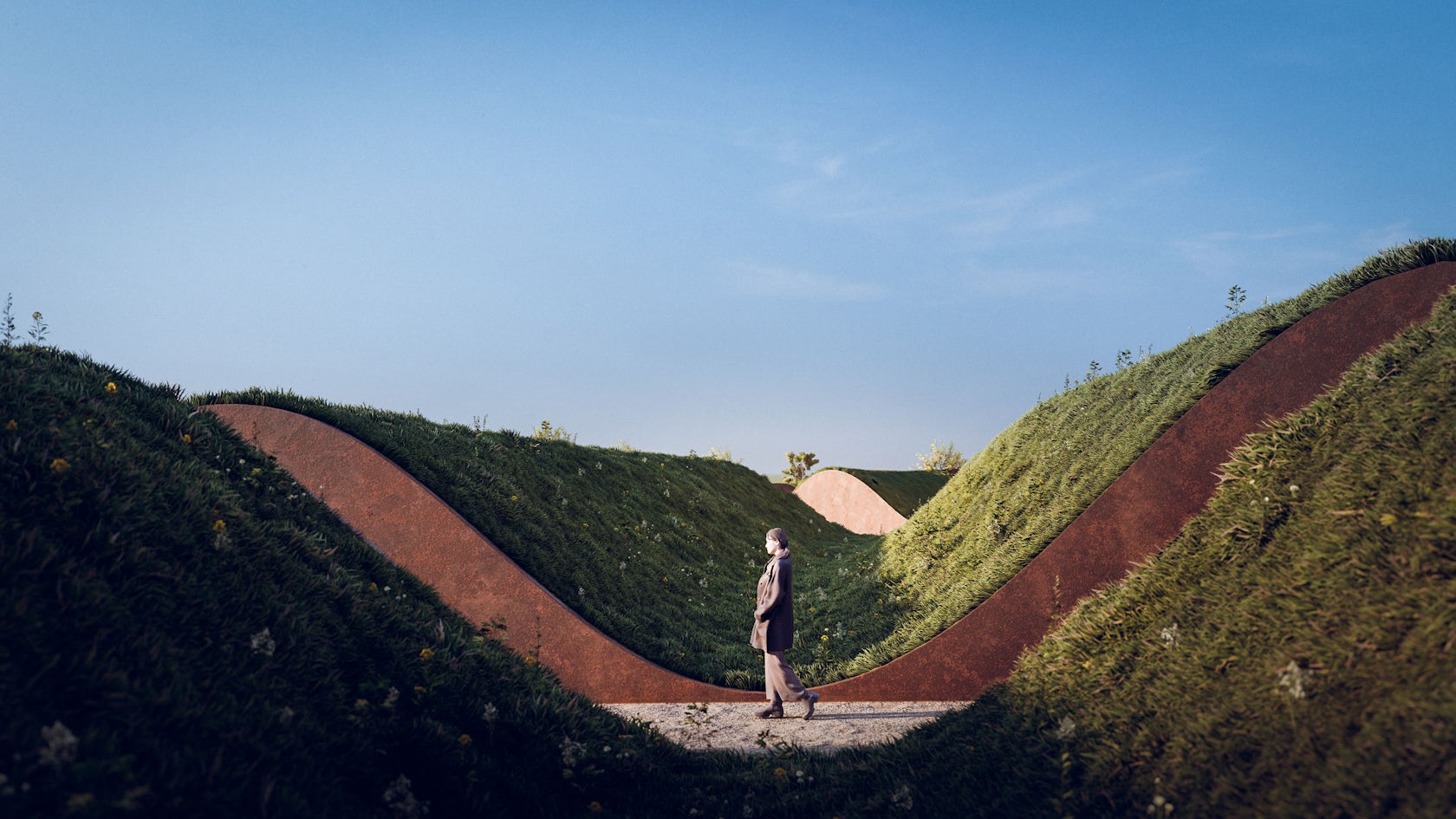
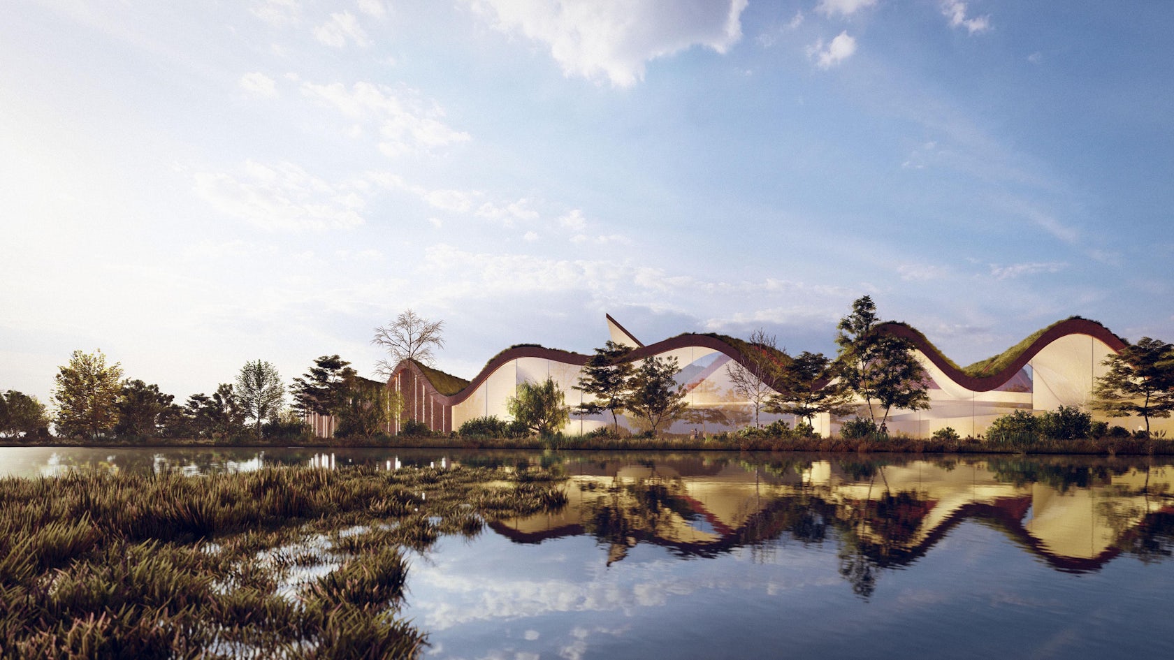
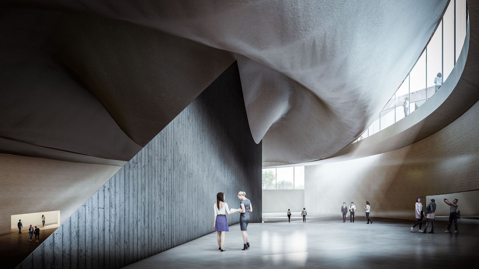
As the 416 memorial park embody the wave of the sea, there were structural challenges to support the wavy landform. If visitors walk along the promenade that crosses the waves of the roof garden, they would ultimately pass through the elevated and huge waves. The tension peaks when the pedestrian reaches the pyramid-shaped ship. By gradually increasing the level of the terrain around the enshrinement pyramid, we have space below maximized for the implementation of educational, cultural, and event programs. The upper terrain allows visitors to contemplate the surrounding park as an observatory deck and to gaze into the interior space below since the terrain is torn. A column-free structure was pursued to maximize the sense of space under this terrain. Therefore, the space is formed in accordance with the shape of the waves, and the shear walls are placed along the waves.
© treceuve
© treceuve

© treceuve

© treceuve

How did the context of your project — environmental, social or cultural — influence your design?

There are various urban cultural and commercial facilities concentrated around the project site, and as such, it has good accessibility by the public due to its large population residing around.
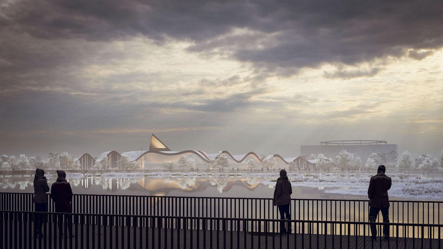
In order to apply the meaning of ‘memorial in everyday life,’ the architecture was designed as memorial, educational, and cultural facilities, and the landscape above was designed as a park—a new typology combining a plaza with a park. The plaza hosts social and cultural events, and provides a good public space for people. A memorial park was designed along the roof garden where visitors can stroll around while looking out at the surrounding area. In particular, the memorial garden on the roof and the enshrinement space on the basement is used as a place to commemorate the victims of the Sewol ferry disaster. This is a mixed type of architecture combined with a park as a figure-ground.

© treceuve

© treceuve

© treceuve

© treceuve

What is your favorite detail in the project and why?

416 memorial park seeks to overcome the pain and sorrow, and furthermore to sublimate and regenerate it ecologically and culturally rather than a mere memorial space of sadness. The 250 birch trees planted in the garden of the memorial park will grow and form a forest over time, and the enshrinement space under the pyramid is open to the outside air allowing visitors to experience a sublime sense of season, space, and time of the disaster. The educational program provides opportunities for engagement and discussion with visitors. The AV theater and exhibition space simulates the disaster scenes and provides exhibitions and education programs tailored to the theme. The park above and the building embrace sustainability by applying new technologies and systems to symbolize the metaphor of the regeneration of the memorial space.
© treceuve

© treceuve

© UNITEDLAB Associates / Vtrilloarquitectos

© UNITEDLAB Associates / Vtrilloarquitectos

In what ways did you collaborate with others, and were there any team members or skills that were essential in bringing this Award winning project to life?

UNITEDLAB Associates has collaborated with Vtrilloarquitectos, an architecture firm specializing in theater in Spain. Due to physical distance and the Pandemic of COVID-19, we mutually met via zoom to discuss the main concept of what memorial park plays in the new age of time. While brainstorming, they developed great alternatives and quickly simulate the scheme into 3D models which helps for us to develop and decide the final options. They have strong technical skills and presentation skills to support our studio in leading the projects. i.e. Computer 3D simulation technics, architecture details, exhibition concept, and its AV theater technical analysis.

© UNITEDLAB Associates / Vtrilloarquitectos

© UNITEDLAB Associates / Vtrilloarquitectos

© UNITEDLAB Associates / Vtrilloarquitectos

© UNITEDLAB Associates / Vtrilloarquitectos

How do you believe this project represents you or your firm as a whole?

We try to balance practical projects and experimental ones for managing studio works. 416 Memorial Park is rather a new way of architecture well united with another discipline of landscape architecture. It was a meaningful hybrid not only in the discipline but at the same time architecturally program use inside and landscape garden above but exemplary sustainability engaged to the memorial park. Of course, it was not easy for us to critically consider diminishing the budget by designing a kind of simple or rectangular building as this project pursues a parametric form of architecture. but as always, we pursue designing a new typology by experimenting with innovation.

© UNITEDLAB Associates / Vtrilloarquitectos

© UNITEDLAB Associates / Vtrilloarquitectos

© UNITEDLAB Associates / Vtrilloarquitectos

© UNITEDLAB Associates / Vtrilloarquitectos

Team Members

Design Firm: UNITEDLAB Associates / Vtrilloarquitectos, Principal in Charge: Sang Dae Lee, Architect: Valentín Trillo Martínez, Designer: Kitae Kim, Siying Chen, Client: City of Ansan, 3D Rendering: treceuve

For more on 416 Memorial Park, please visit the in-depth project page on Architizer.

416 Memorial Park Gallery

Reference

How Ice Cubes by Zone of Utopia + Mathieu Forest Architecte is Changing the Skyline of Northern China
CategoriesArchitecture

How Ice Cubes by Zone of Utopia + Mathieu Forest Architecte is Changing the Skyline of Northern China


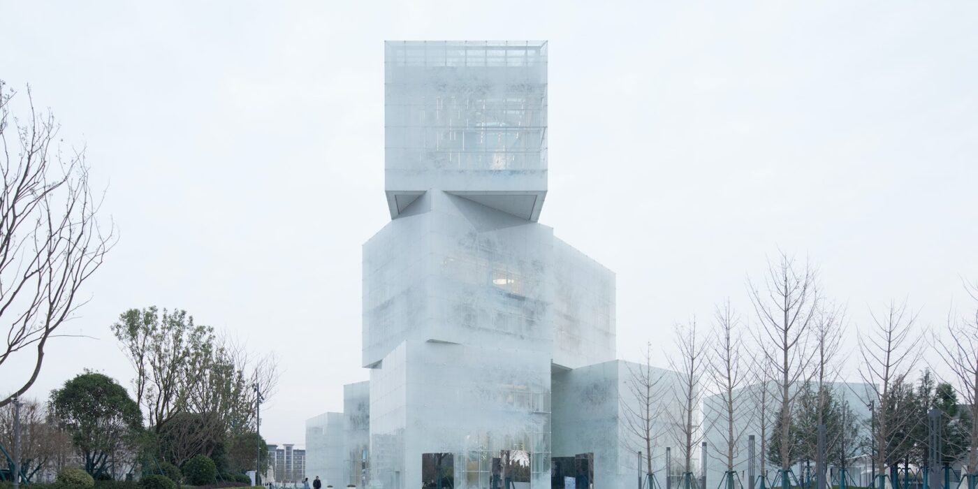
Ice cubes – The question we were asked was that of the spirit of a place. The client imagined a flat building, we proposed a tower: to conquer the sky, mark the territory and put the whole commercial district in tension with the future ski slope on the other side. In this commercial environment, our cultural center says “I am here!“. You can see it everywhere, day and night. The city is conceived from landmarks and vanishing points.

Architizer chatted with Mathieu Forest, Founder of Mathieu Forest Architecte, and Qiang Zou, Design Principal at Zone of Utopia, to learn more about this project.

Architizer: What inspired the initial concept for your design?

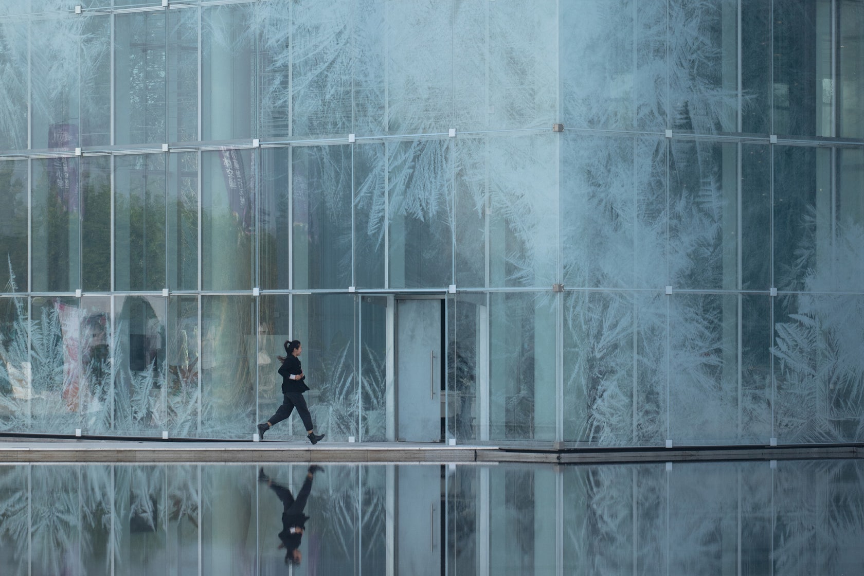
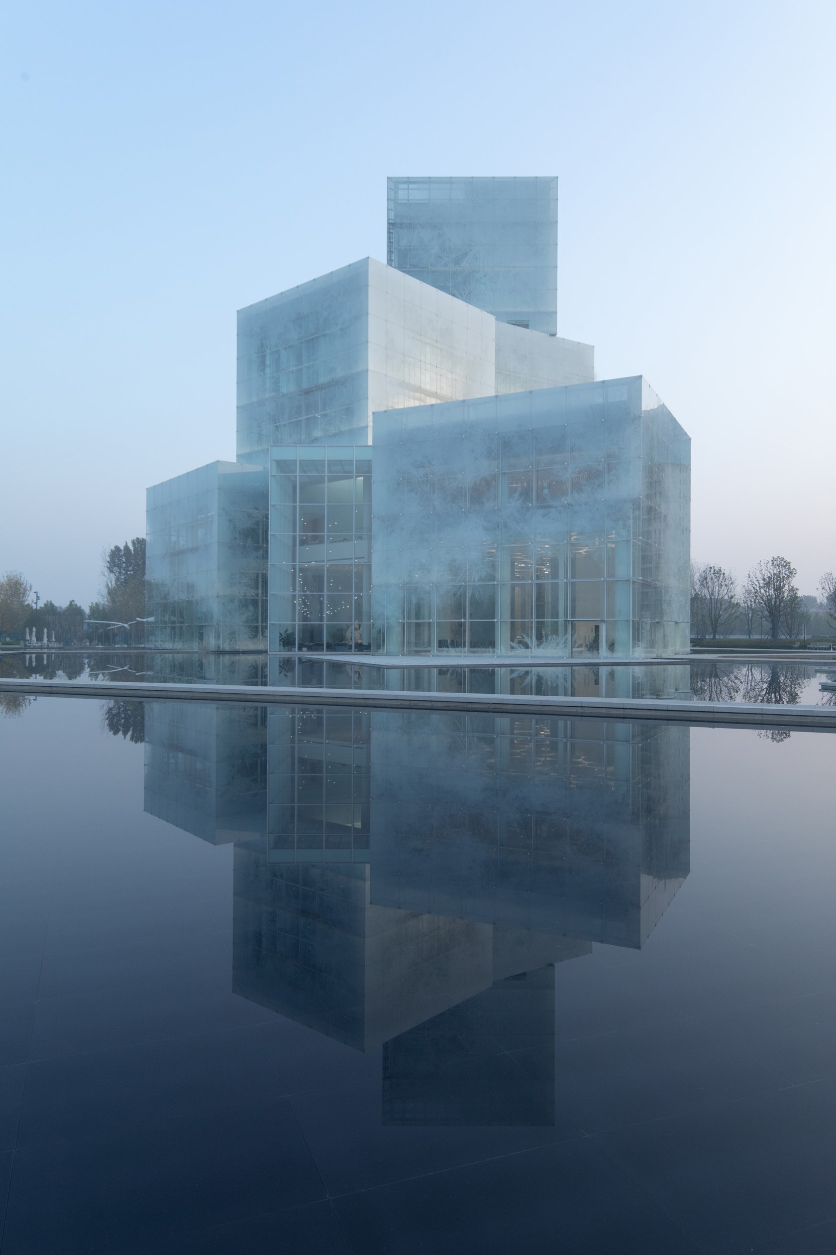
We are starting from a virgin site with only fields and sky as the landscape. We wanted a building that captures the “thickness of the air”, the only tangible context, which by its material and its form is anchored in the sky: the gray and misty skies, the sunbeams which pierce it, the snowy skies, the steely blue skies so characteristic of northern China, the skies overwhelming with light in summer, the golden evening horizons, the bluish mornings… our building continually changes its appearance with the rhythm of the seasons, the variations of the climate and hours, and like a mirror reveals the beauty of a changing sky and landscape. Its facades are a gigantic glass printed fresco according to a unique design, without any repetition. It is also an echo of the representations of landscapes in Chinese painting, whose mystery arises from the immensity and detail.

© Zone of Utopia + Mathieu Forest Architecte

© Zone of Utopia + Mathieu Forest Architecte

© Zone of Utopia + Mathieu Forest Architecte

© Zone of Utopia + Mathieu Forest Architecte

This project won in the 10th Annual A+Awards! What do you believe are the standout components that made your project win?

It is a poetic architecture, for which the technique, as advanced as it is, is at the service of emotion. We think that we must refuse generic, cloned, sanitized, standardized architectures, such as the current world produces too much. We must rediscover the sense of geography and context and never forget that the only goal to be achieved is that of the pleasure of living. As urban art, architecture must address everyone. We are looking for several degrees of mystery: we can see in this architecture the evocation of a mass of ice floating on a lake or that of a lantern and marvel at it, but going deeper, there is a more impressionist vision of capturing the effects of light, with a certain form of abstraction and constant renewal.

© Zone of Utopia + Mathieu Forest Architecte

© Zone of Utopia + Mathieu Forest Architecte

© Zone of Utopia + Mathieu Forest Architecte

© Zone of Utopia + Mathieu Forest Architecte

What was the greatest design challenge you faced during the project, and how did you navigate it?

The greatest challenge was the realization of the facade supposed to evoke a form of immateriality. Many prototypes had to be made to properly adjust the quality and color of the glass, the density and the color of the printed patterns. It was also necessary to work closely with the engineers to design the most absent structures possible. The nicest compliment we often get is that people think when they see the photos that they are perspectives when the building is well constructed!

© Zone of Utopia + Mathieu Forest Architecte

© Zone of Utopia + Mathieu Forest Architecte

© Zone of Utopia + Mathieu Forest Architecte

© Zone of Utopia + Mathieu Forest Architecte

How did the context of your project — environmental, social or cultural — influence your design?

We started from an almost virgin site, the most difficult situation for a contextual architect. There was only a master plan and a bird’s eye view of a future residential area organized along the lake, headed by a tourist area and shops and, as a highlight, a future artificial ski slope to attract future residents and tourists. This district of 10,000 housing units will accommodate approximately 30,000 inhabitants and will be part of the future new town of Pinyuan which will accommodate a total of 500,000 inhabitants.

We took advantage of the incredible dynamism of Chinese industry: in the glass sector in particular. Large samples manufactured in record time allowed us to develop the exact colors and ink densities desired, with exceptional thermal performance.

© Zone of Utopia + Mathieu Forest Architecte

© Zone of Utopia + Mathieu Forest Architecte

© Zone of Utopia + Mathieu Forest Architecte

© Zone of Utopia + Mathieu Forest Architecte

What drove the selection of materials used in the project?

It is a steel and glass building. Steel is adapted to an architecture of lightness and audacity, but also to allow prefabrication and great speed of implementation. We used glass for its advantages while avoiding its disadvantages, taking into account the continental climate, with cold and dry winters and hot and rainy summers. We have designed a waterproof double skin with controlled ventilation: in winter, the double skin is closed and the greenhouse effect makes it possible to avoid almost any heating. In summer, the air cooled by evaporation at the water surface is collected and circulates in the double skin to evacuate heat accumulations and cool the thermal facade and therefore reduce air conditioning needs.

© Zone of Utopia + Mathieu Forest Architecte

© Zone of Utopia + Mathieu Forest Architecte

© Zone of Utopia + Mathieu Forest Architecte

© Zone of Utopia + Mathieu Forest Architecte

What is your favorite detail in the project and why?

We want the structure to disappear so that only the effects remain. The details of the suspended facade were the most sensitive to develop, in the common parts as much as for the details of angles, overhangs and transition between volumes. We worked with our facade engineer on minimalist principles. Each glass of the double skin is only held by 4 pieces of steel of a few centimeters and a simple bead of transparent silicone ensures the seal.

© Zone of Utopia + Mathieu Forest Architecte

© Zone of Utopia + Mathieu Forest Architecte

© Zone of Utopia + Mathieu Forest Architecte

© Zone of Utopia + Mathieu Forest Architecte

How important was sustainability as a design criteria as you worked on this project? 

This question is of course a major one at the present time. This is why we have designed a double-skin façade which considerably reduces energy requirements. In winter, there is no need to heat the building. Dynamic thermal studies have shown that our design saves 50% energy compared to a traditional double-glazed facade. After a few years, the investment in the double glass skin is fully compensated and after 50 years, the gain is considerable.

© Zone of Utopia + Mathieu Forest Architecte

© Zone of Utopia + Mathieu Forest Architecte

© Zone of Utopia + Mathieu Forest Architecte

© Zone of Utopia + Mathieu Forest Architecte

In what ways did you collaborate with others, and were there any team members or skills that were essential in bringing this Award winning project to life?

We collaborated very efficiently, mainly through video conferences. The engineers for the structure and the facade were particularly called upon to be able to build the project and in general, all the actors worked very intensely with the will to be able to achieve this result.

© Zone of Utopia + Mathieu Forest Architecte

© Zone of Utopia + Mathieu Forest Architecte

Were any parts of the project dramatically altered from conception to construction, and if so, why?

Surprisingly, nothing has changed. The process was very fast and the building constructed is very faithful to the sketch.

© Zone of Utopia + Mathieu Forest Architecte

© Zone of Utopia + Mathieu Forest Architecte

How have your clients responded to the finished project?

The client is extremely satisfied with the project and its numerous publications. More generally, all the feedback tells us that the building is very well received by visitors and users.

© Zone of Utopia + Mathieu Forest Architecte

© Zone of Utopia + Mathieu Forest Architecte

What key lesson did you learn in the process of conceiving the project?

Having to go fast does not prevent designing with complexity and accuracy.

© Zone of Utopia + Mathieu Forest Architecte

© Zone of Utopia + Mathieu Forest Architecte

How do you believe this project represents you or your firm as a whole?

It is a contextual project, even if the urban context was almost non-existent. It exactly answers a question asked by a program and a site. In this, it represents our architectural philosophy well.

© Zone of Utopia + Mathieu Forest Architecte

© Zone of Utopia + Mathieu Forest Architecte

How has being the recipient of an A+Award evoked positive responses from others?

It is a great honor for us to receive such a distinction. Especially because we are a young architecture firm and that encourages us enormously to continue our work. This also contributes to our positive image for clients and our partners. It is very important for us.

© Zone of Utopia + Mathieu Forest Architecte

© Zone of Utopia + Mathieu Forest Architecte

How do you imagine this project influencing your work in the future?

We believe that projects always ask new questions for new answers. Each project teaches us, of course, but we will never do the same thing twice.

© Zone of Utopia + Mathieu Forest Architecte

© Zone of Utopia + Mathieu Forest Architecte

Is there anything else important you’d like to share about this project?

The project was designed and carried out during the COVID, in a very short time. There were 20 months between sketch and delivery. Challenge increased by the pandemic which banned travel and stopped the construction site for 4 months. We had to invent, like others, new methods. We worked and checked the site from photos and videos. We had daily video meetings. Paradoxically, the COVID has reinforced the good coordination between all.

For more on Ice cubes, please visit the in-depth project page on Architizer.

Ice cubes Gallery
Reference

Revitalizing a Contaminated Site: The Ford Calumet Environmental Center
CategoriesArchitecture

Revitalizing a Contaminated Site: The Ford Calumet Environmental Center


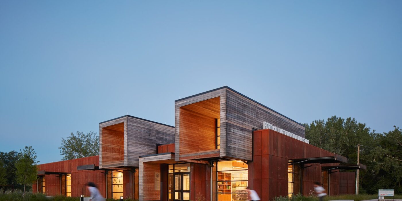
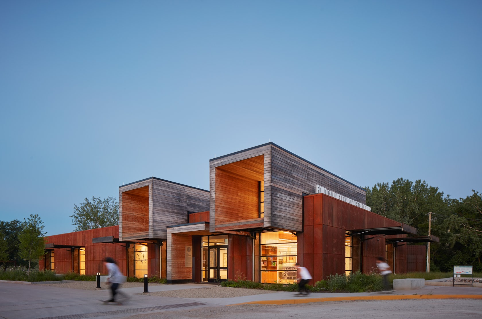
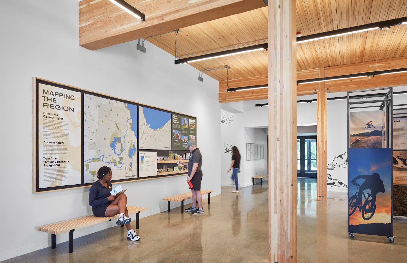
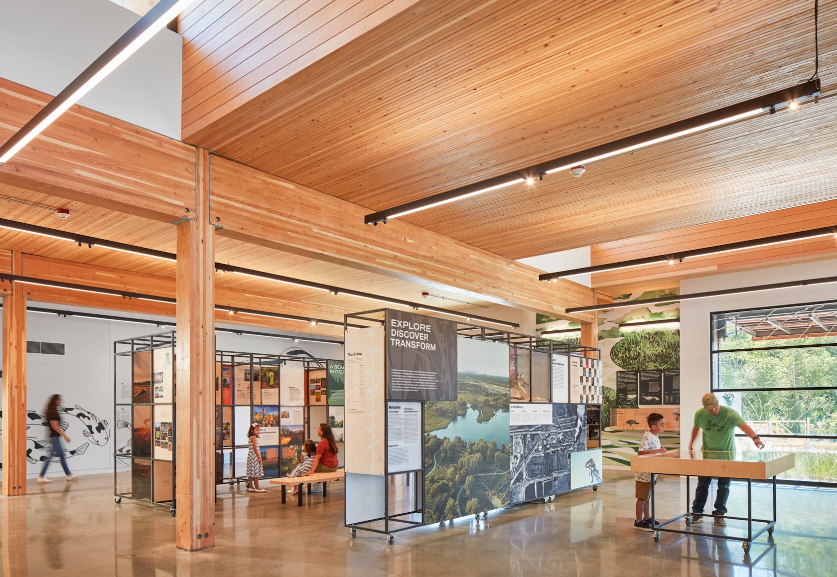
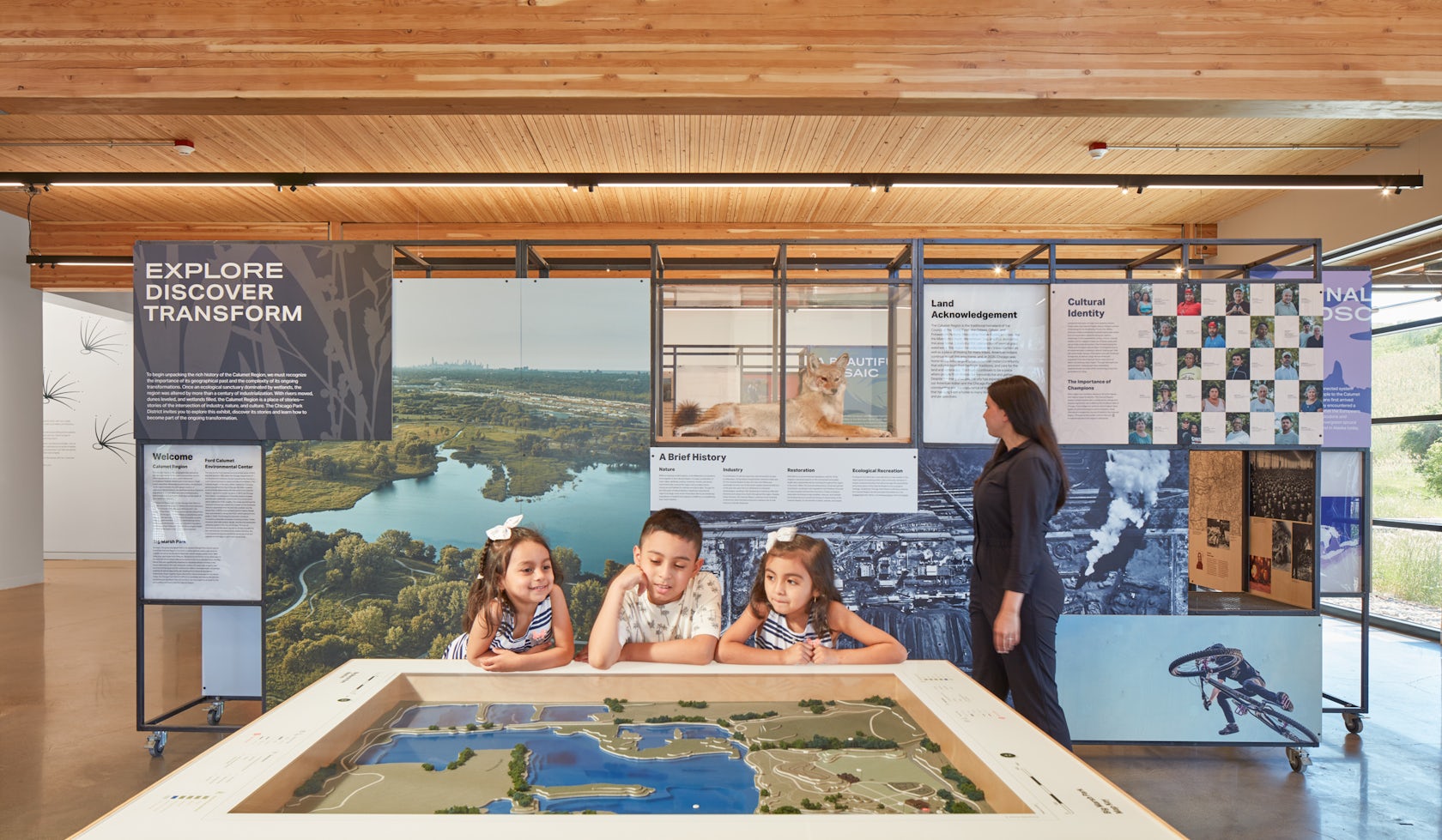
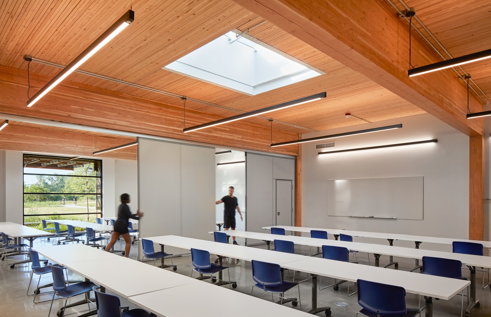
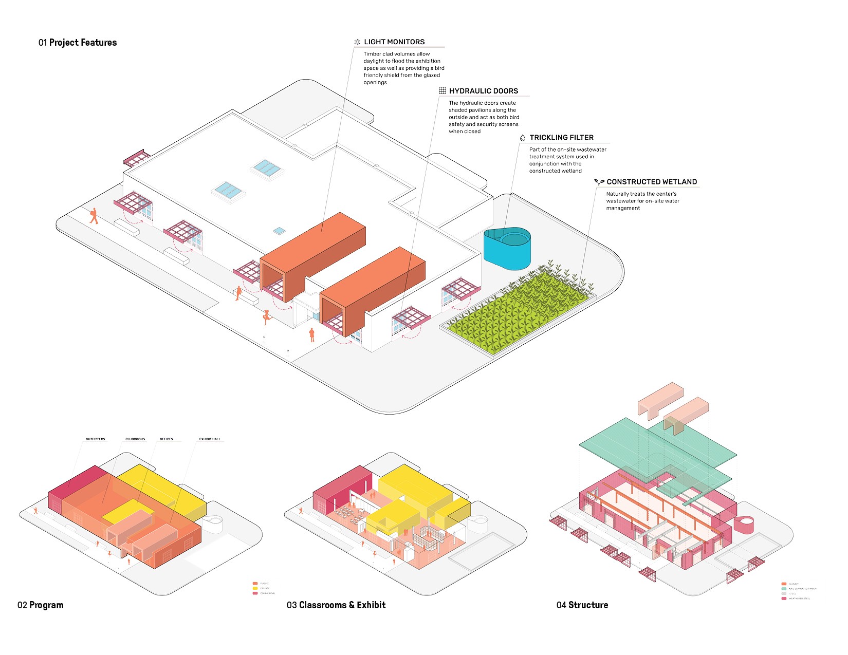
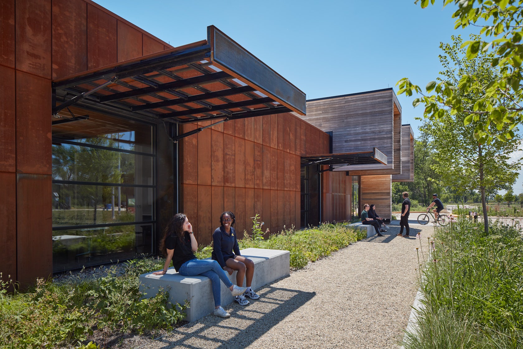
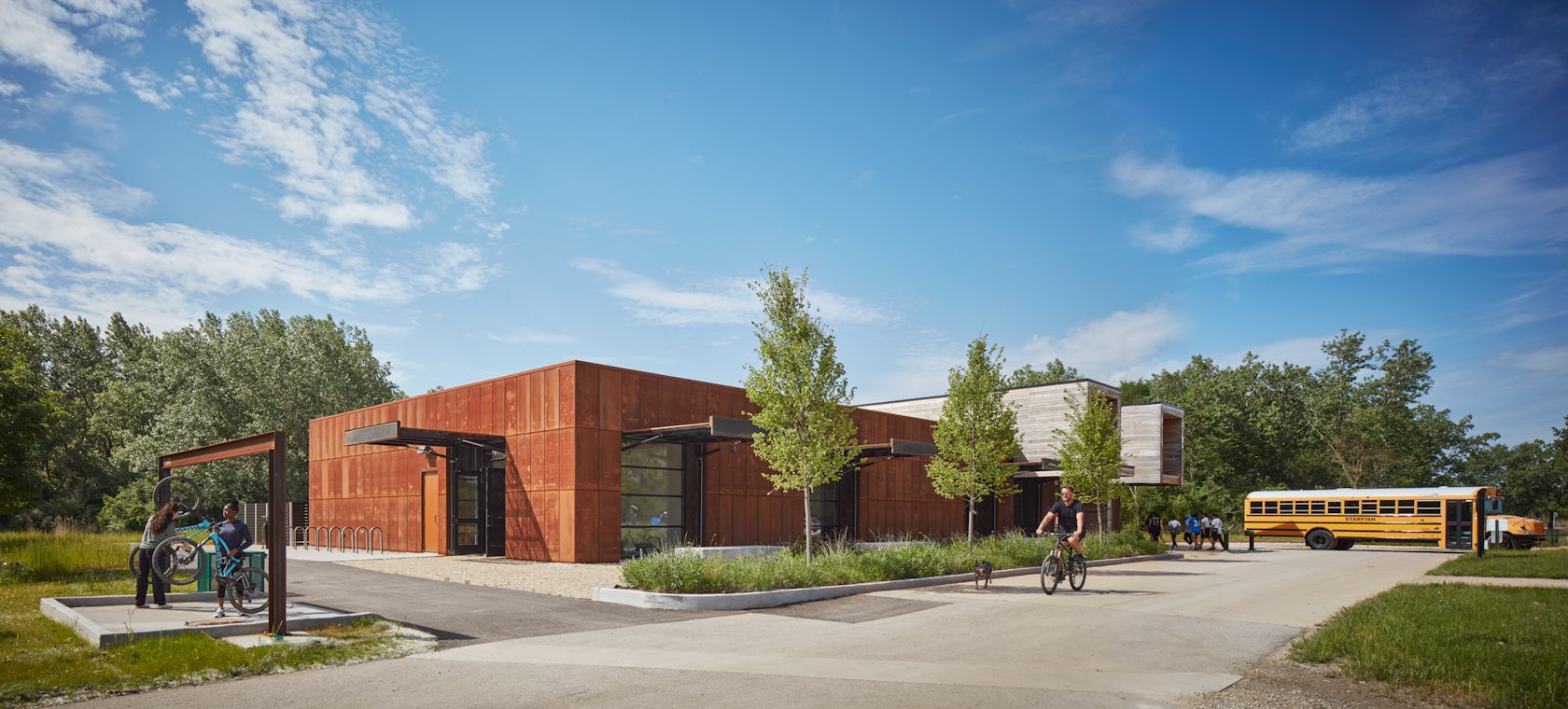
Ford Calumet Environmental Center – Once a dumping ground from nearby steel mills, Big Marsh park opened in 2016 on the southeast side of Chicago. The Chicago Park District asked Valerio Dewalt Train to design an environmental center that serves as an education hub and a gateway to eco-recreation opportunities throughout the region. The design responded to the park’s past by marrying the industrial with the natural. The exterior is clad in a rain screen of weathered steel that recalls the site’s steel mill history, with an exposed mass timber interior. Two large rooftop light monitors, clad in exposed Nail-Laminated-Timber, flood a double-height exhibition area with daylight.

Architizer chatted with Tom Daly, Project Manager and Joe Valerio, Design Principal at Valerio Dewalt Train, to learn more about this project.

© Tom Harris Photography

© Tom Harris Photography

© Tom Harris Photography

© Tom Harris Photography

Architizer: What inspired the initial concept for your design?

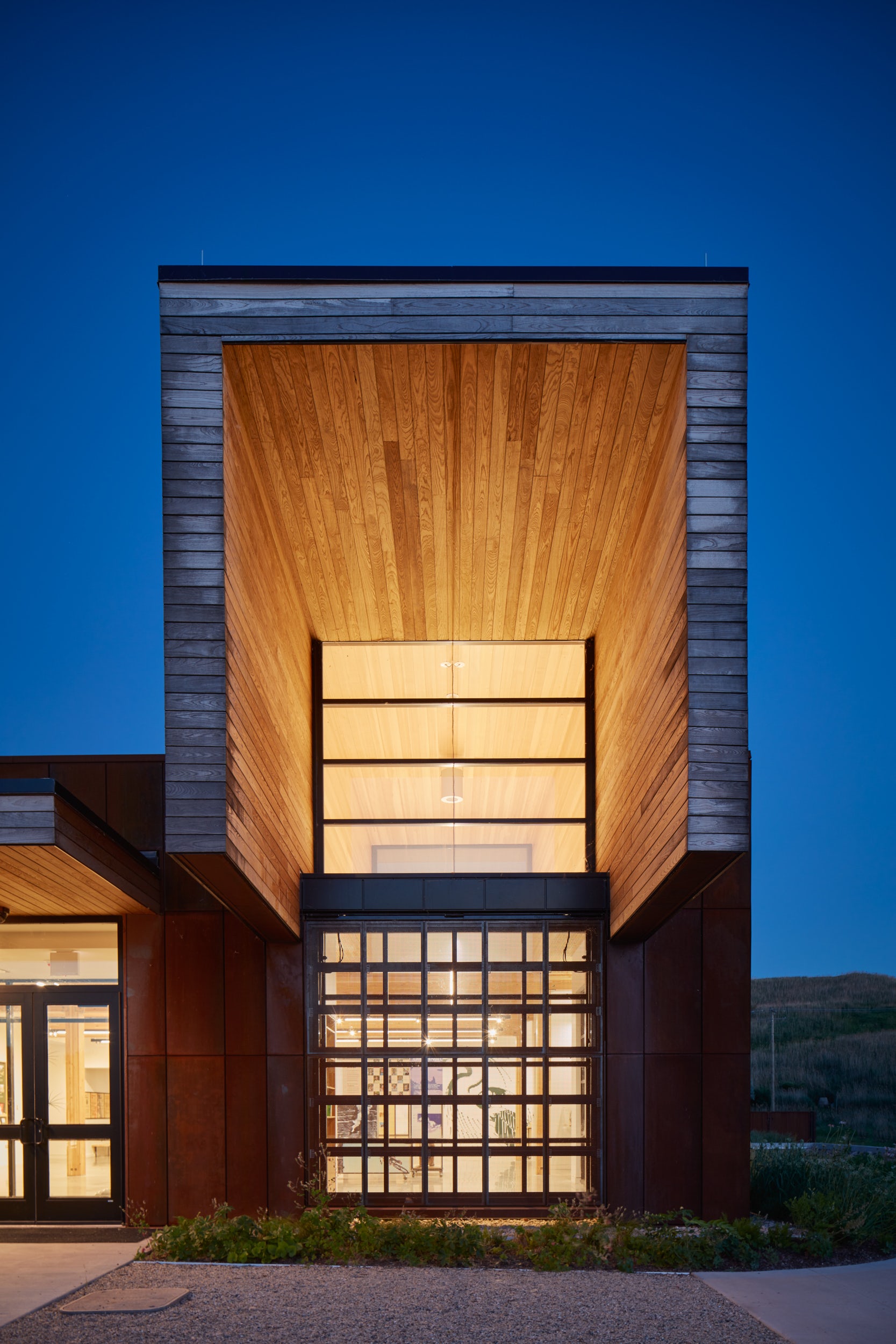
Tom Daly: Historically, Chicago’s Southeast Side has been burdened with the effects of industrialization and left with remnants of steel production in the region of the city. The building’s materiality serves as a metaphor to the site’s industrial past and forward-thinking future: the corten steel that wraps around the building is an acknowledgement of that past, while the two wooden forms cantilever dramatically to both mark the entry and frame a view of the interior, while from the inside they focus your attention on small but significant vignettes of the restored natural landscape. They deliver a message about an environmentally responsive and conscious future.

© Tom Harris Photography

© Tom Harris Photography

This project won in the 10th Annual A+Awards! What do you believe are the standout components that made your project win?

The design serves as an example for a progressive future of building in the City of Chicago, a city known for design innovation. The center was the first wastewater wetland system in the city, and the first mass timber building for the Chicago Park District. The building also actively improves living conditions for its surrounding inhabitants. Its highly bird-safe design rates a 4 out of a 100 level scale, with 0 being the highest, and provides a resource for the surrounding communities who have suffered from a lack of investment and park services for decades. It’s sculptural form and rich materiality serve as a gateway to the park at large.

© Tom Harris Photography

© Tom Harris Photography

What was the greatest design challenge you faced during the project, and how did you navigate it?

The overall project budget was $6.6M, and was made possible by a major contribution from the Ford Motor Company. The Design Team was immediately challenged when it was discovered that the nearest sanitary sewer line was 1.6 miles from the site. The cost of bringing a sanitary sewer to the site was $2.0M – threatening the viability of the entire development. Working with our civil and plumbing engineers, we developed a design for an on-site black water treatment system where the outflow was clean water. The Ford Calumet Environmental Center is the first time a wastewater wetland system has been permitted by the City of Chicago.

© Tom Harris Photography

© Tom Harris Photography

How did the context of your project — environmental, social or cultural — influence your design?

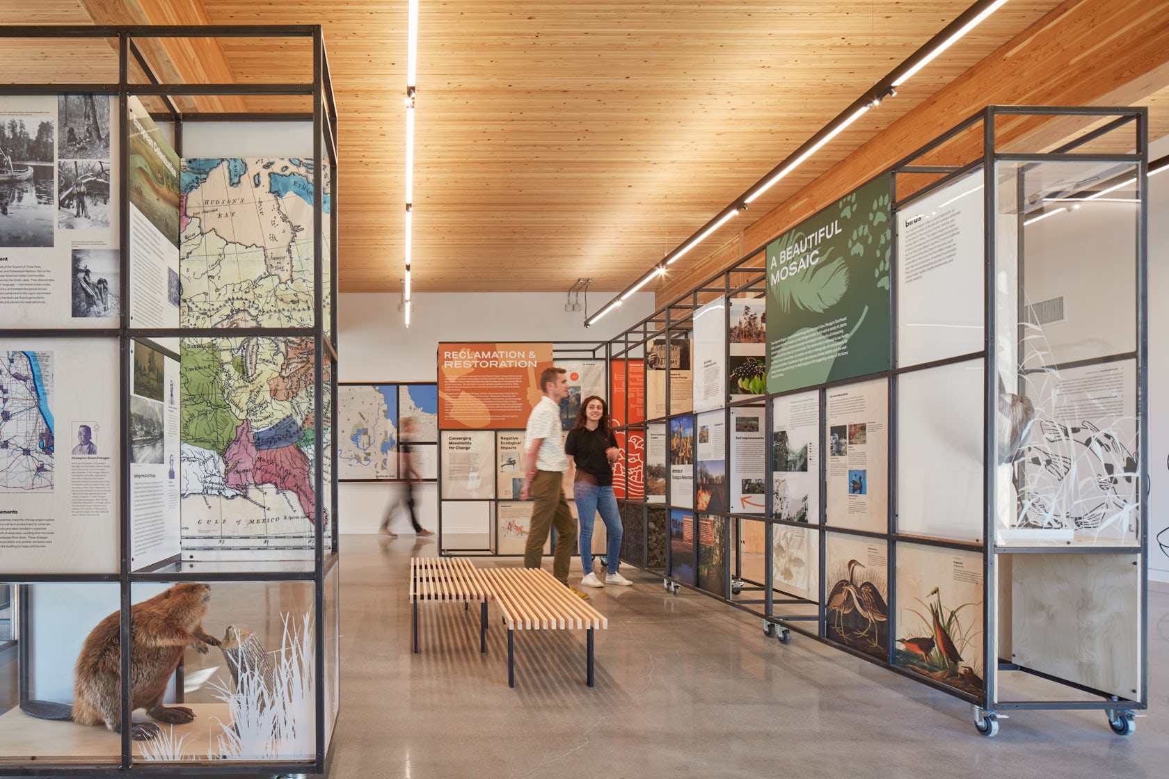
The project’s environmental, social and cultural context are intertwined. Historically, Chicago’s Southeast Side has been financially underserved and burdened with the effects of industrialization. The Ford Calumet Environmental Center is a bold statement of how we can re-inhabit landscapes destroyed by 20th Century technology. A major focus were local residents of the four surrounding neighborhoods including South Deering, Pullman, Trumbull Hill and Hegewisch. Our Media-Objectives Studio reached out to community leaders and developed an award winning exhibit which focuses on their past and optimistic future. Through environmental education and eco-recreation, the center serves as a community resource and cultivates advocacy for positive change across the Calumet Region.

© Tom Harris Photography

© Tom Harris Photography

What drove the selection of materials used in the project?

The building’s materials reinforce its mission. The 20th Century industries that so damaged this region were major sources of carbon released in the atmosphere. The weathered steel cladding is recycled – which has a low level of embodied carbon compared to other building materials. The decision with the most impact is the use of a mass timber structure. The embodied carbon is lower than almost any other material, in addition the timber sequesters carbon leading the way to an environmentally-responsive future.

© Tom Harris Photography

© Tom Harris Photography

What is your favorite detail in the project and why?

Early in the design process our focus was on creating an open and welcoming architecture with a daylit interior. Big Marsh Park is also on one of the major migratory routes for birds, drawing attention from an important constituency for the Park – bird watchers.

The two wooden forms that cantilever over the corten facade, bring daylight from above into the exhibit space. The eight foot cantilever results in eliminating the reflection of the sky in the large clerestory windows, bird safe glass is also used for these window. There are six large windows around the perimeter that bring daylight into all the interior rooms. Each is equipped with large doors, covered in perforated corten steel. In the open position, the doors shade the glass reducing the reflection of the sky. During the migratory season, the doors are kept closed, with the perforated metal still providing adequate light

© Tom Harris Photography

© Tom Harris Photography

How important was sustainability as a design criteria as you worked on this project? 

Sustainability was a driving factor in the design and overall project mission. Sustainable features like the wastewater wetland system are put on display, demonstrating how it takes inspiration from the marshes’ natural processes to treat the building’s blackwater and release clean water back to the site via a leach field. Renewable resources in the project include Nail Laminated Timber, giving the building warmth and a lower carbon footprint. An eco-friendly alternative to aluminum, weathered steel has a lower carbon footprint as well, reducing the building’s overall embodied carbon while providing a durable layer of protection with a beautiful orange patina.

© Tom Harris Photography

© Tom Harris Photography

In what ways did you collaborate with others, and were there any team members or skills that were essential in bringing this Award winning project to life?

Collaboration was critical to the success of the FCEC. It began with the Chicago Park District who were willing to explore new solutions to old problems. In addition, from the beginning one of the Districts goals was to engage the adjacent minority communities.

Designing and permitting the wasteland wastewater system involved many members of the design team, the Park District, and the Chicago Building Department.

Finally, our Media-Objectives Studio brought leaders and residents of the surrounding neighborhoods into the design of the exhibit which includes the history of these communities including photographs of some of the residents including their own words about the past and future of the region.

© Tom Harris Photography

© Tom Harris Photography

Were any parts of the project dramatically altered from conception to construction, and if so, why?

There were a number of changes, but nothing that represented a dramatic change.

How have your clients responded to the finished project?

The FCEC is one of the most widely recognized buildings completed by the Chicago Park District. Among the awards and publications the most significant is first place in the yearly Driehaus Foundation Award for Architectural Excellence in Community Design was established to recognize the importance of great architecture and craftsmanship to city life.

How do you believe this project represents you or your firm as a whole?

Good design is always the answer.

Team Members

Steffan Schoenauer – Project Manager (Chicago Park District); Joe Valerio – Design Principal Mark Dewalt – Principal-in-Charge, Tom Daly, Alexander Raynor – Project Manager, Lauren Shelton, Matt Gamache, Michael Johnson, Susan Crockett, Nina Cackovic, Haydyn Jones, (Valerio Dewalt Train); Joe Lawton – Principal, Allison Rokusek, Jacob Goble, Rafael Barontoni, Stephen Killion – Graphic Designers (Media–Objectives)

Consultants

Chicago Commercial Construction – General Contractor; Primera – Civil Engineer; Jacobs Ryan Associates – Landscape Architecture; Matrix Engineering – Structural Engineering; dbHMS – MEP Engineering; Tom Harris – Photography; TetraTech – Environmental Consultants; BioHabitats – Green Infrastructure

Products and Materials

ReSawn Timber Co; Axis Lighting; Dri Design; Arborwood; Shaw; Crossville; Steelcase;

For more on Ford Calumet Environmental Center, please visit the in-depth project page on Architizer.

Ford Calumet Environmental Center Gallery
Reference

The Relic Shelter | Fuzhou Teahouse // Neri & Hu
CategoriesSustainable News

The Relic Shelter | Fuzhou Teahouse // Neri & Hu

Text description provided by the architects.

The project draws inspiration from imagery uniquely associated with Fuzhou: the Jinshan Temple. This is a rare example of a temple structure built in the middle of a river in China. John Thomson was one of the first photographers ever to travel to the country and provided Western audiences with some of the first glimpses into the Far East.

© Neri & Hu

© Neri & Hu

In the album Foochow and the River Min, which documented his legendary journey up the Min River, Thomson captured the ancient structure in its original state resting serenely above a floating rock in 1871. This would become a lasting image unmistakably identified with the city of Fuzhou.
Conceived as an urban artefact and drawing from the historical roots of the city of Fuzhou, the Relic Shelter internalizes a piece of distinct heritage at a time when rapid new development has eroded traditional culture and identity.

© Neri & Hu

© Neri & Hu

The client’s brief posed the unique challenge of creating an enclosure for a Chinese artefact – the wooden structure of a high-ranking Qing dynasty official’s residence, replete with ornamental carvings and intricate joinery. Relocated from Anhui to its new home in Fuzhou, the Hui-style structure is enshrined as the inhabitable centrepiece of a new teahouse.
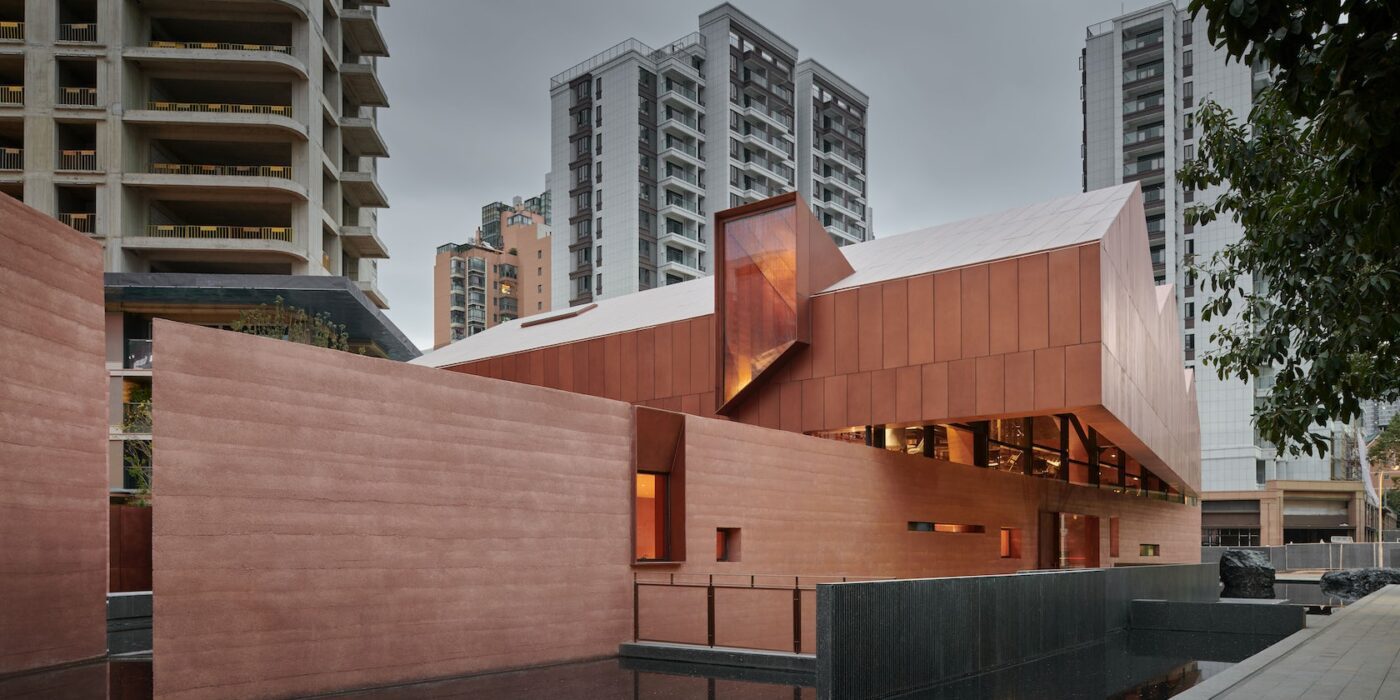
Envisioned as a house atop a rock, the teahouse is elevated above a rammed concrete base, while its sweeping copper roof echoes the roofline of the enclosed architectural relic.

© Neri & Hu

© Neri & Hu

Its core material, rammed concrete, is a modern homage to the traditional earthen dwellings of the region, emphasizing a raw monumentality. Visitors are presented with two images of the building upon approach: the upright silhouette of the form, and its mirrored reflection duplicated in the surrounding pool of water.
A series of contrasts plays out among elements that are bright and dark, light and heavy, coarse and refined, as visitors enter the grand hall where the structure of the ancient residence is situated.

© Neri & Hu

© Neri & Hu

Sky wells penetrate the roof, bringing natural light into the depths of the enclosure and illuminating the priceless artefact on display. Only upon reaching the mezzanine does the structural configuration of the building begin to reveal itself. The hovering metal roof is lifted 50 cm off the solid base by copper-clad trusses to introduce a sliver of continuous illumination around its periphery.

© Neri & Hu

© Neri & Hu

Wrapping itself around the historical wooden structure, the mezzanine space allows visitors to appreciate intricate carpentry details at eye level.
The basement level includes a secondary arrival lobby housing a rotunda, a sunken courtyard and tasting rooms. At the top of the rotunda, a carved oculus capped by glass is submerged beneath the pool in the courtyard above.

© Neri & Hu

© Neri & Hu

It filters the sun through a thin film of water, creating a mesmerizing play of reflections..

© Neri & Hu

© Neri & Hu

The Relic Shelter | Fuzhou Teahouse Gallery
Reference