Dorothée Meilichzon blends nautical and art deco inside Biarritz hotel
CategoriesInterior Design

Dorothée Meilichzon blends nautical and art deco inside Biarritz hotel

French interior designer Dorothée Meilichzon has renovated a Belle Epoque-era hotel in Biarritz, France, blending maritime and art deco motifs to add contemporary flair to the historic building.

The Regina Experimental sits on a clifftop overlooking the Bay of Biscay in the French seaside city, which was once a royal getaway and is now a popular surfing destination.
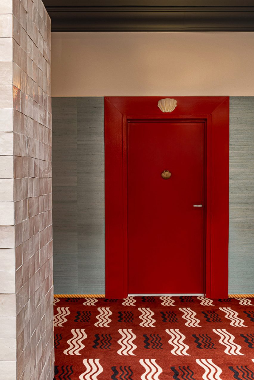
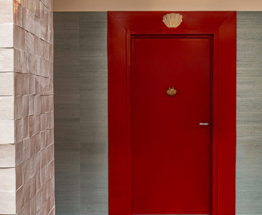
Corridor at Regina Experimental hotel
Nautical designs decorate the corridors

Constructed in 1907 by architect and landscape designer Henry Martinet, the grand building features a 15-metre-high atrium, large bay windows, a glass roof, and hints of art deco throughout.

The majority of its spaces were well preserved, so Meilichzon‘s input involved modernising the furnishings and decor – adding colour and pattern to enliven the spaces while playing on the hotel’s coastal location.
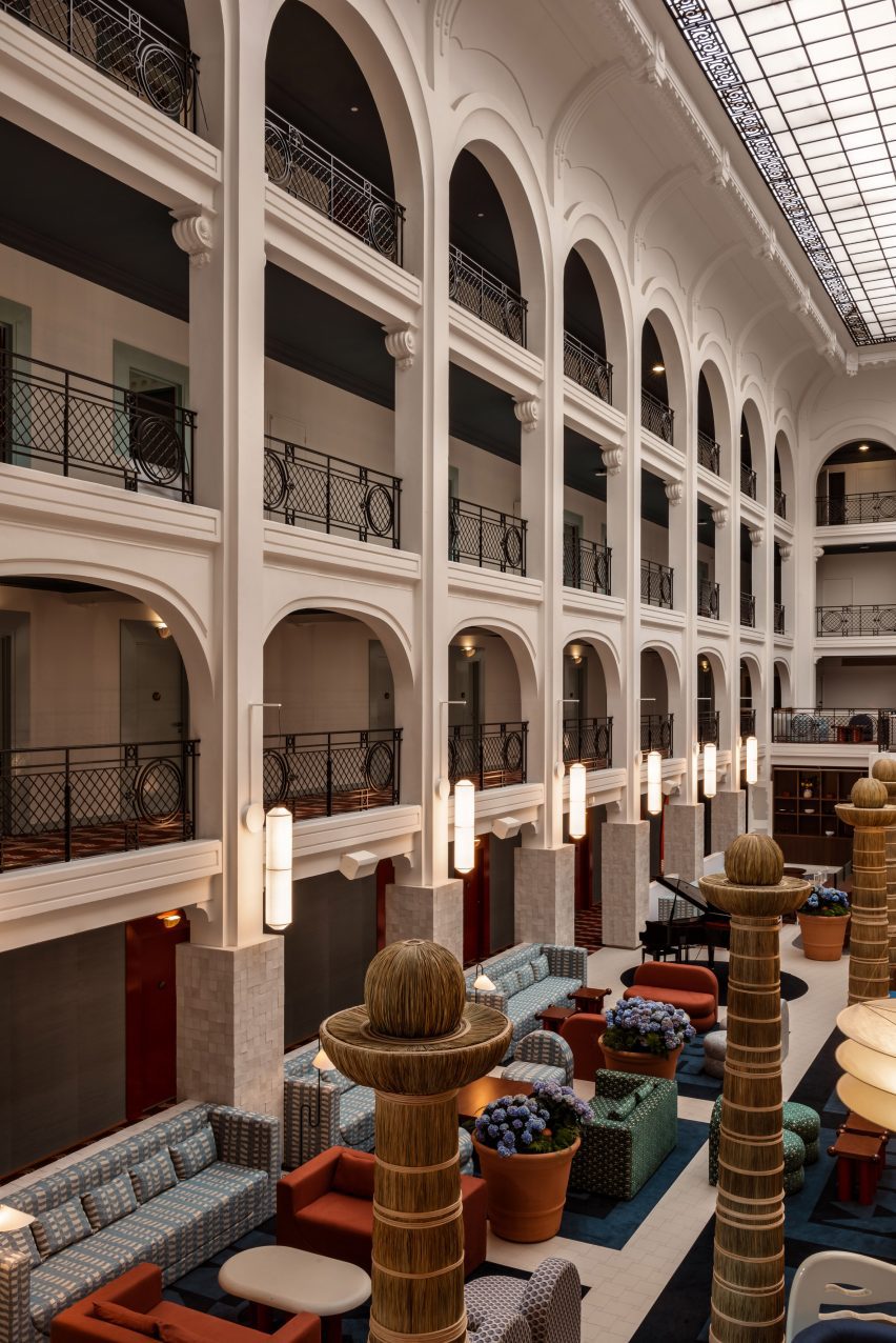
Atrium of Regina Experimental hotel
Totemic sculptures were used in the hotel’s atrium

In the light-filled atrium, dark red and green sofas were arranged to create intimate seating areas within the expansive room.

Totemic wicker sculptures form a line down the centre of the room, and cylindrical paper lanterns by designers Ingo Maurer and Anthony Dickens hang from the columns on either side.
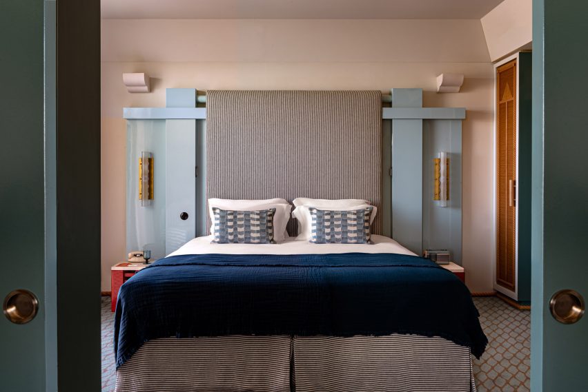
Bedroom with art deco influenced headboard
Guest rooms feature geometric, art deco-influenced headboards and striped upholstery

Guests in this space are served cocktails from a bar top shaped like an ocean liner, designed as an homage to modernist architect Eileen Gray, while listening to live piano music.

While the bar top nods to Gray’s designs, the sofas in the room play on the shapes of the Itsasoan footbridge in nearby Guétary.
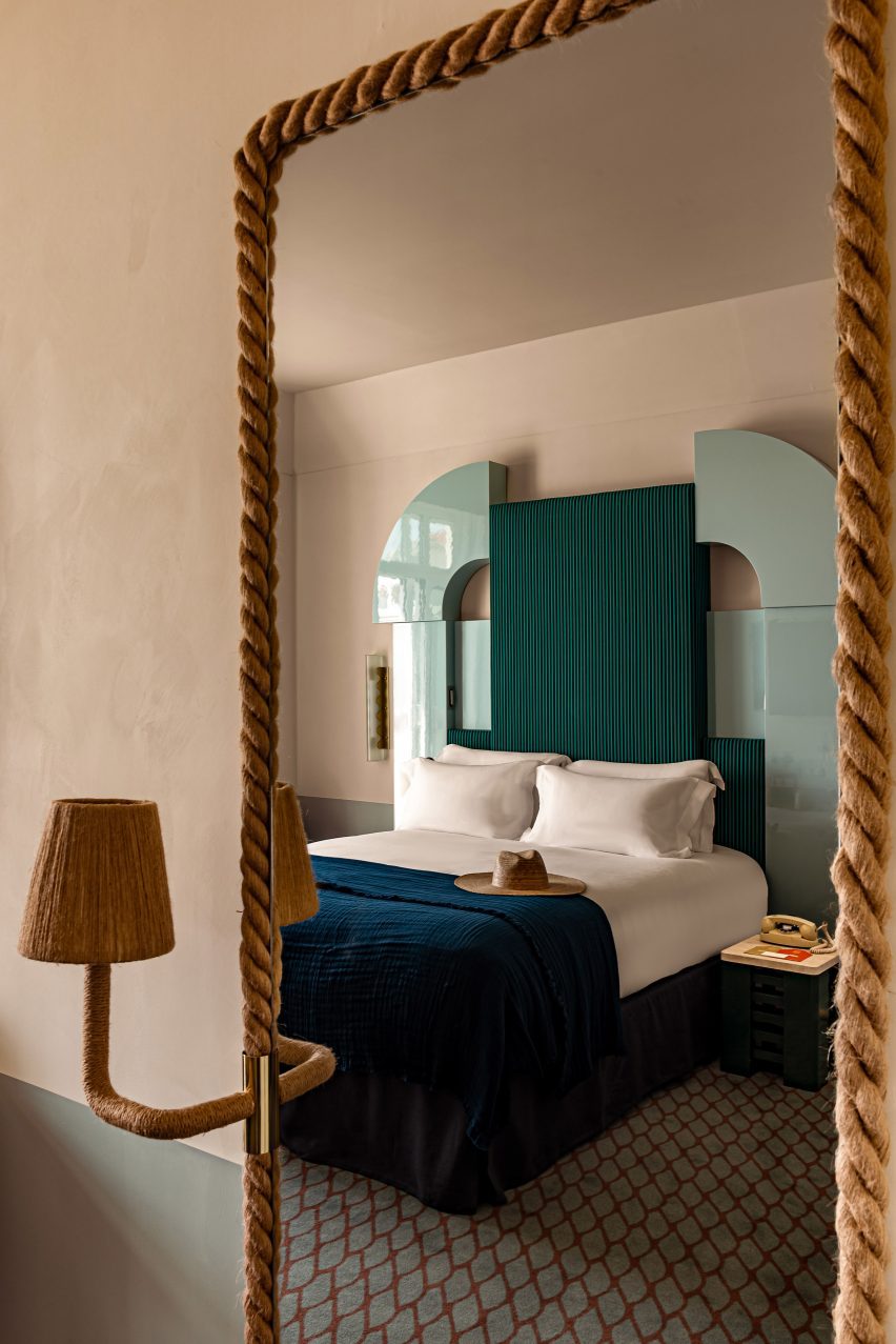
Reflection of a bed in a rope-wrapped mirror
Mirrors wrapped in rope continue the maritime theme in the rooms

Carpet patterns vary between the different areas of the hotel – in the corridors, they carry a nautical motif, while the markings are reminiscent of fish scales in the guest rooms.

The hotel’s restaurant, Frenchie, offers Basque-inspired cuisine within a bright room that features more nautical references, such as rope-hung shelves and shell-shaped sconces.
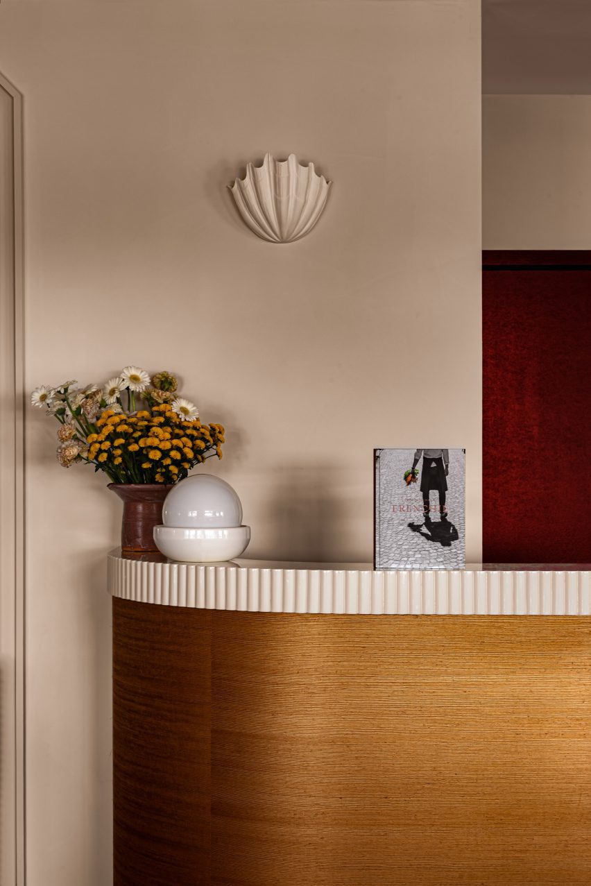
Dining room of Regina Experimental
Shell-shaped sconces decorate the dining room

Highly patterned tiled floors and furniture contrast the restaurant’s neutral plaster walls and ceiling, which are punctuated by arched niches and curved plywood panels.

The dining area spills onto an outdoor terrace, populated by red cafe tables and chairs lined up against pale blue banquettes, around the corner from a swimming pool.

The hotel’s 72 guest rooms are accessible from corridors that wrap around the atrium, and face either the ocean or the Golf de Biarritz Le Phare golf course.

Shades of blue and green dominate the art deco-influenced bedrooms, which feature glossy geometric headboards and marine-striped upholstery.
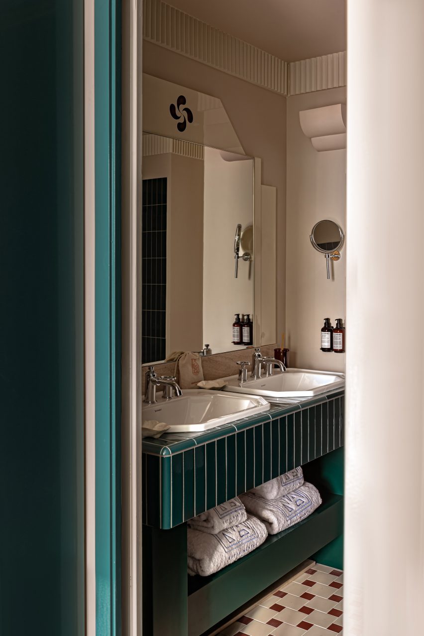
Bathroom with teal-coloured tiles
A cool palette of greens and blues is used in the bathrooms

Small lamps extend from rope frames that wrap around the mirrors, and red accents on smaller furniture pieces pop against the cooler hues.

“Bedrooms are awash with Japanese straw and rope combined with marine stripes and plaster frescoes with aquatic motifs,” said the hotel. “Evocative of an ocean liner, each bedroom incorporates curved forms and long horizontal lines.”
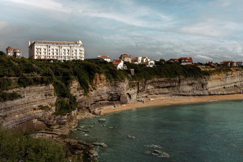
Hotel perched on a cliff overlooking the sea
Built in 1907, the hotel overlooks the Bay of Biscay from a clifftop

Meilichzon, founder of Paris-based design agency Chzon, is a frequent collaborator of the Experimental Group, and has designed the interiors for several of its properties.

Earlier this year, she gave a bohemian refresh to Ibiza’s first hotel, now called the Montesol Experimental, and previously completed the Hotel Il Palazzo Experimental in Venice.

The photography is by Mr Tripper.

Reference

Sheft Farrace designs loft in LA’s art deco Eastern Columbia building
CategoriesInterior Design

Sheft Farrace designs loft in LA’s art deco Eastern Columbia building

Architecture studio Sheft Farrace has renovated a loft apartment in Los Angeles’ iconic Eastern Columbia building, subtly incorporating colours from the art deco exterior into the minimalist interiors.

The studio renovated the loft while drawing details from the exterior of the 13-storey building in Downtown Los Angeles, known for its highly detailed turquoise facade and clock tower, which was designed by Claud Beelman and completed in 1930.

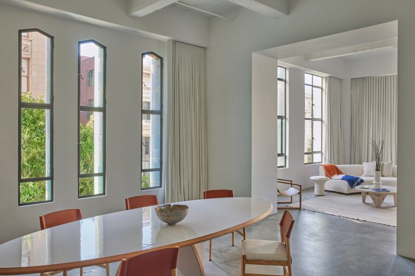
Dining room and living room
Sheft Farrace chose to divide up the loft, yet retain visual connections through framed openings

It was converted into lofts in 2006, and local studio Sheft Farrace was recently tasked with renovating one of the condos for a young creative from Kazakhstan.

“Uninspired by the unit’s original 2006 layout and interiors, the owner wanted it to feel like a brand new space — so Sheft Farrace approached it as a blank canvas,” said the studio, led by Alex Sheft and John Farrace.

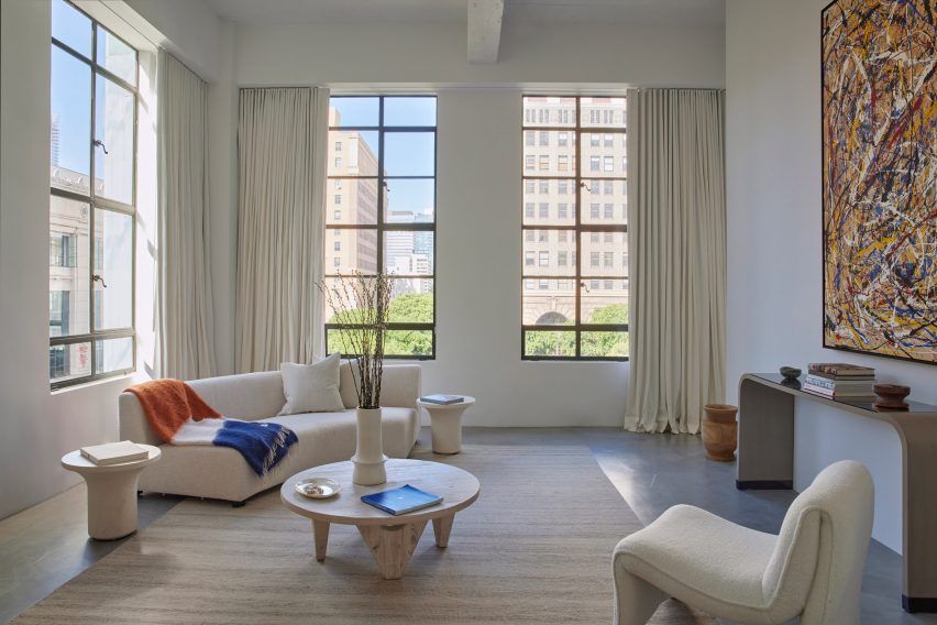
Living room
The pared-down decor contrasts the building’s colourful exterior

The apartment has tall ceilings, and their height is accentuated by the building’s long narrow windows and floor-to-ceiling drapery.

Rather than keep the open floor plan, the studio chose to divide up the space to help define areas for different functions.

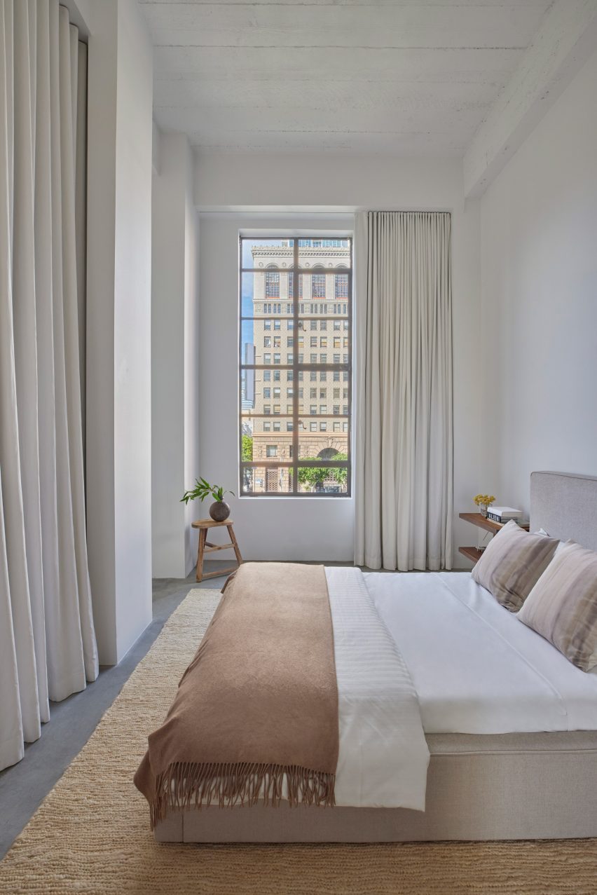
Bedroom with tall ceiling and drapery
The ceiling height is accentuated by tall windows and floor-to-ceiling drapery

However, the visual connections between the kitchen and dining room, and the living room and bedroom, are retained by large framed openings used in place of doors.

“Every space has its own character, based on what time of day it is and how the natural light comes in through the full-height windows,” said Sheft Farrace.

For the most part, the home is decorated in a much more pared-down style than the building’s opulent exterior, primarily with soft neutral hues and sparse furnishings.

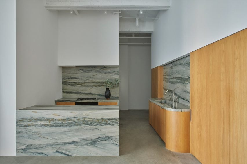
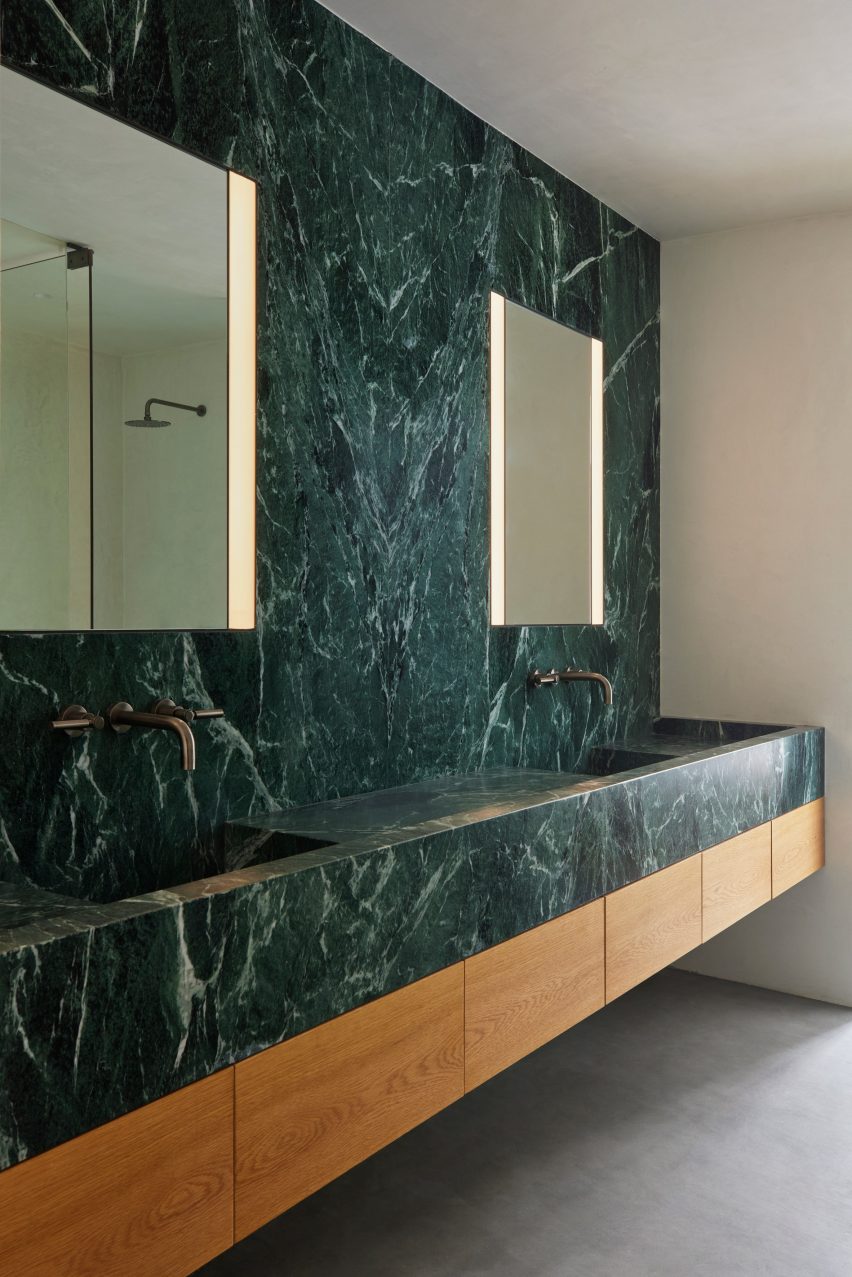
Certain material choices in the kitchen and bathroom tie much more closely to the colourful facades, including white oak, Verde Aver marble, and Florida Brush quartzite to echo the orange, green and blue exterior tiles.

Kitchen with white oak and Florida Brush quartzite
Materials like white oak and Florida Brush quartzite in the kitchen nod to the art deco exterior

The curved corners of the kitchen counters and elongated cabinet hardware also evoke 1930s design.

“Upon first glance, it’s stylistically in stark contrast with the historical building that it’s within, but throughout the space are subtle nods to the art deco exterior and ultimately, it feels like it belongs,” Sheft Farrace said. “We felt honored to have contributed a small chapter to the long and storied history of a Los Angeles landmark.”

Bathroom lined with Verde Aver marble
In the bathroom, Verde Aver marble was also chosen to reference the historic tiled facades

Downtown Los Angeles has dramatically transformed from a no-go zone to a popular and thriving neighbourhood over the past 20 years.

This shift is partially thanks to the opening of cultural institutions like Frank Gehry’s Walt Disney Concert Hall and Diller Scofidio + Renfro’s The Broad museum, as well as a spate of high-end hotels.

The photography is by Yoshihiro Makino.

Reference

8 Contemporary Ways to Resurrect Art Deco Glamor
CategoriesArchitecture

8 Contemporary Ways to Resurrect Art Deco Glamor

Browse the Architizer Jobs Board and apply for architecture and design positions at some of the world’s best firms. Click here to sign up for our Jobs Newsletter.

Art Deco, which is short for Arts Décoratifs, emerged as a design style in France just before World War I and predated the more minimal and functional Mid Century design. Characterized by bold sleek forms, geometric patterns, reflective finishes, metallic and inlaid wood embellishments as well as luxurious materials, the aesthetic later gained popularity in the 1920s and 1930s, where it was showcased across architecture, interiors, fashion, automobiles and more.

The style married high-quality opulence and dramatic simplicity while also paying homage to technological advancements and mass manufacturing. In addition to Cubism and Viennese Succession, Art Deco also draws inspiration from cultures across India, China, Egypt and Mesopotamia. For many in North America, it is epitomized by icons like the Chrysler and Empire State buildings, completed when America was on the brink of the Great Depression. When America emerged from the crisis, the world had changed and so had aesthetic preferences. Today, we’re exploring how 21st century architects and designers are reviving Art Deco sensibilities and adapting them for the contemporary era.

San George by Framework Studio, Amsterdam, Netherlands

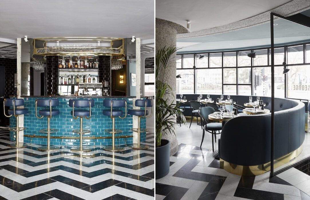
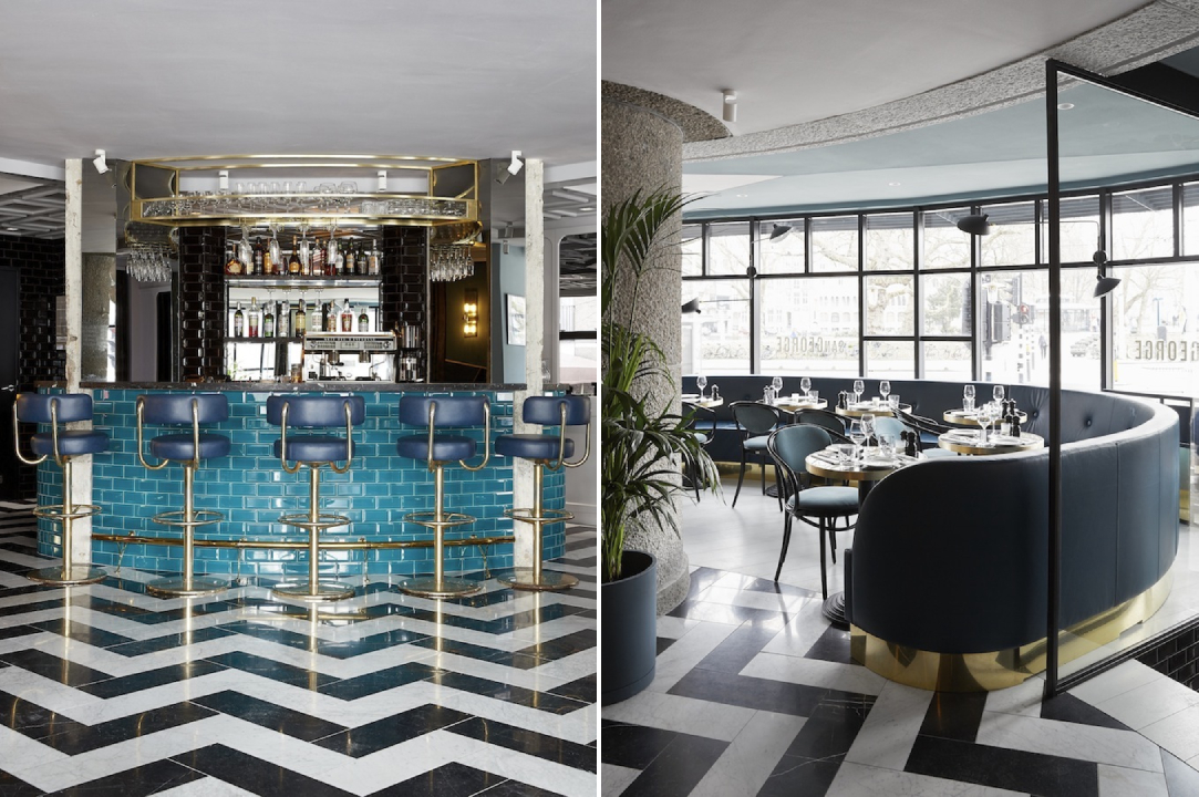
Chevrons and starbursts were some of the most defining elements of the Art Deco style. These patterns can be used in walls, furniture and even floors. Statement zig-zag floors in a high-gloss black and white pattern create a neutral base to place colorful furniture while also adding a stylistic layer to the design. In the San George restaurant, the bold floors come together with bright turquoise and rich emerald tones to create a retro aesthetic without it being too overwhelming.

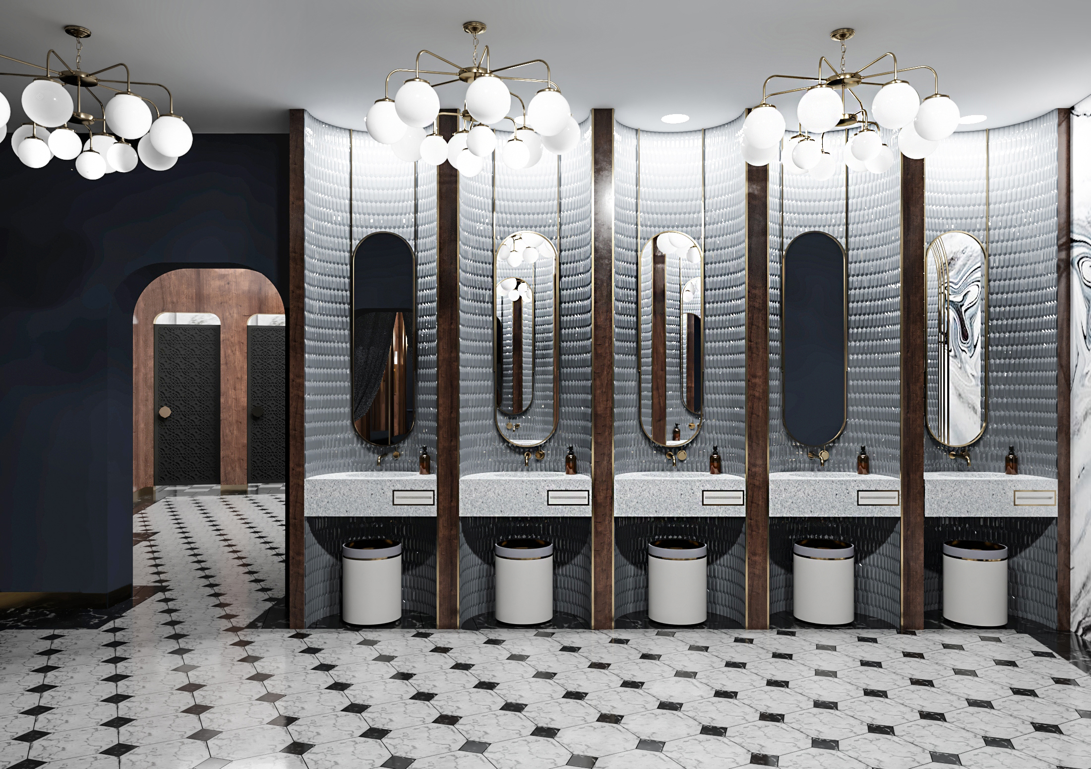
Restroom in Art Deco Style by Futuris Architects, Yerevan, Armenia

Gold is an easy way to bring in the glamour of the roaring 20s. Instead of large metallic furniture pieces, the color can be introduced in a subtle way by using it in the edges or outlines of décor and furniture pieces, molding, lighting or handles. In this restroom, the studio added oblong mirrors with gilded frames and then reinforced this design language with gold-finished lights and matching accessories. The dark tones of the walls and furniture also help the metal stand out more.

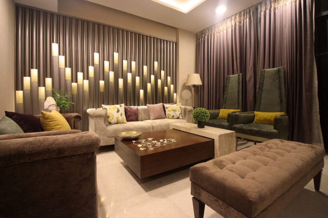
Jazz Billet by Envisage, Gurugram, India

Starburst, solar forms, and stepped patterns are other characteristic elements from this era. These geometric forms were often used in wallpapers, moldings, mirrors and even building exteriors. An Art Deco-style apartment in India showcases these patterns in the form of wall paneling. A dramatic living room wall arrangement is achieved by staggering curved and flat panels of different lengths with recessed light fixtures.

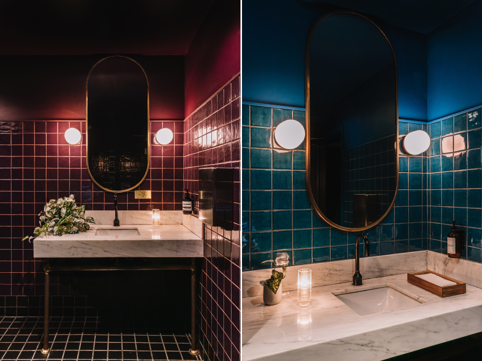
Death & Company Los Angeles by AAmp Studio, Los Angeles, California

Jewel tones have long been associated with wealth and grandeur. Deep shades of red, green, navy or purple can either act as a backdrop or be used in furniture as accents. In Death & Company Los Angeles, these rich hues create a moody atmosphere that is part nostalgic but also contemporary. These colors are juxtaposed with dark wooden panels, light natural stone, metallic accents and floors with geometric tiles.

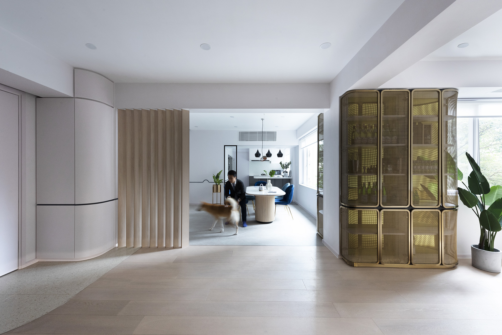
Beau Cloud Mansion / The Cascade by Bean Buro, Hong Kong Island, Hong Kong

Taking inspiration from the automobiles and ocean liners in that era, curvilinear forms and clean lines also became a part of the style in the 1930s. The Bean Cloud Mansion / The Cascade does the same in a modern way. Corners, wall edges and furniture profiles have all been given smooth edges or curved profiles. This is even replicated in cabinet doors and wall dividers. The curved lines are also incorporated at a smaller scale by adding fluting to the dining table.

Santomate by Daniela Bucio Sistos // Taller de Arquitectura y Diseño, Morelia, Mexico

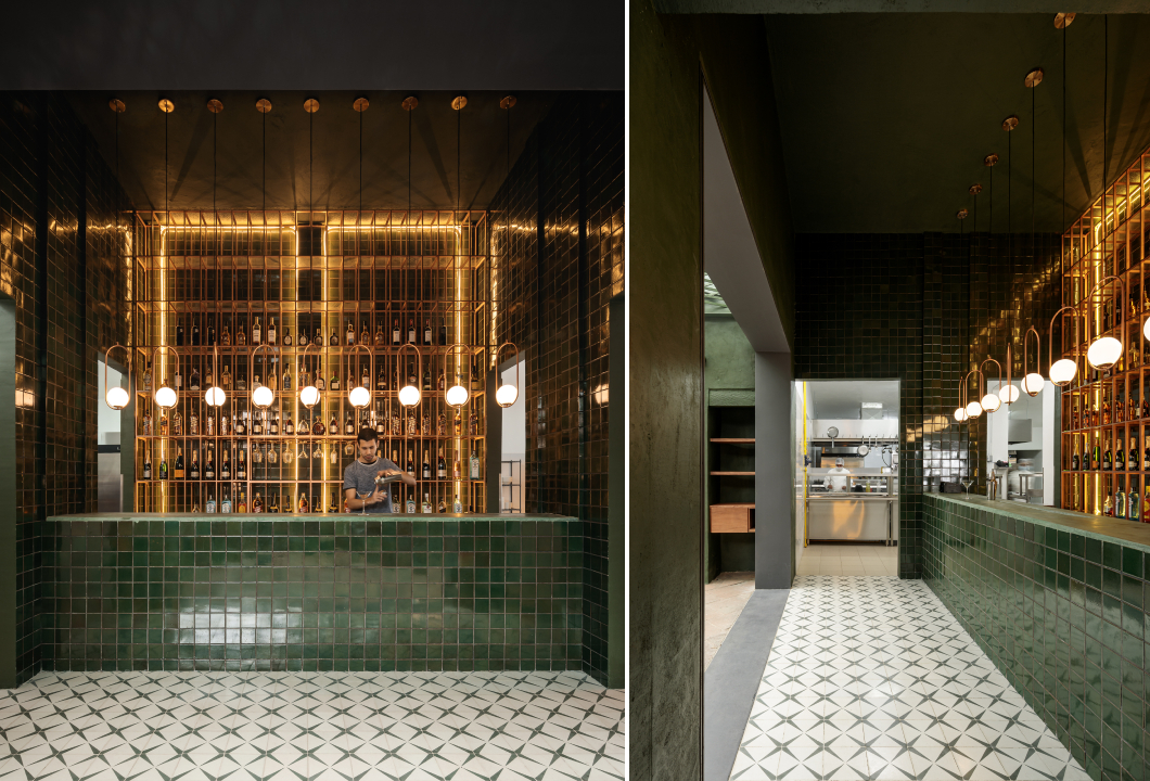
Art Deco is the epitome of making a statement, and lighting can be a big part of this. Illuminators with sleek or geometric forms can easily spruce up simple spaces. This is exhibited in the design of Santome — a restaurant and bar in Morelia Mexico. Globe lights attached to oblong profiles are suspended in a row over the bar. The setup also comprises recessed lighting in the same warm hue to create a halo effect.

Project 1874: Photorealistic 3D Rendering Restaurant by Yantram Architectural Design Studio, Rio Rancho, New Mexico

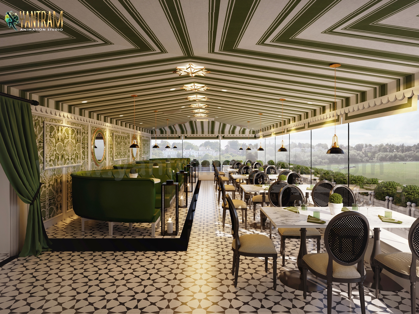
In addition to floors or walls, patterns can also be introduced on the ceiling. In a conceptual design for a restaurant in New Mexico, the firm used a striped pattern in green and ivory to decorate the ceiling. The Art Deco theme is further reinforced with the addition of geometric starburst lights.

5550 Wilshire by TCA Architects, Los Angeles, California

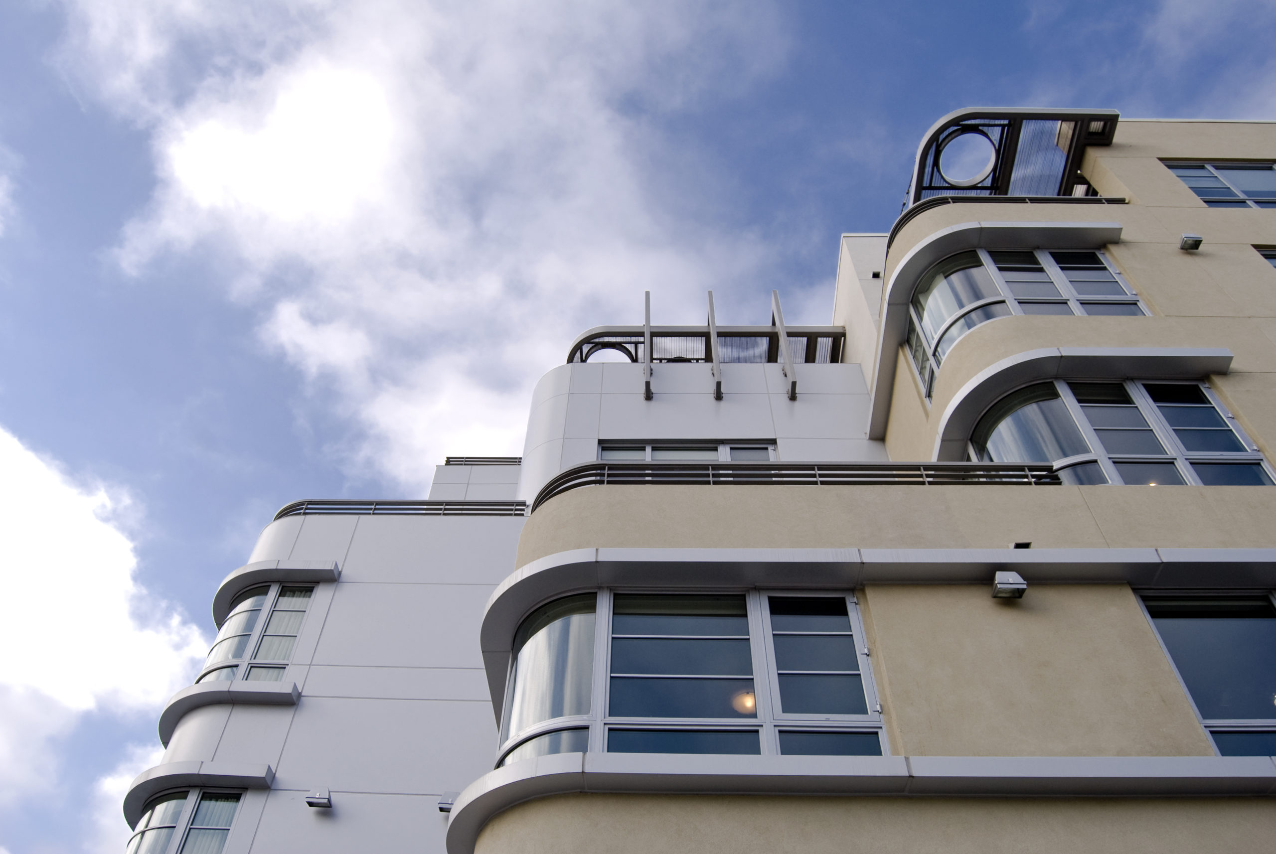
The style manifests in different forms for the exteriors as well. The most iconic Art Deco buildings across the world often mimic lines and forms of old ocean liners. Curved edges, flat roofs, bands of windows, circular openings, horizontal bands, ship railings and ziggurat-shaped decorations are just a few examples. The 5550 Wilshire is a building that encapsulates this style masterfully. The horizontal mass of the structure is further broken up with vertical divisions to create the illusion of height.

Browse the Architizer Jobs Board and apply for architecture and design positions at some of the world’s best firms. Click here to sign up for our Jobs Newsletter.

Reference