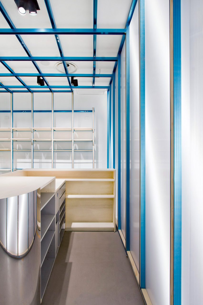
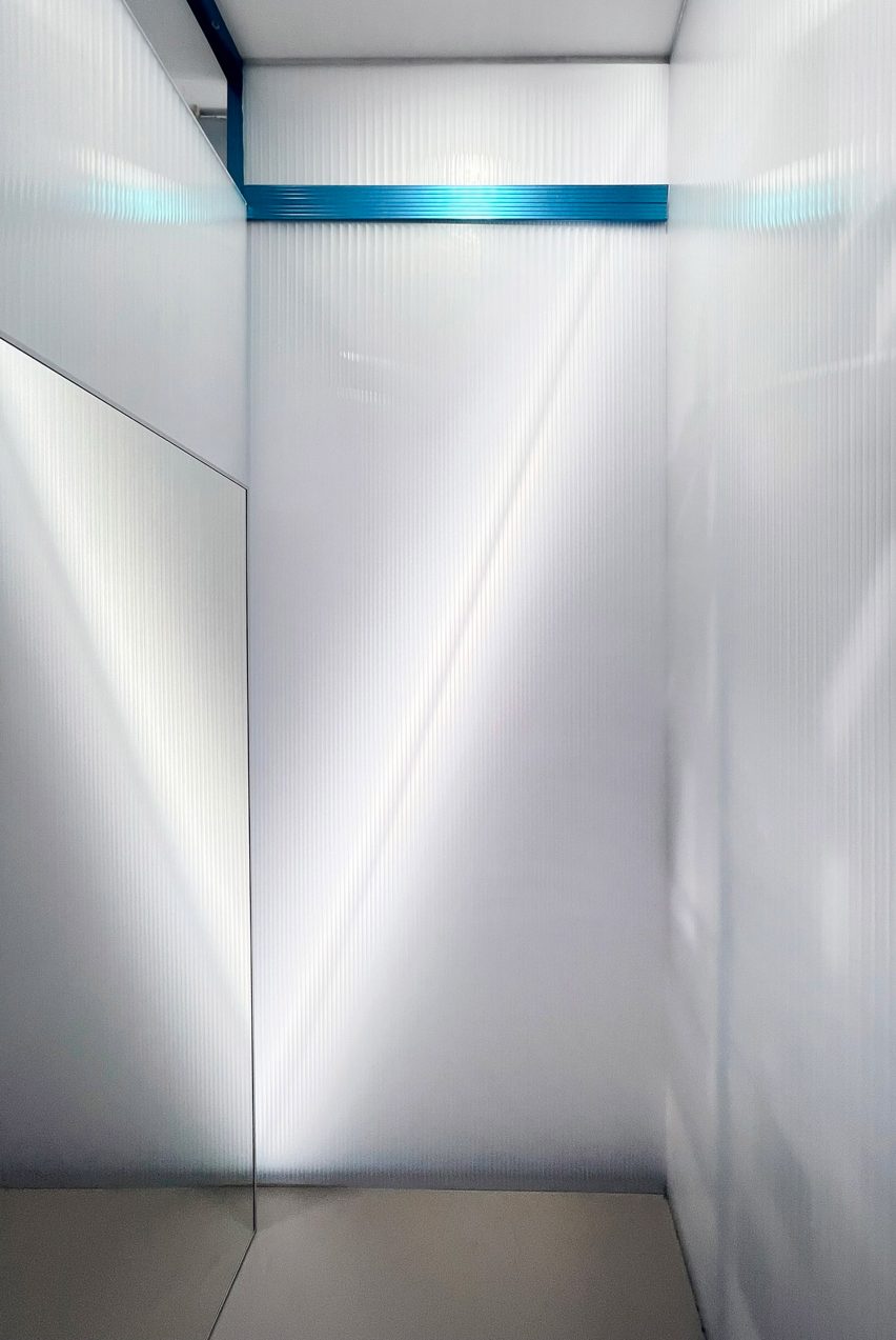
Architecture for London creates demountable interior for stationery store
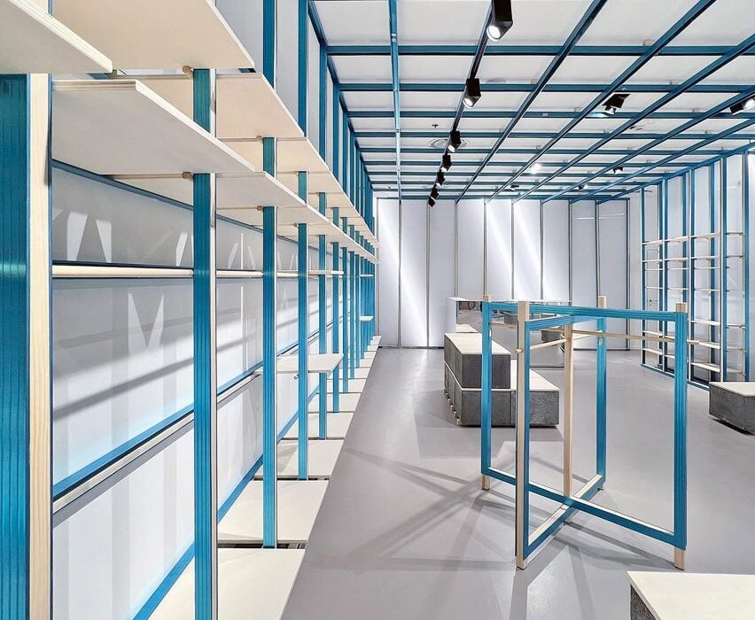
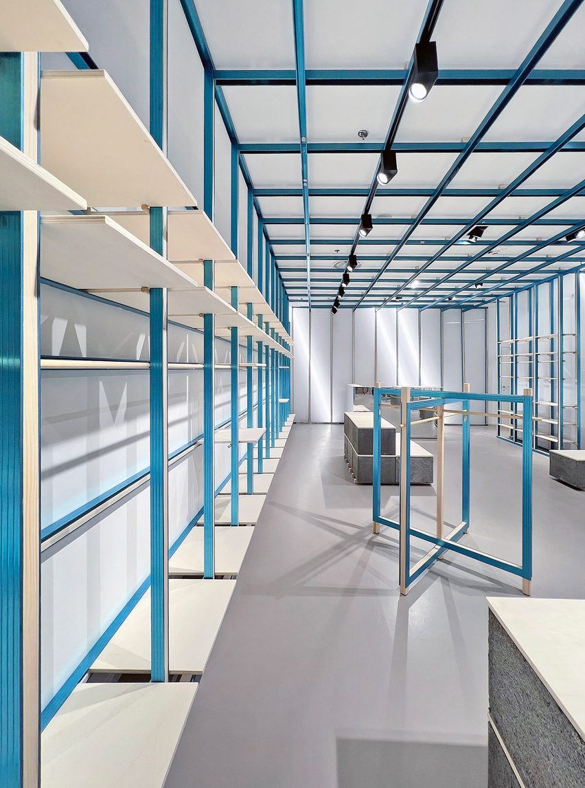
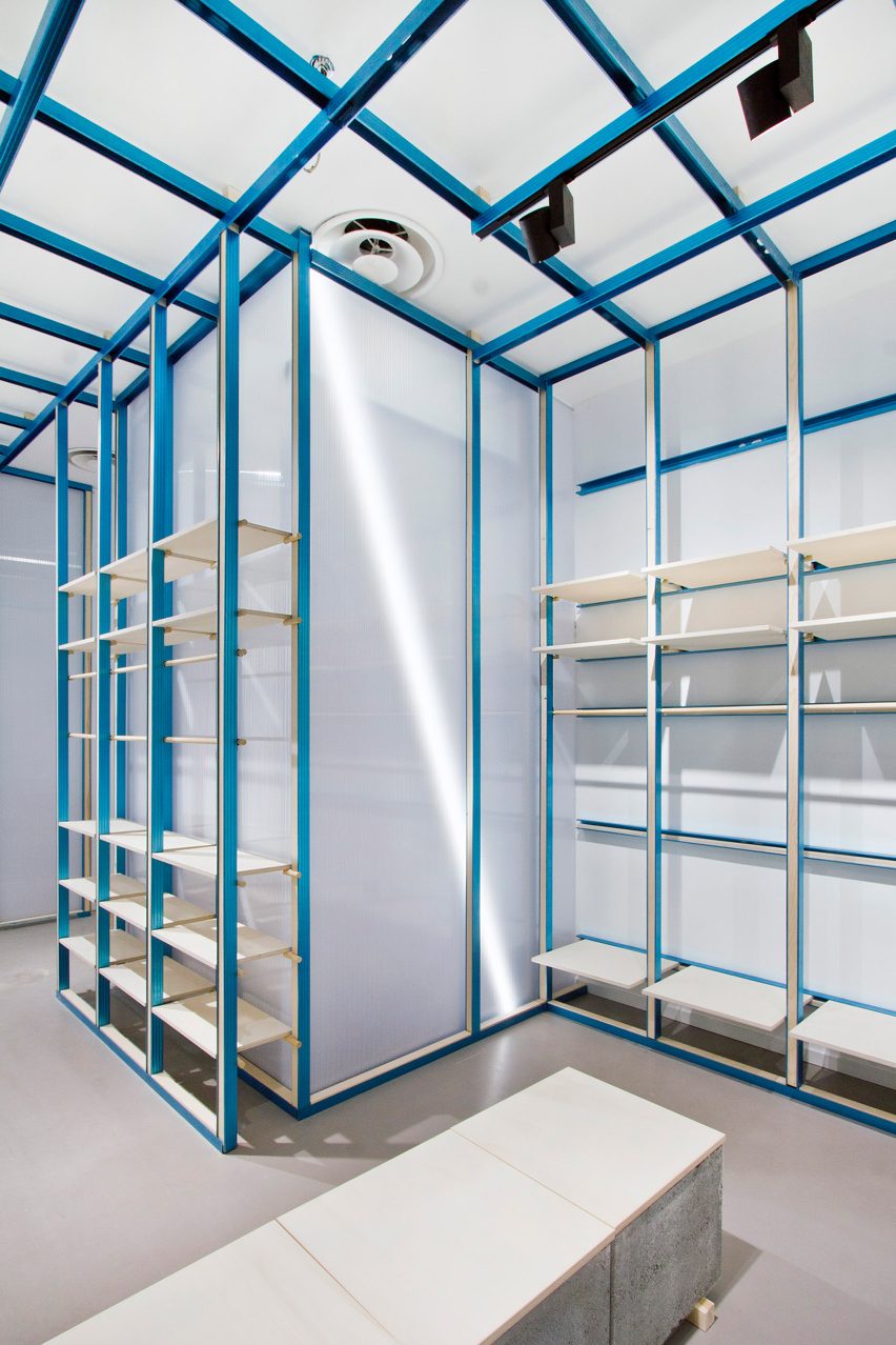
Local studio Architecture for London has designed an interior for stationery store Present & Correct in London, which features gridded joinery and draws on “wunderkammer” cabinets of curiosities.
The studio designed bespoke joinery and storage for the Present & Correct shop in Bloomsbury, central London, which sells vintage and new stationery from across the globe.
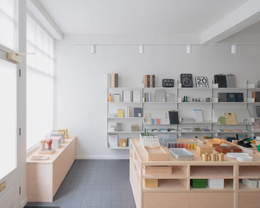
Architecture for London constructed a fully demountable interior for the store, which could be moved in the future if needed.
“Rather than building the joinery around the existing building, we treated each unit as a freestanding cabinet,” Architecture for London director Ben Ridley told Dezeen.
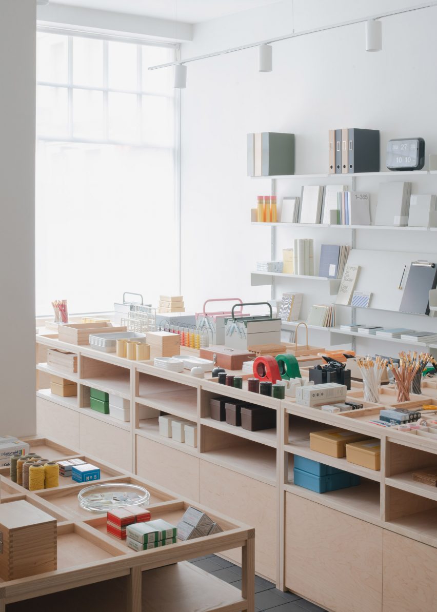
“Aside from the kiosk, most of the joinery was constructed offsite, so we had to consider whether the cabinets fit through a standard door width and could it easily be carried,” he continued.
“In the long term the interior needs to adapt to multiple environments; the current shop has uneven floors, to accommodate this the cabinets have adjustable feet concealed within a recessed plinth, while slender legs appear to be bearing the weight.”
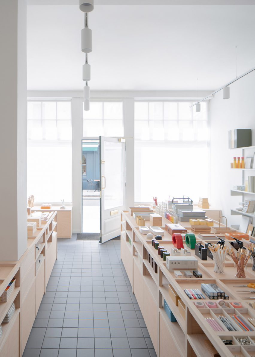
Present & Correct’s aesthetic is often built around an organised grid that holds different-shaped pieces of stationery, and the studio aimed to replicate this in the interior of the store.
“The shop joinery provides order through a grid which becomes progressively smaller as you enter the shop, providing scale to the eclectic collection of objects,” Ridley said.
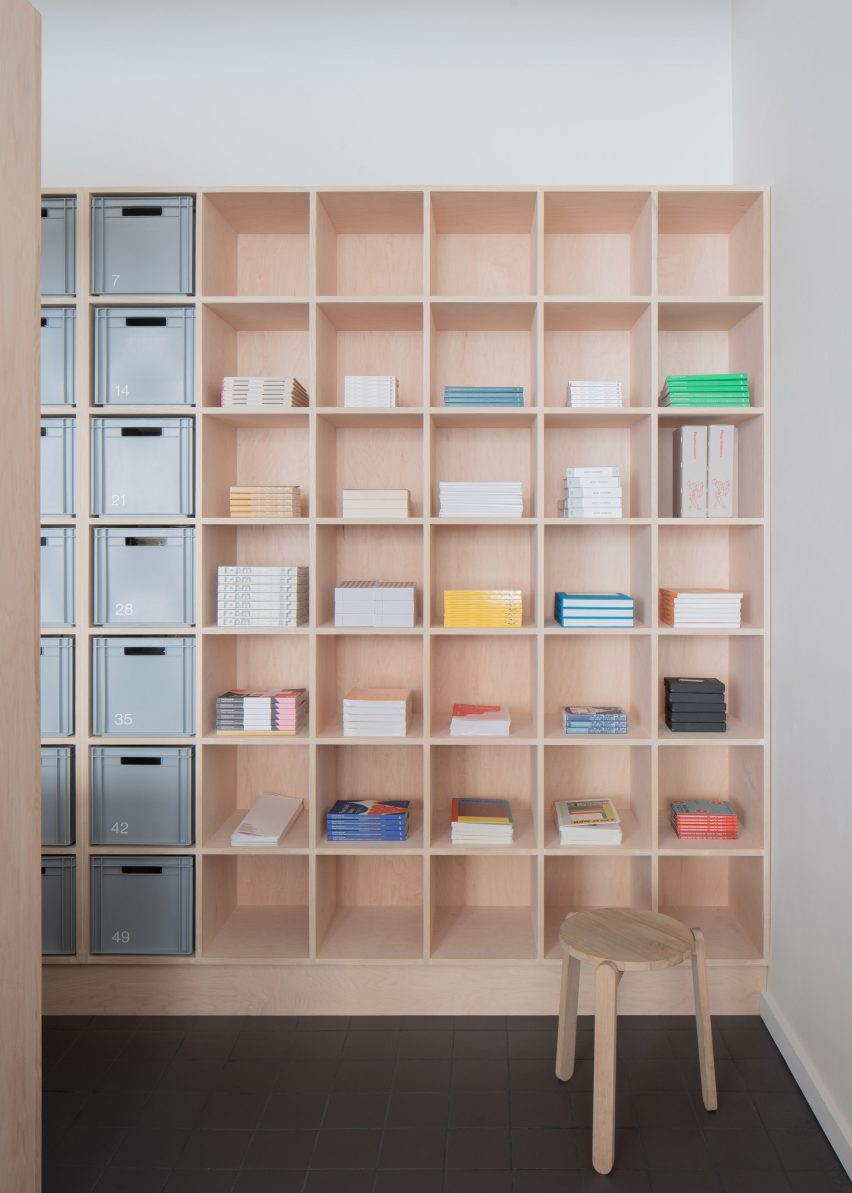
It also drew on the idea of a wunderkammer, informed by the store’s location close to the British Museum, to display the goods as “objects of desire”.
“The wunderkammer is an environment which provides order to a collection of objects through compartmentalisation which could otherwise be observed as a chaotic mess,” Ridley explained.
“So it’s about how we display hundreds of tiny objects like pens, pencils and rubbers alongside toolboxes and trays in a considered and legible way.”
The aim was for the cabinets to be durable and as long-lasting as old museum vitrines. However, budgetary constraints meant that Architecture for London couldn’t use hardwood for the joinery.
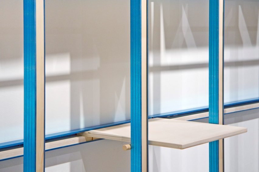
Instead, it chose to work with maple plywood and ash.
“We created the appearance and durability of solid timber by applying a rule that all edges of the maple plywood are finished with 25-millimetre British ash, which can take the knocks from a busy shop floor,” Ridley said.
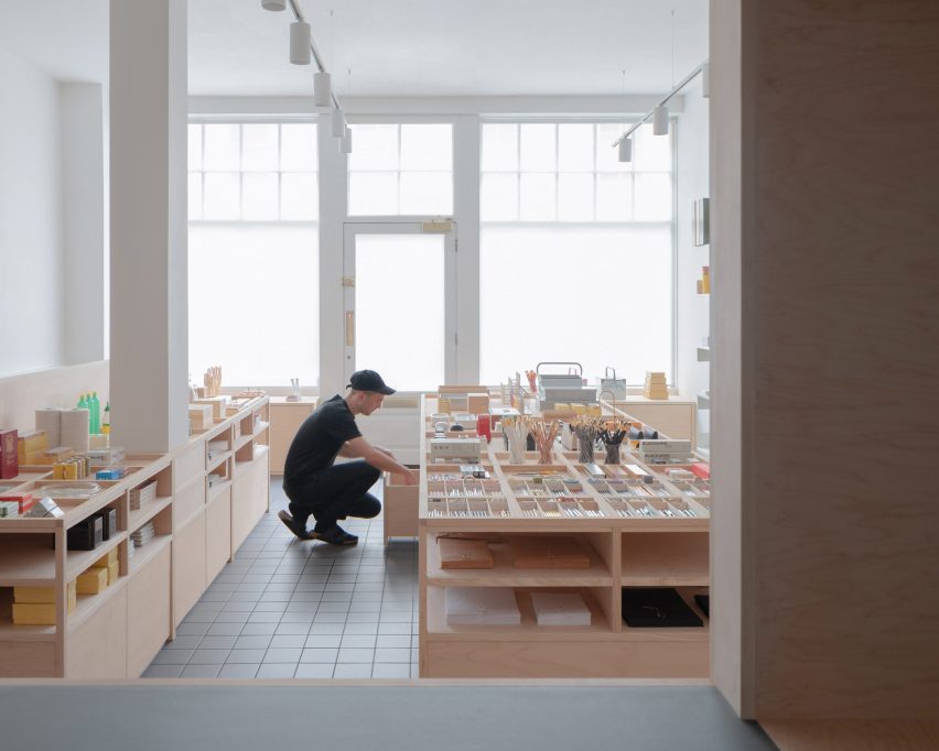
“The maple plywood grain is free from imperfections and has a calm grain, so we didn’t feel the need to use additional veneers,” he added.
“Although the joinery is built with an off-the-shelf material, by concealing the raw plywood edges the interior avoids the DIY aesthetic that can come with working with plywood.”
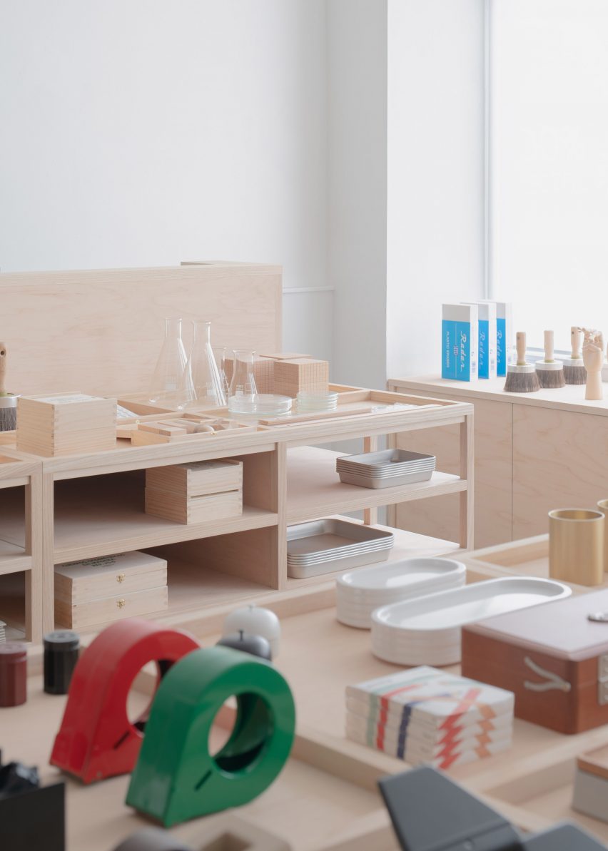
It was important to Present & Correct that the interior would allow the products to shine, rather than compete with them.
This led Architecture for London to use a neutral colour palette and a grid layout that lets the materials speak for themselves, rather than more eye-catching designs.
“At the concept stage, we produced designs which incorporated more playful elements such as large columns shaped like pencils,” Ridley said.
“The shopkeeper understood their product well enough to know that there was enough humour in the stationery, so it didn’t need to be represented in the architecture.”
Other recent projects by Architecture for London include a light-filled extension to a Hackney home and an energy-saving home in north London designed for Ridley.
The photography is by Building Narratives.
Project credits:
Architect: Architecture for London
Interior designer: Architecture for London
Main contractor: AFL Build


