el departamento infuses mountainous hues into texturized optical boutique in madrid
CategoriesArchitecture

el departamento infuses mountainous hues into texturized optical boutique in madrid

El Departamento unveils new PJ Lobster boutique in Madrid


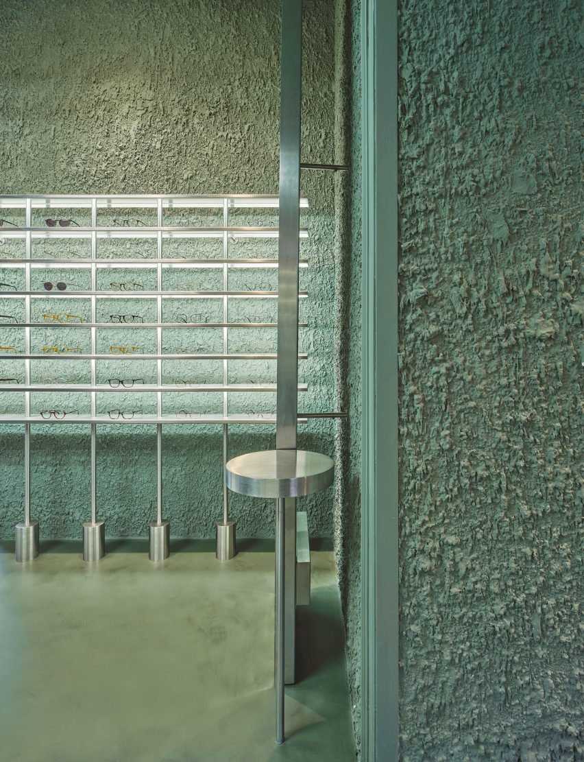
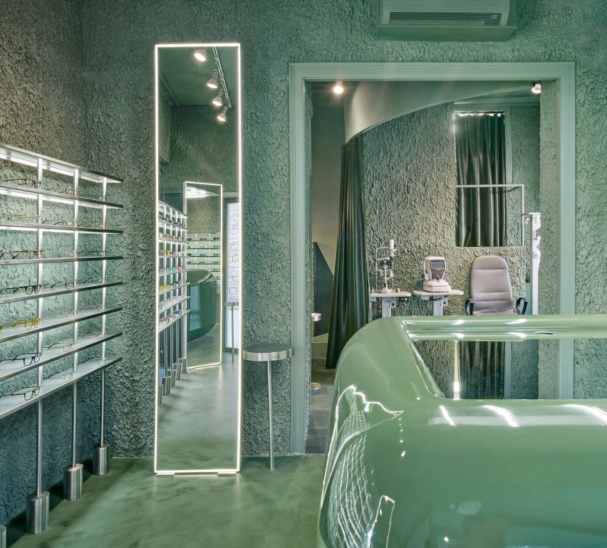
Valencia-based architecture practice El Departamento has crafted a contemporary optical boutique for the PJ Lobster brand in Madrid, Spain. Drawing from the character of the project location, which combines both sophistication and vibrancy, the retail interior incorporates texturized minimalism, rough materiality, organic forms, and stainless steel elements throughout its design. The color palette is inspired by the hues of the Madrid mountains, infusing a natural essence into the design which is otherwise described as ‘high-tech’.
el departamento infuses mountainous hues into texturized optical boutique in madrid
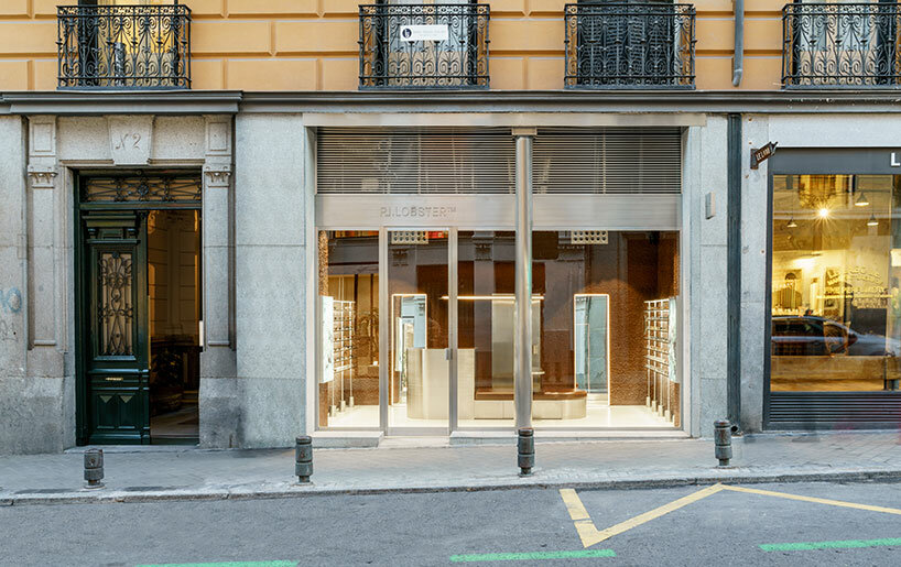
the exterior of the new PJ Lobster boutique in Madrid | all images courtesy of Miguel Fernández-Galiano


PJ Lobster’s Madrid store Unveils a Design Continuum


The new PJ Lobster boutique in Madrid continues the design exploration initiated in the previous project located in Barcelona (see designboom’s previous coverage here), focusing on color, organic forms, and different textures as common design elements.


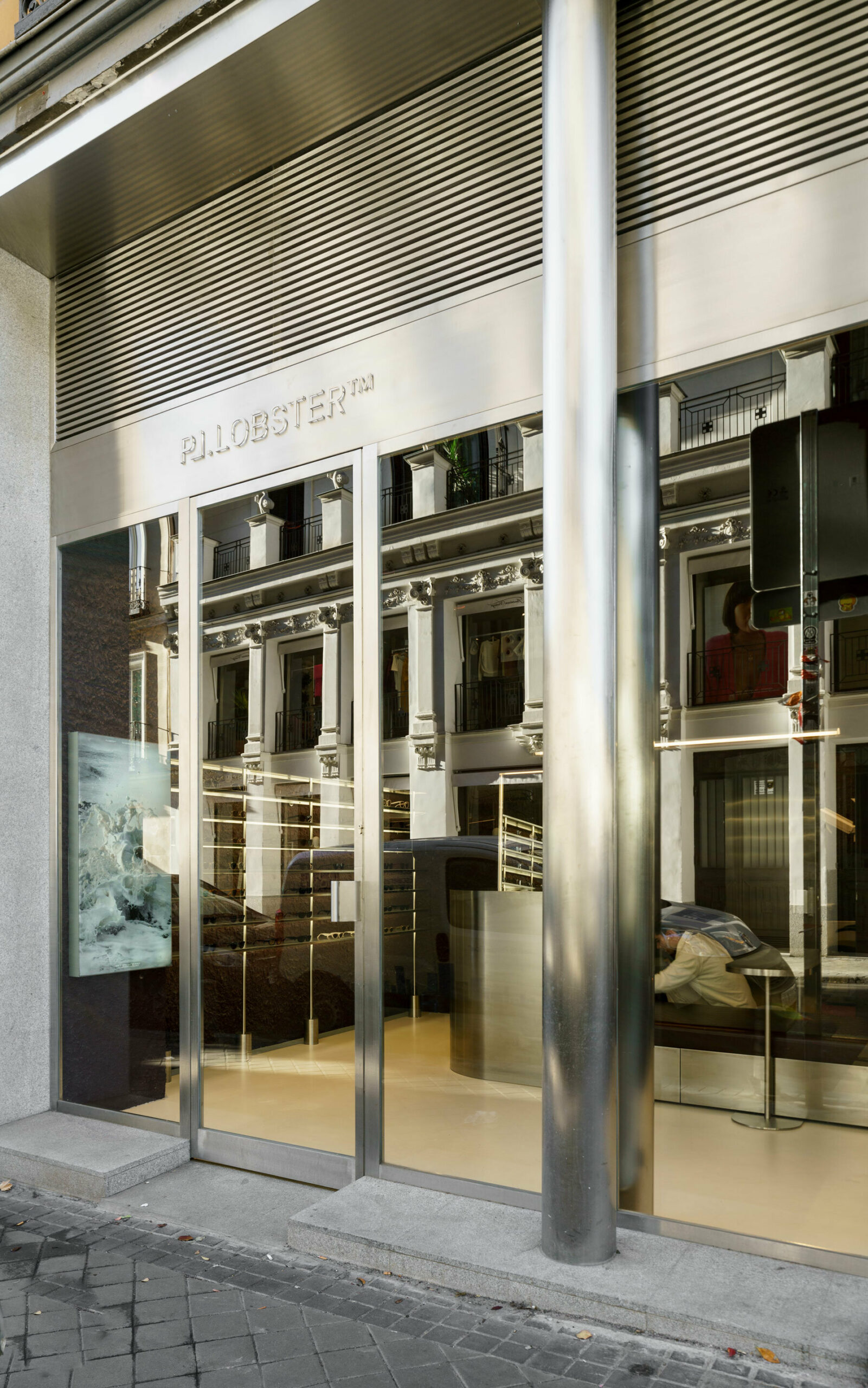
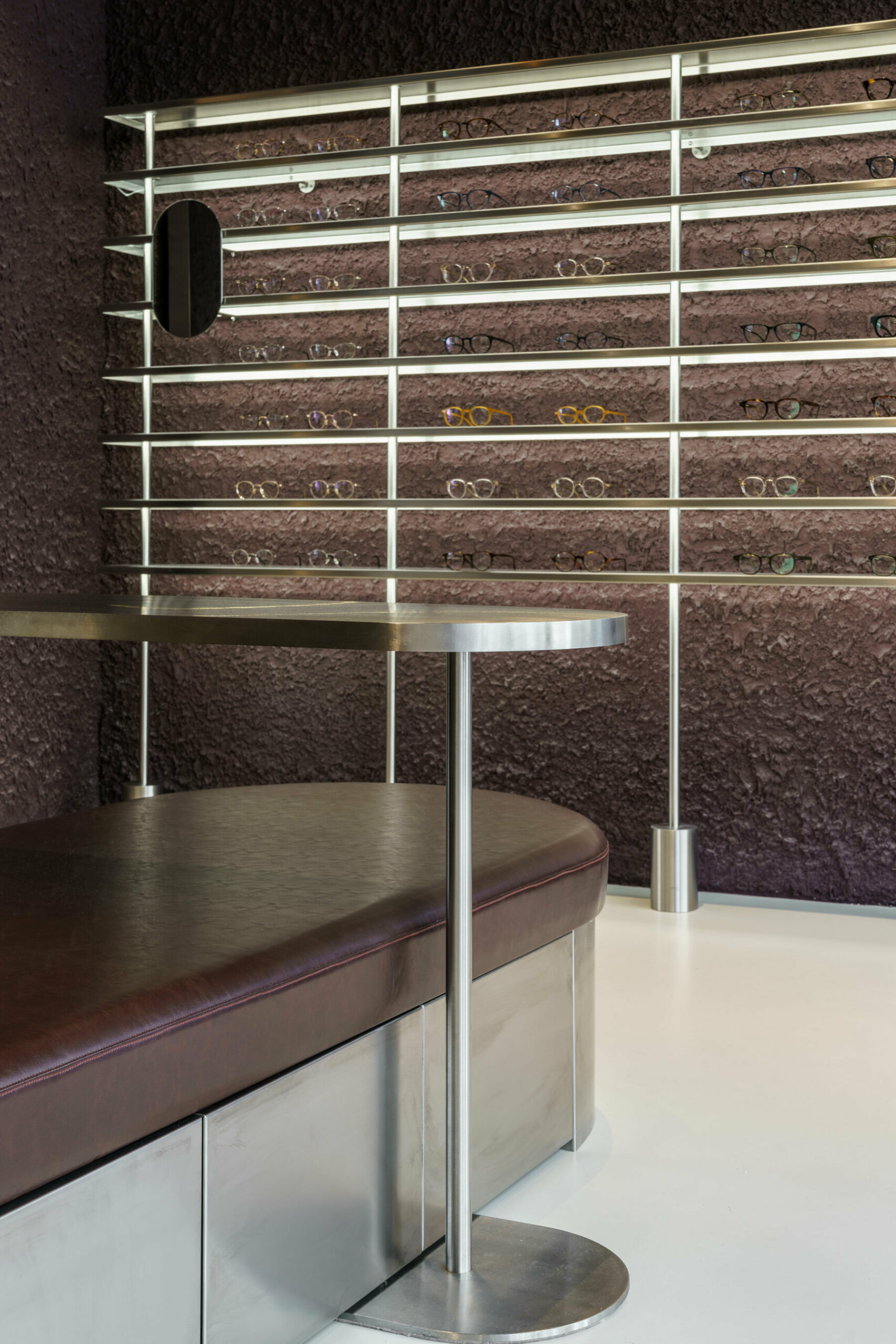
Spanning 42 m2, with an additional operational basement, the structure redefines traditional storefront concepts with an expansive, unobtrusive street-facing facade. The interior boasts ornamental structures, including wooden beams and cast-iron columns, maintaining an impressive free height of over 4 meters. El Departamento (find more here) preserved the original cast-iron pillars on the facade, encasing them in a sleek stainless-steel skin that transforms their appearance into two seamless cylinders. A striking glass facade, precisely centered between the two pillars, establishes a clear boundary, inviting patrons to experience the seamless transition between the external environment and the meticulously crafted interior space.
 

el departamento infuses mountainous hues into texturized optical boutique in madrid
the entrance of the store features reflective stainless steel elements


El Departamento’s Fusion of Textured Minimalism & Raw Precision


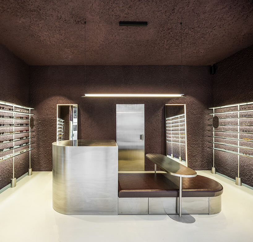
In their latest spatial exploration for this new optical boutique, El Departamento blends textured minimalism and raw precision. Meticulous attention to detail is evident as the color-blocked sales area dynamically contrasts with a neutral floor, yet harmonizes with stainless-steel furniture, accentuating the high-tech ambiance of the space.


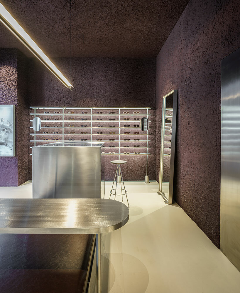
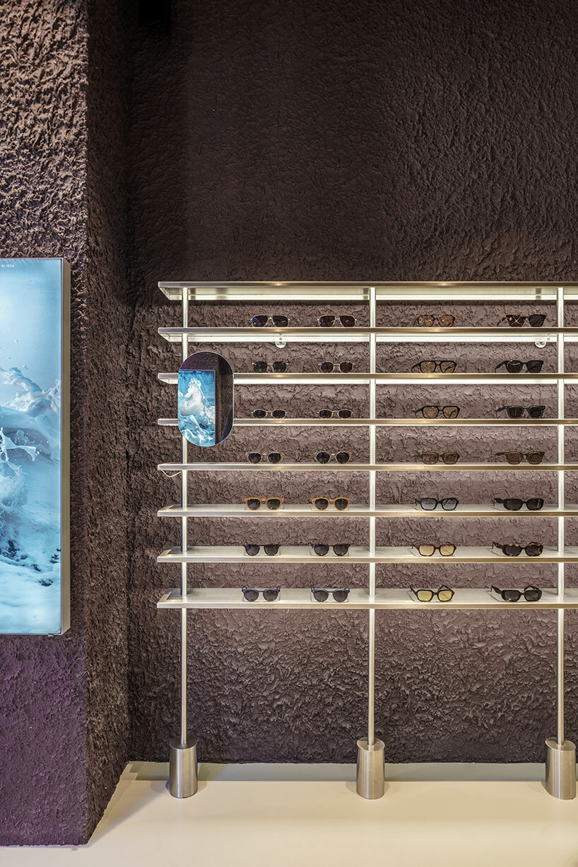
The design of the shop is characterized by rough materiality, as a prominent irregular plaster finish emerges. The color palette, dominated by dark garnet and aubergine hues, pays homage to the traditional color of Madrid’s exposed brick. This color, derived from the various clays of the central plateau, harks back to the architectural materials of Madrid’s late 19th-century aesthetics. ‘This tribute to reddish tones, transformed into garnet, evokes the hues that tint the fields of Madrid’s mountain range in autumnal twilights,’ the design team shares. 
el departamento infuses mountainous hues into texturized optical boutique in madrid
the retail interior incorporates rough materiality, organic forms, and stainless steel elements
el departamento infuses mountainous hues into texturized optical boutique in madrid
the color palette of the project is inspired by the hues of the Madrid mountains
el departamento infuses mountainous hues into texturized optical boutique in madrid
an irregular plaster finish emerges within the interior
el departamento infuses mountainous hues into texturized optical boutique in madrid
the interior boasts ornamental structures, including wooden beams and cast-iron columns
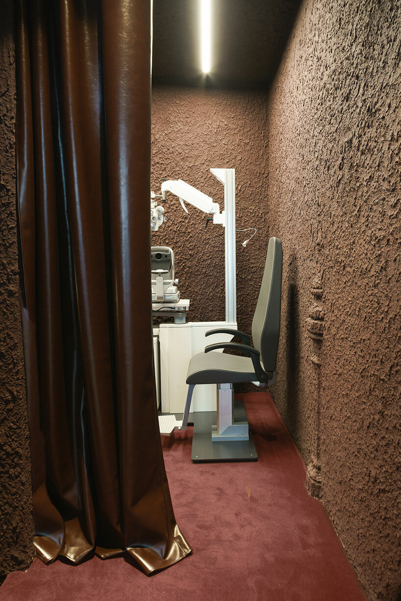
el departamento infuses mountainous hues into texturized optical boutique in madrid
the store is dominated by dark garnet and aubergine hues
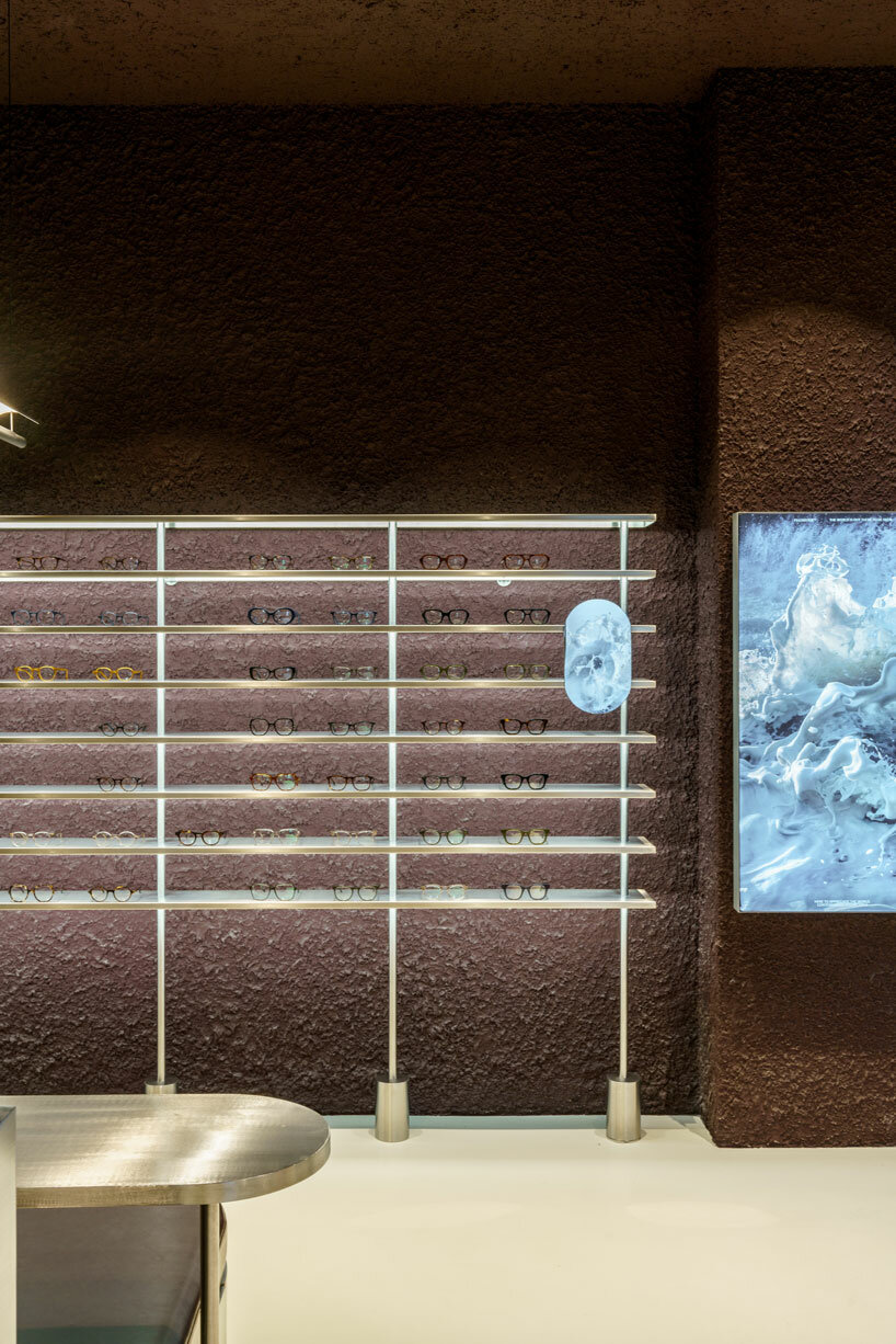
el departamento infuses mountainous hues into texturized optical boutique in madrid
the boutique s characterized by a high-tech ambiance


project info: 

name: PJ Lobster Restyling
architects: El Departamento | @eldepartamento.estudio
design team: Alberto Eltini & Marina Martín

location: 2 Fernando VI Street, Madrid, Spain 
area: 42 sqm
photography: Miguel Fernández-Galiano

myrto katsikopoulou I designboom

dec 25, 2023


Reference

El Departamento designs glasses store as a “challenging visual exercise”
CategoriesInterior Design

El Departamento designs glasses store as a “challenging visual exercise”

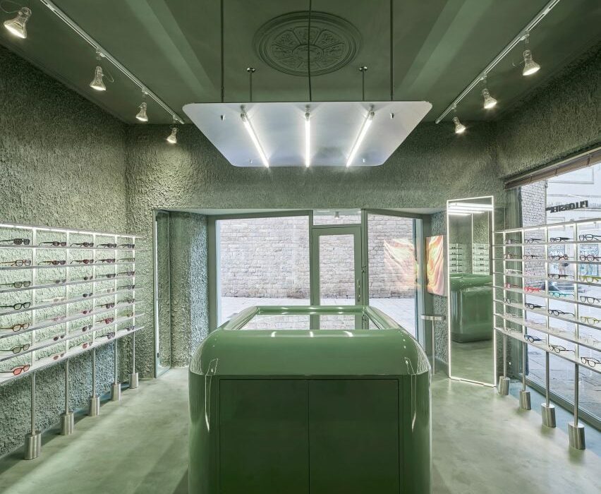
Slight variations in tone and texture differentiate surfaces inside the PJ Lobster glasses store in Barcelona, which Spanish interiors studio El Departamento has finished entirely in green.

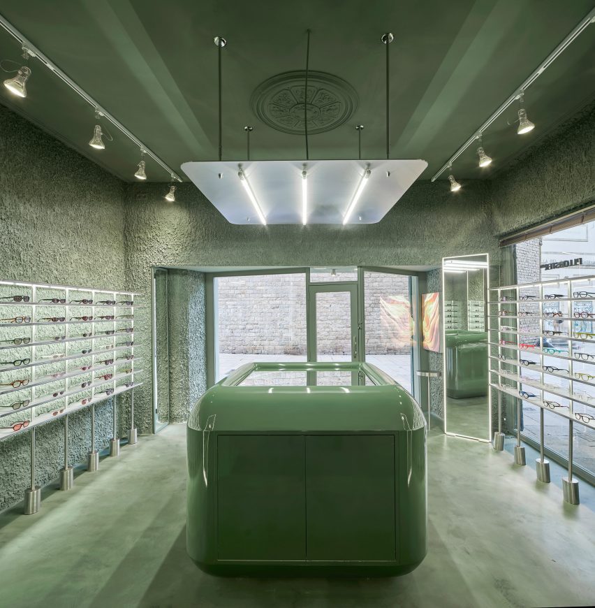
The shop in the El Born district features walls, floors and stuccoed ceilings all covered in soft, tranquil tones of seafoam green, creating an immersive experience designed to challenge the eye.

Central counter inside PJ Lobster eyewear store
The PJ Lobster store in Barcelona is finished entirely in green

“The human eye is able to distinguish more different shades of green than any other colour,” El Departamento told Dezeen. “That’s because, deep inside us, we’re still hunters from the prehistoric era.”

“So that’s what we wanted to aim for here, not to hunt anything but to recover the challenging visual exercise of exploring a wide range of greens.”

Central mirrored counter inside eyewear store in Barcelona by El Departamento
A glossy counter stands at the centre of the shop

The practice was also influenced by Charles and Ray Eames’s short film Powers of Ten, which explores the scales of the universe.

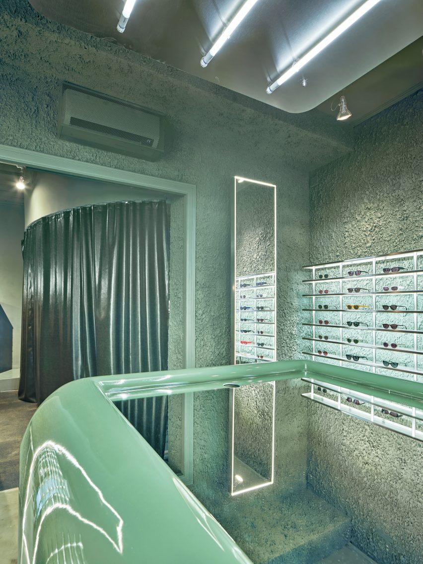
This informed El Departamento’s study of different textures within the store “from macro to micro”, from the small-grained velvety micro-cement on the floor to the rough textured plaster that was applied to the wall by hand to achieve the right level of thickness.

“We wanted to get to the last step, just before a texture becomes a topography,” the studio said. “It was done manually, carefully and step by step to achieve the perfect state.”

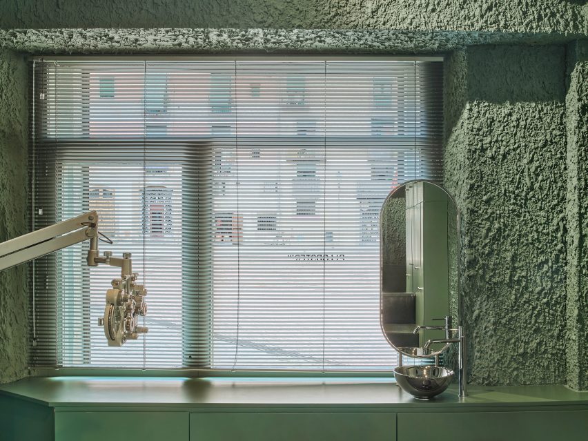
Eye examination room inside PJ Lobster eyewear store
The examination room is located at the rear of the store

Stainless steel is another key player in the store, used to create banks of display shelving that frame each pair of glasses, with the soft sheen of the metal creating a striking contrast with the deliberately blobby texture of the walls behind.

Another textural juxtaposition is provided by the large, capsule-like counter at the heart of the store with its high-shine gloss finish and mirrored top.

Further back in the store is an area dedicated to visual examinations, delineated by a shiny pleather curtain and a softer carpeted floor.

The result, according to El Departamento, is “a vibrant space that swings between the soft and the hard, the rough and the velvety”.

Shelving inside eyewear store in Barcelona by El Departamento
Glasses are displayed on stainless steel shelves

The studio has been collaborating with PJ Lobster since the eyewear brand was founded in 2018 under the name Project Lobster, helping the company to expand from an online business into real-life stores.

With this latest outpost, El Departamento wanted to encapsulate the evolution of the brand and its products.

PJ Lobster eyewear store in Barcelona by El Departamento
The examination room is hidden behind a shiny pleather curtain

“We wanted to show that the brand has matured,” the studio said. “We tried to show somehow the organic evolution of the brand by giving this space a more technical and precise atmosphere, where the wide range of textures speaks of the precision levels of the products.”

Other monochrome eyewear stores include Lunettes Selection in Berlin, which is enveloped by mint-green floor-to-ceiling cabinets, and Melbourne’s Vision Studio where cool-toned industrial materials such as aluminium and concrete are paired with grey marble surfaces.

The photography is by José Hevia.

Reference