Enhancing seeds for desert farming in a changing climate

Spotted: The UN Convention to Combat Desertification’s latest report calls global drought resilience “a necessity.” Given that in the three years between 2016 and 2018, 70 per cent of cereal crops in the Mediterranean were damaged, and droughts continue to grow in severity and length, the outlook is challenging for the world’s agriculture systems.
Rising sea levels are affecting the quality of the water that is available to farmers, which, when combined with the stress of high heat, severely impacts crop yields. Heat and salty soil are two of the main stressors for a variety of plants, many of which are crucial parts of the global diet. Seeking ways to increase growing resilience without using toxins and chemical treatments, agritech startup SaliCrop has created a method that uses a seed’s natural response to stressors to make it possible to grow crops in arid, salty soil.
The company uses a combination of organic and physiological compounds to mimic environmental stressors. That then boosts a seed’s natural biochemical reactions and strengthens the plant’s ability to survive in more arid conditions. The treatments also increase the size of the fruits and vegetables grown and improve the plants’ resilience to pests.
SaliCrop is working with commercial growers of alfalfa, onion, and tomatoes, and their crop yields have increased between 16 and 40 per cent. In Europe, Africa, and India, the company is completing field trials with crops that include rice, wheat, corn, peppers, and broccoli and is seeing yields increase by between 7 and 15 per cent. Those results are particularly important in light of various climate projections that predict decreases in wheat yields of up to six per cent due to increased severity of weather events and overall conditions.
Improving the health of degraded soil is an essential aspect of reducing the carbon emissions from agriculture. Innovations in Springwise’s library helping make that change include using sound to enhance soil microbe growth and using microalgae to make desert soil arable.
Written By: Keely Khoury

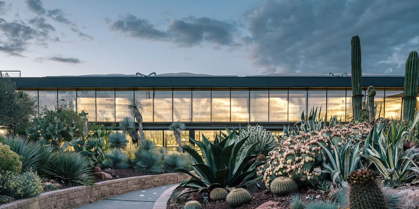
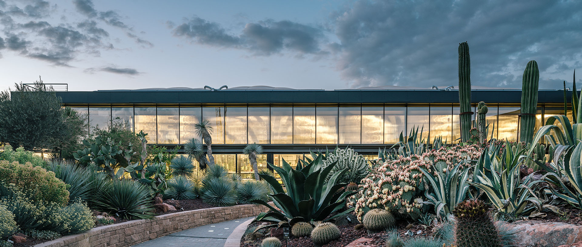
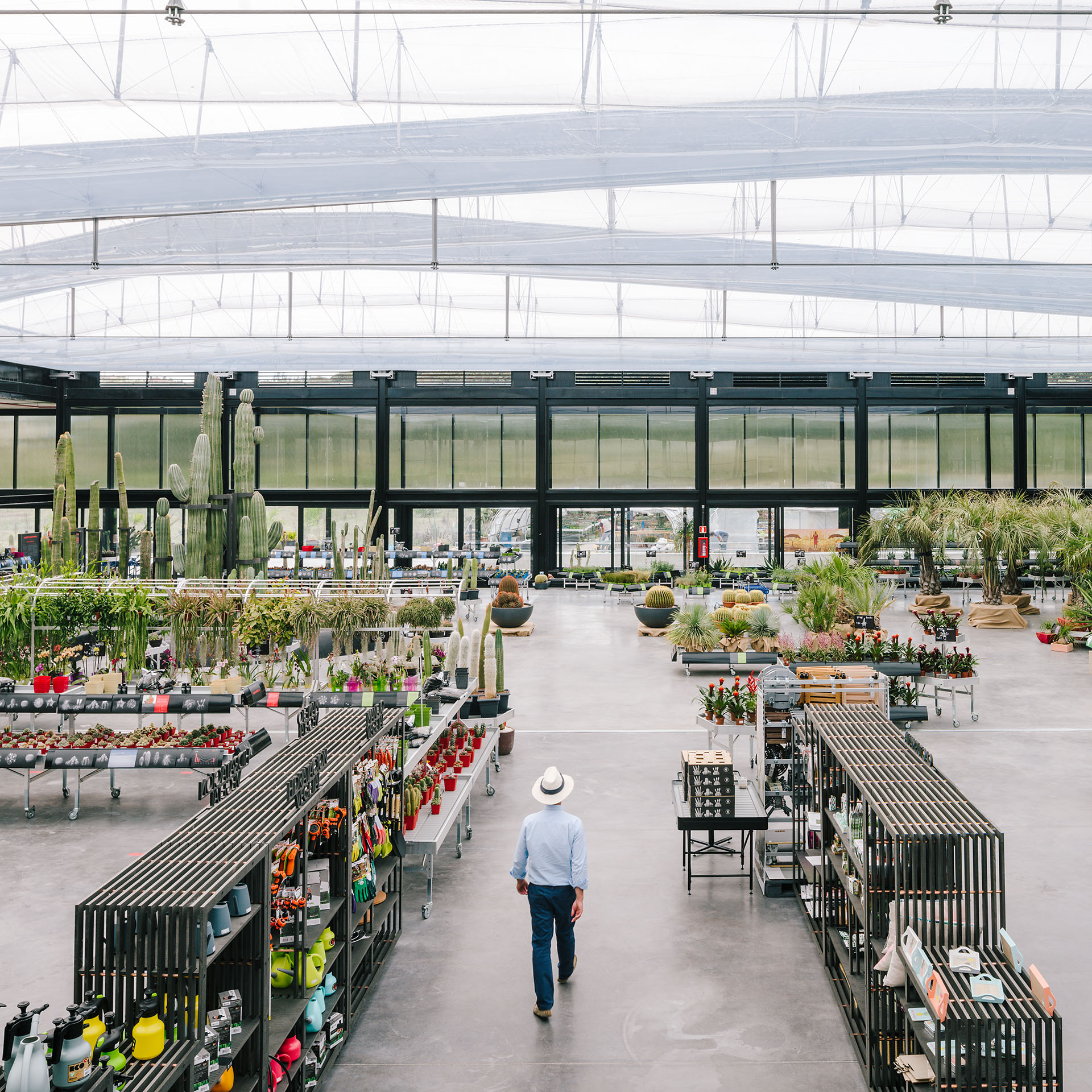 Sited in San Sebastián de los Reyes, GGA’s soaring cactus complex is an infrastructural design between highway and forest, harboring a “twin oasis for cactus exhibiting and growth” with a mixed eco-cultural program. The project showcases sustainable and ecological approaches alongside educational spaces. At Desert City‘s heart is a large garden and greenhouse that house a range of leisure activities and presentations to small conventions, workshops and exhibitions.
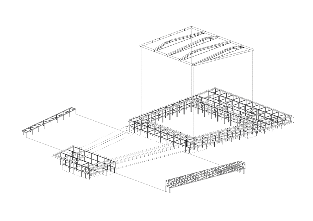 GGA designed the project alongside builder Isolux Corsán, as well as structural engineer Felipe F. Sanz and the greenhouse roof engineer Arenas Ingenieros. Together, they created a cloister-like cactus garden and a cable roof inspired by tensegrity structures for a “billboard-building” alongside the highway. As architect Eduardo Prieto noted, the design features a “powerful steel bridge that extends 40 meters above the cacti, its span constituting the most spectacular moment of the building. The bridge synthesizes the building’s main argument: the image of a machine hovering over the garden to produce a picturesque, if not Surrealist, contrast between opposing geometries.”
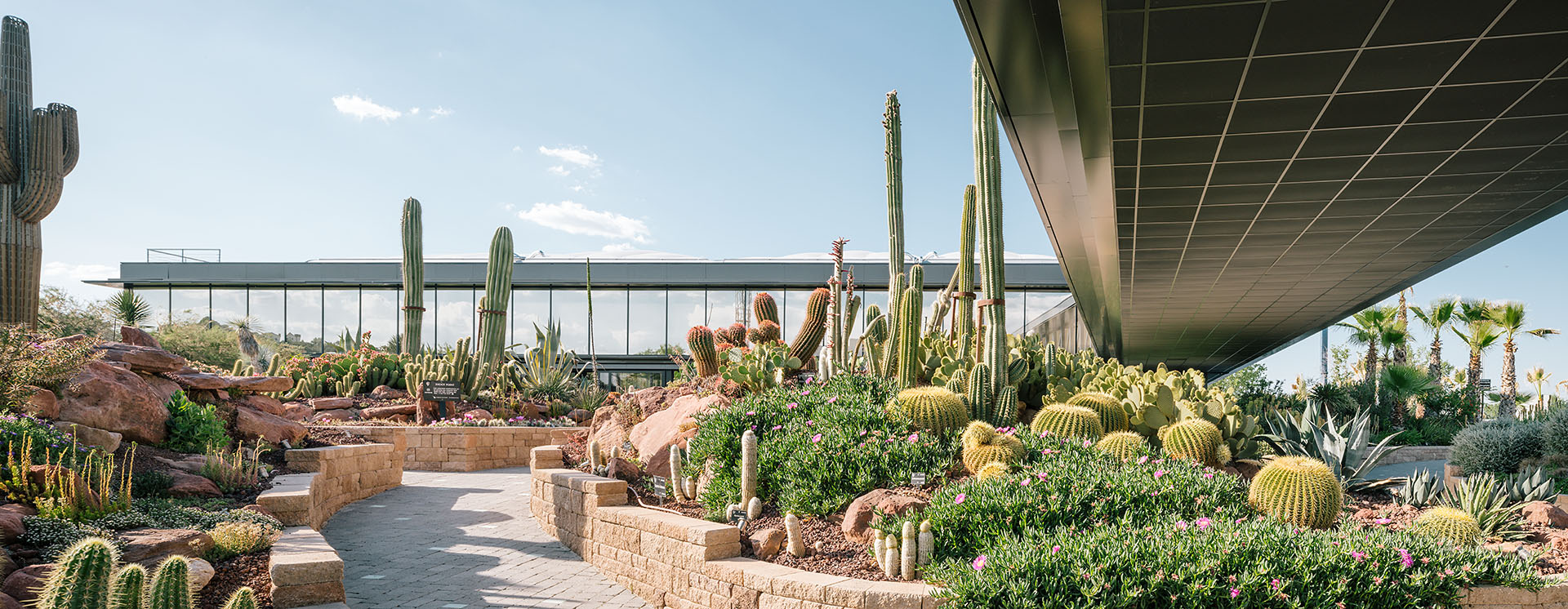
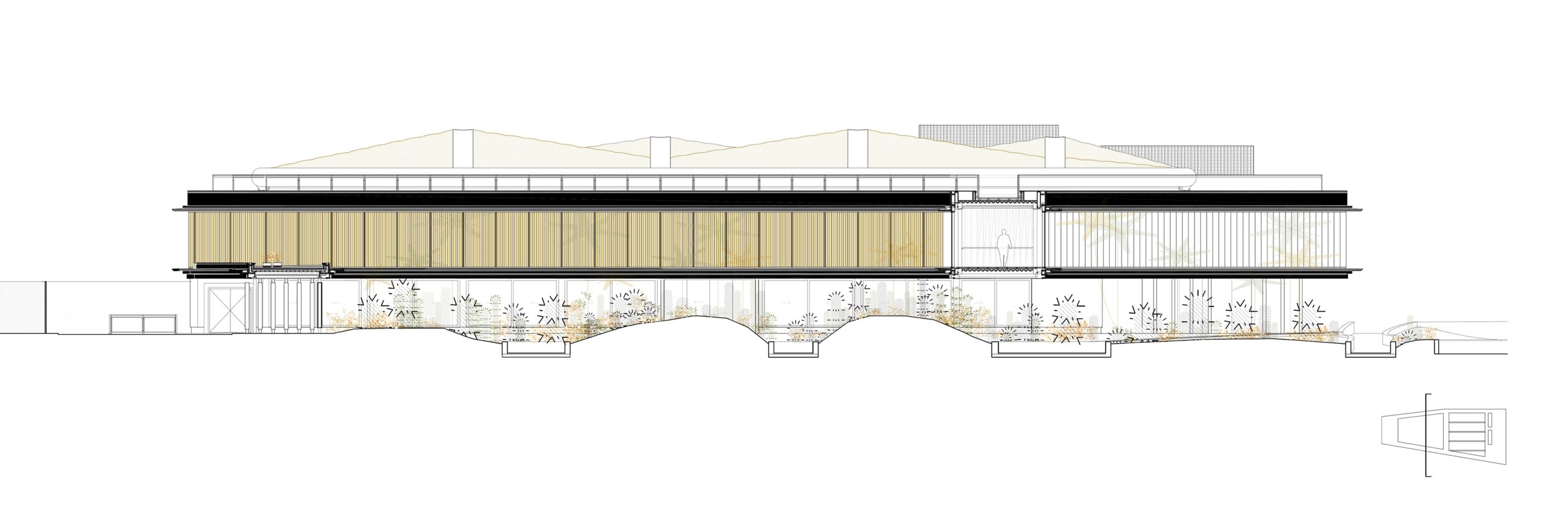 Desert City is a large complex that includes an exhibition and sales space, as well as a restaurant, shop, storage, and office areas. It is organized internally by a sequence of symmetries around the cactus garden, which receives newcomers, and the greenhouse space. As the team notes, despite its hybrid program, the complex’s construction is systematized through repetition, modulation and prefabrication of elements.
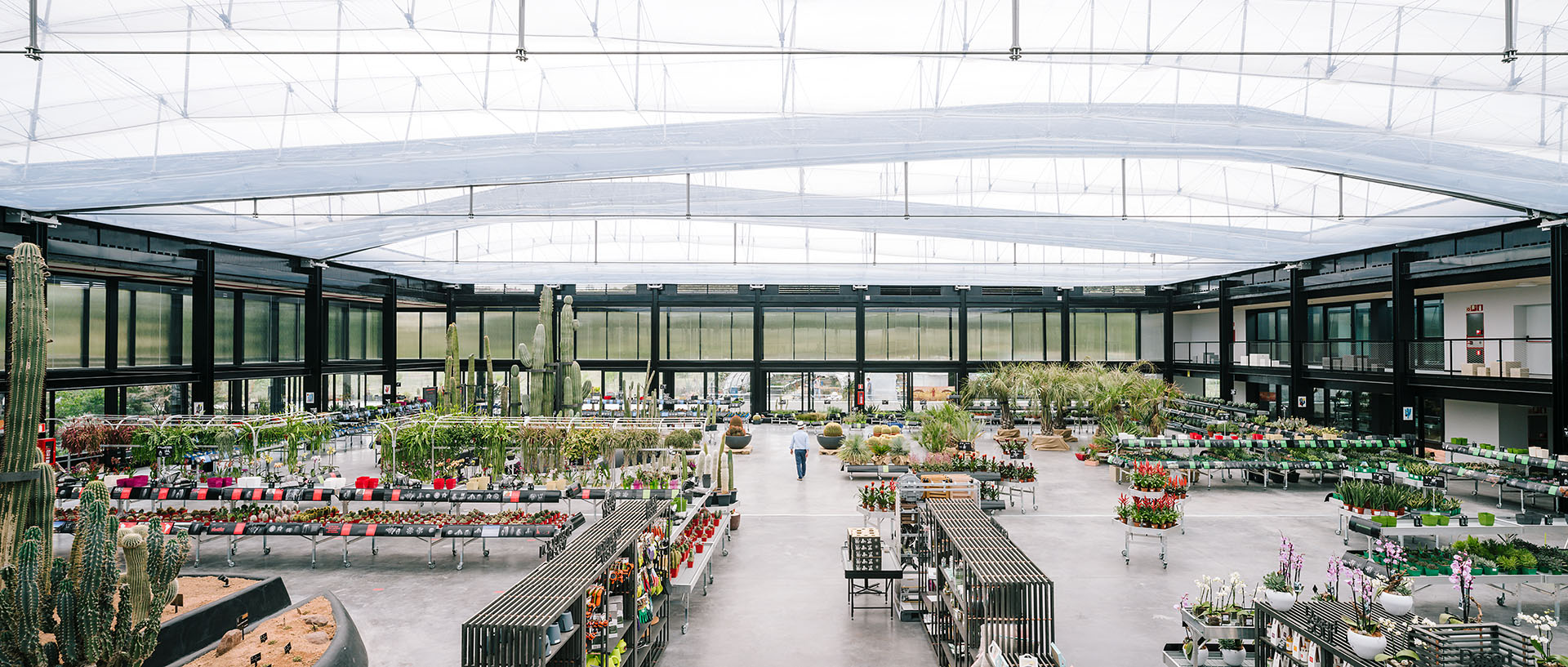
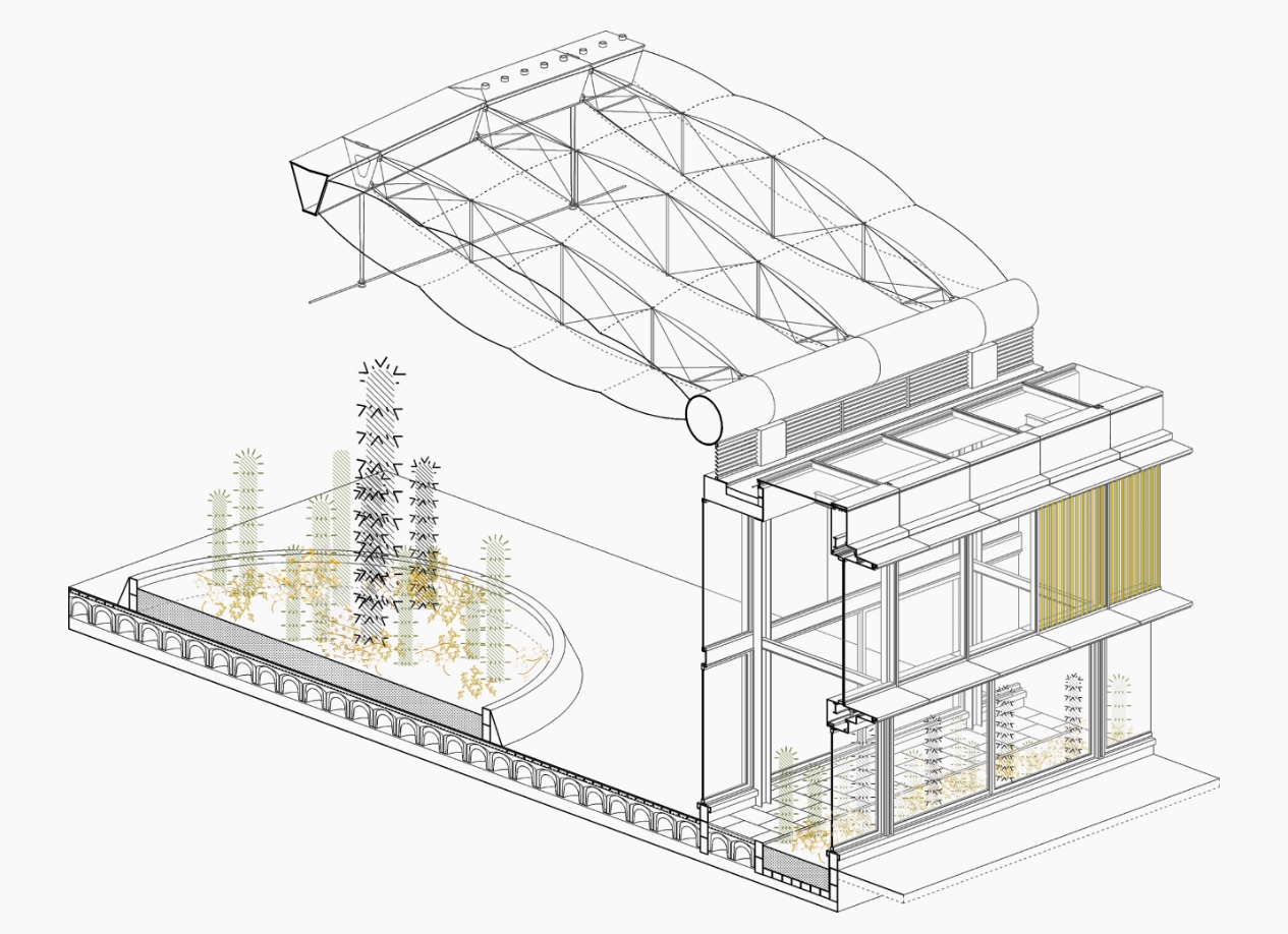 The structure takes on the form of a huge, abstract and stretched out skeleton. The idea was for the building to communicate its inner workings and the veiled presence of greenery as seen from the passing car through a tinted, watery glass façade. As the team explains, the architecture incorporates sustainable solutions such as transparent photovoltaic glass, geothermal power, water recovery systems, solar controls, and extensive plantings in the site, which was originally a wasteland.
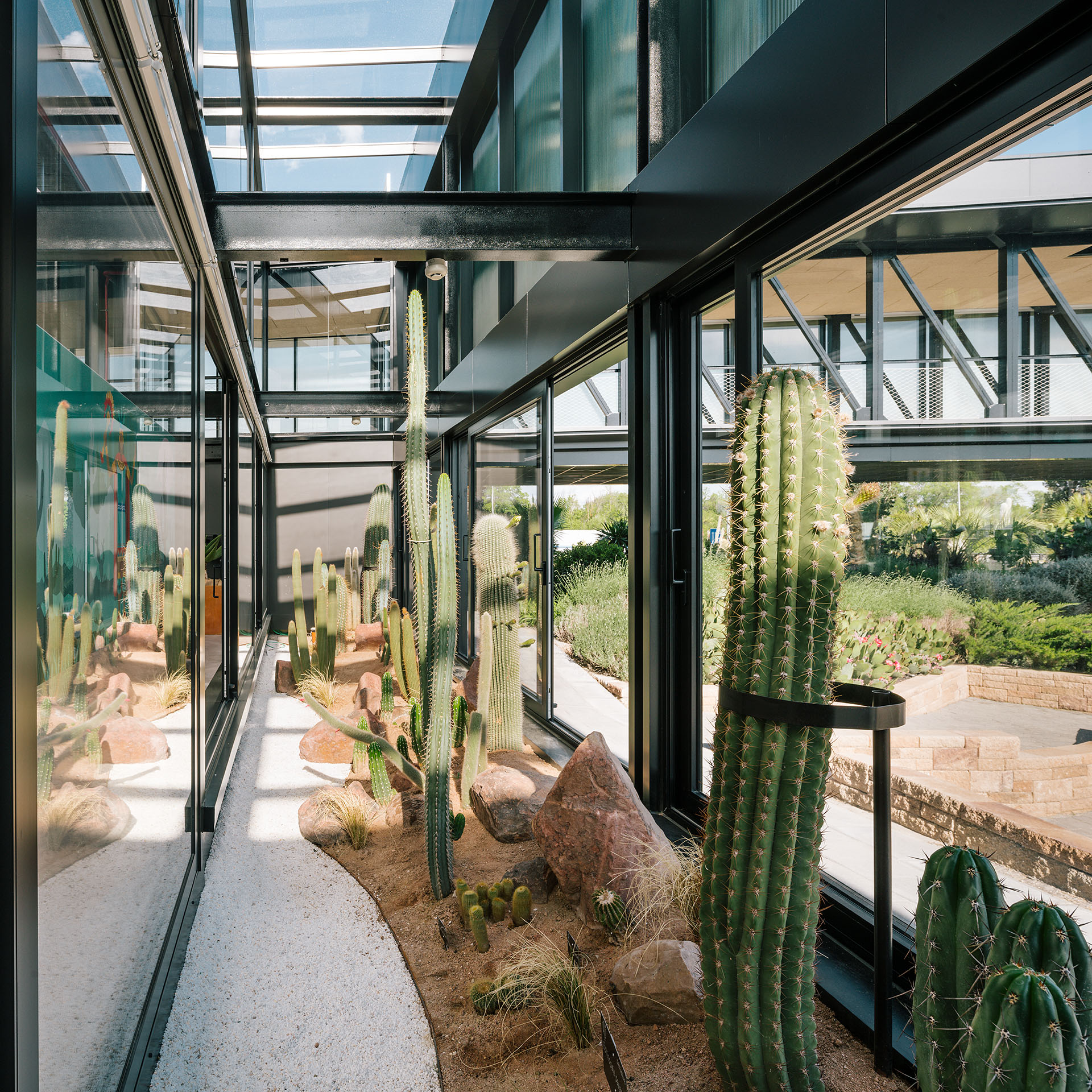 Overall, the project was designed to overlap activities that range from the exhibiting, growing and breeding of cactus from around the globe. As GGA stated, the overlapping of apparently excluding situations, such as “commercial exploitation of leisure events vs. exemplary “green” business; building as sole infrastructure vs. atmospheric and “soft” finishes; size vs. fragility; and oasis by the highway” created a new opportunity. It also includes a significant commitment to R&D, undertaken in collaboration with international universities.
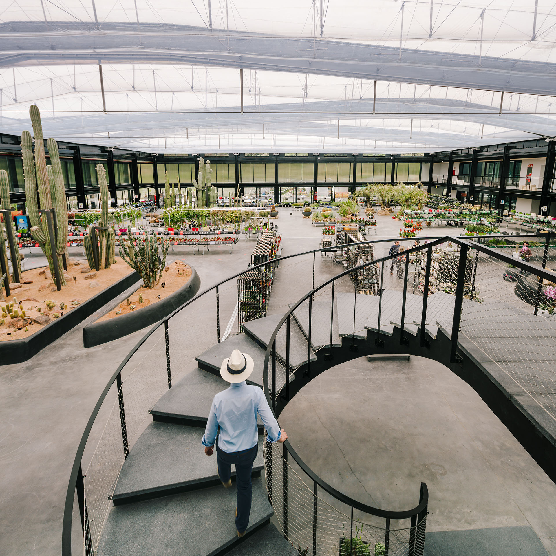
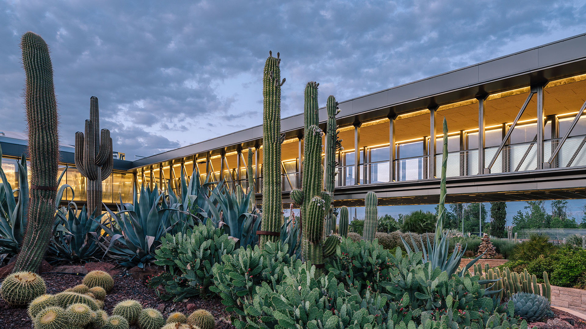 An interplay between light, structure and cacti, Desert City embodies a highly refined and well-executed approach. The building has become a filter between the harsh infrastructural condition of the highway and the limit of the huge green pocket formed by the Parque Regional de la Cuenca Alta del Manzanares on the other side. In turn, it showcases how architecture can be inspired by nature while being created for and with it.